01
Accessible ramp
Nine steps from the seed. Each one is measured against the page surface, so you can see where the scale stops being readable.
Design color systems people can read
Turn a website, image, palette, or single color into readable UI choices, color-vision checks, exportable tokens, and clear fixes — before your design ships.
Every tool is free Only the URL Analyzer needs a (free) account
2 of 3 pairs pass AA for body text
That last tile is our own brand gold on our own surface. Keep it for accents and rules — not for reading.
Inspecting
#D3AF37 on #F5F0E6
Pick a color, or type a 3- or 6-digit hex. Everything below follows.
WCAG 2 contrast
1.85 : 1 Fail
Lightness · OKLCHGap 0.17
Contrast is mostly the distance between two lightnesses. Hue barely counts.
APCA · WCAG 3 draftLc +32
Spot text and non-text only · A draft, shown for comparison; WCAG 2 is still the conformance test.
Each cell is this text hue on this background hue, at one pair of lightnesses. The ring is your pair; the small dots are the nearest passing fixes. Move either slider to walk the map.
#D3AF37 on #F5F0E6 · 1.85:1 · Fail
A ring closes when the pair reaches that threshold. Large text is 24px, or 18.5px bold.
Selecting a type previews it in the specimen too. The simulations follow Machado, Oliveira and Fernandes (2009) at full severity. The ratio barely moves because contrast follows lightness; anything told apart by hue alone can vanish.
Each fix moves one color in lightness only, so the hue stays yours.
Passes every threshold, AAA included. Nothing to fix.
color: #D3AF37;
background-color: #F5F0E6;
Every text color in our palette (rows) on every background (columns). The bar under each cell is its grade. Select a cell to inspect it above.
Live demo
Text#1d2a3e
Background#FFFCF7
Color that reads
Body copy at the size people actually read it, on the surface it will actually sit on.
Accessibility, in the open
Here it is. Every text and control color on this site, placed by its WCAG 2 contrast against the ground it sits on and computed from the color tokens that ship.
Every tool is free
Paid plans
Both caps lifted, plus whole-site crawls of up to 24 pages, cloud sync and API access.
The workflow
Change the color and watch all three steps move. Nothing here asks you to trust a number you cannot reproduce.
Nine steps from the seed. Each one is measured against the page surface, so you can see where the scale stops being readable.
The same ramp through the Machado (2009) models the vision lab uses — so a scale that separates for you separates for everyone.
The scale above, in the format your build already reads.
Color of the day
Auric Gold
The house accent. Warm, metallic, and — as the numbers below show — a color for rules and marks rather than for reading: it clears 3:1 as a large display color and fails as body text on a light surface.
Warm, metallic, attention-carrying. It earns its place as an accent and loses it as body copy: on a light surface a reader needs #8a6d16 (4.79:1) instead.
The libraries
The references
25 references in four parts. Each part opens on the page to start from; the rest go deeper.
Names, codes and conversions, from Tailwind and RAL to every CSS format.
7 entries
Contrast and palettes for real work, with every pair measured.
7 entries
The standards, the law and the patterns, with checks you can run.
6 entries
Tokens, integrations, datasets and the tests behind the engines.
5 entries
Looking for something these don't name? The site search covers every page.
Search the siteBrowse all
All 30 tools, free to use. The search also finds articles, guides, WCAG criteria, patterns and colors across the site.
30 tools
Did you mean ?

Accessibility
Check text and UI colors against WCAG AA and AAA contrast ratios, see the APCA Lc score, preview the pair, and fix failing text in one click.
Accessibility
Simulate 78 vision conditions on your own images and designs: every type of color blindness, plus cataract, glaucoma, macular degeneration and more.

Accessibility
Audit any web page's accessibility, color contrast, metadata and security from its URL, with each finding pointing at the line that caused it. Free account.
Generators
Everyday color tools in one workspace: a palette generator and remixer, gradient maker, color picker, palette battles and quick format conversion.
Design Systems
Generate an accessible design system from an industry, a style and a contrast target: OKLCH color ramps, type, icons and tokens, exported twelve ways.

Utilities
Extract a palette from any image with K-means++ and an eyedropper, then check its WCAG contrast pairs, harmony and CIE Lab values.
Generators
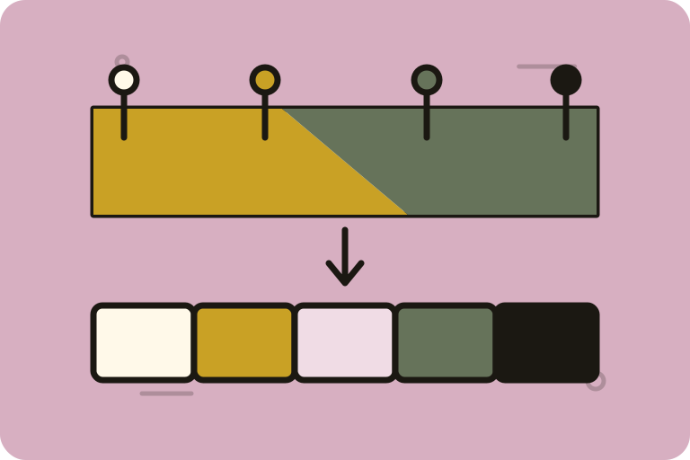
Generate tints, shades and tonal ramps from one color in the space you choose, with every step's lightness and contrast measured as you build.
Generators
Build a color ramp in sRGB, linear RGB, HSL or OKLCH and measure how even its steps are, what text can sit on each one, and what color-blind readers see.
Generators
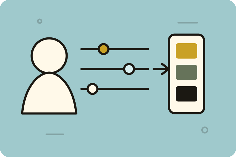
Give it the colors and brief you have in mind and get a design system back: palettes, mesh gradients, type, UI pairs, posters and theme tokens.
Utilities
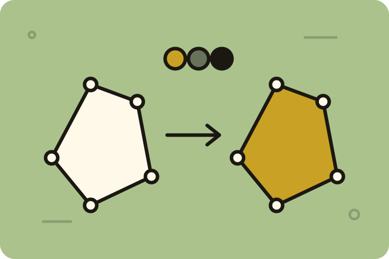
Recolor an SVG file and see exactly what changed: colors can swap places, named colors and shorthands are rewritten, and nothing leaves your browser.
Accessibility
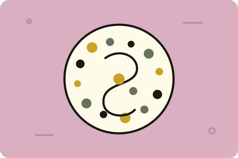
Generate Ishihara-style color vision test plates that hide a figure from a chosen deficiency, measured and scored in OKLab, and export them.
Color Science
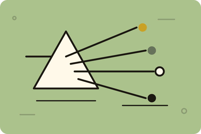
A color science workspace for chromatic adaptation, spectral analysis, color appearance, 60+ color spaces and model comparison, in floating panels.
Colorimetry
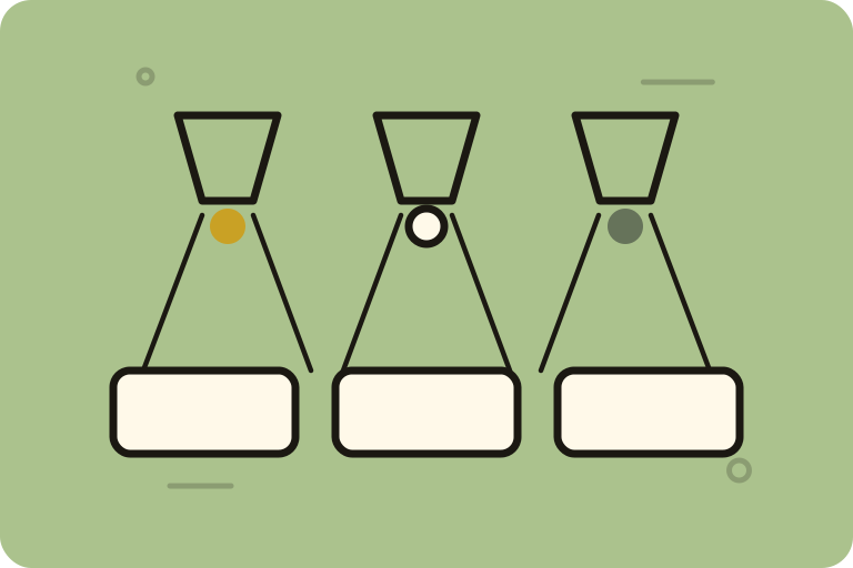
CIE standard illuminants and their spectral power distributions, with CCT and Duv by Ohno's method, the chromaticity diagram and chromatic adaptation.
Colorimetry
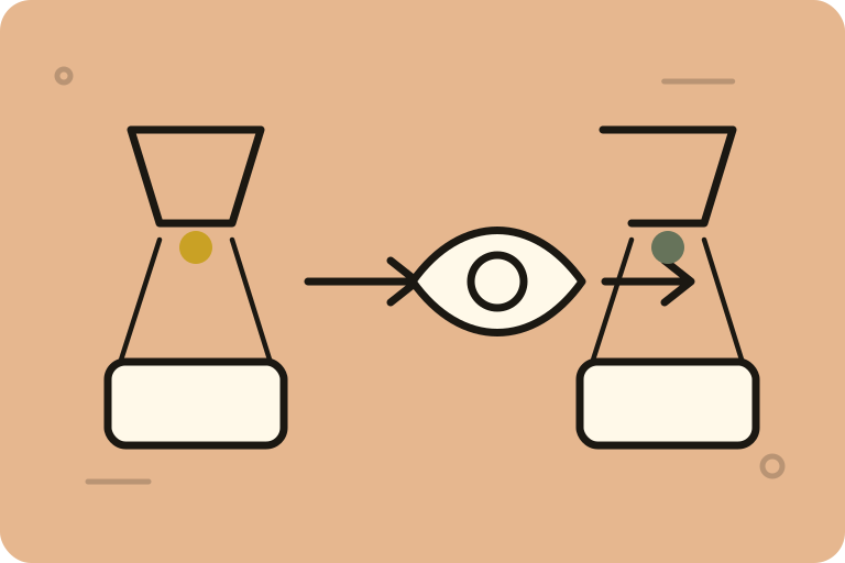
Apply eight published chromatic adaptation transforms to a real image and watch the eye adapt over time, with the data and paper behind each one named.
Colorimetry
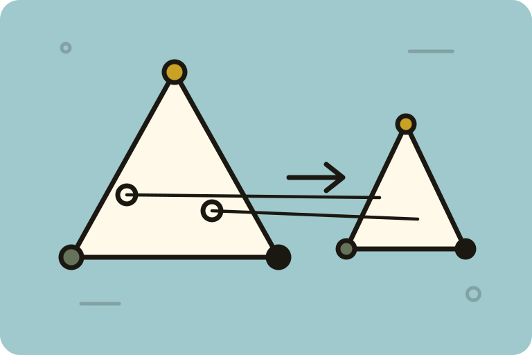
See what a color becomes when the target space cannot hold it: sRGB, Display P3, Rec.2020, Adobe RGB and ProPhoto boundaries sliced through CIELAB.
Gamut & Rendering
Define custom primaries, derive RGB to XYZ matrices, draw color spaces on the chromaticity diagram and measure their gamut area.
Gamut & Rendering
Plot the three broadcast gamuts on one diagram and the PQ and HLG curves that carry them to 10,000 nits, with ICtCp and JzAzBz views.
Gamut & Rendering
Compare nine tone-mapping curves, including Reinhard, Hable and ACES, on HDR images, with a histogram, waveform, vectorscope and LUT export.
Typography
Browse thousands of self-hosted fonts, each shown in itself: set your own words, explore variable axes and glyphs, and copy the kit or CDN line.
Iconography
Search about 12,900 icons across seven sets, recolor and resize them in the tab, and copy them as SVG, JSX or a data URI, or serve them from a CDN.
Utilities
Read a .cube LUT, apply it to an image and see what it moved: hue, lightness and chroma in CIELAB, and the highlights it crushed.
Utilities
Drop an ICC color profile and read it against the ICC specification: header, colorants and primaries, gamut coverage and a conformance verdict.

Utilities
Build a photo collage on a canvas and export it, with coverage, overlap and off-canvas area measured from the pixels. Nothing is uploaded.
Generators
Turn images, your webcam or text into ASCII art with dithering, edge detection and four render modes, then export it. Everything runs in your browser.

Publish
Build a free public portfolio from your color work, see it live as you edit, and publish it at your own address. Paid plans drop the small credit line.
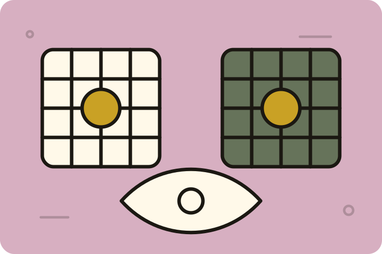
Advanced lab
Run eight simulations of how a scene reaches a different visual system over your own image: color vision deficiency, rod vision, lens yellowing and more.
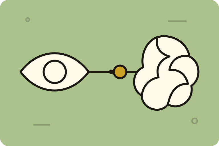
Advanced lab
Follow a color from the retina to V4 one stage at a time: cone signals, opponent channels, centre-surround cells and a V1 Gabor bank, each explained.
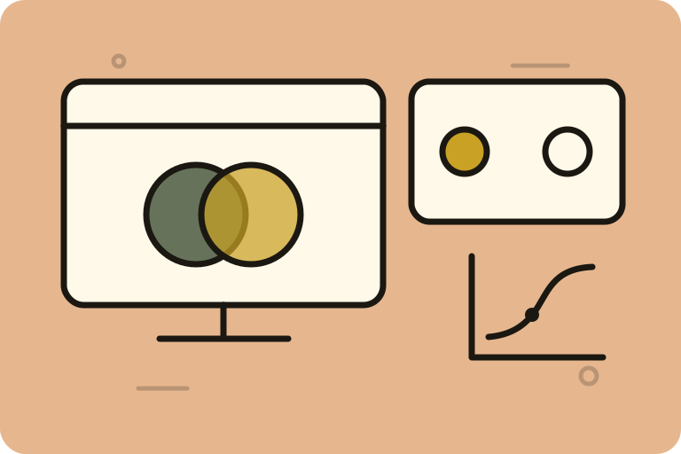
Advanced lab
Measure contrast thresholds with adaptive staircases over gratings stated in luminance and cycles per degree, then fit the psychometric function.
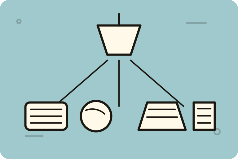
Advanced lab
Light a pigment and see its color: pigment, illuminant and reflectance multiplied one wavelength at a time from 380 to 780 nm, against the CIE observer.
Advanced lab
Mix a dye bath and see its color: Beer–Lambert absorption over 81 wavelengths from 380 to 780 nm, integrated against the CIE 1931 observer.
No tool matches that.