Accessibility pattern · Navigation
Breadcrumb
A labelled nav holds an ordered list of links; the last one is the current page and says so with aria-current. The separators are drawn in CSS, so screen readers never read out a row of arrows, and on a narrow screen the middle levels fold behind a button.
- WCAG criteria
- 6
- Keyboard rules
- 3
- Checked with
- axe, keyboard and the inspector
Live demo
Try it
Use it with a mouse, a keyboard or a screen reader. The inspector beside it shows what the browser tells assistive technology as you go: focus, state changes and announcements.
The demo works without JavaScript only as far as its HTML does; the inspector needs JavaScript.
Keyboard
Keys it answers to
Every action works without a pointer.
| Key | What it does |
|---|---|
| Tab or ShiftTab | Moves along the trail from link to link. On a narrow screen it stops on the fold button between the first level and the last two. |
| Enter | Follows the focused link. |
| Enter or Space | On the fold button, shows or hides the middle levels. Focus stays on the button, and the next Tab reaches the first level it revealed. |
Screen readers
What it announces
Written from the roles, names and states in the markup.
| When | Expected announcement |
|---|---|
| Tab reaches the first link | Store breadcrumb, navigation. List, 6 items. Home, link |
| Tab reaches the last link | Kanjivaram silk saree, current page, link |
| Tab reaches the fold button on a phone | Full path, button, collapsed |
| Enter shows the middle levels | Expanded |
These are expected announcements, not recordings. Wording and order differ between screen readers and browsers.
Code
Copy the code
The exact files this demo runs on. The styles are served with a prefix that keeps this site's own styles out of the demo; what you copy is the original.
<div class="ap-breadcrumb" data-ap-breadcrumb>
  <nav class="ap-breadcrumb__nav" aria-label="Store breadcrumb">
    <ol class="ap-breadcrumb__list" id="bc-list">
      <li class="ap-breadcrumb__item">
        <a class="ap-breadcrumb__link" href="#bc-home">
          <svg class="ap-breadcrumb__home" viewBox="0 0 24 24" aria-hidden="true" focusable="false"><path d="M4 10.5 12 4l8 6.5V19a1 1 0 0 1-1 1h-4.5v-5.5h-5V20H5a1 1 0 0 1-1-1Z"/></svg>
          Home
        </a>
      </li>
      <li class="ap-breadcrumb__item ap-breadcrumb__item--more">
        <button type="button" class="ap-breadcrumb__more" aria-expanded="false" aria-controls="bc-list" aria-label="Full path">
          <svg viewBox="0 0 24 24" aria-hidden="true" focusable="false"><circle cx="6" cy="12" r="1.6"/><circle cx="12" cy="12" r="1.6"/><circle cx="18" cy="12" r="1.6"/></svg>
        </button>
      </li>
      <li class="ap-breadcrumb__item ap-breadcrumb__item--fold"><a class="ap-breadcrumb__link" href="#bc-women">Women</a></li>
      <li class="ap-breadcrumb__item ap-breadcrumb__item--fold"><a class="ap-breadcrumb__link" href="#bc-ethnic">Ethnic wear</a></li>
      <li class="ap-breadcrumb__item ap-breadcrumb__item--fold"><a class="ap-breadcrumb__link" href="#bc-sarees">Sarees</a></li>
      <li class="ap-breadcrumb__item"><a class="ap-breadcrumb__link" href="#bc-silk">Silk sarees</a></li>
      <li class="ap-breadcrumb__item"><a class="ap-breadcrumb__link" href="#bc-kanjivaram" aria-current="page">Kanjivaram silk saree</a></li>
    </ol>
  </nav>

  <div class="ap-breadcrumb__product">
    <span class="ap-breadcrumb__swatch" aria-hidden="true"></span>
    <div class="ap-breadcrumb__info">
      <h3 class="ap-breadcrumb__name">Kanjivaram silk saree</h3>
      <p class="ap-breadcrumb__desc">Handwoven in Kanchipuram, in temple red with a gold zari border.</p>
      <p class="ap-breadcrumb__price">₹18,500</p>
    </div>
  </div>
</div>
/* Breadcrumb. Uses the --ap-* design tokens. */
.ap-breadcrumb {
  width: min(100%, 720px);
  margin-inline: auto;
  container-type: inline-size;
  border: 1px solid var(--ap-border);
  border-radius: var(--ap-radius-lg);
  background: var(--ap-surface);
  box-shadow: var(--ap-shadow-md);
}

.ap-breadcrumb__nav {
  padding: 12px 18px;
  border-bottom: 1px solid var(--ap-border);
}

.ap-breadcrumb__list {
  display: flex;
  flex-wrap: wrap;
  align-items: center;
  gap: 2px 0;
  margin: 0;
  padding: 0;
  list-style: none;
  font-size: .9375rem;
  line-height: 1.4;
}

.ap-breadcrumb__item {
  display: flex;
  align-items: center;
  min-width: 0;
}
/* The separator: a chevron drawn with two borders, so there is no text to read
   out. It follows each level, so a wrapped line starts with a level, not a chevron. */
.ap-breadcrumb__item:not(:last-child)::after {
  content: "";
  flex-shrink: 0;
  width: 6px;
  height: 6px;
  margin: 0 9px 0 5px;
  border-top: 1.5px solid var(--ap-text-3);
  border-right: 1.5px solid var(--ap-text-3);
  transform: rotate(45deg);
}

.ap-breadcrumb__link {
  display: inline-flex;
  align-items: center;
  gap: 6px;
  min-height: 32px;
  padding: 0 4px;
  border-radius: 6px;
  color: var(--ap-text-2);
  text-decoration: underline;
  text-decoration-color: var(--ap-border-strong);
  text-decoration-thickness: 1px;
  text-underline-offset: 4px;
  transition: color var(--ap-duration) var(--ap-ease), text-decoration-color var(--ap-duration) var(--ap-ease);
}
.ap-breadcrumb__link:hover {
  color: var(--ap-text);
  text-decoration-color: currentColor;
}
.ap-breadcrumb__link:focus-visible {
  outline: 2px solid var(--ap-focus);
  outline-offset: 1px;
}
/* The current page: heavier, not underlined, and marked with aria-current. */
.ap-breadcrumb__link[aria-current="page"] {
  color: var(--ap-text);
  font-weight: 650;
  text-decoration: none;
}

.ap-breadcrumb__home {
  width: 16px;
  height: 16px;
  flex-shrink: 0;
  fill: none;
  stroke: currentColor;
  stroke-width: 2;
  stroke-linejoin: round;
}

/* The fold button: only on a narrow trail, and only once the script runs. */
.ap-breadcrumb__item--more {
  display: none;
}
.ap-breadcrumb__more {
  display: grid;
  place-items: center;
  width: 36px;
  height: 28px;
  padding: 0;
  border: 1px solid var(--ap-border-strong);
  border-radius: var(--ap-radius-full);
  background: var(--ap-surface);
  color: var(--ap-text-2);
  cursor: pointer;
  transition: background-color var(--ap-duration) var(--ap-ease);
}
.ap-breadcrumb__more:hover {
  background: var(--ap-surface-2);
  color: var(--ap-text);
}
.ap-breadcrumb__more:focus-visible {
  outline: 2px solid var(--ap-focus);
  outline-offset: 2px;
}
.ap-breadcrumb__more[aria-expanded="true"] {
  border-color: var(--ap-accent);
  background: var(--ap-accent-soft);
  color: var(--ap-accent-soft-text);
}
.ap-breadcrumb__more svg {
  width: 18px;
  height: 18px;
  fill: currentColor;
}

@container (max-width: 600px) {
  .ap-breadcrumb.is-ready .ap-breadcrumb__item--more {
    display: flex;
  }
  .ap-breadcrumb.is-ready:has(.ap-breadcrumb__more[aria-expanded="false"]) .ap-breadcrumb__item--fold {
    display: none;
  }
  .ap-breadcrumb__item--fold {
    animation: ap-breadcrumb-in 200ms var(--ap-ease);
  }
}

/* The page the trail belongs to. */
.ap-breadcrumb__product {
  display: flex;
  align-items: flex-start;
  gap: 18px;
  padding: 20px 18px 22px;
}
.ap-breadcrumb__swatch {
  flex-shrink: 0;
  width: 84px;
  height: 104px;
  border-radius: var(--ap-radius-sm);
  background:
    linear-gradient(to bottom, transparent 0 74%, var(--ap-warning) 74% 80%, transparent 80% 84%, var(--ap-warning) 84% 86%, transparent 86%),
    repeating-linear-gradient(90deg, var(--ap-danger) 0 5px, var(--ap-danger-soft) 5px 6px);
  box-shadow: inset 0 0 0 1px var(--ap-border);
}
.ap-breadcrumb__info {
  display: grid;
  gap: 6px;
  min-width: 0;
}
.ap-breadcrumb__name {
  margin: 0;
  font-size: 1.25rem;
  font-weight: 650;
  line-height: 1.3;
}
.ap-breadcrumb__desc {
  margin: 0;
  color: var(--ap-text-2);
  line-height: 1.55;
}
.ap-breadcrumb__price {
  margin: 4px 0 0;
  color: var(--ap-text);
  font-size: 1.0625rem;
  font-weight: 650;
  font-variant-numeric: tabular-nums;
}

@container (max-width: 380px) {
  .ap-breadcrumb__nav,
  .ap-breadcrumb__product {
    padding-inline: 14px;
  }
  .ap-breadcrumb__product {
    gap: 14px;
  }
  .ap-breadcrumb__swatch {
    width: 64px;
    height: 80px;
  }
}

@keyframes ap-breadcrumb-in {
  from { opacity: 0; }
}

@media (prefers-reduced-motion: reduce) {
  .ap-breadcrumb__link,
  .ap-breadcrumb__more { transition: none; }
  .ap-breadcrumb__item--fold { animation: none; }
}
/**
 * Breadcrumb: a labelled nav holding an ordered list of links, the last one
 * marked aria-current="page". Separators are CSS.
 *
 * When the trail's own box is narrow (a container query in the CSS), the
 * middle levels (li.ap-breadcrumb__item--fold) fold behind a button in
 * li.ap-breadcrumb__item--more. This script makes that button work; until it
 * runs, the button stays hidden and every level shows.
 */

export function init(root) {
  const button = root.querySelector(".ap-breadcrumb__more");

  function onClick() {
    const open = button.getAttribute("aria-expanded") !== "true";
    button.setAttribute("aria-expanded", String(open));
  }

  button.addEventListener("click", onClick);
  // The CSS folds the trail only once this class is set.
  root.classList.add("is-ready");

  return () => {
    button.removeEventListener("click", onClick);
    root.classList.remove("is-ready");
  };
}

for (const root of document.querySelectorAll("[data-ap-breadcrumb]")) init(root);
/* Design tokens for the pattern components. Light by default, dark when the
   system asks for it; set data-theme="dark" on :root to force dark. */
:root {
    --ap-radius-sm: 8px;
    --ap-radius: 12px;
    --ap-radius-lg: 16px;
    --ap-radius-full: 999px;
    --ap-font: "Instrument Sans", ui-sans-serif, system-ui, -apple-system, "Segoe UI", Roboto, sans-serif;
    --ap-mono: "JetBrains Mono", ui-monospace, "Cascadia Mono", "SF Mono", Consolas, monospace;
    --ap-ease: cubic-bezier(.2, .8, .2, 1);
    --ap-duration: 180ms;
    --ap-target: 44px;
    --ap-bg: #F4F4F5;
    --ap-surface: #FFFFFF;
    --ap-surface-2: #F4F4F5;
    --ap-surface-3: #E4E4E7;
    --ap-border: #E4E4E7;
    --ap-border-strong: #76767F;
    --ap-text: #18181B;
    --ap-text-2: #3F3F46;
    --ap-text-3: #5E5E66;
    --ap-accent: #4F46E5;
    --ap-accent-hover: #4338CA;
    --ap-on-accent: #FFFFFF;
    --ap-accent-text: #4338CA;
    --ap-accent-soft: #EEF2FF;
    --ap-accent-soft-text: #3730A3;
    --ap-focus: #4F46E5;
    --ap-danger: #B91C1C;
    --ap-danger-soft: #FEF2F2;
    --ap-success: #15803D;
    --ap-success-soft: #F0FDF4;
    --ap-warning: #A15C07;
    --ap-warning-soft: #FEFCE8;
    --ap-info: #1D4ED8;
    --ap-info-soft: #EFF6FF;
    --ap-scrim: rgb(9 9 11 / .48);
    --ap-shadow-sm: 0 1px 2px rgb(9 9 11 / .06);
    --ap-shadow-md: 0 1px 2px rgb(9 9 11 / .05), 0 6px 16px -4px rgb(9 9 11 / .1);
    --ap-shadow-lg: 0 2px 6px rgb(9 9 11 / .06), 0 20px 40px -12px rgb(9 9 11 / .22);
    --ap-light-bg: #F4F4F5;
    --ap-light-surface: #FFFFFF;
    --ap-light-surface-2: #F4F4F5;
    --ap-light-surface-3: #E4E4E7;
    --ap-light-border: #E4E4E7;
    --ap-light-border-strong: #76767F;
    --ap-light-text: #18181B;
    --ap-light-text-2: #3F3F46;
    --ap-light-text-3: #5E5E66;
    --ap-light-accent: #4F46E5;
    --ap-light-accent-hover: #4338CA;
    --ap-light-on-accent: #FFFFFF;
    --ap-light-accent-text: #4338CA;
    --ap-light-accent-soft: #EEF2FF;
    --ap-light-accent-soft-text: #3730A3;
    --ap-light-focus: #4F46E5;
    --ap-light-danger: #B91C1C;
    --ap-light-danger-soft: #FEF2F2;
    --ap-light-success: #15803D;
    --ap-light-success-soft: #F0FDF4;
    --ap-light-warning: #A15C07;
    --ap-light-warning-soft: #FEFCE8;
    --ap-light-info: #1D4ED8;
    --ap-light-info-soft: #EFF6FF;
    --ap-light-scrim: rgb(9 9 11 / .48);
    --ap-light-shadow-sm: 0 1px 2px rgb(9 9 11 / .06);
    --ap-light-shadow-md: 0 1px 2px rgb(9 9 11 / .05), 0 6px 16px -4px rgb(9 9 11 / .1);
    --ap-light-shadow-lg: 0 2px 6px rgb(9 9 11 / .06), 0 20px 40px -12px rgb(9 9 11 / .22);
    --ap-dark-bg: #09090B;
    --ap-dark-surface: #18181B;
    --ap-dark-surface-2: #27272A;
    --ap-dark-surface-3: #3F3F46;
    --ap-dark-border: #2E2E33;
    --ap-dark-border-strong: #8E8E97;
    --ap-dark-text: #FAFAFA;
    --ap-dark-text-2: #D4D4D8;
    --ap-dark-text-3: #A1A1AA;
    --ap-dark-accent: #818CF8;
    --ap-dark-accent-hover: #A5B4FC;
    --ap-dark-on-accent: #0C0A1F;
    --ap-dark-accent-text: #A5B4FC;
    --ap-dark-accent-soft: #1E1B4B;
    --ap-dark-accent-soft-text: #C7D2FE;
    --ap-dark-focus: #A5B4FC;
    --ap-dark-danger: #F87171;
    --ap-dark-danger-soft: #2A1215;
    --ap-dark-success: #4ADE80;
    --ap-dark-success-soft: #0F2A1A;
    --ap-dark-warning: #FACC15;
    --ap-dark-warning-soft: #2A2410;
    --ap-dark-info: #60A5FA;
    --ap-dark-info-soft: #0F1D33;
    --ap-dark-scrim: rgb(0 0 0 / .62);
    --ap-dark-shadow-sm: 0 1px 2px rgb(0 0 0 / .4);
    --ap-dark-shadow-md: 0 1px 2px rgb(0 0 0 / .4), 0 8px 20px -6px rgb(0 0 0 / .5);
    --ap-dark-shadow-lg: 0 2px 8px rgb(0 0 0 / .45), 0 24px 48px -12px rgb(0 0 0 / .7);
}
@media (prefers-color-scheme: dark) {
  :root:not([data-theme="light"]) {
      --ap-bg: #09090B;
      --ap-surface: #18181B;
      --ap-surface-2: #27272A;
      --ap-surface-3: #3F3F46;
      --ap-border: #2E2E33;
      --ap-border-strong: #8E8E97;
      --ap-text: #FAFAFA;
      --ap-text-2: #D4D4D8;
      --ap-text-3: #A1A1AA;
      --ap-accent: #818CF8;
      --ap-accent-hover: #A5B4FC;
      --ap-on-accent: #0C0A1F;
      --ap-accent-text: #A5B4FC;
      --ap-accent-soft: #1E1B4B;
      --ap-accent-soft-text: #C7D2FE;
      --ap-focus: #A5B4FC;
      --ap-danger: #F87171;
      --ap-danger-soft: #2A1215;
      --ap-success: #4ADE80;
      --ap-success-soft: #0F2A1A;
      --ap-warning: #FACC15;
      --ap-warning-soft: #2A2410;
      --ap-info: #60A5FA;
      --ap-info-soft: #0F1D33;
      --ap-scrim: rgb(0 0 0 / .62);
      --ap-shadow-sm: 0 1px 2px rgb(0 0 0 / .4);
      --ap-shadow-md: 0 1px 2px rgb(0 0 0 / .4), 0 8px 20px -6px rgb(0 0 0 / .5);
      --ap-shadow-lg: 0 2px 8px rgb(0 0 0 / .45), 0 24px 48px -12px rgb(0 0 0 / .7);
  }
}
:root[data-theme="dark"] {
    --ap-bg: #09090B;
    --ap-surface: #18181B;
    --ap-surface-2: #27272A;
    --ap-surface-3: #3F3F46;
    --ap-border: #2E2E33;
    --ap-border-strong: #8E8E97;
    --ap-text: #FAFAFA;
    --ap-text-2: #D4D4D8;
    --ap-text-3: #A1A1AA;
    --ap-accent: #818CF8;
    --ap-accent-hover: #A5B4FC;
    --ap-on-accent: #0C0A1F;
    --ap-accent-text: #A5B4FC;
    --ap-accent-soft: #1E1B4B;
    --ap-accent-soft-text: #C7D2FE;
    --ap-focus: #A5B4FC;
    --ap-danger: #F87171;
    --ap-danger-soft: #2A1215;
    --ap-success: #4ADE80;
    --ap-success-soft: #0F2A1A;
    --ap-warning: #FACC15;
    --ap-warning-soft: #2A2410;
    --ap-info: #60A5FA;
    --ap-info-soft: #0F1D33;
    --ap-scrim: rgb(0 0 0 / .62);
    --ap-shadow-sm: 0 1px 2px rgb(0 0 0 / .4);
    --ap-shadow-md: 0 1px 2px rgb(0 0 0 / .4), 0 8px 20px -6px rgb(0 0 0 / .5);
    --ap-shadow-lg: 0 2px 8px rgb(0 0 0 / .45), 0 24px 48px -12px rgb(0 0 0 / .7);
}
WCAG 2.2
What it meets
The success criteria this pattern takes care of, and how.
-
1.3.1 Info and Relationships
Level A
An ordered list inside a labelled nav exposes the trail's order and length; the separators are CSS, not text, so they are not read as content.
-
1.4.1 Use of Color
Level A
Links are underlined and the current page is set in heavier text without one, so neither is told apart by color alone.
-
1.4.10 Reflow
Level AA
On a narrow screen the middle levels fold behind a button instead of the trail running off the edge or scrolling sideways.
-
2.4.7 Focus Visible
Level AA
Every link and the fold button show a two-pixel focus ring.
-
2.4.8 Location
Level AAA
The trail shows where the page sits in the site, and aria-current marks the page itself.
-
4.1.2 Name, Role, Value
Level A
aria-current="page" names the current item, and the fold button exposes its name and aria-expanded state.
Usage
When to use it
Use it
- Sites with three or more levels, like a shop's categories or a documentation tree.
- Pages people land on from search, who need to see where they are and move up a level.
Use something else
- Flat sites with one or two levels: the main navigation already shows where you are.
- A record of the pages someone visited: that is history, and the Back button already keeps it.
Common failures
How it usually goes wrong
Separators typed as text
Characters like › or / between links are read out at every step, as "greater than" or "slash". Here they are drawn in CSS and never announced.
No sign of the current page
Without aria-current the last item sounds like any other link. With it, screen readers add "current page".
An unlabelled nav
Pages often have several navigation landmarks. One announced only as "navigation" cannot be told apart from the rest.
Levels cut off with no way back
Trimming the trail with an ellipsis in CSS hides levels from everyone. The fold button here brings them back on request.
A trail that scrolls sideways
On a phone a long trail runs off the edge and forces sideways scrolling. Folding the middle keeps it within one or two lines.
Notes
Building it
- Name it with aria-label="Breadcrumb". The demo says "Store breadcrumb" because this page already has a navigation called Breadcrumb at the top, and two landmarks with one name cannot be told apart.
- The fold is a container query, so the trail folds when its own box is narrow, wherever it sits, not only when the window is.
- Without the script the fold button stays hidden and every level shows, so nothing is lost if JavaScript fails.
- The current page can be a link with aria-current or plain text. The WAI-ARIA example uses a link; either works as long as it is marked.
Sources: WAI-ARIA Authoring Practices: Breadcrumb
Checked with axe in light and dark themes, at desktop and phone widths, and by keyboard. Not yet tested with every screen reader and browser pair. Report a correction
Related
Patterns that go with it
-
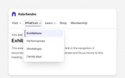
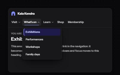
Site navigation with submenus
A header navigation whose sections open lists of links, built from buttons and links rather than an ARIA menu.
-
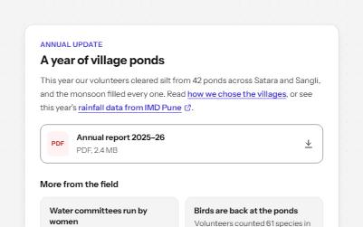
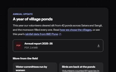
Links that say where they go
Links whose words say where they go: in text, to another site, to a download, and "Read more" made specific.
-
Landmarks
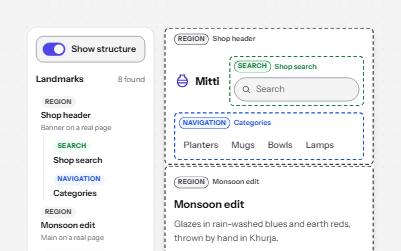
Header, navigation, main, search and footer regions that let screen reader users jump straight to each part of a page.
-
Sidebar navigation
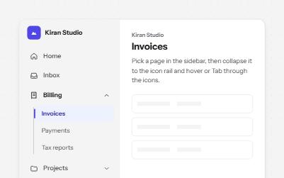
An app sidebar with grouped links that open and close, and a collapsed icon rail where every link keeps its name.