Accessibility pattern · Navigation
Mega menu
The panel is a disclosure: one button with aria-expanded opens it, and inside are ordinary headings, lists and links in reading order. Tab walks through it a group at a time; Escape, a click outside or tabbing past the end closes it.
- WCAG criteria
- 6
- Keyboard rules
- 4
- Checked with
- axe, keyboard and the inspector
Live demo
Try it
Use it with a mouse, a keyboard or a screen reader. The inspector beside it shows what the browser tells assistive technology as you go: focus, state changes and announcements.
The demo works without JavaScript only as far as its HTML does; the inspector needs JavaScript.
Keyboard
Keys it answers to
Every action works without a pointer.
| Key | What it does |
|---|---|
| Enter or Space | On Products, opens or closes the panel. Focus stays on the button. |
| Tab | Moves into the open panel and through its links a group at a time, then on to the next item in the navigation, which closes the panel. |
| ShiftTab | Moves back through the panel to the Products button, which keeps it open. |
| Escape | Closes the panel and returns focus to the Products button. |
Screen readers
What it announces
Written from the roles, names and states in the markup.
| When | Expected announcement |
|---|---|
| Tab reaches the button | Products, button, collapsed |
| Enter opens the panel | Expanded |
| Tab moves into the first group | Living room, list, 3 items. Sofas, link |
| Tab reaches the featured item | Jaipur block prints, link |
| Escape closes the panel | Products, button, collapsed |
These are expected announcements, not recordings. Wording and order differ between screen readers and browsers.
Code
Copy the code
The exact files this demo runs on. The styles are served with a prefix that keeps this site's own styles out of the demo; what you copy is the original.
<div class="ap-mega-menu" data-ap-mega-menu>
  <header class="ap-mega-menu__bar">
    <a class="ap-mega-menu__brand" href="#mega-home">
      <svg class="ap-mega-menu__mark" viewBox="0 0 32 32" aria-hidden="true" focusable="false"><path d="M4 15 16 5l12 10v12H4Z"/><path d="M13 27v-7h6v7"/></svg>
      <span>Aangan</span>
    </a>
    <nav class="ap-mega-menu__nav" aria-label="Main">
      <ul class="ap-mega-menu__list">
        <li class="ap-mega-menu__item">
          <button type="button" class="ap-mega-menu__top ap-mega-menu__toggle" aria-expanded="false" aria-controls="mega-products">
            Products
            <svg class="ap-mega-menu__chev" viewBox="0 0 24 24" aria-hidden="true" focusable="false"><path d="m6 9 6 6 6-6"/></svg>
          </button>
          <div class="ap-mega-menu__panel" id="mega-products" hidden>
            <div class="ap-mega-menu__groups">
              <div class="ap-mega-menu__group">
                <h3 class="ap-mega-menu__group-name" id="mega-living">Living room</h3>
                <ul class="ap-mega-menu__links" aria-labelledby="mega-living">
                  <li class="ap-mega-menu__entry"><a class="ap-mega-menu__link" href="#mega-sofas">Sofas</a><p class="ap-mega-menu__desc">Seaters and sofa beds</p></li>
                  <li class="ap-mega-menu__entry"><a class="ap-mega-menu__link" href="#mega-coffee-tables">Coffee tables</a><p class="ap-mega-menu__desc">Sheesham, cane and marble</p></li>
                  <li class="ap-mega-menu__entry"><a class="ap-mega-menu__link" href="#mega-rugs" aria-current="page">Rugs</a><p class="ap-mega-menu__desc">Dhurries and wool rugs</p></li>
                </ul>
              </div>
              <div class="ap-mega-menu__group">
                <h3 class="ap-mega-menu__group-name" id="mega-bedroom">Bedroom</h3>
                <ul class="ap-mega-menu__links" aria-labelledby="mega-bedroom">
                  <li class="ap-mega-menu__entry"><a class="ap-mega-menu__link" href="#mega-beds">Beds</a><p class="ap-mega-menu__desc">Storage beds and four-posters</p></li>
                  <li class="ap-mega-menu__entry"><a class="ap-mega-menu__link" href="#mega-wardrobes">Wardrobes</a><p class="ap-mega-menu__desc">Two- and three-door</p></li>
                  <li class="ap-mega-menu__entry"><a class="ap-mega-menu__link" href="#mega-bedding">Bedding</a><p class="ap-mega-menu__desc">Sheets, quilts and covers</p></li>
                </ul>
              </div>
              <div class="ap-mega-menu__group">
                <h3 class="ap-mega-menu__group-name" id="mega-kitchen">Kitchen and dining</h3>
                <ul class="ap-mega-menu__links" aria-labelledby="mega-kitchen">
                  <li class="ap-mega-menu__entry"><a class="ap-mega-menu__link" href="#mega-dining">Dining tables</a><p class="ap-mega-menu__desc">Four- to eight-seaters</p></li>
                  <li class="ap-mega-menu__entry"><a class="ap-mega-menu__link" href="#mega-cookware">Cookware</a><p class="ap-mega-menu__desc">Cast iron, brass and steel</p></li>
                  <li class="ap-mega-menu__entry"><a class="ap-mega-menu__link" href="#mega-tableware">Tableware</a><p class="ap-mega-menu__desc">Stoneware and copper</p></li>
                </ul>
              </div>
            </div>
            <div class="ap-mega-menu__feature">
              <span class="ap-mega-menu__art" aria-hidden="true"></span>
              <div class="ap-mega-menu__feature-text">
                <p class="ap-mega-menu__kicker">New collection</p>
                <a class="ap-mega-menu__feature-link" href="#mega-jaipur">Jaipur block prints</a>
                <p class="ap-mega-menu__feature-desc">Hand-printed cotton bedding in indigo and madder red.</p>
              </div>
              <svg class="ap-mega-menu__arrow" viewBox="0 0 24 24" aria-hidden="true" focusable="false"><path d="M5 12h14M13 6l6 6-6 6"/></svg>
            </div>
          </div>
        </li>
        <li class="ap-mega-menu__item"><a class="ap-mega-menu__top" href="#mega-offers">Offers</a></li>
        <li class="ap-mega-menu__item"><a class="ap-mega-menu__top" href="#mega-stores">Stores</a></li>
        <li class="ap-mega-menu__item"><a class="ap-mega-menu__top" href="#mega-help">Help</a></li>
      </ul>
    </nav>
  </header>

  <div class="ap-mega-menu__page">
    <p class="ap-mega-menu__page-kicker">You are on</p>
    <h3 class="ap-mega-menu__page-name" id="mega-page" tabindex="-1" data-ap-page>Rugs</h3>
    <p class="ap-mega-menu__page-text">This area stands in for the page. Choose a link in the menu: it becomes the current page, the panel closes and focus moves to this heading.</p>
  </div>
</div>
/* Mega menu. Uses the --ap-* design tokens. */
.ap-mega-menu {
  width: min(100%, 760px);
  margin-inline: auto;
  container-type: inline-size;
  border: 1px solid var(--ap-border);
  border-radius: var(--ap-radius-lg);
  background: var(--ap-surface);
  box-shadow: var(--ap-shadow-md);
}

/* The header is the panel's frame: the panel spans its full width. */
.ap-mega-menu__bar {
  position: relative;
  display: flex;
  align-items: center;
  justify-content: space-between;
  gap: 8px 20px;
  padding: 10px 12px 10px 18px;
  border-bottom: 1px solid var(--ap-border);
}

.ap-mega-menu__brand {
  display: inline-flex;
  align-items: center;
  gap: 10px;
  min-height: 40px;
  padding-right: 6px;
  border-radius: var(--ap-radius-sm);
  color: var(--ap-text);
  font-size: 1.0625rem;
  font-weight: 700;
  letter-spacing: -.01em;
  text-decoration: none;
}
.ap-mega-menu__mark {
  width: 28px;
  height: 28px;
  flex-shrink: 0;
}
.ap-mega-menu__mark path:first-child {
  fill: var(--ap-accent);
}
.ap-mega-menu__mark path:last-child {
  fill: var(--ap-surface);
}

.ap-mega-menu__list {
  display: flex;
  align-items: center;
  gap: 2px;
  margin: 0;
  padding: 0;
  list-style: none;
}

.ap-mega-menu__top {
  position: relative;
  display: inline-flex;
  align-items: center;
  gap: 4px;
  min-height: 40px;
  padding: 0 12px;
  border: 0;
  border-radius: var(--ap-radius-sm);
  background: transparent;
  color: var(--ap-text-2);
  font: inherit;
  font-weight: 550;
  text-decoration: none;
  white-space: nowrap;
  cursor: pointer;
  transition: background-color var(--ap-duration) var(--ap-ease), color var(--ap-duration) var(--ap-ease);
}
.ap-mega-menu__top:hover,
.ap-mega-menu__toggle[aria-expanded="true"] {
  background: var(--ap-surface-2);
  color: var(--ap-text);
}
.ap-mega-menu__chev {
  width: 16px;
  height: 16px;
  margin-right: -4px;
  fill: none;
  stroke: currentColor;
  stroke-width: 2.2;
  stroke-linecap: round;
  stroke-linejoin: round;
  transition: transform var(--ap-duration) var(--ap-ease);
}
.ap-mega-menu__toggle[aria-expanded="true"] .ap-mega-menu__chev {
  transform: rotate(180deg);
}
/* Where you are: a bar under the current page's link or its section. */
.ap-mega-menu__top[aria-current="page"],
.ap-mega-menu__item:has(.ap-mega-menu__panel [aria-current="page"]) > .ap-mega-menu__toggle {
  color: var(--ap-text);
}
.ap-mega-menu__top[aria-current="page"]::after,
.ap-mega-menu__item:has(.ap-mega-menu__panel [aria-current="page"]) > .ap-mega-menu__toggle::after {
  content: "";
  position: absolute;
  right: 12px;
  bottom: 3px;
  left: 12px;
  height: 2px;
  border-radius: 2px;
  background: var(--ap-accent);
}

/* The panel: three groups, then the featured item. */
.ap-mega-menu__panel {
  position: absolute;
  z-index: 3;
  top: calc(100% + 8px);
  right: 10px;
  left: 10px;
  display: grid;
  gap: 18px;
  padding: 22px 22px 18px;
  border: 1px solid var(--ap-border);
  border-radius: var(--ap-radius-lg);
  background: var(--ap-surface);
  box-shadow: var(--ap-shadow-lg);
}
.ap-mega-menu__panel:not([hidden]) {
  animation: ap-mega-menu-in 180ms var(--ap-ease);
}
.ap-mega-menu__panel[hidden] {
  display: none;
}

.ap-mega-menu__groups {
  display: grid;
  grid-template-columns: repeat(3, minmax(0, 1fr));
  gap: 18px;
}
.ap-mega-menu__group-name {
  margin: 0 0 8px;
  padding-left: 10px;
  color: var(--ap-text-3);
  font-size: .8125rem;
  font-weight: 650;
  letter-spacing: .04em;
  text-transform: uppercase;
}
.ap-mega-menu__links {
  display: grid;
  gap: 2px;
  margin: 0;
  padding: 0;
  list-style: none;
}

/* Each entry is one target: the link stretches over its description. */
.ap-mega-menu__entry {
  position: relative;
  display: grid;
  gap: 1px;
  padding: 8px 10px;
  border-radius: var(--ap-radius-sm);
  transition: background-color var(--ap-duration) var(--ap-ease);
}
.ap-mega-menu__entry:hover {
  background: var(--ap-surface-2);
}
.ap-mega-menu__link {
  color: var(--ap-text);
  font-weight: 600;
  text-decoration: none;
}
.ap-mega-menu__link::after {
  content: "";
  position: absolute;
  inset: 0;
  border-radius: var(--ap-radius-sm);
}
.ap-mega-menu__link:focus-visible {
  outline: none;
}
.ap-mega-menu__link:focus-visible::after {
  outline: 2px solid var(--ap-focus);
  outline-offset: -2px;
}
.ap-mega-menu__desc {
  margin: 0;
  color: var(--ap-text-3);
  font-size: .8125rem;
  line-height: 1.4;
}
.ap-mega-menu__entry:has([aria-current="page"]) {
  background: var(--ap-accent-soft);
  box-shadow: inset 3px 0 0 var(--ap-accent);
}
.ap-mega-menu__entry:has([aria-current="page"]) .ap-mega-menu__link,
.ap-mega-menu__entry:has([aria-current="page"]) .ap-mega-menu__desc {
  color: var(--ap-accent-soft-text);
}

.ap-mega-menu__feature {
  position: relative;
  display: flex;
  align-items: center;
  gap: 16px;
  padding: 12px 18px 12px 12px;
  border-radius: var(--ap-radius);
  background: var(--ap-surface-2);
  transition: background-color var(--ap-duration) var(--ap-ease);
}
.ap-mega-menu__feature:hover {
  background: var(--ap-surface-3);
}
.ap-mega-menu__art {
  flex-shrink: 0;
  width: 72px;
  height: 56px;
  border-radius: var(--ap-radius-sm);
  background:
    radial-gradient(circle at 50% 50%, var(--ap-danger) 0 3px, transparent 3.5px) 0 0 / 14px 14px,
    radial-gradient(circle at 50% 50%, var(--ap-surface) 0 2px, transparent 2.5px) 7px 7px / 14px 14px,
    var(--ap-accent);
}
.ap-mega-menu__feature-text {
  display: grid;
  flex: 1;
  min-width: 0;
}
.ap-mega-menu__feature-text p {
  margin: 0;
}
.ap-mega-menu__kicker {
  color: var(--ap-accent-text);
  font-size: .75rem;
  font-weight: 650;
  letter-spacing: .05em;
  text-transform: uppercase;
}
/* The featured item is one target: its link stretches over the card. */
.ap-mega-menu__feature-link {
  color: var(--ap-text);
  font-weight: 650;
  text-decoration: none;
}
.ap-mega-menu__feature-link::after {
  content: "";
  position: absolute;
  inset: 0;
  border-radius: var(--ap-radius);
}
.ap-mega-menu__feature-link:focus-visible {
  outline: none;
}
.ap-mega-menu__feature-link:focus-visible::after {
  outline: 2px solid var(--ap-focus);
  outline-offset: 2px;
}
.ap-mega-menu__feature-desc {
  color: var(--ap-text-2);
  font-size: .875rem;
  line-height: 1.45;
}
.ap-mega-menu__arrow {
  flex-shrink: 0;
  width: 20px;
  height: 20px;
  fill: none;
  stroke: var(--ap-text-2);
  stroke-width: 2;
  stroke-linecap: round;
  stroke-linejoin: round;
  transition: transform var(--ap-duration) var(--ap-ease);
}
.ap-mega-menu__feature:hover .ap-mega-menu__arrow {
  transform: translateX(3px);
}

.ap-mega-menu :is(.ap-mega-menu__brand, .ap-mega-menu__top):focus-visible {
  outline: 2px solid var(--ap-focus);
  outline-offset: 1px;
}

/* The page the menu belongs to. */
.ap-mega-menu__page {
  display: grid;
  align-content: start;
  gap: 6px;
  min-height: 380px;
  padding: 30px 22px 28px;
}
.ap-mega-menu__page-kicker {
  margin: 0;
  color: var(--ap-text-3);
  font-size: .8125rem;
  font-weight: 600;
  letter-spacing: .04em;
  text-transform: uppercase;
}
.ap-mega-menu__page-name {
  width: fit-content;
  margin: 0;
  border-radius: 6px;
  font-size: 1.625rem;
  font-weight: 650;
  letter-spacing: -.015em;
  line-height: 1.25;
}
.ap-mega-menu__page-name:focus-visible {
  outline: 2px solid var(--ap-focus);
  outline-offset: 4px;
}
.ap-mega-menu__page-text {
  max-width: 50ch;
  margin: 6px 0 0;
  color: var(--ap-text-2);
  line-height: 1.6;
}

/* Medium: the columns are narrower and their descriptions wrap, so the page
   leaves more room under the header for the open panel. */
@container (max-width: 680px) {
  .ap-mega-menu__page {
    min-height: 440px;
  }
}

/* Narrow: the links stack, and the open panel joins the page flow under its
   button, one group after another. */
@container (max-width: 540px) {
  .ap-mega-menu__bar {
    flex-direction: column;
    align-items: stretch;
    padding: 10px 10px 8px 14px;
  }
  .ap-mega-menu__brand {
    width: fit-content;
  }
  .ap-mega-menu__list {
    flex-direction: column;
    align-items: stretch;
    margin-left: -4px;
  }
  .ap-mega-menu__top {
    justify-content: space-between;
    width: 100%;
    min-height: 44px;
    padding: 0 12px 0 10px;
  }
  .ap-mega-menu__chev {
    margin-right: 0;
  }
  .ap-mega-menu__top[aria-current="page"]::after,
  .ap-mega-menu__item:has(.ap-mega-menu__panel [aria-current="page"]) > .ap-mega-menu__toggle::after {
    top: 12px;
    right: auto;
    bottom: 12px;
    left: 0;
    width: 3px;
    height: auto;
  }
  .ap-mega-menu__panel {
    position: static;
    margin: 4px 0 8px;
    padding: 14px 8px 8px;
    border-width: 1px 0 0;
    border-radius: 0;
    box-shadow: none;
  }
  .ap-mega-menu__groups {
    grid-template-columns: minmax(0, 1fr);
    gap: 14px;
  }
  .ap-mega-menu__feature {
    align-items: flex-start;
    gap: 12px;
    padding-right: 12px;
  }
  .ap-mega-menu__art {
    width: 48px;
    height: 48px;
  }
  .ap-mega-menu__arrow {
    display: none;
  }
  .ap-mega-menu__page {
    min-height: 200px;
    padding: 24px 16px;
  }
}

@keyframes ap-mega-menu-in {
  from { opacity: 0; transform: translateY(-4px); }
}

@media (prefers-reduced-motion: reduce) {
  .ap-mega-menu__top,
  .ap-mega-menu__chev,
  .ap-mega-menu__entry,
  .ap-mega-menu__feature,
  .ap-mega-menu__arrow { transition: none; }
  .ap-mega-menu__panel:not([hidden]) { animation: none; }
}
/**
 * Mega menu: a disclosure button in the navigation opens a wide panel of
 * grouped links. Headings, lists and links inside; no role=menu.
 *
 * Markup: [data-ap-mega-menu] holding nav > ul > li items. A panel is
 * button.ap-mega-menu__toggle[aria-expanded][aria-controls] followed by
 * div.ap-mega-menu__panel[hidden]. In the demo, links to "#…" stand in for
 * pages and [data-ap-page] is the heading of the page they lead to.
 */

export function init(root) {
  const nav = root.querySelector("nav");
  const toggles = [...nav.querySelectorAll(".ap-mega-menu__toggle")];
  const panelOf = (button) => document.getElementById(button.getAttribute("aria-controls"));
  const openButton = () => toggles.find((b) => b.getAttribute("aria-expanded") === "true");
  const outside = new AbortController();

  function setOpen(button, open) {
    if ((button.getAttribute("aria-expanded") === "true") === open) return;
    button.setAttribute("aria-expanded", String(open));
    panelOf(button).hidden = !open;
  }

  function closeAll(except = null) {
    for (const b of toggles) if (b !== except) setOpen(b, false);
  }

  // A link that points into this page stands in for a page of its own:
  // mark it current, close the panel and move focus to the new heading.
  // Links to other pages load as normal.
  function visit(link, event) {
    const page = root.querySelector("[data-ap-page]");
    if (!page || !link.getAttribute("href").startsWith("#")) return;
    event.preventDefault();
    for (const a of root.querySelectorAll("a[aria-current]")) a.removeAttribute("aria-current");
    link.setAttribute("aria-current", "page");
    closeAll();
    page.textContent = link.textContent.trim();
    page.focus();
  }

  function onClick(event) {
    const button = event.target.closest(".ap-mega-menu__toggle");
    if (button && nav.contains(button)) {
      const open = button.getAttribute("aria-expanded") !== "true";
      closeAll(button);
      setOpen(button, open);
      return;
    }
    const link = event.target.closest("a[href]");
    if (link && root.contains(link)) visit(link, event);
  }

  function onKeydown(event) {
    if (event.key !== "Escape") return;
    const button = openButton();
    if (!button) return;
    setOpen(button, false);
    button.focus();
  }

  // Focus moving to anything outside the open panel and its button closes it.
  function onFocusin(event) {
    const button = openButton();
    if (button && !button.parentElement.contains(event.target)) setOpen(button, false);
  }
  function onFocusout(event) {
    if (event.relatedTarget && !nav.contains(event.relatedTarget)) closeAll();
  }

  root.addEventListener("click", onClick);
  nav.addEventListener("keydown", onKeydown);
  nav.addEventListener("focusin", onFocusin);
  nav.addEventListener("focusout", onFocusout);
  // A press anywhere outside the navigation closes the panel.
  document.addEventListener("pointerdown", (event) => {
    if (!nav.contains(event.target)) closeAll();
  }, { signal: outside.signal });

  return () => {
    outside.abort();
    root.removeEventListener("click", onClick);
    nav.removeEventListener("keydown", onKeydown);
    nav.removeEventListener("focusin", onFocusin);
    nav.removeEventListener("focusout", onFocusout);
  };
}

for (const root of document.querySelectorAll("[data-ap-mega-menu]")) init(root);
/* Design tokens for the pattern components. Light by default, dark when the
   system asks for it; set data-theme="dark" on :root to force dark. */
:root {
    --ap-radius-sm: 8px;
    --ap-radius: 12px;
    --ap-radius-lg: 16px;
    --ap-radius-full: 999px;
    --ap-font: "Instrument Sans", ui-sans-serif, system-ui, -apple-system, "Segoe UI", Roboto, sans-serif;
    --ap-mono: "JetBrains Mono", ui-monospace, "Cascadia Mono", "SF Mono", Consolas, monospace;
    --ap-ease: cubic-bezier(.2, .8, .2, 1);
    --ap-duration: 180ms;
    --ap-target: 44px;
    --ap-bg: #F4F4F5;
    --ap-surface: #FFFFFF;
    --ap-surface-2: #F4F4F5;
    --ap-surface-3: #E4E4E7;
    --ap-border: #E4E4E7;
    --ap-border-strong: #76767F;
    --ap-text: #18181B;
    --ap-text-2: #3F3F46;
    --ap-text-3: #5E5E66;
    --ap-accent: #4F46E5;
    --ap-accent-hover: #4338CA;
    --ap-on-accent: #FFFFFF;
    --ap-accent-text: #4338CA;
    --ap-accent-soft: #EEF2FF;
    --ap-accent-soft-text: #3730A3;
    --ap-focus: #4F46E5;
    --ap-danger: #B91C1C;
    --ap-danger-soft: #FEF2F2;
    --ap-success: #15803D;
    --ap-success-soft: #F0FDF4;
    --ap-warning: #A15C07;
    --ap-warning-soft: #FEFCE8;
    --ap-info: #1D4ED8;
    --ap-info-soft: #EFF6FF;
    --ap-scrim: rgb(9 9 11 / .48);
    --ap-shadow-sm: 0 1px 2px rgb(9 9 11 / .06);
    --ap-shadow-md: 0 1px 2px rgb(9 9 11 / .05), 0 6px 16px -4px rgb(9 9 11 / .1);
    --ap-shadow-lg: 0 2px 6px rgb(9 9 11 / .06), 0 20px 40px -12px rgb(9 9 11 / .22);
    --ap-light-bg: #F4F4F5;
    --ap-light-surface: #FFFFFF;
    --ap-light-surface-2: #F4F4F5;
    --ap-light-surface-3: #E4E4E7;
    --ap-light-border: #E4E4E7;
    --ap-light-border-strong: #76767F;
    --ap-light-text: #18181B;
    --ap-light-text-2: #3F3F46;
    --ap-light-text-3: #5E5E66;
    --ap-light-accent: #4F46E5;
    --ap-light-accent-hover: #4338CA;
    --ap-light-on-accent: #FFFFFF;
    --ap-light-accent-text: #4338CA;
    --ap-light-accent-soft: #EEF2FF;
    --ap-light-accent-soft-text: #3730A3;
    --ap-light-focus: #4F46E5;
    --ap-light-danger: #B91C1C;
    --ap-light-danger-soft: #FEF2F2;
    --ap-light-success: #15803D;
    --ap-light-success-soft: #F0FDF4;
    --ap-light-warning: #A15C07;
    --ap-light-warning-soft: #FEFCE8;
    --ap-light-info: #1D4ED8;
    --ap-light-info-soft: #EFF6FF;
    --ap-light-scrim: rgb(9 9 11 / .48);
    --ap-light-shadow-sm: 0 1px 2px rgb(9 9 11 / .06);
    --ap-light-shadow-md: 0 1px 2px rgb(9 9 11 / .05), 0 6px 16px -4px rgb(9 9 11 / .1);
    --ap-light-shadow-lg: 0 2px 6px rgb(9 9 11 / .06), 0 20px 40px -12px rgb(9 9 11 / .22);
    --ap-dark-bg: #09090B;
    --ap-dark-surface: #18181B;
    --ap-dark-surface-2: #27272A;
    --ap-dark-surface-3: #3F3F46;
    --ap-dark-border: #2E2E33;
    --ap-dark-border-strong: #8E8E97;
    --ap-dark-text: #FAFAFA;
    --ap-dark-text-2: #D4D4D8;
    --ap-dark-text-3: #A1A1AA;
    --ap-dark-accent: #818CF8;
    --ap-dark-accent-hover: #A5B4FC;
    --ap-dark-on-accent: #0C0A1F;
    --ap-dark-accent-text: #A5B4FC;
    --ap-dark-accent-soft: #1E1B4B;
    --ap-dark-accent-soft-text: #C7D2FE;
    --ap-dark-focus: #A5B4FC;
    --ap-dark-danger: #F87171;
    --ap-dark-danger-soft: #2A1215;
    --ap-dark-success: #4ADE80;
    --ap-dark-success-soft: #0F2A1A;
    --ap-dark-warning: #FACC15;
    --ap-dark-warning-soft: #2A2410;
    --ap-dark-info: #60A5FA;
    --ap-dark-info-soft: #0F1D33;
    --ap-dark-scrim: rgb(0 0 0 / .62);
    --ap-dark-shadow-sm: 0 1px 2px rgb(0 0 0 / .4);
    --ap-dark-shadow-md: 0 1px 2px rgb(0 0 0 / .4), 0 8px 20px -6px rgb(0 0 0 / .5);
    --ap-dark-shadow-lg: 0 2px 8px rgb(0 0 0 / .45), 0 24px 48px -12px rgb(0 0 0 / .7);
}
@media (prefers-color-scheme: dark) {
  :root:not([data-theme="light"]) {
      --ap-bg: #09090B;
      --ap-surface: #18181B;
      --ap-surface-2: #27272A;
      --ap-surface-3: #3F3F46;
      --ap-border: #2E2E33;
      --ap-border-strong: #8E8E97;
      --ap-text: #FAFAFA;
      --ap-text-2: #D4D4D8;
      --ap-text-3: #A1A1AA;
      --ap-accent: #818CF8;
      --ap-accent-hover: #A5B4FC;
      --ap-on-accent: #0C0A1F;
      --ap-accent-text: #A5B4FC;
      --ap-accent-soft: #1E1B4B;
      --ap-accent-soft-text: #C7D2FE;
      --ap-focus: #A5B4FC;
      --ap-danger: #F87171;
      --ap-danger-soft: #2A1215;
      --ap-success: #4ADE80;
      --ap-success-soft: #0F2A1A;
      --ap-warning: #FACC15;
      --ap-warning-soft: #2A2410;
      --ap-info: #60A5FA;
      --ap-info-soft: #0F1D33;
      --ap-scrim: rgb(0 0 0 / .62);
      --ap-shadow-sm: 0 1px 2px rgb(0 0 0 / .4);
      --ap-shadow-md: 0 1px 2px rgb(0 0 0 / .4), 0 8px 20px -6px rgb(0 0 0 / .5);
      --ap-shadow-lg: 0 2px 8px rgb(0 0 0 / .45), 0 24px 48px -12px rgb(0 0 0 / .7);
  }
}
:root[data-theme="dark"] {
    --ap-bg: #09090B;
    --ap-surface: #18181B;
    --ap-surface-2: #27272A;
    --ap-surface-3: #3F3F46;
    --ap-border: #2E2E33;
    --ap-border-strong: #8E8E97;
    --ap-text: #FAFAFA;
    --ap-text-2: #D4D4D8;
    --ap-text-3: #A1A1AA;
    --ap-accent: #818CF8;
    --ap-accent-hover: #A5B4FC;
    --ap-on-accent: #0C0A1F;
    --ap-accent-text: #A5B4FC;
    --ap-accent-soft: #1E1B4B;
    --ap-accent-soft-text: #C7D2FE;
    --ap-focus: #A5B4FC;
    --ap-danger: #F87171;
    --ap-danger-soft: #2A1215;
    --ap-success: #4ADE80;
    --ap-success-soft: #0F2A1A;
    --ap-warning: #FACC15;
    --ap-warning-soft: #2A2410;
    --ap-info: #60A5FA;
    --ap-info-soft: #0F1D33;
    --ap-scrim: rgb(0 0 0 / .62);
    --ap-shadow-sm: 0 1px 2px rgb(0 0 0 / .4);
    --ap-shadow-md: 0 1px 2px rgb(0 0 0 / .4), 0 8px 20px -6px rgb(0 0 0 / .5);
    --ap-shadow-lg: 0 2px 8px rgb(0 0 0 / .45), 0 24px 48px -12px rgb(0 0 0 / .7);
}
WCAG 2.2
What it meets
The success criteria this pattern takes care of, and how.
-
1.3.1 Info and Relationships
Level A
Group names are headings and each list is labelled by its heading, so the panel's structure is exposed, not just drawn in columns.
-
1.3.2 Meaningful Sequence
Level A
The source runs group by group and then the featured item: the order the columns read in, and the order Tab follows.
-
1.4.10 Reflow
Level AA
In a narrow space the columns stack into one and the panel joins the page flow, so nothing is cut off or scrolls sideways.
-
2.1.1 Keyboard
Level A
The panel opens, closes and is moved through with the keyboard alone.
-
2.4.3 Focus Order
Level A
The panel follows its button in the DOM, so the next Tab goes straight into it, and Escape puts focus back on the button.
-
4.1.2 Name, Role, Value
Level A
The button exposes aria-expanded and aria-controls, and the panel is hidden with the hidden attribute while it is closed.
Usage
When to use it
Use it
- Large catalogues or sites where a section holds a dozen or more pages that people browse by category.
- When a few words of description help people choose between similar items.
Use something else
- A section with five or fewer links: a simple submenu is quicker to scan.
- Phones as the main layout: use a navigation drawer and let the groups become sections in it.
Common failures
How it usually goes wrong
Opening on hover
A panel that springs open as the pointer crosses the header covers the page by accident, and closes before keyboard and touch users can reach it.
A grid of links with no headings
Columns look grouped, but without headings a screen reader hears one long list of links. Headings name each group, and each list is labelled by its heading.
Columns laid out against the source
CSS grid can place a column first on screen while it comes last in the source, and then Tab jumps around. Keep the two orders the same.
role=menu and arrow-key traps
Treating the panel as an ARIA menu forces arrow-key movement across a two-dimensional layout nobody can predict. Links and Tab are enough.
Descriptions inside the link name
Putting the description inside the link makes every link a sentence long. Here it follows the link: read in order, but not part of its name.
Notes
Building it
- The panel sits inside the navigation landmark, straight after its button in the source, so no focus management is needed to reach it.
- Close the panel when focus leaves it, not when the pointer does: the path from the button to a far column often crosses empty space.
- In a narrow space the columns stack and the panel becomes part of the page flow instead of floating over it, so nothing is cut off.
- The featured item's artwork is decoration, drawn in CSS and hidden from assistive technology; its link says where it goes on its own.
- In the demo the links stand in for pages: choosing one marks it current, closes the panel and moves focus to the page heading.
Sources: WAI-ARIA Authoring Practices: Disclosure navigation menu example · WAI tutorial: Fly-out menus
Checked with axe in light and dark themes, at desktop and phone widths, and by keyboard. Not yet tested with every screen reader and browser pair. Report a correction
Related
Patterns that go with it
-
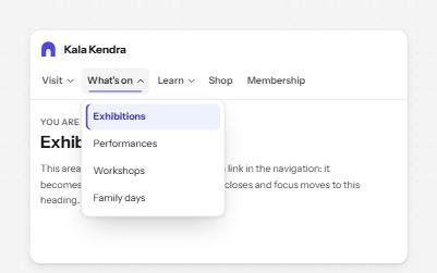
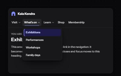
Site navigation with submenus
A header navigation whose sections open lists of links, built from buttons and links rather than an ARIA menu.
-
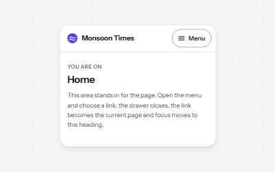
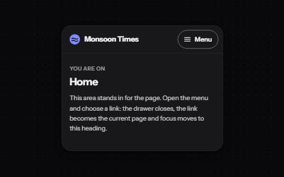
Mobile navigation drawer
A Menu button that opens the site's navigation in a full-height drawer, with nested sections and focus held inside.
-
Show more
A button that reveals the rest of a long text in place, with the hidden part still reachable by find-in-page.
-
Landmarks
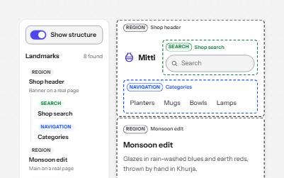
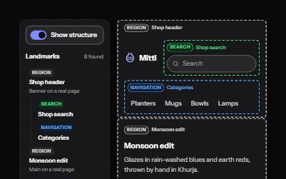
Header, navigation, main, search and footer regions that let screen reader users jump straight to each part of a page.