Accessibility pattern · Navigation
Mobile navigation drawer
The drawer is a modal dialog: showModal() makes the page behind inert, so focus and the screen reader stay in the menu until it closes. The Menu button keeps its name and reports expanded or collapsed; sections inside the drawer are disclosure buttons, not menus within menus.
- WCAG criteria
- 6
- Keyboard rules
- 4
- Checked with
- axe, keyboard and the inspector
Live demo
Try it
Use it with a mouse, a keyboard or a screen reader. The inspector beside it shows what the browser tells assistive technology as you go: focus, state changes and announcements.
You are on
Home
This area stands in for the page. Open the menu and choose a link: the drawer closes, the link becomes the current page and focus moves to this heading.
The demo works without JavaScript only as far as its HTML does; the inspector needs JavaScript.
Keyboard
Keys it answers to
Every action works without a pointer.
| Key | What it does |
|---|---|
| Enter or Space | On Menu, opens the drawer and moves focus into it. On a section button inside, shows or hides its links. |
| Tab or ShiftTab | Moves through the drawer's controls only; the page behind cannot be reached while it is open. |
| Escape | Closes the drawer and returns focus to the Menu button. |
| Enter | On a link, goes to that page: the drawer closes and focus moves to the new page's heading. |
Screen readers
What it announces
Written from the roles, names and states in the markup.
| When | Expected announcement |
|---|---|
| Tab reaches the Menu button | Menu, button, collapsed |
| The drawer opens | Menu, dialog. Close menu, button |
| Tab reaches a section | Sections, button, collapsed |
| Enter opens the section | Expanded |
| The drawer closes | Menu, button, collapsed (focus is back on the button) |
These are expected announcements, not recordings. Wording and order differ between screen readers and browsers.
Code
Copy the code
The exact files this demo runs on. The styles are served with a prefix that keeps this site's own styles out of the demo; what you copy is the original.
<div class="ap-mobile-nav" data-ap-mobile-nav>
  <div class="ap-mobile-nav__screen">
    <header class="ap-mobile-nav__bar">
      <a class="ap-mobile-nav__brand" href="#mobnav-home">
        <svg class="ap-mobile-nav__mark" viewBox="0 0 32 32" aria-hidden="true" focusable="false"><circle cx="16" cy="16" r="14"/><path d="M8 20c3-2 5-2 8 0s5 2 8 0M8 14c3-2 5-2 8 0s5 2 8 0"/></svg>
        <span>Monsoon Times</span>
      </a>
      <button type="button" class="ap-mobile-nav__open" data-ap-open aria-haspopup="dialog" aria-expanded="false" aria-controls="mobnav-drawer">
        <svg viewBox="0 0 24 24" aria-hidden="true" focusable="false"><path d="M4 7h16M4 12h16M4 17h16"/></svg>
        <span>Menu</span>
      </button>
    </header>
    <div class="ap-mobile-nav__page">
      <p class="ap-mobile-nav__kicker">You are on</p>
      <h3 class="ap-mobile-nav__page-name" id="mobnav-page" tabindex="-1" data-ap-page>Home</h3>
      <p class="ap-mobile-nav__page-text">This area stands in for the page. Open the menu and choose a link: the drawer closes, the link becomes the current page and focus moves to this heading.</p>
    </div>
  </div>

  <dialog class="ap-mobile-nav__drawer" id="mobnav-drawer" aria-labelledby="mobnav-name">
    <div class="ap-mobile-nav__sheet">
      <div class="ap-mobile-nav__top">
        <h2 class="ap-mobile-nav__name" id="mobnav-name">Menu</h2>
        <button type="button" class="ap-mobile-nav__close" data-ap-close aria-label="Close menu">
          <svg viewBox="0 0 24 24" aria-hidden="true" focusable="false"><path d="M6 6l12 12M18 6 6 18"/></svg>
        </button>
      </div>
      <nav class="ap-mobile-nav__nav" aria-label="Main">
        <ul class="ap-mobile-nav__list">
          <li><a class="ap-mobile-nav__link" href="#mobnav-home" aria-current="page">Home</a></li>
          <li>
            <button type="button" class="ap-mobile-nav__toggle" aria-expanded="false" aria-controls="mobnav-sections">
              Sections
              <svg viewBox="0 0 24 24" aria-hidden="true" focusable="false"><path d="m6 9 6 6 6-6"/></svg>
            </button>
            <ul class="ap-mobile-nav__sub" id="mobnav-sections" hidden>
              <li><a class="ap-mobile-nav__link" href="#mobnav-india">India</a></li>
              <li><a class="ap-mobile-nav__link" href="#mobnav-world">World</a></li>
              <li><a class="ap-mobile-nav__link" href="#mobnav-business">Business</a></li>
              <li><a class="ap-mobile-nav__link" href="#mobnav-sport">Sport</a></li>
              <li><a class="ap-mobile-nav__link" href="#mobnav-culture">Culture</a></li>
            </ul>
          </li>
          <li>
            <button type="button" class="ap-mobile-nav__toggle" aria-expanded="false" aria-controls="mobnav-cities">
              Cities
              <svg viewBox="0 0 24 24" aria-hidden="true" focusable="false"><path d="m6 9 6 6 6-6"/></svg>
            </button>
            <ul class="ap-mobile-nav__sub" id="mobnav-cities" hidden>
              <li><a class="ap-mobile-nav__link" href="#mobnav-mumbai">Mumbai</a></li>
              <li><a class="ap-mobile-nav__link" href="#mobnav-delhi">Delhi</a></li>
              <li><a class="ap-mobile-nav__link" href="#mobnav-bengaluru">Bengaluru</a></li>
              <li><a class="ap-mobile-nav__link" href="#mobnav-chennai">Chennai</a></li>
              <li><a class="ap-mobile-nav__link" href="#mobnav-kolkata">Kolkata</a></li>
            </ul>
          </li>
          <li><a class="ap-mobile-nav__link" href="#mobnav-podcasts">Podcasts</a></li>
          <li><a class="ap-mobile-nav__link" href="#mobnav-newsletters">Newsletters</a></li>
        </ul>
      </nav>
      <div class="ap-mobile-nav__foot">
        <a class="ap-btn ap-btn--primary" href="#mobnav-subscribe">Subscribe</a>
        <a class="ap-btn" href="#mobnav-sign-in">Sign in</a>
      </div>
    </div>
  </dialog>
</div>
/* Shared primitives: buttons and form fields used across the patterns.
   Uses the --ap-* design tokens. */

.ap-btn {
  display: inline-flex;
  align-items: center;
  justify-content: center;
  gap: 8px;
  min-height: 40px;
  padding: 0 16px;
  border: 1px solid var(--ap-border-strong);
  border-radius: var(--ap-radius-sm);
  background: var(--ap-surface);
  color: var(--ap-text);
  font: inherit;
  font-weight: 600;
  line-height: 1.2;
  text-decoration: none;
  white-space: nowrap;
  cursor: pointer;
  transition: background-color var(--ap-duration) var(--ap-ease), border-color var(--ap-duration) var(--ap-ease), box-shadow var(--ap-duration) var(--ap-ease);
}
.ap-btn:hover {
  background: var(--ap-surface-2);
}
.ap-btn:focus-visible {
  outline: 2px solid var(--ap-focus);
  outline-offset: 2px;
}
.ap-btn:disabled,
.ap-btn[aria-disabled="true"] {
  opacity: .55;
  cursor: not-allowed;
}
.ap-btn--primary {
  border-color: var(--ap-accent);
  background: var(--ap-accent);
  color: var(--ap-on-accent);
  box-shadow: var(--ap-shadow-sm);
}
.ap-btn--primary:hover {
  border-color: var(--ap-accent-hover);
  background: var(--ap-accent-hover);
}
.ap-btn--danger {
  border-color: var(--ap-danger);
  background: var(--ap-danger);
  color: var(--ap-surface);
}
.ap-btn--danger:hover {
  filter: brightness(1.08);
}
.ap-btn--ghost {
  border-color: transparent;
  background: transparent;
}
.ap-btn--ghost:hover {
  background: var(--ap-surface-2);
}
.ap-btn__icon {
  width: 18px;
  height: 18px;
  flex-shrink: 0;
  fill: none;
  stroke: currentColor;
  stroke-width: 2;
  stroke-linecap: round;
  stroke-linejoin: round;
}

.ap-field {
  display: grid;
  gap: 6px;
}
.ap-label {
  color: var(--ap-text);
  font-weight: 600;
  font-size: .9375rem;
}
.ap-hint {
  margin: 0;
  color: var(--ap-text-3);
  font-size: .875rem;
  line-height: 1.45;
}
.ap-error {
  display: flex;
  align-items: flex-start;
  gap: 6px;
  margin: 0;
  color: var(--ap-danger);
  font-size: .875rem;
  font-weight: 600;
  line-height: 1.45;
}
.ap-input {
  width: 100%;
  min-height: 44px;
  padding: 10px 12px;
  border: 1px solid var(--ap-border-strong);
  border-radius: var(--ap-radius-sm);
  background: var(--ap-surface);
  color: var(--ap-text);
  font: inherit;
  line-height: 1.4;
  transition: border-color var(--ap-duration) var(--ap-ease), box-shadow var(--ap-duration) var(--ap-ease);
}
.ap-input::placeholder {
  color: var(--ap-text-3);
}
.ap-input:hover {
  border-color: var(--ap-text-2);
}
.ap-input:focus-visible {
  outline: 2px solid var(--ap-focus);
  outline-offset: 1px;
  border-color: var(--ap-focus);
}
.ap-input[aria-invalid="true"] {
  border-color: var(--ap-danger);
  box-shadow: inset 4px 0 0 var(--ap-danger);
}
textarea.ap-input {
  resize: vertical;
  min-height: 88px;
}

@media (prefers-reduced-motion: reduce) {
  .ap-btn,
  .ap-input { transition: none; }
}

/* Mobile navigation drawer. Uses the --ap-* design tokens and the shared primitives. */
.ap-mobile-nav {
  width: min(100%, 380px);
  margin-inline: auto;
}

/* The phone screen the header sits on. */
.ap-mobile-nav__screen {
  border: 1px solid var(--ap-border);
  border-radius: 22px;
  background: var(--ap-surface);
  box-shadow: var(--ap-shadow-md);
}
.ap-mobile-nav__bar {
  display: flex;
  align-items: center;
  justify-content: space-between;
  gap: 12px;
  padding: 10px 10px 10px 16px;
  border-bottom: 1px solid var(--ap-border);
}
.ap-mobile-nav__brand {
  display: inline-flex;
  align-items: center;
  gap: 9px;
  min-width: 0;
  min-height: 40px;
  padding-right: 4px;
  border-radius: var(--ap-radius-sm);
  color: var(--ap-text);
  font-size: 1.0625rem;
  font-weight: 700;
  letter-spacing: -.01em;
  text-decoration: none;
  white-space: nowrap;
}
.ap-mobile-nav__mark {
  width: 28px;
  height: 28px;
  flex-shrink: 0;
}
.ap-mobile-nav__mark circle {
  fill: var(--ap-accent);
}
.ap-mobile-nav__mark path {
  fill: none;
  stroke: var(--ap-on-accent);
  stroke-width: 2.2;
  stroke-linecap: round;
}

/* The Menu button: an icon and the word, so nobody has to guess. */
.ap-mobile-nav__open {
  display: inline-flex;
  flex-shrink: 0;
  align-items: center;
  gap: 8px;
  min-height: var(--ap-target);
  padding: 0 14px 0 12px;
  border: 1px solid var(--ap-border-strong);
  border-radius: var(--ap-radius-full);
  background: var(--ap-surface);
  color: var(--ap-text);
  font: inherit;
  font-weight: 600;
  cursor: pointer;
}
.ap-mobile-nav__open:hover {
  background: var(--ap-surface-2);
}
.ap-mobile-nav__open svg {
  width: 20px;
  height: 20px;
  fill: none;
  stroke: currentColor;
  stroke-width: 2;
  stroke-linecap: round;
}

.ap-mobile-nav__page {
  display: grid;
  align-content: start;
  gap: 6px;
  min-height: 230px;
  padding: 26px 18px 28px;
}
.ap-mobile-nav__kicker {
  margin: 0;
  color: var(--ap-text-3);
  font-size: .8125rem;
  font-weight: 600;
  letter-spacing: .04em;
  text-transform: uppercase;
}
.ap-mobile-nav__page-name {
  width: fit-content;
  margin: 0;
  border-radius: 6px;
  font-size: 1.5rem;
  font-weight: 650;
  letter-spacing: -.015em;
  line-height: 1.25;
}
.ap-mobile-nav__page-text {
  margin: 6px 0 0;
  color: var(--ap-text-2);
  line-height: 1.6;
}

/* The drawer: a modal dialog pinned to the right edge, full height. */
.ap-mobile-nav__drawer {
  width: min(88vw, 360px);
  max-width: none;
  height: 100dvh;
  max-height: none;
  margin: 0 0 0 auto;
  padding: 0;
  border: 0;
  border-left: 1px solid var(--ap-border);
  background: var(--ap-surface);
  color: var(--ap-text);
  box-shadow: var(--ap-shadow-lg);
  overflow: hidden;
  transform: none;
  transition: transform 260ms var(--ap-ease), overlay 260ms allow-discrete, display 260ms allow-discrete;
}
.ap-mobile-nav__drawer:not([open]) {
  transform: translateX(100%);
}
@starting-style {
  .ap-mobile-nav__drawer[open] {
    transform: translateX(100%);
  }
}
.ap-mobile-nav__drawer::backdrop {
  background: var(--ap-scrim);
  transition: opacity 260ms, overlay 260ms allow-discrete, display 260ms allow-discrete;
}
@starting-style {
  .ap-mobile-nav__drawer[open]::backdrop { opacity: 0; }
}

.ap-mobile-nav__sheet {
  display: flex;
  flex-direction: column;
  height: 100%;
}
.ap-mobile-nav__top {
  display: flex;
  align-items: center;
  justify-content: space-between;
  gap: 12px;
  padding: 12px 12px 12px 20px;
  border-bottom: 1px solid var(--ap-border);
}
.ap-mobile-nav__name {
  margin: 0;
  font-size: 1.125rem;
  font-weight: 650;
}
.ap-mobile-nav__close {
  display: grid;
  place-items: center;
  width: var(--ap-target);
  height: var(--ap-target);
  flex-shrink: 0;
  padding: 0;
  border: 0;
  border-radius: var(--ap-radius-sm);
  background: transparent;
  color: var(--ap-text-2);
  cursor: pointer;
}
.ap-mobile-nav__close:hover {
  background: var(--ap-surface-2);
  color: var(--ap-text);
}
.ap-mobile-nav__close svg {
  width: 22px;
  height: 22px;
  fill: none;
  stroke: currentColor;
  stroke-width: 2;
  stroke-linecap: round;
}

.ap-mobile-nav__nav {
  flex: 1;
  overflow-y: auto;
  overscroll-behavior: contain;
  padding: 8px 10px;
}
.ap-mobile-nav__list,
.ap-mobile-nav__sub {
  display: grid;
  gap: 2px;
  margin: 0;
  padding: 0;
  list-style: none;
}

/* Every row, link or section button, is one full-width 48-pixel target. */
.ap-mobile-nav__link,
.ap-mobile-nav__toggle {
  display: flex;
  align-items: center;
  justify-content: space-between;
  gap: 12px;
  width: 100%;
  min-height: 48px;
  padding: 0 12px;
  border: 0;
  border-radius: var(--ap-radius-sm);
  background: transparent;
  color: var(--ap-text);
  font: inherit;
  font-size: 1rem;
  font-weight: 550;
  text-align: start;
  text-decoration: none;
  cursor: pointer;
}
.ap-mobile-nav__link:hover,
.ap-mobile-nav__toggle:hover {
  background: var(--ap-surface-2);
}
.ap-mobile-nav__toggle svg {
  width: 20px;
  height: 20px;
  flex-shrink: 0;
  fill: none;
  stroke: var(--ap-text-3);
  stroke-width: 2;
  stroke-linecap: round;
  stroke-linejoin: round;
  transition: transform var(--ap-duration) var(--ap-ease);
}
.ap-mobile-nav__toggle[aria-expanded="true"] svg {
  transform: rotate(180deg);
  stroke: var(--ap-accent-text);
}

.ap-mobile-nav__sub {
  margin: 2px 0 6px 18px;
  padding-left: 8px;
  border-left: 1px solid var(--ap-border);
}
.ap-mobile-nav__sub[hidden] {
  display: none;
}
.ap-mobile-nav__sub:not([hidden]) {
  animation: ap-mobile-nav-in 180ms var(--ap-ease);
}
.ap-mobile-nav__sub .ap-mobile-nav__link {
  min-height: 44px;
  color: var(--ap-text-2);
  font-weight: 500;
}

.ap-mobile-nav__link[aria-current="page"] {
  background: var(--ap-accent-soft);
  color: var(--ap-accent-soft-text);
  font-weight: 650;
  box-shadow: inset 3px 0 0 var(--ap-accent);
}

.ap-mobile-nav :is(.ap-mobile-nav__brand, .ap-mobile-nav__open, .ap-mobile-nav__close, .ap-mobile-nav__page-name):focus-visible {
  outline: 2px solid var(--ap-focus);
  outline-offset: 2px;
}
.ap-mobile-nav :is(.ap-mobile-nav__link, .ap-mobile-nav__toggle):focus-visible {
  outline: 2px solid var(--ap-focus);
  outline-offset: -2px;
}

.ap-mobile-nav__foot {
  display: grid;
  grid-template-columns: 1fr 1fr;
  gap: 10px;
  padding: 14px 20px 20px;
  border-top: 1px solid var(--ap-border);
}
.ap-mobile-nav__foot .ap-btn {
  min-height: var(--ap-target);
}

@keyframes ap-mobile-nav-in {
  from { opacity: 0; transform: translateY(-4px); }
}

@media (prefers-reduced-motion: reduce) {
  .ap-mobile-nav__drawer,
  .ap-mobile-nav__drawer::backdrop,
  .ap-mobile-nav__toggle svg { transition: none; }
  .ap-mobile-nav__sub:not([hidden]) { animation: none; }
}
/**
 * Mobile navigation drawer: a Menu button opens the site navigation in a
 * modal dialog pinned to the edge of the screen.
 *
 * Markup: [data-ap-mobile-nav] holding button[data-ap-open][aria-expanded]
 * [aria-controls] and a dialog[aria-labelledby] with a close button
 * [data-ap-close] and a nav. Nested sections are
 * button.ap-mobile-nav__toggle[aria-expanded][aria-controls] + ul[hidden].
 * In the demo, links to "#…" stand in for pages and [data-ap-page] is the
 * heading of the page they lead to.
 */

export function init(root) {
  const opener = root.querySelector("[data-ap-open]");
  const dialog = root.querySelector("dialog");
  const toggles = [...dialog.querySelectorAll(".ap-mobile-nav__toggle")];
  const listOf = (button) => document.getElementById(button.getAttribute("aria-controls"));
  const html = document.documentElement;
  let scrollWas = "";

  function setOpen(button, open) {
    button.setAttribute("aria-expanded", String(open));
    listOf(button).hidden = !open;
  }

  function open() {
    // Show where you are: open the section that holds the current page.
    for (const button of toggles) {
      if (listOf(button).querySelector("[aria-current]")) setOpen(button, true);
    }
    scrollWas = html.style.overflow;
    html.style.overflow = "hidden";
    opener.setAttribute("aria-expanded", "true");
    dialog.showModal();
  }

  // The Menu button says collapsed before focus lands back on it.
  function collapse() {
    opener.setAttribute("aria-expanded", "false");
  }

  function close(landing = opener) {
    collapse();
    dialog.close();
    // Browsers return focus to the opener themselves; older engines need
    // telling, and after a link the new page's heading is the better place.
    landing.focus();
  }

  function onClose() {
    // Escape closes the dialog without going through close().
    collapse();
    html.style.overflow = scrollWas;
    if (!root.contains(document.activeElement)) opener.focus();
  }

  // A link that points into this page stands in for a page of its own:
  // mark it current, close the drawer and move focus to the new heading.
  // Links to other pages load as normal.
  function visit(link, event) {
    const page = root.querySelector("[data-ap-page]");
    if (!page || !link.getAttribute("href").startsWith("#")) return;
    event.preventDefault();
    // The brand link and Home lead to the same page: mark the navigation's entry.
    const entry = dialog.querySelector(`nav a[href="${link.getAttribute("href")}"]`);
    for (const a of root.querySelectorAll("a[aria-current]")) a.removeAttribute("aria-current");
    if (entry) entry.setAttribute("aria-current", "page");
    page.textContent = (entry || link).textContent.trim();
    if (dialog.open) close(page);
    else page.focus();
  }

  function onClick(event) {
    if (event.target === opener || opener.contains(event.target)) {
      open();
      return;
    }
    // A click on the dialog element itself, not its content, is the dimmed page.
    if (event.target === dialog || event.target.closest("[data-ap-close]")) {
      close();
      return;
    }
    const toggle = event.target.closest(".ap-mobile-nav__toggle");
    if (toggle && dialog.contains(toggle)) {
      setOpen(toggle, toggle.getAttribute("aria-expanded") !== "true");
      return;
    }
    const link = event.target.closest("a[href]");
    if (link && root.contains(link)) visit(link, event);
  }

  root.addEventListener("click", onClick);
  dialog.addEventListener("cancel", collapse);
  dialog.addEventListener("close", onClose);

  return () => {
    if (dialog.open) dialog.close();
    html.style.overflow = scrollWas;
    root.removeEventListener("click", onClick);
    dialog.removeEventListener("cancel", collapse);
    dialog.removeEventListener("close", onClose);
  };
}

for (const root of document.querySelectorAll("[data-ap-mobile-nav]")) init(root);
/* Design tokens for the pattern components. Light by default, dark when the
   system asks for it; set data-theme="dark" on :root to force dark. */
:root {
    --ap-radius-sm: 8px;
    --ap-radius: 12px;
    --ap-radius-lg: 16px;
    --ap-radius-full: 999px;
    --ap-font: "Instrument Sans", ui-sans-serif, system-ui, -apple-system, "Segoe UI", Roboto, sans-serif;
    --ap-mono: "JetBrains Mono", ui-monospace, "Cascadia Mono", "SF Mono", Consolas, monospace;
    --ap-ease: cubic-bezier(.2, .8, .2, 1);
    --ap-duration: 180ms;
    --ap-target: 44px;
    --ap-bg: #F4F4F5;
    --ap-surface: #FFFFFF;
    --ap-surface-2: #F4F4F5;
    --ap-surface-3: #E4E4E7;
    --ap-border: #E4E4E7;
    --ap-border-strong: #76767F;
    --ap-text: #18181B;
    --ap-text-2: #3F3F46;
    --ap-text-3: #5E5E66;
    --ap-accent: #4F46E5;
    --ap-accent-hover: #4338CA;
    --ap-on-accent: #FFFFFF;
    --ap-accent-text: #4338CA;
    --ap-accent-soft: #EEF2FF;
    --ap-accent-soft-text: #3730A3;
    --ap-focus: #4F46E5;
    --ap-danger: #B91C1C;
    --ap-danger-soft: #FEF2F2;
    --ap-success: #15803D;
    --ap-success-soft: #F0FDF4;
    --ap-warning: #A15C07;
    --ap-warning-soft: #FEFCE8;
    --ap-info: #1D4ED8;
    --ap-info-soft: #EFF6FF;
    --ap-scrim: rgb(9 9 11 / .48);
    --ap-shadow-sm: 0 1px 2px rgb(9 9 11 / .06);
    --ap-shadow-md: 0 1px 2px rgb(9 9 11 / .05), 0 6px 16px -4px rgb(9 9 11 / .1);
    --ap-shadow-lg: 0 2px 6px rgb(9 9 11 / .06), 0 20px 40px -12px rgb(9 9 11 / .22);
    --ap-light-bg: #F4F4F5;
    --ap-light-surface: #FFFFFF;
    --ap-light-surface-2: #F4F4F5;
    --ap-light-surface-3: #E4E4E7;
    --ap-light-border: #E4E4E7;
    --ap-light-border-strong: #76767F;
    --ap-light-text: #18181B;
    --ap-light-text-2: #3F3F46;
    --ap-light-text-3: #5E5E66;
    --ap-light-accent: #4F46E5;
    --ap-light-accent-hover: #4338CA;
    --ap-light-on-accent: #FFFFFF;
    --ap-light-accent-text: #4338CA;
    --ap-light-accent-soft: #EEF2FF;
    --ap-light-accent-soft-text: #3730A3;
    --ap-light-focus: #4F46E5;
    --ap-light-danger: #B91C1C;
    --ap-light-danger-soft: #FEF2F2;
    --ap-light-success: #15803D;
    --ap-light-success-soft: #F0FDF4;
    --ap-light-warning: #A15C07;
    --ap-light-warning-soft: #FEFCE8;
    --ap-light-info: #1D4ED8;
    --ap-light-info-soft: #EFF6FF;
    --ap-light-scrim: rgb(9 9 11 / .48);
    --ap-light-shadow-sm: 0 1px 2px rgb(9 9 11 / .06);
    --ap-light-shadow-md: 0 1px 2px rgb(9 9 11 / .05), 0 6px 16px -4px rgb(9 9 11 / .1);
    --ap-light-shadow-lg: 0 2px 6px rgb(9 9 11 / .06), 0 20px 40px -12px rgb(9 9 11 / .22);
    --ap-dark-bg: #09090B;
    --ap-dark-surface: #18181B;
    --ap-dark-surface-2: #27272A;
    --ap-dark-surface-3: #3F3F46;
    --ap-dark-border: #2E2E33;
    --ap-dark-border-strong: #8E8E97;
    --ap-dark-text: #FAFAFA;
    --ap-dark-text-2: #D4D4D8;
    --ap-dark-text-3: #A1A1AA;
    --ap-dark-accent: #818CF8;
    --ap-dark-accent-hover: #A5B4FC;
    --ap-dark-on-accent: #0C0A1F;
    --ap-dark-accent-text: #A5B4FC;
    --ap-dark-accent-soft: #1E1B4B;
    --ap-dark-accent-soft-text: #C7D2FE;
    --ap-dark-focus: #A5B4FC;
    --ap-dark-danger: #F87171;
    --ap-dark-danger-soft: #2A1215;
    --ap-dark-success: #4ADE80;
    --ap-dark-success-soft: #0F2A1A;
    --ap-dark-warning: #FACC15;
    --ap-dark-warning-soft: #2A2410;
    --ap-dark-info: #60A5FA;
    --ap-dark-info-soft: #0F1D33;
    --ap-dark-scrim: rgb(0 0 0 / .62);
    --ap-dark-shadow-sm: 0 1px 2px rgb(0 0 0 / .4);
    --ap-dark-shadow-md: 0 1px 2px rgb(0 0 0 / .4), 0 8px 20px -6px rgb(0 0 0 / .5);
    --ap-dark-shadow-lg: 0 2px 8px rgb(0 0 0 / .45), 0 24px 48px -12px rgb(0 0 0 / .7);
}
@media (prefers-color-scheme: dark) {
  :root:not([data-theme="light"]) {
      --ap-bg: #09090B;
      --ap-surface: #18181B;
      --ap-surface-2: #27272A;
      --ap-surface-3: #3F3F46;
      --ap-border: #2E2E33;
      --ap-border-strong: #8E8E97;
      --ap-text: #FAFAFA;
      --ap-text-2: #D4D4D8;
      --ap-text-3: #A1A1AA;
      --ap-accent: #818CF8;
      --ap-accent-hover: #A5B4FC;
      --ap-on-accent: #0C0A1F;
      --ap-accent-text: #A5B4FC;
      --ap-accent-soft: #1E1B4B;
      --ap-accent-soft-text: #C7D2FE;
      --ap-focus: #A5B4FC;
      --ap-danger: #F87171;
      --ap-danger-soft: #2A1215;
      --ap-success: #4ADE80;
      --ap-success-soft: #0F2A1A;
      --ap-warning: #FACC15;
      --ap-warning-soft: #2A2410;
      --ap-info: #60A5FA;
      --ap-info-soft: #0F1D33;
      --ap-scrim: rgb(0 0 0 / .62);
      --ap-shadow-sm: 0 1px 2px rgb(0 0 0 / .4);
      --ap-shadow-md: 0 1px 2px rgb(0 0 0 / .4), 0 8px 20px -6px rgb(0 0 0 / .5);
      --ap-shadow-lg: 0 2px 8px rgb(0 0 0 / .45), 0 24px 48px -12px rgb(0 0 0 / .7);
  }
}
:root[data-theme="dark"] {
    --ap-bg: #09090B;
    --ap-surface: #18181B;
    --ap-surface-2: #27272A;
    --ap-surface-3: #3F3F46;
    --ap-border: #2E2E33;
    --ap-border-strong: #8E8E97;
    --ap-text: #FAFAFA;
    --ap-text-2: #D4D4D8;
    --ap-text-3: #A1A1AA;
    --ap-accent: #818CF8;
    --ap-accent-hover: #A5B4FC;
    --ap-on-accent: #0C0A1F;
    --ap-accent-text: #A5B4FC;
    --ap-accent-soft: #1E1B4B;
    --ap-accent-soft-text: #C7D2FE;
    --ap-focus: #A5B4FC;
    --ap-danger: #F87171;
    --ap-danger-soft: #2A1215;
    --ap-success: #4ADE80;
    --ap-success-soft: #0F2A1A;
    --ap-warning: #FACC15;
    --ap-warning-soft: #2A2410;
    --ap-info: #60A5FA;
    --ap-info-soft: #0F1D33;
    --ap-scrim: rgb(0 0 0 / .62);
    --ap-shadow-sm: 0 1px 2px rgb(0 0 0 / .4);
    --ap-shadow-md: 0 1px 2px rgb(0 0 0 / .4), 0 8px 20px -6px rgb(0 0 0 / .5);
    --ap-shadow-lg: 0 2px 8px rgb(0 0 0 / .45), 0 24px 48px -12px rgb(0 0 0 / .7);
}
WCAG 2.2
What it meets
The success criteria this pattern takes care of, and how.
-
1.3.1 Info and Relationships
Level A
The drawer holds a nav landmark of lists, and each nested section is a list that follows its button.
-
2.1.1 Keyboard
Level A
Opening, closing and every section work from the keyboard; Escape is handled by the browser.
-
2.1.2 No Keyboard Trap
Level A
Focus is held in the drawer while it is open, but Escape, the close button and every link always let it out.
-
2.4.3 Focus Order
Level A
Focus moves into the drawer when it opens and back to the Menu button when it closes, or to the new page's heading after a link.
-
2.5.8 Target Size (Minimum)
Level AA
Every row in the drawer is at least 44 pixels high, well clear of the 24-pixel minimum, and the close button is 44 pixels square.
-
4.1.2 Name, Role, Value
Level A
The Menu button exposes aria-expanded and aria-controls, the drawer is a dialog named Menu, and section buttons carry aria-expanded.
Usage
When to use it
Use it
- Small screens, where the full navigation does not fit across the header.
- Sites with two levels of navigation that people browse on phones.
Use something else
- Wide screens with room for the links: keep them in view, because hidden navigation gets used less.
- Two or three links: show them in the header and skip the drawer.
Common failures
How it usually goes wrong
A drawer that is just a div
Without a modal dialog, focus and the screen reader's reading cursor wander into the page behind the drawer, which is covered and makes no sense.
Three lines and no name
An icon on its own is a guess for many people and silent to screen readers. The button says Menu, in text.
Focus left behind
If focus stays on the Menu button after the drawer opens, the next Tab goes to the page underneath. Here it moves into the drawer.
No way back to where you were
Closing the drawer without returning focus sends keyboard users back to the top of the page.
A new panel for every level
Sliding in another panel for each section loses the context and needs its own back button. Sections here open in place.
Notes
Building it
- Open it with showModal(): the page behind becomes inert and the drawer sits in the top layer, above any sticky header.
- A click on the dimmed page closes the drawer too; Escape and the close button still work, so nobody depends on a pointer.
- When the drawer opens, the section that holds the current page opens with it, so people see where they are.
- After a link is chosen, focus goes to the new page's heading rather than back to the Menu button, because the page has changed.
- The slide-in is short and switched off under reduced motion; the drawer then simply appears.
Sources: WAI-ARIA Authoring Practices: Dialog (Modal) · WAI-ARIA Authoring Practices: Disclosure
Checked with axe in light and dark themes, at desktop and phone widths, and by keyboard. Not yet tested with every screen reader and browser pair. Report a correction
Related
Patterns that go with it
-
Drawer
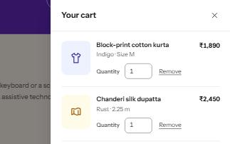
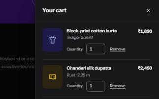
A panel that slides in from the side of the screen for a cart, filters or settings, built on a modal dialog.
-
Modal dialog
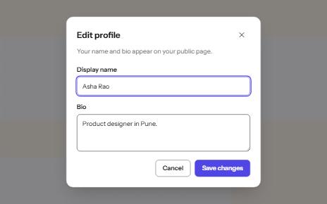
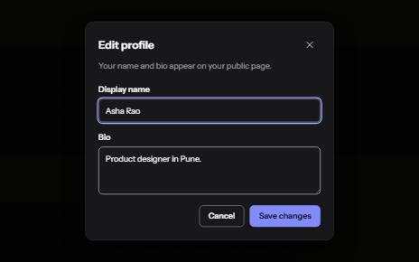
A window over the page that holds focus until it is closed, built on the native dialog element.
-
Site navigation with submenus
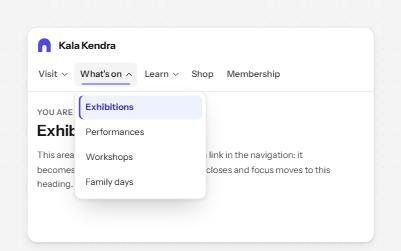
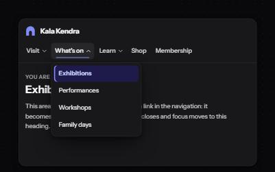
A header navigation whose sections open lists of links, built from buttons and links rather than an ARIA menu.
-
Mega menu
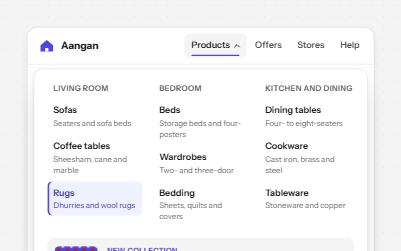
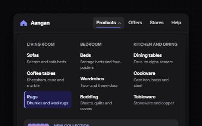
A navigation button that opens a wide panel of grouped links with short descriptions and a featured item.