Accessibility pattern · Navigation
Tabs
The tab list is one stop in the Tab order; the arrow keys move between tabs inside it. Each tab names its panel, and the selected one says so, so a screen reader user knows where they are and how many tabs there are.
- WCAG criteria
- 5
- Keyboard rules
- 4
- Checked with
- axe, keyboard and the inspector
Live demo
Try it
Use it with a mouse, a keyboard or a screen reader. The inspector beside it shows what the browser tells assistive technology as you go: focus, state changes and announcements.
Your name and photo appear on everything you share.
- Name
- Asha Rao
- Handle
- @asha
Two-step sign-in is on. You last changed your password 3 months ago.
- Two-step sign-in
- Authenticator app
- Active sessions
- 2 devices
You are on the yearly plan. It renews on 12 March.
- Plan
- Studio, yearly
- Card
- Ends in 4242
We email you about security and billing only.
- Security alerts
- On
- Product news
- Off
The demo works without JavaScript only as far as its HTML does; the inspector needs JavaScript.
Keyboard
Keys it answers to
Every action works without a pointer.
| Key | What it does |
|---|---|
| Tab | Moves into the tab list, onto the selected tab; the next Tab moves into its panel. |
| Arrow Right or Arrow Left | Moves to the next or previous tab, wrapping at the ends, and shows its panel. |
| Home or End | Moves to the first or last tab. |
| Enter or Space | Shows the focused tab's panel, when tabs are set to activate with Enter. |
Screen readers
What it announces
Written from the roles, names and states in the markup.
| When | Expected announcement |
|---|---|
| Tab reaches the tab list | Account settings, tab list. Profile, tab, selected, 1 of 4 |
| Arrow Right moves to the next tab | Security, tab, selected, 2 of 4 |
| Tab moves into the panel | Security, tab panel |
These are expected announcements, not recordings. Wording and order differ between screen readers and browsers.
Code
Copy the code
The exact files this demo runs on. The styles are served with a prefix that keeps this site's own styles out of the demo; what you copy is the original.
<div class="ap-tabs" data-ap-tabs>
  <div class="ap-tabs__list" role="tablist" aria-label="Account settings">
    <button type="button" class="ap-tabs__tab" role="tab" id="tab-profile" aria-selected="true" aria-controls="panel-profile">Profile</button>
    <button type="button" class="ap-tabs__tab" role="tab" id="tab-security" aria-selected="false" aria-controls="panel-security" tabindex="-1">Security</button>
    <button type="button" class="ap-tabs__tab" role="tab" id="tab-billing" aria-selected="false" aria-controls="panel-billing" tabindex="-1">Billing</button>
    <button type="button" class="ap-tabs__tab" role="tab" id="tab-alerts" aria-selected="false" aria-controls="panel-alerts" tabindex="-1">Alerts</button>
    <span class="ap-tabs__ink" aria-hidden="true"></span>
  </div>

  <div class="ap-tabs__panel" role="tabpanel" id="panel-profile" aria-labelledby="tab-profile" tabindex="0">
    <p class="ap-tabs__lead">Your name and photo appear on everything you share.</p>
    <dl class="ap-tabs__facts">
      <div><dt>Name</dt><dd>Asha Rao</dd></div>
      <div><dt>Handle</dt><dd>@asha</dd></div>
    </dl>
  </div>
  <div class="ap-tabs__panel" role="tabpanel" id="panel-security" aria-labelledby="tab-security" tabindex="0" hidden>
    <p class="ap-tabs__lead">Two-step sign-in is on. You last changed your password 3 months ago.</p>
    <dl class="ap-tabs__facts">
      <div><dt>Two-step sign-in</dt><dd>Authenticator app</dd></div>
      <div><dt>Active sessions</dt><dd>2 devices</dd></div>
    </dl>
  </div>
  <div class="ap-tabs__panel" role="tabpanel" id="panel-billing" aria-labelledby="tab-billing" tabindex="0" hidden>
    <p class="ap-tabs__lead">You are on the yearly plan. It renews on 12 March.</p>
    <dl class="ap-tabs__facts">
      <div><dt>Plan</dt><dd>Studio, yearly</dd></div>
      <div><dt>Card</dt><dd>Ends in 4242</dd></div>
    </dl>
  </div>
  <div class="ap-tabs__panel" role="tabpanel" id="panel-alerts" aria-labelledby="tab-alerts" tabindex="0" hidden>
    <p class="ap-tabs__lead">We email you about security and billing only.</p>
    <dl class="ap-tabs__facts">
      <div><dt>Security alerts</dt><dd>On</dd></div>
      <div><dt>Product news</dt><dd>Off</dd></div>
    </dl>
  </div>
</div>
/* Tabs. Uses the --ap-* design tokens. */
.ap-tabs {
  width: min(100%, 600px);
  margin-inline: auto;
}

.ap-tabs__list {
  position: relative;
  display: flex;
  gap: 2px;
  padding: 4px;
  overflow-x: auto;
  scrollbar-width: none;
  border: 1px solid var(--ap-border);
  border-radius: var(--ap-radius);
  background: var(--ap-surface-2);
}

.ap-tabs__tab {
  position: relative;
  z-index: 1;
  flex: 1 0 auto;
  min-height: 40px;
  padding: 0 16px;
  border: 0;
  border-radius: var(--ap-radius-sm);
  background: transparent;
  color: var(--ap-text-2);
  font: inherit;
  font-weight: 500;
  white-space: nowrap;
  cursor: pointer;
  transition: color var(--ap-duration) var(--ap-ease);
}
.ap-tabs__tab:hover {
  color: var(--ap-text);
}
.ap-tabs__tab[aria-selected="true"] {
  color: var(--ap-text);
  font-weight: 650;
}
.ap-tabs__tab:focus-visible {
  outline: 2px solid var(--ap-focus);
  outline-offset: 1px;
}

/* The indicator behind the selected tab. Positioned by the script; without
   it, the selected tab's own background shows instead. */
.ap-tabs__ink {
  position: absolute;
  top: 4px;
  bottom: 4px;
  left: 0;
  width: var(--ink-w, 0);
  transform: translateX(var(--ink-x, 0));
  border-radius: var(--ap-radius-sm);
  background: var(--ap-surface);
  box-shadow: var(--ap-shadow-sm), 0 0 0 1px var(--ap-border);
  transition: transform 260ms var(--ap-ease), width 260ms var(--ap-ease);
}
.ap-tabs:not(.is-ready) .ap-tabs__tab[aria-selected="true"] {
  background: var(--ap-surface);
  box-shadow: var(--ap-shadow-sm);
}

.ap-tabs__panel {
  margin-top: 16px;
  padding: 22px 24px;
  border: 1px solid var(--ap-border);
  border-radius: var(--ap-radius-lg);
  background: var(--ap-surface);
  box-shadow: var(--ap-shadow-md);
}
.ap-tabs__panel:not([hidden]) {
  animation: ap-tabs-in 180ms var(--ap-ease);
}
.ap-tabs__panel:focus-visible {
  outline: 2px solid var(--ap-focus);
  outline-offset: 2px;
}

.ap-tabs__lead {
  margin: 0 0 16px;
  color: var(--ap-text);
  line-height: 1.55;
}

.ap-tabs__facts {
  display: grid;
  gap: 10px;
  margin: 0;
}
.ap-tabs__facts div {
  display: flex;
  justify-content: space-between;
  gap: 16px;
  padding-top: 10px;
  border-top: 1px solid var(--ap-border);
}
.ap-tabs__facts dt {
  color: var(--ap-text-3);
}
.ap-tabs__facts dd {
  margin: 0;
  color: var(--ap-text);
  font-weight: 600;
  text-align: end;
}

@keyframes ap-tabs-in {
  from { opacity: 0; transform: translateY(4px); }
}

@media (prefers-reduced-motion: reduce) {
  .ap-tabs__ink { transition: none; }
  .ap-tabs__panel:not([hidden]) { animation: none; }
}
/**
 * Tabs: a tab list with one tab stop, arrow keys inside it, and one panel
 * shown at a time.
 *
 * Markup: [data-ap-tabs] > [role=tablist] > button[role=tab][aria-controls]
 * and div[role=tabpanel] for each. Add data-manual to the root to show a
 * panel only on Enter or Space (focus still moves with the arrow keys).
 */

export function init(root) {
  const list = root.querySelector("[role=tablist]");
  const tabs = [...list.querySelectorAll("[role=tab]")];
  const ink = list.querySelector(".ap-tabs__ink");
  const panelOf = (tab) => document.getElementById(tab.getAttribute("aria-controls"));

  function placeInk(tab) {
    if (!ink) return;
    ink.style.setProperty("--ink-x", `${tab.offsetLeft}px`);
    ink.style.setProperty("--ink-w", `${tab.offsetWidth}px`);
  }

  function select(tab) {
    for (const t of tabs) {
      const on = t === tab;
      t.setAttribute("aria-selected", String(on));
      t.tabIndex = on ? 0 : -1;
      panelOf(t).hidden = !on;
    }
    placeInk(tab);
  }

  function onClick(event) {
    const tab = event.target.closest("[role=tab]");
    if (tab && tabs.includes(tab)) select(tab);
  }

  function onKeydown(event) {
    const at = tabs.indexOf(document.activeElement);
    if (at === -1) return;
    let next = null;
    if (event.key === "ArrowRight") next = tabs[(at + 1) % tabs.length];
    else if (event.key === "ArrowLeft") next = tabs[(at - 1 + tabs.length) % tabs.length];
    else if (event.key === "Home") next = tabs[0];
    else if (event.key === "End") next = tabs[tabs.length - 1];
    else if ((event.key === "Enter" || event.key === " ") && root.hasAttribute("data-manual")) {
      event.preventDefault();
      select(tabs[at]);
      return;
    }
    if (!next) return;
    event.preventDefault();
    if (root.hasAttribute("data-manual")) {
      // Roving focus only: the panel changes when the reader asks.
      for (const t of tabs) t.tabIndex = t === next ? 0 : -1;
      next.focus();
    } else {
      select(next);
      next.focus();
    }
  }

  // The indicator follows the selected tab when the list or a tab resizes
  // (a narrower screen, a font loading, a translated label).
  const resize = new ResizeObserver(() => {
    const selected = tabs.find((t) => t.getAttribute("aria-selected") === "true");
    if (selected) placeInk(selected);
  });
  resize.observe(list);
  for (const t of tabs) resize.observe(t);

  list.addEventListener("click", onClick);
  list.addEventListener("keydown", onKeydown);
  select(tabs.find((t) => t.getAttribute("aria-selected") === "true") || tabs[0]);
  root.classList.add("is-ready");

  return () => {
    resize.disconnect();
    list.removeEventListener("click", onClick);
    list.removeEventListener("keydown", onKeydown);
  };
}

for (const root of document.querySelectorAll("[data-ap-tabs]")) init(root);
/* Design tokens for the pattern components. Light by default, dark when the
   system asks for it; set data-theme="dark" on :root to force dark. */
:root {
    --ap-radius-sm: 8px;
    --ap-radius: 12px;
    --ap-radius-lg: 16px;
    --ap-radius-full: 999px;
    --ap-font: "Instrument Sans", ui-sans-serif, system-ui, -apple-system, "Segoe UI", Roboto, sans-serif;
    --ap-mono: "JetBrains Mono", ui-monospace, "Cascadia Mono", "SF Mono", Consolas, monospace;
    --ap-ease: cubic-bezier(.2, .8, .2, 1);
    --ap-duration: 180ms;
    --ap-target: 44px;
    --ap-bg: #F4F4F5;
    --ap-surface: #FFFFFF;
    --ap-surface-2: #F4F4F5;
    --ap-surface-3: #E4E4E7;
    --ap-border: #E4E4E7;
    --ap-border-strong: #76767F;
    --ap-text: #18181B;
    --ap-text-2: #3F3F46;
    --ap-text-3: #5E5E66;
    --ap-accent: #4F46E5;
    --ap-accent-hover: #4338CA;
    --ap-on-accent: #FFFFFF;
    --ap-accent-text: #4338CA;
    --ap-accent-soft: #EEF2FF;
    --ap-accent-soft-text: #3730A3;
    --ap-focus: #4F46E5;
    --ap-danger: #B91C1C;
    --ap-danger-soft: #FEF2F2;
    --ap-success: #15803D;
    --ap-success-soft: #F0FDF4;
    --ap-warning: #A15C07;
    --ap-warning-soft: #FEFCE8;
    --ap-info: #1D4ED8;
    --ap-info-soft: #EFF6FF;
    --ap-scrim: rgb(9 9 11 / .48);
    --ap-shadow-sm: 0 1px 2px rgb(9 9 11 / .06);
    --ap-shadow-md: 0 1px 2px rgb(9 9 11 / .05), 0 6px 16px -4px rgb(9 9 11 / .1);
    --ap-shadow-lg: 0 2px 6px rgb(9 9 11 / .06), 0 20px 40px -12px rgb(9 9 11 / .22);
    --ap-light-bg: #F4F4F5;
    --ap-light-surface: #FFFFFF;
    --ap-light-surface-2: #F4F4F5;
    --ap-light-surface-3: #E4E4E7;
    --ap-light-border: #E4E4E7;
    --ap-light-border-strong: #76767F;
    --ap-light-text: #18181B;
    --ap-light-text-2: #3F3F46;
    --ap-light-text-3: #5E5E66;
    --ap-light-accent: #4F46E5;
    --ap-light-accent-hover: #4338CA;
    --ap-light-on-accent: #FFFFFF;
    --ap-light-accent-text: #4338CA;
    --ap-light-accent-soft: #EEF2FF;
    --ap-light-accent-soft-text: #3730A3;
    --ap-light-focus: #4F46E5;
    --ap-light-danger: #B91C1C;
    --ap-light-danger-soft: #FEF2F2;
    --ap-light-success: #15803D;
    --ap-light-success-soft: #F0FDF4;
    --ap-light-warning: #A15C07;
    --ap-light-warning-soft: #FEFCE8;
    --ap-light-info: #1D4ED8;
    --ap-light-info-soft: #EFF6FF;
    --ap-light-scrim: rgb(9 9 11 / .48);
    --ap-light-shadow-sm: 0 1px 2px rgb(9 9 11 / .06);
    --ap-light-shadow-md: 0 1px 2px rgb(9 9 11 / .05), 0 6px 16px -4px rgb(9 9 11 / .1);
    --ap-light-shadow-lg: 0 2px 6px rgb(9 9 11 / .06), 0 20px 40px -12px rgb(9 9 11 / .22);
    --ap-dark-bg: #09090B;
    --ap-dark-surface: #18181B;
    --ap-dark-surface-2: #27272A;
    --ap-dark-surface-3: #3F3F46;
    --ap-dark-border: #2E2E33;
    --ap-dark-border-strong: #8E8E97;
    --ap-dark-text: #FAFAFA;
    --ap-dark-text-2: #D4D4D8;
    --ap-dark-text-3: #A1A1AA;
    --ap-dark-accent: #818CF8;
    --ap-dark-accent-hover: #A5B4FC;
    --ap-dark-on-accent: #0C0A1F;
    --ap-dark-accent-text: #A5B4FC;
    --ap-dark-accent-soft: #1E1B4B;
    --ap-dark-accent-soft-text: #C7D2FE;
    --ap-dark-focus: #A5B4FC;
    --ap-dark-danger: #F87171;
    --ap-dark-danger-soft: #2A1215;
    --ap-dark-success: #4ADE80;
    --ap-dark-success-soft: #0F2A1A;
    --ap-dark-warning: #FACC15;
    --ap-dark-warning-soft: #2A2410;
    --ap-dark-info: #60A5FA;
    --ap-dark-info-soft: #0F1D33;
    --ap-dark-scrim: rgb(0 0 0 / .62);
    --ap-dark-shadow-sm: 0 1px 2px rgb(0 0 0 / .4);
    --ap-dark-shadow-md: 0 1px 2px rgb(0 0 0 / .4), 0 8px 20px -6px rgb(0 0 0 / .5);
    --ap-dark-shadow-lg: 0 2px 8px rgb(0 0 0 / .45), 0 24px 48px -12px rgb(0 0 0 / .7);
}
@media (prefers-color-scheme: dark) {
  :root:not([data-theme="light"]) {
      --ap-bg: #09090B;
      --ap-surface: #18181B;
      --ap-surface-2: #27272A;
      --ap-surface-3: #3F3F46;
      --ap-border: #2E2E33;
      --ap-border-strong: #8E8E97;
      --ap-text: #FAFAFA;
      --ap-text-2: #D4D4D8;
      --ap-text-3: #A1A1AA;
      --ap-accent: #818CF8;
      --ap-accent-hover: #A5B4FC;
      --ap-on-accent: #0C0A1F;
      --ap-accent-text: #A5B4FC;
      --ap-accent-soft: #1E1B4B;
      --ap-accent-soft-text: #C7D2FE;
      --ap-focus: #A5B4FC;
      --ap-danger: #F87171;
      --ap-danger-soft: #2A1215;
      --ap-success: #4ADE80;
      --ap-success-soft: #0F2A1A;
      --ap-warning: #FACC15;
      --ap-warning-soft: #2A2410;
      --ap-info: #60A5FA;
      --ap-info-soft: #0F1D33;
      --ap-scrim: rgb(0 0 0 / .62);
      --ap-shadow-sm: 0 1px 2px rgb(0 0 0 / .4);
      --ap-shadow-md: 0 1px 2px rgb(0 0 0 / .4), 0 8px 20px -6px rgb(0 0 0 / .5);
      --ap-shadow-lg: 0 2px 8px rgb(0 0 0 / .45), 0 24px 48px -12px rgb(0 0 0 / .7);
  }
}
:root[data-theme="dark"] {
    --ap-bg: #09090B;
    --ap-surface: #18181B;
    --ap-surface-2: #27272A;
    --ap-surface-3: #3F3F46;
    --ap-border: #2E2E33;
    --ap-border-strong: #8E8E97;
    --ap-text: #FAFAFA;
    --ap-text-2: #D4D4D8;
    --ap-text-3: #A1A1AA;
    --ap-accent: #818CF8;
    --ap-accent-hover: #A5B4FC;
    --ap-on-accent: #0C0A1F;
    --ap-accent-text: #A5B4FC;
    --ap-accent-soft: #1E1B4B;
    --ap-accent-soft-text: #C7D2FE;
    --ap-focus: #A5B4FC;
    --ap-danger: #F87171;
    --ap-danger-soft: #2A1215;
    --ap-success: #4ADE80;
    --ap-success-soft: #0F2A1A;
    --ap-warning: #FACC15;
    --ap-warning-soft: #2A2410;
    --ap-info: #60A5FA;
    --ap-info-soft: #0F1D33;
    --ap-scrim: rgb(0 0 0 / .62);
    --ap-shadow-sm: 0 1px 2px rgb(0 0 0 / .4);
    --ap-shadow-md: 0 1px 2px rgb(0 0 0 / .4), 0 8px 20px -6px rgb(0 0 0 / .5);
    --ap-shadow-lg: 0 2px 8px rgb(0 0 0 / .45), 0 24px 48px -12px rgb(0 0 0 / .7);
}
WCAG 2.2
What it meets
The success criteria this pattern takes care of, and how.
-
1.3.1 Info and Relationships
Level A
The tab list, tabs and panels are tied together with roles and aria-controls, so the structure is exposed, not just drawn.
-
2.1.1 Keyboard
Level A
The arrow keys, Home and End move between tabs; nothing needs a pointer.
-
2.4.3 Focus Order
Level A
Only the selected tab is in the Tab order, so the next Tab goes straight into its panel instead of through every tab.
-
2.4.7 Focus Visible
Level AA
The focused tab shows a ring that clears 3:1 against the tab list.
-
4.1.2 Name, Role, Value
Level A
Each tab has role=tab and aria-selected, and the panel is labelled by its tab.
Usage
When to use it
Use it
- Switching between views of the same thing, like the sections of an account or the formats of an export.
- Content people compare a section at a time rather than read top to bottom.
Use something else
- Navigation to other pages: use links in a nav landmark, which can be opened in new tabs and bookmarked.
- More tabs than fit on a phone in one row; consider a select or an accordion there.
- Steps people must do in order: use a multi-step form with progress steps.
Common failures
How it usually goes wrong
Tabs that are links to other pages
role=tab on page links breaks their meaning: people expect a tab to change the panel below, not to load a new page.
Every tab in the Tab order
With ten tabs that is ten key presses before the content. One stop for the list, with arrow keys inside it, is the expected model.
Selection shown only by color
An underline in a slightly different shade is invisible to many. The selected tab here also changes weight and sits on a solid indicator.
Panels without a name
A tabpanel with no aria-labelledby is announced as just "tab panel". Pointing it at its tab names it.
Hidden panels left in the accessibility tree
Panels hidden only by moving them off screen are still read out. The hidden attribute removes them for everyone.
Notes
Building it
- Automatic activation suits panels that appear instantly. If showing a panel loads data, use manual activation (the option above) so arrowing past a tab does not fire requests.
- The panel has tabindex=0 so keyboard users can reach it even when it starts with plain text; drop it if every panel begins with a link or a field.
- Name the tab list with aria-label or aria-labelledby; it is the first thing announced when focus arrives.
- The sliding indicator is decoration: it is aria-hidden, and it stops moving when the system asks for reduced motion.
Sources: WAI-ARIA Authoring Practices: Tabs
Checked with axe in light and dark themes, at desktop and phone widths, and by keyboard. Not yet tested with every screen reader and browser pair. Report a correction
Related
Patterns that go with it
-
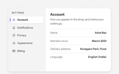
Vertical tabs
Tabs stacked in a side rail, like a settings page, moved through with the Up and Down arrow keys.
-
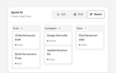
Segmented control
A row of joined segments for picking one of a few views, built from real radio buttons in a fieldset.
-
Accordion
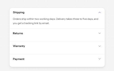
Stacked headings that each show or hide a panel, so a long page reads as a short list.
-
Toolbar
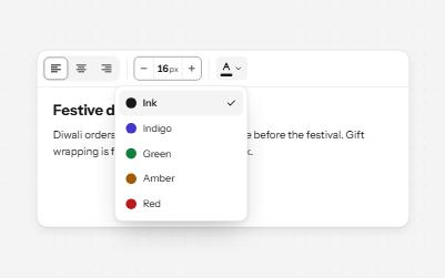
A named row of controls that is one stop in the Tab order, with arrow keys moving between alignment, size and color.