Accessibility pattern · Buttons and actions
Segmented control
A segmented control is a radio group in different clothes: radio inputs inside a fieldset bring the arrow keys, the single tab stop and the checked state with them. The thumb that slides behind the chosen segment is decoration; the checked radio is what assistive technology reports.
- WCAG criteria
- 7
- Keyboard rules
- 4
- Checked with
- axe, keyboard and the inspector
Live demo
Try it
Use it with a mouse, a keyboard or a screen reader. The inspector beside it shows what the browser tells assistive technology as you go: focus, state changes and announcements.
Sprint 14
5 tasks · ends Friday
To do 2
- Write the launch brief Asha
- Book the venue in Pune Ravi
In progress 2
- Design the invite Meera
- Update the price list Kabir
Done 1
- Pick the launch date Asha
The demo works without JavaScript only as far as its HTML does; the inspector needs JavaScript.
Keyboard
Keys it answers to
Every action works without a pointer.
| Key | What it does |
|---|---|
| Tab | Moves to the selected segment; the next Tab leaves the control. |
| Arrow Right or Arrow Down | Selects the next layout, wrapping from the last to the first, and the preview changes at once. |
| Arrow Left or Arrow Up | Selects the previous layout, wrapping from the first to the last. |
| Space | Selects the focused segment, if none is selected yet. |
Screen readers
What it announces
Written from the roles, names and states in the markup.
| When | Expected announcement |
|---|---|
| Tab reaches the control | Layout, group. List, radio button, checked, 1 of 3 |
| Arrow Right selects the next segment | Grid, radio button, checked, 2 of 3 |
| Icons only is on and Arrow Right reaches the last segment | Board, radio button, checked, 3 of 3 |
These are expected announcements, not recordings. Wording and order differ between screen readers and browsers.
Code
Copy the code
The exact files this demo runs on. The styles are served with a prefix that keeps this site's own styles out of the demo; what you copy is the original.
<div class="ap-segmented-control" data-ap-segmented-control>
  <div class="ap-segmented-control__top">
    <div class="ap-segmented-control__id">
      <h3 class="ap-segmented-control__label">Sprint 14</h3>
      <p class="ap-segmented-control__sub">5 tasks · ends Friday</p>
    </div>
    <fieldset class="ap-segmented-control__set">
      <legend class="ap-segmented-control__legend">Layout</legend>
      <div class="ap-segmented-control__track">
        <label class="ap-segmented-control__seg">
          <input class="ap-segmented-control__radio" type="radio" name="segmented-control-layout" value="list" checked />
          <svg viewBox="0 0 24 24" aria-hidden="true" focusable="false"><path d="M8 6h12M8 12h12M8 18h12M4 6h.01M4 12h.01M4 18h.01"/></svg>
          <span class="ap-segmented-control__text">List</span>
        </label>
        <label class="ap-segmented-control__seg">
          <input class="ap-segmented-control__radio" type="radio" name="segmented-control-layout" value="grid" />
          <svg viewBox="0 0 24 24" aria-hidden="true" focusable="false"><rect x="4" y="4" width="7" height="7" rx="1.5"/><rect x="13" y="4" width="7" height="7" rx="1.5"/><rect x="4" y="13" width="7" height="7" rx="1.5"/><rect x="13" y="13" width="7" height="7" rx="1.5"/></svg>
          <span class="ap-segmented-control__text">Grid</span>
        </label>
        <label class="ap-segmented-control__seg">
          <input class="ap-segmented-control__radio" type="radio" name="segmented-control-layout" value="board" />
          <svg viewBox="0 0 24 24" aria-hidden="true" focusable="false"><rect x="3.5" y="4" width="5" height="16" rx="1.5"/><rect x="9.5" y="4" width="5" height="11" rx="1.5"/><rect x="15.5" y="4" width="5" height="7" rx="1.5"/></svg>
          <span class="ap-segmented-control__text">Board</span>
        </label>
        <span class="ap-segmented-control__thumb" aria-hidden="true"></span>
      </div>
    </fieldset>
  </div>

  <div class="ap-segmented-control__preview" data-ap-preview data-view="list">
    <div class="ap-segmented-control__group">
      <h4 class="ap-segmented-control__group-name"><span>To do</span> <span class="ap-segmented-control__n">2</span></h4>
      <ul class="ap-segmented-control__cards">
          <li class="ap-segmented-control__card"><span class="ap-segmented-control__task">Write the launch brief</span> <span class="ap-segmented-control__who">Asha</span></li>
          <li class="ap-segmented-control__card"><span class="ap-segmented-control__task">Book the venue in Pune</span> <span class="ap-segmented-control__who">Ravi</span></li>
      </ul>
    </div>
    <div class="ap-segmented-control__group">
      <h4 class="ap-segmented-control__group-name"><span>In progress</span> <span class="ap-segmented-control__n">2</span></h4>
      <ul class="ap-segmented-control__cards">
          <li class="ap-segmented-control__card"><span class="ap-segmented-control__task">Design the invite</span> <span class="ap-segmented-control__who">Meera</span></li>
          <li class="ap-segmented-control__card"><span class="ap-segmented-control__task">Update the price list</span> <span class="ap-segmented-control__who">Kabir</span></li>
      </ul>
    </div>
    <div class="ap-segmented-control__group">
      <h4 class="ap-segmented-control__group-name"><span>Done</span> <span class="ap-segmented-control__n">1</span></h4>
      <ul class="ap-segmented-control__cards">
          <li class="ap-segmented-control__card"><span class="ap-segmented-control__task">Pick the launch date</span> <span class="ap-segmented-control__who">Asha</span></li>
      </ul>
    </div>
  </div>
</div>
/* Segmented control. Uses the --ap-* design tokens. */
.ap-segmented-control {
  width: min(100%, 620px);
  margin-inline: auto;
  border: 1px solid var(--ap-border);
  border-radius: var(--ap-radius-lg);
  background: var(--ap-surface);
  color: var(--ap-text);
  box-shadow: var(--ap-shadow-md);
  container-type: inline-size;
}

.ap-segmented-control__top {
  display: flex;
  flex-wrap: wrap;
  align-items: center;
  justify-content: space-between;
  gap: 12px 16px;
  padding: 16px 18px;
  border-bottom: 1px solid var(--ap-border);
}
.ap-segmented-control__label {
  margin: 0;
  font-size: 1rem;
  font-weight: 650;
  line-height: 1.35;
}
.ap-segmented-control__sub {
  margin: 2px 0 0;
  color: var(--ap-text-3);
  font-size: .8125rem;
}

/* The control */
.ap-segmented-control__set {
  min-width: 0;
  margin: 0;
  padding: 0;
  border: 0;
}
.ap-segmented-control__legend,
.ap-segmented-control[data-icons-only] .ap-segmented-control__text {
  position: absolute;
  width: 1px;
  height: 1px;
  margin: -1px;
  padding: 0;
  overflow: hidden;
  clip-path: inset(50%);
  white-space: nowrap;
}
.ap-segmented-control__track {
  position: relative;
  display: grid;
  grid-auto-columns: 1fr;
  grid-auto-flow: column;
  padding: 3px;
  border: 1px solid var(--ap-border);
  border-radius: var(--ap-radius);
  background: var(--ap-surface-2);
}
.ap-segmented-control__seg {
  position: relative;
  z-index: 1;
  display: flex;
  align-items: center;
  justify-content: center;
  gap: 8px;
  min-height: var(--ap-target);
  padding: 0 16px;
  border-radius: var(--ap-radius-sm);
  color: var(--ap-text-2);
  font-weight: 500;
  white-space: nowrap;
  cursor: pointer;
  transition: color var(--ap-duration) var(--ap-ease);
}
.ap-segmented-control__seg:hover {
  color: var(--ap-text);
}
.ap-segmented-control__seg:has(.ap-segmented-control__radio:checked) {
  color: var(--ap-text);
  font-weight: 650;
}
.ap-segmented-control__seg:has(.ap-segmented-control__radio:focus-visible) {
  outline: 2px solid var(--ap-focus);
  outline-offset: 2px;
}
.ap-segmented-control[data-icons-only] .ap-segmented-control__seg {
  padding: 0 14px;
}
/* The real radio: invisible, but covering its segment, so it takes clicks and focus. */
.ap-segmented-control__radio {
  position: absolute;
  inset: 0;
  width: 100%;
  height: 100%;
  margin: 0;
  opacity: 0;
  cursor: pointer;
  appearance: none;
}
.ap-segmented-control__seg svg {
  flex-shrink: 0;
  width: 18px;
  height: 18px;
  fill: none;
  stroke: currentColor;
  stroke-width: 2;
  stroke-linecap: round;
  stroke-linejoin: round;
}

/* The thumb, placed by the script from --seg-i and --seg-n. */
.ap-segmented-control__thumb {
  position: absolute;
  top: 3px;
  bottom: 3px;
  left: 3px;
  width: calc((100% - 6px) / var(--seg-n, 3));
  transform: translateX(calc(var(--seg-i, 0) * 100%));
  border: 1px solid var(--ap-border-strong);
  border-radius: var(--ap-radius-sm);
  background: var(--ap-surface);
  box-shadow: var(--ap-shadow-sm);
  transition: transform 260ms var(--ap-ease);
}
.ap-segmented-control:not([data-ready]) .ap-segmented-control__thumb {
  display: none;
}
.ap-segmented-control:not([data-ready]) .ap-segmented-control__seg:has(.ap-segmented-control__radio:checked) {
  border: 1px solid var(--ap-border-strong);
  background: var(--ap-surface);
}

/* The preview the control switches */
.ap-segmented-control__preview {
  display: grid;
  gap: 16px;
  padding: 16px 18px 18px;
}
.ap-segmented-control__group-name {
  display: flex;
  align-items: center;
  gap: 8px;
  margin: 0 0 8px;
  color: var(--ap-text-2);
  font-size: .8125rem;
  font-weight: 650;
}
.ap-segmented-control__n {
  display: inline-grid;
  place-items: center;
  min-width: 20px;
  height: 20px;
  padding: 0 6px;
  border-radius: var(--ap-radius-full);
  background: var(--ap-surface-2);
  color: var(--ap-text-2);
  font-size: .75rem;
}
.ap-segmented-control__cards {
  display: grid;
  gap: 6px;
  margin: 0;
  padding: 0;
  list-style: none;
}
.ap-segmented-control__card {
  display: flex;
  align-items: center;
  justify-content: space-between;
  gap: 12px;
  padding: 10px 12px;
  border: 1px solid var(--ap-border);
  border-radius: var(--ap-radius-sm);
  background: var(--ap-surface);
  font-size: .9375rem;
}
.ap-segmented-control__task {
  min-width: 0;
  font-weight: 500;
}
.ap-segmented-control__who {
  display: flex;
  flex-shrink: 0;
  align-items: center;
  gap: 6px;
  color: var(--ap-text-3);
  font-size: .8125rem;
}
.ap-segmented-control__who::before {
  content: "";
  width: 8px;
  height: 8px;
  border-radius: var(--ap-radius-full);
  background: var(--ap-accent);
}

/* Grid: the same groups as tiles */
.ap-segmented-control__preview[data-view="grid"] .ap-segmented-control__cards {
  grid-template-columns: repeat(2, minmax(0, 1fr));
  gap: 10px;
}
.ap-segmented-control__preview[data-view="grid"] .ap-segmented-control__card,
.ap-segmented-control__preview[data-view="board"] .ap-segmented-control__card {
  flex-direction: column;
  align-items: flex-start;
  justify-content: space-between;
  gap: 10px;
  padding: 12px;
  box-shadow: var(--ap-shadow-sm);
}
.ap-segmented-control__preview[data-view="grid"] .ap-segmented-control__card {
  min-height: 88px;
}

/* Board: the groups as columns */
.ap-segmented-control__preview[data-view="board"] {
  grid-template-columns: repeat(3, minmax(0, 1fr));
  align-items: start;
  gap: 10px;
}
.ap-segmented-control__preview[data-view="board"] .ap-segmented-control__group {
  padding: 10px;
  border-radius: var(--ap-radius);
  background: var(--ap-surface-2);
}
.ap-segmented-control__preview[data-view="board"] .ap-segmented-control__n {
  background: var(--ap-surface);
}

@container (max-width: 420px) {
  .ap-segmented-control__top { padding: 14px; }
  .ap-segmented-control__set { flex: 1 1 100%; }
  .ap-segmented-control__seg { padding: 0 8px; }
  .ap-segmented-control__preview { padding: 14px; }
  .ap-segmented-control__preview[data-view="board"] { gap: 6px; }
  .ap-segmented-control__preview[data-view="board"] .ap-segmented-control__group { padding: 6px; }
  .ap-segmented-control__preview[data-view="board"] .ap-segmented-control__card { padding: 8px; font-size: .8125rem; }
}

@media (forced-colors: active) {
  .ap-segmented-control__seg:has(.ap-segmented-control__radio:checked) { text-decoration: underline; }
}

@media (prefers-reduced-motion: reduce) {
  .ap-segmented-control__thumb,
  .ap-segmented-control__seg { transition: none; }
}
/**
 * Segmented control: native radio buttons in a fieldset, drawn as joined
 * segments with a thumb that slides behind the checked one. The browser does
 * the keyboard and the state; the script only moves the thumb and switches
 * the preview the control drives.
 *
 * Markup: [data-ap-segmented-control] holding a fieldset > legend + a track
 * of label > input[type=radio] and a span.ap-segmented-control__thumb, and a
 * [data-ap-preview] whose data-view follows the checked value. Add
 * data-icons-only to the root to hide the labels visually (they still name
 * the radios).
 */

export function init(root) {
  const track = root.querySelector(".ap-segmented-control__track");
  const radios = [...root.querySelectorAll("input[type=radio]")];
  const preview = root.querySelector("[data-ap-preview]");
  const calm = window.matchMedia("(prefers-reduced-motion: reduce)");

  function sync(animate) {
    const at = Math.max(0, radios.findIndex((r) => r.checked));
    track.style.setProperty("--seg-n", String(radios.length));
    track.style.setProperty("--seg-i", String(at));
    const view = radios[at].value;
    if (preview.dataset.view === view) return;
    preview.dataset.view = view;
    if (animate && !calm.matches) {
      preview.animate(
        [{ opacity: 0, transform: "translateY(6px)" }, { opacity: 1, transform: "none" }],
        { duration: 220, easing: "cubic-bezier(.2, .8, .2, 1)" },
      );
    }
  }

  function onChange(event) {
    if (radios.includes(event.target)) sync(true);
  }

  root.addEventListener("change", onChange);
  sync(false);
  root.setAttribute("data-ready", "");

  return () => {
    root.removeEventListener("change", onChange);
    root.removeAttribute("data-ready");
  };
}

for (const root of document.querySelectorAll("[data-ap-segmented-control]")) init(root);
/* Design tokens for the pattern components. Light by default, dark when the
   system asks for it; set data-theme="dark" on :root to force dark. */
:root {
    --ap-radius-sm: 8px;
    --ap-radius: 12px;
    --ap-radius-lg: 16px;
    --ap-radius-full: 999px;
    --ap-font: "Instrument Sans", ui-sans-serif, system-ui, -apple-system, "Segoe UI", Roboto, sans-serif;
    --ap-mono: "JetBrains Mono", ui-monospace, "Cascadia Mono", "SF Mono", Consolas, monospace;
    --ap-ease: cubic-bezier(.2, .8, .2, 1);
    --ap-duration: 180ms;
    --ap-target: 44px;
    --ap-bg: #F4F4F5;
    --ap-surface: #FFFFFF;
    --ap-surface-2: #F4F4F5;
    --ap-surface-3: #E4E4E7;
    --ap-border: #E4E4E7;
    --ap-border-strong: #76767F;
    --ap-text: #18181B;
    --ap-text-2: #3F3F46;
    --ap-text-3: #5E5E66;
    --ap-accent: #4F46E5;
    --ap-accent-hover: #4338CA;
    --ap-on-accent: #FFFFFF;
    --ap-accent-text: #4338CA;
    --ap-accent-soft: #EEF2FF;
    --ap-accent-soft-text: #3730A3;
    --ap-focus: #4F46E5;
    --ap-danger: #B91C1C;
    --ap-danger-soft: #FEF2F2;
    --ap-success: #15803D;
    --ap-success-soft: #F0FDF4;
    --ap-warning: #A15C07;
    --ap-warning-soft: #FEFCE8;
    --ap-info: #1D4ED8;
    --ap-info-soft: #EFF6FF;
    --ap-scrim: rgb(9 9 11 / .48);
    --ap-shadow-sm: 0 1px 2px rgb(9 9 11 / .06);
    --ap-shadow-md: 0 1px 2px rgb(9 9 11 / .05), 0 6px 16px -4px rgb(9 9 11 / .1);
    --ap-shadow-lg: 0 2px 6px rgb(9 9 11 / .06), 0 20px 40px -12px rgb(9 9 11 / .22);
    --ap-light-bg: #F4F4F5;
    --ap-light-surface: #FFFFFF;
    --ap-light-surface-2: #F4F4F5;
    --ap-light-surface-3: #E4E4E7;
    --ap-light-border: #E4E4E7;
    --ap-light-border-strong: #76767F;
    --ap-light-text: #18181B;
    --ap-light-text-2: #3F3F46;
    --ap-light-text-3: #5E5E66;
    --ap-light-accent: #4F46E5;
    --ap-light-accent-hover: #4338CA;
    --ap-light-on-accent: #FFFFFF;
    --ap-light-accent-text: #4338CA;
    --ap-light-accent-soft: #EEF2FF;
    --ap-light-accent-soft-text: #3730A3;
    --ap-light-focus: #4F46E5;
    --ap-light-danger: #B91C1C;
    --ap-light-danger-soft: #FEF2F2;
    --ap-light-success: #15803D;
    --ap-light-success-soft: #F0FDF4;
    --ap-light-warning: #A15C07;
    --ap-light-warning-soft: #FEFCE8;
    --ap-light-info: #1D4ED8;
    --ap-light-info-soft: #EFF6FF;
    --ap-light-scrim: rgb(9 9 11 / .48);
    --ap-light-shadow-sm: 0 1px 2px rgb(9 9 11 / .06);
    --ap-light-shadow-md: 0 1px 2px rgb(9 9 11 / .05), 0 6px 16px -4px rgb(9 9 11 / .1);
    --ap-light-shadow-lg: 0 2px 6px rgb(9 9 11 / .06), 0 20px 40px -12px rgb(9 9 11 / .22);
    --ap-dark-bg: #09090B;
    --ap-dark-surface: #18181B;
    --ap-dark-surface-2: #27272A;
    --ap-dark-surface-3: #3F3F46;
    --ap-dark-border: #2E2E33;
    --ap-dark-border-strong: #8E8E97;
    --ap-dark-text: #FAFAFA;
    --ap-dark-text-2: #D4D4D8;
    --ap-dark-text-3: #A1A1AA;
    --ap-dark-accent: #818CF8;
    --ap-dark-accent-hover: #A5B4FC;
    --ap-dark-on-accent: #0C0A1F;
    --ap-dark-accent-text: #A5B4FC;
    --ap-dark-accent-soft: #1E1B4B;
    --ap-dark-accent-soft-text: #C7D2FE;
    --ap-dark-focus: #A5B4FC;
    --ap-dark-danger: #F87171;
    --ap-dark-danger-soft: #2A1215;
    --ap-dark-success: #4ADE80;
    --ap-dark-success-soft: #0F2A1A;
    --ap-dark-warning: #FACC15;
    --ap-dark-warning-soft: #2A2410;
    --ap-dark-info: #60A5FA;
    --ap-dark-info-soft: #0F1D33;
    --ap-dark-scrim: rgb(0 0 0 / .62);
    --ap-dark-shadow-sm: 0 1px 2px rgb(0 0 0 / .4);
    --ap-dark-shadow-md: 0 1px 2px rgb(0 0 0 / .4), 0 8px 20px -6px rgb(0 0 0 / .5);
    --ap-dark-shadow-lg: 0 2px 8px rgb(0 0 0 / .45), 0 24px 48px -12px rgb(0 0 0 / .7);
}
@media (prefers-color-scheme: dark) {
  :root:not([data-theme="light"]) {
      --ap-bg: #09090B;
      --ap-surface: #18181B;
      --ap-surface-2: #27272A;
      --ap-surface-3: #3F3F46;
      --ap-border: #2E2E33;
      --ap-border-strong: #8E8E97;
      --ap-text: #FAFAFA;
      --ap-text-2: #D4D4D8;
      --ap-text-3: #A1A1AA;
      --ap-accent: #818CF8;
      --ap-accent-hover: #A5B4FC;
      --ap-on-accent: #0C0A1F;
      --ap-accent-text: #A5B4FC;
      --ap-accent-soft: #1E1B4B;
      --ap-accent-soft-text: #C7D2FE;
      --ap-focus: #A5B4FC;
      --ap-danger: #F87171;
      --ap-danger-soft: #2A1215;
      --ap-success: #4ADE80;
      --ap-success-soft: #0F2A1A;
      --ap-warning: #FACC15;
      --ap-warning-soft: #2A2410;
      --ap-info: #60A5FA;
      --ap-info-soft: #0F1D33;
      --ap-scrim: rgb(0 0 0 / .62);
      --ap-shadow-sm: 0 1px 2px rgb(0 0 0 / .4);
      --ap-shadow-md: 0 1px 2px rgb(0 0 0 / .4), 0 8px 20px -6px rgb(0 0 0 / .5);
      --ap-shadow-lg: 0 2px 8px rgb(0 0 0 / .45), 0 24px 48px -12px rgb(0 0 0 / .7);
  }
}
:root[data-theme="dark"] {
    --ap-bg: #09090B;
    --ap-surface: #18181B;
    --ap-surface-2: #27272A;
    --ap-surface-3: #3F3F46;
    --ap-border: #2E2E33;
    --ap-border-strong: #8E8E97;
    --ap-text: #FAFAFA;
    --ap-text-2: #D4D4D8;
    --ap-text-3: #A1A1AA;
    --ap-accent: #818CF8;
    --ap-accent-hover: #A5B4FC;
    --ap-on-accent: #0C0A1F;
    --ap-accent-text: #A5B4FC;
    --ap-accent-soft: #1E1B4B;
    --ap-accent-soft-text: #C7D2FE;
    --ap-focus: #A5B4FC;
    --ap-danger: #F87171;
    --ap-danger-soft: #2A1215;
    --ap-success: #4ADE80;
    --ap-success-soft: #0F2A1A;
    --ap-warning: #FACC15;
    --ap-warning-soft: #2A2410;
    --ap-info: #60A5FA;
    --ap-info-soft: #0F1D33;
    --ap-scrim: rgb(0 0 0 / .62);
    --ap-shadow-sm: 0 1px 2px rgb(0 0 0 / .4);
    --ap-shadow-md: 0 1px 2px rgb(0 0 0 / .4), 0 8px 20px -6px rgb(0 0 0 / .5);
    --ap-shadow-lg: 0 2px 8px rgb(0 0 0 / .45), 0 24px 48px -12px rgb(0 0 0 / .7);
}
WCAG 2.2
What it meets
The success criteria this pattern takes care of, and how.
-
1.3.1 Info and Relationships
Level A
A fieldset and legend group the three choices and name them Layout, so the group is announced before the options.
-
1.4.1 Use of Color
Level A
The chosen segment sits on a raised thumb with heavier text, so the choice never depends on color.
-
1.4.11 Non-text Contrast
Level AA
The thumb's edge clears 3:1 against the track, so the chosen segment is visible to people who cannot see subtle fills.
-
2.1.1 Keyboard
Level A
Native radio buttons answer to Tab and the arrow keys, so the control needs no key handling of its own.
-
2.4.7 Focus Visible
Level AA
The focused segment shows a ring around the whole segment, drawn when its hidden radio matches :focus-visible.
-
2.5.8 Target Size (Minimum)
Level AA
Each segment is at least 44 pixels tall and as wide as its label, well past the 24 by 24 minimum.
-
4.1.2 Name, Role, Value
Level A
Each segment is a labelled radio input, so its name, role, position in the set and checked state come from the browser.
Usage
When to use it
Use it
- Switching between two to five views or modes of the same content, like list and grid.
- A setting with a few short options that are worth seeing side by side.
Use something else
- Moving between sections of different content: use tabs, which tie each tab to its panel.
- Long labels or more than five options: use a radio group or a select.
- Turning one thing on or off: use a switch or a toggle button.
Common failures
How it usually goes wrong
Toggle buttons for a single choice
A row of aria-pressed buttons lets several look pressed at once and makes every segment its own tab stop. Radios allow one choice and one stop.
Radios hidden with display: none
display: none takes the input out of the keyboard order and the accessibility tree. Here the radio is transparent and covers its segment instead.
No name for the group
Three radios called List, Grid and Board do not say what they change. The legend names the group Layout, visually hidden here but read first.
A focus ring on nothing
When the real input is invisible, so is its focus ring. The ring is drawn on the whole segment with :has(:focus-visible).
Icons with no names
Icon-only segments still need text for screen readers and voice control. With Icons only on, the label is visually hidden but still names the radio.
Notes
Building it
- Radio buttons select as the arrow keys move, which suits a view that changes instantly. If a choice starts something slow, use buttons and confirm it instead.
- The script sets one custom property, --seg-i, from the checked radio's position; equal-width segments turn that into a single translateX for the thumb.
- Without JavaScript the checked segment gets its own fill instead of the sliding thumb, so the control still works and still shows its state.
- In forced colors mode backgrounds disappear but borders remain, so the thumb's border keeps the chosen segment visible.
Sources: WAI-ARIA Authoring Practices: Radio Group · HTML: the radio button state
Checked with axe in light and dark themes, at desktop and phone widths, and by keyboard. Not yet tested with every screen reader and browser pair. Report a correction
Related
Patterns that go with it
-
Radio group
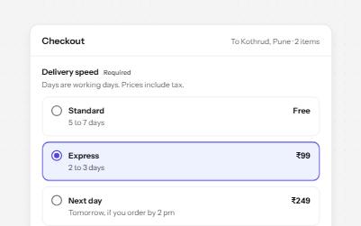
Native radio buttons in a fieldset, restyled with a dot that keeps its contrast, each option with a description and a price.
-
Tabs
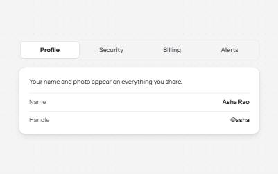
Several panels in one place, one shown at a time, chosen from a row of tabs.
-
Toggle button
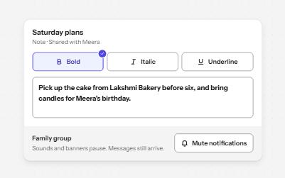
Buttons that stay on or off, like Bold or Mute, with aria-pressed reporting the state while the label stays the same.
-
Radio cards
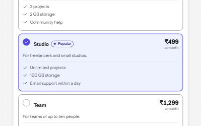
A plan picker where each choice is a large card, built from native radio buttons so arrows, focus and state come free.