Accessibility pattern · Buttons and actions
Icon button
An icon is not a name: each button here gets one with aria-label, and a tooltip shows the same word to everyone who can see it. The favorite button keeps its name while aria-pressed reports whether it is on.
- WCAG criteria
- 7
- Keyboard rules
- 3
- Checked with
- axe, keyboard and the inspector
Live demo
Try it
Use it with a mouse, a keyboard or a screen reader. The inspector beside it shows what the browser tells assistive technology as you go: focus, state changes and announcements.
The demo works without JavaScript only as far as its HTML does; the inspector needs JavaScript.
Keyboard
Keys it answers to
Every action works without a pointer.
| Key | What it does |
|---|---|
| Tab or ShiftTab | Moves from one icon button to the next; the focused button's tooltip appears at once. |
| Enter or Space | Presses the focused button. On Favorite, switches it on or off; on More actions, shows or hides two more actions. |
| Escape | Hides the tooltip without moving focus. It comes back when focus or the pointer moves to another button. |
Screen readers
What it announces
Written from the roles, names and states in the markup.
| When | Expected announcement |
|---|---|
| Focus reaches the pencil icon | Edit, button |
| Focus reaches the star | Favorite, toggle button, not pressed |
| Space presses it | Pressed (the name stays Favorite) |
| More actions is pressed | More actions, button, expanded |
| Delete is pressed | Moved to bin |
These are expected announcements, not recordings. Wording and order differ between screen readers and browsers.
Code
Copy the code
The exact files this demo runs on. The styles are served with a prefix that keeps this site's own styles out of the demo; what you copy is the original.
<div class="ap-icon-button" data-ap-icon-button>
  <div class="ap-icon-button__card">
    <div class="ap-icon-button__top">
      <span class="ap-icon-button__file" aria-hidden="true">
        <svg viewBox="0 0 24 24" focusable="false"><rect x="4" y="3" width="16" height="18" rx="2"/><path d="M4 9h16M4 15h16M10 3v18"/></svg>
      </span>
      <div class="ap-icon-button__about">
        <h3 class="ap-icon-button__name">Goa trip budget</h3>
        <p class="ap-icon-button__meta">Spreadsheet · Edited today by Ananya</p>
      </div>
      <button type="button" class="ap-icon-button__btn ap-icon-button__btn--fav" aria-label="Favorite" aria-pressed="false" data-ap-tip>
        <svg class="ap-icon-button__icon" viewBox="0 0 24 24" aria-hidden="true" focusable="false"><path d="m12 3.5 2.6 5.3 5.9.9-4.3 4.1 1 5.8-5.2-2.7-5.2 2.7 1-5.8-4.3-4.1 5.9-.9Z"/></svg>
      </button>
    </div>
    <p class="ap-icon-button__desc">Flights, stays and food for four people, 12 to 16 December.</p>

    <div class="ap-icon-button__bar">
      <button type="button" class="ap-icon-button__btn" aria-label="Edit" data-ap-tip data-ap-action="edit">
        <svg class="ap-icon-button__icon" viewBox="0 0 24 24" aria-hidden="true" focusable="false"><path d="M12 20h9"/><path d="M16.5 3.5a2.1 2.1 0 0 1 3 3L7 19l-4 1 1-4Z"/></svg>
      </button>
      <button type="button" class="ap-icon-button__btn" aria-label="Share" data-ap-tip data-ap-action="share">
        <svg class="ap-icon-button__icon" viewBox="0 0 24 24" aria-hidden="true" focusable="false"><circle cx="18" cy="5" r="3"/><circle cx="6" cy="12" r="3"/><circle cx="18" cy="19" r="3"/><path d="m8.6 13.5 6.8 4M15.4 6.5l-6.8 4"/></svg>
      </button>
      <button type="button" class="ap-icon-button__btn ap-icon-button__btn--danger" aria-label="Delete" data-ap-tip data-ap-action="delete">
        <svg class="ap-icon-button__icon" viewBox="0 0 24 24" aria-hidden="true" focusable="false"><path d="M4 7h16"/><path d="M10 11v6M14 11v6"/><path d="m6 7 1 12a2 2 0 0 0 2 2h6a2 2 0 0 0 2-2l1-12"/><path d="M9 7V4h6v3"/></svg>
      </button>
      <button type="button" class="ap-icon-button__btn ap-icon-button__btn--more" aria-label="More actions" aria-expanded="false" aria-controls="icon-button-more" data-ap-tip>
        <svg class="ap-icon-button__icon ap-icon-button__icon--solid" viewBox="0 0 24 24" aria-hidden="true" focusable="false"><circle cx="5" cy="12" r="1.75"/><circle cx="12" cy="12" r="1.75"/><circle cx="19" cy="12" r="1.75"/></svg>
      </button>
    </div>

    <div class="ap-icon-button__more" id="icon-button-more" hidden>
      <button type="button" class="ap-btn ap-btn--ghost" data-ap-action="download">
        <svg class="ap-btn__icon" viewBox="0 0 24 24" aria-hidden="true" focusable="false"><path d="M12 4v11"/><path d="m7 10 5 5 5-5"/><path d="M5 20h14"/></svg>
        Download
      </button>
      <button type="button" class="ap-btn ap-btn--ghost" data-ap-action="duplicate">
        <svg class="ap-btn__icon" viewBox="0 0 24 24" aria-hidden="true" focusable="false"><rect x="9" y="9" width="11" height="11" rx="2"/><path d="M5 15V5a2 2 0 0 1 2-2h10"/></svg>
        Duplicate
      </button>
    </div>

    <p class="ap-icon-button__status" role="status"></p>
  </div>
  <span class="ap-icon-button__tip" aria-hidden="true" hidden></span>
</div>
/* Shared primitives: buttons and form fields used across the patterns.
   Uses the --ap-* design tokens. */

.ap-btn {
  display: inline-flex;
  align-items: center;
  justify-content: center;
  gap: 8px;
  min-height: 40px;
  padding: 0 16px;
  border: 1px solid var(--ap-border-strong);
  border-radius: var(--ap-radius-sm);
  background: var(--ap-surface);
  color: var(--ap-text);
  font: inherit;
  font-weight: 600;
  line-height: 1.2;
  text-decoration: none;
  white-space: nowrap;
  cursor: pointer;
  transition: background-color var(--ap-duration) var(--ap-ease), border-color var(--ap-duration) var(--ap-ease), box-shadow var(--ap-duration) var(--ap-ease);
}
.ap-btn:hover {
  background: var(--ap-surface-2);
}
.ap-btn:focus-visible {
  outline: 2px solid var(--ap-focus);
  outline-offset: 2px;
}
.ap-btn:disabled,
.ap-btn[aria-disabled="true"] {
  opacity: .55;
  cursor: not-allowed;
}
.ap-btn--primary {
  border-color: var(--ap-accent);
  background: var(--ap-accent);
  color: var(--ap-on-accent);
  box-shadow: var(--ap-shadow-sm);
}
.ap-btn--primary:hover {
  border-color: var(--ap-accent-hover);
  background: var(--ap-accent-hover);
}
.ap-btn--danger {
  border-color: var(--ap-danger);
  background: var(--ap-danger);
  color: var(--ap-surface);
}
.ap-btn--danger:hover {
  filter: brightness(1.08);
}
.ap-btn--ghost {
  border-color: transparent;
  background: transparent;
}
.ap-btn--ghost:hover {
  background: var(--ap-surface-2);
}
.ap-btn__icon {
  width: 18px;
  height: 18px;
  flex-shrink: 0;
  fill: none;
  stroke: currentColor;
  stroke-width: 2;
  stroke-linecap: round;
  stroke-linejoin: round;
}

.ap-field {
  display: grid;
  gap: 6px;
}
.ap-label {
  color: var(--ap-text);
  font-weight: 600;
  font-size: .9375rem;
}
.ap-hint {
  margin: 0;
  color: var(--ap-text-3);
  font-size: .875rem;
  line-height: 1.45;
}
.ap-error {
  display: flex;
  align-items: flex-start;
  gap: 6px;
  margin: 0;
  color: var(--ap-danger);
  font-size: .875rem;
  font-weight: 600;
  line-height: 1.45;
}
.ap-input {
  width: 100%;
  min-height: 44px;
  padding: 10px 12px;
  border: 1px solid var(--ap-border-strong);
  border-radius: var(--ap-radius-sm);
  background: var(--ap-surface);
  color: var(--ap-text);
  font: inherit;
  line-height: 1.4;
  transition: border-color var(--ap-duration) var(--ap-ease), box-shadow var(--ap-duration) var(--ap-ease);
}
.ap-input::placeholder {
  color: var(--ap-text-3);
}
.ap-input:hover {
  border-color: var(--ap-text-2);
}
.ap-input:focus-visible {
  outline: 2px solid var(--ap-focus);
  outline-offset: 1px;
  border-color: var(--ap-focus);
}
.ap-input[aria-invalid="true"] {
  border-color: var(--ap-danger);
  box-shadow: inset 4px 0 0 var(--ap-danger);
}
textarea.ap-input {
  resize: vertical;
  min-height: 88px;
}

@media (prefers-reduced-motion: reduce) {
  .ap-btn,
  .ap-input { transition: none; }
}

/* Icon buttons with a shared tooltip. Uses the --ap-* design tokens and the
   shared .ap-btn primitive for the text buttons. */
.ap-icon-button {
  position: relative;
  container-type: inline-size;
  width: min(100%, 440px);
  margin-inline: auto;
}

.ap-icon-button__card {
  border: 1px solid var(--ap-border);
  border-radius: var(--ap-radius-lg);
  background: var(--ap-surface);
  box-shadow: var(--ap-shadow-md);
}

.ap-icon-button__top {
  display: flex;
  align-items: center;
  gap: 14px;
  padding: 18px 14px 16px 18px;
}
.ap-icon-button__file {
  display: grid;
  place-items: center;
  flex-shrink: 0;
  width: 44px;
  height: 44px;
  border-radius: var(--ap-radius);
  background: var(--ap-success-soft);
  color: var(--ap-success);
}
.ap-icon-button__file svg {
  width: 22px;
  height: 22px;
  fill: none;
  stroke: currentColor;
  stroke-width: 1.75;
}
.ap-icon-button__about {
  flex: 1;
  min-width: 0;
}
.ap-icon-button__name {
  margin: 0;
  color: var(--ap-text);
  font-size: 1.0625rem;
  font-weight: 650;
  line-height: 1.3;
}
.ap-icon-button__meta {
  margin: 2px 0 0;
  color: var(--ap-text-3);
  font-size: .875rem;
  line-height: 1.4;
}

.ap-icon-button__desc {
  margin: -4px 0 0;
  padding: 0 18px 16px 76px;
  color: var(--ap-text-2);
  font-size: .9375rem;
  line-height: 1.5;
}

.ap-icon-button__bar {
  display: flex;
  align-items: center;
  gap: 4px;
  padding: 8px 10px;
  border-top: 1px solid var(--ap-border);
}
.ap-icon-button__btn--more {
  margin-inline-start: auto;
}

/* The button: a 44px square, the icon centred in it. */
.ap-icon-button__btn {
  display: grid;
  place-items: center;
  flex-shrink: 0;
  width: var(--ap-target);
  height: var(--ap-target);
  padding: 0;
  border: 1px solid transparent;
  border-radius: var(--ap-radius-sm);
  background: transparent;
  color: var(--ap-text-2);
  cursor: pointer;
  transition: background-color var(--ap-duration) var(--ap-ease), color var(--ap-duration) var(--ap-ease);
}
.ap-icon-button__btn:hover {
  background: var(--ap-surface-2);
  color: var(--ap-text);
}
.ap-icon-button__btn:focus-visible {
  outline: 2px solid var(--ap-focus);
  outline-offset: 2px;
}
.ap-icon-button__btn:active {
  background: var(--ap-surface-3);
}
.ap-icon-button__btn--danger:hover {
  background: var(--ap-danger-soft);
  color: var(--ap-danger);
}

.ap-icon-button__icon {
  width: 20px;
  height: 20px;
  fill: none;
  stroke: currentColor;
  stroke-width: 2;
  stroke-linecap: round;
  stroke-linejoin: round;
  transition: transform var(--ap-duration) var(--ap-ease);
}
.ap-icon-button__icon--solid {
  fill: currentColor;
  stroke: none;
}

/* Pressed: the star fills, on a tinted square with an edge. */
.ap-icon-button__btn[aria-pressed="true"] {
  border-color: var(--ap-accent);
  background: var(--ap-accent-soft);
  color: var(--ap-accent-text);
}
.ap-icon-button__btn[aria-pressed="true"] .ap-icon-button__icon {
  fill: currentColor;
  transform: scale(1.06);
}
.ap-icon-button__btn[aria-expanded="true"] {
  background: var(--ap-surface-3);
  color: var(--ap-text);
}

.ap-icon-button__more {
  display: flex;
  flex-wrap: wrap;
  gap: 4px;
  padding: 8px 10px;
  border-top: 1px solid var(--ap-border);
  background: var(--ap-surface-2);
}
.ap-icon-button__more[hidden] {
  display: none;
}
.ap-icon-button__more .ap-btn--ghost:hover {
  background: var(--ap-surface-3);
}

.ap-icon-button__status {
  min-height: 1.45em;
  margin: 0;
  padding: 10px 18px 14px;
  border-top: 1px solid var(--ap-border);
  color: var(--ap-success);
  font-size: .875rem;
  font-weight: 600;
  line-height: 1.45;
}
.ap-icon-button__status:empty {
  padding-block: 0;
  min-height: 0;
  border-top: 0;
}

/* The tooltip: one element, placed by the script over the active button. */
.ap-icon-button__tip {
  position: absolute;
  top: 0;
  left: 0;
  z-index: 2;
  max-width: 220px;
  padding: 6px 10px;
  border-radius: var(--ap-radius-sm);
  background: var(--ap-text);
  color: var(--ap-surface);
  box-shadow: var(--ap-shadow-md);
  font-size: .8125rem;
  font-weight: 600;
  line-height: 1.3;
  white-space: nowrap;
  transform: translate(var(--tip-x, 0), var(--tip-y, 0));
  animation: ap-icon-button-in 140ms var(--ap-ease);
}
.ap-icon-button__tip[hidden] {
  display: none;
}
.ap-icon-button__tip::after {
  content: "";
  position: absolute;
  top: 100%;
  left: var(--tip-arrow, 50%);
  width: 8px;
  height: 8px;
  margin: -4px 0 0 -4px;
  background: inherit;
  transform: rotate(45deg);
}

@keyframes ap-icon-button-in {
  from { opacity: 0; }
}

@container (max-width: 380px) {
  .ap-icon-button__desc { padding-left: 18px; }
}

@media (prefers-reduced-motion: reduce) {
  .ap-icon-button__btn,
  .ap-icon-button__icon { transition: none; }
  .ap-icon-button__btn[aria-pressed="true"] .ap-icon-button__icon { transform: none; }
  .ap-icon-button__tip { animation: none; }
}
/**
 * Icon buttons: named with aria-label, with one shared tooltip that repeats
 * the name on hover and on keyboard focus.
 *
 * Markup: [data-ap-icon-button] holding buttons with [aria-label] and
 * [data-ap-tip], an aria-hidden .ap-icon-button__tip element, and a
 * role=status paragraph. A button with aria-pressed is a toggle; one with
 * aria-controls shows or hides that element; one with data-ap-action reports
 * its result in the status.
 */

const SAYS = {
  edit: "Opened for editing",
  share: "Share link copied",
  delete: "Moved to bin",
  download: "Download started",
  duplicate: "Copy created",
};
const HOVER_DELAY = 300;

export function init(root) {
  const tip = root.querySelector(".ap-icon-button__tip");
  const status = root.querySelector("[role=status]");
  let current = null;   // the button the tooltip is showing for
  let hovered = null;   // the button under the mouse (or whose tooltip is)
  let focused = null;   // the button with keyboard focus
  let dismissed = false;
  let showTimer = 0;
  let hideTimer = 0;
  let sayTimer = 0;

  function place(button) {
    const box = root.getBoundingClientRect();
    const b = button.getBoundingClientRect();
    const w = tip.offsetWidth;
    const centre = b.left - box.left + b.width / 2;
    const x = Math.max(0, Math.min(box.width - w, centre - w / 2));
    tip.style.setProperty("--tip-x", `${Math.round(x)}px`);
    tip.style.setProperty("--tip-y", `${Math.round(b.top - box.top - tip.offsetHeight - 10)}px`);
    tip.style.setProperty("--tip-arrow", `${Math.round(centre - x)}px`);
  }

  function show(button) {
    clearTimeout(showTimer);
    if (!button || dismissed) return hide();
    current = button;
    // The tooltip repeats the accessible name, so the two can never disagree.
    tip.textContent = button.getAttribute("aria-label");
    tip.hidden = false;
    place(button);
  }

  function hide() {
    clearTimeout(showTimer);
    current = null;
    tip.hidden = true;
  }

  const tipButton = (node) => node?.closest?.("[data-ap-tip]");

  function onPointerOver(event) {
    if (event.pointerType !== "mouse") return;
    if (tip.contains(event.target)) {
      clearTimeout(hideTimer);
      return;
    }
    const button = tipButton(event.target);
    if (!button || !root.contains(button)) return;
    clearTimeout(hideTimer);
    if (button === hovered) return;
    hovered = button;
    dismissed = false;
    clearTimeout(showTimer);
    // Moving from one button to the next while a tooltip is up: no new wait.
    if (!tip.hidden) show(button);
    else showTimer = setTimeout(() => show(button), HOVER_DELAY);
  }

  function onPointerOut(event) {
    if (event.pointerType !== "mouse") return;
    const from = tip.contains(event.target) ? tip : tipButton(event.target);
    if (!from) return;
    const to = event.relatedTarget;
    if (to && (from.contains(to) || tip.contains(to) || (hovered && hovered.contains(to)))) return;
    clearTimeout(showTimer);
    clearTimeout(hideTimer);
    hideTimer = setTimeout(() => {
      hovered = null;
      if (focused) show(focused);
      else hide();
    }, 120);
  }

  function onFocusIn(event) {
    const button = tipButton(event.target);
    focused = button && button.matches(":focus-visible") ? button : null;
    dismissed = false;
    if (focused) show(focused);
  }

  function onFocusOut(event) {
    if (tipButton(event.target) === focused) focused = null;
    if (current && current === event.target && current !== hovered) hide();
  }

  // On the document, because a hover tooltip has to close even when focus is
  // somewhere else on the page.
  function onKeydown(event) {
    if (event.key === "Escape" && !tip.hidden) {
      // Dismiss without moving focus or the pointer; it returns on the next button.
      dismissed = true;
      hide();
    }
  }

  function say(text) {
    status.textContent = "";
    clearTimeout(sayTimer);
    sayTimer = setTimeout(() => { status.textContent = text; }, 60);
  }

  function onClick(event) {
    const button = event.target.closest("button");
    if (!button || !root.contains(button)) return;
    if (button.hasAttribute("aria-pressed")) {
      button.setAttribute("aria-pressed", String(button.getAttribute("aria-pressed") !== "true"));
    } else if (button.hasAttribute("aria-controls")) {
      const open = button.getAttribute("aria-expanded") !== "true";
      button.setAttribute("aria-expanded", String(open));
      document.getElementById(button.getAttribute("aria-controls")).hidden = !open;
    } else if (SAYS[button.dataset.apAction]) {
      say(SAYS[button.dataset.apAction]);
    }
    if (current) place(current);
  }

  root.addEventListener("pointerover", onPointerOver);
  root.addEventListener("pointerout", onPointerOut);
  root.addEventListener("focusin", onFocusIn);
  root.addEventListener("focusout", onFocusOut);
  const listening = new AbortController();
  document.addEventListener("keydown", onKeydown, { signal: listening.signal });
  root.addEventListener("click", onClick);

  return () => {
    clearTimeout(showTimer);
    clearTimeout(hideTimer);
    clearTimeout(sayTimer);
    root.removeEventListener("pointerover", onPointerOver);
    root.removeEventListener("pointerout", onPointerOut);
    root.removeEventListener("focusin", onFocusIn);
    root.removeEventListener("focusout", onFocusOut);
    listening.abort();
    root.removeEventListener("click", onClick);
  };
}

for (const root of document.querySelectorAll("[data-ap-icon-button]")) init(root);
/* Design tokens for the pattern components. Light by default, dark when the
   system asks for it; set data-theme="dark" on :root to force dark. */
:root {
    --ap-radius-sm: 8px;
    --ap-radius: 12px;
    --ap-radius-lg: 16px;
    --ap-radius-full: 999px;
    --ap-font: "Instrument Sans", ui-sans-serif, system-ui, -apple-system, "Segoe UI", Roboto, sans-serif;
    --ap-mono: "JetBrains Mono", ui-monospace, "Cascadia Mono", "SF Mono", Consolas, monospace;
    --ap-ease: cubic-bezier(.2, .8, .2, 1);
    --ap-duration: 180ms;
    --ap-target: 44px;
    --ap-bg: #F4F4F5;
    --ap-surface: #FFFFFF;
    --ap-surface-2: #F4F4F5;
    --ap-surface-3: #E4E4E7;
    --ap-border: #E4E4E7;
    --ap-border-strong: #76767F;
    --ap-text: #18181B;
    --ap-text-2: #3F3F46;
    --ap-text-3: #5E5E66;
    --ap-accent: #4F46E5;
    --ap-accent-hover: #4338CA;
    --ap-on-accent: #FFFFFF;
    --ap-accent-text: #4338CA;
    --ap-accent-soft: #EEF2FF;
    --ap-accent-soft-text: #3730A3;
    --ap-focus: #4F46E5;
    --ap-danger: #B91C1C;
    --ap-danger-soft: #FEF2F2;
    --ap-success: #15803D;
    --ap-success-soft: #F0FDF4;
    --ap-warning: #A15C07;
    --ap-warning-soft: #FEFCE8;
    --ap-info: #1D4ED8;
    --ap-info-soft: #EFF6FF;
    --ap-scrim: rgb(9 9 11 / .48);
    --ap-shadow-sm: 0 1px 2px rgb(9 9 11 / .06);
    --ap-shadow-md: 0 1px 2px rgb(9 9 11 / .05), 0 6px 16px -4px rgb(9 9 11 / .1);
    --ap-shadow-lg: 0 2px 6px rgb(9 9 11 / .06), 0 20px 40px -12px rgb(9 9 11 / .22);
    --ap-light-bg: #F4F4F5;
    --ap-light-surface: #FFFFFF;
    --ap-light-surface-2: #F4F4F5;
    --ap-light-surface-3: #E4E4E7;
    --ap-light-border: #E4E4E7;
    --ap-light-border-strong: #76767F;
    --ap-light-text: #18181B;
    --ap-light-text-2: #3F3F46;
    --ap-light-text-3: #5E5E66;
    --ap-light-accent: #4F46E5;
    --ap-light-accent-hover: #4338CA;
    --ap-light-on-accent: #FFFFFF;
    --ap-light-accent-text: #4338CA;
    --ap-light-accent-soft: #EEF2FF;
    --ap-light-accent-soft-text: #3730A3;
    --ap-light-focus: #4F46E5;
    --ap-light-danger: #B91C1C;
    --ap-light-danger-soft: #FEF2F2;
    --ap-light-success: #15803D;
    --ap-light-success-soft: #F0FDF4;
    --ap-light-warning: #A15C07;
    --ap-light-warning-soft: #FEFCE8;
    --ap-light-info: #1D4ED8;
    --ap-light-info-soft: #EFF6FF;
    --ap-light-scrim: rgb(9 9 11 / .48);
    --ap-light-shadow-sm: 0 1px 2px rgb(9 9 11 / .06);
    --ap-light-shadow-md: 0 1px 2px rgb(9 9 11 / .05), 0 6px 16px -4px rgb(9 9 11 / .1);
    --ap-light-shadow-lg: 0 2px 6px rgb(9 9 11 / .06), 0 20px 40px -12px rgb(9 9 11 / .22);
    --ap-dark-bg: #09090B;
    --ap-dark-surface: #18181B;
    --ap-dark-surface-2: #27272A;
    --ap-dark-surface-3: #3F3F46;
    --ap-dark-border: #2E2E33;
    --ap-dark-border-strong: #8E8E97;
    --ap-dark-text: #FAFAFA;
    --ap-dark-text-2: #D4D4D8;
    --ap-dark-text-3: #A1A1AA;
    --ap-dark-accent: #818CF8;
    --ap-dark-accent-hover: #A5B4FC;
    --ap-dark-on-accent: #0C0A1F;
    --ap-dark-accent-text: #A5B4FC;
    --ap-dark-accent-soft: #1E1B4B;
    --ap-dark-accent-soft-text: #C7D2FE;
    --ap-dark-focus: #A5B4FC;
    --ap-dark-danger: #F87171;
    --ap-dark-danger-soft: #2A1215;
    --ap-dark-success: #4ADE80;
    --ap-dark-success-soft: #0F2A1A;
    --ap-dark-warning: #FACC15;
    --ap-dark-warning-soft: #2A2410;
    --ap-dark-info: #60A5FA;
    --ap-dark-info-soft: #0F1D33;
    --ap-dark-scrim: rgb(0 0 0 / .62);
    --ap-dark-shadow-sm: 0 1px 2px rgb(0 0 0 / .4);
    --ap-dark-shadow-md: 0 1px 2px rgb(0 0 0 / .4), 0 8px 20px -6px rgb(0 0 0 / .5);
    --ap-dark-shadow-lg: 0 2px 8px rgb(0 0 0 / .45), 0 24px 48px -12px rgb(0 0 0 / .7);
}
@media (prefers-color-scheme: dark) {
  :root:not([data-theme="light"]) {
      --ap-bg: #09090B;
      --ap-surface: #18181B;
      --ap-surface-2: #27272A;
      --ap-surface-3: #3F3F46;
      --ap-border: #2E2E33;
      --ap-border-strong: #8E8E97;
      --ap-text: #FAFAFA;
      --ap-text-2: #D4D4D8;
      --ap-text-3: #A1A1AA;
      --ap-accent: #818CF8;
      --ap-accent-hover: #A5B4FC;
      --ap-on-accent: #0C0A1F;
      --ap-accent-text: #A5B4FC;
      --ap-accent-soft: #1E1B4B;
      --ap-accent-soft-text: #C7D2FE;
      --ap-focus: #A5B4FC;
      --ap-danger: #F87171;
      --ap-danger-soft: #2A1215;
      --ap-success: #4ADE80;
      --ap-success-soft: #0F2A1A;
      --ap-warning: #FACC15;
      --ap-warning-soft: #2A2410;
      --ap-info: #60A5FA;
      --ap-info-soft: #0F1D33;
      --ap-scrim: rgb(0 0 0 / .62);
      --ap-shadow-sm: 0 1px 2px rgb(0 0 0 / .4);
      --ap-shadow-md: 0 1px 2px rgb(0 0 0 / .4), 0 8px 20px -6px rgb(0 0 0 / .5);
      --ap-shadow-lg: 0 2px 8px rgb(0 0 0 / .45), 0 24px 48px -12px rgb(0 0 0 / .7);
  }
}
:root[data-theme="dark"] {
    --ap-bg: #09090B;
    --ap-surface: #18181B;
    --ap-surface-2: #27272A;
    --ap-surface-3: #3F3F46;
    --ap-border: #2E2E33;
    --ap-border-strong: #8E8E97;
    --ap-text: #FAFAFA;
    --ap-text-2: #D4D4D8;
    --ap-text-3: #A1A1AA;
    --ap-accent: #818CF8;
    --ap-accent-hover: #A5B4FC;
    --ap-on-accent: #0C0A1F;
    --ap-accent-text: #A5B4FC;
    --ap-accent-soft: #1E1B4B;
    --ap-accent-soft-text: #C7D2FE;
    --ap-focus: #A5B4FC;
    --ap-danger: #F87171;
    --ap-danger-soft: #2A1215;
    --ap-success: #4ADE80;
    --ap-success-soft: #0F2A1A;
    --ap-warning: #FACC15;
    --ap-warning-soft: #2A2410;
    --ap-info: #60A5FA;
    --ap-info-soft: #0F1D33;
    --ap-scrim: rgb(0 0 0 / .62);
    --ap-shadow-sm: 0 1px 2px rgb(0 0 0 / .4);
    --ap-shadow-md: 0 1px 2px rgb(0 0 0 / .4), 0 8px 20px -6px rgb(0 0 0 / .5);
    --ap-shadow-lg: 0 2px 8px rgb(0 0 0 / .45), 0 24px 48px -12px rgb(0 0 0 / .7);
}
WCAG 2.2
What it meets
The success criteria this pattern takes care of, and how.
-
1.1.1 Non-text Content
Level A
Each icon is hidden from assistive technology and its button carries the text alternative in aria-label.
-
1.4.11 Non-text Contrast
Level AA
Icons are drawn at 3:1 or more against the card, and the pressed star is filled, not just tinted.
-
1.4.13 Content on Hover or Focus
Level AA
The tooltip can be dismissed with Escape, the pointer can move onto it, and it stays until hover or focus moves away.
-
2.4.7 Focus Visible
Level AA
Every button shows a two-pixel focus ring around its whole 44-pixel square.
-
2.5.8 Target Size (Minimum)
Level AA
Each button is 44 by 44 pixels with the 20-pixel icon centred, well above the 24-pixel minimum.
-
4.1.2 Name, Role, Value
Level A
Names come from aria-label, the favorite state from aria-pressed, and More actions reports expanded or collapsed.
-
4.1.3 Status Messages
Level AA
The result of Edit, Share, Delete and the extra actions is announced in a status message.
Usage
When to use it
Use it
- Actions repeated on every row or card, where a familiar icon saves space: edit, share, delete.
- Toolbars where the icons are widely known and a tooltip is always there to confirm them.
Use something else
- Actions whose icon is not universally understood: add a visible text label instead.
- The main action on a screen: give it a full text button.
- Anything where a wrong guess is costly and cannot be undone.
Common failures
How it usually goes wrong
No accessible name
An icon-only button with no label is announced as just "button". aria-label gives each one a name, in words people would say to press it by voice.
A title attribute as the only label
title appears only on mouse hover after a delay, never on keyboard focus or touch, and screen readers treat it inconsistently. The name here is aria-label, and the tooltip also appears on focus.
A name that flips with the state
Changing "Favorite" to "Unfavorite" while also setting aria-pressed gives "Unfavorite, pressed", a double negative. The name stays; aria-pressed carries the state.
Tooltips that will not go away
A tooltip that covers its neighbours and only goes when the pointer leaves gets in the way of people who magnify the screen. Escape hides it here, and the pointer can rest on it.
Targets the size of the icon
A 16-pixel icon with no padding is hard to hit with a finger or with a tremor. Each button is a 44-pixel square, with the icon in the middle.
The icon announced instead of the button
An SVG without aria-hidden can be read as an image, or by its path data in older tools. The icon is hidden and the button holds the name.
Notes
Building it
- Keep aria-label to the word people would say: speech-input users press it by saying "click Share".
- The tooltip is aria-hidden because it repeats the name exactly. If a tooltip ever adds information, give it role=tooltip and point aria-describedby at it instead.
- The tooltip opens after a short pause on hover and at once on keyboard focus. It never opens on touch, where there is no hover to end it.
- aria-pressed suits a setting that stays on or off. More actions shows a section instead, so it uses aria-expanded.
Sources: WAI-ARIA Authoring Practices: Button · WAI-ARIA Authoring Practices: Tooltip · Understanding WCAG 2.2: Content on Hover or Focus
Checked with axe in light and dark themes, at desktop and phone widths, and by keyboard. Not yet tested with every screen reader and browser pair. Report a correction
Related
Patterns that go with it
-
Button
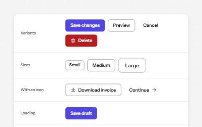
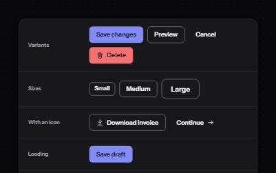
Native buttons in four variants and three sizes, with a loading state that keeps focus and a disabled state that says why.
-
Toggle button
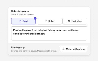
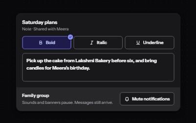
Buttons that stay on or off, like Bold or Mute, with aria-pressed reporting the state while the label stays the same.
-
Tooltip
A short label or hint that appears on hover and keyboard focus, stays while you read it, and hides on Escape.
-
Icons
Icons that are decoration, icons that carry meaning and icons that are the whole control, each exposed the right way.