Accessibility pattern · Media
Icons
An icon next to words is decoration and is hidden; an icon that stands alone gets role=img and a name; an icon that is the whole control leaves the name to the button or link. Drawn in currentColor, every icon follows the text into dark mode and forced colors, where a fixed fill simply vanishes.
- WCAG criteria
- 6
- Keyboard rules
- 3
- Checked with
- axe, keyboard and the inspector
Live demo
Try it
Use it with a mouse, a keyboard or a screen reader. The inspector beside it shows what the browser tells assistive technology as you go: focus, state changes and announcements.
The demo works without JavaScript only as far as its HTML does; the inspector needs JavaScript.
Keyboard
Keys it answers to
Every action works without a pointer.
| Key | What it does |
|---|---|
| Tab or ShiftTab | Moves through the example buttons and links, the search field and each icon in the set. Icons that are only pictures are never tab stops. |
| Enter or Space | On an icon in the set, copies its name to the clipboard and says which name was copied. |
| Escape | In the search field, clears the search and shows every icon again. |
Screen readers
What it announces
Written from the roles, names and states in the markup.
| When | Expected announcement |
|---|---|
| Focus reaches Download invoice | Download invoice, button (the icon is silent) |
| Reading the first order | Order 4821, Out for delivery, image |
| Focus reaches the pencil | Edit, button |
| Focus reaches the Save button with a titled icon | Heart icon Save, button |
| Focus reaches the Delete button with a named icon | Delete Delete, button |
| Typing bin in the search | Icons shown: 1 |
| An icon in the set is pressed | Copied: trash |
These are expected announcements, not recordings. Wording and order differ between screen readers and browsers.
Code
Copy the code
The exact files this demo runs on. The styles are served with a prefix that keeps this site's own styles out of the demo; what you copy is the original.
<div class="ap-svg-icons" data-ap-svg-icons>
<svg class="ap-svg-icons__sprite" aria-hidden="true" focusable="false">
<symbol id="svgi-home" viewBox="0 0 24 24"><path d="M4 11 12 4l8 7"/><path d="M6 9.5V20h12V9.5"/><path d="M10 20v-5h4v5"/></symbol>
<symbol id="svgi-search" viewBox="0 0 24 24"><circle cx="11" cy="11" r="6.5"/><path d="m16 16 4 4"/></symbol>
<symbol id="svgi-user" viewBox="0 0 24 24"><circle cx="12" cy="8" r="4"/><path d="M4.5 20c1.2-4 4-6 7.5-6s6.3 2 7.5 6"/></symbol>
<symbol id="svgi-settings" viewBox="0 0 24 24"><path d="M4 7h9.5M18.5 7H20M4 17h3.5M12.5 17H20"/><circle cx="16" cy="7" r="2.5"/><circle cx="10" cy="17" r="2.5"/></symbol>
<symbol id="svgi-bell" viewBox="0 0 24 24"><path d="M6 16v-5a6 6 0 0 1 12 0v5l1.5 2h-15Z"/><path d="M10 20.5a2 2 0 0 0 4 0"/></symbol>
<symbol id="svgi-mail" viewBox="0 0 24 24"><rect x="3.5" y="5.5" width="17" height="13" rx="2"/><path d="m4 7 8 6 8-6"/></symbol>
<symbol id="svgi-phone" viewBox="0 0 24 24"><path d="M6.5 3.5h3l1.5 4-2 1.5a11 11 0 0 0 6 6l1.5-2 4 1.5v3a2 2 0 0 1-2 2A16 16 0 0 1 4.5 5.5a2 2 0 0 1 2-2Z"/></symbol>
<symbol id="svgi-map-pin" viewBox="0 0 24 24"><path d="M12 21s-6.5-6-6.5-11a6.5 6.5 0 0 1 13 0c0 5-6.5 11-6.5 11Z"/><circle cx="12" cy="10" r="2.5"/></symbol>
<symbol id="svgi-calendar" viewBox="0 0 24 24"><rect x="4" y="5.5" width="16" height="15" rx="2"/><path d="M4 10h16M8.5 3.5v4M15.5 3.5v4"/></symbol>
<symbol id="svgi-cart" viewBox="0 0 24 24"><path d="M3.5 4.5H6l2.2 10.5h10.3l1.8-7.5H7"/><circle cx="9.5" cy="19" r="1.5"/><circle cx="17" cy="19" r="1.5"/></symbol>
<symbol id="svgi-heart" viewBox="0 0 24 24"><path d="M12 20s-7.5-4.6-7.5-10.2A4.3 4.3 0 0 1 12 7.2a4.3 4.3 0 0 1 7.5 2.6C19.5 15.4 12 20 12 20Z"/></symbol>
<symbol id="svgi-star" viewBox="0 0 24 24"><path d="m12 3.5 2.6 5.3 5.9.9-4.3 4.1 1 5.8-5.2-2.7-5.2 2.7 1-5.8-4.3-4.1 5.9-.9Z"/></symbol>
<symbol id="svgi-download" viewBox="0 0 24 24"><path d="M12 4v11"/><path d="m7 10 5 5 5-5"/><path d="M5 20h14"/></symbol>
<symbol id="svgi-upload" viewBox="0 0 24 24"><path d="M12 15V4"/><path d="m7 9 5-5 5 5"/><path d="M5 20h14"/></symbol>
<symbol id="svgi-share" viewBox="0 0 24 24"><circle cx="18" cy="5" r="2.5"/><circle cx="6" cy="12" r="2.5"/><circle cx="18" cy="19" r="2.5"/><path d="m8.2 13.2 7.6 4.6M15.8 6.2l-7.6 4.6"/></symbol>
<symbol id="svgi-edit" viewBox="0 0 24 24"><path d="M12 20h8"/><path d="M16.5 3.5a2.1 2.1 0 0 1 3 3L7 19l-4 1 1-4Z"/></symbol>
<symbol id="svgi-trash" viewBox="0 0 24 24"><path d="M4 7h16"/><path d="M10 11v6M14 11v6"/><path d="m6 7 1 12a2 2 0 0 0 2 2h6a2 2 0 0 0 2-2l1-12"/><path d="M9 7V4h6v3"/></symbol>
<symbol id="svgi-check" viewBox="0 0 24 24"><path d="m5 12.5 4.5 4.5L19 7.5"/></symbol>
<symbol id="svgi-check-circle" viewBox="0 0 24 24"><circle cx="12" cy="12" r="8.5"/><path d="m8.5 12.5 2.5 2.5 4.5-5"/></symbol>
<symbol id="svgi-arrow-right" viewBox="0 0 24 24"><path d="M4 12h16M14 6l6 6-6 6"/></symbol>
<symbol id="svgi-external-link" viewBox="0 0 24 24"><path d="M14 4h6v6"/><path d="M20 4 11 13"/><path d="M18 14v5a1 1 0 0 1-1 1H5a1 1 0 0 1-1-1V7a1 1 0 0 1 1-1h5"/></symbol>
<symbol id="svgi-info" viewBox="0 0 24 24"><circle cx="12" cy="12" r="8.5"/><path d="M12 11v5.5M12 7.5h.01"/></symbol>
<symbol id="svgi-lock" viewBox="0 0 24 24"><rect x="5" y="10.5" width="14" height="10" rx="2"/><path d="M8 10.5V8a4 4 0 0 1 8 0v2.5"/></symbol>
<symbol id="svgi-truck" viewBox="0 0 24 24"><path d="M3 6.5h11v9H3zM14 9.5h4l3 3.5v2.5h-7"/><circle cx="7" cy="18.5" r="2"/><circle cx="17.5" cy="18.5" r="2"/></symbol>
</svg>
<section class="ap-svg-icons__part" aria-labelledby="svgi-jobs">
<h3 class="ap-svg-icons__h" id="svgi-jobs">Four jobs an icon does</h3>
<ul class="ap-svg-icons__cases">
<li class="ap-svg-icons__case">
<h4 class="ap-svg-icons__case-name">Beside text: hidden</h4>
<div class="ap-svg-icons__show">
<button type="button" class="ap-btn"><svg class="ap-btn__icon" viewBox="0 0 24 24" aria-hidden="true" focusable="false"><use href="#svgi-download"/></svg>Download invoice</button>
<span class="ap-svg-icons__chip"><svg class="ap-svg-icons__icon" viewBox="0 0 24 24" aria-hidden="true" focusable="false"><use href="#svgi-check-circle"/></svg>Payment received</span>
</div>
<p class="ap-svg-icons__how"><code translate="no">aria-hidden="true"</code> <span class="ap-svg-icons__heard"><span class="ap-svg-icons__k">Heard as</span> <span>Download invoice, button</span></span></p>
</li>
<li class="ap-svg-icons__case">
<h4 class="ap-svg-icons__case-name">On its own: an image</h4>
<ul class="ap-svg-icons__orders">
<li><span>Order 4821</span><svg class="ap-svg-icons__icon ap-svg-icons__status" viewBox="0 0 24 24" role="img" aria-labelledby="svgi-transit" focusable="false"><title id="svgi-transit">Out for delivery</title><use href="#svgi-truck"/></svg><code translate="no"><title></code></li>
<li><span>Order 4807</span><svg class="ap-svg-icons__icon ap-svg-icons__status" viewBox="0 0 24 24" role="img" aria-label="Delivered" focusable="false"><use href="#svgi-check-circle"/></svg><code translate="no">aria-label</code></li>
</ul>
<p class="ap-svg-icons__how"><code translate="no">role="img"</code> <span class="ap-svg-icons__heard"><span class="ap-svg-icons__k">Heard as</span> <span>Out for delivery, image</span></span></p>
</li>
<li class="ap-svg-icons__case">
<h4 class="ap-svg-icons__case-name">The whole button: name the button</h4>
<div class="ap-svg-icons__show">
<button type="button" class="ap-svg-icons__iconbtn" aria-label="Edit"><svg class="ap-svg-icons__icon" viewBox="0 0 24 24" aria-hidden="true" focusable="false"><use href="#svgi-edit"/></svg></button>
<button type="button" class="ap-svg-icons__iconbtn" aria-label="Share"><svg class="ap-svg-icons__icon" viewBox="0 0 24 24" aria-hidden="true" focusable="false"><use href="#svgi-share"/></svg></button>
<button type="button" class="ap-svg-icons__iconbtn" aria-label="Delete"><svg class="ap-svg-icons__icon" viewBox="0 0 24 24" aria-hidden="true" focusable="false"><use href="#svgi-trash"/></svg></button>
</div>
<p class="ap-svg-icons__how"><code translate="no"><button aria-label="Edit"></code> <span class="ap-svg-icons__heard"><span class="ap-svg-icons__k">Heard as</span> <span>Edit, button</span></span></p>
</li>
<li class="ap-svg-icons__case">
<h4 class="ap-svg-icons__case-name">In a link: name the link</h4>
<div class="ap-svg-icons__show">
<a class="ap-svg-icons__iconbtn" href="#svgi-jobs" aria-label="Call the shop"><svg class="ap-svg-icons__icon" viewBox="0 0 24 24" aria-hidden="true" focusable="false"><use href="#svgi-phone"/></svg></a>
<a class="ap-svg-icons__iconbtn" href="#svgi-jobs" aria-label="Email the shop"><svg class="ap-svg-icons__icon" viewBox="0 0 24 24" aria-hidden="true" focusable="false"><use href="#svgi-mail"/></svg></a>
<a class="ap-svg-icons__link" href="#svgi-jobs">Delivery times<svg class="ap-svg-icons__icon" viewBox="0 0 24 24" aria-hidden="true" focusable="false"><use href="#svgi-arrow-right"/></svg></a>
</div>
<p class="ap-svg-icons__how"><code translate="no"><a aria-label="Call the shop"></code> <span class="ap-svg-icons__heard"><span class="ap-svg-icons__k">Heard as</span> <span>Call the shop, link</span></span></p>
</li>
</ul>
</section>
<section class="ap-svg-icons__part" aria-labelledby="svgi-wrong">
<h3 class="ap-svg-icons__h" id="svgi-wrong">Three ways it goes wrong</h3>
<ul class="ap-svg-icons__cases ap-svg-icons__cases--rows">
<li class="ap-svg-icons__case ap-svg-icons__case--wrong">
<h4 class="ap-svg-icons__case-name">A title on a decorative icon</h4>
<div class="ap-svg-icons__show">
<button type="button" class="ap-btn"><svg class="ap-btn__icon" viewBox="0 0 24 24" focusable="false"><title>Heart icon</title><use href="#svgi-heart"/></svg>Save</button>
</div>
<p class="ap-svg-icons__how"><span class="ap-svg-icons__heard"><span class="ap-svg-icons__k">Heard as</span> <span>Heart icon Save, button</span></span></p>
</li>
<li class="ap-svg-icons__case ap-svg-icons__case--wrong">
<h4 class="ap-svg-icons__case-name">A name on the icon and the button</h4>
<div class="ap-svg-icons__show">
<button type="button" class="ap-btn"><svg class="ap-btn__icon" viewBox="0 0 24 24" aria-label="Delete" focusable="false"><use href="#svgi-trash"/></svg>Delete</button>
</div>
<p class="ap-svg-icons__how"><span class="ap-svg-icons__heard"><span class="ap-svg-icons__k">Heard as</span> <span>Delete Delete, button</span></span></p>
</li>
<li class="ap-svg-icons__case ap-svg-icons__case--wrong">
<h4 class="ap-svg-icons__case-name">A fixed fill color</h4>
<div class="ap-svg-icons__show ap-svg-icons__swatches">
<span class="ap-svg-icons__swatch ap-svg-icons__swatch--fixed"><svg viewBox="0 0 24 24" aria-hidden="true" focusable="false"><path fill="#18181B" d="m12 3.5 2.6 5.3 5.9.9-4.3 4.1 1 5.8-5.2-2.7-5.2 2.7 1-5.8-4.3-4.1 5.9-.9Z"/></svg><code translate="no">fill="#18181B"</code></span>
<span class="ap-svg-icons__swatch"><svg class="ap-svg-icons__icon ap-svg-icons__icon--solid" viewBox="0 0 24 24" aria-hidden="true" focusable="false"><use href="#svgi-star"/></svg><code translate="no">currentColor</code></span>
</div>
<p class="ap-svg-icons__how ap-svg-icons__how--note">Switch the demo to Dark or simulate forced colors: the fixed star disappears.</p>
</li>
</ul>
</section>
<section class="ap-svg-icons__part" aria-labelledby="svgi-set">
<div class="ap-svg-icons__top">
<h3 class="ap-svg-icons__h" id="svgi-set">Icon set</h3>
<p class="ap-svg-icons__count" role="status"><span>Icons shown:</span> <span data-svgi-count>24</span></p>
</div>
<div class="ap-field ap-svg-icons__search">
<label class="ap-label" for="svgi-q">Search icons</label>
<input class="ap-input" id="svgi-q" type="search" autocomplete="off" spellcheck="false" aria-describedby="svgi-q-hint" data-svgi-search />
<p class="ap-hint" id="svgi-q-hint">Search by name or by what it shows, like bin, basket or tick.</p>
</div>
<p class="ap-svg-icons__hint" id="svgi-grid-hint">Press an icon to copy its name.</p>
<ul class="ap-svg-icons__grid" aria-label="Icons">
<li><button type="button" class="ap-svg-icons__tile" data-svgi-name="home" data-svgi-tags="house start" aria-describedby="svgi-grid-hint"><svg class="ap-svg-icons__icon" viewBox="0 0 24 24" aria-hidden="true" focusable="false"><use href="#svgi-home"/></svg><span class="ap-svg-icons__tilename" translate="no">home</span><svg class="ap-svg-icons__done" viewBox="0 0 24 24" aria-hidden="true" focusable="false"><use href="#svgi-check"/></svg></button></li>
<li><button type="button" class="ap-svg-icons__tile" data-svgi-name="search" data-svgi-tags="find magnifier look" aria-describedby="svgi-grid-hint"><svg class="ap-svg-icons__icon" viewBox="0 0 24 24" aria-hidden="true" focusable="false"><use href="#svgi-search"/></svg><span class="ap-svg-icons__tilename" translate="no">search</span><svg class="ap-svg-icons__done" viewBox="0 0 24 24" aria-hidden="true" focusable="false"><use href="#svgi-check"/></svg></button></li>
<li><button type="button" class="ap-svg-icons__tile" data-svgi-name="user" data-svgi-tags="person account profile" aria-describedby="svgi-grid-hint"><svg class="ap-svg-icons__icon" viewBox="0 0 24 24" aria-hidden="true" focusable="false"><use href="#svgi-user"/></svg><span class="ap-svg-icons__tilename" translate="no">user</span><svg class="ap-svg-icons__done" viewBox="0 0 24 24" aria-hidden="true" focusable="false"><use href="#svgi-check"/></svg></button></li>
<li><button type="button" class="ap-svg-icons__tile" data-svgi-name="settings" data-svgi-tags="sliders preferences options" aria-describedby="svgi-grid-hint"><svg class="ap-svg-icons__icon" viewBox="0 0 24 24" aria-hidden="true" focusable="false"><use href="#svgi-settings"/></svg><span class="ap-svg-icons__tilename" translate="no">settings</span><svg class="ap-svg-icons__done" viewBox="0 0 24 24" aria-hidden="true" focusable="false"><use href="#svgi-check"/></svg></button></li>
<li><button type="button" class="ap-svg-icons__tile" data-svgi-name="bell" data-svgi-tags="notification alert reminder" aria-describedby="svgi-grid-hint"><svg class="ap-svg-icons__icon" viewBox="0 0 24 24" aria-hidden="true" focusable="false"><use href="#svgi-bell"/></svg><span class="ap-svg-icons__tilename" translate="no">bell</span><svg class="ap-svg-icons__done" viewBox="0 0 24 24" aria-hidden="true" focusable="false"><use href="#svgi-check"/></svg></button></li>
<li><button type="button" class="ap-svg-icons__tile" data-svgi-name="mail" data-svgi-tags="email envelope message" aria-describedby="svgi-grid-hint"><svg class="ap-svg-icons__icon" viewBox="0 0 24 24" aria-hidden="true" focusable="false"><use href="#svgi-mail"/></svg><span class="ap-svg-icons__tilename" translate="no">mail</span><svg class="ap-svg-icons__done" viewBox="0 0 24 24" aria-hidden="true" focusable="false"><use href="#svgi-check"/></svg></button></li>
<li><button type="button" class="ap-svg-icons__tile" data-svgi-name="phone" data-svgi-tags="call telephone" aria-describedby="svgi-grid-hint"><svg class="ap-svg-icons__icon" viewBox="0 0 24 24" aria-hidden="true" focusable="false"><use href="#svgi-phone"/></svg><span class="ap-svg-icons__tilename" translate="no">phone</span><svg class="ap-svg-icons__done" viewBox="0 0 24 24" aria-hidden="true" focusable="false"><use href="#svgi-check"/></svg></button></li>
<li><button type="button" class="ap-svg-icons__tile" data-svgi-name="map-pin" data-svgi-tags="location place marker address" aria-describedby="svgi-grid-hint"><svg class="ap-svg-icons__icon" viewBox="0 0 24 24" aria-hidden="true" focusable="false"><use href="#svgi-map-pin"/></svg><span class="ap-svg-icons__tilename" translate="no">map-pin</span><svg class="ap-svg-icons__done" viewBox="0 0 24 24" aria-hidden="true" focusable="false"><use href="#svgi-check"/></svg></button></li>
<li><button type="button" class="ap-svg-icons__tile" data-svgi-name="calendar" data-svgi-tags="date schedule booking" aria-describedby="svgi-grid-hint"><svg class="ap-svg-icons__icon" viewBox="0 0 24 24" aria-hidden="true" focusable="false"><use href="#svgi-calendar"/></svg><span class="ap-svg-icons__tilename" translate="no">calendar</span><svg class="ap-svg-icons__done" viewBox="0 0 24 24" aria-hidden="true" focusable="false"><use href="#svgi-check"/></svg></button></li>
<li><button type="button" class="ap-svg-icons__tile" data-svgi-name="cart" data-svgi-tags="basket shop trolley buy" aria-describedby="svgi-grid-hint"><svg class="ap-svg-icons__icon" viewBox="0 0 24 24" aria-hidden="true" focusable="false"><use href="#svgi-cart"/></svg><span class="ap-svg-icons__tilename" translate="no">cart</span><svg class="ap-svg-icons__done" viewBox="0 0 24 24" aria-hidden="true" focusable="false"><use href="#svgi-check"/></svg></button></li>
<li><button type="button" class="ap-svg-icons__tile" data-svgi-name="heart" data-svgi-tags="like love favourite favorite" aria-describedby="svgi-grid-hint"><svg class="ap-svg-icons__icon" viewBox="0 0 24 24" aria-hidden="true" focusable="false"><use href="#svgi-heart"/></svg><span class="ap-svg-icons__tilename" translate="no">heart</span><svg class="ap-svg-icons__done" viewBox="0 0 24 24" aria-hidden="true" focusable="false"><use href="#svgi-check"/></svg></button></li>
<li><button type="button" class="ap-svg-icons__tile" data-svgi-name="star" data-svgi-tags="rating favourite favorite" aria-describedby="svgi-grid-hint"><svg class="ap-svg-icons__icon" viewBox="0 0 24 24" aria-hidden="true" focusable="false"><use href="#svgi-star"/></svg><span class="ap-svg-icons__tilename" translate="no">star</span><svg class="ap-svg-icons__done" viewBox="0 0 24 24" aria-hidden="true" focusable="false"><use href="#svgi-check"/></svg></button></li>
<li><button type="button" class="ap-svg-icons__tile" data-svgi-name="download" data-svgi-tags="save arrow down" aria-describedby="svgi-grid-hint"><svg class="ap-svg-icons__icon" viewBox="0 0 24 24" aria-hidden="true" focusable="false"><use href="#svgi-download"/></svg><span class="ap-svg-icons__tilename" translate="no">download</span><svg class="ap-svg-icons__done" viewBox="0 0 24 24" aria-hidden="true" focusable="false"><use href="#svgi-check"/></svg></button></li>
<li><button type="button" class="ap-svg-icons__tile" data-svgi-name="upload" data-svgi-tags="send arrow up" aria-describedby="svgi-grid-hint"><svg class="ap-svg-icons__icon" viewBox="0 0 24 24" aria-hidden="true" focusable="false"><use href="#svgi-upload"/></svg><span class="ap-svg-icons__tilename" translate="no">upload</span><svg class="ap-svg-icons__done" viewBox="0 0 24 24" aria-hidden="true" focusable="false"><use href="#svgi-check"/></svg></button></li>
<li><button type="button" class="ap-svg-icons__tile" data-svgi-name="share" data-svgi-tags="send network" aria-describedby="svgi-grid-hint"><svg class="ap-svg-icons__icon" viewBox="0 0 24 24" aria-hidden="true" focusable="false"><use href="#svgi-share"/></svg><span class="ap-svg-icons__tilename" translate="no">share</span><svg class="ap-svg-icons__done" viewBox="0 0 24 24" aria-hidden="true" focusable="false"><use href="#svgi-check"/></svg></button></li>
<li><button type="button" class="ap-svg-icons__tile" data-svgi-name="edit" data-svgi-tags="pencil write change" aria-describedby="svgi-grid-hint"><svg class="ap-svg-icons__icon" viewBox="0 0 24 24" aria-hidden="true" focusable="false"><use href="#svgi-edit"/></svg><span class="ap-svg-icons__tilename" translate="no">edit</span><svg class="ap-svg-icons__done" viewBox="0 0 24 24" aria-hidden="true" focusable="false"><use href="#svgi-check"/></svg></button></li>
<li><button type="button" class="ap-svg-icons__tile" data-svgi-name="trash" data-svgi-tags="bin delete remove" aria-describedby="svgi-grid-hint"><svg class="ap-svg-icons__icon" viewBox="0 0 24 24" aria-hidden="true" focusable="false"><use href="#svgi-trash"/></svg><span class="ap-svg-icons__tilename" translate="no">trash</span><svg class="ap-svg-icons__done" viewBox="0 0 24 24" aria-hidden="true" focusable="false"><use href="#svgi-check"/></svg></button></li>
<li><button type="button" class="ap-svg-icons__tile" data-svgi-name="check" data-svgi-tags="tick done yes" aria-describedby="svgi-grid-hint"><svg class="ap-svg-icons__icon" viewBox="0 0 24 24" aria-hidden="true" focusable="false"><use href="#svgi-check"/></svg><span class="ap-svg-icons__tilename" translate="no">check</span><svg class="ap-svg-icons__done" viewBox="0 0 24 24" aria-hidden="true" focusable="false"><use href="#svgi-check"/></svg></button></li>
<li><button type="button" class="ap-svg-icons__tile" data-svgi-name="check-circle" data-svgi-tags="tick done delivered success" aria-describedby="svgi-grid-hint"><svg class="ap-svg-icons__icon" viewBox="0 0 24 24" aria-hidden="true" focusable="false"><use href="#svgi-check-circle"/></svg><span class="ap-svg-icons__tilename" translate="no">check-circle</span><svg class="ap-svg-icons__done" viewBox="0 0 24 24" aria-hidden="true" focusable="false"><use href="#svgi-check"/></svg></button></li>
<li><button type="button" class="ap-svg-icons__tile" data-svgi-name="arrow-right" data-svgi-tags="next forward go" aria-describedby="svgi-grid-hint"><svg class="ap-svg-icons__icon" viewBox="0 0 24 24" aria-hidden="true" focusable="false"><use href="#svgi-arrow-right"/></svg><span class="ap-svg-icons__tilename" translate="no">arrow-right</span><svg class="ap-svg-icons__done" viewBox="0 0 24 24" aria-hidden="true" focusable="false"><use href="#svgi-check"/></svg></button></li>
<li><button type="button" class="ap-svg-icons__tile" data-svgi-name="external-link" data-svgi-tags="new tab open outside" aria-describedby="svgi-grid-hint"><svg class="ap-svg-icons__icon" viewBox="0 0 24 24" aria-hidden="true" focusable="false"><use href="#svgi-external-link"/></svg><span class="ap-svg-icons__tilename" translate="no">external-link</span><svg class="ap-svg-icons__done" viewBox="0 0 24 24" aria-hidden="true" focusable="false"><use href="#svgi-check"/></svg></button></li>
<li><button type="button" class="ap-svg-icons__tile" data-svgi-name="info" data-svgi-tags="about help details" aria-describedby="svgi-grid-hint"><svg class="ap-svg-icons__icon" viewBox="0 0 24 24" aria-hidden="true" focusable="false"><use href="#svgi-info"/></svg><span class="ap-svg-icons__tilename" translate="no">info</span><svg class="ap-svg-icons__done" viewBox="0 0 24 24" aria-hidden="true" focusable="false"><use href="#svgi-check"/></svg></button></li>
<li><button type="button" class="ap-svg-icons__tile" data-svgi-name="lock" data-svgi-tags="secure password private" aria-describedby="svgi-grid-hint"><svg class="ap-svg-icons__icon" viewBox="0 0 24 24" aria-hidden="true" focusable="false"><use href="#svgi-lock"/></svg><span class="ap-svg-icons__tilename" translate="no">lock</span><svg class="ap-svg-icons__done" viewBox="0 0 24 24" aria-hidden="true" focusable="false"><use href="#svgi-check"/></svg></button></li>
<li><button type="button" class="ap-svg-icons__tile" data-svgi-name="truck" data-svgi-tags="delivery shipping van" aria-describedby="svgi-grid-hint"><svg class="ap-svg-icons__icon" viewBox="0 0 24 24" aria-hidden="true" focusable="false"><use href="#svgi-truck"/></svg><span class="ap-svg-icons__tilename" translate="no">truck</span><svg class="ap-svg-icons__done" viewBox="0 0 24 24" aria-hidden="true" focusable="false"><use href="#svgi-check"/></svg></button></li>
</ul>
<p class="ap-svg-icons__empty" data-svgi-empty hidden>No icon matches that. Try a shorter word.</p>
<p class="ap-svg-icons__copied" role="status" data-svgi-copied></p>
</section>
</div>
/* Shared primitives: buttons and form fields used across the patterns.
   Uses the --ap-* design tokens. */

.ap-btn {
  display: inline-flex;
  align-items: center;
  justify-content: center;
  gap: 8px;
  min-height: 40px;
  padding: 0 16px;
  border: 1px solid var(--ap-border-strong);
  border-radius: var(--ap-radius-sm);
  background: var(--ap-surface);
  color: var(--ap-text);
  font: inherit;
  font-weight: 600;
  line-height: 1.2;
  text-decoration: none;
  white-space: nowrap;
  cursor: pointer;
  transition: background-color var(--ap-duration) var(--ap-ease), border-color var(--ap-duration) var(--ap-ease), box-shadow var(--ap-duration) var(--ap-ease);
}
.ap-btn:hover {
  background: var(--ap-surface-2);
}
.ap-btn:focus-visible {
  outline: 2px solid var(--ap-focus);
  outline-offset: 2px;
}
.ap-btn:disabled,
.ap-btn[aria-disabled="true"] {
  opacity: .55;
  cursor: not-allowed;
}
.ap-btn--primary {
  border-color: var(--ap-accent);
  background: var(--ap-accent);
  color: var(--ap-on-accent);
  box-shadow: var(--ap-shadow-sm);
}
.ap-btn--primary:hover {
  border-color: var(--ap-accent-hover);
  background: var(--ap-accent-hover);
}
.ap-btn--danger {
  border-color: var(--ap-danger);
  background: var(--ap-danger);
  color: var(--ap-surface);
}
.ap-btn--danger:hover {
  filter: brightness(1.08);
}
.ap-btn--ghost {
  border-color: transparent;
  background: transparent;
}
.ap-btn--ghost:hover {
  background: var(--ap-surface-2);
}
.ap-btn__icon {
  width: 18px;
  height: 18px;
  flex-shrink: 0;
  fill: none;
  stroke: currentColor;
  stroke-width: 2;
  stroke-linecap: round;
  stroke-linejoin: round;
}

.ap-field {
  display: grid;
  gap: 6px;
}
.ap-label {
  color: var(--ap-text);
  font-weight: 600;
  font-size: .9375rem;
}
.ap-hint {
  margin: 0;
  color: var(--ap-text-3);
  font-size: .875rem;
  line-height: 1.45;
}
.ap-error {
  display: flex;
  align-items: flex-start;
  gap: 6px;
  margin: 0;
  color: var(--ap-danger);
  font-size: .875rem;
  font-weight: 600;
  line-height: 1.45;
}
.ap-input {
  width: 100%;
  min-height: 44px;
  padding: 10px 12px;
  border: 1px solid var(--ap-border-strong);
  border-radius: var(--ap-radius-sm);
  background: var(--ap-surface);
  color: var(--ap-text);
  font: inherit;
  line-height: 1.4;
  transition: border-color var(--ap-duration) var(--ap-ease), box-shadow var(--ap-duration) var(--ap-ease);
}
.ap-input::placeholder {
  color: var(--ap-text-3);
}
.ap-input:hover {
  border-color: var(--ap-text-2);
}
.ap-input:focus-visible {
  outline: 2px solid var(--ap-focus);
  outline-offset: 1px;
  border-color: var(--ap-focus);
}
.ap-input[aria-invalid="true"] {
  border-color: var(--ap-danger);
  box-shadow: inset 4px 0 0 var(--ap-danger);
}
textarea.ap-input {
  resize: vertical;
  min-height: 88px;
}

@media (prefers-reduced-motion: reduce) {
  .ap-btn,
  .ap-input { transition: none; }
}

/* Icons. Uses the --ap-* design tokens and the shared primitives. */
.ap-svg-icons {
  container-type: inline-size;
  position: relative;
  display: grid;
  gap: 28px;
  width: min(100%, 760px);
  margin-inline: auto;
}

/* The sprite holds the drawings once; it takes no space and is never read. */
.ap-svg-icons__sprite {
  position: absolute;
  width: 0;
  height: 0;
  overflow: hidden;
}

/* Every icon takes the text color, so it follows themes and forced colors. */
.ap-svg-icons__icon {
  width: 20px;
  height: 20px;
  flex-shrink: 0;
  fill: none;
  stroke: currentColor;
  stroke-width: 2;
  stroke-linecap: round;
  stroke-linejoin: round;
}
.ap-svg-icons__icon--solid {
  fill: currentColor;
}

.ap-svg-icons__part {
  display: grid;
  gap: 14px;
  min-width: 0;
}
.ap-svg-icons__h {
  margin: 0;
  font-size: 1.0625rem;
  font-weight: 650;
  line-height: 1.35;
}

/* ── Example cards ── */
.ap-svg-icons__cases {
  display: grid;
  grid-template-columns: repeat(2, minmax(0, 1fr));
  gap: 12px;
  margin: 0;
  padding: 0;
  list-style: none;
}
/* The failures read as rows: the example on the left, what goes wrong beside it. */
.ap-svg-icons__cases--rows {
  grid-template-columns: 1fr;
}
.ap-svg-icons__cases--rows .ap-svg-icons__case {
  grid-template-columns: 250px minmax(0, 1fr);
  grid-template-rows: auto 1fr;
  gap: 8px 20px;
}
.ap-svg-icons__cases--rows .ap-svg-icons__show {
  grid-column: 1;
  grid-row: 1 / span 2;
  justify-content: center;
}
.ap-svg-icons__cases--rows .ap-svg-icons__case-name,
.ap-svg-icons__cases--rows .ap-svg-icons__how {
  grid-column: 2;
  align-self: center;
}
.ap-svg-icons__cases--rows .ap-svg-icons__case-name {
  align-self: end;
}
.ap-svg-icons__cases--rows .ap-svg-icons__how {
  align-self: start;
}
.ap-svg-icons__case {
  display: grid;
  grid-template-rows: auto 1fr auto;
  gap: 12px;
  min-width: 0;
  padding: 16px;
  border: 1px solid var(--ap-border);
  border-top: 3px solid var(--ap-success);
  border-radius: var(--ap-radius-lg);
  background: var(--ap-surface);
  box-shadow: var(--ap-shadow-sm);
}
.ap-svg-icons__case--wrong {
  border-top-color: var(--ap-danger);
}
.ap-svg-icons__case-name {
  margin: 0;
  color: var(--ap-text);
  font-size: .9375rem;
  font-weight: 650;
  line-height: 1.35;
}
.ap-svg-icons__show {
  display: flex;
  flex-wrap: wrap;
  align-items: center;
  gap: 10px;
  min-height: 72px;
  padding: 14px;
  border-radius: var(--ap-radius);
  background: var(--ap-surface-2);
}
.ap-svg-icons__how {
  display: grid;
  justify-items: start;
  gap: 6px;
  margin: 0;
  color: var(--ap-text);
  font-size: .8125rem;
  line-height: 1.5;
}
.ap-svg-icons__how--note {
  color: var(--ap-text-3);
}
.ap-svg-icons__heard {
  display: inline-flex;
  flex-wrap: wrap;
  align-items: baseline;
  gap: 2px 8px;
}
.ap-svg-icons__k {
  color: var(--ap-text-3);
  font-size: .6875rem;
  font-weight: 700;
  letter-spacing: .06em;
  text-transform: uppercase;
}
.ap-svg-icons code {
  padding: 2px 6px;
  border-radius: 6px;
  background: var(--ap-accent-soft);
  color: var(--ap-accent-soft-text);
  font-family: var(--ap-mono);
  font-size: .75rem;
  overflow-wrap: anywhere;
}

/* Decorative: a chip whose icon repeats its word. */
.ap-svg-icons__chip {
  display: inline-flex;
  align-items: center;
  gap: 6px;
  padding: 5px 11px 5px 8px;
  border-radius: var(--ap-radius-full);
  background: var(--ap-success-soft);
  color: var(--ap-success);
  font-size: .8125rem;
  font-weight: 650;
}
.ap-svg-icons__chip .ap-svg-icons__icon {
  width: 16px;
  height: 16px;
}

/* Standalone: an order's status shown by an icon alone. */
.ap-svg-icons__orders {
  display: grid;
  gap: 4px;
  margin: 0;
  padding: 8px 14px;
  border-radius: var(--ap-radius);
  background: var(--ap-surface-2);
  list-style: none;
}
.ap-svg-icons__orders li {
  display: flex;
  flex-wrap: wrap;
  align-items: center;
  gap: 4px 10px;
  min-height: 36px;
  font-weight: 600;
  font-variant-numeric: tabular-nums;
}
.ap-svg-icons__orders code {
  margin-left: auto;
}
.ap-svg-icons__status {
  width: 22px;
  height: 22px;
  color: var(--ap-accent-text);
}

/* Icon-only buttons and links: the name is on the control. */
.ap-svg-icons__iconbtn {
  display: inline-grid;
  place-items: center;
  width: 42px;
  height: 42px;
  padding: 0;
  border: 1px solid var(--ap-border-strong);
  border-radius: var(--ap-radius-sm);
  background: var(--ap-surface);
  color: var(--ap-text);
  cursor: pointer;
  transition: background-color var(--ap-duration) var(--ap-ease);
}
.ap-svg-icons__iconbtn:hover {
  background: var(--ap-surface-3);
}
.ap-svg-icons__iconbtn:focus-visible,
.ap-svg-icons__link:focus-visible,
.ap-svg-icons__tile:focus-visible {
  outline: 2px solid var(--ap-focus);
  outline-offset: 2px;
}
.ap-svg-icons__link {
  display: inline-flex;
  align-items: center;
  gap: 6px;
  min-height: 42px;
  margin-left: 4px;
  border-radius: 4px;
  color: var(--ap-accent-text);
  font-weight: 600;
  text-decoration: underline;
  text-underline-offset: 3px;
}
.ap-svg-icons__link .ap-svg-icons__icon {
  width: 16px;
  height: 16px;
}

/* A fixed fill next to currentColor. */
.ap-svg-icons__swatches {
  flex-wrap: nowrap;
  justify-content: space-evenly;
  gap: 12px;
}
.ap-svg-icons__swatch {
  display: grid;
  justify-items: center;
  gap: 8px;
}
.ap-svg-icons__swatch code {
  font-size: .6875rem;
  white-space: nowrap;
}
.ap-svg-icons__swatch svg {
  width: 32px;
  height: 32px;
  padding: 6px;
  border: 1px dashed var(--ap-border-strong);
  border-radius: var(--ap-radius-sm);
  box-sizing: content-box;
}
.ap-svg-icons__swatch .ap-svg-icons__icon--solid {
  color: var(--ap-text);
}

/* ── The icon set ── */
.ap-svg-icons__top {
  display: flex;
  flex-wrap: wrap;
  align-items: baseline;
  justify-content: space-between;
  gap: 4px 12px;
}
.ap-svg-icons__count {
  margin: 0;
  color: var(--ap-text-3);
  font-size: .875rem;
  font-variant-numeric: tabular-nums;
}
.ap-svg-icons__search {
  max-width: 440px;
}
.ap-svg-icons__hint {
  margin: 0;
  color: var(--ap-text-3);
  font-size: .875rem;
}
.ap-svg-icons__grid {
  display: grid;
  grid-template-columns: repeat(auto-fill, minmax(104px, 1fr));
  gap: 8px;
  margin: 0;
  padding: 0;
  list-style: none;
}
.ap-svg-icons__grid li[hidden] {
  display: none;
}
.ap-svg-icons__tile {
  position: relative;
  display: grid;
  justify-items: center;
  align-content: center;
  gap: 8px;
  width: 100%;
  min-height: 86px;
  padding: 14px 6px 12px;
  border: 1px solid var(--ap-border-strong);
  border-radius: var(--ap-radius);
  background: var(--ap-surface);
  color: var(--ap-text);
  font: inherit;
  cursor: pointer;
  transition: background-color var(--ap-duration) var(--ap-ease);
}
.ap-svg-icons__tile:hover {
  background: var(--ap-surface-2);
}
.ap-svg-icons__tile .ap-svg-icons__icon {
  width: 24px;
  height: 24px;
}
.ap-svg-icons__tilename {
  color: var(--ap-text-2);
  font-family: var(--ap-mono);
  font-size: .75rem;
  line-height: 1.3;
  overflow-wrap: anywhere;
}
.ap-svg-icons__done {
  position: absolute;
  top: 6px;
  right: 6px;
  display: none;
  width: 18px;
  height: 18px;
  padding: 3px;
  border-radius: 50%;
  background: var(--ap-success);
  color: var(--ap-surface);
  fill: none;
  stroke: currentColor;
  stroke-width: 3.5;
  stroke-linecap: round;
  stroke-linejoin: round;
}
/* Copied: a tint, a check badge and a stronger edge, not the tint alone. */
.ap-svg-icons__tile.is-copied {
  border-color: var(--ap-success);
  background: var(--ap-success-soft);
  box-shadow: inset 0 0 0 1px var(--ap-success);
}
.ap-svg-icons__tile.is-copied .ap-svg-icons__done {
  display: block;
}
.ap-svg-icons__empty {
  margin: 0;
  padding: 18px;
  border: 1px dashed var(--ap-border-strong);
  border-radius: var(--ap-radius);
  color: var(--ap-text-2);
  text-align: center;
}
.ap-svg-icons__empty[hidden] {
  display: none;
}
.ap-svg-icons__copied {
  min-height: 1.6em;
  margin: 0;
  color: var(--ap-success);
  font-weight: 600;
}

@container (max-width: 540px) {
  .ap-svg-icons__cases { grid-template-columns: 1fr; }
  .ap-svg-icons__cases--rows .ap-svg-icons__case { grid-template-columns: 1fr; }
  .ap-svg-icons__cases--rows :is(.ap-svg-icons__show, .ap-svg-icons__case-name, .ap-svg-icons__how) {
    grid-column: auto;
    grid-row: auto;
  }
  .ap-svg-icons__grid { grid-template-columns: repeat(auto-fill, minmax(88px, 1fr)); }
}

/* Real forced colors: the browser swaps every color for the person's palette.
   Fills vanish, so a state drawn as a fill also gets an outline. */
@media (forced-colors: active) {
  .ap-svg-icons__tile.is-copied {
    outline: 2px solid Highlight;
    outline-offset: -4px;
  }
}

/* Demo only: a simulated forced-colors palette, a dark contrast theme built
   from CSS system colors. In real forced colors the browser does all this,
   and, like here, leaves SVG fill and stroke colors alone. */
.ap-svg-icons[data-forced-colors] {
  color-scheme: dark;
  padding: 16px;
  border-radius: var(--ap-radius-lg);
  background: Canvas;
  color: CanvasText;
}
.ap-svg-icons[data-forced-colors] * {
  background-color: Canvas !important;
  color: CanvasText !important;
  border-color: CanvasText !important;
  box-shadow: none !important;
  text-shadow: none !important;
}
.ap-svg-icons[data-forced-colors] :is(button, input, .ap-btn) {
  color: ButtonText !important;
  border-color: ButtonText !important;
}
.ap-svg-icons[data-forced-colors] a {
  color: LinkText !important;
}
.ap-svg-icons[data-forced-colors] :focus-visible {
  outline-color: Highlight !important;
}
.ap-svg-icons[data-forced-colors] .ap-svg-icons__tile.is-copied {
  outline: 2px solid Highlight;
  outline-offset: -4px;
}

@media (prefers-reduced-motion: reduce) {
  .ap-svg-icons__iconbtn,
  .ap-svg-icons__tile { transition: none; }
}
/**
 * Icons: a searchable icon set where each icon is a button that copies its
 * name. The rest of the demo (decorative, standalone and control icons) is
 * plain HTML and SVG and needs no script.
 *
 * Markup: [data-ap-svg-icons] holding input[data-svgi-search], buttons
 * [data-svgi-name][data-svgi-tags] inside list items, a role=status count
 * ([data-svgi-count] inside it), [data-svgi-empty] and a role=status
 * [data-svgi-copied]. Add data-forced-colors to the root to preview the demo
 * in a simulated forced-colors palette (the stylesheet does that part).
 */

export function init(root) {
  const input = root.querySelector("[data-svgi-search]");
  const tiles = [...root.querySelectorAll("[data-svgi-name]")];
  const count = root.querySelector("[data-svgi-count]");
  const empty = root.querySelector("[data-svgi-empty]");
  const copied = root.querySelector("[data-svgi-copied]");
  let timer = 0;

  // A match is the start of the name or of any search word, so "bin" finds
  // trash and "tick" finds check.
  function filter() {
    const q = input.value.trim().toLowerCase();
    let shown = 0;
    for (const tile of tiles) {
      const words = [tile.dataset.svgiName, ...tile.dataset.svgiName.split("-"), ...(tile.dataset.svgiTags || "").split(/\s+/)];
      const match = !q || tile.dataset.svgiName.includes(q) || words.some((w) => w.startsWith(q));
      tile.parentElement.hidden = !match;
      if (match) shown++;
    }
    // Only a real change reaches the status message, so it is announced once.
    if (count.textContent !== String(shown)) count.textContent = String(shown);
    empty.hidden = shown > 0;
  }

  function onKeydown(event) {
    if (event.key === "Escape" && input.value) {
      event.preventDefault();
      input.value = "";
      filter();
    }
  }

  async function copy(tile) {
    const name = tile.dataset.svgiName;
    let ok = false;
    try {
      await navigator.clipboard.writeText(name);
      ok = true;
    } catch {
      // Clipboard blocked: the name is still shown and announced.
    }
    const label = document.createElement("span");
    label.textContent = ok ? "Copied:" : "Could not copy:";
    const code = document.createElement("code");
    code.textContent = name;
    code.setAttribute("translate", "no");
    copied.replaceChildren(label, " ", code);
    for (const t of tiles) t.classList.toggle("is-copied", ok && t === tile);
    clearTimeout(timer);
    timer = setTimeout(() => tile.classList.remove("is-copied"), 1600);
  }

  function onClick(event) {
    const tile = event.target.closest("[data-svgi-name]");
    if (tile && root.contains(tile)) copy(tile);
  }

  input.addEventListener("input", filter);
  input.addEventListener("keydown", onKeydown);
  root.addEventListener("click", onClick);
  filter();

  return () => {
    clearTimeout(timer);
    input.removeEventListener("input", filter);
    input.removeEventListener("keydown", onKeydown);
    root.removeEventListener("click", onClick);
  };
}

for (const root of document.querySelectorAll("[data-ap-svg-icons]")) init(root);
/* Design tokens for the pattern components. Light by default, dark when the
   system asks for it; set data-theme="dark" on :root to force dark. */
:root {
    --ap-radius-sm: 8px;
    --ap-radius: 12px;
    --ap-radius-lg: 16px;
    --ap-radius-full: 999px;
    --ap-font: "Instrument Sans", ui-sans-serif, system-ui, -apple-system, "Segoe UI", Roboto, sans-serif;
    --ap-mono: "JetBrains Mono", ui-monospace, "Cascadia Mono", "SF Mono", Consolas, monospace;
    --ap-ease: cubic-bezier(.2, .8, .2, 1);
    --ap-duration: 180ms;
    --ap-target: 44px;
    --ap-bg: #F4F4F5;
    --ap-surface: #FFFFFF;
    --ap-surface-2: #F4F4F5;
    --ap-surface-3: #E4E4E7;
    --ap-border: #E4E4E7;
    --ap-border-strong: #76767F;
    --ap-text: #18181B;
    --ap-text-2: #3F3F46;
    --ap-text-3: #5E5E66;
    --ap-accent: #4F46E5;
    --ap-accent-hover: #4338CA;
    --ap-on-accent: #FFFFFF;
    --ap-accent-text: #4338CA;
    --ap-accent-soft: #EEF2FF;
    --ap-accent-soft-text: #3730A3;
    --ap-focus: #4F46E5;
    --ap-danger: #B91C1C;
    --ap-danger-soft: #FEF2F2;
    --ap-success: #15803D;
    --ap-success-soft: #F0FDF4;
    --ap-warning: #A15C07;
    --ap-warning-soft: #FEFCE8;
    --ap-info: #1D4ED8;
    --ap-info-soft: #EFF6FF;
    --ap-scrim: rgb(9 9 11 / .48);
    --ap-shadow-sm: 0 1px 2px rgb(9 9 11 / .06);
    --ap-shadow-md: 0 1px 2px rgb(9 9 11 / .05), 0 6px 16px -4px rgb(9 9 11 / .1);
    --ap-shadow-lg: 0 2px 6px rgb(9 9 11 / .06), 0 20px 40px -12px rgb(9 9 11 / .22);
    --ap-light-bg: #F4F4F5;
    --ap-light-surface: #FFFFFF;
    --ap-light-surface-2: #F4F4F5;
    --ap-light-surface-3: #E4E4E7;
    --ap-light-border: #E4E4E7;
    --ap-light-border-strong: #76767F;
    --ap-light-text: #18181B;
    --ap-light-text-2: #3F3F46;
    --ap-light-text-3: #5E5E66;
    --ap-light-accent: #4F46E5;
    --ap-light-accent-hover: #4338CA;
    --ap-light-on-accent: #FFFFFF;
    --ap-light-accent-text: #4338CA;
    --ap-light-accent-soft: #EEF2FF;
    --ap-light-accent-soft-text: #3730A3;
    --ap-light-focus: #4F46E5;
    --ap-light-danger: #B91C1C;
    --ap-light-danger-soft: #FEF2F2;
    --ap-light-success: #15803D;
    --ap-light-success-soft: #F0FDF4;
    --ap-light-warning: #A15C07;
    --ap-light-warning-soft: #FEFCE8;
    --ap-light-info: #1D4ED8;
    --ap-light-info-soft: #EFF6FF;
    --ap-light-scrim: rgb(9 9 11 / .48);
    --ap-light-shadow-sm: 0 1px 2px rgb(9 9 11 / .06);
    --ap-light-shadow-md: 0 1px 2px rgb(9 9 11 / .05), 0 6px 16px -4px rgb(9 9 11 / .1);
    --ap-light-shadow-lg: 0 2px 6px rgb(9 9 11 / .06), 0 20px 40px -12px rgb(9 9 11 / .22);
    --ap-dark-bg: #09090B;
    --ap-dark-surface: #18181B;
    --ap-dark-surface-2: #27272A;
    --ap-dark-surface-3: #3F3F46;
    --ap-dark-border: #2E2E33;
    --ap-dark-border-strong: #8E8E97;
    --ap-dark-text: #FAFAFA;
    --ap-dark-text-2: #D4D4D8;
    --ap-dark-text-3: #A1A1AA;
    --ap-dark-accent: #818CF8;
    --ap-dark-accent-hover: #A5B4FC;
    --ap-dark-on-accent: #0C0A1F;
    --ap-dark-accent-text: #A5B4FC;
    --ap-dark-accent-soft: #1E1B4B;
    --ap-dark-accent-soft-text: #C7D2FE;
    --ap-dark-focus: #A5B4FC;
    --ap-dark-danger: #F87171;
    --ap-dark-danger-soft: #2A1215;
    --ap-dark-success: #4ADE80;
    --ap-dark-success-soft: #0F2A1A;
    --ap-dark-warning: #FACC15;
    --ap-dark-warning-soft: #2A2410;
    --ap-dark-info: #60A5FA;
    --ap-dark-info-soft: #0F1D33;
    --ap-dark-scrim: rgb(0 0 0 / .62);
    --ap-dark-shadow-sm: 0 1px 2px rgb(0 0 0 / .4);
    --ap-dark-shadow-md: 0 1px 2px rgb(0 0 0 / .4), 0 8px 20px -6px rgb(0 0 0 / .5);
    --ap-dark-shadow-lg: 0 2px 8px rgb(0 0 0 / .45), 0 24px 48px -12px rgb(0 0 0 / .7);
}
@media (prefers-color-scheme: dark) {
  :root:not([data-theme="light"]) {
      --ap-bg: #09090B;
      --ap-surface: #18181B;
      --ap-surface-2: #27272A;
      --ap-surface-3: #3F3F46;
      --ap-border: #2E2E33;
      --ap-border-strong: #8E8E97;
      --ap-text: #FAFAFA;
      --ap-text-2: #D4D4D8;
      --ap-text-3: #A1A1AA;
      --ap-accent: #818CF8;
      --ap-accent-hover: #A5B4FC;
      --ap-on-accent: #0C0A1F;
      --ap-accent-text: #A5B4FC;
      --ap-accent-soft: #1E1B4B;
      --ap-accent-soft-text: #C7D2FE;
      --ap-focus: #A5B4FC;
      --ap-danger: #F87171;
      --ap-danger-soft: #2A1215;
      --ap-success: #4ADE80;
      --ap-success-soft: #0F2A1A;
      --ap-warning: #FACC15;
      --ap-warning-soft: #2A2410;
      --ap-info: #60A5FA;
      --ap-info-soft: #0F1D33;
      --ap-scrim: rgb(0 0 0 / .62);
      --ap-shadow-sm: 0 1px 2px rgb(0 0 0 / .4);
      --ap-shadow-md: 0 1px 2px rgb(0 0 0 / .4), 0 8px 20px -6px rgb(0 0 0 / .5);
      --ap-shadow-lg: 0 2px 8px rgb(0 0 0 / .45), 0 24px 48px -12px rgb(0 0 0 / .7);
  }
}
:root[data-theme="dark"] {
    --ap-bg: #09090B;
    --ap-surface: #18181B;
    --ap-surface-2: #27272A;
    --ap-surface-3: #3F3F46;
    --ap-border: #2E2E33;
    --ap-border-strong: #8E8E97;
    --ap-text: #FAFAFA;
    --ap-text-2: #D4D4D8;
    --ap-text-3: #A1A1AA;
    --ap-accent: #818CF8;
    --ap-accent-hover: #A5B4FC;
    --ap-on-accent: #0C0A1F;
    --ap-accent-text: #A5B4FC;
    --ap-accent-soft: #1E1B4B;
    --ap-accent-soft-text: #C7D2FE;
    --ap-focus: #A5B4FC;
    --ap-danger: #F87171;
    --ap-danger-soft: #2A1215;
    --ap-success: #4ADE80;
    --ap-success-soft: #0F2A1A;
    --ap-warning: #FACC15;
    --ap-warning-soft: #2A2410;
    --ap-info: #60A5FA;
    --ap-info-soft: #0F1D33;
    --ap-scrim: rgb(0 0 0 / .62);
    --ap-shadow-sm: 0 1px 2px rgb(0 0 0 / .4);
    --ap-shadow-md: 0 1px 2px rgb(0 0 0 / .4), 0 8px 20px -6px rgb(0 0 0 / .5);
    --ap-shadow-lg: 0 2px 8px rgb(0 0 0 / .45), 0 24px 48px -12px rgb(0 0 0 / .7);
}
WCAG 2.2
What it meets
The success criteria this pattern takes care of, and how.
-
1.1.1 Non-text Content
Level A
Decorative icons are aria-hidden, standalone icons are images with a name, and an icon-only control is named on the control itself.
-
1.4.11 Non-text Contrast
Level AA
Icons are drawn in currentColor at the text's own contrast, and keep it in dark mode and forced colors.
-
2.4.4 Link Purpose (In Context)
Level A
Icon-only links carry their purpose in aria-label, so a phone glyph is announced as Call the shop.
-
2.5.3 Label in Name
Level A
Where an icon sits beside a visible word, the word is the whole name, so speech users can say what they see.
-
4.1.2 Name, Role, Value
Level A
Every button and link has exactly one name, with no icon text added to it or doubled inside it.
-
4.1.3 Status Messages
Level AA
The number of matching icons and the name just copied are announced from status messages, without moving focus.
Usage
When to use it
Use it
- Icons that support a word, like a download arrow on a Download button: hide them.
- Icons that carry information nothing else shows, like an order's status: make them images with a name.
- Toolbars and dense rows where a familiar icon is the whole control: name the control.
Use something else
- An icon alone for an action people may not recognise: add a visible word.
- Icon fonts: their glyphs can be read as odd characters and vanish when people pick their own fonts.
- Icons as CSS background images for anything meaningful: they have no name and disappear in forced colors.
Common failures
How it usually goes wrong
A title on a decorative icon
A <title> inside an icon that sits beside text is read with the text: "Heart icon Save". Decorative icons get aria-hidden and no title.
A name on the icon inside a named button
aria-label on the SVG and a word in the button gives "Delete Delete". Put the name on the button once and hide the icon.
Fixed fill colors
A fill written into the SVG ignores the theme: it disappears on a dark background and stays put in forced colors. currentColor follows the text.
A standalone icon with no role
Without role=img, screen readers may skip an SVG's title or read it as a group. role=img makes it one named image.
Icons as tab stops
Old browsers put SVGs in the Tab order. focusable="false" keeps them out, so keyboard users stop only on controls.
Notes
Building it
- For a standalone icon, role=img with aria-label is the simplest; role=img with a <title> referenced by aria-labelledby reaches the most screen readers and also gives a hover tooltip. Both are shown above.
- In a sprite, put aria-hidden on the sprite and decide hidden or named at each <use>, never on the <symbol>: the symbol is not what gets announced.
- Draw with stroke or fill set to currentColor in CSS. Chromium's forced colors mode changes the text color but not SVG fills, so only currentColor icons follow it.
- The forced-colors option is a simulation built from CSS system colors (Canvas, CanvasText, LinkText, Highlight). Check the real thing with a Windows contrast theme or the forced-colors emulation in browser developer tools.
- The icon names in the set are code, marked translate="no", so they stay the same in every language.
Sources: W3C WAI: Decorative images · SVG Accessibility API Mappings · MDN: forced-colors
Checked with axe in light and dark themes, at desktop and phone widths, and by keyboard. Not yet tested with every screen reader and browser pair. Report a correction
Related
Patterns that go with it
-
Icon button
Buttons that show only an icon, named with aria-label, 44 pixels square, with a tooltip on hover and focus that repeats the name.
-
Image alternatives
Four kinds of image with the alt text each needs, what a screen reader says when it is wrong, and a decision tree.
-
Button
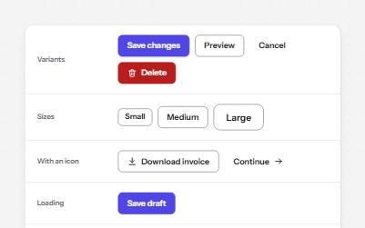
Native buttons in four variants and three sizes, with a loading state that keeps focus and a disabled state that says why.
-
Links that say where they go
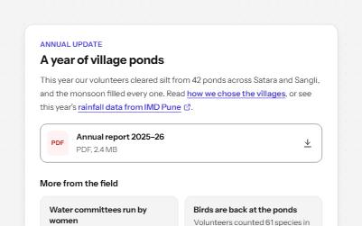
Links whose words say where they go: in text, to another site, to a download, and "Read more" made specific.