Accessibility pattern · Buttons and actions
Button
A real button element brings focus, Enter, Space and the button role with it; the work left is in its states. While it saves, it keeps focus and its width and says so in a status message; when it cannot be used, it stays focusable and says why.
- WCAG criteria
- 7
- Keyboard rules
- 4
- Checked with
- axe, keyboard and the inspector
Live demo
Try it
Use it with a mouse, a keyboard or a screen reader. The inspector beside it shows what the browser tells assistive technology as you go: focus, state changes and announcements.
The demo works without JavaScript only as far as its HTML does; the inspector needs JavaScript.
Keyboard
Keys it answers to
Every action works without a pointer.
| Key | What it does |
|---|---|
| Tab or ShiftTab | Moves through the buttons in order, including Publish while it is unavailable, so its reason can be heard. |
| Enter or Space | Presses the focused button. |
| Enter or Space | On Save draft, starts saving. Focus stays on the button, and presses are ignored until the save is done. |
| Enter or Space | On Publish while it is unavailable, changes nothing and repeats the reason in a status message. |
Screen readers
What it announces
Written from the roles, names and states in the markup.
| When | Expected announcement |
|---|---|
| Focus reaches the danger button | Delete, button |
| Save draft is pressed | Saving |
| The save finishes | Draft saved |
| Focus reaches Publish while it is unavailable | Publish, button, unavailable. Add a cover image to publish. |
| Publish is pressed while unavailable | Not published: add a cover image first. |
| A cover image is added | Cover image added |
These are expected announcements, not recordings. Wording and order differ between screen readers and browsers.
Code
Copy the code
The exact files this demo runs on. The styles are served with a prefix that keeps this site's own styles out of the demo; what you copy is the original.
<div class="ap-button" data-ap-button>
  <div class="ap-button__row">
    <p class="ap-button__k">Variants</p>
    <div class="ap-button__set">
      <button type="button" class="ap-btn ap-btn--primary">Save changes</button>
      <button type="button" class="ap-btn">Preview</button>
      <button type="button" class="ap-btn ap-btn--ghost">Cancel</button>
      <button type="button" class="ap-btn ap-btn--danger">
        <svg class="ap-btn__icon" viewBox="0 0 24 24" aria-hidden="true" focusable="false"><path d="M4 7h16"/><path d="M10 11v6M14 11v6"/><path d="m6 7 1 12a2 2 0 0 0 2 2h6a2 2 0 0 0 2-2l1-12"/><path d="M9 7V4h6v3"/></svg>
        Delete
      </button>
    </div>
  </div>

  <div class="ap-button__row">
    <p class="ap-button__k">Sizes</p>
    <div class="ap-button__set">
      <button type="button" class="ap-btn ap-button--sm">Small</button>
      <button type="button" class="ap-btn">Medium</button>
      <button type="button" class="ap-btn ap-button--lg">Large</button>
    </div>
  </div>

  <div class="ap-button__row">
    <p class="ap-button__k">With an icon</p>
    <div class="ap-button__set">
      <button type="button" class="ap-btn">
        <svg class="ap-btn__icon" viewBox="0 0 24 24" aria-hidden="true" focusable="false"><path d="M12 4v11"/><path d="m7 10 5 5 5-5"/><path d="M5 20h14"/></svg>
        Download invoice
      </button>
      <button type="button" class="ap-btn ap-btn--ghost">
        Continue
        <svg class="ap-btn__icon" viewBox="0 0 24 24" aria-hidden="true" focusable="false"><path d="M5 12h14"/><path d="m13 6 6 6-6 6"/></svg>
      </button>
    </div>
  </div>

  <div class="ap-button__row">
    <p class="ap-button__k">Loading</p>
    <div class="ap-button__set">
      <button type="button" class="ap-btn ap-btn--primary ap-button__save" data-ap-save>
        <span class="ap-button__label">Save draft</span>
        <span class="ap-button__spin" aria-hidden="true"></span>
      </button>
      <p class="ap-button__status" role="status" data-ap-save-status>
        <svg class="ap-button__mark ap-button__mark--done" viewBox="0 0 24 24" aria-hidden="true" focusable="false"><path d="m5 12 5 5L20 7"/></svg>
        <span class="ap-button__text" data-ap-text></span>
      </p>
    </div>
  </div>

  <div class="ap-button__row">
    <p class="ap-button__k">Unavailable</p>
    <div class="ap-button__stack">
      <div class="ap-button__set">
        <button type="button" class="ap-btn ap-btn--primary ap-button__publish" aria-disabled="true" aria-describedby="button-publish-why" data-ap-publish>
          <svg class="ap-btn__icon ap-button__lock" viewBox="0 0 24 24" aria-hidden="true" focusable="false"><rect x="5" y="11" width="14" height="10" rx="2"/><path d="M8 11V8a4 4 0 0 1 8 0v3"/></svg>
          <svg class="ap-btn__icon ap-button__send" viewBox="0 0 24 24" aria-hidden="true" focusable="false"><path d="M12 19V5"/><path d="m5 12 7-7 7 7"/></svg>
          Publish
        </button>
        <button type="button" class="ap-btn" data-ap-cover>
          <svg class="ap-btn__icon" viewBox="0 0 24 24" aria-hidden="true" focusable="false"><rect x="3" y="4" width="18" height="16" rx="2"/><circle cx="9" cy="10" r="2"/><path d="m21 16-5-5L5 20"/></svg>
          <span data-ap-cover-label>Add cover image</span>
        </button>
        <p class="ap-button__status" role="status" data-ap-publish-status>
          <svg class="ap-button__mark ap-button__mark--done" viewBox="0 0 24 24" aria-hidden="true" focusable="false"><path d="m5 12 5 5L20 7"/></svg>
          <svg class="ap-button__mark ap-button__mark--warn" viewBox="0 0 24 24" aria-hidden="true" focusable="false"><path d="M12 4 2.5 20h19Z"/><path d="M12 10v4"/><path d="M12 17h.01"/></svg>
          <span class="ap-button__text" data-ap-text></span>
        </p>
      </div>
      <p class="ap-button__why" id="button-publish-why">
        <svg class="ap-button__mark ap-button__mark--info" viewBox="0 0 24 24" aria-hidden="true" focusable="false"><circle cx="12" cy="12" r="9"/><path d="M12 11v5"/><path d="M12 8h.01"/></svg>
        <svg class="ap-button__mark ap-button__mark--done" viewBox="0 0 24 24" aria-hidden="true" focusable="false"><path d="m5 12 5 5L20 7"/></svg>
        <span data-ap-why-text>Add a cover image to publish.</span>
      </p>
    </div>
  </div>
</div>
/* Shared primitives: buttons and form fields used across the patterns.
   Uses the --ap-* design tokens. */

.ap-btn {
  display: inline-flex;
  align-items: center;
  justify-content: center;
  gap: 8px;
  min-height: 40px;
  padding: 0 16px;
  border: 1px solid var(--ap-border-strong);
  border-radius: var(--ap-radius-sm);
  background: var(--ap-surface);
  color: var(--ap-text);
  font: inherit;
  font-weight: 600;
  line-height: 1.2;
  text-decoration: none;
  white-space: nowrap;
  cursor: pointer;
  transition: background-color var(--ap-duration) var(--ap-ease), border-color var(--ap-duration) var(--ap-ease), box-shadow var(--ap-duration) var(--ap-ease);
}
.ap-btn:hover {
  background: var(--ap-surface-2);
}
.ap-btn:focus-visible {
  outline: 2px solid var(--ap-focus);
  outline-offset: 2px;
}
.ap-btn:disabled,
.ap-btn[aria-disabled="true"] {
  opacity: .55;
  cursor: not-allowed;
}
.ap-btn--primary {
  border-color: var(--ap-accent);
  background: var(--ap-accent);
  color: var(--ap-on-accent);
  box-shadow: var(--ap-shadow-sm);
}
.ap-btn--primary:hover {
  border-color: var(--ap-accent-hover);
  background: var(--ap-accent-hover);
}
.ap-btn--danger {
  border-color: var(--ap-danger);
  background: var(--ap-danger);
  color: var(--ap-surface);
}
.ap-btn--danger:hover {
  filter: brightness(1.08);
}
.ap-btn--ghost {
  border-color: transparent;
  background: transparent;
}
.ap-btn--ghost:hover {
  background: var(--ap-surface-2);
}
.ap-btn__icon {
  width: 18px;
  height: 18px;
  flex-shrink: 0;
  fill: none;
  stroke: currentColor;
  stroke-width: 2;
  stroke-linecap: round;
  stroke-linejoin: round;
}

.ap-field {
  display: grid;
  gap: 6px;
}
.ap-label {
  color: var(--ap-text);
  font-weight: 600;
  font-size: .9375rem;
}
.ap-hint {
  margin: 0;
  color: var(--ap-text-3);
  font-size: .875rem;
  line-height: 1.45;
}
.ap-error {
  display: flex;
  align-items: flex-start;
  gap: 6px;
  margin: 0;
  color: var(--ap-danger);
  font-size: .875rem;
  font-weight: 600;
  line-height: 1.45;
}
.ap-input {
  width: 100%;
  min-height: 44px;
  padding: 10px 12px;
  border: 1px solid var(--ap-border-strong);
  border-radius: var(--ap-radius-sm);
  background: var(--ap-surface);
  color: var(--ap-text);
  font: inherit;
  line-height: 1.4;
  transition: border-color var(--ap-duration) var(--ap-ease), box-shadow var(--ap-duration) var(--ap-ease);
}
.ap-input::placeholder {
  color: var(--ap-text-3);
}
.ap-input:hover {
  border-color: var(--ap-text-2);
}
.ap-input:focus-visible {
  outline: 2px solid var(--ap-focus);
  outline-offset: 1px;
  border-color: var(--ap-focus);
}
.ap-input[aria-invalid="true"] {
  border-color: var(--ap-danger);
  box-shadow: inset 4px 0 0 var(--ap-danger);
}
textarea.ap-input {
  resize: vertical;
  min-height: 88px;
}

@media (prefers-reduced-motion: reduce) {
  .ap-btn,
  .ap-input { transition: none; }
}

/* Button set. Uses the --ap-* design tokens and the shared .ap-btn primitive. */
.ap-button {
  container-type: inline-size;
  width: min(100%, 640px);
  margin-inline: auto;
  border: 1px solid var(--ap-border);
  border-radius: var(--ap-radius-lg);
  background: var(--ap-surface);
  box-shadow: var(--ap-shadow-md);
}

.ap-button__row {
  display: grid;
  grid-template-columns: 128px minmax(0, 1fr);
  align-items: center;
  gap: 10px 20px;
  padding: 18px 22px;
}
.ap-button__row + .ap-button__row {
  border-top: 1px solid var(--ap-border);
}
.ap-button__k {
  margin: 0;
  color: var(--ap-text-3);
  font-size: .8125rem;
  font-weight: 600;
  line-height: 1.35;
}

.ap-button__set {
  display: flex;
  flex-wrap: wrap;
  align-items: center;
  gap: 10px;
}
.ap-button__stack {
  display: grid;
  gap: 10px;
}

/* A press that you can feel, without moving anything around it. */
.ap-button .ap-btn:active:not([aria-disabled="true"]) {
  transform: translateY(1px);
}

/* Sizes: medium is the shared .ap-btn (40px). */
.ap-button--sm {
  min-height: 32px;
  padding: 0 12px;
  font-size: .875rem;
}
.ap-button--lg {
  min-height: 48px;
  padding: 0 22px;
  border-radius: var(--ap-radius);
  font-size: 1.0625rem;
}

/* Loading: the label keeps its place (and the button its width and its
   name); a spinner sits over it. */
.ap-button__save {
  position: relative;
}
.ap-button__label {
  transition: opacity var(--ap-duration) var(--ap-ease);
}
.ap-button__spin {
  position: absolute;
  inset: 0;
  width: 18px;
  height: 18px;
  margin: auto;
  border: 2px solid currentColor;
  border-right-color: transparent;
  border-radius: var(--ap-radius-full);
  opacity: 0;
}
.ap-button__save[aria-busy="true"] {
  opacity: 1;
  cursor: progress;
}
.ap-button__save[aria-busy="true"] .ap-button__label {
  opacity: 0;
}
.ap-button__save[aria-busy="true"] .ap-button__spin {
  opacity: 1;
  animation: ap-button-spin 800ms linear infinite;
}

/* Unavailable, but focusable and explained: muted rather than faded, so the
   label stays readable, with a lock in place of the action icon. */
.ap-button__publish[aria-disabled="true"] {
  border-color: var(--ap-border-strong);
  background: var(--ap-surface-2);
  color: var(--ap-text-3);
  box-shadow: none;
  opacity: 1;
  cursor: not-allowed;
}
.ap-button__publish .ap-button__lock,
.ap-button__publish[aria-disabled="true"] .ap-button__send {
  display: none;
}
.ap-button__publish[aria-disabled="true"] .ap-button__lock {
  display: block;
}

.ap-button__why,
.ap-button__status {
  display: flex;
  align-items: flex-start;
  gap: 6px;
  margin: 0;
  font-size: .875rem;
  line-height: 1.45;
}
.ap-button__why {
  color: var(--ap-text-3);
}
.ap-button__why.is-flagged {
  color: var(--ap-warning);
  font-weight: 600;
}
.ap-button__why.is-ready {
  color: var(--ap-success);
  font-weight: 600;
}
.ap-button__status {
  min-height: 1.45em;
  color: var(--ap-text-2);
  font-weight: 600;
}
.ap-button__status[data-state="done"] {
  color: var(--ap-success);
}
.ap-button__status[data-state="warn"] {
  color: var(--ap-warning);
}

.ap-button__mark {
  display: none;
  flex-shrink: 0;
  width: 16px;
  height: 16px;
  margin-top: 2px;
  fill: none;
  stroke: currentColor;
  stroke-width: 2.25;
  stroke-linecap: round;
  stroke-linejoin: round;
}
.ap-button__why:not(.is-ready) .ap-button__mark--info,
.ap-button__why.is-ready .ap-button__mark--done,
.ap-button__status[data-state="done"] .ap-button__mark--done,
.ap-button__status[data-state="warn"] .ap-button__mark--warn {
  display: block;
}

/* "Saving" is for screen readers; the spinner says it on screen. */
.ap-button__status[data-state="busy"] .ap-button__text {
  position: absolute;
  width: 1px;
  height: 1px;
  margin: -1px;
  padding: 0;
  overflow: hidden;
  clip-path: inset(50%);
  white-space: nowrap;
  border: 0;
}

@container (max-width: 520px) {
  .ap-button__row {
    grid-template-columns: minmax(0, 1fr);
    padding: 16px 18px;
  }
}

@keyframes ap-button-spin {
  to { transform: rotate(360deg); }
}
@keyframes ap-button-pulse {
  50% { opacity: .35; }
}

@media (prefers-reduced-motion: reduce) {
  .ap-button__label { transition: none; }
  .ap-button .ap-btn:active:not([aria-disabled="true"]) { transform: none; }
  /* No spinning: a slow fade still says "working". */
  .ap-button__save[aria-busy="true"] .ap-button__spin {
    border-right-color: currentColor;
    animation: ap-button-pulse 1.6s ease-in-out infinite;
  }
}
/**
 * Button: native buttons with a loading state that keeps focus and an
 * unavailable state that explains itself.
 *
 * Markup: [data-ap-button] holding
 *   button[data-ap-save] and a role=status [data-ap-save-status] beside it;
 *   button[data-ap-publish][aria-disabled="true"][aria-describedby] (the
 *   reason), button[data-ap-cover] that makes it available, and a role=status
 *   [data-ap-publish-status].
 * Each status holds a [data-ap-text] span for the message.
 */

const SAVE_MS = 1400;

export function init(root) {
  const save = root.querySelector("[data-ap-save]");
  const saveStatus = root.querySelector("[data-ap-save-status]");
  const publish = root.querySelector("[data-ap-publish]");
  const publishStatus = root.querySelector("[data-ap-publish-status]");
  const cover = root.querySelector("[data-ap-cover]");
  const coverLabel = cover.querySelector("[data-ap-cover-label]");
  const why = document.getElementById(publish.getAttribute("aria-describedby"));
  const whyText = why.querySelector("[data-ap-why-text]");
  const timers = new Set();

  function later(fn, ms) {
    const t = setTimeout(() => {
      timers.delete(t);
      fn();
    }, ms);
    timers.add(t);
  }

  // Empty the region first, so the same message twice is announced twice.
  function say(region, text, state = "") {
    const out = region.querySelector("[data-ap-text]");
    out.textContent = "";
    region.dataset.state = state;
    later(() => { out.textContent = text; }, 60);
  }

  function startSave() {
    // Already saving: the press is ignored, and focus stays where it is.
    if (save.getAttribute("aria-busy") === "true") return;
    save.setAttribute("aria-busy", "true");
    save.setAttribute("aria-disabled", "true");
    say(saveStatus, "Saving", "busy");
    later(() => {
      save.removeAttribute("aria-busy");
      save.removeAttribute("aria-disabled");
      say(saveStatus, "Draft saved", "done");
    }, SAVE_MS);
  }

  function pressPublish() {
    if (publish.getAttribute("aria-disabled") === "true") {
      why.classList.add("is-flagged");
      say(publishStatus, "Not published: add a cover image first.", "warn");
      return;
    }
    say(publishStatus, "Post published", "done");
  }

  function toggleCover() {
    const adding = publish.getAttribute("aria-disabled") === "true";
    if (adding) publish.removeAttribute("aria-disabled");
    else publish.setAttribute("aria-disabled", "true");
    coverLabel.textContent = adding ? "Remove cover image" : "Add cover image";
    whyText.textContent = adding ? "Ready to publish." : "Add a cover image to publish.";
    why.classList.remove("is-flagged");
    why.classList.toggle("is-ready", adding);
    say(publishStatus, adding ? "Cover image added" : "Cover image removed", adding ? "done" : "");
  }

  function onClick(event) {
    const button = event.target.closest("button");
    if (!button || !root.contains(button)) return;
    if (button === save) startSave();
    else if (button === publish) pressPublish();
    else if (button === cover) toggleCover();
  }

  root.addEventListener("click", onClick);
  return () => {
    for (const t of timers) clearTimeout(t);
    timers.clear();
    root.removeEventListener("click", onClick);
  };
}

for (const root of document.querySelectorAll("[data-ap-button]")) init(root);
/* Design tokens for the pattern components. Light by default, dark when the
   system asks for it; set data-theme="dark" on :root to force dark. */
:root {
    --ap-radius-sm: 8px;
    --ap-radius: 12px;
    --ap-radius-lg: 16px;
    --ap-radius-full: 999px;
    --ap-font: "Instrument Sans", ui-sans-serif, system-ui, -apple-system, "Segoe UI", Roboto, sans-serif;
    --ap-mono: "JetBrains Mono", ui-monospace, "Cascadia Mono", "SF Mono", Consolas, monospace;
    --ap-ease: cubic-bezier(.2, .8, .2, 1);
    --ap-duration: 180ms;
    --ap-target: 44px;
    --ap-bg: #F4F4F5;
    --ap-surface: #FFFFFF;
    --ap-surface-2: #F4F4F5;
    --ap-surface-3: #E4E4E7;
    --ap-border: #E4E4E7;
    --ap-border-strong: #76767F;
    --ap-text: #18181B;
    --ap-text-2: #3F3F46;
    --ap-text-3: #5E5E66;
    --ap-accent: #4F46E5;
    --ap-accent-hover: #4338CA;
    --ap-on-accent: #FFFFFF;
    --ap-accent-text: #4338CA;
    --ap-accent-soft: #EEF2FF;
    --ap-accent-soft-text: #3730A3;
    --ap-focus: #4F46E5;
    --ap-danger: #B91C1C;
    --ap-danger-soft: #FEF2F2;
    --ap-success: #15803D;
    --ap-success-soft: #F0FDF4;
    --ap-warning: #A15C07;
    --ap-warning-soft: #FEFCE8;
    --ap-info: #1D4ED8;
    --ap-info-soft: #EFF6FF;
    --ap-scrim: rgb(9 9 11 / .48);
    --ap-shadow-sm: 0 1px 2px rgb(9 9 11 / .06);
    --ap-shadow-md: 0 1px 2px rgb(9 9 11 / .05), 0 6px 16px -4px rgb(9 9 11 / .1);
    --ap-shadow-lg: 0 2px 6px rgb(9 9 11 / .06), 0 20px 40px -12px rgb(9 9 11 / .22);
    --ap-light-bg: #F4F4F5;
    --ap-light-surface: #FFFFFF;
    --ap-light-surface-2: #F4F4F5;
    --ap-light-surface-3: #E4E4E7;
    --ap-light-border: #E4E4E7;
    --ap-light-border-strong: #76767F;
    --ap-light-text: #18181B;
    --ap-light-text-2: #3F3F46;
    --ap-light-text-3: #5E5E66;
    --ap-light-accent: #4F46E5;
    --ap-light-accent-hover: #4338CA;
    --ap-light-on-accent: #FFFFFF;
    --ap-light-accent-text: #4338CA;
    --ap-light-accent-soft: #EEF2FF;
    --ap-light-accent-soft-text: #3730A3;
    --ap-light-focus: #4F46E5;
    --ap-light-danger: #B91C1C;
    --ap-light-danger-soft: #FEF2F2;
    --ap-light-success: #15803D;
    --ap-light-success-soft: #F0FDF4;
    --ap-light-warning: #A15C07;
    --ap-light-warning-soft: #FEFCE8;
    --ap-light-info: #1D4ED8;
    --ap-light-info-soft: #EFF6FF;
    --ap-light-scrim: rgb(9 9 11 / .48);
    --ap-light-shadow-sm: 0 1px 2px rgb(9 9 11 / .06);
    --ap-light-shadow-md: 0 1px 2px rgb(9 9 11 / .05), 0 6px 16px -4px rgb(9 9 11 / .1);
    --ap-light-shadow-lg: 0 2px 6px rgb(9 9 11 / .06), 0 20px 40px -12px rgb(9 9 11 / .22);
    --ap-dark-bg: #09090B;
    --ap-dark-surface: #18181B;
    --ap-dark-surface-2: #27272A;
    --ap-dark-surface-3: #3F3F46;
    --ap-dark-border: #2E2E33;
    --ap-dark-border-strong: #8E8E97;
    --ap-dark-text: #FAFAFA;
    --ap-dark-text-2: #D4D4D8;
    --ap-dark-text-3: #A1A1AA;
    --ap-dark-accent: #818CF8;
    --ap-dark-accent-hover: #A5B4FC;
    --ap-dark-on-accent: #0C0A1F;
    --ap-dark-accent-text: #A5B4FC;
    --ap-dark-accent-soft: #1E1B4B;
    --ap-dark-accent-soft-text: #C7D2FE;
    --ap-dark-focus: #A5B4FC;
    --ap-dark-danger: #F87171;
    --ap-dark-danger-soft: #2A1215;
    --ap-dark-success: #4ADE80;
    --ap-dark-success-soft: #0F2A1A;
    --ap-dark-warning: #FACC15;
    --ap-dark-warning-soft: #2A2410;
    --ap-dark-info: #60A5FA;
    --ap-dark-info-soft: #0F1D33;
    --ap-dark-scrim: rgb(0 0 0 / .62);
    --ap-dark-shadow-sm: 0 1px 2px rgb(0 0 0 / .4);
    --ap-dark-shadow-md: 0 1px 2px rgb(0 0 0 / .4), 0 8px 20px -6px rgb(0 0 0 / .5);
    --ap-dark-shadow-lg: 0 2px 8px rgb(0 0 0 / .45), 0 24px 48px -12px rgb(0 0 0 / .7);
}
@media (prefers-color-scheme: dark) {
  :root:not([data-theme="light"]) {
      --ap-bg: #09090B;
      --ap-surface: #18181B;
      --ap-surface-2: #27272A;
      --ap-surface-3: #3F3F46;
      --ap-border: #2E2E33;
      --ap-border-strong: #8E8E97;
      --ap-text: #FAFAFA;
      --ap-text-2: #D4D4D8;
      --ap-text-3: #A1A1AA;
      --ap-accent: #818CF8;
      --ap-accent-hover: #A5B4FC;
      --ap-on-accent: #0C0A1F;
      --ap-accent-text: #A5B4FC;
      --ap-accent-soft: #1E1B4B;
      --ap-accent-soft-text: #C7D2FE;
      --ap-focus: #A5B4FC;
      --ap-danger: #F87171;
      --ap-danger-soft: #2A1215;
      --ap-success: #4ADE80;
      --ap-success-soft: #0F2A1A;
      --ap-warning: #FACC15;
      --ap-warning-soft: #2A2410;
      --ap-info: #60A5FA;
      --ap-info-soft: #0F1D33;
      --ap-scrim: rgb(0 0 0 / .62);
      --ap-shadow-sm: 0 1px 2px rgb(0 0 0 / .4);
      --ap-shadow-md: 0 1px 2px rgb(0 0 0 / .4), 0 8px 20px -6px rgb(0 0 0 / .5);
      --ap-shadow-lg: 0 2px 8px rgb(0 0 0 / .45), 0 24px 48px -12px rgb(0 0 0 / .7);
  }
}
:root[data-theme="dark"] {
    --ap-bg: #09090B;
    --ap-surface: #18181B;
    --ap-surface-2: #27272A;
    --ap-surface-3: #3F3F46;
    --ap-border: #2E2E33;
    --ap-border-strong: #8E8E97;
    --ap-text: #FAFAFA;
    --ap-text-2: #D4D4D8;
    --ap-text-3: #A1A1AA;
    --ap-accent: #818CF8;
    --ap-accent-hover: #A5B4FC;
    --ap-on-accent: #0C0A1F;
    --ap-accent-text: #A5B4FC;
    --ap-accent-soft: #1E1B4B;
    --ap-accent-soft-text: #C7D2FE;
    --ap-focus: #A5B4FC;
    --ap-danger: #F87171;
    --ap-danger-soft: #2A1215;
    --ap-success: #4ADE80;
    --ap-success-soft: #0F2A1A;
    --ap-warning: #FACC15;
    --ap-warning-soft: #2A2410;
    --ap-info: #60A5FA;
    --ap-info-soft: #0F1D33;
    --ap-scrim: rgb(0 0 0 / .62);
    --ap-shadow-sm: 0 1px 2px rgb(0 0 0 / .4);
    --ap-shadow-md: 0 1px 2px rgb(0 0 0 / .4), 0 8px 20px -6px rgb(0 0 0 / .5);
    --ap-shadow-lg: 0 2px 8px rgb(0 0 0 / .45), 0 24px 48px -12px rgb(0 0 0 / .7);
}
WCAG 2.2
What it meets
The success criteria this pattern takes care of, and how.
-
1.4.1 Use of Color
Level A
The danger button says Delete and carries a bin icon, and the unavailable button shows a lock, so neither depends on its color.
-
2.1.1 Keyboard
Level A
Every button is a native button element, so Enter and Space press it and Tab reaches it, with no extra script.
-
2.4.7 Focus Visible
Level AA
Each button shows a two-pixel focus ring, offset from its edge so it reads on the filled variants too.
-
2.5.3 Label in Name
Level A
Each name is the visible text, so a speech-input user can say "click Save draft" and it works.
-
2.5.8 Target Size (Minimum)
Level AA
The smallest button is 32 pixels tall, above the 24-pixel minimum; the others are 40 and 48.
-
4.1.2 Name, Role, Value
Level A
Icons are hidden from assistive technology, aria-disabled reports Publish as unavailable, and aria-busy marks the save in progress.
-
4.1.3 Status Messages
Level AA
"Saving", "Draft saved" and the reason Publish is unavailable arrive in status messages, without moving focus.
Usage
When to use it
Use it
- An action on the current page: saving, sending, opening a dialog, deleting.
- Submitting a form; a submit button also lets Enter in a field send it.
Use something else
- Going to another page or address: use a link, which can be opened in a new tab and bookmarked.
- Switching a setting on and off: use a toggle button or a switch, which report their state.
- Several related actions side by side: group them in a toolbar, or behind a menu button.
Common failures
How it usually goes wrong
A div or a link dressed as a button
A div with a click handler gets no focus, no Enter or Space and no role. A link with href="#" is announced as a link and jumps the page. The button element does all of it with no script.
Disabled with no reason
The disabled attribute takes a button out of the Tab order, so keyboard and screen reader users never learn it is there or why it does nothing. aria-disabled keeps it focusable, and a hint tied with aria-describedby says why.
Focus thrown away while loading
Setting disabled during a save drops focus to the top of the page. Here the button keeps focus, ignores presses while it is busy, and a status message says what is happening.
A label that changes width
Swapping the text for "Saving…" resizes the button, so the layout shifts under the pointer. The label stays where it is, made transparent, with a spinner over it.
Danger shown by color alone
A red button that only says "OK" relies on its color to warn. The destructive button here says Delete and carries a bin icon.
Icons read aloud
An SVG without aria-hidden can be announced as "image" or not at all, depending on the browser. Decorative icons are hidden; the text is the name.
Notes
Building it
- Give every button type="button" unless it submits a form: the default type is submit, which sends the form the button sits in.
- aria-disabled does not stop clicks, so the script checks it and returns early. That is the point: the press can explain itself instead of failing silently.
- The busy label is faded with opacity, not visibility: hidden, because hidden text drops out of the accessible name and the focused button would lose its name.
- Support for aria-busy varies between screen readers, so the status message carries the news; aria-busy is a hint on top.
- The small size suits dense tables and toolbars. On touch screens keep primary actions at 44 pixels or more.
Sources: WAI-ARIA Authoring Practices: Button · HTML: the button element
Checked with axe in light and dark themes, at desktop and phone widths, and by keyboard. Not yet tested with every screen reader and browser pair. Report a correction
Related
Patterns that go with it
-
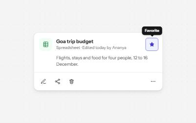
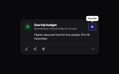
Icon button
Buttons that show only an icon, named with aria-label, 44 pixels square, with a tooltip on hover and focus that repeats the name.
-
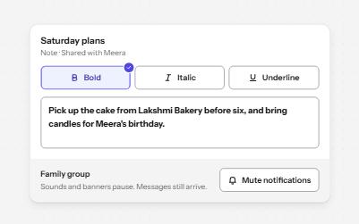
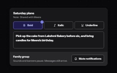
Toggle button
Buttons that stay on or off, like Bold or Mute, with aria-pressed reporting the state while the label stays the same.
-
Split button
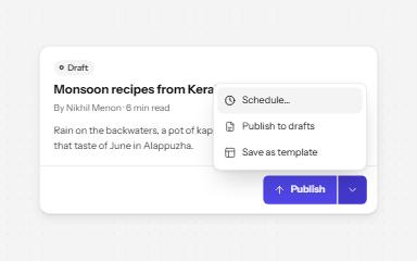
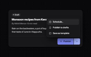
A main action joined to an arrow that opens related options: two buttons, two tab stops, two clear names.
-
Loading state
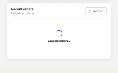
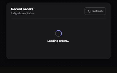
A busy button that keeps focus, a region marked busy while it loads, a spinner with words, and a note when it runs long.