Accessibility pattern · Buttons and actions
Menu button
The button says it opens a menu and whether the menu is open; inside, the arrow keys move between actions and one letter jumps to the action it starts. Choosing an action, pressing Escape or clicking away closes the menu, and focus goes back to the button that opened it.
- WCAG criteria
- 7
- Keyboard rules
- 8
- Checked with
- axe, keyboard and the inspector
Live demo
Try it
Use it with a mouse, a keyboard or a screen reader. The inspector beside it shows what the browser tells assistive technology as you go: focus, state changes and announcements.
The demo works without JavaScript only as far as its HTML does; the inspector needs JavaScript.
Keyboard
Keys it answers to
Every action works without a pointer.
| Key | What it does |
|---|---|
| Enter or Space or Arrow Down | On the button, opens the menu and moves focus to the first action. |
| Arrow Up | On the button, opens the menu at the last action. |
| Arrow Down or Arrow Up | In the menu, moves to the next or previous action, wrapping at the ends. |
| Home or End | Moves to the first or last action. |
| A–Z | Moves to the next action that starts with that letter; press D again to go from Duplicate to Download to Delete. |
| Enter or Space | Runs the focused action, closes the menu and returns focus to the button. |
| Escape | Closes the menu and returns focus to the button. Tab, or a click outside, closes it too. |
| F2 or CtrlD or Delete | Runs Rename, Duplicate or Delete straight away while focus is on the card's button or in its menu. |
Screen readers
What it announces
Written from the roles, names and states in the markup.
| When | Expected announcement |
|---|---|
| Focus reaches the button | Actions, menu button, collapsed |
| Enter opens the menu | Actions, menu. Rename, menu item, F2, 1 of 5 |
| Arrow Down moves on | Duplicate, menu item, Control+D, 2 of 5 |
| An action is chosen | Actions, menu button, collapsed. You chose Duplicate |
These are expected announcements, not recordings. Wording and order differ between screen readers and browsers.
Code
Copy the code
The exact files this demo runs on. The styles are served with a prefix that keeps this site's own styles out of the demo; what you copy is the original.
<div class="ap-menu-button" data-ap-menu-button>
  <div class="ap-menu-button__card">
    <div class="ap-menu-button__top">
      <span class="ap-menu-button__file" aria-hidden="true">
        <svg viewBox="0 0 24 24" focusable="false"><path d="M14 3H7a2 2 0 0 0-2 2v14a2 2 0 0 0 2 2h10a2 2 0 0 0 2-2V8Z"/><path d="M14 3v5h5"/><path d="M9 13h6M9 17h4"/></svg>
      </span>
      <div class="ap-menu-button__about">
        <h3 class="ap-menu-button__name">Q3 sales report.pdf</h3>
        <p class="ap-menu-button__meta">2.4 MB · Edited by Kavya</p>
      </div>
      <div class="ap-menu-button__wrap">
        <button type="button" class="ap-menu-button__trigger" id="menu-button-trigger" aria-haspopup="menu" aria-expanded="false" aria-controls="menu-button-menu">
          <span>Actions</span>
          <svg class="ap-menu-button__chev" viewBox="0 0 24 24" aria-hidden="true" focusable="false"><path d="m6 9 6 6 6-6"/></svg>
        </button>
        <div class="ap-menu-button__menu" role="menu" id="menu-button-menu" aria-labelledby="menu-button-trigger" hidden>
          <button type="button" class="ap-menu-button__item" role="menuitem" tabindex="-1" aria-keyshortcuts="F2" data-ap-action="rename">
            <svg class="ap-menu-button__icon" viewBox="0 0 24 24" aria-hidden="true" focusable="false"><path d="M12 20h9"/><path d="M16.5 3.5a2.1 2.1 0 0 1 3 3L7 19l-4 1 1-4Z"/></svg>
            <span class="ap-menu-button__label">Rename</span>
            <kbd class="ap-menu-button__keys" aria-hidden="true">F2</kbd>
          </button>
          <button type="button" class="ap-menu-button__item" role="menuitem" tabindex="-1" aria-keyshortcuts="Control+D" data-ap-action="duplicate">
            <svg class="ap-menu-button__icon" viewBox="0 0 24 24" aria-hidden="true" focusable="false"><rect x="9" y="9" width="11" height="11" rx="2"/><path d="M5 15V5a2 2 0 0 1 2-2h10"/></svg>
            <span class="ap-menu-button__label">Duplicate</span>
            <kbd class="ap-menu-button__keys" aria-hidden="true">Ctrl+D</kbd>
          </button>
          <button type="button" class="ap-menu-button__item" role="menuitem" tabindex="-1" data-ap-action="share">
            <svg class="ap-menu-button__icon" viewBox="0 0 24 24" aria-hidden="true" focusable="false"><circle cx="18" cy="5" r="3"/><circle cx="6" cy="12" r="3"/><circle cx="18" cy="19" r="3"/><path d="m8.6 13.5 6.8 4M15.4 6.5l-6.8 4"/></svg>
            <span class="ap-menu-button__label">Share</span>
          </button>
          <button type="button" class="ap-menu-button__item" role="menuitem" tabindex="-1" data-ap-action="download">
            <svg class="ap-menu-button__icon" viewBox="0 0 24 24" aria-hidden="true" focusable="false"><path d="M12 4v11"/><path d="m7 10 5 5 5-5"/><path d="M5 20h14"/></svg>
            <span class="ap-menu-button__label">Download</span>
          </button>
          <div class="ap-menu-button__sep" role="separator"></div>
          <button type="button" class="ap-menu-button__item ap-menu-button__item--danger" role="menuitem" tabindex="-1" aria-keyshortcuts="Delete" data-ap-action="delete">
            <svg class="ap-menu-button__icon" viewBox="0 0 24 24" aria-hidden="true" focusable="false"><path d="M4 7h16"/><path d="M10 11v6M14 11v6"/><path d="m6 7 1 12a2 2 0 0 0 2 2h6a2 2 0 0 0 2-2l1-12"/><path d="M9 7V4h6v3"/></svg>
            <span class="ap-menu-button__label">Delete</span>
            <kbd class="ap-menu-button__keys" aria-hidden="true">Del</kbd>
          </button>
        </div>
      </div>
    </div>

    <div class="ap-menu-button__preview" aria-hidden="true">
      <div class="ap-menu-button__page">
        <span class="ap-menu-button__line ap-menu-button__line--lead"></span>
        <span class="ap-menu-button__line"></span>
        <span class="ap-menu-button__line ap-menu-button__line--short"></span>
        <span class="ap-menu-button__bars"><span></span><span></span><span></span><span></span><span></span></span>
        <span class="ap-menu-button__line"></span>
        <span class="ap-menu-button__line ap-menu-button__line--short"></span>
      </div>
    </div>

    <p class="ap-menu-button__status" role="status" data-state="idle">
      <svg class="ap-menu-button__done" viewBox="0 0 24 24" aria-hidden="true" focusable="false"><path d="m5 12 5 5L20 7"/></svg>
      <span data-ap-text>No action chosen yet</span>
    </p>
  </div>
</div>
/* Menu button. Uses the --ap-* design tokens. */
.ap-menu-button {
  container-type: inline-size;
  width: min(100%, 520px);
  margin-inline: auto;
}

.ap-menu-button__card {
  border: 1px solid var(--ap-border);
  border-radius: var(--ap-radius-lg);
  background: var(--ap-surface);
  box-shadow: var(--ap-shadow-md);
}

.ap-menu-button__top {
  display: flex;
  align-items: center;
  gap: 14px;
  padding: 16px 16px 16px 18px;
}
.ap-menu-button__file {
  display: grid;
  place-items: center;
  flex-shrink: 0;
  width: 44px;
  height: 44px;
  border-radius: var(--ap-radius);
  background: var(--ap-danger-soft);
  color: var(--ap-danger);
}
.ap-menu-button__file svg {
  width: 22px;
  height: 22px;
  fill: none;
  stroke: currentColor;
  stroke-width: 1.75;
  stroke-linecap: round;
  stroke-linejoin: round;
}
.ap-menu-button__about {
  flex: 1;
  min-width: 0;
}
.ap-menu-button__name {
  margin: 0;
  color: var(--ap-text);
  font-size: 1rem;
  font-weight: 650;
  line-height: 1.3;
  overflow-wrap: anywhere;
}
.ap-menu-button__meta {
  margin: 2px 0 0;
  color: var(--ap-text-3);
  font-size: .875rem;
}

/* The button and the menu it opens. */
.ap-menu-button__wrap {
  position: relative;
  flex-shrink: 0;
}
.ap-menu-button__trigger {
  display: inline-flex;
  align-items: center;
  gap: 6px;
  min-height: 40px;
  padding: 0 10px 0 14px;
  border: 1px solid var(--ap-border-strong);
  border-radius: var(--ap-radius-sm);
  background: var(--ap-surface);
  color: var(--ap-text);
  font: inherit;
  font-weight: 600;
  cursor: pointer;
  transition: background-color var(--ap-duration) var(--ap-ease);
}
.ap-menu-button__trigger:hover,
.ap-menu-button__trigger[aria-expanded="true"] {
  background: var(--ap-surface-2);
}
.ap-menu-button__trigger:focus-visible {
  outline: 2px solid var(--ap-focus);
  outline-offset: 2px;
}
.ap-menu-button__chev {
  width: 18px;
  height: 18px;
  fill: none;
  stroke: currentColor;
  stroke-width: 2;
  stroke-linecap: round;
  stroke-linejoin: round;
  transition: transform var(--ap-duration) var(--ap-ease);
}
.ap-menu-button__trigger[aria-expanded="true"] .ap-menu-button__chev {
  transform: rotate(180deg);
}

.ap-menu-button__menu {
  position: absolute;
  top: calc(100% + 6px);
  right: 0;
  z-index: 3;
  display: grid;
  width: 236px;
  padding: 6px;
  border: 1px solid var(--ap-border);
  border-radius: var(--ap-radius);
  background: var(--ap-surface);
  box-shadow: var(--ap-shadow-lg);
  transform-origin: top right;
  animation: ap-menu-button-in 140ms var(--ap-ease);
}
.ap-menu-button__menu[hidden] {
  display: none;
}

.ap-menu-button__item {
  display: flex;
  align-items: center;
  gap: 10px;
  min-height: 40px;
  padding: 0 10px;
  border: 0;
  border-radius: var(--ap-radius-sm);
  background: transparent;
  color: var(--ap-text);
  font: inherit;
  font-size: .9375rem;
  text-align: start;
  cursor: pointer;
}
/* One highlight, for the pointer and the keyboard alike: the script focuses
   the item under the pointer. */
.ap-menu-button__item:focus {
  outline: none;
  background: var(--ap-surface-2);
}
.ap-menu-button__item:focus-visible {
  outline: 2px solid var(--ap-focus);
  outline-offset: -2px;
}
.ap-menu-button__icon {
  width: 18px;
  height: 18px;
  flex-shrink: 0;
  fill: none;
  stroke: var(--ap-text-3);
  stroke-width: 2;
  stroke-linecap: round;
  stroke-linejoin: round;
}
.ap-menu-button__item:focus .ap-menu-button__icon {
  stroke: currentColor;
}
.ap-menu-button__label {
  flex: 1;
}
.ap-menu-button__keys {
  color: var(--ap-text-3);
  font-family: var(--ap-mono);
  font-size: .75rem;
  letter-spacing: .02em;
}
.ap-menu-button__item--danger {
  color: var(--ap-danger);
}
.ap-menu-button__item--danger .ap-menu-button__icon {
  stroke: currentColor;
}
.ap-menu-button__item--danger:focus {
  background: var(--ap-danger-soft);
}
.ap-menu-button__sep {
  height: 1px;
  margin: 6px 4px;
  background: var(--ap-border);
}

/* The file's first page, drawn as decoration. */
.ap-menu-button__preview {
  display: grid;
  place-items: center;
  padding: 22px 18px 0;
  border-top: 1px solid var(--ap-border);
  background: var(--ap-surface-2);
  overflow: hidden;
}
.ap-menu-button__page {
  display: grid;
  gap: 9px;
  width: min(100%, 300px);
  padding: 22px 22px 26px;
  border: 1px solid var(--ap-border);
  border-bottom: 0;
  border-radius: var(--ap-radius-sm) var(--ap-radius-sm) 0 0;
  background: var(--ap-surface);
  box-shadow: var(--ap-shadow-sm);
}
.ap-menu-button__line {
  display: block;
  height: 7px;
  border-radius: var(--ap-radius-full);
  background: var(--ap-surface-3);
}
.ap-menu-button__line--lead {
  width: 55%;
  height: 10px;
  margin-bottom: 4px;
  background: var(--ap-text-3);
}
.ap-menu-button__line--short {
  width: 70%;
}
.ap-menu-button__bars {
  display: flex;
  align-items: flex-end;
  gap: 8px;
  height: 64px;
  margin: 6px 0;
  padding: 0 4px;
  border-bottom: 1px solid var(--ap-border);
}
.ap-menu-button__bars span {
  flex: 1;
  border-radius: var(--ap-radius-sm) var(--ap-radius-sm) 0 0;
  background: var(--ap-surface-3);
}
.ap-menu-button__bars span:nth-child(1) { height: 42%; }
.ap-menu-button__bars span:nth-child(2) { height: 60%; }
.ap-menu-button__bars span:nth-child(3) { height: 52%; }
.ap-menu-button__bars span:nth-child(4) { height: 78%; }
.ap-menu-button__bars span:nth-child(5) {
  height: 100%;
  background: var(--ap-accent);
}

.ap-menu-button__status {
  display: flex;
  align-items: center;
  gap: 8px;
  min-height: 52px;
  margin: 0;
  padding: 12px 18px;
  border-top: 1px solid var(--ap-border);
  color: var(--ap-success);
  font-size: .9375rem;
  font-weight: 600;
}
.ap-menu-button__status[data-state="idle"] {
  color: var(--ap-text-3);
  font-weight: 400;
}
.ap-menu-button__done {
  width: 18px;
  height: 18px;
  flex-shrink: 0;
  fill: none;
  stroke: currentColor;
  stroke-width: 2.25;
  stroke-linecap: round;
  stroke-linejoin: round;
}
.ap-menu-button__status[data-state="idle"] .ap-menu-button__done {
  display: none;
}

/* Narrow: the file tile is decoration, so it gives its room to the name. */
@container (max-width: 400px) {
  .ap-menu-button__file { display: none; }
  .ap-menu-button__top { padding-left: 16px; }
}

@keyframes ap-menu-button-in {
  from { opacity: 0; transform: translateY(-4px) scale(.98); }
}

@media (prefers-reduced-motion: reduce) {
  .ap-menu-button__trigger,
  .ap-menu-button__chev { transition: none; }
  .ap-menu-button__menu { animation: none; }
}
/**
 * Menu button: a button that opens a role=menu of actions.
 *
 * Markup: [data-ap-menu-button] holding button[aria-haspopup=menu]
 * [aria-expanded][aria-controls], the div[role=menu][hidden] it controls
 * with button[role=menuitem][tabindex=-1][data-ap-action] items (and an
 * optional role=separator), and a role=status paragraph with a
 * [data-ap-text] span. Items with aria-keyshortcuts also run from the
 * keyboard while focus is inside the root.
 */

const SAYS = {
  rename: "You chose Rename",
  duplicate: "You chose Duplicate",
  share: "You chose Share",
  download: "You chose Download",
  delete: "You chose Delete",
};

export function init(root) {
  const trigger = root.querySelector("[aria-haspopup=menu]");
  const menu = document.getElementById(trigger.getAttribute("aria-controls"));
  const items = [...menu.querySelectorAll("[role=menuitem]")];
  const status = root.querySelector("[role=status]");
  const statusText = status.querySelector("[data-ap-text]");
  let outside = null;
  let sayTimer = 0;

  const isOpen = () => trigger.getAttribute("aria-expanded") === "true";
  const labelOf = (item) => item.querySelector(".ap-menu-button__label").textContent.trim();

  function open(at = 0) {
    if (!isOpen()) {
      menu.hidden = false;
      trigger.setAttribute("aria-expanded", "true");
      // A press anywhere else on the page closes the menu.
      outside = new AbortController();
      document.addEventListener("pointerdown", (event) => {
        if (!root.contains(event.target)) close(false);
      }, { signal: outside.signal });
    }
    items[at < 0 ? items.length - 1 : at].focus();
  }

  function close(returnFocus = true) {
    if (!isOpen()) return;
    menu.hidden = true;
    trigger.setAttribute("aria-expanded", "false");
    outside?.abort();
    outside = null;
    if (returnFocus) trigger.focus();
  }

  function run(action) {
    statusText.textContent = "";
    status.dataset.state = "done";
    clearTimeout(sayTimer);
    sayTimer = setTimeout(() => { statusText.textContent = SAYS[action]; }, 60);
  }

  // The next item after `from` whose label starts with `char`, wrapping.
  function typeahead(char, from) {
    const c = char.toLocaleLowerCase();
    for (let k = 1; k <= items.length; k++) {
      const item = items[(from + k) % items.length];
      if (labelOf(item).toLocaleLowerCase().startsWith(c)) return item;
    }
    return null;
  }

  function shortcut(event) {
    const plain = !event.ctrlKey && !event.metaKey && !event.altKey && !event.shiftKey;
    if (event.key === "F2" && plain) return "rename";
    if (event.key === "Delete" && plain) return "delete";
    if ((event.ctrlKey || event.metaKey) && !event.altKey && !event.shiftKey && event.key.toLowerCase() === "d") return "duplicate";
    return null;
  }

  function onKeydown(event) {
    const action = shortcut(event);
    if (action) {
      event.preventDefault();
      close();
      run(action);
      return;
    }

    if (event.target === trigger) {
      if (event.key === "ArrowDown") {
        event.preventDefault();
        open(0);
      } else if (event.key === "ArrowUp") {
        event.preventDefault();
        open(-1);
      }
      return;
    }

    const at = items.indexOf(event.target);
    if (at === -1) return;
    let next = null;
    switch (event.key) {
      case "ArrowDown": next = items[(at + 1) % items.length]; break;
      case "ArrowUp": next = items[(at - 1 + items.length) % items.length]; break;
      case "Home": case "PageUp": next = items[0]; break;
      case "End": case "PageDown": next = items[items.length - 1]; break;
      case "Escape":
        event.preventDefault();
        close();
        return;
      case "Tab":
        // Leave from the button, so Tab goes on to whatever follows it.
        close();
        if (event.shiftKey) event.preventDefault();
        return;
      default:
        if (event.key.length === 1 && /\S/.test(event.key) && !event.ctrlKey && !event.metaKey && !event.altKey) {
          event.preventDefault();
          next = typeahead(event.key, at);
        }
    }
    if (next) {
      event.preventDefault();
      next.focus();
    }
  }

  function onClick(event) {
    if (event.target.closest("[aria-haspopup=menu]") === trigger) {
      if (isOpen()) close();
      else open(0);
      return;
    }
    const item = event.target.closest("[role=menuitem]");
    if (item && items.includes(item)) {
      close();
      run(item.dataset.apAction);
    }
  }

  // The pointer and the keyboard share one highlight: focus follows the mouse.
  function onPointerMove(event) {
    const item = event.target.closest("[role=menuitem]");
    if (item && document.activeElement !== item) item.focus();
  }

  // Focus moved somewhere outside (a click on another control, say).
  function onFocusOut(event) {
    if (isOpen() && event.relatedTarget && !root.contains(event.relatedTarget)) close(false);
  }

  root.addEventListener("keydown", onKeydown);
  root.addEventListener("click", onClick);
  root.addEventListener("focusout", onFocusOut);
  menu.addEventListener("pointermove", onPointerMove);

  return () => {
    outside?.abort();
    clearTimeout(sayTimer);
    root.removeEventListener("keydown", onKeydown);
    root.removeEventListener("click", onClick);
    root.removeEventListener("focusout", onFocusOut);
    menu.removeEventListener("pointermove", onPointerMove);
  };
}

for (const root of document.querySelectorAll("[data-ap-menu-button]")) init(root);
/* Design tokens for the pattern components. Light by default, dark when the
   system asks for it; set data-theme="dark" on :root to force dark. */
:root {
    --ap-radius-sm: 8px;
    --ap-radius: 12px;
    --ap-radius-lg: 16px;
    --ap-radius-full: 999px;
    --ap-font: "Instrument Sans", ui-sans-serif, system-ui, -apple-system, "Segoe UI", Roboto, sans-serif;
    --ap-mono: "JetBrains Mono", ui-monospace, "Cascadia Mono", "SF Mono", Consolas, monospace;
    --ap-ease: cubic-bezier(.2, .8, .2, 1);
    --ap-duration: 180ms;
    --ap-target: 44px;
    --ap-bg: #F4F4F5;
    --ap-surface: #FFFFFF;
    --ap-surface-2: #F4F4F5;
    --ap-surface-3: #E4E4E7;
    --ap-border: #E4E4E7;
    --ap-border-strong: #76767F;
    --ap-text: #18181B;
    --ap-text-2: #3F3F46;
    --ap-text-3: #5E5E66;
    --ap-accent: #4F46E5;
    --ap-accent-hover: #4338CA;
    --ap-on-accent: #FFFFFF;
    --ap-accent-text: #4338CA;
    --ap-accent-soft: #EEF2FF;
    --ap-accent-soft-text: #3730A3;
    --ap-focus: #4F46E5;
    --ap-danger: #B91C1C;
    --ap-danger-soft: #FEF2F2;
    --ap-success: #15803D;
    --ap-success-soft: #F0FDF4;
    --ap-warning: #A15C07;
    --ap-warning-soft: #FEFCE8;
    --ap-info: #1D4ED8;
    --ap-info-soft: #EFF6FF;
    --ap-scrim: rgb(9 9 11 / .48);
    --ap-shadow-sm: 0 1px 2px rgb(9 9 11 / .06);
    --ap-shadow-md: 0 1px 2px rgb(9 9 11 / .05), 0 6px 16px -4px rgb(9 9 11 / .1);
    --ap-shadow-lg: 0 2px 6px rgb(9 9 11 / .06), 0 20px 40px -12px rgb(9 9 11 / .22);
    --ap-light-bg: #F4F4F5;
    --ap-light-surface: #FFFFFF;
    --ap-light-surface-2: #F4F4F5;
    --ap-light-surface-3: #E4E4E7;
    --ap-light-border: #E4E4E7;
    --ap-light-border-strong: #76767F;
    --ap-light-text: #18181B;
    --ap-light-text-2: #3F3F46;
    --ap-light-text-3: #5E5E66;
    --ap-light-accent: #4F46E5;
    --ap-light-accent-hover: #4338CA;
    --ap-light-on-accent: #FFFFFF;
    --ap-light-accent-text: #4338CA;
    --ap-light-accent-soft: #EEF2FF;
    --ap-light-accent-soft-text: #3730A3;
    --ap-light-focus: #4F46E5;
    --ap-light-danger: #B91C1C;
    --ap-light-danger-soft: #FEF2F2;
    --ap-light-success: #15803D;
    --ap-light-success-soft: #F0FDF4;
    --ap-light-warning: #A15C07;
    --ap-light-warning-soft: #FEFCE8;
    --ap-light-info: #1D4ED8;
    --ap-light-info-soft: #EFF6FF;
    --ap-light-scrim: rgb(9 9 11 / .48);
    --ap-light-shadow-sm: 0 1px 2px rgb(9 9 11 / .06);
    --ap-light-shadow-md: 0 1px 2px rgb(9 9 11 / .05), 0 6px 16px -4px rgb(9 9 11 / .1);
    --ap-light-shadow-lg: 0 2px 6px rgb(9 9 11 / .06), 0 20px 40px -12px rgb(9 9 11 / .22);
    --ap-dark-bg: #09090B;
    --ap-dark-surface: #18181B;
    --ap-dark-surface-2: #27272A;
    --ap-dark-surface-3: #3F3F46;
    --ap-dark-border: #2E2E33;
    --ap-dark-border-strong: #8E8E97;
    --ap-dark-text: #FAFAFA;
    --ap-dark-text-2: #D4D4D8;
    --ap-dark-text-3: #A1A1AA;
    --ap-dark-accent: #818CF8;
    --ap-dark-accent-hover: #A5B4FC;
    --ap-dark-on-accent: #0C0A1F;
    --ap-dark-accent-text: #A5B4FC;
    --ap-dark-accent-soft: #1E1B4B;
    --ap-dark-accent-soft-text: #C7D2FE;
    --ap-dark-focus: #A5B4FC;
    --ap-dark-danger: #F87171;
    --ap-dark-danger-soft: #2A1215;
    --ap-dark-success: #4ADE80;
    --ap-dark-success-soft: #0F2A1A;
    --ap-dark-warning: #FACC15;
    --ap-dark-warning-soft: #2A2410;
    --ap-dark-info: #60A5FA;
    --ap-dark-info-soft: #0F1D33;
    --ap-dark-scrim: rgb(0 0 0 / .62);
    --ap-dark-shadow-sm: 0 1px 2px rgb(0 0 0 / .4);
    --ap-dark-shadow-md: 0 1px 2px rgb(0 0 0 / .4), 0 8px 20px -6px rgb(0 0 0 / .5);
    --ap-dark-shadow-lg: 0 2px 8px rgb(0 0 0 / .45), 0 24px 48px -12px rgb(0 0 0 / .7);
}
@media (prefers-color-scheme: dark) {
  :root:not([data-theme="light"]) {
      --ap-bg: #09090B;
      --ap-surface: #18181B;
      --ap-surface-2: #27272A;
      --ap-surface-3: #3F3F46;
      --ap-border: #2E2E33;
      --ap-border-strong: #8E8E97;
      --ap-text: #FAFAFA;
      --ap-text-2: #D4D4D8;
      --ap-text-3: #A1A1AA;
      --ap-accent: #818CF8;
      --ap-accent-hover: #A5B4FC;
      --ap-on-accent: #0C0A1F;
      --ap-accent-text: #A5B4FC;
      --ap-accent-soft: #1E1B4B;
      --ap-accent-soft-text: #C7D2FE;
      --ap-focus: #A5B4FC;
      --ap-danger: #F87171;
      --ap-danger-soft: #2A1215;
      --ap-success: #4ADE80;
      --ap-success-soft: #0F2A1A;
      --ap-warning: #FACC15;
      --ap-warning-soft: #2A2410;
      --ap-info: #60A5FA;
      --ap-info-soft: #0F1D33;
      --ap-scrim: rgb(0 0 0 / .62);
      --ap-shadow-sm: 0 1px 2px rgb(0 0 0 / .4);
      --ap-shadow-md: 0 1px 2px rgb(0 0 0 / .4), 0 8px 20px -6px rgb(0 0 0 / .5);
      --ap-shadow-lg: 0 2px 8px rgb(0 0 0 / .45), 0 24px 48px -12px rgb(0 0 0 / .7);
  }
}
:root[data-theme="dark"] {
    --ap-bg: #09090B;
    --ap-surface: #18181B;
    --ap-surface-2: #27272A;
    --ap-surface-3: #3F3F46;
    --ap-border: #2E2E33;
    --ap-border-strong: #8E8E97;
    --ap-text: #FAFAFA;
    --ap-text-2: #D4D4D8;
    --ap-text-3: #A1A1AA;
    --ap-accent: #818CF8;
    --ap-accent-hover: #A5B4FC;
    --ap-on-accent: #0C0A1F;
    --ap-accent-text: #A5B4FC;
    --ap-accent-soft: #1E1B4B;
    --ap-accent-soft-text: #C7D2FE;
    --ap-focus: #A5B4FC;
    --ap-danger: #F87171;
    --ap-danger-soft: #2A1215;
    --ap-success: #4ADE80;
    --ap-success-soft: #0F2A1A;
    --ap-warning: #FACC15;
    --ap-warning-soft: #2A2410;
    --ap-info: #60A5FA;
    --ap-info-soft: #0F1D33;
    --ap-scrim: rgb(0 0 0 / .62);
    --ap-shadow-sm: 0 1px 2px rgb(0 0 0 / .4);
    --ap-shadow-md: 0 1px 2px rgb(0 0 0 / .4), 0 8px 20px -6px rgb(0 0 0 / .5);
    --ap-shadow-lg: 0 2px 8px rgb(0 0 0 / .45), 0 24px 48px -12px rgb(0 0 0 / .7);
}
WCAG 2.2
What it meets
The success criteria this pattern takes care of, and how.
-
1.3.1 Info and Relationships
Level A
The menu, its items and the separator have roles, so the grouping and the destructive action's place at the end are exposed, not just drawn.
-
1.4.1 Use of Color
Level A
Delete is set apart by a separator and a bin icon, not only by its red text.
-
2.1.1 Keyboard
Level A
Opening, moving, choosing and closing all work from the keyboard, and the shortcuts shown in the menu really work.
-
2.4.3 Focus Order
Level A
Focus moves into the menu when it opens and back to the button when it closes, so it is never lost.
-
2.4.7 Focus Visible
Level AA
The focused action is marked with a fill and a ring, and the button shows a ring when it has focus.
-
4.1.2 Name, Role, Value
Level A
aria-haspopup and aria-expanded say the button opens a menu and whether it is open; each action is a menuitem with aria-keyshortcuts.
-
4.1.3 Status Messages
Level AA
The result of an action is announced in a status message after focus returns to the button.
Usage
When to use it
Use it
- A handful of actions on one object, like a file or a row, that would crowd the screen as separate buttons.
- Actions people use now and then, where a click to reveal them is a fair price for the space saved.
Use something else
- Navigation between pages: use a disclosure with a list of links, not role=menu.
- Choosing a value for a form field: use a select or a listbox.
- One or two actions: show them as buttons.
Common failures
How it usually goes wrong
role=menu for site navigation
A menu tells screen readers to expect application keys, not links. For a list of pages, a button that shows and hides a list of links is the right pattern.
Focus left on the button
If the menu opens but focus stays behind, arrow keys scroll the page instead. Focus moves to the first action when the menu opens.
Every item in the Tab order
Tabbing through ten menu items is slow, and Tab is how people leave a menu. Items here are reached with arrow keys; Tab closes the menu.
Focus lost when the menu closes
Hiding the menu while an item has focus drops focus to the top of the page. Escape, an action or a click outside sends it back to the button.
Shortcut hints that do nothing
Showing Ctrl+D beside an action promises it works. The shortcuts here run the action, and aria-keyshortcuts exposes them to assistive technology.
A danger item mixed in with the rest
Delete in the middle of the list, distinguished only by color, is easy to hit by mistake. It sits last, after a separator, with its own icon.
Notes
Building it
- Keep the menu's items as buttons with role=menuitem and tabindex=-1: Enter and Space press them natively, and only the arrow keys move between them.
- The menu is named by its button with aria-labelledby, so opening it announces "Actions, menu".
- The shortcut hints are aria-hidden because aria-keyshortcuts already exposes them; without that attribute, leave the hints readable.
- Moving the mouse over an action focuses it, so a single highlight follows both the pointer and the keyboard.
- Typeahead compares the visible label, so it keeps working when the page is translated.
Sources: WAI-ARIA Authoring Practices: Menu Button · WAI-ARIA Authoring Practices: Menu and Menubar
Checked with axe in light and dark themes, at desktop and phone widths, and by keyboard. Not yet tested with every screen reader and browser pair. Report a correction
Related
Patterns that go with it
-
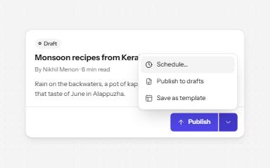
Split button
A main action joined to an arrow that opens related options: two buttons, two tab stops, two clear names.
-
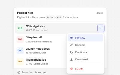
Context menu
A menu of actions for one item, opened by right-click, Shift+F10 or the Menu key, and always by a visible button too.
-
Toolbar
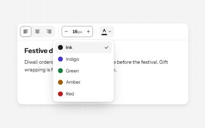
A named row of controls that is one stop in the Tab order, with arrow keys moving between alignment, size and color.
-
Command palette
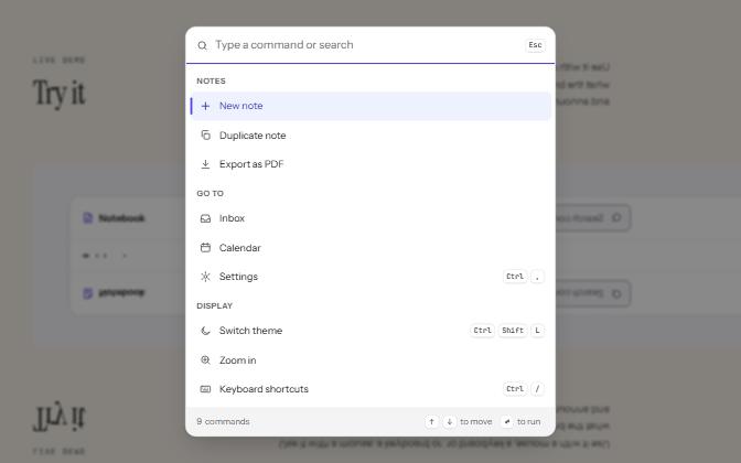
A searchable list of commands, opened with Ctrl+K or a button, that filters as you type and runs the highlighted one.