Accessibility pattern · Buttons and actions
Toggle button
A toggle button is an ordinary button with aria-pressed: its name says what it does, and the pressed state says whether it is on. The label never changes. The fill, a check mark and the icon show the state on screen; aria-pressed says it to assistive technology.
- WCAG criteria
- 6
- Keyboard rules
- 3
- Checked with
- axe, keyboard and the inspector
Live demo
Try it
Use it with a mouse, a keyboard or a screen reader. The inspector beside it shows what the browser tells assistive technology as you go: focus, state changes and announcements.
The demo works without JavaScript only as far as its HTML does; the inspector needs JavaScript.
Keyboard
Keys it answers to
Every action works without a pointer.
| Key | What it does |
|---|---|
| Tab or ShiftTab | Moves between Bold, Italic, Underline, the note and Mute notifications. |
| Enter or Space | Switches the focused toggle on or off. The note takes or drops the style at once. |
| CtrlB or CtrlI or CtrlU | In the note, presses Bold, Italic or Underline without leaving the text; a status message says what changed. |
Screen readers
What it announces
Written from the roles, names and states in the markup.
| When | Expected announcement |
|---|---|
| Focus reaches Bold | Bold, toggle button, not pressed |
| Space presses it | Pressed |
| Ctrl+I is pressed in the note | Italic on |
| Focus reaches the mute button | Mute notifications, toggle button, not pressed. Sounds and banners pause. Messages still arrive. |
| Enter presses it | Pressed (the name stays Mute notifications) |
These are expected announcements, not recordings. Wording and order differ between screen readers and browsers.
Code
Copy the code
The exact files this demo runs on. The styles are served with a prefix that keeps this site's own styles out of the demo; what you copy is the original.
<div class="ap-toggle-button" data-ap-toggle-button>
  <div class="ap-toggle-button__top">
    <h3 class="ap-toggle-button__name" id="toggle-button-note-name">Saturday plans</h3>
    <p class="ap-toggle-button__meta">Note · Shared with Meera</p>
  </div>

  <div class="ap-toggle-button__strip" role="group" aria-label="Note style">
    <button type="button" class="ap-toggle-button__btn" aria-pressed="false" aria-keyshortcuts="Control+B" data-ap-style="bold">
      <svg class="ap-toggle-button__icon" viewBox="0 0 24 24" aria-hidden="true" focusable="false"><path d="M7 5h6a3.5 3.5 0 0 1 0 7H7Z"/><path d="M7 12h7a3.5 3.5 0 0 1 0 7H7Z"/></svg>
      <span>Bold</span>
      <svg class="ap-toggle-button__tick" viewBox="0 0 24 24" aria-hidden="true" focusable="false"><path d="m6 12.5 4 4 8-9"/></svg>
    </button>
    <button type="button" class="ap-toggle-button__btn" aria-pressed="false" aria-keyshortcuts="Control+I" data-ap-style="italic">
      <svg class="ap-toggle-button__icon" viewBox="0 0 24 24" aria-hidden="true" focusable="false"><path d="M10 5h8M6 19h8M14 5l-4 14"/></svg>
      <span>Italic</span>
      <svg class="ap-toggle-button__tick" viewBox="0 0 24 24" aria-hidden="true" focusable="false"><path d="m6 12.5 4 4 8-9"/></svg>
    </button>
    <button type="button" class="ap-toggle-button__btn" aria-pressed="false" aria-keyshortcuts="Control+U" data-ap-style="underline">
      <svg class="ap-toggle-button__icon" viewBox="0 0 24 24" aria-hidden="true" focusable="false"><path d="M7 4v7a5 5 0 0 0 10 0V4"/><path d="M5 20h14"/></svg>
      <span>Underline</span>
      <svg class="ap-toggle-button__tick" viewBox="0 0 24 24" aria-hidden="true" focusable="false"><path d="m6 12.5 4 4 8-9"/></svg>
    </button>
  </div>

  <div class="ap-toggle-button__note" id="toggle-button-note" role="textbox" aria-multiline="true" aria-labelledby="toggle-button-note-name" contenteditable="plaintext-only" spellcheck="false" data-ap-note>Pick up the cake from Lakshmi Bakery before six, and bring candles for Meera's birthday.</div>
  <p class="ap-toggle-button__sr" role="status" data-ap-status></p>

  <div class="ap-toggle-button__setting">
    <div class="ap-toggle-button__copy">
      <p class="ap-toggle-button__k">Family group</p>
      <p class="ap-toggle-button__hint" id="toggle-button-mute-hint">Sounds and banners pause. Messages still arrive.</p>
    </div>
    <button type="button" class="ap-toggle-button__btn ap-toggle-button__mute" aria-pressed="false" aria-describedby="toggle-button-mute-hint">
      <svg class="ap-toggle-button__icon ap-toggle-button__bell" viewBox="0 0 24 24" aria-hidden="true" focusable="false"><path d="M6 16v-5a6 6 0 0 1 12 0v5l1.5 2h-15Z"/><path d="M10 20.5a2 2 0 0 0 4 0"/></svg>
      <svg class="ap-toggle-button__icon ap-toggle-button__bell-off" viewBox="0 0 24 24" aria-hidden="true" focusable="false"><path d="M8.6 5.6A6 6 0 0 1 18 11v4"/><path d="M6 11v5l-1.5 2H17"/><path d="M10 20.5a2 2 0 0 0 4 0"/><path d="m4 4 16 16"/></svg>
      <span>Mute notifications</span>
    </button>
  </div>
</div>
/* Toggle buttons. Uses the --ap-* design tokens. */
.ap-toggle-button {
  container-type: inline-size;
  width: min(100%, 560px);
  margin-inline: auto;
  border: 1px solid var(--ap-border);
  border-radius: var(--ap-radius-lg);
  background: var(--ap-surface);
  box-shadow: var(--ap-shadow-md);
}

.ap-toggle-button__top {
  padding: 18px 20px 0;
}
.ap-toggle-button__name {
  margin: 0;
  color: var(--ap-text);
  font-size: 1.0625rem;
  font-weight: 650;
  line-height: 1.3;
}
.ap-toggle-button__meta {
  margin: 2px 0 0;
  color: var(--ap-text-3);
  font-size: .875rem;
}

.ap-toggle-button__strip {
  display: flex;
  flex-wrap: wrap;
  gap: 8px;
  padding: 14px 20px 0;
}

/* The toggle: an outlined button that fills and gains a check when pressed. */
.ap-toggle-button__btn {
  position: relative;
  display: inline-flex;
  align-items: center;
  justify-content: center;
  gap: 8px;
  min-height: var(--ap-target);
  padding: 0 14px;
  border: 1px solid var(--ap-border-strong);
  border-radius: var(--ap-radius-sm);
  background: var(--ap-surface);
  color: var(--ap-text);
  font: inherit;
  font-weight: 600;
  line-height: 1.2;
  white-space: nowrap;
  cursor: pointer;
  transition: background-color var(--ap-duration) var(--ap-ease), border-color var(--ap-duration) var(--ap-ease), box-shadow var(--ap-duration) var(--ap-ease);
}
.ap-toggle-button__strip .ap-toggle-button__btn {
  flex: 1 1 0;
}
.ap-toggle-button__btn:hover {
  background: var(--ap-surface-2);
}
.ap-toggle-button__btn:focus-visible {
  outline: 2px solid var(--ap-focus);
  outline-offset: 2px;
}
.ap-toggle-button__btn[aria-pressed="true"] {
  border-color: var(--ap-accent);
  background: var(--ap-accent-soft);
  color: var(--ap-accent-soft-text);
  box-shadow: inset 0 0 0 1px var(--ap-accent);
}

.ap-toggle-button__icon {
  width: 18px;
  height: 18px;
  flex-shrink: 0;
  fill: none;
  stroke: currentColor;
  stroke-width: 2.25;
  stroke-linecap: round;
  stroke-linejoin: round;
}

/* The check: a badge on the corner, so pressing never changes the width. */
.ap-toggle-button__tick {
  position: absolute;
  top: -7px;
  right: -7px;
  width: 18px;
  height: 18px;
  padding: 3px;
  border-radius: var(--ap-radius-full);
  background: var(--ap-accent);
  box-shadow: 0 0 0 2px var(--ap-surface);
  fill: none;
  stroke: var(--ap-on-accent);
  stroke-width: 3;
  stroke-linecap: round;
  stroke-linejoin: round;
  opacity: 0;
  transform: scale(.6);
  transition: opacity var(--ap-duration) var(--ap-ease), transform var(--ap-duration) var(--ap-ease);
}
.ap-toggle-button__btn[aria-pressed="true"] .ap-toggle-button__tick {
  opacity: 1;
  transform: none;
}

/* The note the buttons format. */
.ap-toggle-button__note {
  min-height: 96px;
  margin: 14px 20px 20px;
  padding: 12px 14px;
  border: 1px solid var(--ap-border-strong);
  border-radius: var(--ap-radius-sm);
  background: var(--ap-surface);
  color: var(--ap-text);
  font-size: 1rem;
  line-height: 1.6;
  white-space: pre-wrap;
  overflow-wrap: anywhere;
  cursor: text;
}
.ap-toggle-button__note:focus-visible {
  outline: 2px solid var(--ap-focus);
  outline-offset: 1px;
  border-color: var(--ap-focus);
}
.ap-toggle-button__note.is-bold { font-weight: 700; }
.ap-toggle-button__note.is-italic { font-style: italic; }
.ap-toggle-button__note.is-underline {
  text-decoration: underline;
  text-decoration-thickness: 1.5px;
  text-underline-offset: 3px;
}

/* Mute: the same toggle with a label; the bell is crossed out when pressed. */
.ap-toggle-button__setting {
  display: flex;
  flex-wrap: wrap;
  align-items: center;
  justify-content: space-between;
  gap: 12px 16px;
  padding: 16px 20px 18px;
  border-top: 1px solid var(--ap-border);
  background: var(--ap-surface-2);
  border-radius: 0 0 var(--ap-radius-lg) var(--ap-radius-lg);
}
.ap-toggle-button__copy {
  flex: 1 1 180px;
  min-width: 0;
}
.ap-toggle-button__k {
  margin: 0;
  color: var(--ap-text);
  font-weight: 600;
}
.ap-toggle-button__hint {
  margin: 2px 0 0;
  color: var(--ap-text-3);
  font-size: .875rem;
  line-height: 1.45;
}
.ap-toggle-button__bell-off,
.ap-toggle-button__mute[aria-pressed="true"] .ap-toggle-button__bell {
  display: none;
}
.ap-toggle-button__mute[aria-pressed="true"] .ap-toggle-button__bell-off {
  display: block;
}

.ap-toggle-button__sr {
  position: absolute;
  width: 1px;
  height: 1px;
  margin: -1px;
  padding: 0;
  overflow: hidden;
  clip-path: inset(50%);
  white-space: nowrap;
  border: 0;
}

/* Narrow: the three style buttons stay on one row, icon over label. */
@container (max-width: 420px) {
  .ap-toggle-button__strip {
    gap: 6px;
    padding-inline: 16px;
  }
  .ap-toggle-button__strip .ap-toggle-button__btn {
    flex-direction: column;
    gap: 2px;
    min-height: 56px;
    padding: 6px 4px;
    font-size: .8125rem;
  }
  .ap-toggle-button__top { padding-inline: 16px; }
  .ap-toggle-button__note { margin-inline: 16px; }
  .ap-toggle-button__setting { padding-inline: 16px; }
}

@media (prefers-reduced-motion: reduce) {
  .ap-toggle-button__btn,
  .ap-toggle-button__tick { transition: none; }
}
/**
 * Toggle buttons: buttons with aria-pressed whose label never changes.
 *
 * Markup: [data-ap-toggle-button] holding buttons with aria-pressed. A button
 * with data-ap-style="bold|italic|underline" also sets class is-<style> on
 * the [data-ap-note] text box, and Ctrl+B / Ctrl+I / Ctrl+U (or Cmd on a
 * Mac) press it from anywhere in the root. A visually hidden role=status
 * [data-ap-status] reports what a shortcut changed.
 */

const KEYS = { b: "bold", i: "italic", u: "underline" };
const SAYS = {
  bold: ["Bold on", "Bold off"],
  italic: ["Italic on", "Italic off"],
  underline: ["Underline on", "Underline off"],
};

export function init(root) {
  const note = root.querySelector("[data-ap-note]");
  const status = root.querySelector("[data-ap-status]");
  let sayTimer = 0;

  function toggle(button) {
    const on = button.getAttribute("aria-pressed") !== "true";
    button.setAttribute("aria-pressed", String(on));
    const style = button.dataset.apStyle;
    if (style && note) note.classList.toggle(`is-${style}`, on);
    return on;
  }

  function onClick(event) {
    const button = event.target.closest("button[aria-pressed]");
    if (button && root.contains(button)) toggle(button);
  }

  function onKeydown(event) {
    if (!(event.ctrlKey || event.metaKey) || event.altKey || event.shiftKey) return;
    const style = KEYS[event.key.toLowerCase()];
    const button = style && root.querySelector(`[data-ap-style="${style}"]`);
    if (!button) return;
    // Ours, not the browser's (Ctrl+U is "view source" in some browsers).
    event.preventDefault();
    const on = toggle(button);
    // Focus is elsewhere, so the button's own state change goes unheard.
    status.textContent = "";
    clearTimeout(sayTimer);
    sayTimer = setTimeout(() => { status.textContent = SAYS[style][on ? 0 : 1]; }, 60);
  }

  root.addEventListener("click", onClick);
  root.addEventListener("keydown", onKeydown);
  return () => {
    clearTimeout(sayTimer);
    root.removeEventListener("click", onClick);
    root.removeEventListener("keydown", onKeydown);
  };
}

for (const root of document.querySelectorAll("[data-ap-toggle-button]")) init(root);
/* Design tokens for the pattern components. Light by default, dark when the
   system asks for it; set data-theme="dark" on :root to force dark. */
:root {
    --ap-radius-sm: 8px;
    --ap-radius: 12px;
    --ap-radius-lg: 16px;
    --ap-radius-full: 999px;
    --ap-font: "Instrument Sans", ui-sans-serif, system-ui, -apple-system, "Segoe UI", Roboto, sans-serif;
    --ap-mono: "JetBrains Mono", ui-monospace, "Cascadia Mono", "SF Mono", Consolas, monospace;
    --ap-ease: cubic-bezier(.2, .8, .2, 1);
    --ap-duration: 180ms;
    --ap-target: 44px;
    --ap-bg: #F4F4F5;
    --ap-surface: #FFFFFF;
    --ap-surface-2: #F4F4F5;
    --ap-surface-3: #E4E4E7;
    --ap-border: #E4E4E7;
    --ap-border-strong: #76767F;
    --ap-text: #18181B;
    --ap-text-2: #3F3F46;
    --ap-text-3: #5E5E66;
    --ap-accent: #4F46E5;
    --ap-accent-hover: #4338CA;
    --ap-on-accent: #FFFFFF;
    --ap-accent-text: #4338CA;
    --ap-accent-soft: #EEF2FF;
    --ap-accent-soft-text: #3730A3;
    --ap-focus: #4F46E5;
    --ap-danger: #B91C1C;
    --ap-danger-soft: #FEF2F2;
    --ap-success: #15803D;
    --ap-success-soft: #F0FDF4;
    --ap-warning: #A15C07;
    --ap-warning-soft: #FEFCE8;
    --ap-info: #1D4ED8;
    --ap-info-soft: #EFF6FF;
    --ap-scrim: rgb(9 9 11 / .48);
    --ap-shadow-sm: 0 1px 2px rgb(9 9 11 / .06);
    --ap-shadow-md: 0 1px 2px rgb(9 9 11 / .05), 0 6px 16px -4px rgb(9 9 11 / .1);
    --ap-shadow-lg: 0 2px 6px rgb(9 9 11 / .06), 0 20px 40px -12px rgb(9 9 11 / .22);
    --ap-light-bg: #F4F4F5;
    --ap-light-surface: #FFFFFF;
    --ap-light-surface-2: #F4F4F5;
    --ap-light-surface-3: #E4E4E7;
    --ap-light-border: #E4E4E7;
    --ap-light-border-strong: #76767F;
    --ap-light-text: #18181B;
    --ap-light-text-2: #3F3F46;
    --ap-light-text-3: #5E5E66;
    --ap-light-accent: #4F46E5;
    --ap-light-accent-hover: #4338CA;
    --ap-light-on-accent: #FFFFFF;
    --ap-light-accent-text: #4338CA;
    --ap-light-accent-soft: #EEF2FF;
    --ap-light-accent-soft-text: #3730A3;
    --ap-light-focus: #4F46E5;
    --ap-light-danger: #B91C1C;
    --ap-light-danger-soft: #FEF2F2;
    --ap-light-success: #15803D;
    --ap-light-success-soft: #F0FDF4;
    --ap-light-warning: #A15C07;
    --ap-light-warning-soft: #FEFCE8;
    --ap-light-info: #1D4ED8;
    --ap-light-info-soft: #EFF6FF;
    --ap-light-scrim: rgb(9 9 11 / .48);
    --ap-light-shadow-sm: 0 1px 2px rgb(9 9 11 / .06);
    --ap-light-shadow-md: 0 1px 2px rgb(9 9 11 / .05), 0 6px 16px -4px rgb(9 9 11 / .1);
    --ap-light-shadow-lg: 0 2px 6px rgb(9 9 11 / .06), 0 20px 40px -12px rgb(9 9 11 / .22);
    --ap-dark-bg: #09090B;
    --ap-dark-surface: #18181B;
    --ap-dark-surface-2: #27272A;
    --ap-dark-surface-3: #3F3F46;
    --ap-dark-border: #2E2E33;
    --ap-dark-border-strong: #8E8E97;
    --ap-dark-text: #FAFAFA;
    --ap-dark-text-2: #D4D4D8;
    --ap-dark-text-3: #A1A1AA;
    --ap-dark-accent: #818CF8;
    --ap-dark-accent-hover: #A5B4FC;
    --ap-dark-on-accent: #0C0A1F;
    --ap-dark-accent-text: #A5B4FC;
    --ap-dark-accent-soft: #1E1B4B;
    --ap-dark-accent-soft-text: #C7D2FE;
    --ap-dark-focus: #A5B4FC;
    --ap-dark-danger: #F87171;
    --ap-dark-danger-soft: #2A1215;
    --ap-dark-success: #4ADE80;
    --ap-dark-success-soft: #0F2A1A;
    --ap-dark-warning: #FACC15;
    --ap-dark-warning-soft: #2A2410;
    --ap-dark-info: #60A5FA;
    --ap-dark-info-soft: #0F1D33;
    --ap-dark-scrim: rgb(0 0 0 / .62);
    --ap-dark-shadow-sm: 0 1px 2px rgb(0 0 0 / .4);
    --ap-dark-shadow-md: 0 1px 2px rgb(0 0 0 / .4), 0 8px 20px -6px rgb(0 0 0 / .5);
    --ap-dark-shadow-lg: 0 2px 8px rgb(0 0 0 / .45), 0 24px 48px -12px rgb(0 0 0 / .7);
}
@media (prefers-color-scheme: dark) {
  :root:not([data-theme="light"]) {
      --ap-bg: #09090B;
      --ap-surface: #18181B;
      --ap-surface-2: #27272A;
      --ap-surface-3: #3F3F46;
      --ap-border: #2E2E33;
      --ap-border-strong: #8E8E97;
      --ap-text: #FAFAFA;
      --ap-text-2: #D4D4D8;
      --ap-text-3: #A1A1AA;
      --ap-accent: #818CF8;
      --ap-accent-hover: #A5B4FC;
      --ap-on-accent: #0C0A1F;
      --ap-accent-text: #A5B4FC;
      --ap-accent-soft: #1E1B4B;
      --ap-accent-soft-text: #C7D2FE;
      --ap-focus: #A5B4FC;
      --ap-danger: #F87171;
      --ap-danger-soft: #2A1215;
      --ap-success: #4ADE80;
      --ap-success-soft: #0F2A1A;
      --ap-warning: #FACC15;
      --ap-warning-soft: #2A2410;
      --ap-info: #60A5FA;
      --ap-info-soft: #0F1D33;
      --ap-scrim: rgb(0 0 0 / .62);
      --ap-shadow-sm: 0 1px 2px rgb(0 0 0 / .4);
      --ap-shadow-md: 0 1px 2px rgb(0 0 0 / .4), 0 8px 20px -6px rgb(0 0 0 / .5);
      --ap-shadow-lg: 0 2px 8px rgb(0 0 0 / .45), 0 24px 48px -12px rgb(0 0 0 / .7);
  }
}
:root[data-theme="dark"] {
    --ap-bg: #09090B;
    --ap-surface: #18181B;
    --ap-surface-2: #27272A;
    --ap-surface-3: #3F3F46;
    --ap-border: #2E2E33;
    --ap-border-strong: #8E8E97;
    --ap-text: #FAFAFA;
    --ap-text-2: #D4D4D8;
    --ap-text-3: #A1A1AA;
    --ap-accent: #818CF8;
    --ap-accent-hover: #A5B4FC;
    --ap-on-accent: #0C0A1F;
    --ap-accent-text: #A5B4FC;
    --ap-accent-soft: #1E1B4B;
    --ap-accent-soft-text: #C7D2FE;
    --ap-focus: #A5B4FC;
    --ap-danger: #F87171;
    --ap-danger-soft: #2A1215;
    --ap-success: #4ADE80;
    --ap-success-soft: #0F2A1A;
    --ap-warning: #FACC15;
    --ap-warning-soft: #2A2410;
    --ap-info: #60A5FA;
    --ap-info-soft: #0F1D33;
    --ap-scrim: rgb(0 0 0 / .62);
    --ap-shadow-sm: 0 1px 2px rgb(0 0 0 / .4);
    --ap-shadow-md: 0 1px 2px rgb(0 0 0 / .4), 0 8px 20px -6px rgb(0 0 0 / .5);
    --ap-shadow-lg: 0 2px 8px rgb(0 0 0 / .45), 0 24px 48px -12px rgb(0 0 0 / .7);
}
WCAG 2.2
What it meets
The success criteria this pattern takes care of, and how.
-
1.4.1 Use of Color
Level A
A pressed button changes its fill, gains a check mark and an edge, and the mute bell is crossed out, so the state never rests on color.
-
1.4.11 Non-text Contrast
Level AA
Each button's edge clears 3:1 against the card, and the pressed edge uses the accent, which also clears 3:1.
-
2.1.1 Keyboard
Level A
Every toggle works with Enter and Space, and the formatting shortcuts work from inside the note.
-
2.4.7 Focus Visible
Level AA
Each button shows a two-pixel focus ring, and the note shows one too while you type in it.
-
4.1.2 Name, Role, Value
Level A
aria-pressed exposes each button as a toggle with its state; the names never change, so the state is never said twice.
-
4.1.3 Status Messages
Level AA
A shortcut changes a button that does not have focus, so a status message says "Bold on" or "Bold off".
Usage
When to use it
Use it
- Tool states that stay on until turned off, like bold text, a grid overlay, or mute.
- A row of independent options where any number can be on at once.
Use something else
- A setting that takes effect like a light switch, in a settings list: a switch reads more naturally there.
- Choosing one option from several, like text alignment: use a radio group or a segmented control.
- A button that opens or shows something: use aria-expanded, not aria-pressed.
Common failures
How it usually goes wrong
A label that changes instead of a state
A button that reads "Mute" and then "Unmute" with no pressed state leaves people guessing whether the label is the state or the action. Keep one label and let aria-pressed say on or off.
A changing label and aria-pressed together
"Unmute, toggle button, pressed" is a puzzle. Pick one model: a fixed label with aria-pressed, as here, or a changing label with no pressed state.
Pressed shown by a slightly darker fill
A small change of shade is invisible to many people. Pressed buttons here also gain a check mark and a stronger edge, and the mute icon changes.
A styled div with a class for the state
A div that toggles an "active" class says nothing to assistive technology. A button with aria-pressed is announced as a toggle button with its state.
Shortcuts that change things silently
Ctrl+B in the note presses a button that does not have focus, so nothing is announced on its own. The status message here says what changed.
Notes
Building it
- aria-pressed takes "true" or "false", or "mixed" when a style covers only part of a selection. Leave the attribute off entirely and the button is an ordinary one.
- In a full editor the pressed state follows the text under the caret, and the strip belongs in a toolbar with one tab stop; see the toolbar pattern.
- The note uses contenteditable="plaintext-only", so pasting cannot bring in formatting the buttons do not know about.
- Mute could equally be a switch. Use toggle buttons for tool states and switches for settings, and stay consistent within one product.
Sources: WAI-ARIA Authoring Practices: Button · WAI-ARIA 1.2: aria-pressed
Checked with axe in light and dark themes, at desktop and phone widths, and by keyboard. Not yet tested with every screen reader and browser pair. Report a correction
Related
Patterns that go with it
-
Button
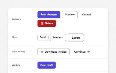
Native buttons in four variants and three sizes, with a loading state that keeps focus and a disabled state that says why.
-
Toolbar
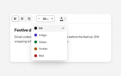
A named row of controls that is one stop in the Tab order, with arrow keys moving between alignment, size and color.
-
Switch
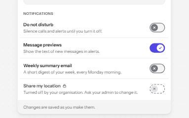
An on and off control for settings that take effect at once, built on a checkbox with the switch role.
-
Segmented control
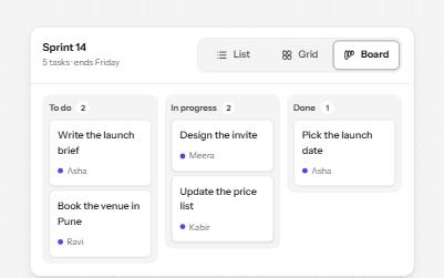
A row of joined segments for picking one of a few views, built from real radio buttons in a fieldset.