Accessibility pattern · Form inputs
Switch
A switch is a checkbox that means on or off, not ticked or unticked: role=switch on a real checkbox input keeps the label, Space and the form value, and makes screen readers say on and off. Each switch changes the page the moment it flips, and a polite status message confirms what was saved.
- WCAG criteria
- 7
- Keyboard rules
- 2
- Checked with
- axe, keyboard and the inspector
Live demo
Try it
Use it with a mouse, a keyboard or a screen reader. The inspector beside it shows what the browser tells assistive technology as you go: focus, state changes and announcements.
Asha Rao
Available Do not disturb
Meera Iyer now Silenced
Are we still on for lunch at 1?New message
Notifications
-
Silence calls and alerts until you turn it off.
-
Show the text of new messages in alerts.
-
A short digest of your week, every Monday morning.
-
Turned off by your organisation. Ask your admin to change it.
Changes are saved as you make them.
The demo works without JavaScript only as far as its HTML does; the inspector needs JavaScript.
Keyboard
Keys it answers to
Every action works without a pointer.
| Key | What it does |
|---|---|
| Tab or ShiftTab | Moves between the switches; the switch your organisation has locked is skipped. |
| Space | Turns the focused switch on or off. The change applies at once and a status message confirms it. |
Screen readers
What it announces
Written from the roles, names and states in the markup.
| When | Expected announcement |
|---|---|
| Focus reaches the first switch | Do not disturb, switch, off. Silence calls and alerts until you turn it off. |
| Space turns it on | On. Do not disturb turned on |
| Space turns Message previews off | Off. Message previews turned off |
| Reading the locked setting in browse mode | Share my location, switch, off, unavailable. Turned off by your organisation. Ask your admin to change it. |
These are expected announcements, not recordings. Wording and order differ between screen readers and browsers.
Code
Copy the code
The exact files this demo runs on. The styles are served with a prefix that keeps this site's own styles out of the demo; what you copy is the original.
<div class="ap-switch" data-ap-switch>
  <div class="ap-switch__me">
    <span class="ap-switch__avatar" aria-hidden="true">AR</span>
    <p class="ap-switch__who">Asha Rao</p>
    <p class="ap-switch__presence" data-ap-presence>
      <span class="ap-switch__presence-on" data-ap-show="available"><span class="ap-switch__dot" aria-hidden="true"></span>Available</span>
      <span class="ap-switch__presence-off" data-ap-show="busy" hidden><svg viewBox="0 0 24 24" aria-hidden="true" focusable="false"><path d="M20 14.5A8 8 0 1 1 9.5 4a6.5 6.5 0 0 0 10.5 10.5Z"/></svg>Do not disturb</span>
    </p>
  </div>

  <div class="ap-switch__alert">
    <span class="ap-switch__avatar ap-switch__avatar--small" aria-hidden="true">MI</span>
    <div class="ap-switch__alert-body">
      <p class="ap-switch__alert-top"><strong>Meera Iyer</strong> <span class="ap-switch__alert-time">now</span> <span class="ap-switch__muted" data-ap-silenced hidden>Silenced</span></p>
      <p class="ap-switch__alert-text"><span data-ap-text="full">Are we still on for lunch at 1?</span><span data-ap-text="short" hidden>New message</span></p>
    </div>
  </div>

  <h3 class="ap-switch__group">Notifications</h3>
  <ul class="ap-switch__list">
    <li class="ap-switch__row">
      <div class="ap-switch__text">
        <label class="ap-switch__label" for="switch-dnd">Do not disturb</label>
        <p class="ap-switch__desc" id="switch-dnd-desc">Silence calls and alerts until you turn it off.</p>
      </div>
      <span class="ap-switch__control">
        <input class="ap-switch__input" type="checkbox" role="switch" id="switch-dnd" aria-describedby="switch-dnd-desc" data-ap-setting="dnd" />
        <span class="ap-switch__track" aria-hidden="true">
          <span class="ap-switch__thumb">
            <svg class="ap-switch__icon ap-switch__icon--on" viewBox="0 0 24 24" focusable="false"><path d="m6 12.5 4 4 8-9"/></svg>
            <svg class="ap-switch__icon ap-switch__icon--off" viewBox="0 0 24 24" focusable="false"><path d="M7 7l10 10M17 7 7 17"/></svg>
          </span>
        </span>
        <span class="ap-switch__state" aria-hidden="true"><span class="ap-switch__state-on">On</span><span class="ap-switch__state-off">Off</span></span>
      </span>
    </li>
    <li class="ap-switch__row">
      <div class="ap-switch__text">
        <label class="ap-switch__label" for="switch-previews">Message previews</label>
        <p class="ap-switch__desc" id="switch-previews-desc">Show the text of new messages in alerts.</p>
      </div>
      <span class="ap-switch__control">
        <input class="ap-switch__input" type="checkbox" role="switch" id="switch-previews" aria-describedby="switch-previews-desc" data-ap-setting="previews" checked />
        <span class="ap-switch__track" aria-hidden="true">
          <span class="ap-switch__thumb">
            <svg class="ap-switch__icon ap-switch__icon--on" viewBox="0 0 24 24" focusable="false"><path d="m6 12.5 4 4 8-9"/></svg>
            <svg class="ap-switch__icon ap-switch__icon--off" viewBox="0 0 24 24" focusable="false"><path d="M7 7l10 10M17 7 7 17"/></svg>
          </span>
        </span>
        <span class="ap-switch__state" aria-hidden="true"><span class="ap-switch__state-on">On</span><span class="ap-switch__state-off">Off</span></span>
      </span>
    </li>
    <li class="ap-switch__row">
      <div class="ap-switch__text">
        <label class="ap-switch__label" for="switch-digest">Weekly summary email</label>
        <p class="ap-switch__desc" id="switch-digest-desc">A short digest of your week, every Monday morning.</p>
      </div>
      <span class="ap-switch__control">
        <input class="ap-switch__input" type="checkbox" role="switch" id="switch-digest" aria-describedby="switch-digest-desc" data-ap-setting="digest" />
        <span class="ap-switch__track" aria-hidden="true">
          <span class="ap-switch__thumb">
            <svg class="ap-switch__icon ap-switch__icon--on" viewBox="0 0 24 24" focusable="false"><path d="m6 12.5 4 4 8-9"/></svg>
            <svg class="ap-switch__icon ap-switch__icon--off" viewBox="0 0 24 24" focusable="false"><path d="M7 7l10 10M17 7 7 17"/></svg>
          </span>
        </span>
        <span class="ap-switch__state" aria-hidden="true"><span class="ap-switch__state-on">On</span><span class="ap-switch__state-off">Off</span></span>
      </span>
    </li>
    <li class="ap-switch__row ap-switch__row--locked">
      <div class="ap-switch__text">
        <label class="ap-switch__label" for="switch-location">Share my location<svg class="ap-switch__lock" viewBox="0 0 24 24" aria-hidden="true" focusable="false"><rect x="5" y="10.5" width="14" height="10" rx="2"/><path d="M8.5 10.5V8a3.5 3.5 0 0 1 7 0v2.5"/></svg></label>
        <p class="ap-switch__desc" id="switch-location-desc">Turned off by your organisation. Ask your admin to change it.</p>
      </div>
      <span class="ap-switch__control">
        <input class="ap-switch__input" type="checkbox" role="switch" id="switch-location" aria-describedby="switch-location-desc" data-ap-setting="location" disabled />
        <span class="ap-switch__track" aria-hidden="true">
          <span class="ap-switch__thumb">
            <svg class="ap-switch__icon ap-switch__icon--on" viewBox="0 0 24 24" focusable="false"><path d="m6 12.5 4 4 8-9"/></svg>
            <svg class="ap-switch__icon ap-switch__icon--off" viewBox="0 0 24 24" focusable="false"><path d="M7 7l10 10M17 7 7 17"/></svg>
          </span>
        </span>
        <span class="ap-switch__state" aria-hidden="true"><span class="ap-switch__state-on">On</span><span class="ap-switch__state-off">Off</span></span>
      </span>
    </li>
  </ul>
  <div class="ap-switch__foot">
    <p class="ap-switch__saved">Changes are saved as you make them.</p>
    <p class="ap-switch__status" role="status"></p>
  </div>
</div>
/* Switch. Uses the --ap-* design tokens. */
.ap-switch {
  width: min(100%, 520px);
  margin-inline: auto;
  border: 1px solid var(--ap-border);
  border-radius: var(--ap-radius-lg);
  background: var(--ap-surface);
  color: var(--ap-text);
  box-shadow: var(--ap-shadow-md);
  container-type: inline-size;
}
.ap-switch [hidden] {
  display: none;
}

/* Who is signed in, and their presence: Do not disturb changes it. */
.ap-switch__me {
  display: grid;
  grid-template-columns: auto minmax(0, 1fr) auto;
  align-items: center;
  gap: 12px;
  padding: 16px 20px;
  border-bottom: 1px solid var(--ap-border);
}
.ap-switch__avatar {
  display: grid;
  place-items: center;
  width: 40px;
  height: 40px;
  border-radius: var(--ap-radius-full);
  background: var(--ap-accent-soft);
  color: var(--ap-accent-soft-text);
  font-size: .8125rem;
  font-weight: 700;
  letter-spacing: .02em;
}
.ap-switch__avatar--small {
  width: 34px;
  height: 34px;
  background: var(--ap-surface-3);
  color: var(--ap-text);
  font-size: .75rem;
}
.ap-switch__who {
  margin: 0;
  font-weight: 650;
}
.ap-switch__presence {
  margin: 0;
  font-size: .8125rem;
  font-weight: 600;
}
.ap-switch__presence > span {
  display: inline-flex;
  align-items: center;
  gap: 6px;
  padding: 4px 10px;
  border-radius: var(--ap-radius-full);
}
.ap-switch__presence-on {
  background: var(--ap-success-soft);
  color: var(--ap-success);
}
.ap-switch__presence-off {
  background: var(--ap-surface-2);
  color: var(--ap-text-2);
  box-shadow: inset 0 0 0 1px var(--ap-border);
}
.ap-switch__dot {
  width: 8px;
  height: 8px;
  border-radius: var(--ap-radius-full);
  background: currentColor;
}
.ap-switch__presence svg {
  width: 14px;
  height: 14px;
  fill: currentColor;
}

/* A notification, as the settings below shape it. */
.ap-switch__alert {
  display: flex;
  align-items: flex-start;
  gap: 12px;
  margin: 16px 20px 4px;
  padding: 12px 14px;
  border: 1px solid var(--ap-border);
  border-radius: var(--ap-radius);
  background: var(--ap-surface-2);
}
.ap-switch__alert-body {
  min-width: 0;
}
.ap-switch__alert-top {
  display: flex;
  flex-wrap: wrap;
  align-items: center;
  gap: 4px 8px;
  margin: 0;
  font-size: .875rem;
}
.ap-switch__alert-time {
  color: var(--ap-text-3);
  font-size: .8125rem;
}
.ap-switch__muted {
  padding: 1px 8px;
  border-radius: var(--ap-radius-full);
  background: var(--ap-surface);
  color: var(--ap-text-2);
  font-size: .75rem;
  font-weight: 600;
  box-shadow: inset 0 0 0 1px var(--ap-border-strong);
}
.ap-switch__alert-text {
  margin: 2px 0 0;
  color: var(--ap-text-2);
  font-size: .9375rem;
  line-height: 1.45;
}

.ap-switch__group {
  margin: 0;
  padding: 18px 20px 4px;
  color: var(--ap-text-3);
  font-size: .75rem;
  font-weight: 650;
  letter-spacing: .06em;
  text-transform: uppercase;
}
.ap-switch__list {
  margin: 0;
  padding: 0 8px 4px;
  list-style: none;
}
.ap-switch__row {
  display: flex;
  align-items: center;
  justify-content: space-between;
  gap: 16px;
  padding: 12px 12px;
}
.ap-switch__row + .ap-switch__row {
  border-top: 1px solid var(--ap-border);
}
.ap-switch__text {
  min-width: 0;
}
.ap-switch__label {
  display: block;
  font-weight: 600;
  line-height: 1.4;
  cursor: pointer;
}
.ap-switch__desc {
  margin: 2px 0 0;
  color: var(--ap-text-3);
  font-size: .875rem;
  line-height: 1.45;
}
.ap-switch__lock {
  display: inline-block;
  width: 15px;
  height: 15px;
  margin-left: 6px;
  vertical-align: -2px;
  fill: none;
  stroke: currentColor;
  stroke-width: 2;
  stroke-linecap: round;
}
.ap-switch__row--locked .ap-switch__label {
  color: var(--ap-text-2);
  cursor: not-allowed;
}

/* The control: a 52 × 44 hit area holding the drawn track, with the real
   input stretched transparent over all of it. */
.ap-switch__control {
  position: relative;
  display: flex;
  flex-shrink: 0;
  align-items: center;
  gap: 10px;
  min-height: var(--ap-target);
}
.ap-switch__input {
  position: absolute;
  inset: 0;
  z-index: 1;
  width: 100%;
  height: 100%;
  margin: 0;
  opacity: 0;
  cursor: pointer;
  appearance: none;
}
.ap-switch__input:disabled {
  cursor: not-allowed;
}
.ap-switch__track {
  position: relative;
  display: block;
  width: 52px;
  height: 32px;
  border: 2px solid var(--ap-border-strong);
  border-radius: var(--ap-radius-full);
  background: var(--ap-surface-2);
  transition: background-color var(--ap-duration) var(--ap-ease), border-color var(--ap-duration) var(--ap-ease);
}
.ap-switch__thumb {
  position: absolute;
  top: 2px;
  left: 2px;
  display: grid;
  place-items: center;
  width: 24px;
  height: 24px;
  border-radius: var(--ap-radius-full);
  background: var(--ap-border-strong);
  color: var(--ap-surface);
  transition: transform var(--ap-duration) var(--ap-ease), background-color var(--ap-duration) var(--ap-ease);
}
.ap-switch__icon {
  grid-area: 1 / 1;
  width: 14px;
  height: 14px;
  fill: none;
  stroke: currentColor;
  stroke-width: 3;
  stroke-linecap: round;
  stroke-linejoin: round;
}
.ap-switch__icon--on {
  opacity: 0;
}

/* On: the thumb moves to the end, turns light and shows a check. */
.ap-switch__input:checked + .ap-switch__track {
  border-color: var(--ap-accent);
  background: var(--ap-accent);
}
.ap-switch__input:checked + .ap-switch__track .ap-switch__thumb {
  transform: translateX(20px);
  background: var(--ap-on-accent);
  color: var(--ap-accent-text);
}
.ap-switch__input:checked + .ap-switch__track .ap-switch__icon--on {
  opacity: 1;
}
.ap-switch__input:checked + .ap-switch__track .ap-switch__icon--off {
  opacity: 0;
}

.ap-switch__input:hover:not(:disabled) + .ap-switch__track {
  border-color: var(--ap-text-2);
}
.ap-switch__input:checked:hover:not(:disabled) + .ap-switch__track {
  border-color: var(--ap-accent-hover);
  background: var(--ap-accent-hover);
}
.ap-switch__input:focus-visible + .ap-switch__track {
  outline: 2px solid var(--ap-focus);
  outline-offset: 2px;
}

/* Locked: a dashed edge and the lock icon say so, not a fade alone. */
.ap-switch__input:disabled + .ap-switch__track {
  border-style: dashed;
  background: var(--ap-surface);
}
.ap-switch__input:disabled + .ap-switch__track .ap-switch__thumb {
  background: var(--ap-surface-3);
  color: var(--ap-text-3);
}

/* On and Off in words, with the option on. */
.ap-switch__state {
  display: none;
  min-width: 2.25em;
  color: var(--ap-text-2);
  font-size: .875rem;
  font-weight: 650;
}
.ap-switch[data-labels] .ap-switch__state {
  display: block;
}
.ap-switch__state-on,
.ap-switch__input:checked ~ .ap-switch__state .ap-switch__state-off {
  display: none;
}
.ap-switch__input:checked ~ .ap-switch__state .ap-switch__state-on {
  display: inline;
}

.ap-switch__foot {
  display: flex;
  align-items: center;
  min-height: 46px;
  padding: 12px 20px;
  border-top: 1px solid var(--ap-border);
  border-radius: 0 0 var(--ap-radius-lg) var(--ap-radius-lg);
  background: var(--ap-surface-2);
  font-size: .875rem;
}
.ap-switch__saved {
  margin: 0;
  color: var(--ap-text-3);
}
.ap-switch__foot:has(.ap-switch__status:not(:empty)) .ap-switch__saved {
  display: none;
}
.ap-switch__status {
  display: flex;
  align-items: center;
  gap: 10px;
  margin: 0;
  color: var(--ap-success);
  font-weight: 600;
}
/* A check drawn in CSS, shown once there is something to confirm. */
.ap-switch__status:not(:empty)::before {
  content: "";
  flex-shrink: 0;
  width: 6px;
  height: 11px;
  margin: -3px 4px 0 5px;
  border: solid currentColor;
  border-width: 0 2.5px 2.5px 0;
  transform: rotate(45deg);
}

@container (max-width: 380px) {
  .ap-switch__me { padding: 14px 16px; gap: 10px; }
  .ap-switch__alert { margin-inline: 16px; }
  .ap-switch__group { padding-inline: 16px; }
  .ap-switch__list { padding-inline: 4px; }
  .ap-switch__row { gap: 12px; }
  .ap-switch__foot { padding-inline: 16px; }
}

@media (forced-colors: active) {
  .ap-switch__thumb { forced-color-adjust: none; background: CanvasText; color: Canvas; }
  .ap-switch__input:checked + .ap-switch__track { forced-color-adjust: none; border-color: Highlight; background: Highlight; }
  .ap-switch__input:checked + .ap-switch__track .ap-switch__thumb { background: HighlightText; color: Highlight; }
}

@media (prefers-reduced-motion: reduce) {
  .ap-switch__track,
  .ap-switch__thumb { transition: none; }
}
/**
 * Switch: settings that apply the moment they change. Each switch is an
 * input[type=checkbox][role=switch]; the browser handles Space, the label and
 * the on or off state. This script applies each setting to the page and
 * confirms it in a polite status message.
 *
 * Markup: [data-ap-switch] holding inputs with data-ap-setting, the parts
 * each setting changes ([data-ap-show], [data-ap-silenced], [data-ap-text])
 * and a p[role=status]. Add data-labels to the root to show On and Off in
 * words beside each switch (CSS only).
 */

// Fixed sentences, so the page's translations can match them: [off, on].
const SAID = {
  dnd: ["Do not disturb turned off", "Do not disturb turned on"],
  previews: ["Message previews turned off", "Message previews turned on"],
  digest: ["Weekly summary turned off", "Weekly summary turned on"],
};

export function init(root) {
  const status = root.querySelector("[role=status]");
  const switches = [...root.querySelectorAll("[data-ap-setting]")];
  const part = (selector) => root.querySelector(selector);

  // What each setting does to the page. A real app would also save it here.
  const APPLY = {
    dnd(on) {
      part("[data-ap-show=available]").hidden = on;
      part("[data-ap-show=busy]").hidden = !on;
      part("[data-ap-silenced]").hidden = !on;
    },
    previews(on) {
      part("[data-ap-text=full]").hidden = !on;
      part("[data-ap-text=short]").hidden = on;
    },
    digest() {},
  };

  function onChange(event) {
    const input = event.target.closest("[data-ap-setting]");
    if (!input || input.disabled) return;
    const key = input.dataset.apSetting;
    APPLY[key]?.(input.checked);
    const words = SAID[key];
    if (words) status.textContent = words[Number(input.checked)];
  }

  // Start in step with the inputs (a reload can restore their checked state).
  for (const input of switches) APPLY[input.dataset.apSetting]?.(input.checked);

  root.addEventListener("change", onChange);
  return () => root.removeEventListener("change", onChange);
}

for (const root of document.querySelectorAll("[data-ap-switch]")) init(root);
/* Design tokens for the pattern components. Light by default, dark when the
   system asks for it; set data-theme="dark" on :root to force dark. */
:root {
    --ap-radius-sm: 8px;
    --ap-radius: 12px;
    --ap-radius-lg: 16px;
    --ap-radius-full: 999px;
    --ap-font: "Instrument Sans", ui-sans-serif, system-ui, -apple-system, "Segoe UI", Roboto, sans-serif;
    --ap-mono: "JetBrains Mono", ui-monospace, "Cascadia Mono", "SF Mono", Consolas, monospace;
    --ap-ease: cubic-bezier(.2, .8, .2, 1);
    --ap-duration: 180ms;
    --ap-target: 44px;
    --ap-bg: #F4F4F5;
    --ap-surface: #FFFFFF;
    --ap-surface-2: #F4F4F5;
    --ap-surface-3: #E4E4E7;
    --ap-border: #E4E4E7;
    --ap-border-strong: #76767F;
    --ap-text: #18181B;
    --ap-text-2: #3F3F46;
    --ap-text-3: #5E5E66;
    --ap-accent: #4F46E5;
    --ap-accent-hover: #4338CA;
    --ap-on-accent: #FFFFFF;
    --ap-accent-text: #4338CA;
    --ap-accent-soft: #EEF2FF;
    --ap-accent-soft-text: #3730A3;
    --ap-focus: #4F46E5;
    --ap-danger: #B91C1C;
    --ap-danger-soft: #FEF2F2;
    --ap-success: #15803D;
    --ap-success-soft: #F0FDF4;
    --ap-warning: #A15C07;
    --ap-warning-soft: #FEFCE8;
    --ap-info: #1D4ED8;
    --ap-info-soft: #EFF6FF;
    --ap-scrim: rgb(9 9 11 / .48);
    --ap-shadow-sm: 0 1px 2px rgb(9 9 11 / .06);
    --ap-shadow-md: 0 1px 2px rgb(9 9 11 / .05), 0 6px 16px -4px rgb(9 9 11 / .1);
    --ap-shadow-lg: 0 2px 6px rgb(9 9 11 / .06), 0 20px 40px -12px rgb(9 9 11 / .22);
    --ap-light-bg: #F4F4F5;
    --ap-light-surface: #FFFFFF;
    --ap-light-surface-2: #F4F4F5;
    --ap-light-surface-3: #E4E4E7;
    --ap-light-border: #E4E4E7;
    --ap-light-border-strong: #76767F;
    --ap-light-text: #18181B;
    --ap-light-text-2: #3F3F46;
    --ap-light-text-3: #5E5E66;
    --ap-light-accent: #4F46E5;
    --ap-light-accent-hover: #4338CA;
    --ap-light-on-accent: #FFFFFF;
    --ap-light-accent-text: #4338CA;
    --ap-light-accent-soft: #EEF2FF;
    --ap-light-accent-soft-text: #3730A3;
    --ap-light-focus: #4F46E5;
    --ap-light-danger: #B91C1C;
    --ap-light-danger-soft: #FEF2F2;
    --ap-light-success: #15803D;
    --ap-light-success-soft: #F0FDF4;
    --ap-light-warning: #A15C07;
    --ap-light-warning-soft: #FEFCE8;
    --ap-light-info: #1D4ED8;
    --ap-light-info-soft: #EFF6FF;
    --ap-light-scrim: rgb(9 9 11 / .48);
    --ap-light-shadow-sm: 0 1px 2px rgb(9 9 11 / .06);
    --ap-light-shadow-md: 0 1px 2px rgb(9 9 11 / .05), 0 6px 16px -4px rgb(9 9 11 / .1);
    --ap-light-shadow-lg: 0 2px 6px rgb(9 9 11 / .06), 0 20px 40px -12px rgb(9 9 11 / .22);
    --ap-dark-bg: #09090B;
    --ap-dark-surface: #18181B;
    --ap-dark-surface-2: #27272A;
    --ap-dark-surface-3: #3F3F46;
    --ap-dark-border: #2E2E33;
    --ap-dark-border-strong: #8E8E97;
    --ap-dark-text: #FAFAFA;
    --ap-dark-text-2: #D4D4D8;
    --ap-dark-text-3: #A1A1AA;
    --ap-dark-accent: #818CF8;
    --ap-dark-accent-hover: #A5B4FC;
    --ap-dark-on-accent: #0C0A1F;
    --ap-dark-accent-text: #A5B4FC;
    --ap-dark-accent-soft: #1E1B4B;
    --ap-dark-accent-soft-text: #C7D2FE;
    --ap-dark-focus: #A5B4FC;
    --ap-dark-danger: #F87171;
    --ap-dark-danger-soft: #2A1215;
    --ap-dark-success: #4ADE80;
    --ap-dark-success-soft: #0F2A1A;
    --ap-dark-warning: #FACC15;
    --ap-dark-warning-soft: #2A2410;
    --ap-dark-info: #60A5FA;
    --ap-dark-info-soft: #0F1D33;
    --ap-dark-scrim: rgb(0 0 0 / .62);
    --ap-dark-shadow-sm: 0 1px 2px rgb(0 0 0 / .4);
    --ap-dark-shadow-md: 0 1px 2px rgb(0 0 0 / .4), 0 8px 20px -6px rgb(0 0 0 / .5);
    --ap-dark-shadow-lg: 0 2px 8px rgb(0 0 0 / .45), 0 24px 48px -12px rgb(0 0 0 / .7);
}
@media (prefers-color-scheme: dark) {
  :root:not([data-theme="light"]) {
      --ap-bg: #09090B;
      --ap-surface: #18181B;
      --ap-surface-2: #27272A;
      --ap-surface-3: #3F3F46;
      --ap-border: #2E2E33;
      --ap-border-strong: #8E8E97;
      --ap-text: #FAFAFA;
      --ap-text-2: #D4D4D8;
      --ap-text-3: #A1A1AA;
      --ap-accent: #818CF8;
      --ap-accent-hover: #A5B4FC;
      --ap-on-accent: #0C0A1F;
      --ap-accent-text: #A5B4FC;
      --ap-accent-soft: #1E1B4B;
      --ap-accent-soft-text: #C7D2FE;
      --ap-focus: #A5B4FC;
      --ap-danger: #F87171;
      --ap-danger-soft: #2A1215;
      --ap-success: #4ADE80;
      --ap-success-soft: #0F2A1A;
      --ap-warning: #FACC15;
      --ap-warning-soft: #2A2410;
      --ap-info: #60A5FA;
      --ap-info-soft: #0F1D33;
      --ap-scrim: rgb(0 0 0 / .62);
      --ap-shadow-sm: 0 1px 2px rgb(0 0 0 / .4);
      --ap-shadow-md: 0 1px 2px rgb(0 0 0 / .4), 0 8px 20px -6px rgb(0 0 0 / .5);
      --ap-shadow-lg: 0 2px 8px rgb(0 0 0 / .45), 0 24px 48px -12px rgb(0 0 0 / .7);
  }
}
:root[data-theme="dark"] {
    --ap-bg: #09090B;
    --ap-surface: #18181B;
    --ap-surface-2: #27272A;
    --ap-surface-3: #3F3F46;
    --ap-border: #2E2E33;
    --ap-border-strong: #8E8E97;
    --ap-text: #FAFAFA;
    --ap-text-2: #D4D4D8;
    --ap-text-3: #A1A1AA;
    --ap-accent: #818CF8;
    --ap-accent-hover: #A5B4FC;
    --ap-on-accent: #0C0A1F;
    --ap-accent-text: #A5B4FC;
    --ap-accent-soft: #1E1B4B;
    --ap-accent-soft-text: #C7D2FE;
    --ap-focus: #A5B4FC;
    --ap-danger: #F87171;
    --ap-danger-soft: #2A1215;
    --ap-success: #4ADE80;
    --ap-success-soft: #0F2A1A;
    --ap-warning: #FACC15;
    --ap-warning-soft: #2A2410;
    --ap-info: #60A5FA;
    --ap-info-soft: #0F1D33;
    --ap-scrim: rgb(0 0 0 / .62);
    --ap-shadow-sm: 0 1px 2px rgb(0 0 0 / .4);
    --ap-shadow-md: 0 1px 2px rgb(0 0 0 / .4), 0 8px 20px -6px rgb(0 0 0 / .5);
    --ap-shadow-lg: 0 2px 8px rgb(0 0 0 / .45), 0 24px 48px -12px rgb(0 0 0 / .7);
}
WCAG 2.2
What it meets
The success criteria this pattern takes care of, and how.
-
1.3.1 Info and Relationships
Level A
Every switch has a label element and a description tied to it with aria-describedby, so its purpose and its effect are read together.
-
1.4.1 Use of Color
Level A
On and off differ in the thumb's position and its icon, a check or a cross, not only in the track's fill.
-
1.4.11 Non-text Contrast
Level AA
The off track's edge and the thumb clear 3:1 against the card, and the on track's fill clears 3:1 too.
-
2.4.7 Focus Visible
Level AA
The focused switch shows a ring around its track, drawn when the transparent input matches :focus-visible.
-
2.5.8 Target Size (Minimum)
Level AA
The input covers a 52 by 44 pixel area, and its label is a second, larger target.
-
4.1.2 Name, Role, Value
Level A
role=switch on a checkbox input exposes a switch whose on or off state comes from the input's checked state.
-
4.1.3 Status Messages
Level AA
A polite status message confirms each change once it has been applied, without moving focus.
Usage
When to use it
Use it
- Settings that take effect immediately, like turning notifications or a feature on and off.
- A list of independent on and off preferences, each with a short explanation.
Use something else
- A choice that only applies when a form is sent: a checkbox says that better.
- Choosing between two named options, like monthly or yearly: use radio buttons or a segmented control.
- A tool state in a toolbar, like Bold: use a toggle button.
Common failures
How it usually goes wrong
A div that looks like a switch
A styled div with a click handler cannot be reached with Tab, ignores Space and has no state. A checkbox input with role=switch brings all three.
A label that changes with the state
A switch called "Turn on alerts" that becomes "Turn off alerts" leaves people unsure whether the label is the state or the action. The label names the setting; the state is on or off.
On and off shown only by color
A green or grey track is the same to many people. The thumb here moves to the other end and changes its icon, and the option above adds On and Off in words.
A switch that waits for a Save button
People expect a switch to act at once. If nothing happens until a form is sent, use a checkbox instead, which promises nothing until then.
A disabled switch with no reason
A greyed-out control with no explanation leaves people guessing. The locked setting here says who turned it off and what to do.
A tiny target
A 36 by 20 pixel switch is hard to hit with a finger or a tremor. The input here covers 52 by 44 pixels, and the label works as well.
Notes
Building it
- Build the switch on input type="checkbox" with role="switch": the label, Space, the checked state and form submission all keep working, and assistive technology says on and off instead of checked.
- The input is transparent and covers the drawn track, so the visible control is also the one that takes clicks, touch and focus.
- A disabled input leaves the Tab order. Its description stays in the page for screen reader browse mode; if people must be able to Tab to a locked setting, use aria-disabled="true" and block the change in script.
- Safari can also draw a native switch from input type="checkbox" switch. It is not in every browser yet, so this pattern draws its own.
- Announce the outcome, not the key press: the switch already says on or off, so the status message says what changed and that it was saved.
Sources: WAI-ARIA Authoring Practices: Switch · ARIA in HTML: role=switch on a checkbox
Checked with axe in light and dark themes, at desktop and phone widths, and by keyboard. Not yet tested with every screen reader and browser pair. Report a correction
Related
Patterns that go with it
-
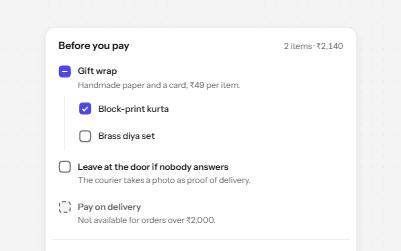
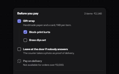
Checkbox
Native checkboxes drawn to match your design, with whole-row targets, a description per option, a mixed state and a required one.
-
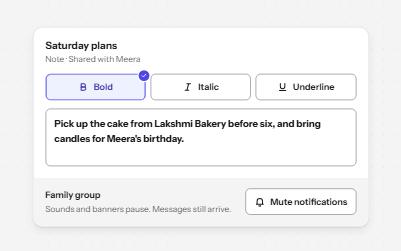
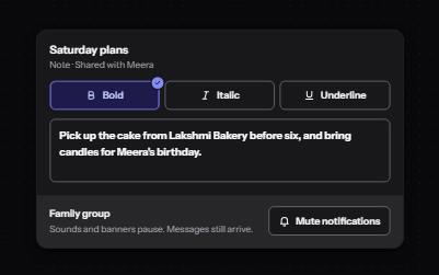
Toggle button
Buttons that stay on or off, like Bold or Mute, with aria-pressed reporting the state while the label stays the same.
-
Segmented control
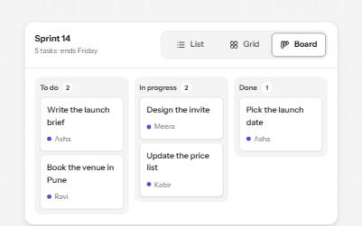
A row of joined segments for picking one of a few views, built from real radio buttons in a fieldset.
-
Status message
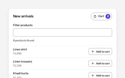
Results, confirmations and saves told to screen readers through role=status, without moving focus, once each time.