Accessibility pattern · Form inputs
Radio group
Native radios with one name are a group already: one Tab stop, arrow keys that move and select, and "2 of 3" announced for free. The fieldset's legend asks the question, each option's description and price join it through aria-describedby, and the dot is drawn in CSS without losing any of that.
- WCAG criteria
- 7
- Keyboard rules
- 5
- Checked with
- axe, keyboard and the inspector
Live demo
Try it
Use it with a mouse, a keyboard or a screen reader. The inspector beside it shows what the browser tells assistive technology as you go: focus, state changes and announcements.
The demo works without JavaScript only as far as its HTML does; the inspector needs JavaScript.
Keyboard
Keys it answers to
Every action works without a pointer.
| Key | What it does |
|---|---|
| Tab | Moves into the group: onto the chosen option, or the first one if none is chosen yet. The next Tab leaves the group. |
| Arrow Down or Arrow Right | Moves to the next option and selects it, wrapping from the last to the first. |
| Arrow Up or Arrow Left | Moves to the previous option and selects it. |
| Space | Selects the focused option, when none is selected yet. |
| Enter | Sends the choice, from an option or from Continue to payment. With nothing chosen, focus moves to the first option and the error is read with it. |
Screen readers
What it announces
Written from the roles, names and states in the markup.
| When | Expected announcement |
|---|---|
| Tab enters the group with nothing chosen | Delivery speed, group. Days are working days… Standard, radio button, not checked, required, 1 of 3. 5 to 7 days Free |
| Arrow Down | Express, radio button, checked, 2 of 3. 2 to 3 days ₹99 |
| Continue is pressed with nothing chosen | Delivery speed, group. Standard, radio button, not checked, invalid entry, required, 1 of 3. 5 to 7 days Free Choose a delivery speed |
| An option is then chosen | Checked (the error clears) |
| The choice is sent | Delivery speed saved |
These are expected announcements, not recordings. Wording and order differ between screen readers and browsers.
Code
Copy the code
The exact files this demo runs on. The styles are served with a prefix that keeps this site's own styles out of the demo; what you copy is the original.
<form class="ap-radio-group" data-ap-radio-group novalidate aria-labelledby="rg-form-name">
  <div class="ap-radio-group__top">
    <h3 class="ap-radio-group__name" id="rg-form-name">Checkout</h3>
    <p class="ap-radio-group__sub">To Kothrud, Pune · 2 items</p>
  </div>

  <fieldset class="ap-radio-group__set" aria-describedby="rg-hint">
    <legend class="ap-radio-group__legend">Delivery speed <span class="ap-radio-group__req" aria-hidden="true">Required</span></legend>
    <p class="ap-radio-group__hint" id="rg-hint">Days are working days. Prices include tax.</p>
    <p class="ap-error ap-radio-group__error" id="rg-error" hidden><svg class="ap-radio-group__icon" viewBox="0 0 24 24" aria-hidden="true" focusable="false"><circle cx="12" cy="12" r="9"/><path d="M12 7.5v5"/><path d="M12 16.5h.01"/></svg><span>Choose a delivery speed</span></p>
    <div class="ap-radio-group__options">
      <div class="ap-radio-group__option">
        <input class="ap-radio-group__radio" type="radio" id="rg-standard" name="speed" value="standard" required aria-describedby="rg-standard-desc rg-standard-price" />
        <div class="ap-radio-group__text">
          <label class="ap-radio-group__label" for="rg-standard">Standard</label>
          <p class="ap-radio-group__desc" id="rg-standard-desc">5 to 7 days</p>
        </div>
        <p class="ap-radio-group__price" id="rg-standard-price">Free</p>
      </div>
      <div class="ap-radio-group__option">
        <input class="ap-radio-group__radio" type="radio" id="rg-express" name="speed" value="express" required aria-describedby="rg-express-desc rg-express-price" />
        <div class="ap-radio-group__text">
          <label class="ap-radio-group__label" for="rg-express">Express</label>
          <p class="ap-radio-group__desc" id="rg-express-desc">2 to 3 days</p>
        </div>
        <p class="ap-radio-group__price" id="rg-express-price">₹99</p>
      </div>
      <div class="ap-radio-group__option">
        <input class="ap-radio-group__radio" type="radio" id="rg-next-day" name="speed" value="next-day" required aria-describedby="rg-next-day-desc rg-next-day-price" />
        <div class="ap-radio-group__text">
          <label class="ap-radio-group__label" for="rg-next-day">Next day</label>
          <p class="ap-radio-group__desc" id="rg-next-day-desc">Tomorrow, if you order by 2 pm</p>
        </div>
        <p class="ap-radio-group__price" id="rg-next-day-price">₹249</p>
      </div>
    </div>
  </fieldset>

  <div class="ap-radio-group__foot">
    <p class="ap-radio-group__status" role="status"></p>
    <button type="submit" class="ap-btn ap-btn--primary">Continue to payment</button>
  </div>
</form>
/* Shared primitives: buttons and form fields used across the patterns.
   Uses the --ap-* design tokens. */

.ap-btn {
  display: inline-flex;
  align-items: center;
  justify-content: center;
  gap: 8px;
  min-height: 40px;
  padding: 0 16px;
  border: 1px solid var(--ap-border-strong);
  border-radius: var(--ap-radius-sm);
  background: var(--ap-surface);
  color: var(--ap-text);
  font: inherit;
  font-weight: 600;
  line-height: 1.2;
  text-decoration: none;
  white-space: nowrap;
  cursor: pointer;
  transition: background-color var(--ap-duration) var(--ap-ease), border-color var(--ap-duration) var(--ap-ease), box-shadow var(--ap-duration) var(--ap-ease);
}
.ap-btn:hover {
  background: var(--ap-surface-2);
}
.ap-btn:focus-visible {
  outline: 2px solid var(--ap-focus);
  outline-offset: 2px;
}
.ap-btn:disabled,
.ap-btn[aria-disabled="true"] {
  opacity: .55;
  cursor: not-allowed;
}
.ap-btn--primary {
  border-color: var(--ap-accent);
  background: var(--ap-accent);
  color: var(--ap-on-accent);
  box-shadow: var(--ap-shadow-sm);
}
.ap-btn--primary:hover {
  border-color: var(--ap-accent-hover);
  background: var(--ap-accent-hover);
}
.ap-btn--danger {
  border-color: var(--ap-danger);
  background: var(--ap-danger);
  color: var(--ap-surface);
}
.ap-btn--danger:hover {
  filter: brightness(1.08);
}
.ap-btn--ghost {
  border-color: transparent;
  background: transparent;
}
.ap-btn--ghost:hover {
  background: var(--ap-surface-2);
}
.ap-btn__icon {
  width: 18px;
  height: 18px;
  flex-shrink: 0;
  fill: none;
  stroke: currentColor;
  stroke-width: 2;
  stroke-linecap: round;
  stroke-linejoin: round;
}

.ap-field {
  display: grid;
  gap: 6px;
}
.ap-label {
  color: var(--ap-text);
  font-weight: 600;
  font-size: .9375rem;
}
.ap-hint {
  margin: 0;
  color: var(--ap-text-3);
  font-size: .875rem;
  line-height: 1.45;
}
.ap-error {
  display: flex;
  align-items: flex-start;
  gap: 6px;
  margin: 0;
  color: var(--ap-danger);
  font-size: .875rem;
  font-weight: 600;
  line-height: 1.45;
}
.ap-input {
  width: 100%;
  min-height: 44px;
  padding: 10px 12px;
  border: 1px solid var(--ap-border-strong);
  border-radius: var(--ap-radius-sm);
  background: var(--ap-surface);
  color: var(--ap-text);
  font: inherit;
  line-height: 1.4;
  transition: border-color var(--ap-duration) var(--ap-ease), box-shadow var(--ap-duration) var(--ap-ease);
}
.ap-input::placeholder {
  color: var(--ap-text-3);
}
.ap-input:hover {
  border-color: var(--ap-text-2);
}
.ap-input:focus-visible {
  outline: 2px solid var(--ap-focus);
  outline-offset: 1px;
  border-color: var(--ap-focus);
}
.ap-input[aria-invalid="true"] {
  border-color: var(--ap-danger);
  box-shadow: inset 4px 0 0 var(--ap-danger);
}
textarea.ap-input {
  resize: vertical;
  min-height: 88px;
}

@media (prefers-reduced-motion: reduce) {
  .ap-btn,
  .ap-input { transition: none; }
}

/* Radio group. Uses the --ap-* design tokens and the shared primitives. */
.ap-radio-group {
  width: min(100%, 560px);
  margin-inline: auto;
  border: 1px solid var(--ap-border);
  border-radius: var(--ap-radius-lg);
  background: var(--ap-surface);
  color: var(--ap-text);
  box-shadow: var(--ap-shadow-md);
  container-type: inline-size;
}
.ap-radio-group[data-compact] {
  width: min(100%, 680px);
}
.ap-radio-group [hidden] {
  display: none;
}

.ap-radio-group__top {
  display: flex;
  flex-wrap: wrap;
  align-items: baseline;
  justify-content: space-between;
  gap: 4px 12px;
  padding: 18px 22px 16px;
  border-bottom: 1px solid var(--ap-border);
}
.ap-radio-group__name {
  margin: 0;
  font-size: 1.0625rem;
  font-weight: 650;
  line-height: 1.3;
}
.ap-radio-group__sub {
  margin: 0;
  color: var(--ap-text-3);
  font-size: .875rem;
}

/* The group */
.ap-radio-group__set {
  min-width: 0;
  margin: 0;
  padding: 0 22px 22px;
  border: 0;
}
.ap-radio-group__legend {
  padding: 18px 0 0;
  color: var(--ap-text);
  font-size: .9375rem;
  font-weight: 650;
}
.ap-radio-group__req {
  margin-left: 6px;
  color: var(--ap-text-3);
  font-size: .75rem;
  font-weight: 600;
}
.ap-radio-group__hint {
  margin: 2px 0 12px;
  color: var(--ap-text-3);
  font-size: .875rem;
  line-height: 1.45;
}
.ap-radio-group__icon {
  width: 16px;
  height: 16px;
  flex-shrink: 0;
  margin-top: 2px;
  fill: none;
  stroke: currentColor;
  stroke-width: 2;
  stroke-linecap: round;
  stroke-linejoin: round;
}
.ap-radio-group__error {
  margin: -4px 0 12px;
}

.ap-radio-group__options {
  display: grid;
  gap: 10px;
}

/* An option card. The label's ::after covers it, so the whole card is the target. */
.ap-radio-group__option {
  position: relative;
  display: grid;
  grid-template-columns: auto minmax(0, 1fr) auto;
  align-items: start;
  gap: 2px 12px;
  min-height: var(--ap-target);
  padding: 14px 16px;
  border: 1px solid var(--ap-border);
  border-radius: var(--ap-radius);
  background: var(--ap-surface);
  transition: border-color var(--ap-duration) var(--ap-ease), box-shadow var(--ap-duration) var(--ap-ease), background-color var(--ap-duration) var(--ap-ease);
}
.ap-radio-group__option:hover {
  background: var(--ap-surface-2);
}
.ap-radio-group__option:has(.ap-radio-group__radio:checked) {
  border-color: var(--ap-accent);
  box-shadow: inset 0 0 0 1px var(--ap-accent);
  background: var(--ap-accent-soft);
}
.ap-radio-group__option:has(.ap-radio-group__radio:focus-visible) {
  outline: 2px solid var(--ap-focus);
  outline-offset: 2px;
}
.ap-radio-group__option:has(.ap-radio-group__radio[aria-invalid="true"]) {
  border-color: var(--ap-danger);
}
.ap-radio-group__text {
  display: grid;
  gap: 2px;
  min-width: 0;
}
.ap-radio-group__label {
  color: var(--ap-text);
  font-weight: 650;
  line-height: 1.4;
  cursor: pointer;
}
.ap-radio-group__label::after {
  content: "";
  position: absolute;
  inset: 0;
  border-radius: inherit;
}
.ap-radio-group__desc {
  margin: 0;
  color: var(--ap-text-3);
  font-size: .875rem;
  line-height: 1.45;
}
.ap-radio-group__option:has(:checked) .ap-radio-group__desc {
  color: var(--ap-text-2);
}
.ap-radio-group__price {
  margin: 0;
  color: var(--ap-text);
  font-weight: 650;
  line-height: 1.4;
  font-variant-numeric: tabular-nums;
  white-space: nowrap;
}

/* The radio: native, redrawn as a ring with a dot */
.ap-radio-group__radio {
  appearance: none;
  display: grid;
  place-content: center;
  width: 20px;
  height: 20px;
  margin: 1px 0 0;
  border: 2px solid var(--ap-border-strong);
  border-radius: 50%;
  background: var(--ap-surface);
  cursor: pointer;
  transition: border-color var(--ap-duration) var(--ap-ease);
}
.ap-radio-group__radio:focus-visible {
  outline: none;
}
.ap-radio-group__radio::before {
  content: "";
  width: 10px;
  height: 10px;
  border-radius: 50%;
  background: var(--ap-accent);
  transform: scale(0);
  transition: transform var(--ap-duration) var(--ap-ease);
}
.ap-radio-group__radio:checked {
  border-color: var(--ap-accent);
}
.ap-radio-group__radio:checked::before {
  transform: scale(1);
}
.ap-radio-group__radio[aria-invalid="true"] {
  border-color: var(--ap-danger);
}

/* Compact: the cards in one row */
.ap-radio-group[data-compact] .ap-radio-group__options {
  grid-auto-columns: minmax(0, 1fr);
  grid-auto-flow: column;
}
.ap-radio-group[data-compact] .ap-radio-group__option {
  grid-template-columns: auto minmax(0, 1fr);
  grid-template-rows: 1fr auto;
  row-gap: 8px;
  padding: 12px 14px;
}
.ap-radio-group[data-compact] .ap-radio-group__price {
  grid-column: 2;
  font-size: .9375rem;
}

.ap-radio-group__foot {
  display: flex;
  flex-wrap: wrap;
  align-items: center;
  justify-content: space-between;
  gap: 0 16px;
  padding: 14px 22px;
  border-top: 1px solid var(--ap-border);
  border-radius: 0 0 var(--ap-radius-lg) var(--ap-radius-lg);
  background: var(--ap-surface-2);
}
.ap-radio-group__status {
  flex: 1 1 160px;
  margin: 0;
  color: var(--ap-success);
  font-size: .9375rem;
  font-weight: 600;
}
.ap-radio-group__foot .ap-btn {
  min-height: var(--ap-target);
  margin-left: auto;
}

@container (max-width: 460px) {
  .ap-radio-group__top { padding: 16px 18px 14px; }
  .ap-radio-group__set { padding: 0 18px 20px; }
  .ap-radio-group[data-compact] .ap-radio-group__options { grid-template-columns: minmax(0, 1fr); grid-auto-flow: row; gap: 8px; }
  .ap-radio-group[data-compact] .ap-radio-group__option { grid-template-columns: auto minmax(0, 1fr) auto; grid-template-rows: auto; row-gap: 2px; padding: 10px 14px; }
  .ap-radio-group[data-compact] .ap-radio-group__price { grid-column: auto; }
  .ap-radio-group__foot { padding: 14px 18px; }
  .ap-radio-group__status:not(:empty) { flex-basis: 100%; margin-bottom: 10px; }
  .ap-radio-group__foot .ap-btn { flex: 1 1 100%; }
}

@media (forced-colors: active) {
  .ap-radio-group__radio::before { forced-color-adjust: none; background: Highlight; }
  .ap-radio-group__option:has(:checked) { border-width: 3px; }
}

@media (prefers-reduced-motion: reduce) {
  .ap-radio-group__option,
  .ap-radio-group__radio,
  .ap-radio-group__radio::before { transition: none; }
}
/**
 * Radio group: native radios in a fieldset, redrawn with CSS, with a
 * required error.
 *
 * Markup: form[data-ap-radio-group][novalidate] > fieldset with a legend, a
 * hidden p#…-error, and option cards each holding input[type=radio][required]
 * (one name), a label and a description and price in its aria-describedby.
 * The browser does the arrow keys. On submit with nothing chosen the script
 * shows the error, marks every radio aria-invalid, joins the error to their
 * descriptions and moves focus into the group. Add data-compact to the root
 * to lay the cards out in a row.
 */

export function init(root) {
  const radios = [...root.querySelectorAll("input[type=radio]")];
  const error = root.querySelector(".ap-radio-group__error");
  const status = () => root.querySelector(".ap-radio-group__foot [role=status]");

  function setError(on) {
    error.hidden = !on;
    for (const radio of radios) {
      if (on) radio.setAttribute("aria-invalid", "true");
      else radio.removeAttribute("aria-invalid");
      const ids = (radio.getAttribute("aria-describedby") || "").split(/\s+/).filter((id) => id && id !== error.id);
      if (on) ids.push(error.id);
      radio.setAttribute("aria-describedby", ids.join(" "));
    }
  }

  function onChange(event) {
    if (!radios.includes(event.target)) return;
    if (status().textContent) status().textContent = "";
    // A choice is all the error asked for.
    if (!error.hidden) setError(false);
  }

  function onSubmit(event) {
    event.preventDefault();
    const chosen = radios.find((radio) => radio.checked);
    if (!chosen) {
      setError(true);
      // Focus goes where Tab would land: the first option.
      const first = radios[0];
      if (document.activeElement === first) first.blur();
      first.focus();
      return;
    }
    const region = status();
    region.textContent = "";
    requestAnimationFrame(() => { region.textContent = "Delivery speed saved"; });
  }

  root.addEventListener("change", onChange);
  root.addEventListener("submit", onSubmit);
  return () => {
    root.removeEventListener("change", onChange);
    root.removeEventListener("submit", onSubmit);
  };
}

for (const root of document.querySelectorAll("[data-ap-radio-group]")) init(root);
/* Design tokens for the pattern components. Light by default, dark when the
   system asks for it; set data-theme="dark" on :root to force dark. */
:root {
    --ap-radius-sm: 8px;
    --ap-radius: 12px;
    --ap-radius-lg: 16px;
    --ap-radius-full: 999px;
    --ap-font: "Instrument Sans", ui-sans-serif, system-ui, -apple-system, "Segoe UI", Roboto, sans-serif;
    --ap-mono: "JetBrains Mono", ui-monospace, "Cascadia Mono", "SF Mono", Consolas, monospace;
    --ap-ease: cubic-bezier(.2, .8, .2, 1);
    --ap-duration: 180ms;
    --ap-target: 44px;
    --ap-bg: #F4F4F5;
    --ap-surface: #FFFFFF;
    --ap-surface-2: #F4F4F5;
    --ap-surface-3: #E4E4E7;
    --ap-border: #E4E4E7;
    --ap-border-strong: #76767F;
    --ap-text: #18181B;
    --ap-text-2: #3F3F46;
    --ap-text-3: #5E5E66;
    --ap-accent: #4F46E5;
    --ap-accent-hover: #4338CA;
    --ap-on-accent: #FFFFFF;
    --ap-accent-text: #4338CA;
    --ap-accent-soft: #EEF2FF;
    --ap-accent-soft-text: #3730A3;
    --ap-focus: #4F46E5;
    --ap-danger: #B91C1C;
    --ap-danger-soft: #FEF2F2;
    --ap-success: #15803D;
    --ap-success-soft: #F0FDF4;
    --ap-warning: #A15C07;
    --ap-warning-soft: #FEFCE8;
    --ap-info: #1D4ED8;
    --ap-info-soft: #EFF6FF;
    --ap-scrim: rgb(9 9 11 / .48);
    --ap-shadow-sm: 0 1px 2px rgb(9 9 11 / .06);
    --ap-shadow-md: 0 1px 2px rgb(9 9 11 / .05), 0 6px 16px -4px rgb(9 9 11 / .1);
    --ap-shadow-lg: 0 2px 6px rgb(9 9 11 / .06), 0 20px 40px -12px rgb(9 9 11 / .22);
    --ap-light-bg: #F4F4F5;
    --ap-light-surface: #FFFFFF;
    --ap-light-surface-2: #F4F4F5;
    --ap-light-surface-3: #E4E4E7;
    --ap-light-border: #E4E4E7;
    --ap-light-border-strong: #76767F;
    --ap-light-text: #18181B;
    --ap-light-text-2: #3F3F46;
    --ap-light-text-3: #5E5E66;
    --ap-light-accent: #4F46E5;
    --ap-light-accent-hover: #4338CA;
    --ap-light-on-accent: #FFFFFF;
    --ap-light-accent-text: #4338CA;
    --ap-light-accent-soft: #EEF2FF;
    --ap-light-accent-soft-text: #3730A3;
    --ap-light-focus: #4F46E5;
    --ap-light-danger: #B91C1C;
    --ap-light-danger-soft: #FEF2F2;
    --ap-light-success: #15803D;
    --ap-light-success-soft: #F0FDF4;
    --ap-light-warning: #A15C07;
    --ap-light-warning-soft: #FEFCE8;
    --ap-light-info: #1D4ED8;
    --ap-light-info-soft: #EFF6FF;
    --ap-light-scrim: rgb(9 9 11 / .48);
    --ap-light-shadow-sm: 0 1px 2px rgb(9 9 11 / .06);
    --ap-light-shadow-md: 0 1px 2px rgb(9 9 11 / .05), 0 6px 16px -4px rgb(9 9 11 / .1);
    --ap-light-shadow-lg: 0 2px 6px rgb(9 9 11 / .06), 0 20px 40px -12px rgb(9 9 11 / .22);
    --ap-dark-bg: #09090B;
    --ap-dark-surface: #18181B;
    --ap-dark-surface-2: #27272A;
    --ap-dark-surface-3: #3F3F46;
    --ap-dark-border: #2E2E33;
    --ap-dark-border-strong: #8E8E97;
    --ap-dark-text: #FAFAFA;
    --ap-dark-text-2: #D4D4D8;
    --ap-dark-text-3: #A1A1AA;
    --ap-dark-accent: #818CF8;
    --ap-dark-accent-hover: #A5B4FC;
    --ap-dark-on-accent: #0C0A1F;
    --ap-dark-accent-text: #A5B4FC;
    --ap-dark-accent-soft: #1E1B4B;
    --ap-dark-accent-soft-text: #C7D2FE;
    --ap-dark-focus: #A5B4FC;
    --ap-dark-danger: #F87171;
    --ap-dark-danger-soft: #2A1215;
    --ap-dark-success: #4ADE80;
    --ap-dark-success-soft: #0F2A1A;
    --ap-dark-warning: #FACC15;
    --ap-dark-warning-soft: #2A2410;
    --ap-dark-info: #60A5FA;
    --ap-dark-info-soft: #0F1D33;
    --ap-dark-scrim: rgb(0 0 0 / .62);
    --ap-dark-shadow-sm: 0 1px 2px rgb(0 0 0 / .4);
    --ap-dark-shadow-md: 0 1px 2px rgb(0 0 0 / .4), 0 8px 20px -6px rgb(0 0 0 / .5);
    --ap-dark-shadow-lg: 0 2px 8px rgb(0 0 0 / .45), 0 24px 48px -12px rgb(0 0 0 / .7);
}
@media (prefers-color-scheme: dark) {
  :root:not([data-theme="light"]) {
      --ap-bg: #09090B;
      --ap-surface: #18181B;
      --ap-surface-2: #27272A;
      --ap-surface-3: #3F3F46;
      --ap-border: #2E2E33;
      --ap-border-strong: #8E8E97;
      --ap-text: #FAFAFA;
      --ap-text-2: #D4D4D8;
      --ap-text-3: #A1A1AA;
      --ap-accent: #818CF8;
      --ap-accent-hover: #A5B4FC;
      --ap-on-accent: #0C0A1F;
      --ap-accent-text: #A5B4FC;
      --ap-accent-soft: #1E1B4B;
      --ap-accent-soft-text: #C7D2FE;
      --ap-focus: #A5B4FC;
      --ap-danger: #F87171;
      --ap-danger-soft: #2A1215;
      --ap-success: #4ADE80;
      --ap-success-soft: #0F2A1A;
      --ap-warning: #FACC15;
      --ap-warning-soft: #2A2410;
      --ap-info: #60A5FA;
      --ap-info-soft: #0F1D33;
      --ap-scrim: rgb(0 0 0 / .62);
      --ap-shadow-sm: 0 1px 2px rgb(0 0 0 / .4);
      --ap-shadow-md: 0 1px 2px rgb(0 0 0 / .4), 0 8px 20px -6px rgb(0 0 0 / .5);
      --ap-shadow-lg: 0 2px 8px rgb(0 0 0 / .45), 0 24px 48px -12px rgb(0 0 0 / .7);
  }
}
:root[data-theme="dark"] {
    --ap-bg: #09090B;
    --ap-surface: #18181B;
    --ap-surface-2: #27272A;
    --ap-surface-3: #3F3F46;
    --ap-border: #2E2E33;
    --ap-border-strong: #8E8E97;
    --ap-text: #FAFAFA;
    --ap-text-2: #D4D4D8;
    --ap-text-3: #A1A1AA;
    --ap-accent: #818CF8;
    --ap-accent-hover: #A5B4FC;
    --ap-on-accent: #0C0A1F;
    --ap-accent-text: #A5B4FC;
    --ap-accent-soft: #1E1B4B;
    --ap-accent-soft-text: #C7D2FE;
    --ap-focus: #A5B4FC;
    --ap-danger: #F87171;
    --ap-danger-soft: #2A1215;
    --ap-success: #4ADE80;
    --ap-success-soft: #0F2A1A;
    --ap-warning: #FACC15;
    --ap-warning-soft: #2A2410;
    --ap-info: #60A5FA;
    --ap-info-soft: #0F1D33;
    --ap-scrim: rgb(0 0 0 / .62);
    --ap-shadow-sm: 0 1px 2px rgb(0 0 0 / .4);
    --ap-shadow-md: 0 1px 2px rgb(0 0 0 / .4), 0 8px 20px -6px rgb(0 0 0 / .5);
    --ap-shadow-lg: 0 2px 8px rgb(0 0 0 / .45), 0 24px 48px -12px rgb(0 0 0 / .7);
}
WCAG 2.2
What it meets
The success criteria this pattern takes care of, and how.
-
1.3.1 Info and Relationships
Level A
The fieldset and legend name the group, and each option's description and price are joined to it with aria-describedby.
-
1.4.1 Use of Color
Level A
The chosen option has a filled dot and a thicker accent edge, not just a tint, and the error has an icon and words.
-
1.4.11 Non-text Contrast
Level AA
The ring, the dot and the chosen edge all clear 3:1 against the card in light and dark.
-
2.1.1 Keyboard
Level A
The browser's own arrow keys, Space and Tab work, because the inputs are real radios sharing one name.
-
2.5.8 Target Size (Minimum)
Level AA
Each whole option card is the label, so every target is far larger than 24 by 24 pixels.
-
3.3.1 Error Identification
Level A
Continuing without a choice shows "Choose a delivery speed" under the legend and marks each radio aria-invalid.
-
4.1.2 Name, Role, Value
Level A
Each radio reports its name, checked state, position in the set and required state natively.
Usage
When to use it
Use it
- Choosing exactly one of a few options that people should compare side by side, like delivery speeds or plans.
- Up to about seven options; beyond that, a select or a listbox is easier to scan.
Use something else
- Options that can be combined: use checkboxes.
- A single on-or-off setting: use a checkbox or a switch.
- Switching between views of content: use tabs or a segmented control.
Common failures
How it usually goes wrong
Radios without a fieldset
"Express, radio button" means little on its own. The legend says what the choice is about, and screen readers read it as focus enters the group.
A custom radio built from divs
Rebuilding arrow keys, roving focus, the checked state and the "2 of 3" count is a lot of code to get wrong. A native input with appearance: none keeps all of it.
Every radio in the Tab order
Adding tabindex to each option breaks the group's one-stop model. Native radios with one name already behave correctly.
Price and details outside the option
If the price is a separate line nobody connects, people choose without hearing the cost. It is part of each option's description here.
Preselecting a choice that costs money
A default that charges more is a dark pattern; no default plus a clear error when nothing is chosen respects the decision.
Notes
Building it
- Put required on the radios themselves; one required radio makes the whole group required, and each announces it.
- The error sits between the legend and the options, so it is seen before the choices, and it joins every radio's description while it shows.
- The compact option lays the cards out in a row on wide screens; below about 460 pixels they stack again, so nothing scrolls sideways.
- aria-invalid is set on the radios, not the fieldset: a group role does not take it, and the radios are what gets focus.
- Enter on a radio sends the form. If focus is already on the first option, the script moves it off and back, so the option and its new error are read again.
Sources: WAI-ARIA Authoring Practices: Radio Group · WAI Tutorials: Grouping controls
Checked with axe in light and dark themes, at desktop and phone widths, and by keyboard. Not yet tested with every screen reader and browser pair. Report a correction
Related
Patterns that go with it
-
Radio cards
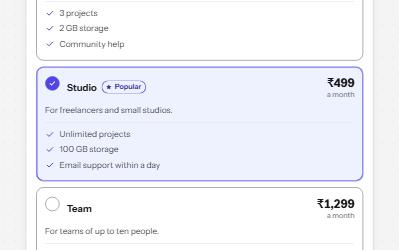
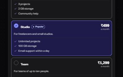
A plan picker where each choice is a large card, built from native radio buttons so arrows, focus and state come free.
-
Checkbox
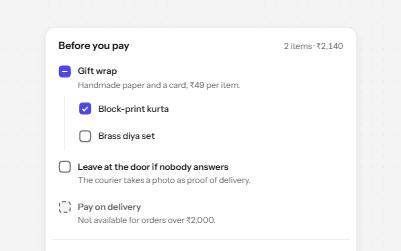
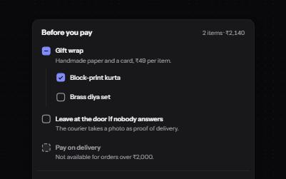
Native checkboxes drawn to match your design, with whole-row targets, a description per option, a mixed state and a required one.
-
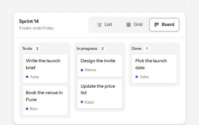
Segmented control
A row of joined segments for picking one of a few views, built from real radio buttons in a fieldset.
-
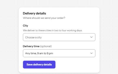
Select
A styled native select with a label, hint, region groups, a placeholder and a required error, drawn by the browser.