Accessibility pattern · Form inputs
Multi-select with tags
The field is a combobox: typing filters a listbox, the arrow keys move a highlight while focus stays in the field, and Enter adds or removes the highlighted value. Each choice becomes a chip in a list with a remove button named after it, and a polite status says what was added or removed and how many are chosen.
- WCAG criteria
- 7
- Keyboard rules
- 7
- Checked with
- axe, keyboard and the inspector
Live demo
Try it
Use it with a mouse, a keyboard or a screen reader. The inspector beside it shows what the browser tells assistive technology as you go: focus, state changes and announcements.
3 selected
Type to filter the list. In the empty field, Backspace moves to the last skill.
- Figma
- Accessibility
- Typography
- Figma
- Accessibility
- Typography
- User research
- Prototyping
- Design systems
- Illustration
- Motion design
- Information architecture
- Copywriting
- HTML and CSS
- JavaScript
- React
No skills match
The demo works without JavaScript only as far as its HTML does; the inspector needs JavaScript.
Keyboard
Keys it answers to
Every action works without a pointer.
| Key | What it does |
|---|---|
| Arrow Down or Arrow Up | In the field, opens the list and moves the highlight to the next or previous skill, wrapping at the ends. |
| Enter | Adds the highlighted skill as a chip, or removes it if it is already chosen. The text clears and focus stays in the field. |
| Escape | Closes the list; pressed again, clears what was typed. |
| Backspace | In the empty field, moves focus to the last chip's remove button. On a chip, removes it. |
| Arrow Left or Arrow Right | Moves between chips; Arrow Left at the start of the field goes to the last chip, and Arrow Right after the last chip comes back. |
| Enter or Space or Delete | On a chip, removes it. Focus moves to the chip that takes its place, or to the field. |
| Tab | Closes the list without choosing and moves on. |
Screen readers
What it announces
Written from the roles, names and states in the markup.
| When | Expected announcement |
|---|---|
| Focus reaches the field | Skills, combo box, collapsed. 3 selected. Type to filter the list. |
| Arrow Down highlights a skill | User research, not selected, 4 of 13 |
| Enter adds it | Added: User research. 4 selected |
| Backspace in the empty field | Remove User research, button |
| A chip is removed | Removed: User research. 3 selected |
| Nothing matches what was typed | No skills match |
These are expected announcements, not recordings. Wording and order differ between screen readers and browsers.
Code
Copy the code
The exact files this demo runs on. The styles are served with a prefix that keeps this site's own styles out of the demo; what you copy is the original.
<div class="ap-multi-select" data-ap-multi-select>
  <div class="ap-multi-select__top">
    <label class="ap-multi-select__label" for="multi-select-input">Skills</label>
    <p class="ap-multi-select__count" id="multi-select-count"><span data-ap-n translate="no">3</span> <span>selected</span></p>
  </div>
  <p class="ap-multi-select__hint" id="multi-select-hint">Type to filter the list. In the empty field, Backspace moves to the last skill.</p>

  <div class="ap-multi-select__field">
    <div class="ap-multi-select__control" data-ap-control>
      <ul class="ap-multi-select__chips" aria-label="Selected skills" data-ap-chips>
      <li class="ap-multi-select__chip" data-value="Figma">
        <span class="ap-multi-select__chip-text">Figma</span>
        <button type="button" class="ap-multi-select__remove" aria-label="Remove Figma"><svg viewBox="0 0 24 24" aria-hidden="true" focusable="false"><path d="M7 7l10 10M17 7 7 17"/></svg></button>
      </li>
      <li class="ap-multi-select__chip" data-value="Accessibility">
        <span class="ap-multi-select__chip-text">Accessibility</span>
        <button type="button" class="ap-multi-select__remove" aria-label="Remove Accessibility"><svg viewBox="0 0 24 24" aria-hidden="true" focusable="false"><path d="M7 7l10 10M17 7 7 17"/></svg></button>
      </li>
      <li class="ap-multi-select__chip" data-value="Typography">
        <span class="ap-multi-select__chip-text">Typography</span>
        <button type="button" class="ap-multi-select__remove" aria-label="Remove Typography"><svg viewBox="0 0 24 24" aria-hidden="true" focusable="false"><path d="M7 7l10 10M17 7 7 17"/></svg></button>
      </li>
      </ul>
      <input class="ap-multi-select__input" id="multi-select-input" type="text" role="combobox" aria-expanded="false" aria-controls="multi-select-list" aria-autocomplete="list" aria-describedby="multi-select-count multi-select-hint" autocomplete="off" spellcheck="false" placeholder="Add a skill" />
      <svg class="ap-multi-select__chevron" viewBox="0 0 24 24" aria-hidden="true" focusable="false"><path d="m6 9 6 6 6-6"/></svg>
    </div>

    <div class="ap-multi-select__pop" data-ap-pop hidden>
      <ul class="ap-multi-select__list" id="multi-select-list" role="listbox" aria-label="Skills" aria-multiselectable="true">
      <li class="ap-multi-select__opt" role="option" id="multi-select-o-figma" aria-selected="true" data-value="Figma">
        <span class="ap-multi-select__box-mark" aria-hidden="true"><svg class="ap-multi-select__tick" viewBox="0 0 24 24" aria-hidden="true" focusable="false"><path d="m6 12.5 4 4 8-9"/></svg></span>
        <span class="ap-multi-select__opt-text">Figma</span>
      </li>
      <li class="ap-multi-select__opt" role="option" id="multi-select-o-accessibility" aria-selected="true" data-value="Accessibility">
        <span class="ap-multi-select__box-mark" aria-hidden="true"><svg class="ap-multi-select__tick" viewBox="0 0 24 24" aria-hidden="true" focusable="false"><path d="m6 12.5 4 4 8-9"/></svg></span>
        <span class="ap-multi-select__opt-text">Accessibility</span>
      </li>
      <li class="ap-multi-select__opt" role="option" id="multi-select-o-typography" aria-selected="true" data-value="Typography">
        <span class="ap-multi-select__box-mark" aria-hidden="true"><svg class="ap-multi-select__tick" viewBox="0 0 24 24" aria-hidden="true" focusable="false"><path d="m6 12.5 4 4 8-9"/></svg></span>
        <span class="ap-multi-select__opt-text">Typography</span>
      </li>
      <li class="ap-multi-select__opt" role="option" id="multi-select-o-research" aria-selected="false" data-value="User research">
        <span class="ap-multi-select__box-mark" aria-hidden="true"><svg class="ap-multi-select__tick" viewBox="0 0 24 24" aria-hidden="true" focusable="false"><path d="m6 12.5 4 4 8-9"/></svg></span>
        <span class="ap-multi-select__opt-text">User research</span>
      </li>
      <li class="ap-multi-select__opt" role="option" id="multi-select-o-prototyping" aria-selected="false" data-value="Prototyping">
        <span class="ap-multi-select__box-mark" aria-hidden="true"><svg class="ap-multi-select__tick" viewBox="0 0 24 24" aria-hidden="true" focusable="false"><path d="m6 12.5 4 4 8-9"/></svg></span>
        <span class="ap-multi-select__opt-text">Prototyping</span>
      </li>
      <li class="ap-multi-select__opt" role="option" id="multi-select-o-systems" aria-selected="false" data-value="Design systems">
        <span class="ap-multi-select__box-mark" aria-hidden="true"><svg class="ap-multi-select__tick" viewBox="0 0 24 24" aria-hidden="true" focusable="false"><path d="m6 12.5 4 4 8-9"/></svg></span>
        <span class="ap-multi-select__opt-text">Design systems</span>
      </li>
      <li class="ap-multi-select__opt" role="option" id="multi-select-o-illustration" aria-selected="false" data-value="Illustration">
        <span class="ap-multi-select__box-mark" aria-hidden="true"><svg class="ap-multi-select__tick" viewBox="0 0 24 24" aria-hidden="true" focusable="false"><path d="m6 12.5 4 4 8-9"/></svg></span>
        <span class="ap-multi-select__opt-text">Illustration</span>
      </li>
      <li class="ap-multi-select__opt" role="option" id="multi-select-o-motion" aria-selected="false" data-value="Motion design">
        <span class="ap-multi-select__box-mark" aria-hidden="true"><svg class="ap-multi-select__tick" viewBox="0 0 24 24" aria-hidden="true" focusable="false"><path d="m6 12.5 4 4 8-9"/></svg></span>
        <span class="ap-multi-select__opt-text">Motion design</span>
      </li>
      <li class="ap-multi-select__opt" role="option" id="multi-select-o-ia" aria-selected="false" data-value="Information architecture">
        <span class="ap-multi-select__box-mark" aria-hidden="true"><svg class="ap-multi-select__tick" viewBox="0 0 24 24" aria-hidden="true" focusable="false"><path d="m6 12.5 4 4 8-9"/></svg></span>
        <span class="ap-multi-select__opt-text">Information architecture</span>
      </li>
      <li class="ap-multi-select__opt" role="option" id="multi-select-o-copy" aria-selected="false" data-value="Copywriting">
        <span class="ap-multi-select__box-mark" aria-hidden="true"><svg class="ap-multi-select__tick" viewBox="0 0 24 24" aria-hidden="true" focusable="false"><path d="m6 12.5 4 4 8-9"/></svg></span>
        <span class="ap-multi-select__opt-text">Copywriting</span>
      </li>
      <li class="ap-multi-select__opt" role="option" id="multi-select-o-html" aria-selected="false" data-value="HTML and CSS">
        <span class="ap-multi-select__box-mark" aria-hidden="true"><svg class="ap-multi-select__tick" viewBox="0 0 24 24" aria-hidden="true" focusable="false"><path d="m6 12.5 4 4 8-9"/></svg></span>
        <span class="ap-multi-select__opt-text">HTML and CSS</span>
      </li>
      <li class="ap-multi-select__opt" role="option" id="multi-select-o-js" aria-selected="false" data-value="JavaScript">
        <span class="ap-multi-select__box-mark" aria-hidden="true"><svg class="ap-multi-select__tick" viewBox="0 0 24 24" aria-hidden="true" focusable="false"><path d="m6 12.5 4 4 8-9"/></svg></span>
        <span class="ap-multi-select__opt-text">JavaScript</span>
      </li>
      <li class="ap-multi-select__opt" role="option" id="multi-select-o-react" aria-selected="false" data-value="React">
        <span class="ap-multi-select__box-mark" aria-hidden="true"><svg class="ap-multi-select__tick" viewBox="0 0 24 24" aria-hidden="true" focusable="false"><path d="m6 12.5 4 4 8-9"/></svg></span>
        <span class="ap-multi-select__opt-text">React</span>
      </li>
      </ul>
      <p class="ap-multi-select__none" data-ap-none hidden>No skills match</p>
    </div>
  </div>

  <p class="ap-multi-select__say" role="status" data-ap-say></p>
</div>
/* Multi-select with tags. Uses the --ap-* design tokens. */
.ap-multi-select {
  position: relative;
  container-type: inline-size;
  display: grid;
  gap: 8px;
  width: min(100%, 520px);
  margin-inline: auto;
  padding: 22px 24px 24px;
  border: 1px solid var(--ap-border);
  border-radius: var(--ap-radius-lg);
  background: var(--ap-surface);
  color: var(--ap-text);
  box-shadow: var(--ap-shadow-md);
  font-family: var(--ap-font);
}

.ap-multi-select__top {
  display: flex;
  align-items: baseline;
  justify-content: space-between;
  gap: 12px;
}
.ap-multi-select__label {
  font-size: .9375rem;
  font-weight: 650;
}
.ap-multi-select__count {
  margin: 0;
  padding: 2px 10px;
  border-radius: var(--ap-radius-full);
  background: var(--ap-surface-2);
  color: var(--ap-text-2);
  font-size: .8125rem;
  font-weight: 600;
  font-variant-numeric: tabular-nums;
  white-space: nowrap;
}
.ap-multi-select__hint {
  margin: 0 0 4px;
  color: var(--ap-text-3);
  font-size: .875rem;
  line-height: 1.45;
}

/* The field box: chips and the text input share one bordered row. */
.ap-multi-select__field {
  position: relative;
}
.ap-multi-select__control {
  display: flex;
  flex-wrap: wrap;
  align-items: center;
  gap: 6px;
  min-height: 48px;
  padding: 7px 40px 7px 8px;
  border: 1px solid var(--ap-border-strong);
  border-radius: var(--ap-radius);
  background: var(--ap-surface);
  cursor: text;
  transition: border-color var(--ap-duration) var(--ap-ease);
}
.ap-multi-select__control:hover {
  border-color: var(--ap-text-2);
}
.ap-multi-select__control:has(.ap-multi-select__input:focus-visible) {
  border-color: var(--ap-focus);
  outline: 2px solid var(--ap-focus);
  outline-offset: 1px;
}

.ap-multi-select__chips {
  display: flex;
  flex-wrap: wrap;
  gap: 6px;
  max-width: 100%;
  margin: 0;
  padding: 0;
  list-style: none;
}
.ap-multi-select__chips[hidden],
.ap-multi-select__opt[hidden] {
  display: none;
}
.ap-multi-select__chip {
  display: inline-flex;
  align-items: center;
  gap: 2px;
  min-height: 32px;
  padding: 0 3px 0 12px;
  border: 1px solid transparent;
  border-radius: var(--ap-radius-full);
  background: var(--ap-accent-soft);
  color: var(--ap-accent-soft-text);
  font-size: .875rem;
  font-weight: 600;
  line-height: 1.2;
  animation: ap-multi-select-in 160ms var(--ap-ease);
}
.ap-multi-select__remove {
  display: grid;
  place-items: center;
  width: 26px;
  height: 26px;
  flex-shrink: 0;
  padding: 0;
  border: 0;
  border-radius: var(--ap-radius-full);
  background: transparent;
  color: inherit;
  cursor: pointer;
  transition: background-color var(--ap-duration) var(--ap-ease), color var(--ap-duration) var(--ap-ease);
}
.ap-multi-select__remove:hover {
  background: var(--ap-accent-soft-text);
  color: var(--ap-accent-soft);
}
.ap-multi-select__remove:focus-visible {
  outline: 2px solid var(--ap-focus);
  outline-offset: 1px;
  background: var(--ap-accent-soft-text);
  color: var(--ap-accent-soft);
}
.ap-multi-select__remove svg {
  width: 14px;
  height: 14px;
  fill: none;
  stroke: currentColor;
  stroke-width: 2.5;
  stroke-linecap: round;
}

.ap-multi-select__input {
  flex: 1 1 6rem;
  min-width: 6rem;
  min-height: 32px;
  padding: 0 4px;
  border: 0;
  background: transparent;
  color: var(--ap-text);
  font: inherit;
}
.ap-multi-select__input::placeholder {
  color: var(--ap-text-3);
}
.ap-multi-select__input:focus {
  outline: none;
}

.ap-multi-select__chevron {
  position: absolute;
  top: 14px;
  right: 12px;
  width: 20px;
  height: 20px;
  fill: none;
  stroke: var(--ap-text-3);
  stroke-width: 2;
  stroke-linecap: round;
  stroke-linejoin: round;
  pointer-events: none;
  transition: transform var(--ap-duration) var(--ap-ease);
}
.ap-multi-select__control:has([aria-expanded="true"]) .ap-multi-select__chevron {
  transform: rotate(180deg);
}

/* The popup list */
.ap-multi-select__pop {
  position: absolute;
  z-index: 5;
  top: calc(100% + 6px);
  right: 0;
  left: 0;
  padding: 6px;
  border: 1px solid var(--ap-border);
  border-radius: var(--ap-radius);
  background: var(--ap-surface);
  box-shadow: var(--ap-shadow-lg);
  animation: ap-multi-select-pop 140ms var(--ap-ease);
}
.ap-multi-select__list {
  max-height: 14.25rem;
  margin: 0;
  padding: 0;
  overflow-y: auto;
  overscroll-behavior: contain;
  list-style: none;
}
.ap-multi-select__opt {
  display: flex;
  align-items: center;
  gap: 12px;
  min-height: 40px;
  padding: 8px 10px;
  border-radius: var(--ap-radius-sm);
  color: var(--ap-text-2);
  cursor: pointer;
}
.ap-multi-select__opt:hover {
  background: var(--ap-surface-2);
}
.ap-multi-select__opt.is-active {
  background: var(--ap-surface-2);
  color: var(--ap-text);
  outline: 2px solid var(--ap-focus);
  outline-offset: -2px;
}
.ap-multi-select__opt[aria-selected="true"] {
  color: var(--ap-text);
  font-weight: 600;
}

/* A checkbox-like mark: empty square, or filled with a tick when chosen. */
.ap-multi-select__box-mark {
  display: grid;
  place-items: center;
  width: 18px;
  height: 18px;
  flex-shrink: 0;
  border: 1.5px solid var(--ap-border-strong);
  border-radius: 5px;
  background: var(--ap-surface);
}
.ap-multi-select__tick {
  width: 14px;
  height: 14px;
  fill: none;
  stroke: var(--ap-on-accent);
  stroke-width: 3;
  stroke-linecap: round;
  stroke-linejoin: round;
  visibility: hidden;
}
.ap-multi-select__opt[aria-selected="true"] .ap-multi-select__box-mark {
  border-color: var(--ap-accent);
  background: var(--ap-accent);
}
.ap-multi-select__opt[aria-selected="true"] .ap-multi-select__tick {
  visibility: visible;
}

.ap-multi-select__none {
  margin: 0;
  padding: 14px 10px;
  color: var(--ap-text-3);
  text-align: center;
}

/* Heard, not seen: the chips already show the change. */
.ap-multi-select__say {
  position: absolute;
  width: 1px;
  height: 1px;
  margin: -1px;
  padding: 0;
  overflow: hidden;
  clip-path: inset(50%);
  white-space: nowrap;
}

@container (max-width: 400px) {
  .ap-multi-select { padding: 18px 16px 20px; }
}

@keyframes ap-multi-select-in {
  from { opacity: 0; transform: scale(.92); }
}
@keyframes ap-multi-select-pop {
  from { opacity: 0; transform: translateY(-4px); }
}

@media (prefers-reduced-motion: reduce) {
  .ap-multi-select__chip,
  .ap-multi-select__pop { animation: none; }
  .ap-multi-select__control,
  .ap-multi-select__chevron,
  .ap-multi-select__remove { transition: none; }
}
/**
 * Multi-select with tags: a combobox that filters a multi-select listbox, and
 * a list of chips, one per chosen value, each with a named remove button.
 *
 * Markup: [data-ap-multi-select] holding a ul[data-ap-chips] of
 * li[data-value] > button (the remove button), an input[role=combobox], a
 * popup [data-ap-pop] with ul[role=listbox][aria-multiselectable] of
 * li[role=option][data-value] and a p[data-ap-none] for no matches, a count
 * [data-ap-n], and a p[role=status][data-ap-say] for announcements.
 * data-value holds the English value: chip names are built from it.
 */

export function init(root) {
  const input = root.querySelector("[role=combobox]");
  const control = root.querySelector("[data-ap-control]");
  const chips = root.querySelector("[data-ap-chips]");
  const pop = root.querySelector("[data-ap-pop]");
  const listbox = root.querySelector("[role=listbox]");
  const options = [...listbox.querySelectorAll("[role=option]")];
  const none = root.querySelector("[data-ap-none]");
  const count = root.querySelector("[data-ap-n]");
  const say = root.querySelector("[data-ap-say]");
  const removeIcon = chips.querySelector("svg")?.cloneNode(true);

  let shown = options;
  let active = null;
  let sayTimer = 0;

  const isOpen = () => !pop.hidden;
  const removeButtons = () => [...chips.querySelectorAll("button")];
  const optionFor = (value) => options.find((o) => o.dataset.value === value);
  const chipFor = (value) => [...chips.children].find((li) => li.dataset.value === value);

  function el(tag, text, cls) {
    const node = document.createElement(tag);
    if (cls) node.className = cls;
    if (text != null) node.textContent = text;
    return node;
  }

  /* ── The highlight (aria-activedescendant; focus stays in the field) ── */
  function setActive(option) {
    active = option;
    for (const o of options) o.classList.toggle("is-active", o === option);
    if (option) {
      input.setAttribute("aria-activedescendant", option.id);
      option.scrollIntoView({ block: "nearest" });
    } else {
      input.removeAttribute("aria-activedescendant");
    }
  }

  function filter() {
    const query = input.value.trim().toLocaleLowerCase();
    shown = options.filter((o) => {
      const hit = !query
        || o.textContent.toLocaleLowerCase().includes(query)
        || o.dataset.value.toLocaleLowerCase().includes(query);
      o.hidden = !hit;
      return hit;
    });
    listbox.hidden = shown.length === 0;
    none.hidden = shown.length > 0;
    input.setAttribute("aria-expanded", String(isOpen() && shown.length > 0));
    // Typing highlights the first match, so Enter takes it; browsing starts with none.
    if (query) setActive(shown[0] || null);
    else if (!shown.includes(active)) setActive(null);
  }

  function open() {
    if (isOpen()) return;
    pop.hidden = false;
    filter();
  }

  function close() {
    pop.hidden = true;
    input.setAttribute("aria-expanded", "false");
    setActive(null);
  }

  /* ── Announcements: fixed words, the value and the count in their own elements ── */
  function announce(word, value) {
    clearTimeout(sayTimer);
    const n = el("span", String(chips.children.length));
    n.setAttribute("translate", "no");
    say.replaceChildren(el("span", word), " ", el("strong", value), ". ", n, " ", el("span", "selected"));
  }

  function updateCount() {
    count.textContent = String(chips.children.length);
    chips.hidden = chips.children.length === 0;
  }

  /* ── Adding and removing ── */
  function add(value) {
    if (chipFor(value)) return;
    const li = el("li", null, "ap-multi-select__chip");
    li.dataset.value = value;
    const button = el("button", null, "ap-multi-select__remove");
    button.type = "button";
    button.setAttribute("aria-label", `Remove ${value}`);
    if (removeIcon) button.append(removeIcon.cloneNode(true));
    li.append(el("span", value, "ap-multi-select__chip-text"), button);
    chips.append(li);
    optionFor(value)?.setAttribute("aria-selected", "true");
    updateCount();
    announce("Added:", value);
  }

  /** Removes a chip. When it had focus, focus goes to the chip that takes its place, or the field. */
  function remove(value) {
    const li = chipFor(value);
    if (!li) return;
    const hadFocus = li.contains(document.activeElement);
    const next = li.nextElementSibling?.querySelector("button");
    li.remove();
    optionFor(value)?.setAttribute("aria-selected", "false");
    updateCount();
    announce("Removed:", value);
    if (hadFocus) (next || input).focus();
  }

  function toggle(option) {
    const value = option.dataset.value;
    if (option.getAttribute("aria-selected") === "true") remove(value);
    else add(value);
    input.value = "";
    filter();
    setActive(option);
  }

  function move(step) {
    if (!isOpen()) open();
    if (!shown.length) return;
    const at = shown.indexOf(active);
    let next;
    if (at === -1) next = step > 0 ? shown[0] : shown[shown.length - 1];
    else next = shown[(at + step + shown.length) % shown.length];
    setActive(next);
  }

  /* ── Keys in the field ── */
  function onInputKey(event) {
    const { key } = event;
    if (key === "ArrowDown" || key === "ArrowUp") {
      event.preventDefault();
      if (event.altKey) open();
      else move(key === "ArrowDown" ? 1 : -1);
    } else if (key === "Enter") {
      if (isOpen() && active) {
        event.preventDefault();
        toggle(active);
      }
    } else if (key === "Escape") {
      if (isOpen()) {
        event.preventDefault();
        close();
      } else if (input.value) {
        event.preventDefault();
        input.value = "";
      }
    } else if (key === "Tab") {
      close();
    } else if (key === "Backspace" || key === "ArrowLeft") {
      const atStart = input.selectionStart === 0 && input.selectionEnd === 0;
      const last = removeButtons().at(-1);
      if (key === "Backspace" ? input.value === "" : atStart) {
        if (!last) return;
        event.preventDefault();
        close();
        last.focus();
      }
    }
  }

  function onInput() {
    open();
    filter();
    // Say when nothing matches, once typing pauses.
    clearTimeout(sayTimer);
    if (!shown.length) sayTimer = setTimeout(() => { say.replaceChildren(el("span", "No skills match")); }, 400);
  }

  /* ── Keys on a chip's remove button ── */
  function onChipKey(event) {
    const button = event.target.closest(".ap-multi-select__remove");
    if (!button) return;
    const all = removeButtons();
    const at = all.indexOf(button);
    if (event.key === "ArrowLeft") {
      event.preventDefault();
      all[Math.max(0, at - 1)].focus();
    } else if (event.key === "ArrowRight") {
      event.preventDefault();
      (all[at + 1] || input).focus();
    } else if (event.key === "Backspace" || event.key === "Delete") {
      event.preventDefault();
      remove(button.parentElement.dataset.value);
    }
  }

  /* ── Pointer ── */
  function onClick(event) {
    const button = event.target.closest(".ap-multi-select__remove");
    if (button && chips.contains(button)) {
      remove(button.parentElement.dataset.value);
      return;
    }
    const option = event.target.closest("[role=option]");
    if (option && listbox.contains(option)) {
      toggle(option);
      input.focus();
      return;
    }
    // Anywhere else in the field box opens the list.
    if (control.contains(event.target)) {
      input.focus();
      open();
    }
  }

  // Keeps focus in the field while an option is clicked.
  const keepFocus = (event) => event.preventDefault();

  function onFocusOut(event) {
    if (!root.contains(event.relatedTarget)) close();
  }

  input.addEventListener("keydown", onInputKey);
  input.addEventListener("input", onInput);
  chips.addEventListener("keydown", onChipKey);
  pop.addEventListener("mousedown", keepFocus);
  root.addEventListener("click", onClick);
  root.addEventListener("focusout", onFocusOut);
  updateCount();

  return () => {
    clearTimeout(sayTimer);
    input.removeEventListener("keydown", onInputKey);
    input.removeEventListener("input", onInput);
    chips.removeEventListener("keydown", onChipKey);
    pop.removeEventListener("mousedown", keepFocus);
    root.removeEventListener("click", onClick);
    root.removeEventListener("focusout", onFocusOut);
  };
}

for (const root of document.querySelectorAll("[data-ap-multi-select]")) init(root);
/* Design tokens for the pattern components. Light by default, dark when the
   system asks for it; set data-theme="dark" on :root to force dark. */
:root {
    --ap-radius-sm: 8px;
    --ap-radius: 12px;
    --ap-radius-lg: 16px;
    --ap-radius-full: 999px;
    --ap-font: "Instrument Sans", ui-sans-serif, system-ui, -apple-system, "Segoe UI", Roboto, sans-serif;
    --ap-mono: "JetBrains Mono", ui-monospace, "Cascadia Mono", "SF Mono", Consolas, monospace;
    --ap-ease: cubic-bezier(.2, .8, .2, 1);
    --ap-duration: 180ms;
    --ap-target: 44px;
    --ap-bg: #F4F4F5;
    --ap-surface: #FFFFFF;
    --ap-surface-2: #F4F4F5;
    --ap-surface-3: #E4E4E7;
    --ap-border: #E4E4E7;
    --ap-border-strong: #76767F;
    --ap-text: #18181B;
    --ap-text-2: #3F3F46;
    --ap-text-3: #5E5E66;
    --ap-accent: #4F46E5;
    --ap-accent-hover: #4338CA;
    --ap-on-accent: #FFFFFF;
    --ap-accent-text: #4338CA;
    --ap-accent-soft: #EEF2FF;
    --ap-accent-soft-text: #3730A3;
    --ap-focus: #4F46E5;
    --ap-danger: #B91C1C;
    --ap-danger-soft: #FEF2F2;
    --ap-success: #15803D;
    --ap-success-soft: #F0FDF4;
    --ap-warning: #A15C07;
    --ap-warning-soft: #FEFCE8;
    --ap-info: #1D4ED8;
    --ap-info-soft: #EFF6FF;
    --ap-scrim: rgb(9 9 11 / .48);
    --ap-shadow-sm: 0 1px 2px rgb(9 9 11 / .06);
    --ap-shadow-md: 0 1px 2px rgb(9 9 11 / .05), 0 6px 16px -4px rgb(9 9 11 / .1);
    --ap-shadow-lg: 0 2px 6px rgb(9 9 11 / .06), 0 20px 40px -12px rgb(9 9 11 / .22);
    --ap-light-bg: #F4F4F5;
    --ap-light-surface: #FFFFFF;
    --ap-light-surface-2: #F4F4F5;
    --ap-light-surface-3: #E4E4E7;
    --ap-light-border: #E4E4E7;
    --ap-light-border-strong: #76767F;
    --ap-light-text: #18181B;
    --ap-light-text-2: #3F3F46;
    --ap-light-text-3: #5E5E66;
    --ap-light-accent: #4F46E5;
    --ap-light-accent-hover: #4338CA;
    --ap-light-on-accent: #FFFFFF;
    --ap-light-accent-text: #4338CA;
    --ap-light-accent-soft: #EEF2FF;
    --ap-light-accent-soft-text: #3730A3;
    --ap-light-focus: #4F46E5;
    --ap-light-danger: #B91C1C;
    --ap-light-danger-soft: #FEF2F2;
    --ap-light-success: #15803D;
    --ap-light-success-soft: #F0FDF4;
    --ap-light-warning: #A15C07;
    --ap-light-warning-soft: #FEFCE8;
    --ap-light-info: #1D4ED8;
    --ap-light-info-soft: #EFF6FF;
    --ap-light-scrim: rgb(9 9 11 / .48);
    --ap-light-shadow-sm: 0 1px 2px rgb(9 9 11 / .06);
    --ap-light-shadow-md: 0 1px 2px rgb(9 9 11 / .05), 0 6px 16px -4px rgb(9 9 11 / .1);
    --ap-light-shadow-lg: 0 2px 6px rgb(9 9 11 / .06), 0 20px 40px -12px rgb(9 9 11 / .22);
    --ap-dark-bg: #09090B;
    --ap-dark-surface: #18181B;
    --ap-dark-surface-2: #27272A;
    --ap-dark-surface-3: #3F3F46;
    --ap-dark-border: #2E2E33;
    --ap-dark-border-strong: #8E8E97;
    --ap-dark-text: #FAFAFA;
    --ap-dark-text-2: #D4D4D8;
    --ap-dark-text-3: #A1A1AA;
    --ap-dark-accent: #818CF8;
    --ap-dark-accent-hover: #A5B4FC;
    --ap-dark-on-accent: #0C0A1F;
    --ap-dark-accent-text: #A5B4FC;
    --ap-dark-accent-soft: #1E1B4B;
    --ap-dark-accent-soft-text: #C7D2FE;
    --ap-dark-focus: #A5B4FC;
    --ap-dark-danger: #F87171;
    --ap-dark-danger-soft: #2A1215;
    --ap-dark-success: #4ADE80;
    --ap-dark-success-soft: #0F2A1A;
    --ap-dark-warning: #FACC15;
    --ap-dark-warning-soft: #2A2410;
    --ap-dark-info: #60A5FA;
    --ap-dark-info-soft: #0F1D33;
    --ap-dark-scrim: rgb(0 0 0 / .62);
    --ap-dark-shadow-sm: 0 1px 2px rgb(0 0 0 / .4);
    --ap-dark-shadow-md: 0 1px 2px rgb(0 0 0 / .4), 0 8px 20px -6px rgb(0 0 0 / .5);
    --ap-dark-shadow-lg: 0 2px 8px rgb(0 0 0 / .45), 0 24px 48px -12px rgb(0 0 0 / .7);
}
@media (prefers-color-scheme: dark) {
  :root:not([data-theme="light"]) {
      --ap-bg: #09090B;
      --ap-surface: #18181B;
      --ap-surface-2: #27272A;
      --ap-surface-3: #3F3F46;
      --ap-border: #2E2E33;
      --ap-border-strong: #8E8E97;
      --ap-text: #FAFAFA;
      --ap-text-2: #D4D4D8;
      --ap-text-3: #A1A1AA;
      --ap-accent: #818CF8;
      --ap-accent-hover: #A5B4FC;
      --ap-on-accent: #0C0A1F;
      --ap-accent-text: #A5B4FC;
      --ap-accent-soft: #1E1B4B;
      --ap-accent-soft-text: #C7D2FE;
      --ap-focus: #A5B4FC;
      --ap-danger: #F87171;
      --ap-danger-soft: #2A1215;
      --ap-success: #4ADE80;
      --ap-success-soft: #0F2A1A;
      --ap-warning: #FACC15;
      --ap-warning-soft: #2A2410;
      --ap-info: #60A5FA;
      --ap-info-soft: #0F1D33;
      --ap-scrim: rgb(0 0 0 / .62);
      --ap-shadow-sm: 0 1px 2px rgb(0 0 0 / .4);
      --ap-shadow-md: 0 1px 2px rgb(0 0 0 / .4), 0 8px 20px -6px rgb(0 0 0 / .5);
      --ap-shadow-lg: 0 2px 8px rgb(0 0 0 / .45), 0 24px 48px -12px rgb(0 0 0 / .7);
  }
}
:root[data-theme="dark"] {
    --ap-bg: #09090B;
    --ap-surface: #18181B;
    --ap-surface-2: #27272A;
    --ap-surface-3: #3F3F46;
    --ap-border: #2E2E33;
    --ap-border-strong: #8E8E97;
    --ap-text: #FAFAFA;
    --ap-text-2: #D4D4D8;
    --ap-text-3: #A1A1AA;
    --ap-accent: #818CF8;
    --ap-accent-hover: #A5B4FC;
    --ap-on-accent: #0C0A1F;
    --ap-accent-text: #A5B4FC;
    --ap-accent-soft: #1E1B4B;
    --ap-accent-soft-text: #C7D2FE;
    --ap-focus: #A5B4FC;
    --ap-danger: #F87171;
    --ap-danger-soft: #2A1215;
    --ap-success: #4ADE80;
    --ap-success-soft: #0F2A1A;
    --ap-warning: #FACC15;
    --ap-warning-soft: #2A2410;
    --ap-info: #60A5FA;
    --ap-info-soft: #0F1D33;
    --ap-scrim: rgb(0 0 0 / .62);
    --ap-shadow-sm: 0 1px 2px rgb(0 0 0 / .4);
    --ap-shadow-md: 0 1px 2px rgb(0 0 0 / .4), 0 8px 20px -6px rgb(0 0 0 / .5);
    --ap-shadow-lg: 0 2px 8px rgb(0 0 0 / .45), 0 24px 48px -12px rgb(0 0 0 / .7);
}
WCAG 2.2
What it meets
The success criteria this pattern takes care of, and how.
-
1.3.1 Info and Relationships
Level A
The chips are a named list, so a screen reader says how many there are, and the field's label and hint are tied to it in code.
-
2.1.1 Keyboard
Level A
Choosing, removing and moving between chips all work from the keyboard; the pointer is never required.
-
2.4.3 Focus Order
Level A
When a chip goes, focus moves to the chip that takes its place or back to the field, never to the top of the page.
-
2.4.7 Focus Visible
Level AA
The field shows a ring while it has focus, each remove button has its own, and the highlighted option is outlined.
-
2.5.8 Target Size (Minimum)
Level AA
Each remove button is at least 24 by 24 pixels and sits apart from its neighbours.
-
4.1.2 Name, Role, Value
Level A
The field is a combobox with aria-expanded and aria-activedescendant; options carry aria-selected, and each remove button is named after its skill.
-
4.1.3 Status Messages
Level AA
Adding, removing and an empty search are reported in a polite status message without moving focus.
Usage
When to use it
Use it
- Choosing several values from a long, known list, like skills, tags, recipients or cities.
- When the chosen values need to stay visible and easy to remove one at a time.
Use something else
- Fewer than about eight choices: a group of checkboxes shows them all and needs no typing.
- Free text people make up as they go, like keywords: a plain text field is simpler.
- Choosing exactly one value: use a combobox or a select.
Common failures
How it usually goes wrong
Remove buttons named only "×"
A screen reader user hears "times, button" six times and cannot tell which chip each one removes. Each button here is named "Remove" plus its skill.
Focus lost when a chip is removed
Deleting the focused button drops focus to the page, so keyboard users start again from the top. Focus moves to the next chip or back to the field.
Silent changes
A chip appearing or vanishing makes no sound. A polite status says what was added or removed and the new count.
The highlight moves focus out of the field
Moving real focus into the list stops people typing. aria-activedescendant points at the highlighted option while the caret stays put.
Chosen values shown by color alone
A tinted row is easy to miss. Chosen options also carry a ticked box and aria-selected, and the chips repeat them in words.
Chips that cannot be reached
Chips drawn as decoration, with remove icons that only respond to a click, cannot be removed from the keyboard. Each one is a real button.
Notes
Building it
- The listbox has aria-multiselectable="true", and aria-selected marks every chosen skill, so Enter on a chosen one removes it again.
- Keep the English value in data-value and build chip names from it: the script then writes only strings it knows, and translation happens in one place.
- Typing highlights the first match so Enter adds it at once; with an empty field, nothing is highlighted until the arrow keys are used.
- The live count sits in the field's description too, so it is heard when focus arrives, not only when it changes.
- A click anywhere in the field box, between the chips too, puts focus in the text input and opens the list, so the box behaves as one field.
Sources: WAI-ARIA Authoring Practices: Combobox · WAI-ARIA Authoring Practices: Listbox
Checked with axe in light and dark themes, at desktop and phone widths, and by keyboard. Not yet tested with every screen reader and browser pair. Report a correction
Related
Patterns that go with it
-
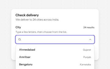
Combobox with autocomplete
A text field that filters a list of suggestions as you type, with arrow keys to pick one and a live count of matches.
-
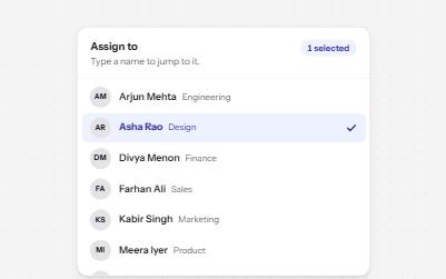
Listbox
A list of options to choose one or several from, with arrow keys, typing to jump and a count of what is selected.
-
Checkbox group with select all
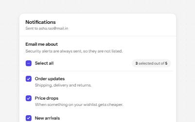
A fieldset of related checkboxes with a Select all box that shows a mixed state and a live count of what is chosen.
-
Search filters
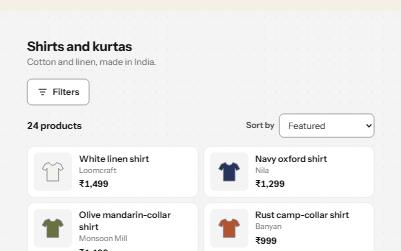
A product filter panel: grouped checkboxes with counts, a price range, sort, removable chips and a result count that is announced.