Accessibility pattern · Form inputs
Radio cards
Each card is a label wrapped around a real radio button, so a click anywhere on it chooses the plan and the arrow keys move between plans as they do in any radio group. The radio is named by the plan and its price and described by its features, so the card reads in full without the whole card becoming one long name.
- WCAG criteria
- 7
- Keyboard rules
- 5
- Checked with
- axe, keyboard and the inspector
Live demo
Try it
Use it with a mouse, a keyboard or a screen reader. The inspector beside it shows what the browser tells assistive technology as you go: focus, state changes and announcements.
The demo works without JavaScript only as far as its HTML does; the inspector needs JavaScript.
Keyboard
Keys it answers to
Every action works without a pointer.
| Key | What it does |
|---|---|
| Tab | Moves to the chosen plan, or to the first plan when none is chosen; the next Tab leaves the group. |
| Arrow Down or Arrow Right | Chooses the next plan, wrapping from the last to the first. |
| Arrow Up or Arrow Left | Chooses the previous plan, wrapping from the first to the last. |
| Space | Chooses the focused plan when none is chosen yet. |
| Enter | On a plan, submits the form, the same as pressing Continue. |
Screen readers
What it announces
Written from the roles, names and states in the markup.
| When | Expected announcement |
|---|---|
| Tab reaches the group | Choose a plan, group. Prices include GST. Studio ₹499 a month, radio button, checked, 2 of 3. Popular. For freelancers and small studios. |
| Arrow Down chooses the next plan | Team ₹1,299 a month, radio button, checked, 3 of 3. For teams of up to ten people. Everything in Studio… |
| Continue is pressed with nothing chosen | Focus moves to Starter: Choose a plan, group. Choose a plan to continue. Starter ₹0 a month, radio button, not checked, 1 of 3 |
| Continue is pressed with a plan chosen | Plan chosen: Team |
These are expected announcements, not recordings. Wording and order differ between screen readers and browsers.
Code
Copy the code
The exact files this demo runs on. The styles are served with a prefix that keeps this site's own styles out of the demo; what you copy is the original.
<form class="ap-radio-cards" data-ap-radio-cards novalidate>
  <fieldset class="ap-radio-cards__set" aria-describedby="radio-cards-hint">
    <legend class="ap-radio-cards__legend">Choose a plan</legend>
    <p class="ap-radio-cards__hint" id="radio-cards-hint">Prices include GST. Change or cancel at any time.</p>
    <p class="ap-error ap-radio-cards__error" id="radio-cards-error" hidden>
      <svg class="ap-radio-cards__error-icon" viewBox="0 0 24 24" aria-hidden="true" focusable="false"><circle cx="12" cy="12" r="9"/><path d="M12 7.5v5.5M12 16.5h.01"/></svg>
      <span>Choose a plan to continue.</span>
    </p>
    <div class="ap-radio-cards__grid">
      <label class="ap-radio-cards__card">
        <input class="ap-radio-cards__radio" type="radio" name="radio-cards-plan" value="starter" aria-labelledby="radio-cards-starter-name radio-cards-starter-price" aria-describedby="radio-cards-starter-fit radio-cards-starter-features" />
        <span class="ap-radio-cards__top">
          <span class="ap-radio-cards__name" id="radio-cards-starter-name">Starter</span>
          <span class="ap-radio-cards__mark" aria-hidden="true"><svg viewBox="0 0 24 24" focusable="false"><path d="m6.5 12.5 3.5 3.5 7.5-8"/></svg></span>
        </span>
        <span class="ap-radio-cards__price" id="radio-cards-starter-price"><span class="ap-radio-cards__amount">₹0</span> <span class="ap-radio-cards__per">a month</span></span>
        <span class="ap-radio-cards__fit" id="radio-cards-starter-fit">For trying it out on your own.</span>
        <span class="ap-radio-cards__features" id="radio-cards-starter-features">
          <span class="ap-radio-cards__feature"><svg class="ap-radio-cards__tick" viewBox="0 0 24 24" aria-hidden="true" focusable="false"><path d="m5 12.5 4.5 4.5L19 7.5"/></svg>3 projects</span>
          <span class="ap-radio-cards__feature"><svg class="ap-radio-cards__tick" viewBox="0 0 24 24" aria-hidden="true" focusable="false"><path d="m5 12.5 4.5 4.5L19 7.5"/></svg>2 GB storage</span>
          <span class="ap-radio-cards__feature"><svg class="ap-radio-cards__tick" viewBox="0 0 24 24" aria-hidden="true" focusable="false"><path d="m5 12.5 4.5 4.5L19 7.5"/></svg>Community help</span>
        </span>
      </label>
      <label class="ap-radio-cards__card">
        <input class="ap-radio-cards__radio" type="radio" name="radio-cards-plan" value="studio" aria-labelledby="radio-cards-studio-name radio-cards-studio-price" aria-describedby="radio-cards-studio-badge radio-cards-studio-fit radio-cards-studio-features" checked />
        <span class="ap-radio-cards__top">
          <span class="ap-radio-cards__name" id="radio-cards-studio-name">Studio</span>
          <span class="ap-radio-cards__badge" id="radio-cards-studio-badge"><svg viewBox="0 0 24 24" aria-hidden="true" focusable="false"><path d="m12 3.5 2.6 5.3 5.9.9-4.25 4.1 1 5.8L12 16.85 6.75 19.6l1-5.8L3.5 9.7l5.9-.9Z"/></svg>Popular</span>
          <span class="ap-radio-cards__mark" aria-hidden="true"><svg viewBox="0 0 24 24" focusable="false"><path d="m6.5 12.5 3.5 3.5 7.5-8"/></svg></span>
        </span>
        <span class="ap-radio-cards__price" id="radio-cards-studio-price"><span class="ap-radio-cards__amount">₹499</span> <span class="ap-radio-cards__per">a month</span></span>
        <span class="ap-radio-cards__fit" id="radio-cards-studio-fit">For freelancers and small studios.</span>
        <span class="ap-radio-cards__features" id="radio-cards-studio-features">
          <span class="ap-radio-cards__feature"><svg class="ap-radio-cards__tick" viewBox="0 0 24 24" aria-hidden="true" focusable="false"><path d="m5 12.5 4.5 4.5L19 7.5"/></svg>Unlimited projects</span>
          <span class="ap-radio-cards__feature"><svg class="ap-radio-cards__tick" viewBox="0 0 24 24" aria-hidden="true" focusable="false"><path d="m5 12.5 4.5 4.5L19 7.5"/></svg>100 GB storage</span>
          <span class="ap-radio-cards__feature"><svg class="ap-radio-cards__tick" viewBox="0 0 24 24" aria-hidden="true" focusable="false"><path d="m5 12.5 4.5 4.5L19 7.5"/></svg>Email support within a day</span>
        </span>
      </label>
      <label class="ap-radio-cards__card">
        <input class="ap-radio-cards__radio" type="radio" name="radio-cards-plan" value="team" aria-labelledby="radio-cards-team-name radio-cards-team-price" aria-describedby="radio-cards-team-fit radio-cards-team-features" />
        <span class="ap-radio-cards__top">
          <span class="ap-radio-cards__name" id="radio-cards-team-name">Team</span>
          <span class="ap-radio-cards__mark" aria-hidden="true"><svg viewBox="0 0 24 24" focusable="false"><path d="m6.5 12.5 3.5 3.5 7.5-8"/></svg></span>
        </span>
        <span class="ap-radio-cards__price" id="radio-cards-team-price"><span class="ap-radio-cards__amount">₹1,299</span> <span class="ap-radio-cards__per">a month</span></span>
        <span class="ap-radio-cards__fit" id="radio-cards-team-fit">For teams of up to ten people.</span>
        <span class="ap-radio-cards__features" id="radio-cards-team-features">
          <span class="ap-radio-cards__feature"><svg class="ap-radio-cards__tick" viewBox="0 0 24 24" aria-hidden="true" focusable="false"><path d="m5 12.5 4.5 4.5L19 7.5"/></svg>Everything in Studio</span>
          <span class="ap-radio-cards__feature"><svg class="ap-radio-cards__tick" viewBox="0 0 24 24" aria-hidden="true" focusable="false"><path d="m5 12.5 4.5 4.5L19 7.5"/></svg>Shared folders</span>
          <span class="ap-radio-cards__feature"><svg class="ap-radio-cards__tick" viewBox="0 0 24 24" aria-hidden="true" focusable="false"><path d="m5 12.5 4.5 4.5L19 7.5"/></svg>Phone support</span>
        </span>
      </label>
    </div>
  </fieldset>
  <div class="ap-radio-cards__foot">
    <p class="ap-radio-cards__total"><span class="ap-radio-cards__total-k">Due today</span> <strong class="ap-radio-cards__total-v" data-ap-total translate="no">₹499</strong></p>
    <button type="submit" class="ap-btn ap-btn--primary">Continue</button>
  </div>
  <p class="ap-radio-cards__status" role="status"></p>
</form>
/* Shared primitives: buttons and form fields used across the patterns.
   Uses the --ap-* design tokens. */

.ap-btn {
  display: inline-flex;
  align-items: center;
  justify-content: center;
  gap: 8px;
  min-height: 40px;
  padding: 0 16px;
  border: 1px solid var(--ap-border-strong);
  border-radius: var(--ap-radius-sm);
  background: var(--ap-surface);
  color: var(--ap-text);
  font: inherit;
  font-weight: 600;
  line-height: 1.2;
  text-decoration: none;
  white-space: nowrap;
  cursor: pointer;
  transition: background-color var(--ap-duration) var(--ap-ease), border-color var(--ap-duration) var(--ap-ease), box-shadow var(--ap-duration) var(--ap-ease);
}
.ap-btn:hover {
  background: var(--ap-surface-2);
}
.ap-btn:focus-visible {
  outline: 2px solid var(--ap-focus);
  outline-offset: 2px;
}
.ap-btn:disabled,
.ap-btn[aria-disabled="true"] {
  opacity: .55;
  cursor: not-allowed;
}
.ap-btn--primary {
  border-color: var(--ap-accent);
  background: var(--ap-accent);
  color: var(--ap-on-accent);
  box-shadow: var(--ap-shadow-sm);
}
.ap-btn--primary:hover {
  border-color: var(--ap-accent-hover);
  background: var(--ap-accent-hover);
}
.ap-btn--danger {
  border-color: var(--ap-danger);
  background: var(--ap-danger);
  color: var(--ap-surface);
}
.ap-btn--danger:hover {
  filter: brightness(1.08);
}
.ap-btn--ghost {
  border-color: transparent;
  background: transparent;
}
.ap-btn--ghost:hover {
  background: var(--ap-surface-2);
}
.ap-btn__icon {
  width: 18px;
  height: 18px;
  flex-shrink: 0;
  fill: none;
  stroke: currentColor;
  stroke-width: 2;
  stroke-linecap: round;
  stroke-linejoin: round;
}

.ap-field {
  display: grid;
  gap: 6px;
}
.ap-label {
  color: var(--ap-text);
  font-weight: 600;
  font-size: .9375rem;
}
.ap-hint {
  margin: 0;
  color: var(--ap-text-3);
  font-size: .875rem;
  line-height: 1.45;
}
.ap-error {
  display: flex;
  align-items: flex-start;
  gap: 6px;
  margin: 0;
  color: var(--ap-danger);
  font-size: .875rem;
  font-weight: 600;
  line-height: 1.45;
}
.ap-input {
  width: 100%;
  min-height: 44px;
  padding: 10px 12px;
  border: 1px solid var(--ap-border-strong);
  border-radius: var(--ap-radius-sm);
  background: var(--ap-surface);
  color: var(--ap-text);
  font: inherit;
  line-height: 1.4;
  transition: border-color var(--ap-duration) var(--ap-ease), box-shadow var(--ap-duration) var(--ap-ease);
}
.ap-input::placeholder {
  color: var(--ap-text-3);
}
.ap-input:hover {
  border-color: var(--ap-text-2);
}
.ap-input:focus-visible {
  outline: 2px solid var(--ap-focus);
  outline-offset: 1px;
  border-color: var(--ap-focus);
}
.ap-input[aria-invalid="true"] {
  border-color: var(--ap-danger);
  box-shadow: inset 4px 0 0 var(--ap-danger);
}
textarea.ap-input {
  resize: vertical;
  min-height: 88px;
}

@media (prefers-reduced-motion: reduce) {
  .ap-btn,
  .ap-input { transition: none; }
}

/* Radio cards. Uses the --ap-* design tokens and the shared primitives. */
.ap-radio-cards {
  width: min(100%, 760px);
  margin-inline: auto;
  padding: 22px;
  border: 1px solid var(--ap-border);
  border-radius: var(--ap-radius-lg);
  background: var(--ap-surface);
  color: var(--ap-text);
  box-shadow: var(--ap-shadow-md);
  container-type: inline-size;
}

.ap-radio-cards__set {
  min-width: 0;
  margin: 0;
  padding: 0;
  border: 0;
}
.ap-radio-cards__legend {
  padding: 0;
  font-size: 1.125rem;
  font-weight: 650;
  line-height: 1.35;
}
.ap-radio-cards__hint {
  margin: 4px 0 0;
  color: var(--ap-text-3);
  font-size: .875rem;
  line-height: 1.5;
}
.ap-radio-cards__error {
  margin-top: 12px;
  padding: 10px 12px;
  border-radius: var(--ap-radius-sm);
  background: var(--ap-danger-soft);
}
.ap-radio-cards__error[hidden] {
  display: none;
}
.ap-radio-cards__error-icon {
  flex-shrink: 0;
  width: 18px;
  height: 18px;
  margin-top: 1px;
  fill: none;
  stroke: currentColor;
  stroke-width: 2;
  stroke-linecap: round;
}

.ap-radio-cards__grid {
  display: grid;
  grid-template-columns: repeat(3, minmax(0, 1fr));
  gap: 12px;
  margin-top: 16px;
}

/* The card is the label: a click anywhere on it chooses the plan. */
.ap-radio-cards__card {
  position: relative;
  display: flex;
  flex-direction: column;
  gap: 4px;
  min-width: 0;
  padding: 16px 16px 18px;
  border: 1px solid var(--ap-border-strong);
  border-radius: var(--ap-radius);
  background: var(--ap-surface);
  cursor: pointer;
  transition: border-color var(--ap-duration) var(--ap-ease), box-shadow var(--ap-duration) var(--ap-ease), background-color var(--ap-duration) var(--ap-ease);
}
.ap-radio-cards__card:hover {
  border-color: var(--ap-text-2);
  background: var(--ap-surface-2);
}
/* Chosen: a two-pixel accent edge (the inset shadow adds the second pixel without moving anything). */
.ap-radio-cards__card:has(.ap-radio-cards__radio:checked) {
  border-color: var(--ap-accent);
  background: var(--ap-accent-soft);
  box-shadow: inset 0 0 0 1px var(--ap-accent), var(--ap-shadow-sm);
}
.ap-radio-cards__card:has(.ap-radio-cards__radio:focus-visible) {
  outline: 2px solid var(--ap-focus);
  outline-offset: 3px;
}

.ap-radio-cards__top {
  display: flex;
  align-items: center;
  gap: 8px;
  min-height: 26px;
}
.ap-radio-cards__name {
  font-size: 1rem;
  font-weight: 650;
  line-height: 1.3;
}
.ap-radio-cards__badge {
  display: inline-flex;
  align-items: center;
  gap: 4px;
  padding: 2px 8px 2px 6px;
  border-radius: var(--ap-radius-full);
  background: var(--ap-accent-soft);
  color: var(--ap-accent-soft-text);
  font-size: .75rem;
  font-weight: 650;
  line-height: 1.5;
  box-shadow: inset 0 0 0 1px var(--ap-accent-text);
}
.ap-radio-cards__badge svg {
  width: 12px;
  height: 12px;
  fill: currentColor;
}

/* The check circle. The real radio sits exactly over it, transparent. */
.ap-radio-cards__mark,
.ap-radio-cards__radio {
  position: absolute;
  top: 15px;
  right: 15px;
  width: 24px;
  height: 24px;
  margin: 0;
  border-radius: var(--ap-radius-full);
}
.ap-radio-cards__radio {
  z-index: 1;
  opacity: 0;
  cursor: pointer;
  appearance: none;
}
.ap-radio-cards__mark {
  display: grid;
  place-items: center;
  border: 1.5px solid var(--ap-border-strong);
  background: var(--ap-surface);
  color: var(--ap-on-accent);
  transition: background-color var(--ap-duration) var(--ap-ease), border-color var(--ap-duration) var(--ap-ease);
}
.ap-radio-cards__mark svg {
  width: 16px;
  height: 16px;
  fill: none;
  stroke: currentColor;
  stroke-width: 2.5;
  stroke-linecap: round;
  stroke-linejoin: round;
  opacity: 0;
  transform: scale(.6);
  transition: opacity var(--ap-duration) var(--ap-ease), transform var(--ap-duration) var(--ap-ease);
}
.ap-radio-cards__card:has(.ap-radio-cards__radio:checked) .ap-radio-cards__mark {
  border-color: var(--ap-accent);
  background: var(--ap-accent);
}
.ap-radio-cards__card:has(.ap-radio-cards__radio:checked) .ap-radio-cards__mark svg {
  opacity: 1;
  transform: none;
}

.ap-radio-cards__price {
  display: block;
  margin-top: 8px;
}
.ap-radio-cards__amount {
  font-size: 1.75rem;
  font-weight: 700;
  line-height: 1.2;
  letter-spacing: -.02em;
  font-variant-numeric: tabular-nums;
}
.ap-radio-cards__per {
  color: var(--ap-text-3);
  font-size: .875rem;
}
.ap-radio-cards__fit {
  display: block;
  color: var(--ap-text-2);
  font-size: .875rem;
  line-height: 1.45;
}
.ap-radio-cards__features {
  display: grid;
  gap: 6px;
  margin-top: 10px;
  padding-top: 12px;
  border-top: 1px solid var(--ap-border);
}
.ap-radio-cards__feature {
  display: flex;
  align-items: flex-start;
  gap: 8px;
  color: var(--ap-text-2);
  font-size: .875rem;
  line-height: 1.4;
}
.ap-radio-cards__tick {
  flex-shrink: 0;
  width: 16px;
  height: 16px;
  margin-top: 1px;
  fill: none;
  stroke: var(--ap-accent-text);
  stroke-width: 2.25;
  stroke-linecap: round;
  stroke-linejoin: round;
}

.ap-radio-cards__foot {
  display: flex;
  flex-wrap: wrap;
  align-items: center;
  justify-content: space-between;
  gap: 12px 16px;
  margin-top: 18px;
  padding-top: 16px;
  border-top: 1px solid var(--ap-border);
}
.ap-radio-cards__total {
  display: flex;
  align-items: baseline;
  gap: 10px;
  margin: 0;
}
.ap-radio-cards__total-k {
  color: var(--ap-text-3);
  font-size: .875rem;
}
.ap-radio-cards__total-v {
  font-size: 1.125rem;
  font-weight: 700;
  font-variant-numeric: tabular-nums;
}
.ap-radio-cards__foot .ap-btn {
  min-height: var(--ap-target);
  padding: 0 22px;
}
.ap-radio-cards__status {
  margin: 0;
  color: var(--ap-success);
  font-size: .875rem;
  font-weight: 600;
}
.ap-radio-cards__status:not(:empty) {
  margin-top: 14px;
  padding: 10px 12px;
  border-radius: var(--ap-radius-sm);
  background: var(--ap-success-soft);
}

/* Narrow: the cards stack, with the price beside the name to save height. */
@container (max-width: 600px) {
  .ap-radio-cards { padding: 18px 16px; }
  .ap-radio-cards__grid { grid-template-columns: minmax(0, 1fr); gap: 10px; }
  .ap-radio-cards__card {
    display: grid;
    grid-template-columns: minmax(0, 1fr) auto;
    column-gap: 12px;
    row-gap: 2px;
    padding: 14px 14px 16px;
  }
  .ap-radio-cards__top { grid-column: 1; flex-wrap: wrap; row-gap: 4px; padding-left: 36px; }
  .ap-radio-cards__price { display: grid; grid-column: 2; grid-row: 1; margin: 0; align-self: start; justify-items: end; text-align: end; }
  .ap-radio-cards__amount { font-size: 1.25rem; }
  .ap-radio-cards__per { font-size: .75rem; line-height: 1.3; }
  .ap-radio-cards__fit { margin-top: 6px; }
  .ap-radio-cards__fit,
  .ap-radio-cards__features { grid-column: 1 / -1; }
  .ap-radio-cards__features { margin-top: 8px; padding-top: 10px; }
  .ap-radio-cards__mark,
  .ap-radio-cards__radio { top: 15px; right: auto; left: 14px; }
}

@media (forced-colors: active) {
  .ap-radio-cards__card:has(.ap-radio-cards__radio:checked) { border-width: 3px; }
  .ap-radio-cards__card:has(.ap-radio-cards__radio:checked) .ap-radio-cards__mark { forced-color-adjust: none; border-color: Highlight; background: Highlight; color: HighlightText; }
}

@media (prefers-reduced-motion: reduce) {
  .ap-radio-cards__card,
  .ap-radio-cards__mark,
  .ap-radio-cards__mark svg { transition: none; }
}
/**
 * Radio cards: a plan picker made of native radio buttons, each wrapped in a
 * label that is drawn as a card. The browser does the choosing and the arrow
 * keys; this script keeps the total in step and checks that a plan was chosen
 * before the form goes on.
 *
 * Markup: form[data-ap-radio-cards] > fieldset[aria-describedby] holding a
 * p[hidden] error (added to the description while shown) and label cards,
 * each with an input[type=radio] and a price in .ap-radio-cards__amount; a
 * [data-ap-total] for the amount due and a p[role=status] for the outcome.
 * Add data-none to the root to start with no plan chosen.
 */

export function init(root) {
  const radios = [...root.querySelectorAll(".ap-radio-cards__radio")];
  const set = root.querySelector("fieldset");
  const error = root.querySelector(".ap-radio-cards__error");
  const total = root.querySelector("[data-ap-total]");
  const status = root.querySelector("[role=status]");
  const cardOf = (radio) => radio.closest(".ap-radio-cards__card");
  const chosen = () => radios.find((r) => r.checked) || null;

  if (root.hasAttribute("data-none")) for (const r of radios) r.checked = false;

  function paint() {
    const radio = chosen();
    total.textContent = radio ? cardOf(radio).querySelector(".ap-radio-cards__amount").textContent : "—";
  }

  // The error is part of the group's description only while it shows: browsers
  // read a hidden element that aria-describedby points to.
  function showError(on) {
    error.hidden = !on;
    const ids = (set.getAttribute("aria-describedby") || "").split(/\s+/).filter((id) => id && id !== error.id);
    if (on) ids.push(error.id);
    set.setAttribute("aria-describedby", ids.join(" "));
  }

  function onChange() {
    showError(false);
    status.textContent = "";
    paint();
  }

  function onSubmit(event) {
    event.preventDefault();
    const radio = chosen();
    if (!radio) {
      status.textContent = "";
      showError(true);
      // Focus goes to the group, so its description (now the error) is read with it.
      radios[0].focus();
      return;
    }
    const said = document.createElement("span");
    said.textContent = "Plan chosen:";
    const what = document.createElement("strong");
    what.textContent = cardOf(radio).querySelector(".ap-radio-cards__name").textContent;
    status.replaceChildren(said, " ", what);
  }

  root.addEventListener("change", onChange);
  root.addEventListener("submit", onSubmit);
  paint();

  return () => {
    root.removeEventListener("change", onChange);
    root.removeEventListener("submit", onSubmit);
  };
}

for (const root of document.querySelectorAll("[data-ap-radio-cards]")) init(root);
/* Design tokens for the pattern components. Light by default, dark when the
   system asks for it; set data-theme="dark" on :root to force dark. */
:root {
    --ap-radius-sm: 8px;
    --ap-radius: 12px;
    --ap-radius-lg: 16px;
    --ap-radius-full: 999px;
    --ap-font: "Instrument Sans", ui-sans-serif, system-ui, -apple-system, "Segoe UI", Roboto, sans-serif;
    --ap-mono: "JetBrains Mono", ui-monospace, "Cascadia Mono", "SF Mono", Consolas, monospace;
    --ap-ease: cubic-bezier(.2, .8, .2, 1);
    --ap-duration: 180ms;
    --ap-target: 44px;
    --ap-bg: #F4F4F5;
    --ap-surface: #FFFFFF;
    --ap-surface-2: #F4F4F5;
    --ap-surface-3: #E4E4E7;
    --ap-border: #E4E4E7;
    --ap-border-strong: #76767F;
    --ap-text: #18181B;
    --ap-text-2: #3F3F46;
    --ap-text-3: #5E5E66;
    --ap-accent: #4F46E5;
    --ap-accent-hover: #4338CA;
    --ap-on-accent: #FFFFFF;
    --ap-accent-text: #4338CA;
    --ap-accent-soft: #EEF2FF;
    --ap-accent-soft-text: #3730A3;
    --ap-focus: #4F46E5;
    --ap-danger: #B91C1C;
    --ap-danger-soft: #FEF2F2;
    --ap-success: #15803D;
    --ap-success-soft: #F0FDF4;
    --ap-warning: #A15C07;
    --ap-warning-soft: #FEFCE8;
    --ap-info: #1D4ED8;
    --ap-info-soft: #EFF6FF;
    --ap-scrim: rgb(9 9 11 / .48);
    --ap-shadow-sm: 0 1px 2px rgb(9 9 11 / .06);
    --ap-shadow-md: 0 1px 2px rgb(9 9 11 / .05), 0 6px 16px -4px rgb(9 9 11 / .1);
    --ap-shadow-lg: 0 2px 6px rgb(9 9 11 / .06), 0 20px 40px -12px rgb(9 9 11 / .22);
    --ap-light-bg: #F4F4F5;
    --ap-light-surface: #FFFFFF;
    --ap-light-surface-2: #F4F4F5;
    --ap-light-surface-3: #E4E4E7;
    --ap-light-border: #E4E4E7;
    --ap-light-border-strong: #76767F;
    --ap-light-text: #18181B;
    --ap-light-text-2: #3F3F46;
    --ap-light-text-3: #5E5E66;
    --ap-light-accent: #4F46E5;
    --ap-light-accent-hover: #4338CA;
    --ap-light-on-accent: #FFFFFF;
    --ap-light-accent-text: #4338CA;
    --ap-light-accent-soft: #EEF2FF;
    --ap-light-accent-soft-text: #3730A3;
    --ap-light-focus: #4F46E5;
    --ap-light-danger: #B91C1C;
    --ap-light-danger-soft: #FEF2F2;
    --ap-light-success: #15803D;
    --ap-light-success-soft: #F0FDF4;
    --ap-light-warning: #A15C07;
    --ap-light-warning-soft: #FEFCE8;
    --ap-light-info: #1D4ED8;
    --ap-light-info-soft: #EFF6FF;
    --ap-light-scrim: rgb(9 9 11 / .48);
    --ap-light-shadow-sm: 0 1px 2px rgb(9 9 11 / .06);
    --ap-light-shadow-md: 0 1px 2px rgb(9 9 11 / .05), 0 6px 16px -4px rgb(9 9 11 / .1);
    --ap-light-shadow-lg: 0 2px 6px rgb(9 9 11 / .06), 0 20px 40px -12px rgb(9 9 11 / .22);
    --ap-dark-bg: #09090B;
    --ap-dark-surface: #18181B;
    --ap-dark-surface-2: #27272A;
    --ap-dark-surface-3: #3F3F46;
    --ap-dark-border: #2E2E33;
    --ap-dark-border-strong: #8E8E97;
    --ap-dark-text: #FAFAFA;
    --ap-dark-text-2: #D4D4D8;
    --ap-dark-text-3: #A1A1AA;
    --ap-dark-accent: #818CF8;
    --ap-dark-accent-hover: #A5B4FC;
    --ap-dark-on-accent: #0C0A1F;
    --ap-dark-accent-text: #A5B4FC;
    --ap-dark-accent-soft: #1E1B4B;
    --ap-dark-accent-soft-text: #C7D2FE;
    --ap-dark-focus: #A5B4FC;
    --ap-dark-danger: #F87171;
    --ap-dark-danger-soft: #2A1215;
    --ap-dark-success: #4ADE80;
    --ap-dark-success-soft: #0F2A1A;
    --ap-dark-warning: #FACC15;
    --ap-dark-warning-soft: #2A2410;
    --ap-dark-info: #60A5FA;
    --ap-dark-info-soft: #0F1D33;
    --ap-dark-scrim: rgb(0 0 0 / .62);
    --ap-dark-shadow-sm: 0 1px 2px rgb(0 0 0 / .4);
    --ap-dark-shadow-md: 0 1px 2px rgb(0 0 0 / .4), 0 8px 20px -6px rgb(0 0 0 / .5);
    --ap-dark-shadow-lg: 0 2px 8px rgb(0 0 0 / .45), 0 24px 48px -12px rgb(0 0 0 / .7);
}
@media (prefers-color-scheme: dark) {
  :root:not([data-theme="light"]) {
      --ap-bg: #09090B;
      --ap-surface: #18181B;
      --ap-surface-2: #27272A;
      --ap-surface-3: #3F3F46;
      --ap-border: #2E2E33;
      --ap-border-strong: #8E8E97;
      --ap-text: #FAFAFA;
      --ap-text-2: #D4D4D8;
      --ap-text-3: #A1A1AA;
      --ap-accent: #818CF8;
      --ap-accent-hover: #A5B4FC;
      --ap-on-accent: #0C0A1F;
      --ap-accent-text: #A5B4FC;
      --ap-accent-soft: #1E1B4B;
      --ap-accent-soft-text: #C7D2FE;
      --ap-focus: #A5B4FC;
      --ap-danger: #F87171;
      --ap-danger-soft: #2A1215;
      --ap-success: #4ADE80;
      --ap-success-soft: #0F2A1A;
      --ap-warning: #FACC15;
      --ap-warning-soft: #2A2410;
      --ap-info: #60A5FA;
      --ap-info-soft: #0F1D33;
      --ap-scrim: rgb(0 0 0 / .62);
      --ap-shadow-sm: 0 1px 2px rgb(0 0 0 / .4);
      --ap-shadow-md: 0 1px 2px rgb(0 0 0 / .4), 0 8px 20px -6px rgb(0 0 0 / .5);
      --ap-shadow-lg: 0 2px 8px rgb(0 0 0 / .45), 0 24px 48px -12px rgb(0 0 0 / .7);
  }
}
:root[data-theme="dark"] {
    --ap-bg: #09090B;
    --ap-surface: #18181B;
    --ap-surface-2: #27272A;
    --ap-surface-3: #3F3F46;
    --ap-border: #2E2E33;
    --ap-border-strong: #8E8E97;
    --ap-text: #FAFAFA;
    --ap-text-2: #D4D4D8;
    --ap-text-3: #A1A1AA;
    --ap-accent: #818CF8;
    --ap-accent-hover: #A5B4FC;
    --ap-on-accent: #0C0A1F;
    --ap-accent-text: #A5B4FC;
    --ap-accent-soft: #1E1B4B;
    --ap-accent-soft-text: #C7D2FE;
    --ap-focus: #A5B4FC;
    --ap-danger: #F87171;
    --ap-danger-soft: #2A1215;
    --ap-success: #4ADE80;
    --ap-success-soft: #0F2A1A;
    --ap-warning: #FACC15;
    --ap-warning-soft: #2A2410;
    --ap-info: #60A5FA;
    --ap-info-soft: #0F1D33;
    --ap-scrim: rgb(0 0 0 / .62);
    --ap-shadow-sm: 0 1px 2px rgb(0 0 0 / .4);
    --ap-shadow-md: 0 1px 2px rgb(0 0 0 / .4), 0 8px 20px -6px rgb(0 0 0 / .5);
    --ap-shadow-lg: 0 2px 8px rgb(0 0 0 / .45), 0 24px 48px -12px rgb(0 0 0 / .7);
}
WCAG 2.2
What it meets
The success criteria this pattern takes care of, and how.
-
1.3.1 Info and Relationships
Level A
A fieldset and legend group the three plans and name the group, and each radio is tied to its own name, price and features with aria-labelledby and aria-describedby.
-
1.4.1 Use of Color
Level A
The chosen card gains a filled check mark and a two-pixel edge, so the choice never rests on its tint.
-
1.4.11 Non-text Contrast
Level AA
The empty check circle and the chosen card's edge both clear 3:1 against the card, so the state of each plan can be seen.
-
2.1.1 Keyboard
Level A
Native radio buttons answer to Tab and the arrow keys, so the cards need no key handling of their own.
-
2.4.7 Focus Visible
Level AA
The card that holds keyboard focus shows a ring around its whole edge, drawn when its radio matches :focus-visible.
-
3.3.1 Error Identification
Level A
Continuing with nothing chosen shows a message in text, adds it to the group's description, and moves focus to the first plan.
-
4.1.2 Name, Role, Value
Level A
Each plan is a real radio input, so its role, name, checked state and position in the set come from the browser.
Usage
When to use it
Use it
- A choice between two to four options that each need a few lines of detail, like plans, delivery speeds or seat classes.
- A decision people compare side by side, where the details help them choose.
Use something else
- Short options that need no detail: a plain radio group is quicker to scan and read.
- Choosing several things at once: use checkboxes, styled as cards if you like.
- Long lists of options: use a select or a combobox.
Common failures
How it usually goes wrong
Clickable divs instead of radios
Cards built from divs with click handlers cannot be reached by Tab, do not answer to the arrow keys and say nothing about being chosen. A real radio inside each card brings all of that.
The radio hidden with display: none
display: none takes the radio out of the Tab order and the accessibility tree, so the cards look fine and work for nobody using a keyboard. Here it is transparent and sits over the check circle.
The whole card as the name
A label wrapped around everything makes the radio's name a paragraph of prices and features. aria-labelledby keeps the name to the plan and price; the rest is its description.
Chosen shown only by a tint
A faint background change is invisible to many people and gone entirely in forced colors mode. The chosen card here also gets a check mark and a heavier edge.
No focus ring on the card
When the real input is invisible, so is its focus ring. The ring is drawn around the card with :has(:focus-visible).
Notes
Building it
- A label may hold only phrasing content, so everything inside the card is a span set to display as a block; a div or ul there is invalid HTML.
- Arrow keys in a radio group choose as they move. That suits a picker like this, where choosing changes nothing until the form is sent.
- The check circle is the radio's own box: the transparent input sits exactly over it, so screen magnifiers and touch exploration find it where the eye does.
- Leave a sensible plan chosen by default when there is one. The option above starts with none chosen to show the error when Continue is pressed without a choice.
- The error joins the fieldset's aria-describedby only while it shows: a hidden element that aria-describedby points to is still read out.
Sources: WAI-ARIA Authoring Practices: Radio Group · HTML: the label element
Checked with axe in light and dark themes, at desktop and phone widths, and by keyboard. Not yet tested with every screen reader and browser pair. Report a correction
Related
Patterns that go with it
-
Radio group
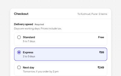
Native radio buttons in a fieldset, restyled with a dot that keeps its contrast, each option with a description and a price.
-
Segmented control
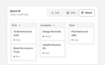
A row of joined segments for picking one of a few views, built from real radio buttons in a fieldset.
-
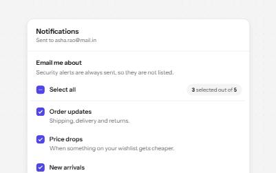
Checkbox group with select all
A fieldset of related checkboxes with a Select all box that shows a mixed state and a live count of what is chosen.
-
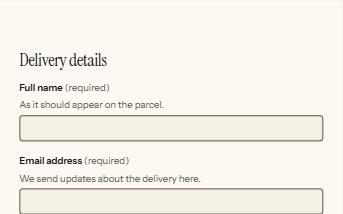
Form errors
An error summary that takes focus, messages tied to each field, and a status message when the form is sent.