Accessibility pattern · Form inputs
Number input
The field is a text input with inputmode="numeric" and role="spinbutton": phones show a number pad, screen readers learn that the arrow keys step it, and nothing changes when the page is scrolled. Minimum, maximum and whole numbers are enforced with messages that name the rule, and reaching a limit is said in a polite status, not by a button that silently stops working.
- WCAG criteria
- 7
- Keyboard rules
- 5
- Checked with
- axe, keyboard and the inspector
Live demo
Try it
Use it with a mouse, a keyboard or a screen reader. The inspector beside it shows what the browser tells assistive technology as you go: focus, state changes and announcements.
Darjeeling first flush tea
Up to 6 per order. Use the buttons, or the Up and Down arrow keys.
Subtotal ₹960
The demo works without JavaScript only as far as its HTML does; the inspector needs JavaScript.
Keyboard
Keys it answers to
Every action works without a pointer.
| Key | What it does |
|---|---|
| Arrow Up or Arrow Down | Adds or takes away one tin. At 1 or 6 the value stays, and a status message says why. |
| Home or End | Sets the smallest or largest quantity allowed. |
| Enter | Checks a typed number: the subtotal updates, or a message says what to change. |
| Tab | Moves on from the field. The minus and plus buttons are skipped, because the arrow keys do their job, unless the option above puts them in the Tab order. |
| Enter or Space | On the minus or plus button, changes the quantity by one; the new quantity is announced. |
Screen readers
What it announces
Written from the roles, names and states in the markup.
| When | Expected announcement |
|---|---|
| Tab reaches the field | Quantity (tins), spin button, 2. Up to 6 per order. Use the buttons, or the Up and Down arrow keys. |
| Arrow Up | 3 |
| Arrow Up reaches 6 | 6. Maximum reached: 6 tins per order. |
| A tap on Increase quantity | Increase quantity, button. 4 tins |
| Enter on a typed 2.5 | Enter a whole number of tins. |
These are expected announcements, not recordings. Wording and order differ between screen readers and browsers.
Code
Copy the code
The exact files this demo runs on. The styles are served with a prefix that keeps this site's own styles out of the demo; what you copy is the original.
<div class="ap-number-input" data-ap-number-input data-price="480" data-region="IN">
  <div class="ap-number-input__item">
    <span class="ap-number-input__thumb" aria-hidden="true"><svg viewBox="0 0 24 24" aria-hidden="true" focusable="false"><path d="M7 6h10v13.5a1.5 1.5 0 0 1-1.5 1.5h-7A1.5 1.5 0 0 1 7 19.5Z"/><path d="M6 3.5h12V6H6Z"/><path d="M10 11.5c1.2-1.6 2.8-1.6 4 0-1.2 1.6-2.8 1.6-4 0Z"/><path d="M12 13.5V16"/></svg></span>
    <div>
      <h3 class="ap-number-input__name">Darjeeling first flush tea</h3>
      <p class="ap-number-input__meta">100 g tin · ₹480 each</p>
    </div>
  </div>

  <div class="ap-field">
    <label class="ap-label" for="number-input-qty">Quantity (tins)</label>
    <p class="ap-hint" id="number-input-hint">Up to 6 per order. Use the buttons, or the Up and Down arrow keys.</p>
    <div class="ap-number-input__row">
      <div class="ap-number-input__stepper">
        <button type="button" class="ap-number-input__btn" data-ap-step="-1" aria-label="Decrease quantity" aria-controls="number-input-qty" aria-disabled="false" tabindex="-1"><svg viewBox="0 0 24 24" aria-hidden="true" focusable="false"><path d="M6 12h12"/></svg></button>
        <input class="ap-number-input__input" id="number-input-qty" type="text" inputmode="numeric" role="spinbutton" aria-valuemin="1" aria-valuemax="6" aria-valuenow="2" value="2" autocomplete="off" aria-describedby="number-input-hint number-input-error" />
        <button type="button" class="ap-number-input__btn" data-ap-step="1" aria-label="Increase quantity" aria-controls="number-input-qty" aria-disabled="false" tabindex="-1"><svg viewBox="0 0 24 24" aria-hidden="true" focusable="false"><path d="M12 6v12M6 12h12"/></svg></button>
      </div>
      <p class="ap-number-input__total"><span>Subtotal</span> <strong data-ap-total translate="no">₹960</strong></p>
    </div>
    <p class="ap-error ap-number-input__msg" id="number-input-error" aria-live="polite"><svg viewBox="0 0 24 24" aria-hidden="true" focusable="false"><circle cx="12" cy="12" r="9"/><path d="M12 7.5v5.5M12 16.5h.01"/></svg><span data-ap-error></span></p>
    <p class="ap-number-input__note ap-number-input__msg" role="status"><svg viewBox="0 0 24 24" aria-hidden="true" focusable="false"><circle cx="12" cy="12" r="9"/><path d="M12 11v5.5M12 7.5h.01"/></svg><span data-ap-note></span></p>
  </div>
  <p class="ap-number-input__sr" role="status" data-ap-say></p>
</div>
/* Shared primitives: buttons and form fields used across the patterns.
   Uses the --ap-* design tokens. */

.ap-btn {
  display: inline-flex;
  align-items: center;
  justify-content: center;
  gap: 8px;
  min-height: 40px;
  padding: 0 16px;
  border: 1px solid var(--ap-border-strong);
  border-radius: var(--ap-radius-sm);
  background: var(--ap-surface);
  color: var(--ap-text);
  font: inherit;
  font-weight: 600;
  line-height: 1.2;
  text-decoration: none;
  white-space: nowrap;
  cursor: pointer;
  transition: background-color var(--ap-duration) var(--ap-ease), border-color var(--ap-duration) var(--ap-ease), box-shadow var(--ap-duration) var(--ap-ease);
}
.ap-btn:hover {
  background: var(--ap-surface-2);
}
.ap-btn:focus-visible {
  outline: 2px solid var(--ap-focus);
  outline-offset: 2px;
}
.ap-btn:disabled,
.ap-btn[aria-disabled="true"] {
  opacity: .55;
  cursor: not-allowed;
}
.ap-btn--primary {
  border-color: var(--ap-accent);
  background: var(--ap-accent);
  color: var(--ap-on-accent);
  box-shadow: var(--ap-shadow-sm);
}
.ap-btn--primary:hover {
  border-color: var(--ap-accent-hover);
  background: var(--ap-accent-hover);
}
.ap-btn--danger {
  border-color: var(--ap-danger);
  background: var(--ap-danger);
  color: var(--ap-surface);
}
.ap-btn--danger:hover {
  filter: brightness(1.08);
}
.ap-btn--ghost {
  border-color: transparent;
  background: transparent;
}
.ap-btn--ghost:hover {
  background: var(--ap-surface-2);
}
.ap-btn__icon {
  width: 18px;
  height: 18px;
  flex-shrink: 0;
  fill: none;
  stroke: currentColor;
  stroke-width: 2;
  stroke-linecap: round;
  stroke-linejoin: round;
}

.ap-field {
  display: grid;
  gap: 6px;
}
.ap-label {
  color: var(--ap-text);
  font-weight: 600;
  font-size: .9375rem;
}
.ap-hint {
  margin: 0;
  color: var(--ap-text-3);
  font-size: .875rem;
  line-height: 1.45;
}
.ap-error {
  display: flex;
  align-items: flex-start;
  gap: 6px;
  margin: 0;
  color: var(--ap-danger);
  font-size: .875rem;
  font-weight: 600;
  line-height: 1.45;
}
.ap-input {
  width: 100%;
  min-height: 44px;
  padding: 10px 12px;
  border: 1px solid var(--ap-border-strong);
  border-radius: var(--ap-radius-sm);
  background: var(--ap-surface);
  color: var(--ap-text);
  font: inherit;
  line-height: 1.4;
  transition: border-color var(--ap-duration) var(--ap-ease), box-shadow var(--ap-duration) var(--ap-ease);
}
.ap-input::placeholder {
  color: var(--ap-text-3);
}
.ap-input:hover {
  border-color: var(--ap-text-2);
}
.ap-input:focus-visible {
  outline: 2px solid var(--ap-focus);
  outline-offset: 1px;
  border-color: var(--ap-focus);
}
.ap-input[aria-invalid="true"] {
  border-color: var(--ap-danger);
  box-shadow: inset 4px 0 0 var(--ap-danger);
}
textarea.ap-input {
  resize: vertical;
  min-height: 88px;
}

@media (prefers-reduced-motion: reduce) {
  .ap-btn,
  .ap-input { transition: none; }
}

/* Number input. Uses the --ap-* design tokens and the shared primitives. */
.ap-number-input {
  position: relative;
  container-type: inline-size;
  display: grid;
  gap: 20px;
  width: min(100%, 460px);
  margin-inline: auto;
  padding: 22px 24px 24px;
  border: 1px solid var(--ap-border);
  border-radius: var(--ap-radius-lg);
  background: var(--ap-surface);
  color: var(--ap-text);
  box-shadow: var(--ap-shadow-md);
  font-family: var(--ap-font);
}

/* The product */
.ap-number-input__item {
  display: flex;
  align-items: center;
  gap: 14px;
  padding-bottom: 18px;
  border-bottom: 1px solid var(--ap-border);
}
.ap-number-input__thumb {
  display: grid;
  place-items: center;
  width: 52px;
  height: 52px;
  flex-shrink: 0;
  border-radius: var(--ap-radius);
  background: var(--ap-accent-soft);
  color: var(--ap-accent-soft-text);
}
.ap-number-input__thumb svg {
  width: 28px;
  height: 28px;
  fill: none;
  stroke: currentColor;
  stroke-width: 1.6;
  stroke-linecap: round;
  stroke-linejoin: round;
}
.ap-number-input__name {
  margin: 0;
  font-family: var(--ap-font);
  font-size: 1rem;
  font-weight: 650;
  line-height: 1.35;
}
.ap-number-input__meta {
  margin: 2px 0 0;
  color: var(--ap-text-3);
  font-size: .875rem;
}

/* The stepper and the subtotal share a row */
.ap-number-input__row {
  display: flex;
  flex-wrap: wrap;
  align-items: center;
  justify-content: space-between;
  gap: 12px 16px;
  margin-top: 4px;
}
.ap-number-input__stepper {
  display: inline-flex;
  align-items: center;
  gap: 2px;
  padding: 3px;
  border: 1px solid var(--ap-border-strong);
  border-radius: var(--ap-radius-full);
  background: var(--ap-surface);
  transition: border-color var(--ap-duration) var(--ap-ease);
}
.ap-number-input__stepper:has(.ap-number-input__input:focus-visible) {
  border-color: var(--ap-focus);
  outline: 2px solid var(--ap-focus);
  outline-offset: 1px;
}
.ap-number-input__stepper:has([aria-invalid="true"]) {
  border-color: var(--ap-danger);
  box-shadow: inset 0 0 0 1px var(--ap-danger);
}

.ap-number-input__btn {
  display: grid;
  place-items: center;
  width: 40px;
  height: 40px;
  flex-shrink: 0;
  padding: 0;
  border: 0;
  border-radius: var(--ap-radius-full);
  background: var(--ap-surface-2);
  color: var(--ap-text);
  cursor: pointer;
  transition: background-color var(--ap-duration) var(--ap-ease), opacity var(--ap-duration) var(--ap-ease);
}
.ap-number-input__btn:hover {
  background: var(--ap-surface-3);
}
.ap-number-input__btn:focus-visible {
  outline: 2px solid var(--ap-focus);
  outline-offset: 2px;
}
.ap-number-input__btn:active {
  transform: scale(.94);
}
/* At a limit the button still answers (with a message), so it looks quieter rather than dead. */
.ap-number-input__btn[aria-disabled="true"] {
  background: transparent;
  color: var(--ap-text-3);
  cursor: not-allowed;
}
.ap-number-input__btn[aria-disabled="true"]:active {
  transform: none;
}
.ap-number-input__btn svg {
  width: 18px;
  height: 18px;
  fill: none;
  stroke: currentColor;
  stroke-width: 2.25;
  stroke-linecap: round;
}

.ap-number-input__input {
  width: 3.5rem;
  min-height: 40px;
  padding: 0;
  border: 0;
  background: transparent;
  color: var(--ap-text);
  font: inherit;
  font-size: 1.125rem;
  font-weight: 700;
  font-variant-numeric: tabular-nums;
  text-align: center;
}
.ap-number-input__input:focus {
  outline: none;
}

.ap-number-input__total {
  display: flex;
  align-items: baseline;
  gap: 8px;
  margin: 0;
  color: var(--ap-text-3);
  font-size: .875rem;
}
.ap-number-input__total strong {
  color: var(--ap-text);
  font-size: 1.25rem;
  font-weight: 700;
  font-variant-numeric: tabular-nums;
}

/* Messages are live regions: they stay in the page, taking no room until they have words. */
.ap-number-input__msg svg {
  width: 18px;
  height: 18px;
  flex-shrink: 0;
  margin-top: 1px;
  fill: none;
  stroke: currentColor;
  stroke-width: 2;
  stroke-linecap: round;
}
.ap-number-input__msg:has(> span:empty) {
  margin-top: -6px;
}
.ap-number-input__msg:has(> span:empty) svg {
  display: none;
}
.ap-number-input__note {
  display: flex;
  align-items: flex-start;
  gap: 6px;
  margin: 0;
  color: var(--ap-info);
  font-size: .875rem;
  font-weight: 600;
  line-height: 1.45;
}

.ap-number-input__sr {
  position: absolute;
  width: 1px;
  height: 1px;
  margin: -1px;
  padding: 0;
  overflow: hidden;
  clip-path: inset(50%);
  white-space: nowrap;
}

@media (prefers-reduced-motion: reduce) {
  .ap-number-input__stepper,
  .ap-number-input__btn { transition: none; }
  .ap-number-input__btn:active { transform: none; }
}
/**
 * Number input: a text field with role=spinbutton, inputmode=numeric and
 * minus and plus buttons. The arrow keys, Home and End step it; a typed value
 * is checked on Enter and when the field is left.
 *
 * Markup: [data-ap-number-input][data-price] holding an input[role=spinbutton]
 * with aria-valuemin, aria-valuemax and aria-valuenow, buttons [data-ap-step]
 * (-1 or 1), a subtotal [data-ap-total], an error [data-ap-error] in a polite
 * live region, a limit note [data-ap-note] in a role=status, and a hidden
 * p[role=status][data-ap-say] for changes made with the buttons.
 * Add data-tab-buttons to the root to put the buttons in the Tab order.
 */

const TEXT = {
  max: "Maximum reached: 6 tins per order.",
  min: "Minimum reached: 1 tin.",
  nan: "Enter a number of tins, like 2.",
  whole: "Enter a whole number of tins.",
  low: "Order at least 1 tin.",
  high: "You can order up to 6 tins.",
  one: "tin",
  many: "tins",
};

export function init(root) {
  const input = root.querySelector("[role=spinbutton]");
  const buttons = [...root.querySelectorAll("[data-ap-step]")];
  const total = root.querySelector("[data-ap-total]");
  const error = root.querySelector("[data-ap-error]");
  const note = root.querySelector("[data-ap-note]");
  const say = root.querySelector("[data-ap-say]");
  const min = Number(input.getAttribute("aria-valuemin"));
  const max = Number(input.getAttribute("aria-valuemax"));
  const price = Number(root.dataset.price);
  const region = root.dataset.region;
  const lang = root.closest("[lang]")?.lang || navigator.language;
  const money = new Intl.NumberFormat(region && !lang.includes("-") ? `${lang}-${region}` : lang, {
    style: "currency", currency: "INR", minimumFractionDigits: 0, maximumFractionDigits: 0,
  });
  let value = Number(input.getAttribute("aria-valuenow"));
  let noteTimer = 0;

  for (const b of buttons) {
    if (root.hasAttribute("data-tab-buttons")) b.removeAttribute("tabindex");
    else b.setAttribute("tabindex", "-1");
  }

  function showError(message) {
    if (error.textContent !== message) error.textContent = message;
    if (message) input.setAttribute("aria-invalid", "true");
    else input.removeAttribute("aria-invalid");
  }

  // Cleared first, so the same limit is announced again on every press.
  function showNote(message) {
    clearTimeout(noteTimer);
    note.textContent = "";
    if (message) noteTimer = setTimeout(() => { note.textContent = message; }, 60);
  }

  function announceValue() {
    const n = document.createElement("span");
    n.setAttribute("translate", "no");
    n.textContent = String(value);
    const unit = document.createElement("span");
    unit.textContent = value === 1 ? TEXT.one : TEXT.many;
    say.replaceChildren(n, " ", unit);
  }

  function set(n) {
    value = n;
    input.value = String(n);
    input.setAttribute("aria-valuenow", String(n));
    total.textContent = money.format(n * price);
    showError("");
    for (const b of buttons) {
      const dir = Number(b.dataset.apStep);
      b.setAttribute("aria-disabled", String(dir < 0 ? n <= min : n >= max));
    }
  }

  /** Moves to n, keeping inside the limits; says so when a limit is reached or pushed against. */
  function moveTo(n, { fromButton = false } = {}) {
    const next = Math.min(max, Math.max(min, n));
    const changed = next !== value || input.value.trim() !== String(value);
    set(next);
    const atLimit = next === max && n >= max ? TEXT.max : next === min && n <= min ? TEXT.min : "";
    showNote(atLimit);
    if (fromButton && changed && !atLimit) announceValue();
  }

  /** Checks a typed value. The text is left as typed when it breaks a rule. */
  function commit() {
    const raw = input.value.trim().replace(/[,\s]/g, "");
    let problem = "";
    if (!/^-?\d+(\.\d+)?$/.test(raw)) problem = TEXT.nan;
    else {
      const n = Number(raw);
      if (!Number.isInteger(n)) problem = TEXT.whole;
      else if (n < min) problem = TEXT.low;
      else if (n > max) problem = TEXT.high;
    }
    if (problem) {
      showError(problem);
      showNote("");
      return;
    }
    set(Number(raw));
    showNote("");
  }

  function onKey(event) {
    switch (event.key) {
      case "ArrowUp": moveTo(value + 1); break;
      case "ArrowDown": moveTo(value - 1); break;
      case "Home": moveTo(min); break;
      case "End": moveTo(max); break;
      case "Enter": commit(); break;
      default: return;
    }
    event.preventDefault();
  }

  function onInput() {
    // A limit note is about the old value; an error already showing is updated as the
    // number is fixed, but never added while typing.
    showNote("");
    if (error.textContent) commit();
  }

  function onClick(event) {
    const button = event.target.closest("[data-ap-step]");
    if (button) moveTo(value + Number(button.dataset.apStep), { fromButton: true });
  }

  input.addEventListener("keydown", onKey);
  input.addEventListener("input", onInput);
  input.addEventListener("change", commit);
  root.addEventListener("click", onClick);
  set(value);

  return () => {
    clearTimeout(noteTimer);
    input.removeEventListener("keydown", onKey);
    input.removeEventListener("input", onInput);
    input.removeEventListener("change", commit);
    root.removeEventListener("click", onClick);
  };
}

for (const root of document.querySelectorAll("[data-ap-number-input]")) init(root);
/* Design tokens for the pattern components. Light by default, dark when the
   system asks for it; set data-theme="dark" on :root to force dark. */
:root {
    --ap-radius-sm: 8px;
    --ap-radius: 12px;
    --ap-radius-lg: 16px;
    --ap-radius-full: 999px;
    --ap-font: "Instrument Sans", ui-sans-serif, system-ui, -apple-system, "Segoe UI", Roboto, sans-serif;
    --ap-mono: "JetBrains Mono", ui-monospace, "Cascadia Mono", "SF Mono", Consolas, monospace;
    --ap-ease: cubic-bezier(.2, .8, .2, 1);
    --ap-duration: 180ms;
    --ap-target: 44px;
    --ap-bg: #F4F4F5;
    --ap-surface: #FFFFFF;
    --ap-surface-2: #F4F4F5;
    --ap-surface-3: #E4E4E7;
    --ap-border: #E4E4E7;
    --ap-border-strong: #76767F;
    --ap-text: #18181B;
    --ap-text-2: #3F3F46;
    --ap-text-3: #5E5E66;
    --ap-accent: #4F46E5;
    --ap-accent-hover: #4338CA;
    --ap-on-accent: #FFFFFF;
    --ap-accent-text: #4338CA;
    --ap-accent-soft: #EEF2FF;
    --ap-accent-soft-text: #3730A3;
    --ap-focus: #4F46E5;
    --ap-danger: #B91C1C;
    --ap-danger-soft: #FEF2F2;
    --ap-success: #15803D;
    --ap-success-soft: #F0FDF4;
    --ap-warning: #A15C07;
    --ap-warning-soft: #FEFCE8;
    --ap-info: #1D4ED8;
    --ap-info-soft: #EFF6FF;
    --ap-scrim: rgb(9 9 11 / .48);
    --ap-shadow-sm: 0 1px 2px rgb(9 9 11 / .06);
    --ap-shadow-md: 0 1px 2px rgb(9 9 11 / .05), 0 6px 16px -4px rgb(9 9 11 / .1);
    --ap-shadow-lg: 0 2px 6px rgb(9 9 11 / .06), 0 20px 40px -12px rgb(9 9 11 / .22);
    --ap-light-bg: #F4F4F5;
    --ap-light-surface: #FFFFFF;
    --ap-light-surface-2: #F4F4F5;
    --ap-light-surface-3: #E4E4E7;
    --ap-light-border: #E4E4E7;
    --ap-light-border-strong: #76767F;
    --ap-light-text: #18181B;
    --ap-light-text-2: #3F3F46;
    --ap-light-text-3: #5E5E66;
    --ap-light-accent: #4F46E5;
    --ap-light-accent-hover: #4338CA;
    --ap-light-on-accent: #FFFFFF;
    --ap-light-accent-text: #4338CA;
    --ap-light-accent-soft: #EEF2FF;
    --ap-light-accent-soft-text: #3730A3;
    --ap-light-focus: #4F46E5;
    --ap-light-danger: #B91C1C;
    --ap-light-danger-soft: #FEF2F2;
    --ap-light-success: #15803D;
    --ap-light-success-soft: #F0FDF4;
    --ap-light-warning: #A15C07;
    --ap-light-warning-soft: #FEFCE8;
    --ap-light-info: #1D4ED8;
    --ap-light-info-soft: #EFF6FF;
    --ap-light-scrim: rgb(9 9 11 / .48);
    --ap-light-shadow-sm: 0 1px 2px rgb(9 9 11 / .06);
    --ap-light-shadow-md: 0 1px 2px rgb(9 9 11 / .05), 0 6px 16px -4px rgb(9 9 11 / .1);
    --ap-light-shadow-lg: 0 2px 6px rgb(9 9 11 / .06), 0 20px 40px -12px rgb(9 9 11 / .22);
    --ap-dark-bg: #09090B;
    --ap-dark-surface: #18181B;
    --ap-dark-surface-2: #27272A;
    --ap-dark-surface-3: #3F3F46;
    --ap-dark-border: #2E2E33;
    --ap-dark-border-strong: #8E8E97;
    --ap-dark-text: #FAFAFA;
    --ap-dark-text-2: #D4D4D8;
    --ap-dark-text-3: #A1A1AA;
    --ap-dark-accent: #818CF8;
    --ap-dark-accent-hover: #A5B4FC;
    --ap-dark-on-accent: #0C0A1F;
    --ap-dark-accent-text: #A5B4FC;
    --ap-dark-accent-soft: #1E1B4B;
    --ap-dark-accent-soft-text: #C7D2FE;
    --ap-dark-focus: #A5B4FC;
    --ap-dark-danger: #F87171;
    --ap-dark-danger-soft: #2A1215;
    --ap-dark-success: #4ADE80;
    --ap-dark-success-soft: #0F2A1A;
    --ap-dark-warning: #FACC15;
    --ap-dark-warning-soft: #2A2410;
    --ap-dark-info: #60A5FA;
    --ap-dark-info-soft: #0F1D33;
    --ap-dark-scrim: rgb(0 0 0 / .62);
    --ap-dark-shadow-sm: 0 1px 2px rgb(0 0 0 / .4);
    --ap-dark-shadow-md: 0 1px 2px rgb(0 0 0 / .4), 0 8px 20px -6px rgb(0 0 0 / .5);
    --ap-dark-shadow-lg: 0 2px 8px rgb(0 0 0 / .45), 0 24px 48px -12px rgb(0 0 0 / .7);
}
@media (prefers-color-scheme: dark) {
  :root:not([data-theme="light"]) {
      --ap-bg: #09090B;
      --ap-surface: #18181B;
      --ap-surface-2: #27272A;
      --ap-surface-3: #3F3F46;
      --ap-border: #2E2E33;
      --ap-border-strong: #8E8E97;
      --ap-text: #FAFAFA;
      --ap-text-2: #D4D4D8;
      --ap-text-3: #A1A1AA;
      --ap-accent: #818CF8;
      --ap-accent-hover: #A5B4FC;
      --ap-on-accent: #0C0A1F;
      --ap-accent-text: #A5B4FC;
      --ap-accent-soft: #1E1B4B;
      --ap-accent-soft-text: #C7D2FE;
      --ap-focus: #A5B4FC;
      --ap-danger: #F87171;
      --ap-danger-soft: #2A1215;
      --ap-success: #4ADE80;
      --ap-success-soft: #0F2A1A;
      --ap-warning: #FACC15;
      --ap-warning-soft: #2A2410;
      --ap-info: #60A5FA;
      --ap-info-soft: #0F1D33;
      --ap-scrim: rgb(0 0 0 / .62);
      --ap-shadow-sm: 0 1px 2px rgb(0 0 0 / .4);
      --ap-shadow-md: 0 1px 2px rgb(0 0 0 / .4), 0 8px 20px -6px rgb(0 0 0 / .5);
      --ap-shadow-lg: 0 2px 8px rgb(0 0 0 / .45), 0 24px 48px -12px rgb(0 0 0 / .7);
  }
}
:root[data-theme="dark"] {
    --ap-bg: #09090B;
    --ap-surface: #18181B;
    --ap-surface-2: #27272A;
    --ap-surface-3: #3F3F46;
    --ap-border: #2E2E33;
    --ap-border-strong: #8E8E97;
    --ap-text: #FAFAFA;
    --ap-text-2: #D4D4D8;
    --ap-text-3: #A1A1AA;
    --ap-accent: #818CF8;
    --ap-accent-hover: #A5B4FC;
    --ap-on-accent: #0C0A1F;
    --ap-accent-text: #A5B4FC;
    --ap-accent-soft: #1E1B4B;
    --ap-accent-soft-text: #C7D2FE;
    --ap-focus: #A5B4FC;
    --ap-danger: #F87171;
    --ap-danger-soft: #2A1215;
    --ap-success: #4ADE80;
    --ap-success-soft: #0F2A1A;
    --ap-warning: #FACC15;
    --ap-warning-soft: #2A2410;
    --ap-info: #60A5FA;
    --ap-info-soft: #0F1D33;
    --ap-scrim: rgb(0 0 0 / .62);
    --ap-shadow-sm: 0 1px 2px rgb(0 0 0 / .4);
    --ap-shadow-md: 0 1px 2px rgb(0 0 0 / .4), 0 8px 20px -6px rgb(0 0 0 / .5);
    --ap-shadow-lg: 0 2px 8px rgb(0 0 0 / .45), 0 24px 48px -12px rgb(0 0 0 / .7);
}
WCAG 2.2
What it meets
The success criteria this pattern takes care of, and how.
-
1.3.1 Info and Relationships
Level A
The unit is part of the label, and the limits are in the field's description, so they are heard with the field, not only seen near it.
-
2.1.1 Keyboard
Level A
The arrow keys, Home and End step the value, and the buttons work with Enter and Space when they are focused.
-
2.5.8 Target Size (Minimum)
Level AA
The minus and plus buttons are 40 pixels square, far above the 15-pixel spinners of a number field.
-
3.3.1 Error Identification
Level A
A typed value that breaks a rule is named in text under the field, and the field is marked invalid.
-
3.3.2 Labels or Instructions
Level A
The label gives the unit and the hint gives the limit before anything is typed.
-
4.1.2 Name, Role, Value
Level A
role=spinbutton with aria-valuenow, aria-valuemin and aria-valuemax exposes the value and its range; the buttons say what they change.
-
4.1.3 Status Messages
Level AA
Reaching a limit, and a change made with the buttons, are reported in polite status messages without moving focus.
Usage
When to use it
Use it
- Small whole numbers that people usually nudge by one or two, like quantities, guests or seats.
- When the limits are known and worth stating, such as stock or a per-order cap.
Use something else
- Numbers that are really identifiers, such as phone, card or PIN numbers: use a plain text field.
- Large values people type in full, like a salary: a text field with the unit is quicker than stepping.
- A range where the position matters more than the exact value: use a slider.
Common failures
How it usually goes wrong
type="number" for everything
It changes value when someone scrolls the page over it, accepts "e", turns anything it cannot read into an empty value, and its spinner arrows are tiny. A text field with inputmode="numeric" avoids all four.
Buttons named "+" and "−"
A screen reader may read "plus" and "minus", or nothing at all. The buttons are named "Increase quantity" and "Decrease quantity".
Silent limits
A disabled plus button that does nothing leaves people pressing it again. At a limit the button stays pressable, says it is unavailable, and the status explains.
The unit only in the design
"2" next to a picture of a tin means nothing to a screen reader. The unit is in the label: Quantity (tins).
Clamping without a word
Turning a typed 9 into 6 quietly changes someone's order. The value is left as typed and the message says the limit.
Notes
Building it
- role="spinbutton" is allowed on a text input; it tells screen readers to expect Up and Down, and aria-valuenow carries the number they announce.
- The buttons have tabindex="-1", as in the WAI-ARIA example, because the arrow keys already do their job. They stay reachable by touch and by a screen reader's reading cursor; the option above shows the other choice.
- Changes made with the buttons are announced, because focus is on the button, not on the value that changed. Changes made with the arrow keys are not: the spin button itself is heard.
- inputmode="numeric" asks for a number pad but does not restrict what is typed, so the value is always checked on Enter and when the field is left.
- The subtotal is formatted with Intl.NumberFormat for India (₹1,920, and ₹1,00,000 for larger sums); it updates quietly, since the quantity is what changed.
Sources: WAI-ARIA Authoring Practices: Spinbutton · GOV.UK Design System: Text input (asking for numbers)
Checked with axe in light and dark themes, at desktop and phone widths, and by keyboard. Not yet tested with every screen reader and browser pair. Report a correction
Related
Patterns that go with it
-
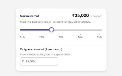
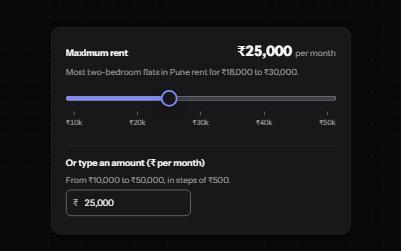
Slider
A native range input styled with a filled track and a large thumb, its value said with units, and a number field kept in step.
-
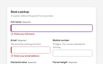
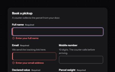
Text field
Text fields with visible labels, hints and errors tied to the input, the right keyboard and autofill, and units you can hear.
-
Form errors
An error summary that takes focus, messages tied to each field, and a status message when the form is sent.
-
Inline validation
A sign-up form that checks each field as it is left, once typed in, with ticks and errors in words and a summary on submit.