Accessibility pattern · Form inputs
Combobox with autocomplete
Typing filters a list of cities below the field. Focus never leaves the field: the arrow keys move a highlight through the list, and aria-activedescendant tells screen readers which city it is on. Nothing is chosen until Enter or a click, so typing and arrowing never change the value behind people's backs. A polite status says how many cities match once typing pauses.
- WCAG criteria
- 7
- Keyboard rules
- 7
- Checked with
- axe, keyboard and the inspector
Live demo
Try it
Use it with a mouse, a keyboard or a screen reader. The inspector beside it shows what the browser tells assistive technology as you go: focus, state changes and announcements.
Check delivery
We deliver to 24 cities across India.
Type a few letters, then choose from the list.
- Ahmedabad Gujarat
- Amritsar Punjab
- Bengaluru Karnataka
- Bhopal Madhya Pradesh
- Bhubaneswar Odisha
- Chennai Tamil Nadu
- Coimbatore Tamil Nadu
- Dehradun Uttarakhand
- Guwahati Assam
- Hyderabad Telangana
- Indore Madhya Pradesh
- Jaipur Rajasthan
- Kochi Kerala
- Kolkata West Bengal
- Lucknow Uttar Pradesh
- Mumbai Maharashtra
- Mysuru Karnataka
- Nagpur Maharashtra
- New Delhi Delhi
- Patna Bihar
- Pune Maharashtra
- Surat Gujarat
- Varanasi Uttar Pradesh
- Visakhapatnam Andhra Pradesh
No cities match
We may not deliver there yet. Check the spelling, or try a city nearby.
Choose a city to see when an order would arrive.
- Delivering to
- Usually arrives
The demo works without JavaScript only as far as its HTML does; the inspector needs JavaScript.
Keyboard
Keys it answers to
Every action works without a pointer.
| Key | What it does |
|---|---|
| A–Z | Typing filters the cities and opens the list; the number that match is announced when typing pauses. |
| Arrow Down or Arrow Up | Opens the list, or moves the highlight to the next or previous city, wrapping at the ends. |
| AltArrow Down | Opens the list without moving the highlight. |
| Enter | Chooses the highlighted city, puts it in the field and closes the list. |
| Escape | Closes the list; pressed again with the list closed, clears the field. |
| AltArrow Up | Closes the list and keeps what is typed. |
| Arrow Left or Arrow Right | Moves the text cursor and takes the highlight off the list, so typing goes on where it was. |
Screen readers
What it announces
Written from the roles, names and states in the markup.
| When | Expected announcement |
|---|---|
| Tab reaches the field | City, combo box, collapsed, edit text. Type a few letters, then choose from the list. |
| Typing "na", then a pause | Expanded. 5 results |
| Arrow Down | Chennai Tamil Nadu, 1 of 5 |
| Enter chooses it | Chennai. Delivering to Chennai, Tamil Nadu. Usually arrives tomorrow |
| Typing a name with no match | Collapsed. No cities match |
These are expected announcements, not recordings. Wording and order differ between screen readers and browsers.
Code
Copy the code
The exact files this demo runs on. The styles are served with a prefix that keeps this site's own styles out of the demo; what you copy is the original.
<div class="ap-combobox" data-ap-combobox>
  <h3 class="ap-combobox__name">Check delivery</h3>
  <p class="ap-combobox__lead">We deliver to 24 cities across India.</p>

  <div class="ap-combobox__field">
    <div class="ap-combobox__row">
      <label class="ap-combobox__label" for="combobox-input">City</label>
      <p class="ap-combobox__count" role="status"></p>
    </div>
    <p class="ap-combobox__hint" id="combobox-hint">Type a few letters, then choose from the list.</p>
    <div class="ap-combobox__box">
      <svg class="ap-combobox__search" viewBox="0 0 24 24" aria-hidden="true" focusable="false"><circle cx="11" cy="11" r="6.5"/><path d="m20 20-4.2-4.2"/></svg>
      <input class="ap-combobox__input" id="combobox-input" type="text" role="combobox" aria-autocomplete="list" aria-expanded="false" aria-controls="combobox-list" aria-describedby="combobox-hint" autocomplete="off" autocapitalize="off" spellcheck="false" />
      <button type="button" class="ap-combobox__clear" aria-label="Clear city" hidden>
        <svg viewBox="0 0 24 24" aria-hidden="true" focusable="false"><path d="M7 7l10 10M17 7 7 17"/></svg>
      </button>
      <button type="button" class="ap-combobox__toggle" tabindex="-1" aria-label="Cities" aria-expanded="false" aria-controls="combobox-list">
        <svg viewBox="0 0 24 24" aria-hidden="true" focusable="false"><path d="m6 9 6 6 6-6"/></svg>
      </button>
    </div>
    <div class="ap-combobox__popup" hidden>
      <ul class="ap-combobox__list" id="combobox-list" role="listbox" aria-label="Cities">
          <li class="ap-combobox__opt" role="option" id="combobox-o-ahmedabad" aria-selected="false" data-en="Ahmedabad" data-days="2"><span class="ap-combobox__city">Ahmedabad</span> <span class="ap-combobox__state">Gujarat</span></li>
          <li class="ap-combobox__opt" role="option" id="combobox-o-amritsar" aria-selected="false" data-en="Amritsar" data-days="3"><span class="ap-combobox__city">Amritsar</span> <span class="ap-combobox__state">Punjab</span></li>
          <li class="ap-combobox__opt" role="option" id="combobox-o-bengaluru" aria-selected="false" data-en="Bengaluru" data-days="1"><span class="ap-combobox__city">Bengaluru</span> <span class="ap-combobox__state">Karnataka</span></li>
          <li class="ap-combobox__opt" role="option" id="combobox-o-bhopal" aria-selected="false" data-en="Bhopal" data-days="3"><span class="ap-combobox__city">Bhopal</span> <span class="ap-combobox__state">Madhya Pradesh</span></li>
          <li class="ap-combobox__opt" role="option" id="combobox-o-bhubaneswar" aria-selected="false" data-en="Bhubaneswar" data-days="3"><span class="ap-combobox__city">Bhubaneswar</span> <span class="ap-combobox__state">Odisha</span></li>
          <li class="ap-combobox__opt" role="option" id="combobox-o-chennai" aria-selected="false" data-en="Chennai" data-days="1"><span class="ap-combobox__city">Chennai</span> <span class="ap-combobox__state">Tamil Nadu</span></li>
          <li class="ap-combobox__opt" role="option" id="combobox-o-coimbatore" aria-selected="false" data-en="Coimbatore" data-days="2"><span class="ap-combobox__city">Coimbatore</span> <span class="ap-combobox__state">Tamil Nadu</span></li>
          <li class="ap-combobox__opt" role="option" id="combobox-o-dehradun" aria-selected="false" data-en="Dehradun" data-days="3"><span class="ap-combobox__city">Dehradun</span> <span class="ap-combobox__state">Uttarakhand</span></li>
          <li class="ap-combobox__opt" role="option" id="combobox-o-guwahati" aria-selected="false" data-en="Guwahati" data-days="4"><span class="ap-combobox__city">Guwahati</span> <span class="ap-combobox__state">Assam</span></li>
          <li class="ap-combobox__opt" role="option" id="combobox-o-hyderabad" aria-selected="false" data-en="Hyderabad" data-days="1"><span class="ap-combobox__city">Hyderabad</span> <span class="ap-combobox__state">Telangana</span></li>
          <li class="ap-combobox__opt" role="option" id="combobox-o-indore" aria-selected="false" data-en="Indore" data-days="2"><span class="ap-combobox__city">Indore</span> <span class="ap-combobox__state">Madhya Pradesh</span></li>
          <li class="ap-combobox__opt" role="option" id="combobox-o-jaipur" aria-selected="false" data-en="Jaipur" data-days="2"><span class="ap-combobox__city">Jaipur</span> <span class="ap-combobox__state">Rajasthan</span></li>
          <li class="ap-combobox__opt" role="option" id="combobox-o-kochi" aria-selected="false" data-en="Kochi" data-days="2"><span class="ap-combobox__city">Kochi</span> <span class="ap-combobox__state">Kerala</span></li>
          <li class="ap-combobox__opt" role="option" id="combobox-o-kolkata" aria-selected="false" data-en="Kolkata" data-days="2"><span class="ap-combobox__city">Kolkata</span> <span class="ap-combobox__state">West Bengal</span></li>
          <li class="ap-combobox__opt" role="option" id="combobox-o-lucknow" aria-selected="false" data-en="Lucknow" data-days="2"><span class="ap-combobox__city">Lucknow</span> <span class="ap-combobox__state">Uttar Pradesh</span></li>
          <li class="ap-combobox__opt" role="option" id="combobox-o-mumbai" aria-selected="false" data-en="Mumbai" data-days="1"><span class="ap-combobox__city">Mumbai</span> <span class="ap-combobox__state">Maharashtra</span></li>
          <li class="ap-combobox__opt" role="option" id="combobox-o-mysuru" aria-selected="false" data-en="Mysuru" data-days="2"><span class="ap-combobox__city">Mysuru</span> <span class="ap-combobox__state">Karnataka</span></li>
          <li class="ap-combobox__opt" role="option" id="combobox-o-nagpur" aria-selected="false" data-en="Nagpur" data-days="2"><span class="ap-combobox__city">Nagpur</span> <span class="ap-combobox__state">Maharashtra</span></li>
          <li class="ap-combobox__opt" role="option" id="combobox-o-new-delhi" aria-selected="false" data-en="New Delhi" data-days="1"><span class="ap-combobox__city">New Delhi</span> <span class="ap-combobox__state">Delhi</span></li>
          <li class="ap-combobox__opt" role="option" id="combobox-o-patna" aria-selected="false" data-en="Patna" data-days="3"><span class="ap-combobox__city">Patna</span> <span class="ap-combobox__state">Bihar</span></li>
          <li class="ap-combobox__opt" role="option" id="combobox-o-pune" aria-selected="false" data-en="Pune" data-days="1"><span class="ap-combobox__city">Pune</span> <span class="ap-combobox__state">Maharashtra</span></li>
          <li class="ap-combobox__opt" role="option" id="combobox-o-surat" aria-selected="false" data-en="Surat" data-days="2"><span class="ap-combobox__city">Surat</span> <span class="ap-combobox__state">Gujarat</span></li>
          <li class="ap-combobox__opt" role="option" id="combobox-o-varanasi" aria-selected="false" data-en="Varanasi" data-days="3"><span class="ap-combobox__city">Varanasi</span> <span class="ap-combobox__state">Uttar Pradesh</span></li>
          <li class="ap-combobox__opt" role="option" id="combobox-o-visakhapatnam" aria-selected="false" data-en="Visakhapatnam" data-days="3"><span class="ap-combobox__city">Visakhapatnam</span> <span class="ap-combobox__state">Andhra Pradesh</span></li>
      </ul>
      <div class="ap-combobox__empty" hidden>
        <svg viewBox="0 0 24 24" aria-hidden="true" focusable="false"><path d="M12 21s-6.5-5.6-6.5-11a6.5 6.5 0 0 1 13 0c0 5.4-6.5 11-6.5 11Z"/><path d="m10 8 4 4M14 8l-4 4"/></svg>
        <p class="ap-combobox__empty-lead">No cities match</p>
        <p class="ap-combobox__empty-hint">We may not deliver there yet. Check the spelling, or try a city nearby.</p>
      </div>
    </div>
  </div>

  <div class="ap-combobox__result">
    <p class="ap-combobox__prompt" data-ap-prompt>Choose a city to see when an order would arrive.</p>
    <div aria-live="polite">
      <dl class="ap-combobox__facts" data-ap-facts hidden>
        <div><dt>Delivering to</dt><dd data-ap-to></dd></div>
        <div><dt>Usually arrives</dt><dd data-ap-eta></dd></div>
      </dl>
    </div>
  </div>
</div>
/* Combobox with list autocomplete. Uses the --ap-* design tokens. */
.ap-combobox {
  width: min(100%, 480px);
  margin-inline: auto;
  padding: 22px 24px 24px;
  border: 1px solid var(--ap-border);
  border-radius: var(--ap-radius-lg);
  background: var(--ap-surface);
  color: var(--ap-text);
  box-shadow: var(--ap-shadow-md);
}
.ap-combobox [hidden] {
  display: none;
}
.ap-combobox__name {
  margin: 0;
  font-size: 1.125rem;
  font-weight: 650;
  line-height: 1.35;
}
.ap-combobox__lead {
  margin: 2px 0 0;
  color: var(--ap-text-3);
  font-size: .9375rem;
}

.ap-combobox__field {
  position: relative;
  margin-top: 18px;
}
.ap-combobox__row {
  display: flex;
  align-items: baseline;
  justify-content: space-between;
  gap: 12px;
}
.ap-combobox__label {
  font-size: .9375rem;
  font-weight: 600;
}
.ap-combobox__count {
  margin: 0;
  color: var(--ap-text-3);
  font-size: .8125rem;
  font-weight: 600;
  font-variant-numeric: tabular-nums;
}
.ap-combobox__hint {
  margin: 4px 0 8px;
  color: var(--ap-text-3);
  font-size: .875rem;
  line-height: 1.45;
}

/* The field: icon, input, clear and open buttons in one bordered box. */
.ap-combobox__box {
  position: relative;
  display: flex;
  align-items: center;
  min-height: var(--ap-target);
  border: 1px solid var(--ap-border-strong);
  border-radius: var(--ap-radius-sm);
  background: var(--ap-surface);
  transition: border-color var(--ap-duration) var(--ap-ease);
}
.ap-combobox__box:hover {
  border-color: var(--ap-text-2);
}
.ap-combobox__box:has(.ap-combobox__input:focus-visible) {
  border-color: var(--ap-focus);
  outline: 2px solid var(--ap-focus);
  outline-offset: 1px;
}
.ap-combobox__search {
  flex-shrink: 0;
  width: 18px;
  height: 18px;
  margin-left: 12px;
  fill: none;
  stroke: var(--ap-text-3);
  stroke-width: 2;
  stroke-linecap: round;
}
.ap-combobox__input {
  flex: 1;
  min-width: 0;
  height: 42px;
  padding: 0 10px;
  border: 0;
  background: transparent;
  color: var(--ap-text);
  font: inherit;
}
.ap-combobox__input:focus-visible {
  outline: none;
}
.ap-combobox__clear,
.ap-combobox__toggle {
  display: grid;
  flex-shrink: 0;
  place-items: center;
  width: 36px;
  height: 36px;
  padding: 0;
  border: 0;
  border-radius: var(--ap-radius-sm);
  background: transparent;
  color: var(--ap-text-2);
  cursor: pointer;
}
.ap-combobox__toggle {
  margin-right: 4px;
}
.ap-combobox__clear:hover,
.ap-combobox__toggle:hover {
  background: var(--ap-surface-2);
  color: var(--ap-text);
}
.ap-combobox__clear:focus-visible {
  outline: 2px solid var(--ap-focus);
  outline-offset: -2px;
}
.ap-combobox__clear svg,
.ap-combobox__toggle svg {
  width: 18px;
  height: 18px;
  fill: none;
  stroke: currentColor;
  stroke-width: 2;
  stroke-linecap: round;
  stroke-linejoin: round;
}
.ap-combobox__toggle svg {
  transition: rotate var(--ap-duration) var(--ap-ease);
}
.ap-combobox__toggle[aria-expanded="true"] svg {
  rotate: 180deg;
}

/* The popup: the listbox, or the empty state, under the field. */
.ap-combobox__popup {
  position: absolute;
  top: calc(100% + 6px);
  right: 0;
  left: 0;
  z-index: 10;
  border: 1px solid var(--ap-border);
  border-radius: var(--ap-radius);
  background: var(--ap-surface);
  box-shadow: var(--ap-shadow-lg);
  animation: ap-combobox-in 140ms var(--ap-ease);
}
.ap-combobox__list {
  max-height: 248px;
  margin: 0;
  padding: 6px;
  overflow-y: auto;
  list-style: none;
  overscroll-behavior: contain;
  scrollbar-width: thin;
}
.ap-combobox__opt {
  display: flex;
  align-items: baseline;
  justify-content: space-between;
  gap: 12px;
  min-height: 40px;
  padding: 9px 12px;
  border-radius: var(--ap-radius-sm);
  cursor: pointer;
}
.ap-combobox__opt:hover {
  background: var(--ap-surface-2);
}
/* The highlighted city: a ring and a bar, so it never rests on the tint. */
.ap-combobox__opt[aria-selected="true"] {
  background: var(--ap-accent-soft);
  box-shadow: inset 0 0 0 2px var(--ap-focus), inset 5px 0 0 var(--ap-focus);
}
.ap-combobox__city {
  font-weight: 550;
}
.ap-combobox__state {
  color: var(--ap-text-3);
  font-size: .8125rem;
  text-align: end;
}
.ap-combobox__opt[aria-selected="true"] .ap-combobox__city,
.ap-combobox__opt[aria-selected="true"] .ap-combobox__state {
  color: var(--ap-accent-soft-text);
}
/* The typed letters, marked by the script with the CSS Custom Highlight API. */
.ap-combobox__city::highlight(ap-combobox-match) {
  background-color: var(--ap-accent-soft);
  color: var(--ap-accent-soft-text);
  text-decoration: underline 2px;
  text-underline-offset: 3px;
}

.ap-combobox__empty {
  display: grid;
  justify-items: center;
  gap: 4px;
  padding: 22px 20px 24px;
  text-align: center;
}
.ap-combobox__empty svg {
  width: 28px;
  height: 28px;
  margin-bottom: 6px;
  fill: none;
  stroke: var(--ap-text-3);
  stroke-width: 1.75;
  stroke-linecap: round;
  stroke-linejoin: round;
}
.ap-combobox__empty-lead {
  margin: 0;
  font-weight: 650;
}
.ap-combobox__empty-hint {
  max-width: 32ch;
  margin: 0;
  color: var(--ap-text-3);
  font-size: .875rem;
  line-height: 1.45;
}

/* What choosing a city changes. */
.ap-combobox__result {
  margin-top: 16px;
  padding: 14px 16px;
  border: 1px dashed var(--ap-border-strong);
  border-radius: var(--ap-radius);
  background: var(--ap-surface-2);
}
.ap-combobox__result:has(.ap-combobox__facts:not([hidden])) {
  border-style: solid;
  border-color: var(--ap-border);
}
.ap-combobox__prompt {
  margin: 0;
  color: var(--ap-text-3);
  font-size: .875rem;
  line-height: 1.45;
}
.ap-combobox__facts {
  display: grid;
  gap: 8px;
  margin: 0;
}
.ap-combobox__facts div {
  display: flex;
  justify-content: space-between;
  gap: 16px;
}
.ap-combobox__facts dt {
  color: var(--ap-text-3);
  font-size: .875rem;
}
.ap-combobox__facts dd {
  margin: 0;
  font-weight: 650;
  text-align: end;
}

@keyframes ap-combobox-in {
  from { opacity: 0; transform: translateY(-4px); }
}

@media (forced-colors: active) {
  .ap-combobox__opt[aria-selected="true"] { outline: 2px solid Highlight; outline-offset: -2px; }
}

@media (prefers-reduced-motion: reduce) {
  .ap-combobox__popup { animation: none; }
  .ap-combobox__box,
  .ap-combobox__toggle svg { transition: none; }
}
/**
 * Combobox with list autocomplete: typing in the field filters a listbox of
 * suggestions. Focus stays in the field; the arrow keys move a highlight that
 * aria-activedescendant reports, and only Enter or a click chooses. A polite
 * status says how many match once typing pauses.
 *
 * Markup: [data-ap-combobox] holding input[role=combobox][aria-controls], a
 * clear button, a chevron button (tabindex=-1), a [hidden] popup with
 * ul[role=listbox] of li[role=option] (visible name in .ap-combobox__city,
 * an English name in data-en, delivery days in data-days) and an empty
 * state, a p[role=status] for the count, and an aria-live result.
 */

// Fixed sentences, so the page's translations can match them.
const ARRIVES = { 1: "Tomorrow", 2: "In two days", 3: "In three days", 4: "In four days" };

export function init(root) {
  const field = root.querySelector(".ap-combobox__field");
  const input = root.querySelector("[role=combobox]");
  const toggle = root.querySelector(".ap-combobox__toggle");
  const clear = root.querySelector(".ap-combobox__clear");
  const popup = root.querySelector(".ap-combobox__popup");
  const list = root.querySelector("[role=listbox]");
  const options = [...list.querySelectorAll("[role=option]")];
  const empty = root.querySelector(".ap-combobox__empty");
  const status = root.querySelector("[role=status]");
  const prompt = root.querySelector("[data-ap-prompt]");
  const facts = root.querySelector("[data-ap-facts]");
  const cityOf = (option) => option.querySelector(".ap-combobox__city");

  // The matching letters are marked without touching the DOM, where supported.
  const marks = typeof Highlight === "function" && CSS.highlights ? new Highlight() : null;
  if (marks) CSS.highlights.set("ap-combobox-match", marks);

  let shown = options;
  let active = null;
  let timer = 0;

  const isOpen = () => !popup.hidden;

  function filter() {
    const query = input.value.trim().toLocaleLowerCase();
    marks?.clear();
    shown = options.filter((option) => {
      const text = cityOf(option).textContent;
      const at = query ? text.toLocaleLowerCase().indexOf(query) : -1;
      const hit = !query || at !== -1 || (option.dataset.en || "").toLocaleLowerCase().includes(query);
      option.hidden = !hit;
      if (marks && at !== -1) {
        const range = new Range();
        range.setStart(cityOf(option).firstChild, at);
        range.setEnd(cityOf(option).firstChild, at + query.length);
        marks.add(range);
      }
      return hit;
    });
    setActive(null);
  }

  function setActive(option) {
    active = option;
    for (const o of options) o.setAttribute("aria-selected", String(o === option));
    if (option) {
      input.setAttribute("aria-activedescendant", option.id);
      // Scroll the list, not the page.
      const top = option.offsetTop;
      const bottom = top + option.offsetHeight;
      if (top < list.scrollTop + 6) list.scrollTop = top - 6;
      else if (bottom > list.scrollTop + list.clientHeight - 6) list.scrollTop = bottom - list.clientHeight + 6;
    } else {
      input.removeAttribute("aria-activedescendant");
    }
  }

  function setExpanded(on) {
    input.setAttribute("aria-expanded", String(on));
    toggle.setAttribute("aria-expanded", String(on));
  }

  // Says how many match once typing pauses, not on every key.
  function announce() {
    clearTimeout(timer);
    timer = setTimeout(() => {
      if (!shown.length) {
        status.textContent = "No cities match";
        return;
      }
      const n = document.createElement("span");
      n.setAttribute("translate", "no");
      n.textContent = String(shown.length);
      const unit = document.createElement("span");
      unit.textContent = shown.length === 1 ? "result" : "results";
      status.replaceChildren(n, " ", unit);
    }, 450);
  }

  function open() {
    const any = shown.length > 0;
    popup.hidden = false;
    list.hidden = !any;
    empty.hidden = any;
    // Expanded means the listbox is showing; the empty message is not a listbox.
    setExpanded(any);
    announce();
  }

  function close() {
    clearTimeout(timer);
    popup.hidden = true;
    setExpanded(false);
    setActive(null);
    status.textContent = "";
  }

  function paintClear() {
    clear.hidden = input.value === "";
  }

  function showResult(option) {
    const to = root.querySelector("[data-ap-to]");
    const eta = root.querySelector("[data-ap-eta]");
    if (!option) {
      prompt.hidden = false;
      facts.hidden = true;
      return;
    }
    to.textContent = `${cityOf(option).textContent}, ${option.querySelector(".ap-combobox__state").textContent}`;
    eta.textContent = ARRIVES[option.dataset.days] || "";
    prompt.hidden = true;
    facts.hidden = false;
  }

  function accept(option) {
    input.value = cityOf(option).textContent;
    close();
    paintClear();
    showResult(option);
  }

  function step(by) {
    if (!shown.length) return;
    const at = shown.indexOf(active);
    const next = at === -1
      ? (by > 0 ? shown[0] : shown[shown.length - 1])
      : shown[(at + by + shown.length) % shown.length];
    setActive(next);
  }

  function onKeydown(event) {
    switch (event.key) {
      case "ArrowDown":
        event.preventDefault();
        if (!isOpen()) {
          filter();
          open();
          if (!event.altKey) step(1);
        } else if (!event.altKey) step(1);
        break;
      case "ArrowUp":
        event.preventDefault();
        if (event.altKey) {
          if (isOpen()) close();
        } else if (!isOpen()) {
          filter();
          open();
          step(-1);
        } else step(-1);
        break;
      case "Enter":
        if (isOpen() && active) {
          event.preventDefault();
          accept(active);
        }
        break;
      case "Escape":
        if (isOpen()) {
          event.preventDefault();
          close();
        } else if (input.value) {
          event.preventDefault();
          input.value = "";
          paintClear();
          showResult(null);
        }
        break;
      case "ArrowLeft":
      case "ArrowRight":
      case "Home":
      case "End":
        // Back to the text: the caret moves, the highlight goes.
        setActive(null);
        break;
      default:
    }
  }

  function onInput() {
    filter();
    open();
    paintClear();
    showResult(null);
  }

  function onClick(event) {
    if (event.target.closest(".ap-combobox__clear")) {
      input.value = "";
      close();
      paintClear();
      showResult(null);
      input.focus();
      return;
    }
    if (event.target.closest(".ap-combobox__toggle")) {
      if (isOpen()) close();
      else {
        filter();
        open();
      }
      input.focus();
      return;
    }
    const option = event.target.closest("[role=option]");
    if (option && list.contains(option)) {
      accept(option);
      input.focus();
      return;
    }
    if (event.target === input && !isOpen()) {
      filter();
      open();
    }
  }

  // Keep focus in the field: a mousedown on the list or the chevron would blur it first.
  function onMousedown(event) {
    if (event.target.closest(".ap-combobox__popup, .ap-combobox__toggle")) event.preventDefault();
  }

  function onFocusout(event) {
    if (!field.contains(event.relatedTarget)) close();
  }

  input.addEventListener("keydown", onKeydown);
  input.addEventListener("input", onInput);
  field.addEventListener("click", onClick);
  field.addEventListener("mousedown", onMousedown);
  field.addEventListener("focusout", onFocusout);
  paintClear();

  return () => {
    clearTimeout(timer);
    if (marks && CSS.highlights.get("ap-combobox-match") === marks) CSS.highlights.delete("ap-combobox-match");
    input.removeEventListener("keydown", onKeydown);
    input.removeEventListener("input", onInput);
    field.removeEventListener("click", onClick);
    field.removeEventListener("mousedown", onMousedown);
    field.removeEventListener("focusout", onFocusout);
  };
}

for (const root of document.querySelectorAll("[data-ap-combobox]")) init(root);
/* Design tokens for the pattern components. Light by default, dark when the
   system asks for it; set data-theme="dark" on :root to force dark. */
:root {
    --ap-radius-sm: 8px;
    --ap-radius: 12px;
    --ap-radius-lg: 16px;
    --ap-radius-full: 999px;
    --ap-font: "Instrument Sans", ui-sans-serif, system-ui, -apple-system, "Segoe UI", Roboto, sans-serif;
    --ap-mono: "JetBrains Mono", ui-monospace, "Cascadia Mono", "SF Mono", Consolas, monospace;
    --ap-ease: cubic-bezier(.2, .8, .2, 1);
    --ap-duration: 180ms;
    --ap-target: 44px;
    --ap-bg: #F4F4F5;
    --ap-surface: #FFFFFF;
    --ap-surface-2: #F4F4F5;
    --ap-surface-3: #E4E4E7;
    --ap-border: #E4E4E7;
    --ap-border-strong: #76767F;
    --ap-text: #18181B;
    --ap-text-2: #3F3F46;
    --ap-text-3: #5E5E66;
    --ap-accent: #4F46E5;
    --ap-accent-hover: #4338CA;
    --ap-on-accent: #FFFFFF;
    --ap-accent-text: #4338CA;
    --ap-accent-soft: #EEF2FF;
    --ap-accent-soft-text: #3730A3;
    --ap-focus: #4F46E5;
    --ap-danger: #B91C1C;
    --ap-danger-soft: #FEF2F2;
    --ap-success: #15803D;
    --ap-success-soft: #F0FDF4;
    --ap-warning: #A15C07;
    --ap-warning-soft: #FEFCE8;
    --ap-info: #1D4ED8;
    --ap-info-soft: #EFF6FF;
    --ap-scrim: rgb(9 9 11 / .48);
    --ap-shadow-sm: 0 1px 2px rgb(9 9 11 / .06);
    --ap-shadow-md: 0 1px 2px rgb(9 9 11 / .05), 0 6px 16px -4px rgb(9 9 11 / .1);
    --ap-shadow-lg: 0 2px 6px rgb(9 9 11 / .06), 0 20px 40px -12px rgb(9 9 11 / .22);
    --ap-light-bg: #F4F4F5;
    --ap-light-surface: #FFFFFF;
    --ap-light-surface-2: #F4F4F5;
    --ap-light-surface-3: #E4E4E7;
    --ap-light-border: #E4E4E7;
    --ap-light-border-strong: #76767F;
    --ap-light-text: #18181B;
    --ap-light-text-2: #3F3F46;
    --ap-light-text-3: #5E5E66;
    --ap-light-accent: #4F46E5;
    --ap-light-accent-hover: #4338CA;
    --ap-light-on-accent: #FFFFFF;
    --ap-light-accent-text: #4338CA;
    --ap-light-accent-soft: #EEF2FF;
    --ap-light-accent-soft-text: #3730A3;
    --ap-light-focus: #4F46E5;
    --ap-light-danger: #B91C1C;
    --ap-light-danger-soft: #FEF2F2;
    --ap-light-success: #15803D;
    --ap-light-success-soft: #F0FDF4;
    --ap-light-warning: #A15C07;
    --ap-light-warning-soft: #FEFCE8;
    --ap-light-info: #1D4ED8;
    --ap-light-info-soft: #EFF6FF;
    --ap-light-scrim: rgb(9 9 11 / .48);
    --ap-light-shadow-sm: 0 1px 2px rgb(9 9 11 / .06);
    --ap-light-shadow-md: 0 1px 2px rgb(9 9 11 / .05), 0 6px 16px -4px rgb(9 9 11 / .1);
    --ap-light-shadow-lg: 0 2px 6px rgb(9 9 11 / .06), 0 20px 40px -12px rgb(9 9 11 / .22);
    --ap-dark-bg: #09090B;
    --ap-dark-surface: #18181B;
    --ap-dark-surface-2: #27272A;
    --ap-dark-surface-3: #3F3F46;
    --ap-dark-border: #2E2E33;
    --ap-dark-border-strong: #8E8E97;
    --ap-dark-text: #FAFAFA;
    --ap-dark-text-2: #D4D4D8;
    --ap-dark-text-3: #A1A1AA;
    --ap-dark-accent: #818CF8;
    --ap-dark-accent-hover: #A5B4FC;
    --ap-dark-on-accent: #0C0A1F;
    --ap-dark-accent-text: #A5B4FC;
    --ap-dark-accent-soft: #1E1B4B;
    --ap-dark-accent-soft-text: #C7D2FE;
    --ap-dark-focus: #A5B4FC;
    --ap-dark-danger: #F87171;
    --ap-dark-danger-soft: #2A1215;
    --ap-dark-success: #4ADE80;
    --ap-dark-success-soft: #0F2A1A;
    --ap-dark-warning: #FACC15;
    --ap-dark-warning-soft: #2A2410;
    --ap-dark-info: #60A5FA;
    --ap-dark-info-soft: #0F1D33;
    --ap-dark-scrim: rgb(0 0 0 / .62);
    --ap-dark-shadow-sm: 0 1px 2px rgb(0 0 0 / .4);
    --ap-dark-shadow-md: 0 1px 2px rgb(0 0 0 / .4), 0 8px 20px -6px rgb(0 0 0 / .5);
    --ap-dark-shadow-lg: 0 2px 8px rgb(0 0 0 / .45), 0 24px 48px -12px rgb(0 0 0 / .7);
}
@media (prefers-color-scheme: dark) {
  :root:not([data-theme="light"]) {
      --ap-bg: #09090B;
      --ap-surface: #18181B;
      --ap-surface-2: #27272A;
      --ap-surface-3: #3F3F46;
      --ap-border: #2E2E33;
      --ap-border-strong: #8E8E97;
      --ap-text: #FAFAFA;
      --ap-text-2: #D4D4D8;
      --ap-text-3: #A1A1AA;
      --ap-accent: #818CF8;
      --ap-accent-hover: #A5B4FC;
      --ap-on-accent: #0C0A1F;
      --ap-accent-text: #A5B4FC;
      --ap-accent-soft: #1E1B4B;
      --ap-accent-soft-text: #C7D2FE;
      --ap-focus: #A5B4FC;
      --ap-danger: #F87171;
      --ap-danger-soft: #2A1215;
      --ap-success: #4ADE80;
      --ap-success-soft: #0F2A1A;
      --ap-warning: #FACC15;
      --ap-warning-soft: #2A2410;
      --ap-info: #60A5FA;
      --ap-info-soft: #0F1D33;
      --ap-scrim: rgb(0 0 0 / .62);
      --ap-shadow-sm: 0 1px 2px rgb(0 0 0 / .4);
      --ap-shadow-md: 0 1px 2px rgb(0 0 0 / .4), 0 8px 20px -6px rgb(0 0 0 / .5);
      --ap-shadow-lg: 0 2px 8px rgb(0 0 0 / .45), 0 24px 48px -12px rgb(0 0 0 / .7);
  }
}
:root[data-theme="dark"] {
    --ap-bg: #09090B;
    --ap-surface: #18181B;
    --ap-surface-2: #27272A;
    --ap-surface-3: #3F3F46;
    --ap-border: #2E2E33;
    --ap-border-strong: #8E8E97;
    --ap-text: #FAFAFA;
    --ap-text-2: #D4D4D8;
    --ap-text-3: #A1A1AA;
    --ap-accent: #818CF8;
    --ap-accent-hover: #A5B4FC;
    --ap-on-accent: #0C0A1F;
    --ap-accent-text: #A5B4FC;
    --ap-accent-soft: #1E1B4B;
    --ap-accent-soft-text: #C7D2FE;
    --ap-focus: #A5B4FC;
    --ap-danger: #F87171;
    --ap-danger-soft: #2A1215;
    --ap-success: #4ADE80;
    --ap-success-soft: #0F2A1A;
    --ap-warning: #FACC15;
    --ap-warning-soft: #2A2410;
    --ap-info: #60A5FA;
    --ap-info-soft: #0F1D33;
    --ap-scrim: rgb(0 0 0 / .62);
    --ap-shadow-sm: 0 1px 2px rgb(0 0 0 / .4);
    --ap-shadow-md: 0 1px 2px rgb(0 0 0 / .4), 0 8px 20px -6px rgb(0 0 0 / .5);
    --ap-shadow-lg: 0 2px 8px rgb(0 0 0 / .45), 0 24px 48px -12px rgb(0 0 0 / .7);
}
WCAG 2.2
What it meets
The success criteria this pattern takes care of, and how.
-
1.3.1 Info and Relationships
Level A
The field has a label and a hint, the list is a labelled listbox, and aria-controls ties the two together.
-
1.4.1 Use of Color
Level A
The highlighted city has a ring and a bar, and the matching letters are underlined as well as tinted, so neither rests on color alone.
-
2.1.1 Keyboard
Level A
Opening, filtering, moving, choosing, closing and clearing all work from the keyboard; the chevron button is a pointer extra.
-
2.4.7 Focus Visible
Level AA
The field shows a focus ring, and the highlighted city has a ring of its own while focus stays in the field.
-
3.2.2 On Input
Level A
Typing and arrowing never choose a city; only Enter or a click does, so nothing changes until people decide.
-
4.1.2 Name, Role, Value
Level A
role=combobox with aria-expanded, aria-autocomplete="list" and aria-activedescendant exposes the field, its list and the city in focus.
-
4.1.3 Status Messages
Level AA
The number of matches, or "No cities match", is a polite status, written once typing pauses.
Usage
When to use it
Use it
- Choosing from a long list people know the answer to, like cities, countries or colleagues.
- A search field that suggests completions people can take or ignore.
Use something else
- Lists of fewer than about fifteen options: a native select is simpler and works with no script.
- A choice people need to compare or browse: show the options as radio buttons or a listbox.
- Free text with no suggestions: a plain text field is enough.
Common failures
How it usually goes wrong
Moving focus into the list
If focus jumps to the options, typing stops working and people lose their place in the field. Focus stays in the input; aria-activedescendant points at the option.
Choosing on arrow
Filling the field as the highlight moves changes the value without asking. Here the field changes only on Enter or a click.
A count announced on every key press
"24 results, 9 results, 5 results" while someone types is noise. The count waits until typing pauses.
An empty list with no message
A list that just disappears leaves people wondering whether it broke. The empty state says nothing matched, on screen and in the status.
Escape that does nothing
People expect Escape to close the list, and again to clear the field. Both work here.
A clear button nobody can name
An × icon with no text is announced as "button". The clear button here is named Clear city.
Notes
Building it
- The matching letters are marked with the CSS Custom Highlight API, which styles a range of text without changing the DOM; browsers without it still filter, only without the tint.
- Filtering compares the visible text as well as an English name in data-en, so the list keeps working when the page is translated.
- The chevron button has tabindex=-1: keyboard users open the list with the arrow keys, and an extra tab stop would only slow them down.
- Options keep focus in the field because the popup cancels mousedown; without that, a click on an option would blur the field and close the list first.
- The delivery result sits in a polite live region that is always in the page, so a chosen city is announced with its delivery time, and the prompt that replaces it while typing is not.
Sources: WAI-ARIA Authoring Practices: Combobox · WAI-ARIA Authoring Practices: Combobox with list autocomplete
Checked with axe in light and dark themes, at desktop and phone widths, and by keyboard. Not yet tested with every screen reader and browser pair. Report a correction
Related
Patterns that go with it
-
Listbox
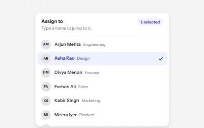
A list of options to choose one or several from, with arrow keys, typing to jump and a count of what is selected.
-
Select
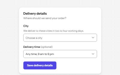
A styled native select with a label, hint, region groups, a placeholder and a required error, drawn by the browser.
-
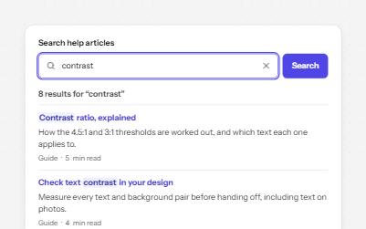
Search field
A labelled search landmark with a clear button, recent searches, and a result count that is announced without moving focus.
-
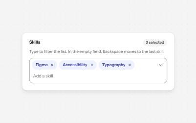
Multi-select with tags
A field that filters a list as you type and turns each choice into a removable chip, for picking several values.