Accessibility pattern · Form inputs
Star rating
Choosing a rating is choosing one of five, so the stars are radio buttons in a fieldset: the arrow keys, the single tab stop and the checked state come from the browser. Showing an average is not a control at all; it is text, "4.3 out of 5", with the stars drawn beside it as decoration.
- WCAG criteria
- 7
- Keyboard rules
- 5
- Checked with
- axe, keyboard and the inspector
Live demo
Try it
Use it with a mouse, a keyboard or a screen reader. The inspector beside it shows what the browser tells assistive technology as you go: focus, state changes and announcements.
The demo works without JavaScript only as far as its HTML does; the inspector needs JavaScript.
Keyboard
Keys it answers to
Every action works without a pointer.
| Key | What it does |
|---|---|
| Tab | Moves into the stars, onto the chosen one (or the first if none is chosen), then on to Clear rating. |
| Arrow Right or Arrow Down | Chooses one more star, wrapping from 5 to 1. |
| Arrow Left or Arrow Up | Chooses one star fewer, wrapping from 1 to 5. |
| Space | Chooses the focused star when none is chosen yet. |
| Enter or Space | On Clear rating, removes the rating and puts focus back on the first star. |
Screen readers
What it announces
Written from the roles, names and states in the markup.
| When | Expected announcement |
|---|---|
| Tab reaches the stars before rating | Rate this product, group. 1 star, radio button, not checked, 1 of 5 |
| Arrow Right chooses 4 stars | 4 stars, radio button, checked, 4 of 5 |
| The choice settles for a moment | Rating saved |
| Reading the average | Customer reviews, heading level 3. 4.3 out of 5. 128 reviews |
| Reading the breakdown | Reviews by rating, list, 5 items. 5 stars 74 reviews |
These are expected announcements, not recordings. Wording and order differ between screen readers and browsers.
Code
Copy the code
The exact files this demo runs on. The styles are served with a prefix that keeps this site's own styles out of the demo; what you copy is the original.
<div class="ap-rating" data-ap-rating>
  <form class="ap-rating__card" data-ap-rate>
    <div class="ap-rating__product">
      <span class="ap-rating__thumb" aria-hidden="true">
        <svg viewBox="0 0 24 24" focusable="false"><path d="M8 3h8l3 8H5Z"/><path d="M12 11v7"/><path d="M8 21h8"/><path d="M12 18v3"/></svg>
      </span>
      <div>
        <p class="ap-rating__item">Brass table lamp</p>
        <p class="ap-rating__meta">Delivered on 2 October</p>
      </div>
    </div>
    <fieldset class="ap-rating__set">
      <legend class="ap-rating__legend">Rate this product</legend>
      <div class="ap-rating__stars">
        <label class="ap-rating__star">
          <input class="ap-rating__radio" type="radio" name="rating-score" value="1" data-word="Poor" />
          <svg class="ap-rating__shape" viewBox="0 0 24 24" aria-hidden="true" focusable="false"><path d="M12 2.8l2.8 5.8 6.3.9-4.6 4.4 1.1 6.3L12 17.2l-5.6 3 1.1-6.3L2.9 9.5l6.3-.9Z"/></svg>
          <span class="ap-rating__sr">1 star</span>
        </label>
        <label class="ap-rating__star">
          <input class="ap-rating__radio" type="radio" name="rating-score" value="2" data-word="Fair" />
          <svg class="ap-rating__shape" viewBox="0 0 24 24" aria-hidden="true" focusable="false"><path d="M12 2.8l2.8 5.8 6.3.9-4.6 4.4 1.1 6.3L12 17.2l-5.6 3 1.1-6.3L2.9 9.5l6.3-.9Z"/></svg>
          <span class="ap-rating__sr">2 stars</span>
        </label>
        <label class="ap-rating__star">
          <input class="ap-rating__radio" type="radio" name="rating-score" value="3" data-word="Good" />
          <svg class="ap-rating__shape" viewBox="0 0 24 24" aria-hidden="true" focusable="false"><path d="M12 2.8l2.8 5.8 6.3.9-4.6 4.4 1.1 6.3L12 17.2l-5.6 3 1.1-6.3L2.9 9.5l6.3-.9Z"/></svg>
          <span class="ap-rating__sr">3 stars</span>
        </label>
        <label class="ap-rating__star">
          <input class="ap-rating__radio" type="radio" name="rating-score" value="4" data-word="Very good" />
          <svg class="ap-rating__shape" viewBox="0 0 24 24" aria-hidden="true" focusable="false"><path d="M12 2.8l2.8 5.8 6.3.9-4.6 4.4 1.1 6.3L12 17.2l-5.6 3 1.1-6.3L2.9 9.5l6.3-.9Z"/></svg>
          <span class="ap-rating__sr">4 stars</span>
        </label>
        <label class="ap-rating__star">
          <input class="ap-rating__radio" type="radio" name="rating-score" value="5" data-word="Excellent" />
          <svg class="ap-rating__shape" viewBox="0 0 24 24" aria-hidden="true" focusable="false"><path d="M12 2.8l2.8 5.8 6.3.9-4.6 4.4 1.1 6.3L12 17.2l-5.6 3 1.1-6.3L2.9 9.5l6.3-.9Z"/></svg>
          <span class="ap-rating__sr">5 stars</span>
        </label>
        <span class="ap-rating__word" aria-hidden="true" data-ap-word></span>
      </div>
    </fieldset>
    <div class="ap-rating__foot">
      <p class="ap-rating__chosen" data-ap-chosen>Not rated yet</p>
      <button type="button" class="ap-btn ap-btn--ghost ap-rating__clear" data-ap-unrate hidden>Clear rating</button>
    </div>
    <p class="ap-rating__saved" role="status" data-ap-say></p>
  </form>

  <section class="ap-rating__card ap-rating__summary" aria-labelledby="rating-avg">
    <h3 class="ap-rating__sum" id="rating-avg">Customer reviews</h3>
    <div class="ap-rating__avg">
      <span class="ap-rating__meter" aria-hidden="true" data-ap-value="4.3" data-ap-of="5">
        <span class="ap-rating__row"><svg class="ap-rating__shape" viewBox="0 0 24 24" aria-hidden="true" focusable="false"><path d="M12 2.8l2.8 5.8 6.3.9-4.6 4.4 1.1 6.3L12 17.2l-5.6 3 1.1-6.3L2.9 9.5l6.3-.9Z"/></svg><svg class="ap-rating__shape" viewBox="0 0 24 24" aria-hidden="true" focusable="false"><path d="M12 2.8l2.8 5.8 6.3.9-4.6 4.4 1.1 6.3L12 17.2l-5.6 3 1.1-6.3L2.9 9.5l6.3-.9Z"/></svg><svg class="ap-rating__shape" viewBox="0 0 24 24" aria-hidden="true" focusable="false"><path d="M12 2.8l2.8 5.8 6.3.9-4.6 4.4 1.1 6.3L12 17.2l-5.6 3 1.1-6.3L2.9 9.5l6.3-.9Z"/></svg><svg class="ap-rating__shape" viewBox="0 0 24 24" aria-hidden="true" focusable="false"><path d="M12 2.8l2.8 5.8 6.3.9-4.6 4.4 1.1 6.3L12 17.2l-5.6 3 1.1-6.3L2.9 9.5l6.3-.9Z"/></svg><svg class="ap-rating__shape" viewBox="0 0 24 24" aria-hidden="true" focusable="false"><path d="M12 2.8l2.8 5.8 6.3.9-4.6 4.4 1.1 6.3L12 17.2l-5.6 3 1.1-6.3L2.9 9.5l6.3-.9Z"/></svg></span>
        <span class="ap-rating__row ap-rating__row--fill"><svg class="ap-rating__shape" viewBox="0 0 24 24" aria-hidden="true" focusable="false"><path d="M12 2.8l2.8 5.8 6.3.9-4.6 4.4 1.1 6.3L12 17.2l-5.6 3 1.1-6.3L2.9 9.5l6.3-.9Z"/></svg><svg class="ap-rating__shape" viewBox="0 0 24 24" aria-hidden="true" focusable="false"><path d="M12 2.8l2.8 5.8 6.3.9-4.6 4.4 1.1 6.3L12 17.2l-5.6 3 1.1-6.3L2.9 9.5l6.3-.9Z"/></svg><svg class="ap-rating__shape" viewBox="0 0 24 24" aria-hidden="true" focusable="false"><path d="M12 2.8l2.8 5.8 6.3.9-4.6 4.4 1.1 6.3L12 17.2l-5.6 3 1.1-6.3L2.9 9.5l6.3-.9Z"/></svg><svg class="ap-rating__shape" viewBox="0 0 24 24" aria-hidden="true" focusable="false"><path d="M12 2.8l2.8 5.8 6.3.9-4.6 4.4 1.1 6.3L12 17.2l-5.6 3 1.1-6.3L2.9 9.5l6.3-.9Z"/></svg><svg class="ap-rating__shape" viewBox="0 0 24 24" aria-hidden="true" focusable="false"><path d="M12 2.8l2.8 5.8 6.3.9-4.6 4.4 1.1 6.3L12 17.2l-5.6 3 1.1-6.3L2.9 9.5l6.3-.9Z"/></svg></span>
      </span>
      <p class="ap-rating__score">4.3 out of 5</p>
      <p class="ap-rating__count">128 reviews</p>
    </div>
    <ul class="ap-rating__dist" aria-label="Reviews by rating">
      <li class="ap-rating__dist-row"><span class="ap-rating__dist-k">5 stars</span><span class="ap-rating__bar" aria-hidden="true"><span data-ap-share="74"></span></span><span class="ap-rating__dist-n"><span translate="no">74</span><span class="ap-rating__sr"> reviews</span></span></li>
      <li class="ap-rating__dist-row"><span class="ap-rating__dist-k">4 stars</span><span class="ap-rating__bar" aria-hidden="true"><span data-ap-share="32"></span></span><span class="ap-rating__dist-n"><span translate="no">32</span><span class="ap-rating__sr"> reviews</span></span></li>
      <li class="ap-rating__dist-row"><span class="ap-rating__dist-k">3 stars</span><span class="ap-rating__bar" aria-hidden="true"><span data-ap-share="11"></span></span><span class="ap-rating__dist-n"><span translate="no">11</span><span class="ap-rating__sr"> reviews</span></span></li>
      <li class="ap-rating__dist-row"><span class="ap-rating__dist-k">2 stars</span><span class="ap-rating__bar" aria-hidden="true"><span data-ap-share="6"></span></span><span class="ap-rating__dist-n"><span translate="no">6</span><span class="ap-rating__sr"> reviews</span></span></li>
      <li class="ap-rating__dist-row"><span class="ap-rating__dist-k">1 star</span><span class="ap-rating__bar" aria-hidden="true"><span data-ap-share="5"></span></span><span class="ap-rating__dist-n"><span translate="no">5</span><span class="ap-rating__sr"> reviews</span></span></li>
    </ul>
  </section>
</div>
/* Shared primitives: buttons and form fields used across the patterns.
   Uses the --ap-* design tokens. */

.ap-btn {
  display: inline-flex;
  align-items: center;
  justify-content: center;
  gap: 8px;
  min-height: 40px;
  padding: 0 16px;
  border: 1px solid var(--ap-border-strong);
  border-radius: var(--ap-radius-sm);
  background: var(--ap-surface);
  color: var(--ap-text);
  font: inherit;
  font-weight: 600;
  line-height: 1.2;
  text-decoration: none;
  white-space: nowrap;
  cursor: pointer;
  transition: background-color var(--ap-duration) var(--ap-ease), border-color var(--ap-duration) var(--ap-ease), box-shadow var(--ap-duration) var(--ap-ease);
}
.ap-btn:hover {
  background: var(--ap-surface-2);
}
.ap-btn:focus-visible {
  outline: 2px solid var(--ap-focus);
  outline-offset: 2px;
}
.ap-btn:disabled,
.ap-btn[aria-disabled="true"] {
  opacity: .55;
  cursor: not-allowed;
}
.ap-btn--primary {
  border-color: var(--ap-accent);
  background: var(--ap-accent);
  color: var(--ap-on-accent);
  box-shadow: var(--ap-shadow-sm);
}
.ap-btn--primary:hover {
  border-color: var(--ap-accent-hover);
  background: var(--ap-accent-hover);
}
.ap-btn--danger {
  border-color: var(--ap-danger);
  background: var(--ap-danger);
  color: var(--ap-surface);
}
.ap-btn--danger:hover {
  filter: brightness(1.08);
}
.ap-btn--ghost {
  border-color: transparent;
  background: transparent;
}
.ap-btn--ghost:hover {
  background: var(--ap-surface-2);
}
.ap-btn__icon {
  width: 18px;
  height: 18px;
  flex-shrink: 0;
  fill: none;
  stroke: currentColor;
  stroke-width: 2;
  stroke-linecap: round;
  stroke-linejoin: round;
}

.ap-field {
  display: grid;
  gap: 6px;
}
.ap-label {
  color: var(--ap-text);
  font-weight: 600;
  font-size: .9375rem;
}
.ap-hint {
  margin: 0;
  color: var(--ap-text-3);
  font-size: .875rem;
  line-height: 1.45;
}
.ap-error {
  display: flex;
  align-items: flex-start;
  gap: 6px;
  margin: 0;
  color: var(--ap-danger);
  font-size: .875rem;
  font-weight: 600;
  line-height: 1.45;
}
.ap-input {
  width: 100%;
  min-height: 44px;
  padding: 10px 12px;
  border: 1px solid var(--ap-border-strong);
  border-radius: var(--ap-radius-sm);
  background: var(--ap-surface);
  color: var(--ap-text);
  font: inherit;
  line-height: 1.4;
  transition: border-color var(--ap-duration) var(--ap-ease), box-shadow var(--ap-duration) var(--ap-ease);
}
.ap-input::placeholder {
  color: var(--ap-text-3);
}
.ap-input:hover {
  border-color: var(--ap-text-2);
}
.ap-input:focus-visible {
  outline: 2px solid var(--ap-focus);
  outline-offset: 1px;
  border-color: var(--ap-focus);
}
.ap-input[aria-invalid="true"] {
  border-color: var(--ap-danger);
  box-shadow: inset 4px 0 0 var(--ap-danger);
}
textarea.ap-input {
  resize: vertical;
  min-height: 88px;
}

@media (prefers-reduced-motion: reduce) {
  .ap-btn,
  .ap-input { transition: none; }
}

/* Star rating. Uses the --ap-* design tokens and the shared primitives. */
.ap-rating {
  display: grid;
  grid-template-columns: repeat(auto-fit, minmax(min(100%, 290px), 1fr));
  align-items: start;
  gap: 16px;
  width: min(100%, 700px);
  margin-inline: auto;
  color: var(--ap-text);
  font-family: var(--ap-font);
}
.ap-rating__card {
  min-width: 0;
  padding: 22px 24px;
  border: 1px solid var(--ap-border);
  border-radius: var(--ap-radius-lg);
  background: var(--ap-surface);
  box-shadow: var(--ap-shadow-md);
}

/* The product being rated */
.ap-rating__product {
  display: flex;
  align-items: center;
  gap: 12px;
}
.ap-rating__thumb {
  display: grid;
  flex-shrink: 0;
  place-items: center;
  width: 48px;
  height: 48px;
  border-radius: var(--ap-radius-sm);
  background: var(--ap-surface-2);
  color: var(--ap-text-2);
}
.ap-rating__thumb svg {
  width: 26px;
  height: 26px;
  fill: none;
  stroke: currentColor;
  stroke-width: 1.6;
  stroke-linecap: round;
  stroke-linejoin: round;
}
.ap-rating__item {
  margin: 0;
  font-weight: 600;
}
.ap-rating__meta {
  margin: 2px 0 0;
  color: var(--ap-text-3);
  font-size: .875rem;
}

/* The question and its five radio buttons */
.ap-rating__set {
  min-width: 0;
  margin: 18px 0 0;
  padding: 16px 0 0;
  border: 0;
  border-top: 1px solid var(--ap-border);
}
.ap-rating__legend {
  float: left;
  width: 100%;
  margin: 0 0 6px;
  padding: 0;
  font-size: 1rem;
  font-weight: 650;
}
.ap-rating__stars {
  clear: both;
  display: flex;
  flex-wrap: wrap;
  align-items: center;
  gap: 2px;
  margin-left: -6px;
}
.ap-rating__star {
  position: relative;
  display: grid;
  place-items: center;
  width: 44px;
  height: 44px;
  border-radius: var(--ap-radius-sm);
  cursor: pointer;
}
.ap-rating__radio {
  position: absolute;
  inset: 0;
  z-index: 1;
  width: 100%;
  height: 100%;
  margin: 0;
  opacity: 0;
  cursor: pointer;
}
.ap-rating__star:has(.ap-rating__radio:focus-visible) {
  outline: 2px solid var(--ap-focus);
  outline-offset: 0;
}
.ap-rating__shape {
  width: 32px;
  height: 32px;
  fill: transparent;
  stroke: var(--ap-text-3);
  stroke-width: 1.6;
  stroke-linejoin: round;
  transition: fill var(--ap-duration) var(--ap-ease), stroke var(--ap-duration) var(--ap-ease), transform var(--ap-duration) var(--ap-ease);
}
/* Filled: the checked star and every star before it. */
.ap-rating__star:is(:has(:checked), :has(~ .ap-rating__star :checked)) .ap-rating__shape {
  fill: var(--ap-warning);
  stroke: var(--ap-warning);
}
/* While a pointer is over a star, the preview takes over; nothing is chosen until a click. */
@media (hover: hover) {
  .ap-rating__stars:has(.ap-rating__star:hover) .ap-rating__star .ap-rating__shape {
    fill: transparent;
    stroke: var(--ap-text-3);
  }
  .ap-rating__stars:has(.ap-rating__star:hover) :is(.ap-rating__star:hover, .ap-rating__star:has(~ .ap-rating__star:hover)) .ap-rating__shape {
    fill: var(--ap-warning);
    fill-opacity: .45;
    stroke: var(--ap-warning);
  }
  /* Stars both chosen and previewed stay solid; only the extra ones are pale. */
  .ap-rating__stars:has(.ap-rating__star:hover) .ap-rating__star:is(:has(:checked), :has(~ .ap-rating__star :checked)):is(:hover, :has(~ .ap-rating__star:hover)) .ap-rating__shape {
    fill-opacity: 1;
  }
  .ap-rating__star:hover .ap-rating__shape {
    transform: scale(1.1);
  }
}
.ap-rating__word {
  margin-left: 10px;
  color: var(--ap-text-2);
  font-weight: 600;
}
.ap-rating__word.is-preview {
  color: var(--ap-text-3);
  font-weight: 500;
}

.ap-rating__foot {
  display: flex;
  flex-wrap: wrap;
  align-items: center;
  justify-content: space-between;
  gap: 8px 12px;
  min-height: 40px;
  margin-top: 12px;
}
.ap-rating__chosen {
  margin: 0;
  color: var(--ap-text-2);
}
.ap-rating__chosen strong {
  color: var(--ap-text);
}
.ap-rating__clear[hidden] {
  display: none;
}
.ap-rating__saved {
  display: flex;
  align-items: center;
  gap: 6px;
  margin: 6px 0 0;
  color: var(--ap-success);
  font-size: .875rem;
  font-weight: 600;
}
.ap-rating__saved:empty {
  margin: 0;
}
.ap-rating__saved svg {
  width: 16px;
  height: 16px;
  fill: none;
  stroke: currentColor;
  stroke-width: 2.4;
  stroke-linecap: round;
  stroke-linejoin: round;
}

/* The read-only average */
.ap-rating__sum {
  margin: 0;
  font-size: 1rem;
  font-weight: 650;
}
.ap-rating__avg {
  display: grid;
  justify-items: start;
  gap: 2px;
  margin-top: 14px;
}
.ap-rating__meter {
  position: relative;
  display: inline-block;
  margin-bottom: 6px;
}
.ap-rating__row {
  display: flex;
  gap: 3px;
  white-space: nowrap;
}
.ap-rating__row .ap-rating__shape {
  flex-shrink: 0;
  width: 26px;
  height: 26px;
  stroke-width: 1.4;
}
.ap-rating__row--fill {
  position: absolute;
  inset: 0 auto 0 0;
  width: var(--fill, 0);
  overflow: hidden;
}
.ap-rating__row--fill .ap-rating__shape {
  fill: var(--ap-warning);
  stroke: var(--ap-warning);
}
.ap-rating__score {
  margin: 0;
  font-size: 1.375rem;
  font-weight: 700;
  line-height: 1.3;
}
.ap-rating__count {
  margin: 0;
  color: var(--ap-text-3);
  font-size: .875rem;
}

.ap-rating__dist {
  display: grid;
  gap: 8px;
  margin: 18px 0 0;
  padding: 16px 0 0;
  border-top: 1px solid var(--ap-border);
  list-style: none;
}
.ap-rating__dist-row {
  display: grid;
  grid-template-columns: auto minmax(0, 1fr) 2.5ch;
  align-items: center;
  gap: 10px;
  font-size: .875rem;
}
.ap-rating__dist-k {
  min-width: 52px;
  color: var(--ap-text-2);
  white-space: nowrap;
}
.ap-rating__bar {
  height: 8px;
  overflow: hidden;
  border-radius: var(--ap-radius-full);
  background: var(--ap-surface-3);
}
.ap-rating__bar span {
  display: block;
  width: var(--share, 0);
  height: 100%;
  border-radius: var(--ap-radius-full);
  background: var(--ap-warning);
}
.ap-rating__dist-n {
  color: var(--ap-text-3);
  font-variant-numeric: tabular-nums;
  text-align: end;
}

.ap-rating__sr {
  position: absolute;
  width: 1px;
  height: 1px;
  margin: -1px;
  padding: 0;
  overflow: hidden;
  clip-path: inset(50%);
  white-space: nowrap;
  border: 0;
}

@media (prefers-reduced-motion: reduce) {
  .ap-rating__shape { transition: none; }
  .ap-rating__star:hover .ap-rating__shape { transform: none; }
}
/**
 * Star rating: five native radio buttons drawn as SVG stars, a hover preview
 * that never commits, the choice written out and saved once it settles, and a
 * read-only average shown as text with the stars as decoration.
 *
 * Markup: [data-ap-rating] holding a form[data-ap-rate] with a fieldset of
 * label.ap-rating__star > input[type=radio][data-word] + svg + span (the
 * name), a [data-ap-word] preview, [data-ap-chosen], a [data-ap-unrate]
 * button and p[role=status][data-ap-say]; and a summary with
 * [data-ap-value][data-ap-of] (the average) and [data-ap-share] bars.
 */

const SVG = "http://www.w3.org/2000/svg";

function span(text) {
  const s = document.createElement("span");
  s.textContent = text;
  return s;
}

function tick() {
  const svg = document.createElementNS(SVG, "svg");
  svg.setAttribute("viewBox", "0 0 24 24");
  svg.setAttribute("aria-hidden", "true");
  svg.setAttribute("focusable", "false");
  const path = document.createElementNS(SVG, "path");
  path.setAttribute("d", "m5 12 5 5L20 7");
  svg.append(path);
  return svg;
}

export function init(root) {
  const radios = [...root.querySelectorAll(".ap-rating__radio")];
  const stars = root.querySelector(".ap-rating__stars");
  const word = root.querySelector("[data-ap-word]");
  const chosen = root.querySelector("[data-ap-chosen]");
  const unrate = root.querySelector("[data-ap-unrate]");
  const say = root.querySelector("[data-ap-say]");
  let saveTimer = 0;

  const checked = () => radios.find((r) => r.checked);
  const nameOf = (radio) => radio.closest("label").querySelector(".ap-rating__sr").textContent.trim();

  function showWord(radio, preview) {
    word.textContent = radio ? radio.dataset.word : "";
    word.classList.toggle("is-preview", preview);
  }

  function show() {
    const radio = checked();
    showWord(radio, false);
    unrate.hidden = !radio;
    if (!radio) {
      chosen.replaceChildren(span("Not rated yet"));
      return;
    }
    const strong = document.createElement("strong");
    strong.textContent = nameOf(radio);
    chosen.replaceChildren(span("Your rating:"), " ", strong);
  }

  // Saved once the choice has been still for a moment: arrowing from 1 to 5 is one save.
  function onChange(event) {
    if (!radios.includes(event.target)) return;
    show();
    clearTimeout(saveTimer);
    say.replaceChildren();
    saveTimer = setTimeout(() => say.replaceChildren(tick(), span("Rating saved")), 800);
  }

  function onUnrate() {
    clearTimeout(saveTimer);
    for (const r of radios) r.checked = false;
    show();
    radios[0].focus();
    say.replaceChildren();
    saveTimer = setTimeout(() => say.replaceChildren(span("Rating removed")), 60);
  }

  /* The hover preview: a word beside the stars; the fill is done in CSS. */
  function onOver(event) {
    const radio = event.target.closest(".ap-rating__star")?.querySelector(".ap-rating__radio");
    if (radio) showWord(radio, true);
  }
  function onLeave() {
    showWord(checked(), false);
  }

  stars.addEventListener("pointerover", onOver);
  stars.addEventListener("pointerleave", onLeave);
  root.addEventListener("change", onChange);
  unrate.addEventListener("click", onUnrate);
  show();

  /* The read-only average: the filled row is clipped to the exact share of five stars. */
  const meter = root.querySelector("[data-ap-value]");
  if (meter) {
    const value = Number(meter.dataset.apValue);
    const shapes = meter.querySelectorAll(".ap-rating__row:first-child .ap-rating__shape");
    const whole = Math.floor(value);
    const at = shapes[Math.min(whole, shapes.length - 1)];
    const width = whole >= shapes.length ? meter.offsetWidth : at.getBoundingClientRect().left - meter.getBoundingClientRect().left + (value - whole) * at.getBoundingClientRect().width;
    meter.style.setProperty("--fill", `${width}px`);
  }
  const shares = [...root.querySelectorAll("[data-ap-share]")];
  const total = shares.reduce((sum, s) => sum + Number(s.dataset.apShare), 0);
  for (const s of shares) s.style.setProperty("--share", `${(Number(s.dataset.apShare) / total) * 100}%`);

  return () => {
    clearTimeout(saveTimer);
    stars.removeEventListener("pointerover", onOver);
    stars.removeEventListener("pointerleave", onLeave);
    root.removeEventListener("change", onChange);
    unrate.removeEventListener("click", onUnrate);
  };
}

for (const root of document.querySelectorAll("[data-ap-rating]")) init(root);
/* Design tokens for the pattern components. Light by default, dark when the
   system asks for it; set data-theme="dark" on :root to force dark. */
:root {
    --ap-radius-sm: 8px;
    --ap-radius: 12px;
    --ap-radius-lg: 16px;
    --ap-radius-full: 999px;
    --ap-font: "Instrument Sans", ui-sans-serif, system-ui, -apple-system, "Segoe UI", Roboto, sans-serif;
    --ap-mono: "JetBrains Mono", ui-monospace, "Cascadia Mono", "SF Mono", Consolas, monospace;
    --ap-ease: cubic-bezier(.2, .8, .2, 1);
    --ap-duration: 180ms;
    --ap-target: 44px;
    --ap-bg: #F4F4F5;
    --ap-surface: #FFFFFF;
    --ap-surface-2: #F4F4F5;
    --ap-surface-3: #E4E4E7;
    --ap-border: #E4E4E7;
    --ap-border-strong: #76767F;
    --ap-text: #18181B;
    --ap-text-2: #3F3F46;
    --ap-text-3: #5E5E66;
    --ap-accent: #4F46E5;
    --ap-accent-hover: #4338CA;
    --ap-on-accent: #FFFFFF;
    --ap-accent-text: #4338CA;
    --ap-accent-soft: #EEF2FF;
    --ap-accent-soft-text: #3730A3;
    --ap-focus: #4F46E5;
    --ap-danger: #B91C1C;
    --ap-danger-soft: #FEF2F2;
    --ap-success: #15803D;
    --ap-success-soft: #F0FDF4;
    --ap-warning: #A15C07;
    --ap-warning-soft: #FEFCE8;
    --ap-info: #1D4ED8;
    --ap-info-soft: #EFF6FF;
    --ap-scrim: rgb(9 9 11 / .48);
    --ap-shadow-sm: 0 1px 2px rgb(9 9 11 / .06);
    --ap-shadow-md: 0 1px 2px rgb(9 9 11 / .05), 0 6px 16px -4px rgb(9 9 11 / .1);
    --ap-shadow-lg: 0 2px 6px rgb(9 9 11 / .06), 0 20px 40px -12px rgb(9 9 11 / .22);
    --ap-light-bg: #F4F4F5;
    --ap-light-surface: #FFFFFF;
    --ap-light-surface-2: #F4F4F5;
    --ap-light-surface-3: #E4E4E7;
    --ap-light-border: #E4E4E7;
    --ap-light-border-strong: #76767F;
    --ap-light-text: #18181B;
    --ap-light-text-2: #3F3F46;
    --ap-light-text-3: #5E5E66;
    --ap-light-accent: #4F46E5;
    --ap-light-accent-hover: #4338CA;
    --ap-light-on-accent: #FFFFFF;
    --ap-light-accent-text: #4338CA;
    --ap-light-accent-soft: #EEF2FF;
    --ap-light-accent-soft-text: #3730A3;
    --ap-light-focus: #4F46E5;
    --ap-light-danger: #B91C1C;
    --ap-light-danger-soft: #FEF2F2;
    --ap-light-success: #15803D;
    --ap-light-success-soft: #F0FDF4;
    --ap-light-warning: #A15C07;
    --ap-light-warning-soft: #FEFCE8;
    --ap-light-info: #1D4ED8;
    --ap-light-info-soft: #EFF6FF;
    --ap-light-scrim: rgb(9 9 11 / .48);
    --ap-light-shadow-sm: 0 1px 2px rgb(9 9 11 / .06);
    --ap-light-shadow-md: 0 1px 2px rgb(9 9 11 / .05), 0 6px 16px -4px rgb(9 9 11 / .1);
    --ap-light-shadow-lg: 0 2px 6px rgb(9 9 11 / .06), 0 20px 40px -12px rgb(9 9 11 / .22);
    --ap-dark-bg: #09090B;
    --ap-dark-surface: #18181B;
    --ap-dark-surface-2: #27272A;
    --ap-dark-surface-3: #3F3F46;
    --ap-dark-border: #2E2E33;
    --ap-dark-border-strong: #8E8E97;
    --ap-dark-text: #FAFAFA;
    --ap-dark-text-2: #D4D4D8;
    --ap-dark-text-3: #A1A1AA;
    --ap-dark-accent: #818CF8;
    --ap-dark-accent-hover: #A5B4FC;
    --ap-dark-on-accent: #0C0A1F;
    --ap-dark-accent-text: #A5B4FC;
    --ap-dark-accent-soft: #1E1B4B;
    --ap-dark-accent-soft-text: #C7D2FE;
    --ap-dark-focus: #A5B4FC;
    --ap-dark-danger: #F87171;
    --ap-dark-danger-soft: #2A1215;
    --ap-dark-success: #4ADE80;
    --ap-dark-success-soft: #0F2A1A;
    --ap-dark-warning: #FACC15;
    --ap-dark-warning-soft: #2A2410;
    --ap-dark-info: #60A5FA;
    --ap-dark-info-soft: #0F1D33;
    --ap-dark-scrim: rgb(0 0 0 / .62);
    --ap-dark-shadow-sm: 0 1px 2px rgb(0 0 0 / .4);
    --ap-dark-shadow-md: 0 1px 2px rgb(0 0 0 / .4), 0 8px 20px -6px rgb(0 0 0 / .5);
    --ap-dark-shadow-lg: 0 2px 8px rgb(0 0 0 / .45), 0 24px 48px -12px rgb(0 0 0 / .7);
}
@media (prefers-color-scheme: dark) {
  :root:not([data-theme="light"]) {
      --ap-bg: #09090B;
      --ap-surface: #18181B;
      --ap-surface-2: #27272A;
      --ap-surface-3: #3F3F46;
      --ap-border: #2E2E33;
      --ap-border-strong: #8E8E97;
      --ap-text: #FAFAFA;
      --ap-text-2: #D4D4D8;
      --ap-text-3: #A1A1AA;
      --ap-accent: #818CF8;
      --ap-accent-hover: #A5B4FC;
      --ap-on-accent: #0C0A1F;
      --ap-accent-text: #A5B4FC;
      --ap-accent-soft: #1E1B4B;
      --ap-accent-soft-text: #C7D2FE;
      --ap-focus: #A5B4FC;
      --ap-danger: #F87171;
      --ap-danger-soft: #2A1215;
      --ap-success: #4ADE80;
      --ap-success-soft: #0F2A1A;
      --ap-warning: #FACC15;
      --ap-warning-soft: #2A2410;
      --ap-info: #60A5FA;
      --ap-info-soft: #0F1D33;
      --ap-scrim: rgb(0 0 0 / .62);
      --ap-shadow-sm: 0 1px 2px rgb(0 0 0 / .4);
      --ap-shadow-md: 0 1px 2px rgb(0 0 0 / .4), 0 8px 20px -6px rgb(0 0 0 / .5);
      --ap-shadow-lg: 0 2px 8px rgb(0 0 0 / .45), 0 24px 48px -12px rgb(0 0 0 / .7);
  }
}
:root[data-theme="dark"] {
    --ap-bg: #09090B;
    --ap-surface: #18181B;
    --ap-surface-2: #27272A;
    --ap-surface-3: #3F3F46;
    --ap-border: #2E2E33;
    --ap-border-strong: #8E8E97;
    --ap-text: #FAFAFA;
    --ap-text-2: #D4D4D8;
    --ap-text-3: #A1A1AA;
    --ap-accent: #818CF8;
    --ap-accent-hover: #A5B4FC;
    --ap-on-accent: #0C0A1F;
    --ap-accent-text: #A5B4FC;
    --ap-accent-soft: #1E1B4B;
    --ap-accent-soft-text: #C7D2FE;
    --ap-focus: #A5B4FC;
    --ap-danger: #F87171;
    --ap-danger-soft: #2A1215;
    --ap-success: #4ADE80;
    --ap-success-soft: #0F2A1A;
    --ap-warning: #FACC15;
    --ap-warning-soft: #2A2410;
    --ap-info: #60A5FA;
    --ap-info-soft: #0F1D33;
    --ap-scrim: rgb(0 0 0 / .62);
    --ap-shadow-sm: 0 1px 2px rgb(0 0 0 / .4);
    --ap-shadow-md: 0 1px 2px rgb(0 0 0 / .4), 0 8px 20px -6px rgb(0 0 0 / .5);
    --ap-shadow-lg: 0 2px 8px rgb(0 0 0 / .45), 0 24px 48px -12px rgb(0 0 0 / .7);
}
WCAG 2.2
What it meets
The success criteria this pattern takes care of, and how.
-
1.1.1 Non-text Content
Level A
Each star has a text name, 1 star to 5 stars, and the average is written as text, so no meaning is carried by the drawings alone.
-
1.3.1 Info and Relationships
Level A
The stars are radio buttons in a fieldset whose legend asks the question; the average is a heading, text and a list.
-
1.4.1 Use of Color
Level A
Chosen stars are filled, not just recolored, and the choice is also written out below them.
-
1.4.11 Non-text Contrast
Level AA
Empty stars are outlined at 3:1 or more against the card, so all five are visible before any is chosen.
-
2.1.1 Keyboard
Level A
The arrow keys choose a rating, as in any radio group; Clear rating is a button.
-
2.4.7 Focus Visible
Level AA
The focused star shows a ring, drawn around its label because the radio itself is transparent.
-
4.1.3 Status Messages
Level AA
Saving is confirmed in a status message once the choice settles, not on every arrow press.
Usage
When to use it
Use it
- Asking for a quick opinion on a scale, like rating a purchase, a recipe or a support answer.
- Showing an average rating next to a product, a place or a course.
Use something else
- Questions with named answers, like Satisfied or Not satisfied: use a plain radio group with those words.
- Fine-grained scores, like 1 to 10: use a number input or a slider.
Common failures
How it usually goes wrong
Stars made of clickable spans
Five icons with click handlers cannot be reached by keyboard or told apart by a screen reader. Native radio buttons give both.
Hover that changes the rating
Committing on hover lets a pointer passing over the stars wipe out a choice. Hovering here only previews; a click or a key chooses.
An average drawn only as stars
Four and a third yellow stars mean nothing to a screen reader or in high contrast mode. The number is written out, and the drawing is hidden.
The average as a disabled control
A read-only slider or a disabled radio group for an average is noise: people tab to it, or skip it as unavailable. Text is the right element.
No way back to no rating
A radio group cannot be unchecked by itself. Clear rating gives people a way out after an accidental click.
Notes
Building it
- The radio input covers its star, transparent, so the whole star is the target and keeps its native focus and keys; the ring is drawn with :has(:focus-visible).
- The fill comes from :has(): a star is filled when its own radio, or any later one, is checked. The hover preview uses the same trick with :hover.
- The partial star in the average is a filled row of stars clipped at 4.3 of them; the script measures that from data-ap-value, and the text beside it says the same.
- The rating saves after the choice has been still for a moment, so arrowing from 1 to 5 sends one request, not four.
Sources: WAI-ARIA Authoring Practices: Radio Group · HTML: the fieldset element
Checked with axe in light and dark themes, at desktop and phone widths, and by keyboard. Not yet tested with every screen reader and browser pair. Report a correction
Related
Patterns that go with it
-
Radio group
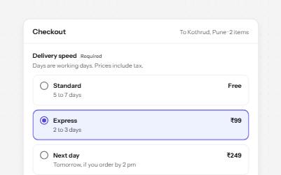
Native radio buttons in a fieldset, restyled with a dot that keeps its contrast, each option with a description and a price.
-
Radio cards
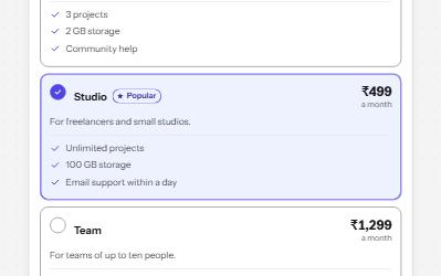
A plan picker where each choice is a large card, built from native radio buttons so arrows, focus and state come free.
-
Reactions
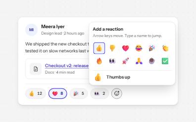
Emoji reactions as toggle buttons named with their meaning and count, a keyboard emoji picker, and who reacted on focus.
-
Meter
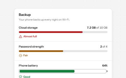
A gauge for a value inside a known range, like storage used or battery left, with its state in words as well as color.