Accessibility pattern · Form inputs
Text field
A text field is only as clear as its label: visible, above the input, and tied to it with for and id. Hints and errors join the field's description through aria-describedby, so they are read as the field is reached, while autocomplete and inputmode bring the right autofill and keyboard.
- WCAG criteria
- 7
- Keyboard rules
- 3
- Checked with
- axe, keyboard and the inspector
Live demo
Try it
Use it with a mouse, a keyboard or a screen reader. The inspector beside it shows what the browser tells assistive technology as you go: focus, state changes and announcements.
The demo works without JavaScript only as far as its HTML does; the inspector needs JavaScript.
Keyboard
Keys it answers to
Every action works without a pointer.
| Key | What it does |
|---|---|
| Tab | Moves to the next field. The read-only booking number is a stop; the disabled city is skipped. |
| ShiftTab | Moves to the previous field. |
| Enter | Sends the form from any field. If something is wrong, focus moves to the first field with an error. |
Screen readers
What it announces
Written from the roles, names and states in the markup.
| When | Expected announcement |
|---|---|
| Focus reaches Full name | Full name, edit text, required |
| Focus reaches Email | Email, edit text, required. We send the tracking link here. |
| Focus reaches Declared value | Declared value in rupees, edit text, required. For transit insurance. |
| Focus reaches Parcel weight | Parcel weight, edit text, required. In kilograms, up to 30. |
| Book pickup is pressed with Full name and Parcel weight empty | Full name, edit text, required, invalid entry. Enter your full name |
| The status beside the button updates | 2 fields need attention. |
| Focus reaches the booking number | Booking number, edit text, read only, PK-48213. Read-only. You can focus and copy it, and it is sent with the form. |
| Every field is valid and the form is sent | Pickup booked. Your tracking link is on its way. |
These are expected announcements, not recordings. Wording and order differ between screen readers and browsers.
Code
Copy the code
The exact files this demo runs on. The styles are served with a prefix that keeps this site's own styles out of the demo; what you copy is the original.
<form class="ap-text-field" data-ap-text-field novalidate aria-labelledby="tf-form-name">
  <div class="ap-text-field__top">
    <h3 class="ap-text-field__name" id="tf-form-name">Book a pickup</h3>
    <p class="ap-text-field__sub">A courier collects the parcel from your door.</p>
  </div>

  <div class="ap-text-field__grid">
    <div class="ap-field ap-text-field__item ap-text-field__item--wide">
      <label class="ap-label ap-text-field__label" for="tf-name">Full name <span class="ap-text-field__req" aria-hidden="true">Required</span></label>
      <input class="ap-input" id="tf-name" name="name" type="text" autocomplete="name" spellcheck="false" required />
      <p class="ap-error ap-text-field__error" id="tf-name-error" hidden><svg class="ap-text-field__icon" viewBox="0 0 24 24" aria-hidden="true" focusable="false"><circle cx="12" cy="12" r="9"/><path d="M12 7.5v5"/><path d="M12 16.5h.01"/></svg><span class="ap-text-field__msg"></span></p>
    </div>

    <div class="ap-field ap-text-field__item">
      <label class="ap-label ap-text-field__label" for="tf-email">Email <span class="ap-text-field__req" aria-hidden="true">Required</span></label>
      <p class="ap-hint" id="tf-email-hint">We send the tracking link here.</p>
      <input class="ap-input" id="tf-email" name="email" type="email" autocomplete="email" spellcheck="false" required aria-describedby="tf-email-hint" />
      <p class="ap-error ap-text-field__error" id="tf-email-error" hidden><svg class="ap-text-field__icon" viewBox="0 0 24 24" aria-hidden="true" focusable="false"><circle cx="12" cy="12" r="9"/><path d="M12 7.5v5"/><path d="M12 16.5h.01"/></svg><span class="ap-text-field__msg"></span></p>
    </div>

    <div class="ap-field ap-text-field__item">
      <label class="ap-label ap-text-field__label" for="tf-tel">Mobile number</label>
      <p class="ap-hint" id="tf-tel-hint">10 digits. The courier calls before arriving.</p>
      <input class="ap-input" id="tf-tel" name="tel" type="tel" autocomplete="tel" aria-describedby="tf-tel-hint" />
      <p class="ap-error ap-text-field__error" id="tf-tel-error" hidden><svg class="ap-text-field__icon" viewBox="0 0 24 24" aria-hidden="true" focusable="false"><circle cx="12" cy="12" r="9"/><path d="M12 7.5v5"/><path d="M12 16.5h.01"/></svg><span class="ap-text-field__msg"></span></p>
    </div>

    <div class="ap-field ap-text-field__item">
      <label class="ap-label ap-text-field__label" for="tf-value"><span>Declared value<span class="ap-text-field__vh"> in rupees</span></span> <span class="ap-text-field__req" aria-hidden="true">Required</span></label>
      <p class="ap-hint" id="tf-value-hint">For transit insurance.</p>
      <div class="ap-text-field__affixed ap-text-field__affixed--pre">
        <span class="ap-text-field__affix" aria-hidden="true">₹</span>
        <input class="ap-input" id="tf-value" name="value" type="text" inputmode="numeric" required aria-describedby="tf-value-hint" />
      </div>
      <p class="ap-error ap-text-field__error" id="tf-value-error" hidden><svg class="ap-text-field__icon" viewBox="0 0 24 24" aria-hidden="true" focusable="false"><circle cx="12" cy="12" r="9"/><path d="M12 7.5v5"/><path d="M12 16.5h.01"/></svg><span class="ap-text-field__msg"></span></p>
    </div>

    <div class="ap-field ap-text-field__item">
      <label class="ap-label ap-text-field__label" for="tf-weight">Parcel weight <span class="ap-text-field__req" aria-hidden="true">Required</span></label>
      <p class="ap-hint" id="tf-weight-hint">In kilograms, up to 30.</p>
      <div class="ap-text-field__affixed ap-text-field__affixed--post">
        <input class="ap-input" id="tf-weight" name="weight" type="text" inputmode="decimal" required aria-describedby="tf-weight-hint" />
        <span class="ap-text-field__affix" aria-hidden="true">kg</span>
      </div>
      <p class="ap-error ap-text-field__error" id="tf-weight-error" hidden><svg class="ap-text-field__icon" viewBox="0 0 24 24" aria-hidden="true" focusable="false"><circle cx="12" cy="12" r="9"/><path d="M12 7.5v5"/><path d="M12 16.5h.01"/></svg><span class="ap-text-field__msg"></span></p>
    </div>
  </div>

  <div class="ap-text-field__panel">
    <h4 class="ap-text-field__group">Booking details</h4>
    <div class="ap-text-field__pair">
      <div class="ap-field ap-text-field__item">
        <label class="ap-label ap-text-field__label" for="tf-booking">Booking number</label>
        <input class="ap-input ap-text-field__fixed" id="tf-booking" name="booking" type="text" value="PK-48213" readonly aria-describedby="tf-booking-note" />
        <p class="ap-text-field__note" id="tf-booking-note"><span class="ap-text-field__tag"><svg class="ap-text-field__icon" viewBox="0 0 24 24" aria-hidden="true" focusable="false"><rect x="5" y="11" width="14" height="9" rx="2"/><path d="M8 11V8a4 4 0 0 1 8 0v3"/></svg>Read-only</span> <span>You can focus and copy it, and it is sent with the form.</span></p>
      </div>
      <div class="ap-field ap-text-field__item">
        <label class="ap-label ap-text-field__label" for="tf-city">Pickup city</label>
        <input class="ap-input ap-text-field__fixed" id="tf-city" name="city" type="text" value="Pune" disabled aria-describedby="tf-city-note" />
        <p class="ap-text-field__note" id="tf-city-note"><span class="ap-text-field__tag"><svg class="ap-text-field__icon" viewBox="0 0 24 24" aria-hidden="true" focusable="false"><circle cx="12" cy="12" r="9"/><path d="m5.7 5.7 12.6 12.6"/></svg>Disabled</span> <span>Skipped by Tab and left out of the form.</span></p>
      </div>
    </div>
  </div>

  <div class="ap-text-field__foot">
    <p class="ap-text-field__status" role="status">
      <svg class="ap-text-field__icon ap-text-field__icon--ok" viewBox="0 0 24 24" aria-hidden="true" focusable="false"><circle cx="12" cy="12" r="9"/><path d="m8 12.5 2.5 2.5L16 9.5"/></svg>
      <svg class="ap-text-field__icon ap-text-field__icon--bad" viewBox="0 0 24 24" aria-hidden="true" focusable="false"><circle cx="12" cy="12" r="9"/><path d="M12 7.5v5"/><path d="M12 16.5h.01"/></svg>
      <span class="ap-text-field__say" data-ap-say></span>
    </p>
    <button type="submit" class="ap-btn ap-btn--primary">Book pickup</button>
  </div>
</form>
/* Shared primitives: buttons and form fields used across the patterns.
   Uses the --ap-* design tokens. */

.ap-btn {
  display: inline-flex;
  align-items: center;
  justify-content: center;
  gap: 8px;
  min-height: 40px;
  padding: 0 16px;
  border: 1px solid var(--ap-border-strong);
  border-radius: var(--ap-radius-sm);
  background: var(--ap-surface);
  color: var(--ap-text);
  font: inherit;
  font-weight: 600;
  line-height: 1.2;
  text-decoration: none;
  white-space: nowrap;
  cursor: pointer;
  transition: background-color var(--ap-duration) var(--ap-ease), border-color var(--ap-duration) var(--ap-ease), box-shadow var(--ap-duration) var(--ap-ease);
}
.ap-btn:hover {
  background: var(--ap-surface-2);
}
.ap-btn:focus-visible {
  outline: 2px solid var(--ap-focus);
  outline-offset: 2px;
}
.ap-btn:disabled,
.ap-btn[aria-disabled="true"] {
  opacity: .55;
  cursor: not-allowed;
}
.ap-btn--primary {
  border-color: var(--ap-accent);
  background: var(--ap-accent);
  color: var(--ap-on-accent);
  box-shadow: var(--ap-shadow-sm);
}
.ap-btn--primary:hover {
  border-color: var(--ap-accent-hover);
  background: var(--ap-accent-hover);
}
.ap-btn--danger {
  border-color: var(--ap-danger);
  background: var(--ap-danger);
  color: var(--ap-surface);
}
.ap-btn--danger:hover {
  filter: brightness(1.08);
}
.ap-btn--ghost {
  border-color: transparent;
  background: transparent;
}
.ap-btn--ghost:hover {
  background: var(--ap-surface-2);
}
.ap-btn__icon {
  width: 18px;
  height: 18px;
  flex-shrink: 0;
  fill: none;
  stroke: currentColor;
  stroke-width: 2;
  stroke-linecap: round;
  stroke-linejoin: round;
}

.ap-field {
  display: grid;
  gap: 6px;
}
.ap-label {
  color: var(--ap-text);
  font-weight: 600;
  font-size: .9375rem;
}
.ap-hint {
  margin: 0;
  color: var(--ap-text-3);
  font-size: .875rem;
  line-height: 1.45;
}
.ap-error {
  display: flex;
  align-items: flex-start;
  gap: 6px;
  margin: 0;
  color: var(--ap-danger);
  font-size: .875rem;
  font-weight: 600;
  line-height: 1.45;
}
.ap-input {
  width: 100%;
  min-height: 44px;
  padding: 10px 12px;
  border: 1px solid var(--ap-border-strong);
  border-radius: var(--ap-radius-sm);
  background: var(--ap-surface);
  color: var(--ap-text);
  font: inherit;
  line-height: 1.4;
  transition: border-color var(--ap-duration) var(--ap-ease), box-shadow var(--ap-duration) var(--ap-ease);
}
.ap-input::placeholder {
  color: var(--ap-text-3);
}
.ap-input:hover {
  border-color: var(--ap-text-2);
}
.ap-input:focus-visible {
  outline: 2px solid var(--ap-focus);
  outline-offset: 1px;
  border-color: var(--ap-focus);
}
.ap-input[aria-invalid="true"] {
  border-color: var(--ap-danger);
  box-shadow: inset 4px 0 0 var(--ap-danger);
}
textarea.ap-input {
  resize: vertical;
  min-height: 88px;
}

@media (prefers-reduced-motion: reduce) {
  .ap-btn,
  .ap-input { transition: none; }
}

/* Text field. Uses the --ap-* design tokens and the shared primitives. */
.ap-text-field {
  width: min(100%, 620px);
  margin-inline: auto;
  border: 1px solid var(--ap-border);
  border-radius: var(--ap-radius-lg);
  background: var(--ap-surface);
  color: var(--ap-text);
  box-shadow: var(--ap-shadow-md);
  container-type: inline-size;
}
.ap-text-field [hidden] {
  display: none;
}

.ap-text-field__top {
  padding: 20px 24px 0;
}
.ap-text-field__name {
  margin: 0;
  font-size: 1.125rem;
  font-weight: 650;
  line-height: 1.3;
}
.ap-text-field__sub {
  margin: 4px 0 0;
  color: var(--ap-text-3);
  font-size: .875rem;
  line-height: 1.45;
}

.ap-text-field__grid {
  display: grid;
  grid-template-columns: repeat(2, minmax(0, 1fr));
  align-items: start;
  gap: 20px 16px;
  padding: 20px 24px 24px;
}
.ap-text-field__item {
  min-width: 0;
}
.ap-text-field__item--wide {
  grid-column: 1 / -1;
}

/* Label row: the name, then "Required" in words */
.ap-text-field__label {
  display: flex;
  flex-wrap: wrap;
  align-items: baseline;
  gap: 4px 8px;
}
.ap-text-field__req {
  color: var(--ap-text-3);
  font-size: .75rem;
  font-weight: 600;
  letter-spacing: .01em;
}
.ap-text-field__vh {
  position: absolute;
  width: 1px;
  height: 1px;
  margin: -1px;
  padding: 0;
  overflow: hidden;
  clip-path: inset(50%);
  white-space: nowrap;
}
.ap-text-field .ap-hint {
  margin-top: -2px;
}

.ap-text-field__icon {
  width: 16px;
  height: 16px;
  flex-shrink: 0;
  fill: none;
  stroke: currentColor;
  stroke-width: 2;
  stroke-linecap: round;
  stroke-linejoin: round;
}
.ap-text-field__error .ap-text-field__icon {
  margin-top: 2px;
}

/* Units: drawn inside the input's edge; spoken by the label or the hint */
.ap-text-field__affixed {
  position: relative;
}
.ap-text-field__affix {
  position: absolute;
  top: 1px;
  bottom: 1px;
  display: grid;
  place-items: center;
  min-width: 42px;
  padding: 0 10px;
  background: var(--ap-surface-2);
  color: var(--ap-text-2);
  font-weight: 600;
  pointer-events: none;
}
.ap-text-field__affixed--pre .ap-text-field__affix {
  left: 1px;
  border-right: 1px solid var(--ap-border);
  border-radius: calc(var(--ap-radius-sm) - 1px) 0 0 calc(var(--ap-radius-sm) - 1px);
}
.ap-text-field__affixed--post .ap-text-field__affix {
  right: 1px;
  border-left: 1px solid var(--ap-border);
  border-radius: 0 calc(var(--ap-radius-sm) - 1px) calc(var(--ap-radius-sm) - 1px) 0;
}
.ap-text-field__affixed--pre .ap-input {
  padding-left: 54px;
}
.ap-text-field__affixed--post .ap-input {
  padding-right: 54px;
}
/* The error edge would sit under a leading unit, so the unit carries it. */
.ap-text-field__affixed--pre:has(.ap-input[aria-invalid="true"]) .ap-text-field__affix {
  box-shadow: inset 4px 0 0 var(--ap-danger);
}

/* Read-only and disabled, side by side */
.ap-text-field__panel {
  padding: 18px 24px 22px;
  border-top: 1px solid var(--ap-border);
}
.ap-text-field__group {
  margin: 0 0 14px;
  color: var(--ap-text-2);
  font-size: .8125rem;
  font-weight: 650;
  letter-spacing: .02em;
}
.ap-text-field__pair {
  display: grid;
  grid-template-columns: repeat(2, minmax(0, 1fr));
  gap: 16px;
}
.ap-text-field__fixed {
  background: var(--ap-surface-2);
}
.ap-text-field__fixed:read-only:not(:disabled):hover {
  border-color: var(--ap-border-strong);
}
.ap-text-field__fixed:disabled {
  border-style: dashed;
  color: var(--ap-text-3);
  cursor: not-allowed;
}
.ap-text-field__note {
  display: grid;
  justify-items: start;
  gap: 2px;
  margin: 0;
  color: var(--ap-text-3);
  font-size: .8125rem;
  line-height: 1.45;
}
.ap-text-field__tag {
  display: inline-flex;
  align-items: center;
  gap: 5px;
  color: var(--ap-text-2);
  font-weight: 650;
}
.ap-text-field__tag .ap-text-field__icon {
  width: 14px;
  height: 14px;
}

/* Footer: the outcome beside the button */
.ap-text-field__foot {
  display: flex;
  flex-wrap: wrap;
  align-items: center;
  justify-content: space-between;
  gap: 12px 16px;
  padding: 16px 24px;
  border-top: 1px solid var(--ap-border);
  border-radius: 0 0 var(--ap-radius-lg) var(--ap-radius-lg);
  background: var(--ap-surface-2);
}
.ap-text-field__status {
  display: flex;
  flex: 1 1 220px;
  align-items: flex-start;
  gap: 8px;
  min-height: 1.5em;
  margin: 0;
  font-size: .9375rem;
  font-weight: 600;
  line-height: 1.45;
}
.ap-text-field__status:not([data-tone]) {
  min-height: 0;
}
.ap-text-field__status .ap-text-field__icon {
  display: none;
  width: 18px;
  height: 18px;
  margin-top: 1px;
}
.ap-text-field__status[data-tone="ok"] {
  color: var(--ap-success);
}
.ap-text-field__status[data-tone="bad"] {
  color: var(--ap-danger);
}
.ap-text-field__status[data-tone="ok"] .ap-text-field__icon--ok,
.ap-text-field__status[data-tone="bad"] .ap-text-field__icon--bad {
  display: block;
}
.ap-text-field__foot .ap-btn {
  min-height: var(--ap-target);
  margin-left: auto;
}

@container (max-width: 480px) {
  .ap-text-field__top { padding: 18px 18px 0; }
  .ap-text-field__grid { grid-template-columns: minmax(0, 1fr); padding: 18px 18px 22px; }
  .ap-text-field__panel { padding: 16px 18px 20px; }
  .ap-text-field__pair { grid-template-columns: minmax(0, 1fr); }
  .ap-text-field__foot { row-gap: 0; padding: 14px 18px; }
  .ap-text-field__status[data-tone] { margin-bottom: 12px; }
  .ap-text-field__foot .ap-btn { flex: 1 1 100%; }
}

@media (forced-colors: active) {
  .ap-text-field__affix { border: 1px solid CanvasText; }
  .ap-text-field__fixed:disabled { color: GrayText; }
}
/**
 * Text fields: visible labels, hints and errors joined to their inputs.
 *
 * Markup: form[data-ap-text-field][novalidate] holding inputs, each with a
 * label, an optional hint in its aria-describedby, and a hidden
 * p#<input id>-error. On submit the script checks every field, marks the
 * broken ones aria-invalid, adds their error to aria-describedby, moves focus
 * to the first, and says how many need attention in the role=status beside
 * the button. Each error clears as soon as its field is fixed.
 */

// One check per field name; each returns "" or the message to show.
const CHECKS = {
  name: (v) => (v ? "" : "Enter your full name"),
  email: (v) => {
    if (!v) return "Enter your email address";
    return /^[^\s@]+@[^\s@]+\.[^\s@]+$/.test(v) ? "" : "Enter an email address like [email protected]";
  },
  tel: (v) => {
    if (!v) return "";
    const digits = v.replace(/[\s-]/g, "").replace(/^(\+91|0)/, "");
    return /^\d{10}$/.test(digits) ? "" : "Enter a 10-digit mobile number";
  },
  value: (v) => {
    if (!v) return "Enter the declared value";
    return /^\d[\d,]*$/.test(v) ? "" : "Enter the value in whole rupees, like 2500";
  },
  weight: (v) => {
    if (!v) return "Enter the parcel weight";
    if (!/^\d*\.?\d+$/.test(v) || Number(v) <= 0) return "Enter the weight as a number, like 2.5";
    return Number(v) > 30 ? "Enter a weight of 30 kg or less" : "";
  },
};

export function init(root) {
  const fields = [...root.querySelectorAll("input[name]")].filter((input) => CHECKS[input.name] && !input.disabled);
  const errorOf = (input) => document.getElementById(`${input.id}-error`);
  // Look the status parts up each time: a translated page may rebuild them.
  const status = () => root.querySelector("[role=status]");
  const say = () => root.querySelector("[data-ap-say]");

  function describedBy(input, errorId, on) {
    const ids = (input.getAttribute("aria-describedby") || "").split(/\s+/).filter((id) => id && id !== errorId);
    if (on) ids.push(errorId);
    if (ids.length) input.setAttribute("aria-describedby", ids.join(" "));
    else input.removeAttribute("aria-describedby");
  }

  function setError(input, message) {
    const box = errorOf(input);
    if (message) {
      box.querySelector(".ap-text-field__msg").textContent = message;
      box.hidden = false;
      input.setAttribute("aria-invalid", "true");
    } else {
      box.hidden = true;
      input.removeAttribute("aria-invalid");
    }
    describedBy(input, box.id, Boolean(message));
  }

  function report(tone, parts) {
    const region = status();
    if (tone) region.dataset.tone = tone;
    else delete region.dataset.tone;
    say().replaceChildren(...parts);
  }

  function piece(text, cls) {
    const span = document.createElement("span");
    span.textContent = text;
    if (cls) span.className = cls;
    return span;
  }

  function onSubmit(event) {
    event.preventDefault();
    const hadFocus = document.activeElement;
    const broken = [];
    for (const input of fields) {
      const message = CHECKS[input.name](input.value.trim());
      setError(input, message);
      if (message) broken.push(input);
    }
    if (!broken.length) {
      report("ok", [piece("Pickup booked. Your tracking link is on its way.")]);
      return;
    }
    const first = broken[0];
    const count = piece(String(broken.length));
    count.setAttribute("data-ap-count", "");
    const words = piece(broken.length === 1 ? "field needs attention." : "fields need attention.");
    const parts = [count, " ", words];
    // Enter pressed inside the first broken field: focus is already there, so
    // moving it announces nothing. The status carries that field's message.
    if (hadFocus === first) parts.push(" ", piece(CHECKS[first.name](first.value.trim()), "ap-text-field__vh"));
    report("bad", []);
    requestAnimationFrame(() => report("bad", parts));
    first.focus();
  }

  function onInput(event) {
    const input = event.target;
    if (!fields.includes(input) || input.getAttribute("aria-invalid") !== "true") return;
    // Errors appear on submit; once shown, they go as soon as the field is right.
    if (!CHECKS[input.name](input.value.trim())) {
      setError(input, "");
      if (!fields.some((f) => f.getAttribute("aria-invalid") === "true")) report(null, []);
    }
  }

  root.addEventListener("submit", onSubmit);
  root.addEventListener("input", onInput);
  return () => {
    root.removeEventListener("submit", onSubmit);
    root.removeEventListener("input", onInput);
  };
}

for (const root of document.querySelectorAll("[data-ap-text-field]")) init(root);
/* Design tokens for the pattern components. Light by default, dark when the
   system asks for it; set data-theme="dark" on :root to force dark. */
:root {
    --ap-radius-sm: 8px;
    --ap-radius: 12px;
    --ap-radius-lg: 16px;
    --ap-radius-full: 999px;
    --ap-font: "Instrument Sans", ui-sans-serif, system-ui, -apple-system, "Segoe UI", Roboto, sans-serif;
    --ap-mono: "JetBrains Mono", ui-monospace, "Cascadia Mono", "SF Mono", Consolas, monospace;
    --ap-ease: cubic-bezier(.2, .8, .2, 1);
    --ap-duration: 180ms;
    --ap-target: 44px;
    --ap-bg: #F4F4F5;
    --ap-surface: #FFFFFF;
    --ap-surface-2: #F4F4F5;
    --ap-surface-3: #E4E4E7;
    --ap-border: #E4E4E7;
    --ap-border-strong: #76767F;
    --ap-text: #18181B;
    --ap-text-2: #3F3F46;
    --ap-text-3: #5E5E66;
    --ap-accent: #4F46E5;
    --ap-accent-hover: #4338CA;
    --ap-on-accent: #FFFFFF;
    --ap-accent-text: #4338CA;
    --ap-accent-soft: #EEF2FF;
    --ap-accent-soft-text: #3730A3;
    --ap-focus: #4F46E5;
    --ap-danger: #B91C1C;
    --ap-danger-soft: #FEF2F2;
    --ap-success: #15803D;
    --ap-success-soft: #F0FDF4;
    --ap-warning: #A15C07;
    --ap-warning-soft: #FEFCE8;
    --ap-info: #1D4ED8;
    --ap-info-soft: #EFF6FF;
    --ap-scrim: rgb(9 9 11 / .48);
    --ap-shadow-sm: 0 1px 2px rgb(9 9 11 / .06);
    --ap-shadow-md: 0 1px 2px rgb(9 9 11 / .05), 0 6px 16px -4px rgb(9 9 11 / .1);
    --ap-shadow-lg: 0 2px 6px rgb(9 9 11 / .06), 0 20px 40px -12px rgb(9 9 11 / .22);
    --ap-light-bg: #F4F4F5;
    --ap-light-surface: #FFFFFF;
    --ap-light-surface-2: #F4F4F5;
    --ap-light-surface-3: #E4E4E7;
    --ap-light-border: #E4E4E7;
    --ap-light-border-strong: #76767F;
    --ap-light-text: #18181B;
    --ap-light-text-2: #3F3F46;
    --ap-light-text-3: #5E5E66;
    --ap-light-accent: #4F46E5;
    --ap-light-accent-hover: #4338CA;
    --ap-light-on-accent: #FFFFFF;
    --ap-light-accent-text: #4338CA;
    --ap-light-accent-soft: #EEF2FF;
    --ap-light-accent-soft-text: #3730A3;
    --ap-light-focus: #4F46E5;
    --ap-light-danger: #B91C1C;
    --ap-light-danger-soft: #FEF2F2;
    --ap-light-success: #15803D;
    --ap-light-success-soft: #F0FDF4;
    --ap-light-warning: #A15C07;
    --ap-light-warning-soft: #FEFCE8;
    --ap-light-info: #1D4ED8;
    --ap-light-info-soft: #EFF6FF;
    --ap-light-scrim: rgb(9 9 11 / .48);
    --ap-light-shadow-sm: 0 1px 2px rgb(9 9 11 / .06);
    --ap-light-shadow-md: 0 1px 2px rgb(9 9 11 / .05), 0 6px 16px -4px rgb(9 9 11 / .1);
    --ap-light-shadow-lg: 0 2px 6px rgb(9 9 11 / .06), 0 20px 40px -12px rgb(9 9 11 / .22);
    --ap-dark-bg: #09090B;
    --ap-dark-surface: #18181B;
    --ap-dark-surface-2: #27272A;
    --ap-dark-surface-3: #3F3F46;
    --ap-dark-border: #2E2E33;
    --ap-dark-border-strong: #8E8E97;
    --ap-dark-text: #FAFAFA;
    --ap-dark-text-2: #D4D4D8;
    --ap-dark-text-3: #A1A1AA;
    --ap-dark-accent: #818CF8;
    --ap-dark-accent-hover: #A5B4FC;
    --ap-dark-on-accent: #0C0A1F;
    --ap-dark-accent-text: #A5B4FC;
    --ap-dark-accent-soft: #1E1B4B;
    --ap-dark-accent-soft-text: #C7D2FE;
    --ap-dark-focus: #A5B4FC;
    --ap-dark-danger: #F87171;
    --ap-dark-danger-soft: #2A1215;
    --ap-dark-success: #4ADE80;
    --ap-dark-success-soft: #0F2A1A;
    --ap-dark-warning: #FACC15;
    --ap-dark-warning-soft: #2A2410;
    --ap-dark-info: #60A5FA;
    --ap-dark-info-soft: #0F1D33;
    --ap-dark-scrim: rgb(0 0 0 / .62);
    --ap-dark-shadow-sm: 0 1px 2px rgb(0 0 0 / .4);
    --ap-dark-shadow-md: 0 1px 2px rgb(0 0 0 / .4), 0 8px 20px -6px rgb(0 0 0 / .5);
    --ap-dark-shadow-lg: 0 2px 8px rgb(0 0 0 / .45), 0 24px 48px -12px rgb(0 0 0 / .7);
}
@media (prefers-color-scheme: dark) {
  :root:not([data-theme="light"]) {
      --ap-bg: #09090B;
      --ap-surface: #18181B;
      --ap-surface-2: #27272A;
      --ap-surface-3: #3F3F46;
      --ap-border: #2E2E33;
      --ap-border-strong: #8E8E97;
      --ap-text: #FAFAFA;
      --ap-text-2: #D4D4D8;
      --ap-text-3: #A1A1AA;
      --ap-accent: #818CF8;
      --ap-accent-hover: #A5B4FC;
      --ap-on-accent: #0C0A1F;
      --ap-accent-text: #A5B4FC;
      --ap-accent-soft: #1E1B4B;
      --ap-accent-soft-text: #C7D2FE;
      --ap-focus: #A5B4FC;
      --ap-danger: #F87171;
      --ap-danger-soft: #2A1215;
      --ap-success: #4ADE80;
      --ap-success-soft: #0F2A1A;
      --ap-warning: #FACC15;
      --ap-warning-soft: #2A2410;
      --ap-info: #60A5FA;
      --ap-info-soft: #0F1D33;
      --ap-scrim: rgb(0 0 0 / .62);
      --ap-shadow-sm: 0 1px 2px rgb(0 0 0 / .4);
      --ap-shadow-md: 0 1px 2px rgb(0 0 0 / .4), 0 8px 20px -6px rgb(0 0 0 / .5);
      --ap-shadow-lg: 0 2px 8px rgb(0 0 0 / .45), 0 24px 48px -12px rgb(0 0 0 / .7);
  }
}
:root[data-theme="dark"] {
    --ap-bg: #09090B;
    --ap-surface: #18181B;
    --ap-surface-2: #27272A;
    --ap-surface-3: #3F3F46;
    --ap-border: #2E2E33;
    --ap-border-strong: #8E8E97;
    --ap-text: #FAFAFA;
    --ap-text-2: #D4D4D8;
    --ap-text-3: #A1A1AA;
    --ap-accent: #818CF8;
    --ap-accent-hover: #A5B4FC;
    --ap-on-accent: #0C0A1F;
    --ap-accent-text: #A5B4FC;
    --ap-accent-soft: #1E1B4B;
    --ap-accent-soft-text: #C7D2FE;
    --ap-focus: #A5B4FC;
    --ap-danger: #F87171;
    --ap-danger-soft: #2A1215;
    --ap-success: #4ADE80;
    --ap-success-soft: #0F2A1A;
    --ap-warning: #FACC15;
    --ap-warning-soft: #2A2410;
    --ap-info: #60A5FA;
    --ap-info-soft: #0F1D33;
    --ap-scrim: rgb(0 0 0 / .62);
    --ap-shadow-sm: 0 1px 2px rgb(0 0 0 / .4);
    --ap-shadow-md: 0 1px 2px rgb(0 0 0 / .4), 0 8px 20px -6px rgb(0 0 0 / .5);
    --ap-shadow-lg: 0 2px 8px rgb(0 0 0 / .45), 0 24px 48px -12px rgb(0 0 0 / .7);
}
WCAG 2.2
What it meets
The success criteria this pattern takes care of, and how.
-
1.3.1 Info and Relationships
Level A
Each label is tied to its input with for and id, and hints and errors join the input's aria-describedby, so the relationships are in the code, not only in the layout.
-
1.3.5 Identify Input Purpose
Level AA
Name, email and mobile number carry autocomplete tokens, so browsers and password managers can fill them in.
-
1.4.1 Use of Color
Level A
An error is marked with an icon, a message and a thick edge on the field, never by a red border alone.
-
3.3.1 Error Identification
Level A
Each field with a problem is marked aria-invalid and gets its own message, in text, straight under it.
-
3.3.2 Labels or Instructions
Level A
Every field has a visible label above it, required fields say Required in words, and units and formats are given before typing starts.
-
3.3.3 Error Suggestion
Level AA
Messages say how to put the problem right, with an example where the format matters, like 2.5 for a weight.
-
4.1.2 Name, Role, Value
Level A
Required, invalid and read-only states come from the input itself, so a screen reader reports them with the field's name.
Usage
When to use it
Use it
- Short free-text answers: names, email addresses, phone numbers, amounts and references.
- Values with a unit or a currency, where an adornment helps people check what they typed.
Use something else
- A choice from a short, known list: use radio buttons or a select.
- Long answers: use a text area, with a counter if there is a limit.
- Quantities people step up and down: a number input with buttons suits that better.
Common failures
How it usually goes wrong
A placeholder instead of a label
Placeholder text disappears as soon as typing starts, is usually too faint to read, and is not a dependable name. Every field here has a real label above it.
A red border as the only sign of an error
People who cannot tell red from grey see nothing wrong. Each error here has an icon and a message, and the field gets a thick edge as well.
An error that is not tied to its field
A message that sits near the input but is not in its aria-describedby is never heard by someone tabbing through the form. The script adds the error's id when it appears.
type=number for things that are not quantities
Phone numbers, PINs and amounts are not values you step through: type=number drops leading zeros, changes on scroll and rejects commas. inputmode brings up the number keypad without those problems.
A unit drawn only beside the box
A ₹ or kg painted next to the input is not part of its name or description. Say the unit in the label or the hint, as the two fields here do.
Disabled where read-only was meant
A disabled field cannot take focus, so keyboard and screen reader users never hear its value or its explanation, and it is left out of the data sent. Use readonly for values people need to read.
Notes
Building it
- The form has novalidate so the script's messages replace the browser's bubbles; the required attribute stays, so the state is still exposed.
- Errors appear when the form is sent, not while people type. Once shown, each one clears the moment its field is fixed.
- Keep the hint in aria-describedby and add or remove only the error's id, so the hint is never lost when the error goes.
- The word Required is aria-hidden because the required attribute already reports it; showing it in text helps everyone who would miss an asterisk.
- The ₹ unit is spoken through visually hidden text in the label, and kg through the hint. When Enter is pressed in the first broken field, focus is already there, so the status beside the button also reads that field's message.
Sources: WAI Tutorials: Labeling controls · WAI Tutorials: User notifications · HTML: autofill field names
Checked with axe in light and dark themes, at desktop and phone widths, and by keyboard. Not yet tested with every screen reader and browser pair. Report a correction
Related
Patterns that go with it
-
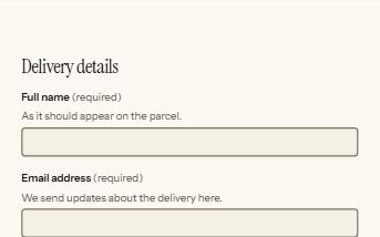
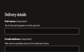
Form errors
An error summary that takes focus, messages tied to each field, and a status message when the form is sent.
-
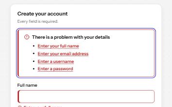
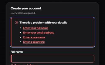
Inline validation
A sign-up form that checks each field as it is left, once typed in, with ticks and errors in words and a summary on submit.
-
Text area with character count
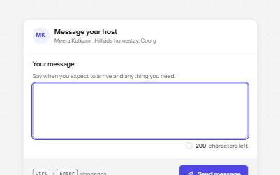
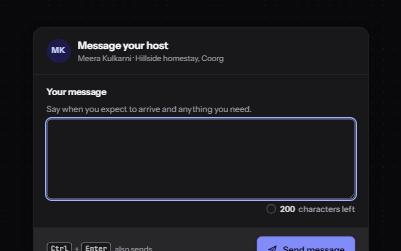
A text area with a visible character count that speaks only at thresholds, never cuts text off, and blocks sending when over.
-
Password field
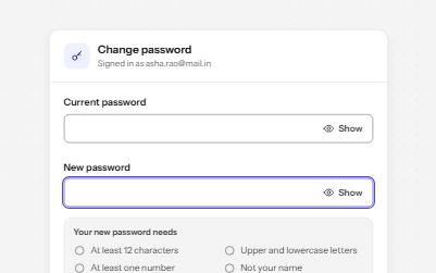
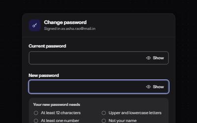
A password input with a Show toggle that keeps focus in place, a live requirements checklist, and a Caps Lock warning.