Accessibility pattern · Form inputs
Select
A native select already works everywhere: with every screen reader, with the keyboard, and as the system's own picker on a phone. Style it rather than replace it. Where appearance: base-select is supported the open list takes the same design; elsewhere the closed box is styled and the browser draws the list.
- WCAG criteria
- 7
- Keyboard rules
- 6
- Checked with
- axe, keyboard and the inspector
Live demo
Try it
Use it with a mouse, a keyboard or a screen reader. The inspector beside it shows what the browser tells assistive technology as you go: focus, state changes and announcements.
The demo works without JavaScript only as far as its HTML does; the inspector needs JavaScript.
Keyboard
Keys it answers to
Every action works without a pointer.
| Key | What it does |
|---|---|
| Tab or ShiftTab | Moves to and from each select. |
| Space or AltArrow Down | Opens the list with the chosen option, or the first city, in focus. |
| Arrow Down or Arrow Up | In the open list, moves to the next or previous city, across the region groups. |
| Enter | Chooses the focused city and closes the list. |
| Escape | Closes the list without changing the choice. |
| A–Z | Typing the first letters of a city jumps to it, with the list open or closed. |
Screen readers
What it announces
Written from the roles, names and states in the markup.
| When | Expected announcement |
|---|---|
| Focus reaches the city select | City, combo box, Choose a city, required. We deliver to these cities in two to four working days. |
| Space opens the list | North, group. Chandigarh, option, 1 of 14 |
| Enter chooses Pune | City, combo box, Pune |
| Save is pressed with no city | City, combo box, Choose a city, invalid entry, required. We deliver to these cities in two to four working days. Choose a city for delivery. |
| The details are saved | Saved: Pune |
These are expected announcements, not recordings. Wording and order differ between screen readers and browsers.
Code
Copy the code
The exact files this demo runs on. The styles are served with a prefix that keeps this site's own styles out of the demo; what you copy is the original.
<form class="ap-select" data-ap-select novalidate>
  <h3 class="ap-select__name">Delivery details</h3>
  <p class="ap-select__lead">Where should we send your order?</p>

  <div class="ap-field">
    <label class="ap-label" for="select-city">City</label>
    <p class="ap-hint" id="select-city-hint">We deliver to these cities in two to four working days.</p>
    <div class="ap-select__box">
      <select class="ap-select__control" id="select-city" name="city" required aria-describedby="select-city-hint">
        <option value="" disabled selected>Choose a city</option>
        <optgroup label="North">
          <option value="chandigarh">Chandigarh</option>
          <option value="delhi">Delhi</option>
          <option value="jaipur">Jaipur</option>
          <option value="lucknow">Lucknow</option>
        </optgroup>
        <optgroup label="West">
          <option value="ahmedabad">Ahmedabad</option>
          <option value="mumbai">Mumbai</option>
          <option value="pune">Pune</option>
        </optgroup>
        <optgroup label="South">
          <option value="bengaluru">Bengaluru</option>
          <option value="chennai">Chennai</option>
          <option value="hyderabad">Hyderabad</option>
          <option value="kochi">Kochi</option>
        </optgroup>
        <optgroup label="East">
          <option value="bhubaneswar">Bhubaneswar</option>
          <option value="guwahati">Guwahati</option>
          <option value="kolkata">Kolkata</option>
        </optgroup>
      </select>
      <svg class="ap-select__chevron" viewBox="0 0 24 24" aria-hidden="true" focusable="false"><path d="m6 9 6 6 6-6"/></svg>
    </div>
    <p class="ap-error" id="select-city-error" hidden>
      <svg class="ap-select__error-icon" viewBox="0 0 24 24" aria-hidden="true" focusable="false"><circle cx="12" cy="12" r="9"/><path d="M12 7.5v5.5M12 16.5h.01"/></svg>
      <span>Choose a city for delivery.</span>
    </p>
  </div>

  <div class="ap-field">
    <label class="ap-label" for="select-slot">Delivery time <span class="ap-select__optional">(optional)</span></label>
    <div class="ap-select__box">
      <select class="ap-select__control" id="select-slot" name="slot">
        <option value="any" selected>Any time, 9 am to 9 pm</option>
        <option value="morning">Morning, 9 am to 12 noon</option>
        <option value="afternoon">Afternoon, 12 noon to 4 pm</option>
        <option value="evening">Evening, 4 pm to 9 pm</option>
      </select>
      <svg class="ap-select__chevron" viewBox="0 0 24 24" aria-hidden="true" focusable="false"><path d="m6 9 6 6 6-6"/></svg>
    </div>
  </div>

  <div class="ap-select__actions">
    <button type="submit" class="ap-btn ap-btn--primary">Save delivery details</button>
  </div>
  <p class="ap-select__status" role="status"></p>
</form>
/* Shared primitives: buttons and form fields used across the patterns.
   Uses the --ap-* design tokens. */

.ap-btn {
  display: inline-flex;
  align-items: center;
  justify-content: center;
  gap: 8px;
  min-height: 40px;
  padding: 0 16px;
  border: 1px solid var(--ap-border-strong);
  border-radius: var(--ap-radius-sm);
  background: var(--ap-surface);
  color: var(--ap-text);
  font: inherit;
  font-weight: 600;
  line-height: 1.2;
  text-decoration: none;
  white-space: nowrap;
  cursor: pointer;
  transition: background-color var(--ap-duration) var(--ap-ease), border-color var(--ap-duration) var(--ap-ease), box-shadow var(--ap-duration) var(--ap-ease);
}
.ap-btn:hover {
  background: var(--ap-surface-2);
}
.ap-btn:focus-visible {
  outline: 2px solid var(--ap-focus);
  outline-offset: 2px;
}
.ap-btn:disabled,
.ap-btn[aria-disabled="true"] {
  opacity: .55;
  cursor: not-allowed;
}
.ap-btn--primary {
  border-color: var(--ap-accent);
  background: var(--ap-accent);
  color: var(--ap-on-accent);
  box-shadow: var(--ap-shadow-sm);
}
.ap-btn--primary:hover {
  border-color: var(--ap-accent-hover);
  background: var(--ap-accent-hover);
}
.ap-btn--danger {
  border-color: var(--ap-danger);
  background: var(--ap-danger);
  color: var(--ap-surface);
}
.ap-btn--danger:hover {
  filter: brightness(1.08);
}
.ap-btn--ghost {
  border-color: transparent;
  background: transparent;
}
.ap-btn--ghost:hover {
  background: var(--ap-surface-2);
}
.ap-btn__icon {
  width: 18px;
  height: 18px;
  flex-shrink: 0;
  fill: none;
  stroke: currentColor;
  stroke-width: 2;
  stroke-linecap: round;
  stroke-linejoin: round;
}

.ap-field {
  display: grid;
  gap: 6px;
}
.ap-label {
  color: var(--ap-text);
  font-weight: 600;
  font-size: .9375rem;
}
.ap-hint {
  margin: 0;
  color: var(--ap-text-3);
  font-size: .875rem;
  line-height: 1.45;
}
.ap-error {
  display: flex;
  align-items: flex-start;
  gap: 6px;
  margin: 0;
  color: var(--ap-danger);
  font-size: .875rem;
  font-weight: 600;
  line-height: 1.45;
}
.ap-input {
  width: 100%;
  min-height: 44px;
  padding: 10px 12px;
  border: 1px solid var(--ap-border-strong);
  border-radius: var(--ap-radius-sm);
  background: var(--ap-surface);
  color: var(--ap-text);
  font: inherit;
  line-height: 1.4;
  transition: border-color var(--ap-duration) var(--ap-ease), box-shadow var(--ap-duration) var(--ap-ease);
}
.ap-input::placeholder {
  color: var(--ap-text-3);
}
.ap-input:hover {
  border-color: var(--ap-text-2);
}
.ap-input:focus-visible {
  outline: 2px solid var(--ap-focus);
  outline-offset: 1px;
  border-color: var(--ap-focus);
}
.ap-input[aria-invalid="true"] {
  border-color: var(--ap-danger);
  box-shadow: inset 4px 0 0 var(--ap-danger);
}
textarea.ap-input {
  resize: vertical;
  min-height: 88px;
}

@media (prefers-reduced-motion: reduce) {
  .ap-btn,
  .ap-input { transition: none; }
}

/* Select. Uses the --ap-* design tokens and the shared primitives. */
.ap-select {
  display: grid;
  gap: 18px;
  width: min(100%, 460px);
  margin-inline: auto;
  padding: 22px 24px 24px;
  border: 1px solid var(--ap-border);
  border-radius: var(--ap-radius-lg);
  background: var(--ap-surface);
  color: var(--ap-text);
  box-shadow: var(--ap-shadow-md);
  container-type: inline-size;
}
.ap-select__name {
  margin: 0;
  font-size: 1.125rem;
  font-weight: 650;
  line-height: 1.35;
}
.ap-select__lead {
  margin: -14px 0 2px;
  color: var(--ap-text-3);
  font-size: .9375rem;
}
.ap-select__optional {
  color: var(--ap-text-3);
  font-weight: 400;
}
.ap-select .ap-error[hidden] {
  display: none;
}
.ap-select__error-icon {
  flex-shrink: 0;
  width: 18px;
  height: 18px;
  margin-top: 1px;
  fill: none;
  stroke: currentColor;
  stroke-width: 2;
  stroke-linecap: round;
}

/* The closed select: a native control with its arrow replaced by an SVG
   chevron laid over it. This much works in every browser. */
.ap-select__box {
  position: relative;
}
.ap-select__control {
  width: 100%;
  min-height: var(--ap-target);
  padding: 10px 44px 10px 12px;
  border: 1px solid var(--ap-border-strong);
  border-radius: var(--ap-radius-sm);
  background: var(--ap-surface);
  color: var(--ap-text);
  font: inherit;
  line-height: 1.4;
  cursor: pointer;
  appearance: none;
  transition: border-color var(--ap-duration) var(--ap-ease), box-shadow var(--ap-duration) var(--ap-ease);
}
.ap-select__control:hover {
  border-color: var(--ap-text-2);
}
.ap-select__control:focus-visible {
  outline: 2px solid var(--ap-focus);
  outline-offset: 1px;
  border-color: var(--ap-focus);
}
/* The placeholder reads as a prompt, not an answer. */
.ap-select__control:has(option[value=""]:checked) {
  color: var(--ap-text-3);
}
.ap-select__control[aria-invalid="true"] {
  border-color: var(--ap-danger);
  box-shadow: inset 4px 0 0 var(--ap-danger);
}
.ap-select__control option {
  color: var(--ap-text);
}
.ap-select__chevron {
  position: absolute;
  top: 50%;
  right: 12px;
  width: 20px;
  height: 20px;
  translate: 0 -50%;
  pointer-events: none;
  fill: none;
  stroke: var(--ap-text-2);
  stroke-width: 2;
  stroke-linecap: round;
  stroke-linejoin: round;
  transition: rotate var(--ap-duration) var(--ap-ease);
}

/* The open list, where the browser lets the page style it. */
@supports (appearance: base-select) {
  .ap-select:not([data-system]) .ap-select__control,
  .ap-select:not([data-system]) .ap-select__control::picker(select) {
    appearance: base-select;
  }
  .ap-select:not([data-system]) .ap-select__control {
    display: flex;
    align-items: center;
  }
  .ap-select:not([data-system]) .ap-select__control::picker-icon {
    display: none;
  }
  .ap-select:not([data-system]) .ap-select__box:has(.ap-select__control:open) .ap-select__chevron {
    rotate: 180deg;
  }
  .ap-select:not([data-system]) .ap-select__control::picker(select) {
    max-block-size: min(340px, 60vh);
    margin-block: 6px;
    padding: 6px;
    border: 1px solid var(--ap-border);
    border-radius: var(--ap-radius);
    background: var(--ap-surface);
    color: var(--ap-text);
    box-shadow: var(--ap-shadow-lg);
  }
  /* The group's label is drawn by the browser 6px in from the edge; this lines it up with the options' text. */
  .ap-select:not([data-system]) .ap-select__control optgroup {
    padding: 4px 0 4px 6px;
    color: var(--ap-text-3);
    font-size: .75rem;
    font-weight: 650;
    letter-spacing: .06em;
    text-transform: uppercase;
  }
  .ap-select:not([data-system]) .ap-select__control optgroup + optgroup {
    margin-top: 4px;
    border-top: 1px solid var(--ap-border);
  }
  .ap-select:not([data-system]) .ap-select__control optgroup option {
    margin-inline-start: -6px;
  }
  .ap-select:not([data-system]) .ap-select__control option {
    display: flex;
    align-items: center;
    gap: 10px;
    min-block-size: 40px;
    padding: 8px 12px;
    border-radius: var(--ap-radius-sm);
    color: var(--ap-text);
    font-size: .9375rem;
    font-weight: 400;
    letter-spacing: normal;
    text-transform: none;
    cursor: pointer;
  }
  .ap-select:not([data-system]) .ap-select__control option:hover {
    background: var(--ap-surface-2);
  }
  .ap-select:not([data-system]) .ap-select__control option:focus-visible {
    outline: 2px solid var(--ap-focus);
    outline-offset: -2px;
  }
  .ap-select:not([data-system]) .ap-select__control option:checked {
    background: var(--ap-accent-soft);
    color: var(--ap-accent-soft-text);
    font-weight: 650;
  }
  .ap-select:not([data-system]) .ap-select__control option::checkmark {
    order: 1;
    margin-inline-start: auto;
    color: var(--ap-accent-soft-text);
  }
  .ap-select:not([data-system]) .ap-select__control option:disabled {
    color: var(--ap-text-3);
    cursor: default;
  }
}

.ap-select__actions {
  display: flex;
  flex-wrap: wrap;
  gap: 10px;
  margin-top: 2px;
}
.ap-select__actions .ap-btn {
  min-height: var(--ap-target);
  padding: 0 20px;
}
.ap-select__status {
  margin: -6px 0 0;
  color: var(--ap-success);
  font-size: .875rem;
  font-weight: 600;
}
.ap-select__status:empty {
  display: none;
}
.ap-select__status:not(:empty) {
  padding: 10px 12px;
  border-radius: var(--ap-radius-sm);
  background: var(--ap-success-soft);
}

@container (max-width: 380px) {
  .ap-select { padding: 18px 16px 20px; }
  .ap-select__actions .ap-btn { flex: 1 1 100%; }
}

@media (prefers-reduced-motion: reduce) {
  .ap-select__control,
  .ap-select__chevron { transition: none; }
}
/**
 * Select: native select elements, styled. The browser does the opening, the
 * keys, typing to jump and the phone picker; this script only checks the
 * required city when the form is saved and reports the outcome.
 *
 * Markup: form[data-ap-select] holding a select[required][aria-describedby],
 * a p[hidden] error (added to the select's description while shown) and a
 * p[role=status]. Add data-system to the root to leave the open list to the
 * system even where appearance: base-select works (CSS only).
 */

export function init(root) {
  const city = root.querySelector("select[required]");
  const error = root.querySelector(".ap-error");
  const status = root.querySelector("[role=status]");

  // Browsers read a hidden element that aria-describedby points to, so the
  // error joins the description only while it shows.
  function showError(on) {
    error.hidden = !on;
    const ids = (city.getAttribute("aria-describedby") || "").split(/\s+/).filter((id) => id && id !== error.id);
    if (on) {
      ids.push(error.id);
      city.setAttribute("aria-invalid", "true");
    } else {
      city.removeAttribute("aria-invalid");
    }
    city.setAttribute("aria-describedby", ids.join(" "));
  }

  function onChange(event) {
    status.textContent = "";
    if (event.target === city && city.value) showError(false);
  }

  function onSubmit(event) {
    event.preventDefault();
    if (!city.value) {
      status.textContent = "";
      showError(true);
      city.focus();
      return;
    }
    const said = document.createElement("span");
    said.textContent = "Saved:";
    const what = document.createElement("strong");
    what.textContent = city.selectedOptions[0].textContent.trim();
    status.replaceChildren(said, " ", what);
  }

  root.addEventListener("change", onChange);
  root.addEventListener("submit", onSubmit);
  return () => {
    root.removeEventListener("change", onChange);
    root.removeEventListener("submit", onSubmit);
  };
}

for (const root of document.querySelectorAll("[data-ap-select]")) init(root);
/* Design tokens for the pattern components. Light by default, dark when the
   system asks for it; set data-theme="dark" on :root to force dark. */
:root {
    --ap-radius-sm: 8px;
    --ap-radius: 12px;
    --ap-radius-lg: 16px;
    --ap-radius-full: 999px;
    --ap-font: "Instrument Sans", ui-sans-serif, system-ui, -apple-system, "Segoe UI", Roboto, sans-serif;
    --ap-mono: "JetBrains Mono", ui-monospace, "Cascadia Mono", "SF Mono", Consolas, monospace;
    --ap-ease: cubic-bezier(.2, .8, .2, 1);
    --ap-duration: 180ms;
    --ap-target: 44px;
    --ap-bg: #F4F4F5;
    --ap-surface: #FFFFFF;
    --ap-surface-2: #F4F4F5;
    --ap-surface-3: #E4E4E7;
    --ap-border: #E4E4E7;
    --ap-border-strong: #76767F;
    --ap-text: #18181B;
    --ap-text-2: #3F3F46;
    --ap-text-3: #5E5E66;
    --ap-accent: #4F46E5;
    --ap-accent-hover: #4338CA;
    --ap-on-accent: #FFFFFF;
    --ap-accent-text: #4338CA;
    --ap-accent-soft: #EEF2FF;
    --ap-accent-soft-text: #3730A3;
    --ap-focus: #4F46E5;
    --ap-danger: #B91C1C;
    --ap-danger-soft: #FEF2F2;
    --ap-success: #15803D;
    --ap-success-soft: #F0FDF4;
    --ap-warning: #A15C07;
    --ap-warning-soft: #FEFCE8;
    --ap-info: #1D4ED8;
    --ap-info-soft: #EFF6FF;
    --ap-scrim: rgb(9 9 11 / .48);
    --ap-shadow-sm: 0 1px 2px rgb(9 9 11 / .06);
    --ap-shadow-md: 0 1px 2px rgb(9 9 11 / .05), 0 6px 16px -4px rgb(9 9 11 / .1);
    --ap-shadow-lg: 0 2px 6px rgb(9 9 11 / .06), 0 20px 40px -12px rgb(9 9 11 / .22);
    --ap-light-bg: #F4F4F5;
    --ap-light-surface: #FFFFFF;
    --ap-light-surface-2: #F4F4F5;
    --ap-light-surface-3: #E4E4E7;
    --ap-light-border: #E4E4E7;
    --ap-light-border-strong: #76767F;
    --ap-light-text: #18181B;
    --ap-light-text-2: #3F3F46;
    --ap-light-text-3: #5E5E66;
    --ap-light-accent: #4F46E5;
    --ap-light-accent-hover: #4338CA;
    --ap-light-on-accent: #FFFFFF;
    --ap-light-accent-text: #4338CA;
    --ap-light-accent-soft: #EEF2FF;
    --ap-light-accent-soft-text: #3730A3;
    --ap-light-focus: #4F46E5;
    --ap-light-danger: #B91C1C;
    --ap-light-danger-soft: #FEF2F2;
    --ap-light-success: #15803D;
    --ap-light-success-soft: #F0FDF4;
    --ap-light-warning: #A15C07;
    --ap-light-warning-soft: #FEFCE8;
    --ap-light-info: #1D4ED8;
    --ap-light-info-soft: #EFF6FF;
    --ap-light-scrim: rgb(9 9 11 / .48);
    --ap-light-shadow-sm: 0 1px 2px rgb(9 9 11 / .06);
    --ap-light-shadow-md: 0 1px 2px rgb(9 9 11 / .05), 0 6px 16px -4px rgb(9 9 11 / .1);
    --ap-light-shadow-lg: 0 2px 6px rgb(9 9 11 / .06), 0 20px 40px -12px rgb(9 9 11 / .22);
    --ap-dark-bg: #09090B;
    --ap-dark-surface: #18181B;
    --ap-dark-surface-2: #27272A;
    --ap-dark-surface-3: #3F3F46;
    --ap-dark-border: #2E2E33;
    --ap-dark-border-strong: #8E8E97;
    --ap-dark-text: #FAFAFA;
    --ap-dark-text-2: #D4D4D8;
    --ap-dark-text-3: #A1A1AA;
    --ap-dark-accent: #818CF8;
    --ap-dark-accent-hover: #A5B4FC;
    --ap-dark-on-accent: #0C0A1F;
    --ap-dark-accent-text: #A5B4FC;
    --ap-dark-accent-soft: #1E1B4B;
    --ap-dark-accent-soft-text: #C7D2FE;
    --ap-dark-focus: #A5B4FC;
    --ap-dark-danger: #F87171;
    --ap-dark-danger-soft: #2A1215;
    --ap-dark-success: #4ADE80;
    --ap-dark-success-soft: #0F2A1A;
    --ap-dark-warning: #FACC15;
    --ap-dark-warning-soft: #2A2410;
    --ap-dark-info: #60A5FA;
    --ap-dark-info-soft: #0F1D33;
    --ap-dark-scrim: rgb(0 0 0 / .62);
    --ap-dark-shadow-sm: 0 1px 2px rgb(0 0 0 / .4);
    --ap-dark-shadow-md: 0 1px 2px rgb(0 0 0 / .4), 0 8px 20px -6px rgb(0 0 0 / .5);
    --ap-dark-shadow-lg: 0 2px 8px rgb(0 0 0 / .45), 0 24px 48px -12px rgb(0 0 0 / .7);
}
@media (prefers-color-scheme: dark) {
  :root:not([data-theme="light"]) {
      --ap-bg: #09090B;
      --ap-surface: #18181B;
      --ap-surface-2: #27272A;
      --ap-surface-3: #3F3F46;
      --ap-border: #2E2E33;
      --ap-border-strong: #8E8E97;
      --ap-text: #FAFAFA;
      --ap-text-2: #D4D4D8;
      --ap-text-3: #A1A1AA;
      --ap-accent: #818CF8;
      --ap-accent-hover: #A5B4FC;
      --ap-on-accent: #0C0A1F;
      --ap-accent-text: #A5B4FC;
      --ap-accent-soft: #1E1B4B;
      --ap-accent-soft-text: #C7D2FE;
      --ap-focus: #A5B4FC;
      --ap-danger: #F87171;
      --ap-danger-soft: #2A1215;
      --ap-success: #4ADE80;
      --ap-success-soft: #0F2A1A;
      --ap-warning: #FACC15;
      --ap-warning-soft: #2A2410;
      --ap-info: #60A5FA;
      --ap-info-soft: #0F1D33;
      --ap-scrim: rgb(0 0 0 / .62);
      --ap-shadow-sm: 0 1px 2px rgb(0 0 0 / .4);
      --ap-shadow-md: 0 1px 2px rgb(0 0 0 / .4), 0 8px 20px -6px rgb(0 0 0 / .5);
      --ap-shadow-lg: 0 2px 8px rgb(0 0 0 / .45), 0 24px 48px -12px rgb(0 0 0 / .7);
  }
}
:root[data-theme="dark"] {
    --ap-bg: #09090B;
    --ap-surface: #18181B;
    --ap-surface-2: #27272A;
    --ap-surface-3: #3F3F46;
    --ap-border: #2E2E33;
    --ap-border-strong: #8E8E97;
    --ap-text: #FAFAFA;
    --ap-text-2: #D4D4D8;
    --ap-text-3: #A1A1AA;
    --ap-accent: #818CF8;
    --ap-accent-hover: #A5B4FC;
    --ap-on-accent: #0C0A1F;
    --ap-accent-text: #A5B4FC;
    --ap-accent-soft: #1E1B4B;
    --ap-accent-soft-text: #C7D2FE;
    --ap-focus: #A5B4FC;
    --ap-danger: #F87171;
    --ap-danger-soft: #2A1215;
    --ap-success: #4ADE80;
    --ap-success-soft: #0F2A1A;
    --ap-warning: #FACC15;
    --ap-warning-soft: #2A2410;
    --ap-info: #60A5FA;
    --ap-info-soft: #0F1D33;
    --ap-scrim: rgb(0 0 0 / .62);
    --ap-shadow-sm: 0 1px 2px rgb(0 0 0 / .4);
    --ap-shadow-md: 0 1px 2px rgb(0 0 0 / .4), 0 8px 20px -6px rgb(0 0 0 / .5);
    --ap-shadow-lg: 0 2px 8px rgb(0 0 0 / .45), 0 24px 48px -12px rgb(0 0 0 / .7);
}
WCAG 2.2
What it meets
The success criteria this pattern takes care of, and how.
-
1.3.1 Info and Relationships
Level A
Each select has a label element, its hint and error are tied to it with aria-describedby, and optgroups group the cities by region in a way assistive technology can read.
-
1.4.11 Non-text Contrast
Level AA
The select's edge and chevron clear 3:1 against the card, so the control can be found without its label.
-
2.1.1 Keyboard
Level A
Opening, moving through and choosing are the browser's own keys, the same in every select on the web.
-
2.4.7 Focus Visible
Level AA
The select shows a two-pixel focus ring, and so does each option in the styled list.
-
3.3.1 Error Identification
Level A
Saving without a city marks the select invalid and shows the reason in text beside it, with an icon, and focus goes to the select.
-
3.3.2 Labels or Instructions
Level A
The label says what to choose, the hint says what happens next, and the optional field says it is optional.
-
4.1.2 Name, Role, Value
Level A
A native select exposes its role, name, value and required state with no ARIA added.
Usage
When to use it
Use it
- Choosing one option from a list of about five to fifteen, where people know what they are looking for.
- Forms on phones, where the system's own picker is the quickest way to choose.
Use something else
- Two to five options people should compare at a glance: show them as radio buttons.
- Long lists, like every city in the country: use a combobox people can type into.
- Choosing several options: use checkboxes or a multi-select listbox.
Common failures
How it usually goes wrong
A custom dropdown instead of a select
A div that opens a list of divs has to rebuild the keyboard, focus, typing to jump, the phone picker and screen reader support, and usually misses some. A native select has them all.
A placeholder people can choose
If "Choose a city" can be selected and submitted, the form receives an empty value that looks like an answer. Here it is disabled, and the required check rejects it.
No label, only the placeholder
Once a city is chosen, the placeholder is gone and nothing says what the field is. The label stays above the select.
Error shown only by a red edge
A red border is invisible to many people and silent to screen readers. The error here is text, with an icon, tied to the select and announced with it.
The arrow drawn by removing it
appearance: none with no replacement leaves a box that does not look like it opens. The chevron here is drawn over the select and clears 3:1.
Notes
Building it
- appearance: base-select is set inside @supports, on both the select and its ::picker(select); browsers without it keep the native list and still get the styled box.
- The chevron is an SVG laid over the select with pointer-events: none, so a click on it still opens the select.
- The placeholder option has value="", disabled and selected: the required attribute then counts it as no answer, and nobody can choose it again.
- Optgroups are read as groups by screen readers and drawn as labelled sections in the list; they cannot be chosen themselves.
- The form has novalidate so the error is written by the page, in the page's words and style, instead of the browser's bubble.
Sources: HTML: the select element · Chrome for Developers: customizable select
Checked with axe in light and dark themes, at desktop and phone widths, and by keyboard. Not yet tested with every screen reader and browser pair. Report a correction
Related
Patterns that go with it
-
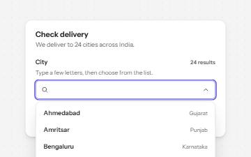
Combobox with autocomplete
A text field that filters a list of suggestions as you type, with arrow keys to pick one and a live count of matches.
-
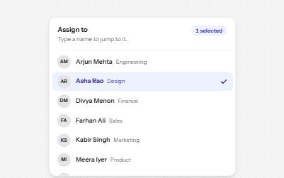
Listbox
A list of options to choose one or several from, with arrow keys, typing to jump and a count of what is selected.
-
Radio group
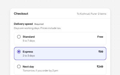
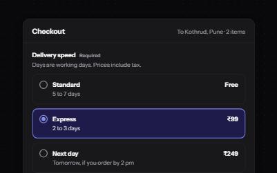
Native radio buttons in a fieldset, restyled with a dot that keeps its contrast, each option with a description and a price.
-
Form errors
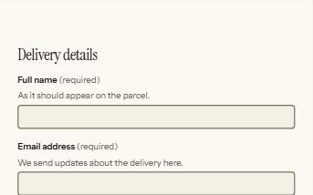
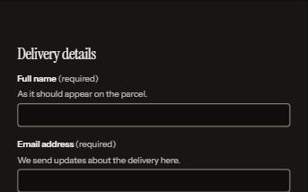
An error summary that takes focus, messages tied to each field, and a status message when the form is sent.