Accessibility pattern · Form inputs
Checkbox
Each box is a real input type=checkbox with appearance: none, so the tick, the mixed bar and the focus ring are drawn in CSS while the browser keeps the role, the state and Space. The label covers the whole row, so the target is the full width and at least 44 pixels high, and each description is joined with aria-describedby.
- WCAG criteria
- 7
- Keyboard rules
- 4
- Checked with
- axe, keyboard and the inspector
Live demo
Try it
Use it with a mouse, a keyboard or a screen reader. The inspector beside it shows what the browser tells assistive technology as you go: focus, state changes and announcements.
The demo works without JavaScript only as far as its HTML does; the inspector needs JavaScript.
Keyboard
Keys it answers to
Every action works without a pointer.
| Key | What it does |
|---|---|
| Tab | Moves to the next checkbox; Pay on delivery is disabled and skipped. |
| ShiftTab | Moves to the previous checkbox. |
| Space | Ticks or clears the focused checkbox. On Gift wrap, ticks or clears both items under it. |
| Enter | On Place order, sends the form. If the terms are not agreed, focus moves to that checkbox and its error. |
Screen readers
What it announces
Written from the roles, names and states in the markup.
| When | Expected announcement |
|---|---|
| Focus reaches Gift wrap with one item ticked | Gift wrap, checkbox, partly checked. Handmade paper and a card, ₹49 per item. |
| Space ticks it | Checked (both items under it are ticked too) |
| Tab reaches an item under it | Gift wrap, group. Block-print kurta, checkbox, checked |
| Focus reaches the terms | I agree to the terms of sale, checkbox, not checked, required. Returns within 30 days. Handmade pieces can vary slightly. |
| Place order is pressed without agreeing | I agree to the terms of sale, checkbox, not checked, invalid entry, required. Returns within 30 days… Agree to the terms of sale to place your order |
| The order is placed | Order placed. Your receipt is on its way. |
These are expected announcements, not recordings. Wording and order differ between screen readers and browsers.
Code
Copy the code
The exact files this demo runs on. The styles are served with a prefix that keeps this site's own styles out of the demo; what you copy is the original.
<form class="ap-checkbox" data-ap-checkbox novalidate aria-labelledby="cb-form-name">
  <div class="ap-checkbox__top">
    <h3 class="ap-checkbox__name" id="cb-form-name">Before you pay</h3>
    <p class="ap-checkbox__sub">2 items · ₹2,140</p>
  </div>

  <div class="ap-checkbox__list">
    <div class="ap-checkbox__row">
      <input class="ap-checkbox__box" type="checkbox" id="cb-wrap" name="wrap" aria-controls="cb-wrap-kurta cb-wrap-diya" aria-describedby="cb-wrap-desc" />
      <div class="ap-checkbox__text">
        <label class="ap-checkbox__label" id="cb-wrap-label" for="cb-wrap">Gift wrap</label>
        <p class="ap-checkbox__desc" id="cb-wrap-desc">Handmade paper and a card, ₹49 per item.</p>
      </div>
    </div>
    <div class="ap-checkbox__children" role="group" aria-labelledby="cb-wrap-label">
      <div class="ap-checkbox__row ap-checkbox__row--child">
        <input class="ap-checkbox__box" type="checkbox" id="cb-wrap-kurta" name="wrap-item" value="kurta" checked />
        <div class="ap-checkbox__text">
          <label class="ap-checkbox__label" for="cb-wrap-kurta">Block-print kurta</label>
        </div>
      </div>
      <div class="ap-checkbox__row ap-checkbox__row--child">
        <input class="ap-checkbox__box" type="checkbox" id="cb-wrap-diya" name="wrap-item" value="diya" />
        <div class="ap-checkbox__text">
          <label class="ap-checkbox__label" for="cb-wrap-diya">Brass diya set</label>
        </div>
      </div>
    </div>

    <div class="ap-checkbox__row">
      <input class="ap-checkbox__box" type="checkbox" id="cb-door" name="door" aria-describedby="cb-door-desc" />
      <div class="ap-checkbox__text">
        <label class="ap-checkbox__label" for="cb-door">Leave at the door if nobody answers</label>
        <p class="ap-checkbox__desc" id="cb-door-desc">The courier takes a photo as proof of delivery.</p>
      </div>
    </div>

    <div class="ap-checkbox__row">
      <input class="ap-checkbox__box" type="checkbox" id="cb-cod" name="cod" disabled aria-describedby="cb-cod-desc" />
      <div class="ap-checkbox__text">
        <label class="ap-checkbox__label" for="cb-cod">Pay on delivery</label>
        <p class="ap-checkbox__desc" id="cb-cod-desc">Not available for orders over ₹2,000.</p>
      </div>
    </div>
  </div>

  <div class="ap-checkbox__consent">
    <div class="ap-checkbox__row">
      <input class="ap-checkbox__box" type="checkbox" id="cb-terms" name="terms" required aria-describedby="cb-terms-desc" />
      <div class="ap-checkbox__text">
        <label class="ap-checkbox__label" for="cb-terms">I agree to the terms of sale <span class="ap-checkbox__req" aria-hidden="true">Required</span></label>
        <p class="ap-checkbox__desc" id="cb-terms-desc">Returns within 30 days. Handmade pieces can vary slightly.</p>
      </div>
    </div>
    <p class="ap-error ap-checkbox__error" id="cb-terms-error" hidden><svg class="ap-checkbox__icon" viewBox="0 0 24 24" aria-hidden="true" focusable="false"><circle cx="12" cy="12" r="9"/><path d="M12 7.5v5"/><path d="M12 16.5h.01"/></svg><span>Agree to the terms of sale to place your order</span></p>
  </div>

  <div class="ap-checkbox__foot">
    <p class="ap-checkbox__status" role="status"></p>
    <button type="submit" class="ap-btn ap-btn--primary">Place order</button>
  </div>
</form>
/* Shared primitives: buttons and form fields used across the patterns.
   Uses the --ap-* design tokens. */

.ap-btn {
  display: inline-flex;
  align-items: center;
  justify-content: center;
  gap: 8px;
  min-height: 40px;
  padding: 0 16px;
  border: 1px solid var(--ap-border-strong);
  border-radius: var(--ap-radius-sm);
  background: var(--ap-surface);
  color: var(--ap-text);
  font: inherit;
  font-weight: 600;
  line-height: 1.2;
  text-decoration: none;
  white-space: nowrap;
  cursor: pointer;
  transition: background-color var(--ap-duration) var(--ap-ease), border-color var(--ap-duration) var(--ap-ease), box-shadow var(--ap-duration) var(--ap-ease);
}
.ap-btn:hover {
  background: var(--ap-surface-2);
}
.ap-btn:focus-visible {
  outline: 2px solid var(--ap-focus);
  outline-offset: 2px;
}
.ap-btn:disabled,
.ap-btn[aria-disabled="true"] {
  opacity: .55;
  cursor: not-allowed;
}
.ap-btn--primary {
  border-color: var(--ap-accent);
  background: var(--ap-accent);
  color: var(--ap-on-accent);
  box-shadow: var(--ap-shadow-sm);
}
.ap-btn--primary:hover {
  border-color: var(--ap-accent-hover);
  background: var(--ap-accent-hover);
}
.ap-btn--danger {
  border-color: var(--ap-danger);
  background: var(--ap-danger);
  color: var(--ap-surface);
}
.ap-btn--danger:hover {
  filter: brightness(1.08);
}
.ap-btn--ghost {
  border-color: transparent;
  background: transparent;
}
.ap-btn--ghost:hover {
  background: var(--ap-surface-2);
}
.ap-btn__icon {
  width: 18px;
  height: 18px;
  flex-shrink: 0;
  fill: none;
  stroke: currentColor;
  stroke-width: 2;
  stroke-linecap: round;
  stroke-linejoin: round;
}

.ap-field {
  display: grid;
  gap: 6px;
}
.ap-label {
  color: var(--ap-text);
  font-weight: 600;
  font-size: .9375rem;
}
.ap-hint {
  margin: 0;
  color: var(--ap-text-3);
  font-size: .875rem;
  line-height: 1.45;
}
.ap-error {
  display: flex;
  align-items: flex-start;
  gap: 6px;
  margin: 0;
  color: var(--ap-danger);
  font-size: .875rem;
  font-weight: 600;
  line-height: 1.45;
}
.ap-input {
  width: 100%;
  min-height: 44px;
  padding: 10px 12px;
  border: 1px solid var(--ap-border-strong);
  border-radius: var(--ap-radius-sm);
  background: var(--ap-surface);
  color: var(--ap-text);
  font: inherit;
  line-height: 1.4;
  transition: border-color var(--ap-duration) var(--ap-ease), box-shadow var(--ap-duration) var(--ap-ease);
}
.ap-input::placeholder {
  color: var(--ap-text-3);
}
.ap-input:hover {
  border-color: var(--ap-text-2);
}
.ap-input:focus-visible {
  outline: 2px solid var(--ap-focus);
  outline-offset: 1px;
  border-color: var(--ap-focus);
}
.ap-input[aria-invalid="true"] {
  border-color: var(--ap-danger);
  box-shadow: inset 4px 0 0 var(--ap-danger);
}
textarea.ap-input {
  resize: vertical;
  min-height: 88px;
}

@media (prefers-reduced-motion: reduce) {
  .ap-btn,
  .ap-input { transition: none; }
}

/* Checkbox. Uses the --ap-* design tokens and the shared primitives. */
.ap-checkbox {
  width: min(100%, 520px);
  margin-inline: auto;
  border: 1px solid var(--ap-border);
  border-radius: var(--ap-radius-lg);
  background: var(--ap-surface);
  color: var(--ap-text);
  box-shadow: var(--ap-shadow-md);
  container-type: inline-size;
}
.ap-checkbox [hidden] {
  display: none;
}

.ap-checkbox__top {
  display: flex;
  flex-wrap: wrap;
  align-items: baseline;
  justify-content: space-between;
  gap: 4px 12px;
  padding: 18px 22px 10px;
}
.ap-checkbox__name {
  margin: 0;
  font-size: 1.0625rem;
  font-weight: 650;
  line-height: 1.3;
}
.ap-checkbox__sub {
  margin: 0;
  color: var(--ap-text-3);
  font-size: .875rem;
  font-variant-numeric: tabular-nums;
}

.ap-checkbox__list {
  display: grid;
  gap: 2px;
  padding: 0 10px 10px;
}

/* A row: the box, then the label and its description. The label's ::after
   stretches over the whole row, so the full row is the target. */
.ap-checkbox__row {
  position: relative;
  display: flex;
  align-items: flex-start;
  gap: 12px;
  min-height: var(--ap-target);
  padding: 11px 12px;
  border-radius: var(--ap-radius-sm);
  transition: background-color var(--ap-duration) var(--ap-ease);
}
.ap-checkbox__row:hover:not(:has(:disabled)) {
  background: var(--ap-surface-2);
}
.ap-checkbox__row:has(.ap-checkbox__box:focus-visible) {
  outline: 2px solid var(--ap-focus);
  outline-offset: -2px;
}
.ap-checkbox__text {
  display: grid;
  gap: 2px;
  min-width: 0;
}
.ap-checkbox__label {
  color: var(--ap-text);
  font-weight: 600;
  line-height: 1.4;
  cursor: pointer;
}
.ap-checkbox__label::after {
  content: "";
  position: absolute;
  inset: 0;
  border-radius: inherit;
}
.ap-checkbox__desc {
  margin: 0;
  color: var(--ap-text-3);
  font-size: .875rem;
  line-height: 1.45;
}
.ap-checkbox__req {
  margin-left: 6px;
  color: var(--ap-text-3);
  font-size: .75rem;
  font-weight: 600;
}

/* The box: a native checkbox, redrawn */
.ap-checkbox__box {
  appearance: none;
  display: grid;
  flex-shrink: 0;
  place-content: center;
  width: 20px;
  height: 20px;
  margin: 1px 0 0;
  border: 2px solid var(--ap-border-strong);
  border-radius: 6px;
  background: var(--ap-surface);
  cursor: pointer;
  transition: background-color var(--ap-duration) var(--ap-ease), border-color var(--ap-duration) var(--ap-ease);
}
.ap-checkbox__box:focus-visible {
  outline: none;
}
/* The tick: two borders of a box, turned */
.ap-checkbox__box::before {
  content: "";
  width: 10px;
  height: 5px;
  margin-top: -2px;
  border: solid var(--ap-on-accent);
  border-width: 0 0 2.5px 2.5px;
  transform: rotate(-45deg) scale(0);
  transition: transform var(--ap-duration) var(--ap-ease);
}
.ap-checkbox__box:checked,
.ap-checkbox__box:indeterminate {
  border-color: var(--ap-accent);
  background: var(--ap-accent);
}
.ap-checkbox__box:checked::before {
  transform: rotate(-45deg) scale(1);
}
/* Mixed: a bar, so it never reads as checked */
.ap-checkbox__box:indeterminate::before {
  width: 10px;
  height: 0;
  margin-top: 0;
  border-width: 0 0 2.5px;
  border-radius: 2px;
  transform: none;
}
.ap-checkbox__box:disabled {
  border-style: dashed;
  background: var(--ap-surface-2);
  cursor: not-allowed;
}
.ap-checkbox__row:has(:disabled) .ap-checkbox__label {
  color: var(--ap-text-3);
  cursor: not-allowed;
}
.ap-checkbox__box[aria-invalid="true"] {
  border-color: var(--ap-danger);
  box-shadow: 0 0 0 3px var(--ap-danger-soft);
}

/* Items under Gift wrap: indented on a guide line */
.ap-checkbox__children {
  display: grid;
  gap: 2px;
  margin: -4px 0 4px 21px;
  padding-left: 12px;
  border-left: 1px solid var(--ap-border);
}
.ap-checkbox__row--child {
  padding-block: 10px;
}
.ap-checkbox__row--child .ap-checkbox__label {
  font-weight: 500;
}

/* The required consent, set apart */
.ap-checkbox__consent {
  display: grid;
  gap: 6px;
  margin: 0 10px;
  padding: 10px 0 14px;
  border-top: 1px solid var(--ap-border);
}
.ap-checkbox__icon {
  width: 16px;
  height: 16px;
  flex-shrink: 0;
  margin-top: 2px;
  fill: none;
  stroke: currentColor;
  stroke-width: 2;
  stroke-linecap: round;
  stroke-linejoin: round;
}
.ap-checkbox__error {
  padding: 0 12px 0 44px;
}

.ap-checkbox__foot {
  display: flex;
  flex-wrap: wrap;
  align-items: center;
  justify-content: space-between;
  gap: 0 16px;
  padding: 14px 22px;
  border-top: 1px solid var(--ap-border);
  border-radius: 0 0 var(--ap-radius-lg) var(--ap-radius-lg);
  background: var(--ap-surface-2);
}
.ap-checkbox__status {
  flex: 1 1 160px;
  margin: 0;
  color: var(--ap-success);
  font-size: .9375rem;
  font-weight: 600;
}
.ap-checkbox__foot .ap-btn {
  min-height: var(--ap-target);
  margin-left: auto;
}

@container (max-width: 420px) {
  .ap-checkbox__top { padding: 16px 18px 8px; }
  .ap-checkbox__list { padding: 0 6px 8px; }
  .ap-checkbox__consent { margin: 0 6px; }
  .ap-checkbox__error { padding-left: 44px; }
  .ap-checkbox__foot { padding: 14px 18px; }
  .ap-checkbox__status:not(:empty) { flex-basis: 100%; margin-bottom: 10px; }
  .ap-checkbox__foot .ap-btn { flex: 1 1 100%; }
}

@media (forced-colors: active) {
  .ap-checkbox__box:is(:checked, :indeterminate) {
    forced-color-adjust: none;
    border-color: Highlight;
    background: Highlight;
  }
  .ap-checkbox__box::before { border-color: HighlightText; }
}

@media (prefers-reduced-motion: reduce) {
  .ap-checkbox__row,
  .ap-checkbox__box,
  .ap-checkbox__box::before { transition: none; }
}
/**
 * Checkboxes: native inputs redrawn with CSS, a parent with a mixed state,
 * and a required consent.
 *
 * Markup: form[data-ap-checkbox][novalidate] of rows, each an
 * input[type=checkbox] with a label (whose ::after covers the row) and a
 * description in its aria-describedby. A parent checkbox names its items in
 * aria-controls; the script keeps it checked, clear or indeterminate to
 * match them. A required checkbox gets aria-invalid and its error (a hidden
 * p#<id>-error) when the form is sent without it; a role=status gives the
 * result.
 */

export function init(root) {
  const parents = [...root.querySelectorAll("input[type=checkbox][aria-controls]")];
  const itemsOf = (parent) => parent.getAttribute("aria-controls").split(/\s+/).map((id) => document.getElementById(id)).filter(Boolean);
  const required = [...root.querySelectorAll("input[type=checkbox][required]")];
  const status = () => root.querySelector("[role=status]");

  // There is no attribute for "mixed": the property is set from the items.
  function syncParent(parent) {
    const items = itemsOf(parent);
    const on = items.filter((item) => item.checked).length;
    parent.checked = on === items.length;
    parent.indeterminate = on > 0 && on < items.length;
  }

  function setError(box, on) {
    const error = document.getElementById(`${box.id}-error`);
    error.hidden = !on;
    if (on) box.setAttribute("aria-invalid", "true");
    else box.removeAttribute("aria-invalid");
    const ids = (box.getAttribute("aria-describedby") || "").split(/\s+/).filter((id) => id && id !== error.id);
    if (on) ids.push(error.id);
    box.setAttribute("aria-describedby", ids.join(" "));
  }

  function onChange(event) {
    const box = event.target;
    if (!(box instanceof HTMLInputElement) || box.type !== "checkbox") return;
    if (status().textContent) status().textContent = "";
    if (parents.includes(box)) {
      // Ticking the parent from mixed ticks every item; clearing clears them.
      for (const item of itemsOf(box)) item.checked = box.checked;
      box.indeterminate = false;
    }
    for (const parent of parents) if (itemsOf(parent).includes(box)) syncParent(parent);
    // An error, once shown, goes as soon as the box is ticked.
    if (required.includes(box) && box.checked && box.getAttribute("aria-invalid") === "true") setError(box, false);
  }

  function onSubmit(event) {
    event.preventDefault();
    const missing = required.filter((box) => !box.checked);
    for (const box of required) setError(box, missing.includes(box));
    if (missing.length) {
      missing[0].focus();
      return;
    }
    status().textContent = "Order placed. Your receipt is on its way.";
  }

  for (const parent of parents) syncParent(parent);
  root.addEventListener("change", onChange);
  root.addEventListener("submit", onSubmit);
  return () => {
    root.removeEventListener("change", onChange);
    root.removeEventListener("submit", onSubmit);
  };
}

for (const root of document.querySelectorAll("[data-ap-checkbox]")) init(root);
/* Design tokens for the pattern components. Light by default, dark when the
   system asks for it; set data-theme="dark" on :root to force dark. */
:root {
    --ap-radius-sm: 8px;
    --ap-radius: 12px;
    --ap-radius-lg: 16px;
    --ap-radius-full: 999px;
    --ap-font: "Instrument Sans", ui-sans-serif, system-ui, -apple-system, "Segoe UI", Roboto, sans-serif;
    --ap-mono: "JetBrains Mono", ui-monospace, "Cascadia Mono", "SF Mono", Consolas, monospace;
    --ap-ease: cubic-bezier(.2, .8, .2, 1);
    --ap-duration: 180ms;
    --ap-target: 44px;
    --ap-bg: #F4F4F5;
    --ap-surface: #FFFFFF;
    --ap-surface-2: #F4F4F5;
    --ap-surface-3: #E4E4E7;
    --ap-border: #E4E4E7;
    --ap-border-strong: #76767F;
    --ap-text: #18181B;
    --ap-text-2: #3F3F46;
    --ap-text-3: #5E5E66;
    --ap-accent: #4F46E5;
    --ap-accent-hover: #4338CA;
    --ap-on-accent: #FFFFFF;
    --ap-accent-text: #4338CA;
    --ap-accent-soft: #EEF2FF;
    --ap-accent-soft-text: #3730A3;
    --ap-focus: #4F46E5;
    --ap-danger: #B91C1C;
    --ap-danger-soft: #FEF2F2;
    --ap-success: #15803D;
    --ap-success-soft: #F0FDF4;
    --ap-warning: #A15C07;
    --ap-warning-soft: #FEFCE8;
    --ap-info: #1D4ED8;
    --ap-info-soft: #EFF6FF;
    --ap-scrim: rgb(9 9 11 / .48);
    --ap-shadow-sm: 0 1px 2px rgb(9 9 11 / .06);
    --ap-shadow-md: 0 1px 2px rgb(9 9 11 / .05), 0 6px 16px -4px rgb(9 9 11 / .1);
    --ap-shadow-lg: 0 2px 6px rgb(9 9 11 / .06), 0 20px 40px -12px rgb(9 9 11 / .22);
    --ap-light-bg: #F4F4F5;
    --ap-light-surface: #FFFFFF;
    --ap-light-surface-2: #F4F4F5;
    --ap-light-surface-3: #E4E4E7;
    --ap-light-border: #E4E4E7;
    --ap-light-border-strong: #76767F;
    --ap-light-text: #18181B;
    --ap-light-text-2: #3F3F46;
    --ap-light-text-3: #5E5E66;
    --ap-light-accent: #4F46E5;
    --ap-light-accent-hover: #4338CA;
    --ap-light-on-accent: #FFFFFF;
    --ap-light-accent-text: #4338CA;
    --ap-light-accent-soft: #EEF2FF;
    --ap-light-accent-soft-text: #3730A3;
    --ap-light-focus: #4F46E5;
    --ap-light-danger: #B91C1C;
    --ap-light-danger-soft: #FEF2F2;
    --ap-light-success: #15803D;
    --ap-light-success-soft: #F0FDF4;
    --ap-light-warning: #A15C07;
    --ap-light-warning-soft: #FEFCE8;
    --ap-light-info: #1D4ED8;
    --ap-light-info-soft: #EFF6FF;
    --ap-light-scrim: rgb(9 9 11 / .48);
    --ap-light-shadow-sm: 0 1px 2px rgb(9 9 11 / .06);
    --ap-light-shadow-md: 0 1px 2px rgb(9 9 11 / .05), 0 6px 16px -4px rgb(9 9 11 / .1);
    --ap-light-shadow-lg: 0 2px 6px rgb(9 9 11 / .06), 0 20px 40px -12px rgb(9 9 11 / .22);
    --ap-dark-bg: #09090B;
    --ap-dark-surface: #18181B;
    --ap-dark-surface-2: #27272A;
    --ap-dark-surface-3: #3F3F46;
    --ap-dark-border: #2E2E33;
    --ap-dark-border-strong: #8E8E97;
    --ap-dark-text: #FAFAFA;
    --ap-dark-text-2: #D4D4D8;
    --ap-dark-text-3: #A1A1AA;
    --ap-dark-accent: #818CF8;
    --ap-dark-accent-hover: #A5B4FC;
    --ap-dark-on-accent: #0C0A1F;
    --ap-dark-accent-text: #A5B4FC;
    --ap-dark-accent-soft: #1E1B4B;
    --ap-dark-accent-soft-text: #C7D2FE;
    --ap-dark-focus: #A5B4FC;
    --ap-dark-danger: #F87171;
    --ap-dark-danger-soft: #2A1215;
    --ap-dark-success: #4ADE80;
    --ap-dark-success-soft: #0F2A1A;
    --ap-dark-warning: #FACC15;
    --ap-dark-warning-soft: #2A2410;
    --ap-dark-info: #60A5FA;
    --ap-dark-info-soft: #0F1D33;
    --ap-dark-scrim: rgb(0 0 0 / .62);
    --ap-dark-shadow-sm: 0 1px 2px rgb(0 0 0 / .4);
    --ap-dark-shadow-md: 0 1px 2px rgb(0 0 0 / .4), 0 8px 20px -6px rgb(0 0 0 / .5);
    --ap-dark-shadow-lg: 0 2px 8px rgb(0 0 0 / .45), 0 24px 48px -12px rgb(0 0 0 / .7);
}
@media (prefers-color-scheme: dark) {
  :root:not([data-theme="light"]) {
      --ap-bg: #09090B;
      --ap-surface: #18181B;
      --ap-surface-2: #27272A;
      --ap-surface-3: #3F3F46;
      --ap-border: #2E2E33;
      --ap-border-strong: #8E8E97;
      --ap-text: #FAFAFA;
      --ap-text-2: #D4D4D8;
      --ap-text-3: #A1A1AA;
      --ap-accent: #818CF8;
      --ap-accent-hover: #A5B4FC;
      --ap-on-accent: #0C0A1F;
      --ap-accent-text: #A5B4FC;
      --ap-accent-soft: #1E1B4B;
      --ap-accent-soft-text: #C7D2FE;
      --ap-focus: #A5B4FC;
      --ap-danger: #F87171;
      --ap-danger-soft: #2A1215;
      --ap-success: #4ADE80;
      --ap-success-soft: #0F2A1A;
      --ap-warning: #FACC15;
      --ap-warning-soft: #2A2410;
      --ap-info: #60A5FA;
      --ap-info-soft: #0F1D33;
      --ap-scrim: rgb(0 0 0 / .62);
      --ap-shadow-sm: 0 1px 2px rgb(0 0 0 / .4);
      --ap-shadow-md: 0 1px 2px rgb(0 0 0 / .4), 0 8px 20px -6px rgb(0 0 0 / .5);
      --ap-shadow-lg: 0 2px 8px rgb(0 0 0 / .45), 0 24px 48px -12px rgb(0 0 0 / .7);
  }
}
:root[data-theme="dark"] {
    --ap-bg: #09090B;
    --ap-surface: #18181B;
    --ap-surface-2: #27272A;
    --ap-surface-3: #3F3F46;
    --ap-border: #2E2E33;
    --ap-border-strong: #8E8E97;
    --ap-text: #FAFAFA;
    --ap-text-2: #D4D4D8;
    --ap-text-3: #A1A1AA;
    --ap-accent: #818CF8;
    --ap-accent-hover: #A5B4FC;
    --ap-on-accent: #0C0A1F;
    --ap-accent-text: #A5B4FC;
    --ap-accent-soft: #1E1B4B;
    --ap-accent-soft-text: #C7D2FE;
    --ap-focus: #A5B4FC;
    --ap-danger: #F87171;
    --ap-danger-soft: #2A1215;
    --ap-success: #4ADE80;
    --ap-success-soft: #0F2A1A;
    --ap-warning: #FACC15;
    --ap-warning-soft: #2A2410;
    --ap-info: #60A5FA;
    --ap-info-soft: #0F1D33;
    --ap-scrim: rgb(0 0 0 / .62);
    --ap-shadow-sm: 0 1px 2px rgb(0 0 0 / .4);
    --ap-shadow-md: 0 1px 2px rgb(0 0 0 / .4), 0 8px 20px -6px rgb(0 0 0 / .5);
    --ap-shadow-lg: 0 2px 8px rgb(0 0 0 / .45), 0 24px 48px -12px rgb(0 0 0 / .7);
}
WCAG 2.2
What it meets
The success criteria this pattern takes care of, and how.
-
1.3.1 Info and Relationships
Level A
Every box has a label tied with for and id, each description is joined with aria-describedby, and the gift wrap items sit in a group named by their parent.
-
1.4.1 Use of Color
Level A
Checked shows a tick, mixed shows a bar, disabled shows a dashed edge, and an error shows an icon and a message, so no state is color alone.
-
1.4.11 Non-text Contrast
Level AA
The unchecked edge, the filled box and the focus ring all clear 3:1 against the card, in light and dark.
-
2.5.8 Target Size (Minimum)
Level AA
The whole row is the label, so each target is the full width of the card and at least 44 pixels high, well above 24.
-
3.3.1 Error Identification
Level A
Placing the order without agreeing marks the consent box aria-invalid and explains why in text under it.
-
3.3.2 Labels or Instructions
Level A
Required is written beside the consent label, and each option's description says what it does before it is chosen.
-
4.1.2 Name, Role, Value
Level A
Native checkboxes report checked, not checked, partly checked, required and unavailable without any ARIA.
Usage
When to use it
Use it
- Options that can be chosen independently, in any combination, including none.
- A single yes-or-no agreement that has to be given on purpose, like accepting terms.
Use something else
- Choosing exactly one of several: use a radio group.
- A setting that takes effect at once, with no form to send: a switch says that better.
- Long lists where people pick a few: consider a multi-select or a filter list with search.
Common failures
How it usually goes wrong
A div drawn to look like a checkbox
Without a real input it has no role, no state and no Space key unless all three are rebuilt. appearance: none restyles the native box and keeps all of that.
Only the tiny box is clickable
A 16 pixel box is hard to hit with a tremor or on a phone. The label here covers the whole row.
The description inside the label
Putting the help text inside the label makes it part of the name, so it is read every time and becomes harder to match by voice. It sits beside the label and is joined with aria-describedby.
A tick that fades into the background
A pale tick on a pale fill fails 3:1 and vanishes in sunlight. The box here fills with the accent and the tick is white on it.
Mixed drawn like checked
If partly checked looks the same as checked, people cannot tell that some items are left out. It is drawn as a bar, and announced as partly checked.
Consent ticked in advance
A box already ticked is not consent, and an error that only turns the box red is missed. It starts empty, and the error says what to do.
Notes
Building it
- There is no HTML attribute for the mixed state: the script sets the indeterminate property from the items each time one changes, and on start-up.
- aria-controls on Gift wrap names the items it changes, as in the WAI-ARIA mixed checkbox example.
- The row's focus ring is drawn with :has(:focus-visible), so it surrounds the whole target rather than the 20 pixel box.
- In Windows high contrast the fills are dropped; the forced-colors rules paint checked boxes with the system highlight so the tick stays visible.
- Leave disabled options out of the Tab order, as the browser does, and say why they are unavailable in a description people can read.
Sources: WAI-ARIA Authoring Practices: Checkbox · WAI-ARIA Authoring Practices: Mixed-state checkbox example
Checked with axe in light and dark themes, at desktop and phone widths, and by keyboard. Not yet tested with every screen reader and browser pair. Report a correction
Related
Patterns that go with it
-
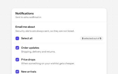
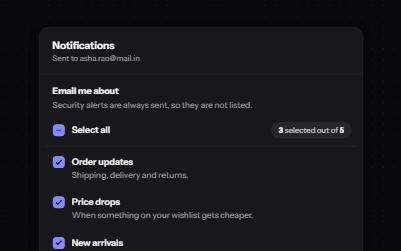
Checkbox group with select all
A fieldset of related checkboxes with a Select all box that shows a mixed state and a live count of what is chosen.
-
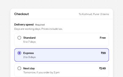
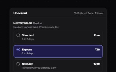
Radio group
Native radio buttons in a fieldset, restyled with a dot that keeps its contrast, each option with a description and a price.
-
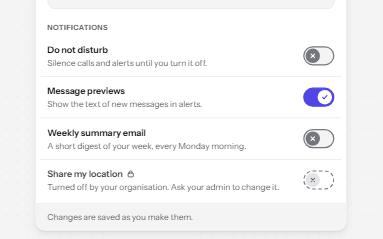
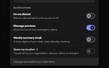
Switch
An on and off control for settings that take effect at once, built on a checkbox with the switch role.
-
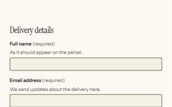
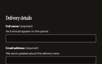
Form errors
An error summary that takes focus, messages tied to each field, and a status message when the form is sent.