Accessibility pattern · Form inputs
Date picker
Typing the date is always allowed, with the format shown and checked; the calendar is a second way in, never the only one. The calendar is a modal dialog around a grid: one day is in the Tab order, the arrow keys move by day and week, Page Up and Page Down by month, and Enter picks the day and sends focus back.
- WCAG criteria
- 7
- Keyboard rules
- 9
- Checked with
- axe, keyboard and the inspector
Live demo
Try it
Use it with a mouse, a keyboard or a screen reader. The inspector beside it shows what the browser tells assistive technology as you go: focus, state changes and announcements.
Mumbai CSMT to Pune Junction
Deccan Queen, chair car
Format: DD/MM/YYYY. Trains can be booked from today.
The demo works without JavaScript only as far as its HTML does; the inspector needs JavaScript.
Keyboard
Keys it answers to
Every action works without a pointer.
| Key | What it does |
|---|---|
| Enter or Space | On the calendar button, opens the dialog with focus on the chosen date, or today. |
| Arrow Left or Arrow Right | In the grid, moves to the previous or next day, crossing into the next month when needed. |
| Arrow Up or Arrow Down | Moves to the same day of the previous or next week. |
| Home or End | Moves to the first (Monday) or last (Sunday) day of the week. |
| Page Up or Page Down | Shows the previous or next month, keeping the day of the month where it can. |
| ShiftPage Up or ShiftPage Down | Shows the same month in the previous or next year. |
| Enter or Space | On a day, chooses it, fills the field, closes the dialog and returns focus to the calendar button. |
| Escape | Closes the dialog without changing the date; focus returns to the calendar button. |
| Tab or ShiftTab | Moves between the month and year buttons, the grid and Cancel, inside the dialog only. |
Screen readers
What it announces
Written from the roles, names and states in the markup.
| When | Expected announcement |
|---|---|
| Focus reaches the calendar button | Choose date, button, opens a dialog |
| The dialog opens | Choose journey date, dialog. Arrow keys move by day and week. Monday, 5 October 2026, current date |
| Page Down shows the next month | November 2026 (from the live month name), then the focused day |
| Enter chooses a day | Change date, Saturday, 14 November 2026, button |
| A typed date cannot be read | Enter the date as DD/MM/YYYY. |
These are expected announcements, not recordings. Wording and order differ between screen readers and browsers.
Code
Copy the code
The exact files this demo runs on. The styles are served with a prefix that keeps this site's own styles out of the demo; what you copy is the original.
<div class="ap-date-picker" data-ap-date-picker data-region="IN">
  <div class="ap-date-picker__trip">
    <span class="ap-date-picker__badge" aria-hidden="true"><svg viewBox="0 0 24 24" aria-hidden="true" focusable="false"><rect x="6" y="3" width="12" height="14" rx="3"/><path d="M6 11h12M9 21l1.5-4M15 21l-1.5-4"/><path d="M9.5 14h.01M14.5 14h.01"/></svg></span>
    <div>
      <p class="ap-date-picker__route">Mumbai CSMT to Pune Junction</p>
      <p class="ap-date-picker__train">Deccan Queen, chair car</p>
    </div>
  </div>

  <div class="ap-field">
    <label class="ap-label" for="date-picker-input">Journey date</label>
    <p class="ap-hint" id="date-picker-hint">Format: DD/MM/YYYY. Trains can be booked from today.</p>
    <div class="ap-date-picker__group" data-ap-group>
      <input class="ap-input ap-date-picker__input" id="date-picker-input" type="text" autocomplete="off" spellcheck="false" aria-describedby="date-picker-hint date-picker-error" />
      <button type="button" class="ap-date-picker__open" data-ap-open aria-haspopup="dialog">
        <svg viewBox="0 0 24 24" aria-hidden="true" focusable="false"><rect x="3.5" y="5" width="17" height="15" rx="2.5"/><path d="M3.5 10h17M8 3v4M16 3v4"/><path d="M8 14h.01M12 14h.01M16 14h.01M8 17h.01M12 17h.01"/></svg>
        <span class="ap-date-picker__sr" data-ap-word>Choose date</span>
        <span class="ap-date-picker__sr" data-ap-chosen></span>
      </button>
    </div>
    <p class="ap-error ap-date-picker__error" id="date-picker-error" aria-live="polite">
      <svg viewBox="0 0 24 24" aria-hidden="true" focusable="false"><circle cx="12" cy="12" r="9"/><path d="M12 7.5v5.5M12 16.5h.01"/></svg>
      <span data-ap-error></span>
    </p>
  </div>

  <dialog class="ap-date-picker__dialog" aria-label="Choose journey date" aria-describedby="date-picker-keys">
    <div class="ap-date-picker__panel">
      <div class="ap-date-picker__head">
        <button type="button" class="ap-date-picker__nav" data-ap-step="-12" aria-label="Previous year"><svg viewBox="0 0 24 24" aria-hidden="true" focusable="false"><path d="m12 17-5-5 5-5M18 17l-5-5 5-5"/></svg></button>
        <button type="button" class="ap-date-picker__nav" data-ap-step="-1" aria-label="Previous month"><svg viewBox="0 0 24 24" aria-hidden="true" focusable="false"><path d="m15 18-6-6 6-6"/></svg></button>
        <h2 class="ap-date-picker__month" id="date-picker-month" aria-live="polite" data-ap-month></h2>
        <button type="button" class="ap-date-picker__nav" data-ap-step="1" aria-label="Next month"><svg viewBox="0 0 24 24" aria-hidden="true" focusable="false"><path d="m9 18 6-6-6-6"/></svg></button>
        <button type="button" class="ap-date-picker__nav" data-ap-step="12" aria-label="Next year"><svg viewBox="0 0 24 24" aria-hidden="true" focusable="false"><path d="m12 17 5-5-5-5M6 17l5-5-5-5"/></svg></button>
      </div>
      <table class="ap-date-picker__grid" role="grid" aria-labelledby="date-picker-month">
        <thead>
          <tr>
            <th scope="col"><span aria-hidden="true">Mo</span><span class="ap-date-picker__sr">Monday</span></th>
            <th scope="col"><span aria-hidden="true">Tu</span><span class="ap-date-picker__sr">Tuesday</span></th>
            <th scope="col"><span aria-hidden="true">We</span><span class="ap-date-picker__sr">Wednesday</span></th>
            <th scope="col"><span aria-hidden="true">Th</span><span class="ap-date-picker__sr">Thursday</span></th>
            <th scope="col"><span aria-hidden="true">Fr</span><span class="ap-date-picker__sr">Friday</span></th>
            <th scope="col"><span aria-hidden="true">Sa</span><span class="ap-date-picker__sr">Saturday</span></th>
            <th scope="col"><span aria-hidden="true">Su</span><span class="ap-date-picker__sr">Sunday</span></th>
          </tr>
        </thead>
        <tbody data-ap-days></tbody>
      </table>
      <div class="ap-date-picker__foot">
        <ul class="ap-date-picker__legend">
          <li><span class="ap-date-picker__key ap-date-picker__key--today" aria-hidden="true"></span>Today</li>
          <li><span class="ap-date-picker__key ap-date-picker__key--selected" aria-hidden="true"></span>Selected</li>
          <li><span class="ap-date-picker__key ap-date-picker__key--past" aria-hidden="true">8</span>Unavailable</li>
        </ul>
      </div>
      <div class="ap-date-picker__end">
        <p class="ap-date-picker__keys" id="date-picker-keys">Arrow keys move by day and week. Page Up and Page Down change the month.</p>
        <button type="button" class="ap-btn ap-date-picker__cancel" data-ap-cancel>Cancel</button>
      </div>
    </div>
  </dialog>
</div>
/* Shared primitives: buttons and form fields used across the patterns.
   Uses the --ap-* design tokens. */

.ap-btn {
  display: inline-flex;
  align-items: center;
  justify-content: center;
  gap: 8px;
  min-height: 40px;
  padding: 0 16px;
  border: 1px solid var(--ap-border-strong);
  border-radius: var(--ap-radius-sm);
  background: var(--ap-surface);
  color: var(--ap-text);
  font: inherit;
  font-weight: 600;
  line-height: 1.2;
  text-decoration: none;
  white-space: nowrap;
  cursor: pointer;
  transition: background-color var(--ap-duration) var(--ap-ease), border-color var(--ap-duration) var(--ap-ease), box-shadow var(--ap-duration) var(--ap-ease);
}
.ap-btn:hover {
  background: var(--ap-surface-2);
}
.ap-btn:focus-visible {
  outline: 2px solid var(--ap-focus);
  outline-offset: 2px;
}
.ap-btn:disabled,
.ap-btn[aria-disabled="true"] {
  opacity: .55;
  cursor: not-allowed;
}
.ap-btn--primary {
  border-color: var(--ap-accent);
  background: var(--ap-accent);
  color: var(--ap-on-accent);
  box-shadow: var(--ap-shadow-sm);
}
.ap-btn--primary:hover {
  border-color: var(--ap-accent-hover);
  background: var(--ap-accent-hover);
}
.ap-btn--danger {
  border-color: var(--ap-danger);
  background: var(--ap-danger);
  color: var(--ap-surface);
}
.ap-btn--danger:hover {
  filter: brightness(1.08);
}
.ap-btn--ghost {
  border-color: transparent;
  background: transparent;
}
.ap-btn--ghost:hover {
  background: var(--ap-surface-2);
}
.ap-btn__icon {
  width: 18px;
  height: 18px;
  flex-shrink: 0;
  fill: none;
  stroke: currentColor;
  stroke-width: 2;
  stroke-linecap: round;
  stroke-linejoin: round;
}

.ap-field {
  display: grid;
  gap: 6px;
}
.ap-label {
  color: var(--ap-text);
  font-weight: 600;
  font-size: .9375rem;
}
.ap-hint {
  margin: 0;
  color: var(--ap-text-3);
  font-size: .875rem;
  line-height: 1.45;
}
.ap-error {
  display: flex;
  align-items: flex-start;
  gap: 6px;
  margin: 0;
  color: var(--ap-danger);
  font-size: .875rem;
  font-weight: 600;
  line-height: 1.45;
}
.ap-input {
  width: 100%;
  min-height: 44px;
  padding: 10px 12px;
  border: 1px solid var(--ap-border-strong);
  border-radius: var(--ap-radius-sm);
  background: var(--ap-surface);
  color: var(--ap-text);
  font: inherit;
  line-height: 1.4;
  transition: border-color var(--ap-duration) var(--ap-ease), box-shadow var(--ap-duration) var(--ap-ease);
}
.ap-input::placeholder {
  color: var(--ap-text-3);
}
.ap-input:hover {
  border-color: var(--ap-text-2);
}
.ap-input:focus-visible {
  outline: 2px solid var(--ap-focus);
  outline-offset: 1px;
  border-color: var(--ap-focus);
}
.ap-input[aria-invalid="true"] {
  border-color: var(--ap-danger);
  box-shadow: inset 4px 0 0 var(--ap-danger);
}
textarea.ap-input {
  resize: vertical;
  min-height: 88px;
}

@media (prefers-reduced-motion: reduce) {
  .ap-btn,
  .ap-input { transition: none; }
}

/* Date picker. Uses the --ap-* design tokens and the shared primitives. */
.ap-date-picker {
  display: grid;
  gap: 20px;
  width: min(100%, 420px);
  margin-inline: auto;
  padding: 22px 24px 24px;
  border: 1px solid var(--ap-border);
  border-radius: var(--ap-radius-lg);
  background: var(--ap-surface);
  color: var(--ap-text);
  box-shadow: var(--ap-shadow-md);
  font-family: var(--ap-font);
}

/* The journey the date is for */
.ap-date-picker__trip {
  display: flex;
  align-items: center;
  gap: 14px;
  padding-bottom: 18px;
  border-bottom: 1px solid var(--ap-border);
}
.ap-date-picker__badge {
  display: grid;
  place-items: center;
  width: 44px;
  height: 44px;
  flex-shrink: 0;
  border-radius: var(--ap-radius);
  background: var(--ap-accent-soft);
  color: var(--ap-accent-soft-text);
}
.ap-date-picker__badge svg {
  width: 24px;
  height: 24px;
  fill: none;
  stroke: currentColor;
  stroke-width: 1.8;
  stroke-linecap: round;
  stroke-linejoin: round;
}
.ap-date-picker__route {
  margin: 0;
  font-weight: 650;
  line-height: 1.35;
}
.ap-date-picker__train {
  margin: 2px 0 0;
  color: var(--ap-text-3);
  font-size: .875rem;
}

/* The field and its calendar button, joined */
.ap-date-picker__group {
  display: flex;
}
.ap-date-picker__input {
  flex: 1;
  min-width: 0;
  border-start-end-radius: 0;
  border-end-end-radius: 0;
  font-variant-numeric: tabular-nums;
  letter-spacing: .02em;
}
.ap-date-picker__input:focus-visible {
  position: relative;
  z-index: 1;
}
.ap-date-picker__open {
  display: grid;
  place-items: center;
  width: 48px;
  min-height: 44px;
  flex-shrink: 0;
  margin-inline-start: -1px;
  padding: 0;
  border: 1px solid var(--ap-border-strong);
  border-start-end-radius: var(--ap-radius-sm);
  border-end-end-radius: var(--ap-radius-sm);
  background: var(--ap-surface-2);
  color: var(--ap-text-2);
  cursor: pointer;
  transition: background-color var(--ap-duration) var(--ap-ease), color var(--ap-duration) var(--ap-ease);
}
.ap-date-picker__open:hover {
  background: var(--ap-surface-3);
  color: var(--ap-text);
}
.ap-date-picker__open:focus-visible {
  position: relative;
  z-index: 1;
  outline: 2px solid var(--ap-focus);
  outline-offset: 1px;
}
.ap-date-picker__open svg {
  width: 22px;
  height: 22px;
  fill: none;
  stroke: currentColor;
  stroke-width: 1.8;
  stroke-linecap: round;
  stroke-linejoin: round;
}

/* The error line takes no room until it has words. */
.ap-date-picker__error svg {
  width: 18px;
  height: 18px;
  flex-shrink: 0;
  margin-top: 1px;
  fill: none;
  stroke: currentColor;
  stroke-width: 2;
  stroke-linecap: round;
}
.ap-date-picker__error:has(> span:empty) svg {
  display: none;
}
.ap-date-picker__error:has(> span:empty) {
  margin-top: -6px;
}

.ap-date-picker__sr {
  position: absolute;
  width: 1px;
  height: 1px;
  margin: -1px;
  padding: 0;
  overflow: hidden;
  clip-path: inset(50%);
  white-space: nowrap;
}

/* The calendar dialog */
.ap-date-picker__dialog {
  width: 336px;
  max-width: calc(100vw - 16px);
  padding: 0;
  border: 1px solid var(--ap-border);
  border-radius: var(--ap-radius-lg);
  background: var(--ap-surface);
  color: var(--ap-text);
  box-shadow: var(--ap-shadow-lg);
  font-family: var(--ap-font);
  opacity: 1;
  transform: none;
  transition: opacity 160ms var(--ap-ease), transform 160ms var(--ap-ease), overlay 160ms allow-discrete, display 160ms allow-discrete;
}
.ap-date-picker__dialog:not([open]) {
  opacity: 0;
  transform: translateY(-4px);
}
@starting-style {
  .ap-date-picker__dialog[open] {
    opacity: 0;
    transform: translateY(-4px);
  }
}
.ap-date-picker__dialog::backdrop {
  background: var(--ap-scrim, rgb(9 9 11 / .5));
  opacity: .4;
}
.ap-date-picker__panel {
  padding: 14px 16px 16px;
}

.ap-date-picker__head {
  display: flex;
  align-items: center;
  gap: 2px;
  margin-bottom: 8px;
}
.ap-date-picker__month {
  flex: 1;
  margin: 0;
  font-family: var(--ap-font);
  font-size: 1rem;
  font-weight: 650;
  line-height: 1.3;
  text-align: center;
}
.ap-date-picker__nav {
  display: grid;
  place-items: center;
  width: 36px;
  height: 36px;
  flex-shrink: 0;
  padding: 0;
  border: 0;
  border-radius: var(--ap-radius-sm);
  background: transparent;
  color: var(--ap-text-2);
  cursor: pointer;
}
.ap-date-picker__nav:hover {
  background: var(--ap-surface-2);
  color: var(--ap-text);
}
.ap-date-picker__nav:focus-visible {
  outline: 2px solid var(--ap-focus);
  outline-offset: 1px;
}
.ap-date-picker__nav[aria-disabled="true"] {
  opacity: .4;
  cursor: not-allowed;
}
.ap-date-picker__nav[aria-disabled="true"]:hover {
  background: transparent;
}
.ap-date-picker__nav svg {
  width: 18px;
  height: 18px;
  fill: none;
  stroke: currentColor;
  stroke-width: 2;
  stroke-linecap: round;
  stroke-linejoin: round;
}

.ap-date-picker__grid {
  width: 100%;
  border: 0;
  border-collapse: separate;
  border-spacing: 2px;
  table-layout: fixed;
  background: transparent;
}
.ap-date-picker__grid th,
.ap-date-picker__grid td {
  padding: 0;
  border: 0;
  background: transparent;
  text-align: center;
}
.ap-date-picker__grid th {
  height: 30px;
  color: var(--ap-text-3);
  font-size: .75rem;
  font-weight: 650;
  letter-spacing: .04em;
  text-transform: uppercase;
}
.ap-date-picker__grid td {
  height: 40px;
  border-radius: var(--ap-radius-full);
  color: var(--ap-text);
  font-size: .9375rem;
  font-variant-numeric: tabular-nums;
}
.ap-date-picker__grid td[data-date] {
  cursor: pointer;
  transition: background-color var(--ap-duration) var(--ap-ease);
}
.ap-date-picker__grid td[data-date]:hover {
  background: var(--ap-surface-2);
}
.ap-date-picker__grid td[data-date]:focus-visible {
  outline: 2px solid var(--ap-focus);
  outline-offset: 1px;
}
/* Today: a ring and bold type */
.ap-date-picker__grid td[aria-current="date"] {
  box-shadow: inset 0 0 0 1.5px var(--ap-border-strong);
  font-weight: 750;
}
/* Chosen: a solid fill */
.ap-date-picker__grid td[aria-selected="true"],
.ap-date-picker__grid td[aria-selected="true"]:hover {
  background: var(--ap-accent);
  color: var(--ap-on-accent);
  font-weight: 700;
}
/* Unavailable: struck through */
.ap-date-picker__grid td[aria-disabled="true"],
.ap-date-picker__grid td[aria-disabled="true"]:hover {
  background: transparent;
  color: var(--ap-text-3);
  text-decoration: line-through;
  cursor: default;
}

.ap-date-picker__foot {
  margin-top: 8px;
  padding-top: 12px;
  border-top: 1px solid var(--ap-border);
}
.ap-date-picker__end {
  display: flex;
  align-items: flex-end;
  justify-content: space-between;
  gap: 12px;
  margin-top: 12px;
}
.ap-date-picker__legend {
  display: flex;
  flex-wrap: wrap;
  justify-content: space-between;
  gap: 6px 12px;
  margin: 0;
  padding: 0;
  list-style: none;
  color: var(--ap-text-2);
  font-size: .8125rem;
}
.ap-date-picker__legend li {
  display: inline-flex;
  align-items: center;
  gap: 6px;
}
.ap-date-picker__key {
  display: inline-grid;
  place-items: center;
  width: 18px;
  height: 18px;
  border-radius: var(--ap-radius-full);
  font-size: .75rem;
  font-weight: 600;
}
.ap-date-picker__key--today {
  box-shadow: inset 0 0 0 1.5px var(--ap-border-strong);
}
.ap-date-picker__key--selected {
  background: var(--ap-accent);
}
.ap-date-picker__key--past {
  color: var(--ap-text-3);
  text-decoration: line-through;
}
.ap-date-picker__cancel {
  flex-shrink: 0;
  min-height: 36px;
  padding: 0 14px;
}
.ap-date-picker__keys {
  margin: 0;
  color: var(--ap-text-3);
  font-size: .8125rem;
  line-height: 1.45;
}

@media (prefers-reduced-motion: reduce) {
  .ap-date-picker__dialog,
  .ap-date-picker__open,
  .ap-date-picker__grid td[data-date] { transition: none; }
}
/**
 * Date picker: a text field that takes a typed date (DD/MM/YYYY), and a
 * button that opens a modal calendar dialog with a keyboard grid of days.
 *
 * Markup: [data-ap-date-picker] holding an input, a wrapper [data-ap-group]
 * that the dialog is anchored to, a button[data-ap-open] with hidden name
 * parts [data-ap-word] and [data-ap-chosen], an error [data-ap-error] in a
 * polite live region, and a dialog with buttons [data-ap-step] (months to
 * move), a live month name [data-ap-month], a table[role=grid] whose tbody
 * [data-ap-days] the script fills, and a button[data-ap-cancel].
 * Days before today cannot be chosen. data-region on the root (for example
 * "IN") is added to a bare page language when dates are formatted.
 */

const MESSAGES = {
  format: "Enter the date as DD/MM/YYYY.",
  real: "There is no such date. Check the day and month.",
  past: "Choose today or a later date.",
};

const startOfDay = (d) => new Date(d.getFullYear(), d.getMonth(), d.getDate());
const sameDay = (a, b) => !!a && !!b && a.getTime() === b.getTime();
const addDays = (d, n) => new Date(d.getFullYear(), d.getMonth(), d.getDate() + n);
const daysIn = (y, m) => new Date(y, m + 1, 0).getDate();
const pad = (n) => String(n).padStart(2, "0");
const iso = (d) => `${d.getFullYear()}-${pad(d.getMonth() + 1)}-${pad(d.getDate())}`;
const dmy = (d) => `${pad(d.getDate())}/${pad(d.getMonth() + 1)}/${d.getFullYear()}`;

/** The same day of the month, months away, or the last day when that month is shorter. */
function addMonths(d, n) {
  const y = d.getFullYear();
  const m = d.getMonth() + n;
  return new Date(y, m, Math.min(d.getDate(), daysIn(y, m)));
}

/** Reads DD/MM/YYYY (or with dots, dashes or spaces). Returns { date } or { error }. */
function parse(text, min) {
  const m = text.trim().match(/^(\d{1,2})[/.\- ](\d{1,2})[/.\- ](\d{4})$/);
  if (!m) return { error: "format" };
  const [day, month, year] = [Number(m[1]), Number(m[2]), Number(m[3])];
  const date = new Date(year, month - 1, day);
  if (date.getFullYear() !== year || date.getMonth() !== month - 1 || date.getDate() !== day) return { error: "real" };
  if (date < min) return { error: "past" };
  return { date };
}

export function init(root) {
  const input = root.querySelector("input");
  const group = root.querySelector("[data-ap-group]");
  const opener = root.querySelector("[data-ap-open]");
  const word = opener.querySelector("[data-ap-word]");
  const chosen = opener.querySelector("[data-ap-chosen]");
  const error = root.querySelector("[data-ap-error]");
  const dialog = root.querySelector("dialog");
  const monthName = dialog.querySelector("[data-ap-month]");
  const days = dialog.querySelector("[data-ap-days]");
  const steps = [...dialog.querySelectorAll("[data-ap-step]")];
  const html = document.documentElement;
  const events = new AbortController();

  let selected = null;
  let focusDate = null;
  let shownMonth = "";
  let scrollWas = "";

  const today = () => startOfDay(new Date());

  // Formatted in the page's language, so a translated page gets its own month names.
  function formatter(options) {
    const lang = root.closest("[lang]")?.lang || navigator.language;
    const region = root.dataset.region;
    const locale = region && !lang.includes("-") ? `${lang}-${region}` : lang;
    try {
      return new Intl.DateTimeFormat(locale, options);
    } catch {
      return new Intl.DateTimeFormat(undefined, options);
    }
  }

  /* ── The field ── */
  function showError(kind) {
    const message = kind ? MESSAGES[kind] : "";
    if (error.textContent !== message) error.textContent = message;
    if (kind) input.setAttribute("aria-invalid", "true");
    else input.removeAttribute("aria-invalid");
  }

  function setSelected(date) {
    selected = date;
    if (date) {
      word.textContent = "Change date,";
      chosen.textContent = formatter({ weekday: "long", day: "numeric", month: "long", year: "numeric" }).format(date);
    } else {
      word.textContent = "Choose date";
      chosen.textContent = "";
    }
  }

  function checkField() {
    const text = input.value.trim();
    if (!text) {
      showError(null);
      setSelected(null);
      return;
    }
    const result = parse(text, today());
    if (result.error) {
      showError(result.error);
      setSelected(null);
      return;
    }
    input.value = dmy(result.date);
    showError(null);
    setSelected(result.date);
  }

  function onFieldKey(event) {
    if (event.key === "Enter") checkField();
  }

  /* ── The grid ── */
  function render() {
    const y = focusDate.getFullYear();
    const m = focusDate.getMonth();
    const min = today();
    const now = today();
    const name = formatter({ weekday: "long", day: "numeric", month: "long", year: "numeric" });
    const key = `${y}-${m}`;
    // The month name is a live region: write it only when the month changes.
    if (key !== shownMonth) {
      monthName.textContent = formatter({ month: "long", year: "numeric" }).format(focusDate);
      shownMonth = key;
    }
    const lead = (new Date(y, m, 1).getDay() + 6) % 7; // Monday first
    const total = daysIn(y, m);
    const rows = [];
    for (let r = 0; r < 6; r++) {
      const tr = document.createElement("tr");
      for (let c = 0; c < 7; c++) {
        const n = r * 7 + c - lead + 1;
        const td = document.createElement("td");
        if (n >= 1 && n <= total) {
          const date = new Date(y, m, n);
          td.textContent = String(n);
          td.dataset.date = iso(date);
          td.setAttribute("aria-label", name.format(date));
          td.tabIndex = sameDay(date, focusDate) ? 0 : -1;
          // showModal() focuses the [autofocus] element, so focus lands on the day, not the first button.
          if (td.tabIndex === 0) td.autofocus = true;
          if (sameDay(date, now)) td.setAttribute("aria-current", "date");
          if (sameDay(date, selected)) td.setAttribute("aria-selected", "true");
          if (date < min) td.setAttribute("aria-disabled", "true");
        }
        tr.append(td);
      }
      rows.push(tr);
    }
    days.replaceChildren(...rows);
    // Earlier months hold nothing that can be chosen.
    const atStart = y === min.getFullYear() && m === min.getMonth();
    for (const b of steps) {
      if (Number(b.dataset.apStep) < 0) b.setAttribute("aria-disabled", String(atStart));
    }
  }

  function cellFor(date) {
    return days.querySelector(`[data-date="${iso(date)}"]`);
  }

  function moveTo(date, focus = true) {
    const min = today();
    focusDate = date < min ? min : date;
    render();
    if (focus) cellFor(focusDate)?.focus();
  }

  function choose(date) {
    if (date < today()) return;
    input.value = dmy(date);
    showError(null);
    setSelected(date);
    dialog.close();
  }

  function onGridKey(event) {
    const cell = event.target.closest("td[data-date]");
    if (!cell) return;
    const d = focusDate;
    let next = null;
    switch (event.key) {
      case "ArrowRight": next = addDays(d, 1); break;
      case "ArrowLeft": next = addDays(d, -1); break;
      case "ArrowDown": next = addDays(d, 7); break;
      case "ArrowUp": next = addDays(d, -7); break;
      case "Home": next = addDays(d, -((d.getDay() + 6) % 7)); break;
      case "End": next = addDays(d, 6 - ((d.getDay() + 6) % 7)); break;
      case "PageUp": next = addMonths(d, event.shiftKey ? -12 : -1); break;
      case "PageDown": next = addMonths(d, event.shiftKey ? 12 : 1); break;
      case "Enter":
      case " ":
        event.preventDefault();
        choose(d);
        return;
      default: return;
    }
    event.preventDefault();
    moveTo(next);
  }

  function onDialogClick(event) {
    const cell = event.target.closest("td[data-date]");
    if (cell) {
      const [y, m, n] = cell.dataset.date.split("-").map(Number);
      choose(new Date(y, m - 1, n));
      return;
    }
    const step = event.target.closest("[data-ap-step]");
    if (step) {
      if (step.getAttribute("aria-disabled") === "true") return;
      // Focus stays on the button; the live month name says where we are.
      moveTo(addMonths(focusDate, Number(step.dataset.apStep)), false);
      return;
    }
    if (event.target.closest("[data-ap-cancel]")) {
      dialog.close();
      return;
    }
    // The dialog element itself, outside its panel, is the backdrop.
    if (event.target === dialog) dialog.close();
  }

  /* ── Opening and closing ── */
  function place() {
    dialog.style.margin = "";
    dialog.style.inset = "";
    const box = group.getBoundingClientRect();
    const w = dialog.offsetWidth;
    const h = dialog.offsetHeight;
    const vw = html.clientWidth;
    const vh = window.innerHeight;
    // No room under the field (a phone, or the field low on screen): stay centred, as showModal() puts it.
    const top = box.bottom + 8;
    if (vw < w + 32 || top + h > vh - 8) return;
    const left = Math.min(Math.max(8, box.right - w), vw - w - 8);
    dialog.style.margin = "0";
    dialog.style.inset = `${Math.round(top)}px auto auto ${Math.round(left)}px`;
  }

  function open() {
    checkField();
    scrollWas = html.style.overflow;
    html.style.overflow = "hidden";
    shownMonth = "";
    focusDate = selected || today();
    render();
    dialog.showModal();
    place();
    cellFor(focusDate)?.focus();
  }

  function onClose() {
    html.style.overflow = scrollWas;
    opener.focus();
  }

  input.addEventListener("change", checkField);
  input.addEventListener("keydown", onFieldKey);
  opener.addEventListener("click", open);
  days.addEventListener("keydown", onGridKey);
  dialog.addEventListener("click", onDialogClick);
  dialog.addEventListener("close", onClose);
  window.addEventListener("resize", () => { if (dialog.open) place(); }, { signal: events.signal });

  return () => {
    events.abort();
    if (dialog.open) dialog.close();
    html.style.overflow = scrollWas;
    input.removeEventListener("change", checkField);
    input.removeEventListener("keydown", onFieldKey);
    opener.removeEventListener("click", open);
    days.removeEventListener("keydown", onGridKey);
    dialog.removeEventListener("click", onDialogClick);
    dialog.removeEventListener("close", onClose);
  };
}

for (const root of document.querySelectorAll("[data-ap-date-picker]")) init(root);
/* Design tokens for the pattern components. Light by default, dark when the
   system asks for it; set data-theme="dark" on :root to force dark. */
:root {
    --ap-radius-sm: 8px;
    --ap-radius: 12px;
    --ap-radius-lg: 16px;
    --ap-radius-full: 999px;
    --ap-font: "Instrument Sans", ui-sans-serif, system-ui, -apple-system, "Segoe UI", Roboto, sans-serif;
    --ap-mono: "JetBrains Mono", ui-monospace, "Cascadia Mono", "SF Mono", Consolas, monospace;
    --ap-ease: cubic-bezier(.2, .8, .2, 1);
    --ap-duration: 180ms;
    --ap-target: 44px;
    --ap-bg: #F4F4F5;
    --ap-surface: #FFFFFF;
    --ap-surface-2: #F4F4F5;
    --ap-surface-3: #E4E4E7;
    --ap-border: #E4E4E7;
    --ap-border-strong: #76767F;
    --ap-text: #18181B;
    --ap-text-2: #3F3F46;
    --ap-text-3: #5E5E66;
    --ap-accent: #4F46E5;
    --ap-accent-hover: #4338CA;
    --ap-on-accent: #FFFFFF;
    --ap-accent-text: #4338CA;
    --ap-accent-soft: #EEF2FF;
    --ap-accent-soft-text: #3730A3;
    --ap-focus: #4F46E5;
    --ap-danger: #B91C1C;
    --ap-danger-soft: #FEF2F2;
    --ap-success: #15803D;
    --ap-success-soft: #F0FDF4;
    --ap-warning: #A15C07;
    --ap-warning-soft: #FEFCE8;
    --ap-info: #1D4ED8;
    --ap-info-soft: #EFF6FF;
    --ap-scrim: rgb(9 9 11 / .48);
    --ap-shadow-sm: 0 1px 2px rgb(9 9 11 / .06);
    --ap-shadow-md: 0 1px 2px rgb(9 9 11 / .05), 0 6px 16px -4px rgb(9 9 11 / .1);
    --ap-shadow-lg: 0 2px 6px rgb(9 9 11 / .06), 0 20px 40px -12px rgb(9 9 11 / .22);
    --ap-light-bg: #F4F4F5;
    --ap-light-surface: #FFFFFF;
    --ap-light-surface-2: #F4F4F5;
    --ap-light-surface-3: #E4E4E7;
    --ap-light-border: #E4E4E7;
    --ap-light-border-strong: #76767F;
    --ap-light-text: #18181B;
    --ap-light-text-2: #3F3F46;
    --ap-light-text-3: #5E5E66;
    --ap-light-accent: #4F46E5;
    --ap-light-accent-hover: #4338CA;
    --ap-light-on-accent: #FFFFFF;
    --ap-light-accent-text: #4338CA;
    --ap-light-accent-soft: #EEF2FF;
    --ap-light-accent-soft-text: #3730A3;
    --ap-light-focus: #4F46E5;
    --ap-light-danger: #B91C1C;
    --ap-light-danger-soft: #FEF2F2;
    --ap-light-success: #15803D;
    --ap-light-success-soft: #F0FDF4;
    --ap-light-warning: #A15C07;
    --ap-light-warning-soft: #FEFCE8;
    --ap-light-info: #1D4ED8;
    --ap-light-info-soft: #EFF6FF;
    --ap-light-scrim: rgb(9 9 11 / .48);
    --ap-light-shadow-sm: 0 1px 2px rgb(9 9 11 / .06);
    --ap-light-shadow-md: 0 1px 2px rgb(9 9 11 / .05), 0 6px 16px -4px rgb(9 9 11 / .1);
    --ap-light-shadow-lg: 0 2px 6px rgb(9 9 11 / .06), 0 20px 40px -12px rgb(9 9 11 / .22);
    --ap-dark-bg: #09090B;
    --ap-dark-surface: #18181B;
    --ap-dark-surface-2: #27272A;
    --ap-dark-surface-3: #3F3F46;
    --ap-dark-border: #2E2E33;
    --ap-dark-border-strong: #8E8E97;
    --ap-dark-text: #FAFAFA;
    --ap-dark-text-2: #D4D4D8;
    --ap-dark-text-3: #A1A1AA;
    --ap-dark-accent: #818CF8;
    --ap-dark-accent-hover: #A5B4FC;
    --ap-dark-on-accent: #0C0A1F;
    --ap-dark-accent-text: #A5B4FC;
    --ap-dark-accent-soft: #1E1B4B;
    --ap-dark-accent-soft-text: #C7D2FE;
    --ap-dark-focus: #A5B4FC;
    --ap-dark-danger: #F87171;
    --ap-dark-danger-soft: #2A1215;
    --ap-dark-success: #4ADE80;
    --ap-dark-success-soft: #0F2A1A;
    --ap-dark-warning: #FACC15;
    --ap-dark-warning-soft: #2A2410;
    --ap-dark-info: #60A5FA;
    --ap-dark-info-soft: #0F1D33;
    --ap-dark-scrim: rgb(0 0 0 / .62);
    --ap-dark-shadow-sm: 0 1px 2px rgb(0 0 0 / .4);
    --ap-dark-shadow-md: 0 1px 2px rgb(0 0 0 / .4), 0 8px 20px -6px rgb(0 0 0 / .5);
    --ap-dark-shadow-lg: 0 2px 8px rgb(0 0 0 / .45), 0 24px 48px -12px rgb(0 0 0 / .7);
}
@media (prefers-color-scheme: dark) {
  :root:not([data-theme="light"]) {
      --ap-bg: #09090B;
      --ap-surface: #18181B;
      --ap-surface-2: #27272A;
      --ap-surface-3: #3F3F46;
      --ap-border: #2E2E33;
      --ap-border-strong: #8E8E97;
      --ap-text: #FAFAFA;
      --ap-text-2: #D4D4D8;
      --ap-text-3: #A1A1AA;
      --ap-accent: #818CF8;
      --ap-accent-hover: #A5B4FC;
      --ap-on-accent: #0C0A1F;
      --ap-accent-text: #A5B4FC;
      --ap-accent-soft: #1E1B4B;
      --ap-accent-soft-text: #C7D2FE;
      --ap-focus: #A5B4FC;
      --ap-danger: #F87171;
      --ap-danger-soft: #2A1215;
      --ap-success: #4ADE80;
      --ap-success-soft: #0F2A1A;
      --ap-warning: #FACC15;
      --ap-warning-soft: #2A2410;
      --ap-info: #60A5FA;
      --ap-info-soft: #0F1D33;
      --ap-scrim: rgb(0 0 0 / .62);
      --ap-shadow-sm: 0 1px 2px rgb(0 0 0 / .4);
      --ap-shadow-md: 0 1px 2px rgb(0 0 0 / .4), 0 8px 20px -6px rgb(0 0 0 / .5);
      --ap-shadow-lg: 0 2px 8px rgb(0 0 0 / .45), 0 24px 48px -12px rgb(0 0 0 / .7);
  }
}
:root[data-theme="dark"] {
    --ap-bg: #09090B;
    --ap-surface: #18181B;
    --ap-surface-2: #27272A;
    --ap-surface-3: #3F3F46;
    --ap-border: #2E2E33;
    --ap-border-strong: #8E8E97;
    --ap-text: #FAFAFA;
    --ap-text-2: #D4D4D8;
    --ap-text-3: #A1A1AA;
    --ap-accent: #818CF8;
    --ap-accent-hover: #A5B4FC;
    --ap-on-accent: #0C0A1F;
    --ap-accent-text: #A5B4FC;
    --ap-accent-soft: #1E1B4B;
    --ap-accent-soft-text: #C7D2FE;
    --ap-focus: #A5B4FC;
    --ap-danger: #F87171;
    --ap-danger-soft: #2A1215;
    --ap-success: #4ADE80;
    --ap-success-soft: #0F2A1A;
    --ap-warning: #FACC15;
    --ap-warning-soft: #2A2410;
    --ap-info: #60A5FA;
    --ap-info-soft: #0F1D33;
    --ap-scrim: rgb(0 0 0 / .62);
    --ap-shadow-sm: 0 1px 2px rgb(0 0 0 / .4);
    --ap-shadow-md: 0 1px 2px rgb(0 0 0 / .4), 0 8px 20px -6px rgb(0 0 0 / .5);
    --ap-shadow-lg: 0 2px 8px rgb(0 0 0 / .45), 0 24px 48px -12px rgb(0 0 0 / .7);
}
WCAG 2.2
What it meets
The success criteria this pattern takes care of, and how.
-
1.3.1 Info and Relationships
Level A
The calendar is a real table with column headers, so each day is heard with its weekday, and the grid is named by the month.
-
1.4.1 Use of Color
Level A
Today has a ring and bold type, the chosen day a solid fill, and unavailable days are struck through; the legend says so in words.
-
2.1.1 Keyboard
Level A
Every date can be typed, and every part of the calendar works from the keyboard.
-
2.4.3 Focus Order
Level A
Focus moves to the chosen day when the dialog opens and back to the calendar button when it closes.
-
3.3.1 Error Identification
Level A
A date that cannot be read, does not exist or is in the past is named in text beside the field and marks it invalid.
-
3.3.2 Labels or Instructions
Level A
The field's label and its format hint are visible and tied to the field in code.
-
4.1.2 Name, Role, Value
Level A
Days carry aria-selected, aria-current="date" and aria-disabled; the button's name says which date is chosen.
Usage
When to use it
Use it
- Dates near today that people think of on a calendar, like a journey, a booking or a delivery slot.
- When the weekday matters to the choice, such as avoiding a weekend.
Use something else
- Dates people know by heart, such as a date of birth: use three text fields for day, month and year.
- Ranges with a start and an end: use a range picker that keeps both visible.
- A field where the calendar is the only way in; typing must always work.
Common failures
How it usually goes wrong
No way to type the date
A read-only field that only opens a calendar makes everyone page through months, and fails people whose tools fill fields for them. The text field here takes a typed date.
Every day in the Tab order
Forty-two tab stops before the Cancel button is unusable. One day is in the Tab order and the arrow keys move between days.
Today and the selection shown by color alone
A tinted circle tells nothing to people who cannot see the difference. Today has a ring and bold type, the chosen day a fill, and both are in the legend and announced.
Day cells named only by their number
"14" on its own does not say which month or weekday it is. Each day is named with its full date.
Month changes that are not announced
Page Down silently swaps the grid. The month name is a polite live region, so the new month is heard.
The format kept secret
A placeholder vanishes as soon as typing starts. The format is a hint below the label, and errors repeat it.
Notes
Building it
- Dates are formatted with Intl.DateTimeFormat in the page's language, so the month and weekday names follow a translated page without a dictionary.
- The dialog opens under the field when there is room and centred otherwise; showModal() keeps it modal either way.
- Days before today are struck through and marked aria-disabled; the arrow keys stop at today, so focus never lands on a day that cannot be chosen.
- After a choice, the calendar button's name becomes "Change date" and the date, which is what a screen reader hears as focus returns to it.
- Six rows are always drawn, so the dialog keeps its size from month to month and the buttons do not jump.
Sources: WAI-ARIA Authoring Practices: Date Picker Dialog example · GOV.UK Design System: Date input
Checked with axe in light and dark themes, at desktop and phone widths, and by keyboard. Not yet tested with every screen reader and browser pair. Report a correction
Related
Patterns that go with it
-
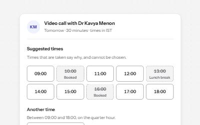
Time picker
Suggested times as a radio group, taken ones disabled with the reason, and a native time field for any other time.
-
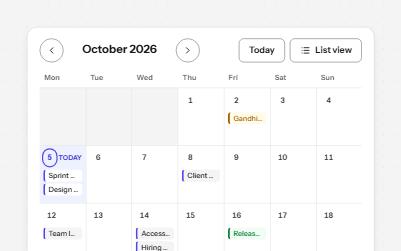
Calendar
A month of events as a grid with one tab stop, today marked in words, a day's events below, and a list view.
-
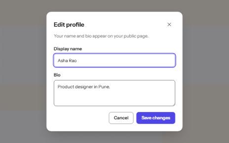
Modal dialog
A window over the page that holds focus until it is closed, built on the native dialog element.
-
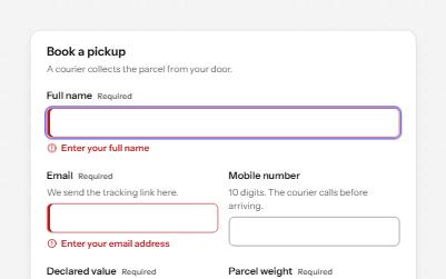
Text field
Text fields with visible labels, hints and errors tied to the input, the right keyboard and autofill, and units you can hear.