Accessibility pattern · Form inputs
Time picker
Most people want one of a few times, so the suggestions are a native radio group: one Tab stop, arrow keys to choose, and disabled times skipped with the reason written beside them. A native time field covers every other time; the script checks it against opening hours, the quarter hour and the booked slots, and a status message confirms the booking.
- WCAG criteria
- 7
- Keyboard rules
- 6
- Checked with
- axe, keyboard and the inspector
Live demo
Try it
Use it with a mouse, a keyboard or a screen reader. The inspector beside it shows what the browser tells assistive technology as you go: focus, state changes and announcements.
The demo works without JavaScript only as far as its HTML does; the inspector needs JavaScript.
Keyboard
Keys it answers to
Every action works without a pointer.
| Key | What it does |
|---|---|
| Tab | Moves into the suggested times (onto the chosen one, or the first free one), then to the time field and the button. |
| Arrow Down or Arrow Right | Chooses the next free time, skipping taken ones and wrapping at the end. |
| Arrow Up or Arrow Left | Chooses the previous free time. |
| Space | Chooses the focused time when none is chosen yet. |
| Arrow Up or Arrow Down | In the time field, changes the hour, minutes or am/pm part that has focus. |
| Enter | Confirms the booking, or explains what is missing and moves focus there. |
Screen readers
What it announces
Written from the roles, names and states in the markup.
| When | Expected announcement |
|---|---|
| Tab reaches the suggested times | Suggested times, group. 09:00, radio button, not checked |
| Arrow Down from 09:00 | 11:00, radio button, checked (10:00 is taken, so it is skipped) |
| Reading a taken time in browse mode | 10:00 Booked, radio button, unavailable |
| The booking is confirmed | Booked for tomorrow at 11:00 |
| Enter in the time field, on a time that clashes with a booking | That time overlaps a booked slot. Choose another. |
These are expected announcements, not recordings. Wording and order differ between screen readers and browsers.
Code
Copy the code
The exact files this demo runs on. The styles are served with a prefix that keeps this site's own styles out of the demo; what you copy is the original.
<form class="ap-time-picker" data-ap-time-picker data-region="IN" novalidate>
  <div class="ap-time-picker__intro">
    <span class="ap-time-picker__avatar" aria-hidden="true">KM</span>
    <div>
      <h3 class="ap-time-picker__who">Video call with Dr Kavya Menon</h3>
      <p class="ap-time-picker__meta">Tomorrow · 30 minutes · times in IST</p>
    </div>
  </div>

  <fieldset class="ap-time-picker__set" aria-describedby="time-picker-slot-error">
    <legend class="ap-time-picker__legend">Suggested times</legend>
    <p class="ap-hint">Times that are taken say why, and cannot be chosen.</p>
    <p class="ap-error ap-time-picker__error" id="time-picker-slot-error" aria-live="polite"><svg viewBox="0 0 24 24" aria-hidden="true" focusable="false"><circle cx="12" cy="12" r="9"/><path d="M12 7.5v5.5M12 16.5h.01"/></svg><span data-ap-slot-error></span></p>
    <div class="ap-time-picker__grid">
      <label class="ap-time-picker__slot">
        <input type="radio" name="time-picker-slot" value="09:00" />
        <span class="ap-time-picker__time" data-ap-time="09:00">09:00</span>
        <svg class="ap-time-picker__tick" viewBox="0 0 24 24" aria-hidden="true" focusable="false"><path d="m6 12.5 4 4 8-9"/></svg>
      </label>
      <label class="ap-time-picker__slot">
        <input type="radio" name="time-picker-slot" value="10:00" disabled data-minutes="30" />
        <span class="ap-time-picker__time" data-ap-time="10:00">10:00</span>
        <span class="ap-time-picker__why">Booked</span>
      </label>
      <label class="ap-time-picker__slot">
        <input type="radio" name="time-picker-slot" value="11:00" />
        <span class="ap-time-picker__time" data-ap-time="11:00">11:00</span>
        <svg class="ap-time-picker__tick" viewBox="0 0 24 24" aria-hidden="true" focusable="false"><path d="m6 12.5 4 4 8-9"/></svg>
      </label>
      <label class="ap-time-picker__slot">
        <input type="radio" name="time-picker-slot" value="12:00" />
        <span class="ap-time-picker__time" data-ap-time="12:00">12:00</span>
        <svg class="ap-time-picker__tick" viewBox="0 0 24 24" aria-hidden="true" focusable="false"><path d="m6 12.5 4 4 8-9"/></svg>
      </label>
      <label class="ap-time-picker__slot">
        <input type="radio" name="time-picker-slot" value="13:00" disabled data-minutes="60" />
        <span class="ap-time-picker__time" data-ap-time="13:00">13:00</span>
        <span class="ap-time-picker__why">Lunch break</span>
      </label>
      <label class="ap-time-picker__slot">
        <input type="radio" name="time-picker-slot" value="14:00" />
        <span class="ap-time-picker__time" data-ap-time="14:00">14:00</span>
        <svg class="ap-time-picker__tick" viewBox="0 0 24 24" aria-hidden="true" focusable="false"><path d="m6 12.5 4 4 8-9"/></svg>
      </label>
      <label class="ap-time-picker__slot">
        <input type="radio" name="time-picker-slot" value="15:00" />
        <span class="ap-time-picker__time" data-ap-time="15:00">15:00</span>
        <svg class="ap-time-picker__tick" viewBox="0 0 24 24" aria-hidden="true" focusable="false"><path d="m6 12.5 4 4 8-9"/></svg>
      </label>
      <label class="ap-time-picker__slot">
        <input type="radio" name="time-picker-slot" value="16:00" disabled data-minutes="30" />
        <span class="ap-time-picker__time" data-ap-time="16:00">16:00</span>
        <span class="ap-time-picker__why">Booked</span>
      </label>
      <label class="ap-time-picker__slot">
        <input type="radio" name="time-picker-slot" value="17:00" />
        <span class="ap-time-picker__time" data-ap-time="17:00">17:00</span>
        <svg class="ap-time-picker__tick" viewBox="0 0 24 24" aria-hidden="true" focusable="false"><path d="m6 12.5 4 4 8-9"/></svg>
      </label>
      <label class="ap-time-picker__slot">
        <input type="radio" name="time-picker-slot" value="18:00" />
        <span class="ap-time-picker__time" data-ap-time="18:00">18:00</span>
        <svg class="ap-time-picker__tick" viewBox="0 0 24 24" aria-hidden="true" focusable="false"><path d="m6 12.5 4 4 8-9"/></svg>
      </label>
    </div>
  </fieldset>

  <div class="ap-field ap-time-picker__other">
    <label class="ap-label" for="time-picker-other">Another time</label>
    <p class="ap-hint" id="time-picker-other-hint" data-ap-hint>Between 09:00 and 18:00, on the quarter hour.</p>
    <input class="ap-input ap-time-picker__input" id="time-picker-other" type="time" min="09:00" max="18:00" step="900" aria-describedby="time-picker-other-hint time-picker-other-error" />
    <p class="ap-error ap-time-picker__error" id="time-picker-other-error" aria-live="polite"><svg viewBox="0 0 24 24" aria-hidden="true" focusable="false"><circle cx="12" cy="12" r="9"/><path d="M12 7.5v5.5M12 16.5h.01"/></svg><span data-ap-other-error></span></p>
  </div>

  <button type="submit" class="ap-btn ap-btn--primary ap-time-picker__go">Confirm time</button>
  <p class="ap-time-picker__done" role="status"><svg viewBox="0 0 24 24" aria-hidden="true" focusable="false"><circle cx="12" cy="12" r="9"/><path d="m8 12.5 3 3 5-6"/></svg><span data-ap-done></span></p>
</form>
/* Shared primitives: buttons and form fields used across the patterns.
   Uses the --ap-* design tokens. */

.ap-btn {
  display: inline-flex;
  align-items: center;
  justify-content: center;
  gap: 8px;
  min-height: 40px;
  padding: 0 16px;
  border: 1px solid var(--ap-border-strong);
  border-radius: var(--ap-radius-sm);
  background: var(--ap-surface);
  color: var(--ap-text);
  font: inherit;
  font-weight: 600;
  line-height: 1.2;
  text-decoration: none;
  white-space: nowrap;
  cursor: pointer;
  transition: background-color var(--ap-duration) var(--ap-ease), border-color var(--ap-duration) var(--ap-ease), box-shadow var(--ap-duration) var(--ap-ease);
}
.ap-btn:hover {
  background: var(--ap-surface-2);
}
.ap-btn:focus-visible {
  outline: 2px solid var(--ap-focus);
  outline-offset: 2px;
}
.ap-btn:disabled,
.ap-btn[aria-disabled="true"] {
  opacity: .55;
  cursor: not-allowed;
}
.ap-btn--primary {
  border-color: var(--ap-accent);
  background: var(--ap-accent);
  color: var(--ap-on-accent);
  box-shadow: var(--ap-shadow-sm);
}
.ap-btn--primary:hover {
  border-color: var(--ap-accent-hover);
  background: var(--ap-accent-hover);
}
.ap-btn--danger {
  border-color: var(--ap-danger);
  background: var(--ap-danger);
  color: var(--ap-surface);
}
.ap-btn--danger:hover {
  filter: brightness(1.08);
}
.ap-btn--ghost {
  border-color: transparent;
  background: transparent;
}
.ap-btn--ghost:hover {
  background: var(--ap-surface-2);
}
.ap-btn__icon {
  width: 18px;
  height: 18px;
  flex-shrink: 0;
  fill: none;
  stroke: currentColor;
  stroke-width: 2;
  stroke-linecap: round;
  stroke-linejoin: round;
}

.ap-field {
  display: grid;
  gap: 6px;
}
.ap-label {
  color: var(--ap-text);
  font-weight: 600;
  font-size: .9375rem;
}
.ap-hint {
  margin: 0;
  color: var(--ap-text-3);
  font-size: .875rem;
  line-height: 1.45;
}
.ap-error {
  display: flex;
  align-items: flex-start;
  gap: 6px;
  margin: 0;
  color: var(--ap-danger);
  font-size: .875rem;
  font-weight: 600;
  line-height: 1.45;
}
.ap-input {
  width: 100%;
  min-height: 44px;
  padding: 10px 12px;
  border: 1px solid var(--ap-border-strong);
  border-radius: var(--ap-radius-sm);
  background: var(--ap-surface);
  color: var(--ap-text);
  font: inherit;
  line-height: 1.4;
  transition: border-color var(--ap-duration) var(--ap-ease), box-shadow var(--ap-duration) var(--ap-ease);
}
.ap-input::placeholder {
  color: var(--ap-text-3);
}
.ap-input:hover {
  border-color: var(--ap-text-2);
}
.ap-input:focus-visible {
  outline: 2px solid var(--ap-focus);
  outline-offset: 1px;
  border-color: var(--ap-focus);
}
.ap-input[aria-invalid="true"] {
  border-color: var(--ap-danger);
  box-shadow: inset 4px 0 0 var(--ap-danger);
}
textarea.ap-input {
  resize: vertical;
  min-height: 88px;
}

@media (prefers-reduced-motion: reduce) {
  .ap-btn,
  .ap-input { transition: none; }
}

/* Time picker. Uses the --ap-* design tokens and the shared primitives. */
.ap-time-picker {
  container-type: inline-size;
  display: grid;
  gap: 22px;
  width: min(100%, 540px);
  margin-inline: auto;
  padding: 22px 24px 24px;
  border: 1px solid var(--ap-border);
  border-radius: var(--ap-radius-lg);
  background: var(--ap-surface);
  color: var(--ap-text);
  box-shadow: var(--ap-shadow-md);
  font-family: var(--ap-font);
}

/* Who the call is with */
.ap-time-picker__intro {
  display: flex;
  align-items: center;
  gap: 14px;
  padding-bottom: 18px;
  border-bottom: 1px solid var(--ap-border);
}
.ap-time-picker__avatar {
  display: grid;
  place-items: center;
  width: 44px;
  height: 44px;
  flex-shrink: 0;
  border-radius: var(--ap-radius-full);
  background: var(--ap-accent-soft);
  color: var(--ap-accent-soft-text);
  font-size: .875rem;
  font-weight: 700;
  letter-spacing: .02em;
}
.ap-time-picker__who {
  margin: 0;
  font-family: var(--ap-font);
  font-size: 1rem;
  font-weight: 650;
  line-height: 1.35;
}
.ap-time-picker__meta {
  margin: 2px 0 0;
  color: var(--ap-text-3);
  font-size: .875rem;
}

/* The suggested times */
.ap-time-picker__set {
  display: grid;
  gap: 6px;
  min-width: 0;
  margin: 0;
  padding: 0;
  border: 0;
}
.ap-time-picker__legend {
  margin-bottom: 6px;
  padding: 0;
  color: var(--ap-text);
  font-size: .9375rem;
  font-weight: 650;
}
.ap-time-picker__grid {
  display: grid;
  grid-template-columns: repeat(5, minmax(0, 1fr));
  gap: 8px;
  margin-top: 6px;
}
@container (max-width: 470px) {
  .ap-time-picker { padding: 18px 16px 20px; }
  .ap-time-picker__grid { grid-template-columns: repeat(3, minmax(0, 1fr)); }
}

.ap-time-picker__slot {
  position: relative;
  display: grid;
  place-content: center;
  justify-items: center;
  gap: 1px;
  min-height: 52px;
  padding: 6px 4px;
  border: 1px solid var(--ap-border-strong);
  border-radius: var(--ap-radius-sm);
  background: var(--ap-surface);
  color: var(--ap-text);
  text-align: center;
  cursor: pointer;
  transition: background-color var(--ap-duration) var(--ap-ease), border-color var(--ap-duration) var(--ap-ease);
}
/* The real radio covers the card: it takes the clicks and the focus. */
.ap-time-picker__slot input {
  position: absolute;
  inset: 0;
  width: 100%;
  height: 100%;
  margin: 0;
  opacity: 0;
  cursor: inherit;
}
.ap-time-picker__slot:hover {
  background: var(--ap-surface-2);
}
.ap-time-picker__slot:has(input:focus-visible) {
  outline: 2px solid var(--ap-focus);
  outline-offset: 2px;
}
.ap-time-picker__time {
  font-size: .9375rem;
  font-weight: 550;
  font-variant-numeric: tabular-nums;
  white-space: nowrap;
}
.ap-time-picker__tick {
  position: absolute;
  top: 4px;
  right: 4px;
  width: 16px;
  height: 16px;
  padding: 2px;
  border-radius: var(--ap-radius-full);
  background: var(--ap-accent);
  fill: none;
  stroke: var(--ap-on-accent);
  stroke-width: 3.5;
  stroke-linecap: round;
  stroke-linejoin: round;
  visibility: hidden;
}

/* Chosen: thicker accent border, soft fill, bold type and a tick */
.ap-time-picker__slot:has(input:checked) {
  border-color: var(--ap-accent);
  background: var(--ap-accent-soft);
  box-shadow: inset 0 0 0 1px var(--ap-accent);
  color: var(--ap-accent-soft-text);
}
.ap-time-picker__slot:has(input:checked) .ap-time-picker__time {
  font-weight: 750;
}
.ap-time-picker__slot:has(input:checked) .ap-time-picker__tick {
  visibility: visible;
}

/* Taken: dashed edge, struck-through time, the reason in words */
.ap-time-picker__slot:has(input:disabled) {
  border-style: dashed;
  background: var(--ap-surface-2);
  color: var(--ap-text-3);
  cursor: not-allowed;
}
.ap-time-picker__slot:has(input:disabled) .ap-time-picker__time {
  text-decoration: line-through;
}
.ap-time-picker__why {
  color: var(--ap-text-3);
  font-size: .75rem;
  font-weight: 600;
  line-height: 1.25;
}

/* Another time */
.ap-time-picker__input {
  width: min(100%, 12rem);
  font-variant-numeric: tabular-nums;
}
.ap-time-picker__input::-webkit-calendar-picker-indicator {
  cursor: pointer;
}

/* Errors are live regions: they stay in the page, taking no room until they have words. */
.ap-time-picker__error svg {
  width: 18px;
  height: 18px;
  flex-shrink: 0;
  margin-top: 1px;
  fill: none;
  stroke: currentColor;
  stroke-width: 2;
  stroke-linecap: round;
}
.ap-time-picker__error:has(> span:empty) {
  margin-top: -6px;
}
.ap-time-picker__error:has(> span:empty) svg {
  display: none;
}

.ap-time-picker__go {
  justify-self: start;
  min-height: var(--ap-target);
  padding: 0 22px;
}

.ap-time-picker__done {
  display: flex;
  align-items: center;
  gap: 10px;
  margin: -6px 0 0;
  padding: 12px 14px;
  border-radius: var(--ap-radius-sm);
  background: var(--ap-success-soft);
  color: var(--ap-success);
  font-weight: 600;
  line-height: 1.4;
}
/* The status stays in the page while empty, so its first message is heard. */
.ap-time-picker__done:has(> span:empty) {
  margin-top: -22px;
  padding: 0;
  background: transparent;
}
.ap-time-picker__done:has(> span:empty) svg {
  display: none;
}
.ap-time-picker__done svg {
  width: 20px;
  height: 20px;
  flex-shrink: 0;
  fill: none;
  stroke: currentColor;
  stroke-width: 2;
  stroke-linecap: round;
  stroke-linejoin: round;
}
.ap-time-picker__done strong {
  font-weight: 750;
}

@media (prefers-reduced-motion: reduce) {
  .ap-time-picker__slot { transition: none; }
}
/**
 * Time picker: suggested times as a native radio group (taken ones disabled,
 * with the reason in their label), a native input type=time for any other
 * time, and a status message that confirms the booking.
 *
 * Markup: form[data-ap-time-picker][novalidate] holding radios (value HH:MM;
 * disabled ones carry data-minutes, the time they block) with a
 * [data-ap-time] element each, a fieldset error [data-ap-slot-error], an
 * input[type=time] with min, max and step, its hint [data-ap-hint] and error
 * [data-ap-other-error], a submit button, and p[role=status] > [data-ap-done].
 * Add data-12h to the root to write times on a 12-hour clock.
 */

const SLOT_MINUTES = 30;

const TEXT = {
  none: "Choose a suggested time or enter one.",
  bad: "Enter a full time, with hours and minutes.",
  taken: "That time overlaps a booked slot. Choose another.",
  range: { 24: "Choose a time between 09:00 and 18:00.", 12: "Choose a time between 9:00 am and 6:00 pm." },
  step: { 24: "Use a time on the quarter hour, like 14:15.", 12: "Use a time on the quarter hour, like 2:15 pm." },
  hint: { 24: "Between 09:00 and 18:00, on the quarter hour.", 12: "Between 9:00 am and 6:00 pm, on the quarter hour." },
  done: "Booked for tomorrow at",
};

const minutesOf = (hhmm) => {
  const [h, m] = hhmm.split(":").map(Number);
  return h * 60 + m;
};

export function init(root) {
  const radios = [...root.querySelectorAll("input[type=radio]")];
  const other = root.querySelector("input[type=time]");
  const hint = root.querySelector("[data-ap-hint]");
  const slotError = root.querySelector("[data-ap-slot-error]");
  const otherError = root.querySelector("[data-ap-other-error]");
  const done = root.querySelector("[data-ap-done]");
  const clock = () => (root.hasAttribute("data-12h") ? 12 : 24);

  // The times nobody can book, read from the disabled radios.
  const taken = radios.filter((r) => r.disabled).map((r) => {
    const start = minutesOf(r.value);
    return [start, start + Number(r.dataset.minutes || SLOT_MINUTES)];
  });

  function format(hhmm) {
    const [h, m] = hhmm.split(":").map(Number);
    const lang = root.closest("[lang]")?.lang || navigator.language;
    const region = root.dataset.region;
    const locale = region && !lang.includes("-") ? `${lang}-${region}` : lang;
    const options = clock() === 12
      ? { hour: "numeric", minute: "2-digit", hour12: true }
      : { hour: "2-digit", minute: "2-digit", hourCycle: "h23" };
    try {
      return new Intl.DateTimeFormat(locale, options).format(new Date(2000, 0, 1, h, m));
    } catch {
      return hhmm;
    }
  }

  // Write every time on the chosen clock.
  for (const el of root.querySelectorAll("[data-ap-time]")) el.textContent = format(el.dataset.apTime);
  hint.textContent = TEXT.hint[clock()];

  function setError(target, field, message) {
    if (target.textContent !== message) target.textContent = message;
    if (!field) return;
    if (message) field.setAttribute("aria-invalid", "true");
    else field.removeAttribute("aria-invalid");
  }

  /** What is wrong with the typed time, or "" when it can be booked. */
  function checkOther() {
    const v = other.validity;
    if (v.badInput) return TEXT.bad;
    if (v.rangeUnderflow || v.rangeOverflow) return TEXT.range[clock()];
    if (v.stepMismatch) return TEXT.step[clock()];
    const start = minutesOf(other.value);
    const end = start + SLOT_MINUTES;
    if (taken.some(([a, b]) => start < b && end > a)) return TEXT.taken;
    return "";
  }

  function confirm(hhmm) {
    const time = document.createElement("strong");
    time.textContent = format(hhmm);
    const words = document.createElement("span");
    words.textContent = TEXT.done;
    done.replaceChildren(words, " ", time);
  }

  function onSubmit(event) {
    event.preventDefault();
    setError(slotError, null, "");
    const typed = other.value || other.validity.badInput;
    if (typed) {
      const problem = checkOther();
      setError(otherError, other, problem);
      if (problem) {
        done.replaceChildren();
        other.focus();
        return;
      }
      confirm(other.value);
      return;
    }
    setError(otherError, other, "");
    const chosen = radios.find((r) => r.checked);
    if (!chosen) {
      done.replaceChildren();
      setError(slotError, null, TEXT.none);
      radios.find((r) => !r.disabled)?.focus();
      return;
    }
    confirm(chosen.value);
  }

  // A suggested time and a typed one cannot both stand: choosing one clears the other.
  function onChange(event) {
    const el = event.target;
    if (el.type === "radio" && el.checked) {
      other.value = "";
      setError(otherError, other, "");
      setError(slotError, null, "");
      done.replaceChildren();
    }
  }

  function onInput(event) {
    if (event.target !== other) return;
    if (other.value) for (const r of radios) r.checked = false;
    setError(slotError, null, "");
    done.replaceChildren();
    // An error already showing is updated as the time is fixed, never added while typing.
    if (otherError.textContent) setError(otherError, other, other.value ? checkOther() : "");
  }

  root.addEventListener("submit", onSubmit);
  root.addEventListener("change", onChange);
  root.addEventListener("input", onInput);

  return () => {
    root.removeEventListener("submit", onSubmit);
    root.removeEventListener("change", onChange);
    root.removeEventListener("input", onInput);
  };
}

for (const root of document.querySelectorAll("[data-ap-time-picker]")) init(root);
/* Design tokens for the pattern components. Light by default, dark when the
   system asks for it; set data-theme="dark" on :root to force dark. */
:root {
    --ap-radius-sm: 8px;
    --ap-radius: 12px;
    --ap-radius-lg: 16px;
    --ap-radius-full: 999px;
    --ap-font: "Instrument Sans", ui-sans-serif, system-ui, -apple-system, "Segoe UI", Roboto, sans-serif;
    --ap-mono: "JetBrains Mono", ui-monospace, "Cascadia Mono", "SF Mono", Consolas, monospace;
    --ap-ease: cubic-bezier(.2, .8, .2, 1);
    --ap-duration: 180ms;
    --ap-target: 44px;
    --ap-bg: #F4F4F5;
    --ap-surface: #FFFFFF;
    --ap-surface-2: #F4F4F5;
    --ap-surface-3: #E4E4E7;
    --ap-border: #E4E4E7;
    --ap-border-strong: #76767F;
    --ap-text: #18181B;
    --ap-text-2: #3F3F46;
    --ap-text-3: #5E5E66;
    --ap-accent: #4F46E5;
    --ap-accent-hover: #4338CA;
    --ap-on-accent: #FFFFFF;
    --ap-accent-text: #4338CA;
    --ap-accent-soft: #EEF2FF;
    --ap-accent-soft-text: #3730A3;
    --ap-focus: #4F46E5;
    --ap-danger: #B91C1C;
    --ap-danger-soft: #FEF2F2;
    --ap-success: #15803D;
    --ap-success-soft: #F0FDF4;
    --ap-warning: #A15C07;
    --ap-warning-soft: #FEFCE8;
    --ap-info: #1D4ED8;
    --ap-info-soft: #EFF6FF;
    --ap-scrim: rgb(9 9 11 / .48);
    --ap-shadow-sm: 0 1px 2px rgb(9 9 11 / .06);
    --ap-shadow-md: 0 1px 2px rgb(9 9 11 / .05), 0 6px 16px -4px rgb(9 9 11 / .1);
    --ap-shadow-lg: 0 2px 6px rgb(9 9 11 / .06), 0 20px 40px -12px rgb(9 9 11 / .22);
    --ap-light-bg: #F4F4F5;
    --ap-light-surface: #FFFFFF;
    --ap-light-surface-2: #F4F4F5;
    --ap-light-surface-3: #E4E4E7;
    --ap-light-border: #E4E4E7;
    --ap-light-border-strong: #76767F;
    --ap-light-text: #18181B;
    --ap-light-text-2: #3F3F46;
    --ap-light-text-3: #5E5E66;
    --ap-light-accent: #4F46E5;
    --ap-light-accent-hover: #4338CA;
    --ap-light-on-accent: #FFFFFF;
    --ap-light-accent-text: #4338CA;
    --ap-light-accent-soft: #EEF2FF;
    --ap-light-accent-soft-text: #3730A3;
    --ap-light-focus: #4F46E5;
    --ap-light-danger: #B91C1C;
    --ap-light-danger-soft: #FEF2F2;
    --ap-light-success: #15803D;
    --ap-light-success-soft: #F0FDF4;
    --ap-light-warning: #A15C07;
    --ap-light-warning-soft: #FEFCE8;
    --ap-light-info: #1D4ED8;
    --ap-light-info-soft: #EFF6FF;
    --ap-light-scrim: rgb(9 9 11 / .48);
    --ap-light-shadow-sm: 0 1px 2px rgb(9 9 11 / .06);
    --ap-light-shadow-md: 0 1px 2px rgb(9 9 11 / .05), 0 6px 16px -4px rgb(9 9 11 / .1);
    --ap-light-shadow-lg: 0 2px 6px rgb(9 9 11 / .06), 0 20px 40px -12px rgb(9 9 11 / .22);
    --ap-dark-bg: #09090B;
    --ap-dark-surface: #18181B;
    --ap-dark-surface-2: #27272A;
    --ap-dark-surface-3: #3F3F46;
    --ap-dark-border: #2E2E33;
    --ap-dark-border-strong: #8E8E97;
    --ap-dark-text: #FAFAFA;
    --ap-dark-text-2: #D4D4D8;
    --ap-dark-text-3: #A1A1AA;
    --ap-dark-accent: #818CF8;
    --ap-dark-accent-hover: #A5B4FC;
    --ap-dark-on-accent: #0C0A1F;
    --ap-dark-accent-text: #A5B4FC;
    --ap-dark-accent-soft: #1E1B4B;
    --ap-dark-accent-soft-text: #C7D2FE;
    --ap-dark-focus: #A5B4FC;
    --ap-dark-danger: #F87171;
    --ap-dark-danger-soft: #2A1215;
    --ap-dark-success: #4ADE80;
    --ap-dark-success-soft: #0F2A1A;
    --ap-dark-warning: #FACC15;
    --ap-dark-warning-soft: #2A2410;
    --ap-dark-info: #60A5FA;
    --ap-dark-info-soft: #0F1D33;
    --ap-dark-scrim: rgb(0 0 0 / .62);
    --ap-dark-shadow-sm: 0 1px 2px rgb(0 0 0 / .4);
    --ap-dark-shadow-md: 0 1px 2px rgb(0 0 0 / .4), 0 8px 20px -6px rgb(0 0 0 / .5);
    --ap-dark-shadow-lg: 0 2px 8px rgb(0 0 0 / .45), 0 24px 48px -12px rgb(0 0 0 / .7);
}
@media (prefers-color-scheme: dark) {
  :root:not([data-theme="light"]) {
      --ap-bg: #09090B;
      --ap-surface: #18181B;
      --ap-surface-2: #27272A;
      --ap-surface-3: #3F3F46;
      --ap-border: #2E2E33;
      --ap-border-strong: #8E8E97;
      --ap-text: #FAFAFA;
      --ap-text-2: #D4D4D8;
      --ap-text-3: #A1A1AA;
      --ap-accent: #818CF8;
      --ap-accent-hover: #A5B4FC;
      --ap-on-accent: #0C0A1F;
      --ap-accent-text: #A5B4FC;
      --ap-accent-soft: #1E1B4B;
      --ap-accent-soft-text: #C7D2FE;
      --ap-focus: #A5B4FC;
      --ap-danger: #F87171;
      --ap-danger-soft: #2A1215;
      --ap-success: #4ADE80;
      --ap-success-soft: #0F2A1A;
      --ap-warning: #FACC15;
      --ap-warning-soft: #2A2410;
      --ap-info: #60A5FA;
      --ap-info-soft: #0F1D33;
      --ap-scrim: rgb(0 0 0 / .62);
      --ap-shadow-sm: 0 1px 2px rgb(0 0 0 / .4);
      --ap-shadow-md: 0 1px 2px rgb(0 0 0 / .4), 0 8px 20px -6px rgb(0 0 0 / .5);
      --ap-shadow-lg: 0 2px 8px rgb(0 0 0 / .45), 0 24px 48px -12px rgb(0 0 0 / .7);
  }
}
:root[data-theme="dark"] {
    --ap-bg: #09090B;
    --ap-surface: #18181B;
    --ap-surface-2: #27272A;
    --ap-surface-3: #3F3F46;
    --ap-border: #2E2E33;
    --ap-border-strong: #8E8E97;
    --ap-text: #FAFAFA;
    --ap-text-2: #D4D4D8;
    --ap-text-3: #A1A1AA;
    --ap-accent: #818CF8;
    --ap-accent-hover: #A5B4FC;
    --ap-on-accent: #0C0A1F;
    --ap-accent-text: #A5B4FC;
    --ap-accent-soft: #1E1B4B;
    --ap-accent-soft-text: #C7D2FE;
    --ap-focus: #A5B4FC;
    --ap-danger: #F87171;
    --ap-danger-soft: #2A1215;
    --ap-success: #4ADE80;
    --ap-success-soft: #0F2A1A;
    --ap-warning: #FACC15;
    --ap-warning-soft: #2A2410;
    --ap-info: #60A5FA;
    --ap-info-soft: #0F1D33;
    --ap-scrim: rgb(0 0 0 / .62);
    --ap-shadow-sm: 0 1px 2px rgb(0 0 0 / .4);
    --ap-shadow-md: 0 1px 2px rgb(0 0 0 / .4), 0 8px 20px -6px rgb(0 0 0 / .5);
    --ap-shadow-lg: 0 2px 8px rgb(0 0 0 / .45), 0 24px 48px -12px rgb(0 0 0 / .7);
}
WCAG 2.2
What it meets
The success criteria this pattern takes care of, and how.
-
1.3.1 Info and Relationships
Level A
The times are a fieldset with a legend, and each reason is part of its time's label, so the grouping and the reasons are in the code.
-
1.4.1 Use of Color
Level A
The chosen time has a tick, a thicker border and bold type; taken times are struck through and say why in words.
-
2.1.1 Keyboard
Level A
Native radio buttons and a native time field: every part works from the keyboard without extra code.
-
2.5.8 Target Size (Minimum)
Level AA
Each time is a whole card at least 44 pixels high, so it is easy to hit with a finger.
-
3.3.1 Error Identification
Level A
A time outside opening hours, off the quarter hour or over a booked slot is described in text, and the field is marked invalid.
-
3.3.2 Labels or Instructions
Level A
The legend, labels and hints say what can be chosen, before anyone gets it wrong.
-
4.1.3 Status Messages
Level AA
The confirmation and each error are polite live messages, so pressing Enter in the field is answered even though focus stays put.
Usage
When to use it
Use it
- Booking from a short list of times, such as appointments, deliveries or table reservations.
- When most people take a suggested time but some need another one.
Use something else
- Any time of day with no rules: a native time field on its own is enough.
- Long lists of slots across many days: pick the day first, then show its times.
- Durations, like a 90-minute timer: use number fields for hours and minutes.
Common failures
How it usually goes wrong
Taken times that vanish
Removing booked times leaves gaps nobody can explain. They stay in place, disabled, with the reason written under the time.
A reason that only appears on hover
A tooltip on a disabled control cannot be reached with the keyboard or by touch. The reason is plain text inside the label.
Times as a row of buttons
Buttons do not say which one is chosen or how many there are. Radio buttons in a fieldset say both, and the arrow keys come free.
A custom clock face
Dial pickers need dragging and precise pointing. The native time field already works with the keyboard, screen readers and every phone's own picker.
Errors that only say "Invalid time"
People need to know what to change. Each message names the rule: opening hours, the quarter hour, or a clash with a booking.
No confirmation
Pressing Confirm and hearing nothing leaves people unsure. A status message repeats the booked time.
Notes
Building it
- The native time field shows 12 or 24 hours by the browser's own settings; its value is always 24-hour HH:MM, so check that, never the text on screen.
- The 12-hour option above changes how the script writes times (with Intl.DateTimeFormat); the radio values and the rules stay in 24-hour time.
- Disabled radio buttons are skipped by the arrow keys and by Tab, so the reason must also live outside focus: the hint above the times says that taken ones explain themselves.
- Booked slots are read from the disabled radios and their data-minutes, so the field's clash check and the cards cannot disagree.
- The form has novalidate: the browser's own bubbles are replaced by messages tied to each field with aria-describedby.
Sources: WAI-ARIA Authoring Practices: Radio Group · MDN: input type="time"
Checked with axe in light and dark themes, at desktop and phone widths, and by keyboard. Not yet tested with every screen reader and browser pair. Report a correction
Related
Patterns that go with it
-
Date picker
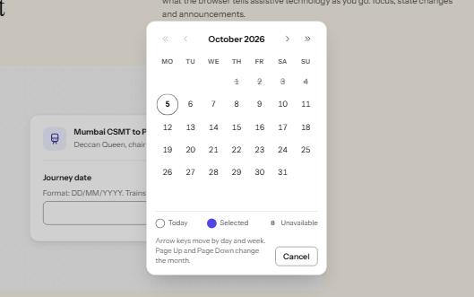
A date field that takes a typed date or opens a calendar dialog, with a month grid driven by the arrow keys.
-
Radio cards
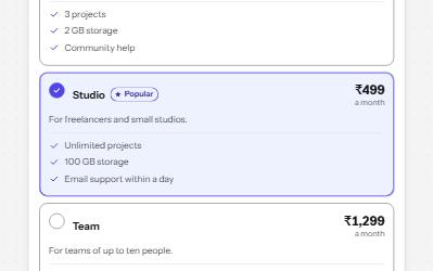
A plan picker where each choice is a large card, built from native radio buttons so arrows, focus and state come free.
-
Radio group
Native radio buttons in a fieldset, restyled with a dot that keeps its contrast, each option with a description and a price.
-
Form errors
An error summary that takes focus, messages tied to each field, and a status message when the form is sent.