Accessibility pattern · Form inputs
Color picker
Three ways to set one color, all native: the browser's color input, a hex code field that explains its format, and preset swatches that are radio buttons with names. The contrast against white and black text is worked out with the WCAG formula and written as a ratio and a verdict, not shown as a color.
- WCAG criteria
- 7
- Keyboard rules
- 5
- Checked with
- axe, keyboard and the inspector
Live demo
Try it
Use it with a mouse, a keyboard or a screen reader. The inspector beside it shows what the browser tells assistive technology as you go: focus, state changes and announcements.
Brand color
Used for buttons and links on your shop page.
6 characters from 0–9 and A–F. A leading # is fine.
Text on this color
White text 6.2:1 Passes AA
Black text 3.3:1 Passes AA
Use white text on this color.
The demo works without JavaScript only as far as its HTML does; the inspector needs JavaScript.
Keyboard
Keys it answers to
Every action works without a pointer.
| Key | What it does |
|---|---|
| Tab | Moves to the color input, the hex field, the checked preset (or the first one), and on out of the presets. |
| Enter or Space | On the color input, opens the browser's own picker. |
| Enter | In the hex field, applies the code, or explains what is wrong with it. |
| Arrow Right or Arrow Down | In the presets, chooses the next swatch, wrapping at the end. |
| Arrow Left or Arrow Up | In the presets, chooses the previous swatch. |
Screen readers
What it announces
Written from the roles, names and states in the markup.
| When | Expected announcement |
|---|---|
| Tab reaches the presets | Presets, radio group. Indigo, radio button, checked, 1 of 8 |
| Arrow Right chooses the next swatch | Teal, radio button, checked, 2 of 8 |
| The color settles for a moment | White text: 5.4:1, Passes AA. Black text: 3.8:1, Large text only. |
| A wrong hex code is applied | Use 6 characters from 0–9 and A–F, like 4F46E5. |
These are expected announcements, not recordings. Wording and order differ between screen readers and browsers.
Code
Copy the code
The exact files this demo runs on. The styles are served with a prefix that keeps this site's own styles out of the demo; what you copy is the original.
<div class="ap-color-picker" data-ap-color-picker>
  <div class="ap-color-picker__top">
    <h3 class="ap-color-picker__name">Brand color</h3>
    <p class="ap-color-picker__lead">Used for buttons and links on your shop page.</p>
  </div>

  <div class="ap-color-picker__pick">
    <div class="ap-field">
      <label class="ap-label" for="color-picker-well">Color</label>
      <input class="ap-color-picker__well" id="color-picker-well" type="color" value="#4f46e5" />
    </div>
    <div class="ap-field ap-color-picker__hex">
      <label class="ap-label" for="color-picker-hex">Hex code</label>
      <div class="ap-color-picker__hexbox">
        <span aria-hidden="true">#</span>
        <input class="ap-input" id="color-picker-hex" type="text" value="4F46E5" maxlength="7" autocomplete="off" spellcheck="false" aria-describedby="color-picker-hint color-picker-error" />
      </div>
    </div>
  </div>
  <p class="ap-hint ap-color-picker__hint" id="color-picker-hint">6 characters from 0–9 and A–F. A leading # is fine.</p>
  <p class="ap-error ap-color-picker__error" id="color-picker-error" aria-live="polite"></p>

  <div class="ap-color-picker__presets" role="radiogroup" aria-labelledby="color-picker-presets">
    <div class="ap-color-picker__bar">
      <span class="ap-color-picker__sub" id="color-picker-presets">Presets</span>
      <span class="ap-color-picker__picked" aria-hidden="true" data-ap-picked>Indigo</span>
    </div>
    <div class="ap-color-picker__swatches">
      <label class="ap-color-picker__swatch">
        <input class="ap-color-picker__radio" type="radio" name="color-picker-preset" value="#4F46E5" checked />
        <span class="ap-color-picker__chip" aria-hidden="true"><svg viewBox="0 0 24 24" focusable="false"><path d="m5 12 5 5L20 7"/></svg></span>
        <span class="ap-color-picker__sr">Indigo</span>
      </label>
      <label class="ap-color-picker__swatch">
        <input class="ap-color-picker__radio" type="radio" name="color-picker-preset" value="#0F766E" />
        <span class="ap-color-picker__chip" aria-hidden="true"><svg viewBox="0 0 24 24" focusable="false"><path d="m5 12 5 5L20 7"/></svg></span>
        <span class="ap-color-picker__sr">Teal</span>
      </label>
      <label class="ap-color-picker__swatch">
        <input class="ap-color-picker__radio" type="radio" name="color-picker-preset" value="#F59E0B" />
        <span class="ap-color-picker__chip" aria-hidden="true"><svg viewBox="0 0 24 24" focusable="false"><path d="m5 12 5 5L20 7"/></svg></span>
        <span class="ap-color-picker__sr">Saffron</span>
      </label>
      <label class="ap-color-picker__swatch">
        <input class="ap-color-picker__radio" type="radio" name="color-picker-preset" value="#BE123C" />
        <span class="ap-color-picker__chip" aria-hidden="true"><svg viewBox="0 0 24 24" focusable="false"><path d="m5 12 5 5L20 7"/></svg></span>
        <span class="ap-color-picker__sr">Crimson</span>
      </label>
      <label class="ap-color-picker__swatch">
        <input class="ap-color-picker__radio" type="radio" name="color-picker-preset" value="#15803D" />
        <span class="ap-color-picker__chip" aria-hidden="true"><svg viewBox="0 0 24 24" focusable="false"><path d="m5 12 5 5L20 7"/></svg></span>
        <span class="ap-color-picker__sr">Forest</span>
      </label>
      <label class="ap-color-picker__swatch">
        <input class="ap-color-picker__radio" type="radio" name="color-picker-preset" value="#0EA5E9" />
        <span class="ap-color-picker__chip" aria-hidden="true"><svg viewBox="0 0 24 24" focusable="false"><path d="m5 12 5 5L20 7"/></svg></span>
        <span class="ap-color-picker__sr">Sky</span>
      </label>
      <label class="ap-color-picker__swatch">
        <input class="ap-color-picker__radio" type="radio" name="color-picker-preset" value="#7E22CE" />
        <span class="ap-color-picker__chip" aria-hidden="true"><svg viewBox="0 0 24 24" focusable="false"><path d="m5 12 5 5L20 7"/></svg></span>
        <span class="ap-color-picker__sr">Plum</span>
      </label>
      <label class="ap-color-picker__swatch">
        <input class="ap-color-picker__radio" type="radio" name="color-picker-preset" value="#27272A" />
        <span class="ap-color-picker__chip" aria-hidden="true"><svg viewBox="0 0 24 24" focusable="false"><path d="m5 12 5 5L20 7"/></svg></span>
        <span class="ap-color-picker__sr">Charcoal</span>
      </label>
    </div>
  </div>

  <section class="ap-color-picker__contrast" aria-labelledby="color-picker-contrast">
    <h4 class="ap-color-picker__sub" id="color-picker-contrast">Text on this color</h4>
    <div class="ap-color-picker__pairs">
      <div class="ap-color-picker__pair" data-ap-pair data-ink="#FFFFFF">
        <div class="ap-color-picker__sample" aria-hidden="true"><span class="ap-color-picker__aa"></span><span class="ap-color-picker__line"></span></div>
        <p class="ap-color-picker__verdict"><span class="ap-color-picker__who">White text</span> <strong class="ap-color-picker__ratio" translate="no" data-ap-ratio>6.2:1</strong> <span class="ap-color-picker__badge" data-ap-badge><svg viewBox="0 0 24 24" aria-hidden="true" focusable="false"><path d="m5 12 5 5L20 7"/></svg><span data-ap-level>Passes AA</span></span></p>
      </div>
      <div class="ap-color-picker__pair" data-ap-pair data-ink="#000000">
        <div class="ap-color-picker__sample" aria-hidden="true"><span class="ap-color-picker__aa"></span><span class="ap-color-picker__line"></span></div>
        <p class="ap-color-picker__verdict"><span class="ap-color-picker__who">Black text</span> <strong class="ap-color-picker__ratio" translate="no" data-ap-ratio>3.3:1</strong> <span class="ap-color-picker__badge" data-ap-badge><svg viewBox="0 0 24 24" aria-hidden="true" focusable="false"><path d="m5 12 5 5L20 7"/></svg><span data-ap-level>Passes AA</span></span></p>
      </div>
    </div>
    <p class="ap-color-picker__advice" data-ap-advice>Use white text on this color.</p>
  </section>
  <p class="ap-color-picker__sr" role="status" data-ap-say></p>
</div>
/* Shared primitives: buttons and form fields used across the patterns.
   Uses the --ap-* design tokens. */

.ap-btn {
  display: inline-flex;
  align-items: center;
  justify-content: center;
  gap: 8px;
  min-height: 40px;
  padding: 0 16px;
  border: 1px solid var(--ap-border-strong);
  border-radius: var(--ap-radius-sm);
  background: var(--ap-surface);
  color: var(--ap-text);
  font: inherit;
  font-weight: 600;
  line-height: 1.2;
  text-decoration: none;
  white-space: nowrap;
  cursor: pointer;
  transition: background-color var(--ap-duration) var(--ap-ease), border-color var(--ap-duration) var(--ap-ease), box-shadow var(--ap-duration) var(--ap-ease);
}
.ap-btn:hover {
  background: var(--ap-surface-2);
}
.ap-btn:focus-visible {
  outline: 2px solid var(--ap-focus);
  outline-offset: 2px;
}
.ap-btn:disabled,
.ap-btn[aria-disabled="true"] {
  opacity: .55;
  cursor: not-allowed;
}
.ap-btn--primary {
  border-color: var(--ap-accent);
  background: var(--ap-accent);
  color: var(--ap-on-accent);
  box-shadow: var(--ap-shadow-sm);
}
.ap-btn--primary:hover {
  border-color: var(--ap-accent-hover);
  background: var(--ap-accent-hover);
}
.ap-btn--danger {
  border-color: var(--ap-danger);
  background: var(--ap-danger);
  color: var(--ap-surface);
}
.ap-btn--danger:hover {
  filter: brightness(1.08);
}
.ap-btn--ghost {
  border-color: transparent;
  background: transparent;
}
.ap-btn--ghost:hover {
  background: var(--ap-surface-2);
}
.ap-btn__icon {
  width: 18px;
  height: 18px;
  flex-shrink: 0;
  fill: none;
  stroke: currentColor;
  stroke-width: 2;
  stroke-linecap: round;
  stroke-linejoin: round;
}

.ap-field {
  display: grid;
  gap: 6px;
}
.ap-label {
  color: var(--ap-text);
  font-weight: 600;
  font-size: .9375rem;
}
.ap-hint {
  margin: 0;
  color: var(--ap-text-3);
  font-size: .875rem;
  line-height: 1.45;
}
.ap-error {
  display: flex;
  align-items: flex-start;
  gap: 6px;
  margin: 0;
  color: var(--ap-danger);
  font-size: .875rem;
  font-weight: 600;
  line-height: 1.45;
}
.ap-input {
  width: 100%;
  min-height: 44px;
  padding: 10px 12px;
  border: 1px solid var(--ap-border-strong);
  border-radius: var(--ap-radius-sm);
  background: var(--ap-surface);
  color: var(--ap-text);
  font: inherit;
  line-height: 1.4;
  transition: border-color var(--ap-duration) var(--ap-ease), box-shadow var(--ap-duration) var(--ap-ease);
}
.ap-input::placeholder {
  color: var(--ap-text-3);
}
.ap-input:hover {
  border-color: var(--ap-text-2);
}
.ap-input:focus-visible {
  outline: 2px solid var(--ap-focus);
  outline-offset: 1px;
  border-color: var(--ap-focus);
}
.ap-input[aria-invalid="true"] {
  border-color: var(--ap-danger);
  box-shadow: inset 4px 0 0 var(--ap-danger);
}
textarea.ap-input {
  resize: vertical;
  min-height: 88px;
}

@media (prefers-reduced-motion: reduce) {
  .ap-btn,
  .ap-input { transition: none; }
}

/* Color picker. Uses the --ap-* design tokens and the shared primitives.
   --chip, --chip-ink, --brand and --ink are set by the script from the colors being tested. */
.ap-color-picker {
  container-type: inline-size;
  width: min(100%, 560px);
  margin-inline: auto;
  padding: 22px 24px 24px;
  border: 1px solid var(--ap-border);
  border-radius: var(--ap-radius-lg);
  background: var(--ap-surface);
  box-shadow: var(--ap-shadow-md);
  color: var(--ap-text);
  font-family: var(--ap-font);
}

.ap-color-picker__top {
  display: grid;
  gap: 2px;
}
.ap-color-picker__name {
  margin: 0;
  font-size: 1.0625rem;
  font-weight: 650;
  line-height: 1.35;
}
.ap-color-picker__lead {
  margin: 0;
  color: var(--ap-text-3);
  font-size: .875rem;
  line-height: 1.45;
}

/* The native input and the hex field */
.ap-color-picker__pick {
  display: grid;
  grid-template-columns: auto minmax(0, 1fr);
  align-items: end;
  gap: 14px;
  margin-top: 18px;
}
.ap-color-picker__well {
  display: block;
  width: 64px;
  height: 44px;
  padding: 3px;
  border: 1px solid var(--ap-border-strong);
  border-radius: var(--ap-radius-sm);
  background: var(--ap-surface);
  cursor: pointer;
  appearance: none;
  -webkit-appearance: none;
}
.ap-color-picker__well::-webkit-color-swatch-wrapper {
  padding: 0;
}
.ap-color-picker__well::-webkit-color-swatch {
  border: 0;
  border-radius: 5px;
}
.ap-color-picker__well::-moz-color-swatch {
  border: 0;
  border-radius: 5px;
}
.ap-color-picker__well:hover {
  border-color: var(--ap-text-2);
}
.ap-color-picker__well:focus-visible {
  outline: 2px solid var(--ap-focus);
  outline-offset: 2px;
}
.ap-color-picker__hexbox {
  position: relative;
}
.ap-color-picker__hexbox span {
  position: absolute;
  top: 50%;
  left: 12px;
  transform: translateY(-50%);
  color: var(--ap-text-3);
  font-family: var(--ap-mono);
  pointer-events: none;
}
.ap-color-picker__hexbox .ap-input {
  padding-left: 26px;
  font-family: var(--ap-mono);
  letter-spacing: .04em;
  text-transform: uppercase;
}
.ap-color-picker__hint {
  margin-top: 8px;
}
.ap-color-picker__error {
  margin-top: 6px;
}
.ap-color-picker__error:empty {
  margin: 0;
}
.ap-color-picker__error svg {
  flex-shrink: 0;
  width: 18px;
  height: 18px;
  margin-top: 1px;
  fill: none;
  stroke: currentColor;
  stroke-width: 2;
  stroke-linecap: round;
  stroke-linejoin: round;
}

/* Presets: radio buttons drawn as swatches */
.ap-color-picker__presets {
  margin-top: 20px;
}
.ap-color-picker__bar {
  display: flex;
  align-items: baseline;
  justify-content: space-between;
  gap: 12px;
  margin-bottom: 10px;
}
.ap-color-picker__sub {
  margin: 0;
  color: var(--ap-text-2);
  font-size: .875rem;
  font-weight: 600;
}
.ap-color-picker__picked {
  color: var(--ap-text-3);
  font-size: .875rem;
}
.ap-color-picker__swatches {
  display: flex;
  flex-wrap: wrap;
  gap: 10px;
}
.ap-color-picker__swatch {
  position: relative;
  display: block;
  width: 40px;
  height: 40px;
}
.ap-color-picker__radio {
  position: absolute;
  inset: 0;
  z-index: 1;
  width: 100%;
  height: 100%;
  margin: 0;
  opacity: 0;
  cursor: pointer;
}
.ap-color-picker__chip {
  display: grid;
  place-items: center;
  width: 100%;
  height: 100%;
  border-radius: 50%;
  background: var(--chip);
  box-shadow: inset 0 0 0 1px var(--ap-border-strong);
  transition: transform var(--ap-duration) var(--ap-ease), box-shadow var(--ap-duration) var(--ap-ease);
}
.ap-color-picker__chip svg {
  width: 18px;
  height: 18px;
  fill: none;
  stroke: var(--chip-ink);
  stroke-width: 3;
  stroke-linecap: round;
  stroke-linejoin: round;
  opacity: 0;
}
.ap-color-picker__swatch:hover .ap-color-picker__chip {
  transform: scale(1.08);
}
.ap-color-picker__radio:checked + .ap-color-picker__chip {
  box-shadow: inset 0 0 0 1px var(--ap-border-strong), 0 0 0 2px var(--ap-surface), 0 0 0 4px var(--ap-text);
}
.ap-color-picker__radio:checked + .ap-color-picker__chip svg {
  opacity: 1;
}
.ap-color-picker__radio:focus-visible + .ap-color-picker__chip {
  outline: 2px solid var(--ap-focus);
  outline-offset: 5px;
}

/* Contrast results */
.ap-color-picker__contrast {
  margin-top: 22px;
  padding-top: 18px;
  border-top: 1px solid var(--ap-border);
}
.ap-color-picker__contrast .ap-color-picker__sub {
  margin-bottom: 10px;
}
.ap-color-picker__pairs {
  display: grid;
  grid-template-columns: repeat(2, minmax(0, 1fr));
  gap: 12px;
}
.ap-color-picker__pair {
  overflow: hidden;
  border: 1px solid var(--ap-border);
  border-radius: var(--ap-radius);
  background: var(--ap-surface);
}
.ap-color-picker__sample {
  display: flex;
  align-items: center;
  justify-content: space-between;
  gap: 12px;
  min-height: 72px;
  padding: 14px 16px;
  background: var(--brand);
  color: var(--ink);
  transition: background-color var(--ap-duration) var(--ap-ease);
}
/* Letters drawn as generated content: an illustration, hidden from assistive technology. */
.ap-color-picker__aa::before {
  content: "Aa";
  font-size: 1.75rem;
  font-weight: 700;
  line-height: 1;
}
.ap-color-picker__line::before {
  content: "Aa Bb 123";
  font-size: .875rem;
  font-weight: 500;
}
.ap-color-picker__verdict {
  display: flex;
  flex-wrap: wrap;
  align-items: center;
  gap: 4px 10px;
  margin: 0;
  padding: 12px 14px;
}
.ap-color-picker__who {
  flex-basis: 100%;
  color: var(--ap-text-3);
  font-size: .8125rem;
}
.ap-color-picker__ratio {
  color: var(--ap-text);
  font-size: 1.25rem;
  font-weight: 700;
  font-variant-numeric: tabular-nums;
}
.ap-color-picker__badge {
  display: inline-flex;
  align-items: center;
  gap: 4px;
  padding: 3px 9px 3px 7px;
  border-radius: var(--ap-radius-full);
  background: var(--ap-success-soft);
  color: var(--ap-success);
  font-size: .8125rem;
  font-weight: 600;
}
.ap-color-picker__badge[data-level="large"] {
  background: var(--ap-warning-soft);
  color: var(--ap-warning);
}
.ap-color-picker__badge[data-level="fail"] {
  background: var(--ap-danger-soft);
  color: var(--ap-danger);
}
.ap-color-picker__badge svg {
  width: 14px;
  height: 14px;
  fill: none;
  stroke: currentColor;
  stroke-width: 2.6;
  stroke-linecap: round;
  stroke-linejoin: round;
}
.ap-color-picker__advice {
  margin: 12px 0 0;
  color: var(--ap-text-2);
  font-size: .9375rem;
  font-weight: 500;
}

.ap-color-picker__sr {
  position: absolute;
  width: 1px;
  height: 1px;
  margin: -1px;
  padding: 0;
  overflow: hidden;
  clip-path: inset(50%);
  white-space: nowrap;
  border: 0;
}

@container (max-width: 400px) {
  .ap-color-picker__pairs { grid-template-columns: minmax(0, 1fr); }
  .ap-color-picker__swatches { gap: 8px; }
}

@media (prefers-reduced-motion: reduce) {
  .ap-color-picker__chip,
  .ap-color-picker__sample { transition: none; }
  .ap-color-picker__swatch:hover .ap-color-picker__chip { transform: none; }
}
/**
 * Color picker: a native color input and a hex field kept in sync, preset
 * swatches as named radio buttons, and contrast against white and black text
 * worked out with the WCAG formula and written in words.
 *
 * Markup: [data-ap-color-picker] holding input[type=color], the hex text
 * field (#color-picker-hex) with an error p[aria-live], a [role=radiogroup]
 * of input[type=radio] whose values are hex codes (names in each label) and
 * a [data-ap-picked] caption, [data-ap-pair] blocks with data-ink (the text
 * color to test), [data-ap-advice], and a visually hidden [role=status].
 */

/* WCAG 2.2 relative luminance and contrast ratio. */
function channel(value) {
  const c = value / 255;
  return c <= 0.04045 ? c / 12.92 : ((c + 0.055) / 1.055) ** 2.4;
}
function luminance(hex) {
  const n = parseInt(hex.slice(1), 16);
  return 0.2126 * channel((n >> 16) & 255) + 0.7152 * channel((n >> 8) & 255) + 0.0722 * channel(n & 255);
}
function contrast(a, b) {
  const [hi, lo] = [luminance(a), luminance(b)].sort((x, y) => y - x);
  return (hi + 0.05) / (lo + 0.05);
}
/** Rounded down, so a ratio shown as passing never fails. */
function ratioText(ratio) {
  const down = Math.floor(ratio * 10) / 10;
  return `${Number.isInteger(down) ? down : down.toFixed(1)}:1`;
}

/** "#4f46e5", "4F46E5" or "4fe" → "#4F46E5"; anything else → null. */
function parseHex(raw) {
  let v = raw.trim().replace(/^#/, "");
  if (/^[0-9a-f]{3}$/i.test(v)) v = [...v].map((c) => c + c).join("");
  return /^[0-9a-f]{6}$/i.test(v) ? `#${v.toUpperCase()}` : null;
}

const SVG = "http://www.w3.org/2000/svg";
const ICONS = {
  aaa: ["m5 12 5 5L20 7"],
  aa: ["m5 12 5 5L20 7"],
  large: ["M12 3 2 20h20Z", "M12 10v4", "M12 17h.01"],
  fail: ["M6 6l12 12M18 6 6 18"],
};
const LEVELS = { aaa: "Passes AAA", aa: "Passes AA", large: "Large text only", fail: "Fails" };

function icon(paths) {
  const svg = document.createElementNS(SVG, "svg");
  svg.setAttribute("viewBox", "0 0 24 24");
  svg.setAttribute("aria-hidden", "true");
  svg.setAttribute("focusable", "false");
  for (const d of paths) {
    const path = document.createElementNS(SVG, "path");
    path.setAttribute("d", d);
    svg.append(path);
  }
  return svg;
}

function span(text, raw = false) {
  const s = document.createElement("span");
  s.textContent = text;
  if (raw) s.setAttribute("translate", "no");
  return s;
}

export function init(root) {
  const well = root.querySelector("input[type=color]");
  const hexField = root.querySelector("#color-picker-hex");
  const error = root.querySelector(".ap-color-picker__error");
  const radios = [...root.querySelectorAll("input[type=radio]")];
  const picked = root.querySelector("[data-ap-picked]");
  const pairs = [...root.querySelectorAll("[data-ap-pair]")];
  const advice = root.querySelector("[data-ap-advice]");
  const say = root.querySelector("[data-ap-say]");
  let current = parseHex(well.value);
  let sayTimer = 0;

  const level = (r) => (r >= 7 ? "aaa" : r >= 4.5 ? "aa" : r >= 3 ? "large" : "fail");
  const nameOf = (radio) => radio.closest("label").querySelector(".ap-color-picker__sr").textContent.trim();

  // Each swatch is painted from its own value, with a tick that contrasts with it.
  for (const radio of radios) {
    const chip = radio.parentElement.querySelector(".ap-color-picker__chip");
    chip.style.setProperty("--chip", radio.value);
    chip.style.setProperty("--chip-ink", contrast(radio.value, "#FFFFFF") >= contrast(radio.value, "#000000") ? "#FFFFFF" : "#000000");
  }

  function paint() {
    const ratios = pairs.map((pair) => {
      const ink = pair.dataset.ink;
      const ratio = contrast(current, ink);
      const lvl = level(ratio);
      pair.style.setProperty("--brand", current);
      pair.style.setProperty("--ink", ink);
      pair.querySelector("[data-ap-ratio]").textContent = ratioText(ratio);
      const badge = pair.querySelector("[data-ap-badge]");
      badge.dataset.level = lvl;
      badge.replaceChildren(icon(ICONS[lvl]), span(LEVELS[lvl]));
      return ratio;
    });
    const best = pairs[ratios[0] >= ratios[1] ? 0 : 1].dataset.ink;
    advice.textContent = best === "#FFFFFF" ? "Use white text on this color." : "Use black text on this color.";
    const checked = radios.find((r) => r.checked);
    picked.textContent = checked ? nameOf(checked) : "Custom color";
  }

  // Say the results once the color stops changing; a drag in the picker fires many times.
  function sayLater() {
    clearTimeout(sayTimer);
    sayTimer = setTimeout(() => {
      const parts = [];
      pairs.forEach((pair, i) => {
        const ratio = contrast(current, pair.dataset.ink);
        if (i) parts.push(" ");
        parts.push(span(i ? "Black text:" : "White text:"), " ", span(ratioText(ratio), true), ", ", span(LEVELS[level(ratio)]), ".");
      });
      say.replaceChildren(...parts);
    }, 700);
  }

  function apply(hex, from) {
    if (hex === current && from !== "init") return;
    current = hex;
    if (from !== "well") well.value = hex.toLowerCase();
    if (from !== "hex") {
      hexField.value = hex.slice(1);
      clearError();
    }
    if (from !== "preset") for (const r of radios) r.checked = r.value.toUpperCase() === hex;
    paint();
    if (from !== "init") sayLater();
  }

  function showError() {
    hexField.setAttribute("aria-invalid", "true");
    error.replaceChildren(icon(ICONS.large), span("Use 6 characters from 0–9 and A–F, like 4F46E5."));
  }
  function clearError() {
    if (hexField.getAttribute("aria-invalid") !== "true") return;
    hexField.removeAttribute("aria-invalid");
    error.replaceChildren();
  }

  /* The hex field: full codes apply as typed; short ones and errors wait for Enter or blur,
     so typing 4F4 on the way to 4F46E5 does not flash #44FF44. */
  function onHexInput() {
    const hex = hexField.value.replace(/^#/, "").length === 6 ? parseHex(hexField.value) : null;
    if (hex) {
      clearError();
      apply(hex, "hex");
    }
  }
  function commitHex() {
    const hex = parseHex(hexField.value);
    if (!hex) {
      showError();
      return;
    }
    clearError();
    hexField.value = hex.slice(1);
    apply(hex, "hex");
  }
  function onHexKey(event) {
    if (event.key === "Enter") {
      event.preventDefault();
      commitHex();
    }
  }

  function onWell() {
    apply(well.value.toUpperCase(), "well");
  }

  function onChange(event) {
    if (event.target === hexField) commitHex();
    else if (radios.includes(event.target)) apply(event.target.value.toUpperCase(), "preset");
  }

  hexField.addEventListener("input", onHexInput);
  hexField.addEventListener("keydown", onHexKey);
  well.addEventListener("input", onWell);
  root.addEventListener("change", onChange);
  apply(current, "init");

  return () => {
    clearTimeout(sayTimer);
    hexField.removeEventListener("input", onHexInput);
    hexField.removeEventListener("keydown", onHexKey);
    well.removeEventListener("input", onWell);
    root.removeEventListener("change", onChange);
  };
}

for (const root of document.querySelectorAll("[data-ap-color-picker]")) init(root);
/* Design tokens for the pattern components. Light by default, dark when the
   system asks for it; set data-theme="dark" on :root to force dark. */
:root {
    --ap-radius-sm: 8px;
    --ap-radius: 12px;
    --ap-radius-lg: 16px;
    --ap-radius-full: 999px;
    --ap-font: "Instrument Sans", ui-sans-serif, system-ui, -apple-system, "Segoe UI", Roboto, sans-serif;
    --ap-mono: "JetBrains Mono", ui-monospace, "Cascadia Mono", "SF Mono", Consolas, monospace;
    --ap-ease: cubic-bezier(.2, .8, .2, 1);
    --ap-duration: 180ms;
    --ap-target: 44px;
    --ap-bg: #F4F4F5;
    --ap-surface: #FFFFFF;
    --ap-surface-2: #F4F4F5;
    --ap-surface-3: #E4E4E7;
    --ap-border: #E4E4E7;
    --ap-border-strong: #76767F;
    --ap-text: #18181B;
    --ap-text-2: #3F3F46;
    --ap-text-3: #5E5E66;
    --ap-accent: #4F46E5;
    --ap-accent-hover: #4338CA;
    --ap-on-accent: #FFFFFF;
    --ap-accent-text: #4338CA;
    --ap-accent-soft: #EEF2FF;
    --ap-accent-soft-text: #3730A3;
    --ap-focus: #4F46E5;
    --ap-danger: #B91C1C;
    --ap-danger-soft: #FEF2F2;
    --ap-success: #15803D;
    --ap-success-soft: #F0FDF4;
    --ap-warning: #A15C07;
    --ap-warning-soft: #FEFCE8;
    --ap-info: #1D4ED8;
    --ap-info-soft: #EFF6FF;
    --ap-scrim: rgb(9 9 11 / .48);
    --ap-shadow-sm: 0 1px 2px rgb(9 9 11 / .06);
    --ap-shadow-md: 0 1px 2px rgb(9 9 11 / .05), 0 6px 16px -4px rgb(9 9 11 / .1);
    --ap-shadow-lg: 0 2px 6px rgb(9 9 11 / .06), 0 20px 40px -12px rgb(9 9 11 / .22);
    --ap-light-bg: #F4F4F5;
    --ap-light-surface: #FFFFFF;
    --ap-light-surface-2: #F4F4F5;
    --ap-light-surface-3: #E4E4E7;
    --ap-light-border: #E4E4E7;
    --ap-light-border-strong: #76767F;
    --ap-light-text: #18181B;
    --ap-light-text-2: #3F3F46;
    --ap-light-text-3: #5E5E66;
    --ap-light-accent: #4F46E5;
    --ap-light-accent-hover: #4338CA;
    --ap-light-on-accent: #FFFFFF;
    --ap-light-accent-text: #4338CA;
    --ap-light-accent-soft: #EEF2FF;
    --ap-light-accent-soft-text: #3730A3;
    --ap-light-focus: #4F46E5;
    --ap-light-danger: #B91C1C;
    --ap-light-danger-soft: #FEF2F2;
    --ap-light-success: #15803D;
    --ap-light-success-soft: #F0FDF4;
    --ap-light-warning: #A15C07;
    --ap-light-warning-soft: #FEFCE8;
    --ap-light-info: #1D4ED8;
    --ap-light-info-soft: #EFF6FF;
    --ap-light-scrim: rgb(9 9 11 / .48);
    --ap-light-shadow-sm: 0 1px 2px rgb(9 9 11 / .06);
    --ap-light-shadow-md: 0 1px 2px rgb(9 9 11 / .05), 0 6px 16px -4px rgb(9 9 11 / .1);
    --ap-light-shadow-lg: 0 2px 6px rgb(9 9 11 / .06), 0 20px 40px -12px rgb(9 9 11 / .22);
    --ap-dark-bg: #09090B;
    --ap-dark-surface: #18181B;
    --ap-dark-surface-2: #27272A;
    --ap-dark-surface-3: #3F3F46;
    --ap-dark-border: #2E2E33;
    --ap-dark-border-strong: #8E8E97;
    --ap-dark-text: #FAFAFA;
    --ap-dark-text-2: #D4D4D8;
    --ap-dark-text-3: #A1A1AA;
    --ap-dark-accent: #818CF8;
    --ap-dark-accent-hover: #A5B4FC;
    --ap-dark-on-accent: #0C0A1F;
    --ap-dark-accent-text: #A5B4FC;
    --ap-dark-accent-soft: #1E1B4B;
    --ap-dark-accent-soft-text: #C7D2FE;
    --ap-dark-focus: #A5B4FC;
    --ap-dark-danger: #F87171;
    --ap-dark-danger-soft: #2A1215;
    --ap-dark-success: #4ADE80;
    --ap-dark-success-soft: #0F2A1A;
    --ap-dark-warning: #FACC15;
    --ap-dark-warning-soft: #2A2410;
    --ap-dark-info: #60A5FA;
    --ap-dark-info-soft: #0F1D33;
    --ap-dark-scrim: rgb(0 0 0 / .62);
    --ap-dark-shadow-sm: 0 1px 2px rgb(0 0 0 / .4);
    --ap-dark-shadow-md: 0 1px 2px rgb(0 0 0 / .4), 0 8px 20px -6px rgb(0 0 0 / .5);
    --ap-dark-shadow-lg: 0 2px 8px rgb(0 0 0 / .45), 0 24px 48px -12px rgb(0 0 0 / .7);
}
@media (prefers-color-scheme: dark) {
  :root:not([data-theme="light"]) {
      --ap-bg: #09090B;
      --ap-surface: #18181B;
      --ap-surface-2: #27272A;
      --ap-surface-3: #3F3F46;
      --ap-border: #2E2E33;
      --ap-border-strong: #8E8E97;
      --ap-text: #FAFAFA;
      --ap-text-2: #D4D4D8;
      --ap-text-3: #A1A1AA;
      --ap-accent: #818CF8;
      --ap-accent-hover: #A5B4FC;
      --ap-on-accent: #0C0A1F;
      --ap-accent-text: #A5B4FC;
      --ap-accent-soft: #1E1B4B;
      --ap-accent-soft-text: #C7D2FE;
      --ap-focus: #A5B4FC;
      --ap-danger: #F87171;
      --ap-danger-soft: #2A1215;
      --ap-success: #4ADE80;
      --ap-success-soft: #0F2A1A;
      --ap-warning: #FACC15;
      --ap-warning-soft: #2A2410;
      --ap-info: #60A5FA;
      --ap-info-soft: #0F1D33;
      --ap-scrim: rgb(0 0 0 / .62);
      --ap-shadow-sm: 0 1px 2px rgb(0 0 0 / .4);
      --ap-shadow-md: 0 1px 2px rgb(0 0 0 / .4), 0 8px 20px -6px rgb(0 0 0 / .5);
      --ap-shadow-lg: 0 2px 8px rgb(0 0 0 / .45), 0 24px 48px -12px rgb(0 0 0 / .7);
  }
}
:root[data-theme="dark"] {
    --ap-bg: #09090B;
    --ap-surface: #18181B;
    --ap-surface-2: #27272A;
    --ap-surface-3: #3F3F46;
    --ap-border: #2E2E33;
    --ap-border-strong: #8E8E97;
    --ap-text: #FAFAFA;
    --ap-text-2: #D4D4D8;
    --ap-text-3: #A1A1AA;
    --ap-accent: #818CF8;
    --ap-accent-hover: #A5B4FC;
    --ap-on-accent: #0C0A1F;
    --ap-accent-text: #A5B4FC;
    --ap-accent-soft: #1E1B4B;
    --ap-accent-soft-text: #C7D2FE;
    --ap-focus: #A5B4FC;
    --ap-danger: #F87171;
    --ap-danger-soft: #2A1215;
    --ap-success: #4ADE80;
    --ap-success-soft: #0F2A1A;
    --ap-warning: #FACC15;
    --ap-warning-soft: #2A2410;
    --ap-info: #60A5FA;
    --ap-info-soft: #0F1D33;
    --ap-scrim: rgb(0 0 0 / .62);
    --ap-shadow-sm: 0 1px 2px rgb(0 0 0 / .4);
    --ap-shadow-md: 0 1px 2px rgb(0 0 0 / .4), 0 8px 20px -6px rgb(0 0 0 / .5);
    --ap-shadow-lg: 0 2px 8px rgb(0 0 0 / .45), 0 24px 48px -12px rgb(0 0 0 / .7);
}
WCAG 2.2
What it meets
The success criteria this pattern takes care of, and how.
-
1.1.1 Non-text Content
Level A
Each swatch has a text name, Indigo or Teal, so a color is never identified only by how it looks.
-
1.4.1 Use of Color
Level A
The contrast result is a ratio and a verdict in words with an icon; the checked swatch has a ring and a tick.
-
1.4.11 Non-text Contrast
Level AA
Every swatch has a 1 px outline that clears 3:1 against the card, so light colors like Saffron keep a visible edge.
-
2.1.1 Keyboard
Level A
The color input opens from the keyboard, the hex field takes typing, and the arrow keys move through the presets.
-
3.3.1 Error Identification
Level A
A hex code that cannot be read is described in text, tied to the field, and the field is marked invalid.
-
3.3.2 Labels or Instructions
Level A
The hex field's hint gives the format and an example before anyone types.
-
4.1.3 Status Messages
Level AA
The new contrast results are announced politely once the color stops changing, not on every step of a drag.
Usage
When to use it
Use it
- Choosing a brand, theme or label color, where people may have an exact code or just want something close.
- Settings where the chosen color will carry text, so its contrast matters as much as its hue.
Use something else
- Choosing from a fixed set of named colors only: a plain radio group is simpler.
- Precise color work like gradients or print profiles, which needs a full editor with numeric channels.
Common failures
How it usually goes wrong
Swatches with no names
A row of colored squares reads as "radio button, 1 of 8" eight times. Each swatch here has a name, read with it and shown for the checked one.
A custom canvas picker with no keyboard
A drag-only hue wheel locks out keyboard and switch users. The native color input and the hex field cover every case.
Hex errors on every keystroke
Half-typed codes are not mistakes. A full six-character code applies as it is typed; errors, and the three-character short form, wait for Enter or for focus to leave.
Contrast shown as a green or red dot
A dot says nothing to people who cannot tell the two apart. The ratio and verdict are written out, with a tick, a warning or a cross.
Rounding a fail into a pass
4.46:1 rounded to 4.5:1 looks like a pass. The ratio here is rounded down, so a value that shows as passing really passes.
Notes
Building it
- Relative luminance follows the WCAG 2.2 definition (the sRGB curve with the 0.04045 threshold), and the ratio is (L1 + 0.05) / (L2 + 0.05).
- Large text only means 3:1 or more, which passes AA for text at least 24 px, or 18.66 px bold.
- input type="color" always reports lowercase #rrggbb; the script uppercases it for the hex field and accepts either case, with or without #, and the three-digit short form.
- The swatch colors are set by the script from each radio's value, so the markup carries no inline styles.
- The samples draw their letters with CSS generated content and are aria-hidden: they illustrate a result that is given in words beside them, and a sample that fails on purpose would otherwise be reported by automated checkers as a page error.
Sources: WCAG 2.2: Contrast ratio · HTML: the color input
Checked with axe in light and dark themes, at desktop and phone widths, and by keyboard. Not yet tested with every screen reader and browser pair. Report a correction
Related
Patterns that go with it
-
Radio group
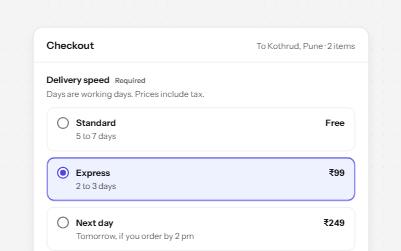
Native radio buttons in a fieldset, restyled with a dot that keeps its contrast, each option with a description and a price.
-
Text field
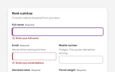
Text fields with visible labels, hints and errors tied to the input, the right keyboard and autofill, and units you can hear.
-
Inline validation
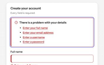
A sign-up form that checks each field as it is left, once typed in, with ticks and errors in words and a summary on submit.
-
Segmented control
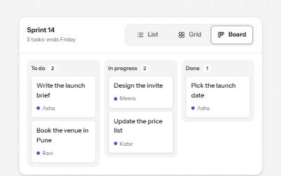
A row of joined segments for picking one of a few views, built from real radio buttons in a fieldset.