Accessibility pattern · Form inputs
Slider
A native range input already has the slider role, the arrow keys, Home and End; styling it keeps all of that, so the work is in the look, the words and the steps. aria-valuetext says "₹25,000 per month" instead of a bare number, and a number field beside it lets anyone type the exact amount instead of dragging.
- WCAG criteria
- 7
- Keyboard rules
- 6
- Checked with
- axe, keyboard and the inspector
Live demo
Try it
Use it with a mouse, a keyboard or a screen reader. The inspector beside it shows what the browser tells assistive technology as you go: focus, state changes and announcements.
The demo works without JavaScript only as far as its HTML does; the inspector needs JavaScript.
Keyboard
Keys it answers to
Every action works without a pointer.
| Key | What it does |
|---|---|
| Arrow Right or Arrow Up | Raises the rent by ₹500. |
| Arrow Left or Arrow Down | Lowers the rent by ₹500. |
| Page Up or Page Down | Raises or lowers it by ₹5,000, the same in every browser. |
| Home or End | Sets the lowest (₹10,000) or highest (₹50,000) amount. |
| Tab | Moves from the slider to the amount field, which always shows the same value. |
| Enter | In the amount field, checks the number and moves the slider to it, or says what to change. |
Screen readers
What it announces
Written from the roles, names and states in the markup.
| When | Expected announcement |
|---|---|
| Tab reaches the slider | Maximum rent, slider, ₹25,000 per month. Most two-bedroom flats in Pune rent for ₹18,000 to ₹30,000. |
| Arrow Right | ₹25,500 per month |
| End | ₹50,000 per month |
| Tab to the amount field | Or type an amount (₹ per month), edit text, 50,000 |
| Enter on a typed 23,250 | Use steps of ₹500, like ₹23,500. |
These are expected announcements, not recordings. Wording and order differ between screen readers and browsers.
Code
Copy the code
The exact files this demo runs on. The styles are served with a prefix that keeps this site's own styles out of the demo; what you copy is the original.
<div class="ap-slider" data-ap-slider data-region="IN">
  <div class="ap-slider__top">
    <label class="ap-slider__label" for="slider-range">Maximum rent</label>
    <output class="ap-slider__out" for="slider-range" aria-live="off" data-ap-out><span class="ap-slider__amount" data-ap-amount translate="no">₹25,000</span> <span class="ap-slider__per">per month</span></output>
  </div>
  <p class="ap-hint" id="slider-hint">Most two-bedroom flats in Pune rent for ₹18,000 to ₹30,000.</p>

  <div class="ap-slider__track">
    <input class="ap-slider__range" id="slider-range" type="range" min="10000" max="50000" step="500" value="25000" aria-valuetext="₹25,000 per month" aria-describedby="slider-hint" />
    <div class="ap-slider__ticks" aria-hidden="true">
      <span class="ap-slider__tick">₹10k</span>
      <span class="ap-slider__tick">₹20k</span>
      <span class="ap-slider__tick">₹30k</span>
      <span class="ap-slider__tick">₹40k</span>
      <span class="ap-slider__tick">₹50k</span>
    </div>
  </div>

  <div class="ap-field ap-slider__exact">
    <label class="ap-label" for="slider-amount">Or type an amount (₹ per month)</label>
    <p class="ap-hint" id="slider-amount-hint">From ₹10,000 to ₹50,000, in steps of ₹500.</p>
    <div class="ap-slider__money">
      <span class="ap-slider__prefix" aria-hidden="true">₹</span>
      <input class="ap-input ap-slider__input" id="slider-amount" type="text" inputmode="numeric" autocomplete="off" value="25,000" aria-describedby="slider-amount-hint slider-amount-error" />
    </div>
    <p class="ap-error ap-slider__error" id="slider-amount-error" aria-live="polite"><svg viewBox="0 0 24 24" aria-hidden="true" focusable="false"><circle cx="12" cy="12" r="9"/><path d="M12 7.5v5.5M12 16.5h.01"/></svg><span data-ap-error></span></p>
  </div>
</div>
/* Shared primitives: buttons and form fields used across the patterns.
   Uses the --ap-* design tokens. */

.ap-btn {
  display: inline-flex;
  align-items: center;
  justify-content: center;
  gap: 8px;
  min-height: 40px;
  padding: 0 16px;
  border: 1px solid var(--ap-border-strong);
  border-radius: var(--ap-radius-sm);
  background: var(--ap-surface);
  color: var(--ap-text);
  font: inherit;
  font-weight: 600;
  line-height: 1.2;
  text-decoration: none;
  white-space: nowrap;
  cursor: pointer;
  transition: background-color var(--ap-duration) var(--ap-ease), border-color var(--ap-duration) var(--ap-ease), box-shadow var(--ap-duration) var(--ap-ease);
}
.ap-btn:hover {
  background: var(--ap-surface-2);
}
.ap-btn:focus-visible {
  outline: 2px solid var(--ap-focus);
  outline-offset: 2px;
}
.ap-btn:disabled,
.ap-btn[aria-disabled="true"] {
  opacity: .55;
  cursor: not-allowed;
}
.ap-btn--primary {
  border-color: var(--ap-accent);
  background: var(--ap-accent);
  color: var(--ap-on-accent);
  box-shadow: var(--ap-shadow-sm);
}
.ap-btn--primary:hover {
  border-color: var(--ap-accent-hover);
  background: var(--ap-accent-hover);
}
.ap-btn--danger {
  border-color: var(--ap-danger);
  background: var(--ap-danger);
  color: var(--ap-surface);
}
.ap-btn--danger:hover {
  filter: brightness(1.08);
}
.ap-btn--ghost {
  border-color: transparent;
  background: transparent;
}
.ap-btn--ghost:hover {
  background: var(--ap-surface-2);
}
.ap-btn__icon {
  width: 18px;
  height: 18px;
  flex-shrink: 0;
  fill: none;
  stroke: currentColor;
  stroke-width: 2;
  stroke-linecap: round;
  stroke-linejoin: round;
}

.ap-field {
  display: grid;
  gap: 6px;
}
.ap-label {
  color: var(--ap-text);
  font-weight: 600;
  font-size: .9375rem;
}
.ap-hint {
  margin: 0;
  color: var(--ap-text-3);
  font-size: .875rem;
  line-height: 1.45;
}
.ap-error {
  display: flex;
  align-items: flex-start;
  gap: 6px;
  margin: 0;
  color: var(--ap-danger);
  font-size: .875rem;
  font-weight: 600;
  line-height: 1.45;
}
.ap-input {
  width: 100%;
  min-height: 44px;
  padding: 10px 12px;
  border: 1px solid var(--ap-border-strong);
  border-radius: var(--ap-radius-sm);
  background: var(--ap-surface);
  color: var(--ap-text);
  font: inherit;
  line-height: 1.4;
  transition: border-color var(--ap-duration) var(--ap-ease), box-shadow var(--ap-duration) var(--ap-ease);
}
.ap-input::placeholder {
  color: var(--ap-text-3);
}
.ap-input:hover {
  border-color: var(--ap-text-2);
}
.ap-input:focus-visible {
  outline: 2px solid var(--ap-focus);
  outline-offset: 1px;
  border-color: var(--ap-focus);
}
.ap-input[aria-invalid="true"] {
  border-color: var(--ap-danger);
  box-shadow: inset 4px 0 0 var(--ap-danger);
}
textarea.ap-input {
  resize: vertical;
  min-height: 88px;
}

@media (prefers-reduced-motion: reduce) {
  .ap-btn,
  .ap-input { transition: none; }
}

/* Slider. Uses the --ap-* design tokens and the shared primitives. */
.ap-slider {
  --ap-slider-thumb: 28px;
  display: grid;
  gap: 6px;
  width: min(100%, 500px);
  margin-inline: auto;
  padding: 22px 24px 24px;
  border: 1px solid var(--ap-border);
  border-radius: var(--ap-radius-lg);
  background: var(--ap-surface);
  color: var(--ap-text);
  box-shadow: var(--ap-shadow-md);
  font-family: var(--ap-font);
}

.ap-slider__top {
  display: flex;
  flex-wrap: wrap;
  align-items: baseline;
  justify-content: space-between;
  gap: 4px 16px;
}
.ap-slider__label {
  font-size: .9375rem;
  font-weight: 650;
}
.ap-slider__out {
  display: inline-flex;
  align-items: baseline;
  gap: 6px;
  color: var(--ap-text-3);
  font-size: .875rem;
}
.ap-slider__amount {
  color: var(--ap-text);
  font-size: 1.5rem;
  font-weight: 750;
  font-variant-numeric: tabular-nums;
  letter-spacing: -.01em;
}

/* The track: a native range input, restyled */
.ap-slider__track {
  margin: 14px 0 22px;
}
.ap-slider__range {
  display: block;
  width: 100%;
  height: var(--ap-slider-thumb);
  margin: 0;
  background: transparent;
  cursor: pointer;
  -webkit-appearance: none;
  appearance: none;
}
.ap-slider__range:focus-visible {
  outline: none;
}

/* Chromium and Safari: the fill is a gradient stop at the thumb's centre. */
.ap-slider__range::-webkit-slider-runnable-track {
  height: 8px;
  border-radius: var(--ap-radius-full);
  background: linear-gradient(to right,
    var(--ap-accent) 0 calc(var(--ap-slider-thumb) / 2 + var(--ap-slider-fill, .5) * (100% - var(--ap-slider-thumb))),
    var(--ap-surface-3) 0);
  box-shadow: inset 0 0 0 1px var(--ap-border-strong);
}
.ap-slider__range::-webkit-slider-thumb {
  width: var(--ap-slider-thumb);
  height: var(--ap-slider-thumb);
  margin-top: calc((8px - var(--ap-slider-thumb)) / 2);
  border: 3px solid var(--ap-accent);
  border-radius: var(--ap-radius-full);
  background: var(--ap-surface);
  box-shadow: var(--ap-shadow-md);
  -webkit-appearance: none;
  appearance: none;
  transition: transform var(--ap-duration) var(--ap-ease);
}
.ap-slider__range:active::-webkit-slider-thumb {
  transform: scale(1.08);
}
.ap-slider__range:focus-visible::-webkit-slider-thumb {
  box-shadow: 0 0 0 3px var(--ap-surface), 0 0 0 5px var(--ap-focus), var(--ap-shadow-md);
}

/* Firefox draws the fill itself. */
.ap-slider__range::-moz-range-track {
  height: 8px;
  border-radius: var(--ap-radius-full);
  background: var(--ap-surface-3);
  box-shadow: inset 0 0 0 1px var(--ap-border-strong);
}
.ap-slider__range::-moz-range-progress {
  height: 8px;
  border-radius: var(--ap-radius-full);
  background: var(--ap-accent);
}
.ap-slider__range::-moz-range-thumb {
  box-sizing: border-box;
  width: var(--ap-slider-thumb);
  height: var(--ap-slider-thumb);
  border: 3px solid var(--ap-accent);
  border-radius: var(--ap-radius-full);
  background: var(--ap-surface);
  box-shadow: var(--ap-shadow-md);
}
.ap-slider__range:focus-visible::-moz-range-thumb {
  box-shadow: 0 0 0 3px var(--ap-surface), 0 0 0 5px var(--ap-focus), var(--ap-shadow-md);
}

/* Tick labels sit under the thumb's centre at each end and every quarter. */
.ap-slider__ticks {
  display: flex;
  justify-content: space-between;
  margin-top: 8px;
  padding-inline: calc(var(--ap-slider-thumb) / 2);
}
.ap-slider__tick {
  display: flex;
  flex-direction: column;
  align-items: center;
  width: 0;
  color: var(--ap-text-3);
  font-size: .75rem;
  font-variant-numeric: tabular-nums;
  white-space: nowrap;
}
.ap-slider__tick::before {
  content: "";
  width: 1px;
  height: 6px;
  margin-bottom: 4px;
  background: var(--ap-border-strong);
}

/* The exact amount */
.ap-slider__exact {
  padding-top: 18px;
  border-top: 1px solid var(--ap-border);
}
.ap-slider__money {
  position: relative;
  width: min(100%, 13rem);
}
.ap-slider__prefix {
  position: absolute;
  top: 50%;
  left: 12px;
  color: var(--ap-text-3);
  font-weight: 600;
  transform: translateY(-50%);
  pointer-events: none;
}
.ap-slider__input {
  padding-left: 30px;
  font-variant-numeric: tabular-nums;
}
.ap-slider__error svg {
  width: 18px;
  height: 18px;
  flex-shrink: 0;
  margin-top: 1px;
  fill: none;
  stroke: currentColor;
  stroke-width: 2;
  stroke-linecap: round;
}
/* A live region: it stays in the page, taking no room until it has words. */
.ap-slider__error:has(> span:empty) {
  margin-top: -6px;
}
.ap-slider__error:has(> span:empty) svg {
  display: none;
}

@media (prefers-reduced-motion: reduce) {
  .ap-slider__range::-webkit-slider-thumb { transition: none; }
  .ap-slider__range:active::-webkit-slider-thumb { transform: none; }
}
/**
 * Slider: a styled native input type=range with a visible output, an
 * aria-valuetext taken from that output, fixed Page Up and Page Down steps,
 * and a text field (inputmode=numeric) kept in sync as another way in.
 *
 * Markup: [data-ap-slider] holding an input[type=range] with min, max and
 * step, an output[aria-live=off][data-ap-out] with the amount in
 * [data-ap-amount], an input[inputmode=numeric] for typing, and an error
 * [data-ap-error] in a polite live region. data-region (for example "IN") is
 * added to a bare page language when amounts are formatted.
 */

const PAGE = 10; // steps moved by Page Up and Page Down

const TEXT = {
  nan: "Enter an amount in rupees, like 25,000.",
  range: "Enter an amount from ₹10,000 to ₹50,000.",
  step: "Use steps of ₹500, like ₹23,500.",
};

export function init(root) {
  const range = root.querySelector("input[type=range]");
  const out = root.querySelector("[data-ap-out]");
  const amount = out.querySelector("[data-ap-amount]");
  const field = root.querySelector("input[inputmode]");
  const error = root.querySelector("[data-ap-error]");
  const min = Number(range.min);
  const max = Number(range.max);
  const step = Number(range.step);
  const region = root.dataset.region;
  const lang = root.closest("[lang]")?.lang || navigator.language;
  const locale = region && !lang.includes("-") ? `${lang}-${region}` : lang;
  const money = new Intl.NumberFormat(locale, { style: "currency", currency: "INR", minimumFractionDigits: 0, maximumFractionDigits: 0 });
  const plain = new Intl.NumberFormat(locale, { maximumFractionDigits: 0 });

  function showError(message) {
    if (error.textContent !== message) error.textContent = message;
    if (message) field.setAttribute("aria-invalid", "true");
    else field.removeAttribute("aria-invalid");
  }

  /** Paints the value everywhere: the output, the fill, aria-valuetext and (optionally) the field. */
  function paint({ toField = true } = {}) {
    const value = Number(range.value);
    amount.textContent = money.format(value);
    range.style.setProperty("--ap-slider-fill", String((value - min) / (max - min)));
    // Read back from the output, so the words match what is on screen, in its language.
    range.setAttribute("aria-valuetext", out.textContent.replace(/\s+/g, " ").trim());
    if (toField) {
      field.value = plain.format(value);
      showError("");
    }
  }

  /** What is wrong with the typed amount, or "" with the number to use. */
  function readField() {
    const raw = field.value.replace(/[₹,\s]/g, "");
    if (!/^\d+$/.test(raw)) return { problem: TEXT.nan };
    const n = Number(raw);
    if (n < min || n > max) return { problem: TEXT.range };
    if ((n - min) % step !== 0) return { problem: TEXT.step };
    return { value: n, problem: "" };
  }

  function onRangeInput() {
    paint();
  }

  // Page Up and Page Down differ between browsers; make them the same everywhere.
  function onRangeKey(event) {
    if (event.key !== "PageUp" && event.key !== "PageDown") return;
    event.preventDefault();
    const dir = event.key === "PageUp" ? 1 : -1;
    const next = Math.min(max, Math.max(min, Number(range.value) + dir * PAGE * step));
    if (next === Number(range.value)) return;
    range.value = String(next);
    range.dispatchEvent(new Event("input", { bubbles: true }));
    range.dispatchEvent(new Event("change", { bubbles: true }));
  }

  // While typing, the slider follows any amount it can show; errors wait until Enter or leaving.
  function onFieldInput() {
    const { value, problem } = readField();
    if (!problem) {
      range.value = String(value);
      paint({ toField: false });
      showError("");
    } else if (error.textContent) {
      showError(problem);
    }
  }

  function commitField() {
    const { value, problem } = readField();
    if (problem) {
      showError(problem);
      return;
    }
    range.value = String(value);
    paint();
  }

  function onFieldKey(event) {
    if (event.key === "Enter") commitField();
  }

  range.addEventListener("input", onRangeInput);
  range.addEventListener("keydown", onRangeKey);
  field.addEventListener("input", onFieldInput);
  field.addEventListener("change", commitField);
  field.addEventListener("keydown", onFieldKey);
  paint();

  return () => {
    range.removeEventListener("input", onRangeInput);
    range.removeEventListener("keydown", onRangeKey);
    field.removeEventListener("input", onFieldInput);
    field.removeEventListener("change", commitField);
    field.removeEventListener("keydown", onFieldKey);
  };
}

for (const root of document.querySelectorAll("[data-ap-slider]")) init(root);
/* Design tokens for the pattern components. Light by default, dark when the
   system asks for it; set data-theme="dark" on :root to force dark. */
:root {
    --ap-radius-sm: 8px;
    --ap-radius: 12px;
    --ap-radius-lg: 16px;
    --ap-radius-full: 999px;
    --ap-font: "Instrument Sans", ui-sans-serif, system-ui, -apple-system, "Segoe UI", Roboto, sans-serif;
    --ap-mono: "JetBrains Mono", ui-monospace, "Cascadia Mono", "SF Mono", Consolas, monospace;
    --ap-ease: cubic-bezier(.2, .8, .2, 1);
    --ap-duration: 180ms;
    --ap-target: 44px;
    --ap-bg: #F4F4F5;
    --ap-surface: #FFFFFF;
    --ap-surface-2: #F4F4F5;
    --ap-surface-3: #E4E4E7;
    --ap-border: #E4E4E7;
    --ap-border-strong: #76767F;
    --ap-text: #18181B;
    --ap-text-2: #3F3F46;
    --ap-text-3: #5E5E66;
    --ap-accent: #4F46E5;
    --ap-accent-hover: #4338CA;
    --ap-on-accent: #FFFFFF;
    --ap-accent-text: #4338CA;
    --ap-accent-soft: #EEF2FF;
    --ap-accent-soft-text: #3730A3;
    --ap-focus: #4F46E5;
    --ap-danger: #B91C1C;
    --ap-danger-soft: #FEF2F2;
    --ap-success: #15803D;
    --ap-success-soft: #F0FDF4;
    --ap-warning: #A15C07;
    --ap-warning-soft: #FEFCE8;
    --ap-info: #1D4ED8;
    --ap-info-soft: #EFF6FF;
    --ap-scrim: rgb(9 9 11 / .48);
    --ap-shadow-sm: 0 1px 2px rgb(9 9 11 / .06);
    --ap-shadow-md: 0 1px 2px rgb(9 9 11 / .05), 0 6px 16px -4px rgb(9 9 11 / .1);
    --ap-shadow-lg: 0 2px 6px rgb(9 9 11 / .06), 0 20px 40px -12px rgb(9 9 11 / .22);
    --ap-light-bg: #F4F4F5;
    --ap-light-surface: #FFFFFF;
    --ap-light-surface-2: #F4F4F5;
    --ap-light-surface-3: #E4E4E7;
    --ap-light-border: #E4E4E7;
    --ap-light-border-strong: #76767F;
    --ap-light-text: #18181B;
    --ap-light-text-2: #3F3F46;
    --ap-light-text-3: #5E5E66;
    --ap-light-accent: #4F46E5;
    --ap-light-accent-hover: #4338CA;
    --ap-light-on-accent: #FFFFFF;
    --ap-light-accent-text: #4338CA;
    --ap-light-accent-soft: #EEF2FF;
    --ap-light-accent-soft-text: #3730A3;
    --ap-light-focus: #4F46E5;
    --ap-light-danger: #B91C1C;
    --ap-light-danger-soft: #FEF2F2;
    --ap-light-success: #15803D;
    --ap-light-success-soft: #F0FDF4;
    --ap-light-warning: #A15C07;
    --ap-light-warning-soft: #FEFCE8;
    --ap-light-info: #1D4ED8;
    --ap-light-info-soft: #EFF6FF;
    --ap-light-scrim: rgb(9 9 11 / .48);
    --ap-light-shadow-sm: 0 1px 2px rgb(9 9 11 / .06);
    --ap-light-shadow-md: 0 1px 2px rgb(9 9 11 / .05), 0 6px 16px -4px rgb(9 9 11 / .1);
    --ap-light-shadow-lg: 0 2px 6px rgb(9 9 11 / .06), 0 20px 40px -12px rgb(9 9 11 / .22);
    --ap-dark-bg: #09090B;
    --ap-dark-surface: #18181B;
    --ap-dark-surface-2: #27272A;
    --ap-dark-surface-3: #3F3F46;
    --ap-dark-border: #2E2E33;
    --ap-dark-border-strong: #8E8E97;
    --ap-dark-text: #FAFAFA;
    --ap-dark-text-2: #D4D4D8;
    --ap-dark-text-3: #A1A1AA;
    --ap-dark-accent: #818CF8;
    --ap-dark-accent-hover: #A5B4FC;
    --ap-dark-on-accent: #0C0A1F;
    --ap-dark-accent-text: #A5B4FC;
    --ap-dark-accent-soft: #1E1B4B;
    --ap-dark-accent-soft-text: #C7D2FE;
    --ap-dark-focus: #A5B4FC;
    --ap-dark-danger: #F87171;
    --ap-dark-danger-soft: #2A1215;
    --ap-dark-success: #4ADE80;
    --ap-dark-success-soft: #0F2A1A;
    --ap-dark-warning: #FACC15;
    --ap-dark-warning-soft: #2A2410;
    --ap-dark-info: #60A5FA;
    --ap-dark-info-soft: #0F1D33;
    --ap-dark-scrim: rgb(0 0 0 / .62);
    --ap-dark-shadow-sm: 0 1px 2px rgb(0 0 0 / .4);
    --ap-dark-shadow-md: 0 1px 2px rgb(0 0 0 / .4), 0 8px 20px -6px rgb(0 0 0 / .5);
    --ap-dark-shadow-lg: 0 2px 8px rgb(0 0 0 / .45), 0 24px 48px -12px rgb(0 0 0 / .7);
}
@media (prefers-color-scheme: dark) {
  :root:not([data-theme="light"]) {
      --ap-bg: #09090B;
      --ap-surface: #18181B;
      --ap-surface-2: #27272A;
      --ap-surface-3: #3F3F46;
      --ap-border: #2E2E33;
      --ap-border-strong: #8E8E97;
      --ap-text: #FAFAFA;
      --ap-text-2: #D4D4D8;
      --ap-text-3: #A1A1AA;
      --ap-accent: #818CF8;
      --ap-accent-hover: #A5B4FC;
      --ap-on-accent: #0C0A1F;
      --ap-accent-text: #A5B4FC;
      --ap-accent-soft: #1E1B4B;
      --ap-accent-soft-text: #C7D2FE;
      --ap-focus: #A5B4FC;
      --ap-danger: #F87171;
      --ap-danger-soft: #2A1215;
      --ap-success: #4ADE80;
      --ap-success-soft: #0F2A1A;
      --ap-warning: #FACC15;
      --ap-warning-soft: #2A2410;
      --ap-info: #60A5FA;
      --ap-info-soft: #0F1D33;
      --ap-scrim: rgb(0 0 0 / .62);
      --ap-shadow-sm: 0 1px 2px rgb(0 0 0 / .4);
      --ap-shadow-md: 0 1px 2px rgb(0 0 0 / .4), 0 8px 20px -6px rgb(0 0 0 / .5);
      --ap-shadow-lg: 0 2px 8px rgb(0 0 0 / .45), 0 24px 48px -12px rgb(0 0 0 / .7);
  }
}
:root[data-theme="dark"] {
    --ap-bg: #09090B;
    --ap-surface: #18181B;
    --ap-surface-2: #27272A;
    --ap-surface-3: #3F3F46;
    --ap-border: #2E2E33;
    --ap-border-strong: #8E8E97;
    --ap-text: #FAFAFA;
    --ap-text-2: #D4D4D8;
    --ap-text-3: #A1A1AA;
    --ap-accent: #818CF8;
    --ap-accent-hover: #A5B4FC;
    --ap-on-accent: #0C0A1F;
    --ap-accent-text: #A5B4FC;
    --ap-accent-soft: #1E1B4B;
    --ap-accent-soft-text: #C7D2FE;
    --ap-focus: #A5B4FC;
    --ap-danger: #F87171;
    --ap-danger-soft: #2A1215;
    --ap-success: #4ADE80;
    --ap-success-soft: #0F2A1A;
    --ap-warning: #FACC15;
    --ap-warning-soft: #2A2410;
    --ap-info: #60A5FA;
    --ap-info-soft: #0F1D33;
    --ap-scrim: rgb(0 0 0 / .62);
    --ap-shadow-sm: 0 1px 2px rgb(0 0 0 / .4);
    --ap-shadow-md: 0 1px 2px rgb(0 0 0 / .4), 0 8px 20px -6px rgb(0 0 0 / .5);
    --ap-shadow-lg: 0 2px 8px rgb(0 0 0 / .45), 0 24px 48px -12px rgb(0 0 0 / .7);
}
WCAG 2.2
What it meets
The success criteria this pattern takes care of, and how.
-
1.3.1 Info and Relationships
Level A
The label names the slider, the output is tied to it with for, and the hint is its description.
-
1.4.11 Non-text Contrast
Level AA
The thumb's accent ring and the filled part of the track clear 3:1 against the card, and the track has a 3:1 edge.
-
2.1.1 Keyboard
Level A
The arrow keys, Page Up, Page Down, Home and End all move the slider, and the amount can be typed instead.
-
2.4.7 Focus Visible
Level AA
The thumb gets a double ring, surface then focus color, so it shows on the fill and off it.
-
2.5.7 Dragging Movements
Level AA
Dragging is never needed: a tap on the track jumps there, and the number field takes the exact amount.
-
2.5.8 Target Size (Minimum)
Level AA
The thumb is 28 pixels across, and the whole 28-pixel-high track takes taps.
-
4.1.2 Name, Role, Value
Level A
The native range input exposes role, minimum, maximum and value; aria-valuetext adds the currency and the period.
Usage
When to use it
Use it
- Choosing a value in a range where roughly right is fine and seeing the position helps, like a budget, a volume or a radius.
- Filters people adjust and watch the results of.
Use something else
- Exact values people already know: a number field is faster and more precise.
- A small set of named steps, like Small, Medium and Large: use radio buttons.
- Ranges with two ends, like a price from and to: use a range slider with two thumbs.
Common failures
How it usually goes wrong
A slider with no number
People cannot tell ₹24,500 from ₹25,000 by thumb position. The value is shown beside the label and can be typed.
Bare numbers read aloud
"25000" could be anything. aria-valuetext reads "₹25,000 per month", taken from the same text the screen shows.
A thumb too small to grab
The default thumb is about 16 pixels. This one is 28, with a track that takes taps along its full height.
A div rebuilt as a slider
A custom slider has to rebuild the role, the values and every key. The native range input has them; CSS only changes its look.
Focus hidden by the restyle
appearance: none removes the browser's focus ring along with its look. The thumb gets its own two-ring focus style.
Two inputs that disagree
A number field that does not follow the slider shows two different answers. Each one updates the other as it changes.
Notes
Building it
- Page Up and Page Down move by different amounts in different browsers (Chrome uses a tenth of the range). The script sets them to ₹5,000 everywhere and says so in the keyboard table.
- The output element is a live region by default; aria-live="off" stops it repeating what the slider already announces on every step.
- The fill is a gradient on the track, positioned from a custom property the script sets; Firefox draws it with ::-moz-range-progress instead.
- aria-valuetext is copied from the output's text, so when the page is translated, the units follow the translation.
- The tick labels repeat the minimum, maximum and the steps between, so they are hidden from screen readers rather than read before the slider.
Sources: WAI-ARIA Authoring Practices: Slider · MDN: input type="range"
Checked with axe in light and dark themes, at desktop and phone widths, and by keyboard. Not yet tested with every screen reader and browser pair. Report a correction
Related
Patterns that go with it
-
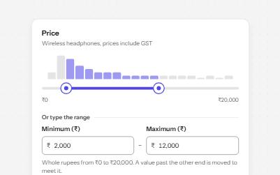
Range slider
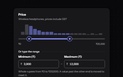
Two thumbs on one track that set a minimum and a maximum, with typed fields as an alternative and a live result count.
-
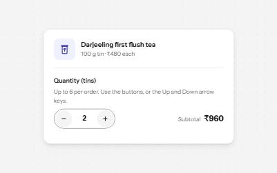
Number input
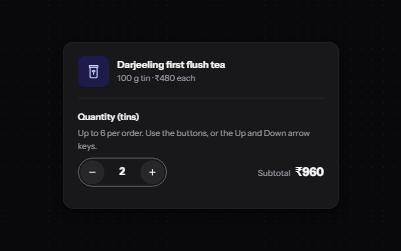
A quantity field with minus and plus buttons, arrow-key steps, limits it explains, and a total that keeps up.
-
Search filters
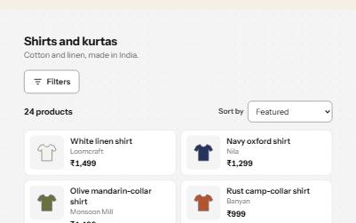
A product filter panel: grouped checkboxes with counts, a price range, sort, removable chips and a result count that is announced.