Accessibility pattern · Form inputs
Checkbox group with select all
A fieldset and legend name the group, so each option is announced with the question it answers. Select all is a native checkbox whose indeterminate state follows the options both ways, and a polite status says how many of them are chosen.
- WCAG criteria
- 6
- Keyboard rules
- 4
- Checked with
- axe, keyboard and the inspector
Live demo
Try it
Use it with a mouse, a keyboard or a screen reader. The inspector beside it shows what the browser tells assistive technology as you go: focus, state changes and announcements.
The demo works without JavaScript only as far as its HTML does; the inspector needs JavaScript.
Keyboard
Keys it answers to
Every action works without a pointer.
| Key | What it does |
|---|---|
| Tab | Moves to Select all, then through each option in turn; every checkbox is its own stop. |
| ShiftTab | Moves back through the options. |
| Space | On Select all, ticks every option, or clears them all when all are ticked. On an option, ticks or clears it and Select all follows. |
| Enter | On Save preferences, saves the choices. |
Screen readers
What it announces
Written from the roles, names and states in the markup.
| When | Expected announcement |
|---|---|
| Tab enters the group | Email me about, group. Security alerts are always sent… Select all, checkbox, partly checked |
| Space on Select all | Checked, then: 5 selected out of 5 |
| Space clears one option | Not checked, then: 4 selected out of 5 |
| Focus returns to Select all | Select all, checkbox, partly checked |
| With the option on, Space on Select all three times | Checked … Not checked … Partly checked, and your earlier picks are back |
| Save preferences is pressed | Preferences saved |
These are expected announcements, not recordings. Wording and order differ between screen readers and browsers.
Code
Copy the code
The exact files this demo runs on. The styles are served with a prefix that keeps this site's own styles out of the demo; what you copy is the original.
<form class="ap-checkbox-group" data-ap-checkbox-group novalidate aria-labelledby="cbg-form-name">
  <div class="ap-checkbox-group__top">
    <h3 class="ap-checkbox-group__name" id="cbg-form-name">Notifications</h3>
    <p class="ap-checkbox-group__sub">Sent to [email protected]</p>
  </div>

  <fieldset class="ap-checkbox-group__set" aria-describedby="cbg-hint">
    <legend class="ap-checkbox-group__legend">Email me about</legend>
    <p class="ap-checkbox-group__hint" id="cbg-hint">Security alerts are always sent, so they are not listed.</p>

    <div class="ap-checkbox-group__head">
      <div class="ap-checkbox-group__row ap-checkbox-group__row--all">
        <input class="ap-checkbox-group__box" type="checkbox" id="cbg-all" aria-controls="cbg-orders cbg-prices cbg-arrivals cbg-offers cbg-tips" />
        <div class="ap-checkbox-group__text">
          <label class="ap-checkbox-group__label" for="cbg-all">Select all</label>
        </div>
      </div>
      <p class="ap-checkbox-group__count" role="status" aria-atomic="true"><span class="ap-checkbox-group__n" data-ap-on>3</span> <span>selected out of</span> <span class="ap-checkbox-group__n" data-ap-total>5</span></p>
    </div>

    <div class="ap-checkbox-group__options">
      <div class="ap-checkbox-group__row">
        <input class="ap-checkbox-group__box" type="checkbox" id="cbg-orders" name="topics" value="orders" aria-describedby="cbg-orders-desc" checked />
        <div class="ap-checkbox-group__text">
          <label class="ap-checkbox-group__label" for="cbg-orders">Order updates</label>
          <p class="ap-checkbox-group__desc" id="cbg-orders-desc">Shipping, delivery and returns.</p>
        </div>
      </div>
      <div class="ap-checkbox-group__row">
        <input class="ap-checkbox-group__box" type="checkbox" id="cbg-prices" name="topics" value="prices" aria-describedby="cbg-prices-desc" checked />
        <div class="ap-checkbox-group__text">
          <label class="ap-checkbox-group__label" for="cbg-prices">Price drops</label>
          <p class="ap-checkbox-group__desc" id="cbg-prices-desc">When something on your wishlist gets cheaper.</p>
        </div>
      </div>
      <div class="ap-checkbox-group__row">
        <input class="ap-checkbox-group__box" type="checkbox" id="cbg-arrivals" name="topics" value="arrivals" aria-describedby="cbg-arrivals-desc" checked />
        <div class="ap-checkbox-group__text">
          <label class="ap-checkbox-group__label" for="cbg-arrivals">New arrivals</label>
          <p class="ap-checkbox-group__desc" id="cbg-arrivals-desc">A weekly round-up from makers you follow.</p>
        </div>
      </div>
      <div class="ap-checkbox-group__row">
        <input class="ap-checkbox-group__box" type="checkbox" id="cbg-offers" name="topics" value="offers" aria-describedby="cbg-offers-desc" />
        <div class="ap-checkbox-group__text">
          <label class="ap-checkbox-group__label" for="cbg-offers">Offers and sales</label>
          <p class="ap-checkbox-group__desc" id="cbg-offers-desc">Festival sales and coupon codes.</p>
        </div>
      </div>
      <div class="ap-checkbox-group__row">
        <input class="ap-checkbox-group__box" type="checkbox" id="cbg-tips" name="topics" value="tips" aria-describedby="cbg-tips-desc" />
        <div class="ap-checkbox-group__text">
          <label class="ap-checkbox-group__label" for="cbg-tips">Tips and guides</label>
          <p class="ap-checkbox-group__desc" id="cbg-tips-desc">Getting more from your account, once a month.</p>
        </div>
      </div>
    </div>
  </fieldset>

  <div class="ap-checkbox-group__foot">
    <p class="ap-checkbox-group__saved" role="status"></p>
    <button type="submit" class="ap-btn ap-btn--primary">Save preferences</button>
  </div>
</form>
/* Shared primitives: buttons and form fields used across the patterns.
   Uses the --ap-* design tokens. */

.ap-btn {
  display: inline-flex;
  align-items: center;
  justify-content: center;
  gap: 8px;
  min-height: 40px;
  padding: 0 16px;
  border: 1px solid var(--ap-border-strong);
  border-radius: var(--ap-radius-sm);
  background: var(--ap-surface);
  color: var(--ap-text);
  font: inherit;
  font-weight: 600;
  line-height: 1.2;
  text-decoration: none;
  white-space: nowrap;
  cursor: pointer;
  transition: background-color var(--ap-duration) var(--ap-ease), border-color var(--ap-duration) var(--ap-ease), box-shadow var(--ap-duration) var(--ap-ease);
}
.ap-btn:hover {
  background: var(--ap-surface-2);
}
.ap-btn:focus-visible {
  outline: 2px solid var(--ap-focus);
  outline-offset: 2px;
}
.ap-btn:disabled,
.ap-btn[aria-disabled="true"] {
  opacity: .55;
  cursor: not-allowed;
}
.ap-btn--primary {
  border-color: var(--ap-accent);
  background: var(--ap-accent);
  color: var(--ap-on-accent);
  box-shadow: var(--ap-shadow-sm);
}
.ap-btn--primary:hover {
  border-color: var(--ap-accent-hover);
  background: var(--ap-accent-hover);
}
.ap-btn--danger {
  border-color: var(--ap-danger);
  background: var(--ap-danger);
  color: var(--ap-surface);
}
.ap-btn--danger:hover {
  filter: brightness(1.08);
}
.ap-btn--ghost {
  border-color: transparent;
  background: transparent;
}
.ap-btn--ghost:hover {
  background: var(--ap-surface-2);
}
.ap-btn__icon {
  width: 18px;
  height: 18px;
  flex-shrink: 0;
  fill: none;
  stroke: currentColor;
  stroke-width: 2;
  stroke-linecap: round;
  stroke-linejoin: round;
}

.ap-field {
  display: grid;
  gap: 6px;
}
.ap-label {
  color: var(--ap-text);
  font-weight: 600;
  font-size: .9375rem;
}
.ap-hint {
  margin: 0;
  color: var(--ap-text-3);
  font-size: .875rem;
  line-height: 1.45;
}
.ap-error {
  display: flex;
  align-items: flex-start;
  gap: 6px;
  margin: 0;
  color: var(--ap-danger);
  font-size: .875rem;
  font-weight: 600;
  line-height: 1.45;
}
.ap-input {
  width: 100%;
  min-height: 44px;
  padding: 10px 12px;
  border: 1px solid var(--ap-border-strong);
  border-radius: var(--ap-radius-sm);
  background: var(--ap-surface);
  color: var(--ap-text);
  font: inherit;
  line-height: 1.4;
  transition: border-color var(--ap-duration) var(--ap-ease), box-shadow var(--ap-duration) var(--ap-ease);
}
.ap-input::placeholder {
  color: var(--ap-text-3);
}
.ap-input:hover {
  border-color: var(--ap-text-2);
}
.ap-input:focus-visible {
  outline: 2px solid var(--ap-focus);
  outline-offset: 1px;
  border-color: var(--ap-focus);
}
.ap-input[aria-invalid="true"] {
  border-color: var(--ap-danger);
  box-shadow: inset 4px 0 0 var(--ap-danger);
}
textarea.ap-input {
  resize: vertical;
  min-height: 88px;
}

@media (prefers-reduced-motion: reduce) {
  .ap-btn,
  .ap-input { transition: none; }
}

/* Checkbox group with Select all. Uses the --ap-* design tokens and the shared primitives. */
.ap-checkbox-group {
  width: min(100%, 540px);
  margin-inline: auto;
  border: 1px solid var(--ap-border);
  border-radius: var(--ap-radius-lg);
  background: var(--ap-surface);
  color: var(--ap-text);
  box-shadow: var(--ap-shadow-md);
  container-type: inline-size;
}

.ap-checkbox-group__top {
  padding: 18px 22px 16px;
  border-bottom: 1px solid var(--ap-border);
}
.ap-checkbox-group__name {
  margin: 0;
  font-size: 1.0625rem;
  font-weight: 650;
  line-height: 1.3;
}
.ap-checkbox-group__sub {
  margin: 2px 0 0;
  color: var(--ap-text-3);
  font-size: .8125rem;
  overflow-wrap: anywhere;
}

/* The group */
.ap-checkbox-group__set {
  min-width: 0;
  margin: 0;
  padding: 0 10px 10px;
  border: 0;
}
.ap-checkbox-group__legend {
  padding: 16px 12px 0;
  color: var(--ap-text);
  font-size: .9375rem;
  font-weight: 650;
}
.ap-checkbox-group__hint {
  margin: 2px 12px 10px;
  color: var(--ap-text-3);
  font-size: .875rem;
  line-height: 1.45;
}

/* Select all, with the count beside it */
.ap-checkbox-group__head {
  display: flex;
  flex-wrap: wrap;
  align-items: center;
  justify-content: space-between;
  gap: 0 12px;
  margin-bottom: 4px;
  padding-bottom: 4px;
  border-bottom: 1px solid var(--ap-border);
}
.ap-checkbox-group__row--all {
  flex: 1 1 auto;
}
.ap-checkbox-group__count {
  margin: 0 8px 0 0;
  padding: 4px 12px;
  border-radius: var(--ap-radius-full);
  background: var(--ap-surface-2);
  color: var(--ap-text-2);
  font-size: .8125rem;
  white-space: nowrap;
}
.ap-checkbox-group__n {
  color: var(--ap-text);
  font-weight: 650;
  font-variant-numeric: tabular-nums;
}

.ap-checkbox-group__options {
  display: grid;
  gap: 2px;
}

/* A row: the label's ::after covers it, so the full row is the target. */
.ap-checkbox-group__row {
  position: relative;
  display: flex;
  align-items: flex-start;
  gap: 12px;
  min-height: var(--ap-target);
  padding: 11px 12px;
  border-radius: var(--ap-radius-sm);
  transition: background-color var(--ap-duration) var(--ap-ease);
}
.ap-checkbox-group__row:hover {
  background: var(--ap-surface-2);
}
.ap-checkbox-group__row:has(.ap-checkbox-group__box:focus-visible) {
  outline: 2px solid var(--ap-focus);
  outline-offset: -2px;
}
.ap-checkbox-group__text {
  display: grid;
  gap: 2px;
  min-width: 0;
}
.ap-checkbox-group__label {
  color: var(--ap-text);
  font-weight: 600;
  line-height: 1.4;
  cursor: pointer;
}
.ap-checkbox-group__label::after {
  content: "";
  position: absolute;
  inset: 0;
  border-radius: inherit;
}
.ap-checkbox-group__desc {
  margin: 0;
  color: var(--ap-text-3);
  font-size: .875rem;
  line-height: 1.45;
}

/* The box: a native checkbox, redrawn */
.ap-checkbox-group__box {
  appearance: none;
  display: grid;
  flex-shrink: 0;
  place-content: center;
  width: 20px;
  height: 20px;
  margin: 1px 0 0;
  border: 2px solid var(--ap-border-strong);
  border-radius: 6px;
  background: var(--ap-surface);
  cursor: pointer;
  transition: background-color var(--ap-duration) var(--ap-ease), border-color var(--ap-duration) var(--ap-ease);
}
.ap-checkbox-group__box:focus-visible {
  outline: none;
}
.ap-checkbox-group__box::before {
  content: "";
  width: 10px;
  height: 5px;
  margin-top: -2px;
  border: solid var(--ap-on-accent);
  border-width: 0 0 2.5px 2.5px;
  transform: rotate(-45deg) scale(0);
  transition: transform var(--ap-duration) var(--ap-ease);
}
.ap-checkbox-group__box:checked,
.ap-checkbox-group__box:indeterminate {
  border-color: var(--ap-accent);
  background: var(--ap-accent);
}
.ap-checkbox-group__box:checked::before {
  transform: rotate(-45deg) scale(1);
}
.ap-checkbox-group__box:indeterminate::before {
  width: 10px;
  height: 0;
  margin-top: 0;
  border-width: 0 0 2.5px;
  border-radius: 2px;
  transform: none;
}

.ap-checkbox-group__foot {
  display: flex;
  flex-wrap: wrap;
  align-items: center;
  justify-content: space-between;
  gap: 0 16px;
  padding: 14px 22px;
  border-top: 1px solid var(--ap-border);
  border-radius: 0 0 var(--ap-radius-lg) var(--ap-radius-lg);
  background: var(--ap-surface-2);
}
.ap-checkbox-group__saved {
  flex: 1 1 160px;
  margin: 0;
  color: var(--ap-success);
  font-size: .9375rem;
  font-weight: 600;
}
.ap-checkbox-group__foot .ap-btn {
  min-height: var(--ap-target);
  margin-left: auto;
}

@container (max-width: 420px) {
  .ap-checkbox-group__top { padding: 16px 18px 14px; }
  .ap-checkbox-group__set { padding: 0 6px 8px; }
  .ap-checkbox-group__foot { padding: 14px 18px; }
  .ap-checkbox-group__saved:not(:empty) { flex-basis: 100%; margin-bottom: 10px; }
  .ap-checkbox-group__foot .ap-btn { flex: 1 1 100%; }
}

@media (forced-colors: active) {
  .ap-checkbox-group__box:is(:checked, :indeterminate) {
    forced-color-adjust: none;
    border-color: Highlight;
    background: Highlight;
  }
  .ap-checkbox-group__box::before { border-color: HighlightText; }
}

@media (prefers-reduced-motion: reduce) {
  .ap-checkbox-group__row,
  .ap-checkbox-group__box,
  .ap-checkbox-group__box::before { transition: none; }
}
/**
 * Checkbox group with Select all: a fieldset of native checkboxes, a parent
 * that is checked, clear or mixed to match them, and a live count.
 *
 * Markup: form[data-ap-checkbox-group] > fieldset with a legend, a Select all
 * input[aria-controls="<option ids>"], a p[role=status][aria-atomic=true]
 * holding [data-ap-on] and [data-ap-total], and the option checkboxes. Add
 * data-restore to the root for the WAI-ARIA tri-state cycle: from clear,
 * Select all brings back the last partial choice.
 */

export function init(root) {
  const all = root.querySelector("input[type=checkbox][aria-controls]");
  const options = all.getAttribute("aria-controls").split(/\s+/).map((id) => document.getElementById(id)).filter(Boolean);
  // Look these up each time: a translated page may rebuild text inside them.
  const count = () => root.querySelector("[aria-atomic=true][role=status]");
  const saved = () => root.querySelector(".ap-checkbox-group__foot [role=status]");
  let partial = null; // the options ticked the last time the choice was mixed

  const ticked = () => options.filter((o) => o.checked);

  function sync() {
    const on = ticked().length;
    all.checked = on === options.length;
    all.indeterminate = on > 0 && on < options.length;
    if (all.indeterminate) partial = new Set(ticked());
  }

  function showCount() {
    const region = count();
    region.querySelector("[data-ap-on]").textContent = String(ticked().length);
    region.querySelector("[data-ap-total]").textContent = String(options.length);
  }

  function onChange(event) {
    const box = event.target;
    if (box !== all && !options.includes(box)) return;
    if (saved().textContent) saved().textContent = "";
    if (box === all) {
      // Decide from the options, not from the box's own new value.
      const on = ticked().length;
      let next;
      if (on === options.length) next = new Set();
      else if (on === 0 && root.hasAttribute("data-restore") && partial) next = partial;
      else next = new Set(options);
      for (const o of options) o.checked = next.has(o);
    }
    sync();
    showCount();
  }

  function onSubmit(event) {
    event.preventDefault();
    const region = saved();
    region.textContent = "";
    requestAnimationFrame(() => { region.textContent = "Preferences saved"; });
  }

  sync();
  root.addEventListener("change", onChange);
  root.addEventListener("submit", onSubmit);
  return () => {
    root.removeEventListener("change", onChange);
    root.removeEventListener("submit", onSubmit);
  };
}

for (const root of document.querySelectorAll("[data-ap-checkbox-group]")) init(root);
/* Design tokens for the pattern components. Light by default, dark when the
   system asks for it; set data-theme="dark" on :root to force dark. */
:root {
    --ap-radius-sm: 8px;
    --ap-radius: 12px;
    --ap-radius-lg: 16px;
    --ap-radius-full: 999px;
    --ap-font: "Instrument Sans", ui-sans-serif, system-ui, -apple-system, "Segoe UI", Roboto, sans-serif;
    --ap-mono: "JetBrains Mono", ui-monospace, "Cascadia Mono", "SF Mono", Consolas, monospace;
    --ap-ease: cubic-bezier(.2, .8, .2, 1);
    --ap-duration: 180ms;
    --ap-target: 44px;
    --ap-bg: #F4F4F5;
    --ap-surface: #FFFFFF;
    --ap-surface-2: #F4F4F5;
    --ap-surface-3: #E4E4E7;
    --ap-border: #E4E4E7;
    --ap-border-strong: #76767F;
    --ap-text: #18181B;
    --ap-text-2: #3F3F46;
    --ap-text-3: #5E5E66;
    --ap-accent: #4F46E5;
    --ap-accent-hover: #4338CA;
    --ap-on-accent: #FFFFFF;
    --ap-accent-text: #4338CA;
    --ap-accent-soft: #EEF2FF;
    --ap-accent-soft-text: #3730A3;
    --ap-focus: #4F46E5;
    --ap-danger: #B91C1C;
    --ap-danger-soft: #FEF2F2;
    --ap-success: #15803D;
    --ap-success-soft: #F0FDF4;
    --ap-warning: #A15C07;
    --ap-warning-soft: #FEFCE8;
    --ap-info: #1D4ED8;
    --ap-info-soft: #EFF6FF;
    --ap-scrim: rgb(9 9 11 / .48);
    --ap-shadow-sm: 0 1px 2px rgb(9 9 11 / .06);
    --ap-shadow-md: 0 1px 2px rgb(9 9 11 / .05), 0 6px 16px -4px rgb(9 9 11 / .1);
    --ap-shadow-lg: 0 2px 6px rgb(9 9 11 / .06), 0 20px 40px -12px rgb(9 9 11 / .22);
    --ap-light-bg: #F4F4F5;
    --ap-light-surface: #FFFFFF;
    --ap-light-surface-2: #F4F4F5;
    --ap-light-surface-3: #E4E4E7;
    --ap-light-border: #E4E4E7;
    --ap-light-border-strong: #76767F;
    --ap-light-text: #18181B;
    --ap-light-text-2: #3F3F46;
    --ap-light-text-3: #5E5E66;
    --ap-light-accent: #4F46E5;
    --ap-light-accent-hover: #4338CA;
    --ap-light-on-accent: #FFFFFF;
    --ap-light-accent-text: #4338CA;
    --ap-light-accent-soft: #EEF2FF;
    --ap-light-accent-soft-text: #3730A3;
    --ap-light-focus: #4F46E5;
    --ap-light-danger: #B91C1C;
    --ap-light-danger-soft: #FEF2F2;
    --ap-light-success: #15803D;
    --ap-light-success-soft: #F0FDF4;
    --ap-light-warning: #A15C07;
    --ap-light-warning-soft: #FEFCE8;
    --ap-light-info: #1D4ED8;
    --ap-light-info-soft: #EFF6FF;
    --ap-light-scrim: rgb(9 9 11 / .48);
    --ap-light-shadow-sm: 0 1px 2px rgb(9 9 11 / .06);
    --ap-light-shadow-md: 0 1px 2px rgb(9 9 11 / .05), 0 6px 16px -4px rgb(9 9 11 / .1);
    --ap-light-shadow-lg: 0 2px 6px rgb(9 9 11 / .06), 0 20px 40px -12px rgb(9 9 11 / .22);
    --ap-dark-bg: #09090B;
    --ap-dark-surface: #18181B;
    --ap-dark-surface-2: #27272A;
    --ap-dark-surface-3: #3F3F46;
    --ap-dark-border: #2E2E33;
    --ap-dark-border-strong: #8E8E97;
    --ap-dark-text: #FAFAFA;
    --ap-dark-text-2: #D4D4D8;
    --ap-dark-text-3: #A1A1AA;
    --ap-dark-accent: #818CF8;
    --ap-dark-accent-hover: #A5B4FC;
    --ap-dark-on-accent: #0C0A1F;
    --ap-dark-accent-text: #A5B4FC;
    --ap-dark-accent-soft: #1E1B4B;
    --ap-dark-accent-soft-text: #C7D2FE;
    --ap-dark-focus: #A5B4FC;
    --ap-dark-danger: #F87171;
    --ap-dark-danger-soft: #2A1215;
    --ap-dark-success: #4ADE80;
    --ap-dark-success-soft: #0F2A1A;
    --ap-dark-warning: #FACC15;
    --ap-dark-warning-soft: #2A2410;
    --ap-dark-info: #60A5FA;
    --ap-dark-info-soft: #0F1D33;
    --ap-dark-scrim: rgb(0 0 0 / .62);
    --ap-dark-shadow-sm: 0 1px 2px rgb(0 0 0 / .4);
    --ap-dark-shadow-md: 0 1px 2px rgb(0 0 0 / .4), 0 8px 20px -6px rgb(0 0 0 / .5);
    --ap-dark-shadow-lg: 0 2px 8px rgb(0 0 0 / .45), 0 24px 48px -12px rgb(0 0 0 / .7);
}
@media (prefers-color-scheme: dark) {
  :root:not([data-theme="light"]) {
      --ap-bg: #09090B;
      --ap-surface: #18181B;
      --ap-surface-2: #27272A;
      --ap-surface-3: #3F3F46;
      --ap-border: #2E2E33;
      --ap-border-strong: #8E8E97;
      --ap-text: #FAFAFA;
      --ap-text-2: #D4D4D8;
      --ap-text-3: #A1A1AA;
      --ap-accent: #818CF8;
      --ap-accent-hover: #A5B4FC;
      --ap-on-accent: #0C0A1F;
      --ap-accent-text: #A5B4FC;
      --ap-accent-soft: #1E1B4B;
      --ap-accent-soft-text: #C7D2FE;
      --ap-focus: #A5B4FC;
      --ap-danger: #F87171;
      --ap-danger-soft: #2A1215;
      --ap-success: #4ADE80;
      --ap-success-soft: #0F2A1A;
      --ap-warning: #FACC15;
      --ap-warning-soft: #2A2410;
      --ap-info: #60A5FA;
      --ap-info-soft: #0F1D33;
      --ap-scrim: rgb(0 0 0 / .62);
      --ap-shadow-sm: 0 1px 2px rgb(0 0 0 / .4);
      --ap-shadow-md: 0 1px 2px rgb(0 0 0 / .4), 0 8px 20px -6px rgb(0 0 0 / .5);
      --ap-shadow-lg: 0 2px 8px rgb(0 0 0 / .45), 0 24px 48px -12px rgb(0 0 0 / .7);
  }
}
:root[data-theme="dark"] {
    --ap-bg: #09090B;
    --ap-surface: #18181B;
    --ap-surface-2: #27272A;
    --ap-surface-3: #3F3F46;
    --ap-border: #2E2E33;
    --ap-border-strong: #8E8E97;
    --ap-text: #FAFAFA;
    --ap-text-2: #D4D4D8;
    --ap-text-3: #A1A1AA;
    --ap-accent: #818CF8;
    --ap-accent-hover: #A5B4FC;
    --ap-on-accent: #0C0A1F;
    --ap-accent-text: #A5B4FC;
    --ap-accent-soft: #1E1B4B;
    --ap-accent-soft-text: #C7D2FE;
    --ap-focus: #A5B4FC;
    --ap-danger: #F87171;
    --ap-danger-soft: #2A1215;
    --ap-success: #4ADE80;
    --ap-success-soft: #0F2A1A;
    --ap-warning: #FACC15;
    --ap-warning-soft: #2A2410;
    --ap-info: #60A5FA;
    --ap-info-soft: #0F1D33;
    --ap-scrim: rgb(0 0 0 / .62);
    --ap-shadow-sm: 0 1px 2px rgb(0 0 0 / .4);
    --ap-shadow-md: 0 1px 2px rgb(0 0 0 / .4), 0 8px 20px -6px rgb(0 0 0 / .5);
    --ap-shadow-lg: 0 2px 8px rgb(0 0 0 / .45), 0 24px 48px -12px rgb(0 0 0 / .7);
}
WCAG 2.2
What it meets
The success criteria this pattern takes care of, and how.
-
1.3.1 Info and Relationships
Level A
The fieldset and legend group the options under one question, and each option's description is joined with aria-describedby.
-
1.4.1 Use of Color
Level A
Mixed is drawn as a bar, checked as a tick, and the count says the number in words, so nothing relies on color.
-
1.4.11 Non-text Contrast
Level AA
Box edges, fills and the focus ring clear 3:1 against the card in both themes.
-
2.5.8 Target Size (Minimum)
Level AA
Each label covers its whole row, at least 44 pixels high and the full width of the card.
-
4.1.2 Name, Role, Value
Level A
Select all is a native checkbox; its indeterminate property is exposed as partly checked, and aria-controls lists the options it changes.
-
4.1.3 Status Messages
Level AA
The count is a polite, atomic status, so a change is read as "4 selected out of 5" without moving focus.
Usage
When to use it
Use it
- Several related options under one question, where people often want all or none.
- Preference lists, filters and bulk selection in a table or a list of files.
Use something else
- Two or three options: Select all adds a control without saving effort.
- Options that exclude each other: use a radio group.
Common failures
How it usually goes wrong
Select all that only works one way
If ticking every option by hand leaves Select all clear, the control lies about the state. It follows the options in both directions here.
Mixed shown as checked or unchecked
A parent that looks ticked while two options are off hides what will be sent. It shows a bar and is announced as partly checked.
A group without a legend
Without a fieldset and legend, "Price drops, checkbox" is heard with no question around it. The legend gives every option its context.
A count that is not atomic
When only the number changes, many screen readers read just "4". aria-atomic=true makes the whole "4 selected out of 5" read.
Announcing the whole list on every change
Reading every option's state after each tick is noise. One short count says what changed in total.
Notes
Building it
- Select all decides from the options, not from its own checked property, so a click from mixed always ticks every option.
- The option above follows the WAI-ARIA mixed checkbox example: from clear, Select all brings back the last partial choice instead of ticking everything.
- The count's numbers sit in their own elements, so the words around them can be translated without rebuilding the sentence.
- Leave Select all inside the fieldset, so it is announced with the group's name like any other option.
Sources: WAI-ARIA Authoring Practices: Checkbox · WAI-ARIA Authoring Practices: Mixed-state checkbox example · WAI Tutorials: Grouping controls
Checked with axe in light and dark themes, at desktop and phone widths, and by keyboard. Not yet tested with every screen reader and browser pair. Report a correction
Related
Patterns that go with it
-
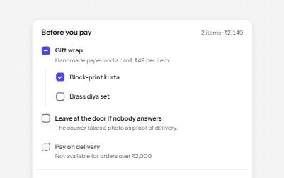
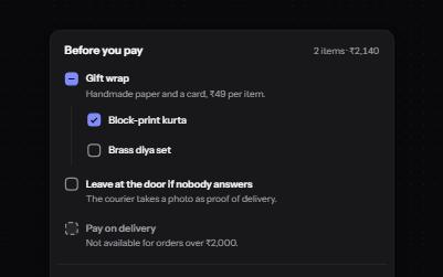
Checkbox
Native checkboxes drawn to match your design, with whole-row targets, a description per option, a mixed state and a required one.
-
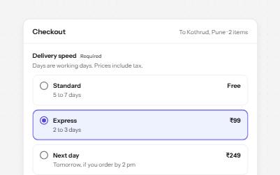
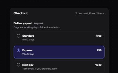
Radio group
Native radio buttons in a fieldset, restyled with a dot that keeps its contrast, each option with a description and a price.
-
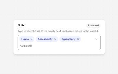
Multi-select with tags
A field that filters a list as you type and turns each choice into a removable chip, for picking several values.
-
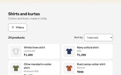
Search filters
A product filter panel: grouped checkboxes with counts, a price range, sort, removable chips and a result count that is announced.