Accessibility pattern · Disclosure and content
Glossary term
Each term is a button that opens a short definition beside it; the definition is announced from a live region and Escape closes it. Every definition lives once, in a glossary list below, and the toggletip copies its words from there, with a link to the full entry and a link back.
- WCAG criteria
- 7
- Keyboard rules
- 4
- Checked with
- axe, keyboard and the inspector
Live demo
Try it
Use it with a mouse, a keyboard or a screen reader. The inspector beside it shows what the browser tells assistive technology as you go: focus, state changes and announcements.
Choosing text colors
compares how light the text is with how light its background is. asks for at least 4.5:1 for body text; can pass at 3:1. Both figures are worked out from each color's , not from its hue.
Glossary
- Contrast ratio
-
How much lighter one color is than another, from 1:1 for no difference to 21:1 for black on white.
It is worked out from the relative luminance of the two colors as
Back to text(L1 + 0.05) / (L2 + 0.05), where L1 is the lighter one. - WCAG
-
Web Content Accessibility Guidelines: the W3C standard that many accessibility laws refer to.
Version 2.2 became a W3C Recommendation in October 2023. Its success criteria are graded A, AA and AAA.
Back to text - Large text
-
Text of at least 18 points, or 14 points in bold: about 24 and 18.66 CSS pixels.
Bigger letters stay readable at lower contrast, so large text needs 3:1 rather than 4.5:1.
Back to text - Relative luminance
-
How bright a color is, from 0 for black to 1 for white, weighted for how the eye sees red, green and blue.
Green counts for most of it and blue for least, which is why yellow text on white fails and pure blue on white passes.
Back to text
The demo works without JavaScript only as far as its HTML does; the inspector needs JavaScript.
Keyboard
Keys it answers to
Every action works without a pointer.
| Key | What it does |
|---|---|
| Tab | Moves through the terms in the text; from an open definition's term, the next Tab reaches its See the full entry link. |
| Enter or Space | On a term, opens its short definition, or closes it if it is open. Opening one closes any other. |
| Escape | Closes the open definition and puts focus back on its term. |
| Enter | On See the full entry, goes to the term in the glossary and moves focus there; on Back to text, returns to the term in the paragraph. |
Screen readers
What it announces
Written from the roles, names and states in the markup.
| When | Expected announcement |
|---|---|
| Focus reaches a term | Contrast ratio, button, collapsed |
| Enter opens it | Expanded. Contrast ratio. How much lighter one color is than another, from 1:1 for no difference to 21:1 for black on white. See the full entry |
| See the full entry is followed | Contrast ratio, term |
| Focus reaches Back to text | Back to text, link, Contrast ratio |
These are expected announcements, not recordings. Wording and order differ between screen readers and browsers.
Code
Copy the code
The exact files this demo runs on. The styles are served with a prefix that keeps this site's own styles out of the demo; what you copy is the original.
<div class="ap-glossary-term" data-ap-glossary-term>
  <h3 class="ap-glossary-term__name">Choosing text colors</h3>
  <p class="ap-glossary-term__text"><span class="ap-glossary-term__wrap"><button type="button" class="ap-glossary-term__term" id="gt-ref-contrast" aria-expanded="false" data-ap-term="gt-contrast">Contrast ratio</button><span class="ap-glossary-term__tip" role="status"></span></span> compares how light the text is with how light its background is. <span class="ap-glossary-term__wrap"><button type="button" class="ap-glossary-term__term" id="gt-ref-wcag" aria-expanded="false" data-ap-term="gt-wcag"><abbr>WCAG</abbr></button><span class="ap-glossary-term__tip" role="status"></span></span> asks for at least 4.5:1 for body text; <span class="ap-glossary-term__wrap"><button type="button" class="ap-glossary-term__term" id="gt-ref-large" aria-expanded="false" data-ap-term="gt-large">large text</button><span class="ap-glossary-term__tip" role="status"></span></span> can pass at 3:1. Both figures are worked out from each color's <span class="ap-glossary-term__wrap"><button type="button" class="ap-glossary-term__term" id="gt-ref-luminance" aria-expanded="false" data-ap-term="gt-luminance">relative luminance</button><span class="ap-glossary-term__tip" role="status"></span></span>, not from its hue.</p>

  <div class="ap-glossary-term__glossary">
    <h4 class="ap-glossary-term__label">Glossary</h4>
    <dl class="ap-glossary-term__list">
      <div class="ap-glossary-term__entry">
        <dt id="gt-contrast" tabindex="-1"><dfn id="gt-dfn-contrast">Contrast ratio</dfn></dt>
        <dd>
          <p class="ap-glossary-term__short">How much lighter one color is than another, from 1:1 for no difference to 21:1 for black on white.</p>
          <p>It is worked out from the relative luminance of the two colors as <code>(L1 + 0.05) / (L2 + 0.05)</code>, where L1 is the lighter one.</p>
          <a class="ap-glossary-term__back" href="#gt-ref-contrast" aria-describedby="gt-dfn-contrast">Back to text</a>
        </dd>
      </div>
      <div class="ap-glossary-term__entry">
        <dt id="gt-wcag" tabindex="-1"><dfn id="gt-dfn-wcag"><abbr>WCAG</abbr></dfn></dt>
        <dd>
          <p class="ap-glossary-term__short">Web Content Accessibility Guidelines: the W3C standard that many accessibility laws refer to.</p>
          <p>Version 2.2 became a W3C Recommendation in October 2023. Its success criteria are graded A, AA and AAA.</p>
          <a class="ap-glossary-term__back" href="#gt-ref-wcag" aria-describedby="gt-dfn-wcag">Back to text</a>
        </dd>
      </div>
      <div class="ap-glossary-term__entry">
        <dt id="gt-large" tabindex="-1"><dfn id="gt-dfn-large">Large text</dfn></dt>
        <dd>
          <p class="ap-glossary-term__short">Text of at least 18 points, or 14 points in bold: about 24 and 18.66 CSS pixels.</p>
          <p>Bigger letters stay readable at lower contrast, so large text needs 3:1 rather than 4.5:1.</p>
          <a class="ap-glossary-term__back" href="#gt-ref-large" aria-describedby="gt-dfn-large">Back to text</a>
        </dd>
      </div>
      <div class="ap-glossary-term__entry">
        <dt id="gt-luminance" tabindex="-1"><dfn id="gt-dfn-luminance">Relative luminance</dfn></dt>
        <dd>
          <p class="ap-glossary-term__short">How bright a color is, from 0 for black to 1 for white, weighted for how the eye sees red, green and blue.</p>
          <p>Green counts for most of it and blue for least, which is why yellow text on white fails and pure blue on white passes.</p>
          <a class="ap-glossary-term__back" href="#gt-ref-luminance" aria-describedby="gt-dfn-luminance">Back to text</a>
        </dd>
      </div>
    </dl>
  </div>
</div>
/* Glossary term. Uses the --ap-* design tokens. */
.ap-glossary-term {
  width: min(100%, 620px);
  margin-inline: auto;
  padding: 28px 28px 22px;
  border: 1px solid var(--ap-border);
  border-radius: var(--ap-radius-lg);
  background: var(--ap-surface);
  color: var(--ap-text);
  box-shadow: var(--ap-shadow-md);
  container-type: inline-size;
}

.ap-glossary-term__name {
  margin: 0 0 12px;
  font-size: 1.25rem;
  font-weight: 650;
  line-height: 1.3;
}
.ap-glossary-term__text {
  margin: 0;
  color: var(--ap-text-2);
  font-size: 1.0625rem;
  line-height: 1.85;
}

/* A term: reads as a word in the sentence, with a dotted underline that
   says there is more; open, it is tinted and the underline turns solid. */
.ap-glossary-term__wrap {
  position: relative;
  display: inline-block;
  white-space: nowrap;
}
.ap-glossary-term__term {
  margin: 0 -.12em;
  padding: .05em .12em;
  border: 0;
  border-radius: var(--ap-radius-sm);
  background: transparent;
  color: var(--ap-accent-text);
  font: inherit;
  font-weight: 600;
  line-height: 1.35;
  text-decoration: underline dotted;
  text-decoration-thickness: 2px;
  text-underline-offset: .25em;
  cursor: pointer;
  scroll-margin-block: 6rem;
  transition: background-color var(--ap-duration) var(--ap-ease), color var(--ap-duration) var(--ap-ease);
}
.ap-glossary-term__term:hover {
  background: var(--ap-accent-soft);
  color: var(--ap-accent-soft-text);
}
.ap-glossary-term__term[aria-expanded="true"] {
  background: var(--ap-accent-soft);
  color: var(--ap-accent-soft-text);
  text-decoration-style: solid;
}
.ap-glossary-term__term:focus-visible {
  outline: 2px solid var(--ap-focus);
  outline-offset: 2px;
}
/* Back from the glossary: the term it came from is marked. */
.ap-glossary-term__term:target {
  box-shadow: 0 0 0 3px var(--ap-accent-soft);
}
.ap-glossary-term abbr {
  text-decoration: none;
}

/* The toggletip. The status region itself has no box, so an empty one
   draws nothing; the bubble inside it is what shows. */
.ap-glossary-term__bubble {
  position: absolute;
  top: calc(100% + 10px);
  left: 50%;
  z-index: 5;
  display: grid;
  gap: 6px;
  width: max-content;
  max-width: min(19rem, 86cqi);
  padding: 12px 14px 12px;
  border: 1px solid var(--ap-border);
  border-radius: var(--ap-radius);
  background: var(--ap-surface);
  color: var(--ap-text-2);
  box-shadow: var(--ap-shadow-lg);
  font-size: .9375rem;
  font-weight: 400;
  line-height: 1.5;
  text-align: start;
  white-space: normal;
  translate: calc(-50% + var(--gt-shift, 0px)) 0;
  animation: ap-glossary-term-in var(--ap-duration) var(--ap-ease);
}
/* The arrow points at the term, wherever the bubble had to shift to. */
.ap-glossary-term__bubble::before {
  content: "";
  position: absolute;
  top: -7px;
  left: calc(50% - var(--gt-shift, 0px) - 6px);
  width: 12px;
  height: 12px;
  border-top: 1px solid var(--ap-border);
  border-left: 1px solid var(--ap-border);
  background: var(--ap-surface);
  rotate: 45deg;
}
.ap-glossary-term__bubble-term {
  color: var(--ap-text);
  font-weight: 650;
}
.ap-glossary-term__more {
  justify-self: start;
  color: var(--ap-accent-text);
  font-weight: 600;
  text-decoration: underline;
  text-underline-offset: 3px;
}
.ap-glossary-term__more:hover {
  text-decoration-thickness: 2px;
}
.ap-glossary-term__more:focus-visible {
  outline: 2px solid var(--ap-focus);
  outline-offset: 2px;
}

/* The glossary. */
.ap-glossary-term__glossary {
  margin-top: 24px;
  padding-top: 16px;
  border-top: 1px solid var(--ap-border);
}
.ap-glossary-term__label {
  margin: 0 0 6px;
  color: var(--ap-text-3);
  font-size: .875rem;
  font-weight: 650;
  line-height: 1.4;
}
.ap-glossary-term__list {
  display: grid;
  gap: 2px;
  margin: 0 -12px;
}
.ap-glossary-term__entry {
  display: grid;
  grid-template-columns: 10.5rem minmax(0, 1fr);
  column-gap: 16px;
  padding: 12px;
  border-radius: var(--ap-radius-sm);
  transition: background-color var(--ap-duration) var(--ap-ease);
}
.ap-glossary-term__entry + .ap-glossary-term__entry {
  box-shadow: inset 0 1px 0 var(--ap-border);
}
.ap-glossary-term__entry dt {
  align-self: start;
  justify-self: start;
  color: var(--ap-text);
  font-weight: 650;
  line-height: 1.5;
  scroll-margin-block: 6rem;
}
.ap-glossary-term__entry dt:focus {
  outline: none;
}
.ap-glossary-term__entry dt:focus-visible {
  outline: 2px solid var(--ap-focus);
  outline-offset: 2px;
}
.ap-glossary-term__entry dfn {
  font-style: normal;
}
.ap-glossary-term__entry dd {
  display: grid;
  gap: 6px;
  margin: 0;
  color: var(--ap-text-2);
  font-size: .9375rem;
  line-height: 1.6;
}
.ap-glossary-term__entry dd p {
  margin: 0;
}
.ap-glossary-term__short {
  color: var(--ap-text);
}
.ap-glossary-term__entry code {
  padding: .1em .35em;
  border-radius: var(--ap-radius-sm);
  background: var(--ap-surface-2);
  color: var(--ap-text);
  font-family: var(--ap-mono);
  font-size: .875em;
  white-space: nowrap;
}
/* The entry a link jumped to. */
.ap-glossary-term__entry:has(:target) {
  background: var(--ap-accent-soft);
  box-shadow: inset 3px 0 0 var(--ap-accent);
  animation: ap-glossary-term-ping 900ms var(--ap-ease);
}
.ap-glossary-term__entry:has(:target) dt {
  color: var(--ap-accent-soft-text);
}
.ap-glossary-term__entry:has(:target) code {
  background: var(--ap-surface);
}

.ap-glossary-term__back {
  justify-self: start;
  display: inline-flex;
  align-items: center;
  min-height: 28px;
  margin-inline-start: -8px;
  padding: 2px 8px;
  border-radius: var(--ap-radius-full);
  color: var(--ap-accent-text);
  font-size: .875rem;
  font-weight: 600;
  text-decoration: none;
}
.ap-glossary-term__back::before {
  content: "↑";
  content: "↑" / "";
  margin-inline-end: 6px;
}
.ap-glossary-term__back:hover {
  background: var(--ap-surface-2);
  text-decoration: underline;
  text-underline-offset: 3px;
}
.ap-glossary-term__entry:has(:target) .ap-glossary-term__back:hover {
  background: var(--ap-surface);
}
.ap-glossary-term__back:focus-visible {
  outline: 2px solid var(--ap-focus);
  outline-offset: 1px;
}

@keyframes ap-glossary-term-in {
  from { opacity: 0; transform: translateY(-4px); }
}
@keyframes ap-glossary-term-ping {
  from { box-shadow: 0 0 0 6px var(--ap-accent-soft), inset 3px 0 0 var(--ap-accent); }
}

@container (max-width: 500px) {
  .ap-glossary-term {
    padding: 22px 18px 16px;
  }
  .ap-glossary-term__text {
    font-size: 1rem;
  }
  .ap-glossary-term__entry {
    grid-template-columns: minmax(0, 1fr);
    row-gap: 4px;
  }
}

@media (prefers-reduced-motion: reduce) {
  .ap-glossary-term__term,
  .ap-glossary-term__entry { transition: none; }
  .ap-glossary-term__bubble,
  .ap-glossary-term__entry:has(:target) { animation: none; }
}
/**
 * Glossary terms: buttons in running text that open a short definition in
 * a toggletip, backed by a full glossary list with links both ways.
 *
 * Markup: [data-ap-glossary-term] holding, in the text,
 *   span.ap-glossary-term__wrap > button[aria-expanded][data-ap-term="<dt id>"] + span[role=status]
 * and a dl whose dt[id][tabindex="-1"] entries each have a
 * p.ap-glossary-term__short in their dd and an a[href="#<button id>"] back.
 *
 * The toggletip copies the term and its short definition from the glossary,
 * so each definition is written once. It opens on click or Enter/Space and
 * closes on Escape, a click elsewhere, or focus leaving it.
 */

export function init(root) {
  const controller = new AbortController();
  const { signal } = controller;
  let open = null;
  let timer = 0;
  let frame = 0;

  const tipOf = (button) => button.nextElementSibling;

  function close({ refocus = false } = {}) {
    if (!open) return;
    const button = open;
    open = null;
    clearTimeout(timer);
    button.setAttribute("aria-expanded", "false");
    tipOf(button).replaceChildren();
    if (refocus) button.focus();
  }

  function bubbleFor(entry) {
    const short = entry.nextElementSibling?.querySelector(".ap-glossary-term__short");
    const bubble = document.createElement("span");
    bubble.className = "ap-glossary-term__bubble";
    const term = document.createElement("span");
    term.className = "ap-glossary-term__bubble-term";
    term.textContent = entry.textContent.trim();
    const words = document.createElement("span");
    words.textContent = short ? short.textContent.trim() : "";
    const more = document.createElement("a");
    more.className = "ap-glossary-term__more";
    more.href = `#${entry.id}`;
    more.textContent = "See the full entry";
    bubble.append(term, words, more);
    return bubble;
  }

  // Keep the bubble inside the component: shift it sideways if it would
  // spill over an edge (the arrow stays on the term).
  function place(bubble) {
    bubble.style.removeProperty("--gt-shift");
    const area = root.getBoundingClientRect();
    const box = bubble.getBoundingClientRect();
    const gap = 8;
    let shift = 0;
    if (box.right > area.right - gap) shift = area.right - gap - box.right;
    if (box.left + shift < area.left + gap) shift = area.left + gap - box.left;
    if (shift) bubble.style.setProperty("--gt-shift", `${Math.round(shift)}px`);
  }

  function show(button) {
    close();
    const entry = document.getElementById(button.dataset.apTerm);
    if (!entry) return;
    open = button;
    button.setAttribute("aria-expanded", "true");
    const tip = tipOf(button);
    tip.replaceChildren();
    // Filling the (already present) live region a moment after emptying it
    // makes screen readers announce it, every time it opens.
    timer = setTimeout(() => {
      const bubble = bubbleFor(entry);
      tip.append(bubble);
      place(bubble);
    }, 50);
  }

  function onClick(event) {
    const button = event.target.closest("[data-ap-term]");
    if (button && root.contains(button)) {
      if (open === button) close();
      else show(button);
      return;
    }
    // In-page links (See the full entry, Back to text): let the browser
    // follow the link, then move focus to where it landed.
    if (event.button !== 0 || event.metaKey || event.ctrlKey || event.shiftKey || event.altKey) return;
    const link = event.target.closest("a[href^='#']");
    if (!link || !root.contains(link)) return;
    const target = document.getElementById(decodeURIComponent(link.hash.slice(1)));
    if (!target || !root.contains(target)) return;
    cancelAnimationFrame(frame);
    frame = requestAnimationFrame(() => target.focus({ preventScroll: true }));
  }

  function onKeydown(event) {
    if (event.key !== "Escape" || !open) return;
    const wrap = open.parentElement;
    const inside = wrap.contains(document.activeElement);
    close({ refocus: inside });
    if (inside) event.preventDefault();
  }

  function onPointerdown(event) {
    if (open && !open.parentElement.contains(event.target)) close();
  }

  function onFocusout(event) {
    if (!open) return;
    const wrap = open.parentElement;
    if (wrap.contains(event.target) && !wrap.contains(event.relatedTarget)) close();
  }

  root.addEventListener("click", onClick, { signal });
  root.addEventListener("focusout", onFocusout, { signal });
  document.addEventListener("keydown", onKeydown, { signal });
  document.addEventListener("pointerdown", onPointerdown, { signal });

  return () => {
    close();
    clearTimeout(timer);
    cancelAnimationFrame(frame);
    controller.abort();
  };
}

for (const root of document.querySelectorAll("[data-ap-glossary-term]")) init(root);
/* Design tokens for the pattern components. Light by default, dark when the
   system asks for it; set data-theme="dark" on :root to force dark. */
:root {
    --ap-radius-sm: 8px;
    --ap-radius: 12px;
    --ap-radius-lg: 16px;
    --ap-radius-full: 999px;
    --ap-font: "Instrument Sans", ui-sans-serif, system-ui, -apple-system, "Segoe UI", Roboto, sans-serif;
    --ap-mono: "JetBrains Mono", ui-monospace, "Cascadia Mono", "SF Mono", Consolas, monospace;
    --ap-ease: cubic-bezier(.2, .8, .2, 1);
    --ap-duration: 180ms;
    --ap-target: 44px;
    --ap-bg: #F4F4F5;
    --ap-surface: #FFFFFF;
    --ap-surface-2: #F4F4F5;
    --ap-surface-3: #E4E4E7;
    --ap-border: #E4E4E7;
    --ap-border-strong: #76767F;
    --ap-text: #18181B;
    --ap-text-2: #3F3F46;
    --ap-text-3: #5E5E66;
    --ap-accent: #4F46E5;
    --ap-accent-hover: #4338CA;
    --ap-on-accent: #FFFFFF;
    --ap-accent-text: #4338CA;
    --ap-accent-soft: #EEF2FF;
    --ap-accent-soft-text: #3730A3;
    --ap-focus: #4F46E5;
    --ap-danger: #B91C1C;
    --ap-danger-soft: #FEF2F2;
    --ap-success: #15803D;
    --ap-success-soft: #F0FDF4;
    --ap-warning: #A15C07;
    --ap-warning-soft: #FEFCE8;
    --ap-info: #1D4ED8;
    --ap-info-soft: #EFF6FF;
    --ap-scrim: rgb(9 9 11 / .48);
    --ap-shadow-sm: 0 1px 2px rgb(9 9 11 / .06);
    --ap-shadow-md: 0 1px 2px rgb(9 9 11 / .05), 0 6px 16px -4px rgb(9 9 11 / .1);
    --ap-shadow-lg: 0 2px 6px rgb(9 9 11 / .06), 0 20px 40px -12px rgb(9 9 11 / .22);
    --ap-light-bg: #F4F4F5;
    --ap-light-surface: #FFFFFF;
    --ap-light-surface-2: #F4F4F5;
    --ap-light-surface-3: #E4E4E7;
    --ap-light-border: #E4E4E7;
    --ap-light-border-strong: #76767F;
    --ap-light-text: #18181B;
    --ap-light-text-2: #3F3F46;
    --ap-light-text-3: #5E5E66;
    --ap-light-accent: #4F46E5;
    --ap-light-accent-hover: #4338CA;
    --ap-light-on-accent: #FFFFFF;
    --ap-light-accent-text: #4338CA;
    --ap-light-accent-soft: #EEF2FF;
    --ap-light-accent-soft-text: #3730A3;
    --ap-light-focus: #4F46E5;
    --ap-light-danger: #B91C1C;
    --ap-light-danger-soft: #FEF2F2;
    --ap-light-success: #15803D;
    --ap-light-success-soft: #F0FDF4;
    --ap-light-warning: #A15C07;
    --ap-light-warning-soft: #FEFCE8;
    --ap-light-info: #1D4ED8;
    --ap-light-info-soft: #EFF6FF;
    --ap-light-scrim: rgb(9 9 11 / .48);
    --ap-light-shadow-sm: 0 1px 2px rgb(9 9 11 / .06);
    --ap-light-shadow-md: 0 1px 2px rgb(9 9 11 / .05), 0 6px 16px -4px rgb(9 9 11 / .1);
    --ap-light-shadow-lg: 0 2px 6px rgb(9 9 11 / .06), 0 20px 40px -12px rgb(9 9 11 / .22);
    --ap-dark-bg: #09090B;
    --ap-dark-surface: #18181B;
    --ap-dark-surface-2: #27272A;
    --ap-dark-surface-3: #3F3F46;
    --ap-dark-border: #2E2E33;
    --ap-dark-border-strong: #8E8E97;
    --ap-dark-text: #FAFAFA;
    --ap-dark-text-2: #D4D4D8;
    --ap-dark-text-3: #A1A1AA;
    --ap-dark-accent: #818CF8;
    --ap-dark-accent-hover: #A5B4FC;
    --ap-dark-on-accent: #0C0A1F;
    --ap-dark-accent-text: #A5B4FC;
    --ap-dark-accent-soft: #1E1B4B;
    --ap-dark-accent-soft-text: #C7D2FE;
    --ap-dark-focus: #A5B4FC;
    --ap-dark-danger: #F87171;
    --ap-dark-danger-soft: #2A1215;
    --ap-dark-success: #4ADE80;
    --ap-dark-success-soft: #0F2A1A;
    --ap-dark-warning: #FACC15;
    --ap-dark-warning-soft: #2A2410;
    --ap-dark-info: #60A5FA;
    --ap-dark-info-soft: #0F1D33;
    --ap-dark-scrim: rgb(0 0 0 / .62);
    --ap-dark-shadow-sm: 0 1px 2px rgb(0 0 0 / .4);
    --ap-dark-shadow-md: 0 1px 2px rgb(0 0 0 / .4), 0 8px 20px -6px rgb(0 0 0 / .5);
    --ap-dark-shadow-lg: 0 2px 8px rgb(0 0 0 / .45), 0 24px 48px -12px rgb(0 0 0 / .7);
}
@media (prefers-color-scheme: dark) {
  :root:not([data-theme="light"]) {
      --ap-bg: #09090B;
      --ap-surface: #18181B;
      --ap-surface-2: #27272A;
      --ap-surface-3: #3F3F46;
      --ap-border: #2E2E33;
      --ap-border-strong: #8E8E97;
      --ap-text: #FAFAFA;
      --ap-text-2: #D4D4D8;
      --ap-text-3: #A1A1AA;
      --ap-accent: #818CF8;
      --ap-accent-hover: #A5B4FC;
      --ap-on-accent: #0C0A1F;
      --ap-accent-text: #A5B4FC;
      --ap-accent-soft: #1E1B4B;
      --ap-accent-soft-text: #C7D2FE;
      --ap-focus: #A5B4FC;
      --ap-danger: #F87171;
      --ap-danger-soft: #2A1215;
      --ap-success: #4ADE80;
      --ap-success-soft: #0F2A1A;
      --ap-warning: #FACC15;
      --ap-warning-soft: #2A2410;
      --ap-info: #60A5FA;
      --ap-info-soft: #0F1D33;
      --ap-scrim: rgb(0 0 0 / .62);
      --ap-shadow-sm: 0 1px 2px rgb(0 0 0 / .4);
      --ap-shadow-md: 0 1px 2px rgb(0 0 0 / .4), 0 8px 20px -6px rgb(0 0 0 / .5);
      --ap-shadow-lg: 0 2px 8px rgb(0 0 0 / .45), 0 24px 48px -12px rgb(0 0 0 / .7);
  }
}
:root[data-theme="dark"] {
    --ap-bg: #09090B;
    --ap-surface: #18181B;
    --ap-surface-2: #27272A;
    --ap-surface-3: #3F3F46;
    --ap-border: #2E2E33;
    --ap-border-strong: #8E8E97;
    --ap-text: #FAFAFA;
    --ap-text-2: #D4D4D8;
    --ap-text-3: #A1A1AA;
    --ap-accent: #818CF8;
    --ap-accent-hover: #A5B4FC;
    --ap-on-accent: #0C0A1F;
    --ap-accent-text: #A5B4FC;
    --ap-accent-soft: #1E1B4B;
    --ap-accent-soft-text: #C7D2FE;
    --ap-focus: #A5B4FC;
    --ap-danger: #F87171;
    --ap-danger-soft: #2A1215;
    --ap-success: #4ADE80;
    --ap-success-soft: #0F2A1A;
    --ap-warning: #FACC15;
    --ap-warning-soft: #2A2410;
    --ap-info: #60A5FA;
    --ap-info-soft: #0F1D33;
    --ap-scrim: rgb(0 0 0 / .62);
    --ap-shadow-sm: 0 1px 2px rgb(0 0 0 / .4);
    --ap-shadow-md: 0 1px 2px rgb(0 0 0 / .4), 0 8px 20px -6px rgb(0 0 0 / .5);
    --ap-shadow-lg: 0 2px 8px rgb(0 0 0 / .45), 0 24px 48px -12px rgb(0 0 0 / .7);
}
WCAG 2.2
What it meets
The success criteria this pattern takes care of, and how.
-
1.3.1 Info and Relationships
Level A
The glossary is a description list, each term in a dfn inside its dt, so terms and definitions are paired in the markup.
-
1.4.13 Content on Hover or Focus
Level AA
Definitions open on a click or a key press, never on hover alone; once open they stay until dismissed, and Escape closes them without moving the pointer.
-
2.1.1 Keyboard
Level A
Terms are buttons, so Enter and Space open them; Escape, Tab and the links all work from the keyboard.
-
3.1.3 Unusual Words
Level AAA
Every technical term in the text has a definition one key press away and a full entry in the glossary.
-
3.1.4 Abbreviations
Level AAA
The abbreviation WCAG is marked with abbr and expanded in its definition, in the toggletip and in the glossary.
-
4.1.2 Name, Role, Value
Level A
Each term button reports aria-expanded, so its open or closed state is exposed.
-
4.1.3 Status Messages
Level AA
The definition is written into a polite status region, so it is announced when it opens without moving focus.
Usage
When to use it
Use it
- Docs, articles and reports with technical terms some readers know and others do not.
- A first mention of a term, where a definition in place saves a trip to another page.
Use something else
- Every repeat of the same term: mark the first use, and let the glossary serve the rest.
- Long explanations: link to a page; a toggletip is for a sentence or two.
- Labels of form fields and controls: put help text beside the field and tie it with aria-describedby.
Common failures
How it usually goes wrong
Definitions only in a title attribute
A title tooltip appears on mouse hover only. Keyboard, touch and many screen reader users never see it. A button that opens the definition works for everyone.
A tooltip that vanishes on the way to it
Hover tooltips close as the pointer moves onto them, and cannot hold a link. A toggletip stays open until it is dismissed.
Opening without saying anything
If the definition appears silently, screen reader users have to go looking for it. The status region announces it the moment it opens.
No way back from the glossary
A one-way link leaves readers stranded at the bottom of the page. Every entry links back to the term in the text, and focus follows.
dfn on every use
dfn marks the place where a term is defined. In the glossary that is the dt; using it on each mention in the text says the text defines it.
Two copies of every definition
A definition written in the toggletip and again in the glossary drifts apart. The toggletip here copies the glossary's short definition.
Notes
Building it
- The status region is in the page, empty, before anything is written into it; a live region created at the same moment as its content is often not announced.
- The script empties the region and fills it a moment later, so the same definition is announced again if the term is opened twice.
- The definition closes when focus leaves the term and its toggletip, on Escape, and on a click elsewhere, but never on a timer.
- Without the script the buttons do nothing, while the glossary still reads in full. If the text must work without scripts, make each term a link to its entry and turn it into a button from the script.
- Each Back to text link is described by its term, so a list of links tells them apart.
Sources: Inclusive Components: Tooltips and toggletips · Understanding SC 3.1.3: Unusual Words · HTML: the dfn element
Checked with axe in light and dark themes, at desktop and phone widths, and by keyboard. Not yet tested with every screen reader and browser pair. Report a correction
Related
Patterns that go with it
-
Toggletip
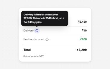
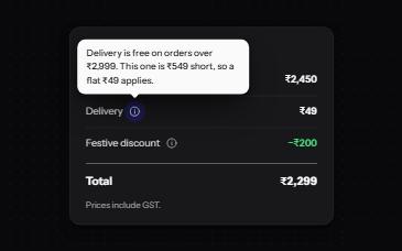
An info button that shows a short note when pressed and has it announced, for help that a label cannot hold.
-
Tooltip
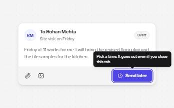
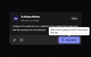
A short label or hint that appears on hover and keyboard focus, stays while you read it, and hides on Escape.
-
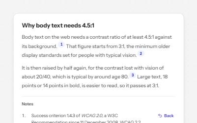
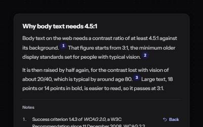
Footnotes
Numbered references in the text that jump to notes at the end, and links in each note that jump back.
-
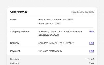
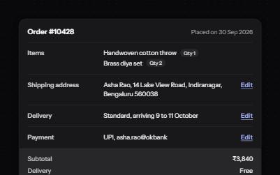
Description list
Name and value pairs in dl, dt and dd: an order summary and a profile card, with Edit links that say what they edit.