Accessibility pattern · Overlays
Tooltip
A tooltip is text tied to a button: it names an icon button through aria-labelledby, or adds a hint to a labelled one through aria-describedby. It appears on keyboard focus as well as hover, stays while the pointer moves onto it, and Escape hides it without moving focus.
- WCAG criteria
- 5
- Keyboard rules
- 2
- Checked with
- axe, keyboard and the inspector
Live demo
Try it
Use it with a mouse, a keyboard or a screen reader. The inspector beside it shows what the browser tells assistive technology as you go: focus, state changes and announcements.
To Rohan Mehta
Site visit on Friday
Friday at 11 works for me. I will bring the revised floor plan and the tile samples for the kitchen.
The demo works without JavaScript only as far as its HTML does; the inspector needs JavaScript.
Keyboard
Keys it answers to
Every action works without a pointer.
| Key | What it does |
|---|---|
| Tab or ShiftTab | Moves to a button; its tooltip appears after a short pause, or at once if a neighbour's was just showing, and hides when focus moves on. |
| Escape | Hides the open tooltip without moving focus; it stays hidden until focus or the pointer leaves and comes back. |
Screen readers
What it announces
Written from the roles, names and states in the markup.
| When | Expected announcement |
|---|---|
| Focus reaches the Send later button | Send later, button. Pick a time. It goes out even if you close this tab. |
| Focus reaches the paperclip button | Attach a file, button |
| The tooltip appears | Nothing extra: its words are already the button's name or description |
| Escape hides it | Nothing; focus stays on the button |
These are expected announcements, not recordings. Wording and order differ between screen readers and browsers.
Code
Copy the code
The exact files this demo runs on. The styles are served with a prefix that keeps this site's own styles out of the demo; what you copy is the original.
<div class="ap-tooltip" data-ap-tooltip>
  <div class="ap-tooltip__top">
    <span class="ap-tooltip__avatar" aria-hidden="true" translate="no">RM</span>
    <div class="ap-tooltip__who">
      <h3 class="ap-tooltip__to">To Rohan Mehta</h3>
      <p class="ap-tooltip__subject">Site visit on Friday</p>
    </div>
    <span class="ap-tooltip__pill">Draft</span>
  </div>
  <p class="ap-tooltip__msg">Friday at 11 works for me. I will bring the revised floor plan and the tile samples for the kitchen.</p>

  <div class="ap-tooltip__bar">
    <div class="ap-tooltip__tools">
      <button type="button" class="ap-tooltip__icon" id="tooltip-attach-btn" aria-labelledby="tooltip-attach">
        <svg viewBox="0 0 24 24" aria-hidden="true" focusable="false"><path d="m21.4 11.1-9.2 9.2a6 6 0 0 1-8.5-8.5l8.6-8.6a4 4 0 0 1 5.7 5.7l-8.6 8.6a2 2 0 0 1-2.8-2.8l8.5-8.5"/></svg>
      </button>
      <div class="ap-tooltip__tip" role="tooltip" id="tooltip-attach" popover="manual">Attach a file</div>

      <button type="button" class="ap-tooltip__icon" id="tooltip-photo-btn" aria-labelledby="tooltip-photo">
        <svg viewBox="0 0 24 24" aria-hidden="true" focusable="false"><rect x="3" y="3" width="18" height="18" rx="2"/><circle cx="9" cy="9" r="2"/><path d="m21 15-3.1-3.1a2 2 0 0 0-2.8 0L6 21"/></svg>
      </button>
      <div class="ap-tooltip__tip" role="tooltip" id="tooltip-photo" popover="manual">Insert a photo</div>
    </div>

    <button type="button" class="ap-btn ap-btn--primary" id="tooltip-later-btn" aria-describedby="tooltip-later">
      <svg class="ap-btn__icon" viewBox="0 0 24 24" aria-hidden="true" focusable="false"><circle cx="12" cy="12" r="9"/><path d="M12 7v5l3 2"/></svg>
      Send later
    </button>
    <div class="ap-tooltip__tip" role="tooltip" id="tooltip-later" popover="manual">Pick a time. It goes out even if you close this tab.</div>
  </div>
</div>
/* Shared primitives: buttons and form fields used across the patterns.
   Uses the --ap-* design tokens. */

.ap-btn {
  display: inline-flex;
  align-items: center;
  justify-content: center;
  gap: 8px;
  min-height: 40px;
  padding: 0 16px;
  border: 1px solid var(--ap-border-strong);
  border-radius: var(--ap-radius-sm);
  background: var(--ap-surface);
  color: var(--ap-text);
  font: inherit;
  font-weight: 600;
  line-height: 1.2;
  text-decoration: none;
  white-space: nowrap;
  cursor: pointer;
  transition: background-color var(--ap-duration) var(--ap-ease), border-color var(--ap-duration) var(--ap-ease), box-shadow var(--ap-duration) var(--ap-ease);
}
.ap-btn:hover {
  background: var(--ap-surface-2);
}
.ap-btn:focus-visible {
  outline: 2px solid var(--ap-focus);
  outline-offset: 2px;
}
.ap-btn:disabled,
.ap-btn[aria-disabled="true"] {
  opacity: .55;
  cursor: not-allowed;
}
.ap-btn--primary {
  border-color: var(--ap-accent);
  background: var(--ap-accent);
  color: var(--ap-on-accent);
  box-shadow: var(--ap-shadow-sm);
}
.ap-btn--primary:hover {
  border-color: var(--ap-accent-hover);
  background: var(--ap-accent-hover);
}
.ap-btn--danger {
  border-color: var(--ap-danger);
  background: var(--ap-danger);
  color: var(--ap-surface);
}
.ap-btn--danger:hover {
  filter: brightness(1.08);
}
.ap-btn--ghost {
  border-color: transparent;
  background: transparent;
}
.ap-btn--ghost:hover {
  background: var(--ap-surface-2);
}
.ap-btn__icon {
  width: 18px;
  height: 18px;
  flex-shrink: 0;
  fill: none;
  stroke: currentColor;
  stroke-width: 2;
  stroke-linecap: round;
  stroke-linejoin: round;
}

.ap-field {
  display: grid;
  gap: 6px;
}
.ap-label {
  color: var(--ap-text);
  font-weight: 600;
  font-size: .9375rem;
}
.ap-hint {
  margin: 0;
  color: var(--ap-text-3);
  font-size: .875rem;
  line-height: 1.45;
}
.ap-error {
  display: flex;
  align-items: flex-start;
  gap: 6px;
  margin: 0;
  color: var(--ap-danger);
  font-size: .875rem;
  font-weight: 600;
  line-height: 1.45;
}
.ap-input {
  width: 100%;
  min-height: 44px;
  padding: 10px 12px;
  border: 1px solid var(--ap-border-strong);
  border-radius: var(--ap-radius-sm);
  background: var(--ap-surface);
  color: var(--ap-text);
  font: inherit;
  line-height: 1.4;
  transition: border-color var(--ap-duration) var(--ap-ease), box-shadow var(--ap-duration) var(--ap-ease);
}
.ap-input::placeholder {
  color: var(--ap-text-3);
}
.ap-input:hover {
  border-color: var(--ap-text-2);
}
.ap-input:focus-visible {
  outline: 2px solid var(--ap-focus);
  outline-offset: 1px;
  border-color: var(--ap-focus);
}
.ap-input[aria-invalid="true"] {
  border-color: var(--ap-danger);
  box-shadow: inset 4px 0 0 var(--ap-danger);
}
textarea.ap-input {
  resize: vertical;
  min-height: 88px;
}

@media (prefers-reduced-motion: reduce) {
  .ap-btn,
  .ap-input { transition: none; }
}

/* Tooltip. Uses the --ap-* design tokens and the shared primitives. */
.ap-tooltip {
  width: min(100%, 460px);
  margin-inline: auto;
  border: 1px solid var(--ap-border);
  border-radius: var(--ap-radius-lg);
  background: var(--ap-surface);
  box-shadow: var(--ap-shadow-md);
}

.ap-tooltip__top {
  display: flex;
  align-items: center;
  gap: 12px;
  padding: 18px 20px 0;
}
.ap-tooltip__avatar {
  display: grid;
  place-items: center;
  width: 40px;
  height: 40px;
  flex-shrink: 0;
  border-radius: var(--ap-radius-full);
  background: var(--ap-accent-soft);
  color: var(--ap-accent-soft-text);
  font-size: .875rem;
  font-weight: 650;
}
.ap-tooltip__who {
  flex: 1;
  min-width: 0;
}
.ap-tooltip__to {
  margin: 0;
  font-size: 1rem;
  font-weight: 600;
  line-height: 1.35;
}
.ap-tooltip__subject {
  margin: 2px 0 0;
  color: var(--ap-text-3);
  font-size: .875rem;
}
.ap-tooltip__pill {
  flex-shrink: 0;
  padding: 3px 10px;
  border: 1px solid var(--ap-border);
  border-radius: var(--ap-radius-full);
  background: var(--ap-surface-2);
  color: var(--ap-text-2);
  font-size: .75rem;
  font-weight: 600;
}
.ap-tooltip__msg {
  margin: 0;
  padding: 14px 20px 20px;
  color: var(--ap-text-2);
  line-height: 1.6;
}

.ap-tooltip__bar {
  display: flex;
  flex-wrap: wrap;
  align-items: center;
  justify-content: space-between;
  gap: 10px;
  padding: 10px 12px;
  border-top: 1px solid var(--ap-border);
  border-radius: 0 0 var(--ap-radius-lg) var(--ap-radius-lg);
  background: var(--ap-surface-2);
}
.ap-tooltip__tools {
  display: flex;
  gap: 4px;
}
.ap-tooltip__icon {
  display: grid;
  place-items: center;
  width: 40px;
  height: 40px;
  padding: 0;
  border: 0;
  border-radius: var(--ap-radius-sm);
  background: transparent;
  color: var(--ap-text-2);
  cursor: pointer;
  transition: background-color var(--ap-duration) var(--ap-ease), color var(--ap-duration) var(--ap-ease);
}
.ap-tooltip__icon:hover {
  background: var(--ap-surface-3);
  color: var(--ap-text);
}
.ap-tooltip__icon:focus-visible {
  outline: 2px solid var(--ap-focus);
  outline-offset: 2px;
}
.ap-tooltip__icon svg {
  width: 20px;
  height: 20px;
  fill: none;
  stroke: currentColor;
  stroke-width: 2;
  stroke-linecap: round;
  stroke-linejoin: round;
}

/* The tooltip: a manual popover in the top layer, placed by the script.
   Without a position it simply does not show; the browser hides closed popovers. */
.ap-tooltip__tip {
  inset: auto;
  margin: 0;
  max-width: min(260px, calc(100vw - 16px));
  padding: 7px 11px;
  border: 0;
  border-radius: var(--ap-radius-sm);
  background: var(--ap-text);
  color: var(--ap-surface);
  font-family: var(--ap-font);
  font-size: .8125rem;
  font-weight: 500;
  line-height: 1.45;
  text-align: start;
  box-shadow: var(--ap-shadow-md);
  overflow: visible;
}
.ap-tooltip__tip:popover-open {
  animation: ap-tooltip-in var(--ap-duration) var(--ap-ease);
}
.ap-tooltip__tip[data-side="bottom"] {
  --ap-tooltip-from: -4px;
}

/* The arrow, pointing at the middle of the button. */
.ap-tooltip__tip::before {
  content: "";
  position: absolute;
  left: var(--arrow-x, 50%);
  width: 10px;
  height: 10px;
  border-radius: 2px;
  background: inherit;
  transform: translateX(-50%) rotate(45deg);
}
.ap-tooltip__tip[data-side="top"]::before { bottom: -4px; }
.ap-tooltip__tip[data-side="bottom"]::before { top: -4px; }

/* An invisible bridge over the gap, so the pointer can travel from the
   button to the tooltip without it closing. */
.ap-tooltip__tip::after {
  content: "";
  position: absolute;
  left: 0;
  right: 0;
  height: 12px;
}
.ap-tooltip__tip[data-side="top"]::after { top: 100%; }
.ap-tooltip__tip[data-side="bottom"]::after { bottom: 100%; }

@keyframes ap-tooltip-in {
  from { opacity: 0; transform: translateY(var(--ap-tooltip-from, 4px)); }
}

@media (forced-colors: active) {
  .ap-tooltip__tip { border: 1px solid CanvasText; }
  .ap-tooltip__tip::before { display: none; }
}

@media (prefers-reduced-motion: reduce) {
  .ap-tooltip__icon { transition: none; }
  .ap-tooltip__tip:popover-open { animation: none; }
}
/**
 * Tooltip: text tied to a button, shown on hover and keyboard focus, that
 * stays while the pointer is over it and hides on Escape (WCAG 1.4.13).
 *
 * Markup: [data-ap-tooltip] holding buttons that point at an element with
 * role=tooltip and popover=manual, through aria-labelledby (the only label
 * of an icon button) or aria-describedby (a hint for a labelled button).
 * Add data-instant to the root to show tooltips without the short delay.
 */

const HOVER_DELAY = 300; // long enough not to flash as the pointer passes over
const FOCUS_DELAY = 120;
const HIDE_DELAY = 120;  // time to cross the gap from the button to the tooltip
const WARM = 500;        // a tooltip that hid this recently lets the next one show at once
const GAP = 10;          // between the button and the tooltip
const EDGE = 8;          // the closest the tooltip comes to the window's edge

export function init(root) {
  const ac = new AbortController();
  const on = (target, type, fn, options = {}) => target.addEventListener(type, fn, { ...options, signal: ac.signal });
  const pairs = [];
  let lastHidden = -Infinity;

  for (const tip of root.querySelectorAll("[role=tooltip]")) {
    const trigger = root.querySelector(`[aria-labelledby~="${tip.id}"], [aria-describedby~="${tip.id}"]`);
    if (trigger) pairs.push({ trigger, tip, hover: false, focus: false, dismissed: false, timer: 0 });
  }

  const isOpen = (p) => p.tip.matches(":popover-open");

  function place(p) {
    const { trigger, tip } = p;
    const r = trigger.getBoundingClientRect();
    const vw = document.documentElement.clientWidth;
    const vh = document.documentElement.clientHeight;
    const w = tip.offsetWidth;
    const h = tip.offsetHeight;
    // Above by default; below when there is no room above and there is below.
    const fitsAbove = r.top - GAP - h >= EDGE;
    const fitsBelow = r.bottom + GAP + h <= vh - EDGE;
    const side = fitsAbove || !fitsBelow ? "top" : "bottom";
    const centre = r.left + r.width / 2;
    const left = Math.min(Math.max(centre - w / 2, EDGE), vw - w - EDGE);
    tip.dataset.side = side;
    tip.style.top = `${Math.round(side === "top" ? r.top - GAP - h : r.bottom + GAP)}px`;
    tip.style.left = `${Math.round(left)}px`;
    tip.style.setProperty("--arrow-x", `${Math.round(centre - left)}px`);
  }

  function show(p) {
    clearTimeout(p.timer);
    if (p.dismissed || isOpen(p)) return;
    for (const other of pairs) if (other !== p) hide(other);
    p.tip.showPopover();
    place(p);
  }

  function hide(p) {
    clearTimeout(p.timer);
    if (!isOpen(p)) return;
    p.tip.hidePopover();
    lastHidden = performance.now();
  }

  function showSoon(p, delay) {
    clearTimeout(p.timer);
    const warm = performance.now() - lastHidden < WARM || pairs.some((o) => o !== p && isOpen(o));
    p.timer = setTimeout(() => show(p), root.hasAttribute("data-instant") || warm ? 0 : delay);
  }

  // Hidden only once neither the pointer nor focus is on the button or the tooltip.
  function hideSoon(p, delay) {
    if (p.hover || p.focus) return;
    clearTimeout(p.timer);
    p.timer = setTimeout(() => hide(p), delay);
  }

  for (const p of pairs) {
    const { trigger, tip } = p;
    on(trigger, "pointerenter", (event) => {
      if (event.pointerType === "touch") return;
      p.hover = true;
      p.dismissed = false;
      showSoon(p, HOVER_DELAY);
    });
    on(trigger, "pointerleave", (event) => {
      if (event.pointerType === "touch") return;
      p.hover = false;
      hideSoon(p, HIDE_DELAY);
    });
    on(tip, "pointerenter", () => {
      p.hover = true;
      clearTimeout(p.timer);
    });
    on(tip, "pointerleave", () => {
      p.hover = false;
      hideSoon(p, HIDE_DELAY);
    });
    on(trigger, "focus", () => {
      // Keyboard focus only: a mouse click already showed it on hover, and a tap should not.
      if (!trigger.matches(":focus-visible")) return;
      p.focus = true;
      p.dismissed = false;
      showSoon(p, FOCUS_DELAY);
    });
    on(trigger, "blur", () => {
      p.focus = false;
      hideSoon(p, 0);
    });
  }

  // Escape works wherever focus is: the pointer may be resting on a button
  // while focus is somewhere else on the page.
  on(document, "keydown", (event) => {
    if (event.key !== "Escape") return;
    let handled = false;
    for (const p of pairs) {
      if (isOpen(p)) {
        hide(p);
        handled = true;
      } else clearTimeout(p.timer);
      if (p.hover || p.focus) p.dismissed = true;
    }
    // Only this Escape is used up; a dialog around the tooltip stays open.
    if (handled) event.preventDefault();
  });

  const follow = () => { for (const p of pairs) if (isOpen(p)) place(p); };
  on(window, "scroll", follow, { capture: true, passive: true });
  on(window, "resize", follow, { passive: true });

  return () => {
    ac.abort();
    for (const p of pairs) hide(p);
  };
}

for (const root of document.querySelectorAll("[data-ap-tooltip]")) init(root);
/* Design tokens for the pattern components. Light by default, dark when the
   system asks for it; set data-theme="dark" on :root to force dark. */
:root {
    --ap-radius-sm: 8px;
    --ap-radius: 12px;
    --ap-radius-lg: 16px;
    --ap-radius-full: 999px;
    --ap-font: "Instrument Sans", ui-sans-serif, system-ui, -apple-system, "Segoe UI", Roboto, sans-serif;
    --ap-mono: "JetBrains Mono", ui-monospace, "Cascadia Mono", "SF Mono", Consolas, monospace;
    --ap-ease: cubic-bezier(.2, .8, .2, 1);
    --ap-duration: 180ms;
    --ap-target: 44px;
    --ap-bg: #F4F4F5;
    --ap-surface: #FFFFFF;
    --ap-surface-2: #F4F4F5;
    --ap-surface-3: #E4E4E7;
    --ap-border: #E4E4E7;
    --ap-border-strong: #76767F;
    --ap-text: #18181B;
    --ap-text-2: #3F3F46;
    --ap-text-3: #5E5E66;
    --ap-accent: #4F46E5;
    --ap-accent-hover: #4338CA;
    --ap-on-accent: #FFFFFF;
    --ap-accent-text: #4338CA;
    --ap-accent-soft: #EEF2FF;
    --ap-accent-soft-text: #3730A3;
    --ap-focus: #4F46E5;
    --ap-danger: #B91C1C;
    --ap-danger-soft: #FEF2F2;
    --ap-success: #15803D;
    --ap-success-soft: #F0FDF4;
    --ap-warning: #A15C07;
    --ap-warning-soft: #FEFCE8;
    --ap-info: #1D4ED8;
    --ap-info-soft: #EFF6FF;
    --ap-scrim: rgb(9 9 11 / .48);
    --ap-shadow-sm: 0 1px 2px rgb(9 9 11 / .06);
    --ap-shadow-md: 0 1px 2px rgb(9 9 11 / .05), 0 6px 16px -4px rgb(9 9 11 / .1);
    --ap-shadow-lg: 0 2px 6px rgb(9 9 11 / .06), 0 20px 40px -12px rgb(9 9 11 / .22);
    --ap-light-bg: #F4F4F5;
    --ap-light-surface: #FFFFFF;
    --ap-light-surface-2: #F4F4F5;
    --ap-light-surface-3: #E4E4E7;
    --ap-light-border: #E4E4E7;
    --ap-light-border-strong: #76767F;
    --ap-light-text: #18181B;
    --ap-light-text-2: #3F3F46;
    --ap-light-text-3: #5E5E66;
    --ap-light-accent: #4F46E5;
    --ap-light-accent-hover: #4338CA;
    --ap-light-on-accent: #FFFFFF;
    --ap-light-accent-text: #4338CA;
    --ap-light-accent-soft: #EEF2FF;
    --ap-light-accent-soft-text: #3730A3;
    --ap-light-focus: #4F46E5;
    --ap-light-danger: #B91C1C;
    --ap-light-danger-soft: #FEF2F2;
    --ap-light-success: #15803D;
    --ap-light-success-soft: #F0FDF4;
    --ap-light-warning: #A15C07;
    --ap-light-warning-soft: #FEFCE8;
    --ap-light-info: #1D4ED8;
    --ap-light-info-soft: #EFF6FF;
    --ap-light-scrim: rgb(9 9 11 / .48);
    --ap-light-shadow-sm: 0 1px 2px rgb(9 9 11 / .06);
    --ap-light-shadow-md: 0 1px 2px rgb(9 9 11 / .05), 0 6px 16px -4px rgb(9 9 11 / .1);
    --ap-light-shadow-lg: 0 2px 6px rgb(9 9 11 / .06), 0 20px 40px -12px rgb(9 9 11 / .22);
    --ap-dark-bg: #09090B;
    --ap-dark-surface: #18181B;
    --ap-dark-surface-2: #27272A;
    --ap-dark-surface-3: #3F3F46;
    --ap-dark-border: #2E2E33;
    --ap-dark-border-strong: #8E8E97;
    --ap-dark-text: #FAFAFA;
    --ap-dark-text-2: #D4D4D8;
    --ap-dark-text-3: #A1A1AA;
    --ap-dark-accent: #818CF8;
    --ap-dark-accent-hover: #A5B4FC;
    --ap-dark-on-accent: #0C0A1F;
    --ap-dark-accent-text: #A5B4FC;
    --ap-dark-accent-soft: #1E1B4B;
    --ap-dark-accent-soft-text: #C7D2FE;
    --ap-dark-focus: #A5B4FC;
    --ap-dark-danger: #F87171;
    --ap-dark-danger-soft: #2A1215;
    --ap-dark-success: #4ADE80;
    --ap-dark-success-soft: #0F2A1A;
    --ap-dark-warning: #FACC15;
    --ap-dark-warning-soft: #2A2410;
    --ap-dark-info: #60A5FA;
    --ap-dark-info-soft: #0F1D33;
    --ap-dark-scrim: rgb(0 0 0 / .62);
    --ap-dark-shadow-sm: 0 1px 2px rgb(0 0 0 / .4);
    --ap-dark-shadow-md: 0 1px 2px rgb(0 0 0 / .4), 0 8px 20px -6px rgb(0 0 0 / .5);
    --ap-dark-shadow-lg: 0 2px 8px rgb(0 0 0 / .45), 0 24px 48px -12px rgb(0 0 0 / .7);
}
@media (prefers-color-scheme: dark) {
  :root:not([data-theme="light"]) {
      --ap-bg: #09090B;
      --ap-surface: #18181B;
      --ap-surface-2: #27272A;
      --ap-surface-3: #3F3F46;
      --ap-border: #2E2E33;
      --ap-border-strong: #8E8E97;
      --ap-text: #FAFAFA;
      --ap-text-2: #D4D4D8;
      --ap-text-3: #A1A1AA;
      --ap-accent: #818CF8;
      --ap-accent-hover: #A5B4FC;
      --ap-on-accent: #0C0A1F;
      --ap-accent-text: #A5B4FC;
      --ap-accent-soft: #1E1B4B;
      --ap-accent-soft-text: #C7D2FE;
      --ap-focus: #A5B4FC;
      --ap-danger: #F87171;
      --ap-danger-soft: #2A1215;
      --ap-success: #4ADE80;
      --ap-success-soft: #0F2A1A;
      --ap-warning: #FACC15;
      --ap-warning-soft: #2A2410;
      --ap-info: #60A5FA;
      --ap-info-soft: #0F1D33;
      --ap-scrim: rgb(0 0 0 / .62);
      --ap-shadow-sm: 0 1px 2px rgb(0 0 0 / .4);
      --ap-shadow-md: 0 1px 2px rgb(0 0 0 / .4), 0 8px 20px -6px rgb(0 0 0 / .5);
      --ap-shadow-lg: 0 2px 8px rgb(0 0 0 / .45), 0 24px 48px -12px rgb(0 0 0 / .7);
  }
}
:root[data-theme="dark"] {
    --ap-bg: #09090B;
    --ap-surface: #18181B;
    --ap-surface-2: #27272A;
    --ap-surface-3: #3F3F46;
    --ap-border: #2E2E33;
    --ap-border-strong: #8E8E97;
    --ap-text: #FAFAFA;
    --ap-text-2: #D4D4D8;
    --ap-text-3: #A1A1AA;
    --ap-accent: #818CF8;
    --ap-accent-hover: #A5B4FC;
    --ap-on-accent: #0C0A1F;
    --ap-accent-text: #A5B4FC;
    --ap-accent-soft: #1E1B4B;
    --ap-accent-soft-text: #C7D2FE;
    --ap-focus: #A5B4FC;
    --ap-danger: #F87171;
    --ap-danger-soft: #2A1215;
    --ap-success: #4ADE80;
    --ap-success-soft: #0F2A1A;
    --ap-warning: #FACC15;
    --ap-warning-soft: #2A2410;
    --ap-info: #60A5FA;
    --ap-info-soft: #0F1D33;
    --ap-scrim: rgb(0 0 0 / .62);
    --ap-shadow-sm: 0 1px 2px rgb(0 0 0 / .4);
    --ap-shadow-md: 0 1px 2px rgb(0 0 0 / .4), 0 8px 20px -6px rgb(0 0 0 / .5);
    --ap-shadow-lg: 0 2px 8px rgb(0 0 0 / .45), 0 24px 48px -12px rgb(0 0 0 / .7);
}
WCAG 2.2
What it meets
The success criteria this pattern takes care of, and how.
-
1.1.1 Non-text Content
Level A
The icon buttons take their names from their tooltips, so a picture of a paperclip is announced as Attach a file.
-
1.4.13 Content on Hover or Focus
Level AA
Escape hides the tooltip without moving the pointer or focus, the pointer can move onto it, and it stays until hover and focus have both left.
-
2.1.1 Keyboard
Level A
Every tooltip appears on keyboard focus, not only on hover, so keyboard users see the same words.
-
2.4.11 Focus Not Obscured (Minimum)
Level AA
The tooltip sits beside its button, never over it, and flips below when there is no room above, so the focused button stays in view.
-
4.1.2 Name, Role, Value
Level A
role=tooltip, with the button pointing at it through aria-labelledby or aria-describedby, puts the words in the button's name or description.
Usage
When to use it
Use it
- The name of an icon-only button, for people who can see the icon but cannot guess what it does.
- A short hint that adds to a visible label, like what Send later actually does.
Use something else
- Anything people need to finish a task: put it on the page, where everyone sees it.
- Links, buttons or fields: a tooltip cannot take focus, so use a popover or a toggletip instead.
- Touch-first screens, where there is no hover: use visible labels or a toggletip.
Common failures
How it usually goes wrong
Hover only
A tooltip that appears on mouseover alone is never seen by keyboard users. Here it also appears when the button receives keyboard focus.
It vanishes when you reach for it
If moving the pointer from the button to the tooltip closes it, people who zoom in cannot read it. A short grace period and an invisible bridge over the gap keep it open.
No way to put it away
A tooltip that covers other content must be dismissible without moving the pointer or focus. Escape hides it, and it stays hidden until you leave and come back.
The title attribute as the tooltip
title text does not appear on keyboard focus or touch, shows after a long delay and cannot be styled. A real element with role=tooltip does all three.
A tooltip on something that cannot take focus
A hint on a plain icon or a span is out of reach for keyboard and screen reader users. Put it on a button, a link or a field.
Links or buttons inside the tooltip
Focus cannot move into a tooltip, so controls inside it are unreachable. If the content needs a link, it is a popover or a toggletip.
Notes
Building it
- Use aria-labelledby when the tooltip is the only label, as on an icon button, and aria-describedby when it adds to a visible label. Never put the same words in both.
- popover=manual puts the tooltip in the top layer, so no ancestor with overflow: hidden can clip it, while it stays next to its button in the DOM and the accessibility tree.
- The short delay stops tooltips flashing as the pointer crosses a toolbar; once one is showing, its neighbours appear at once.
- Touch screens have no hover, and a tap does not set focus-visible, so nothing appears there. Never put information only in a tooltip.
- The script places the tooltip with getBoundingClientRect and moves it with the page as it scrolls; CSS anchor positioning can do the same job where it is supported.
Sources: WAI-ARIA Authoring Practices: Tooltip · Understanding WCAG 2.2: Content on Hover or Focus
Checked with axe in light and dark themes, at desktop and phone widths, and by keyboard. Not yet tested with every screen reader and browser pair. Report a correction
Related
Patterns that go with it
-
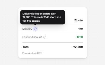
Toggletip
An info button that shows a short note when pressed and has it announced, for help that a label cannot hold.
-
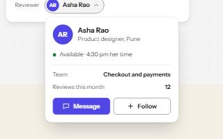
Popover
A card anchored to its button, opened with the popover attribute and dismissed by Escape or a click outside.
-
Icon button
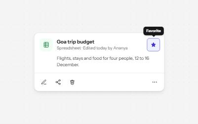
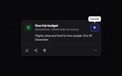
Buttons that show only an icon, named with aria-label, 44 pixels square, with a tooltip on hover and focus that repeats the name.
-
Content on hover or focus
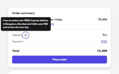
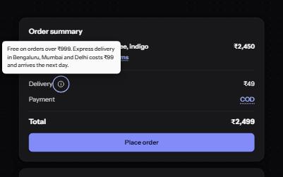
Definitions, profile cards and previews that appear on hover and focus, and can be dismissed, hovered and kept open.