Accessibility pattern · Overlays
Alert dialog
An alert dialog is a modal dialog that interrupts on purpose, to get a decision about something that cannot be undone. Name it, say what will be lost in plain words, and put focus on the answer that loses nothing.
- WCAG criteria
- 6
- Keyboard rules
- 4
- Checked with
- axe, keyboard and the inspector
Live demo
Try it
Use it with a mouse, a keyboard or a screen reader. The inspector beside it shows what the browser tells assistive technology as you go: focus, state changes and announcements.
Danger zone
Delete this project
Removes Monsoon campaign and everything in it for the whole team.
The demo works without JavaScript only as far as its HTML does; the inspector needs JavaScript.
Keyboard
Keys it answers to
Every action works without a pointer.
| Key | What it does |
|---|---|
| Enter or Space | On Delete project, opens the alert dialog with focus on Cancel. |
| Tab or ShiftTab | Moves between the dialog's controls only; the page behind cannot be reached. |
| Escape | Closes the dialog without deleting anything and returns focus to the trigger. |
| Enter | In the name field, confirms. If the name does not match, an error appears and focus stays in the field. |
Screen readers
What it announces
Written from the roles, names and states in the markup.
| When | Expected announcement |
|---|---|
| The dialog opens | Delete Monsoon campaign?, alert dialog. The project, its 48 files and its 3 shared links will be deleted for everyone on the team. This cannot be undone. Cancel, button |
| Tab reaches the destructive button | Delete project, button |
| The typed name does not match | To confirm, type monsoon-campaign, edit text, invalid entry. Type the project name exactly as shown. |
| The project is deleted | Project deleted |
| The dialog is cancelled | Nothing was deleted |
These are expected announcements, not recordings. Wording and order differ between screen readers and browsers.
Code
Copy the code
The exact files this demo runs on. The styles are served with a prefix that keeps this site's own styles out of the demo; what you copy is the original.
<div class="ap-alert-dialog" data-ap-alert-dialog>
  <div class="ap-alert-dialog__zone">
    <div class="ap-alert-dialog__copy">
      <p class="ap-alert-dialog__kicker">Danger zone</p>
      <h3 class="ap-alert-dialog__zone-name">Delete this project</h3>
      <p class="ap-alert-dialog__note">Removes Monsoon campaign and everything in it for the whole team.</p>
    </div>
    <button type="button" class="ap-btn ap-btn--danger" data-ap-open aria-haspopup="dialog">
      <svg class="ap-btn__icon" viewBox="0 0 24 24" aria-hidden="true" focusable="false"><path d="M4 7h16"/><path d="M10 11v6M14 11v6"/><path d="m6 7 1 12a2 2 0 0 0 2 2h6a2 2 0 0 0 2-2l1-12"/><path d="M9 7V4.5A1.5 1.5 0 0 1 10.5 3h3A1.5 1.5 0 0 1 15 4.5V7"/></svg>
      Delete project
    </button>
  </div>
  <p class="ap-alert-dialog__status" role="status"></p>

  <dialog class="ap-alert-dialog__dialog" role="alertdialog" aria-labelledby="alert-dialog-name" aria-describedby="alert-dialog-desc">
    <form class="ap-alert-dialog__form" method="dialog">
      <span class="ap-alert-dialog__icon" aria-hidden="true">
        <svg viewBox="0 0 24 24" focusable="false"><path d="M10.3 3.9 2.4 17.6A2 2 0 0 0 4.1 20.6h15.8a2 2 0 0 0 1.7-3L13.7 3.9a2 2 0 0 0-3.4 0Z"/><path d="M12 9.5v4.5"/><path d="M12 17.3h.01"/></svg>
      </span>
      <h2 class="ap-alert-dialog__name" id="alert-dialog-name">Delete Monsoon campaign?</h2>
      <p class="ap-alert-dialog__desc" id="alert-dialog-desc">The project, its 48 files and its 3 shared links will be deleted for everyone on the team. This cannot be undone.</p>
      <div class="ap-field ap-alert-dialog__confirm" data-ap-confirm hidden>
        <label class="ap-label" for="alert-dialog-confirm">To confirm, type <code>monsoon-campaign</code></label>
        <input class="ap-input" id="alert-dialog-confirm" name="confirm" data-ap-expect="monsoon-campaign" autocomplete="off" autocapitalize="off" spellcheck="false" aria-describedby="alert-dialog-error" />
        <p class="ap-error" id="alert-dialog-error" data-ap-error hidden>
          <svg class="ap-alert-dialog__err" viewBox="0 0 24 24" aria-hidden="true" focusable="false"><circle cx="12" cy="12" r="9"/><path d="M12 7.5v5"/><path d="M12 16.2h.01"/></svg>
          Type the project name exactly as shown.
        </p>
      </div>
      <div class="ap-alert-dialog__actions">
        <button type="button" class="ap-btn" data-ap-cancel autofocus>Cancel</button>
        <button type="submit" class="ap-btn ap-btn--danger" value="delete">Delete project</button>
      </div>
    </form>
  </dialog>
</div>
/* Shared primitives: buttons and form fields used across the patterns.
   Uses the --ap-* design tokens. */

.ap-btn {
  display: inline-flex;
  align-items: center;
  justify-content: center;
  gap: 8px;
  min-height: 40px;
  padding: 0 16px;
  border: 1px solid var(--ap-border-strong);
  border-radius: var(--ap-radius-sm);
  background: var(--ap-surface);
  color: var(--ap-text);
  font: inherit;
  font-weight: 600;
  line-height: 1.2;
  text-decoration: none;
  white-space: nowrap;
  cursor: pointer;
  transition: background-color var(--ap-duration) var(--ap-ease), border-color var(--ap-duration) var(--ap-ease), box-shadow var(--ap-duration) var(--ap-ease);
}
.ap-btn:hover {
  background: var(--ap-surface-2);
}
.ap-btn:focus-visible {
  outline: 2px solid var(--ap-focus);
  outline-offset: 2px;
}
.ap-btn:disabled,
.ap-btn[aria-disabled="true"] {
  opacity: .55;
  cursor: not-allowed;
}
.ap-btn--primary {
  border-color: var(--ap-accent);
  background: var(--ap-accent);
  color: var(--ap-on-accent);
  box-shadow: var(--ap-shadow-sm);
}
.ap-btn--primary:hover {
  border-color: var(--ap-accent-hover);
  background: var(--ap-accent-hover);
}
.ap-btn--danger {
  border-color: var(--ap-danger);
  background: var(--ap-danger);
  color: var(--ap-surface);
}
.ap-btn--danger:hover {
  filter: brightness(1.08);
}
.ap-btn--ghost {
  border-color: transparent;
  background: transparent;
}
.ap-btn--ghost:hover {
  background: var(--ap-surface-2);
}
.ap-btn__icon {
  width: 18px;
  height: 18px;
  flex-shrink: 0;
  fill: none;
  stroke: currentColor;
  stroke-width: 2;
  stroke-linecap: round;
  stroke-linejoin: round;
}

.ap-field {
  display: grid;
  gap: 6px;
}
.ap-label {
  color: var(--ap-text);
  font-weight: 600;
  font-size: .9375rem;
}
.ap-hint {
  margin: 0;
  color: var(--ap-text-3);
  font-size: .875rem;
  line-height: 1.45;
}
.ap-error {
  display: flex;
  align-items: flex-start;
  gap: 6px;
  margin: 0;
  color: var(--ap-danger);
  font-size: .875rem;
  font-weight: 600;
  line-height: 1.45;
}
.ap-input {
  width: 100%;
  min-height: 44px;
  padding: 10px 12px;
  border: 1px solid var(--ap-border-strong);
  border-radius: var(--ap-radius-sm);
  background: var(--ap-surface);
  color: var(--ap-text);
  font: inherit;
  line-height: 1.4;
  transition: border-color var(--ap-duration) var(--ap-ease), box-shadow var(--ap-duration) var(--ap-ease);
}
.ap-input::placeholder {
  color: var(--ap-text-3);
}
.ap-input:hover {
  border-color: var(--ap-text-2);
}
.ap-input:focus-visible {
  outline: 2px solid var(--ap-focus);
  outline-offset: 1px;
  border-color: var(--ap-focus);
}
.ap-input[aria-invalid="true"] {
  border-color: var(--ap-danger);
  box-shadow: inset 4px 0 0 var(--ap-danger);
}
textarea.ap-input {
  resize: vertical;
  min-height: 88px;
}

@media (prefers-reduced-motion: reduce) {
  .ap-btn,
  .ap-input { transition: none; }
}

/* Alert dialog. Uses the --ap-* design tokens and the shared primitives. */
.ap-alert-dialog {
  display: grid;
  justify-items: center;
  gap: 14px;
}
.ap-alert-dialog [hidden] {
  display: none;
}

/* The settings card the trigger lives in */
.ap-alert-dialog__zone {
  display: flex;
  flex-wrap: wrap;
  align-items: center;
  justify-content: space-between;
  gap: 18px 28px;
  width: min(100%, 580px);
  padding: 22px 24px;
  border: 1px solid var(--ap-border);
  border-radius: var(--ap-radius-lg);
  background: var(--ap-surface);
  box-shadow: var(--ap-shadow-md);
}
.ap-alert-dialog__copy {
  flex: 1 1 250px;
  min-width: 0;
}
.ap-alert-dialog__kicker {
  margin: 0 0 6px;
  color: var(--ap-danger);
  font-size: .75rem;
  font-weight: 700;
  letter-spacing: .08em;
  text-transform: uppercase;
}
.ap-alert-dialog__zone-name {
  margin: 0 0 4px;
  font-size: 1.0625rem;
  font-weight: 650;
  line-height: 1.35;
}
.ap-alert-dialog__note {
  margin: 0;
  color: var(--ap-text-3);
  line-height: 1.5;
}
.ap-alert-dialog__status {
  min-height: 1.5em;
  margin: 0;
  color: var(--ap-text-2);
  font-weight: 600;
}

/* The dialog */
.ap-alert-dialog__dialog {
  width: min(100% - 32px, 440px);
  max-width: calc(100% - 32px);
  max-height: min(100% - 32px, 640px);
  padding: 0;
  border: 1px solid var(--ap-border);
  border-radius: var(--ap-radius-lg);
  background: var(--ap-surface);
  color: var(--ap-text);
  box-shadow: var(--ap-shadow-lg);
  overflow: auto;
  opacity: 1;
  transform: none;
  transition: opacity 180ms var(--ap-ease), transform 180ms var(--ap-ease), overlay 180ms allow-discrete, display 180ms allow-discrete;
}
.ap-alert-dialog__dialog:not([open]) {
  opacity: 0;
  transform: scale(.96);
}
@starting-style {
  .ap-alert-dialog__dialog[open] {
    opacity: 0;
    transform: scale(.96);
  }
}
.ap-alert-dialog__dialog::backdrop {
  background: var(--ap-scrim);
  backdrop-filter: blur(2px);
  transition: opacity 180ms, overlay 180ms allow-discrete, display 180ms allow-discrete;
}
@starting-style {
  .ap-alert-dialog__dialog[open]::backdrop { opacity: 0; }
}

.ap-alert-dialog__form {
  display: grid;
  padding: 24px;
  container-type: inline-size;
}
.ap-alert-dialog__icon {
  display: grid;
  place-items: center;
  width: 44px;
  height: 44px;
  margin-bottom: 16px;
  border-radius: var(--ap-radius-full);
  background: var(--ap-danger-soft);
  color: var(--ap-danger);
}
.ap-alert-dialog__icon svg {
  width: 22px;
  height: 22px;
  fill: none;
  stroke: currentColor;
  stroke-width: 2;
  stroke-linecap: round;
  stroke-linejoin: round;
}
.ap-alert-dialog__name {
  margin: 0 0 8px;
  font-size: 1.1875rem;
  font-weight: 650;
  line-height: 1.3;
}
.ap-alert-dialog__desc {
  margin: 0;
  color: var(--ap-text-2);
  line-height: 1.55;
}

.ap-alert-dialog__confirm {
  margin-top: 20px;
}
.ap-alert-dialog__confirm code {
  padding: 1px 6px;
  border-radius: 6px;
  background: var(--ap-surface-2);
  font-family: var(--ap-mono);
  font-size: .875em;
  font-weight: 600;
}
.ap-alert-dialog__confirm .ap-input {
  font-family: var(--ap-mono);
}
.ap-alert-dialog__err {
  width: 16px;
  height: 16px;
  flex-shrink: 0;
  margin-top: 2px;
  fill: none;
  stroke: currentColor;
  stroke-width: 2;
  stroke-linecap: round;
}

.ap-alert-dialog__actions {
  display: flex;
  flex-wrap: wrap;
  justify-content: flex-end;
  gap: 10px;
  margin-top: 24px;
}
.ap-alert-dialog__actions .ap-btn {
  min-height: var(--ap-target);
}
@container (max-width: 340px) {
  .ap-alert-dialog__actions .ap-btn { flex: 1 1 100%; }
}

@media (prefers-reduced-motion: reduce) {
  .ap-alert-dialog__dialog,
  .ap-alert-dialog__dialog::backdrop { transition: none; }
}
/**
 * Alert dialog: a modal confirmation before something that cannot be undone,
 * on the native dialog element with role=alertdialog.
 *
 * Markup: [data-ap-alert-dialog] holding a trigger button[data-ap-open], a
 * dialog[role=alertdialog][aria-labelledby][aria-describedby] whose
 * form[method=dialog] ends with a Cancel button[data-ap-cancel][autofocus]
 * and a submit button[value=delete], and a role=status paragraph for the
 * outcome. Add data-type-to-confirm to the root to ask for the project's name
 * before deleting; the name to match is the field's data-ap-expect.
 */

export function init(root) {
  const opener = root.querySelector("[data-ap-open]");
  const dialog = root.querySelector("dialog");
  const form = dialog.querySelector("form");
  const status = root.querySelector("[role=status]");
  const confirm = dialog.querySelector("[data-ap-confirm]");
  const field = confirm.querySelector("input");
  const error = confirm.querySelector("[data-ap-error]");
  const html = document.documentElement;
  let scrollWas = "";

  const typed = () => root.hasAttribute("data-type-to-confirm");

  function showError(on) {
    error.hidden = !on;
    if (on) field.setAttribute("aria-invalid", "true");
    else field.removeAttribute("aria-invalid");
  }

  function open() {
    scrollWas = html.style.overflow;
    html.style.overflow = "hidden";
    status.textContent = "";
    confirm.hidden = !typed();
    field.value = "";
    showError(false);
    dialog.returnValue = "";
    dialog.showModal();
    // autofocus has put focus on Cancel. Typing deletes nothing, so when the
    // name is asked for, the field is the safe place to start.
    if (typed()) field.focus();
  }

  // Only the delete button submits; Cancel and Escape close without it.
  function onSubmit(event) {
    if (!typed() || field.value.trim() === field.dataset.apExpect) return;
    event.preventDefault();
    showError(true);
    field.focus();
  }

  function onInput() {
    if (!error.hidden) showError(false);
  }

  function onClick(event) {
    if (event.target.closest("[data-ap-cancel]")) dialog.close();
  }

  function onClose() {
    html.style.overflow = scrollWas;
    status.textContent = dialog.returnValue === "delete" ? "Project deleted" : "Nothing was deleted";
    dialog.returnValue = "";
    // Browsers do this for modal dialogs; older engines need telling.
    opener.focus();
  }

  opener.addEventListener("click", open);
  form.addEventListener("submit", onSubmit);
  field.addEventListener("input", onInput);
  dialog.addEventListener("click", onClick);
  dialog.addEventListener("close", onClose);

  return () => {
    dialog.removeEventListener("close", onClose);
    if (dialog.open) dialog.close();
    html.style.overflow = scrollWas;
    opener.removeEventListener("click", open);
    form.removeEventListener("submit", onSubmit);
    field.removeEventListener("input", onInput);
    dialog.removeEventListener("click", onClick);
  };
}

for (const root of document.querySelectorAll("[data-ap-alert-dialog]")) init(root);
/* Design tokens for the pattern components. Light by default, dark when the
   system asks for it; set data-theme="dark" on :root to force dark. */
:root {
    --ap-radius-sm: 8px;
    --ap-radius: 12px;
    --ap-radius-lg: 16px;
    --ap-radius-full: 999px;
    --ap-font: "Instrument Sans", ui-sans-serif, system-ui, -apple-system, "Segoe UI", Roboto, sans-serif;
    --ap-mono: "JetBrains Mono", ui-monospace, "Cascadia Mono", "SF Mono", Consolas, monospace;
    --ap-ease: cubic-bezier(.2, .8, .2, 1);
    --ap-duration: 180ms;
    --ap-target: 44px;
    --ap-bg: #F4F4F5;
    --ap-surface: #FFFFFF;
    --ap-surface-2: #F4F4F5;
    --ap-surface-3: #E4E4E7;
    --ap-border: #E4E4E7;
    --ap-border-strong: #76767F;
    --ap-text: #18181B;
    --ap-text-2: #3F3F46;
    --ap-text-3: #5E5E66;
    --ap-accent: #4F46E5;
    --ap-accent-hover: #4338CA;
    --ap-on-accent: #FFFFFF;
    --ap-accent-text: #4338CA;
    --ap-accent-soft: #EEF2FF;
    --ap-accent-soft-text: #3730A3;
    --ap-focus: #4F46E5;
    --ap-danger: #B91C1C;
    --ap-danger-soft: #FEF2F2;
    --ap-success: #15803D;
    --ap-success-soft: #F0FDF4;
    --ap-warning: #A15C07;
    --ap-warning-soft: #FEFCE8;
    --ap-info: #1D4ED8;
    --ap-info-soft: #EFF6FF;
    --ap-scrim: rgb(9 9 11 / .48);
    --ap-shadow-sm: 0 1px 2px rgb(9 9 11 / .06);
    --ap-shadow-md: 0 1px 2px rgb(9 9 11 / .05), 0 6px 16px -4px rgb(9 9 11 / .1);
    --ap-shadow-lg: 0 2px 6px rgb(9 9 11 / .06), 0 20px 40px -12px rgb(9 9 11 / .22);
    --ap-light-bg: #F4F4F5;
    --ap-light-surface: #FFFFFF;
    --ap-light-surface-2: #F4F4F5;
    --ap-light-surface-3: #E4E4E7;
    --ap-light-border: #E4E4E7;
    --ap-light-border-strong: #76767F;
    --ap-light-text: #18181B;
    --ap-light-text-2: #3F3F46;
    --ap-light-text-3: #5E5E66;
    --ap-light-accent: #4F46E5;
    --ap-light-accent-hover: #4338CA;
    --ap-light-on-accent: #FFFFFF;
    --ap-light-accent-text: #4338CA;
    --ap-light-accent-soft: #EEF2FF;
    --ap-light-accent-soft-text: #3730A3;
    --ap-light-focus: #4F46E5;
    --ap-light-danger: #B91C1C;
    --ap-light-danger-soft: #FEF2F2;
    --ap-light-success: #15803D;
    --ap-light-success-soft: #F0FDF4;
    --ap-light-warning: #A15C07;
    --ap-light-warning-soft: #FEFCE8;
    --ap-light-info: #1D4ED8;
    --ap-light-info-soft: #EFF6FF;
    --ap-light-scrim: rgb(9 9 11 / .48);
    --ap-light-shadow-sm: 0 1px 2px rgb(9 9 11 / .06);
    --ap-light-shadow-md: 0 1px 2px rgb(9 9 11 / .05), 0 6px 16px -4px rgb(9 9 11 / .1);
    --ap-light-shadow-lg: 0 2px 6px rgb(9 9 11 / .06), 0 20px 40px -12px rgb(9 9 11 / .22);
    --ap-dark-bg: #09090B;
    --ap-dark-surface: #18181B;
    --ap-dark-surface-2: #27272A;
    --ap-dark-surface-3: #3F3F46;
    --ap-dark-border: #2E2E33;
    --ap-dark-border-strong: #8E8E97;
    --ap-dark-text: #FAFAFA;
    --ap-dark-text-2: #D4D4D8;
    --ap-dark-text-3: #A1A1AA;
    --ap-dark-accent: #818CF8;
    --ap-dark-accent-hover: #A5B4FC;
    --ap-dark-on-accent: #0C0A1F;
    --ap-dark-accent-text: #A5B4FC;
    --ap-dark-accent-soft: #1E1B4B;
    --ap-dark-accent-soft-text: #C7D2FE;
    --ap-dark-focus: #A5B4FC;
    --ap-dark-danger: #F87171;
    --ap-dark-danger-soft: #2A1215;
    --ap-dark-success: #4ADE80;
    --ap-dark-success-soft: #0F2A1A;
    --ap-dark-warning: #FACC15;
    --ap-dark-warning-soft: #2A2410;
    --ap-dark-info: #60A5FA;
    --ap-dark-info-soft: #0F1D33;
    --ap-dark-scrim: rgb(0 0 0 / .62);
    --ap-dark-shadow-sm: 0 1px 2px rgb(0 0 0 / .4);
    --ap-dark-shadow-md: 0 1px 2px rgb(0 0 0 / .4), 0 8px 20px -6px rgb(0 0 0 / .5);
    --ap-dark-shadow-lg: 0 2px 8px rgb(0 0 0 / .45), 0 24px 48px -12px rgb(0 0 0 / .7);
}
@media (prefers-color-scheme: dark) {
  :root:not([data-theme="light"]) {
      --ap-bg: #09090B;
      --ap-surface: #18181B;
      --ap-surface-2: #27272A;
      --ap-surface-3: #3F3F46;
      --ap-border: #2E2E33;
      --ap-border-strong: #8E8E97;
      --ap-text: #FAFAFA;
      --ap-text-2: #D4D4D8;
      --ap-text-3: #A1A1AA;
      --ap-accent: #818CF8;
      --ap-accent-hover: #A5B4FC;
      --ap-on-accent: #0C0A1F;
      --ap-accent-text: #A5B4FC;
      --ap-accent-soft: #1E1B4B;
      --ap-accent-soft-text: #C7D2FE;
      --ap-focus: #A5B4FC;
      --ap-danger: #F87171;
      --ap-danger-soft: #2A1215;
      --ap-success: #4ADE80;
      --ap-success-soft: #0F2A1A;
      --ap-warning: #FACC15;
      --ap-warning-soft: #2A2410;
      --ap-info: #60A5FA;
      --ap-info-soft: #0F1D33;
      --ap-scrim: rgb(0 0 0 / .62);
      --ap-shadow-sm: 0 1px 2px rgb(0 0 0 / .4);
      --ap-shadow-md: 0 1px 2px rgb(0 0 0 / .4), 0 8px 20px -6px rgb(0 0 0 / .5);
      --ap-shadow-lg: 0 2px 8px rgb(0 0 0 / .45), 0 24px 48px -12px rgb(0 0 0 / .7);
  }
}
:root[data-theme="dark"] {
    --ap-bg: #09090B;
    --ap-surface: #18181B;
    --ap-surface-2: #27272A;
    --ap-surface-3: #3F3F46;
    --ap-border: #2E2E33;
    --ap-border-strong: #8E8E97;
    --ap-text: #FAFAFA;
    --ap-text-2: #D4D4D8;
    --ap-text-3: #A1A1AA;
    --ap-accent: #818CF8;
    --ap-accent-hover: #A5B4FC;
    --ap-on-accent: #0C0A1F;
    --ap-accent-text: #A5B4FC;
    --ap-accent-soft: #1E1B4B;
    --ap-accent-soft-text: #C7D2FE;
    --ap-focus: #A5B4FC;
    --ap-danger: #F87171;
    --ap-danger-soft: #2A1215;
    --ap-success: #4ADE80;
    --ap-success-soft: #0F2A1A;
    --ap-warning: #FACC15;
    --ap-warning-soft: #2A2410;
    --ap-info: #60A5FA;
    --ap-info-soft: #0F1D33;
    --ap-scrim: rgb(0 0 0 / .62);
    --ap-shadow-sm: 0 1px 2px rgb(0 0 0 / .4);
    --ap-shadow-md: 0 1px 2px rgb(0 0 0 / .4), 0 8px 20px -6px rgb(0 0 0 / .5);
    --ap-shadow-lg: 0 2px 8px rgb(0 0 0 / .45), 0 24px 48px -12px rgb(0 0 0 / .7);
}
WCAG 2.2
What it meets
The success criteria this pattern takes care of, and how.
-
1.3.1 Info and Relationships
Level A
The dialog is named by its heading and described by the paragraph that states the cost, so both are read out when it opens.
-
2.4.3 Focus Order
Level A
Focus starts on Cancel, the answer that loses nothing, and goes back to the trigger when the dialog closes.
-
3.3.1 Error Identification
Level A
A name that does not match is reported in text beside the field, with aria-invalid, not just a red border.
-
3.3.4 Error Prevention (Legal, Financial, Data)
Level AA
Deleting data waits for an explicit confirmation, and the high-stakes version asks for the project's name as well.
-
4.1.2 Name, Role, Value
Level A
role=alertdialog tells assistive technology this is an urgent question, and the dialog element keeps the page behind inert.
-
4.1.3 Status Messages
Level AA
The outcome, deleted or not, is written to a status line that is announced without moving focus.
Usage
When to use it
Use it
- Confirming an action that destroys data or cannot be reversed, like deleting a project or closing an account.
- A problem that blocks the task until someone decides, like leaving a page with unsaved work.
Use something else
- Actions that can be undone: do them straight away and offer Undo instead.
- News that needs no decision: use a status message or a toast.
- Confirming routine actions: people learn to press the button without reading, which defeats the point.
Common failures
How it usually goes wrong
Focus on the destructive button
Someone who presses Enter out of habit as the dialog appears deletes the project. Focus starts on Cancel here, so a reflex loses nothing.
A vague question
"Are you sure?" with OK and Cancel says nothing about what happens. The heading names the project, the description says what is lost, and the button says Delete project.
No description
Without aria-describedby only the heading is announced when the dialog opens, and the consequence is heard only by someone who goes looking for it.
Closing on a stray click
A click outside the dialog is not an answer. This one closes only from its two buttons or Escape, and Escape always means cancel.
A greyed-out button with no reason
A disabled Delete button gives no hint of what it is waiting for, and many screen readers skip it. Here the button always works and says what is wrong.
role=alert instead of a dialog
role=alert reads a message out once, but nothing takes focus to its buttons or keeps the page behind out of reach. The alert dialog does both.
Notes
Building it
- role=alertdialog on a dialog element replaces its role but keeps everything showModal() gives: the top layer, the inert page and Escape.
- The autofocus attribute puts focus on Cancel. With the name check on, the script moves focus into the field instead, because typing deletes nothing.
- Label the destructive button with the action, "Delete project", not "OK" or "Yes", so it still makes sense to someone who tabs straight to it.
- Leave light dismiss off: a decision this size needs an explicit answer, and the status line confirms which one was given.
Sources: WAI-ARIA Authoring Practices: Alert and Message Dialogs · WAI-ARIA 1.2: the alertdialog role
Checked with axe in light and dark themes, at desktop and phone widths, and by keyboard. Not yet tested with every screen reader and browser pair. Report a correction
Related
Patterns that go with it
-
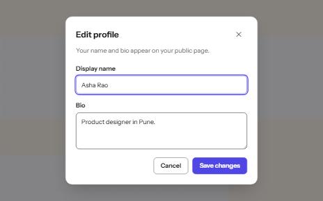
Modal dialog
A window over the page that holds focus until it is closed, built on the native dialog element.
-
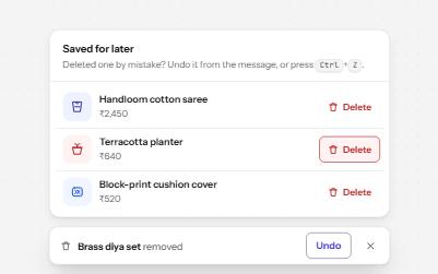
Destructive action with undo
Delete at once and offer Undo in a toast that waits while you use it, instead of asking Are you sure? first.
-
Status message
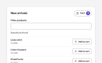
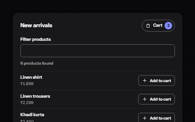
Results, confirmations and saves told to screen readers through role=status, without moving focus, once each time.
-
Inline validation
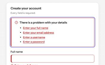
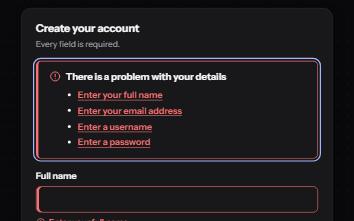
A sign-up form that checks each field as it is left, once typed in, with ticks and errors in words and a summary on submit.