Accessibility pattern · Overlays
Toggletip
A toggletip is a button that shows a note when pressed; a tooltip, by contrast, appears on hover and has no button of its own. The note is written into a live region a moment after the press, so screen readers announce it without anyone going to look for it.
- WCAG criteria
- 6
- Keyboard rules
- 3
- Checked with
- axe, keyboard and the inspector
Live demo
Try it
Use it with a mouse, a keyboard or a screen reader. The inspector beside it shows what the browser tells assistive technology as you go: focus, state changes and announcements.
Order summary
- Items (3)
- ₹2,450
- Delivery Delivery is free on orders over ₹2,999. This one is ₹549 short, so a flat ₹49 applies.
- ₹49
- Festive discount Code DIWALI200 takes ₹200 off orders over ₹1,500. It ends on 3 November.
- −₹200
- Total
- ₹2,299
Prices include GST.
The demo works without JavaScript only as far as its HTML does; the inspector needs JavaScript.
Keyboard
Keys it answers to
Every action works without a pointer.
| Key | What it does |
|---|---|
| Enter or Space | On an info button, shows its note; pressed again, hides it. Opening one note closes any other. |
| Escape | Hides the open note; focus stays on the button. |
| Tab or ShiftTab | Moves on to the next control and hides the note. |
Screen readers
What it announces
Written from the roles, names and states in the markup.
| When | Expected announcement |
|---|---|
| Focus reaches the info button | More about delivery charges, button, collapsed |
| Enter shows the note | Expanded. Delivery is free on orders over ₹2,999. This one is ₹549 short, so a flat ₹49 applies. |
| Escape hides it | Collapsed |
These are expected announcements, not recordings. Wording and order differ between screen readers and browsers.
Code
Copy the code
The exact files this demo runs on. The styles are served with a prefix that keeps this site's own styles out of the demo; what you copy is the original.
<div class="ap-toggletip" data-ap-toggletip>
  <h3 class="ap-toggletip__name">Order summary</h3>
  <dl class="ap-toggletip__rows">
    <div class="ap-toggletip__row">
      <dt>Items <span class="ap-toggletip__qty">(3)</span></dt>
      <dd>₹2,450</dd>
    </div>
    <div class="ap-toggletip__row">
      <dt>
        Delivery
        <span class="ap-toggletip__wrap">
          <button type="button" class="ap-toggletip__btn" id="toggletip-delivery-btn" aria-label="More about delivery charges" aria-expanded="false">
            <svg viewBox="0 0 24 24" aria-hidden="true" focusable="false"><circle cx="12" cy="12" r="9"/><path d="M12 11v5"/><path d="M12 7.5h.01"/></svg>
          </button>
          <span class="ap-toggletip__live" role="status">
            <span class="ap-toggletip__bubble" data-ap-note hidden>Delivery is free on orders over ₹2,999. This one is ₹549 short, so a flat ₹49 applies.</span>
          </span>
        </span>
      </dt>
      <dd>₹49</dd>
    </div>
    <div class="ap-toggletip__row">
      <dt>
        Festive discount
        <span class="ap-toggletip__wrap">
          <button type="button" class="ap-toggletip__btn" id="toggletip-discount-btn" aria-label="More about the festive discount" aria-expanded="false">
            <svg viewBox="0 0 24 24" aria-hidden="true" focusable="false"><circle cx="12" cy="12" r="9"/><path d="M12 11v5"/><path d="M12 7.5h.01"/></svg>
          </button>
          <span class="ap-toggletip__live" role="status">
            <span class="ap-toggletip__bubble" data-ap-note hidden>Code DIWALI200 takes ₹200 off orders over ₹1,500. It ends on 3 November.</span>
          </span>
        </span>
      </dt>
      <dd class="ap-toggletip__minus">−₹200</dd>
    </div>
    <div class="ap-toggletip__row ap-toggletip__row--total">
      <dt>Total</dt>
      <dd>₹2,299</dd>
    </div>
  </dl>
  <p class="ap-toggletip__note">Prices include GST.</p>
</div>
/* Toggletip. Uses the --ap-* design tokens. */
.ap-toggletip {
  width: min(100%, 400px);
  margin-inline: auto;
  padding: 22px 24px 20px;
  border: 1px solid var(--ap-border);
  border-radius: var(--ap-radius-lg);
  background: var(--ap-surface);
  box-shadow: var(--ap-shadow-md);
  container-type: inline-size;
}
.ap-toggletip__name {
  margin: 0 0 10px;
  font-size: 1.0625rem;
  font-weight: 650;
  line-height: 1.35;
}

.ap-toggletip__rows {
  display: grid;
  margin: 0;
}
.ap-toggletip__row {
  display: flex;
  align-items: center;
  justify-content: space-between;
  gap: 16px;
  min-height: 48px;
  border-top: 1px solid var(--ap-border);
}
.ap-toggletip__row:first-child {
  border-top: 0;
}
.ap-toggletip__row dt {
  display: flex;
  align-items: center;
  gap: 2px;
  color: var(--ap-text-2);
}
.ap-toggletip__row dd {
  margin: 0;
  color: var(--ap-text);
  font-weight: 600;
  font-variant-numeric: tabular-nums;
}
.ap-toggletip__qty {
  margin-inline-start: 4px;
  color: var(--ap-text-3);
}
.ap-toggletip__row dd.ap-toggletip__minus {
  color: var(--ap-success);
}
.ap-toggletip__row--total {
  margin-top: 6px;
  padding-top: 8px;
  border-top-color: var(--ap-border-strong);
  font-size: 1.0625rem;
}
.ap-toggletip__row--total dt {
  color: var(--ap-text);
  font-weight: 650;
}
.ap-toggletip__row--total dd {
  font-weight: 700;
}
.ap-toggletip__note {
  margin: 6px 0 0;
  color: var(--ap-text-3);
  font-size: .8125rem;
}

/* The button and its note */
.ap-toggletip__wrap {
  position: relative;
  display: inline-flex;
}
.ap-toggletip__btn {
  display: grid;
  place-items: center;
  width: 32px;
  height: 32px;
  padding: 0;
  border: 0;
  border-radius: var(--ap-radius-full);
  background: transparent;
  color: var(--ap-text-3);
  cursor: pointer;
  transition: background-color var(--ap-duration) var(--ap-ease), color var(--ap-duration) var(--ap-ease);
}
.ap-toggletip__btn:hover {
  background: var(--ap-surface-2);
  color: var(--ap-text);
}
.ap-toggletip__btn[aria-expanded="true"] {
  background: var(--ap-accent-soft);
  color: var(--ap-accent-soft-text);
}
.ap-toggletip__btn:focus-visible {
  outline: 2px solid var(--ap-focus);
  outline-offset: 1px;
}
.ap-toggletip__btn svg {
  width: 18px;
  height: 18px;
  fill: none;
  stroke: currentColor;
  stroke-width: 2;
  stroke-linecap: round;
  stroke-linejoin: round;
}

/* Placed by the script: above the button, or below when there is no room,
   and kept inside the card. */
.ap-toggletip__bubble {
  position: absolute;
  z-index: 2;
  bottom: calc(100% + 10px);
  left: 0;
  width: max-content;
  max-width: min(260px, calc(100cqi - 24px));
  padding: 10px 14px;
  border-radius: var(--ap-radius);
  background: var(--ap-text);
  color: var(--ap-surface);
  font-size: .875rem;
  font-weight: 500;
  line-height: 1.5;
  text-align: start;
  box-shadow: var(--ap-shadow-lg);
  animation: ap-toggletip-in var(--ap-duration) var(--ap-ease);
}
.ap-toggletip__bubble[data-side="bottom"] {
  top: calc(100% + 10px);
  bottom: auto;
  --ap-toggletip-from: -4px;
}
.ap-toggletip__bubble::before {
  content: "";
  position: absolute;
  bottom: -4px;
  left: var(--arrow-x, 16px);
  width: 10px;
  height: 10px;
  border-radius: 2px;
  background: inherit;
  transform: translateX(-50%) rotate(45deg);
}
.ap-toggletip__bubble[data-side="bottom"]::before {
  top: -4px;
  bottom: auto;
}

@keyframes ap-toggletip-in {
  from { opacity: 0; transform: translateY(var(--ap-toggletip-from, 4px)); }
}

@media (forced-colors: active) {
  .ap-toggletip__bubble { border: 1px solid CanvasText; }
  .ap-toggletip__bubble::before { display: none; }
}

@media (prefers-reduced-motion: reduce) {
  .ap-toggletip__btn { transition: none; }
  .ap-toggletip__bubble { animation: none; }
}
/**
 * Toggletip: an info button that shows a short note when pressed, written
 * into a live region so screen readers announce it.
 *
 * Markup: [data-ap-toggletip] holding, for each note, a .ap-toggletip__wrap
 * with a button[aria-expanded] and a role=status region that contains the
 * note ([data-ap-note]), hidden until the button is pressed.
 */

const ANNOUNCE_DELAY = 100; // empty first, then the note: the addition is what gets announced
const GAP = 10;             // between the button and the note
const EDGE = 12;            // the closest the note comes to the card's edge

export function init(root) {
  const ac = new AbortController();
  const on = (target, type, fn) => target.addEventListener(type, fn, { signal: ac.signal });
  const tips = [...root.querySelectorAll(".ap-toggletip__wrap")].map((wrap) => ({
    wrap,
    button: wrap.querySelector("button[aria-expanded]"),
    live: wrap.querySelector("[role=status]"),
    note: wrap.querySelector("[data-ap-note]"),
    timer: 0,
  }));

  const isOpen = (t) => t.button.getAttribute("aria-expanded") === "true";

  function place(t) {
    const { button, note, wrap } = t;
    const b = button.getBoundingClientRect();
    const card = root.getBoundingClientRect();
    const w = note.offsetWidth;
    const h = note.offsetHeight;
    const centre = b.left + b.width / 2;
    const left = Math.min(Math.max(centre - w / 2, card.left + EDGE), card.right - EDGE - w);
    const fitsAbove = b.top - GAP - h >= 8;
    const fitsBelow = b.bottom + GAP + h <= document.documentElement.clientHeight - 8;
    note.dataset.side = fitsAbove || !fitsBelow ? "top" : "bottom";
    note.style.left = `${Math.round(left - wrap.getBoundingClientRect().left)}px`;
    note.style.setProperty("--arrow-x", `${Math.round(centre - left)}px`);
  }

  function open(t) {
    for (const other of tips) if (other !== t) close(other);
    t.button.setAttribute("aria-expanded", "true");
    // Empty the live region, then put the note back a moment later.
    t.note.hidden = true;
    t.live.replaceChildren();
    clearTimeout(t.timer);
    t.timer = setTimeout(() => {
      t.note.hidden = false;
      t.live.append(t.note);
      place(t);
    }, ANNOUNCE_DELAY);
  }

  function close(t) {
    clearTimeout(t.timer);
    if (!isOpen(t)) return;
    t.button.setAttribute("aria-expanded", "false");
    t.note.hidden = true;
    if (!t.note.isConnected) t.live.append(t.note);
  }

  on(root, "click", (event) => {
    const t = tips.find((x) => x.button === event.target.closest("button"));
    if (t) (isOpen(t) ? close : open)(t);
  });

  // Tab, or anything else that moves focus to another control, closes the
  // note. A click inside the note can hand focus to a focusable ancestor
  // (often main); that is not leaving, so it is ignored.
  for (const t of tips) {
    on(t.wrap, "focusout", (event) => {
      const to = event.relatedTarget;
      if (to && !t.wrap.contains(to) && !to.contains(t.wrap)) close(t);
    });
  }

  on(document, "click", (event) => {
    for (const t of tips) if (isOpen(t) && !t.wrap.contains(event.target)) close(t);
  });

  on(document, "keydown", (event) => {
    if (event.key !== "Escape") return;
    const t = tips.find(isOpen);
    if (!t) return;
    close(t);
    event.preventDefault();
  });

  on(window, "resize", () => { for (const t of tips) if (isOpen(t) && !t.note.hidden) place(t); });

  return () => {
    ac.abort();
    for (const t of tips) close(t);
  };
}

for (const root of document.querySelectorAll("[data-ap-toggletip]")) init(root);
/* Design tokens for the pattern components. Light by default, dark when the
   system asks for it; set data-theme="dark" on :root to force dark. */
:root {
    --ap-radius-sm: 8px;
    --ap-radius: 12px;
    --ap-radius-lg: 16px;
    --ap-radius-full: 999px;
    --ap-font: "Instrument Sans", ui-sans-serif, system-ui, -apple-system, "Segoe UI", Roboto, sans-serif;
    --ap-mono: "JetBrains Mono", ui-monospace, "Cascadia Mono", "SF Mono", Consolas, monospace;
    --ap-ease: cubic-bezier(.2, .8, .2, 1);
    --ap-duration: 180ms;
    --ap-target: 44px;
    --ap-bg: #F4F4F5;
    --ap-surface: #FFFFFF;
    --ap-surface-2: #F4F4F5;
    --ap-surface-3: #E4E4E7;
    --ap-border: #E4E4E7;
    --ap-border-strong: #76767F;
    --ap-text: #18181B;
    --ap-text-2: #3F3F46;
    --ap-text-3: #5E5E66;
    --ap-accent: #4F46E5;
    --ap-accent-hover: #4338CA;
    --ap-on-accent: #FFFFFF;
    --ap-accent-text: #4338CA;
    --ap-accent-soft: #EEF2FF;
    --ap-accent-soft-text: #3730A3;
    --ap-focus: #4F46E5;
    --ap-danger: #B91C1C;
    --ap-danger-soft: #FEF2F2;
    --ap-success: #15803D;
    --ap-success-soft: #F0FDF4;
    --ap-warning: #A15C07;
    --ap-warning-soft: #FEFCE8;
    --ap-info: #1D4ED8;
    --ap-info-soft: #EFF6FF;
    --ap-scrim: rgb(9 9 11 / .48);
    --ap-shadow-sm: 0 1px 2px rgb(9 9 11 / .06);
    --ap-shadow-md: 0 1px 2px rgb(9 9 11 / .05), 0 6px 16px -4px rgb(9 9 11 / .1);
    --ap-shadow-lg: 0 2px 6px rgb(9 9 11 / .06), 0 20px 40px -12px rgb(9 9 11 / .22);
    --ap-light-bg: #F4F4F5;
    --ap-light-surface: #FFFFFF;
    --ap-light-surface-2: #F4F4F5;
    --ap-light-surface-3: #E4E4E7;
    --ap-light-border: #E4E4E7;
    --ap-light-border-strong: #76767F;
    --ap-light-text: #18181B;
    --ap-light-text-2: #3F3F46;
    --ap-light-text-3: #5E5E66;
    --ap-light-accent: #4F46E5;
    --ap-light-accent-hover: #4338CA;
    --ap-light-on-accent: #FFFFFF;
    --ap-light-accent-text: #4338CA;
    --ap-light-accent-soft: #EEF2FF;
    --ap-light-accent-soft-text: #3730A3;
    --ap-light-focus: #4F46E5;
    --ap-light-danger: #B91C1C;
    --ap-light-danger-soft: #FEF2F2;
    --ap-light-success: #15803D;
    --ap-light-success-soft: #F0FDF4;
    --ap-light-warning: #A15C07;
    --ap-light-warning-soft: #FEFCE8;
    --ap-light-info: #1D4ED8;
    --ap-light-info-soft: #EFF6FF;
    --ap-light-scrim: rgb(9 9 11 / .48);
    --ap-light-shadow-sm: 0 1px 2px rgb(9 9 11 / .06);
    --ap-light-shadow-md: 0 1px 2px rgb(9 9 11 / .05), 0 6px 16px -4px rgb(9 9 11 / .1);
    --ap-light-shadow-lg: 0 2px 6px rgb(9 9 11 / .06), 0 20px 40px -12px rgb(9 9 11 / .22);
    --ap-dark-bg: #09090B;
    --ap-dark-surface: #18181B;
    --ap-dark-surface-2: #27272A;
    --ap-dark-surface-3: #3F3F46;
    --ap-dark-border: #2E2E33;
    --ap-dark-border-strong: #8E8E97;
    --ap-dark-text: #FAFAFA;
    --ap-dark-text-2: #D4D4D8;
    --ap-dark-text-3: #A1A1AA;
    --ap-dark-accent: #818CF8;
    --ap-dark-accent-hover: #A5B4FC;
    --ap-dark-on-accent: #0C0A1F;
    --ap-dark-accent-text: #A5B4FC;
    --ap-dark-accent-soft: #1E1B4B;
    --ap-dark-accent-soft-text: #C7D2FE;
    --ap-dark-focus: #A5B4FC;
    --ap-dark-danger: #F87171;
    --ap-dark-danger-soft: #2A1215;
    --ap-dark-success: #4ADE80;
    --ap-dark-success-soft: #0F2A1A;
    --ap-dark-warning: #FACC15;
    --ap-dark-warning-soft: #2A2410;
    --ap-dark-info: #60A5FA;
    --ap-dark-info-soft: #0F1D33;
    --ap-dark-scrim: rgb(0 0 0 / .62);
    --ap-dark-shadow-sm: 0 1px 2px rgb(0 0 0 / .4);
    --ap-dark-shadow-md: 0 1px 2px rgb(0 0 0 / .4), 0 8px 20px -6px rgb(0 0 0 / .5);
    --ap-dark-shadow-lg: 0 2px 8px rgb(0 0 0 / .45), 0 24px 48px -12px rgb(0 0 0 / .7);
}
@media (prefers-color-scheme: dark) {
  :root:not([data-theme="light"]) {
      --ap-bg: #09090B;
      --ap-surface: #18181B;
      --ap-surface-2: #27272A;
      --ap-surface-3: #3F3F46;
      --ap-border: #2E2E33;
      --ap-border-strong: #8E8E97;
      --ap-text: #FAFAFA;
      --ap-text-2: #D4D4D8;
      --ap-text-3: #A1A1AA;
      --ap-accent: #818CF8;
      --ap-accent-hover: #A5B4FC;
      --ap-on-accent: #0C0A1F;
      --ap-accent-text: #A5B4FC;
      --ap-accent-soft: #1E1B4B;
      --ap-accent-soft-text: #C7D2FE;
      --ap-focus: #A5B4FC;
      --ap-danger: #F87171;
      --ap-danger-soft: #2A1215;
      --ap-success: #4ADE80;
      --ap-success-soft: #0F2A1A;
      --ap-warning: #FACC15;
      --ap-warning-soft: #2A2410;
      --ap-info: #60A5FA;
      --ap-info-soft: #0F1D33;
      --ap-scrim: rgb(0 0 0 / .62);
      --ap-shadow-sm: 0 1px 2px rgb(0 0 0 / .4);
      --ap-shadow-md: 0 1px 2px rgb(0 0 0 / .4), 0 8px 20px -6px rgb(0 0 0 / .5);
      --ap-shadow-lg: 0 2px 8px rgb(0 0 0 / .45), 0 24px 48px -12px rgb(0 0 0 / .7);
  }
}
:root[data-theme="dark"] {
    --ap-bg: #09090B;
    --ap-surface: #18181B;
    --ap-surface-2: #27272A;
    --ap-surface-3: #3F3F46;
    --ap-border: #2E2E33;
    --ap-border-strong: #8E8E97;
    --ap-text: #FAFAFA;
    --ap-text-2: #D4D4D8;
    --ap-text-3: #A1A1AA;
    --ap-accent: #818CF8;
    --ap-accent-hover: #A5B4FC;
    --ap-on-accent: #0C0A1F;
    --ap-accent-text: #A5B4FC;
    --ap-accent-soft: #1E1B4B;
    --ap-accent-soft-text: #C7D2FE;
    --ap-focus: #A5B4FC;
    --ap-danger: #F87171;
    --ap-danger-soft: #2A1215;
    --ap-success: #4ADE80;
    --ap-success-soft: #0F2A1A;
    --ap-warning: #FACC15;
    --ap-warning-soft: #2A2410;
    --ap-info: #60A5FA;
    --ap-info-soft: #0F1D33;
    --ap-scrim: rgb(0 0 0 / .62);
    --ap-shadow-sm: 0 1px 2px rgb(0 0 0 / .4);
    --ap-shadow-md: 0 1px 2px rgb(0 0 0 / .4), 0 8px 20px -6px rgb(0 0 0 / .5);
    --ap-shadow-lg: 0 2px 8px rgb(0 0 0 / .45), 0 24px 48px -12px rgb(0 0 0 / .7);
}
WCAG 2.2
What it meets
The success criteria this pattern takes care of, and how.
-
1.1.1 Non-text Content
Level A
Each info icon is a button named for what it explains, such as More about delivery charges, not just Info.
-
2.1.1 Keyboard
Level A
The note opens with Enter or Space and closes with Escape, the same button or Tab; no pointer is needed.
-
2.5.8 Target Size (Minimum)
Level AA
The target is the whole 32-pixel button, not just the 18-pixel icon drawn in it, so it clears the 24-pixel minimum.
-
4.1.2 Name, Role, Value
Level A
The button carries aria-expanded, so its name, role and whether the note is showing are all exposed.
-
4.1.3 Status Messages
Level AA
The note is written into a role=status region, so it is announced as it appears without moving focus.
-
1.4.11 Non-text Contrast
Level AA
The info icon and the button's focus ring both clear 3:1 against the card in both themes.
Usage
When to use it
Use it
- A sentence or two of help beside a figure or a field: why a charge applies, what a term means.
- Touch screens, where a tooltip cannot be opened at all.
Use something else
- A label for an icon button: give the button a name, or a tooltip.
- Help with links, fields or anything to act on: use a popover or a disclosure.
- Information everyone needs: write it on the page.
Common failures
How it usually goes wrong
A tooltip on an info icon
Hover-only help cannot be opened on a phone or by many keyboard users. A button that toggles the note works for everyone.
A note nobody hears
Showing a hidden element beside the button says nothing to a screen reader user, who has to go hunting for it. The live region announces it.
Every icon called Info
Five buttons all named Info are indistinguishable in a list of buttons. Name each one for the thing it explains.
Links inside the note
A live region reads its content as plain text, and a link in it is hard to reach. Notes with actions belong in a popover.
No way to close it from the keyboard
A note that only an outside click dismisses can sit over content for good. Escape, the same button and Tab all close it here.
Notes
Building it
- The live region is in the page from the start. The script empties it and writes the note in a moment later, which screen readers announce reliably; a region added together with its text often is not.
- role=status is polite, so the note waits until the screen reader has finished saying the button's state.
- The note sits right after its button in the DOM, so anyone reading on through the page meets it in the right place too.
- Keep the note to plain text of a sentence or two. The script places it above the button, or below when there is no room, and keeps it inside the card.
Sources: Inclusive Components: Tooltips and Toggletips · WAI-ARIA 1.2: the status role
Checked with axe in light and dark themes, at desktop and phone widths, and by keyboard. Not yet tested with every screen reader and browser pair. Report a correction
Related
Patterns that go with it
-
Tooltip
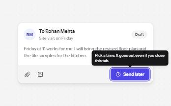
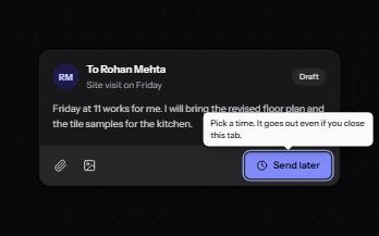
A short label or hint that appears on hover and keyboard focus, stays while you read it, and hides on Escape.
-
Popover
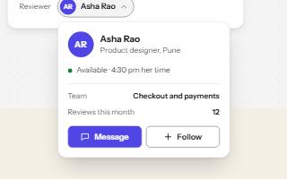
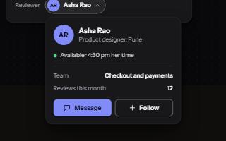
A card anchored to its button, opened with the popover attribute and dismissed by Escape or a click outside.
-
Glossary term
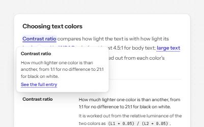
Technical terms in running text that open a short definition in place, backed by a full glossary with links both ways.
-
Status message
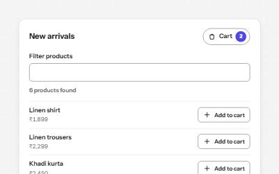
Results, confirmations and saves told to screen readers through role=status, without moving focus, once each time.