Accessibility pattern · Overlays
Non-modal dialog
show() opens a dialog without making the page inert, so people can read the help and keep typing in the form beside it. Focus moves into the panel when it opens and back when it closes; while it is open, F6 or a pair of buttons moves between the two.
- WCAG criteria
- 6
- Keyboard rules
- 4
- Checked with
- axe, keyboard and the inspector
Live demo
Try it
Use it with a mouse, a keyboard or a screen reader. The inspector beside it shows what the browser tells assistive technology as you go: focus, state changes and announcements.
The demo works without JavaScript only as far as its HTML does; the inspector needs JavaScript.
Keyboard
Keys it answers to
Every action works without a pointer.
| Key | What it does |
|---|---|
| Enter or Space | On Help, opens the panel and moves focus into it. While the panel is open, the same button reads Go to help and takes focus back into it. |
| F6 or ShiftF6 | While the panel is open, moves focus between the panel and the page, back to where it was in each. |
| Tab or ShiftTab | Moves through the page and the panel in reading order; the panel never traps focus. |
| Escape | With focus in the panel, closes it and returns focus to the Help button. |
Screen readers
What it announces
Written from the roles, names and states in the markup.
| When | Expected announcement |
|---|---|
| Focus reaches the Help button | Help, button, opens a dialog |
| The panel opens | Address help, dialog. Address help, heading level 3 |
| F6 or Back to page, after typing in the PIN code field | PIN code, edit text, 400607 |
| Focus reaches the page's button while the panel is open | Go to help, button, opens a dialog |
| A question is sent | Sent. We reply by email within a day. |
| Escape closes the panel | Help, button, opens a dialog |
These are expected announcements, not recordings. Wording and order differ between screen readers and browsers.
Code
Copy the code
The exact files this demo runs on. The styles are served with a prefix that keeps this site's own styles out of the demo; what you copy is the original.
<div class="ap-nmd" data-ap-nmd>
  <div class="ap-nmd__layout">
    <form class="ap-nmd__page" data-ap-nmd-page>
      <div class="ap-nmd__top">
        <h3 class="ap-nmd__name">Delivery address</h3>
        <button type="button" class="ap-btn ap-nmd__help" data-ap-nmd-open aria-haspopup="dialog">
          <svg class="ap-btn__icon" viewBox="0 0 24 24" aria-hidden="true" focusable="false"><circle cx="12" cy="12" r="9"/><path d="M9.6 9.3a2.5 2.5 0 1 1 3.3 2.4c-.6.3-.9.8-.9 1.4v.4"/><path d="M12 17h.01"/></svg>
          <span data-ap-nmd-label>Help</span>
        </button>
      </div>
      <div class="ap-field">
        <label class="ap-label" for="nmd-line1">Flat and building</label>
        <input class="ap-input" id="nmd-line1" name="line1" autocomplete="address-line1" value="B-1204, Silver Oak Residency" />
      </div>
      <div class="ap-nmd__pair">
        <div class="ap-field">
          <label class="ap-label" for="nmd-pin">PIN code</label>
          <input class="ap-input" id="nmd-pin" name="pin" inputmode="numeric" autocomplete="postal-code" value="400607" />
        </div>
        <div class="ap-field">
          <label class="ap-label" for="nmd-city">City</label>
          <input class="ap-input" id="nmd-city" name="city" autocomplete="address-level2" value="Thane" />
        </div>
      </div>
      <div class="ap-nmd__foot">
        <button type="submit" class="ap-btn ap-btn--primary">Save address</button>
        <p class="ap-nmd__saved" role="status"></p>
      </div>
    </form>

    <dialog class="ap-nmd__panel" aria-labelledby="nmd-name">
      <div class="ap-nmd__head">
        <span class="ap-nmd__badge" aria-hidden="true">
          <svg viewBox="0 0 24 24" focusable="false"><circle cx="12" cy="12" r="9"/><path d="M9.6 9.3a2.5 2.5 0 1 1 3.3 2.4c-.6.3-.9.8-.9 1.4v.4"/><path d="M12 17h.01"/></svg>
        </span>
        <h3 class="ap-nmd__pname" id="nmd-name" tabindex="-1" autofocus>Address help</h3>
        <button type="button" class="ap-nmd__close" data-ap-nmd-close aria-label="Close help">
          <svg viewBox="0 0 24 24" aria-hidden="true" focusable="false"><path d="M6 6l12 12M18 6 6 18"/></svg>
        </button>
      </div>
      <ul class="ap-nmd__tips">
        <li>Your PIN code is on any parcel sent to this address.</li>
        <li>Put the flat number first, so the rider finds the door.</li>
      </ul>
      <form class="ap-nmd__ask" data-ap-nmd-ask>
        <label class="ap-label" for="nmd-question">Ask a question</label>
        <div class="ap-nmd__row">
          <input class="ap-input" id="nmd-question" name="question" autocomplete="off" />
          <button type="submit" class="ap-btn ap-btn--primary">Send</button>
        </div>
        <p class="ap-nmd__status" role="status"></p>
      </form>
      <div class="ap-nmd__back">
        <button type="button" class="ap-btn ap-btn--ghost" data-ap-nmd-back>
          <svg class="ap-btn__icon" viewBox="0 0 24 24" aria-hidden="true" focusable="false"><path d="M19 12H5"/><path d="m11 18-6-6 6-6"/></svg>
          Back to page
        </button>
        <p class="ap-nmd__keys">or press <kbd>F6</kbd></p>
      </div>
    </dialog>
  </div>
</div>
/* Shared primitives: buttons and form fields used across the patterns.
   Uses the --ap-* design tokens. */

.ap-btn {
  display: inline-flex;
  align-items: center;
  justify-content: center;
  gap: 8px;
  min-height: 40px;
  padding: 0 16px;
  border: 1px solid var(--ap-border-strong);
  border-radius: var(--ap-radius-sm);
  background: var(--ap-surface);
  color: var(--ap-text);
  font: inherit;
  font-weight: 600;
  line-height: 1.2;
  text-decoration: none;
  white-space: nowrap;
  cursor: pointer;
  transition: background-color var(--ap-duration) var(--ap-ease), border-color var(--ap-duration) var(--ap-ease), box-shadow var(--ap-duration) var(--ap-ease);
}
.ap-btn:hover {
  background: var(--ap-surface-2);
}
.ap-btn:focus-visible {
  outline: 2px solid var(--ap-focus);
  outline-offset: 2px;
}
.ap-btn:disabled,
.ap-btn[aria-disabled="true"] {
  opacity: .55;
  cursor: not-allowed;
}
.ap-btn--primary {
  border-color: var(--ap-accent);
  background: var(--ap-accent);
  color: var(--ap-on-accent);
  box-shadow: var(--ap-shadow-sm);
}
.ap-btn--primary:hover {
  border-color: var(--ap-accent-hover);
  background: var(--ap-accent-hover);
}
.ap-btn--danger {
  border-color: var(--ap-danger);
  background: var(--ap-danger);
  color: var(--ap-surface);
}
.ap-btn--danger:hover {
  filter: brightness(1.08);
}
.ap-btn--ghost {
  border-color: transparent;
  background: transparent;
}
.ap-btn--ghost:hover {
  background: var(--ap-surface-2);
}
.ap-btn__icon {
  width: 18px;
  height: 18px;
  flex-shrink: 0;
  fill: none;
  stroke: currentColor;
  stroke-width: 2;
  stroke-linecap: round;
  stroke-linejoin: round;
}

.ap-field {
  display: grid;
  gap: 6px;
}
.ap-label {
  color: var(--ap-text);
  font-weight: 600;
  font-size: .9375rem;
}
.ap-hint {
  margin: 0;
  color: var(--ap-text-3);
  font-size: .875rem;
  line-height: 1.45;
}
.ap-error {
  display: flex;
  align-items: flex-start;
  gap: 6px;
  margin: 0;
  color: var(--ap-danger);
  font-size: .875rem;
  font-weight: 600;
  line-height: 1.45;
}
.ap-input {
  width: 100%;
  min-height: 44px;
  padding: 10px 12px;
  border: 1px solid var(--ap-border-strong);
  border-radius: var(--ap-radius-sm);
  background: var(--ap-surface);
  color: var(--ap-text);
  font: inherit;
  line-height: 1.4;
  transition: border-color var(--ap-duration) var(--ap-ease), box-shadow var(--ap-duration) var(--ap-ease);
}
.ap-input::placeholder {
  color: var(--ap-text-3);
}
.ap-input:hover {
  border-color: var(--ap-text-2);
}
.ap-input:focus-visible {
  outline: 2px solid var(--ap-focus);
  outline-offset: 1px;
  border-color: var(--ap-focus);
}
.ap-input[aria-invalid="true"] {
  border-color: var(--ap-danger);
  box-shadow: inset 4px 0 0 var(--ap-danger);
}
textarea.ap-input {
  resize: vertical;
  min-height: 88px;
}

@media (prefers-reduced-motion: reduce) {
  .ap-btn,
  .ap-input { transition: none; }
}

/* Non-modal dialog. Uses the --ap-* design tokens and the shared primitives. */
.ap-nmd {
  container-type: inline-size;
}
.ap-nmd__layout {
  display: grid;
  grid-template-columns: minmax(0, 420px);
  justify-content: center;
  align-items: start;
  gap: 16px;
}

/* The page the panel helps with */
.ap-nmd__page {
  display: grid;
  gap: 16px;
  padding: 20px 20px 22px;
  border: 1px solid var(--ap-border);
  border-radius: var(--ap-radius-lg);
  background: var(--ap-surface);
  box-shadow: var(--ap-shadow-sm);
}
.ap-nmd__top {
  display: flex;
  align-items: center;
  justify-content: space-between;
  gap: 8px;
}
.ap-nmd__name {
  margin: 0;
  font-size: 1.125rem;
  font-weight: 650;
  line-height: 1.3;
}
.ap-nmd__help {
  flex-shrink: 0;
  min-height: 36px;
  padding: 0 10px;
}
.ap-nmd__layout:has(> .ap-nmd__panel[open]) .ap-nmd__help {
  border-color: var(--ap-accent);
  background: var(--ap-accent-soft);
  color: var(--ap-accent-soft-text);
}
.ap-nmd__pair {
  display: grid;
  grid-template-columns: minmax(0, 1fr) minmax(0, 1.4fr);
  gap: 12px;
}
.ap-nmd__foot {
  display: flex;
  flex-wrap: wrap;
  align-items: center;
  gap: 8px 14px;
}
.ap-nmd__saved,
.ap-nmd__status {
  margin: 0;
  color: var(--ap-success);
  font-size: .875rem;
  font-weight: 600;
}
.ap-nmd__saved:empty,
.ap-nmd__status:empty {
  display: none;
}

/* The panel: a dialog opened with show(), in the flow beside the page */
.ap-nmd__panel {
  position: relative;
  inset: auto;
  width: auto;
  max-width: none;
  margin: 0;
  padding: 16px 18px 18px;
  border: 1px solid var(--ap-border);
  border-radius: var(--ap-radius-lg);
  background: var(--ap-surface);
  color: var(--ap-text);
  box-shadow: var(--ap-shadow-lg);
}
.ap-nmd__panel[open] {
  display: grid;
  gap: 12px;
  animation: ap-nmd-in 200ms var(--ap-ease);
}
.ap-nmd__head {
  display: flex;
  align-items: center;
  gap: 10px;
}
.ap-nmd__badge {
  display: grid;
  place-items: center;
  width: 32px;
  height: 32px;
  flex-shrink: 0;
  border-radius: var(--ap-radius-sm);
  background: var(--ap-accent-soft);
  color: var(--ap-accent-soft-text);
}
.ap-nmd__badge svg,
.ap-nmd__close svg {
  width: 18px;
  height: 18px;
  fill: none;
  stroke: currentColor;
  stroke-width: 2;
  stroke-linecap: round;
  stroke-linejoin: round;
}
.ap-nmd__pname {
  min-width: 0;
  margin: 0;
  margin-inline-end: auto;
  padding: 2px 4px;
  border-radius: calc(var(--ap-radius-sm) - 2px);
  font-size: 1rem;
  font-weight: 650;
  line-height: 1.3;
}
/* Focus lands here on open and on F6, so it shows where you are. */
.ap-nmd__pname:focus-visible {
  outline: 2px solid var(--ap-focus);
  outline-offset: 2px;
}
.ap-nmd__close {
  display: grid;
  place-items: center;
  width: 36px;
  height: 36px;
  flex-shrink: 0;
  padding: 0;
  border: 0;
  border-radius: var(--ap-radius-sm);
  background: transparent;
  color: var(--ap-text-2);
  cursor: pointer;
}
.ap-nmd__close:hover {
  background: var(--ap-surface-2);
  color: var(--ap-text);
}
.ap-nmd__close:focus-visible {
  outline: 2px solid var(--ap-focus);
  outline-offset: 2px;
}
.ap-nmd__tips {
  display: grid;
  gap: 8px;
  margin: 0;
  padding: 0 0 0 18px;
  color: var(--ap-text-2);
  font-size: .9375rem;
  line-height: 1.5;
}
.ap-nmd__tips li::marker {
  color: var(--ap-accent-text);
}
.ap-nmd__ask {
  display: grid;
  gap: 6px;
  padding-top: 12px;
  border-top: 1px solid var(--ap-border);
}
.ap-nmd__row {
  display: flex;
  gap: 8px;
}
.ap-nmd__row .ap-input {
  flex: 1;
  min-width: 0;
}
.ap-nmd__back {
  display: flex;
  flex-wrap: wrap;
  align-items: center;
  gap: 4px 6px;
  margin: -2px 0 -4px -10px;
}
.ap-nmd__back .ap-btn {
  padding: 0 10px;
}
.ap-nmd__keys {
  margin: 0;
  color: var(--ap-text-3);
  font-size: .8125rem;
}
.ap-nmd__keys kbd {
  display: inline-block;
  min-width: 24px;
  margin-inline-end: 2px;
  padding: 1px 6px;
  border: 1px solid var(--ap-border-strong);
  border-radius: calc(var(--ap-radius-sm) - 2px);
  background: var(--ap-surface-2);
  color: var(--ap-text);
  font-family: var(--ap-mono);
  font-size: .75rem;
  text-align: center;
}

/* Wide enough for both: the panel stands beside the form, a little lower,
   so neither covers the other. Narrower, it follows the form. */
@container (min-width: 560px) {
  .ap-nmd__layout:has(> .ap-nmd__panel[open]) {
    grid-template-columns: minmax(0, 420px) minmax(0, 270px);
  }
  .ap-nmd__panel {
    margin-top: 20px;
  }
}

@keyframes ap-nmd-in {
  from { opacity: 0; transform: translateY(8px) scale(.98); }
}

@media (prefers-reduced-motion: reduce) {
  .ap-nmd__panel[open] { animation: none; }
}
/**
 * Non-modal dialog: a help panel opened with dialog.show(), so the page
 * beside it stays usable.
 *
 * Markup: [data-ap-nmd] holding the page (form[data-ap-nmd-page]) with a
 * Help button[data-ap-nmd-open], and a dialog[aria-labelledby] whose heading
 * has tabindex=-1 and autofocus, with a close button[data-ap-nmd-close], a
 * Back to page button[data-ap-nmd-back] and a form[data-ap-nmd-ask]. Each
 * form has a role=status paragraph for its outcome.
 */

export function init(root) {
  const page = root.querySelector("[data-ap-nmd-page]");
  const opener = root.querySelector("[data-ap-nmd-open]");
  const label = opener.querySelector("[data-ap-nmd-label]");
  const panel = root.querySelector("dialog");
  const start = panel.querySelector("[autofocus]") || panel;
  const ask = panel.querySelector("[data-ap-nmd-ask]");
  const question = ask.querySelector("input");
  const askStatus = ask.querySelector("[role=status]");
  const pageStatus = page.querySelector("[role=status]");
  // Where focus was last in each part, so moving between them lands there.
  let lastInPage = null;
  let lastInPanel = null;

  function toPanel() {
    (lastInPanel && panel.contains(lastInPanel) ? lastInPanel : start).focus();
  }
  function toPage() {
    (lastInPage && page.contains(lastInPage) ? lastInPage : opener).focus();
  }

  function onOpenerClick() {
    if (panel.open) {
      toPanel();
      return;
    }
    lastInPanel = null;
    askStatus.textContent = "";
    panel.show();
    label.textContent = "Go to help";
    // show() focuses the autofocus heading; older engines need telling.
    if (document.activeElement !== start) start.focus();
  }

  function close() {
    const inside = panel.contains(document.activeElement);
    panel.close();
    if (inside) opener.focus();
  }

  function onClose() {
    label.textContent = "Help";
  }

  function onClick(event) {
    if (event.target.closest("[data-ap-nmd-close]")) close();
    else if (event.target.closest("[data-ap-nmd-back]")) toPage();
  }

  function onKeydown(event) {
    if (event.key === "F6" && panel.open) {
      event.preventDefault();
      if (panel.contains(document.activeElement)) toPage();
      else toPanel();
    } else if (event.key === "Escape" && panel.open && panel.contains(document.activeElement)) {
      event.preventDefault();
      close();
    }
  }

  function onFocusin(event) {
    if (panel.contains(event.target)) lastInPanel = event.target;
    else if (page.contains(event.target)) lastInPage = event.target;
  }

  // Emptied first, so the same message twice is announced twice.
  function say(region, text) {
    region.textContent = "";
    requestAnimationFrame(() => { region.textContent = text; });
  }

  function onAsk(event) {
    event.preventDefault();
    if (!question.value.trim()) {
      question.focus();
      say(askStatus, "Type your question first.");
      return;
    }
    question.value = "";
    say(askStatus, "Sent. We reply by email within a day.");
  }

  function onSave(event) {
    event.preventDefault();
    say(pageStatus, "Address saved.");
  }

  opener.addEventListener("click", onOpenerClick);
  panel.addEventListener("click", onClick);
  panel.addEventListener("close", onClose);
  root.addEventListener("keydown", onKeydown);
  root.addEventListener("focusin", onFocusin);
  ask.addEventListener("submit", onAsk);
  page.addEventListener("submit", onSave);

  return () => {
    if (panel.open) panel.close();
    opener.removeEventListener("click", onOpenerClick);
    panel.removeEventListener("click", onClick);
    panel.removeEventListener("close", onClose);
    root.removeEventListener("keydown", onKeydown);
    root.removeEventListener("focusin", onFocusin);
    ask.removeEventListener("submit", onAsk);
    page.removeEventListener("submit", onSave);
  };
}

for (const root of document.querySelectorAll("[data-ap-nmd]")) init(root);
/* Design tokens for the pattern components. Light by default, dark when the
   system asks for it; set data-theme="dark" on :root to force dark. */
:root {
    --ap-radius-sm: 8px;
    --ap-radius: 12px;
    --ap-radius-lg: 16px;
    --ap-radius-full: 999px;
    --ap-font: "Instrument Sans", ui-sans-serif, system-ui, -apple-system, "Segoe UI", Roboto, sans-serif;
    --ap-mono: "JetBrains Mono", ui-monospace, "Cascadia Mono", "SF Mono", Consolas, monospace;
    --ap-ease: cubic-bezier(.2, .8, .2, 1);
    --ap-duration: 180ms;
    --ap-target: 44px;
    --ap-bg: #F4F4F5;
    --ap-surface: #FFFFFF;
    --ap-surface-2: #F4F4F5;
    --ap-surface-3: #E4E4E7;
    --ap-border: #E4E4E7;
    --ap-border-strong: #76767F;
    --ap-text: #18181B;
    --ap-text-2: #3F3F46;
    --ap-text-3: #5E5E66;
    --ap-accent: #4F46E5;
    --ap-accent-hover: #4338CA;
    --ap-on-accent: #FFFFFF;
    --ap-accent-text: #4338CA;
    --ap-accent-soft: #EEF2FF;
    --ap-accent-soft-text: #3730A3;
    --ap-focus: #4F46E5;
    --ap-danger: #B91C1C;
    --ap-danger-soft: #FEF2F2;
    --ap-success: #15803D;
    --ap-success-soft: #F0FDF4;
    --ap-warning: #A15C07;
    --ap-warning-soft: #FEFCE8;
    --ap-info: #1D4ED8;
    --ap-info-soft: #EFF6FF;
    --ap-scrim: rgb(9 9 11 / .48);
    --ap-shadow-sm: 0 1px 2px rgb(9 9 11 / .06);
    --ap-shadow-md: 0 1px 2px rgb(9 9 11 / .05), 0 6px 16px -4px rgb(9 9 11 / .1);
    --ap-shadow-lg: 0 2px 6px rgb(9 9 11 / .06), 0 20px 40px -12px rgb(9 9 11 / .22);
    --ap-light-bg: #F4F4F5;
    --ap-light-surface: #FFFFFF;
    --ap-light-surface-2: #F4F4F5;
    --ap-light-surface-3: #E4E4E7;
    --ap-light-border: #E4E4E7;
    --ap-light-border-strong: #76767F;
    --ap-light-text: #18181B;
    --ap-light-text-2: #3F3F46;
    --ap-light-text-3: #5E5E66;
    --ap-light-accent: #4F46E5;
    --ap-light-accent-hover: #4338CA;
    --ap-light-on-accent: #FFFFFF;
    --ap-light-accent-text: #4338CA;
    --ap-light-accent-soft: #EEF2FF;
    --ap-light-accent-soft-text: #3730A3;
    --ap-light-focus: #4F46E5;
    --ap-light-danger: #B91C1C;
    --ap-light-danger-soft: #FEF2F2;
    --ap-light-success: #15803D;
    --ap-light-success-soft: #F0FDF4;
    --ap-light-warning: #A15C07;
    --ap-light-warning-soft: #FEFCE8;
    --ap-light-info: #1D4ED8;
    --ap-light-info-soft: #EFF6FF;
    --ap-light-scrim: rgb(9 9 11 / .48);
    --ap-light-shadow-sm: 0 1px 2px rgb(9 9 11 / .06);
    --ap-light-shadow-md: 0 1px 2px rgb(9 9 11 / .05), 0 6px 16px -4px rgb(9 9 11 / .1);
    --ap-light-shadow-lg: 0 2px 6px rgb(9 9 11 / .06), 0 20px 40px -12px rgb(9 9 11 / .22);
    --ap-dark-bg: #09090B;
    --ap-dark-surface: #18181B;
    --ap-dark-surface-2: #27272A;
    --ap-dark-surface-3: #3F3F46;
    --ap-dark-border: #2E2E33;
    --ap-dark-border-strong: #8E8E97;
    --ap-dark-text: #FAFAFA;
    --ap-dark-text-2: #D4D4D8;
    --ap-dark-text-3: #A1A1AA;
    --ap-dark-accent: #818CF8;
    --ap-dark-accent-hover: #A5B4FC;
    --ap-dark-on-accent: #0C0A1F;
    --ap-dark-accent-text: #A5B4FC;
    --ap-dark-accent-soft: #1E1B4B;
    --ap-dark-accent-soft-text: #C7D2FE;
    --ap-dark-focus: #A5B4FC;
    --ap-dark-danger: #F87171;
    --ap-dark-danger-soft: #2A1215;
    --ap-dark-success: #4ADE80;
    --ap-dark-success-soft: #0F2A1A;
    --ap-dark-warning: #FACC15;
    --ap-dark-warning-soft: #2A2410;
    --ap-dark-info: #60A5FA;
    --ap-dark-info-soft: #0F1D33;
    --ap-dark-scrim: rgb(0 0 0 / .62);
    --ap-dark-shadow-sm: 0 1px 2px rgb(0 0 0 / .4);
    --ap-dark-shadow-md: 0 1px 2px rgb(0 0 0 / .4), 0 8px 20px -6px rgb(0 0 0 / .5);
    --ap-dark-shadow-lg: 0 2px 8px rgb(0 0 0 / .45), 0 24px 48px -12px rgb(0 0 0 / .7);
}
@media (prefers-color-scheme: dark) {
  :root:not([data-theme="light"]) {
      --ap-bg: #09090B;
      --ap-surface: #18181B;
      --ap-surface-2: #27272A;
      --ap-surface-3: #3F3F46;
      --ap-border: #2E2E33;
      --ap-border-strong: #8E8E97;
      --ap-text: #FAFAFA;
      --ap-text-2: #D4D4D8;
      --ap-text-3: #A1A1AA;
      --ap-accent: #818CF8;
      --ap-accent-hover: #A5B4FC;
      --ap-on-accent: #0C0A1F;
      --ap-accent-text: #A5B4FC;
      --ap-accent-soft: #1E1B4B;
      --ap-accent-soft-text: #C7D2FE;
      --ap-focus: #A5B4FC;
      --ap-danger: #F87171;
      --ap-danger-soft: #2A1215;
      --ap-success: #4ADE80;
      --ap-success-soft: #0F2A1A;
      --ap-warning: #FACC15;
      --ap-warning-soft: #2A2410;
      --ap-info: #60A5FA;
      --ap-info-soft: #0F1D33;
      --ap-scrim: rgb(0 0 0 / .62);
      --ap-shadow-sm: 0 1px 2px rgb(0 0 0 / .4);
      --ap-shadow-md: 0 1px 2px rgb(0 0 0 / .4), 0 8px 20px -6px rgb(0 0 0 / .5);
      --ap-shadow-lg: 0 2px 8px rgb(0 0 0 / .45), 0 24px 48px -12px rgb(0 0 0 / .7);
  }
}
:root[data-theme="dark"] {
    --ap-bg: #09090B;
    --ap-surface: #18181B;
    --ap-surface-2: #27272A;
    --ap-surface-3: #3F3F46;
    --ap-border: #2E2E33;
    --ap-border-strong: #8E8E97;
    --ap-text: #FAFAFA;
    --ap-text-2: #D4D4D8;
    --ap-text-3: #A1A1AA;
    --ap-accent: #818CF8;
    --ap-accent-hover: #A5B4FC;
    --ap-on-accent: #0C0A1F;
    --ap-accent-text: #A5B4FC;
    --ap-accent-soft: #1E1B4B;
    --ap-accent-soft-text: #C7D2FE;
    --ap-focus: #A5B4FC;
    --ap-danger: #F87171;
    --ap-danger-soft: #2A1215;
    --ap-success: #4ADE80;
    --ap-success-soft: #0F2A1A;
    --ap-warning: #FACC15;
    --ap-warning-soft: #2A2410;
    --ap-info: #60A5FA;
    --ap-info-soft: #0F1D33;
    --ap-scrim: rgb(0 0 0 / .62);
    --ap-shadow-sm: 0 1px 2px rgb(0 0 0 / .4);
    --ap-shadow-md: 0 1px 2px rgb(0 0 0 / .4), 0 8px 20px -6px rgb(0 0 0 / .5);
    --ap-shadow-lg: 0 2px 8px rgb(0 0 0 / .45), 0 24px 48px -12px rgb(0 0 0 / .7);
}
WCAG 2.2
What it meets
The success criteria this pattern takes care of, and how.
-
2.1.1 Keyboard
Level A
Opening, closing and moving between the panel and the page all work from the keyboard, with buttons for each as well as keys.
-
2.1.2 No Keyboard Trap
Level A
The panel is not modal, so Tab moves out of it into the rest of the page as it would from any other content.
-
2.4.3 Focus Order
Level A
Focus goes into the panel on open, back to the Help button on close, and F6 returns to the exact control left in each part.
-
2.4.11 Focus Not Obscured (Minimum)
Level AA
On wide screens the panel sits beside the form and on narrow ones below it, so it never covers the field that has focus.
-
4.1.2 Name, Role, Value
Level A
The dialog element gives role=dialog, its heading names it, and the Help button says it opens a dialog.
-
4.1.3 Status Messages
Level AA
Saving the address and sending a question are confirmed in status messages, announced without moving focus.
Usage
When to use it
Use it
- Help, notes or tools that people consult while they keep working on the page.
- Panels that can stay open alongside the work, like a chat window or a find-and-replace bar.
Use something else
- A task that has to be finished or dismissed before going on: use a modal dialog.
- A question that must be answered now, like confirming a delete: use an alert dialog.
- A small panel that belongs to one button and closes when you click away: use a popover.
Common failures
How it usually goes wrong
Modal by accident
Opening a help panel with showModal() makes the form it is helping with unreachable. show() leaves the page working.
aria-modal on a panel that is not modal
aria-modal=true tells screen readers to hide the page, while Tab still goes there. Leave it off; the dialog element sets it only for showModal().
Focus left on the page
If focus stays on the button, screen reader users do not know the panel opened, and keyboard users must Tab through the whole page to reach it.
No quick way back
With the panel open, getting between it and the page by Tab alone can take dozens of presses. F6 and the Back to page button take one.
Covering what it helps with
A floating panel over the form hides the very field people are filling in. Here it sits beside the form, or below it on a narrow screen.
Notes
Building it
- show() opens the dialog without inertness or a backdrop; the element still has role=dialog, and aria-labelledby pointing at its heading names it.
- The panel's heading has tabindex=-1 and autofocus, so the browser puts focus there on show(): reading starts at the panel's name instead of skipping the tips to reach the first field.
- Escape is not built in for non-modal dialogs. The script closes on Escape only when focus is inside the panel, so the page's own fields keep the key.
- Browsers use F6 to reach the address bar, so the script takes it only while the panel is open and focus is in the demo. The Back to page and Go to help buttons do the same job for anyone who does not know the key.
Sources: HTML: the dialog element · WAI-ARIA Authoring Practices: Developing a Keyboard Interface
Checked with axe in light and dark themes, at desktop and phone widths, and by keyboard. Not yet tested with every screen reader and browser pair. Report a correction
Related
Patterns that go with it
-
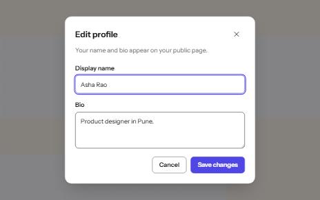
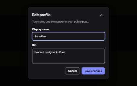
Modal dialog
A window over the page that holds focus until it is closed, built on the native dialog element.
-
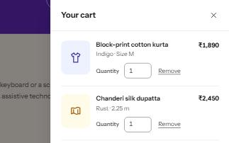
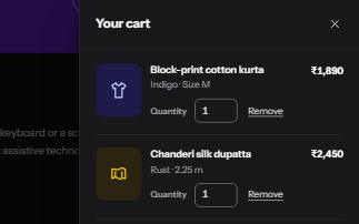
Drawer
A panel that slides in from the side of the screen for a cart, filters or settings, built on a modal dialog.
-
Popover
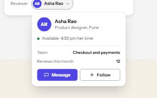
A card anchored to its button, opened with the popover attribute and dismissed by Escape or a click outside.
-
Keyboard shortcuts
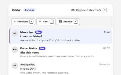
Single-key shortcuts that are off until turned on, can be remapped, work only in their list, and repeat a visible button.