Accessibility pattern · Interaction and motion
Content on hover or focus
Anything that appears on hover or focus must pass three tests: Escape hides it without moving anything, the pointer can move onto it, and it stays until you leave or dismiss it. Try the three popups below and the checks tick as you go; then switch on the broken version and watch them fail.
- WCAG criteria
- 5
- Keyboard rules
- 3
- Checked with
- axe, keyboard and the inspector
Live demo
Try it
Use it with a mouse, a keyboard or a screen reader. The inspector beside it shows what the browser tells assistive technology as you go: focus, state changes and announcements.
Order summary
Handloom cotton saree, indigo
Sold by Meera Handlooms
₹2,450
- Delivery Free on orders over ₹999. Express delivery in Bengaluru, Mumbai and Delhi costs ₹99 and arrives the next day.
- ₹49
- Payment
- CODCash on delivery: pay in cash or by UPI when the parcel arrives.
- Total
- ₹2,499
The three conditions
-
Dismissible
Not tried yet
Press Escape while a popup shows. It should hide, and focus and the pointer stay where they are.
-
Hoverable
Not tried yet
Move the pointer from a trigger onto its popup. It should stay open.
-
Persistent
Not tried yet
Rest on a trigger for three seconds. The popup should stay until you leave or press Escape.
The demo works without JavaScript only as far as its HTML does; the inspector needs JavaScript.
Keyboard
Keys it answers to
Every action works without a pointer.
| Key | What it does |
|---|---|
| Tab or ShiftTab | Moves to a trigger and its popup appears. From the seller's name, Tab moves into the card's links; leaving the card hides it. |
| Escape | Hides the open popup without moving focus. From inside the card, focus goes back to the seller's name. It stays hidden until you leave and come back. |
| Enter | Follows the focused link, or shows the delivery preview from the info button, as a tap does. |
Screen readers
What it announces
Written from the roles, names and states in the markup.
| When | Expected announcement |
|---|---|
| Focus reaches COD | COD, link. Cash on delivery: pay in cash or by UPI when the parcel arrives. |
| Focus reaches the info button | About delivery charges, button. Free on orders over ₹999. Express delivery in Bengaluru, Mumbai and Delhi costs ₹99 and arrives the next day. |
| Tab moves from the seller's name into the card | Meera Handlooms, group. Visit the shop, link |
| Escape hides a popup | Nothing; focus stays on the trigger |
| A check changes | Hoverable: pass |
These are expected announcements, not recordings. Wording and order differ between screen readers and browsers.
Code
Copy the code
The exact files this demo runs on. The styles are served with a prefix that keeps this site's own styles out of the demo; what you copy is the original.
<div class="ap-hover" data-ap-hover-content>
  <div class="ap-hover__layout">
    <section class="ap-hover__order" aria-labelledby="hover-order-name">
      <h3 class="ap-hover__name" id="hover-order-name">Order summary</h3>

      <div class="ap-hover__item">
        <svg class="ap-hover__swatch" viewBox="0 0 48 48" aria-hidden="true" focusable="false"><rect class="ap-hover__cloth" width="48" height="48" rx="8"/><path class="ap-hover__weave" d="M0 34h48M0 39h48"/><path class="ap-hover__motif" d="M12 12l4 6-4 6-4-6zM28 12l4 6-4 6-4-6z"/></svg>
        <div class="ap-hover__item-text">
          <p class="ap-hover__item-name">Handloom cotton saree, indigo</p>
          <p class="ap-hover__seller-line">Sold by <a class="ap-hover__trigger ap-hover__seller" id="hover-seller" href="#hover-shop" data-ap-trigger="hover-card">Meera Handlooms</a></p>
          <div class="ap-hover__pop ap-hover__card" id="hover-card" role="group" aria-labelledby="hover-card-name" popover="manual">
            <div class="ap-hover__card-top">
              <span class="ap-hover__avatar" aria-hidden="true" translate="no">MH</span>
              <div>
                <p class="ap-hover__card-name" id="hover-card-name">Meera Handlooms</p>
                <p class="ap-hover__card-meta">Weavers in Varanasi since 1998</p>
              </div>
            </div>
            <p class="ap-hover__card-stat">Rated 4.8 out of 5 by 1,240 buyers</p>
            <div class="ap-hover__card-links">
              <a href="#hover-shop">Visit the shop</a>
              <a href="#hover-message">Message the seller</a>
            </div>
          </div>
        </div>
        <p class="ap-hover__price">₹2,450</p>
      </div>

      <dl class="ap-hover__lines">
        <div class="ap-hover__line">
          <dt class="ap-hover__label">Delivery
            <button type="button" class="ap-hover__trigger ap-hover__info" id="hover-info" aria-label="About delivery charges" aria-describedby="hover-preview" data-ap-trigger="hover-preview">
              <svg viewBox="0 0 24 24" aria-hidden="true" focusable="false"><circle cx="12" cy="12" r="9"/><path d="M12 11v5M12 8h.01"/></svg>
            </button>
            <span class="ap-hover__pop ap-hover__tip" id="hover-preview" role="tooltip" popover="manual">Free on orders over ₹999. Express delivery in Bengaluru, Mumbai and Delhi costs ₹99 and arrives the next day.</span>
          </dt>
          <dd>₹49</dd>
        </div>
        <div class="ap-hover__line">
          <dt class="ap-hover__label">Payment</dt>
          <dd><a class="ap-hover__trigger ap-hover__term" id="hover-cod" href="#hover-glossary-cod" aria-describedby="hover-def" data-ap-trigger="hover-def">COD</a><span class="ap-hover__pop ap-hover__tip" id="hover-def" role="tooltip" popover="manual">Cash on delivery: pay in cash or by UPI when the parcel arrives.</span></dd>
        </div>
        <div class="ap-hover__line ap-hover__line--total">
          <dt>Total</dt>
          <dd>₹2,499</dd>
        </div>
      </dl>
      <button type="button" class="ap-btn ap-btn--primary ap-hover__place" data-ap-place>Place order</button>
      <p class="ap-hover__note" role="status"></p>
    </section>

    <section class="ap-hover__checks" aria-labelledby="hover-checks-name">
      <h3 class="ap-hover__checks-name" id="hover-checks-name">The three conditions</h3>
      <ul class="ap-hover__conds">
        <li class="ap-hover__cond" data-ap-cond="dismissible" data-state="idle">
          <svg class="ap-hover__mark" viewBox="0 0 24 24" aria-hidden="true" focusable="false"><circle class="ap-hover__mark-idle" cx="12" cy="12" r="8"/><path class="ap-hover__mark-pass" d="m5 12.5 4.5 4.5L19 7.5"/><path class="ap-hover__mark-fail" d="M7 7l10 10M17 7 7 17"/></svg>
          <span class="ap-hover__cond-name">Dismissible</span>
          <span class="ap-hover__verdict" data-ap-verdict>Not tried yet</span>
          <p class="ap-hover__how" data-ap-result>Press Escape while a popup shows. It should hide, and focus and the pointer stay where they are.</p>
        </li>
        <li class="ap-hover__cond" data-ap-cond="hoverable" data-state="idle">
          <svg class="ap-hover__mark" viewBox="0 0 24 24" aria-hidden="true" focusable="false"><circle class="ap-hover__mark-idle" cx="12" cy="12" r="8"/><path class="ap-hover__mark-pass" d="m5 12.5 4.5 4.5L19 7.5"/><path class="ap-hover__mark-fail" d="M7 7l10 10M17 7 7 17"/></svg>
          <span class="ap-hover__cond-name">Hoverable</span>
          <span class="ap-hover__verdict" data-ap-verdict>Not tried yet</span>
          <p class="ap-hover__how" data-ap-result>Move the pointer from a trigger onto its popup. It should stay open.</p>
        </li>
        <li class="ap-hover__cond" data-ap-cond="persistent" data-state="idle">
          <svg class="ap-hover__mark" viewBox="0 0 24 24" aria-hidden="true" focusable="false"><circle class="ap-hover__mark-idle" cx="12" cy="12" r="8"/><path class="ap-hover__mark-pass" d="m5 12.5 4.5 4.5L19 7.5"/><path class="ap-hover__mark-fail" d="M7 7l10 10M17 7 7 17"/></svg>
          <span class="ap-hover__cond-name">Persistent</span>
          <span class="ap-hover__verdict" data-ap-verdict>Not tried yet</span>
          <p class="ap-hover__how" data-ap-result>Rest on a trigger for three seconds. The popup should stay until you leave or press Escape.</p>
        </li>
      </ul>
      <p class="ap-hover__said" role="status"></p>
    </section>
  </div>
</div>
/* Shared primitives: buttons and form fields used across the patterns.
   Uses the --ap-* design tokens. */

.ap-btn {
  display: inline-flex;
  align-items: center;
  justify-content: center;
  gap: 8px;
  min-height: 40px;
  padding: 0 16px;
  border: 1px solid var(--ap-border-strong);
  border-radius: var(--ap-radius-sm);
  background: var(--ap-surface);
  color: var(--ap-text);
  font: inherit;
  font-weight: 600;
  line-height: 1.2;
  text-decoration: none;
  white-space: nowrap;
  cursor: pointer;
  transition: background-color var(--ap-duration) var(--ap-ease), border-color var(--ap-duration) var(--ap-ease), box-shadow var(--ap-duration) var(--ap-ease);
}
.ap-btn:hover {
  background: var(--ap-surface-2);
}
.ap-btn:focus-visible {
  outline: 2px solid var(--ap-focus);
  outline-offset: 2px;
}
.ap-btn:disabled,
.ap-btn[aria-disabled="true"] {
  opacity: .55;
  cursor: not-allowed;
}
.ap-btn--primary {
  border-color: var(--ap-accent);
  background: var(--ap-accent);
  color: var(--ap-on-accent);
  box-shadow: var(--ap-shadow-sm);
}
.ap-btn--primary:hover {
  border-color: var(--ap-accent-hover);
  background: var(--ap-accent-hover);
}
.ap-btn--danger {
  border-color: var(--ap-danger);
  background: var(--ap-danger);
  color: var(--ap-surface);
}
.ap-btn--danger:hover {
  filter: brightness(1.08);
}
.ap-btn--ghost {
  border-color: transparent;
  background: transparent;
}
.ap-btn--ghost:hover {
  background: var(--ap-surface-2);
}
.ap-btn__icon {
  width: 18px;
  height: 18px;
  flex-shrink: 0;
  fill: none;
  stroke: currentColor;
  stroke-width: 2;
  stroke-linecap: round;
  stroke-linejoin: round;
}

.ap-field {
  display: grid;
  gap: 6px;
}
.ap-label {
  color: var(--ap-text);
  font-weight: 600;
  font-size: .9375rem;
}
.ap-hint {
  margin: 0;
  color: var(--ap-text-3);
  font-size: .875rem;
  line-height: 1.45;
}
.ap-error {
  display: flex;
  align-items: flex-start;
  gap: 6px;
  margin: 0;
  color: var(--ap-danger);
  font-size: .875rem;
  font-weight: 600;
  line-height: 1.45;
}
.ap-input {
  width: 100%;
  min-height: 44px;
  padding: 10px 12px;
  border: 1px solid var(--ap-border-strong);
  border-radius: var(--ap-radius-sm);
  background: var(--ap-surface);
  color: var(--ap-text);
  font: inherit;
  line-height: 1.4;
  transition: border-color var(--ap-duration) var(--ap-ease), box-shadow var(--ap-duration) var(--ap-ease);
}
.ap-input::placeholder {
  color: var(--ap-text-3);
}
.ap-input:hover {
  border-color: var(--ap-text-2);
}
.ap-input:focus-visible {
  outline: 2px solid var(--ap-focus);
  outline-offset: 1px;
  border-color: var(--ap-focus);
}
.ap-input[aria-invalid="true"] {
  border-color: var(--ap-danger);
  box-shadow: inset 4px 0 0 var(--ap-danger);
}
textarea.ap-input {
  resize: vertical;
  min-height: 88px;
}

@media (prefers-reduced-motion: reduce) {
  .ap-btn,
  .ap-input { transition: none; }
}

/* Content on hover or focus. Uses the --ap-* design tokens and the shared primitives.
   data-broken on the root shows the failures 1.4.13 forbids. */
.ap-hover {
  width: min(100%, 820px);
  margin-inline: auto;
  color: var(--ap-text);
  container-type: inline-size;
}
.ap-hover__layout {
  display: grid;
  gap: 16px;
  align-items: start;
}

/* ── The order ── */
.ap-hover__order {
  display: grid;
  gap: 14px;
  min-width: 0;
  padding: 20px 22px 22px;
  border: 1px solid var(--ap-border);
  border-radius: var(--ap-radius-lg);
  background: var(--ap-surface);
  box-shadow: var(--ap-shadow-md);
}
.ap-hover__name {
  margin: 0;
  font-size: 1.0625rem;
  font-weight: 650;
  line-height: 1.35;
}
.ap-hover__item {
  display: grid;
  grid-template-columns: auto minmax(0, 1fr) auto;
  align-items: start;
  gap: 14px;
  padding-bottom: 14px;
  border-bottom: 1px solid var(--ap-border);
}
.ap-hover__swatch {
  width: 52px;
  height: 52px;
}
.ap-hover__cloth { fill: var(--ap-accent); }
.ap-hover__weave { fill: none; stroke: var(--ap-on-accent); stroke-width: 2; }
.ap-hover__motif { fill: var(--ap-warning-soft); }
.ap-hover__item-name,
.ap-hover__seller-line,
.ap-hover__price {
  margin: 0;
}
.ap-hover__item-name {
  font-weight: 600;
  line-height: 1.4;
}
.ap-hover__seller-line {
  margin-top: 4px;
  color: var(--ap-text-3);
  font-size: .875rem;
}
.ap-hover__price {
  font-weight: 650;
  font-variant-numeric: tabular-nums;
}

.ap-hover__lines {
  display: grid;
  gap: 2px;
  margin: 0;
}
.ap-hover__line {
  display: flex;
  align-items: center;
  justify-content: space-between;
  gap: 16px;
  min-height: 36px;
}
.ap-hover__line dt {
  color: var(--ap-text-2);
}
.ap-hover__line dd {
  margin: 0;
  font-variant-numeric: tabular-nums;
}
.ap-hover__label {
  display: flex;
  align-items: center;
  gap: 4px;
}
.ap-hover__line--total {
  margin-top: 6px;
  padding-top: 12px;
  border-top: 1px solid var(--ap-border);
  font-size: 1.0625rem;
  font-weight: 700;
}
.ap-hover__line--total dt {
  color: var(--ap-text);
}
.ap-hover__place {
  min-height: var(--ap-target);
}
.ap-hover__note {
  margin: 0;
  color: var(--ap-text-2);
  font-size: .875rem;
  font-weight: 600;
}
.ap-hover__note:empty {
  display: none;
}

/* ── Triggers ── */
.ap-hover__seller,
.ap-hover__term,
.ap-hover__card-links a {
  border-radius: 3px;
  color: var(--ap-accent-text);
  font-weight: 600;
  text-decoration: underline;
  text-underline-offset: 3px;
}
/* A term with a definition: a dotted underline says "there is more here". */
.ap-hover__term {
  text-decoration-style: dotted;
  text-decoration-thickness: 2px;
}
.ap-hover__info {
  display: grid;
  place-items: center;
  width: 32px;
  height: 32px;
  padding: 0;
  border: 0;
  border-radius: var(--ap-radius-full);
  background: transparent;
  color: var(--ap-text-2);
  cursor: pointer;
}
.ap-hover__info:hover {
  background: var(--ap-surface-2);
  color: var(--ap-text);
}
.ap-hover__info svg {
  width: 18px;
  height: 18px;
  fill: none;
  stroke: currentColor;
  stroke-width: 2;
  stroke-linecap: round;
}
.ap-hover__trigger:focus-visible {
  outline: 2px solid var(--ap-focus);
  outline-offset: 2px;
}

/* ── Popups: manual popovers in the top layer, placed by the script ── */
.ap-hover__pop {
  inset: auto;
  margin: 0;
  overflow: visible;
  font-family: var(--ap-font);
  text-align: start;
}
.ap-hover__pop:popover-open {
  animation: ap-hover-in var(--ap-duration) var(--ap-ease);
}
.ap-hover__tip {
  max-width: min(280px, calc(100vw - 16px));
  padding: 9px 12px;
  border: 0;
  border-radius: var(--ap-radius-sm);
  background: var(--ap-text);
  color: var(--ap-surface);
  font-size: .8125rem;
  font-weight: 500;
  line-height: 1.5;
  box-shadow: var(--ap-shadow-md);
}
.ap-hover__card {
  width: min(290px, calc(100vw - 16px));
  padding: 16px;
  border: 1px solid var(--ap-border);
  border-radius: var(--ap-radius);
  background: var(--ap-surface);
  color: var(--ap-text);
  font-size: .9375rem;
  box-shadow: var(--ap-shadow-lg);
}
.ap-hover__card-top {
  display: flex;
  align-items: center;
  gap: 12px;
}
.ap-hover__avatar {
  display: grid;
  place-items: center;
  width: 42px;
  height: 42px;
  flex-shrink: 0;
  border-radius: var(--ap-radius-full);
  background: var(--ap-accent-soft);
  color: var(--ap-accent-soft-text);
  font-size: .8125rem;
  font-weight: 700;
}
.ap-hover__card-name,
.ap-hover__card-meta,
.ap-hover__card-stat {
  margin: 0;
}
.ap-hover__card-name {
  font-weight: 650;
}
.ap-hover__card-meta {
  color: var(--ap-text-3);
  font-size: .8125rem;
}
.ap-hover__card-stat {
  margin-top: 12px;
  color: var(--ap-text-2);
  font-size: .875rem;
}
.ap-hover__card-links {
  display: flex;
  flex-wrap: wrap;
  gap: 4px 16px;
  margin-top: 12px;
  padding-top: 12px;
  border-top: 1px solid var(--ap-border);
  font-size: .875rem;
}
.ap-hover__card-links a {
  display: inline-flex;
  align-items: center;
  min-height: 28px;
}
.ap-hover__card-links a:focus-visible {
  outline: 2px solid var(--ap-focus);
  outline-offset: 2px;
}

/* The bridge: covers the gap toward the trigger, so the pointer can cross it. */
.ap-hover__pop::after {
  content: "";
  position: absolute;
  left: 0;
  right: 0;
  height: 12px;
}
.ap-hover__pop[data-side="top"]::after { top: 100%; }
.ap-hover__pop[data-side="bottom"]::after { bottom: 100%; }
.ap-hover[data-broken] .ap-hover__pop::after {
  display: none;
}

/* ── The checks ── */
.ap-hover__checks {
  display: grid;
  gap: 12px;
  min-width: 0;
  padding: 18px 18px 16px;
  border: 1px solid var(--ap-border);
  border-radius: var(--ap-radius-lg);
  background: var(--ap-surface);
  box-shadow: var(--ap-shadow-md);
}
.ap-hover__checks-name {
  margin: 0;
  font-size: 1rem;
  font-weight: 650;
}
.ap-hover__conds {
  display: grid;
  gap: 8px;
  margin: 0;
  padding: 0;
  list-style: none;
}
.ap-hover__cond {
  display: grid;
  grid-template-columns: auto minmax(0, 1fr) auto;
  align-items: center;
  gap: 4px 10px;
  padding: 12px 14px;
  border: 1px solid var(--ap-border);
  border-radius: var(--ap-radius-sm);
  transition: background-color var(--ap-duration) var(--ap-ease), border-color var(--ap-duration) var(--ap-ease);
}
.ap-hover__mark {
  width: 20px;
  height: 20px;
  fill: none;
  stroke: currentColor;
  stroke-width: 2.5;
  stroke-linecap: round;
  stroke-linejoin: round;
}
.ap-hover__mark > * {
  display: none;
}
.ap-hover__mark-idle {
  stroke-width: 2;
  stroke-dasharray: 3 3;
}
.ap-hover__cond[data-state="idle"] .ap-hover__mark-idle,
.ap-hover__cond[data-state="pass"] .ap-hover__mark-pass,
.ap-hover__cond[data-state="fail"] .ap-hover__mark-fail {
  display: inline;
}
.ap-hover__cond-name {
  font-weight: 650;
}
.ap-hover__verdict {
  font-size: .8125rem;
  font-weight: 650;
}
.ap-hover__how {
  grid-column: 2 / -1;
  margin: 0;
  color: var(--ap-text-2);
  font-size: .8125rem;
  line-height: 1.45;
}
.ap-hover__cond[data-state="idle"] {
  color: var(--ap-text-3);
}
.ap-hover__cond[data-state="idle"] .ap-hover__cond-name {
  color: var(--ap-text);
}
.ap-hover__cond[data-state="pass"] {
  border-color: var(--ap-success);
  background: var(--ap-success-soft);
  color: var(--ap-success);
}
.ap-hover__cond[data-state="fail"] {
  border-color: var(--ap-danger);
  background: var(--ap-danger-soft);
  color: var(--ap-danger);
}
.ap-hover__cond:is([data-state="pass"], [data-state="fail"]) .ap-hover__how {
  color: inherit;
}
.ap-hover__said {
  margin: 0;
  color: var(--ap-text-2);
  font-size: .875rem;
}
.ap-hover__said:empty {
  display: none;
}

@keyframes ap-hover-in {
  from { opacity: 0; transform: translateY(var(--ap-hover-from, 4px)); }
}
.ap-hover__pop[data-side="bottom"] {
  --ap-hover-from: -4px;
}

@container (min-width: 640px) {
  .ap-hover__layout { grid-template-columns: minmax(0, 1fr) minmax(0, 300px); }
}

@media (forced-colors: active) {
  .ap-hover__tip { border: 1px solid CanvasText; }
}

@media (prefers-reduced-motion: reduce) {
  .ap-hover__pop:popover-open { animation: none; }
  .ap-hover__cond { transition: none; }
}
/**
 * Content on hover or focus (WCAG 1.4.13): popups that appear on hover and
 * keyboard focus, hide on Escape without moving anything, can be hovered
 * across the gap from their trigger, and stay until hover and focus leave.
 * A panel of checks watches real events and marks each condition.
 *
 * Markup: [data-ap-hover-content] holding triggers [data-ap-trigger="<id>"]
 * that name a popover=manual element, the checks [data-ap-cond], and two
 * role=status paragraphs. Add data-broken to the root for the failures:
 * no grace delay or bridge, no Escape, a two-second timer, placed over the
 * content below.
 */

const SHOW_HOVER = 250;     // long enough not to flash as the pointer passes
const SHOW_FOCUS = 80;
const GRACE = 300;          // time to cross from the trigger to the popup
const PERSIST = 3000;       // open this long while in use: persistent
const BROKEN_TIMER = 2000;  // the broken version closes itself
const GAP = 8;
const BROKEN_GAP = 14;
const EDGE = 8;

const RESULT = {
  dismissible: {
    pass: ["Escape hid it, and focus and the pointer stayed put.", "Dismissible: pass"],
    fail: ["Escape did nothing. The popup still covers the page.", "Dismissible: fail"],
  },
  hoverable: {
    pass: ["The pointer reached the popup, and it stayed open.", "Hoverable: pass"],
    fail: ["It closed before the pointer could reach it.", "Hoverable: fail"],
  },
  persistent: {
    pass: ["It stayed open for three seconds, with no timer to close it.", "Persistent: pass"],
    fail: ["It closed on a timer while you were still on it.", "Persistent: fail"],
  },
};

export function init(root) {
  const ac = new AbortController();
  const on = (target, type, fn, options = {}) => target.addEventListener(type, fn, { ...options, signal: ac.signal });
  const broken = () => root.hasAttribute("data-broken");
  const said = root.querySelector(".ap-hover__said");
  const note = root.querySelector(".ap-hover__note");
  const conds = Object.fromEntries([...root.querySelectorAll("[data-ap-cond]")].map((li) => [li.dataset.apCond, li]));
  const timers = new Set();
  let ghost = null; // where a broken popup was when it vanished under the pointer's path

  const pairs = [...root.querySelectorAll("[data-ap-trigger]")].map((trigger) => ({
    trigger,
    pop: document.getElementById(trigger.dataset.apTrigger),
    hover: false, popHover: false, focus: false, pinned: false,
    dismissed: false, byHover: false, returning: false, timer: 0, life: 0,
  }));

  const isOpen = (p) => p.pop.matches(":popover-open");
  const engaged = (p) => p.hover || p.popHover || p.focus || p.pinned;
  const later = (fn, ms) => {
    const t = setTimeout(() => { timers.delete(t); fn(); }, ms);
    timers.add(t);
    return t;
  };

  function say(region, text) {
    region.textContent = "";
    later(() => { region.textContent = text; }, 60);
  }

  function mark(key, state) {
    const li = conds[key];
    const [text, line] = RESULT[key][state];
    if (li.dataset.state === state) return;
    li.dataset.state = state;
    li.querySelector("[data-ap-verdict]").textContent = state === "pass" ? "Pass" : "Fail";
    li.querySelector("[data-ap-result]").textContent = text;
    say(said, line);
  }

  function place(p) {
    const r = p.trigger.getBoundingClientRect();
    const vw = document.documentElement.clientWidth;
    const vh = document.documentElement.clientHeight;
    const w = p.pop.offsetWidth;
    const h = p.pop.offsetHeight;
    let side = "bottom";
    let gap = BROKEN_GAP;
    if (!broken()) {
      // Above by default, below when there is no room above: never over the trigger.
      gap = GAP;
      side = r.top - gap - h >= EDGE || r.bottom + gap + h > vh - EDGE ? "top" : "bottom";
    }
    const left = Math.min(Math.max(r.left + r.width / 2 - w / 2, EDGE), vw - w - EDGE);
    p.pop.dataset.side = side;
    p.pop.style.left = `${Math.round(left)}px`;
    p.pop.style.top = `${Math.round(side === "top" ? r.top - gap - h : r.bottom + gap)}px`;
  }

  function show(p) {
    clearTimeout(p.timer);
    if (p.dismissed || isOpen(p)) return;
    for (const o of pairs) if (o !== p) hide(o);
    p.pop.showPopover();
    place(p);
    clearTimeout(p.life);
    if (broken()) {
      p.life = later(() => {
        const inUse = engaged(p);
        hide(p);
        if (inUse) mark("persistent", "fail");
      }, BROKEN_TIMER);
    } else {
      p.life = later(() => { if (isOpen(p) && engaged(p)) mark("persistent", "pass"); }, PERSIST);
    }
  }

  function hide(p, why = "") {
    clearTimeout(p.timer);
    clearTimeout(p.life);
    if (!isOpen(p)) return;
    if (why === "leave" && broken()) {
      const b = p.pop.getBoundingClientRect();
      ghost = { left: b.left - BROKEN_GAP, top: b.top - BROKEN_GAP, right: b.right + BROKEN_GAP, bottom: b.bottom + BROKEN_GAP, until: performance.now() + 900 };
    }
    p.pop.hidePopover();
    p.byHover = false;
  }

  function showSoon(p, delay) {
    clearTimeout(p.timer);
    p.timer = later(() => show(p), broken() ? 0 : delay);
  }

  // Hidden only once the pointer and focus have both left the trigger and the popup.
  function hideSoon(p, delay = GRACE) {
    if (engaged(p)) return;
    clearTimeout(p.timer);
    p.timer = later(() => { if (!engaged(p)) hide(p, "leave"); }, delay);
  }

  for (const p of pairs) {
    const { trigger, pop } = p;
    on(trigger, "pointerenter", (event) => {
      if (event.pointerType === "touch") return;
      p.hover = true;
      p.byHover = true;
      p.dismissed = false;
      showSoon(p, SHOW_HOVER);
    });
    on(trigger, "pointerleave", (event) => {
      if (event.pointerType === "touch") return;
      p.hover = false;
      if (broken()) hide(p, "leave");
      else hideSoon(p);
    });
    on(pop, "pointerenter", () => {
      p.popHover = true;
      clearTimeout(p.timer);
      if (!broken() && p.byHover) later(() => { if (isOpen(p) && p.popHover) mark("hoverable", "pass"); }, 400);
    });
    on(pop, "pointerleave", () => {
      p.popHover = false;
      if (!broken()) hideSoon(p);
    });
    on(trigger, "focus", () => {
      // Keyboard focus: a click already showed it on hover, and a tap uses click.
      if (!trigger.matches(":focus-visible")) return;
      p.focus = true;
      // Focus put back by Escape: the popup stays dismissed.
      if (p.returning) {
        p.returning = false;
        return;
      }
      p.dismissed = false;
      showSoon(p, SHOW_FOCUS);
    });
  }

  // Focus may move from a trigger into its popup (the profile card's links).
  function onFocusMove() {
    requestAnimationFrame(() => {
      const el = document.activeElement;
      for (const p of pairs) {
        const within = p.pop.contains(el) || (p.trigger === el && p.focus);
        if (p.pop.contains(el)) p.focus = true;
        if (p.focus && !within) {
          p.focus = false;
          p.pinned = false;
          hideSoon(p, 0);
        }
      }
    });
  }

  function onKeydown(event) {
    if (event.key !== "Escape") return;
    const open = pairs.filter(isOpen);
    if (!open.length) return;
    if (broken()) {
      later(() => { if (open.some(isOpen)) mark("dismissible", "fail"); }, 0);
      return;
    }
    // Only this Escape is used up: a dialog around the demo stays open.
    event.preventDefault();
    for (const p of open) {
      const inside = p.pop.contains(document.activeElement);
      p.pinned = false;
      hide(p);
      p.dismissed = true;
      // Focus inside a hidden popup would be lost: put it back on the trigger.
      if (inside) {
        p.returning = true;
        p.trigger.focus();
        p.returning = false;
      }
    }
    mark("dismissible", "pass");
  }

  function onPointerMove(event) {
    if (!ghost) return;
    if (performance.now() > ghost.until) {
      ghost = null;
      return;
    }
    const { clientX: x, clientY: y } = event;
    if (x >= ghost.left && x <= ghost.right && y >= ghost.top && y <= ghost.bottom) {
      ghost = null;
      mark("hoverable", "fail");
    }
  }

  // A tap or click elsewhere puts away a popup that a click opened.
  function onPointerDown(event) {
    for (const p of pairs) {
      if (isOpen(p) && !p.trigger.contains(event.target) && !p.pop.contains(event.target)) {
        p.pinned = false;
        if (!engaged(p)) hide(p);
      }
    }
  }

  function onClick(event) {
    const t = event.target;
    const info = t.closest("button[data-ap-trigger]");
    if (info) {
      // A tap has no hover and no focus-visible: the click shows the preview.
      const p = pairs.find((o) => o.trigger === info);
      p.pinned = true;
      p.dismissed = false;
      show(p);
      return;
    }
    if (t.closest("[data-ap-place]")) {
      say(note, "Order placed. A confirmation is on its way by SMS.");
      return;
    }
    const link = t.closest("a[href^='#']");
    if (link) {
      // The demo's pages do not exist here: stay, and say what would happen.
      event.preventDefault();
      say(note, "In a real site this link opens that page.");
    }
  }

  const follow = () => { for (const p of pairs) if (isOpen(p)) place(p); };

  on(root, "focusin", onFocusMove);
  on(root, "focusout", onFocusMove);
  on(root, "click", onClick);
  on(document, "keydown", onKeydown);
  on(document, "pointermove", onPointerMove, { passive: true });
  on(document, "pointerdown", onPointerDown);
  on(window, "scroll", follow, { capture: true, passive: true });
  on(window, "resize", follow, { passive: true });

  return () => {
    ac.abort();
    for (const p of pairs) hide(p);
    for (const t of timers) clearTimeout(t);
  };
}

for (const root of document.querySelectorAll("[data-ap-hover-content]")) init(root);
/* Design tokens for the pattern components. Light by default, dark when the
   system asks for it; set data-theme="dark" on :root to force dark. */
:root {
    --ap-radius-sm: 8px;
    --ap-radius: 12px;
    --ap-radius-lg: 16px;
    --ap-radius-full: 999px;
    --ap-font: "Instrument Sans", ui-sans-serif, system-ui, -apple-system, "Segoe UI", Roboto, sans-serif;
    --ap-mono: "JetBrains Mono", ui-monospace, "Cascadia Mono", "SF Mono", Consolas, monospace;
    --ap-ease: cubic-bezier(.2, .8, .2, 1);
    --ap-duration: 180ms;
    --ap-target: 44px;
    --ap-bg: #F4F4F5;
    --ap-surface: #FFFFFF;
    --ap-surface-2: #F4F4F5;
    --ap-surface-3: #E4E4E7;
    --ap-border: #E4E4E7;
    --ap-border-strong: #76767F;
    --ap-text: #18181B;
    --ap-text-2: #3F3F46;
    --ap-text-3: #5E5E66;
    --ap-accent: #4F46E5;
    --ap-accent-hover: #4338CA;
    --ap-on-accent: #FFFFFF;
    --ap-accent-text: #4338CA;
    --ap-accent-soft: #EEF2FF;
    --ap-accent-soft-text: #3730A3;
    --ap-focus: #4F46E5;
    --ap-danger: #B91C1C;
    --ap-danger-soft: #FEF2F2;
    --ap-success: #15803D;
    --ap-success-soft: #F0FDF4;
    --ap-warning: #A15C07;
    --ap-warning-soft: #FEFCE8;
    --ap-info: #1D4ED8;
    --ap-info-soft: #EFF6FF;
    --ap-scrim: rgb(9 9 11 / .48);
    --ap-shadow-sm: 0 1px 2px rgb(9 9 11 / .06);
    --ap-shadow-md: 0 1px 2px rgb(9 9 11 / .05), 0 6px 16px -4px rgb(9 9 11 / .1);
    --ap-shadow-lg: 0 2px 6px rgb(9 9 11 / .06), 0 20px 40px -12px rgb(9 9 11 / .22);
    --ap-light-bg: #F4F4F5;
    --ap-light-surface: #FFFFFF;
    --ap-light-surface-2: #F4F4F5;
    --ap-light-surface-3: #E4E4E7;
    --ap-light-border: #E4E4E7;
    --ap-light-border-strong: #76767F;
    --ap-light-text: #18181B;
    --ap-light-text-2: #3F3F46;
    --ap-light-text-3: #5E5E66;
    --ap-light-accent: #4F46E5;
    --ap-light-accent-hover: #4338CA;
    --ap-light-on-accent: #FFFFFF;
    --ap-light-accent-text: #4338CA;
    --ap-light-accent-soft: #EEF2FF;
    --ap-light-accent-soft-text: #3730A3;
    --ap-light-focus: #4F46E5;
    --ap-light-danger: #B91C1C;
    --ap-light-danger-soft: #FEF2F2;
    --ap-light-success: #15803D;
    --ap-light-success-soft: #F0FDF4;
    --ap-light-warning: #A15C07;
    --ap-light-warning-soft: #FEFCE8;
    --ap-light-info: #1D4ED8;
    --ap-light-info-soft: #EFF6FF;
    --ap-light-scrim: rgb(9 9 11 / .48);
    --ap-light-shadow-sm: 0 1px 2px rgb(9 9 11 / .06);
    --ap-light-shadow-md: 0 1px 2px rgb(9 9 11 / .05), 0 6px 16px -4px rgb(9 9 11 / .1);
    --ap-light-shadow-lg: 0 2px 6px rgb(9 9 11 / .06), 0 20px 40px -12px rgb(9 9 11 / .22);
    --ap-dark-bg: #09090B;
    --ap-dark-surface: #18181B;
    --ap-dark-surface-2: #27272A;
    --ap-dark-surface-3: #3F3F46;
    --ap-dark-border: #2E2E33;
    --ap-dark-border-strong: #8E8E97;
    --ap-dark-text: #FAFAFA;
    --ap-dark-text-2: #D4D4D8;
    --ap-dark-text-3: #A1A1AA;
    --ap-dark-accent: #818CF8;
    --ap-dark-accent-hover: #A5B4FC;
    --ap-dark-on-accent: #0C0A1F;
    --ap-dark-accent-text: #A5B4FC;
    --ap-dark-accent-soft: #1E1B4B;
    --ap-dark-accent-soft-text: #C7D2FE;
    --ap-dark-focus: #A5B4FC;
    --ap-dark-danger: #F87171;
    --ap-dark-danger-soft: #2A1215;
    --ap-dark-success: #4ADE80;
    --ap-dark-success-soft: #0F2A1A;
    --ap-dark-warning: #FACC15;
    --ap-dark-warning-soft: #2A2410;
    --ap-dark-info: #60A5FA;
    --ap-dark-info-soft: #0F1D33;
    --ap-dark-scrim: rgb(0 0 0 / .62);
    --ap-dark-shadow-sm: 0 1px 2px rgb(0 0 0 / .4);
    --ap-dark-shadow-md: 0 1px 2px rgb(0 0 0 / .4), 0 8px 20px -6px rgb(0 0 0 / .5);
    --ap-dark-shadow-lg: 0 2px 8px rgb(0 0 0 / .45), 0 24px 48px -12px rgb(0 0 0 / .7);
}
@media (prefers-color-scheme: dark) {
  :root:not([data-theme="light"]) {
      --ap-bg: #09090B;
      --ap-surface: #18181B;
      --ap-surface-2: #27272A;
      --ap-surface-3: #3F3F46;
      --ap-border: #2E2E33;
      --ap-border-strong: #8E8E97;
      --ap-text: #FAFAFA;
      --ap-text-2: #D4D4D8;
      --ap-text-3: #A1A1AA;
      --ap-accent: #818CF8;
      --ap-accent-hover: #A5B4FC;
      --ap-on-accent: #0C0A1F;
      --ap-accent-text: #A5B4FC;
      --ap-accent-soft: #1E1B4B;
      --ap-accent-soft-text: #C7D2FE;
      --ap-focus: #A5B4FC;
      --ap-danger: #F87171;
      --ap-danger-soft: #2A1215;
      --ap-success: #4ADE80;
      --ap-success-soft: #0F2A1A;
      --ap-warning: #FACC15;
      --ap-warning-soft: #2A2410;
      --ap-info: #60A5FA;
      --ap-info-soft: #0F1D33;
      --ap-scrim: rgb(0 0 0 / .62);
      --ap-shadow-sm: 0 1px 2px rgb(0 0 0 / .4);
      --ap-shadow-md: 0 1px 2px rgb(0 0 0 / .4), 0 8px 20px -6px rgb(0 0 0 / .5);
      --ap-shadow-lg: 0 2px 8px rgb(0 0 0 / .45), 0 24px 48px -12px rgb(0 0 0 / .7);
  }
}
:root[data-theme="dark"] {
    --ap-bg: #09090B;
    --ap-surface: #18181B;
    --ap-surface-2: #27272A;
    --ap-surface-3: #3F3F46;
    --ap-border: #2E2E33;
    --ap-border-strong: #8E8E97;
    --ap-text: #FAFAFA;
    --ap-text-2: #D4D4D8;
    --ap-text-3: #A1A1AA;
    --ap-accent: #818CF8;
    --ap-accent-hover: #A5B4FC;
    --ap-on-accent: #0C0A1F;
    --ap-accent-text: #A5B4FC;
    --ap-accent-soft: #1E1B4B;
    --ap-accent-soft-text: #C7D2FE;
    --ap-focus: #A5B4FC;
    --ap-danger: #F87171;
    --ap-danger-soft: #2A1215;
    --ap-success: #4ADE80;
    --ap-success-soft: #0F2A1A;
    --ap-warning: #FACC15;
    --ap-warning-soft: #2A2410;
    --ap-info: #60A5FA;
    --ap-info-soft: #0F1D33;
    --ap-scrim: rgb(0 0 0 / .62);
    --ap-shadow-sm: 0 1px 2px rgb(0 0 0 / .4);
    --ap-shadow-md: 0 1px 2px rgb(0 0 0 / .4), 0 8px 20px -6px rgb(0 0 0 / .5);
    --ap-shadow-lg: 0 2px 8px rgb(0 0 0 / .45), 0 24px 48px -12px rgb(0 0 0 / .7);
}
WCAG 2.2
What it meets
The success criteria this pattern takes care of, and how.
-
1.4.13 Content on Hover or Focus
Level AA
Each popup can be dismissed with Escape without moving the pointer or focus, can be hovered across the gap from its trigger, and stays until hover and focus leave or Escape is pressed. The checks test all three live.
-
2.1.1 Keyboard
Level A
Every popup appears on keyboard focus as well as hover, and the info button also shows its preview on Enter or a tap.
-
2.4.3 Focus Order
Level A
The profile card follows its link in the DOM, so Tab goes from the name straight into the card's links and on to the rest of the order.
-
2.4.11 Focus Not Obscured (Minimum)
Level AA
Popups open beside their trigger, never over it, so the element with focus stays in view.
-
4.1.2 Name, Role, Value
Level A
The definition and the preview are role=tooltip and describe their triggers; the card, which holds links, is a named group.
Usage
When to use it
Use it
- Short extra information people may want on the way past: a definition, a preview of where a link goes, a profile card.
- Content that also exists elsewhere, so nobody who cannot hover misses anything they need.
Use something else
- Information needed to finish the task, like a delivery fee that is only in a tooltip: put it on the page.
- Long or complex content, or forms: open a popover or a dialog on click instead.
- Touch-first screens with no hover: use a toggletip that opens on tap.
Common failures
How it usually goes wrong
It vanishes when you reach for it
A gap between trigger and popup with no grace period closes it as the pointer crosses. People who zoom in need to move onto it to read it. A short delay and an invisible bridge keep it open.
No way to make it go away
A popup that covers the next line and ignores Escape forces people to move the pointer, which may hide what they were reading. Escape must hide it without moving anything.
It closes on a timer
A popup that disappears after two seconds is gone before slow readers finish. It stays until the pointer or focus leaves, or Escape.
Hover only
Keyboard users never see a popup that only opens on mouseover, and their focus can never reach the links inside it. Show it on focus too, and put it next to its trigger in the DOM.
Links in a tooltip
role=tooltip cannot hold interactive content. The profile card holds links, so it is a named group that focus can enter, not a tooltip.
Notes
Building it
- popover=manual puts each popup in the top layer, so overflow on a parent cannot clip it, while it stays next to its trigger in the DOM and in the Tab order.
- The bridge is an ::after on the popup that covers the gap toward the trigger, plus a 300 ms grace delay before hiding: both are needed, because pointers do not move in straight lines.
- After Escape, a popup stays dismissed until the pointer and focus have both left its trigger and come back, so it does not reappear under a resting pointer.
- The checks watch real events: an Escape while a popup is open, the pointer reaching a popup, and a popup that stays open for three seconds or closes on a timer.
- The demo's links point to #… because their pages do not exist here; in a real site they are ordinary links.
Sources: Understanding WCAG 2.2: Content on Hover or Focus · WAI-ARIA Authoring Practices: Tooltip · HTML: the popover attribute
Checked with axe in light and dark themes, at desktop and phone widths, and by keyboard. Not yet tested with every screen reader and browser pair. Report a correction
Related
Patterns that go with it
-
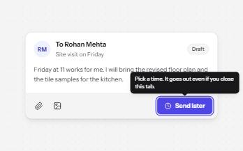
Tooltip
A short label or hint that appears on hover and keyboard focus, stays while you read it, and hides on Escape.
-
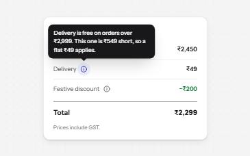
Toggletip
An info button that shows a short note when pressed and has it announced, for help that a label cannot hold.
-
Popover
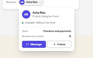
A card anchored to its button, opened with the popover attribute and dismissed by Escape or a click outside.
-
Glossary term
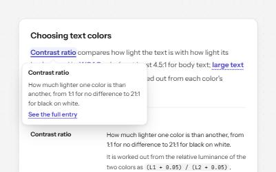
Technical terms in running text that open a short definition in place, backed by a full glossary with links both ways.