Accessibility pattern · Interaction and motion
Text size and spacing
People who read more easily with wider spacing override it with their own styles; 1.4.12 asks that nothing is lost when they do. The robust card grows with its text because nothing in it has a fixed height; the fragile one uses fixed heights and overflow: hidden, and the script counts what it cuts off.
- WCAG criteria
- 6
- Keyboard rules
- 5
- Checked with
- axe, keyboard and the inspector
Live demo
Try it
Use it with a mouse, a keyboard or a screen reader. The inspector beside it shows what the browser tells assistive technology as you go: focus, state changes and announcements.
The demo works without JavaScript only as far as its HTML does; the inspector needs JavaScript.
Keyboard
Keys it answers to
Every action works without a pointer.
| Key | What it does |
|---|---|
| Tab or ShiftTab | Moves between the spacing switch, the fragile version checkbox, the text size slider and, while spacing is on, the four spacing sliders. |
| Space | On the switch, applies the 1.4.12 values or removes them; on the checkbox, shows or hides the fragile card. |
| Arrow Right or Arrow Up | On a slider, widens that spacing or enlarges the text by one step. |
| Arrow Left or Arrow Down | On a slider, narrows it again; spacing never goes below the 1.4.12 minimum. |
| Home or End | On a slider, jumps to the minimum or the maximum. |
Screen readers
What it announces
Written from the roles, names and states in the markup.
| When | Expected announcement |
|---|---|
| Focus reaches the switch | Apply 1.4.12 spacing, switch, off |
| Space turns it on | On. 1.4.12 spacing applied. Robust card, clipped or overlapping: 0. Fragile card, clipped or overlapping: 6. |
| Tab reaches the first slider | Line height, slider, 1.5. Each value is a multiple of the font size; each slider starts at the 1.4.12 minimum. |
| Arrow Right on it | 1.6 |
| Space turns the switch off | Off. Spacing back to normal. |
These are expected announcements, not recordings. Wording and order differ between screen readers and browsers.
Code
Copy the code
The exact files this demo runs on. The styles are served with a prefix that keeps this site's own styles out of the demo; what you copy is the original.
<div class="ap-text-spacing" data-ap-text-spacing>
  <div class="ap-text-spacing__controls">
    <div class="ap-text-spacing__main">
      <label class="ap-text-spacing__switch">
        <input class="ap-text-spacing__switch-input" type="checkbox" role="switch" data-ap-apply />
        <span class="ap-text-spacing__track" aria-hidden="true"><span class="ap-text-spacing__thumb"></span></span>
        <span>Apply 1.4.12 spacing</span>
      </label>
      <label class="ap-text-spacing__check">
        <input type="checkbox" checked data-ap-show-fragile />
        <span>Show the fragile version</span>
      </label>
      <div class="ap-text-spacing__size">
        <label class="ap-text-spacing__slider-label" for="text-spacing-size">Text size</label>
        <input class="ap-text-spacing__range" id="text-spacing-size" type="range" min="100" max="200" step="10" value="100" aria-valuetext="100%" data-ap-size />
        <span class="ap-text-spacing__val" translate="no" data-ap-size-val>100%</span>
      </div>
    </div>
    <fieldset class="ap-text-spacing__sliders" data-ap-sliders disabled>
      <legend class="ap-text-spacing__legend">Push it further</legend>
      <p class="ap-text-spacing__units" id="text-spacing-units">Each value is a multiple of the font size; each slider starts at the 1.4.12 minimum.</p>
      <div class="ap-text-spacing__grid">
        <div class="ap-text-spacing__slider">
          <label class="ap-text-spacing__slider-label" for="text-spacing-line">Line height</label>
          <input class="ap-text-spacing__range" id="text-spacing-line" type="range" min="1.5" max="3" step="0.1" value="1.5" aria-describedby="text-spacing-units" data-ap-prop="line" />
          <span class="ap-text-spacing__val" translate="no" data-ap-val>1.5×</span>
        </div>
        <div class="ap-text-spacing__slider">
          <label class="ap-text-spacing__slider-label" for="text-spacing-para">Space after paragraphs</label>
          <input class="ap-text-spacing__range" id="text-spacing-para" type="range" min="2" max="4" step="0.25" value="2" aria-describedby="text-spacing-units" data-ap-prop="para" />
          <span class="ap-text-spacing__val" translate="no" data-ap-val>2×</span>
        </div>
        <div class="ap-text-spacing__slider">
          <label class="ap-text-spacing__slider-label" for="text-spacing-letter">Letter spacing</label>
          <input class="ap-text-spacing__range" id="text-spacing-letter" type="range" min="0.12" max="0.4" step="0.02" value="0.12" aria-describedby="text-spacing-units" data-ap-prop="letter" />
          <span class="ap-text-spacing__val" translate="no" data-ap-val>0.12×</span>
        </div>
        <div class="ap-text-spacing__slider">
          <label class="ap-text-spacing__slider-label" for="text-spacing-word">Word spacing</label>
          <input class="ap-text-spacing__range" id="text-spacing-word" type="range" min="0.16" max="0.8" step="0.04" value="0.16" aria-describedby="text-spacing-units" data-ap-prop="word" />
          <span class="ap-text-spacing__val" translate="no" data-ap-val>0.16×</span>
        </div>
      </div>
    </fieldset>
    <p class="ap-text-spacing__sr" role="status" data-ap-spacing-status></p>
  </div>

  <div class="ap-text-spacing__previews" data-ap-previews>
      <div class="ap-text-spacing__panel ap-text-spacing__panel--robust" role="group" aria-labelledby="text-spacing-robust-name" data-ap-panel="robust">
        <div class="ap-text-spacing__panel-top">
          <h3 class="ap-text-spacing__panel-name" id="text-spacing-robust-name">Robust</h3>
          <p class="ap-text-spacing__verdict" data-ap-verdict data-state="ok"><svg class="ap-text-spacing__ok" viewBox="0 0 24 24" aria-hidden="true" focusable="false"><path d="m5 12.5 4.5 4.5L19 7.5"/></svg><svg class="ap-text-spacing__bad" viewBox="0 0 24 24" aria-hidden="true" focusable="false"><path d="M7 7l10 10M17 7 7 17"/></svg><span>Clipped or overlapping:</span> <span translate="no" data-ap-clipped>0</span></p>
        </div>
        <p class="ap-text-spacing__panel-desc">Heights grow with the text, and rows wrap.</p>
        <div class="ap-text-spacing__sample ap-text-spacing__sample--robust" data-ap-sample inert>
          <div class="ap-text-spacing__nav">
            <a href="#recipes">Recipes</a>
            <a href="#guides">Guides</a>
            <a href="#videos">Videos</a>
            <a href="#saved">Saved</a>
          </div>
          <div class="ap-text-spacing__teaser">
            <span class="ap-text-spacing__badge">New guide</span>
            <h4 class="ap-text-spacing__teaser-name">Cooking for a crowd on a budget</h4>
            <p class="ap-text-spacing__teaser-text">Plan a thali for twelve without the stress: a shopping list, a timeline and the dishes to make the day before.</p>
            <a class="ap-text-spacing__more" href="#guide">Read the guide</a>
          </div>
          <div class="ap-text-spacing__field">
            <label class="ap-text-spacing__label" for="text-spacing-robust-email">Email for the weekly menu</label>
            <p class="ap-text-spacing__hint">Sent every Friday.</p>
            <input class="ap-text-spacing__input" id="text-spacing-robust-email" type="email" autocomplete="email" />
          </div>
          <div class="ap-text-spacing__actions">
            <button type="button" class="ap-btn ap-btn--primary">Subscribe</button>
            <button type="button" class="ap-btn">Not now</button>
          </div>
        </div>
      </div>
      <div class="ap-text-spacing__panel ap-text-spacing__panel--fragile" role="group" aria-labelledby="text-spacing-fragile-name" data-ap-panel="fragile">
        <div class="ap-text-spacing__panel-top">
          <h3 class="ap-text-spacing__panel-name" id="text-spacing-fragile-name">Fragile</h3>
          <p class="ap-text-spacing__verdict" data-ap-verdict data-state="ok"><svg class="ap-text-spacing__ok" viewBox="0 0 24 24" aria-hidden="true" focusable="false"><path d="m5 12.5 4.5 4.5L19 7.5"/></svg><svg class="ap-text-spacing__bad" viewBox="0 0 24 24" aria-hidden="true" focusable="false"><path d="M7 7l10 10M17 7 7 17"/></svg><span>Clipped or overlapping:</span> <span translate="no" data-ap-clipped>0</span></p>
        </div>
        <p class="ap-text-spacing__panel-desc">Fixed heights and widths, with overflow: hidden.</p>
        <div class="ap-text-spacing__sample ap-text-spacing__sample--fragile" data-ap-sample inert>
          <div class="ap-text-spacing__nav">
            <a href="#recipes">Recipes</a>
            <a href="#guides">Guides</a>
            <a href="#videos">Videos</a>
            <a href="#saved">Saved</a>
          </div>
          <div class="ap-text-spacing__teaser">
            <span class="ap-text-spacing__badge">New guide</span>
            <h4 class="ap-text-spacing__teaser-name">Cooking for a crowd on a budget</h4>
            <p class="ap-text-spacing__teaser-text">Plan a thali for twelve without the stress: a shopping list, a timeline and the dishes to make the day before.</p>
            <a class="ap-text-spacing__more" href="#guide">Read the guide</a>
          </div>
          <div class="ap-text-spacing__field">
            <label class="ap-text-spacing__label" for="text-spacing-fragile-email">Email for the weekly menu</label>
            <p class="ap-text-spacing__hint">Sent every Friday.</p>
            <input class="ap-text-spacing__input" id="text-spacing-fragile-email" type="email" autocomplete="email" />
          </div>
          <div class="ap-text-spacing__actions">
            <button type="button" class="ap-btn ap-btn--primary">Subscribe</button>
            <button type="button" class="ap-btn">Not now</button>
          </div>
        </div>
      </div>
  </div>
</div>
/* Shared primitives: buttons and form fields used across the patterns.
   Uses the --ap-* design tokens. */

.ap-btn {
  display: inline-flex;
  align-items: center;
  justify-content: center;
  gap: 8px;
  min-height: 40px;
  padding: 0 16px;
  border: 1px solid var(--ap-border-strong);
  border-radius: var(--ap-radius-sm);
  background: var(--ap-surface);
  color: var(--ap-text);
  font: inherit;
  font-weight: 600;
  line-height: 1.2;
  text-decoration: none;
  white-space: nowrap;
  cursor: pointer;
  transition: background-color var(--ap-duration) var(--ap-ease), border-color var(--ap-duration) var(--ap-ease), box-shadow var(--ap-duration) var(--ap-ease);
}
.ap-btn:hover {
  background: var(--ap-surface-2);
}
.ap-btn:focus-visible {
  outline: 2px solid var(--ap-focus);
  outline-offset: 2px;
}
.ap-btn:disabled,
.ap-btn[aria-disabled="true"] {
  opacity: .55;
  cursor: not-allowed;
}
.ap-btn--primary {
  border-color: var(--ap-accent);
  background: var(--ap-accent);
  color: var(--ap-on-accent);
  box-shadow: var(--ap-shadow-sm);
}
.ap-btn--primary:hover {
  border-color: var(--ap-accent-hover);
  background: var(--ap-accent-hover);
}
.ap-btn--danger {
  border-color: var(--ap-danger);
  background: var(--ap-danger);
  color: var(--ap-surface);
}
.ap-btn--danger:hover {
  filter: brightness(1.08);
}
.ap-btn--ghost {
  border-color: transparent;
  background: transparent;
}
.ap-btn--ghost:hover {
  background: var(--ap-surface-2);
}
.ap-btn__icon {
  width: 18px;
  height: 18px;
  flex-shrink: 0;
  fill: none;
  stroke: currentColor;
  stroke-width: 2;
  stroke-linecap: round;
  stroke-linejoin: round;
}

.ap-field {
  display: grid;
  gap: 6px;
}
.ap-label {
  color: var(--ap-text);
  font-weight: 600;
  font-size: .9375rem;
}
.ap-hint {
  margin: 0;
  color: var(--ap-text-3);
  font-size: .875rem;
  line-height: 1.45;
}
.ap-error {
  display: flex;
  align-items: flex-start;
  gap: 6px;
  margin: 0;
  color: var(--ap-danger);
  font-size: .875rem;
  font-weight: 600;
  line-height: 1.45;
}
.ap-input {
  width: 100%;
  min-height: 44px;
  padding: 10px 12px;
  border: 1px solid var(--ap-border-strong);
  border-radius: var(--ap-radius-sm);
  background: var(--ap-surface);
  color: var(--ap-text);
  font: inherit;
  line-height: 1.4;
  transition: border-color var(--ap-duration) var(--ap-ease), box-shadow var(--ap-duration) var(--ap-ease);
}
.ap-input::placeholder {
  color: var(--ap-text-3);
}
.ap-input:hover {
  border-color: var(--ap-text-2);
}
.ap-input:focus-visible {
  outline: 2px solid var(--ap-focus);
  outline-offset: 1px;
  border-color: var(--ap-focus);
}
.ap-input[aria-invalid="true"] {
  border-color: var(--ap-danger);
  box-shadow: inset 4px 0 0 var(--ap-danger);
}
textarea.ap-input {
  resize: vertical;
  min-height: 88px;
}

@media (prefers-reduced-motion: reduce) {
  .ap-btn,
  .ap-input { transition: none; }
}

/* Text size and spacing. Uses the --ap-* design tokens and the shared primitives. */
.ap-text-spacing {
  display: grid;
  gap: 16px;
  width: min(100%, 860px);
  margin-inline: auto;
  color: var(--ap-text);
  container-type: inline-size;
}
.ap-text-spacing [hidden] {
  display: none;
}

/* ── Controls ── */
.ap-text-spacing__controls {
  display: grid;
  gap: 16px;
  padding: 18px 20px;
  border: 1px solid var(--ap-border);
  border-radius: var(--ap-radius-lg);
  background: var(--ap-surface);
  box-shadow: var(--ap-shadow-md);
}
.ap-text-spacing__main {
  display: flex;
  flex-wrap: wrap;
  align-items: center;
  gap: 12px 28px;
}

.ap-text-spacing__switch {
  position: relative;
  display: inline-flex;
  align-items: center;
  gap: 12px;
  min-height: var(--ap-target);
  font-weight: 650;
  cursor: pointer;
}
.ap-text-spacing__switch-input {
  position: absolute;
  left: 0;
  z-index: 1;
  width: 48px;
  height: 30px;
  margin: 0;
  opacity: 0;
  cursor: pointer;
}
.ap-text-spacing__track {
  position: relative;
  flex-shrink: 0;
  width: 48px;
  height: 30px;
  border: 1px solid var(--ap-border-strong);
  border-radius: var(--ap-radius-full);
  background: var(--ap-surface-3);
}
.ap-text-spacing__thumb {
  position: absolute;
  top: 4px;
  left: 4px;
  width: 20px;
  height: 20px;
  border-radius: var(--ap-radius-full);
  background: var(--ap-surface);
  box-shadow: var(--ap-shadow-sm), 0 0 0 1px var(--ap-border-strong);
}
.ap-text-spacing__switch:has(:checked) .ap-text-spacing__track {
  border-color: var(--ap-accent);
  background: var(--ap-accent);
}
.ap-text-spacing__switch:has(:checked) .ap-text-spacing__thumb {
  transform: translateX(18px);
}
.ap-text-spacing__switch:has(:focus-visible) .ap-text-spacing__track {
  outline: 2px solid var(--ap-focus);
  outline-offset: 2px;
}

.ap-text-spacing__check {
  display: inline-flex;
  align-items: center;
  gap: 8px;
  min-height: var(--ap-target);
  cursor: pointer;
}
.ap-text-spacing__check input {
  width: 18px;
  height: 18px;
  margin: 0;
  accent-color: var(--ap-accent);
}
.ap-text-spacing__check input:focus-visible {
  outline: 2px solid var(--ap-focus);
  outline-offset: 2px;
}

.ap-text-spacing__size {
  display: inline-flex;
  flex-wrap: wrap;
  align-items: center;
  gap: 4px 10px;
}
.ap-text-spacing__size .ap-text-spacing__range {
  width: 150px;
}

.ap-text-spacing__sliders {
  min-width: 0;
  margin: 0;
  padding: 12px 16px 16px;
  border: 1px solid var(--ap-border);
  border-radius: var(--ap-radius);
  background: var(--ap-surface-2);
}
.ap-text-spacing__legend {
  padding: 0 6px;
  font-size: .875rem;
  font-weight: 650;
}
.ap-text-spacing__units {
  margin: 0 0 12px;
  color: var(--ap-text-3);
  font-size: .8125rem;
  line-height: 1.45;
}
.ap-text-spacing__grid {
  display: grid;
  grid-template-columns: repeat(2, minmax(0, 1fr));
  gap: 12px 28px;
}
.ap-text-spacing__slider {
  display: grid;
  grid-template-columns: minmax(0, 1fr) auto;
  align-items: center;
  gap: 2px 12px;
}
.ap-text-spacing__slider .ap-text-spacing__range {
  grid-column: 1 / -1;
  grid-row: 2;
}
.ap-text-spacing__slider .ap-text-spacing__val {
  grid-column: 2;
  grid-row: 1;
}
.ap-text-spacing__slider-label {
  font-size: .875rem;
  font-weight: 600;
}
.ap-text-spacing__range {
  width: 100%;
  min-height: 24px;
  margin: 0;
  accent-color: var(--ap-accent);
  cursor: pointer;
}
.ap-text-spacing__range:focus-visible {
  outline: 2px solid var(--ap-focus);
  outline-offset: 2px;
}
.ap-text-spacing__range:disabled {
  cursor: not-allowed;
}
.ap-text-spacing__val {
  min-width: 3.5em;
  color: var(--ap-text-2);
  font-size: .875rem;
  font-weight: 650;
  font-variant-numeric: tabular-nums;
  text-align: end;
}
.ap-text-spacing__sliders:disabled .ap-text-spacing__slider-label,
.ap-text-spacing__sliders:disabled .ap-text-spacing__val {
  color: var(--ap-text-3);
}

/* ── The two cards ── */
.ap-text-spacing__previews {
  display: grid;
  grid-template-columns: repeat(2, minmax(0, 1fr));
  gap: 16px;
  align-items: start;
}
.ap-text-spacing__previews.is-single {
  grid-template-columns: minmax(0, 1fr);
}
.ap-text-spacing__panel {
  display: grid;
  gap: 10px;
  min-width: 0;
  padding: 16px;
  border: 1px solid var(--ap-border);
  border-radius: var(--ap-radius-lg);
  background: var(--ap-surface);
  box-shadow: var(--ap-shadow-sm);
}
.ap-text-spacing__panel-top {
  display: flex;
  flex-wrap: wrap;
  align-items: center;
  justify-content: space-between;
  gap: 6px 12px;
}
.ap-text-spacing__panel-name {
  margin: 0;
  font-size: 1rem;
  font-weight: 650;
}
.ap-text-spacing__panel-desc {
  margin: 0;
  color: var(--ap-text-3);
  font-size: .8125rem;
}
.ap-text-spacing__verdict {
  display: inline-flex;
  align-items: center;
  gap: 6px;
  margin: 0;
  padding: 3px 10px 3px 8px;
  border-radius: var(--ap-radius-full);
  font-size: .8125rem;
  font-weight: 650;
}
.ap-text-spacing__verdict svg {
  width: 14px;
  height: 14px;
  fill: none;
  stroke: currentColor;
  stroke-width: 2.6;
  stroke-linecap: round;
  stroke-linejoin: round;
}
.ap-text-spacing__verdict[data-state="ok"] {
  background: var(--ap-success-soft);
  color: var(--ap-success);
}
.ap-text-spacing__verdict[data-state="bad"] {
  background: var(--ap-danger-soft);
  color: var(--ap-danger);
}
.ap-text-spacing__verdict[data-state="ok"] .ap-text-spacing__bad,
.ap-text-spacing__verdict[data-state="bad"] .ap-text-spacing__ok {
  display: none;
}

/* ── The specimen card, robust: sized in em, nothing fixed, rows wrap ── */
.ap-text-spacing__sample {
  display: grid;
  gap: .9em;
  padding: 1em;
  border: 1px solid var(--ap-border);
  border-radius: var(--ap-radius);
  background: var(--ap-bg);
  color: var(--ap-text);
  font-size: var(--ts-size, 100%);
}
.ap-text-spacing__nav {
  display: flex;
  flex-wrap: wrap;
  gap: .25em .9em;
  padding-bottom: .6em;
  border-bottom: 1px solid var(--ap-border);
  font-size: .875em;
  font-weight: 600;
  line-height: 1.4;
}
.ap-text-spacing__nav a,
.ap-text-spacing__more {
  color: var(--ap-accent-text);
}
.ap-text-spacing__nav a {
  text-decoration: none;
}
.ap-text-spacing__teaser {
  display: grid;
  justify-items: start;
  gap: .4em;
}
.ap-text-spacing__badge {
  padding: .15em .6em;
  border-radius: var(--ap-radius-full);
  background: var(--ap-accent-soft);
  color: var(--ap-accent-soft-text);
  font-size: .75em;
  font-weight: 700;
  line-height: 1.4;
}
.ap-text-spacing__teaser-name {
  margin: 0;
  font-size: 1.0625em;
  font-weight: 650;
  line-height: 1.3;
}
.ap-text-spacing__teaser-text {
  margin: 0;
  color: var(--ap-text-2);
  font-size: .9375em;
  line-height: 1.45;
}
.ap-text-spacing__more {
  font-size: .875em;
  font-weight: 600;
  text-decoration: underline;
  text-underline-offset: .2em;
}
.ap-text-spacing__field {
  display: grid;
  gap: .3em;
}
.ap-text-spacing__label {
  font-size: .875em;
  font-weight: 600;
  line-height: 1.3;
}
.ap-text-spacing__hint {
  margin: 0;
  color: var(--ap-text-3);
  font-size: .8125em;
  line-height: 1.35;
}
.ap-text-spacing__input {
  width: 100%;
  min-height: 2.6em;
  padding: .5em .7em;
  border: 1px solid var(--ap-border-strong);
  border-radius: var(--ap-radius-sm);
  background: var(--ap-surface);
  color: var(--ap-text);
  font: inherit;
  font-size: .9375em;
}
.ap-text-spacing__actions {
  display: flex;
  flex-wrap: wrap;
  gap: .5em;
}
.ap-text-spacing__actions .ap-btn {
  min-height: 2.6em;
  padding: .45em 1em;
  font-size: .875em;
  white-space: normal;
}

/* ── The same card, fragile: pixel heights and widths, overflow hidden ── */
.ap-text-spacing__sample--fragile .ap-text-spacing__nav {
  display: block;
  height: 30px;
  overflow: hidden;
  white-space: nowrap;
}
.ap-text-spacing__sample--fragile .ap-text-spacing__nav a {
  margin-right: 14px;
}
.ap-text-spacing__sample--fragile .ap-text-spacing__teaser {
  height: 146px;
  overflow: hidden;
}
.ap-text-spacing__sample--fragile .ap-text-spacing__badge {
  width: 80px;
  height: 20px;
  padding: 0 8px;
  overflow: hidden;
  line-height: 20px;
  white-space: nowrap;
}
.ap-text-spacing__sample--fragile .ap-text-spacing__teaser-name {
  line-height: 20px;
}
.ap-text-spacing__sample--fragile .ap-text-spacing__label {
  height: 18px;
  overflow: hidden;
  white-space: nowrap;
}
.ap-text-spacing__sample--fragile .ap-text-spacing__hint {
  height: 16px;
  overflow: hidden;
}
.ap-text-spacing__sample--fragile .ap-text-spacing__input {
  height: 36px;
  min-height: 0;
}
.ap-text-spacing__sample--fragile .ap-text-spacing__actions {
  display: block;
  height: 36px;
  overflow: hidden;
  white-space: nowrap;
}
.ap-text-spacing__sample--fragile .ap-text-spacing__actions .ap-btn {
  width: 90px;
  height: 34px;
  min-height: 0;
  margin-right: 6px;
  padding: 0 8px;
  overflow: hidden;
  white-space: nowrap;
}

/* What the script found: an outline on every part that no longer fits. */
.ap-text-spacing__sample [data-clipped] {
  outline: 2px dashed var(--ap-danger);
  outline-offset: 1px;
}

/* ── The test: what a reader's own stylesheet or a bookmarklet does ── */
.ap-text-spacing__previews[data-spacing] .ap-text-spacing__sample * {
  line-height: var(--ts-line, 1.5) !important;
  letter-spacing: var(--ts-letter, .12em) !important;
  word-spacing: var(--ts-word, .16em) !important;
}
.ap-text-spacing__previews[data-spacing] .ap-text-spacing__sample p {
  margin-bottom: var(--ts-para, 2em) !important;
}

/* Read by screen readers, not shown. */
.ap-text-spacing__sr {
  position: absolute;
  width: 1px;
  height: 1px;
  margin: -1px;
  padding: 0;
  overflow: hidden;
  clip-path: inset(50%);
  white-space: nowrap;
  border: 0;
}

@container (max-width: 620px) {
  .ap-text-spacing__previews,
  .ap-text-spacing__grid { grid-template-columns: minmax(0, 1fr); }
  .ap-text-spacing__controls { padding: 16px; }
}

@media (prefers-reduced-motion: no-preference) {
  .ap-text-spacing__thumb { transition: transform var(--ap-duration) var(--ap-ease); }
}

@media (forced-colors: active) {
  .ap-text-spacing__switch:has(:checked) .ap-text-spacing__track { background: Highlight; }
  .ap-text-spacing__sample [data-clipped] { outline-color: Mark; }
}
/**
 * Text size and spacing: apply the WCAG 1.4.12 test values to a robust
 * card and a fragile one, push them further, and count what each loses.
 *
 * The spacing is applied the way a reader's own stylesheet would apply it:
 * custom properties on [data-ap-previews] feed !important rules in the
 * stylesheet. The script then measures every element of each card and marks
 * the ones whose content no longer fits their box (clipped or overlapping).
 *
 * Markup: [data-ap-text-spacing] holding the switch input[data-ap-apply],
 * the checkbox input[data-ap-show-fragile], the text size range
 * [data-ap-size], a fieldset[data-ap-sliders] of ranges [data-ap-prop=
 * "line|para|letter|word"], a role=status [data-ap-spacing-status], and
 * [data-ap-previews] with one [data-ap-panel] per card, each holding
 * [data-ap-sample] and a verdict with [data-ap-clipped].
 */

const UNIT = { line: "", para: "em", letter: "em", word: "em" };

export function init(root) {
  const apply = root.querySelector("[data-ap-apply]");
  const showFragile = root.querySelector("[data-ap-show-fragile]");
  const size = root.querySelector("[data-ap-size]");
  const sizeVal = root.querySelector("[data-ap-size-val]");
  const sliders = root.querySelector("[data-ap-sliders]");
  const ranges = [...sliders.querySelectorAll("[data-ap-prop]")];
  const status = root.querySelector("[data-ap-spacing-status]");
  const previews = root.querySelector("[data-ap-previews]");
  const panels = [...previews.querySelectorAll("[data-ap-panel]")];
  let frame = 0;
  let speaking = 0;

  /** Elements whose content is taller or wider than their box. */
  function count(panel) {
    let n = 0;
    for (const el of panel.querySelectorAll("[data-ap-sample] *")) {
      const fits = el.matches("input, select, textarea, svg, svg *") || !el.clientHeight
        || (el.scrollHeight <= el.clientHeight + 1 && el.scrollWidth <= el.clientWidth + 1);
      el.toggleAttribute("data-clipped", !fits);
      if (!fits) n++;
    }
    const out = panel.querySelector("[data-ap-clipped]");
    if (out.textContent !== String(n)) out.textContent = String(n);
    panel.querySelector("[data-ap-verdict]").dataset.state = n ? "bad" : "ok";
    return n;
  }
  function measure() {
    cancelAnimationFrame(frame);
    frame = 0;
    return panels.filter((p) => !p.hidden).map((p) => [p.dataset.apPanel, count(p)]);
  }
  const later = () => {
    if (!frame) frame = requestAnimationFrame(measure);
  };

  function write() {
    const on = apply.checked;
    sliders.disabled = !on;
    previews.toggleAttribute("data-spacing", on);
    for (const r of ranges) {
      r.parentElement.querySelector("[data-ap-val]").textContent = `${Number(r.value)}×`;
      previews.style.setProperty(`--ts-${r.dataset.apProp}`, `${r.value}${UNIT[r.dataset.apProp]}`);
    }
    sizeVal.textContent = `${size.value}%`;
    size.setAttribute("aria-valuetext", `${size.value}%`);
    previews.style.setProperty("--ts-size", `${size.value}%`);
    const fragile = panels.find((p) => p.dataset.apPanel === "fragile");
    fragile.hidden = !showFragile.checked;
    previews.classList.toggle("is-single", fragile.hidden);
  }

  function part(text, raw = false) {
    const span = document.createElement("span");
    span.textContent = text;
    if (raw) span.translate = false;
    return span;
  }
  function announce(results) {
    clearTimeout(speaking);
    status.textContent = "";
    speaking = setTimeout(() => {
      if (!apply.checked) {
        status.textContent = "Spacing back to normal.";
        return;
      }
      const nodes = [part("1.4.12 spacing applied.")];
      for (const [kind, n] of results) {
        nodes.push(" ", part(kind === "robust" ? "Robust card, clipped or overlapping:" : "Fragile card, clipped or overlapping:"), " ", part(`${n}.`, true));
      }
      status.replaceChildren(...nodes);
    }, 60);
  }

  function onChange(event) {
    if (event.target === apply) {
      // The switch applies exactly the test values; the sliders go further.
      if (apply.checked) for (const r of ranges) r.value = r.min;
      write();
      announce(measure());
    } else if (event.target === showFragile) {
      write();
      measure();
    }
  }
  function onInput(event) {
    if (event.target === size || ranges.includes(event.target)) {
      write();
      later();
    }
  }

  const resize = new ResizeObserver(later);
  resize.observe(previews);
  root.addEventListener("change", onChange);
  root.addEventListener("input", onInput);
  write();
  measure();

  return () => {
    cancelAnimationFrame(frame);
    clearTimeout(speaking);
    resize.disconnect();
    root.removeEventListener("change", onChange);
    root.removeEventListener("input", onInput);
  };
}

for (const root of document.querySelectorAll("[data-ap-text-spacing]")) init(root);
/* Design tokens for the pattern components. Light by default, dark when the
   system asks for it; set data-theme="dark" on :root to force dark. */
:root {
    --ap-radius-sm: 8px;
    --ap-radius: 12px;
    --ap-radius-lg: 16px;
    --ap-radius-full: 999px;
    --ap-font: "Instrument Sans", ui-sans-serif, system-ui, -apple-system, "Segoe UI", Roboto, sans-serif;
    --ap-mono: "JetBrains Mono", ui-monospace, "Cascadia Mono", "SF Mono", Consolas, monospace;
    --ap-ease: cubic-bezier(.2, .8, .2, 1);
    --ap-duration: 180ms;
    --ap-target: 44px;
    --ap-bg: #F4F4F5;
    --ap-surface: #FFFFFF;
    --ap-surface-2: #F4F4F5;
    --ap-surface-3: #E4E4E7;
    --ap-border: #E4E4E7;
    --ap-border-strong: #76767F;
    --ap-text: #18181B;
    --ap-text-2: #3F3F46;
    --ap-text-3: #5E5E66;
    --ap-accent: #4F46E5;
    --ap-accent-hover: #4338CA;
    --ap-on-accent: #FFFFFF;
    --ap-accent-text: #4338CA;
    --ap-accent-soft: #EEF2FF;
    --ap-accent-soft-text: #3730A3;
    --ap-focus: #4F46E5;
    --ap-danger: #B91C1C;
    --ap-danger-soft: #FEF2F2;
    --ap-success: #15803D;
    --ap-success-soft: #F0FDF4;
    --ap-warning: #A15C07;
    --ap-warning-soft: #FEFCE8;
    --ap-info: #1D4ED8;
    --ap-info-soft: #EFF6FF;
    --ap-scrim: rgb(9 9 11 / .48);
    --ap-shadow-sm: 0 1px 2px rgb(9 9 11 / .06);
    --ap-shadow-md: 0 1px 2px rgb(9 9 11 / .05), 0 6px 16px -4px rgb(9 9 11 / .1);
    --ap-shadow-lg: 0 2px 6px rgb(9 9 11 / .06), 0 20px 40px -12px rgb(9 9 11 / .22);
    --ap-light-bg: #F4F4F5;
    --ap-light-surface: #FFFFFF;
    --ap-light-surface-2: #F4F4F5;
    --ap-light-surface-3: #E4E4E7;
    --ap-light-border: #E4E4E7;
    --ap-light-border-strong: #76767F;
    --ap-light-text: #18181B;
    --ap-light-text-2: #3F3F46;
    --ap-light-text-3: #5E5E66;
    --ap-light-accent: #4F46E5;
    --ap-light-accent-hover: #4338CA;
    --ap-light-on-accent: #FFFFFF;
    --ap-light-accent-text: #4338CA;
    --ap-light-accent-soft: #EEF2FF;
    --ap-light-accent-soft-text: #3730A3;
    --ap-light-focus: #4F46E5;
    --ap-light-danger: #B91C1C;
    --ap-light-danger-soft: #FEF2F2;
    --ap-light-success: #15803D;
    --ap-light-success-soft: #F0FDF4;
    --ap-light-warning: #A15C07;
    --ap-light-warning-soft: #FEFCE8;
    --ap-light-info: #1D4ED8;
    --ap-light-info-soft: #EFF6FF;
    --ap-light-scrim: rgb(9 9 11 / .48);
    --ap-light-shadow-sm: 0 1px 2px rgb(9 9 11 / .06);
    --ap-light-shadow-md: 0 1px 2px rgb(9 9 11 / .05), 0 6px 16px -4px rgb(9 9 11 / .1);
    --ap-light-shadow-lg: 0 2px 6px rgb(9 9 11 / .06), 0 20px 40px -12px rgb(9 9 11 / .22);
    --ap-dark-bg: #09090B;
    --ap-dark-surface: #18181B;
    --ap-dark-surface-2: #27272A;
    --ap-dark-surface-3: #3F3F46;
    --ap-dark-border: #2E2E33;
    --ap-dark-border-strong: #8E8E97;
    --ap-dark-text: #FAFAFA;
    --ap-dark-text-2: #D4D4D8;
    --ap-dark-text-3: #A1A1AA;
    --ap-dark-accent: #818CF8;
    --ap-dark-accent-hover: #A5B4FC;
    --ap-dark-on-accent: #0C0A1F;
    --ap-dark-accent-text: #A5B4FC;
    --ap-dark-accent-soft: #1E1B4B;
    --ap-dark-accent-soft-text: #C7D2FE;
    --ap-dark-focus: #A5B4FC;
    --ap-dark-danger: #F87171;
    --ap-dark-danger-soft: #2A1215;
    --ap-dark-success: #4ADE80;
    --ap-dark-success-soft: #0F2A1A;
    --ap-dark-warning: #FACC15;
    --ap-dark-warning-soft: #2A2410;
    --ap-dark-info: #60A5FA;
    --ap-dark-info-soft: #0F1D33;
    --ap-dark-scrim: rgb(0 0 0 / .62);
    --ap-dark-shadow-sm: 0 1px 2px rgb(0 0 0 / .4);
    --ap-dark-shadow-md: 0 1px 2px rgb(0 0 0 / .4), 0 8px 20px -6px rgb(0 0 0 / .5);
    --ap-dark-shadow-lg: 0 2px 8px rgb(0 0 0 / .45), 0 24px 48px -12px rgb(0 0 0 / .7);
}
@media (prefers-color-scheme: dark) {
  :root:not([data-theme="light"]) {
      --ap-bg: #09090B;
      --ap-surface: #18181B;
      --ap-surface-2: #27272A;
      --ap-surface-3: #3F3F46;
      --ap-border: #2E2E33;
      --ap-border-strong: #8E8E97;
      --ap-text: #FAFAFA;
      --ap-text-2: #D4D4D8;
      --ap-text-3: #A1A1AA;
      --ap-accent: #818CF8;
      --ap-accent-hover: #A5B4FC;
      --ap-on-accent: #0C0A1F;
      --ap-accent-text: #A5B4FC;
      --ap-accent-soft: #1E1B4B;
      --ap-accent-soft-text: #C7D2FE;
      --ap-focus: #A5B4FC;
      --ap-danger: #F87171;
      --ap-danger-soft: #2A1215;
      --ap-success: #4ADE80;
      --ap-success-soft: #0F2A1A;
      --ap-warning: #FACC15;
      --ap-warning-soft: #2A2410;
      --ap-info: #60A5FA;
      --ap-info-soft: #0F1D33;
      --ap-scrim: rgb(0 0 0 / .62);
      --ap-shadow-sm: 0 1px 2px rgb(0 0 0 / .4);
      --ap-shadow-md: 0 1px 2px rgb(0 0 0 / .4), 0 8px 20px -6px rgb(0 0 0 / .5);
      --ap-shadow-lg: 0 2px 8px rgb(0 0 0 / .45), 0 24px 48px -12px rgb(0 0 0 / .7);
  }
}
:root[data-theme="dark"] {
    --ap-bg: #09090B;
    --ap-surface: #18181B;
    --ap-surface-2: #27272A;
    --ap-surface-3: #3F3F46;
    --ap-border: #2E2E33;
    --ap-border-strong: #8E8E97;
    --ap-text: #FAFAFA;
    --ap-text-2: #D4D4D8;
    --ap-text-3: #A1A1AA;
    --ap-accent: #818CF8;
    --ap-accent-hover: #A5B4FC;
    --ap-on-accent: #0C0A1F;
    --ap-accent-text: #A5B4FC;
    --ap-accent-soft: #1E1B4B;
    --ap-accent-soft-text: #C7D2FE;
    --ap-focus: #A5B4FC;
    --ap-danger: #F87171;
    --ap-danger-soft: #2A1215;
    --ap-success: #4ADE80;
    --ap-success-soft: #0F2A1A;
    --ap-warning: #FACC15;
    --ap-warning-soft: #2A2410;
    --ap-info: #60A5FA;
    --ap-info-soft: #0F1D33;
    --ap-scrim: rgb(0 0 0 / .62);
    --ap-shadow-sm: 0 1px 2px rgb(0 0 0 / .4);
    --ap-shadow-md: 0 1px 2px rgb(0 0 0 / .4), 0 8px 20px -6px rgb(0 0 0 / .5);
    --ap-shadow-lg: 0 2px 8px rgb(0 0 0 / .45), 0 24px 48px -12px rgb(0 0 0 / .7);
}
WCAG 2.2
What it meets
The success criteria this pattern takes care of, and how.
-
1.4.12 Text Spacing
Level AA
With line height 1.5, paragraph spacing 2, letter spacing 0.12 and word spacing 0.16 times the font size, the robust card loses nothing: no clipped text, no overlap.
-
1.4.4 Resize Text
Level AA
The robust card is sized in em with no fixed heights, so the Text size slider can take it to 200 percent and nothing is lost; the fragile card, sized in pixels, clips.
-
1.4.10 Reflow
Level AA
Rows of links and buttons wrap instead of scrolling sideways, so the card still fits a 320 pixel wide screen with the wider spacing.
-
2.1.1 Keyboard
Level A
The switch, the checkbox and the native range sliders all work from the keyboard.
-
4.1.2 Name, Role, Value
Level A
The switch is a checkbox with role=switch, and each slider is a labelled native range input that reports its value.
-
4.1.3 Status Messages
Level AA
Turning the spacing on announces how many parts of each card are clipped or overlapping, so the result does not depend on seeing it.
Usage
When to use it
Use it
- Every component with text: buttons, badges, navigation, cards, form fields and tables all meet 1.4.12 or fail it.
- Design reviews: apply the test values to each new component before it ships, as the switch here does.
Use something else
- Shipping a spacing control instead of fixing the layout: 1.4.12 is about people's own stylesheets and extensions, which you cannot see.
- Text inside images or canvas: it cannot respond to spacing at all, so use real text.
Common failures
How it usually goes wrong
Fixed heights on text containers
A height that fits the text today cuts it off when the line height grows. Use min-height, or let padding and content decide.
overflow: hidden as tidying up
Clipping hides the failure instead of preventing it. The fragile card cuts off its links, badge, field label, hint and a button label; the robust one has no overflow: hidden at all.
Rows that cannot wrap
white-space: nowrap on a row of links or buttons pushes items out of view once letters spread. flex-wrap lets them move to a new line.
Badges and buttons with fixed widths
An 80-pixel badge fits "New guide" at normal spacing only. Padding around the text keeps it fitting at any spacing.
Line height in pixels
line-height: 20px stays 20 pixels when the font or the spacing grows, so lines overlap. Unitless line heights scale with the text.
Testing with your own eyes only
The failure appears only under someone else's styles. Apply the four values with a bookmarklet or a test stylesheet, as this demo does, on every component.
Notes
Building it
- The demo applies the test the way a reader's own stylesheet would: the four values with !important on every element of the card. That is the stylesheet to copy for your own checks.
- 1.4.12 asks only that nothing is lost at those values; it does not ask you to offer spacing controls. The sliders are here to show how much headroom the robust card has.
- The script counts an element as clipped or overlapping when its content is taller or wider than its box, and outlines it, so the fragile card shows where it fails.
- Both cards are inert specimens: their links and buttons are not reachable, because only the layout is being tested. The live result is announced instead.
- Text size is not part of 1.4.12; resizing text is 1.4.4. The robust card sizes everything in em from one font size, which is why the Text size slider scales it whole.
Sources: WCAG 2.2 Understanding: Text Spacing · WCAG Technique C36: allowing text spacing to be overridden · WCAG Technique C35: allowing for text spacing without wrapping
Checked with axe in light and dark themes, at desktop and phone widths, and by keyboard. Not yet tested with every screen reader and browser pair. Report a correction
Related
Patterns that go with it
-
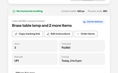
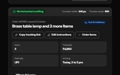
Reflow
A page that fits 320 CSS pixels, a 1280-pixel window at 400% zoom, with no sideways scrolling and nothing cut off.
-
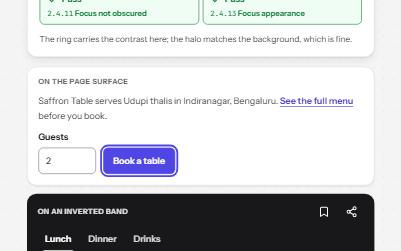
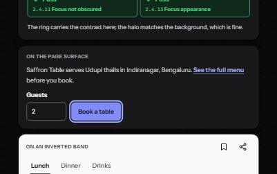
Focus indicator
A focus ring you can always see: two colors, at least 2 px, never under a sticky bar, with a live meter that measures it.
-
Target size
Targets big enough to hit: 24 px or well spaced at AA, 44 px at AAA, with an overlay that measures every one.
-
Card
Cards whose title link covers the whole card, with Save and Share buttons that stay reachable on top of it.