Accessibility pattern · Layout and structure
Reflow
At 400% zoom a 1280-pixel window is 320 CSS pixels wide, so a page that reflows to 320 pixels is a page people can zoom: one column, read top to bottom, never scrolled sideways. Nothing on the page has a fixed width: grids collapse with container queries, rows wrap, long links break, and the readout measures the result instead of trusting it.
- WCAG criteria
- 6
- Keyboard rules
- 6
- Checked with
- axe, keyboard and the inspector
Live demo
Try it
Use it with a mouse, a keyboard or a screen reader. The inspector beside it shows what the browser tells assistive technology as you go: focus, state changes and announcements.
A 1280-pixel window at 400% zoom leaves 320 CSS pixels for the page.
No horizontal scrolling
- Content width
- 1280 px
- Preview scale
- 100%
Order 4417853 · placed 2 October
Brass table lamp and 2 more items
Out for delivery
- Brass table lamp, 40 cmQty 1₹3,250
- Handloom cotton cushion covers, set of 2Qty 1₹890
- Warm white LED bulb, 9 WQty 2₹720
- Items
- 3
- Total paid
- ₹4,860
- Paid with
- UPI
- Arriving
- Today, 2 to 5 pm
Where it is now
- Packed 2 Oct
- Shipped 3 Oct
- Out for delivery Today
- Delivered By 5 pm
Your parcel left the Bengaluru hub at 6:40 am and is with a courier in Indiranagar.
Follow it live: track.parcel.test/consignment/IN-BLR-2026-0004417853?ref=order-email
Updates go to [email protected]
The demo works without JavaScript only as far as its HTML does; the inspector needs JavaScript.
Keyboard
Keys it answers to
Every action works without a pointer.
| Key | What it does |
|---|---|
| Arrow Left or Arrow Right | On the slider, narrows or widens the preview by 10 pixels; Arrow Down and Arrow Up do the same. |
| Page Down or Page Up | Narrows or widens it by 160 pixels, the same in every browser. |
| Home or End | Sets 320 pixels (400% zoom) or 1280 pixels (100% zoom). |
| Enter or Space | On a zoom button, sets the width that zoom level leaves: 1280, 640 or 320 pixels. |
| Tab | Moves on to the preview, which takes focus only while it scrolls, then through the page's own controls. |
| Arrow Down or Arrow Up | In the focused preview, scrolls it; in the fixed-width version, Arrow Left and Arrow Right scroll it sideways too. |
Screen readers
What it announces
Written from the roles, names and states in the markup.
| When | Expected announcement |
|---|---|
| Tab reaches the slider | Viewport width, slider, 1280 pixels, 100% zoom. A 1280-pixel window at 400% zoom leaves 320 CSS pixels for the page. |
| Home | 320 pixels, 400% zoom |
| Focus reaches the 200% button | Zoom, group. 200%, toggle button, not pressed |
| In the fixed-width version, the width drops below 960 pixels | Needs horizontal scrolling |
| Tab reaches the preview while it scrolls | Demo page preview, region |
| Copy tracking link is pressed | Tracking link copied |
These are expected announcements, not recordings. Wording and order differ between screen readers and browsers.
Code
Copy the code
The exact files this demo runs on. The styles are served with a prefix that keeps this site's own styles out of the demo; what you copy is the original.
<div class="ap-reflow" data-ap-reflow>
  <div class="ap-reflow__bench">
    <div class="ap-reflow__top">
      <label class="ap-reflow__label" for="reflow-width">Viewport width</label>
      <output class="ap-reflow__now" for="reflow-width" aria-live="off"><span class="ap-reflow__num" data-ap-reflow-vw>1280</span> <span data-ap-reflow-unit>pixels</span> <span class="ap-reflow__sep" aria-hidden="true">·</span> <span class="ap-reflow__num"><span data-ap-reflow-zoom>100</span>%</span> <span data-ap-reflow-zword>zoom</span></output>
    </div>
    <p class="ap-hint" id="reflow-hint">A 1280-pixel window at 400% zoom leaves 320 CSS pixels for the page.</p>
    <input class="ap-reflow__range" id="reflow-width" type="range" min="320" max="1280" step="10" value="1280" aria-valuetext="1280 pixels, 100% zoom" aria-describedby="reflow-hint" data-ap-reflow-range />
    <div class="ap-reflow__ticks" aria-hidden="true">
      <span>320</span><span>640</span><span>960</span><span>1280</span>
    </div>
    <div class="ap-reflow__zoom" role="group" aria-labelledby="reflow-zoom-name">
      <span class="ap-reflow__zoom-name" id="reflow-zoom-name">Zoom</span>
      <div class="ap-reflow__seg">
        <button type="button" class="ap-reflow__preset" aria-pressed="true" data-ap-reflow-to="1280">100%</button>
        <button type="button" class="ap-reflow__preset" aria-pressed="false" data-ap-reflow-to="640">200%</button>
        <button type="button" class="ap-reflow__preset" aria-pressed="false" data-ap-reflow-to="320">400%</button>
      </div>
    </div>
  </div>

  <div class="ap-reflow__window">
    <div class="ap-reflow__chrome">
      <p class="ap-reflow__verdict" role="status" data-ap-reflow-verdict data-fits="true"><svg class="ap-reflow__icon ap-reflow__icon--fits" viewBox="0 0 24 24" aria-hidden="true" focusable="false"><circle cx="12" cy="12" r="9"/><path d="m8.2 12.4 2.6 2.6 5-5.2"/></svg><svg class="ap-reflow__icon ap-reflow__icon--scrolls" viewBox="0 0 24 24" aria-hidden="true" focusable="false"><path d="M3.5 12h17"/><path d="m7.5 8-4 4 4 4"/><path d="m16.5 8 4 4-4 4"/></svg><span data-ap-reflow-verdict-text>No horizontal scrolling</span></p>
      <dl class="ap-reflow__measure">
        <div><dt>Content width</dt><dd><span data-ap-reflow-content>1280</span> <span translate="no">px</span></dd></div>
        <div><dt>Preview scale</dt><dd><span data-ap-reflow-scale>100</span>%</dd></div>
      </dl>
    </div>
    <div class="ap-reflow__screen" role="region" aria-label="Demo page preview" data-ap-reflow-screen>
      <div class="ap-reflow__sizer" data-ap-reflow-sizer>
        <div class="ap-reflow__frame" data-ap-reflow-frame>
          <div class="ap-reflow__page">
            <div class="ap-reflow__body">
              <div class="ap-reflow__head">
                <div class="ap-reflow__id">
                  <p class="ap-reflow__kicker">Order 4417853 · placed 2 October</p>
                  <h3 class="ap-reflow__name">Brass table lamp and 2 more items</h3>
                </div>
                <p class="ap-reflow__badge"><svg class="ap-reflow__icon" viewBox="0 0 24 24" aria-hidden="true" focusable="false"><path d="M2.5 6.5h11v9h-11z"/><path d="M13.5 9.5h4l3 3.2v2.8h-7"/><circle cx="6.5" cy="17.5" r="1.8"/><circle cx="16.5" cy="17.5" r="1.8"/></svg><span>Out for delivery</span></p>
              </div>

              <div class="ap-reflow__actions" role="group" aria-label="Order actions">
                <button type="button" class="ap-btn" data-ap-reflow-copy><svg class="ap-btn__icon" viewBox="0 0 24 24" aria-hidden="true" focusable="false"><path d="M10 14a4 4 0 0 0 5.7 0l3-3a4 4 0 0 0-5.7-5.7l-1 1"/><path d="M14 10a4 4 0 0 0-5.7 0l-3 3a4 4 0 0 0 5.7 5.7l1-1"/></svg>Copy tracking link</button>
                <button type="button" class="ap-btn" data-ap-reflow-edit><svg class="ap-btn__icon" viewBox="0 0 24 24" aria-hidden="true" focusable="false"><path d="M12 20h9"/><path d="M16.5 3.5a2.1 2.1 0 0 1 3 3L7 19l-4 1 1-4Z"/></svg>Edit instructions</button>
                <button type="button" class="ap-btn" aria-expanded="false" aria-controls="reflow-items" data-ap-reflow-items><svg class="ap-btn__icon ap-reflow__chev" viewBox="0 0 24 24" aria-hidden="true" focusable="false"><path d="m6 9 6 6 6-6"/></svg>Order items</button>
                <p class="ap-reflow__msg" role="status" data-ap-reflow-msg></p>
              </div>

              <ul class="ap-reflow__items" id="reflow-items" hidden>
                <li><span class="ap-reflow__item">Brass table lamp, 40 cm</span><span class="ap-reflow__qty">Qty 1</span><span class="ap-reflow__price">₹3,250</span></li>
                <li><span class="ap-reflow__item">Handloom cotton cushion covers, set of 2</span><span class="ap-reflow__qty">Qty 1</span><span class="ap-reflow__price">₹890</span></li>
                <li><span class="ap-reflow__item">Warm white LED bulb, 9 W</span><span class="ap-reflow__qty">Qty 2</span><span class="ap-reflow__price">₹720</span></li>
              </ul>

              <dl class="ap-reflow__stats">
                <div><dt>Items</dt><dd>3</dd></div>
                <div><dt>Total paid</dt><dd>₹4,860</dd></div>
                <div><dt>Paid with</dt><dd>UPI</dd></div>
                <div><dt>Arriving</dt><dd>Today, 2 to 5 pm</dd></div>
              </dl>

              <div class="ap-reflow__cols">
                <div class="ap-reflow__card">
                  <h4 class="ap-reflow__sub">Where it is now</h4>
                  <ol class="ap-reflow__journey">
                    <li class="ap-reflow__stop is-done">
                      <span class="ap-reflow__pin" aria-hidden="true"><svg viewBox="0 0 24 24" aria-hidden="true" focusable="false"><path d="m6.5 12.5 3.5 3.5 7.5-8"/></svg></span>
                      <span class="ap-reflow__what">Packed</span>
                      <span class="ap-reflow__when">2 Oct</span>
                    </li>
                    <li class="ap-reflow__stop is-done">
                      <span class="ap-reflow__pin" aria-hidden="true"><svg viewBox="0 0 24 24" aria-hidden="true" focusable="false"><path d="m6.5 12.5 3.5 3.5 7.5-8"/></svg></span>
                      <span class="ap-reflow__what">Shipped</span>
                      <span class="ap-reflow__when">3 Oct</span>
                    </li>
                    <li class="ap-reflow__stop" aria-current="step">
                      <span class="ap-reflow__pin" aria-hidden="true"></span>
                      <span class="ap-reflow__what">Out for delivery</span>
                      <span class="ap-reflow__when">Today</span>
                    </li>
                    <li class="ap-reflow__stop">
                      <span class="ap-reflow__pin" aria-hidden="true"></span>
                      <span class="ap-reflow__what">Delivered</span>
                      <span class="ap-reflow__when">By 5 pm</span>
                    </li>
                  </ol>
                  <p>Your parcel left the Bengaluru hub at 6:40 am and is with a courier in Indiranagar.</p>
                  <p><span>Follow it live:</span> <a class="ap-reflow__link" href="#reflow-track" translate="no" data-ap-reflow-link>track.parcel.test/consignment/IN-BLR-2026-0004417853?ref=order-email</a></p>
                  <p><span>Updates go to</span> <span class="ap-reflow__email" translate="no">[email protected]</span></p>
                </div>

                <form class="ap-reflow__form" data-ap-reflow-form>
                  <h4 class="ap-reflow__sub">Delivery instructions</h4>
                  <div class="ap-reflow__fields">
                    <div class="ap-field">
                      <label class="ap-label" for="reflow-leave">Leave it with</label>
                      <div class="ap-reflow__select">
                        <select class="ap-input" id="reflow-leave" name="leave" data-ap-reflow-first>
                          <option>Me only</option>
                          <option>Next door</option>
                          <option>The security desk</option>
                        </select>
                        <svg class="ap-reflow__caret" viewBox="0 0 24 24" aria-hidden="true" focusable="false"><path d="m6 9 6 6 6-6"/></svg>
                      </div>
                    </div>
                    <div class="ap-field">
                      <label class="ap-label" for="reflow-note">Note for the courier</label>
                      <input class="ap-input" id="reflow-note" name="note" type="text" autocomplete="off" aria-describedby="reflow-note-hint" />
                      <p class="ap-hint" id="reflow-note-hint">For example, ring twice or call when you arrive.</p>
                    </div>
                  </div>
                  <div class="ap-reflow__submit">
                    <button type="submit" class="ap-btn ap-btn--primary">Save instructions</button>
                    <p class="ap-reflow__saved" role="status" data-ap-reflow-saved></p>
                  </div>
                </form>
              </div>
            </div>
          </div>
        </div>
      </div>
    </div>
  </div>
</div>
/* Shared primitives: buttons and form fields used across the patterns.
   Uses the --ap-* design tokens. */

.ap-btn {
  display: inline-flex;
  align-items: center;
  justify-content: center;
  gap: 8px;
  min-height: 40px;
  padding: 0 16px;
  border: 1px solid var(--ap-border-strong);
  border-radius: var(--ap-radius-sm);
  background: var(--ap-surface);
  color: var(--ap-text);
  font: inherit;
  font-weight: 600;
  line-height: 1.2;
  text-decoration: none;
  white-space: nowrap;
  cursor: pointer;
  transition: background-color var(--ap-duration) var(--ap-ease), border-color var(--ap-duration) var(--ap-ease), box-shadow var(--ap-duration) var(--ap-ease);
}
.ap-btn:hover {
  background: var(--ap-surface-2);
}
.ap-btn:focus-visible {
  outline: 2px solid var(--ap-focus);
  outline-offset: 2px;
}
.ap-btn:disabled,
.ap-btn[aria-disabled="true"] {
  opacity: .55;
  cursor: not-allowed;
}
.ap-btn--primary {
  border-color: var(--ap-accent);
  background: var(--ap-accent);
  color: var(--ap-on-accent);
  box-shadow: var(--ap-shadow-sm);
}
.ap-btn--primary:hover {
  border-color: var(--ap-accent-hover);
  background: var(--ap-accent-hover);
}
.ap-btn--danger {
  border-color: var(--ap-danger);
  background: var(--ap-danger);
  color: var(--ap-surface);
}
.ap-btn--danger:hover {
  filter: brightness(1.08);
}
.ap-btn--ghost {
  border-color: transparent;
  background: transparent;
}
.ap-btn--ghost:hover {
  background: var(--ap-surface-2);
}
.ap-btn__icon {
  width: 18px;
  height: 18px;
  flex-shrink: 0;
  fill: none;
  stroke: currentColor;
  stroke-width: 2;
  stroke-linecap: round;
  stroke-linejoin: round;
}

.ap-field {
  display: grid;
  gap: 6px;
}
.ap-label {
  color: var(--ap-text);
  font-weight: 600;
  font-size: .9375rem;
}
.ap-hint {
  margin: 0;
  color: var(--ap-text-3);
  font-size: .875rem;
  line-height: 1.45;
}
.ap-error {
  display: flex;
  align-items: flex-start;
  gap: 6px;
  margin: 0;
  color: var(--ap-danger);
  font-size: .875rem;
  font-weight: 600;
  line-height: 1.45;
}
.ap-input {
  width: 100%;
  min-height: 44px;
  padding: 10px 12px;
  border: 1px solid var(--ap-border-strong);
  border-radius: var(--ap-radius-sm);
  background: var(--ap-surface);
  color: var(--ap-text);
  font: inherit;
  line-height: 1.4;
  transition: border-color var(--ap-duration) var(--ap-ease), box-shadow var(--ap-duration) var(--ap-ease);
}
.ap-input::placeholder {
  color: var(--ap-text-3);
}
.ap-input:hover {
  border-color: var(--ap-text-2);
}
.ap-input:focus-visible {
  outline: 2px solid var(--ap-focus);
  outline-offset: 1px;
  border-color: var(--ap-focus);
}
.ap-input[aria-invalid="true"] {
  border-color: var(--ap-danger);
  box-shadow: inset 4px 0 0 var(--ap-danger);
}
textarea.ap-input {
  resize: vertical;
  min-height: 88px;
}

@media (prefers-reduced-motion: reduce) {
  .ap-btn,
  .ap-input { transition: none; }
}

/* Reflow. Uses the --ap-* design tokens and the shared primitives.
   Two parts: the test bench (slider, readout, scaled preview) and the order
   page inside it. The page is the pattern: mobile first, widened with
   container queries, no fixed widths. */

/* ── The test bench ─────────────────────────────────────── */
.ap-reflow {
  --ap-reflow-thumb: 28px;
  container: reflow-bench / inline-size;
  display: grid;
  gap: 16px;
  width: min(100%, 760px);
  margin-inline: auto;
  color: var(--ap-text);
  font-family: var(--ap-font);
}

.ap-reflow__bench {
  display: grid;
  gap: 6px;
  padding: 18px 18px 16px;
  border: 1px solid var(--ap-border);
  border-radius: var(--ap-radius-lg);
  background: var(--ap-surface);
  box-shadow: var(--ap-shadow-md);
}
.ap-reflow__top {
  display: flex;
  flex-wrap: wrap;
  align-items: baseline;
  justify-content: space-between;
  gap: 2px 16px;
}
.ap-reflow__label {
  font-size: .9375rem;
  font-weight: 650;
}
.ap-reflow__now {
  color: var(--ap-text-3);
  font-size: .875rem;
  font-variant-numeric: tabular-nums;
}
.ap-reflow__num {
  color: var(--ap-text);
  font-size: 1.125rem;
  font-weight: 700;
  letter-spacing: -.01em;
}
.ap-reflow__sep {
  margin-inline: 4px;
}

/* The slider: a native range input, restyled */
.ap-reflow__range {
  display: block;
  width: 100%;
  height: var(--ap-reflow-thumb);
  margin: 10px 0 0;
  background: transparent;
  cursor: pointer;
  -webkit-appearance: none;
  appearance: none;
}
.ap-reflow__range:focus-visible {
  outline: none;
}
.ap-reflow__range::-webkit-slider-runnable-track {
  height: 8px;
  border-radius: var(--ap-radius-full);
  background: linear-gradient(to right,
    var(--ap-accent) 0 calc(var(--ap-reflow-thumb) / 2 + var(--ap-reflow-fill, 1) * (100% - var(--ap-reflow-thumb))),
    var(--ap-surface-3) 0);
  box-shadow: inset 0 0 0 1px var(--ap-border-strong);
}
.ap-reflow__range::-webkit-slider-thumb {
  width: var(--ap-reflow-thumb);
  height: var(--ap-reflow-thumb);
  margin-top: calc((8px - var(--ap-reflow-thumb)) / 2);
  border: 3px solid var(--ap-accent);
  border-radius: var(--ap-radius-full);
  background: var(--ap-surface);
  box-shadow: var(--ap-shadow-md);
  -webkit-appearance: none;
  appearance: none;
}
.ap-reflow__range:focus-visible::-webkit-slider-thumb {
  box-shadow: 0 0 0 3px var(--ap-surface), 0 0 0 5px var(--ap-focus), var(--ap-shadow-md);
}
.ap-reflow__range::-moz-range-track {
  height: 8px;
  border-radius: var(--ap-radius-full);
  background: var(--ap-surface-3);
  box-shadow: inset 0 0 0 1px var(--ap-border-strong);
}
.ap-reflow__range::-moz-range-progress {
  height: 8px;
  border-radius: var(--ap-radius-full);
  background: var(--ap-accent);
}
.ap-reflow__range::-moz-range-thumb {
  box-sizing: border-box;
  width: var(--ap-reflow-thumb);
  height: var(--ap-reflow-thumb);
  border: 3px solid var(--ap-accent);
  border-radius: var(--ap-radius-full);
  background: var(--ap-surface);
  box-shadow: var(--ap-shadow-md);
}
.ap-reflow__range:focus-visible::-moz-range-thumb {
  box-shadow: 0 0 0 3px var(--ap-surface), 0 0 0 5px var(--ap-focus), var(--ap-shadow-md);
}

/* 320, 640, 960 and 1280 sit a third apart, under the thumb's centre. */
.ap-reflow__ticks {
  display: flex;
  justify-content: space-between;
  padding-inline: calc(var(--ap-reflow-thumb) / 2);
}
.ap-reflow__ticks span {
  display: flex;
  flex-direction: column;
  align-items: center;
  width: 0;
  color: var(--ap-text-3);
  font-size: .75rem;
  font-variant-numeric: tabular-nums;
  white-space: nowrap;
}
.ap-reflow__ticks span::before {
  content: "";
  width: 1px;
  height: 6px;
  margin-bottom: 3px;
  background: var(--ap-border-strong);
}

/* Zoom buttons: a segmented row; the pressed one is raised and bold. */
.ap-reflow__zoom {
  display: flex;
  flex-wrap: wrap;
  align-items: center;
  justify-content: space-between;
  gap: 8px 16px;
  margin-top: 12px;
  padding-top: 14px;
  border-top: 1px solid var(--ap-border);
}
.ap-reflow__zoom-name {
  color: var(--ap-text-2);
  font-size: .875rem;
  font-weight: 600;
}
.ap-reflow__seg {
  display: inline-flex;
  gap: 2px;
  padding: 3px;
  border: 1px solid var(--ap-border-strong);
  border-radius: var(--ap-radius);
  background: var(--ap-surface-2);
}
.ap-reflow__preset {
  min-width: 64px;
  min-height: 36px;
  padding: 0 12px;
  border: 1px solid transparent;
  border-radius: var(--ap-radius-sm);
  background: transparent;
  color: var(--ap-text-2);
  font: inherit;
  font-size: .9375rem;
  font-weight: 500;
  font-variant-numeric: tabular-nums;
  cursor: pointer;
  transition: background-color var(--ap-duration) var(--ap-ease), color var(--ap-duration) var(--ap-ease);
}
.ap-reflow__preset:hover {
  color: var(--ap-text);
}
.ap-reflow__preset[aria-pressed="true"] {
  border-color: var(--ap-border-strong);
  background: var(--ap-surface);
  color: var(--ap-text);
  font-weight: 700;
  box-shadow: var(--ap-shadow-sm);
}
.ap-reflow__preset:focus-visible {
  outline: 2px solid var(--ap-focus);
  outline-offset: 1px;
}

/* The window: a readout strip over the preview */
.ap-reflow__window {
  border: 1px solid var(--ap-border);
  border-radius: var(--ap-radius-lg);
  background: var(--ap-surface);
  box-shadow: var(--ap-shadow-md);
  overflow: hidden;
  transition: border-color var(--ap-duration) var(--ap-ease);
}
.ap-reflow[data-scrolls] .ap-reflow__window {
  border-color: var(--ap-danger);
}
.ap-reflow__chrome {
  display: flex;
  flex-wrap: wrap;
  align-items: center;
  justify-content: space-between;
  gap: 8px 16px;
  padding: 10px 14px;
  border-bottom: 1px solid var(--ap-border);
  background: var(--ap-surface-2);
}
.ap-reflow__verdict {
  display: inline-flex;
  align-items: center;
  gap: 6px;
  margin: 0;
  padding: 4px 12px 4px 8px;
  border-radius: var(--ap-radius-full);
  background: var(--ap-success-soft);
  color: var(--ap-success);
  font-size: .875rem;
  font-weight: 650;
  line-height: 1.4;
}
.ap-reflow__verdict[data-fits="false"] {
  background: var(--ap-danger-soft);
  color: var(--ap-danger);
}
.ap-reflow__icon {
  width: 18px;
  height: 18px;
  flex-shrink: 0;
  fill: none;
  stroke: currentColor;
  stroke-width: 2;
  stroke-linecap: round;
  stroke-linejoin: round;
}
.ap-reflow__verdict[data-fits="true"] .ap-reflow__icon--scrolls,
.ap-reflow__verdict[data-fits="false"] .ap-reflow__icon--fits {
  display: none;
}
.ap-reflow__measure {
  display: flex;
  flex-wrap: wrap;
  gap: 4px 18px;
  margin: 0;
  color: var(--ap-text-3);
  font-size: .8125rem;
}
.ap-reflow__measure div {
  display: flex;
  gap: 6px;
}
.ap-reflow__measure dd {
  margin: 0;
  color: var(--ap-text);
  font-weight: 650;
  font-variant-numeric: tabular-nums;
}

/* The preview. Without the script it shows the page at its own width; with
   it, the page is laid out at the chosen CSS width and scaled to fit. */
.ap-reflow__screen {
  max-height: min(540px, 72vh);
  overflow: auto;
  overscroll-behavior: contain;
  scrollbar-gutter: stable;
  scrollbar-width: thin;
  scrollbar-color: var(--ap-border-strong) transparent;
  background: var(--ap-surface);
}
.ap-reflow__screen:focus-visible {
  outline: 2px solid var(--ap-focus);
  outline-offset: -2px;
}
.ap-reflow.is-ready .ap-reflow__sizer {
  position: relative;
  overflow: clip;
}
.ap-reflow.is-ready .ap-reflow__frame {
  position: absolute;
  top: 0;
  left: 0;
  transform-origin: 0 0;
}

/* ── The order page: the part to copy ───────────────────── */
/* The page is the container; container queries style what is inside it. */
.ap-reflow__page {
  container: reflow-page / inline-size;
  background: var(--ap-surface);
  color: var(--ap-text);
  font-size: 16px;
  line-height: 1.55;
}
.ap-reflow__body {
  display: grid;
  gap: 18px;
  padding: 20px 16px 24px;
}
/* The failure, for comparison: a page given a fixed width. */
.ap-reflow[data-fixed] .ap-reflow__page {
  width: 960px;
}
.ap-reflow__page p {
  margin: 0;
}

.ap-reflow__head {
  display: flex;
  flex-wrap: wrap;
  align-items: flex-start;
  justify-content: space-between;
  gap: 10px 24px;
}
.ap-reflow__id {
  flex: 1 1 18em;
  min-width: 0;
}
.ap-reflow__kicker {
  color: var(--ap-text-3);
  font-size: .875rem;
}
.ap-reflow__name {
  margin: 2px 0 0;
  font-size: 1.375rem;
  font-weight: 700;
  line-height: 1.25;
  letter-spacing: -.01em;
}
.ap-reflow__badge {
  display: inline-flex;
  align-items: center;
  gap: 6px;
  padding: 5px 12px 5px 10px;
  border-radius: var(--ap-radius-full);
  background: var(--ap-info-soft);
  color: var(--ap-info);
  font-size: .875rem;
  font-weight: 650;
}

/* Actions wrap; on a narrow page each takes a full row. */
.ap-reflow__actions {
  display: flex;
  flex-wrap: wrap;
  align-items: center;
  gap: 8px;
}
.ap-reflow__actions .ap-btn {
  flex: 1 1 100%;
  justify-content: flex-start;
}
.ap-reflow__chev {
  transition: transform var(--ap-duration) var(--ap-ease);
}
.ap-reflow__actions [aria-expanded="true"] .ap-reflow__chev {
  transform: rotate(180deg);
}
.ap-reflow__msg {
  color: var(--ap-text-2);
  font-size: .875rem;
  font-weight: 600;
}

/* The items list: one line each when there is room, two when not. */
.ap-reflow__items {
  display: grid;
  margin: 0;
  padding: 0;
  border: 1px solid var(--ap-border);
  border-radius: var(--ap-radius);
  list-style: none;
}
.ap-reflow__items[hidden] {
  display: none;
}
.ap-reflow__items li {
  display: grid;
  grid-template-columns: minmax(0, 1fr) auto;
  gap: 2px 16px;
  padding: 10px 14px;
}
.ap-reflow__items li + li {
  border-top: 1px solid var(--ap-border);
}
.ap-reflow__item {
  grid-column: 1 / -1;
  font-weight: 600;
}
.ap-reflow__qty {
  color: var(--ap-text-3);
}
.ap-reflow__price {
  font-weight: 650;
  font-variant-numeric: tabular-nums;
  text-align: end;
}

/* Figures: rows of label and value, then tiles that fill the line. */
.ap-reflow__stats {
  display: grid;
  margin: 0;
  padding: 2px 14px;
  border: 1px solid var(--ap-border);
  border-radius: var(--ap-radius);
  background: var(--ap-surface-2);
}
.ap-reflow__stats div {
  display: flex;
  flex-wrap: wrap;
  justify-content: space-between;
  gap: 2px 16px;
  padding: 9px 0;
}
.ap-reflow__stats div + div {
  border-top: 1px solid var(--ap-border);
}
.ap-reflow__stats dt {
  color: var(--ap-text-3);
}
.ap-reflow__stats dd {
  margin: 0;
  font-weight: 650;
}

.ap-reflow__cols {
  display: grid;
  gap: 18px;
}

.ap-reflow__card,
.ap-reflow__form {
  display: grid;
  align-content: start;
  gap: 14px;
  min-width: 0;
  padding: 18px 16px;
  border: 1px solid var(--ap-border);
  border-radius: var(--ap-radius-lg);
  background: var(--ap-surface);
}
.ap-reflow__card {
  container: reflow-card / inline-size;
}
.ap-reflow__card p {
  color: var(--ap-text-2);
}
.ap-reflow__sub {
  margin: 0;
  font-size: 1.0625rem;
  font-weight: 650;
  line-height: 1.35;
}

/* Long strings break anywhere rather than push the page wider. */
.ap-reflow__link,
.ap-reflow__email {
  overflow-wrap: anywhere;
}
.ap-reflow__link {
  color: var(--ap-accent-text);
  text-decoration-thickness: 1px;
  text-underline-offset: 3px;
}
.ap-reflow__link:focus-visible {
  outline: 2px solid var(--ap-focus);
  outline-offset: 2px;
  border-radius: 2px;
}
.ap-reflow__email {
  color: var(--ap-text);
  font-weight: 600;
}

/* The journey: a vertical list, across the card when it has room. */
.ap-reflow__journey {
  display: grid;
  margin: 0;
  padding: 0;
  list-style: none;
}
.ap-reflow__stop {
  position: relative;
  display: grid;
  grid-template-columns: 24px minmax(0, 1fr);
  column-gap: 12px;
  padding-bottom: 12px;
}
.ap-reflow__stop:last-child {
  padding-bottom: 0;
}
.ap-reflow__stop:not(:last-child)::before {
  content: "";
  position: absolute;
  top: 26px;
  bottom: 2px;
  left: 11px;
  width: 2px;
  border-radius: 1px;
  background: var(--ap-border);
}
.ap-reflow__stop.is-done::before {
  background: var(--ap-accent);
}
.ap-reflow__pin {
  display: grid;
  grid-row: span 2;
  place-items: center;
  width: 24px;
  height: 24px;
  border: 2px solid var(--ap-border-strong);
  border-radius: var(--ap-radius-full);
  background: var(--ap-surface);
}
.ap-reflow__pin svg {
  width: 16px;
  height: 16px;
  fill: none;
  stroke: var(--ap-on-accent);
  stroke-width: 2.6;
  stroke-linecap: round;
  stroke-linejoin: round;
}
.ap-reflow__stop.is-done .ap-reflow__pin {
  border-color: var(--ap-accent);
  background: var(--ap-accent);
}
.ap-reflow__stop[aria-current="step"] .ap-reflow__pin {
  border-color: var(--ap-accent);
  box-shadow: inset 0 0 0 4px var(--ap-surface), inset 0 0 0 12px var(--ap-accent);
}
.ap-reflow__what {
  color: var(--ap-text-2);
  font-weight: 600;
  line-height: 1.4;
}
.ap-reflow__stop[aria-current="step"] .ap-reflow__what {
  color: var(--ap-text);
  font-weight: 750;
}
.ap-reflow__stop:not(.is-done):not([aria-current]) .ap-reflow__what {
  color: var(--ap-text-3);
  font-weight: 500;
}
.ap-reflow__when {
  color: var(--ap-text-3);
  font-size: .8125rem;
  line-height: 1.4;
}

/* The form: fields side by side when each can have 200 pixels. */
.ap-reflow__fields {
  display: grid;
  grid-template-columns: repeat(auto-fit, minmax(min(100%, 200px), 1fr));
  gap: 14px 16px;
  align-items: start;
}
.ap-reflow__select {
  position: relative;
}
.ap-reflow__select select {
  padding-inline-end: 40px;
  cursor: pointer;
  -webkit-appearance: none;
  appearance: none;
}
.ap-reflow__caret {
  position: absolute;
  top: 50%;
  right: 12px;
  width: 18px;
  height: 18px;
  fill: none;
  stroke: var(--ap-text-2);
  stroke-width: 2;
  stroke-linecap: round;
  stroke-linejoin: round;
  transform: translateY(-50%);
  pointer-events: none;
}
.ap-reflow__submit {
  display: flex;
  flex-wrap: wrap;
  align-items: center;
  gap: 8px 14px;
}
.ap-reflow__saved {
  color: var(--ap-success);
  font-size: .875rem;
  font-weight: 600;
}

/* ── Wider pages ── */
@container reflow-page (min-width: 400px) {
  .ap-reflow__body {
    gap: 20px;
    padding: 24px 24px 28px;
  }
  .ap-reflow__name {
    font-size: 1.5rem;
  }
  .ap-reflow__actions .ap-btn {
    flex: 0 1 auto;
  }
  .ap-reflow__items li {
    grid-template-columns: minmax(0, 1fr) auto 6em;
    align-items: baseline;
  }
  .ap-reflow__item {
    grid-column: auto;
  }
  .ap-reflow__stats {
    grid-template-columns: repeat(2, minmax(0, 1fr));
    gap: 10px;
    padding: 0;
    border: 0;
    background: none;
  }
  .ap-reflow__stats div {
    display: grid;
    align-content: start;
    gap: 2px;
    padding: 12px 14px;
    border: 1px solid var(--ap-border);
    border-radius: var(--ap-radius);
    background: var(--ap-surface-2);
  }
  .ap-reflow__stats div + div {
    border-top: 1px solid var(--ap-border);
  }
  .ap-reflow__stats dt {
    font-size: .8125rem;
  }
  .ap-reflow__stats dd {
    font-size: 1.0625rem;
  }
  .ap-reflow__card,
  .ap-reflow__form {
    padding: 20px 22px;
  }
}

@container reflow-page (min-width: 720px) {
  .ap-reflow__stats {
    grid-template-columns: repeat(4, minmax(0, 1fr));
  }
}

@container reflow-page (min-width: 800px) {
  .ap-reflow__body {
    padding: 32px 40px 40px;
  }
  .ap-reflow__cols {
    grid-template-columns: minmax(0, 7fr) minmax(0, 5fr);
    align-items: start;
  }
}

@container reflow-card (min-width: 420px) {
  .ap-reflow__journey {
    grid-template-columns: repeat(4, minmax(0, 1fr));
    padding-bottom: 4px;
  }
  .ap-reflow__stop {
    grid-template-columns: none;
    row-gap: 8px;
    padding: 0 10px 0 0;
  }
  .ap-reflow__pin {
    grid-row: auto;
  }
  .ap-reflow__stop:not(:last-child)::before {
    top: 11px;
    right: 6px;
    bottom: auto;
    left: 32px;
    width: auto;
    height: 2px;
  }
  .ap-reflow__stop:last-child {
    padding-right: 0;
  }
}

/* The bench on a wider stage */
@container reflow-bench (min-width: 520px) {
  .ap-reflow__bench {
    padding: 20px 24px 18px;
  }
  .ap-reflow__chrome {
    padding: 10px 16px;
  }
}

@media (prefers-reduced-motion: reduce) {
  .ap-reflow__preset,
  .ap-reflow__window,
  .ap-reflow__chev { transition: none; }
}
/**
 * Reflow: an order page that fits 320 CSS pixels with no sideways
 * scrolling, in a preview whose width a slider sets (1280 to 320 pixels,
 * which is 100% to 400% zoom on a 1280-pixel window).
 *
 * The page reflows with CSS alone. This script runs the test bench: it lays
 * the preview out at the chosen width, scales it to fit, measures whether
 * the content is wider than the viewport, and says so in a status message.
 * It also runs the page's own small actions (copy a link, jump to the form,
 * show the items, save the form).
 *
 * Markup: [data-ap-reflow] holding input[type=range][data-ap-reflow-range],
 * an output with [data-ap-reflow-vw], [data-ap-reflow-zoom] and the unit
 * words [data-ap-reflow-unit] and [data-ap-reflow-zword], zoom buttons
 * [data-ap-reflow-to=<width>][aria-pressed], a role=status
 * [data-ap-reflow-verdict] with [data-ap-reflow-verdict-text], the figures
 * [data-ap-reflow-content] and [data-ap-reflow-scale], and the preview:
 * [data-ap-reflow-screen] > [data-ap-reflow-sizer] > [data-ap-reflow-frame].
 * Add data-fixed to the root to give the page a fixed 960-pixel width (CSS
 * only), the failure the readout then reports.
 */

const WINDOW = 1280; // the window the zoom levels are measured on, in CSS pixels
const PAGE_STEP = 160; // Page Up and Page Down, in CSS pixels

const TEXT = {
  fits: "No horizontal scrolling",
  scrolls: "Needs horizontal scrolling",
  copied: "Tracking link copied",
  copyFailed: "Copy failed. Select the link and copy it.",
  saved: "Instructions saved",
};

export function init(root) {
  const $ = (selector) => root.querySelector(selector);
  const range = $("[data-ap-reflow-range]");
  const presets = [...root.querySelectorAll("[data-ap-reflow-to]")];
  const screen = $("[data-ap-reflow-screen]");
  const sizer = $("[data-ap-reflow-sizer]");
  const frame = $("[data-ap-reflow-frame]");
  const verdict = $("[data-ap-reflow-verdict]");
  const form = $("[data-ap-reflow-form]");
  const min = Number(range.min);
  const max = Number(range.max);
  const timers = new Set();
  let raf = 0;
  let laidOut = { width: 0, view: 0 };

  const ratio = (at, span) => (span > 0 ? at / span : 0);

  /** Puts text into an element only when it changes. */
  const write = (selector, text) => {
    const el = $(selector);
    if (el.textContent !== text) el.textContent = text;
  };

  /** The width and zoom in words: the output, the slider's spoken value, the pressed button. */
  function describe() {
    const width = Number(range.value);
    const zoom = Math.round((WINDOW / width) * 100);
    write("[data-ap-reflow-vw]", String(width));
    write("[data-ap-reflow-zoom]", String(zoom));
    range.style.setProperty("--ap-reflow-fill", String((width - min) / (max - min)));
    // The unit words are read back from the page, so they are in its language.
    const unit = $("[data-ap-reflow-unit]").textContent.trim();
    const word = $("[data-ap-reflow-zword]").textContent.trim();
    const spoken = `${width} ${unit}, ${zoom}% ${word}`;
    if (range.getAttribute("aria-valuetext") !== spoken) range.setAttribute("aria-valuetext", spoken);
    for (const button of presets) {
      const on = String(Number(button.dataset.apReflowTo) === width);
      if (button.getAttribute("aria-pressed") !== on) button.setAttribute("aria-pressed", on);
    }
  }

  /** Lays the page out at the chosen CSS width, scales it to fit, and measures it. */
  function layout() {
    cancelAnimationFrame(raf);
    raf = 0;
    const width = Number(range.value);
    const view = screen.clientWidth;
    if (!view) return;
    const scale = view / width;
    // A new width or scale keeps the reader at the same place in the page.
    const moved = width !== laidOut.width || view !== laidOut.view;
    const keepY = ratio(screen.scrollTop, screen.scrollHeight - screen.clientHeight);
    const keepX = ratio(screen.scrollLeft, screen.scrollWidth - screen.clientWidth);
    frame.style.width = `${width}px`;
    frame.style.transform = `scale(${scale})`;
    // Measured at the real CSS width: a transform never changes layout.
    const content = Math.max(width, Math.ceil(frame.scrollWidth));
    const fits = content <= width + 1;
    sizer.style.width = `${(fits ? width : content) * scale}px`;
    sizer.style.height = `${frame.offsetHeight * scale}px`;
    if (moved) {
      screen.scrollTop = keepY * (screen.scrollHeight - screen.clientHeight);
      screen.scrollLeft = keepX * (screen.scrollWidth - screen.clientWidth);
    }
    laidOut = { width, view };

    write("[data-ap-reflow-content]", String(fits ? width : content));
    write("[data-ap-reflow-scale]", String(Math.round(scale * 100)));
    // The status changes only when the answer does, so dragging is not chatty.
    if (verdict.dataset.fits !== String(fits)) {
      verdict.dataset.fits = String(fits);
      $("[data-ap-reflow-verdict-text]").textContent = fits ? TEXT.fits : TEXT.scrolls;
    }
    root.toggleAttribute("data-scrolls", !fits);
    // A preview that scrolls must be reachable by keyboard; one that fits is no extra stop.
    const scrolls = screen.scrollHeight > screen.clientHeight + 1 || screen.scrollWidth > screen.clientWidth + 1;
    if (scrolls) screen.tabIndex = 0;
    else screen.removeAttribute("tabindex");
  }

  const schedule = () => {
    if (!raf) raf = requestAnimationFrame(layout);
  };

  // A value set by the slider, a button, the keyboard or a restored page state.
  function onInput() {
    describe();
    layout();
  }

  function setWidth(value) {
    const next = Math.min(max, Math.max(min, value));
    if (next === Number(range.value)) return;
    range.value = String(next);
    range.dispatchEvent(new Event("input", { bubbles: true }));
    range.dispatchEvent(new Event("change", { bubbles: true }));
  }

  // Page Up and Page Down move a set distance; browsers disagree on their own.
  function onRangeKeydown(event) {
    if (event.key !== "PageUp" && event.key !== "PageDown") return;
    event.preventDefault();
    setWidth(Number(range.value) + (event.key === "PageUp" ? PAGE_STEP : -PAGE_STEP));
  }

  /** Writes a status message so it is read even when it repeats. */
  function say(region, text) {
    region.textContent = "";
    const timer = setTimeout(() => {
      timers.delete(timer);
      region.textContent = text;
    }, 60);
    timers.add(timer);
  }

  async function copyLink() {
    const link = $("[data-ap-reflow-link]");
    const message = $("[data-ap-reflow-msg]");
    try {
      await navigator.clipboard.writeText(`https://${link.textContent.trim()}`);
      say(message, TEXT.copied);
    } catch {
      say(message, TEXT.copyFailed);
    }
  }

  function onClick(event) {
    const preset = event.target.closest("[data-ap-reflow-to]");
    if (preset) {
      setWidth(Number(preset.dataset.apReflowTo));
      return;
    }
    if (event.target.closest("[data-ap-reflow-copy]")) {
      copyLink();
      return;
    }
    if (event.target.closest("[data-ap-reflow-edit]")) {
      $("[data-ap-reflow-first]").focus();
      return;
    }
    const toggle = event.target.closest("[data-ap-reflow-items]");
    if (toggle) {
      const open = toggle.getAttribute("aria-expanded") !== "true";
      toggle.setAttribute("aria-expanded", String(open));
      document.getElementById(toggle.getAttribute("aria-controls")).hidden = !open;
    }
  }

  function onSubmit(event) {
    event.preventDefault();
    say($("[data-ap-reflow-saved]"), TEXT.saved);
  }

  // The preview re-measures when the stage or the page changes size: a
  // narrower screen, a translated label, the items list opening.
  const resize = new ResizeObserver(schedule);
  resize.observe(screen);
  resize.observe(frame);
  // A translated unit word changes the spoken value too.
  const words = new MutationObserver(describe);
  for (const el of root.querySelectorAll("[data-ap-reflow-unit], [data-ap-reflow-zword]")) {
    words.observe(el, { childList: true, characterData: true, subtree: true });
  }

  range.addEventListener("input", onInput);
  range.addEventListener("change", onInput);
  range.addEventListener("keydown", onRangeKeydown);
  root.addEventListener("click", onClick);
  form.addEventListener("submit", onSubmit);
  root.classList.add("is-ready");
  describe();
  layout();

  return () => {
    resize.disconnect();
    words.disconnect();
    cancelAnimationFrame(raf);
    for (const timer of timers) clearTimeout(timer);
    range.removeEventListener("input", onInput);
    range.removeEventListener("change", onInput);
    range.removeEventListener("keydown", onRangeKeydown);
    root.removeEventListener("click", onClick);
    form.removeEventListener("submit", onSubmit);
    root.classList.remove("is-ready");
    root.removeAttribute("data-scrolls");
    frame.removeAttribute("style");
    sizer.removeAttribute("style");
  };
}

for (const root of document.querySelectorAll("[data-ap-reflow]")) init(root);
/* Design tokens for the pattern components. Light by default, dark when the
   system asks for it; set data-theme="dark" on :root to force dark. */
:root {
    --ap-radius-sm: 8px;
    --ap-radius: 12px;
    --ap-radius-lg: 16px;
    --ap-radius-full: 999px;
    --ap-font: "Instrument Sans", ui-sans-serif, system-ui, -apple-system, "Segoe UI", Roboto, sans-serif;
    --ap-mono: "JetBrains Mono", ui-monospace, "Cascadia Mono", "SF Mono", Consolas, monospace;
    --ap-ease: cubic-bezier(.2, .8, .2, 1);
    --ap-duration: 180ms;
    --ap-target: 44px;
    --ap-bg: #F4F4F5;
    --ap-surface: #FFFFFF;
    --ap-surface-2: #F4F4F5;
    --ap-surface-3: #E4E4E7;
    --ap-border: #E4E4E7;
    --ap-border-strong: #76767F;
    --ap-text: #18181B;
    --ap-text-2: #3F3F46;
    --ap-text-3: #5E5E66;
    --ap-accent: #4F46E5;
    --ap-accent-hover: #4338CA;
    --ap-on-accent: #FFFFFF;
    --ap-accent-text: #4338CA;
    --ap-accent-soft: #EEF2FF;
    --ap-accent-soft-text: #3730A3;
    --ap-focus: #4F46E5;
    --ap-danger: #B91C1C;
    --ap-danger-soft: #FEF2F2;
    --ap-success: #15803D;
    --ap-success-soft: #F0FDF4;
    --ap-warning: #A15C07;
    --ap-warning-soft: #FEFCE8;
    --ap-info: #1D4ED8;
    --ap-info-soft: #EFF6FF;
    --ap-scrim: rgb(9 9 11 / .48);
    --ap-shadow-sm: 0 1px 2px rgb(9 9 11 / .06);
    --ap-shadow-md: 0 1px 2px rgb(9 9 11 / .05), 0 6px 16px -4px rgb(9 9 11 / .1);
    --ap-shadow-lg: 0 2px 6px rgb(9 9 11 / .06), 0 20px 40px -12px rgb(9 9 11 / .22);
    --ap-light-bg: #F4F4F5;
    --ap-light-surface: #FFFFFF;
    --ap-light-surface-2: #F4F4F5;
    --ap-light-surface-3: #E4E4E7;
    --ap-light-border: #E4E4E7;
    --ap-light-border-strong: #76767F;
    --ap-light-text: #18181B;
    --ap-light-text-2: #3F3F46;
    --ap-light-text-3: #5E5E66;
    --ap-light-accent: #4F46E5;
    --ap-light-accent-hover: #4338CA;
    --ap-light-on-accent: #FFFFFF;
    --ap-light-accent-text: #4338CA;
    --ap-light-accent-soft: #EEF2FF;
    --ap-light-accent-soft-text: #3730A3;
    --ap-light-focus: #4F46E5;
    --ap-light-danger: #B91C1C;
    --ap-light-danger-soft: #FEF2F2;
    --ap-light-success: #15803D;
    --ap-light-success-soft: #F0FDF4;
    --ap-light-warning: #A15C07;
    --ap-light-warning-soft: #FEFCE8;
    --ap-light-info: #1D4ED8;
    --ap-light-info-soft: #EFF6FF;
    --ap-light-scrim: rgb(9 9 11 / .48);
    --ap-light-shadow-sm: 0 1px 2px rgb(9 9 11 / .06);
    --ap-light-shadow-md: 0 1px 2px rgb(9 9 11 / .05), 0 6px 16px -4px rgb(9 9 11 / .1);
    --ap-light-shadow-lg: 0 2px 6px rgb(9 9 11 / .06), 0 20px 40px -12px rgb(9 9 11 / .22);
    --ap-dark-bg: #09090B;
    --ap-dark-surface: #18181B;
    --ap-dark-surface-2: #27272A;
    --ap-dark-surface-3: #3F3F46;
    --ap-dark-border: #2E2E33;
    --ap-dark-border-strong: #8E8E97;
    --ap-dark-text: #FAFAFA;
    --ap-dark-text-2: #D4D4D8;
    --ap-dark-text-3: #A1A1AA;
    --ap-dark-accent: #818CF8;
    --ap-dark-accent-hover: #A5B4FC;
    --ap-dark-on-accent: #0C0A1F;
    --ap-dark-accent-text: #A5B4FC;
    --ap-dark-accent-soft: #1E1B4B;
    --ap-dark-accent-soft-text: #C7D2FE;
    --ap-dark-focus: #A5B4FC;
    --ap-dark-danger: #F87171;
    --ap-dark-danger-soft: #2A1215;
    --ap-dark-success: #4ADE80;
    --ap-dark-success-soft: #0F2A1A;
    --ap-dark-warning: #FACC15;
    --ap-dark-warning-soft: #2A2410;
    --ap-dark-info: #60A5FA;
    --ap-dark-info-soft: #0F1D33;
    --ap-dark-scrim: rgb(0 0 0 / .62);
    --ap-dark-shadow-sm: 0 1px 2px rgb(0 0 0 / .4);
    --ap-dark-shadow-md: 0 1px 2px rgb(0 0 0 / .4), 0 8px 20px -6px rgb(0 0 0 / .5);
    --ap-dark-shadow-lg: 0 2px 8px rgb(0 0 0 / .45), 0 24px 48px -12px rgb(0 0 0 / .7);
}
@media (prefers-color-scheme: dark) {
  :root:not([data-theme="light"]) {
      --ap-bg: #09090B;
      --ap-surface: #18181B;
      --ap-surface-2: #27272A;
      --ap-surface-3: #3F3F46;
      --ap-border: #2E2E33;
      --ap-border-strong: #8E8E97;
      --ap-text: #FAFAFA;
      --ap-text-2: #D4D4D8;
      --ap-text-3: #A1A1AA;
      --ap-accent: #818CF8;
      --ap-accent-hover: #A5B4FC;
      --ap-on-accent: #0C0A1F;
      --ap-accent-text: #A5B4FC;
      --ap-accent-soft: #1E1B4B;
      --ap-accent-soft-text: #C7D2FE;
      --ap-focus: #A5B4FC;
      --ap-danger: #F87171;
      --ap-danger-soft: #2A1215;
      --ap-success: #4ADE80;
      --ap-success-soft: #0F2A1A;
      --ap-warning: #FACC15;
      --ap-warning-soft: #2A2410;
      --ap-info: #60A5FA;
      --ap-info-soft: #0F1D33;
      --ap-scrim: rgb(0 0 0 / .62);
      --ap-shadow-sm: 0 1px 2px rgb(0 0 0 / .4);
      --ap-shadow-md: 0 1px 2px rgb(0 0 0 / .4), 0 8px 20px -6px rgb(0 0 0 / .5);
      --ap-shadow-lg: 0 2px 8px rgb(0 0 0 / .45), 0 24px 48px -12px rgb(0 0 0 / .7);
  }
}
:root[data-theme="dark"] {
    --ap-bg: #09090B;
    --ap-surface: #18181B;
    --ap-surface-2: #27272A;
    --ap-surface-3: #3F3F46;
    --ap-border: #2E2E33;
    --ap-border-strong: #8E8E97;
    --ap-text: #FAFAFA;
    --ap-text-2: #D4D4D8;
    --ap-text-3: #A1A1AA;
    --ap-accent: #818CF8;
    --ap-accent-hover: #A5B4FC;
    --ap-on-accent: #0C0A1F;
    --ap-accent-text: #A5B4FC;
    --ap-accent-soft: #1E1B4B;
    --ap-accent-soft-text: #C7D2FE;
    --ap-focus: #A5B4FC;
    --ap-danger: #F87171;
    --ap-danger-soft: #2A1215;
    --ap-success: #4ADE80;
    --ap-success-soft: #0F2A1A;
    --ap-warning: #FACC15;
    --ap-warning-soft: #2A2410;
    --ap-info: #60A5FA;
    --ap-info-soft: #0F1D33;
    --ap-scrim: rgb(0 0 0 / .62);
    --ap-shadow-sm: 0 1px 2px rgb(0 0 0 / .4);
    --ap-shadow-md: 0 1px 2px rgb(0 0 0 / .4), 0 8px 20px -6px rgb(0 0 0 / .5);
    --ap-shadow-lg: 0 2px 8px rgb(0 0 0 / .45), 0 24px 48px -12px rgb(0 0 0 / .7);
}
WCAG 2.2
What it meets
The success criteria this pattern takes care of, and how.
-
1.4.10 Reflow
Level AA
At 320 CSS pixels the page is one column with nothing cut off and no sideways scrolling, and the readout measures it rather than assuming it.
-
1.4.4 Resize Text
Level AA
At 200% zoom (640 pixels) every part of the order page still shows and works; text grows with the zoom because nothing is sized in fixed boxes.
-
1.3.2 Meaningful Sequence
Level A
Columns stack in source order, with no CSS order or grid placement, so the reading order at 320 pixels is the order in the code.
-
2.1.1 Keyboard
Level A
The slider, the zoom buttons and the page's controls all work from the keyboard, and the preview takes focus while it scrolls so the arrow keys can scroll it.
-
4.1.2 Name, Role, Value
Level A
The slider says its width and zoom in aria-valuetext, and the zoom buttons report pressed or not pressed.
-
4.1.3 Status Messages
Level AA
The result, a copied link and saved instructions are status messages, read out without moving focus.
Usage
When to use it
Use it
- Every page: reflow is a Level AA requirement, and it is what people who zoom to 400% depend on.
- Testing a layout: set a 1280-pixel window to 400% zoom, or a 320-pixel viewport, and check nothing scrolls sideways.
Use something else
- Forcing one column on content that needs two dimensions: data tables, maps, diagrams and code may scroll sideways inside their own focusable region.
- Hiding what does not fit: a narrow layout must keep every piece of content and every function, even if it moves.
Common failures
How it usually goes wrong
A fixed page width
width: 960px or a min-width on a wrapper makes every line scroll sideways at 400% zoom. Turn on the fixed-width version above and narrow the preview to see it.
Long links and addresses that cannot break
One unbroken URL or email address pushes the whole page wider than the screen. overflow-wrap: anywhere on them lets them wrap at any character.
overflow-x: hidden as the fix
Clipping the page hides the scrollbar but also the content past the edge, which is worse than scrolling. Make the content fit instead.
Rows that never wrap
A toolbar or a row of figures with white-space: nowrap or fixed flex sizes runs off the edge. flex-wrap and auto-fit grids let them fold onto new lines.
Reordering columns to stack them
CSS order or grid placement can put the sidebar first on a phone while the code still reads it last, so screen reader and keyboard order no longer match the screen.
Zoom turned off
maximum-scale=1 or user-scalable=no in the viewport meta tag stops people zooming at all on some phones. Leave zoom alone and make the layout cope.
Notes
Building it
- The parts to copy into a real page are the rules for the order page (.ap-reflow__page and what is inside it); the slider, the readout and the scaled preview are a test bench for this demo.
- The page is styled mobile first and widened with container queries, so each part reflows wherever it is placed; on a whole page, media queries on the viewport work too, because at 400% zoom the viewport really is 320 CSS pixels wide.
- The preview is laid out at the chosen CSS width and then scaled to fit this box with a transform, which never changes layout, so the readout's scrollWidth is the real content width.
- The order page has no landmarks because it sits inside this page's main landmark; on a real page it would be the main content, under the site's own header and navigation. The tracking link stands for another page, so it has a # href here.
- To check your own pages, set a 1280-pixel window to 400% zoom, or 320 pixels in your browser's responsive mode, and confirm document.documentElement.scrollWidth is no wider than clientWidth.
Sources: WCAG 2.2 Understanding: Reflow · WCAG 2.2 Understanding: Resize Text · MDN: CSS container queries
Checked with axe in light and dark themes, at desktop and phone widths, and by keyboard. Not yet tested with every screen reader and browser pair. Report a correction
Related
Patterns that go with it
-
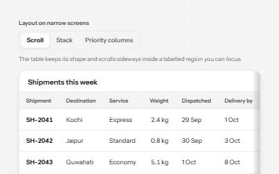
Responsive table
One table, three ways to fit a narrow screen: scroll it in a labelled region, stack rows into cards, or hide minor columns.
-
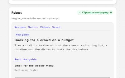
Text size and spacing
A card that stays readable when people enlarge its text or widen its spacing, beside a fragile one that clips.
-
Sticky header that keeps focus visible
A header that stays at the top while you scroll, shrinks out of the way, and never covers the element with keyboard focus.
-
Target size
Targets big enough to hit: 24 px or well spaced at AA, 44 px at AAA, with an overlay that measures every one.