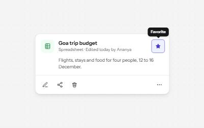
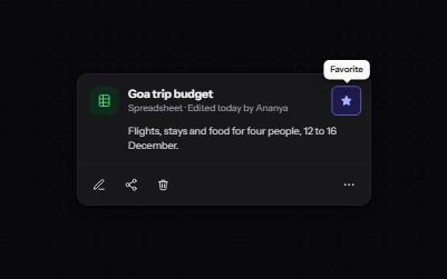
Some words are only needed by people who cannot see the layout: who a Read more link is about, what an icon button does, what a table holds.The utility clips them to a single pixel instead of removing them, so screen readers still read them and nothing else changes.
Use it with a mouse, a keyboard or a screen reader.The inspector beside it shows what the browser tells assistive technology as you go: focus, state changes and announcements.
Each switch hides its button one way, and the answers are measured from the page. aria-hidden starts off: switch it on to see the trap.
Gone for everyone, space and all.
Gone for everyone, but its space stays.
The HTML way to say display: none.
Invisible, yet still read, still clickable, still a tab stop.
Seen but silent. Right for decoration, wrong for anything focusable.
Read, not seen. Anything focusable needs the focusable version.
The demo works without JavaScript only as far as its HTML does; the inspector needs JavaScript.
Keyboard
Keys it answers to
Every action works without a pointer.
Key
What it does
Tab
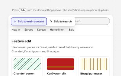
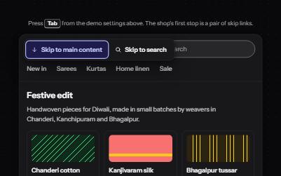
From the top of the shop card, first reveals the Skip to reviews link; then moves through the card's links and buttons, and on to the comparison.
Enter
On Skip to reviews, moves focus to the reviews; on Read more, follows the link.
Space
On Show hidden text, draws every visually hidden phrase in place; on a technique's switch, hides its button and measures the result.
Enter or Space
On the heart button, saves the rug to the wishlist or removes it.
Screen readers
What it announces
Written from the roles, names and states in the markup.
When
Expected announcement
Focus reaches the Read more link
Read more about the cotton dhurrie, link
Enter on Skip to reviews
Reviews, group
Focus reaches the heart button
Save to wishlist, toggle button, not pressed
A screen reader reads the old price
Was ₹4,200. Now ₹3,400
It reaches the delivery table
Delivery times by city, table, 3 rows, 2 columns
The aria-hidden switch is turned on
aria-hidden="true". Visible: Yes. Read by screen readers: No. Focusable: Yes. Takes up space: Yes.
These are expected announcements, not recordings.Wording and order differ between screen readers and browsers.
Code
Copy the code
The exact files this demo runs on.The styles are served with a prefix that keeps this site's own styles out of the demo; what you copy is the original.
The markup
<div class="ap-vh-demo" data-ap-visually-hidden>
  <div class="ap-vh-demo__good">
    <div class="ap-vh-demo__head">
      <h3 class="ap-vh-demo__name" id="vh-good-name">Good uses</h3>
      <button type="button" class="ap-vh-demo__switch" role="switch" aria-checked="false" data-vh-reveal>
        <span class="ap-vh-demo__track" aria-hidden="true"><span class="ap-vh-demo__knob"></span></span>
        Show hidden text
      </button>
    </div>

    <article class="ap-vh-demo__product" aria-labelledby="vh-product-name">
      <a class="ap-visually-hidden--focusable ap-vh-demo__skip" href="#vh-reviews">Skip to reviews</a>
      <div class="ap-vh-demo__art" aria-hidden="true"></div>
      <div class="ap-vh-demo__info">
        <div class="ap-vh-demo__row">
          <h4 class="ap-vh-demo__product-name" id="vh-product-name">Handloom cotton dhurrie, 4 × 6 ft</h4>
          <button type="button" class="ap-vh-demo__icon" aria-pressed="false" data-vh-save>
            <svg viewBox="0 0 24 24" aria-hidden="true" focusable="false"><path d="M12 20s-7-4.4-7-10a4 4 0 0 1 7-2.6A4 4 0 0 1 19 10c0 5.6-7 10-7 10Z"/></svg>
            <span class="ap-visually-hidden">Save to wishlist</span>
          </button>
        </div>
        <p class="ap-vh-demo__price">
          <s><span class="ap-visually-hidden">Was </span>₹4,200</s>
          <strong><span class="ap-visually-hidden">Now </span>₹3,400</strong>
        </p>
        <p class="ap-vh-demo__blurb">Woven on pit looms in Panipat from undyed cotton. <a href="#vh-dhurrie">Read more<span class="ap-visually-hidden"> about the cotton dhurrie</span></a></p>
        <table class="ap-vh-demo__table">
          <caption class="ap-visually-hidden">Delivery times by city</caption>
          <thead><tr><th scope="col">City</th><th scope="col">Arrives in</th></tr></thead>
          <tbody>
            <tr><th scope="row">Mumbai</th><td>2 days</td></tr>
            <tr><th scope="row">Kochi</th><td>4 days</td></tr>
          </tbody>
        </table>
        <div class="ap-vh-demo__reviews" id="vh-reviews" tabindex="-1" role="group" aria-labelledby="vh-reviews-label">
          <p class="ap-vh-demo__rv-label" id="vh-reviews-label">Reviews</p>
          <p class="ap-vh-demo__score"><span class="ap-vh-demo__stars" aria-hidden="true">★★★★★</span> 4.6<span class="ap-visually-hidden"> out of 5</span></p>
          <p class="ap-vh-demo__count">128 reviews</p>
        </div>
      </div>
    </article>
  </div>

  <div class="ap-vh-demo__compare">
    <h3 class="ap-vh-demo__name" id="vh-compare-name">Six ways to hide, compared</h3>
    <p class="ap-vh-demo__intro">Each switch hides its button one way, and the answers are measured from the page. aria-hidden starts off: switch it on to see the trap.</p>
    <ul class="ap-vh-demo__grid" role="list">
      <li class="ap-vh-demo__card" data-vh-technique="display">
        <button type="button" class="ap-vh-demo__switch ap-vh-demo__switch--small" role="switch" aria-checked="true" data-vh-apply>
          <span class="ap-vh-demo__track" aria-hidden="true"><span class="ap-vh-demo__knob"></span></span>
          <code translate="no">display: none</code>
        </button>
        <p class="ap-vh-demo__what">Gone for everyone, space and all.</p>
        <div class="ap-vh-demo__slot"><button type="button" class="ap-btn ap-vh-demo__specimen is-display">Track order</button></div>
        <dl class="ap-vh-demo__out" data-vh-out></dl>
      </li>
      <li class="ap-vh-demo__card" data-vh-technique="visibility">
        <button type="button" class="ap-vh-demo__switch ap-vh-demo__switch--small" role="switch" aria-checked="true" data-vh-apply>
          <span class="ap-vh-demo__track" aria-hidden="true"><span class="ap-vh-demo__knob"></span></span>
          <code translate="no">visibility: hidden</code>
        </button>
        <p class="ap-vh-demo__what">Gone for everyone, but its space stays.</p>
        <div class="ap-vh-demo__slot"><button type="button" class="ap-btn ap-vh-demo__specimen is-visibility">Track order</button></div>
        <dl class="ap-vh-demo__out" data-vh-out></dl>
      </li>
      <li class="ap-vh-demo__card" data-vh-technique="hidden">
        <button type="button" class="ap-vh-demo__switch ap-vh-demo__switch--small" role="switch" aria-checked="true" data-vh-apply>
          <span class="ap-vh-demo__track" aria-hidden="true"><span class="ap-vh-demo__knob"></span></span>
          <code translate="no">hidden</code>
        </button>
        <p class="ap-vh-demo__what">The HTML way to say display: none.</p>
        <div class="ap-vh-demo__slot"><button type="button" class="ap-btn ap-vh-demo__specimen" hidden>Track order</button></div>
        <dl class="ap-vh-demo__out" data-vh-out></dl>
      </li>
      <li class="ap-vh-demo__card" data-vh-technique="opacity">
        <button type="button" class="ap-vh-demo__switch ap-vh-demo__switch--small" role="switch" aria-checked="true" data-vh-apply>
          <span class="ap-vh-demo__track" aria-hidden="true"><span class="ap-vh-demo__knob"></span></span>
          <code translate="no">opacity: 0</code>
        </button>
        <p class="ap-vh-demo__what">Invisible, yet still read, still clickable, still a tab stop.</p>
        <div class="ap-vh-demo__slot"><button type="button" class="ap-btn ap-vh-demo__specimen is-opacity">Track order</button></div>
        <dl class="ap-vh-demo__out" data-vh-out></dl>
      </li>
      <li class="ap-vh-demo__card" data-vh-technique="aria-hidden">
        <button type="button" class="ap-vh-demo__switch ap-vh-demo__switch--small" role="switch" aria-checked="false" data-vh-apply>
          <span class="ap-vh-demo__track" aria-hidden="true"><span class="ap-vh-demo__knob"></span></span>
          <code translate="no">aria-hidden="true"</code>
        </button>
        <p class="ap-vh-demo__what">Seen but silent. Right for decoration, wrong for anything focusable.</p>
        <div class="ap-vh-demo__slot"><button type="button" class="ap-btn ap-vh-demo__specimen">Track order</button></div>
        <dl class="ap-vh-demo__out" data-vh-out></dl>
      </li>
      <li class="ap-vh-demo__card" data-vh-technique="visually-hidden">
        <button type="button" class="ap-vh-demo__switch ap-vh-demo__switch--small" role="switch" aria-checked="true" data-vh-apply>
          <span class="ap-vh-demo__track" aria-hidden="true"><span class="ap-vh-demo__knob"></span></span>
          <code translate="no">.ap-visually-hidden</code>
        </button>
        <p class="ap-vh-demo__what">Read, not seen. Anything focusable needs the focusable version.</p>
        <div class="ap-vh-demo__slot"><button type="button" class="ap-btn ap-vh-demo__specimen ap-visually-hidden">Track order</button></div>
        <dl class="ap-vh-demo__out" data-vh-out></dl>
      </li>
    </ul>
    <p class="ap-visually-hidden" role="status" data-vh-status></p>
  </div>
</div>
Each measurement is also announced through a visually hidden status message, without moving focus.
Usage
When to use it
Use it
Words sighted people get from the layout: the subject of a Read more link, a table's caption, Was and Now beside two prices.
Names for icon-only buttons, and status messages that only screen reader users need.
Use something else
Anything useful to everyone: if it helps a screen reader user, it often helps sighted people too, so show it.
Hiding focusable controls: a link or button must be visible whenever it has focus, so use the focusable version.
Long passages, or text in a different order from the screen: what is read and what is seen should tell the same story.
Common failures
How it usually goes wrong
aria-hidden on something focusable
The button is still a tab stop, so keyboard users land on it, and screen readers announce nothing or something unrelated. Hide it from everyone, or from nobody.
display: none for screen reader text
display: none and visibility: hidden remove text from the accessibility tree too, so the words meant for screen readers are never read.
Moving text far off screen
left: -9999px works until a focusable element inside makes the page scroll sideways, or a right-to-left layout brings it back. Clipping keeps it in place.
opacity: 0 as a way to hide
Invisible elements stay clickable and focusable, so a click lands on a ghost and focus disappears. Remove it or show it.
Hidden text that contradicts the label
A visible Buy with hidden text Add to cart breaks voice control, which only knows what it sees. Start the name with the visible words.
Forgetting that hidden loses to CSS
Any display rule on the element beats the hidden attribute's default. Add [hidden] { display: none } for elements you show and hide.
Notes
Building it
The utility: position absolute, 1 pixel by 1, a negative margin, overflow hidden, clip-path: inset(50%) and white-space: nowrap. nowrap stops the clipped words being read as one squashed word.
The focusable version applies the same rules only while the element does not have focus, so a skip link appears the moment it is reached and hides again when focus moves on.
Show hidden text overrides the utility inside this demo only, so you can check what screen reader users get; it is not part of the utility.
The comparison measures each button with checkVisibility, its box and its attributes, the way the browser builds the accessibility tree, so the answers are the browser's, not a table typed in advance.
Prefer aria-label only where there is no text node to hide; visible or visually hidden text is translated by browser tools, and aria-label often is not.
Checked with axe in light and dark themes, at desktop and phone widths, and by keyboard.Not yet tested with every screen reader and browser pair.Report a correction