Accessibility pattern · Interaction and motion
Target size
Every target needs a 24 by 24 px hit area, or enough room that a 24 px circle on its center touches nothing else; 44 px is the AAA goal. The fix rarely means bigger icons: padding grows the button around the same icon, and an absolutely positioned ::after grows the hit area without moving anything.
- WCAG criteria
- 5
- Keyboard rules
- 4
- Checked with
- axe, keyboard and the inspector
Live demo
Try it
Use it with a mouse, a keyboard or a screen reader. The inspector beside it shows what the browser tells assistive technology as you go: focus, state changes and announcements.
Free delivery on orders over ₹999.
Shop nowWrite a review
Handloom cotton saree, indigo
Soft handloom cotton, and the indigo is exactly as shown. The pallu could be a little longer.
Reviews follow our community guidelines and privacy notice.
Target check
Pass 0 Fail 0 Exempt 0
Counts are for AA: 24 px, or spaced (2.5.8). AAA asks 44 px (2.5.5). On the overlay: a circle badge passes, a square fails, a dotted box is an exempt link in a sentence.
| # | Target and size | AA 24 px | AAA 44 px |
|---|
The demo works without JavaScript only as far as its HTML does; the inspector needs JavaScript.
Keyboard
Keys it answers to
Every action works without a pointer.
| Key | What it does |
|---|---|
| Tab or ShiftTab | Moves between the controls, the toolbar (one stop), the links and the buttons. |
| Arrow Right or Arrow Left | In the formatting toolbar, moves to the next or previous button; in the Targets group, switches between As drawn and Fixed. |
| Home or End | In the toolbar, moves to the first or last button. |
| Space or Enter | Presses the focused button: a format, Show hit areas, Post review or Dismiss the offer. Enter follows a link. |
Screen readers
What it announces
Written from the roles, names and states in the markup.
| When | Expected announcement |
|---|---|
| Focus reaches the toolbar | Formatting, toolbar. Bold, toggle button, not pressed |
| Show hit areas is pressed | Show hit areas, toggle button, pressed. Hit areas shown |
| Fixed is chosen | Fixed, radio button, checked, 2 of 2. Targets fixed. The check is updated. |
| Focus reaches the current page | Page 1, current page, link |
| Focus reaches the close button | Dismiss the offer, button |
These are expected announcements, not recordings. Wording and order differ between screen readers and browsers.
Code
Copy the code
The exact files this demo runs on. The styles are served with a prefix that keeps this site's own styles out of the demo; what you copy is the original.
<div class="ap-tsize" data-ap-target-size>
  <div class="ap-tsize__controls">
    <button type="button" class="ap-btn ap-tsize__show" aria-pressed="false" data-ap-hits>
      <svg class="ap-btn__icon" viewBox="0 0 24 24" aria-hidden="true" focusable="false"><circle cx="12" cy="12" r="8" stroke-dasharray="3 3"/><circle cx="12" cy="12" r="2"/></svg>
      Show hit areas
    </button>
    <fieldset class="ap-tsize__mode">
      <legend class="ap-tsize__legend">Targets</legend>
      <div class="ap-tsize__seg">
        <label class="ap-tsize__opt"><input type="radio" name="tsize-mode" value="drawn" checked /><span>As drawn</span></label>
        <label class="ap-tsize__opt"><input type="radio" name="tsize-mode" value="fixed" /><span>Fixed</span></label>
      </div>
    </fieldset>
    <p class="ap-tsize__said" role="status"></p>
  </div>

  <div class="ap-tsize__layout">
    <div class="ap-tsize__card" data-ap-surface>
      <div class="ap-tsize__promo">
        <p class="ap-tsize__promo-text">Free delivery on orders over ₹999.</p>
        <a class="ap-tsize__promo-link" href="#tsize-offers">Shop now</a>
        <button type="button" class="ap-tsize__close" aria-label="Dismiss the offer" data-ap-dismiss>
          <svg viewBox="0 0 24 24" aria-hidden="true" focusable="false"><path d="M6 6l12 12M18 6 6 18"/></svg>
        </button>
      </div>

      <div class="ap-tsize__body">
        <h3 class="ap-tsize__name">Write a review</h3>
        <p class="ap-tsize__item">Handloom cotton saree, indigo</p>
        <div class="ap-tsize__editor">
          <div class="ap-tsize__tools" role="toolbar" aria-label="Formatting">
        <button type="button" class="ap-tsize__tool" data-ap-cmd="bold" aria-label="Bold" aria-pressed="false">
          <svg viewBox="0 0 24 24" aria-hidden="true" focusable="false"><path d="M7 5h6a3.5 3.5 0 0 1 0 7H7zm0 7h7a3.5 3.5 0 0 1 0 7H7z"/></svg>
        </button>
        <button type="button" class="ap-tsize__tool" data-ap-cmd="italic" aria-label="Italic" aria-pressed="false" tabindex="-1">
          <svg viewBox="0 0 24 24" aria-hidden="true" focusable="false"><path d="M14 5h-4m4 14h-4m3-14-2 14"/></svg>
        </button>
        <button type="button" class="ap-tsize__tool" data-ap-cmd="underline" aria-label="Underline" aria-pressed="false" tabindex="-1">
          <svg viewBox="0 0 24 24" aria-hidden="true" focusable="false"><path d="M7 4v7a5 5 0 0 0 10 0V4M5 20h14"/></svg>
        </button>
        <button type="button" class="ap-tsize__tool" data-ap-cmd="strike" aria-label="Strikethrough" aria-pressed="false" tabindex="-1">
          <svg viewBox="0 0 24 24" aria-hidden="true" focusable="false"><path d="M16 7a4 3 0 0 0-8 0c0 4 8 2 8 6a4 3 0 0 1-8 1M4 12h16"/></svg>
        </button>
          </div>
          <p class="ap-tsize__review" data-ap-review>Soft handloom cotton, and the indigo is exactly as shown. The pallu could be a little longer.</p>
        </div>
        <p class="ap-tsize__terms">Reviews follow our <a href="#tsize-guidelines">community guidelines</a> and <a href="#tsize-privacy">privacy notice</a>.</p>
        <button type="button" class="ap-btn ap-btn--primary ap-tsize__post" data-ap-post>Post review</button>
      </div>

      <div class="ap-tsize__foot">
        <nav class="ap-tsize__pager" aria-label="Review pages">
          <p class="ap-tsize__foot-k">Reviews</p>
          <ul class="ap-tsize__pages">
            <li><a class="ap-tsize__page" href="#tsize-reviews-prev" aria-label="Previous page" data-ap-step="-1"><svg viewBox="0 0 24 24" aria-hidden="true" focusable="false"><path d="m15 6-6 6 6 6"/></svg></a></li>
          <li><a class="ap-tsize__page" href="#tsize-reviews-1" aria-label="Page 1" aria-current="page">1</a></li>
          <li><a class="ap-tsize__page" href="#tsize-reviews-2" aria-label="Page 2">2</a></li>
          <li><a class="ap-tsize__page" href="#tsize-reviews-3" aria-label="Page 3">3</a></li>
            <li><a class="ap-tsize__page" href="#tsize-reviews-next" aria-label="Next page" data-ap-step="1"><svg viewBox="0 0 24 24" aria-hidden="true" focusable="false"><path d="m9 6 6 6-6 6"/></svg></a></li>
          </ul>
        </nav>
        <nav class="ap-tsize__help" aria-label="Help topics">
          <p class="ap-tsize__foot-k">Need help?</p>
          <ul class="ap-tsize__links">
            <li><a href="#tsize-delivery">Delivery</a></li>
            <li><a href="#tsize-returns">Returns</a></li>
            <li><a href="#tsize-size-guide">Size guide</a></li>
            <li><a href="#tsize-contact">Contact us</a></li>
          </ul>
        </nav>
      </div>
      <p class="ap-tsize__note" role="status"></p>
      <div class="ap-tsize__overlay" aria-hidden="true" data-ap-overlay></div>
    </div>

    <div class="ap-tsize__report">
      <h3 class="ap-tsize__report-name" id="tsize-report-name">Target check</h3>
      <p class="ap-tsize__sum" data-ap-sum>
        <span class="ap-tsize__stat ap-tsize__stat--pass"><span>Pass</span> <strong data-ap-n="pass" translate="no">0</strong></span>
        <span class="ap-tsize__stat ap-tsize__stat--fail"><span>Fail</span> <strong data-ap-n="fail" translate="no">0</strong></span>
        <span class="ap-tsize__stat ap-tsize__stat--inline"><span>Exempt</span> <strong data-ap-n="inline" translate="no">0</strong></span>
      </p>
      <p class="ap-tsize__key">Counts are for AA: 24 px, or spaced (2.5.8). AAA asks 44 px (2.5.5). On the overlay: a circle badge passes, a square fails, a dotted box is an exempt link in a sentence.</p>
      <div class="ap-tsize__scroll" role="region" aria-labelledby="tsize-report-name" tabindex="0">
        <table class="ap-tsize__table">
          <thead><tr><th scope="col">#</th><th scope="col">Target and size</th><th scope="col"><span class="ap-tsize__th">AA</span> <span class="ap-tsize__th-px" translate="no">24 px</span></th><th scope="col"><span class="ap-tsize__th">AAA</span> <span class="ap-tsize__th-px" translate="no">44 px</span></th></tr></thead>
          <tbody data-ap-rows></tbody>
        </table>
      </div>
    </div>
  </div>
</div>
/* Shared primitives: buttons and form fields used across the patterns.
   Uses the --ap-* design tokens. */

.ap-btn {
  display: inline-flex;
  align-items: center;
  justify-content: center;
  gap: 8px;
  min-height: 40px;
  padding: 0 16px;
  border: 1px solid var(--ap-border-strong);
  border-radius: var(--ap-radius-sm);
  background: var(--ap-surface);
  color: var(--ap-text);
  font: inherit;
  font-weight: 600;
  line-height: 1.2;
  text-decoration: none;
  white-space: nowrap;
  cursor: pointer;
  transition: background-color var(--ap-duration) var(--ap-ease), border-color var(--ap-duration) var(--ap-ease), box-shadow var(--ap-duration) var(--ap-ease);
}
.ap-btn:hover {
  background: var(--ap-surface-2);
}
.ap-btn:focus-visible {
  outline: 2px solid var(--ap-focus);
  outline-offset: 2px;
}
.ap-btn:disabled,
.ap-btn[aria-disabled="true"] {
  opacity: .55;
  cursor: not-allowed;
}
.ap-btn--primary {
  border-color: var(--ap-accent);
  background: var(--ap-accent);
  color: var(--ap-on-accent);
  box-shadow: var(--ap-shadow-sm);
}
.ap-btn--primary:hover {
  border-color: var(--ap-accent-hover);
  background: var(--ap-accent-hover);
}
.ap-btn--danger {
  border-color: var(--ap-danger);
  background: var(--ap-danger);
  color: var(--ap-surface);
}
.ap-btn--danger:hover {
  filter: brightness(1.08);
}
.ap-btn--ghost {
  border-color: transparent;
  background: transparent;
}
.ap-btn--ghost:hover {
  background: var(--ap-surface-2);
}
.ap-btn__icon {
  width: 18px;
  height: 18px;
  flex-shrink: 0;
  fill: none;
  stroke: currentColor;
  stroke-width: 2;
  stroke-linecap: round;
  stroke-linejoin: round;
}

.ap-field {
  display: grid;
  gap: 6px;
}
.ap-label {
  color: var(--ap-text);
  font-weight: 600;
  font-size: .9375rem;
}
.ap-hint {
  margin: 0;
  color: var(--ap-text-3);
  font-size: .875rem;
  line-height: 1.45;
}
.ap-error {
  display: flex;
  align-items: flex-start;
  gap: 6px;
  margin: 0;
  color: var(--ap-danger);
  font-size: .875rem;
  font-weight: 600;
  line-height: 1.45;
}
.ap-input {
  width: 100%;
  min-height: 44px;
  padding: 10px 12px;
  border: 1px solid var(--ap-border-strong);
  border-radius: var(--ap-radius-sm);
  background: var(--ap-surface);
  color: var(--ap-text);
  font: inherit;
  line-height: 1.4;
  transition: border-color var(--ap-duration) var(--ap-ease), box-shadow var(--ap-duration) var(--ap-ease);
}
.ap-input::placeholder {
  color: var(--ap-text-3);
}
.ap-input:hover {
  border-color: var(--ap-text-2);
}
.ap-input:focus-visible {
  outline: 2px solid var(--ap-focus);
  outline-offset: 1px;
  border-color: var(--ap-focus);
}
.ap-input[aria-invalid="true"] {
  border-color: var(--ap-danger);
  box-shadow: inset 4px 0 0 var(--ap-danger);
}
textarea.ap-input {
  resize: vertical;
  min-height: 88px;
}

@media (prefers-reduced-motion: reduce) {
  .ap-btn,
  .ap-input { transition: none; }
}

/* Target size. Uses the --ap-* design tokens and the shared primitives.
   data-fixed on the root switches every small target to its fixed size:
   the icons stay the same, the hit areas grow. */
.ap-tsize {
  width: min(100%, 820px);
  margin-inline: auto;
  color: var(--ap-text);
  container-type: inline-size;
}
.ap-tsize [hidden] {
  display: none;
}

/* ── Controls ── */
.ap-tsize__controls {
  display: flex;
  flex-wrap: wrap;
  align-items: center;
  gap: 10px 18px;
  margin-bottom: 16px;
}
.ap-tsize__show[aria-pressed="true"] {
  border-color: var(--ap-accent);
  background: var(--ap-accent-soft);
  color: var(--ap-accent-soft-text);
}
.ap-tsize__mode {
  display: flex;
  align-items: center;
  margin: 0;
  padding: 0;
  border: 0;
  min-inline-size: 0;
}
.ap-tsize__legend {
  float: left;
  margin-right: 10px;
  padding: 0;
  font-size: .9375rem;
  font-weight: 600;
}
.ap-tsize__seg {
  display: inline-flex;
  gap: 2px;
  padding: 3px;
  border: 1px solid var(--ap-border-strong);
  border-radius: var(--ap-radius-sm);
  background: var(--ap-surface-2);
}
.ap-tsize__opt {
  position: relative;
  display: flex;
}
.ap-tsize__opt input {
  position: absolute;
  inset: 0;
  width: 100%;
  height: 100%;
  margin: 0;
  opacity: 0;
  cursor: pointer;
}
.ap-tsize__opt span {
  display: flex;
  align-items: center;
  min-height: 34px;
  padding: 0 14px;
  border-radius: 6px;
  color: var(--ap-text-2);
  font-size: .9375rem;
  font-weight: 500;
}
.ap-tsize__opt input:checked + span {
  background: var(--ap-surface);
  color: var(--ap-text);
  font-weight: 650;
  box-shadow: var(--ap-shadow-sm), 0 0 0 1px var(--ap-border-strong);
}
.ap-tsize__opt input:focus-visible + span {
  outline: 2px solid var(--ap-focus);
  outline-offset: 2px;
}
.ap-tsize__said {
  margin: 0;
  color: var(--ap-text-2);
  font-size: .875rem;
}

.ap-tsize__layout {
  display: grid;
  gap: 16px;
  align-items: start;
}

/* ── The card being checked ── */
.ap-tsize__card {
  position: relative;
  min-width: 0;
  border: 1px solid var(--ap-border);
  border-radius: var(--ap-radius-lg);
  background: var(--ap-surface);
  box-shadow: var(--ap-shadow-md);
}

.ap-tsize__promo {
  display: flex;
  flex-wrap: wrap;
  align-items: center;
  gap: 6px 12px;
  padding: 14px 16px;
  border-bottom: 1px solid var(--ap-border);
  border-radius: var(--ap-radius-lg) var(--ap-radius-lg) 0 0;
  background: var(--ap-accent-soft);
  color: var(--ap-accent-soft-text);
  font-size: .875rem;
}
.ap-tsize__promo-text {
  flex: 1 1 12em;
  margin: 0;
  line-height: 20px;
}
.ap-tsize__promo-link {
  color: var(--ap-accent-soft-text);
  font-weight: 650;
  line-height: 20px;
  text-decoration: underline;
  text-underline-offset: 2px;
  white-space: nowrap;
}
/* A 16 px close button: it passes 2.5.8 only because nothing is near it. */
.ap-tsize__close {
  position: relative;
  display: grid;
  place-items: center;
  width: 16px;
  height: 16px;
  flex-shrink: 0;
  margin-left: 4px;
  padding: 0;
  border: 0;
  border-radius: 4px;
  background: transparent;
  color: var(--ap-accent-soft-text);
  cursor: pointer;
}
.ap-tsize__close svg {
  width: 12px;
  height: 12px;
  fill: none;
  stroke: currentColor;
  stroke-width: 2.5;
  stroke-linecap: round;
}

.ap-tsize__body {
  display: grid;
  gap: 12px;
  padding: 18px 20px 20px;
}
.ap-tsize__name {
  margin: 0;
  font-size: 1.0625rem;
  font-weight: 650;
  line-height: 1.35;
}
.ap-tsize__item {
  margin: -8px 0 0;
  color: var(--ap-text-3);
  font-size: .875rem;
}

/* The formatting toolbar: 20 px buttons, 2 px apart. The chip behind the
   icon is a pseudo-element, so it keeps its size when the button grows. */
.ap-tsize__editor {
  border: 1px solid var(--ap-border-strong);
  border-radius: var(--ap-radius-sm);
}
.ap-tsize__tools {
  display: flex;
  gap: 2px;
  padding: 6px 8px;
  border-bottom: 1px solid var(--ap-border);
  border-radius: 7px 7px 0 0;
  background: var(--ap-surface-2);
}
.ap-tsize__tool {
  --chip-inset: 0px;
  position: relative;
  z-index: 0;
  display: grid;
  place-items: center;
  width: 20px;
  height: 20px;
  padding: 0;
  border: 0;
  border-radius: 4px;
  background: transparent;
  color: var(--ap-text-2);
  cursor: pointer;
}
.ap-tsize__tool::before {
  content: "";
  position: absolute;
  z-index: -1;
  inset: var(--chip-inset);
  border-radius: 4px;
  transition: background-color var(--ap-duration) var(--ap-ease);
}
.ap-tsize__tool:hover::before {
  background: var(--ap-surface-3);
}
.ap-tsize__tool[aria-pressed="true"] {
  color: var(--ap-accent-soft-text);
}
.ap-tsize__tool[aria-pressed="true"]::before {
  background: var(--ap-accent-soft);
  box-shadow: inset 0 0 0 1px var(--ap-accent);
}
.ap-tsize__tool svg {
  width: 14px;
  height: 14px;
  fill: none;
  stroke: currentColor;
  stroke-width: 2.2;
  stroke-linecap: round;
  stroke-linejoin: round;
}
.ap-tsize__tool:focus-visible {
  outline: 2px solid var(--ap-focus);
  outline-offset: 1px;
}
.ap-tsize__review {
  margin: 0;
  padding: 12px 14px;
  color: var(--ap-text);
  line-height: 1.55;
}
.ap-tsize__review[data-bold] { font-weight: 700; }
.ap-tsize__review[data-italic] { font-style: italic; }
.ap-tsize__review[data-underline] { text-decoration-line: underline; }
.ap-tsize__review[data-strike] { text-decoration-line: line-through; }
.ap-tsize__review[data-underline][data-strike] { text-decoration-line: underline line-through; }

/* Links in a sentence: exempt, because the text sets their size. */
.ap-tsize__terms {
  margin: 0;
  color: var(--ap-text-3);
  font-size: .875rem;
  line-height: 1.5;
}
.ap-tsize__terms a,
.ap-tsize__links a {
  color: var(--ap-accent-text);
  text-decoration: underline;
  text-underline-offset: 2px;
}
.ap-tsize__post {
  justify-self: start;
  min-height: var(--ap-target);
}

/* Footer: pagination and a stacked list of small links. */
.ap-tsize__foot {
  display: grid;
  grid-template-columns: repeat(2, minmax(0, 1fr));
  gap: 16px;
  padding: 16px 20px 18px;
  border-top: 1px solid var(--ap-border);
  border-radius: 0 0 var(--ap-radius-lg) var(--ap-radius-lg);
  background: var(--ap-surface-2);
}
.ap-tsize__foot-k {
  margin: 0 0 8px;
  color: var(--ap-text-3);
  font-size: .75rem;
  font-weight: 650;
  letter-spacing: .06em;
  text-transform: uppercase;
}
.ap-tsize__pages {
  display: flex;
  align-items: center;
  gap: 2px;
  margin: 0;
  padding: 0;
  list-style: none;
}
.ap-tsize__page {
  --chip-inset: 0px;
  position: relative;
  z-index: 0;
  display: grid;
  place-items: center;
  min-width: 20px;
  height: 20px;
  border-radius: 4px;
  color: var(--ap-text-2);
  font-size: .75rem;
  font-weight: 600;
  text-decoration: none;
}
.ap-tsize__page::before {
  content: "";
  position: absolute;
  z-index: -1;
  inset: var(--chip-inset);
  border-radius: 4px;
}
.ap-tsize__page:hover::before {
  background: var(--ap-surface-3);
}
.ap-tsize__page[aria-current="page"] {
  color: var(--ap-surface);
  font-weight: 700;
}
.ap-tsize__page[aria-current="page"]::before {
  background: var(--ap-text);
}
.ap-tsize__page svg {
  width: 12px;
  height: 12px;
  fill: none;
  stroke: currentColor;
  stroke-width: 2.5;
  stroke-linecap: round;
  stroke-linejoin: round;
}
.ap-tsize__links {
  margin: 0;
  padding: 0;
  list-style: none;
}
.ap-tsize__links a {
  display: block;
  width: fit-content;
  font-size: .8125rem;
  line-height: 16px;
}
.ap-tsize__note {
  grid-column: 1 / -1;
  margin: 0;
  color: var(--ap-text-2);
  font-size: .875rem;
  font-weight: 600;
}
.ap-tsize__note:empty {
  display: none;
}

/* ── Fixed: the same look, bigger hit areas ── */
.ap-tsize[data-fixed] .ap-tsize__promo-link {
  padding-block: 2px;
}
/* Grown with a pseudo-element: 44 × 44 px of hit area, nothing moves. */
.ap-tsize[data-fixed] .ap-tsize__close::after {
  content: "";
  position: absolute;
  inset: -14px;
  border-radius: 50%;
}
/* Grown with padding: the 20 px chip and icon sit in a 28 px button. */
.ap-tsize[data-fixed] .ap-tsize__tools {
  gap: 0;
  padding: 2px 4px;
}
.ap-tsize[data-fixed] .ap-tsize__tool,
.ap-tsize[data-fixed] .ap-tsize__page {
  --chip-inset: 4px;
  min-width: 28px;
  width: 28px;
  height: 28px;
}
.ap-tsize[data-fixed] .ap-tsize__links a {
  padding-block: 4px;
}

/* ── The overlay: hit areas, 24 px circles and numbered badges ── */
.ap-tsize__overlay {
  position: absolute;
  inset: 0;
  display: none;
  pointer-events: none;
}
.ap-tsize[data-hits] .ap-tsize__overlay {
  display: block;
}
.ap-tsize__hit,
.ap-tsize__circle,
.ap-tsize__badge {
  position: absolute;
  --hit: var(--ap-success);
}
:is(.ap-tsize__hit, .ap-tsize__circle, .ap-tsize__badge)[data-state="fail"] { --hit: var(--ap-danger); }
:is(.ap-tsize__hit, .ap-tsize__circle, .ap-tsize__badge)[data-state="inline"] { --hit: var(--ap-info); }
.ap-tsize__hit {
  border: 1.5px solid var(--hit);
  border-radius: 3px;
  background: color-mix(in srgb, var(--hit) 12%, transparent);
}
.ap-tsize__hit[data-state="fail"] {
  border-style: dashed;
}
.ap-tsize__hit[data-state="inline"] {
  border-style: dotted;
}
.ap-tsize__circle {
  width: 24px;
  height: 24px;
  border: 1px dashed var(--hit);
  border-radius: 50%;
}
.ap-tsize__badge {
  display: grid;
  place-items: center;
  min-width: 16px;
  height: 16px;
  padding: 0 3px;
  border-radius: var(--ap-radius-full);
  background: var(--hit);
  color: var(--ap-surface);
  font: 700 10px/1 var(--ap-mono);
}
.ap-tsize__badge[data-state="fail"] {
  border-radius: 2px;
}
.ap-tsize__badge[data-state="inline"] {
  border: 1px dotted var(--hit);
  background: var(--ap-surface);
  color: var(--hit);
}

/* ── The report ── */
.ap-tsize__report {
  display: grid;
  gap: 10px;
  min-width: 0;
  padding: 18px 18px 16px;
  border: 1px solid var(--ap-border);
  border-radius: var(--ap-radius-lg);
  background: var(--ap-surface);
  box-shadow: var(--ap-shadow-md);
}
.ap-tsize__report-name {
  margin: 0;
  font-size: 1rem;
  font-weight: 650;
  line-height: 1.35;
}
.ap-tsize__sum {
  display: flex;
  flex-wrap: wrap;
  gap: 6px;
  margin: 0;
}
.ap-tsize__stat {
  display: inline-flex;
  align-items: baseline;
  gap: 6px;
  padding: 4px 10px;
  border-radius: var(--ap-radius-full);
  font-size: .8125rem;
  font-weight: 600;
}
.ap-tsize__stat strong {
  font-family: var(--ap-mono);
  font-size: .9375rem;
}
.ap-tsize__stat--pass { background: var(--ap-success-soft); color: var(--ap-success); }
.ap-tsize__stat--fail { background: var(--ap-danger-soft); color: var(--ap-danger); }
.ap-tsize__stat--inline { background: var(--ap-info-soft); color: var(--ap-info); }
.ap-tsize__key {
  margin: 0;
  color: var(--ap-text-3);
  font-size: .8125rem;
  line-height: 1.45;
}
.ap-tsize__scroll {
  max-height: 392px;
  overflow: auto;
  border: 1px solid var(--ap-border);
  border-radius: var(--ap-radius-sm);
}
.ap-tsize__scroll:focus-visible {
  outline: 2px solid var(--ap-focus);
  outline-offset: 2px;
}
.ap-tsize__table {
  width: 100%;
  border-collapse: collapse;
  font-size: .8125rem;
  line-height: 1.35;
}
.ap-tsize__table th {
  position: sticky;
  top: 0;
  z-index: 1;
  padding: 7px 6px;
  background: var(--ap-surface-2);
  color: var(--ap-text-2);
  font-size: .75rem;
  font-weight: 650;
  text-align: start;
  white-space: nowrap;
}
.ap-tsize__th-px {
  display: block;
  color: var(--ap-text-3);
  font-family: var(--ap-mono);
  font-size: .6875rem;
  font-weight: 500;
}
.ap-tsize__table td {
  padding: 6px;
  border-top: 1px solid var(--ap-border);
  vertical-align: middle;
}
.ap-tsize__table td:first-child,
.ap-tsize__size {
  color: var(--ap-text-3);
  font-family: var(--ap-mono);
  font-size: .75rem;
  white-space: nowrap;
}
.ap-tsize__label,
.ap-tsize__size {
  display: block;
}
.ap-tsize__label {
  font-weight: 500;
}
.ap-tsize__v {
  display: inline-flex;
  align-items: center;
  gap: 4px;
  font-weight: 650;
  white-space: nowrap;
}
.ap-tsize__v svg {
  width: 13px;
  height: 13px;
  flex-shrink: 0;
  fill: none;
  stroke: currentColor;
  stroke-width: 2.6;
  stroke-linecap: round;
  stroke-linejoin: round;
}
.ap-tsize__v[data-state="pass"] { color: var(--ap-success); }
.ap-tsize__v[data-state="fail"] { color: var(--ap-danger); }
.ap-tsize__v[data-state="inline"] { color: var(--ap-info); }

@container (min-width: 700px) {
  .ap-tsize__layout { grid-template-columns: minmax(0, 1fr) minmax(0, 330px); }
}
@container (max-width: 380px) {
  .ap-tsize__foot { grid-template-columns: minmax(0, 1fr); }
}

@media (forced-colors: active) {
  .ap-tsize__badge { border: 1px solid CanvasText; }
}

@media (prefers-reduced-motion: reduce) {
  .ap-tsize__tool::before { transition: none; }
}
/**
 * Target size: a card of small targets, a switch between the targets as
 * drawn and fixed (bigger hit areas, same look), and a check that measures
 * every target against WCAG 2.5.8 (24 px or spaced) and 2.5.5 (44 px).
 *
 * Markup: [data-ap-target-size] holding a button[data-ap-hits]
 * (aria-pressed), radios name=tsize-mode, the card [data-ap-surface] with
 * its [data-ap-overlay], and the report ([data-ap-n], [data-ap-rows]).
 * The root gets data-fixed and data-hits from the controls.
 */

const MIN = 24;  // 2.5.8, AA
const AAA = 44;  // 2.5.5, AAA
const R = MIN / 2;

const ICON = {
  pass: "<path d=\"m5 12.5 4.5 4.5L19 7.5\"/>",
  fail: "<path d=\"M7 7l10 10M17 7 7 17\"/>",
  inline: "<path d=\"M7 12h10\"/>",
};

/** The area that takes the click: the box plus any absolutely positioned pseudo-element. */
function hitRect(el) {
  const box = el.getBoundingClientRect();
  let { left, top, right, bottom } = box;
  const cs = getComputedStyle(el);
  const pad = {
    left: box.left + parseFloat(cs.borderLeftWidth),
    top: box.top + parseFloat(cs.borderTopWidth),
    right: box.right - parseFloat(cs.borderRightWidth),
    bottom: box.bottom - parseFloat(cs.borderBottomWidth),
  };
  for (const which of ["::before", "::after"]) {
    const ps = getComputedStyle(el, which);
    if (ps.content === "none" || ps.content === "normal" || ps.display === "none" || ps.position !== "absolute" || ps.pointerEvents === "none") continue;
    const w = parseFloat(ps.width);
    const h = parseFloat(ps.height);
    if (!w || !h) continue;
    const x = ps.left !== "auto" ? pad.left + parseFloat(ps.left) : ps.right !== "auto" ? pad.right - parseFloat(ps.right) - w : pad.left;
    const y = ps.top !== "auto" ? pad.top + parseFloat(ps.top) : ps.bottom !== "auto" ? pad.bottom - parseFloat(ps.bottom) - h : pad.top;
    left = Math.min(left, x);
    top = Math.min(top, y);
    right = Math.max(right, x + w);
    bottom = Math.max(bottom, y + h);
  }
  return { left, top, right, bottom };
}

/** A link in running text: its size comes from the line, so 2.5.8 exempts it. */
function inSentence(el) {
  if (getComputedStyle(el).display !== "inline") return false;
  const p = el.parentElement;
  return p.matches("p") && [...p.childNodes].some((n) => n.nodeType === 3 && n.data.trim());
}

const toRect = (x, y, r) => Math.hypot(Math.max(r.left - x, 0, x - r.right), Math.max(r.top - y, 0, y - r.bottom));

export function init(root) {
  const ac = new AbortController();
  const on = (target, type, fn, options = {}) => target.addEventListener(type, fn, { ...options, signal: ac.signal });
  const card = root.querySelector("[data-ap-surface]");
  const overlay = root.querySelector("[data-ap-overlay]");
  const rows = root.querySelector("[data-ap-rows]");
  const counts = Object.fromEntries([...root.querySelectorAll("[data-ap-n]")].map((n) => [n.dataset.apN, n]));
  const hits = root.querySelector("[data-ap-hits]");
  const said = root.querySelector(".ap-tsize__said");
  const note = root.querySelector(".ap-tsize__note");
  const review = root.querySelector("[data-ap-review]");
  const tools = [...root.querySelectorAll(".ap-tsize__tool")];
  const pages = [...root.querySelectorAll(".ap-tsize__page:not([data-ap-step])")];
  const timers = new Set();
  let frame = 0;

  function say(region, text) {
    region.textContent = "";
    const t = setTimeout(() => { region.textContent = text; timers.delete(t); }, 60);
    timers.add(t);
  }

  function measure() {
    const list = [...card.querySelectorAll("a[href], button, input, select, textarea")]
      .filter((el) => el.getClientRects().length)
      .map((el, i) => {
        const inline = inSentence(el);
        // A link that wraps is one box per line, not one box around both lines.
        const rects = inline ? [...el.getClientRects()].map((c) => ({ left: c.left, top: c.top, right: c.right, bottom: c.bottom })) : [hitRect(el)];
        const r = rects[0];
        const w = r.right - r.left;
        const h = r.bottom - r.top;
        return { el, n: i + 1, rects, r, w, h, x: (r.left + r.right) / 2, y: (r.top + r.bottom) / 2, inline, small: w < MIN - 0.01 || h < MIN - 0.01 };
      });
    const gap = (x, y, o) => Math.min(...o.rects.map((r) => toRect(x, y, r)));
    for (const t of list) {
      if (t.inline) t.aa = "inline";
      else if (!t.small) t.aa = "pass";
      else {
        // A 24 px circle on its center may not touch another target, or another small target's circle.
        const clear = list.every((o) => o === t || (gap(t.x, t.y, o) >= R && (!o.small || Math.hypot(o.x - t.x, o.y - t.y) >= MIN)));
        t.aa = clear ? "spaced" : "fail";
      }
      t.aaa = t.inline ? "inline" : t.w >= AAA - 0.01 && t.h >= AAA - 0.01 ? "pass" : "fail";
    }
    return list;
  }

  function verdict(state) {
    const v = document.createElement("span");
    const look = state === "spaced" ? "pass" : state;
    v.className = "ap-tsize__v";
    v.dataset.state = look;
    v.innerHTML = `<svg viewBox="0 0 24 24" aria-hidden="true" focusable="false">${ICON[look]}</svg>`;
    const word = document.createElement("span");
    word.textContent = { pass: "Pass", spaced: "Spaced", fail: "Fail", inline: "Exempt" }[state];
    v.append(word);
    return v;
  }

  function render() {
    const list = measure();
    const base = card.getBoundingClientRect();
    const ox = base.left + card.clientLeft;
    const oy = base.top + card.clientTop;
    const parts = [];
    const place = (cls, state, x, y, w, h, text = "") => {
      const d = document.createElement("span");
      d.className = cls;
      d.dataset.state = state;
      d.style.left = `${Math.round(x)}px`;
      d.style.top = `${Math.round(y)}px`;
      if (w != null) {
        d.style.width = `${Math.round(w)}px`;
        d.style.height = `${Math.round(h)}px`;
      }
      d.textContent = text;
      parts.push(d);
    };
    const body = [];
    for (const t of list) {
      const state = t.aa === "spaced" ? "pass" : t.aa;
      for (const r of t.rects) place("ap-tsize__hit", state, r.left - ox, r.top - oy, r.right - r.left, r.bottom - r.top);
      if (t.small && !t.inline) place("ap-tsize__circle", state, t.x - ox - R, t.y - oy - R);
      place("ap-tsize__badge", state, t.r.left - ox - 8, t.r.top - oy - 8, null, null, String(t.n));

      const tr = document.createElement("tr");
      const num = document.createElement("td");
      num.textContent = String(t.n);
      num.setAttribute("translate", "no");
      const name = document.createElement("td");
      const label = document.createElement("span");
      label.className = "ap-tsize__label";
      label.textContent = (t.el.getAttribute("aria-label") || t.el.textContent).replace(/\s+/g, " ").trim();
      const size = document.createElement("span");
      size.className = "ap-tsize__size";
      size.setAttribute("translate", "no");
      size.textContent = `${Math.round(t.w)} × ${Math.round(t.h)}`;
      name.append(label, " ", size);
      const aa = document.createElement("td");
      aa.append(verdict(t.aa));
      const aaa = document.createElement("td");
      aaa.append(verdict(t.aaa));
      tr.append(num, name, aa, aaa);
      body.push(tr);
    }
    overlay.replaceChildren(...parts);
    rows.replaceChildren(...body);
    counts.pass.textContent = String(list.filter((t) => t.aa === "pass" || t.aa === "spaced").length);
    counts.fail.textContent = String(list.filter((t) => t.aa === "fail").length);
    counts.inline.textContent = String(list.filter((t) => t.aa === "inline").length);
  }

  function soon() {
    cancelAnimationFrame(frame);
    frame = requestAnimationFrame(render);
  }

  /* The formatting toolbar: one tab stop, arrow keys inside. */
  function onToolKey(event) {
    const at = tools.indexOf(event.target);
    if (at === -1) return;
    let next = null;
    if (event.key === "ArrowRight") next = tools[(at + 1) % tools.length];
    else if (event.key === "ArrowLeft") next = tools[(at - 1 + tools.length) % tools.length];
    else if (event.key === "Home") next = tools[0];
    else if (event.key === "End") next = tools[tools.length - 1];
    if (!next) return;
    event.preventDefault();
    for (const t of tools) t.tabIndex = t === next ? 0 : -1;
    next.focus();
  }

  function goTo(link) {
    for (const p of pages) {
      if (p === link) p.setAttribute("aria-current", "page");
      else p.removeAttribute("aria-current");
    }
  }

  function onClick(event) {
    const t = event.target;
    if (t.closest("[data-ap-hits]")) {
      const show = hits.getAttribute("aria-pressed") !== "true";
      hits.setAttribute("aria-pressed", String(show));
      root.toggleAttribute("data-hits", show);
      say(said, show ? "Hit areas shown" : "Hit areas hidden");
      soon();
      return;
    }
    const tool = t.closest(".ap-tsize__tool");
    if (tool) {
      const pressed = tool.getAttribute("aria-pressed") !== "true";
      tool.setAttribute("aria-pressed", String(pressed));
      review.toggleAttribute(`data-${tool.dataset.apCmd}`, pressed);
      for (const o of tools) o.tabIndex = o === tool ? 0 : -1;
      return;
    }
    if (t.closest("[data-ap-dismiss]")) return say(note, "In a real site this hides the offer.");
    if (t.closest("[data-ap-post]")) return say(note, "Thanks. Your review is posted.");
    const link = t.closest("a[href]");
    if (!link) return;
    // The demo's pages do not exist here: stay, and say what would happen.
    event.preventDefault();
    if (pages.includes(link)) return goTo(link);
    if (link.dataset.apStep) {
      const at = pages.findIndex((p) => p.hasAttribute("aria-current"));
      goTo(pages[Math.min(pages.length - 1, Math.max(0, at + Number(link.dataset.apStep)))]);
      return;
    }
    say(note, "In a real site this link opens that page.");
  }

  function onChange(event) {
    if (event.target.name !== "tsize-mode") return;
    const fixed = event.target.value === "fixed";
    root.toggleAttribute("data-fixed", fixed);
    say(said, fixed ? "Targets fixed. The check is updated." : "Targets as drawn. The check is updated.");
    soon();
  }

  on(root, "click", onClick);
  on(root, "change", onChange);
  on(root, "keydown", onToolKey);
  on(window, "resize", soon, { passive: true });
  const resize = new ResizeObserver(soon);
  resize.observe(card);
  // A radio may come back checked after a reload; follow it.
  root.toggleAttribute("data-fixed", !!root.querySelector("input[name=tsize-mode][value=fixed]:checked"));
  render();

  return () => {
    ac.abort();
    resize.disconnect();
    cancelAnimationFrame(frame);
    for (const t of timers) clearTimeout(t);
  };
}

for (const root of document.querySelectorAll("[data-ap-target-size]")) init(root);
/* Design tokens for the pattern components. Light by default, dark when the
   system asks for it; set data-theme="dark" on :root to force dark. */
:root {
    --ap-radius-sm: 8px;
    --ap-radius: 12px;
    --ap-radius-lg: 16px;
    --ap-radius-full: 999px;
    --ap-font: "Instrument Sans", ui-sans-serif, system-ui, -apple-system, "Segoe UI", Roboto, sans-serif;
    --ap-mono: "JetBrains Mono", ui-monospace, "Cascadia Mono", "SF Mono", Consolas, monospace;
    --ap-ease: cubic-bezier(.2, .8, .2, 1);
    --ap-duration: 180ms;
    --ap-target: 44px;
    --ap-bg: #F4F4F5;
    --ap-surface: #FFFFFF;
    --ap-surface-2: #F4F4F5;
    --ap-surface-3: #E4E4E7;
    --ap-border: #E4E4E7;
    --ap-border-strong: #76767F;
    --ap-text: #18181B;
    --ap-text-2: #3F3F46;
    --ap-text-3: #5E5E66;
    --ap-accent: #4F46E5;
    --ap-accent-hover: #4338CA;
    --ap-on-accent: #FFFFFF;
    --ap-accent-text: #4338CA;
    --ap-accent-soft: #EEF2FF;
    --ap-accent-soft-text: #3730A3;
    --ap-focus: #4F46E5;
    --ap-danger: #B91C1C;
    --ap-danger-soft: #FEF2F2;
    --ap-success: #15803D;
    --ap-success-soft: #F0FDF4;
    --ap-warning: #A15C07;
    --ap-warning-soft: #FEFCE8;
    --ap-info: #1D4ED8;
    --ap-info-soft: #EFF6FF;
    --ap-scrim: rgb(9 9 11 / .48);
    --ap-shadow-sm: 0 1px 2px rgb(9 9 11 / .06);
    --ap-shadow-md: 0 1px 2px rgb(9 9 11 / .05), 0 6px 16px -4px rgb(9 9 11 / .1);
    --ap-shadow-lg: 0 2px 6px rgb(9 9 11 / .06), 0 20px 40px -12px rgb(9 9 11 / .22);
    --ap-light-bg: #F4F4F5;
    --ap-light-surface: #FFFFFF;
    --ap-light-surface-2: #F4F4F5;
    --ap-light-surface-3: #E4E4E7;
    --ap-light-border: #E4E4E7;
    --ap-light-border-strong: #76767F;
    --ap-light-text: #18181B;
    --ap-light-text-2: #3F3F46;
    --ap-light-text-3: #5E5E66;
    --ap-light-accent: #4F46E5;
    --ap-light-accent-hover: #4338CA;
    --ap-light-on-accent: #FFFFFF;
    --ap-light-accent-text: #4338CA;
    --ap-light-accent-soft: #EEF2FF;
    --ap-light-accent-soft-text: #3730A3;
    --ap-light-focus: #4F46E5;
    --ap-light-danger: #B91C1C;
    --ap-light-danger-soft: #FEF2F2;
    --ap-light-success: #15803D;
    --ap-light-success-soft: #F0FDF4;
    --ap-light-warning: #A15C07;
    --ap-light-warning-soft: #FEFCE8;
    --ap-light-info: #1D4ED8;
    --ap-light-info-soft: #EFF6FF;
    --ap-light-scrim: rgb(9 9 11 / .48);
    --ap-light-shadow-sm: 0 1px 2px rgb(9 9 11 / .06);
    --ap-light-shadow-md: 0 1px 2px rgb(9 9 11 / .05), 0 6px 16px -4px rgb(9 9 11 / .1);
    --ap-light-shadow-lg: 0 2px 6px rgb(9 9 11 / .06), 0 20px 40px -12px rgb(9 9 11 / .22);
    --ap-dark-bg: #09090B;
    --ap-dark-surface: #18181B;
    --ap-dark-surface-2: #27272A;
    --ap-dark-surface-3: #3F3F46;
    --ap-dark-border: #2E2E33;
    --ap-dark-border-strong: #8E8E97;
    --ap-dark-text: #FAFAFA;
    --ap-dark-text-2: #D4D4D8;
    --ap-dark-text-3: #A1A1AA;
    --ap-dark-accent: #818CF8;
    --ap-dark-accent-hover: #A5B4FC;
    --ap-dark-on-accent: #0C0A1F;
    --ap-dark-accent-text: #A5B4FC;
    --ap-dark-accent-soft: #1E1B4B;
    --ap-dark-accent-soft-text: #C7D2FE;
    --ap-dark-focus: #A5B4FC;
    --ap-dark-danger: #F87171;
    --ap-dark-danger-soft: #2A1215;
    --ap-dark-success: #4ADE80;
    --ap-dark-success-soft: #0F2A1A;
    --ap-dark-warning: #FACC15;
    --ap-dark-warning-soft: #2A2410;
    --ap-dark-info: #60A5FA;
    --ap-dark-info-soft: #0F1D33;
    --ap-dark-scrim: rgb(0 0 0 / .62);
    --ap-dark-shadow-sm: 0 1px 2px rgb(0 0 0 / .4);
    --ap-dark-shadow-md: 0 1px 2px rgb(0 0 0 / .4), 0 8px 20px -6px rgb(0 0 0 / .5);
    --ap-dark-shadow-lg: 0 2px 8px rgb(0 0 0 / .45), 0 24px 48px -12px rgb(0 0 0 / .7);
}
@media (prefers-color-scheme: dark) {
  :root:not([data-theme="light"]) {
      --ap-bg: #09090B;
      --ap-surface: #18181B;
      --ap-surface-2: #27272A;
      --ap-surface-3: #3F3F46;
      --ap-border: #2E2E33;
      --ap-border-strong: #8E8E97;
      --ap-text: #FAFAFA;
      --ap-text-2: #D4D4D8;
      --ap-text-3: #A1A1AA;
      --ap-accent: #818CF8;
      --ap-accent-hover: #A5B4FC;
      --ap-on-accent: #0C0A1F;
      --ap-accent-text: #A5B4FC;
      --ap-accent-soft: #1E1B4B;
      --ap-accent-soft-text: #C7D2FE;
      --ap-focus: #A5B4FC;
      --ap-danger: #F87171;
      --ap-danger-soft: #2A1215;
      --ap-success: #4ADE80;
      --ap-success-soft: #0F2A1A;
      --ap-warning: #FACC15;
      --ap-warning-soft: #2A2410;
      --ap-info: #60A5FA;
      --ap-info-soft: #0F1D33;
      --ap-scrim: rgb(0 0 0 / .62);
      --ap-shadow-sm: 0 1px 2px rgb(0 0 0 / .4);
      --ap-shadow-md: 0 1px 2px rgb(0 0 0 / .4), 0 8px 20px -6px rgb(0 0 0 / .5);
      --ap-shadow-lg: 0 2px 8px rgb(0 0 0 / .45), 0 24px 48px -12px rgb(0 0 0 / .7);
  }
}
:root[data-theme="dark"] {
    --ap-bg: #09090B;
    --ap-surface: #18181B;
    --ap-surface-2: #27272A;
    --ap-surface-3: #3F3F46;
    --ap-border: #2E2E33;
    --ap-border-strong: #8E8E97;
    --ap-text: #FAFAFA;
    --ap-text-2: #D4D4D8;
    --ap-text-3: #A1A1AA;
    --ap-accent: #818CF8;
    --ap-accent-hover: #A5B4FC;
    --ap-on-accent: #0C0A1F;
    --ap-accent-text: #A5B4FC;
    --ap-accent-soft: #1E1B4B;
    --ap-accent-soft-text: #C7D2FE;
    --ap-focus: #A5B4FC;
    --ap-danger: #F87171;
    --ap-danger-soft: #2A1215;
    --ap-success: #4ADE80;
    --ap-success-soft: #0F2A1A;
    --ap-warning: #FACC15;
    --ap-warning-soft: #2A2410;
    --ap-info: #60A5FA;
    --ap-info-soft: #0F1D33;
    --ap-scrim: rgb(0 0 0 / .62);
    --ap-shadow-sm: 0 1px 2px rgb(0 0 0 / .4);
    --ap-shadow-md: 0 1px 2px rgb(0 0 0 / .4), 0 8px 20px -6px rgb(0 0 0 / .5);
    --ap-shadow-lg: 0 2px 8px rgb(0 0 0 / .45), 0 24px 48px -12px rgb(0 0 0 / .7);
}
WCAG 2.2
What it meets
The success criteria this pattern takes care of, and how.
-
2.5.8 Target Size (Minimum)
Level AA
With Fixed on, every target is at least 24 by 24 px, or so spaced that a 24 px circle on its center touches no other target or circle; links in a sentence are exempt. The check measures each one.
-
2.5.5 Target Size (Enhanced)
Level AAA
The close button's ::after gives it a 44 by 44 px hit area and Post review is 44 px tall; the check shows which targets reach 44 px and which stop at 24.
-
2.1.1 Keyboard
Level A
The toolbar, pagination, links and buttons all work from the keyboard; target size helps pointers and touch, and never replaces keyboard access.
-
2.4.7 Focus Visible
Level AA
Every target, the small ones included, shows a 2 px focus ring that clears 3:1 against the card.
-
4.1.2 Name, Role, Value
Level A
The format buttons are toggle buttons with aria-pressed inside a named toolbar, and the icon-only buttons and page links have names.
Usage
When to use it
Use it
- Every interface, and above all dense ones: toolbars, pagination, table row actions, tags, close buttons and footer links.
- Touch screens, where a fingertip covers 40 px or more and a near miss lands on the neighbor.
Use something else
- Growing the icon itself when only the hit area is short: padding keeps the design and gives the room.
- Overlapping hit areas from pseudo-elements on neighbors: the one painted later wins, and the other shrinks.
- Shrinking targets to fit more on a phone: wrap the row or move actions into a menu instead.
Common failures
How it usually goes wrong
Icons packed edge to edge
Twenty-pixel buttons two pixels apart fail 2.5.8: their 24 px circles overlap. The fixed toolbar keeps the icons and puts them in 28 px buttons.
Footer links stacked line on line
Small links one under another, with no gap, sit closer than 24 px. Padding on each link, not a bigger font, gives every one its own 24 px row.
A close button as small as its icon
A 16 px × passes 2.5.8 only while nothing is near it. An ::after with a negative inset makes it 44 px without moving the layout.
Measuring the icon instead of the hit area
What counts is the area that takes the click: the element's box plus any pseudo-element that is part of it, minus anything on top of it.
Treating the inline exception as a loophole
Links in a sentence are exempt because their size comes from the text. A row of links styled as tags or a footer list is not a sentence.
Notes
Building it
- Spacing exception, as the check applies it: an undersized target passes if a 24 px circle centered on its box overlaps no other target and no other undersized target's circle.
- To grow a hit area without moving anything, give the target position: relative and an ::after with position: absolute and a negative inset. Keep neighbors' pseudo-elements from overlapping.
- The hit areas are measured from getBoundingClientRect plus any absolutely positioned ::before or ::after, read with getComputedStyle(element, "::after").
- 24 px is the floor, not the aim: the tokens' --ap-target is 44 px, and primary actions here use it.
- The demo's links point to #… because their pages do not exist here; in a real site they are ordinary links.
Sources: Understanding WCAG 2.2: Target Size (Minimum) · Understanding WCAG 2.2: Target Size (Enhanced) · WAI-ARIA Authoring Practices: Toolbar
Checked with axe in light and dark themes, at desktop and phone widths, and by keyboard. Not yet tested with every screen reader and browser pair. Report a correction
Related
Patterns that go with it
-
Icon button
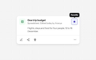
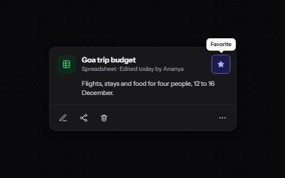
Buttons that show only an icon, named with aria-label, 44 pixels square, with a tooltip on hover and focus that repeats the name.
-
Toolbar
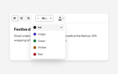
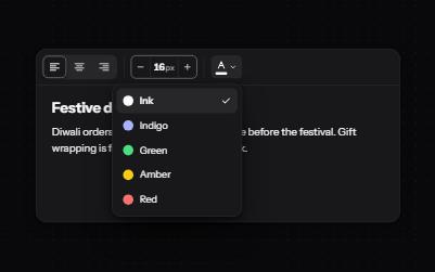
A named row of controls that is one stop in the Tab order, with arrow keys moving between alignment, size and color.
-
Pagination
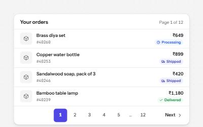
Page links in a labelled nav that name each page, mark the current one, and say when the list changes.
-
Focus indicator
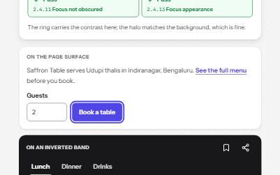
A focus ring you can always see: two colors, at least 2 px, never under a sticky bar, with a live meter that measures it.