Accessibility pattern · Interaction and motion
Theme switcher
Three native radio buttons pick Light, Dark or System; the choice sets one attribute on the page's root, and the stylesheet does the rest. System follows the device and changes with it, color-scheme brings the browser's own controls and scrollbars along, and a tiny script in the head stops a flash of the wrong theme.
- WCAG criteria
- 7
- Keyboard rules
- 4
- Checked with
- axe, keyboard and the inspector
Live demo
Try it
Use it with a mouse, a keyboard or a screen reader. The inspector beside it shows what the browser tells assistive technology as you go: focus, state changes and announcements.
Appearance
This preview keeps its own theme, separate from the Light and Dark buttons above the stage.
Your device is set to light.
Your order
On its wayMasala chai × 2, vada pav × 1
Arrives in about 12 minutes. Track the rider
- Filter coffee, idli 28 Sep
- Masala chai × 3 21 Sep
- Bun maska, ginger tea 14 Sep
- Poha, filter coffee 7 Sep
- Vada pav × 2 31 Aug
| Pair | Light | Dark |
|---|---|---|
Body text text / surface |
17.72:1 AAA | 16.97:1 AAA |
Secondary text text-3 / surface |
6.42:1 AA | 6.91:1 AA |
Links accent-text / surface |
7.90:1 AAA | 8.89:1 AAA |
Button label on-accent / accent |
6.29:1 AA | 6.53:1 AA |
Control edges border-strong / surface |
4.50:1 AA | 5.46:1 AA |
<script>
                            const saved = localStorage.getItem("theme-choice");
                            if (saved) document.documentElement.dataset.theme = saved;
</script>The demo works without JavaScript only as far as its HTML does; the inspector needs JavaScript.
Keyboard
Keys it answers to
Every action works without a pointer.
| Key | What it does |
|---|---|
| Tab | Moves to the selected theme; the next Tab leaves the group for the rest of the page. |
| Arrow Right or Arrow Down | Selects the next theme, wrapping from System to Light, and the page changes at once. |
| Arrow Left or Arrow Up | Selects the previous theme, wrapping from Light to System. |
| Space | Selects the focused theme, if none is selected yet. |
Screen readers
What it announces
Written from the roles, names and states in the markup.
| When | Expected announcement |
|---|---|
| Tab reaches the group | Theme, group. Your device is set to light. System, radio button, checked, 3 of 3 |
| Arrow Right selects Light | Light, radio button, checked, 1 of 3. Light theme on |
| Arrow Right selects Dark | Dark, radio button, checked, 2 of 3. Dark theme on |
| System is selected on a device set to dark | System, radio button, checked, 3 of 3. Theme follows your device: dark |
| The device switches while System is selected | Nothing: the page changes, but nobody here asked for it |
These are expected announcements, not recordings. Wording and order differ between screen readers and browsers.
Code
Copy the code
The exact files this demo runs on. The styles are served with a prefix that keeps this site's own styles out of the demo; what you copy is the original.
<div class="ap-theme-switcher" data-ap-theme-switcher data-theme="system">
<div class="ap-theme-switcher__appbar">
<span class="ap-theme-switcher__logo" aria-hidden="true"><svg viewBox="0 0 24 24" focusable="false"><path d="M5 8h11v6a5 5 0 0 1-5 5h-1a5 5 0 0 1-5-5Z"/><path d="M16 9h1.5a2.5 2.5 0 0 1 0 5H16M8 3.5c0 1 1 1 1 2M11.5 3.5c0 1 1 1 1 2"/></svg></span>
<span class="ap-theme-switcher__brand">Nukkad Café</span>
<span class="ap-theme-switcher__avatar" aria-hidden="true" translate="no">AR</span>
</div>
<div class="ap-theme-switcher__body">
<div class="ap-theme-switcher__settings">
<h3 class="ap-theme-switcher__name">Appearance</h3>
<p class="ap-theme-switcher__own">This preview keeps its own theme, separate from the Light and Dark buttons above the stage.</p>
<fieldset class="ap-theme-switcher__set" aria-describedby="theme-switcher-device">
<legend class="ap-theme-switcher__legend">Theme</legend>
<div class="ap-theme-switcher__options">
<label class="ap-theme-switcher__opt">
<input class="ap-theme-switcher__radio" type="radio" name="theme-switcher-theme" value="light" />
<svg viewBox="0 0 24 24" aria-hidden="true" focusable="false"><circle cx="12" cy="12" r="4"/><path d="M12 2.5v2M12 19.5v2M4.6 4.6 6 6M18 18l1.4 1.4M2.5 12h2M19.5 12h2M4.6 19.4 6 18M18 6l1.4-1.4"/></svg>
<span>Light</span>
</label>
<label class="ap-theme-switcher__opt">
<input class="ap-theme-switcher__radio" type="radio" name="theme-switcher-theme" value="dark" />
<svg viewBox="0 0 24 24" aria-hidden="true" focusable="false"><path d="M20 14.5A8 8 0 1 1 9.5 4a6.5 6.5 0 0 0 10.5 10.5Z"/></svg>
<span>Dark</span>
</label>
<label class="ap-theme-switcher__opt">
<input class="ap-theme-switcher__radio" type="radio" name="theme-switcher-theme" value="system" checked />
<svg viewBox="0 0 24 24" aria-hidden="true" focusable="false"><rect x="3" y="4" width="18" height="12" rx="2"/><path d="M8 20h8M12 16v4"/></svg>
<span>System</span>
</label>
</div>
</fieldset>
<p class="ap-theme-switcher__device" id="theme-switcher-device" data-ap-device>Your device is set to light.</p>
<p class="ap-theme-switcher__sr" role="status" data-ap-theme-status></p>
</div>
<div class="ap-theme-switcher__order">
<div class="ap-theme-switcher__order-top">
<h4 class="ap-theme-switcher__order-name">Your order</h4>
<span class="ap-theme-switcher__chip"><svg viewBox="0 0 24 24" aria-hidden="true" focusable="false"><path d="m5 12.5 4.5 4.5L19 7.5"/></svg>On its way</span>
</div>
<p class="ap-theme-switcher__items">Masala chai × 2, vada pav × 1</p>
<p class="ap-theme-switcher__eta">Arrives in about 12 minutes. <a href="#rider">Track the rider</a></p>
<div class="ap-field">
<label class="ap-label" for="theme-switcher-note">Note for the rider</label>
<input class="ap-input" id="theme-switcher-note" type="text" value="Gate 2, ring once" />
</div>
<div class="ap-theme-switcher__controls">
<label class="ap-theme-switcher__check"><input type="checkbox" checked /> Leave at the door</label>
<label class="ap-theme-switcher__tip">Rider tip
<select>
<option>None</option>
<option selected>₹20</option>
<option>₹50</option>
</select>
</label>
</div>
<div class="ap-theme-switcher__past" role="region" aria-label="Past orders" tabindex="0">
<ul>
<li><span>Filter coffee, idli</span> <span class="ap-theme-switcher__when" translate="no">28 Sep</span></li>
<li><span>Masala chai × 3</span> <span class="ap-theme-switcher__when" translate="no">21 Sep</span></li>
<li><span>Bun maska, ginger tea</span> <span class="ap-theme-switcher__when" translate="no">14 Sep</span></li>
<li><span>Poha, filter coffee</span> <span class="ap-theme-switcher__when" translate="no">7 Sep</span></li>
<li><span>Vada pav × 2</span> <span class="ap-theme-switcher__when" translate="no">31 Aug</span></li>
</ul>
</div>
</div>
</div>
<div class="ap-theme-switcher__contrast-wrap">
<table class="ap-theme-switcher__contrast">
<caption>Contrast in both themes, from the design tokens</caption>
<thead>
<tr>
<th scope="col">Pair</th>
<th scope="col" data-col="light">Light <span class="ap-theme-switcher__now" aria-hidden="true">Now</span></th>
<th scope="col" data-col="dark">Dark <span class="ap-theme-switcher__now" aria-hidden="true">Now</span></th>
</tr>
</thead>
<tbody>
<tr>
<th scope="row"><span>Body text</span> <code>text / surface</code></th>
<td data-col="light"><span translate="no">17.72:1</span> <span class="ap-theme-switcher__lvl" translate="no">AAA</span></td>
<td data-col="dark"><span translate="no">16.97:1</span> <span class="ap-theme-switcher__lvl" translate="no">AAA</span></td>
</tr>
<tr>
<th scope="row"><span>Secondary text</span> <code>text-3 / surface</code></th>
<td data-col="light"><span translate="no">6.42:1</span> <span class="ap-theme-switcher__lvl" translate="no">AA</span></td>
<td data-col="dark"><span translate="no">6.91:1</span> <span class="ap-theme-switcher__lvl" translate="no">AA</span></td>
</tr>
<tr>
<th scope="row"><span>Links</span> <code>accent-text / surface</code></th>
<td data-col="light"><span translate="no">7.90:1</span> <span class="ap-theme-switcher__lvl" translate="no">AAA</span></td>
<td data-col="dark"><span translate="no">8.89:1</span> <span class="ap-theme-switcher__lvl" translate="no">AAA</span></td>
</tr>
<tr>
<th scope="row"><span>Button label</span> <code>on-accent / accent</code></th>
<td data-col="light"><span translate="no">6.29:1</span> <span class="ap-theme-switcher__lvl" translate="no">AA</span></td>
<td data-col="dark"><span translate="no">6.53:1</span> <span class="ap-theme-switcher__lvl" translate="no">AA</span></td>
</tr>
<tr>
<th scope="row"><span>Control edges</span> <code>border-strong / surface</code></th>
<td data-col="light"><span translate="no">4.50:1</span> <span class="ap-theme-switcher__lvl" translate="no">AA</span></td>
<td data-col="dark"><span translate="no">5.46:1</span> <span class="ap-theme-switcher__lvl" translate="no">AA</span></td>
</tr>
</tbody>
</table>
</div>
<figure class="ap-theme-switcher__head">
<figcaption>No flash on load: in the head, before the stylesheets</figcaption>
<pre><code><script>
<span class="ap-theme-switcher__in">const saved = localStorage.getItem("theme-choice");</span>
<span class="ap-theme-switcher__in">if (saved) document.documentElement.dataset.theme = saved;</span>
</script></code></pre>
</figure>
</div>
/* Shared primitives: buttons and form fields used across the patterns.
   Uses the --ap-* design tokens. */

.ap-btn {
  display: inline-flex;
  align-items: center;
  justify-content: center;
  gap: 8px;
  min-height: 40px;
  padding: 0 16px;
  border: 1px solid var(--ap-border-strong);
  border-radius: var(--ap-radius-sm);
  background: var(--ap-surface);
  color: var(--ap-text);
  font: inherit;
  font-weight: 600;
  line-height: 1.2;
  text-decoration: none;
  white-space: nowrap;
  cursor: pointer;
  transition: background-color var(--ap-duration) var(--ap-ease), border-color var(--ap-duration) var(--ap-ease), box-shadow var(--ap-duration) var(--ap-ease);
}
.ap-btn:hover {
  background: var(--ap-surface-2);
}
.ap-btn:focus-visible {
  outline: 2px solid var(--ap-focus);
  outline-offset: 2px;
}
.ap-btn:disabled,
.ap-btn[aria-disabled="true"] {
  opacity: .55;
  cursor: not-allowed;
}
.ap-btn--primary {
  border-color: var(--ap-accent);
  background: var(--ap-accent);
  color: var(--ap-on-accent);
  box-shadow: var(--ap-shadow-sm);
}
.ap-btn--primary:hover {
  border-color: var(--ap-accent-hover);
  background: var(--ap-accent-hover);
}
.ap-btn--danger {
  border-color: var(--ap-danger);
  background: var(--ap-danger);
  color: var(--ap-surface);
}
.ap-btn--danger:hover {
  filter: brightness(1.08);
}
.ap-btn--ghost {
  border-color: transparent;
  background: transparent;
}
.ap-btn--ghost:hover {
  background: var(--ap-surface-2);
}
.ap-btn__icon {
  width: 18px;
  height: 18px;
  flex-shrink: 0;
  fill: none;
  stroke: currentColor;
  stroke-width: 2;
  stroke-linecap: round;
  stroke-linejoin: round;
}

.ap-field {
  display: grid;
  gap: 6px;
}
.ap-label {
  color: var(--ap-text);
  font-weight: 600;
  font-size: .9375rem;
}
.ap-hint {
  margin: 0;
  color: var(--ap-text-3);
  font-size: .875rem;
  line-height: 1.45;
}
.ap-error {
  display: flex;
  align-items: flex-start;
  gap: 6px;
  margin: 0;
  color: var(--ap-danger);
  font-size: .875rem;
  font-weight: 600;
  line-height: 1.45;
}
.ap-input {
  width: 100%;
  min-height: 44px;
  padding: 10px 12px;
  border: 1px solid var(--ap-border-strong);
  border-radius: var(--ap-radius-sm);
  background: var(--ap-surface);
  color: var(--ap-text);
  font: inherit;
  line-height: 1.4;
  transition: border-color var(--ap-duration) var(--ap-ease), box-shadow var(--ap-duration) var(--ap-ease);
}
.ap-input::placeholder {
  color: var(--ap-text-3);
}
.ap-input:hover {
  border-color: var(--ap-text-2);
}
.ap-input:focus-visible {
  outline: 2px solid var(--ap-focus);
  outline-offset: 1px;
  border-color: var(--ap-focus);
}
.ap-input[aria-invalid="true"] {
  border-color: var(--ap-danger);
  box-shadow: inset 4px 0 0 var(--ap-danger);
}
textarea.ap-input {
  resize: vertical;
  min-height: 88px;
}

@media (prefers-reduced-motion: reduce) {
  .ap-btn,
  .ap-input { transition: none; }
}

/* Theme switcher. Uses the --ap-* design tokens and the shared primitives. */

/* The demo stands in for a whole page, whose root carries data-theme. It
   holds the token palette for both themes as light-dark() pairs, so it can
   switch on its own inside this page, whatever theme the page around it
   shows. color-scheme picks the side of each pair: data-theme="light" or
   "dark" fixes it, and "system" allows both, so the device decides, live.
   Both palettes come from the tokens stylesheet (Tokens tab), which always
   declares them as --ap-light-* and --ap-dark-*. On a real page the tokens
   stylesheet themes :root itself and this block is not needed. */
.ap-theme-switcher {
  color-scheme: light dark;
  --ap-bg: light-dark(var(--ap-light-bg), var(--ap-dark-bg));
  --ap-surface: light-dark(var(--ap-light-surface), var(--ap-dark-surface));
  --ap-surface-2: light-dark(var(--ap-light-surface-2), var(--ap-dark-surface-2));
  --ap-surface-3: light-dark(var(--ap-light-surface-3), var(--ap-dark-surface-3));
  --ap-border: light-dark(var(--ap-light-border), var(--ap-dark-border));
  --ap-border-strong: light-dark(var(--ap-light-border-strong), var(--ap-dark-border-strong));
  --ap-text: light-dark(var(--ap-light-text), var(--ap-dark-text));
  --ap-text-2: light-dark(var(--ap-light-text-2), var(--ap-dark-text-2));
  --ap-text-3: light-dark(var(--ap-light-text-3), var(--ap-dark-text-3));
  --ap-accent: light-dark(var(--ap-light-accent), var(--ap-dark-accent));
  --ap-accent-hover: light-dark(var(--ap-light-accent-hover), var(--ap-dark-accent-hover));
  --ap-on-accent: light-dark(var(--ap-light-on-accent), var(--ap-dark-on-accent));
  --ap-accent-text: light-dark(var(--ap-light-accent-text), var(--ap-dark-accent-text));
  --ap-accent-soft: light-dark(var(--ap-light-accent-soft), var(--ap-dark-accent-soft));
  --ap-accent-soft-text: light-dark(var(--ap-light-accent-soft-text), var(--ap-dark-accent-soft-text));
  --ap-focus: light-dark(var(--ap-light-focus), var(--ap-dark-focus));
  --ap-success: light-dark(var(--ap-light-success), var(--ap-dark-success));
  --ap-success-soft: light-dark(var(--ap-light-success-soft), var(--ap-dark-success-soft));
}
.ap-theme-switcher[data-theme="light"] {
  color-scheme: light;
}
.ap-theme-switcher[data-theme="dark"] {
  color-scheme: dark;
}

.ap-theme-switcher {
  width: min(100%, 780px);
  margin-inline: auto;
  overflow: hidden;
  border: 1px solid var(--ap-border);
  border-radius: var(--ap-radius-lg);
  background: var(--ap-bg);
  color: var(--ap-text);
  box-shadow: var(--ap-shadow-md);
  container-type: inline-size;
}

/* ── The app's own bar ── */
.ap-theme-switcher__appbar {
  display: flex;
  align-items: center;
  gap: 10px;
  padding: 12px 18px;
  border-bottom: 1px solid var(--ap-border);
  background: var(--ap-surface);
}
.ap-theme-switcher__logo {
  display: grid;
  place-items: center;
  width: 34px;
  height: 34px;
  border-radius: var(--ap-radius-sm);
  background: var(--ap-accent-soft);
  color: var(--ap-accent-soft-text);
}
.ap-theme-switcher__logo svg {
  width: 20px;
  height: 20px;
  fill: none;
  stroke: currentColor;
  stroke-width: 1.8;
  stroke-linecap: round;
  stroke-linejoin: round;
}
.ap-theme-switcher__brand {
  font-weight: 700;
}
.ap-theme-switcher__avatar {
  display: grid;
  place-items: center;
  width: 32px;
  height: 32px;
  margin-left: auto;
  border-radius: var(--ap-radius-full);
  background: var(--ap-surface-3);
  color: var(--ap-text);
  font-size: .75rem;
  font-weight: 700;
}

.ap-theme-switcher__body {
  display: grid;
  grid-template-columns: minmax(0, .9fr) minmax(0, 1.1fr);
  gap: 16px;
  padding: 18px;
}
.ap-theme-switcher__settings,
.ap-theme-switcher__order {
  min-width: 0;
  padding: 18px;
  border: 1px solid var(--ap-border);
  border-radius: var(--ap-radius);
  background: var(--ap-surface);
}

/* ── The switcher: three radios drawn as one segmented control ── */
.ap-theme-switcher__name {
  margin: 0;
  font-size: 1.0625rem;
  font-weight: 650;
}
.ap-theme-switcher__own {
  margin: 4px 0 16px;
  color: var(--ap-text-3);
  font-size: .8125rem;
  line-height: 1.5;
}
.ap-theme-switcher__set {
  min-width: 0;
  margin: 0;
  padding: 0;
  border: 0;
}
.ap-theme-switcher__legend {
  margin-bottom: 8px;
  padding: 0;
  font-size: .875rem;
  font-weight: 650;
}
.ap-theme-switcher__options {
  display: grid;
  grid-template-columns: repeat(3, minmax(0, 1fr));
  gap: 4px;
  padding: 4px;
  border: 1px solid var(--ap-border-strong);
  border-radius: var(--ap-radius);
  background: var(--ap-surface-2);
}
.ap-theme-switcher__opt {
  position: relative;
  display: flex;
  flex-direction: column;
  align-items: center;
  justify-content: center;
  gap: 4px;
  min-height: 60px;
  padding: 6px 4px;
  border-radius: var(--ap-radius-sm);
  color: var(--ap-text-2);
  font-size: .8125rem;
  font-weight: 600;
  text-align: center;
  cursor: pointer;
}
.ap-theme-switcher__opt:hover {
  color: var(--ap-text);
}
.ap-theme-switcher__radio {
  position: absolute;
  inset: 0;
  width: 100%;
  height: 100%;
  margin: 0;
  opacity: 0;
  cursor: pointer;
}
.ap-theme-switcher__opt svg {
  width: 20px;
  height: 20px;
  fill: none;
  stroke: currentColor;
  stroke-width: 1.8;
  stroke-linecap: round;
  stroke-linejoin: round;
}
/* The chosen theme: raised, outlined in the accent, bolder; not color alone. */
.ap-theme-switcher__opt:has(:checked) {
  background: var(--ap-surface);
  color: var(--ap-text);
  font-weight: 750;
  box-shadow: 0 0 0 1.5px var(--ap-accent), var(--ap-shadow-sm);
}
.ap-theme-switcher__opt:has(:checked) svg {
  color: var(--ap-accent-text);
}
.ap-theme-switcher__opt:has(:focus-visible) {
  outline: 2px solid var(--ap-focus);
  outline-offset: 2px;
}
.ap-theme-switcher__device {
  margin: 10px 0 0;
  color: var(--ap-text-3);
  font-size: .8125rem;
}

/* ── A screen of the app, to see the theme on ── */
.ap-theme-switcher__order {
  display: grid;
  gap: 12px;
  align-content: start;
}
.ap-theme-switcher__order-top {
  display: flex;
  flex-wrap: wrap;
  align-items: center;
  justify-content: space-between;
  gap: 8px;
}
.ap-theme-switcher__order-name {
  margin: 0;
  font-size: 1rem;
  font-weight: 650;
}
.ap-theme-switcher__chip {
  display: inline-flex;
  align-items: center;
  gap: 4px;
  padding: 3px 10px 3px 8px;
  border-radius: var(--ap-radius-full);
  background: var(--ap-success-soft);
  color: var(--ap-success);
  font-size: .75rem;
  font-weight: 700;
}
.ap-theme-switcher__chip svg {
  width: 14px;
  height: 14px;
  fill: none;
  stroke: currentColor;
  stroke-width: 2.4;
  stroke-linecap: round;
  stroke-linejoin: round;
}
.ap-theme-switcher__items,
.ap-theme-switcher__eta {
  margin: 0;
}
.ap-theme-switcher__items {
  font-weight: 600;
}
.ap-theme-switcher__eta {
  margin-top: -6px;
  color: var(--ap-text-2);
  font-size: .875rem;
}
.ap-theme-switcher__eta a {
  color: var(--ap-accent-text);
  font-weight: 600;
  text-decoration: underline;
  text-underline-offset: 3px;
}
.ap-theme-switcher__eta a:focus-visible {
  outline: 2px solid var(--ap-focus);
  outline-offset: 2px;
  border-radius: 2px;
}

/* Native controls left native: color-scheme themes them, accent-color tints them. */
.ap-theme-switcher__controls {
  display: flex;
  flex-wrap: wrap;
  align-items: center;
  gap: 10px 22px;
  font-size: .9375rem;
}
.ap-theme-switcher__check,
.ap-theme-switcher__tip {
  display: inline-flex;
  align-items: center;
  gap: 8px;
}
.ap-theme-switcher__check input {
  width: 18px;
  height: 18px;
  margin: 0;
  accent-color: var(--ap-accent);
}
.ap-theme-switcher__tip select {
  min-height: 36px;
  padding: 4px 8px;
  font: inherit;
  accent-color: var(--ap-accent);
}
.ap-theme-switcher__check input:focus-visible,
.ap-theme-switcher__tip select:focus-visible {
  outline: 2px solid var(--ap-focus);
  outline-offset: 2px;
}

.ap-theme-switcher__past {
  height: 92px;
  overflow: auto;
  border: 1px solid var(--ap-border);
  border-radius: var(--ap-radius-sm);
}
.ap-theme-switcher__past:focus-visible {
  outline: 2px solid var(--ap-focus);
  outline-offset: 2px;
}
.ap-theme-switcher__past ul {
  margin: 0;
  padding: 2px 12px;
  list-style: none;
}
.ap-theme-switcher__past li {
  display: flex;
  justify-content: space-between;
  gap: 12px;
  padding: 7px 0;
  border-bottom: 1px solid var(--ap-border);
  color: var(--ap-text-2);
  font-size: .875rem;
}
.ap-theme-switcher__past li:last-child {
  border-bottom: 0;
}
.ap-theme-switcher__when {
  flex-shrink: 0;
  color: var(--ap-text-3);
  font-variant-numeric: tabular-nums;
}

/* ── Contrast, both themes, the one showing now marked ── */
.ap-theme-switcher__contrast-wrap {
  margin: 0 18px 18px;
  overflow: hidden;
  border: 1px solid var(--ap-border);
  border-radius: var(--ap-radius);
  background: var(--ap-surface);
}
.ap-theme-switcher__contrast {
  width: 100%;
  border-collapse: collapse;
  font-size: .875rem;
}
.ap-theme-switcher__contrast caption {
  padding: 12px 14px;
  font-weight: 650;
  text-align: start;
}
.ap-theme-switcher__contrast th,
.ap-theme-switcher__contrast td {
  padding: 8px 14px;
  border-top: 1px solid var(--ap-border);
  text-align: start;
  vertical-align: top;
}
.ap-theme-switcher__contrast thead th {
  color: var(--ap-text-3);
  font-size: .75rem;
  font-weight: 700;
  letter-spacing: .04em;
  text-transform: uppercase;
}
.ap-theme-switcher__contrast tbody th {
  font-weight: 600;
}
.ap-theme-switcher__contrast code {
  display: block;
  margin-top: 2px;
  color: var(--ap-text-3);
  font-family: var(--ap-mono);
  font-size: .75rem;
  font-weight: 400;
}
.ap-theme-switcher__contrast td {
  font-variant-numeric: tabular-nums;
  white-space: nowrap;
}
.ap-theme-switcher__lvl {
  display: inline-block;
  margin-left: 4px;
  padding: 0 6px;
  border: 1px solid var(--ap-border);
  border-radius: var(--ap-radius-full);
  background: var(--ap-surface);
  color: var(--ap-text-2);
  font-size: .6875rem;
  font-weight: 700;
}
.ap-theme-switcher__now {
  display: none;
  margin-left: 4px;
  padding: 0 6px;
  border-radius: var(--ap-radius-full);
  background: var(--ap-accent);
  color: var(--ap-on-accent);
  font-size: .6875rem;
  letter-spacing: .04em;
}
.ap-theme-switcher[data-resolved="light"] [data-col="light"],
.ap-theme-switcher[data-resolved="dark"] [data-col="dark"] {
  background: var(--ap-accent-soft);
  color: var(--ap-accent-soft-text);
}
.ap-theme-switcher[data-resolved="light"] [data-col="light"] .ap-theme-switcher__now,
.ap-theme-switcher[data-resolved="dark"] [data-col="dark"] .ap-theme-switcher__now {
  display: inline-block;
}

/* ── The head script that prevents a flash ── */
.ap-theme-switcher__head {
  margin: 0 18px 18px;
  border: 1px solid var(--ap-border);
  border-radius: var(--ap-radius);
  background: var(--ap-surface);
}
.ap-theme-switcher__head figcaption {
  padding: 10px 14px;
  border-bottom: 1px solid var(--ap-border);
  color: var(--ap-text-2);
  font-size: .8125rem;
  font-weight: 650;
}
.ap-theme-switcher__head pre {
  margin: 0;
  padding: 12px 14px;
  color: var(--ap-text);
  font-family: var(--ap-mono);
  font-size: .8125rem;
  line-height: 1.6;
  /* pre-line keeps the line breaks but drops the indentation of the page source. */
  white-space: pre-line;
  overflow-wrap: anywhere;
}
.ap-theme-switcher__in {
  display: inline-block;
  padding-left: 2ch;
}

/* Read by screen readers, not shown. */
.ap-theme-switcher__sr {
  position: absolute;
  width: 1px;
  height: 1px;
  margin: -1px;
  padding: 0;
  overflow: hidden;
  clip-path: inset(50%);
  white-space: nowrap;
  border: 0;
}

@container (max-width: 600px) {
  .ap-theme-switcher__body { grid-template-columns: minmax(0, 1fr); padding: 14px; }
  .ap-theme-switcher__contrast-wrap,
  .ap-theme-switcher__head { margin-inline: 14px; }
  .ap-theme-switcher__contrast th,
  .ap-theme-switcher__contrast td { padding-inline: 10px; }
}

@container (max-width: 460px) {
  .ap-theme-switcher__contrast { font-size: .8125rem; }
  .ap-theme-switcher__contrast th,
  .ap-theme-switcher__contrast td { padding: 8px; }
  .ap-theme-switcher__contrast td { white-space: normal; }
  .ap-theme-switcher__contrast code { overflow-wrap: anywhere; }
  .ap-theme-switcher__lvl { display: block; width: fit-content; margin: 4px 0 0; }
}

@media (forced-colors: active) {
  .ap-theme-switcher__opt:has(:checked) { outline: 2px solid Highlight; }
}
/**
 * Theme switcher: Light, Dark and System as native radio buttons.
 *
 * The choice is written to one attribute, data-theme, on the element that
 * stands for the page's root; the stylesheet does the rest (here with
 * light-dark() and color-scheme). System leaves the device in charge, and
 * the page changes with it, live. A polite status confirms a choice made
 * here, and stays quiet when the device changes the theme.
 *
 * Markup: [data-ap-theme-switcher] (the themed root, data-theme="light|dark|
 * system") holding radio inputs name="theme-switcher-theme", a
 * p[data-ap-device] that says what the device is set to, and a role=status
 * element [data-ap-theme-status]. Add data-remember to the root to save the
 * choice in localStorage ("theme-choice") and restore it on the next visit.
 *
 * On a real page, use document.documentElement as the target.
 */

const KEY = "theme-choice";
const CHOICES = ["light", "dark", "system"];

export function init(root) {
  const target = root; // on a real page: document.documentElement
  const radios = [...root.querySelectorAll("input[name='theme-switcher-theme']")];
  const device = root.querySelector("[data-ap-device]");
  const status = root.querySelector("[data-ap-theme-status]");
  const prefersDark = window.matchMedia("(prefers-color-scheme: dark)");
  let speaking = 0;

  const resolved = (choice) => (choice === "system" ? (prefersDark.matches ? "dark" : "light") : choice);
  const checked = () => (radios.find((r) => r.checked) || radios[radios.length - 1]).value;

  function remembered() {
    if (!root.hasAttribute("data-remember")) return null;
    try {
      const saved = localStorage.getItem(KEY);
      return CHOICES.includes(saved) ? saved : null;
    } catch {
      return null; // storage blocked: fall back to the default
    }
  }
  function remember(choice) {
    if (!root.hasAttribute("data-remember")) return;
    try { localStorage.setItem(KEY, choice); } catch { /* storage blocked */ }
  }

  function apply(choice) {
    target.dataset.theme = choice;
    target.dataset.resolved = resolved(choice);
    const text = prefersDark.matches ? "Your device is set to dark." : "Your device is set to light.";
    if (device.textContent !== text) device.textContent = text;
  }

  function say(text) {
    clearTimeout(speaking);
    status.textContent = "";
    speaking = setTimeout(() => { status.textContent = text; }, 60);
  }

  function onChange(event) {
    if (!radios.includes(event.target)) return;
    const choice = event.target.value;
    apply(choice);
    remember(choice);
    if (choice === "light") say("Light theme on");
    else if (choice === "dark") say("Dark theme on");
    else say(prefersDark.matches ? "Theme follows your device: dark" : "Theme follows your device: light");
  }

  // The device changed (a schedule, or a setting elsewhere): follow it if
  // System is chosen, and update the line about the device. Nobody here
  // asked, so nothing is announced.
  function onDevice() {
    apply(checked());
  }

  const start = remembered() || checked();
  for (const r of radios) r.checked = r.value === start;
  apply(start);

  root.addEventListener("change", onChange);
  prefersDark.addEventListener("change", onDevice);

  return () => {
    clearTimeout(speaking);
    root.removeEventListener("change", onChange);
    prefersDark.removeEventListener("change", onDevice);
  };
}

for (const root of document.querySelectorAll("[data-ap-theme-switcher]")) init(root);
/* Design tokens for the pattern components. Light by default, dark when the
   system asks for it; set data-theme="dark" on :root to force dark. */
:root {
    --ap-radius-sm: 8px;
    --ap-radius: 12px;
    --ap-radius-lg: 16px;
    --ap-radius-full: 999px;
    --ap-font: "Instrument Sans", ui-sans-serif, system-ui, -apple-system, "Segoe UI", Roboto, sans-serif;
    --ap-mono: "JetBrains Mono", ui-monospace, "Cascadia Mono", "SF Mono", Consolas, monospace;
    --ap-ease: cubic-bezier(.2, .8, .2, 1);
    --ap-duration: 180ms;
    --ap-target: 44px;
    --ap-bg: #F4F4F5;
    --ap-surface: #FFFFFF;
    --ap-surface-2: #F4F4F5;
    --ap-surface-3: #E4E4E7;
    --ap-border: #E4E4E7;
    --ap-border-strong: #76767F;
    --ap-text: #18181B;
    --ap-text-2: #3F3F46;
    --ap-text-3: #5E5E66;
    --ap-accent: #4F46E5;
    --ap-accent-hover: #4338CA;
    --ap-on-accent: #FFFFFF;
    --ap-accent-text: #4338CA;
    --ap-accent-soft: #EEF2FF;
    --ap-accent-soft-text: #3730A3;
    --ap-focus: #4F46E5;
    --ap-danger: #B91C1C;
    --ap-danger-soft: #FEF2F2;
    --ap-success: #15803D;
    --ap-success-soft: #F0FDF4;
    --ap-warning: #A15C07;
    --ap-warning-soft: #FEFCE8;
    --ap-info: #1D4ED8;
    --ap-info-soft: #EFF6FF;
    --ap-scrim: rgb(9 9 11 / .48);
    --ap-shadow-sm: 0 1px 2px rgb(9 9 11 / .06);
    --ap-shadow-md: 0 1px 2px rgb(9 9 11 / .05), 0 6px 16px -4px rgb(9 9 11 / .1);
    --ap-shadow-lg: 0 2px 6px rgb(9 9 11 / .06), 0 20px 40px -12px rgb(9 9 11 / .22);
    --ap-light-bg: #F4F4F5;
    --ap-light-surface: #FFFFFF;
    --ap-light-surface-2: #F4F4F5;
    --ap-light-surface-3: #E4E4E7;
    --ap-light-border: #E4E4E7;
    --ap-light-border-strong: #76767F;
    --ap-light-text: #18181B;
    --ap-light-text-2: #3F3F46;
    --ap-light-text-3: #5E5E66;
    --ap-light-accent: #4F46E5;
    --ap-light-accent-hover: #4338CA;
    --ap-light-on-accent: #FFFFFF;
    --ap-light-accent-text: #4338CA;
    --ap-light-accent-soft: #EEF2FF;
    --ap-light-accent-soft-text: #3730A3;
    --ap-light-focus: #4F46E5;
    --ap-light-danger: #B91C1C;
    --ap-light-danger-soft: #FEF2F2;
    --ap-light-success: #15803D;
    --ap-light-success-soft: #F0FDF4;
    --ap-light-warning: #A15C07;
    --ap-light-warning-soft: #FEFCE8;
    --ap-light-info: #1D4ED8;
    --ap-light-info-soft: #EFF6FF;
    --ap-light-scrim: rgb(9 9 11 / .48);
    --ap-light-shadow-sm: 0 1px 2px rgb(9 9 11 / .06);
    --ap-light-shadow-md: 0 1px 2px rgb(9 9 11 / .05), 0 6px 16px -4px rgb(9 9 11 / .1);
    --ap-light-shadow-lg: 0 2px 6px rgb(9 9 11 / .06), 0 20px 40px -12px rgb(9 9 11 / .22);
    --ap-dark-bg: #09090B;
    --ap-dark-surface: #18181B;
    --ap-dark-surface-2: #27272A;
    --ap-dark-surface-3: #3F3F46;
    --ap-dark-border: #2E2E33;
    --ap-dark-border-strong: #8E8E97;
    --ap-dark-text: #FAFAFA;
    --ap-dark-text-2: #D4D4D8;
    --ap-dark-text-3: #A1A1AA;
    --ap-dark-accent: #818CF8;
    --ap-dark-accent-hover: #A5B4FC;
    --ap-dark-on-accent: #0C0A1F;
    --ap-dark-accent-text: #A5B4FC;
    --ap-dark-accent-soft: #1E1B4B;
    --ap-dark-accent-soft-text: #C7D2FE;
    --ap-dark-focus: #A5B4FC;
    --ap-dark-danger: #F87171;
    --ap-dark-danger-soft: #2A1215;
    --ap-dark-success: #4ADE80;
    --ap-dark-success-soft: #0F2A1A;
    --ap-dark-warning: #FACC15;
    --ap-dark-warning-soft: #2A2410;
    --ap-dark-info: #60A5FA;
    --ap-dark-info-soft: #0F1D33;
    --ap-dark-scrim: rgb(0 0 0 / .62);
    --ap-dark-shadow-sm: 0 1px 2px rgb(0 0 0 / .4);
    --ap-dark-shadow-md: 0 1px 2px rgb(0 0 0 / .4), 0 8px 20px -6px rgb(0 0 0 / .5);
    --ap-dark-shadow-lg: 0 2px 8px rgb(0 0 0 / .45), 0 24px 48px -12px rgb(0 0 0 / .7);
}
@media (prefers-color-scheme: dark) {
  :root:not([data-theme="light"]) {
      --ap-bg: #09090B;
      --ap-surface: #18181B;
      --ap-surface-2: #27272A;
      --ap-surface-3: #3F3F46;
      --ap-border: #2E2E33;
      --ap-border-strong: #8E8E97;
      --ap-text: #FAFAFA;
      --ap-text-2: #D4D4D8;
      --ap-text-3: #A1A1AA;
      --ap-accent: #818CF8;
      --ap-accent-hover: #A5B4FC;
      --ap-on-accent: #0C0A1F;
      --ap-accent-text: #A5B4FC;
      --ap-accent-soft: #1E1B4B;
      --ap-accent-soft-text: #C7D2FE;
      --ap-focus: #A5B4FC;
      --ap-danger: #F87171;
      --ap-danger-soft: #2A1215;
      --ap-success: #4ADE80;
      --ap-success-soft: #0F2A1A;
      --ap-warning: #FACC15;
      --ap-warning-soft: #2A2410;
      --ap-info: #60A5FA;
      --ap-info-soft: #0F1D33;
      --ap-scrim: rgb(0 0 0 / .62);
      --ap-shadow-sm: 0 1px 2px rgb(0 0 0 / .4);
      --ap-shadow-md: 0 1px 2px rgb(0 0 0 / .4), 0 8px 20px -6px rgb(0 0 0 / .5);
      --ap-shadow-lg: 0 2px 8px rgb(0 0 0 / .45), 0 24px 48px -12px rgb(0 0 0 / .7);
  }
}
:root[data-theme="dark"] {
    --ap-bg: #09090B;
    --ap-surface: #18181B;
    --ap-surface-2: #27272A;
    --ap-surface-3: #3F3F46;
    --ap-border: #2E2E33;
    --ap-border-strong: #8E8E97;
    --ap-text: #FAFAFA;
    --ap-text-2: #D4D4D8;
    --ap-text-3: #A1A1AA;
    --ap-accent: #818CF8;
    --ap-accent-hover: #A5B4FC;
    --ap-on-accent: #0C0A1F;
    --ap-accent-text: #A5B4FC;
    --ap-accent-soft: #1E1B4B;
    --ap-accent-soft-text: #C7D2FE;
    --ap-focus: #A5B4FC;
    --ap-danger: #F87171;
    --ap-danger-soft: #2A1215;
    --ap-success: #4ADE80;
    --ap-success-soft: #0F2A1A;
    --ap-warning: #FACC15;
    --ap-warning-soft: #2A2410;
    --ap-info: #60A5FA;
    --ap-info-soft: #0F1D33;
    --ap-scrim: rgb(0 0 0 / .62);
    --ap-shadow-sm: 0 1px 2px rgb(0 0 0 / .4);
    --ap-shadow-md: 0 1px 2px rgb(0 0 0 / .4), 0 8px 20px -6px rgb(0 0 0 / .5);
    --ap-shadow-lg: 0 2px 8px rgb(0 0 0 / .45), 0 24px 48px -12px rgb(0 0 0 / .7);
}
WCAG 2.2
What it meets
The success criteria this pattern takes care of, and how.
-
1.3.1 Info and Relationships
Level A
A fieldset and legend group the three choices under Theme, and the line about the device describes the group.
-
1.4.3 Contrast (Minimum)
Level AA
Every text pair meets 4.5:1 in both themes; the table shows the ratios, measured from the design tokens.
-
1.4.11 Non-text Contrast
Level AA
Control edges, the focus ring and the selected option's border stay at 3:1 or more in both themes.
-
2.1.1 Keyboard
Level A
Native radio buttons answer to Tab and the arrow keys, so the switcher needs no key handling of its own.
-
3.2.2 On Input
Level A
Choosing a theme changes the colors only; focus stays on the radio button and nothing else on the page moves.
-
4.1.2 Name, Role, Value
Level A
Each option is a labelled radio input, so its name, its place in the set and its checked state come from the browser.
-
4.1.3 Status Messages
Level AA
A polite status message confirms a choice the person made, and stays quiet when the device changes the theme on its own.
Usage
When to use it
Use it
- Sites and apps with a light and a dark design, where people may want something other than their device's setting.
- Settings pages and site headers; a header usually shows the same three choices behind a menu button.
Use something else
- Sites with one theme: following prefers-color-scheme without a control is enough if you offer both designs.
- A single on and off toggle for dark mode: it cannot say "follow my device", which is what most people want.
Common failures
How it usually goes wrong
A flash of the wrong theme
A choice applied after the page loads paints the default first, which glares in the dark. A blocking script in the head sets the attribute before the first paint.
No System option
Light and Dark alone pin the page, so it no longer follows the device at sunset. System is the default here and changes live.
Dark backgrounds with light controls
Without color-scheme, checkboxes, selects and scrollbars stay bright on a dark page. Setting it lets the browser draw its own controls to match.
Contrast checked in one theme only
A muted gray that passes on white can fail on near-black. Every pair here is measured in both themes, from the same tokens.
Announcing changes nobody asked for
Reading out "Dark theme on" because the device switched at sunset interrupts whatever the person was doing. Only a choice made here is announced.
A toggle that shows the wrong state
A sun icon that means "switch to light" on one site and "light is on" on another confuses everyone. Radio buttons show which theme is chosen, with the name in text.
Notes
Building it
- On a real page the script sets data-theme on document.documentElement, and the tokens stylesheet (Tokens tab) already switches on :root[data-theme] and prefers-color-scheme. Here the demo's own root stands in for it.
- The demo's stylesheet holds both palettes as light-dark() pairs and sets color-scheme from data-theme; with System, both schemes are allowed and the device decides, live, with no script involved.
- The script listens to matchMedia("(prefers-color-scheme: dark)") only to keep the device line and the System announcement accurate.
- With Remember the choice on, the pick is saved in localStorage as theme-choice. The head script shown in the demo reads that key before any CSS loads, so the first paint is already right.
- The Track the rider link stands for another page; in the copied code it is an ordinary link.
Sources: Media Queries Level 5: prefers-color-scheme · CSS Color Adjustment: the color-scheme property · WAI-ARIA Authoring Practices: Radio Group
Checked with axe in light and dark themes, at desktop and phone widths, and by keyboard. Not yet tested with every screen reader and browser pair. Report a correction
Related
Patterns that go with it
-
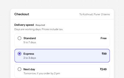
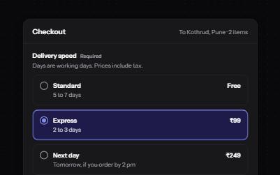
Radio group
Native radio buttons in a fieldset, restyled with a dot that keeps its contrast, each option with a description and a price.
-
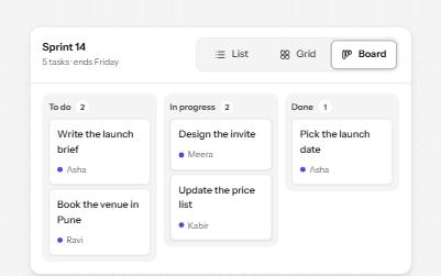
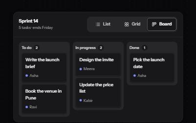
Segmented control
A row of joined segments for picking one of a few views, built from real radio buttons in a fieldset.
-
Reduced motion
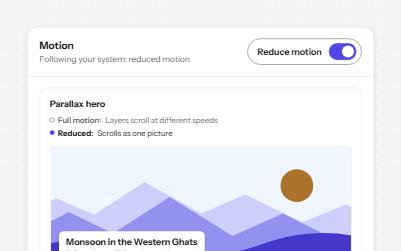
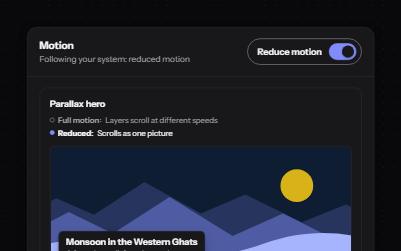
Animated pieces that follow the system's reduced motion setting, with a switch to override it, swapping movement for fades.
-
Switch
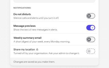
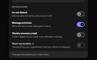
An on and off control for settings that take effect at once, built on a checkbox with the switch role.