Accessibility pattern · Interaction and motion
Focus indicator
The ring is an outline in the focus color between two halos in the surface color, so one band contrasts with whatever sits behind it: a light page, a dark band or a brand fill. Use Tab in the gallery and the meter measures the ring on the focused element: its width, its contrast against the background and whether anything covers it.
- WCAG criteria
- 5
- Keyboard rules
- 4
- Checked with
- axe, keyboard and the inspector
Live demo
Try it
Use it with a mouse, a keyboard or a screen reader. The inspector beside it shows what the browser tells assistive technology as you go: focus, state changes and announcements.
Focus meter
Press Tab to measure the ring on whatever has focus.
- Ring width
- –
- Gap to the edge
- –
- Ring against background
- –
- Halo against background
- –
- 2.4.7 Focus visible Not measured
- 1.4.11 Non-text contrast Not measured
- 2.4.11 Focus not obscured Not measured
- 2.4.13 Focus appearance Not measured
Bad versions: the link, the button and the tabs have no ring at all, the field, the icon buttons and the card get a faint 1 px ring, and the order list lets focus slide under its sticky bar.
On the page surface
Saffron Table serves Udupi thalis in Indiranagar, Bengaluru. See the full menu before you book.
On an inverted band
A thali of twelve dishes, served from noon until three.
Dosas and appams to order, from seven until eleven.
Filter coffee, buttermilk and fresh lime soda all day.
The demo works without JavaScript only as far as its HTML does; the inspector needs JavaScript.
Keyboard
Keys it answers to
Every action works without a pointer.
| Key | What it does |
|---|---|
| Tab or ShiftTab | Moves through the gallery; whatever takes focus shows the two-color ring, and the meter measures it. |
| Arrow Right or Arrow Left | In the menu tabs, moves to the next or previous tab and shows its panel. |
| Home or End | In the menu tabs, moves to the first or last tab. |
| Enter or Space | Uses the focused button; Enter also follows a link. The ring stays on the element afterwards. |
Screen readers
What it announces
Written from the roles, names and states in the markup.
| When | Expected announcement |
|---|---|
| Focus reaches the booking button | Book a table, button |
| Focus reaches the Save icon button | Save, toggle button, not pressed |
| Focus reaches the first menu tab | Lunch, tab, selected, 1 of 3 |
| Focus reaches the card on the brand band | Thali of the day, Twelve dishes, ₹320, link |
| The ring appears | Nothing extra: the ring is visual, and the name and role are what is read |
| A table is booked | Table request sent. We confirm by SMS within the hour. |
These are expected announcements, not recordings. Wording and order differ between screen readers and browsers.
Code
Copy the code
The exact files this demo runs on. The styles are served with a prefix that keeps this site's own styles out of the demo; what you copy is the original.
<div class="ap-focus" data-ap-focus-indicator>
  <div class="ap-focus__layout">
    <section class="ap-focus__meter" aria-labelledby="focus-meter-name">
      <div class="ap-focus__meter-top">
        <h3 class="ap-focus__meter-name" id="focus-meter-name">Focus meter</h3>
        <p class="ap-focus__target" data-ap-target><span class="ap-focus__target-idle">Press Tab to measure the ring on whatever has focus.</span></p>
      </div>
      <dl class="ap-focus__nums">
        <div class="ap-focus__num"><dt>Ring width</dt><dd><span data-ap-m="width" translate="no">–</span></dd></div>
        <div class="ap-focus__num"><dt>Gap to the edge</dt><dd><span data-ap-m="gap" translate="no">–</span></dd></div>
        <div class="ap-focus__num"><dt>Ring against background</dt><dd><span class="ap-focus__swatch" data-ap-swatch="ring" aria-hidden="true"></span><span data-ap-m="ring" translate="no">–</span></dd></div>
        <div class="ap-focus__num"><dt>Halo against background</dt><dd><span class="ap-focus__swatch" data-ap-swatch="halo" aria-hidden="true"></span><span data-ap-m="halo" translate="no">–</span></dd></div>
      </dl>
      <ul class="ap-focus__checks">
      <li class="ap-focus__check" data-ap-check="visible" data-state="idle">
        <svg class="ap-focus__mark" viewBox="0 0 24 24" aria-hidden="true" focusable="false"><path class="ap-focus__mark-idle" d="M7 12h10"/><path class="ap-focus__mark-pass" d="m5 12.5 4.5 4.5L19 7.5"/><path class="ap-focus__mark-fail" d="M7 7l10 10M17 7 7 17"/></svg>
        <span class="ap-focus__what"><span class="ap-focus__ref" translate="no">2.4.7</span> <span class="ap-focus__crit">Focus visible</span></span>
        <span class="ap-focus__verdict" data-ap-verdict>Not measured</span>
      </li>
      <li class="ap-focus__check" data-ap-check="contrast" data-state="idle">
        <svg class="ap-focus__mark" viewBox="0 0 24 24" aria-hidden="true" focusable="false"><path class="ap-focus__mark-idle" d="M7 12h10"/><path class="ap-focus__mark-pass" d="m5 12.5 4.5 4.5L19 7.5"/><path class="ap-focus__mark-fail" d="M7 7l10 10M17 7 7 17"/></svg>
        <span class="ap-focus__what"><span class="ap-focus__ref" translate="no">1.4.11</span> <span class="ap-focus__crit">Non-text contrast</span></span>
        <span class="ap-focus__verdict" data-ap-verdict>Not measured</span>
      </li>
      <li class="ap-focus__check" data-ap-check="obscured" data-state="idle">
        <svg class="ap-focus__mark" viewBox="0 0 24 24" aria-hidden="true" focusable="false"><path class="ap-focus__mark-idle" d="M7 12h10"/><path class="ap-focus__mark-pass" d="m5 12.5 4.5 4.5L19 7.5"/><path class="ap-focus__mark-fail" d="M7 7l10 10M17 7 7 17"/></svg>
        <span class="ap-focus__what"><span class="ap-focus__ref" translate="no">2.4.11</span> <span class="ap-focus__crit">Focus not obscured</span></span>
        <span class="ap-focus__verdict" data-ap-verdict>Not measured</span>
      </li>
      <li class="ap-focus__check" data-ap-check="appearance" data-state="idle">
        <svg class="ap-focus__mark" viewBox="0 0 24 24" aria-hidden="true" focusable="false"><path class="ap-focus__mark-idle" d="M7 12h10"/><path class="ap-focus__mark-pass" d="m5 12.5 4.5 4.5L19 7.5"/><path class="ap-focus__mark-fail" d="M7 7l10 10M17 7 7 17"/></svg>
        <span class="ap-focus__what"><span class="ap-focus__ref" translate="no">2.4.13</span> <span class="ap-focus__crit">Focus appearance</span></span>
        <span class="ap-focus__verdict" data-ap-verdict>Not measured</span>
      </li>
      </ul>
      <p class="ap-focus__why" data-ap-why></p>
    </section>

    <div class="ap-focus__gallery">
      <p class="ap-focus__bad-note"><svg viewBox="0 0 24 24" aria-hidden="true" focusable="false"><path d="M12 9v4m0 4h.01M10.3 3.9 2.4 18a2 2 0 0 0 1.7 3h15.8a2 2 0 0 0 1.7-3L13.7 3.9a2 2 0 0 0-3.4 0Z"/></svg><span>Bad versions: the link, the button and the tabs have no ring at all, the field, the icon buttons and the card get a faint 1 px ring, and the order list lets focus slide under its sticky bar.</span></p>

      <div class="ap-focus__tile ap-focus__tile--page" role="group" aria-labelledby="focus-cap-page">
        <p class="ap-focus__cap" id="focus-cap-page">On the page surface</p>
        <p class="ap-focus__text">Saffron Table serves Udupi thalis in Indiranagar, Bengaluru. <a class="ap-focus__link" href="#focus-menu">See the full menu</a> before you book.</p>
        <div class="ap-focus__book">
          <div class="ap-field ap-focus__guests">
            <label class="ap-label" for="focus-guests">Guests</label>
            <input class="ap-input" id="focus-guests" type="number" min="1" max="12" value="2" inputmode="numeric" />
          </div>
          <button type="button" class="ap-btn ap-btn--primary" data-ap-book>Book a table</button>
        </div>
      </div>

      <div class="ap-focus__tile ap-focus__tile--invert" role="group" aria-labelledby="focus-cap-invert">
        <div class="ap-focus__tile-top">
          <p class="ap-focus__cap" id="focus-cap-invert">On an inverted band</p>
          <div class="ap-focus__icons">
            <button type="button" class="ap-focus__icon" aria-label="Save" aria-pressed="false" data-ap-save>
              <svg viewBox="0 0 24 24" aria-hidden="true" focusable="false"><path d="M19 21 12 16.5 5 21V5a2 2 0 0 1 2-2h10a2 2 0 0 1 2 2Z"/></svg>
            </button>
            <button type="button" class="ap-focus__icon" aria-label="Share" data-ap-share>
              <svg viewBox="0 0 24 24" aria-hidden="true" focusable="false"><circle cx="18" cy="5" r="3"/><circle cx="6" cy="12" r="3"/><circle cx="18" cy="19" r="3"/><path d="m8.6 13.5 6.8 4M15.4 6.5l-6.8 4"/></svg>
            </button>
          </div>
        </div>
        <div class="ap-focus__tabs" role="tablist" aria-label="Menus">
          <button type="button" class="ap-focus__tab" role="tab" id="focus-tab-lunch" aria-selected="true" aria-controls="focus-panel-lunch">Lunch</button>
          <button type="button" class="ap-focus__tab" role="tab" id="focus-tab-dinner" aria-selected="false" aria-controls="focus-panel-dinner" tabindex="-1">Dinner</button>
          <button type="button" class="ap-focus__tab" role="tab" id="focus-tab-drinks" aria-selected="false" aria-controls="focus-panel-drinks" tabindex="-1">Drinks</button>
        </div>
        <p class="ap-focus__panel" role="tabpanel" id="focus-panel-lunch" aria-labelledby="focus-tab-lunch" tabindex="0">A thali of twelve dishes, served from noon until three.</p>
        <p class="ap-focus__panel" role="tabpanel" id="focus-panel-dinner" aria-labelledby="focus-tab-dinner" tabindex="0" hidden>Dosas and appams to order, from seven until eleven.</p>
        <p class="ap-focus__panel" role="tabpanel" id="focus-panel-drinks" aria-labelledby="focus-tab-drinks" tabindex="0" hidden>Filter coffee, buttermilk and fresh lime soda all day.</p>
      </div>

      <div class="ap-focus__tile ap-focus__tile--brand" role="group" aria-labelledby="focus-cap-brand">
        <p class="ap-focus__cap" id="focus-cap-brand">On the brand color</p>
        <a class="ap-focus__card" href="#focus-thali">
          <svg class="ap-focus__art" viewBox="0 0 96 64" aria-hidden="true" focusable="false"><circle class="ap-focus__plate" cx="48" cy="32" r="29"/><circle class="ap-focus__bowl ap-focus__bowl--a" cx="34" cy="19" r="8"/><circle class="ap-focus__bowl ap-focus__bowl--b" cx="54" cy="16" r="7"/><circle class="ap-focus__bowl ap-focus__bowl--c" cx="66" cy="31" r="7.5"/><ellipse class="ap-focus__rice" cx="42" cy="40" rx="13" ry="9"/><circle class="ap-focus__bowl ap-focus__bowl--a" cx="61" cy="47" r="6"/></svg>
          <span class="ap-focus__card-body">
            <span class="ap-focus__card-name">Thali of the day</span>
            <span class="ap-focus__card-meta">Twelve dishes, ₹320</span>
          </span>
        </a>
        <div class="ap-focus__brand-foot">
          <p class="ap-focus__brand-text">Festive menu from 20 October.</p>
          <button type="button" class="ap-focus__ghost" data-ap-gift>Gift a meal</button>
        </div>
      </div>

      <div class="ap-focus__tile ap-focus__tile--list" role="group" aria-labelledby="focus-cap-list">
        <p class="ap-focus__cap" id="focus-cap-list">In a list with a sticky bar</p>
        <div class="ap-focus__scroll" data-ap-scroll>
          <ul class="ap-focus__orders" aria-label="Your orders">
        <li><a class="ap-focus__order" href="#focus-order-4821"><span class="ap-focus__dish">Masala dosa, two</span> <span class="ap-focus__when">12 Sep · ₹240</span></a></li>
        <li><a class="ap-focus__order" href="#focus-order-4790"><span class="ap-focus__dish">Lunch thali</span> <span class="ap-focus__when">9 Sep · ₹320</span></a></li>
        <li><a class="ap-focus__order" href="#focus-order-4755"><span class="ap-focus__dish">Bisi bele bath</span> <span class="ap-focus__when">4 Sep · ₹180</span></a></li>
        <li><a class="ap-focus__order" href="#focus-order-4712"><span class="ap-focus__dish">Filter coffee, four</span> <span class="ap-focus__when">1 Sep · ₹160</span></a></li>
        <li><a class="ap-focus__order" href="#focus-order-4688"><span class="ap-focus__dish">Neer dosa with curry</span> <span class="ap-focus__when">28 Aug · ₹260</span></a></li>
        <li><a class="ap-focus__order" href="#focus-order-4651"><span class="ap-focus__dish">Mysore pak, half kilo</span> <span class="ap-focus__when">24 Aug · ₹350</span></a></li>
        <li><a class="ap-focus__order" href="#focus-order-4630"><span class="ap-focus__dish">Rava idli, two</span> <span class="ap-focus__when">20 Aug · ₹150</span></a></li>
          </ul>
          <div class="ap-focus__bar">
            <button type="button" class="ap-btn" data-ap-bills>Download bills</button>
          </div>
        </div>
      </div>

      <p class="ap-focus__status" role="status"></p>
    </div>
  </div>
</div>
/* Shared primitives: buttons and form fields used across the patterns.
   Uses the --ap-* design tokens. */

.ap-btn {
  display: inline-flex;
  align-items: center;
  justify-content: center;
  gap: 8px;
  min-height: 40px;
  padding: 0 16px;
  border: 1px solid var(--ap-border-strong);
  border-radius: var(--ap-radius-sm);
  background: var(--ap-surface);
  color: var(--ap-text);
  font: inherit;
  font-weight: 600;
  line-height: 1.2;
  text-decoration: none;
  white-space: nowrap;
  cursor: pointer;
  transition: background-color var(--ap-duration) var(--ap-ease), border-color var(--ap-duration) var(--ap-ease), box-shadow var(--ap-duration) var(--ap-ease);
}
.ap-btn:hover {
  background: var(--ap-surface-2);
}
.ap-btn:focus-visible {
  outline: 2px solid var(--ap-focus);
  outline-offset: 2px;
}
.ap-btn:disabled,
.ap-btn[aria-disabled="true"] {
  opacity: .55;
  cursor: not-allowed;
}
.ap-btn--primary {
  border-color: var(--ap-accent);
  background: var(--ap-accent);
  color: var(--ap-on-accent);
  box-shadow: var(--ap-shadow-sm);
}
.ap-btn--primary:hover {
  border-color: var(--ap-accent-hover);
  background: var(--ap-accent-hover);
}
.ap-btn--danger {
  border-color: var(--ap-danger);
  background: var(--ap-danger);
  color: var(--ap-surface);
}
.ap-btn--danger:hover {
  filter: brightness(1.08);
}
.ap-btn--ghost {
  border-color: transparent;
  background: transparent;
}
.ap-btn--ghost:hover {
  background: var(--ap-surface-2);
}
.ap-btn__icon {
  width: 18px;
  height: 18px;
  flex-shrink: 0;
  fill: none;
  stroke: currentColor;
  stroke-width: 2;
  stroke-linecap: round;
  stroke-linejoin: round;
}

.ap-field {
  display: grid;
  gap: 6px;
}
.ap-label {
  color: var(--ap-text);
  font-weight: 600;
  font-size: .9375rem;
}
.ap-hint {
  margin: 0;
  color: var(--ap-text-3);
  font-size: .875rem;
  line-height: 1.45;
}
.ap-error {
  display: flex;
  align-items: flex-start;
  gap: 6px;
  margin: 0;
  color: var(--ap-danger);
  font-size: .875rem;
  font-weight: 600;
  line-height: 1.45;
}
.ap-input {
  width: 100%;
  min-height: 44px;
  padding: 10px 12px;
  border: 1px solid var(--ap-border-strong);
  border-radius: var(--ap-radius-sm);
  background: var(--ap-surface);
  color: var(--ap-text);
  font: inherit;
  line-height: 1.4;
  transition: border-color var(--ap-duration) var(--ap-ease), box-shadow var(--ap-duration) var(--ap-ease);
}
.ap-input::placeholder {
  color: var(--ap-text-3);
}
.ap-input:hover {
  border-color: var(--ap-text-2);
}
.ap-input:focus-visible {
  outline: 2px solid var(--ap-focus);
  outline-offset: 1px;
  border-color: var(--ap-focus);
}
.ap-input[aria-invalid="true"] {
  border-color: var(--ap-danger);
  box-shadow: inset 4px 0 0 var(--ap-danger);
}
textarea.ap-input {
  resize: vertical;
  min-height: 88px;
}

@media (prefers-reduced-motion: reduce) {
  .ap-btn,
  .ap-input { transition: none; }
}

/* Focus indicator. Uses the --ap-* design tokens and the shared primitives. */
.ap-focus {
  /* The ring: an outline in the focus color between two halos in the
     surface color. One of the two bands contrasts with any background. */
  --ring-color: var(--ap-focus);
  --ring-halo: var(--ap-surface);
  --ring-width: 3px;
  --ring-gap: 2px;
  --ring-outer: 2px;
  width: min(100%, 780px);
  margin-inline: auto;
  color: var(--ap-text);
  container-type: inline-size;
}
.ap-focus [hidden] {
  display: none;
}

/* Every focusable element in the component, keyboard focus only. */
.ap-focus :focus-visible {
  outline: var(--ring-width) solid var(--ring-color);
  outline-offset: var(--ring-gap);
  box-shadow:
    0 0 0 var(--ring-gap) var(--ring-halo),
    0 0 0 calc(var(--ring-gap) + var(--ring-width) + var(--ring-outer)) var(--ring-halo);
}

.ap-focus__layout {
  display: grid;
  gap: 16px;
}

/* ── The meter ── */
.ap-focus__meter {
  display: grid;
  gap: 14px;
  padding: 18px 20px;
  border: 1px solid var(--ap-border);
  border-radius: var(--ap-radius-lg);
  background: var(--ap-surface);
  box-shadow: var(--ap-shadow-md);
}
.ap-focus__meter-top {
  display: flex;
  flex-wrap: wrap;
  align-items: baseline;
  justify-content: space-between;
  gap: 4px 16px;
}
.ap-focus__meter-name {
  margin: 0;
  font-size: 1rem;
  font-weight: 650;
  line-height: 1.35;
}
.ap-focus__target {
  margin: 0;
  color: var(--ap-text-3);
  font-size: .875rem;
  line-height: 1.45;
}
.ap-focus__target strong {
  color: var(--ap-text);
  font-weight: 650;
}

.ap-focus__nums {
  display: grid;
  grid-template-columns: repeat(2, minmax(0, 1fr));
  gap: 8px;
  margin: 0;
}
.ap-focus__num {
  min-width: 0;
  padding: 10px 12px;
  border-radius: var(--ap-radius-sm);
  background: var(--ap-surface-2);
}
.ap-focus__num dt {
  color: var(--ap-text-3);
  font-size: .75rem;
  font-weight: 600;
  line-height: 1.35;
}
.ap-focus__num dd {
  display: flex;
  align-items: center;
  gap: 8px;
  margin: 4px 0 0;
  font-family: var(--ap-mono);
  font-size: 1.0625rem;
  font-weight: 650;
  font-variant-numeric: tabular-nums;
}
/* Left half: the background. Right half: the band measured against it. */
.ap-focus__swatch {
  display: none;
  width: 22px;
  height: 14px;
  flex-shrink: 0;
  border-radius: 4px;
  background: linear-gradient(90deg, var(--sw-bg) 50%, var(--sw-fg) 50%);
  box-shadow: inset 0 0 0 1px var(--ap-border-strong);
}
.ap-focus__swatch[data-on] {
  display: block;
}

.ap-focus__checks {
  display: grid;
  gap: 6px;
  margin: 0;
  padding: 0;
  list-style: none;
}
.ap-focus__checks {
  grid-template-columns: repeat(2, minmax(0, 1fr));
}
/* Verdict first to the eye, criterion first to the ear. */
.ap-focus__check {
  display: grid;
  grid-template-columns: auto minmax(0, 1fr);
  grid-template-areas: "mark verdict" "what what";
  align-items: center;
  gap: 4px 6px;
  min-width: 0;
  padding: 10px 12px;
  border: 1px solid var(--ap-border);
  border-radius: var(--ap-radius-sm);
  font-size: .8125rem;
  line-height: 1.35;
}
.ap-focus__check .ap-focus__mark { grid-area: mark; }
.ap-focus__what { grid-area: what; }
.ap-focus__verdict { grid-area: verdict; }
.ap-focus__mark {
  width: 18px;
  height: 18px;
  fill: none;
  stroke: currentColor;
  stroke-width: 2.5;
  stroke-linecap: round;
  stroke-linejoin: round;
}
.ap-focus__mark path {
  display: none;
}
.ap-focus__check[data-state="idle"] .ap-focus__mark-idle,
.ap-focus__check[data-state="pass"] .ap-focus__mark-pass,
.ap-focus__check[data-state="fail"] .ap-focus__mark-fail {
  display: inline;
}
.ap-focus__ref {
  color: var(--ap-text-3);
  font-family: var(--ap-mono);
  font-size: .75rem;
}
.ap-focus__crit {
  font-weight: 600;
}
.ap-focus__verdict {
  font-size: .9375rem;
  font-weight: 650;
}
.ap-focus__check[data-state="idle"] {
  color: var(--ap-text-3);
}
.ap-focus__check[data-state="pass"] {
  border-color: var(--ap-success);
  background: var(--ap-success-soft);
  color: var(--ap-success);
}
.ap-focus__check[data-state="fail"] {
  border-color: var(--ap-danger);
  background: var(--ap-danger-soft);
  color: var(--ap-danger);
}
.ap-focus__check[data-state="pass"] .ap-focus__ref,
.ap-focus__check[data-state="fail"] .ap-focus__ref {
  color: inherit;
}
.ap-focus__why {
  margin: 0;
  color: var(--ap-text-2);
  font-size: .875rem;
  line-height: 1.5;
}

/* ── The gallery ── */
.ap-focus__gallery {
  display: grid;
  gap: 14px;
  align-items: stretch;
}
.ap-focus__bad-note {
  display: none;
  align-items: flex-start;
  gap: 10px;
  margin: 0;
  padding: 12px 14px;
  border: 1px solid var(--ap-danger);
  border-radius: var(--ap-radius);
  background: var(--ap-danger-soft);
  color: var(--ap-danger);
  font-size: .875rem;
  font-weight: 600;
  line-height: 1.5;
}
.ap-focus[data-bad] .ap-focus__bad-note {
  display: flex;
}
.ap-focus__bad-note svg {
  width: 18px;
  height: 18px;
  flex-shrink: 0;
  margin-top: 1px;
  fill: none;
  stroke: currentColor;
  stroke-width: 2;
  stroke-linecap: round;
  stroke-linejoin: round;
}

.ap-focus__tile {
  display: flex;
  flex-direction: column;
  gap: 12px;
  min-width: 0;
  padding: 16px 18px 18px;
  border-radius: var(--ap-radius-lg);
  /* A color close to the tile's own, for the faint ring of the bad versions. */
  --tile-faint: var(--ap-border);
}
.ap-focus__tile--page,
.ap-focus__tile--list {
  border: 1px solid var(--ap-border);
  background: var(--ap-surface);
  box-shadow: var(--ap-shadow-sm);
}
.ap-focus__tile--invert {
  background: var(--ap-text);
  color: var(--ap-surface);
  --tile-faint: var(--ap-text-2);
}
.ap-focus__tile--brand {
  background: var(--ap-accent);
  color: var(--ap-on-accent);
  --tile-faint: var(--ap-accent-hover);
}
.ap-focus__cap {
  margin: 0;
  color: var(--ap-text-3);
  font-size: .75rem;
  font-weight: 650;
  letter-spacing: .06em;
  line-height: 1.4;
  text-transform: uppercase;
}
.ap-focus__tile--invert .ap-focus__cap {
  color: var(--ap-surface-3);
}
.ap-focus__tile--brand .ap-focus__cap {
  color: var(--ap-on-accent);
}

/* Page surface: a link in text, a field and a button. */
.ap-focus__text {
  margin: 0;
  color: var(--ap-text-2);
  line-height: 1.6;
}
.ap-focus__link {
  border-radius: 3px;
  color: var(--ap-accent-text);
  font-weight: 600;
  text-decoration: underline;
  text-decoration-thickness: 1px;
  text-underline-offset: 3px;
}
.ap-focus__link:hover {
  text-decoration-thickness: 2px;
}
.ap-focus__book {
  display: flex;
  flex-wrap: wrap;
  align-items: flex-end;
  gap: 12px;
  margin-top: auto;
}
.ap-focus__guests {
  width: 96px;
}
.ap-focus__book .ap-btn {
  min-height: 44px;
}

/* Inverted band: icon buttons and tabs. */
.ap-focus__tile-top {
  display: flex;
  align-items: center;
  justify-content: space-between;
  gap: 12px;
  margin-block: -6px;
}
.ap-focus__icons {
  display: flex;
  gap: 6px;
}
.ap-focus__icon {
  display: grid;
  place-items: center;
  width: 40px;
  height: 40px;
  padding: 0;
  border: 0;
  border-radius: var(--ap-radius-sm);
  background: transparent;
  color: inherit;
  cursor: pointer;
  transition: background-color var(--ap-duration) var(--ap-ease);
}
.ap-focus__icon:hover {
  background: var(--ap-text-2);
}
.ap-focus__icon svg {
  width: 20px;
  height: 20px;
  fill: none;
  stroke: currentColor;
  stroke-width: 2;
  stroke-linecap: round;
  stroke-linejoin: round;
}
.ap-focus__icon[aria-pressed="true"] svg {
  fill: currentColor;
}
.ap-focus__tabs {
  display: flex;
  gap: 4px;
  border-bottom: 1px solid var(--ap-text-2);
}
.ap-focus__tab {
  position: relative;
  min-height: 40px;
  padding: 0 12px;
  border: 0;
  border-radius: var(--ap-radius-sm) var(--ap-radius-sm) 0 0;
  background: transparent;
  color: var(--ap-surface-3);
  font: inherit;
  font-weight: 500;
  cursor: pointer;
}
.ap-focus__tab:hover {
  color: var(--ap-surface);
}
.ap-focus__tab[aria-selected="true"] {
  color: var(--ap-surface);
  font-weight: 650;
}
/* The selected marker is a bar, not a shadow, so the focus halo cannot erase it. */
.ap-focus__tab[aria-selected="true"]::after {
  content: "";
  position: absolute;
  left: 8px;
  right: 8px;
  bottom: -1px;
  height: 3px;
  border-radius: 3px 3px 0 0;
  background: currentColor;
}
.ap-focus__panel {
  margin: 0;
  padding: 2px 4px;
  border-radius: 4px;
  color: var(--ap-surface-3);
  line-height: 1.55;
}

/* Brand band: a card that is one link. */
.ap-focus__card {
  display: flex;
  align-items: center;
  gap: 14px;
  padding: 12px;
  border-radius: var(--ap-radius);
  background: var(--ap-surface);
  color: var(--ap-text);
  text-decoration: none;
  box-shadow: var(--ap-shadow-md);
}
.ap-focus__card:hover .ap-focus__card-name {
  text-decoration: underline;
  text-underline-offset: 3px;
}
.ap-focus__art {
  width: 76px;
  height: 52px;
  flex-shrink: 0;
  border-radius: var(--ap-radius-sm);
  background: var(--ap-surface-2);
}
.ap-focus__plate {
  fill: var(--ap-surface);
  stroke: var(--ap-border-strong);
  stroke-width: 1.5;
}
.ap-focus__bowl--a { fill: var(--ap-warning); }
.ap-focus__bowl--b { fill: var(--ap-success); }
.ap-focus__bowl--c { fill: var(--ap-danger); }
.ap-focus__rice { fill: var(--ap-surface-3); }
.ap-focus__card-body {
  display: grid;
  gap: 2px;
  min-width: 0;
}
.ap-focus__card-name {
  font-weight: 650;
}
.ap-focus__card-meta {
  color: var(--ap-text-3);
  font-size: .875rem;
}
.ap-focus__brand-foot {
  display: flex;
  flex-wrap: wrap;
  align-items: center;
  justify-content: space-between;
  gap: 10px 16px;
  margin-top: auto;
}
.ap-focus__brand-text {
  margin: 0;
  font-weight: 600;
  line-height: 1.45;
}
.ap-focus__ghost {
  min-height: 40px;
  padding: 0 16px;
  border: 1px solid var(--ap-on-accent);
  border-radius: var(--ap-radius-sm);
  background: transparent;
  color: var(--ap-on-accent);
  font: inherit;
  font-weight: 600;
  cursor: pointer;
  transition: background-color var(--ap-duration) var(--ap-ease), color var(--ap-duration) var(--ap-ease);
}
.ap-focus__ghost:hover {
  background: var(--ap-on-accent);
  color: var(--ap-accent);
}

/* A scrolling list with a sticky bar. scroll-padding as tall as the bar
   (plus the ring) makes the browser stop a focused row above it. */
.ap-focus__scroll {
  position: relative;
  height: 204px;
  overflow-y: auto;
  overscroll-behavior: contain;
  border: 1px solid var(--ap-border);
  border-radius: var(--ap-radius);
  background: var(--ap-surface);
  scroll-padding-block: 10px 76px;
}
.ap-focus__orders {
  display: grid;
  gap: 2px;
  margin: 0;
  padding: 8px;
  list-style: none;
}
.ap-focus__order {
  display: flex;
  flex-wrap: wrap;
  align-items: baseline;
  justify-content: space-between;
  gap: 2px 12px;
  padding: 10px 12px;
  border-radius: var(--ap-radius-sm);
  color: var(--ap-text);
  text-decoration: none;
}
.ap-focus__order:hover {
  background: var(--ap-surface-2);
}
.ap-focus__dish {
  font-weight: 600;
}
.ap-focus__when {
  color: var(--ap-text-3);
  font-size: .8125rem;
  white-space: nowrap;
}
.ap-focus__bar {
  position: sticky;
  bottom: 0;
  z-index: 1;
  display: flex;
  justify-content: flex-end;
  padding: 10px 12px;
  border-top: 1px solid var(--ap-border);
  background: var(--ap-surface-2);
}

.ap-focus__status {
  margin: 0;
  min-height: 1.5em;
  color: var(--ap-text);
  font-weight: 600;
}
.ap-focus__status:empty {
  display: none;
}

@container (min-width: 620px) {
  .ap-focus__nums { grid-template-columns: repeat(4, minmax(0, 1fr)); }
  .ap-focus__checks { grid-template-columns: repeat(4, minmax(0, 1fr)); }
  .ap-focus__gallery { grid-template-columns: repeat(2, minmax(0, 1fr)); }
  .ap-focus__bad-note,
  .ap-focus__status { grid-column: 1 / -1; }
}

/* ── The bad versions, for comparison only. Never ship these. ── */
.ap-focus[data-bad] :is(.ap-focus__link, .ap-focus__book .ap-btn, .ap-focus__tab):focus-visible {
  outline: none;
  box-shadow: none;
}
.ap-focus[data-bad] :is(.ap-input, .ap-focus__icon, .ap-focus__card):focus-visible {
  outline: 1px solid var(--tile-faint);
  outline-offset: 0;
  box-shadow: none;
}
.ap-focus[data-bad] .ap-input:focus-visible {
  border-color: var(--ap-border-strong);
}
.ap-focus[data-bad] .ap-focus__card:focus-visible {
  box-shadow: var(--ap-shadow-md);
}
.ap-focus[data-bad] .ap-focus__scroll {
  scroll-padding-block: 0;
}

@media (prefers-reduced-motion: reduce) {
  .ap-focus__icon { transition: none; }
}
/**
 * Focus indicator: a two-color ring on every control, kept clear of sticky
 * bars with scroll-padding, and a meter that measures the ring on whatever
 * has focus (WCAG 2.4.7, 1.4.11, 2.4.11 and 2.4.13).
 *
 * Markup: [data-ap-focus-indicator] holding the components, a meter
 * ([data-ap-target], [data-ap-m], [data-ap-swatch], [data-ap-check],
 * [data-ap-why]) and a role=status paragraph. Add data-bad to the root to
 * see the failures the ring guards against.
 */

const MIN = 3;       // contrast for 1.4.11 and 2.4.13
const SEEN = 1.1;    // below this a band is effectively invisible
const MIN_BAND = 2;  // px: 2.4.13's two-pixel perimeter

/* ── Color: parse computed values, composite, measure ── */
function parseColor(text) {
  const alpha = (a) => (a == null ? 1 : a.endsWith("%") ? parseFloat(a) / 100 : parseFloat(a));
  let m = /rgba?\(\s*([\d.]+)[\s,]+([\d.]+)[\s,]+([\d.]+)(?:\s*[,/]\s*([\d.]+%?))?/.exec(text);
  if (m) return { r: +m[1], g: +m[2], b: +m[3], a: alpha(m[4]) };
  // color-mix() and friends compute to color(srgb r g b / a), in 0–1.
  m = /color\(srgb\s+([\d.e-]+)\s+([\d.e-]+)\s+([\d.e-]+)(?:\s*\/\s*([\d.]+%?))?/.exec(text);
  if (m) return { r: m[1] * 255, g: m[2] * 255, b: m[3] * 255, a: alpha(m[4]) };
  return null;
}
const over = (top, under) => ({
  r: top.r * top.a + under.r * (1 - top.a),
  g: top.g * top.a + under.g * (1 - top.a),
  b: top.b * top.a + under.b * (1 - top.a),
  a: 1,
});
function luminance({ r, g, b }) {
  const ch = (c) => { c /= 255; return c <= 0.04045 ? c / 12.92 : ((c + 0.055) / 1.055) ** 2.4; };
  return 0.2126 * ch(r) + 0.7152 * ch(g) + 0.0722 * ch(b);
}
function contrast(a, b) {
  const x = luminance(a);
  const y = luminance(b);
  return (Math.max(x, y) + 0.05) / (Math.min(x, y) + 0.05);
}
const css = ({ r, g, b }) => `rgb(${Math.round(r)} ${Math.round(g)} ${Math.round(b)})`;
// WCAG ratios are not rounded up: 2.996 is a fail, so show it as 2.99.
const ratio = (n) => `${(Math.floor(n * 100) / 100).toFixed(2)}:1`;

/** The color the ring is drawn over: the first solid background behind it. */
function backgroundOf(start) {
  const layers = [];
  for (let n = start; n && n.nodeType === 1; n = n.parentElement) {
    const c = parseColor(getComputedStyle(n).backgroundColor);
    if (c && c.a > 0) {
      layers.push(c);
      if (c.a >= 1) break;
    }
  }
  let base = { r: 255, g: 255, b: 255, a: 1 };
  for (const c of layers.reverse()) base = over(c, base);
  return base;
}

/** Solid rings drawn with box-shadow: no offset, no blur, a spread. */
function halosOf(shadow) {
  if (!shadow || shadow === "none") return [];
  const parts = [];
  let depth = 0;
  let start = 0;
  for (let i = 0; i < shadow.length; i++) {
    if (shadow[i] === "(") depth++;
    else if (shadow[i] === ")") depth--;
    else if (shadow[i] === "," && depth === 0) {
      parts.push(shadow.slice(start, i));
      start = i + 1;
    }
  }
  parts.push(shadow.slice(start));
  return parts.map((part) => {
    const color = parseColor(part);
    const [x = 0, y = 0, blur = 0, spread = 0] = (part.replace(/\w+\([^)]*\)/g, "").match(/-?[\d.]+px/g) || []).map(parseFloat);
    return { color, x, y, blur, spread, inset: /\binset\b/.test(part) };
  }).filter((s) => s.color && s.color.a > 0 && !s.inset && !s.x && !s.y && !s.blur && s.spread > 0);
}

/** How much of the element is on top at its own position: 1, part, or 0. */
function shownShare(el) {
  let seen = 0;
  let total = 0;
  for (const r of el.getClientRects()) {
    for (let i = 0; i < 5; i++) {
      for (let j = 0; j < 3; j++) {
        const x = r.left + ((i + 0.5) * r.width) / 5;
        const y = r.top + ((j + 0.5) * r.height) / 3;
        total++;
        if (x < 0 || y < 0 || x >= innerWidth || y >= innerHeight) continue;
        const top = document.elementFromPoint(x, y);
        if (top && (top === el || el.contains(top))) seen++;
      }
    }
  }
  return total ? seen / total : 0;
}

function nameOf(el) {
  const text = (el.getAttribute("aria-label") || (el.labels && el.labels[0] ? el.labels[0].textContent : "")
    || el.querySelector?.(".ap-focus__card-name, .ap-focus__dish")?.textContent || el.textContent || "").replace(/\s+/g, " ").trim();
  return text.length > 44 ? `${text.slice(0, 42)}…` : text;
}

export function init(root) {
  const ac = new AbortController();
  const on = (target, type, fn, options = {}) => target.addEventListener(type, fn, { ...options, signal: ac.signal });
  const status = root.querySelector(".ap-focus__status");
  const target = root.querySelector("[data-ap-target]");
  const values = Object.fromEntries([...root.querySelectorAll("[data-ap-m]")].map((n) => [n.dataset.apM, n]));
  const swatches = Object.fromEntries([...root.querySelectorAll("[data-ap-swatch]")].map((n) => [n.dataset.apSwatch, n]));
  const checks = Object.fromEntries([...root.querySelectorAll("[data-ap-check]")].map((n) => [n.dataset.apCheck, n]));
  const why = root.querySelector("[data-ap-why]");
  const tabs = [...root.querySelectorAll("[role=tab]")];
  let frame = 0;
  let settle = 0;
  let sayTimer = 0;

  function say(text) {
    status.textContent = "";
    clearTimeout(sayTimer);
    sayTimer = setTimeout(() => { status.textContent = text; }, 60);
  }

  function setCheck(key, state) {
    const li = checks[key];
    li.dataset.state = state;
    li.querySelector("[data-ap-verdict]").textContent = state === "pass" ? "Pass" : state === "fail" ? "Fail" : "Not measured";
  }

  function swatch(key, fg, bg) {
    const s = swatches[key];
    if (!fg) {
      s.removeAttribute("data-on");
      return;
    }
    s.style.setProperty("--sw-fg", css(fg));
    s.style.setProperty("--sw-bg", css(bg));
    s.setAttribute("data-on", "");
  }

  function clear() {
    const hint = document.createElement("span");
    hint.className = "ap-focus__target-idle";
    hint.textContent = "Press Tab to measure the ring on whatever has focus.";
    target.replaceChildren(hint);
    for (const n of Object.values(values)) n.textContent = "–";
    for (const k of Object.keys(swatches)) swatch(k, null);
    for (const k of Object.keys(checks)) setCheck(k, "idle");
    why.textContent = "The checks need keyboard focus on something in the gallery.";
  }

  function measure(el) {
    const label = document.createElement("strong");
    label.textContent = nameOf(el);
    const lead = document.createElement("span");
    lead.textContent = "Measuring";
    target.replaceChildren(lead, document.createTextNode(" "), label);

    if (!el.matches(":focus-visible")) {
      for (const n of Object.values(values)) n.textContent = "–";
      for (const k of Object.keys(swatches)) swatch(k, null);
      for (const k of Object.keys(checks)) setCheck(k, "idle");
      why.textContent = "Focused by a pointer: :focus-visible does not match, so no ring is drawn. Press Tab to see it.";
      return;
    }

    const cs = getComputedStyle(el);
    const width = cs.outlineStyle === "none" ? 0 : parseFloat(cs.outlineWidth) || 0;
    const offset = width ? parseFloat(cs.outlineOffset) || 0 : 0;
    // A ring drawn inside the element sits on the element's own background.
    const bg = backgroundOf(offset + width <= 0 ? el : el.parentElement);
    const ring = width ? parseColor(cs.outlineColor) : null;
    const ringC = ring ? contrast(over(ring, bg), bg) : 0;

    const halos = halosOf(cs.boxShadow);
    const widest = halos.reduce((a, h) => (h.spread > (a ? a.spread : 0) ? h : a), null);
    // The halo shows in the gap inside the ring and beyond its outer edge.
    const inner = halos.some((h) => h.spread >= offset) ? Math.max(0, offset) : 0;
    const outer = widest ? Math.max(0, widest.spread - Math.max(0, offset + width)) : 0;
    const haloBand = widest ? inner + outer : 0;
    const haloC = widest ? contrast(over(widest.color, bg), bg) : 0;

    values.width.textContent = `${+width.toFixed(1)} px`;
    values.gap.textContent = width ? `${+offset.toFixed(1)} px` : "–";
    values.ring.textContent = ring ? ratio(ringC) : "–";
    values.halo.textContent = widest ? ratio(haloC) : "–";
    swatch("ring", ring && over(ring, bg), bg);
    swatch("halo", widest && over(widest.color, bg), bg);

    const drawn = (width > 0 && ringC >= SEEN) || (haloBand > 0 && haloC >= SEEN);
    const strong = (width >= 1 && ringC >= MIN) || (haloBand >= 1 && haloC >= MIN);
    const appearance = (width >= MIN_BAND && ringC >= MIN) || (haloBand >= MIN_BAND && haloC >= MIN);
    const share = shownShare(el);

    setCheck("visible", drawn ? "pass" : "fail");
    setCheck("contrast", strong ? "pass" : "fail");
    setCheck("obscured", share > 0 ? "pass" : "fail");
    setCheck("appearance", appearance ? "pass" : "fail");

    if (share === 0) why.textContent = "This element is entirely covered: focus slid under the sticky bar.";
    else if (!drawn) why.textContent = "No ring: this element has outline: none and nothing in its place.";
    else if (!appearance) why.textContent = "A ring is drawn, but it is too thin and too faint to find at a glance.";
    else if (share < 1) why.textContent = "Part of this element is covered. That passes 2.4.11 but not 2.4.12, which asks for all of it.";
    else if (ringC < MIN) why.textContent = "The ring color alone is too close to this background; the halo carries the contrast.";
    else if (haloC < MIN) why.textContent = "The ring carries the contrast here; the halo matches the background, which is fine.";
    else why.textContent = "Both bands contrast with this background.";
  }

  // Measure after the browser has scrolled the element into view, and again
  // once a transition on the ring (the shared buttons ease box-shadow) is over.
  function soon() {
    cancelAnimationFrame(frame);
    clearTimeout(settle);
    frame = requestAnimationFrame(() => {
      frame = requestAnimationFrame(() => {
        const el = document.activeElement;
        if (!el || !root.contains(el) || el === root) return clear();
        measure(el);
        settle = setTimeout(() => { if (document.activeElement === el) measure(el); }, 260);
      });
    });
  }

  /* The menu tabs: one tab stop, arrow keys inside. */
  function select(tab) {
    for (const t of tabs) {
      const onIt = t === tab;
      t.setAttribute("aria-selected", String(onIt));
      t.tabIndex = onIt ? 0 : -1;
      document.getElementById(t.getAttribute("aria-controls")).hidden = !onIt;
    }
  }
  function onTabKey(event) {
    const at = tabs.indexOf(event.target);
    if (at === -1) return;
    let next = null;
    if (event.key === "ArrowRight") next = tabs[(at + 1) % tabs.length];
    else if (event.key === "ArrowLeft") next = tabs[(at - 1 + tabs.length) % tabs.length];
    else if (event.key === "Home") next = tabs[0];
    else if (event.key === "End") next = tabs[tabs.length - 1];
    if (!next) return;
    event.preventDefault();
    select(next);
    next.focus();
  }

  async function share() {
    try {
      await navigator.clipboard.writeText(location.href.split("#")[0]);
      say("Link copied");
    } catch {
      say("Could not copy the link");
    }
  }

  function onClick(event) {
    const t = event.target;
    const tab = t.closest("[role=tab]");
    if (tab) return select(tab);
    const save = t.closest("[data-ap-save]");
    if (save) return save.setAttribute("aria-pressed", String(save.getAttribute("aria-pressed") !== "true"));
    if (t.closest("[data-ap-share]")) return share();
    if (t.closest("[data-ap-book]")) return say("Table request sent. We confirm by SMS within the hour.");
    if (t.closest("[data-ap-gift]")) return say("In a real site this opens the gift order form.");
    if (t.closest("[data-ap-bills]")) return say("In a real site this downloads your bills as a PDF.");
    const link = t.closest("a[href^='#']");
    if (link) {
      // The demo's pages do not exist here: stay, and say what would happen.
      event.preventDefault();
      say("In a real site this link opens that page.");
    }
  }

  on(root, "focusin", soon);
  on(root, "focusout", soon);
  on(root, "click", onClick);
  on(root, "keydown", onTabKey);
  clear();

  return () => {
    ac.abort();
    cancelAnimationFrame(frame);
    clearTimeout(settle);
    clearTimeout(sayTimer);
  };
}

for (const root of document.querySelectorAll("[data-ap-focus-indicator]")) init(root);
/* Design tokens for the pattern components. Light by default, dark when the
   system asks for it; set data-theme="dark" on :root to force dark. */
:root {
    --ap-radius-sm: 8px;
    --ap-radius: 12px;
    --ap-radius-lg: 16px;
    --ap-radius-full: 999px;
    --ap-font: "Instrument Sans", ui-sans-serif, system-ui, -apple-system, "Segoe UI", Roboto, sans-serif;
    --ap-mono: "JetBrains Mono", ui-monospace, "Cascadia Mono", "SF Mono", Consolas, monospace;
    --ap-ease: cubic-bezier(.2, .8, .2, 1);
    --ap-duration: 180ms;
    --ap-target: 44px;
    --ap-bg: #F4F4F5;
    --ap-surface: #FFFFFF;
    --ap-surface-2: #F4F4F5;
    --ap-surface-3: #E4E4E7;
    --ap-border: #E4E4E7;
    --ap-border-strong: #76767F;
    --ap-text: #18181B;
    --ap-text-2: #3F3F46;
    --ap-text-3: #5E5E66;
    --ap-accent: #4F46E5;
    --ap-accent-hover: #4338CA;
    --ap-on-accent: #FFFFFF;
    --ap-accent-text: #4338CA;
    --ap-accent-soft: #EEF2FF;
    --ap-accent-soft-text: #3730A3;
    --ap-focus: #4F46E5;
    --ap-danger: #B91C1C;
    --ap-danger-soft: #FEF2F2;
    --ap-success: #15803D;
    --ap-success-soft: #F0FDF4;
    --ap-warning: #A15C07;
    --ap-warning-soft: #FEFCE8;
    --ap-info: #1D4ED8;
    --ap-info-soft: #EFF6FF;
    --ap-scrim: rgb(9 9 11 / .48);
    --ap-shadow-sm: 0 1px 2px rgb(9 9 11 / .06);
    --ap-shadow-md: 0 1px 2px rgb(9 9 11 / .05), 0 6px 16px -4px rgb(9 9 11 / .1);
    --ap-shadow-lg: 0 2px 6px rgb(9 9 11 / .06), 0 20px 40px -12px rgb(9 9 11 / .22);
    --ap-light-bg: #F4F4F5;
    --ap-light-surface: #FFFFFF;
    --ap-light-surface-2: #F4F4F5;
    --ap-light-surface-3: #E4E4E7;
    --ap-light-border: #E4E4E7;
    --ap-light-border-strong: #76767F;
    --ap-light-text: #18181B;
    --ap-light-text-2: #3F3F46;
    --ap-light-text-3: #5E5E66;
    --ap-light-accent: #4F46E5;
    --ap-light-accent-hover: #4338CA;
    --ap-light-on-accent: #FFFFFF;
    --ap-light-accent-text: #4338CA;
    --ap-light-accent-soft: #EEF2FF;
    --ap-light-accent-soft-text: #3730A3;
    --ap-light-focus: #4F46E5;
    --ap-light-danger: #B91C1C;
    --ap-light-danger-soft: #FEF2F2;
    --ap-light-success: #15803D;
    --ap-light-success-soft: #F0FDF4;
    --ap-light-warning: #A15C07;
    --ap-light-warning-soft: #FEFCE8;
    --ap-light-info: #1D4ED8;
    --ap-light-info-soft: #EFF6FF;
    --ap-light-scrim: rgb(9 9 11 / .48);
    --ap-light-shadow-sm: 0 1px 2px rgb(9 9 11 / .06);
    --ap-light-shadow-md: 0 1px 2px rgb(9 9 11 / .05), 0 6px 16px -4px rgb(9 9 11 / .1);
    --ap-light-shadow-lg: 0 2px 6px rgb(9 9 11 / .06), 0 20px 40px -12px rgb(9 9 11 / .22);
    --ap-dark-bg: #09090B;
    --ap-dark-surface: #18181B;
    --ap-dark-surface-2: #27272A;
    --ap-dark-surface-3: #3F3F46;
    --ap-dark-border: #2E2E33;
    --ap-dark-border-strong: #8E8E97;
    --ap-dark-text: #FAFAFA;
    --ap-dark-text-2: #D4D4D8;
    --ap-dark-text-3: #A1A1AA;
    --ap-dark-accent: #818CF8;
    --ap-dark-accent-hover: #A5B4FC;
    --ap-dark-on-accent: #0C0A1F;
    --ap-dark-accent-text: #A5B4FC;
    --ap-dark-accent-soft: #1E1B4B;
    --ap-dark-accent-soft-text: #C7D2FE;
    --ap-dark-focus: #A5B4FC;
    --ap-dark-danger: #F87171;
    --ap-dark-danger-soft: #2A1215;
    --ap-dark-success: #4ADE80;
    --ap-dark-success-soft: #0F2A1A;
    --ap-dark-warning: #FACC15;
    --ap-dark-warning-soft: #2A2410;
    --ap-dark-info: #60A5FA;
    --ap-dark-info-soft: #0F1D33;
    --ap-dark-scrim: rgb(0 0 0 / .62);
    --ap-dark-shadow-sm: 0 1px 2px rgb(0 0 0 / .4);
    --ap-dark-shadow-md: 0 1px 2px rgb(0 0 0 / .4), 0 8px 20px -6px rgb(0 0 0 / .5);
    --ap-dark-shadow-lg: 0 2px 8px rgb(0 0 0 / .45), 0 24px 48px -12px rgb(0 0 0 / .7);
}
@media (prefers-color-scheme: dark) {
  :root:not([data-theme="light"]) {
      --ap-bg: #09090B;
      --ap-surface: #18181B;
      --ap-surface-2: #27272A;
      --ap-surface-3: #3F3F46;
      --ap-border: #2E2E33;
      --ap-border-strong: #8E8E97;
      --ap-text: #FAFAFA;
      --ap-text-2: #D4D4D8;
      --ap-text-3: #A1A1AA;
      --ap-accent: #818CF8;
      --ap-accent-hover: #A5B4FC;
      --ap-on-accent: #0C0A1F;
      --ap-accent-text: #A5B4FC;
      --ap-accent-soft: #1E1B4B;
      --ap-accent-soft-text: #C7D2FE;
      --ap-focus: #A5B4FC;
      --ap-danger: #F87171;
      --ap-danger-soft: #2A1215;
      --ap-success: #4ADE80;
      --ap-success-soft: #0F2A1A;
      --ap-warning: #FACC15;
      --ap-warning-soft: #2A2410;
      --ap-info: #60A5FA;
      --ap-info-soft: #0F1D33;
      --ap-scrim: rgb(0 0 0 / .62);
      --ap-shadow-sm: 0 1px 2px rgb(0 0 0 / .4);
      --ap-shadow-md: 0 1px 2px rgb(0 0 0 / .4), 0 8px 20px -6px rgb(0 0 0 / .5);
      --ap-shadow-lg: 0 2px 8px rgb(0 0 0 / .45), 0 24px 48px -12px rgb(0 0 0 / .7);
  }
}
:root[data-theme="dark"] {
    --ap-bg: #09090B;
    --ap-surface: #18181B;
    --ap-surface-2: #27272A;
    --ap-surface-3: #3F3F46;
    --ap-border: #2E2E33;
    --ap-border-strong: #8E8E97;
    --ap-text: #FAFAFA;
    --ap-text-2: #D4D4D8;
    --ap-text-3: #A1A1AA;
    --ap-accent: #818CF8;
    --ap-accent-hover: #A5B4FC;
    --ap-on-accent: #0C0A1F;
    --ap-accent-text: #A5B4FC;
    --ap-accent-soft: #1E1B4B;
    --ap-accent-soft-text: #C7D2FE;
    --ap-focus: #A5B4FC;
    --ap-danger: #F87171;
    --ap-danger-soft: #2A1215;
    --ap-success: #4ADE80;
    --ap-success-soft: #0F2A1A;
    --ap-warning: #FACC15;
    --ap-warning-soft: #2A2410;
    --ap-info: #60A5FA;
    --ap-info-soft: #0F1D33;
    --ap-scrim: rgb(0 0 0 / .62);
    --ap-shadow-sm: 0 1px 2px rgb(0 0 0 / .4);
    --ap-shadow-md: 0 1px 2px rgb(0 0 0 / .4), 0 8px 20px -6px rgb(0 0 0 / .5);
    --ap-shadow-lg: 0 2px 8px rgb(0 0 0 / .45), 0 24px 48px -12px rgb(0 0 0 / .7);
}
WCAG 2.2
What it meets
The success criteria this pattern takes care of, and how.
-
2.4.7 Focus Visible
Level AA
Every link, button, field, tab, card and icon button draws a ring when it has keyboard focus; nothing sets outline: none without a replacement.
-
1.4.11 Non-text Contrast
Level AA
The ring and its halo are two colors that contrast with each other, so at least one band stands out from the light page, the dark band and the brand fill; the meter shows the ratios.
-
2.4.11 Focus Not Obscured (Minimum)
Level AA
The order list has scroll-padding as tall as its sticky bar, so the browser stops a focused row above the bar instead of under it.
-
2.4.12 Focus Not Obscured (Enhanced)
Level AAA
The same scroll-padding keeps the whole focused row in view, not just part of it.
-
2.4.13 Focus Appearance
Level AAA
The ring is a 3 px outline 2 px out from the element, more than a 2 px perimeter, and its pixels change by at least 3:1 from the unfocused background through one of its bands.
Usage
When to use it
Use it
- Every interface: each focusable element needs a ring, and one shared style keeps them consistent.
- Components that sit on more than one background, like a button that appears on white cards, dark bands and brand fills.
Use something else
- Removing the ring because it shows on click: use :focus-visible, which already leaves pointer clicks alone.
- A color change alone, like a slightly darker button: it is not a ring, and it fails people who cannot tell the shades apart.
- A box-shadow on its own as the ring: forced-colors mode drops shadows, so keep an outline.
Common failures
How it usually goes wrong
outline: none with nothing in its place
A reset that removes the outline everywhere leaves keyboard users guessing where they are. Turn on the bad versions and Tab past the link and the button: nothing shows.
A ring that only works on one background
An indigo ring on an indigo banner is invisible. The halo in the surface color separates the ring from any fill, which the brand band shows.
A faint 1 px ring
A hairline in a light gray is technically drawn but nearly invisible, especially on high-resolution screens. Use 2 px or more, at 3:1 against what sits next to it.
Focus under a sticky header or footer
The browser scrolls a focused element into view, but not out from under a sticky bar. scroll-padding as tall as the bar fixes it, in a scrolling panel or on the page.
Styling :focus, then removing it
A ring on :focus also appears after a mouse click, so designers remove it. :focus-visible shows it for the keyboard and text fields only.
Clipped rings
overflow: hidden on a parent cuts off a ring drawn outside the element. Give the container padding as wide as the ring, or draw it inset.
Notes
Building it
- The ring is outline: 3px solid var(--ap-focus) with outline-offset: 2px, plus two box-shadow halos in var(--ap-surface): one fills the 2 px gap, one sits 2 px outside the ring. The outline survives forced-colors mode, where shadows are dropped.
- Two colors with contrast C between them guarantee at least √C against any background. Indigo and white give 2.5:1 at worst on a mid-tone; near-black and white give 4.1:1, so use the text color as the ring on photos.
- Set scroll-padding on any scrolling container with a sticky bar, and on html when the site header is fixed, so focus scrolling stops short of the bar.
- The meter reads computed styles: the outline width, offset and color, the halo from box-shadow, and the first solid background behind the element. It checks covering by asking elementFromPoint what is on top at points across the element.
- The demo's links point to #… because their pages do not exist here; in a real site they are ordinary links.
Sources: Understanding WCAG 2.2: Focus Appearance · Understanding WCAG 2.2: Focus Not Obscured (Minimum) · CSS Selectors Level 4: :focus-visible
Checked with axe in light and dark themes, at desktop and phone widths, and by keyboard. Not yet tested with every screen reader and browser pair. Report a correction
Related
Patterns that go with it
-
Skip links
Links at the very top of a page that let keyboard users jump past the header to the content or the search.
-
Sticky header that keeps focus visible
A header that stays at the top while you scroll, shrinks out of the way, and never covers the element with keyboard focus.
-
Button
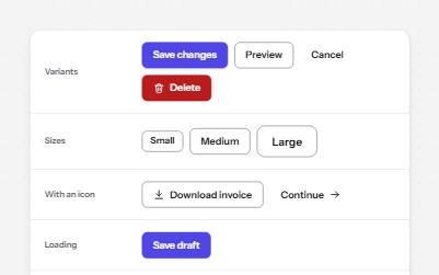
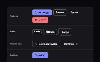
Native buttons in four variants and three sizes, with a loading state that keeps focus and a disabled state that says why.
-
Links that say where they go
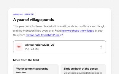
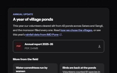
Links whose words say where they go: in text, to another site, to a download, and "Read more" made specific.