Accessibility pattern · Buttons and actions
Toolbar
The whole toolbar is a single stop in the Tab order: Left and Right move between its controls, and Tab leaves it. Inside, each control keeps its own keys: Up and Down pick an alignment, change the size, or open the color menu.
- WCAG criteria
- 7
- Keyboard rules
- 7
- Checked with
- axe, keyboard and the inspector
Live demo
Try it
Use it with a mouse, a keyboard or a screen reader. The inspector beside it shows what the browser tells assistive technology as you go: focus, state changes and announcements.
The demo works without JavaScript only as far as its HTML does; the inspector needs JavaScript.
Keyboard
Keys it answers to
Every action works without a pointer.
| Key | What it does |
|---|---|
| Tab or ShiftTab | Moves into the toolbar, onto the control used last, and out again. The toolbar is one stop. |
| Arrow Right or Arrow Left | Moves to the next or previous control, wrapping at the ends. |
| Home or End | Moves to the first or last control. |
| Enter or Space | Picks the focused alignment, or opens the color menu. |
| Arrow Down or Arrow Up | In the alignment group, picks the next or previous alignment. On the size, makes the text one pixel smaller or larger. On the color button, opens the menu. |
| Page Down or Page Up | On the size, makes the text four pixels smaller or larger. |
| Escape | Closes the color menu and returns focus to its button, or hides the tooltip. |
Screen readers
What it announces
Written from the roles, names and states in the markup.
| When | Expected announcement |
|---|---|
| Tab reaches the toolbar | Text formatting, toolbar. Text alignment, radio group. Align left, radio button, checked, 1 of 3 |
| Arrow Right moves on | Align center, radio button, not checked, 2 of 3 |
| Arrow Right reaches the size | Font size in pixels, spin button, 16 |
| Arrow Up changes it | 17 |
| Arrow Right reaches the color button | Text color Ink, menu button, collapsed |
| A color is chosen | Text color Indigo, menu button, collapsed |
These are expected announcements, not recordings. Wording and order differ between screen readers and browsers.
Code
Copy the code
The exact files this demo runs on. The styles are served with a prefix that keeps this site's own styles out of the demo; what you copy is the original.
<div class="ap-toolbar" data-ap-toolbar>
  <div class="ap-toolbar__card">
    <div class="ap-toolbar__bar" role="toolbar" aria-label="Text formatting" aria-orientation="horizontal" aria-controls="toolbar-sample">
      <div class="ap-toolbar__radios" role="radiogroup" aria-label="Text alignment">
        <button type="button" class="ap-toolbar__btn" role="radio" aria-checked="true" aria-label="Align left" data-ap-align="start" data-ap-tip>
          <svg class="ap-toolbar__icon" viewBox="0 0 24 24" aria-hidden="true" focusable="false"><path d="M4 6h16M4 10h10M4 14h16M4 18h10"/></svg>
        </button>
        <button type="button" class="ap-toolbar__btn" role="radio" aria-checked="false" aria-label="Align center" tabindex="-1" data-ap-align="center" data-ap-tip>
          <svg class="ap-toolbar__icon" viewBox="0 0 24 24" aria-hidden="true" focusable="false"><path d="M4 6h16M7 10h10M4 14h16M7 18h10"/></svg>
        </button>
        <button type="button" class="ap-toolbar__btn" role="radio" aria-checked="false" aria-label="Align right" tabindex="-1" data-ap-align="end" data-ap-tip>
          <svg class="ap-toolbar__icon" viewBox="0 0 24 24" aria-hidden="true" focusable="false"><path d="M4 6h16M10 10h10M4 14h16M10 18h10"/></svg>
        </button>
      </div>

      <div class="ap-toolbar__sep" role="separator" aria-orientation="vertical"></div>

      <div class="ap-toolbar__size" data-ap-tip>
        <span class="ap-toolbar__step" data-ap-step="-1" aria-hidden="true">
          <svg viewBox="0 0 24 24" focusable="false"><path d="M6 12h12"/></svg>
        </span>
        <span class="ap-toolbar__spin" role="spinbutton" tabindex="-1" aria-label="Font size in pixels" aria-valuenow="16" aria-valuemin="12" aria-valuemax="28"><span data-ap-value translate="no">16</span><span class="ap-toolbar__unit" aria-hidden="true" translate="no">px</span></span>
        <span class="ap-toolbar__step" data-ap-step="1" aria-hidden="true">
          <svg viewBox="0 0 24 24" focusable="false"><path d="M6 12h12M12 6v12"/></svg>
        </span>
      </div>

      <div class="ap-toolbar__sep" role="separator" aria-orientation="vertical"></div>

      <div class="ap-toolbar__color">
        <button type="button" class="ap-toolbar__btn ap-toolbar__pick" id="toolbar-color-button" aria-haspopup="menu" aria-expanded="false" aria-controls="toolbar-colors" aria-labelledby="toolbar-color-label toolbar-color-name" tabindex="-1" data-ap-tip>
          <span class="ap-toolbar__sr" id="toolbar-color-label">Text color</span>
          <span class="ap-toolbar__glyph" aria-hidden="true">
            <svg viewBox="0 0 24 24" focusable="false"><path d="m6 17 6-13 6 13M8.3 12h7.4"/></svg>
            <span class="ap-toolbar__ink" data-color="ink"></span>
          </span>
          <span class="ap-toolbar__sr" id="toolbar-color-name">Ink</span>
          <svg class="ap-toolbar__chev" viewBox="0 0 24 24" aria-hidden="true" focusable="false"><path d="m7 10 5 5 5-5"/></svg>
        </button>
        <div class="ap-toolbar__menu" role="menu" id="toolbar-colors" aria-labelledby="toolbar-color-label" hidden>
          <button type="button" class="ap-toolbar__item" role="menuitemradio" aria-checked="true" tabindex="-1" data-color="ink">
            <span class="ap-toolbar__swatch" aria-hidden="true"></span><span class="ap-toolbar__label">Ink</span>
            <svg class="ap-toolbar__tick" viewBox="0 0 24 24" aria-hidden="true" focusable="false"><path d="m5 12 5 5L20 7"/></svg>
          </button>
          <button type="button" class="ap-toolbar__item" role="menuitemradio" aria-checked="false" tabindex="-1" data-color="indigo">
            <span class="ap-toolbar__swatch" aria-hidden="true"></span><span class="ap-toolbar__label">Indigo</span>
            <svg class="ap-toolbar__tick" viewBox="0 0 24 24" aria-hidden="true" focusable="false"><path d="m5 12 5 5L20 7"/></svg>
          </button>
          <button type="button" class="ap-toolbar__item" role="menuitemradio" aria-checked="false" tabindex="-1" data-color="green">
            <span class="ap-toolbar__swatch" aria-hidden="true"></span><span class="ap-toolbar__label">Green</span>
            <svg class="ap-toolbar__tick" viewBox="0 0 24 24" aria-hidden="true" focusable="false"><path d="m5 12 5 5L20 7"/></svg>
          </button>
          <button type="button" class="ap-toolbar__item" role="menuitemradio" aria-checked="false" tabindex="-1" data-color="amber">
            <span class="ap-toolbar__swatch" aria-hidden="true"></span><span class="ap-toolbar__label">Amber</span>
            <svg class="ap-toolbar__tick" viewBox="0 0 24 24" aria-hidden="true" focusable="false"><path d="m5 12 5 5L20 7"/></svg>
          </button>
          <button type="button" class="ap-toolbar__item" role="menuitemradio" aria-checked="false" tabindex="-1" data-color="red">
            <span class="ap-toolbar__swatch" aria-hidden="true"></span><span class="ap-toolbar__label">Red</span>
            <svg class="ap-toolbar__tick" viewBox="0 0 24 24" aria-hidden="true" focusable="false"><path d="m5 12 5 5L20 7"/></svg>
          </button>
        </div>
      </div>
    </div>

    <div class="ap-toolbar__sample" id="toolbar-sample" data-align="start" data-color="ink">
      <p class="ap-toolbar__lead">Festive delivery</p>
      <p>Diwali orders placed by 28 October arrive before the festival. Gift wrapping is free on every order this week.</p>
    </div>
  </div>
  <span class="ap-toolbar__tip" aria-hidden="true" hidden></span>
</div>
/* Toolbar. Uses the --ap-* design tokens. */
.ap-toolbar {
  position: relative;
  container-type: inline-size;
  width: min(100%, 560px);
  margin-inline: auto;
}

.ap-toolbar__card {
  border: 1px solid var(--ap-border);
  border-radius: var(--ap-radius-lg);
  background: var(--ap-surface);
  box-shadow: var(--ap-shadow-md);
}

.ap-toolbar__bar {
  display: flex;
  flex-wrap: wrap;
  align-items: center;
  gap: 4px;
  padding: 8px;
  border-bottom: 1px solid var(--ap-border);
}

.ap-toolbar__sep {
  align-self: stretch;
  width: 1px;
  margin: 4px 6px;
  background: var(--ap-border);
}

/* Controls: 36px squares, a ring when focused. */
.ap-toolbar__btn {
  display: inline-flex;
  align-items: center;
  justify-content: center;
  gap: 2px;
  min-width: 36px;
  height: 36px;
  padding: 0 6px;
  border: 1px solid transparent;
  border-radius: var(--ap-radius-sm);
  background: transparent;
  color: var(--ap-text-2);
  cursor: pointer;
  transition: background-color var(--ap-duration) var(--ap-ease), color var(--ap-duration) var(--ap-ease);
}
.ap-toolbar__btn:hover {
  background: var(--ap-surface-2);
  color: var(--ap-text);
}
.ap-toolbar__btn:focus-visible,
.ap-toolbar__spin:focus-visible {
  outline: 2px solid var(--ap-focus);
  outline-offset: 1px;
}
.ap-toolbar__icon {
  width: 20px;
  height: 20px;
  fill: none;
  stroke: currentColor;
  stroke-width: 2;
  stroke-linecap: round;
}

/* The alignment radios sit in a well; the checked one is raised. */
.ap-toolbar__radios {
  display: flex;
  gap: 2px;
  padding: 2px;
  border-radius: calc(var(--ap-radius-sm) + 2px);
  background: var(--ap-surface-2);
}
.ap-toolbar__radios .ap-toolbar__btn {
  width: 36px;
  height: 34px;
  padding: 0;
}
.ap-toolbar__radios .ap-toolbar__btn:hover {
  background: var(--ap-surface-3);
}
.ap-toolbar__btn[aria-checked="true"],
.ap-toolbar__radios .ap-toolbar__btn[aria-checked="true"]:hover {
  border-color: var(--ap-border-strong);
  background: var(--ap-surface);
  color: var(--ap-text);
  box-shadow: var(--ap-shadow-sm);
}

/* Size: minus, the spin button, plus. */
.ap-toolbar__size {
  display: flex;
  align-items: center;
  height: 36px;
  border: 1px solid var(--ap-border-strong);
  border-radius: var(--ap-radius-sm);
}
.ap-toolbar__step {
  display: grid;
  place-items: center;
  width: 28px;
  height: 100%;
  color: var(--ap-text-2);
  cursor: pointer;
  user-select: none;
}
.ap-toolbar__step:hover {
  background: var(--ap-surface-2);
  color: var(--ap-text);
}
.ap-toolbar__step:first-child {
  border-radius: var(--ap-radius-sm) 0 0 var(--ap-radius-sm);
}
.ap-toolbar__step:last-child {
  border-radius: 0 var(--ap-radius-sm) var(--ap-radius-sm) 0;
}
.ap-toolbar__step svg {
  width: 16px;
  height: 16px;
  fill: none;
  stroke: currentColor;
  stroke-width: 2.25;
  stroke-linecap: round;
}
.ap-toolbar__spin {
  display: block;
  min-width: 44px;
  height: 100%;
  padding: 0 4px;
  line-height: 34px;
  text-align: center;
  border-inline: 1px solid var(--ap-border);
  color: var(--ap-text);
  font-variant-numeric: tabular-nums;
  font-weight: 650;
  cursor: default;
}
.ap-toolbar__unit {
  margin-left: 1px;
  color: var(--ap-text-3);
  font-size: .75rem;
  font-weight: 500;
}

/* Color: an A with the current color under it, and the menu it opens. */
.ap-toolbar__color {
  position: relative;
}
.ap-toolbar__pick[aria-expanded="true"] {
  background: var(--ap-surface-2);
  color: var(--ap-text);
}
.ap-toolbar__glyph {
  display: grid;
  justify-items: center;
  gap: 1px;
}
.ap-toolbar__glyph svg {
  width: 18px;
  height: 18px;
  fill: none;
  stroke: currentColor;
  stroke-width: 2.25;
  stroke-linecap: round;
  stroke-linejoin: round;
}
.ap-toolbar__ink {
  width: 18px;
  height: 4px;
  border-radius: var(--ap-radius-full);
  background: var(--swatch);
}
.ap-toolbar__chev {
  width: 14px;
  height: 14px;
  fill: none;
  stroke: currentColor;
  stroke-width: 2.25;
  stroke-linecap: round;
  stroke-linejoin: round;
}

.ap-toolbar__menu {
  position: absolute;
  top: calc(100% + 8px);
  right: 0;
  z-index: 3;
  display: grid;
  width: 200px;
  padding: 6px;
  border: 1px solid var(--ap-border);
  border-radius: var(--ap-radius);
  background: var(--ap-surface);
  box-shadow: var(--ap-shadow-lg);
  animation: ap-toolbar-in 140ms var(--ap-ease);
}
.ap-toolbar__menu[hidden] {
  display: none;
}
.ap-toolbar__item {
  display: flex;
  align-items: center;
  gap: 10px;
  min-height: 38px;
  padding: 0 10px;
  border: 0;
  border-radius: var(--ap-radius-sm);
  background: transparent;
  color: var(--ap-text);
  font: inherit;
  font-size: .9375rem;
  text-align: start;
  cursor: pointer;
}
.ap-toolbar__item:focus {
  outline: none;
  background: var(--ap-surface-2);
}
.ap-toolbar__item:focus-visible {
  outline: 2px solid var(--ap-focus);
  outline-offset: -2px;
}
.ap-toolbar__swatch {
  width: 16px;
  height: 16px;
  flex-shrink: 0;
  border-radius: var(--ap-radius-full);
  background: var(--swatch);
}
.ap-toolbar__label {
  flex: 1;
}
.ap-toolbar__tick {
  width: 16px;
  height: 16px;
  fill: none;
  stroke: currentColor;
  stroke-width: 2.5;
  stroke-linecap: round;
  stroke-linejoin: round;
  visibility: hidden;
}
.ap-toolbar__item[aria-checked="true"] {
  font-weight: 600;
}
.ap-toolbar__item[aria-checked="true"] .ap-toolbar__tick {
  visibility: visible;
}

/* The five colors, each from a token that holds 4.5:1 on the surface. */
.ap-toolbar [data-color="ink"] { --swatch: var(--ap-text); }
.ap-toolbar [data-color="indigo"] { --swatch: var(--ap-accent-text); }
.ap-toolbar [data-color="green"] { --swatch: var(--ap-success); }
.ap-toolbar [data-color="amber"] { --swatch: var(--ap-warning); }
.ap-toolbar [data-color="red"] { --swatch: var(--ap-danger); }

/* The text the toolbar works on. */
.ap-toolbar__sample {
  min-height: 210px;
  margin: 0;
  padding: 22px 24px 26px;
  color: var(--swatch);
  font-size: var(--ap-toolbar-size, 16px);
  line-height: 1.6;
  text-align: start;
  transition: font-size var(--ap-duration) var(--ap-ease);
}
.ap-toolbar__sample p {
  margin: 0;
}
.ap-toolbar__sample .ap-toolbar__lead {
  margin-bottom: .4em;
  font-size: 1.375em;
  font-weight: 700;
  line-height: 1.25;
}
.ap-toolbar__sample[data-align="center"] { text-align: center; }
.ap-toolbar__sample[data-align="end"] { text-align: end; }

/* The label a control shows on hover and keyboard focus. */
.ap-toolbar__tip {
  position: absolute;
  top: 0;
  left: 0;
  z-index: 4;
  padding: 6px 10px;
  border-radius: var(--ap-radius-sm);
  background: var(--ap-text);
  color: var(--ap-surface);
  box-shadow: var(--ap-shadow-md);
  font-size: .8125rem;
  font-weight: 600;
  line-height: 1.3;
  white-space: nowrap;
  transform: translate(var(--tip-x, 0), var(--tip-y, 0));
  animation: ap-toolbar-fade 140ms var(--ap-ease);
}
.ap-toolbar__tip[hidden] {
  display: none;
}

.ap-toolbar__sr {
  position: absolute;
  width: 1px;
  height: 1px;
  margin: -1px;
  padding: 0;
  overflow: hidden;
  clip-path: inset(50%);
  white-space: nowrap;
  border: 0;
}

/* Narrow: tighter spacing keeps the whole toolbar on one line. */
@container (max-width: 360px) {
  .ap-toolbar__bar { padding: 6px; gap: 3px; }
  .ap-toolbar__sep { margin-inline: 3px; }
  .ap-toolbar__radios .ap-toolbar__btn { width: 32px; }
  .ap-toolbar__step { width: 26px; }
  .ap-toolbar__sample { padding-inline: 18px; }
}

@keyframes ap-toolbar-in {
  from { opacity: 0; transform: translateY(-4px); }
}
@keyframes ap-toolbar-fade {
  from { opacity: 0; }
}

@media (prefers-reduced-motion: reduce) {
  .ap-toolbar__btn,
  .ap-toolbar__sample { transition: none; }
  .ap-toolbar__menu,
  .ap-toolbar__tip { animation: none; }
}
/**
 * Toolbar: one tab stop, a roving tabindex moved by the arrow keys, and
 * controls that keep their own keys.
 *
 * Markup: [data-ap-toolbar] holding [role=toolbar][aria-controls] (the text it
 * formats) with, in order: a [role=radiogroup] of button[role=radio]
 * [data-ap-align]; a [role=spinbutton] with a [data-ap-value] span and
 * [data-ap-step] buttons for the pointer; and a button[aria-haspopup=menu]
 * whose aria-labelledby names "Text color" then the current color, opening
 * a [role=menu] of button[role=menuitemradio][data-color]. Elements with
 * [data-ap-tip] show their name in the .ap-toolbar__tip on hover and focus.
 */

const MIN = 12;
const MAX = 28;
const HOVER_DELAY = 300;

export function init(root) {
  const bar = root.querySelector("[role=toolbar]");
  const sample = document.getElementById(bar.getAttribute("aria-controls"));
  const radios = [...bar.querySelectorAll("[role=radio]")];
  const spin = bar.querySelector("[role=spinbutton]");
  const spinValue = spin.querySelector("[data-ap-value]");
  const pick = bar.querySelector("[aria-haspopup=menu]");
  const [pickLabel, pickName] = pick.getAttribute("aria-labelledby").split(/\s+/).map((id) => document.getElementById(id));
  const pickInk = pick.querySelector("[data-color]");
  const menu = document.getElementById(pick.getAttribute("aria-controls"));
  const colors = [...menu.querySelectorAll("[role=menuitemradio]")];
  const items = [...radios, spin, pick];
  const tip = root.querySelector(".ap-toolbar__tip");
  const listening = new AbortController();
  let outside = null;

  /* ── Roving tabindex: the toolbar's one stop is the control used last ── */
  function rove(to) {
    for (const el of items) el.tabIndex = el === to ? 0 : -1;
    to.focus();
  }

  /* ── Alignment ── */
  function align(radio) {
    for (const r of radios) r.setAttribute("aria-checked", String(r === radio));
    sample.dataset.align = radio.dataset.apAlign;
  }

  /* ── Size ── */
  function size(n) {
    const value = Math.min(MAX, Math.max(MIN, n));
    spin.setAttribute("aria-valuenow", String(value));
    spinValue.textContent = String(value);
    sample.style.setProperty("--ap-toolbar-size", `${value}px`);
  }
  const sizeNow = () => Number(spin.getAttribute("aria-valuenow"));

  /* ── Color menu ── */
  const isOpen = () => pick.getAttribute("aria-expanded") === "true";
  const checkedColor = () => colors.find((c) => c.getAttribute("aria-checked") === "true") || colors[0];

  function openMenu() {
    hideTip();
    if (!isOpen()) {
      menu.hidden = false;
      pick.setAttribute("aria-expanded", "true");
      outside = new AbortController();
      document.addEventListener("pointerdown", (event) => {
        if (!root.contains(event.target)) closeMenu(false);
      }, { signal: outside.signal });
    }
    checkedColor().focus();
  }

  function closeMenu(returnFocus = true) {
    if (!isOpen()) return;
    menu.hidden = true;
    pick.setAttribute("aria-expanded", "false");
    outside?.abort();
    outside = null;
    if (returnFocus) rove(pick);
  }

  function choose(item) {
    for (const c of colors) c.setAttribute("aria-checked", String(c === item));
    sample.dataset.color = item.dataset.color;
    pickInk.dataset.color = item.dataset.color;
    // The button's name is "Text color" plus this, so the choice is heard on it.
    pickName.textContent = item.querySelector(".ap-toolbar__label").textContent.trim();
    closeMenu();
  }

  function typeahead(char, from) {
    const c = char.toLocaleLowerCase();
    for (let k = 1; k <= colors.length; k++) {
      const item = colors[(from + k) % colors.length];
      if (item.textContent.trim().toLocaleLowerCase().startsWith(c)) return item;
    }
    return null;
  }

  function onMenuKey(event) {
    const at = colors.indexOf(event.target);
    let next = null;
    switch (event.key) {
      case "ArrowDown": next = colors[(at + 1) % colors.length]; break;
      case "ArrowUp": next = colors[(at - 1 + colors.length) % colors.length]; break;
      case "Home": next = colors[0]; break;
      case "End": next = colors[colors.length - 1]; break;
      case "Escape":
        event.preventDefault();
        closeMenu();
        return;
      case "Tab":
        closeMenu();
        if (event.shiftKey) event.preventDefault();
        return;
      default:
        if (event.key.length === 1 && /\S/.test(event.key) && !event.ctrlKey && !event.metaKey && !event.altKey) {
          event.preventDefault();
          next = typeahead(event.key, at);
        }
    }
    if (next) {
      event.preventDefault();
      next.focus();
    }
  }

  /* ── Keys ── */
  function onKeydown(event) {
    if (menu.contains(event.target)) {
      onMenuKey(event);
      return;
    }
    const at = items.indexOf(event.target);
    if (at === -1) return;
    const target = event.target;
    switch (event.key) {
      case "ArrowRight": rove(items[(at + 1) % items.length]); break;
      case "ArrowLeft": rove(items[(at - 1 + items.length) % items.length]); break;
      case "Home": rove(items[0]); break;
      case "End": rove(items[items.length - 1]); break;
      case "ArrowDown":
      case "ArrowUp": {
        const down = event.key === "ArrowDown";
        if (radios.includes(target)) {
          const i = radios.indexOf(target);
          const next = radios[(i + (down ? 1 : -1) + radios.length) % radios.length];
          align(next);
          rove(next);
        } else if (target === spin) {
          size(sizeNow() + (down ? -1 : 1));
        } else if (target === pick) {
          openMenu();
        }
        break;
      }
      case "PageDown":
      case "PageUp":
        if (target !== spin) return;
        size(sizeNow() + (event.key === "PageDown" ? -4 : 4));
        break;
      default:
        return;
    }
    event.preventDefault();
  }

  /* ── Pointer ── */
  function onClick(event) {
    const radio = event.target.closest("[role=radio]");
    if (radio && radios.includes(radio)) {
      align(radio);
      rove(radio);
      return;
    }
    const step = event.target.closest("[data-ap-step]");
    if (step && bar.contains(step)) {
      size(sizeNow() + Number(step.dataset.apStep));
      rove(spin);
      return;
    }
    if (event.target.closest("[aria-haspopup=menu]") === pick) {
      if (isOpen()) closeMenu();
      else openMenu();
      return;
    }
    const item = event.target.closest("[role=menuitemradio]");
    if (item && colors.includes(item)) choose(item);
  }

  function onPointerMove(event) {
    const item = event.target.closest("[role=menuitemradio]");
    if (item && document.activeElement !== item) item.focus();
  }

  /* ── Labels on hover and keyboard focus ── */
  let hovered = null;
  let focused = null;
  let dismissed = false;
  let showTimer = 0;
  let hideTimer = 0;

  function nameOf(el) {
    const named = el.matches("[role], button") ? el : el.querySelector("[role]");
    if (named === pick) return pickLabel.textContent.trim();
    return named.getAttribute("aria-label");
  }

  function showTip(el) {
    clearTimeout(showTimer);
    if (!el || dismissed || isOpen()) return hideTip();
    tip.textContent = nameOf(el);
    tip.hidden = false;
    const box = root.getBoundingClientRect();
    const b = el.getBoundingClientRect();
    const w = tip.offsetWidth;
    const x = Math.max(0, Math.min(box.width - w, b.left - box.left + b.width / 2 - w / 2));
    tip.style.setProperty("--tip-x", `${Math.round(x)}px`);
    tip.style.setProperty("--tip-y", `${Math.round(b.bottom - box.top + 8)}px`);
  }

  function hideTip() {
    clearTimeout(showTimer);
    tip.hidden = true;
  }

  const tipTarget = (node) => {
    const el = node?.closest?.("[data-ap-tip]");
    return el && bar.contains(el) ? el : null;
  };

  function onPointerOver(event) {
    if (event.pointerType !== "mouse") return;
    const el = tipTarget(event.target);
    if (!el) return;
    clearTimeout(hideTimer);
    if (el === hovered) return;
    hovered = el;
    dismissed = false;
    clearTimeout(showTimer);
    if (!tip.hidden) showTip(el);
    else showTimer = setTimeout(() => showTip(el), HOVER_DELAY);
  }

  function onPointerOut(event) {
    if (event.pointerType !== "mouse") return;
    const from = tipTarget(event.target);
    if (!from) return;
    const to = event.relatedTarget;
    if (to && (from.contains(to) || tip.contains(to))) return;
    clearTimeout(showTimer);
    clearTimeout(hideTimer);
    hideTimer = setTimeout(() => {
      hovered = null;
      if (focused) showTip(focused);
      else hideTip();
    }, 120);
  }

  function onFocusIn(event) {
    // A click can focus a control too; the toolbar's tab stop follows it.
    if (items.includes(event.target)) {
      for (const item of items) item.tabIndex = item === event.target ? 0 : -1;
    }
    const el = tipTarget(event.target);
    focused = el && event.target.matches(":focus-visible") ? el : null;
    dismissed = false;
    if (focused) showTip(focused);
    else if (!hovered) hideTip();
  }

  function onFocusOut(event) {
    if (tipTarget(event.target) === focused) focused = null;
    if (!hovered) hideTip();
    // Focus left the toolbar's menu for somewhere else on the page.
    if (isOpen() && event.relatedTarget && !root.contains(event.relatedTarget)) closeMenu(false);
  }

  // On the document: a hover label must close even when focus is elsewhere.
  document.addEventListener("keydown", (event) => {
    if (event.key === "Escape" && !tip.hidden) {
      dismissed = true;
      hideTip();
    }
  }, { signal: listening.signal });

  bar.addEventListener("keydown", onKeydown);
  bar.addEventListener("click", onClick);
  menu.addEventListener("pointermove", onPointerMove);
  root.addEventListener("pointerover", onPointerOver);
  root.addEventListener("pointerout", onPointerOut);
  root.addEventListener("focusin", onFocusIn);
  root.addEventListener("focusout", onFocusOut);

  return () => {
    listening.abort();
    outside?.abort();
    clearTimeout(showTimer);
    clearTimeout(hideTimer);
    bar.removeEventListener("keydown", onKeydown);
    bar.removeEventListener("click", onClick);
    menu.removeEventListener("pointermove", onPointerMove);
    root.removeEventListener("pointerover", onPointerOver);
    root.removeEventListener("pointerout", onPointerOut);
    root.removeEventListener("focusin", onFocusIn);
    root.removeEventListener("focusout", onFocusOut);
  };
}

for (const root of document.querySelectorAll("[data-ap-toolbar]")) init(root);
/* Design tokens for the pattern components. Light by default, dark when the
   system asks for it; set data-theme="dark" on :root to force dark. */
:root {
    --ap-radius-sm: 8px;
    --ap-radius: 12px;
    --ap-radius-lg: 16px;
    --ap-radius-full: 999px;
    --ap-font: "Instrument Sans", ui-sans-serif, system-ui, -apple-system, "Segoe UI", Roboto, sans-serif;
    --ap-mono: "JetBrains Mono", ui-monospace, "Cascadia Mono", "SF Mono", Consolas, monospace;
    --ap-ease: cubic-bezier(.2, .8, .2, 1);
    --ap-duration: 180ms;
    --ap-target: 44px;
    --ap-bg: #F4F4F5;
    --ap-surface: #FFFFFF;
    --ap-surface-2: #F4F4F5;
    --ap-surface-3: #E4E4E7;
    --ap-border: #E4E4E7;
    --ap-border-strong: #76767F;
    --ap-text: #18181B;
    --ap-text-2: #3F3F46;
    --ap-text-3: #5E5E66;
    --ap-accent: #4F46E5;
    --ap-accent-hover: #4338CA;
    --ap-on-accent: #FFFFFF;
    --ap-accent-text: #4338CA;
    --ap-accent-soft: #EEF2FF;
    --ap-accent-soft-text: #3730A3;
    --ap-focus: #4F46E5;
    --ap-danger: #B91C1C;
    --ap-danger-soft: #FEF2F2;
    --ap-success: #15803D;
    --ap-success-soft: #F0FDF4;
    --ap-warning: #A15C07;
    --ap-warning-soft: #FEFCE8;
    --ap-info: #1D4ED8;
    --ap-info-soft: #EFF6FF;
    --ap-scrim: rgb(9 9 11 / .48);
    --ap-shadow-sm: 0 1px 2px rgb(9 9 11 / .06);
    --ap-shadow-md: 0 1px 2px rgb(9 9 11 / .05), 0 6px 16px -4px rgb(9 9 11 / .1);
    --ap-shadow-lg: 0 2px 6px rgb(9 9 11 / .06), 0 20px 40px -12px rgb(9 9 11 / .22);
    --ap-light-bg: #F4F4F5;
    --ap-light-surface: #FFFFFF;
    --ap-light-surface-2: #F4F4F5;
    --ap-light-surface-3: #E4E4E7;
    --ap-light-border: #E4E4E7;
    --ap-light-border-strong: #76767F;
    --ap-light-text: #18181B;
    --ap-light-text-2: #3F3F46;
    --ap-light-text-3: #5E5E66;
    --ap-light-accent: #4F46E5;
    --ap-light-accent-hover: #4338CA;
    --ap-light-on-accent: #FFFFFF;
    --ap-light-accent-text: #4338CA;
    --ap-light-accent-soft: #EEF2FF;
    --ap-light-accent-soft-text: #3730A3;
    --ap-light-focus: #4F46E5;
    --ap-light-danger: #B91C1C;
    --ap-light-danger-soft: #FEF2F2;
    --ap-light-success: #15803D;
    --ap-light-success-soft: #F0FDF4;
    --ap-light-warning: #A15C07;
    --ap-light-warning-soft: #FEFCE8;
    --ap-light-info: #1D4ED8;
    --ap-light-info-soft: #EFF6FF;
    --ap-light-scrim: rgb(9 9 11 / .48);
    --ap-light-shadow-sm: 0 1px 2px rgb(9 9 11 / .06);
    --ap-light-shadow-md: 0 1px 2px rgb(9 9 11 / .05), 0 6px 16px -4px rgb(9 9 11 / .1);
    --ap-light-shadow-lg: 0 2px 6px rgb(9 9 11 / .06), 0 20px 40px -12px rgb(9 9 11 / .22);
    --ap-dark-bg: #09090B;
    --ap-dark-surface: #18181B;
    --ap-dark-surface-2: #27272A;
    --ap-dark-surface-3: #3F3F46;
    --ap-dark-border: #2E2E33;
    --ap-dark-border-strong: #8E8E97;
    --ap-dark-text: #FAFAFA;
    --ap-dark-text-2: #D4D4D8;
    --ap-dark-text-3: #A1A1AA;
    --ap-dark-accent: #818CF8;
    --ap-dark-accent-hover: #A5B4FC;
    --ap-dark-on-accent: #0C0A1F;
    --ap-dark-accent-text: #A5B4FC;
    --ap-dark-accent-soft: #1E1B4B;
    --ap-dark-accent-soft-text: #C7D2FE;
    --ap-dark-focus: #A5B4FC;
    --ap-dark-danger: #F87171;
    --ap-dark-danger-soft: #2A1215;
    --ap-dark-success: #4ADE80;
    --ap-dark-success-soft: #0F2A1A;
    --ap-dark-warning: #FACC15;
    --ap-dark-warning-soft: #2A2410;
    --ap-dark-info: #60A5FA;
    --ap-dark-info-soft: #0F1D33;
    --ap-dark-scrim: rgb(0 0 0 / .62);
    --ap-dark-shadow-sm: 0 1px 2px rgb(0 0 0 / .4);
    --ap-dark-shadow-md: 0 1px 2px rgb(0 0 0 / .4), 0 8px 20px -6px rgb(0 0 0 / .5);
    --ap-dark-shadow-lg: 0 2px 8px rgb(0 0 0 / .45), 0 24px 48px -12px rgb(0 0 0 / .7);
}
@media (prefers-color-scheme: dark) {
  :root:not([data-theme="light"]) {
      --ap-bg: #09090B;
      --ap-surface: #18181B;
      --ap-surface-2: #27272A;
      --ap-surface-3: #3F3F46;
      --ap-border: #2E2E33;
      --ap-border-strong: #8E8E97;
      --ap-text: #FAFAFA;
      --ap-text-2: #D4D4D8;
      --ap-text-3: #A1A1AA;
      --ap-accent: #818CF8;
      --ap-accent-hover: #A5B4FC;
      --ap-on-accent: #0C0A1F;
      --ap-accent-text: #A5B4FC;
      --ap-accent-soft: #1E1B4B;
      --ap-accent-soft-text: #C7D2FE;
      --ap-focus: #A5B4FC;
      --ap-danger: #F87171;
      --ap-danger-soft: #2A1215;
      --ap-success: #4ADE80;
      --ap-success-soft: #0F2A1A;
      --ap-warning: #FACC15;
      --ap-warning-soft: #2A2410;
      --ap-info: #60A5FA;
      --ap-info-soft: #0F1D33;
      --ap-scrim: rgb(0 0 0 / .62);
      --ap-shadow-sm: 0 1px 2px rgb(0 0 0 / .4);
      --ap-shadow-md: 0 1px 2px rgb(0 0 0 / .4), 0 8px 20px -6px rgb(0 0 0 / .5);
      --ap-shadow-lg: 0 2px 8px rgb(0 0 0 / .45), 0 24px 48px -12px rgb(0 0 0 / .7);
  }
}
:root[data-theme="dark"] {
    --ap-bg: #09090B;
    --ap-surface: #18181B;
    --ap-surface-2: #27272A;
    --ap-surface-3: #3F3F46;
    --ap-border: #2E2E33;
    --ap-border-strong: #8E8E97;
    --ap-text: #FAFAFA;
    --ap-text-2: #D4D4D8;
    --ap-text-3: #A1A1AA;
    --ap-accent: #818CF8;
    --ap-accent-hover: #A5B4FC;
    --ap-on-accent: #0C0A1F;
    --ap-accent-text: #A5B4FC;
    --ap-accent-soft: #1E1B4B;
    --ap-accent-soft-text: #C7D2FE;
    --ap-focus: #A5B4FC;
    --ap-danger: #F87171;
    --ap-danger-soft: #2A1215;
    --ap-success: #4ADE80;
    --ap-success-soft: #0F2A1A;
    --ap-warning: #FACC15;
    --ap-warning-soft: #2A2410;
    --ap-info: #60A5FA;
    --ap-info-soft: #0F1D33;
    --ap-scrim: rgb(0 0 0 / .62);
    --ap-shadow-sm: 0 1px 2px rgb(0 0 0 / .4);
    --ap-shadow-md: 0 1px 2px rgb(0 0 0 / .4), 0 8px 20px -6px rgb(0 0 0 / .5);
    --ap-shadow-lg: 0 2px 8px rgb(0 0 0 / .45), 0 24px 48px -12px rgb(0 0 0 / .7);
}
WCAG 2.2
What it meets
The success criteria this pattern takes care of, and how.
-
1.3.1 Info and Relationships
Level A
The toolbar, the radio group and the separators have roles, so the grouping that is drawn is also exposed.
-
1.4.1 Use of Color
Level A
The checked alignment is raised with an edge and a shadow, and the chosen color has a check mark, not just a tint.
-
1.4.13 Content on Hover or Focus
Level AA
The labels that appear on hover or focus can be dismissed with Escape and stay while the pointer is over them.
-
2.1.1 Keyboard
Level A
Every control works from the keyboard, with the keys each role is expected to answer to.
-
2.4.3 Focus Order
Level A
The toolbar is one stop in the Tab order and remembers the last control used, so Tab never walks through every button.
-
2.4.7 Focus Visible
Level AA
Each control shows a two-pixel focus ring, and the focused color in the menu is filled as well.
-
4.1.2 Name, Role, Value
Level A
Alignment buttons are radios with aria-checked, the size is a spin button with its value, and the color button names the current color.
Usage
When to use it
Use it
- Three or more controls that act on the same thing, like the formatting of a text or the view of a chart.
- A dense set of tools that would cost too many Tab presses as separate stops.
Use something else
- Two buttons side by side: leave them as plain buttons.
- Controls that need text entry and the Left and Right keys, like a search field: put them outside the toolbar, or last in it.
- A row of links to other pages: use a nav landmark.
Common failures
How it usually goes wrong
Every control a tab stop
Ten tools in a row cost ten Tab presses to get past. A toolbar is one stop, with arrow keys inside, as people expect from desktop apps.
A toolbar with no name
"Toolbar" alone does not say what it works on. aria-label names it, and aria-controls points at the text it changes.
Focus that forgets
Returning to the toolbar should land on the control used last, not the first one. The roving tabindex here moves with focus, so it remembers.
Arrow keys taken by a field
A text field inside a toolbar needs Left and Right to move its caret, which breaks moving between controls. The size here is a spin button, which uses Up and Down.
Icon-only controls with no visible label
Sighted keyboard users cannot read an aria-label. A label appears beside each control on hover and on keyboard focus.
Separators read out as content
Drawing groups with stray characters like "|" fills the reading order with noise. role=separator marks the break without words.
Notes
Building it
- Set aria-orientation="horizontal" (the default for toolbars) so assistive technology knows which arrow keys move; a vertical toolbar would use Up and Down.
- Home and End move within the toolbar, not to the size's minimum and maximum; Page Up and Page Down make bigger steps instead.
- The plus and minus beside the size are for pointer users only: they are hidden from assistive technology, because the spin button already answers to Up and Down.
- The color button's name joins two elements, "Text color" and the current color, so the choice is heard without opening the menu.
- The color menu's items are menuitemradio with aria-checked, because exactly one color is chosen at a time.
Sources: WAI-ARIA Authoring Practices: Toolbar · WAI-ARIA Authoring Practices: Toolbar example · WAI-ARIA Authoring Practices: Spinbutton
Checked with axe in light and dark themes, at desktop and phone widths, and by keyboard. Not yet tested with every screen reader and browser pair. Report a correction
Related
Patterns that go with it
-
Toggle button
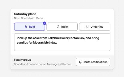
Buttons that stay on or off, like Bold or Mute, with aria-pressed reporting the state while the label stays the same.
-
Menu button
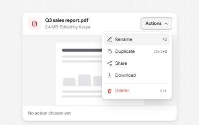
A button that opens a list of actions, moved through with the arrow keys and closed with Escape, focus going back to the button.
-
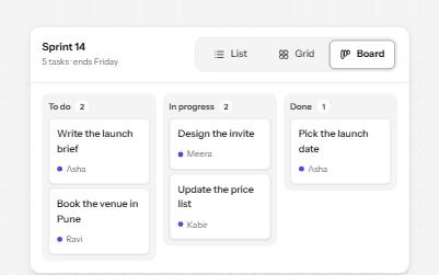
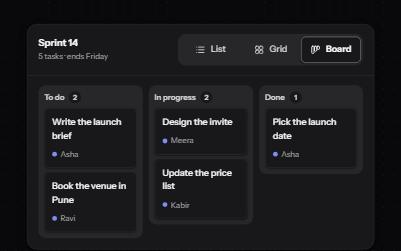
Segmented control
A row of joined segments for picking one of a few views, built from real radio buttons in a fieldset.
-
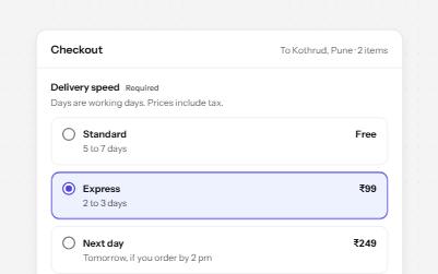
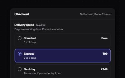
Radio group
Native radio buttons in a fieldset, restyled with a dot that keeps its contrast, each option with a description and a price.