Accessibility pattern · Disclosure and content
Card
The heading's link is the card's one link; a pseudo-element stretches it over the whole card, so the card is clickable without wrapping everything in an anchor. Save and Share sit above that layer with their own names, focus rings and Tab stops, and the heading comes first in the source even though the picture is drawn above it.
- WCAG criteria
- 7
- Keyboard rules
- 3
- Checked with
- axe, keyboard and the inspector
Live demo
Try it
Use it with a mouse, a keyboard or a screen reader. The inspector beside it shows what the browser tells assistive technology as you go: focus, state changes and announcements.
Made by hand this month
-
Blue pottery vase
Quartz clay, painted by hand in cobalt and turquoise. 22 cm tall.
₹2,450
-
Dhokra brass elephant
Cast by the lost-wax method, so no two are quite alike. 12 cm long.
₹3,200
-
Kantha cushion cover
Layers of old cotton saris, quilted with running stitch. 40 × 40 cm.
₹1,150
The demo works without JavaScript only as far as its HTML does; the inspector needs JavaScript.
Keyboard
Keys it answers to
Every action works without a pointer.
| Key | What it does |
|---|---|
| Tab | Moves to each card's link, then its Save and Share buttons, card by card. |
| Enter | On a card's link, follows it, like a click anywhere else on the card. |
| Enter or Space | On Save, saves or unsaves the item; on Share, shares the link or copies it and says so. |
Screen readers
What it announces
Written from the roles, names and states in the markup.
| When | Expected announcement |
|---|---|
| Tab reaches a card | Blue pottery vase, link, heading level 4 |
| Tab reaches Save | Save Blue pottery vase, toggle button, not pressed |
| Save is pressed | Pressed |
| Share copies the link | Link copied |
| A screen reader lists the links | Blue pottery vase, Dhokra brass elephant, Kantha cushion cover |
These are expected announcements, not recordings. Wording and order differ between screen readers and browsers.
Code
Copy the code
The exact files this demo runs on. The styles are served with a prefix that keeps this site's own styles out of the demo; what you copy is the original.
<div class="ap-card-grid" data-ap-card-grid>
  <h3 class="ap-card-grid__group">Made by hand this month</h3>
  <ul class="ap-card-grid__grid" role="list">
    <li class="ap-card-grid__item" id="card-vase">
      <h4 class="ap-card-grid__name"><a class="ap-card-grid__link" id="card-name-1" href="#card-vase">Blue pottery vase</a></h4>
      <p class="ap-card-grid__meta">Jaipur · Ceramics</p>
      <p class="ap-card-grid__desc">Quartz clay, painted by hand in cobalt and turquoise. 22 cm tall.</p>
      <div class="ap-card-grid__foot">
        <p class="ap-card-grid__price">₹2,450</p>
        <div class="ap-card-grid__actions">
          <button type="button" class="ap-card-grid__act" data-card-save aria-pressed="false" aria-labelledby="card-save-1 card-name-1">
            <svg class="ap-card-grid__icon" viewBox="0 0 24 24" aria-hidden="true" focusable="false"><path d="M12 20s-7-4.4-7-10a4 4 0 0 1 7-2.6A4 4 0 0 1 19 10c0 5.6-7 10-7 10Z"/></svg>
            <span id="card-save-1">Save</span>
          </button>
          <button type="button" class="ap-card-grid__act" data-card-share aria-labelledby="card-share-1 card-name-1">
            <svg class="ap-card-grid__icon" viewBox="0 0 24 24" aria-hidden="true" focusable="false"><path d="M12 4v11M7.5 8.5 12 4l4.5 4.5M5 13v5a2 2 0 0 0 2 2h10a2 2 0 0 0 2-2v-5"/></svg>
            <span id="card-share-1">Share</span>
          </button>
        </div>
      </div>
      <p class="ap-card-grid__note" role="status"></p>
      <div class="ap-card-grid__media ap-card-grid__media--vase" aria-hidden="true">
        <svg viewBox="0 0 320 200" preserveAspectRatio="xMidYMid meet" focusable="false">
          <ellipse class="ap-card-grid__ink ap-card-grid__ink--soft" cx="160" cy="176" rx="64" ry="8"/>
          <path class="ap-card-grid__ink" d="M140 44h40v14c0 10 30 22 30 64 0 30-20 54-50 54s-50-24-50-54c0-42 30-54 30-64Z"/>
          <path class="ap-card-grid__line" d="M118 112c14 10 28 10 42 0s28-10 42 0M114 132c15 10 31 10 46 0s31-10 46 0"/>
          <path class="ap-card-grid__line ap-card-grid__line--thin" d="M136 44h48"/>
        </svg>
      </div>
    </li>
    <li class="ap-card-grid__item" id="card-elephant">
      <h4 class="ap-card-grid__name"><a class="ap-card-grid__link" id="card-name-2" href="#card-elephant">Dhokra brass elephant</a></h4>
      <p class="ap-card-grid__meta">Bastar · Metalwork</p>
      <p class="ap-card-grid__desc">Cast by the lost-wax method, so no two are quite alike. 12 cm long.</p>
      <div class="ap-card-grid__foot">
        <p class="ap-card-grid__price">₹3,200</p>
        <div class="ap-card-grid__actions">
          <button type="button" class="ap-card-grid__act" data-card-save aria-pressed="false" aria-labelledby="card-save-2 card-name-2">
            <svg class="ap-card-grid__icon" viewBox="0 0 24 24" aria-hidden="true" focusable="false"><path d="M12 20s-7-4.4-7-10a4 4 0 0 1 7-2.6A4 4 0 0 1 19 10c0 5.6-7 10-7 10Z"/></svg>
            <span id="card-save-2">Save</span>
          </button>
          <button type="button" class="ap-card-grid__act" data-card-share aria-labelledby="card-share-2 card-name-2">
            <svg class="ap-card-grid__icon" viewBox="0 0 24 24" aria-hidden="true" focusable="false"><path d="M12 4v11M7.5 8.5 12 4l4.5 4.5M5 13v5a2 2 0 0 0 2 2h10a2 2 0 0 0 2-2v-5"/></svg>
            <span id="card-share-2">Share</span>
          </button>
        </div>
      </div>
      <p class="ap-card-grid__note" role="status"></p>
      <div class="ap-card-grid__media ap-card-grid__media--elephant" aria-hidden="true">
        <svg viewBox="0 0 320 200" preserveAspectRatio="xMidYMid meet" focusable="false">
          <ellipse class="ap-card-grid__ink ap-card-grid__ink--soft" cx="160" cy="176" rx="80" ry="7"/>
          <path class="ap-card-grid__trunk ap-card-grid__trunk--tail" d="M94 104c-10 6-12 16-8 26"/>
          <path class="ap-card-grid__ink" d="M100 128h20v44h-20ZM126 134h18v38h-18ZM164 134h18v38h-18ZM188 128h20v44h-20Z"/>
          <ellipse class="ap-card-grid__ink" cx="150" cy="112" rx="60" ry="40"/>
          <circle class="ap-card-grid__ink" cx="214" cy="98" r="30"/>
          <path class="ap-card-grid__trunk" d="M236 110c10 14 12 32 4 46-3 6-9 8-14 4"/>
          <path class="ap-card-grid__line ap-card-grid__line--thin" d="M204 78c-14 6-16 28-2 38M114 100c16-8 46-8 66 0M110 120c20-8 54-8 76 0"/>
          <path class="ap-card-grid__line ap-card-grid__line--thin" d="M228 122c4 6 10 8 16 5"/>
          <circle class="ap-card-grid__dot" cx="224" cy="92" r="3.5"/>
        </svg>
      </div>
    </li>
    <li class="ap-card-grid__item" id="card-cushion">
      <h4 class="ap-card-grid__name"><a class="ap-card-grid__link" id="card-name-3" href="#card-cushion">Kantha cushion cover</a></h4>
      <p class="ap-card-grid__meta">Bolpur · Textiles</p>
      <p class="ap-card-grid__desc">Layers of old cotton saris, quilted with running stitch. 40 × 40 cm.</p>
      <div class="ap-card-grid__foot">
        <p class="ap-card-grid__price">₹1,150</p>
        <div class="ap-card-grid__actions">
          <button type="button" class="ap-card-grid__act" data-card-save aria-pressed="false" aria-labelledby="card-save-3 card-name-3">
            <svg class="ap-card-grid__icon" viewBox="0 0 24 24" aria-hidden="true" focusable="false"><path d="M12 20s-7-4.4-7-10a4 4 0 0 1 7-2.6A4 4 0 0 1 19 10c0 5.6-7 10-7 10Z"/></svg>
            <span id="card-save-3">Save</span>
          </button>
          <button type="button" class="ap-card-grid__act" data-card-share aria-labelledby="card-share-3 card-name-3">
            <svg class="ap-card-grid__icon" viewBox="0 0 24 24" aria-hidden="true" focusable="false"><path d="M12 4v11M7.5 8.5 12 4l4.5 4.5M5 13v5a2 2 0 0 0 2 2h10a2 2 0 0 0 2-2v-5"/></svg>
            <span id="card-share-3">Share</span>
          </button>
        </div>
      </div>
      <p class="ap-card-grid__note" role="status"></p>
      <div class="ap-card-grid__media ap-card-grid__media--cushion" aria-hidden="true">
        <svg viewBox="0 0 320 200" preserveAspectRatio="xMidYMid meet" focusable="false">
          <ellipse class="ap-card-grid__ink ap-card-grid__ink--soft" cx="160" cy="178" rx="70" ry="7"/>
          <path class="ap-card-grid__ink" d="M96 52c22 6 106 6 128 0 8 30 8 90 0 120-22-6-106-6-128 0-8-30-8-90 0-120Z"/>
          <path class="ap-card-grid__line ap-card-grid__line--dash" d="M110 74c20 4 80 4 100 0M110 96c20 4 80 4 100 0M110 118c20 4 80 4 100 0M110 140c20 4 80 4 100 0"/>
        </svg>
      </div>
    </li>
  </ul>
</div>
/* Cards. Uses the --ap-* design tokens. */
.ap-card-grid {
  container-type: inline-size;
  width: min(100%, 760px);
  margin-inline: auto;
  color: var(--ap-text);
}
.ap-card-grid__group {
  margin: 0 0 14px;
  font-size: 1.125rem;
  font-weight: 650;
  line-height: 1.3;
}
.ap-card-grid__grid {
  display: grid;
  grid-template-columns: repeat(auto-fill, minmax(180px, 1fr));
  gap: 16px;
  margin: 0;
  padding: 0;
  list-style: none;
}

/* The card is the positioning box for the stretched link. The source order
   is heading, place, description, price, actions, picture; the picture and
   the place are drawn first with order. */
.ap-card-grid__item {
  position: relative;
  display: flex;
  flex-direction: column;
  border: 1px solid var(--ap-border);
  border-radius: var(--ap-radius-lg);
  background: var(--ap-surface);
  box-shadow: var(--ap-shadow-sm);
  transition: box-shadow var(--ap-duration) var(--ap-ease), transform var(--ap-duration) var(--ap-ease), border-color var(--ap-duration) var(--ap-ease);
}
.ap-card-grid__item:hover {
  box-shadow: var(--ap-shadow-lg);
  transform: translateY(-2px);
}
.ap-card-grid__item:focus-within {
  border-color: var(--ap-border-strong);
}

.ap-card-grid__media {
  order: -2;
  aspect-ratio: 16 / 10;
  border-radius: calc(var(--ap-radius-lg) - 1px) calc(var(--ap-radius-lg) - 1px) 0 0;
}
.ap-card-grid__media svg {
  display: block;
  width: 100%;
  height: 100%;
}
.ap-card-grid__media--vase { background: var(--ap-info-soft); color: var(--ap-info); }
.ap-card-grid__media--elephant { background: var(--ap-warning-soft); color: var(--ap-warning); }
.ap-card-grid__media--cushion { background: var(--ap-danger-soft); color: var(--ap-danger); }
.ap-card-grid__ink { fill: currentColor; }
.ap-card-grid__ink--soft { opacity: .22; }
.ap-card-grid__dot { fill: var(--ap-surface); }
.ap-card-grid__line {
  fill: none;
  stroke: var(--ap-surface);
  stroke-width: 4;
  stroke-linecap: round;
}
.ap-card-grid__line--thin { stroke-width: 2.5; opacity: .75; }
.ap-card-grid__trunk {
  fill: none;
  stroke: currentColor;
  stroke-width: 14;
  stroke-linecap: round;
}
.ap-card-grid__trunk--tail { stroke-width: 4; }
.ap-card-grid__line--dash { stroke-width: 2.5; stroke-dasharray: 6 5; }

.ap-card-grid__meta {
  order: -1;
  margin: 16px 18px 0;
  color: var(--ap-text-3);
  font-size: .8125rem;
  font-weight: 600;
}
.ap-card-grid__name {
  margin: 4px 18px 0;
  font-size: 1.0625rem;
  font-weight: 650;
  line-height: 1.35;
}
.ap-card-grid__link {
  color: var(--ap-text);
  text-decoration: underline;
  text-decoration-color: transparent;
  text-decoration-thickness: 2px;
  text-underline-offset: 4px;
  transition: text-decoration-color var(--ap-duration) var(--ap-ease);
}
/* The stretched link: the whole card is its click target. */
.ap-card-grid__link::after {
  content: "";
  position: absolute;
  inset: 0;
  z-index: 1;
  border-radius: var(--ap-radius-lg);
}
.ap-card-grid__item:hover .ap-card-grid__link {
  text-decoration-color: currentColor;
}
.ap-card-grid__link:focus-visible {
  outline: none;
  text-decoration-color: currentColor;
}
.ap-card-grid__link:focus-visible::after {
  outline: 2px solid var(--ap-focus);
  outline-offset: 3px;
}

.ap-card-grid__desc {
  margin: 8px 18px 0;
  color: var(--ap-text-2);
  font-size: .9375rem;
  line-height: 1.55;
}

.ap-card-grid__foot {
  display: grid;
  gap: 12px;
  margin-top: auto;
  padding: 16px 16px 16px 18px;
}
.ap-card-grid__price {
  margin: 0;
  color: var(--ap-text);
  font-size: 1.0625rem;
  font-weight: 650;
  font-variant-numeric: tabular-nums;
}

/* Above the stretched link, so they get their own clicks. */
.ap-card-grid__actions {
  position: relative;
  z-index: 2;
  display: flex;
  flex-wrap: wrap;
  gap: 8px;
}
.ap-card-grid__act {
  flex: 1 1 0;
  display: inline-flex;
  align-items: center;
  justify-content: center;
  gap: 6px;
  min-height: 38px;
  padding: 0 10px;
  border: 1px solid var(--ap-border-strong);
  border-radius: var(--ap-radius-sm);
  background: var(--ap-surface);
  color: var(--ap-text);
  font: inherit;
  font-size: .875rem;
  font-weight: 600;
  white-space: nowrap;
  cursor: pointer;
  transition: background-color var(--ap-duration) var(--ap-ease), border-color var(--ap-duration) var(--ap-ease);
}
.ap-card-grid__act:hover {
  background: var(--ap-surface-2);
}
.ap-card-grid__act:focus-visible {
  outline: 2px solid var(--ap-focus);
  outline-offset: 2px;
}
.ap-card-grid__icon {
  width: 17px;
  height: 17px;
  flex-shrink: 0;
  fill: none;
  stroke: currentColor;
  stroke-width: 2;
  stroke-linecap: round;
  stroke-linejoin: round;
}
/* Saved: the heart fills in, so the state is a shape as well as a color. */
.ap-card-grid__act[aria-pressed="true"] {
  border-color: var(--ap-accent);
  background: var(--ap-accent-soft);
  color: var(--ap-accent-soft-text);
}
.ap-card-grid__act[aria-pressed="true"] .ap-card-grid__icon {
  fill: currentColor;
}

.ap-card-grid__note {
  position: relative;
  z-index: 2;
  margin: -6px 18px 14px;
  color: var(--ap-success);
  font-size: .875rem;
  font-weight: 600;
}
.ap-card-grid__note:empty {
  margin: 0;
}

@media (prefers-reduced-motion: reduce) {
  .ap-card-grid__item,
  .ap-card-grid__link,
  .ap-card-grid__act { transition: none; }
  .ap-card-grid__item:hover { transform: none; }
}
/**
 * Cards: one stretched link per card, with Save (a toggle button) and Share
 * buttons that sit above it.
 *
 * Markup: [data-ap-card-grid] holding .ap-card-grid__item cards, each with an
 * a.ap-card-grid__link in its heading, button[data-card-save][aria-pressed],
 * button[data-card-share] and a role=status .ap-card-grid__note. The stretched
 * link itself is CSS only; the script handles the two buttons.
 */

export function init(root) {
  const off = new AbortController();
  const timers = new Set();

  // Clear first, then write, so the same message twice is announced twice.
  function say(note, text) {
    note.textContent = "";
    const show = setTimeout(() => {
      note.textContent = text;
      const hide = setTimeout(() => { note.textContent = ""; timers.delete(hide); }, 4000);
      timers.add(hide);
      timers.delete(show);
    }, 50);
    timers.add(show);
  }

  async function share(button) {
    const item = button.closest(".ap-card-grid__item");
    const link = item.querySelector(".ap-card-grid__link");
    const note = item.querySelector(".ap-card-grid__note");
    const url = new URL(link.getAttribute("href"), location.href).href;
    // Phones and tablets have a share sheet; elsewhere, copying is what people expect.
    if (navigator.share && window.matchMedia("(pointer: coarse)").matches) {
      try {
        await navigator.share({ title: link.textContent.trim(), url });
      } catch { /* the sheet was closed */ }
      return;
    }
    try {
      await navigator.clipboard.writeText(url);
      say(note, "Link copied");
    } catch {
      say(note, "Could not copy the link");
    }
  }

  root.addEventListener("click", (event) => {
    const button = event.target.closest("button");
    if (!button || !root.contains(button)) return;
    if (button.hasAttribute("data-card-save")) {
      button.setAttribute("aria-pressed", String(button.getAttribute("aria-pressed") !== "true"));
    } else if (button.hasAttribute("data-card-share")) {
      share(button);
    }
  }, { signal: off.signal });

  return () => {
    off.abort();
    for (const t of timers) clearTimeout(t);
    timers.clear();
  };
}

for (const root of document.querySelectorAll("[data-ap-card-grid]")) init(root);
/* Design tokens for the pattern components. Light by default, dark when the
   system asks for it; set data-theme="dark" on :root to force dark. */
:root {
    --ap-radius-sm: 8px;
    --ap-radius: 12px;
    --ap-radius-lg: 16px;
    --ap-radius-full: 999px;
    --ap-font: "Instrument Sans", ui-sans-serif, system-ui, -apple-system, "Segoe UI", Roboto, sans-serif;
    --ap-mono: "JetBrains Mono", ui-monospace, "Cascadia Mono", "SF Mono", Consolas, monospace;
    --ap-ease: cubic-bezier(.2, .8, .2, 1);
    --ap-duration: 180ms;
    --ap-target: 44px;
    --ap-bg: #F4F4F5;
    --ap-surface: #FFFFFF;
    --ap-surface-2: #F4F4F5;
    --ap-surface-3: #E4E4E7;
    --ap-border: #E4E4E7;
    --ap-border-strong: #76767F;
    --ap-text: #18181B;
    --ap-text-2: #3F3F46;
    --ap-text-3: #5E5E66;
    --ap-accent: #4F46E5;
    --ap-accent-hover: #4338CA;
    --ap-on-accent: #FFFFFF;
    --ap-accent-text: #4338CA;
    --ap-accent-soft: #EEF2FF;
    --ap-accent-soft-text: #3730A3;
    --ap-focus: #4F46E5;
    --ap-danger: #B91C1C;
    --ap-danger-soft: #FEF2F2;
    --ap-success: #15803D;
    --ap-success-soft: #F0FDF4;
    --ap-warning: #A15C07;
    --ap-warning-soft: #FEFCE8;
    --ap-info: #1D4ED8;
    --ap-info-soft: #EFF6FF;
    --ap-scrim: rgb(9 9 11 / .48);
    --ap-shadow-sm: 0 1px 2px rgb(9 9 11 / .06);
    --ap-shadow-md: 0 1px 2px rgb(9 9 11 / .05), 0 6px 16px -4px rgb(9 9 11 / .1);
    --ap-shadow-lg: 0 2px 6px rgb(9 9 11 / .06), 0 20px 40px -12px rgb(9 9 11 / .22);
    --ap-light-bg: #F4F4F5;
    --ap-light-surface: #FFFFFF;
    --ap-light-surface-2: #F4F4F5;
    --ap-light-surface-3: #E4E4E7;
    --ap-light-border: #E4E4E7;
    --ap-light-border-strong: #76767F;
    --ap-light-text: #18181B;
    --ap-light-text-2: #3F3F46;
    --ap-light-text-3: #5E5E66;
    --ap-light-accent: #4F46E5;
    --ap-light-accent-hover: #4338CA;
    --ap-light-on-accent: #FFFFFF;
    --ap-light-accent-text: #4338CA;
    --ap-light-accent-soft: #EEF2FF;
    --ap-light-accent-soft-text: #3730A3;
    --ap-light-focus: #4F46E5;
    --ap-light-danger: #B91C1C;
    --ap-light-danger-soft: #FEF2F2;
    --ap-light-success: #15803D;
    --ap-light-success-soft: #F0FDF4;
    --ap-light-warning: #A15C07;
    --ap-light-warning-soft: #FEFCE8;
    --ap-light-info: #1D4ED8;
    --ap-light-info-soft: #EFF6FF;
    --ap-light-scrim: rgb(9 9 11 / .48);
    --ap-light-shadow-sm: 0 1px 2px rgb(9 9 11 / .06);
    --ap-light-shadow-md: 0 1px 2px rgb(9 9 11 / .05), 0 6px 16px -4px rgb(9 9 11 / .1);
    --ap-light-shadow-lg: 0 2px 6px rgb(9 9 11 / .06), 0 20px 40px -12px rgb(9 9 11 / .22);
    --ap-dark-bg: #09090B;
    --ap-dark-surface: #18181B;
    --ap-dark-surface-2: #27272A;
    --ap-dark-surface-3: #3F3F46;
    --ap-dark-border: #2E2E33;
    --ap-dark-border-strong: #8E8E97;
    --ap-dark-text: #FAFAFA;
    --ap-dark-text-2: #D4D4D8;
    --ap-dark-text-3: #A1A1AA;
    --ap-dark-accent: #818CF8;
    --ap-dark-accent-hover: #A5B4FC;
    --ap-dark-on-accent: #0C0A1F;
    --ap-dark-accent-text: #A5B4FC;
    --ap-dark-accent-soft: #1E1B4B;
    --ap-dark-accent-soft-text: #C7D2FE;
    --ap-dark-focus: #A5B4FC;
    --ap-dark-danger: #F87171;
    --ap-dark-danger-soft: #2A1215;
    --ap-dark-success: #4ADE80;
    --ap-dark-success-soft: #0F2A1A;
    --ap-dark-warning: #FACC15;
    --ap-dark-warning-soft: #2A2410;
    --ap-dark-info: #60A5FA;
    --ap-dark-info-soft: #0F1D33;
    --ap-dark-scrim: rgb(0 0 0 / .62);
    --ap-dark-shadow-sm: 0 1px 2px rgb(0 0 0 / .4);
    --ap-dark-shadow-md: 0 1px 2px rgb(0 0 0 / .4), 0 8px 20px -6px rgb(0 0 0 / .5);
    --ap-dark-shadow-lg: 0 2px 8px rgb(0 0 0 / .45), 0 24px 48px -12px rgb(0 0 0 / .7);
}
@media (prefers-color-scheme: dark) {
  :root:not([data-theme="light"]) {
      --ap-bg: #09090B;
      --ap-surface: #18181B;
      --ap-surface-2: #27272A;
      --ap-surface-3: #3F3F46;
      --ap-border: #2E2E33;
      --ap-border-strong: #8E8E97;
      --ap-text: #FAFAFA;
      --ap-text-2: #D4D4D8;
      --ap-text-3: #A1A1AA;
      --ap-accent: #818CF8;
      --ap-accent-hover: #A5B4FC;
      --ap-on-accent: #0C0A1F;
      --ap-accent-text: #A5B4FC;
      --ap-accent-soft: #1E1B4B;
      --ap-accent-soft-text: #C7D2FE;
      --ap-focus: #A5B4FC;
      --ap-danger: #F87171;
      --ap-danger-soft: #2A1215;
      --ap-success: #4ADE80;
      --ap-success-soft: #0F2A1A;
      --ap-warning: #FACC15;
      --ap-warning-soft: #2A2410;
      --ap-info: #60A5FA;
      --ap-info-soft: #0F1D33;
      --ap-scrim: rgb(0 0 0 / .62);
      --ap-shadow-sm: 0 1px 2px rgb(0 0 0 / .4);
      --ap-shadow-md: 0 1px 2px rgb(0 0 0 / .4), 0 8px 20px -6px rgb(0 0 0 / .5);
      --ap-shadow-lg: 0 2px 8px rgb(0 0 0 / .45), 0 24px 48px -12px rgb(0 0 0 / .7);
  }
}
:root[data-theme="dark"] {
    --ap-bg: #09090B;
    --ap-surface: #18181B;
    --ap-surface-2: #27272A;
    --ap-surface-3: #3F3F46;
    --ap-border: #2E2E33;
    --ap-border-strong: #8E8E97;
    --ap-text: #FAFAFA;
    --ap-text-2: #D4D4D8;
    --ap-text-3: #A1A1AA;
    --ap-accent: #818CF8;
    --ap-accent-hover: #A5B4FC;
    --ap-on-accent: #0C0A1F;
    --ap-accent-text: #A5B4FC;
    --ap-accent-soft: #1E1B4B;
    --ap-accent-soft-text: #C7D2FE;
    --ap-focus: #A5B4FC;
    --ap-danger: #F87171;
    --ap-danger-soft: #2A1215;
    --ap-success: #4ADE80;
    --ap-success-soft: #0F2A1A;
    --ap-warning: #FACC15;
    --ap-warning-soft: #2A2410;
    --ap-info: #60A5FA;
    --ap-info-soft: #0F1D33;
    --ap-scrim: rgb(0 0 0 / .62);
    --ap-shadow-sm: 0 1px 2px rgb(0 0 0 / .4);
    --ap-shadow-md: 0 1px 2px rgb(0 0 0 / .4), 0 8px 20px -6px rgb(0 0 0 / .5);
    --ap-shadow-lg: 0 2px 8px rgb(0 0 0 / .45), 0 24px 48px -12px rgb(0 0 0 / .7);
}
WCAG 2.2
What it meets
The success criteria this pattern takes care of, and how.
-
1.3.1 Info and Relationships
Level A
The cards are items of a list, each with a heading, so a screen reader says how many there are and can jump from name to name.
-
1.3.2 Meaningful Sequence
Level A
The heading comes first in the source and the picture last, so a card reads name, place, description, price, though it is drawn picture first.
-
2.4.4 Link Purpose (In Context)
Level A
The link text is the product's name, so a list of links reads as a list of products, not three Read more links.
-
2.4.7 Focus Visible
Level AA
The link's focus ring is drawn around the whole card, and Save and Share have rings of their own.
-
2.5.3 Label in Name
Level A
Save and Share are named by their visible word followed by the product name, so the name starts with what is on screen.
-
4.1.2 Name, Role, Value
Level A
Save is a toggle button with aria-pressed, so whether the item is saved is announced.
-
4.1.3 Status Messages
Level AA
Copying a link is confirmed in a status message inside the card, without moving focus.
Usage
When to use it
Use it
- A grid of items of the same kind that each lead to their own page: products, articles, places.
- Items with one main destination and a couple of quick actions.
Use something else
- Several equally important links in one card: list them as separate links, without the stretched layer.
- Long text people may want to select and copy: the stretched link catches every click on it.
- Data people compare across items: a table lines the values up.
Common failures
How it usually goes wrong
The whole card wrapped in a link
A link around everything reads the price, description and buttons as one long link name, and puts buttons inside a link. One stretched link keeps the name short.
Read more, three times
Links that all say Read more are useless in a list of links. Here the product name is the link.
Buttons under the stretched layer
If the link's pseudo-element covers Save, a click on Save opens the card instead. The actions sit above it, with a higher z-index.
The picture first in the source
With the image first, a screen reader meets a picture before it knows what the card is about. The heading comes first; CSS draws the picture on top.
Actions that appear only on hover
Save and Share revealed on hover cannot be found by touch, and appear from nowhere for keyboard users. They are always visible here.
Identical button names
Three buttons called Save make a list of buttons useless. Each name here adds the product it belongs to.
Notes
Building it
- The stretched link is an ::after on the link, positioned against the card; the card needs position: relative, and nothing in between may set its own position.
- list-style: none removes list semantics in Safari; role="list" on the ul puts them back.
- The pictures are decorative because the heading already names the product. If a picture adds information, give it alt text and keep it after the heading in the source.
- Share uses the system share sheet on touch devices that have one and copies the link elsewhere, reporting the result in the card's status line.
Sources: Inclusive Components: Cards · WAI-ARIA Authoring Practices: Button (toggle)
Checked with axe in light and dark themes, at desktop and phone widths, and by keyboard. Not yet tested with every screen reader and browser pair. Report a correction
Related
Patterns that go with it
-
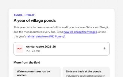
Links that say where they go
Links whose words say where they go: in text, to another site, to a download, and "Read more" made specific.
-
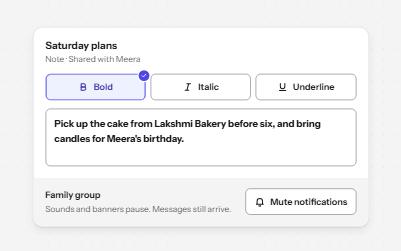
Toggle button
Buttons that stay on or off, like Bold or Mute, with aria-pressed reporting the state while the label stays the same.
-
Copy to clipboard
A button that copies a command, key or link, confirms it on the button and in a status message, and says what to do if it fails.
-
Image alternatives
Four kinds of image with the alt text each needs, what a screen reader says when it is wrong, and a decision tree.