Accessibility pattern · Disclosure and content
Accordion
Each section is a heading with a button in it; the button says whether its panel is open. Collapsed panels use hidden="until-found", so find-in-page still reaches the text inside and opens the section.
- WCAG criteria
- 5
- Keyboard rules
- 4
- Checked with
- axe, keyboard and the inspector
Live demo
Try it
Use it with a mouse, a keyboard or a screen reader. The inspector beside it shows what the browser tells assistive technology as you go: focus, state changes and announcements.
Orders ship within two working days. Delivery takes three to five days, and you get a tracking link by email.
Return anything unused within 30 days. Print the label from your order page and drop the parcel at any post office.
Every product carries a two-year warranty against defects. Keep your order email; it is your proof of purchase.
Pay by card, UPI or net banking. Nothing is charged until your order ships.
The demo works without JavaScript only as far as its HTML does; the inspector needs JavaScript.
Keyboard
Keys it answers to
Every action works without a pointer.
| Key | What it does |
|---|---|
| Enter or Space | Opens or closes the section whose heading has focus. |
| Tab | Moves to the next heading, or into an open panel's links and fields. |
| Arrow Down or Arrow Up | Moves to the next or previous heading, wrapping at the ends. |
| Home or End | Moves to the first or last heading. |
Screen readers
What it announces
Written from the roles, names and states in the markup.
| When | Expected announcement |
|---|---|
| Focus reaches a closed heading | Returns, button, collapsed, heading level 3 |
| Enter opens it | Expanded |
| Tab moves into the open panel | Returns, region |
| Find-in-page matches text in a closed panel | The panel opens and its heading reports expanded |
These are expected announcements, not recordings. Wording and order differ between screen readers and browsers.
Code
Copy the code
The exact files this demo runs on. The styles are served with a prefix that keeps this site's own styles out of the demo; what you copy is the original.
<div class="ap-accordion" data-ap-accordion>
  <h3 class="ap-accordion__head">
    <button type="button" class="ap-accordion__trigger" id="acc-trigger-1" aria-expanded="true" aria-controls="acc-panel-1">
      <span class="ap-accordion__label">Shipping</span>
      <svg class="ap-accordion__icon" viewBox="0 0 24 24" aria-hidden="true" focusable="false"><path d="m6 9 6 6 6-6"/></svg>
    </button>
  </h3>
  <div class="ap-accordion__panel" id="acc-panel-1" role="region" aria-labelledby="acc-trigger-1">
    <p>Orders ship within two working days. Delivery takes three to five days, and you get a tracking link by email.</p>
  </div>

  <h3 class="ap-accordion__head">
    <button type="button" class="ap-accordion__trigger" id="acc-trigger-2" aria-expanded="false" aria-controls="acc-panel-2">
      <span class="ap-accordion__label">Returns</span>
      <svg class="ap-accordion__icon" viewBox="0 0 24 24" aria-hidden="true" focusable="false"><path d="m6 9 6 6 6-6"/></svg>
    </button>
  </h3>
  <div class="ap-accordion__panel" id="acc-panel-2" role="region" aria-labelledby="acc-trigger-2" hidden="until-found">
    <p>Return anything unused within 30 days. Print the label from your order page and drop the parcel at any post office.</p>
  </div>

  <h3 class="ap-accordion__head">
    <button type="button" class="ap-accordion__trigger" id="acc-trigger-3" aria-expanded="false" aria-controls="acc-panel-3">
      <span class="ap-accordion__label">Warranty</span>
      <svg class="ap-accordion__icon" viewBox="0 0 24 24" aria-hidden="true" focusable="false"><path d="m6 9 6 6 6-6"/></svg>
    </button>
  </h3>
  <div class="ap-accordion__panel" id="acc-panel-3" role="region" aria-labelledby="acc-trigger-3" hidden="until-found">
    <p>Every product carries a two-year warranty against defects. Keep your order email; it is your proof of purchase.</p>
  </div>

  <h3 class="ap-accordion__head">
    <button type="button" class="ap-accordion__trigger" id="acc-trigger-4" aria-expanded="false" aria-controls="acc-panel-4">
      <span class="ap-accordion__label">Payment</span>
      <svg class="ap-accordion__icon" viewBox="0 0 24 24" aria-hidden="true" focusable="false"><path d="m6 9 6 6 6-6"/></svg>
    </button>
  </h3>
  <div class="ap-accordion__panel" id="acc-panel-4" role="region" aria-labelledby="acc-trigger-4" hidden="until-found">
    <p>Pay by card, UPI or net banking. Nothing is charged until your order ships.</p>
  </div>
</div>
/* Accordion. Uses the --ap-* design tokens. */
.ap-accordion {
  width: min(100%, 560px);
  margin-inline: auto;
  border: 1px solid var(--ap-border);
  border-radius: var(--ap-radius-lg);
  background: var(--ap-surface);
  box-shadow: var(--ap-shadow-md);
  overflow: hidden;
}

.ap-accordion__head {
  margin: 0;
  font-size: 1rem;
  font-weight: 600;
  line-height: 1.4;
}
.ap-accordion__head + .ap-accordion__panel + .ap-accordion__head,
.ap-accordion__head:not(:first-child) {
  border-top: 1px solid var(--ap-border);
}

.ap-accordion__trigger {
  display: flex;
  align-items: center;
  justify-content: space-between;
  gap: 16px;
  width: 100%;
  min-height: var(--ap-target);
  padding: 16px 20px;
  border: 0;
  background: transparent;
  color: var(--ap-text);
  font: inherit;
  text-align: start;
  cursor: pointer;
  transition: background-color var(--ap-duration) var(--ap-ease);
}
.ap-accordion__trigger:hover {
  background: var(--ap-surface-2);
}
.ap-accordion__trigger:focus-visible {
  outline: 2px solid var(--ap-focus);
  outline-offset: -4px;
  border-radius: calc(var(--ap-radius-lg) - 4px);
}

.ap-accordion__icon {
  flex-shrink: 0;
  width: 20px;
  height: 20px;
  fill: none;
  stroke: var(--ap-text-3);
  stroke-width: 2;
  stroke-linecap: round;
  stroke-linejoin: round;
  transition: transform var(--ap-duration) var(--ap-ease);
}
.ap-accordion__trigger[aria-expanded="true"] .ap-accordion__icon {
  transform: rotate(180deg);
  stroke: var(--ap-accent-text);
}

.ap-accordion__panel {
  padding: 0 20px 20px;
  color: var(--ap-text-2);
  line-height: 1.6;
}
.ap-accordion__panel:not([hidden]) {
  animation: ap-accordion-in 200ms var(--ap-ease);
}
.ap-accordion__panel p {
  margin: 0;
}

@keyframes ap-accordion-in {
  from { opacity: 0; transform: translateY(-4px); }
}

@media (prefers-reduced-motion: reduce) {
  .ap-accordion__icon,
  .ap-accordion__trigger { transition: none; }
  .ap-accordion__panel:not([hidden]) { animation: none; }
}

/* A global reset such as [hidden] { display: none !important } turns
   until-found back into plain hidden. Keep collapsed panels searchable. */
.ap-accordion__panel[hidden="until-found" i] {
  display: block !important;
  content-visibility: hidden !important;
}
/**
 * Accordion: headings with buttons that show or hide their panels.
 *
 * Markup: [data-ap-accordion] holding pairs of
 *   h3 > button[aria-expanded][aria-controls]  and  div#panel[hidden="until-found"]
 * Add data-multiple to the root to let several sections stay open.
 */

export function init(root) {
  const triggers = [...root.querySelectorAll(".ap-accordion__trigger")];
  const panelOf = (button) => document.getElementById(button.getAttribute("aria-controls"));

  function setOpen(button, open) {
    button.setAttribute("aria-expanded", String(open));
    const panel = panelOf(button);
    if (open) panel.removeAttribute("hidden");
    else panel.setAttribute("hidden", "until-found");
  }

  function toggle(button) {
    const open = button.getAttribute("aria-expanded") !== "true";
    if (open && !root.hasAttribute("data-multiple")) {
      for (const other of triggers) if (other !== button) setOpen(other, false);
    }
    setOpen(button, open);
  }

  function onClick(event) {
    const button = event.target.closest(".ap-accordion__trigger");
    if (button && root.contains(button)) toggle(button);
  }

  function onKeydown(event) {
    const at = triggers.indexOf(document.activeElement);
    if (at === -1) return;
    let next = null;
    if (event.key === "ArrowDown") next = triggers[(at + 1) % triggers.length];
    else if (event.key === "ArrowUp") next = triggers[(at - 1 + triggers.length) % triggers.length];
    else if (event.key === "Home") next = triggers[0];
    else if (event.key === "End") next = triggers[triggers.length - 1];
    if (next) {
      event.preventDefault();
      next.focus();
    }
  }

  // Find-in-page found text in a collapsed panel: the browser reveals it,
  // and the heading has to say so too.
  function onBeforeMatch(event) {
    const button = triggers.find((b) => panelOf(b) === event.target);
    if (button) {
      if (!root.hasAttribute("data-multiple")) {
        for (const other of triggers) if (other !== button) setOpen(other, false);
      }
      button.setAttribute("aria-expanded", "true");
    }
  }

  root.addEventListener("click", onClick);
  root.addEventListener("keydown", onKeydown);
  root.addEventListener("beforematch", onBeforeMatch);
  return () => {
    root.removeEventListener("click", onClick);
    root.removeEventListener("keydown", onKeydown);
    root.removeEventListener("beforematch", onBeforeMatch);
  };
}

for (const root of document.querySelectorAll("[data-ap-accordion]")) init(root);
/* Design tokens for the pattern components. Light by default, dark when the
   system asks for it; set data-theme="dark" on :root to force dark. */
:root {
    --ap-radius-sm: 8px;
    --ap-radius: 12px;
    --ap-radius-lg: 16px;
    --ap-radius-full: 999px;
    --ap-font: "Instrument Sans", ui-sans-serif, system-ui, -apple-system, "Segoe UI", Roboto, sans-serif;
    --ap-mono: "JetBrains Mono", ui-monospace, "Cascadia Mono", "SF Mono", Consolas, monospace;
    --ap-ease: cubic-bezier(.2, .8, .2, 1);
    --ap-duration: 180ms;
    --ap-target: 44px;
    --ap-bg: #F4F4F5;
    --ap-surface: #FFFFFF;
    --ap-surface-2: #F4F4F5;
    --ap-surface-3: #E4E4E7;
    --ap-border: #E4E4E7;
    --ap-border-strong: #76767F;
    --ap-text: #18181B;
    --ap-text-2: #3F3F46;
    --ap-text-3: #5E5E66;
    --ap-accent: #4F46E5;
    --ap-accent-hover: #4338CA;
    --ap-on-accent: #FFFFFF;
    --ap-accent-text: #4338CA;
    --ap-accent-soft: #EEF2FF;
    --ap-accent-soft-text: #3730A3;
    --ap-focus: #4F46E5;
    --ap-danger: #B91C1C;
    --ap-danger-soft: #FEF2F2;
    --ap-success: #15803D;
    --ap-success-soft: #F0FDF4;
    --ap-warning: #A15C07;
    --ap-warning-soft: #FEFCE8;
    --ap-info: #1D4ED8;
    --ap-info-soft: #EFF6FF;
    --ap-scrim: rgb(9 9 11 / .48);
    --ap-shadow-sm: 0 1px 2px rgb(9 9 11 / .06);
    --ap-shadow-md: 0 1px 2px rgb(9 9 11 / .05), 0 6px 16px -4px rgb(9 9 11 / .1);
    --ap-shadow-lg: 0 2px 6px rgb(9 9 11 / .06), 0 20px 40px -12px rgb(9 9 11 / .22);
    --ap-light-bg: #F4F4F5;
    --ap-light-surface: #FFFFFF;
    --ap-light-surface-2: #F4F4F5;
    --ap-light-surface-3: #E4E4E7;
    --ap-light-border: #E4E4E7;
    --ap-light-border-strong: #76767F;
    --ap-light-text: #18181B;
    --ap-light-text-2: #3F3F46;
    --ap-light-text-3: #5E5E66;
    --ap-light-accent: #4F46E5;
    --ap-light-accent-hover: #4338CA;
    --ap-light-on-accent: #FFFFFF;
    --ap-light-accent-text: #4338CA;
    --ap-light-accent-soft: #EEF2FF;
    --ap-light-accent-soft-text: #3730A3;
    --ap-light-focus: #4F46E5;
    --ap-light-danger: #B91C1C;
    --ap-light-danger-soft: #FEF2F2;
    --ap-light-success: #15803D;
    --ap-light-success-soft: #F0FDF4;
    --ap-light-warning: #A15C07;
    --ap-light-warning-soft: #FEFCE8;
    --ap-light-info: #1D4ED8;
    --ap-light-info-soft: #EFF6FF;
    --ap-light-scrim: rgb(9 9 11 / .48);
    --ap-light-shadow-sm: 0 1px 2px rgb(9 9 11 / .06);
    --ap-light-shadow-md: 0 1px 2px rgb(9 9 11 / .05), 0 6px 16px -4px rgb(9 9 11 / .1);
    --ap-light-shadow-lg: 0 2px 6px rgb(9 9 11 / .06), 0 20px 40px -12px rgb(9 9 11 / .22);
    --ap-dark-bg: #09090B;
    --ap-dark-surface: #18181B;
    --ap-dark-surface-2: #27272A;
    --ap-dark-surface-3: #3F3F46;
    --ap-dark-border: #2E2E33;
    --ap-dark-border-strong: #8E8E97;
    --ap-dark-text: #FAFAFA;
    --ap-dark-text-2: #D4D4D8;
    --ap-dark-text-3: #A1A1AA;
    --ap-dark-accent: #818CF8;
    --ap-dark-accent-hover: #A5B4FC;
    --ap-dark-on-accent: #0C0A1F;
    --ap-dark-accent-text: #A5B4FC;
    --ap-dark-accent-soft: #1E1B4B;
    --ap-dark-accent-soft-text: #C7D2FE;
    --ap-dark-focus: #A5B4FC;
    --ap-dark-danger: #F87171;
    --ap-dark-danger-soft: #2A1215;
    --ap-dark-success: #4ADE80;
    --ap-dark-success-soft: #0F2A1A;
    --ap-dark-warning: #FACC15;
    --ap-dark-warning-soft: #2A2410;
    --ap-dark-info: #60A5FA;
    --ap-dark-info-soft: #0F1D33;
    --ap-dark-scrim: rgb(0 0 0 / .62);
    --ap-dark-shadow-sm: 0 1px 2px rgb(0 0 0 / .4);
    --ap-dark-shadow-md: 0 1px 2px rgb(0 0 0 / .4), 0 8px 20px -6px rgb(0 0 0 / .5);
    --ap-dark-shadow-lg: 0 2px 8px rgb(0 0 0 / .45), 0 24px 48px -12px rgb(0 0 0 / .7);
}
@media (prefers-color-scheme: dark) {
  :root:not([data-theme="light"]) {
      --ap-bg: #09090B;
      --ap-surface: #18181B;
      --ap-surface-2: #27272A;
      --ap-surface-3: #3F3F46;
      --ap-border: #2E2E33;
      --ap-border-strong: #8E8E97;
      --ap-text: #FAFAFA;
      --ap-text-2: #D4D4D8;
      --ap-text-3: #A1A1AA;
      --ap-accent: #818CF8;
      --ap-accent-hover: #A5B4FC;
      --ap-on-accent: #0C0A1F;
      --ap-accent-text: #A5B4FC;
      --ap-accent-soft: #1E1B4B;
      --ap-accent-soft-text: #C7D2FE;
      --ap-focus: #A5B4FC;
      --ap-danger: #F87171;
      --ap-danger-soft: #2A1215;
      --ap-success: #4ADE80;
      --ap-success-soft: #0F2A1A;
      --ap-warning: #FACC15;
      --ap-warning-soft: #2A2410;
      --ap-info: #60A5FA;
      --ap-info-soft: #0F1D33;
      --ap-scrim: rgb(0 0 0 / .62);
      --ap-shadow-sm: 0 1px 2px rgb(0 0 0 / .4);
      --ap-shadow-md: 0 1px 2px rgb(0 0 0 / .4), 0 8px 20px -6px rgb(0 0 0 / .5);
      --ap-shadow-lg: 0 2px 8px rgb(0 0 0 / .45), 0 24px 48px -12px rgb(0 0 0 / .7);
  }
}
:root[data-theme="dark"] {
    --ap-bg: #09090B;
    --ap-surface: #18181B;
    --ap-surface-2: #27272A;
    --ap-surface-3: #3F3F46;
    --ap-border: #2E2E33;
    --ap-border-strong: #8E8E97;
    --ap-text: #FAFAFA;
    --ap-text-2: #D4D4D8;
    --ap-text-3: #A1A1AA;
    --ap-accent: #818CF8;
    --ap-accent-hover: #A5B4FC;
    --ap-on-accent: #0C0A1F;
    --ap-accent-text: #A5B4FC;
    --ap-accent-soft: #1E1B4B;
    --ap-accent-soft-text: #C7D2FE;
    --ap-focus: #A5B4FC;
    --ap-danger: #F87171;
    --ap-danger-soft: #2A1215;
    --ap-success: #4ADE80;
    --ap-success-soft: #0F2A1A;
    --ap-warning: #FACC15;
    --ap-warning-soft: #2A2410;
    --ap-info: #60A5FA;
    --ap-info-soft: #0F1D33;
    --ap-scrim: rgb(0 0 0 / .62);
    --ap-shadow-sm: 0 1px 2px rgb(0 0 0 / .4);
    --ap-shadow-md: 0 1px 2px rgb(0 0 0 / .4), 0 8px 20px -6px rgb(0 0 0 / .5);
    --ap-shadow-lg: 0 2px 8px rgb(0 0 0 / .45), 0 24px 48px -12px rgb(0 0 0 / .7);
}
WCAG 2.2
What it meets
The success criteria this pattern takes care of, and how.
-
1.3.1 Info and Relationships
Level A
Each section header is a real heading, so the accordion shows up in a screen reader's list of headings.
-
2.1.1 Keyboard
Level A
Every section opens and closes with Enter or Space; the arrow keys are a shortcut, not the only way.
-
2.4.3 Focus Order
Level A
Focus stays on the heading that was used, and Tab reaches an open panel's content straight after it.
-
2.4.7 Focus Visible
Level AA
Each heading button shows a two-pixel focus ring that clears 3:1 against the surface.
-
4.1.2 Name, Role, Value
Level A
The button carries aria-expanded and aria-controls, so its name, role and open state are exposed.
Usage
When to use it
Use it
- Several sections people scan before reading one, like product details or settings groups.
- Long pages on small screens, where showing every section at once means endless scrolling.
Use something else
- Content most people need to read in full: hiding it adds a click for everyone.
- Switching between views of the same thing: tabs say that better.
- A single show-or-hide section: use the simpler disclosure pattern.
Common failures
How it usually goes wrong
A clickable div instead of a button
A div with a click handler cannot be reached with Tab and says nothing about being expandable. A button inside the heading gives both for free.
No open or closed state
Without aria-expanded a screen reader user cannot tell whether pressing the heading did anything, or which sections are open.
Headings replaced by the buttons
Putting role=button on the heading itself removes it from the headings list, which is how many people move around a page.
Collapsed text that cannot be found
Panels hidden with display: none disappear from find-in-page. hidden="until-found" keeps them searchable and opens the section on a match.
Only the chevron is clickable
A tiny icon target fails people with tremors. The whole heading row is the button here, at least 44 pixels high.
Animation with no way to turn it off
Sliding panels can trigger nausea. The motion here is short and stops when the system asks for reduced motion.
Notes
Building it
- Use the heading level that fits where the accordion sits in your page; the demo uses h3 because it sits under an h2.
- role=region on each panel helps when there are a few sections; with more than about six, leave it off, because a page full of regions is noise.
- hidden="until-found" works in Chromium browsers. Elsewhere the attribute still hides the panel, and the beforematch event simply never fires.
- A global reset such as [hidden] { display: none !important } also hides until-found panels from find-in-page; the stylesheet restores them for the panel class.
- The option above switches between one section at a time and several at once; both are valid, so pick the one your content needs.
Sources: WAI-ARIA Authoring Practices: Accordion · HTML: the hidden attribute
Checked with axe in light and dark themes, at desktop and phone widths, and by keyboard. Not yet tested with every screen reader and browser pair. Report a correction
Related
Patterns that go with it
-
Show more
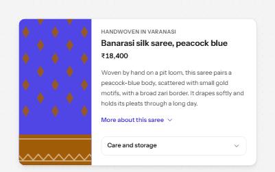
A button that reveals the rest of a long text in place, with the hidden part still reachable by find-in-page.
-
FAQ
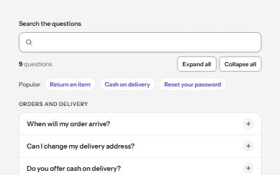
Questions grouped by topic that open their answers, with live search, expand all, and links that open any question.
-
Tabs
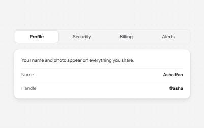
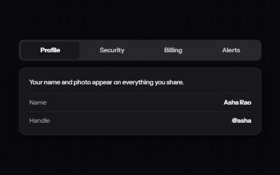
Several panels in one place, one shown at a time, chosen from a row of tabs.
-
Vertical tabs
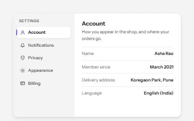
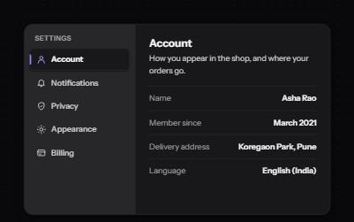
Tabs stacked in a side rail, like a settings page, moved through with the Up and Down arrow keys.