Accessibility pattern · Disclosure and content
Show more
A real button with aria-expanded shows or hides the rest of the text, and focus stays on the button. The hidden part comes straight after the button and uses hidden="until-found", so find-in-page still reaches every word.
- WCAG criteria
- 6
- Keyboard rules
- 2
- Checked with
- axe, keyboard and the inspector
Live demo
Try it
Use it with a mouse, a keyboard or a screen reader. The inspector beside it shows what the browser tells assistive technology as you go: focus, state changes and announcements.
Handwoven in Varanasi
Banarasi silk saree, peacock blue
₹18,400
Woven by hand on a pit loom, this saree pairs a peacock-blue body, scattered with small gold motifs, with a broad zari border. It drapes softly and holds its pleats through a long day.
Each saree takes one weaver about three weeks. Small changes in the weave are the mark of a handloom, not flaws.
- Fabric
- Katan silk with zari
- Length
- 5.5 m, with a 0.8 m blouse piece
- Weight
- About 650 g
Care and storage
Dry clean only. Store it folded in muslin, away from damp, and refold it along new lines every few months so the zari does not crack.
The demo works without JavaScript only as far as its HTML does; the inspector needs JavaScript.
Keyboard
Keys it answers to
Every action works without a pointer.
| Key | What it does |
|---|---|
| Tab | Moves from More about this saree to Care and storage; a link in the revealed text would come in between. |
| Enter or Space | Shows or hides the text the focused button or summary controls; focus stays where it is. |
Screen readers
What it announces
Written from the roles, names and states in the markup.
| When | Expected announcement |
|---|---|
| Focus reaches the button | More about this saree, button, collapsed |
| Enter shows the rest | Expanded |
| Reading on from the button | Each saree takes one weaver about three weeks… |
| Focus reaches the details summary | Care and storage, button, collapsed |
| Find-in-page matches hidden text | The text is revealed and the button reports expanded |
These are expected announcements, not recordings. Wording and order differ between screen readers and browsers.
Code
Copy the code
The exact files this demo runs on. The styles are served with a prefix that keeps this site's own styles out of the demo; what you copy is the original.
<div class="ap-disclosure" data-ap-disclosure>
  <div class="ap-disclosure__layout">
    <div class="ap-disclosure__swatch" aria-hidden="true">
      <svg viewBox="0 0 200 200" preserveAspectRatio="xMidYMax slice" focusable="false">
        <defs>
          <pattern id="disc-butti" width="40" height="36" patternUnits="userSpaceOnUse">
            <path class="ap-disclosure__butti" d="M20 10l5 8-5 8-5-8ZM0-8l5 8-5 8-5-8ZM40-8l5 8-5 8-5-8ZM0 28l5 8-5 8-5-8ZM40 28l5 8-5 8-5-8Z"/>
          </pattern>
          <pattern id="disc-zari" width="14" height="42" patternUnits="userSpaceOnUse">
            <path class="ap-disclosure__zari-line" d="M0 25l7-8 7 8"/>
          </pattern>
        </defs>
        <rect class="ap-disclosure__silk" width="200" height="200"/>
        <rect width="200" height="136" fill="url(#disc-butti)"/>
        <rect class="ap-disclosure__zari" y="158" width="200" height="42"/>
        <rect y="158" width="200" height="42" fill="url(#disc-zari)"/>
        <path class="ap-disclosure__zari-line" d="M0 164h200M0 194h200"/>
      </svg>
    </div>

    <div class="ap-disclosure__body">
      <p class="ap-disclosure__kicker">Handwoven in Varanasi</p>
      <h3 class="ap-disclosure__name">Banarasi silk saree, peacock blue</h3>
      <p class="ap-disclosure__price">₹18,400</p>

      <p class="ap-disclosure__intro">Woven by hand on a pit loom, this saree pairs a peacock-blue body, scattered with small gold motifs, with a broad zari border. It drapes softly and holds its pleats through a long day.</p>
      <button type="button" class="ap-disclosure__toggle" aria-expanded="false" aria-controls="disc-more">
        <span>More about this saree</span>
        <svg class="ap-disclosure__chev" viewBox="0 0 24 24" aria-hidden="true" focusable="false"><path d="m6 9 6 6 6-6"/></svg>
      </button>
      <div class="ap-disclosure__more" id="disc-more" hidden="until-found">
        <div class="ap-disclosure__more-in">
          <p>Each saree takes one weaver about three weeks. Small changes in the weave are the mark of a handloom, not flaws.</p>
          <dl class="ap-disclosure__facts">
            <div><dt>Fabric</dt><dd>Katan silk with zari</dd></div>
            <div><dt>Length</dt><dd>5.5 m, with a 0.8 m blouse piece</dd></div>
            <div><dt>Weight</dt><dd>About 650 g</dd></div>
          </dl>
        </div>
      </div>

      <details class="ap-disclosure__details">
        <summary class="ap-disclosure__summary">
          <span>Care and storage</span>
          <svg class="ap-disclosure__chev" viewBox="0 0 24 24" aria-hidden="true" focusable="false"><path d="m6 9 6 6 6-6"/></svg>
        </summary>
        <div class="ap-disclosure__details-in">
          <p>Dry clean only. Store it folded in muslin, away from damp, and refold it along new lines every few months so the zari does not crack.</p>
        </div>
      </details>
    </div>
  </div>
</div>
/* Show more (disclosure). Uses the --ap-* design tokens. */
.ap-disclosure {
  container-type: inline-size;
  width: min(100%, 640px);
  margin-inline: auto;
  border: 1px solid var(--ap-border);
  border-radius: var(--ap-radius-lg);
  background: var(--ap-surface);
  color: var(--ap-text);
  box-shadow: var(--ap-shadow-md);
  overflow: hidden;
}

.ap-disclosure__layout {
  display: grid;
  grid-template-columns: minmax(0, 1fr);
}

/* The fabric swatch is decoration: aria-hidden, drawn with SVG. A band on
   top in a narrow card, a full-height strip beside the text in a wide one. */
.ap-disclosure__swatch {
  height: 104px;
  background: var(--ap-accent);
}
@container (min-width: 540px) {
  .ap-disclosure__layout {
    grid-template-columns: 176px minmax(0, 1fr);
  }
  .ap-disclosure__swatch {
    height: auto;
  }
}
.ap-disclosure__swatch svg {
  display: block;
  width: 100%;
  height: 100%;
}
.ap-disclosure__silk { fill: var(--ap-accent); }
.ap-disclosure__butti {
  fill: var(--ap-warning);
  opacity: .85;
}
.ap-disclosure__zari { fill: var(--ap-warning); }
.ap-disclosure__zari-line {
  fill: none;
  stroke: var(--ap-surface);
  stroke-width: 1.5;
  opacity: .55;
}

.ap-disclosure__body {
  display: grid;
  align-content: start;
  padding: 22px 24px 24px;
}
.ap-disclosure__kicker {
  margin: 0 0 4px;
  color: var(--ap-text-3);
  font-size: .8125rem;
  font-weight: 600;
  letter-spacing: .04em;
  text-transform: uppercase;
}
.ap-disclosure__name {
  margin: 0;
  font-size: 1.25rem;
  font-weight: 650;
  line-height: 1.3;
}
.ap-disclosure__price {
  margin: 6px 0 0;
  color: var(--ap-text);
  font-size: 1.0625rem;
  font-weight: 600;
  font-variant-numeric: tabular-nums;
}
.ap-disclosure__intro,
.ap-disclosure__more-in p,
.ap-disclosure__details-in p {
  margin: 0;
  color: var(--ap-text-2);
  line-height: 1.65;
}
.ap-disclosure__intro {
  margin-top: 16px;
}

/* The button sits between the summary and the rest, like a rule. */
.ap-disclosure__toggle {
  display: inline-flex;
  align-items: center;
  justify-self: start;
  gap: 6px;
  min-height: var(--ap-target);
  margin: 6px 0 0 -10px;
  padding: 0 10px;
  border: 0;
  border-radius: var(--ap-radius-sm);
  background: transparent;
  color: var(--ap-accent-text);
  font: inherit;
  font-weight: 600;
  cursor: pointer;
  transition: background-color var(--ap-duration) var(--ap-ease);
}
.ap-disclosure__toggle:hover {
  background: var(--ap-accent-soft);
  color: var(--ap-accent-soft-text);
}
.ap-disclosure__toggle:focus-visible {
  outline: 2px solid var(--ap-focus);
  outline-offset: 0;
}

.ap-disclosure__chev {
  flex-shrink: 0;
  width: 18px;
  height: 18px;
  fill: none;
  stroke: currentColor;
  stroke-width: 2;
  stroke-linecap: round;
  stroke-linejoin: round;
  transition: transform var(--ap-duration) var(--ap-ease);
}
.ap-disclosure__toggle[aria-expanded="true"] .ap-disclosure__chev,
.ap-disclosure__details[open] .ap-disclosure__chev {
  transform: rotate(180deg);
}

/* Many resets set [hidden] { display: none !important }, which makes
   until-found plain hidden again and find-in-page stops reaching the text.
   Keep the panel findable; it has no padding or border of its own, so it
   takes no space while collapsed. */
.ap-disclosure__more[hidden="until-found"] {
  display: block !important;
  content-visibility: hidden !important;
}
.ap-disclosure__more:not([hidden]) {
  animation: ap-disclosure-in 200ms var(--ap-ease);
}
.ap-disclosure__more-in {
  display: grid;
  gap: 14px;
  padding: 4px 0 2px;
}

.ap-disclosure__facts {
  display: grid;
  margin: 0;
  border-top: 1px solid var(--ap-border);
}
.ap-disclosure__facts div {
  display: flex;
  flex-wrap: wrap;
  justify-content: space-between;
  gap: 4px 16px;
  padding: 9px 0;
  border-bottom: 1px solid var(--ap-border);
}
.ap-disclosure__facts dt {
  color: var(--ap-text-3);
}
.ap-disclosure__facts dd {
  margin: 0;
  color: var(--ap-text);
  font-weight: 600;
  text-align: end;
}

/* The native version. */
.ap-disclosure__details {
  margin-top: 18px;
  border: 1px solid var(--ap-border);
  border-radius: var(--ap-radius);
  background: var(--ap-surface);
}
.ap-disclosure__summary {
  display: flex;
  align-items: center;
  justify-content: space-between;
  gap: 12px;
  min-height: var(--ap-target);
  padding: 10px 14px;
  border-radius: calc(var(--ap-radius) - 1px);
  color: var(--ap-text);
  font-weight: 600;
  list-style: none;
  cursor: pointer;
  transition: background-color var(--ap-duration) var(--ap-ease);
}
.ap-disclosure__summary::-webkit-details-marker {
  display: none;
}
.ap-disclosure__summary:hover {
  background: var(--ap-surface-2);
}
.ap-disclosure__summary:focus-visible {
  outline: 2px solid var(--ap-focus);
  outline-offset: 2px;
}
.ap-disclosure__summary .ap-disclosure__chev {
  color: var(--ap-text-3);
}
.ap-disclosure__details[open] .ap-disclosure__summary {
  border-bottom: 1px solid var(--ap-border);
  border-radius: calc(var(--ap-radius) - 1px) calc(var(--ap-radius) - 1px) 0 0;
}
.ap-disclosure__details-in {
  padding: 12px 14px 14px;
}
.ap-disclosure__details[open] .ap-disclosure__details-in {
  animation: ap-disclosure-in 200ms var(--ap-ease);
}

@keyframes ap-disclosure-in {
  from { opacity: 0; transform: translateY(-4px); }
}

@media (prefers-reduced-motion: reduce) {
  .ap-disclosure__toggle,
  .ap-disclosure__summary,
  .ap-disclosure__chev { transition: none; }
  .ap-disclosure__more:not([hidden]),
  .ap-disclosure__details[open] .ap-disclosure__details-in { animation: none; }
}
/**
 * Show more (disclosure): a button that shows or hides the text after it.
 *
 * Markup: [data-ap-disclosure] holding button[aria-expanded][aria-controls]
 * and the element it controls, div[hidden="until-found"]. The details
 * element beside it needs no script.
 */

export function init(root) {
  const buttons = [...root.querySelectorAll("button[aria-expanded][aria-controls]")];
  const panelOf = (button) => document.getElementById(button.getAttribute("aria-controls"));

  function setOpen(button, open) {
    button.setAttribute("aria-expanded", String(open));
    const panel = panelOf(button);
    if (open) panel.removeAttribute("hidden");
    else panel.setAttribute("hidden", "until-found");
  }

  // Focus stays on the button: people asked for more and read on from here.
  function onClick(event) {
    const button = event.target.closest("button[aria-expanded][aria-controls]");
    if (button && buttons.includes(button)) setOpen(button, button.getAttribute("aria-expanded") !== "true");
  }

  // Find-in-page matched hidden text: the browser reveals it, and the button
  // has to say so too.
  function onBeforeMatch(event) {
    const button = buttons.find((b) => panelOf(b) === event.target);
    if (button) button.setAttribute("aria-expanded", "true");
  }

  root.addEventListener("click", onClick);
  root.addEventListener("beforematch", onBeforeMatch);
  return () => {
    root.removeEventListener("click", onClick);
    root.removeEventListener("beforematch", onBeforeMatch);
  };
}

for (const root of document.querySelectorAll("[data-ap-disclosure]")) init(root);
/* Design tokens for the pattern components. Light by default, dark when the
   system asks for it; set data-theme="dark" on :root to force dark. */
:root {
    --ap-radius-sm: 8px;
    --ap-radius: 12px;
    --ap-radius-lg: 16px;
    --ap-radius-full: 999px;
    --ap-font: "Instrument Sans", ui-sans-serif, system-ui, -apple-system, "Segoe UI", Roboto, sans-serif;
    --ap-mono: "JetBrains Mono", ui-monospace, "Cascadia Mono", "SF Mono", Consolas, monospace;
    --ap-ease: cubic-bezier(.2, .8, .2, 1);
    --ap-duration: 180ms;
    --ap-target: 44px;
    --ap-bg: #F4F4F5;
    --ap-surface: #FFFFFF;
    --ap-surface-2: #F4F4F5;
    --ap-surface-3: #E4E4E7;
    --ap-border: #E4E4E7;
    --ap-border-strong: #76767F;
    --ap-text: #18181B;
    --ap-text-2: #3F3F46;
    --ap-text-3: #5E5E66;
    --ap-accent: #4F46E5;
    --ap-accent-hover: #4338CA;
    --ap-on-accent: #FFFFFF;
    --ap-accent-text: #4338CA;
    --ap-accent-soft: #EEF2FF;
    --ap-accent-soft-text: #3730A3;
    --ap-focus: #4F46E5;
    --ap-danger: #B91C1C;
    --ap-danger-soft: #FEF2F2;
    --ap-success: #15803D;
    --ap-success-soft: #F0FDF4;
    --ap-warning: #A15C07;
    --ap-warning-soft: #FEFCE8;
    --ap-info: #1D4ED8;
    --ap-info-soft: #EFF6FF;
    --ap-scrim: rgb(9 9 11 / .48);
    --ap-shadow-sm: 0 1px 2px rgb(9 9 11 / .06);
    --ap-shadow-md: 0 1px 2px rgb(9 9 11 / .05), 0 6px 16px -4px rgb(9 9 11 / .1);
    --ap-shadow-lg: 0 2px 6px rgb(9 9 11 / .06), 0 20px 40px -12px rgb(9 9 11 / .22);
    --ap-light-bg: #F4F4F5;
    --ap-light-surface: #FFFFFF;
    --ap-light-surface-2: #F4F4F5;
    --ap-light-surface-3: #E4E4E7;
    --ap-light-border: #E4E4E7;
    --ap-light-border-strong: #76767F;
    --ap-light-text: #18181B;
    --ap-light-text-2: #3F3F46;
    --ap-light-text-3: #5E5E66;
    --ap-light-accent: #4F46E5;
    --ap-light-accent-hover: #4338CA;
    --ap-light-on-accent: #FFFFFF;
    --ap-light-accent-text: #4338CA;
    --ap-light-accent-soft: #EEF2FF;
    --ap-light-accent-soft-text: #3730A3;
    --ap-light-focus: #4F46E5;
    --ap-light-danger: #B91C1C;
    --ap-light-danger-soft: #FEF2F2;
    --ap-light-success: #15803D;
    --ap-light-success-soft: #F0FDF4;
    --ap-light-warning: #A15C07;
    --ap-light-warning-soft: #FEFCE8;
    --ap-light-info: #1D4ED8;
    --ap-light-info-soft: #EFF6FF;
    --ap-light-scrim: rgb(9 9 11 / .48);
    --ap-light-shadow-sm: 0 1px 2px rgb(9 9 11 / .06);
    --ap-light-shadow-md: 0 1px 2px rgb(9 9 11 / .05), 0 6px 16px -4px rgb(9 9 11 / .1);
    --ap-light-shadow-lg: 0 2px 6px rgb(9 9 11 / .06), 0 20px 40px -12px rgb(9 9 11 / .22);
    --ap-dark-bg: #09090B;
    --ap-dark-surface: #18181B;
    --ap-dark-surface-2: #27272A;
    --ap-dark-surface-3: #3F3F46;
    --ap-dark-border: #2E2E33;
    --ap-dark-border-strong: #8E8E97;
    --ap-dark-text: #FAFAFA;
    --ap-dark-text-2: #D4D4D8;
    --ap-dark-text-3: #A1A1AA;
    --ap-dark-accent: #818CF8;
    --ap-dark-accent-hover: #A5B4FC;
    --ap-dark-on-accent: #0C0A1F;
    --ap-dark-accent-text: #A5B4FC;
    --ap-dark-accent-soft: #1E1B4B;
    --ap-dark-accent-soft-text: #C7D2FE;
    --ap-dark-focus: #A5B4FC;
    --ap-dark-danger: #F87171;
    --ap-dark-danger-soft: #2A1215;
    --ap-dark-success: #4ADE80;
    --ap-dark-success-soft: #0F2A1A;
    --ap-dark-warning: #FACC15;
    --ap-dark-warning-soft: #2A2410;
    --ap-dark-info: #60A5FA;
    --ap-dark-info-soft: #0F1D33;
    --ap-dark-scrim: rgb(0 0 0 / .62);
    --ap-dark-shadow-sm: 0 1px 2px rgb(0 0 0 / .4);
    --ap-dark-shadow-md: 0 1px 2px rgb(0 0 0 / .4), 0 8px 20px -6px rgb(0 0 0 / .5);
    --ap-dark-shadow-lg: 0 2px 8px rgb(0 0 0 / .45), 0 24px 48px -12px rgb(0 0 0 / .7);
}
@media (prefers-color-scheme: dark) {
  :root:not([data-theme="light"]) {
      --ap-bg: #09090B;
      --ap-surface: #18181B;
      --ap-surface-2: #27272A;
      --ap-surface-3: #3F3F46;
      --ap-border: #2E2E33;
      --ap-border-strong: #8E8E97;
      --ap-text: #FAFAFA;
      --ap-text-2: #D4D4D8;
      --ap-text-3: #A1A1AA;
      --ap-accent: #818CF8;
      --ap-accent-hover: #A5B4FC;
      --ap-on-accent: #0C0A1F;
      --ap-accent-text: #A5B4FC;
      --ap-accent-soft: #1E1B4B;
      --ap-accent-soft-text: #C7D2FE;
      --ap-focus: #A5B4FC;
      --ap-danger: #F87171;
      --ap-danger-soft: #2A1215;
      --ap-success: #4ADE80;
      --ap-success-soft: #0F2A1A;
      --ap-warning: #FACC15;
      --ap-warning-soft: #2A2410;
      --ap-info: #60A5FA;
      --ap-info-soft: #0F1D33;
      --ap-scrim: rgb(0 0 0 / .62);
      --ap-shadow-sm: 0 1px 2px rgb(0 0 0 / .4);
      --ap-shadow-md: 0 1px 2px rgb(0 0 0 / .4), 0 8px 20px -6px rgb(0 0 0 / .5);
      --ap-shadow-lg: 0 2px 8px rgb(0 0 0 / .45), 0 24px 48px -12px rgb(0 0 0 / .7);
  }
}
:root[data-theme="dark"] {
    --ap-bg: #09090B;
    --ap-surface: #18181B;
    --ap-surface-2: #27272A;
    --ap-surface-3: #3F3F46;
    --ap-border: #2E2E33;
    --ap-border-strong: #8E8E97;
    --ap-text: #FAFAFA;
    --ap-text-2: #D4D4D8;
    --ap-text-3: #A1A1AA;
    --ap-accent: #818CF8;
    --ap-accent-hover: #A5B4FC;
    --ap-on-accent: #0C0A1F;
    --ap-accent-text: #A5B4FC;
    --ap-accent-soft: #1E1B4B;
    --ap-accent-soft-text: #C7D2FE;
    --ap-focus: #A5B4FC;
    --ap-danger: #F87171;
    --ap-danger-soft: #2A1215;
    --ap-success: #4ADE80;
    --ap-success-soft: #0F2A1A;
    --ap-warning: #FACC15;
    --ap-warning-soft: #2A2410;
    --ap-info: #60A5FA;
    --ap-info-soft: #0F1D33;
    --ap-scrim: rgb(0 0 0 / .62);
    --ap-shadow-sm: 0 1px 2px rgb(0 0 0 / .4);
    --ap-shadow-md: 0 1px 2px rgb(0 0 0 / .4), 0 8px 20px -6px rgb(0 0 0 / .5);
    --ap-shadow-lg: 0 2px 8px rgb(0 0 0 / .45), 0 24px 48px -12px rgb(0 0 0 / .7);
}
WCAG 2.2
What it meets
The success criteria this pattern takes care of, and how.
-
1.3.2 Meaningful Sequence
Level A
The revealed text comes straight after the button in the source, so reading on from the button reaches it first.
-
2.1.1 Keyboard
Level A
Both versions open and close with Enter or Space; nothing depends on a pointer.
-
2.4.3 Focus Order
Level A
Focus stays on the button when the text opens, and the next Tab goes into what was revealed.
-
2.4.7 Focus Visible
Level AA
The button and the summary show a two-pixel focus ring that clears 3:1 against the card.
-
2.5.8 Target Size (Minimum)
Level AA
The button and the summary row are at least 44 pixels high, well over the 24-pixel minimum.
-
4.1.2 Name, Role, Value
Level A
aria-expanded on the button, and the open state of details, are exposed, so the state is announced as it changes.
Usage
When to use it
Use it
- Long descriptions where most people need the first paragraph and some want the rest.
- Secondary detail on a busy page: specifications, care instructions, terms.
Use something else
- Text people need in order to decide or stay safe, like fees or warnings: show it.
- Several related sections people scan: an accordion groups them.
- Long lists of items: use pagination or a feed with Load more.
Common failures
How it usually goes wrong
Clamped with CSS alone
line-clamp hides lines on screen, but a screen reader still reads every word, so the button promises something it does not do. Here the rest is hidden for everyone until asked for.
A link that goes nowhere
An a href="#" announces a link, jumps to the top of the page when the script fails and has no expanded state. A button is the right element.
Text added above the button
If the new text appears before the button, a screen reader user who pressed it has to go back to find it. Here it follows the button.
A label that says the state twice
Swapping Show more for Show less while also setting aria-expanded gives "Show less, expanded". The name here describes the content and never changes.
A sentence cut in half
Splitting a sentence around the button leaves two fragments that make sense to nobody. Cut at the end of a paragraph.
Hidden text find-in-page cannot reach
Text hidden with display: none is invisible to Ctrl+F. hidden="until-found" and details both let the browser find the text and open it.
Notes
Building it
- Use details and summary when the disclosure needs no script; use a button with aria-expanded when the trigger must sit apart from the content or be styled freely.
- Many CSS resets set [hidden] { display: none !important }, which turns until-found back into plain hidden. The stylesheet restores display and content-visibility for the panel.
- beforematch fires just before the browser reveals the text; the script uses it to set aria-expanded, so the button tells the truth.
- hidden="until-found" and opening details on a find-in-page match work in Chromium browsers; elsewhere the text simply stays hidden until the button is used.
- Don't move focus into the revealed text: people asked for more and will read on from where they are.
Sources: WAI-ARIA Authoring Practices: Disclosure · HTML: the details element · HTML: the hidden attribute
Checked with axe in light and dark themes, at desktop and phone widths, and by keyboard. Not yet tested with every screen reader and browser pair. Report a correction
Related
Patterns that go with it
-
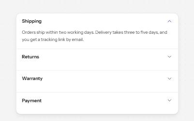
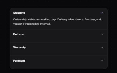
Accordion
Stacked headings that each show or hide a panel, so a long page reads as a short list.
-
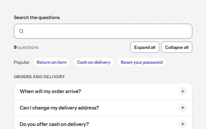
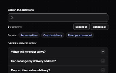
FAQ
Questions grouped by topic that open their answers, with live search, expand all, and links that open any question.
-
Toggletip
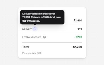
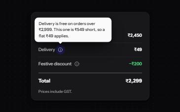
An info button that shows a short note when pressed and has it announced, for help that a label cannot hold.
-
Feed with load more
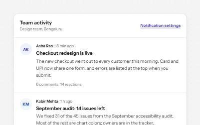
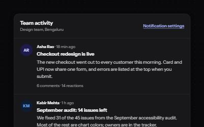
A stream of posts people read in order, with keys to move post by post, a Load more button and new posts that wait.