Accessibility pattern · Disclosure and content
Callout
Each callout starts with a word, Note, Tip, Warning, Success or Danger, so its meaning never rests on its color or its icon. They are static text, so nothing is announced on load; the one that can be dismissed hands focus to the next callout when it goes.
- WCAG criteria
- 7
- Keyboard rules
- 2
- Checked with
- axe, keyboard and the inspector
Live demo
Try it
Use it with a mouse, a keyboard or a screen reader. The inspector beside it shows what the browser tells assistive technology as you go: focus, state changes and announcements.
Connect your own domain
Point your domain at your store in a few minutes. Read these before you change any settings.
The demo works without JavaScript only as far as its HTML does; the inspector needs JavaScript.
Keyboard
Keys it answers to
Every action works without a pointer.
| Key | What it does |
|---|---|
| Tab | Reaches the tip's dismiss button; the callouts themselves are text and take no tab stop. |
| Enter or Space | Dismisses the tip and moves focus to the callout that takes its place. |
Screen readers
What it announces
Written from the roles, names and states in the markup.
| When | Expected announcement |
|---|---|
| Reading reaches a callout | Warning: Changing nameservers moves your email too. Copy your mail records across… |
| Focus reaches the dismiss button | Dismiss tip, button |
| The tip is dismissed | Warning: Changing nameservers moves your email too… (focus is on the next callout), then Tip dismissed |
| The page loads | Nothing: static callouts are read in order, never announced |
These are expected announcements, not recordings. Wording and order differ between screen readers and browsers.
Code
Copy the code
The exact files this demo runs on. The styles are served with a prefix that keeps this site's own styles out of the demo; what you copy is the original.
<div class="ap-callout" data-ap-callout>
  <h3 class="ap-callout__intro">Connect your own domain</h3>
  <p class="ap-callout__lead">Point your domain at your store in a few minutes. Read these before you change any settings.</p>

  <div class="ap-callout__stack">
    <aside class="ap-callout__item ap-callout__item--note" role="note">
      <svg class="ap-callout__icon" viewBox="0 0 24 24" aria-hidden="true" focusable="false"><circle cx="12" cy="12" r="9"/><path d="M12 11v5"/><path d="M12 7.5h.01"/></svg>
      <div class="ap-callout__body">
        <p class="ap-callout__label">Note:</p>
        <p class="ap-callout__text">DNS changes can take up to 48 hours to reach every network. Until then, some visitors may still reach your old site.</p>
      </div>
    </aside>

    <aside class="ap-callout__item ap-callout__item--tip" role="note">
      <svg class="ap-callout__icon" viewBox="0 0 24 24" aria-hidden="true" focusable="false"><path d="M9 18h6"/><path d="M10 21h4"/><path d="M12 3a6 6 0 0 0-3.6 10.8c.7.5 1.1 1.3 1.1 2.2h5c0-.9.4-1.7 1.1-2.2A6 6 0 0 0 12 3Z"/></svg>
      <div class="ap-callout__body">
        <p class="ap-callout__label">Tip:</p>
        <p class="ap-callout__text">Add both the www and the bare version of your domain. We send one to the other, so people reach your store whichever they type.</p>
      </div>
      <button type="button" class="ap-callout__dismiss" aria-label="Dismiss tip" data-ap-dismiss>
        <svg viewBox="0 0 24 24" aria-hidden="true" focusable="false"><path d="M6 6l12 12M18 6 6 18"/></svg>
      </button>
    </aside>

    <aside class="ap-callout__item ap-callout__item--warning" role="note">
      <svg class="ap-callout__icon" viewBox="0 0 24 24" aria-hidden="true" focusable="false"><path d="M10.3 3.9 1.8 18a2 2 0 0 0 1.7 3h17a2 2 0 0 0 1.7-3L13.7 3.9a2 2 0 0 0-3.4 0Z"/><path d="M12 9v4"/><path d="M12 17h.01"/></svg>
      <div class="ap-callout__body">
        <p class="ap-callout__label">Warning:</p>
        <p class="ap-callout__text">Changing nameservers moves your email too. Copy your mail records across before you switch, or messages will stop arriving.</p>
      </div>
    </aside>

    <aside class="ap-callout__item ap-callout__item--success" role="note">
      <svg class="ap-callout__icon" viewBox="0 0 24 24" aria-hidden="true" focusable="false"><circle cx="12" cy="12" r="9"/><path d="m8 12.5 2.7 2.7L16.2 9.6"/></svg>
      <div class="ap-callout__body">
        <p class="ap-callout__label">Success:</p>
        <p class="ap-callout__text">When the status reads Active, your domain is live and its security certificate is in place.</p>
      </div>
    </aside>

    <aside class="ap-callout__item ap-callout__item--danger" role="note">
      <svg class="ap-callout__icon" viewBox="0 0 24 24" aria-hidden="true" focusable="false"><path d="M7.9 2.5h8.2l5.4 5.4v8.2l-5.4 5.4H7.9l-5.4-5.4V7.9Z"/><path d="m15 9-6 6M9 9l6 6"/></svg>
      <div class="ap-callout__body">
        <p class="ap-callout__label">Danger:</p>
        <p class="ap-callout__text">Removing a domain takes your store offline at that address straight away. It cannot be undone.</p>
      </div>
    </aside>
  </div>

  <p class="ap-callout__sr" role="status"></p>
</div>
/* Callout. Uses the --ap-* design tokens. */
.ap-callout {
  width: min(100%, 600px);
  margin-inline: auto;
  padding: 24px 24px 26px;
  border: 1px solid var(--ap-border);
  border-radius: var(--ap-radius-lg);
  background: var(--ap-surface);
  color: var(--ap-text);
  box-shadow: var(--ap-shadow-md);
  container-type: inline-size;
}

.ap-callout__intro {
  margin: 0;
  font-size: 1.1875rem;
  font-weight: 650;
  line-height: 1.3;
}
.ap-callout__lead {
  margin: 6px 0 20px;
  color: var(--ap-text-3);
  line-height: 1.55;
}

.ap-callout__stack {
  display: grid;
  gap: 12px;
}

/* One callout. Each kind sets its tone; the label word and the icon carry
   the meaning, the tint and stripe repeat it. */
.ap-callout__item {
  --ap-callout-tone: var(--ap-info);
  --ap-callout-soft: var(--ap-info-soft);
  display: grid;
  grid-template-columns: auto minmax(0, 1fr) auto;
  align-items: start;
  column-gap: 12px;
  padding: 14px 14px 14px 18px;
  border: 1px solid var(--ap-border);
  border-radius: var(--ap-radius);
  background: var(--ap-callout-soft);
  box-shadow: inset 4px 0 0 var(--ap-callout-tone);
}
.ap-callout__item--tip {
  --ap-callout-tone: var(--ap-accent-text);
  --ap-callout-soft: var(--ap-accent-soft);
}
.ap-callout__item--warning {
  --ap-callout-tone: var(--ap-warning);
  --ap-callout-soft: var(--ap-warning-soft);
}
.ap-callout__item--success {
  --ap-callout-tone: var(--ap-success);
  --ap-callout-soft: var(--ap-success-soft);
}
.ap-callout__item--danger {
  --ap-callout-tone: var(--ap-danger);
  --ap-callout-soft: var(--ap-danger-soft);
}
/* Focus arrives here only from the script, after a dismiss. */
.ap-callout__item:focus {
  outline: none;
}
.ap-callout__item:focus-visible {
  outline: 2px solid var(--ap-focus);
  outline-offset: 2px;
}

.ap-callout__icon {
  width: 22px;
  height: 22px;
  margin-top: 1px;
  fill: none;
  stroke: var(--ap-callout-tone);
  stroke-width: 2;
  stroke-linecap: round;
  stroke-linejoin: round;
}

.ap-callout__body {
  display: grid;
  gap: 2px;
  min-width: 0;
}
.ap-callout__label {
  margin: 0;
  color: var(--ap-callout-tone);
  font-size: .9375rem;
  font-weight: 700;
  line-height: 1.5;
}
.ap-callout__text {
  margin: 0;
  color: var(--ap-text);
  line-height: 1.55;
}

.ap-callout__dismiss {
  display: grid;
  place-items: center;
  width: 32px;
  height: 32px;
  margin: -4px -4px 0 0;
  padding: 0;
  border: 0;
  border-radius: var(--ap-radius-sm);
  background: transparent;
  color: var(--ap-text-2);
  cursor: pointer;
  transition: background-color var(--ap-duration) var(--ap-ease), color var(--ap-duration) var(--ap-ease);
}
.ap-callout__dismiss:hover {
  background: var(--ap-surface);
  color: var(--ap-text);
}
.ap-callout__dismiss:focus-visible {
  outline: 2px solid var(--ap-focus);
  outline-offset: 1px;
}
.ap-callout__dismiss svg {
  width: 18px;
  height: 18px;
  fill: none;
  stroke: currentColor;
  stroke-width: 2;
  stroke-linecap: round;
}

/* Read by screen readers, not shown. */
.ap-callout__sr {
  position: absolute;
  width: 1px;
  height: 1px;
  margin: -1px;
  padding: 0;
  overflow: hidden;
  clip-path: inset(50%);
  white-space: nowrap;
  border: 0;
}

/* Narrow: the icon moves up beside the label, and the sentence takes the
   full width under them. */
@container (max-width: 440px) {
  .ap-callout {
    padding: 20px 16px;
  }
  .ap-callout__item {
    align-items: center;
    column-gap: 8px;
    row-gap: 4px;
    padding: 12px 10px 14px 16px;
  }
  .ap-callout__body {
    display: contents;
  }
  .ap-callout__icon {
    width: 20px;
    height: 20px;
  }
  .ap-callout__text {
    grid-column: 1 / -1;
  }
  .ap-callout__dismiss {
    grid-row: 1;
    grid-column: 3;
  }
}

@media (prefers-reduced-motion: reduce) {
  .ap-callout__dismiss { transition: none; }
}
/**
 * Callout: notes, tips, warnings, successes and dangers set apart from the
 * text. The callouts are static HTML and need no script; this one only runs
 * the dismiss button.
 *
 * Markup: [data-ap-callout] holding aside.ap-callout__item[role=note]
 * elements, any of which may contain a button[data-ap-dismiss], and a
 * p[role=status] for the confirmation. When a callout is dismissed, focus
 * moves to the next callout (or the previous one, or the stack's heading),
 * so it is never dropped at the top of the page.
 */

export function init(root) {
  const status = root.querySelector("[role=status]");
  let timer = 0;

  function say(text) {
    // Emptying the region first makes the same words announce again.
    status.textContent = "";
    clearTimeout(timer);
    timer = setTimeout(() => { status.textContent = text; }, 60);
  }

  function dismiss(item) {
    const items = [...root.querySelectorAll(".ap-callout__item")];
    const at = items.indexOf(item);
    const next = items[at + 1] || items[at - 1] || root.querySelector("h3");
    item.remove();
    if (next) {
      // Focusable by script only: tabindex=-1 keeps it out of the Tab order.
      if (!next.hasAttribute("tabindex")) next.tabIndex = -1;
      next.focus();
    }
    say("Tip dismissed");
  }

  function onClick(event) {
    const button = event.target.closest("[data-ap-dismiss]");
    if (button && root.contains(button)) dismiss(button.closest(".ap-callout__item"));
  }

  root.addEventListener("click", onClick);
  return () => {
    clearTimeout(timer);
    root.removeEventListener("click", onClick);
  };
}

for (const root of document.querySelectorAll("[data-ap-callout]")) init(root);
/* Design tokens for the pattern components. Light by default, dark when the
   system asks for it; set data-theme="dark" on :root to force dark. */
:root {
    --ap-radius-sm: 8px;
    --ap-radius: 12px;
    --ap-radius-lg: 16px;
    --ap-radius-full: 999px;
    --ap-font: "Instrument Sans", ui-sans-serif, system-ui, -apple-system, "Segoe UI", Roboto, sans-serif;
    --ap-mono: "JetBrains Mono", ui-monospace, "Cascadia Mono", "SF Mono", Consolas, monospace;
    --ap-ease: cubic-bezier(.2, .8, .2, 1);
    --ap-duration: 180ms;
    --ap-target: 44px;
    --ap-bg: #F4F4F5;
    --ap-surface: #FFFFFF;
    --ap-surface-2: #F4F4F5;
    --ap-surface-3: #E4E4E7;
    --ap-border: #E4E4E7;
    --ap-border-strong: #76767F;
    --ap-text: #18181B;
    --ap-text-2: #3F3F46;
    --ap-text-3: #5E5E66;
    --ap-accent: #4F46E5;
    --ap-accent-hover: #4338CA;
    --ap-on-accent: #FFFFFF;
    --ap-accent-text: #4338CA;
    --ap-accent-soft: #EEF2FF;
    --ap-accent-soft-text: #3730A3;
    --ap-focus: #4F46E5;
    --ap-danger: #B91C1C;
    --ap-danger-soft: #FEF2F2;
    --ap-success: #15803D;
    --ap-success-soft: #F0FDF4;
    --ap-warning: #A15C07;
    --ap-warning-soft: #FEFCE8;
    --ap-info: #1D4ED8;
    --ap-info-soft: #EFF6FF;
    --ap-scrim: rgb(9 9 11 / .48);
    --ap-shadow-sm: 0 1px 2px rgb(9 9 11 / .06);
    --ap-shadow-md: 0 1px 2px rgb(9 9 11 / .05), 0 6px 16px -4px rgb(9 9 11 / .1);
    --ap-shadow-lg: 0 2px 6px rgb(9 9 11 / .06), 0 20px 40px -12px rgb(9 9 11 / .22);
    --ap-light-bg: #F4F4F5;
    --ap-light-surface: #FFFFFF;
    --ap-light-surface-2: #F4F4F5;
    --ap-light-surface-3: #E4E4E7;
    --ap-light-border: #E4E4E7;
    --ap-light-border-strong: #76767F;
    --ap-light-text: #18181B;
    --ap-light-text-2: #3F3F46;
    --ap-light-text-3: #5E5E66;
    --ap-light-accent: #4F46E5;
    --ap-light-accent-hover: #4338CA;
    --ap-light-on-accent: #FFFFFF;
    --ap-light-accent-text: #4338CA;
    --ap-light-accent-soft: #EEF2FF;
    --ap-light-accent-soft-text: #3730A3;
    --ap-light-focus: #4F46E5;
    --ap-light-danger: #B91C1C;
    --ap-light-danger-soft: #FEF2F2;
    --ap-light-success: #15803D;
    --ap-light-success-soft: #F0FDF4;
    --ap-light-warning: #A15C07;
    --ap-light-warning-soft: #FEFCE8;
    --ap-light-info: #1D4ED8;
    --ap-light-info-soft: #EFF6FF;
    --ap-light-scrim: rgb(9 9 11 / .48);
    --ap-light-shadow-sm: 0 1px 2px rgb(9 9 11 / .06);
    --ap-light-shadow-md: 0 1px 2px rgb(9 9 11 / .05), 0 6px 16px -4px rgb(9 9 11 / .1);
    --ap-light-shadow-lg: 0 2px 6px rgb(9 9 11 / .06), 0 20px 40px -12px rgb(9 9 11 / .22);
    --ap-dark-bg: #09090B;
    --ap-dark-surface: #18181B;
    --ap-dark-surface-2: #27272A;
    --ap-dark-surface-3: #3F3F46;
    --ap-dark-border: #2E2E33;
    --ap-dark-border-strong: #8E8E97;
    --ap-dark-text: #FAFAFA;
    --ap-dark-text-2: #D4D4D8;
    --ap-dark-text-3: #A1A1AA;
    --ap-dark-accent: #818CF8;
    --ap-dark-accent-hover: #A5B4FC;
    --ap-dark-on-accent: #0C0A1F;
    --ap-dark-accent-text: #A5B4FC;
    --ap-dark-accent-soft: #1E1B4B;
    --ap-dark-accent-soft-text: #C7D2FE;
    --ap-dark-focus: #A5B4FC;
    --ap-dark-danger: #F87171;
    --ap-dark-danger-soft: #2A1215;
    --ap-dark-success: #4ADE80;
    --ap-dark-success-soft: #0F2A1A;
    --ap-dark-warning: #FACC15;
    --ap-dark-warning-soft: #2A2410;
    --ap-dark-info: #60A5FA;
    --ap-dark-info-soft: #0F1D33;
    --ap-dark-scrim: rgb(0 0 0 / .62);
    --ap-dark-shadow-sm: 0 1px 2px rgb(0 0 0 / .4);
    --ap-dark-shadow-md: 0 1px 2px rgb(0 0 0 / .4), 0 8px 20px -6px rgb(0 0 0 / .5);
    --ap-dark-shadow-lg: 0 2px 8px rgb(0 0 0 / .45), 0 24px 48px -12px rgb(0 0 0 / .7);
}
@media (prefers-color-scheme: dark) {
  :root:not([data-theme="light"]) {
      --ap-bg: #09090B;
      --ap-surface: #18181B;
      --ap-surface-2: #27272A;
      --ap-surface-3: #3F3F46;
      --ap-border: #2E2E33;
      --ap-border-strong: #8E8E97;
      --ap-text: #FAFAFA;
      --ap-text-2: #D4D4D8;
      --ap-text-3: #A1A1AA;
      --ap-accent: #818CF8;
      --ap-accent-hover: #A5B4FC;
      --ap-on-accent: #0C0A1F;
      --ap-accent-text: #A5B4FC;
      --ap-accent-soft: #1E1B4B;
      --ap-accent-soft-text: #C7D2FE;
      --ap-focus: #A5B4FC;
      --ap-danger: #F87171;
      --ap-danger-soft: #2A1215;
      --ap-success: #4ADE80;
      --ap-success-soft: #0F2A1A;
      --ap-warning: #FACC15;
      --ap-warning-soft: #2A2410;
      --ap-info: #60A5FA;
      --ap-info-soft: #0F1D33;
      --ap-scrim: rgb(0 0 0 / .62);
      --ap-shadow-sm: 0 1px 2px rgb(0 0 0 / .4);
      --ap-shadow-md: 0 1px 2px rgb(0 0 0 / .4), 0 8px 20px -6px rgb(0 0 0 / .5);
      --ap-shadow-lg: 0 2px 8px rgb(0 0 0 / .45), 0 24px 48px -12px rgb(0 0 0 / .7);
  }
}
:root[data-theme="dark"] {
    --ap-bg: #09090B;
    --ap-surface: #18181B;
    --ap-surface-2: #27272A;
    --ap-surface-3: #3F3F46;
    --ap-border: #2E2E33;
    --ap-border-strong: #8E8E97;
    --ap-text: #FAFAFA;
    --ap-text-2: #D4D4D8;
    --ap-text-3: #A1A1AA;
    --ap-accent: #818CF8;
    --ap-accent-hover: #A5B4FC;
    --ap-on-accent: #0C0A1F;
    --ap-accent-text: #A5B4FC;
    --ap-accent-soft: #1E1B4B;
    --ap-accent-soft-text: #C7D2FE;
    --ap-focus: #A5B4FC;
    --ap-danger: #F87171;
    --ap-danger-soft: #2A1215;
    --ap-success: #4ADE80;
    --ap-success-soft: #0F2A1A;
    --ap-warning: #FACC15;
    --ap-warning-soft: #2A2410;
    --ap-info: #60A5FA;
    --ap-info-soft: #0F1D33;
    --ap-scrim: rgb(0 0 0 / .62);
    --ap-shadow-sm: 0 1px 2px rgb(0 0 0 / .4);
    --ap-shadow-md: 0 1px 2px rgb(0 0 0 / .4), 0 8px 20px -6px rgb(0 0 0 / .5);
    --ap-shadow-lg: 0 2px 8px rgb(0 0 0 / .45), 0 24px 48px -12px rgb(0 0 0 / .7);
}
WCAG 2.2
What it meets
The success criteria this pattern takes care of, and how.
-
1.3.1 Info and Relationships
Level A
Each callout is an aside exposed as a note, and its kind is a word in the text, so the structure does not depend on how it looks.
-
1.4.1 Use of Color
Level A
Note, Tip, Warning, Success and Danger are written out and drawn with different icons; the tint and stripe only repeat what the word says.
-
1.4.3 Contrast (Minimum)
Level AA
The label and body text clear 4.5:1 on every tinted background, in the light and the dark theme.
-
2.4.3 Focus Order
Level A
When the tip is dismissed, focus moves to the callout that takes its place instead of falling back to the top of the page.
-
2.5.8 Target Size (Minimum)
Level AA
The dismiss button is 32 by 32 pixels, above the 24-pixel minimum, with space around it.
-
4.1.2 Name, Role, Value
Level A
The dismiss button's icon is hidden and the button is named Dismiss tip, so it says what it closes.
-
4.1.3 Status Messages
Level AA
Tip dismissed is also confirmed in a polite status message, so the change is heard even where focusing a callout reads nothing.
Usage
When to use it
Use it
- Information that sits beside the main text: a caveat, a shortcut, a risk, or a sign that a step worked.
- Docs, help pages and settings where one sentence must not be missed by people who skim.
Use something else
- Messages caused by something the person just did: use a status message or an alert banner, which are announced.
- Whole sections of content: a callout every paragraph is noise, and readers start skipping all of them.
- Errors in a form: tie them to the field they belong to with the form errors pattern.
Common failures
How it usually goes wrong
role=alert on static content
An alert is announced the moment it appears, so callouts marked that way all shout at once when the page loads, and none of them is news.
Meaning carried by color alone
A yellow box and a red box look the same to many people with color vision deficiencies and to every screen reader. A word at the start says which it is.
An icon with no text
A triangle is not a label. The icon here is decoration, hidden from assistive technology, and the visible word does the work.
Five landmarks in a row
An aside directly in the main content becomes a complementary landmark, so a stack of them floods the landmarks list. role=note keeps the meaning without the noise.
Focus lost on dismiss
Removing the element that has focus drops keyboard users at the top of the page. Focus moves to the next callout instead.
Tinted text that fails contrast
Colored body text on a tinted background often lands near 3:1. Only the short label takes the tone color here; the sentence stays in the main text color.
Notes
Building it
- The label is real text, not CSS content, so it is read, translated and copied with the rest of the sentence.
- Give the callout that can be dismissed a name in its button (Dismiss tip, not Close), and remember the choice for next time, in storage or the account, so it stays gone.
- The next callout gets tabindex=-1 only so the script can focus it; it never joins the Tab order.
- Use a callout for content written into the page. For a message the page reacts with, use a role=status region, which is announced, or role=alert if it is urgent.
Sources: WAI-ARIA 1.2: the note role · ARIA in HTML: the aside element · Understanding SC 1.4.1: Use of Color
Checked with axe in light and dark themes, at desktop and phone widths, and by keyboard. Not yet tested with every screen reader and browser pair. Report a correction
Related
Patterns that go with it
-
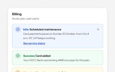
Alert banner
Messages in four tones, each with a word and an icon, and role=alert only for errors that happen while someone works.
-
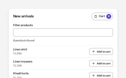
Status message
Results, confirmations and saves told to screen readers through role=status, without moving focus, once each time.
-
Card
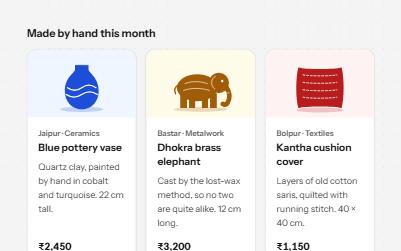
Cards whose title link covers the whole card, with Save and Share buttons that stay reachable on top of it.
-
Toast notifications
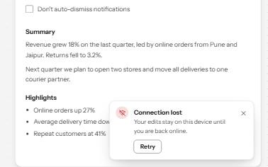
Short messages that appear in a corner, are announced politely, never take focus, and wait while you read or act on them.