Accessibility pattern · Feedback and status
Alert banner
Alerts already on the page are plain content: a tone word, an icon and a heading, read in order like the rest of the page. Only an error that happens later, like a failed payment, goes into a role=alert container that was in the page from the start, so it is announced at once and focus stays put.
- WCAG criteria
- 6
- Keyboard rules
- 3
- Checked with
- axe, keyboard and the inspector
Live demo
Try it
Use it with a mouse, a keyboard or a screen reader. The inspector beside it shows what the browser tells assistive technology as you go: focus, state changes and announcements.
Billing
Studio plan, paid yearly
Info: Scheduled maintenance
Card payments pause on Sunday 12 October, from 2 to 4 a.m. IST. UPI keeps working.
See service statusSuccess: Card added
Your HDFC Bank card ending 4418 now pays for this plan.
Warning: Your plan renews in 3 days
₹4,999 will be charged on 8 October. Change or cancel the plan before then if you need to.
Review your planError: GST number not verified
The GSTIN on file does not match your business name, so it cannot appear on your invoices.
Fix GST detailsAmount due
₹4,999
In this demo the payment always fails, so you can see the alert.
Error: Payment failed
Your bank declined the card ending 4418, and you have not been charged. Try another card, or pay by UPI.
The demo works without JavaScript only as far as its HTML does; the inspector needs JavaScript.
Keyboard
Keys it answers to
Every action works without a pointer.
| Key | What it does |
|---|---|
| Tab or ShiftTab | Moves through the links and buttons inside the alerts; the alerts themselves are not tab stops. |
| Enter or Space | On Pay ₹4,999, tries the payment. The error appears below and is announced at once, while focus stays on the button. |
| Enter or Space | On the dismiss button, removes the maintenance notice and moves focus to the alert that takes its place. |
Screen readers
What it announces
Written from the roles, names and states in the markup.
| When | Expected announcement |
|---|---|
| The page loads | Nothing: alerts already on the page are read in order, never announced |
| Reading reaches the warning | Warning: Your plan renews in 3 days, heading level 4 |
| Pay ₹4,999 fails | Error: Payment failed. Your bank declined the card ending 4418… (at once, interrupting) |
| Focus reaches the dismiss button | Dismiss Scheduled maintenance, button |
| The notice is dismissed | Success: Card added, group (focus is on the next alert) |
These are expected announcements, not recordings. Wording and order differ between screen readers and browsers.
Code
Copy the code
The exact files this demo runs on. The styles are served with a prefix that keeps this site's own styles out of the demo; what you copy is the original.
<div class="ap-alert" data-ap-alert>
  <div class="ap-alert__top">
    <h3 class="ap-alert__intro" id="alert-billing" tabindex="-1">Billing</h3>
    <p class="ap-alert__lead">Studio plan, paid yearly</p>
  </div>

  <div class="ap-alert__stack">
    <div class="ap-alert__item ap-alert__item--info" role="group" aria-labelledby="alert-info-h">
      <span class="ap-alert__mark" aria-hidden="true"><svg class="ap-alert__icon" viewBox="0 0 24 24" focusable="false"><circle cx="12" cy="12" r="9"/><path d="M12 11v5"/><path d="M12 7.5h.01"/></svg></span>
      <div class="ap-alert__body">
        <h4 class="ap-alert__name" id="alert-info-h"><span class="ap-alert__tone">Info:</span> <span id="alert-info-name">Scheduled maintenance</span></h4>
        <p class="ap-alert__text">Card payments pause on Sunday 12 October, from 2 to 4 a.m. IST. UPI keeps working.</p>
        <a class="ap-alert__link" href="#alert-status">See service status</a>
      </div>
      <button type="button" class="ap-alert__dismiss" id="alert-info-x" aria-labelledby="alert-info-x alert-info-name" data-ap-dismiss>
        <svg viewBox="0 0 24 24" aria-hidden="true" focusable="false"><path d="M6 6l12 12M18 6 6 18"/></svg>
        <span class="ap-alert__sr">Dismiss</span>
      </button>
    </div>

    <div class="ap-alert__item ap-alert__item--success" role="group" aria-labelledby="alert-success-h">
      <span class="ap-alert__mark" aria-hidden="true"><svg class="ap-alert__icon" viewBox="0 0 24 24" focusable="false"><circle cx="12" cy="12" r="9"/><path d="m8 12.5 2.7 2.7L16.2 9.6"/></svg></span>
      <div class="ap-alert__body">
        <h4 class="ap-alert__name" id="alert-success-h"><span class="ap-alert__tone">Success:</span> <span>Card added</span></h4>
        <p class="ap-alert__text">Your HDFC Bank card ending 4418 now pays for this plan.</p>
      </div>
    </div>

    <div class="ap-alert__item ap-alert__item--warning" role="group" aria-labelledby="alert-warning-h">
      <span class="ap-alert__mark" aria-hidden="true"><svg class="ap-alert__icon" viewBox="0 0 24 24" focusable="false"><path d="M10.3 3.9 1.8 18a2 2 0 0 0 1.7 3h17a2 2 0 0 0 1.7-3L13.7 3.9a2 2 0 0 0-3.4 0Z"/><path d="M12 9v4"/><path d="M12 17h.01"/></svg></span>
      <div class="ap-alert__body">
        <h4 class="ap-alert__name" id="alert-warning-h"><span class="ap-alert__tone">Warning:</span> <span>Your plan renews in 3 days</span></h4>
        <p class="ap-alert__text">₹4,999 will be charged on 8 October. Change or cancel the plan before then if you need to.</p>
        <a class="ap-alert__link" href="#alert-plan">Review your plan</a>
      </div>
    </div>

    <div class="ap-alert__item ap-alert__item--error" role="group" aria-labelledby="alert-error-h">
      <span class="ap-alert__mark" aria-hidden="true"><svg class="ap-alert__icon" viewBox="0 0 24 24" focusable="false"><path d="M7.9 2.5h8.2l5.4 5.4v8.2l-5.4 5.4H7.9l-5.4-5.4V7.9Z"/><path d="m15 9-6 6M9 9l6 6"/></svg></span>
      <div class="ap-alert__body">
        <h4 class="ap-alert__name" id="alert-error-h"><span class="ap-alert__tone">Error:</span> <span>GST number not verified</span></h4>
        <p class="ap-alert__text">The GSTIN on file does not match your business name, so it cannot appear on your invoices.</p>
        <a class="ap-alert__link" href="#alert-gst">Fix GST details</a>
      </div>
    </div>
  </div>

  <div class="ap-alert__pay">
    <div class="ap-alert__due">
      <p class="ap-alert__k">Amount due</p>
      <p class="ap-alert__amount">₹4,999</p>
      <p class="ap-alert__hint">In this demo the payment always fails, so you can see the alert.</p>
    </div>
    <button type="button" class="ap-btn ap-btn--primary" data-ap-pay>Pay ₹4,999</button>
  </div>
  <div class="ap-alert__live" role="alert" data-ap-live></div>

  <template data-ap-failed>
    <div class="ap-alert__item ap-alert__item--error">
      <span class="ap-alert__mark" aria-hidden="true"><svg class="ap-alert__icon" viewBox="0 0 24 24" focusable="false"><path d="M7.9 2.5h8.2l5.4 5.4v8.2l-5.4 5.4H7.9l-5.4-5.4V7.9Z"/><path d="m15 9-6 6M9 9l6 6"/></svg></span>
      <div class="ap-alert__body">
        <h4 class="ap-alert__name"><span class="ap-alert__tone">Error:</span> <span>Payment failed</span></h4>
        <p class="ap-alert__text">Your bank declined the card ending 4418, and you have not been charged. Try another card, or pay by UPI.</p>
      </div>
    </div>
  </template>
</div>
/* Shared primitives: buttons and form fields used across the patterns.
   Uses the --ap-* design tokens. */

.ap-btn {
  display: inline-flex;
  align-items: center;
  justify-content: center;
  gap: 8px;
  min-height: 40px;
  padding: 0 16px;
  border: 1px solid var(--ap-border-strong);
  border-radius: var(--ap-radius-sm);
  background: var(--ap-surface);
  color: var(--ap-text);
  font: inherit;
  font-weight: 600;
  line-height: 1.2;
  text-decoration: none;
  white-space: nowrap;
  cursor: pointer;
  transition: background-color var(--ap-duration) var(--ap-ease), border-color var(--ap-duration) var(--ap-ease), box-shadow var(--ap-duration) var(--ap-ease);
}
.ap-btn:hover {
  background: var(--ap-surface-2);
}
.ap-btn:focus-visible {
  outline: 2px solid var(--ap-focus);
  outline-offset: 2px;
}
.ap-btn:disabled,
.ap-btn[aria-disabled="true"] {
  opacity: .55;
  cursor: not-allowed;
}
.ap-btn--primary {
  border-color: var(--ap-accent);
  background: var(--ap-accent);
  color: var(--ap-on-accent);
  box-shadow: var(--ap-shadow-sm);
}
.ap-btn--primary:hover {
  border-color: var(--ap-accent-hover);
  background: var(--ap-accent-hover);
}
.ap-btn--danger {
  border-color: var(--ap-danger);
  background: var(--ap-danger);
  color: var(--ap-surface);
}
.ap-btn--danger:hover {
  filter: brightness(1.08);
}
.ap-btn--ghost {
  border-color: transparent;
  background: transparent;
}
.ap-btn--ghost:hover {
  background: var(--ap-surface-2);
}
.ap-btn__icon {
  width: 18px;
  height: 18px;
  flex-shrink: 0;
  fill: none;
  stroke: currentColor;
  stroke-width: 2;
  stroke-linecap: round;
  stroke-linejoin: round;
}

.ap-field {
  display: grid;
  gap: 6px;
}
.ap-label {
  color: var(--ap-text);
  font-weight: 600;
  font-size: .9375rem;
}
.ap-hint {
  margin: 0;
  color: var(--ap-text-3);
  font-size: .875rem;
  line-height: 1.45;
}
.ap-error {
  display: flex;
  align-items: flex-start;
  gap: 6px;
  margin: 0;
  color: var(--ap-danger);
  font-size: .875rem;
  font-weight: 600;
  line-height: 1.45;
}
.ap-input {
  width: 100%;
  min-height: 44px;
  padding: 10px 12px;
  border: 1px solid var(--ap-border-strong);
  border-radius: var(--ap-radius-sm);
  background: var(--ap-surface);
  color: var(--ap-text);
  font: inherit;
  line-height: 1.4;
  transition: border-color var(--ap-duration) var(--ap-ease), box-shadow var(--ap-duration) var(--ap-ease);
}
.ap-input::placeholder {
  color: var(--ap-text-3);
}
.ap-input:hover {
  border-color: var(--ap-text-2);
}
.ap-input:focus-visible {
  outline: 2px solid var(--ap-focus);
  outline-offset: 1px;
  border-color: var(--ap-focus);
}
.ap-input[aria-invalid="true"] {
  border-color: var(--ap-danger);
  box-shadow: inset 4px 0 0 var(--ap-danger);
}
textarea.ap-input {
  resize: vertical;
  min-height: 88px;
}

@media (prefers-reduced-motion: reduce) {
  .ap-btn,
  .ap-input { transition: none; }
}

/* Alert banner. Uses the --ap-* design tokens and the shared primitives. */
.ap-alert {
  width: min(100%, 600px);
  margin-inline: auto;
  padding: 24px;
  border: 1px solid var(--ap-border);
  border-radius: var(--ap-radius-lg);
  background: var(--ap-surface);
  color: var(--ap-text);
  box-shadow: var(--ap-shadow-md);
  container-type: inline-size;
}

.ap-alert__top {
  margin-bottom: 18px;
}
.ap-alert__intro {
  margin: 0;
  font-size: 1.1875rem;
  font-weight: 650;
  line-height: 1.3;
}
/* Focus lands here only from the script, when the last alert is dismissed. */
.ap-alert__intro:focus {
  outline: none;
}
.ap-alert__intro:focus-visible {
  outline: 2px solid var(--ap-focus);
  outline-offset: 4px;
  border-radius: 4px;
}
.ap-alert__lead {
  margin: 4px 0 0;
  color: var(--ap-text-3);
  line-height: 1.5;
}

.ap-alert__stack {
  display: grid;
  gap: 12px;
}

/* One alert. Each tone sets two colors; the word and the icon carry the
   meaning, the tint repeats it. */
.ap-alert__item {
  --ap-alert-tone: var(--ap-info);
  --ap-alert-soft: var(--ap-info-soft);
  display: grid;
  grid-template-columns: auto minmax(0, 1fr) auto;
  align-items: start;
  column-gap: 14px;
  padding: 14px 14px 16px 16px;
  border: 1px solid color-mix(in srgb, var(--ap-alert-tone) 32%, transparent);
  border-radius: var(--ap-radius);
  background: var(--ap-alert-soft);
}
.ap-alert__item--success {
  --ap-alert-tone: var(--ap-success);
  --ap-alert-soft: var(--ap-success-soft);
}
.ap-alert__item--warning {
  --ap-alert-tone: var(--ap-warning);
  --ap-alert-soft: var(--ap-warning-soft);
}
.ap-alert__item--error {
  --ap-alert-tone: var(--ap-danger);
  --ap-alert-soft: var(--ap-danger-soft);
}
.ap-alert__item:focus {
  outline: none;
}
.ap-alert__item:focus-visible {
  outline: 2px solid var(--ap-focus);
  outline-offset: 2px;
}

.ap-alert__mark {
  display: grid;
  place-items: center;
  width: 34px;
  height: 34px;
  border-radius: var(--ap-radius-full);
  background: color-mix(in srgb, var(--ap-alert-tone) 14%, transparent);
}
.ap-alert__icon {
  width: 19px;
  height: 19px;
  fill: none;
  stroke: var(--ap-alert-tone);
  stroke-width: 2;
  stroke-linecap: round;
  stroke-linejoin: round;
}

.ap-alert__body {
  display: grid;
  gap: 3px;
  min-width: 0;
  padding-top: 6px;
}
.ap-alert__name {
  margin: 0;
  color: var(--ap-text);
  font-size: 1rem;
  font-weight: 650;
  line-height: 1.4;
}
.ap-alert__tone {
  color: var(--ap-alert-tone);
  font-weight: 750;
}
.ap-alert__text {
  margin: 0;
  color: var(--ap-text-2);
  font-size: .9375rem;
  line-height: 1.55;
}
.ap-alert__link {
  display: inline-flex;
  align-items: center;
  justify-self: start;
  min-height: 24px;
  margin-top: 4px;
  border-radius: 4px;
  color: var(--ap-alert-tone);
  font-size: .9375rem;
  font-weight: 600;
  text-decoration: underline;
  text-underline-offset: 3px;
}
.ap-alert__link:hover {
  text-decoration-thickness: 2px;
}
.ap-alert__link:focus-visible {
  outline: 2px solid var(--ap-focus);
  outline-offset: 2px;
}

.ap-alert__dismiss {
  display: grid;
  place-items: center;
  width: 32px;
  height: 32px;
  margin: 1px -2px 0 0;
  padding: 0;
  border: 0;
  border-radius: var(--ap-radius-sm);
  background: transparent;
  color: var(--ap-text-2);
  cursor: pointer;
  transition: background-color var(--ap-duration) var(--ap-ease), color var(--ap-duration) var(--ap-ease);
}
.ap-alert__dismiss:hover {
  background: color-mix(in srgb, var(--ap-alert-tone) 14%, transparent);
  color: var(--ap-text);
}
.ap-alert__dismiss:focus-visible {
  outline: 2px solid var(--ap-focus);
  outline-offset: 1px;
}
.ap-alert__dismiss svg {
  width: 18px;
  height: 18px;
  fill: none;
  stroke: currentColor;
  stroke-width: 2;
  stroke-linecap: round;
}

/* The payment, and the live region its error goes into. */
.ap-alert__pay {
  display: flex;
  flex-wrap: wrap;
  align-items: center;
  justify-content: space-between;
  gap: 14px 20px;
  margin-top: 20px;
  padding: 16px 18px;
  border: 1px solid var(--ap-border);
  border-radius: var(--ap-radius);
  background: var(--ap-surface-2);
}
.ap-alert__due {
  flex: 1 1 220px;
  min-width: 0;
}
.ap-alert__k {
  margin: 0;
  color: var(--ap-text-3);
  font-size: .8125rem;
  font-weight: 600;
  letter-spacing: .02em;
}
.ap-alert__amount {
  margin: 2px 0 0;
  font-size: 1.375rem;
  font-weight: 700;
  line-height: 1.25;
  font-variant-numeric: tabular-nums;
}
.ap-alert__hint {
  margin: 6px 0 0;
  color: var(--ap-text-3);
  font-size: .8125rem;
  line-height: 1.45;
}
.ap-alert__pay .ap-btn {
  min-height: var(--ap-target);
}

/* Never display: none, even when empty: the region has to be in the
   accessibility tree before the message arrives. */
.ap-alert__live:not(:empty) {
  margin-top: 14px;
}
.ap-alert__live > .ap-alert__item {
  animation: ap-alert-in 220ms var(--ap-ease);
}

/* Read by screen readers, not shown. */
.ap-alert__sr {
  position: absolute;
  width: 1px;
  height: 1px;
  margin: -1px;
  padding: 0;
  overflow: hidden;
  clip-path: inset(50%);
  white-space: nowrap;
  border: 0;
}

@keyframes ap-alert-in {
  from { opacity: 0; transform: translateY(-4px); }
}

/* Narrow: tighter padding, and the icon sits a little smaller. */
@container (max-width: 440px) {
  .ap-alert {
    padding: 20px 16px;
  }
  .ap-alert__item {
    column-gap: 10px;
    padding: 12px 10px 14px 12px;
  }
  .ap-alert__mark {
    width: 30px;
    height: 30px;
  }
  .ap-alert__body {
    padding-top: 4px;
  }
  .ap-alert__pay .ap-btn {
    flex: 1 1 100%;
  }
}

@media (prefers-reduced-motion: reduce) {
  .ap-alert__dismiss { transition: none; }
  .ap-alert__live > .ap-alert__item { animation: none; }
}
/**
 * Alert banner: static alerts in four tones, one of them dismissible, and a
 * live alert for an error that happens while the page is in use.
 *
 * Markup: [data-ap-alert] holding .ap-alert__item elements inside
 * .ap-alert__stack (plain content, no live role), any of which may contain a
 * button[data-ap-dismiss]; a button[data-ap-pay]; an empty
 * div[role=alert][data-ap-live] that is in the page from the start; and a
 * template[data-ap-failed] holding the error to show. The section heading
 * (.ap-alert__intro, tabindex=-1) takes focus when no alert is left.
 */

export function init(root) {
  const live = root.querySelector("[data-ap-live]");
  const failed = root.querySelector("template[data-ap-failed]");
  let timer = 0;

  // The region is already in the page, so changing what is inside it is what
  // gets announced. Emptying it first and filling it a moment later makes
  // the same error count as news when it happens twice.
  function showError() {
    clearTimeout(timer);
    live.replaceChildren();
    timer = setTimeout(() => {
      live.append(failed.content.cloneNode(true));
    }, 100);
  }

  function dismiss(item) {
    const items = [...root.querySelectorAll(".ap-alert__stack > .ap-alert__item")];
    const at = items.indexOf(item);
    const next = items[at + 1] || items[at - 1] || root.querySelector(".ap-alert__intro");
    item.remove();
    // Focusable by script only: tabindex=-1 keeps it out of the Tab order.
    if (!next.hasAttribute("tabindex")) next.tabIndex = -1;
    next.focus();
  }

  function onClick(event) {
    if (event.target.closest("[data-ap-pay]")) {
      showError();
      return;
    }
    const button = event.target.closest("[data-ap-dismiss]");
    if (button && root.contains(button)) dismiss(button.closest(".ap-alert__item"));
  }

  root.addEventListener("click", onClick);
  return () => {
    clearTimeout(timer);
    root.removeEventListener("click", onClick);
  };
}

for (const root of document.querySelectorAll("[data-ap-alert]")) init(root);
/* Design tokens for the pattern components. Light by default, dark when the
   system asks for it; set data-theme="dark" on :root to force dark. */
:root {
    --ap-radius-sm: 8px;
    --ap-radius: 12px;
    --ap-radius-lg: 16px;
    --ap-radius-full: 999px;
    --ap-font: "Instrument Sans", ui-sans-serif, system-ui, -apple-system, "Segoe UI", Roboto, sans-serif;
    --ap-mono: "JetBrains Mono", ui-monospace, "Cascadia Mono", "SF Mono", Consolas, monospace;
    --ap-ease: cubic-bezier(.2, .8, .2, 1);
    --ap-duration: 180ms;
    --ap-target: 44px;
    --ap-bg: #F4F4F5;
    --ap-surface: #FFFFFF;
    --ap-surface-2: #F4F4F5;
    --ap-surface-3: #E4E4E7;
    --ap-border: #E4E4E7;
    --ap-border-strong: #76767F;
    --ap-text: #18181B;
    --ap-text-2: #3F3F46;
    --ap-text-3: #5E5E66;
    --ap-accent: #4F46E5;
    --ap-accent-hover: #4338CA;
    --ap-on-accent: #FFFFFF;
    --ap-accent-text: #4338CA;
    --ap-accent-soft: #EEF2FF;
    --ap-accent-soft-text: #3730A3;
    --ap-focus: #4F46E5;
    --ap-danger: #B91C1C;
    --ap-danger-soft: #FEF2F2;
    --ap-success: #15803D;
    --ap-success-soft: #F0FDF4;
    --ap-warning: #A15C07;
    --ap-warning-soft: #FEFCE8;
    --ap-info: #1D4ED8;
    --ap-info-soft: #EFF6FF;
    --ap-scrim: rgb(9 9 11 / .48);
    --ap-shadow-sm: 0 1px 2px rgb(9 9 11 / .06);
    --ap-shadow-md: 0 1px 2px rgb(9 9 11 / .05), 0 6px 16px -4px rgb(9 9 11 / .1);
    --ap-shadow-lg: 0 2px 6px rgb(9 9 11 / .06), 0 20px 40px -12px rgb(9 9 11 / .22);
    --ap-light-bg: #F4F4F5;
    --ap-light-surface: #FFFFFF;
    --ap-light-surface-2: #F4F4F5;
    --ap-light-surface-3: #E4E4E7;
    --ap-light-border: #E4E4E7;
    --ap-light-border-strong: #76767F;
    --ap-light-text: #18181B;
    --ap-light-text-2: #3F3F46;
    --ap-light-text-3: #5E5E66;
    --ap-light-accent: #4F46E5;
    --ap-light-accent-hover: #4338CA;
    --ap-light-on-accent: #FFFFFF;
    --ap-light-accent-text: #4338CA;
    --ap-light-accent-soft: #EEF2FF;
    --ap-light-accent-soft-text: #3730A3;
    --ap-light-focus: #4F46E5;
    --ap-light-danger: #B91C1C;
    --ap-light-danger-soft: #FEF2F2;
    --ap-light-success: #15803D;
    --ap-light-success-soft: #F0FDF4;
    --ap-light-warning: #A15C07;
    --ap-light-warning-soft: #FEFCE8;
    --ap-light-info: #1D4ED8;
    --ap-light-info-soft: #EFF6FF;
    --ap-light-scrim: rgb(9 9 11 / .48);
    --ap-light-shadow-sm: 0 1px 2px rgb(9 9 11 / .06);
    --ap-light-shadow-md: 0 1px 2px rgb(9 9 11 / .05), 0 6px 16px -4px rgb(9 9 11 / .1);
    --ap-light-shadow-lg: 0 2px 6px rgb(9 9 11 / .06), 0 20px 40px -12px rgb(9 9 11 / .22);
    --ap-dark-bg: #09090B;
    --ap-dark-surface: #18181B;
    --ap-dark-surface-2: #27272A;
    --ap-dark-surface-3: #3F3F46;
    --ap-dark-border: #2E2E33;
    --ap-dark-border-strong: #8E8E97;
    --ap-dark-text: #FAFAFA;
    --ap-dark-text-2: #D4D4D8;
    --ap-dark-text-3: #A1A1AA;
    --ap-dark-accent: #818CF8;
    --ap-dark-accent-hover: #A5B4FC;
    --ap-dark-on-accent: #0C0A1F;
    --ap-dark-accent-text: #A5B4FC;
    --ap-dark-accent-soft: #1E1B4B;
    --ap-dark-accent-soft-text: #C7D2FE;
    --ap-dark-focus: #A5B4FC;
    --ap-dark-danger: #F87171;
    --ap-dark-danger-soft: #2A1215;
    --ap-dark-success: #4ADE80;
    --ap-dark-success-soft: #0F2A1A;
    --ap-dark-warning: #FACC15;
    --ap-dark-warning-soft: #2A2410;
    --ap-dark-info: #60A5FA;
    --ap-dark-info-soft: #0F1D33;
    --ap-dark-scrim: rgb(0 0 0 / .62);
    --ap-dark-shadow-sm: 0 1px 2px rgb(0 0 0 / .4);
    --ap-dark-shadow-md: 0 1px 2px rgb(0 0 0 / .4), 0 8px 20px -6px rgb(0 0 0 / .5);
    --ap-dark-shadow-lg: 0 2px 8px rgb(0 0 0 / .45), 0 24px 48px -12px rgb(0 0 0 / .7);
}
@media (prefers-color-scheme: dark) {
  :root:not([data-theme="light"]) {
      --ap-bg: #09090B;
      --ap-surface: #18181B;
      --ap-surface-2: #27272A;
      --ap-surface-3: #3F3F46;
      --ap-border: #2E2E33;
      --ap-border-strong: #8E8E97;
      --ap-text: #FAFAFA;
      --ap-text-2: #D4D4D8;
      --ap-text-3: #A1A1AA;
      --ap-accent: #818CF8;
      --ap-accent-hover: #A5B4FC;
      --ap-on-accent: #0C0A1F;
      --ap-accent-text: #A5B4FC;
      --ap-accent-soft: #1E1B4B;
      --ap-accent-soft-text: #C7D2FE;
      --ap-focus: #A5B4FC;
      --ap-danger: #F87171;
      --ap-danger-soft: #2A1215;
      --ap-success: #4ADE80;
      --ap-success-soft: #0F2A1A;
      --ap-warning: #FACC15;
      --ap-warning-soft: #2A2410;
      --ap-info: #60A5FA;
      --ap-info-soft: #0F1D33;
      --ap-scrim: rgb(0 0 0 / .62);
      --ap-shadow-sm: 0 1px 2px rgb(0 0 0 / .4);
      --ap-shadow-md: 0 1px 2px rgb(0 0 0 / .4), 0 8px 20px -6px rgb(0 0 0 / .5);
      --ap-shadow-lg: 0 2px 8px rgb(0 0 0 / .45), 0 24px 48px -12px rgb(0 0 0 / .7);
  }
}
:root[data-theme="dark"] {
    --ap-bg: #09090B;
    --ap-surface: #18181B;
    --ap-surface-2: #27272A;
    --ap-surface-3: #3F3F46;
    --ap-border: #2E2E33;
    --ap-border-strong: #8E8E97;
    --ap-text: #FAFAFA;
    --ap-text-2: #D4D4D8;
    --ap-text-3: #A1A1AA;
    --ap-accent: #818CF8;
    --ap-accent-hover: #A5B4FC;
    --ap-on-accent: #0C0A1F;
    --ap-accent-text: #A5B4FC;
    --ap-accent-soft: #1E1B4B;
    --ap-accent-soft-text: #C7D2FE;
    --ap-focus: #A5B4FC;
    --ap-danger: #F87171;
    --ap-danger-soft: #2A1215;
    --ap-success: #4ADE80;
    --ap-success-soft: #0F2A1A;
    --ap-warning: #FACC15;
    --ap-warning-soft: #2A2410;
    --ap-info: #60A5FA;
    --ap-info-soft: #0F1D33;
    --ap-scrim: rgb(0 0 0 / .62);
    --ap-shadow-sm: 0 1px 2px rgb(0 0 0 / .4);
    --ap-shadow-md: 0 1px 2px rgb(0 0 0 / .4), 0 8px 20px -6px rgb(0 0 0 / .5);
    --ap-shadow-lg: 0 2px 8px rgb(0 0 0 / .45), 0 24px 48px -12px rgb(0 0 0 / .7);
}
WCAG 2.2
What it meets
The success criteria this pattern takes care of, and how.
-
1.3.1 Info and Relationships
Level A
Each alert has a real heading that starts with its tone, so the alerts show up in a screen reader's list of headings with their meaning.
-
1.4.1 Use of Color
Level A
Info, Success, Warning and Error are written out and each has its own icon shape; the tint only repeats what the word says.
-
2.4.3 Focus Order
Level A
When the notice is dismissed, focus moves to the alert that takes its place instead of falling back to the top of the page.
-
3.3.1 Error Identification
Level A
The failed payment is described in words: what went wrong, that no money was taken, and what to try next.
-
4.1.2 Name, Role, Value
Level A
The dismiss button's name is Dismiss plus the alert's heading, so it says which alert it closes.
-
4.1.3 Status Messages
Level AA
The payment error arrives in a role=alert container and is announced without focus moving to it.
Usage
When to use it
Use it
- Something on the page needs attention: a problem, a risk, a change in service, or a sign that a step worked.
- An error caused by something the person just did, like a failed payment, that they must hear about now.
Use something else
- Routine confirmations such as Saved: use a polite status message or a toast, which do not interrupt.
- Errors in form fields: show them next to the field and in an error summary, as in the form errors pattern.
- Anything that needs an answer before going on: use an alert dialog.
Common failures
How it usually goes wrong
role=alert on alerts already there
An alert that is in the page when it loads is either read over everything else or not at all, depending on the browser. Static alerts are plain content here; only the payment error, which happens later, is live.
Adding the live region with its message
A role=alert element inserted with its text already inside is missed by some screen reader and browser pairs. The empty container is in the HTML from the start, and only its content changes.
Moving focus to the message
Focus that jumps to an error pulls people away from what they were doing and loses their place. role=alert is heard wherever focus is.
Tone shown by color alone
A red box and a green box look alike to many people with color vision deficiencies, and to every screen reader. Each alert starts with its tone in words.
A row of buttons called Close
With several alerts, Close, Close, Close says nothing about what goes. Each dismiss button is named Dismiss plus its alert's heading.
Assertive for everything
Every assertive message cuts off what a screen reader was saying. Keep role=alert for errors and risks; confirmations go in a polite status.
Notes
Building it
- role=alert means aria-live="assertive" plus aria-atomic="true": it interrupts and reads the whole message. role=status is the polite version, read at the next pause. aria-live on its own sets the politeness without a role, for an element that already has one, like a list.
- A live region only announces changes made after the browser knows it is there. Put the empty container in the HTML, then add the message; a region added together with its text, or one shown from display: none at the same moment, is often missed. That is why the container here is never hidden, only empty.
- To announce the same error twice, empty the container and add the message a moment later: replacing text with the same text may not count as a change.
- Remember a dismissed notice, in storage or the account, so it stays gone. Never let people dismiss an error while the problem is still there.
- The links in the alerts use # addresses in the demo, where they stand for other pages.
Sources: WAI-ARIA Authoring Practices: Alert · WAI-ARIA 1.2: the alert role · Understanding SC 4.1.3: Status Messages
Checked with axe in light and dark themes, at desktop and phone widths, and by keyboard. Not yet tested with every screen reader and browser pair. Report a correction
Related
Patterns that go with it
-
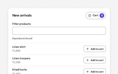
Status message
Results, confirmations and saves told to screen readers through role=status, without moving focus, once each time.
-
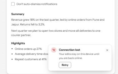
Toast notifications
Short messages that appear in a corner, are announced politely, never take focus, and wait while you read or act on them.
-
Callout
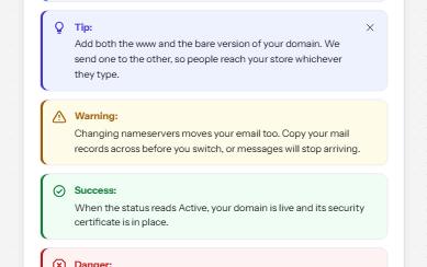
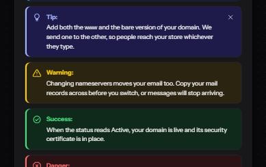
Notes, tips, warnings, successes and dangers set apart from the text, each with an icon and a word that says which.
-
Alert dialog
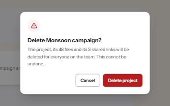
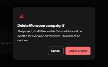
A modal that stops to confirm something that cannot be undone, with focus on the safe answer and the cost in plain words.