Accessibility pattern · Feedback and status
Progress bar
A native progress element, labelled and described, gives the role and the value for free; leave out the value and it becomes indeterminate. A screen reader hears the progress at 25, 50, 75 and 100 percent from a polite status, not at every tick, and Pause and Cancel keep focus where it is.
- WCAG criteria
- 5
- Keyboard rules
- 4
- Checked with
- axe, keyboard and the inspector
Live demo
Try it
Use it with a mouse, a keyboard or a screen reader. The inspector beside it shows what the browser tells assistive technology as you go: focus, state changes and announcements.
The demo works without JavaScript only as far as its HTML does; the inspector needs JavaScript.
Keyboard
Keys it answers to
Every action works without a pointer.
| Key | What it does |
|---|---|
| Enter or Space | On Start upload, starts it; the same button then pauses and resumes it, and focus stays on it. |
| Enter or Space | On Cancel, stops the upload. Cancel stays focusable but unavailable when there is nothing to cancel, so focus is never lost. |
| Enter or Space | On Back or Next, moves the checkout bar one step; the step is announced. |
| Tab | Moves between the buttons; the progress bars are read in place and take no tab stop. |
Screen readers
What it announces
Written from the roles, names and states in the markup.
| When | Expected announcement |
|---|---|
| Reading reaches the upload bar | Uploading 7 photos, progress bar, 45%. 3 uploaded, 4 left |
| The upload passes 25% | 25% uploaded |
| The progress moves between milestones | Nothing: the bar changes quietly |
| The upload finishes | 100% uploaded. Making thumbnails…, then Upload complete. 7 photos added to Diwali 2026. |
| Pause is pressed | Upload paused |
| Next is pressed in the checkout | Step 3 of 4: Payment |
These are expected announcements, not recordings. Wording and order differ between screen readers and browsers.
Code
Copy the code
The exact files this demo runs on. The styles are served with a prefix that keeps this site's own styles out of the demo; what you copy is the original.
<div class="ap-progress-bar" data-ap-progress-bar data-state="idle">
  <section class="ap-progress-bar__card" aria-labelledby="progress-album-h">
    <div class="ap-progress-bar__top">
      <span class="ap-progress-bar__art" aria-hidden="true">
        <svg viewBox="0 0 24 24" focusable="false"><rect x="3" y="6" width="15" height="13" rx="2"/><path d="M7 3h12a2 2 0 0 1 2 2v11"/><circle cx="8" cy="11" r="1.5"/><path d="m18 16-4-4-7 7"/></svg>
      </span>
      <div>
        <h3 class="ap-progress-bar__h" id="progress-album-h">Diwali 2026</h3>
        <p class="ap-progress-bar__sub">Shared album · 7 photos, 24 MB</p>
      </div>
    </div>

    <div class="ap-progress-bar__row">
      <label class="ap-progress-bar__label" for="progress-upload" data-ap-label>Ready to upload 7 photos</label>
      <span class="ap-progress-bar__pct" aria-hidden="true" data-ap-pct>0%</span>
    </div>
    <progress class="ap-progress-bar__bar" id="progress-upload" max="100" value="0" aria-describedby="progress-files" data-ap-bar></progress>
    <p class="ap-progress-bar__files" id="progress-files"><span data-ap-done>0</span> <span>uploaded,</span> <span data-ap-left>7</span> <span>left</span></p>
    <ol class="ap-progress-bar__tiles" aria-hidden="true" data-ap-tiles><li><svg viewBox="0 0 24 24" focusable="false"><rect x="4" y="5" width="16" height="14" rx="2"/><circle cx="9" cy="10" r="1.6"/><path d="m20 16-4.5-4.5L7 19"/></svg></li><li><svg viewBox="0 0 24 24" focusable="false"><rect x="4" y="5" width="16" height="14" rx="2"/><circle cx="9" cy="10" r="1.6"/><path d="m20 16-4.5-4.5L7 19"/></svg></li><li><svg viewBox="0 0 24 24" focusable="false"><rect x="4" y="5" width="16" height="14" rx="2"/><circle cx="9" cy="10" r="1.6"/><path d="m20 16-4.5-4.5L7 19"/></svg></li><li><svg viewBox="0 0 24 24" focusable="false"><rect x="4" y="5" width="16" height="14" rx="2"/><circle cx="9" cy="10" r="1.6"/><path d="m20 16-4.5-4.5L7 19"/></svg></li><li><svg viewBox="0 0 24 24" focusable="false"><rect x="4" y="5" width="16" height="14" rx="2"/><circle cx="9" cy="10" r="1.6"/><path d="m20 16-4.5-4.5L7 19"/></svg></li><li><svg viewBox="0 0 24 24" focusable="false"><rect x="4" y="5" width="16" height="14" rx="2"/><circle cx="9" cy="10" r="1.6"/><path d="m20 16-4.5-4.5L7 19"/></svg></li><li><svg viewBox="0 0 24 24" focusable="false"><rect x="4" y="5" width="16" height="14" rx="2"/><circle cx="9" cy="10" r="1.6"/><path d="m20 16-4.5-4.5L7 19"/></svg></li></ol>

    <div class="ap-progress-bar__acts">
      <button type="button" class="ap-btn ap-btn--primary ap-progress-bar__go" data-ap-go>
        <svg class="ap-btn__icon ap-progress-bar__i-start" viewBox="0 0 24 24" aria-hidden="true" focusable="false"><path d="M12 16V4"/><path d="m7 9 5-5 5 5"/><path d="M4 16v2a2 2 0 0 0 2 2h12a2 2 0 0 0 2-2v-2"/></svg>
        <svg class="ap-btn__icon ap-progress-bar__i-pause" viewBox="0 0 24 24" aria-hidden="true" focusable="false"><path d="M9 5v14M15 5v14"/></svg>
        <svg class="ap-btn__icon ap-progress-bar__i-resume" viewBox="0 0 24 24" aria-hidden="true" focusable="false"><path d="M8 5v14l11-7Z"/></svg>
        <span data-ap-go-label>Start upload</span>
      </button>
      <button type="button" class="ap-btn" aria-disabled="true" data-ap-cancel>Cancel</button>
    </div>
    <p class="ap-progress-bar__sr" role="status" data-ap-say></p>
  </section>

  <section class="ap-progress-bar__card" aria-labelledby="progress-steps-h">
    <div class="ap-progress-bar__row">
      <h3 class="ap-progress-bar__h" id="progress-steps-h">Checkout</h3>
      <p class="ap-progress-bar__step" role="status" data-ap-step-text>Step 2 of 4: Delivery</p>
    </div>
    <div class="ap-progress-bar__steps">
      <progress class="ap-progress-bar__bar" max="4" value="2" aria-labelledby="progress-steps-h" aria-valuetext="Step 2 of 4: Delivery" data-ap-steps></progress>
      <span class="ap-progress-bar__gaps" aria-hidden="true"></span>
    </div>
    <div class="ap-progress-bar__acts">
      <button type="button" class="ap-btn" data-ap-back>Back</button>
      <button type="button" class="ap-btn ap-btn--primary" data-ap-next>Next</button>
    </div>
  </section>
</div>
/* Shared primitives: buttons and form fields used across the patterns.
   Uses the --ap-* design tokens. */

.ap-btn {
  display: inline-flex;
  align-items: center;
  justify-content: center;
  gap: 8px;
  min-height: 40px;
  padding: 0 16px;
  border: 1px solid var(--ap-border-strong);
  border-radius: var(--ap-radius-sm);
  background: var(--ap-surface);
  color: var(--ap-text);
  font: inherit;
  font-weight: 600;
  line-height: 1.2;
  text-decoration: none;
  white-space: nowrap;
  cursor: pointer;
  transition: background-color var(--ap-duration) var(--ap-ease), border-color var(--ap-duration) var(--ap-ease), box-shadow var(--ap-duration) var(--ap-ease);
}
.ap-btn:hover {
  background: var(--ap-surface-2);
}
.ap-btn:focus-visible {
  outline: 2px solid var(--ap-focus);
  outline-offset: 2px;
}
.ap-btn:disabled,
.ap-btn[aria-disabled="true"] {
  opacity: .55;
  cursor: not-allowed;
}
.ap-btn--primary {
  border-color: var(--ap-accent);
  background: var(--ap-accent);
  color: var(--ap-on-accent);
  box-shadow: var(--ap-shadow-sm);
}
.ap-btn--primary:hover {
  border-color: var(--ap-accent-hover);
  background: var(--ap-accent-hover);
}
.ap-btn--danger {
  border-color: var(--ap-danger);
  background: var(--ap-danger);
  color: var(--ap-surface);
}
.ap-btn--danger:hover {
  filter: brightness(1.08);
}
.ap-btn--ghost {
  border-color: transparent;
  background: transparent;
}
.ap-btn--ghost:hover {
  background: var(--ap-surface-2);
}
.ap-btn__icon {
  width: 18px;
  height: 18px;
  flex-shrink: 0;
  fill: none;
  stroke: currentColor;
  stroke-width: 2;
  stroke-linecap: round;
  stroke-linejoin: round;
}

.ap-field {
  display: grid;
  gap: 6px;
}
.ap-label {
  color: var(--ap-text);
  font-weight: 600;
  font-size: .9375rem;
}
.ap-hint {
  margin: 0;
  color: var(--ap-text-3);
  font-size: .875rem;
  line-height: 1.45;
}
.ap-error {
  display: flex;
  align-items: flex-start;
  gap: 6px;
  margin: 0;
  color: var(--ap-danger);
  font-size: .875rem;
  font-weight: 600;
  line-height: 1.45;
}
.ap-input {
  width: 100%;
  min-height: 44px;
  padding: 10px 12px;
  border: 1px solid var(--ap-border-strong);
  border-radius: var(--ap-radius-sm);
  background: var(--ap-surface);
  color: var(--ap-text);
  font: inherit;
  line-height: 1.4;
  transition: border-color var(--ap-duration) var(--ap-ease), box-shadow var(--ap-duration) var(--ap-ease);
}
.ap-input::placeholder {
  color: var(--ap-text-3);
}
.ap-input:hover {
  border-color: var(--ap-text-2);
}
.ap-input:focus-visible {
  outline: 2px solid var(--ap-focus);
  outline-offset: 1px;
  border-color: var(--ap-focus);
}
.ap-input[aria-invalid="true"] {
  border-color: var(--ap-danger);
  box-shadow: inset 4px 0 0 var(--ap-danger);
}
textarea.ap-input {
  resize: vertical;
  min-height: 88px;
}

@media (prefers-reduced-motion: reduce) {
  .ap-btn,
  .ap-input { transition: none; }
}

/* Progress bar. Uses the --ap-* design tokens and the shared primitives. */
.ap-progress-bar {
  display: grid;
  gap: 16px;
  width: min(100%, 540px);
  margin-inline: auto;
  container-type: inline-size;
}

.ap-progress-bar__card {
  display: grid;
  gap: 12px;
  padding: 22px 24px 24px;
  border: 1px solid var(--ap-border);
  border-radius: var(--ap-radius-lg);
  background: var(--ap-surface);
  color: var(--ap-text);
  box-shadow: var(--ap-shadow-md);
}

.ap-progress-bar__top {
  display: flex;
  align-items: center;
  gap: 14px;
  margin-bottom: 8px;
}
.ap-progress-bar__art {
  display: grid;
  place-items: center;
  width: 44px;
  height: 44px;
  flex-shrink: 0;
  border-radius: var(--ap-radius);
  background: var(--ap-accent-soft);
  color: var(--ap-accent-soft-text);
}
.ap-progress-bar__art svg {
  width: 24px;
  height: 24px;
  fill: none;
  stroke: currentColor;
  stroke-width: 1.8;
  stroke-linecap: round;
  stroke-linejoin: round;
}
.ap-progress-bar__h {
  margin: 0;
  font-size: 1.125rem;
  font-weight: 650;
  line-height: 1.3;
}
.ap-progress-bar__sub {
  margin: 2px 0 0;
  color: var(--ap-text-3);
  font-size: .875rem;
}

.ap-progress-bar__row {
  display: flex;
  flex-wrap: wrap;
  align-items: baseline;
  justify-content: space-between;
  gap: 4px 16px;
}
.ap-progress-bar__label {
  font-weight: 600;
}
.ap-progress-bar__pct {
  font-weight: 650;
  font-variant-numeric: tabular-nums;
}
.ap-progress-bar__files,
.ap-progress-bar__step {
  margin: 0;
  color: var(--ap-text-3);
  font-size: .875rem;
  font-variant-numeric: tabular-nums;
}
.ap-progress-bar__step {
  color: var(--ap-text-2);
  font-weight: 600;
}

/* The native progress element, styled. The value part is the accent; the
   track behind it is a quiet fill. */
.ap-progress-bar__bar {
  -webkit-appearance: none;
  appearance: none;
  display: block;
  width: 100%;
  height: 10px;
  border: 0;
  border-radius: var(--ap-radius-full);
  background: var(--ap-surface-3);
  overflow: hidden;
}
.ap-progress-bar__bar::-webkit-progress-bar {
  border-radius: var(--ap-radius-full);
  background: var(--ap-surface-3);
}
.ap-progress-bar__bar::-webkit-progress-value {
  border-radius: var(--ap-radius-full);
  background: var(--ap-accent);
  transition: inline-size 240ms var(--ap-ease);
}
.ap-progress-bar__bar::-moz-progress-bar {
  border-radius: var(--ap-radius-full);
  background: var(--ap-accent);
}
/* No value: indeterminate. A stripe sweeps across the track. */
.ap-progress-bar__bar:indeterminate {
  background:
    linear-gradient(90deg, transparent 0, var(--ap-accent) 30%, transparent 60%) no-repeat,
    var(--ap-surface-3);
  background-size: 50% 100%, auto;
  animation: ap-progress-bar-sweep 1.2s var(--ap-ease) infinite;
}
.ap-progress-bar__bar:indeterminate::-webkit-progress-bar {
  background: transparent;
}
.ap-progress-bar__bar:indeterminate::-moz-progress-bar {
  background: transparent;
}

/* One tile per photo: decoration that repeats the count. */
.ap-progress-bar__tiles {
  display: grid;
  grid-template-columns: repeat(7, minmax(0, 1fr));
  gap: 8px;
  margin: 6px 0 4px;
  padding: 0;
  list-style: none;
}
.ap-progress-bar__tiles li {
  display: grid;
  place-items: center;
  aspect-ratio: 1;
  max-height: 52px;
  border: 1px dashed var(--ap-border-strong);
  border-radius: var(--ap-radius-sm);
  color: var(--ap-text-3);
  transition: background-color var(--ap-duration) var(--ap-ease), border-color var(--ap-duration) var(--ap-ease);
}
.ap-progress-bar__tiles li.is-done {
  border-style: solid;
  border-color: var(--ap-accent);
  background: var(--ap-accent-soft);
  color: var(--ap-accent-soft-text);
}
.ap-progress-bar__tiles svg {
  width: 55%;
  height: 55%;
  fill: none;
  stroke: currentColor;
  stroke-width: 1.8;
  stroke-linecap: round;
  stroke-linejoin: round;
}

.ap-progress-bar__acts {
  display: flex;
  flex-wrap: wrap;
  gap: 10px;
  margin-top: 6px;
}
.ap-progress-bar__acts .ap-btn {
  min-height: var(--ap-target);
}

/* One icon on the main button, by state; a steady width as its words change. */
.ap-progress-bar__go {
  min-width: 10em;
}
.ap-progress-bar__go svg {
  display: none;
}
.ap-progress-bar:is([data-state="idle"], [data-state="cancelled"], [data-state="done"]) .ap-progress-bar__i-start,
.ap-progress-bar:is([data-state="preparing"], [data-state="uploading"], [data-state="processing"]) .ap-progress-bar__i-pause,
.ap-progress-bar[data-state="paused"] .ap-progress-bar__i-resume {
  display: block;
}
.ap-progress-bar[data-state="paused"] .ap-progress-bar__card:first-child .ap-progress-bar__bar::-webkit-progress-value {
  background: var(--ap-text-3);
}
.ap-progress-bar[data-state="paused"] .ap-progress-bar__card:first-child .ap-progress-bar__bar::-moz-progress-bar {
  background: var(--ap-text-3);
}

/* Four steps: gaps in the card's own color cut the bar into segments. */
.ap-progress-bar__steps {
  position: relative;
}
.ap-progress-bar__gaps {
  position: absolute;
  inset: 0;
  background: linear-gradient(90deg,
    transparent calc(25% - 2px), var(--ap-surface) 0 calc(25% + 2px),
    transparent 0 calc(50% - 2px), var(--ap-surface) 0 calc(50% + 2px),
    transparent 0 calc(75% - 2px), var(--ap-surface) 0 calc(75% + 2px),
    transparent 0);
}

/* Read by screen readers, not shown. */
.ap-progress-bar__sr {
  position: absolute;
  width: 1px;
  height: 1px;
  margin: -1px;
  padding: 0;
  overflow: hidden;
  clip-path: inset(50%);
  white-space: nowrap;
  border: 0;
}

@keyframes ap-progress-bar-sweep {
  from { background-position: -100% 0, 0 0; }
  to { background-position: 200% 0, 0 0; }
}

@container (max-width: 440px) {
  .ap-progress-bar__card {
    padding: 18px 16px 20px;
  }
  .ap-progress-bar__tiles {
    gap: 5px;
  }
  .ap-progress-bar__acts .ap-btn {
    flex: 1 1 auto;
  }
}

/* Reduced motion: no sweep, no filling animation. The indeterminate bar
   becomes a still, striped track; its label still says what is happening. */
@media (prefers-reduced-motion: reduce) {
  .ap-progress-bar__bar::-webkit-progress-value { transition: none; }
  .ap-progress-bar__tiles li { transition: none; }
  .ap-progress-bar__bar:indeterminate {
    animation: none;
    background: repeating-linear-gradient(135deg, var(--ap-accent) 0 6px, var(--ap-surface-3) 6px 12px);
  }
}
/**
 * Progress bar: a simulated photo upload on a native progress element
 * (indeterminate while preparing and processing, determinate while
 * uploading), milestones announced at quarters, Pause and Cancel; and a
 * four-step checkout bar with aria-valuetext.
 *
 * Markup: [data-ap-progress-bar][data-state] holding
 *   a label[data-ap-label] for progress[data-ap-bar] (described by the
 *   [data-ap-done] / [data-ap-left] counts), a [data-ap-pct] percentage,
 *   ol[data-ap-tiles], button[data-ap-go] with a [data-ap-go-label],
 *   button[data-ap-cancel], and an empty p[role=status][data-ap-say];
 *   progress[data-ap-steps] with p[role=status][data-ap-step-text] and
 *   buttons [data-ap-back] and [data-ap-next].
 * Add data-slow to the root for a slow connection.
 */

const FILES = 7;
const TICK = 120; // ms between updates
const PREPARE_MS = 900;
const PROCESS_MS = 1200;
const MILESTONES = [[25, "25% uploaded"], [50, "50% uploaded"], [75, "75% uploaded"], [100, "100% uploaded. Making thumbnails…"]];
const LABEL = {
  idle: "Ready to upload 7 photos",
  preparing: "Preparing 7 photos…",
  uploading: "Uploading 7 photos",
  paused: "Upload paused",
  processing: "Making thumbnails…",
  done: "7 photos uploaded",
  cancelled: "Upload cancelled",
};
const GO = {
  idle: "Start upload",
  preparing: "Pause",
  uploading: "Pause",
  paused: "Resume",
  processing: "Pause",
  done: "Upload again",
  cancelled: "Start upload",
};
const STEPS = ["Step 1 of 4: Cart", "Step 2 of 4: Delivery", "Step 3 of 4: Payment", "Step 4 of 4: Review"];

export function init(root) {
  const bar = root.querySelector("[data-ap-bar]");
  const label = root.querySelector("[data-ap-label]");
  const pct = root.querySelector("[data-ap-pct]");
  const doneCount = root.querySelector("[data-ap-done]");
  const leftCount = root.querySelector("[data-ap-left]");
  const tiles = [...root.querySelectorAll("[data-ap-tiles] li")];
  const go = root.querySelector("[data-ap-go]");
  const goLabel = root.querySelector("[data-ap-go-label]");
  const cancel = root.querySelector("[data-ap-cancel]");
  const say = root.querySelector("[data-ap-say]");
  const steps = root.querySelector("[data-ap-steps]");
  const stepText = root.querySelector("[data-ap-step-text]");
  const back = root.querySelector("[data-ap-back]");
  const next = root.querySelector("[data-ap-next]");

  let state = "idle";
  let pausedFrom = "uploading";
  let value = 0;
  let phaseLeft = 0; // ms left in preparing or processing
  let loop = 0;
  let sayTimer = 0;
  let frame = 0;
  let painted = ""; // the state the words were last written for

  const slow = () => root.hasAttribute("data-slow");
  const unavailable = (button, off) => {
    if (off) button.setAttribute("aria-disabled", "true");
    else button.removeAttribute("aria-disabled");
  };

  // The status element is in the page from the start, so changing its text
  // is announced. It is emptied first so a repeat (paused twice) is news too.
  function announce(text) {
    clearTimeout(sayTimer);
    say.textContent = "";
    sayTimer = setTimeout(() => { say.textContent = text; }, 80);
  }

  function paint() {
    // Words change with the state only, not on every tick.
    if (painted !== state) {
      painted = state;
      root.dataset.state = state;
      label.textContent = LABEL[state];
      goLabel.textContent = GO[state];
    }
    const waiting = state === "preparing" || state === "processing";
    // No value attribute: the bar is indeterminate.
    if (waiting) bar.removeAttribute("value");
    else bar.value = value;
    pct.textContent = waiting ? "" : `${Math.floor(value)}%`;
    const done = Math.min(FILES, Math.floor(value / (100 / FILES) + 0.0001));
    doneCount.textContent = String(done);
    leftCount.textContent = String(FILES - done);
    tiles.forEach((tile, i) => tile.classList.toggle("is-done", i < done));
    unavailable(cancel, !["preparing", "uploading", "paused"].includes(state));
    unavailable(go, state === "processing");
  }

  function tick() {
    if (state === "preparing") {
      phaseLeft -= TICK;
      if (phaseLeft <= 0) state = "uploading";
    } else if (state === "uploading") {
      const before = value;
      value = Math.min(100, value + (slow() ? 0.35 : 1.4) * (0.5 + Math.random()));
      for (const [at, words] of MILESTONES) if (before < at && value >= at) announce(words);
      if (value >= 100) {
        state = "processing";
        phaseLeft = PROCESS_MS * (slow() ? 2.5 : 1);
      }
    } else if (state === "processing") {
      phaseLeft -= TICK;
      if (phaseLeft <= 0) {
        stop();
        state = "done";
        announce("Upload complete. 7 photos added to Diwali 2026.");
      }
    }
    paint();
  }
  const start = () => {
    stop();
    loop = setInterval(tick, TICK);
  };
  const stop = () => {
    clearInterval(loop);
    loop = 0;
  };

  function pressGo() {
    if (go.getAttribute("aria-disabled") === "true") return;
    if (state === "preparing" || state === "uploading") {
      stop();
      pausedFrom = state;
      state = "paused";
      announce("Upload paused");
    } else if (state === "paused") {
      state = pausedFrom;
      start();
      announce("Upload resumed");
    } else {
      value = 0;
      phaseLeft = PREPARE_MS * (slow() ? 2.5 : 1);
      state = "preparing";
      start();
    }
    paint();
  }

  function pressCancel() {
    // aria-disabled, not disabled: the button keeps focus and simply does nothing.
    if (cancel.getAttribute("aria-disabled") === "true") return;
    stop();
    value = 0;
    state = "cancelled";
    paint();
    announce("Upload cancelled. No photos were added.");
  }

  /* ── The checkout steps ── */
  function setStep(n) {
    steps.value = n;
    stepText.textContent = STEPS[n - 1];
    unavailable(back, n === 1);
    unavailable(next, n === STEPS.length);
    // aria-valuetext copies the words as shown, after anything on the page
    // (a translation, say) has rewritten them.
    cancelAnimationFrame(frame);
    frame = requestAnimationFrame(() => steps.setAttribute("aria-valuetext", stepText.textContent.trim()));
  }
  function moveStep(by, button) {
    if (button.getAttribute("aria-disabled") === "true") return;
    setStep(Math.min(STEPS.length, Math.max(1, Number(steps.value) + by)));
  }

  function onClick(event) {
    const button = event.target.closest("button");
    if (!button || !root.contains(button)) return;
    if (button === go) pressGo();
    else if (button === cancel) pressCancel();
    else if (button === back) moveStep(-1, back);
    else if (button === next) moveStep(1, next);
  }

  root.addEventListener("click", onClick);
  paint();
  unavailable(back, Number(steps.value) === 1);
  unavailable(next, Number(steps.value) === STEPS.length);

  return () => {
    stop();
    clearTimeout(sayTimer);
    cancelAnimationFrame(frame);
    root.removeEventListener("click", onClick);
  };
}

for (const root of document.querySelectorAll("[data-ap-progress-bar]")) init(root);
/* Design tokens for the pattern components. Light by default, dark when the
   system asks for it; set data-theme="dark" on :root to force dark. */
:root {
    --ap-radius-sm: 8px;
    --ap-radius: 12px;
    --ap-radius-lg: 16px;
    --ap-radius-full: 999px;
    --ap-font: "Instrument Sans", ui-sans-serif, system-ui, -apple-system, "Segoe UI", Roboto, sans-serif;
    --ap-mono: "JetBrains Mono", ui-monospace, "Cascadia Mono", "SF Mono", Consolas, monospace;
    --ap-ease: cubic-bezier(.2, .8, .2, 1);
    --ap-duration: 180ms;
    --ap-target: 44px;
    --ap-bg: #F4F4F5;
    --ap-surface: #FFFFFF;
    --ap-surface-2: #F4F4F5;
    --ap-surface-3: #E4E4E7;
    --ap-border: #E4E4E7;
    --ap-border-strong: #76767F;
    --ap-text: #18181B;
    --ap-text-2: #3F3F46;
    --ap-text-3: #5E5E66;
    --ap-accent: #4F46E5;
    --ap-accent-hover: #4338CA;
    --ap-on-accent: #FFFFFF;
    --ap-accent-text: #4338CA;
    --ap-accent-soft: #EEF2FF;
    --ap-accent-soft-text: #3730A3;
    --ap-focus: #4F46E5;
    --ap-danger: #B91C1C;
    --ap-danger-soft: #FEF2F2;
    --ap-success: #15803D;
    --ap-success-soft: #F0FDF4;
    --ap-warning: #A15C07;
    --ap-warning-soft: #FEFCE8;
    --ap-info: #1D4ED8;
    --ap-info-soft: #EFF6FF;
    --ap-scrim: rgb(9 9 11 / .48);
    --ap-shadow-sm: 0 1px 2px rgb(9 9 11 / .06);
    --ap-shadow-md: 0 1px 2px rgb(9 9 11 / .05), 0 6px 16px -4px rgb(9 9 11 / .1);
    --ap-shadow-lg: 0 2px 6px rgb(9 9 11 / .06), 0 20px 40px -12px rgb(9 9 11 / .22);
    --ap-light-bg: #F4F4F5;
    --ap-light-surface: #FFFFFF;
    --ap-light-surface-2: #F4F4F5;
    --ap-light-surface-3: #E4E4E7;
    --ap-light-border: #E4E4E7;
    --ap-light-border-strong: #76767F;
    --ap-light-text: #18181B;
    --ap-light-text-2: #3F3F46;
    --ap-light-text-3: #5E5E66;
    --ap-light-accent: #4F46E5;
    --ap-light-accent-hover: #4338CA;
    --ap-light-on-accent: #FFFFFF;
    --ap-light-accent-text: #4338CA;
    --ap-light-accent-soft: #EEF2FF;
    --ap-light-accent-soft-text: #3730A3;
    --ap-light-focus: #4F46E5;
    --ap-light-danger: #B91C1C;
    --ap-light-danger-soft: #FEF2F2;
    --ap-light-success: #15803D;
    --ap-light-success-soft: #F0FDF4;
    --ap-light-warning: #A15C07;
    --ap-light-warning-soft: #FEFCE8;
    --ap-light-info: #1D4ED8;
    --ap-light-info-soft: #EFF6FF;
    --ap-light-scrim: rgb(9 9 11 / .48);
    --ap-light-shadow-sm: 0 1px 2px rgb(9 9 11 / .06);
    --ap-light-shadow-md: 0 1px 2px rgb(9 9 11 / .05), 0 6px 16px -4px rgb(9 9 11 / .1);
    --ap-light-shadow-lg: 0 2px 6px rgb(9 9 11 / .06), 0 20px 40px -12px rgb(9 9 11 / .22);
    --ap-dark-bg: #09090B;
    --ap-dark-surface: #18181B;
    --ap-dark-surface-2: #27272A;
    --ap-dark-surface-3: #3F3F46;
    --ap-dark-border: #2E2E33;
    --ap-dark-border-strong: #8E8E97;
    --ap-dark-text: #FAFAFA;
    --ap-dark-text-2: #D4D4D8;
    --ap-dark-text-3: #A1A1AA;
    --ap-dark-accent: #818CF8;
    --ap-dark-accent-hover: #A5B4FC;
    --ap-dark-on-accent: #0C0A1F;
    --ap-dark-accent-text: #A5B4FC;
    --ap-dark-accent-soft: #1E1B4B;
    --ap-dark-accent-soft-text: #C7D2FE;
    --ap-dark-focus: #A5B4FC;
    --ap-dark-danger: #F87171;
    --ap-dark-danger-soft: #2A1215;
    --ap-dark-success: #4ADE80;
    --ap-dark-success-soft: #0F2A1A;
    --ap-dark-warning: #FACC15;
    --ap-dark-warning-soft: #2A2410;
    --ap-dark-info: #60A5FA;
    --ap-dark-info-soft: #0F1D33;
    --ap-dark-scrim: rgb(0 0 0 / .62);
    --ap-dark-shadow-sm: 0 1px 2px rgb(0 0 0 / .4);
    --ap-dark-shadow-md: 0 1px 2px rgb(0 0 0 / .4), 0 8px 20px -6px rgb(0 0 0 / .5);
    --ap-dark-shadow-lg: 0 2px 8px rgb(0 0 0 / .45), 0 24px 48px -12px rgb(0 0 0 / .7);
}
@media (prefers-color-scheme: dark) {
  :root:not([data-theme="light"]) {
      --ap-bg: #09090B;
      --ap-surface: #18181B;
      --ap-surface-2: #27272A;
      --ap-surface-3: #3F3F46;
      --ap-border: #2E2E33;
      --ap-border-strong: #8E8E97;
      --ap-text: #FAFAFA;
      --ap-text-2: #D4D4D8;
      --ap-text-3: #A1A1AA;
      --ap-accent: #818CF8;
      --ap-accent-hover: #A5B4FC;
      --ap-on-accent: #0C0A1F;
      --ap-accent-text: #A5B4FC;
      --ap-accent-soft: #1E1B4B;
      --ap-accent-soft-text: #C7D2FE;
      --ap-focus: #A5B4FC;
      --ap-danger: #F87171;
      --ap-danger-soft: #2A1215;
      --ap-success: #4ADE80;
      --ap-success-soft: #0F2A1A;
      --ap-warning: #FACC15;
      --ap-warning-soft: #2A2410;
      --ap-info: #60A5FA;
      --ap-info-soft: #0F1D33;
      --ap-scrim: rgb(0 0 0 / .62);
      --ap-shadow-sm: 0 1px 2px rgb(0 0 0 / .4);
      --ap-shadow-md: 0 1px 2px rgb(0 0 0 / .4), 0 8px 20px -6px rgb(0 0 0 / .5);
      --ap-shadow-lg: 0 2px 8px rgb(0 0 0 / .45), 0 24px 48px -12px rgb(0 0 0 / .7);
  }
}
:root[data-theme="dark"] {
    --ap-bg: #09090B;
    --ap-surface: #18181B;
    --ap-surface-2: #27272A;
    --ap-surface-3: #3F3F46;
    --ap-border: #2E2E33;
    --ap-border-strong: #8E8E97;
    --ap-text: #FAFAFA;
    --ap-text-2: #D4D4D8;
    --ap-text-3: #A1A1AA;
    --ap-accent: #818CF8;
    --ap-accent-hover: #A5B4FC;
    --ap-on-accent: #0C0A1F;
    --ap-accent-text: #A5B4FC;
    --ap-accent-soft: #1E1B4B;
    --ap-accent-soft-text: #C7D2FE;
    --ap-focus: #A5B4FC;
    --ap-danger: #F87171;
    --ap-danger-soft: #2A1215;
    --ap-success: #4ADE80;
    --ap-success-soft: #0F2A1A;
    --ap-warning: #FACC15;
    --ap-warning-soft: #2A2410;
    --ap-info: #60A5FA;
    --ap-info-soft: #0F1D33;
    --ap-scrim: rgb(0 0 0 / .62);
    --ap-shadow-sm: 0 1px 2px rgb(0 0 0 / .4);
    --ap-shadow-md: 0 1px 2px rgb(0 0 0 / .4), 0 8px 20px -6px rgb(0 0 0 / .5);
    --ap-shadow-lg: 0 2px 8px rgb(0 0 0 / .45), 0 24px 48px -12px rgb(0 0 0 / .7);
}
WCAG 2.2
What it meets
The success criteria this pattern takes care of, and how.
-
1.3.1 Info and Relationships
Level A
The label element is tied to the upload bar, and the file count is its description, so both are read with it. The photo tiles only repeat the count and are hidden.
-
1.4.11 Non-text Contrast
Level AA
The filled part of each bar clears 3:1 against its track in both themes, and the percentage is also written out.
-
2.3.3 Animation from Interactions
Level AAA
The sweeping stripe of the indeterminate bar and the filling animation stop when the system asks for reduced motion; the words still say what is happening.
-
4.1.2 Name, Role, Value
Level A
The native progress element exposes the progressbar role and its value; the checkout bar's aria-valuetext says Step 3 of 4 instead of a bare percentage.
-
4.1.3 Status Messages
Level AA
Milestones, the pause and the result are announced from a polite status, without moving focus.
Usage
When to use it
Use it
- A task that takes more than a couple of seconds and whose size is known, like an upload, an export or an import.
- A known number of steps, shown as how far through them someone is.
Use something else
- Waits under a second or so: a progress bar that flashes past is noise.
- A value within a known range that is not progress, like disk use or a password's strength: use a meter.
- Steps people can go back to by name: show them as progress steps with links.
Common failures
How it usually goes wrong
Announcing every tick
A live region updated on every percent reads numbers non-stop. The bar changes quietly; only the quarters and the result are announced.
A bar with no name
A progress bar that says only 45% leaves people asking what is at 45%. The label element names it Uploading 7 photos.
A div that only looks like a bar
A styled div has no role and no value, so nothing is exposed. The native progress element brings both, and its look is styled.
Disabled buttons that drop focus
Disabling Cancel at the end of an upload throws focus to the top of the page. aria-disabled keeps it focusable and says it is unavailable.
No way to stop it
An upload that cannot be paused or cancelled traps people into waiting. Both buttons work from the keyboard at any point.
A percentage for steps
Step 2 of 4 read out as 50% hides what people need to know. aria-valuetext gives the step and its name instead.
Notes
Building it
- Leaving out the value attribute, or removing it, makes a progress element indeterminate: the same element covers preparing, uploading and processing.
- The milestone messages go into a role=status element that is in the HTML from the start. A live region has to exist before its text changes, so screen readers know to watch it; one created with its first message is often silent.
- aria-valuetext replaces the number a screen reader would say. Use it when a percentage would mislead, as for steps, and leave it off when the percentage is the point.
- The visible percentage is aria-hidden because the progress element already exposes it; without that, reading the card would say 45% twice.
- The upload is simulated; the Slow connection option makes it slower so the pause and cancel can be tried at leisure.
Sources: HTML: the progress element · WAI-ARIA 1.2: the progressbar role · Understanding SC 4.1.3: Status Messages
Checked with axe in light and dark themes, at desktop and phone widths, and by keyboard. Not yet tested with every screen reader and browser pair. Report a correction
Related
Patterns that go with it
-
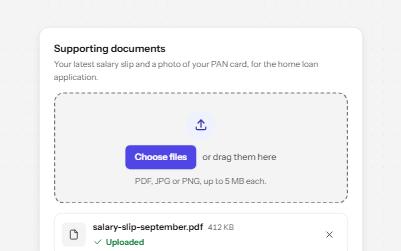
File upload
A drop zone that is a real file input underneath, with a file list, per-file progress, errors in words and a Remove button each.
-
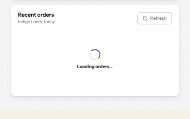
Loading state
A busy button that keeps focus, a region marked busy while it loads, a spinner with words, and a note when it runs long.
-
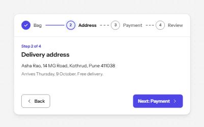
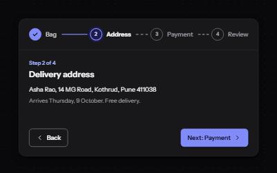
Progress steps
A row of numbered steps that says which are done, which is current and which are still to come, with Back and Next to move.
-
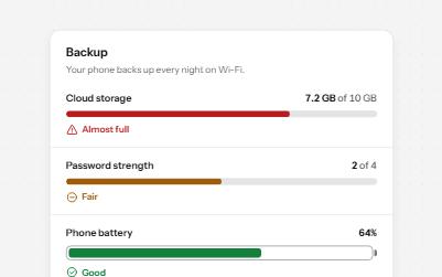
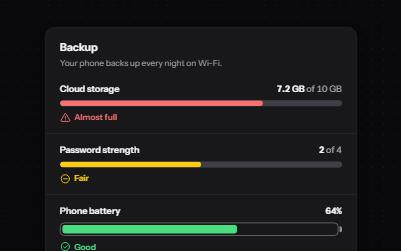
Meter
A gauge for a value inside a known range, like storage used or battery left, with its state in words as well as color.