Accessibility pattern · Feedback and status
Badge and count
A badge on its own is decoration; the count belongs in the name of the button it sits on, so "Notifications, 3 unread" is what a screen reader hears, and it changes when items are read. Status pills pair a word with an icon of a different shape, so Paid in full, Pending, Overdue and Draft read the same in color, in grayscale and aloud.
- WCAG criteria
- 7
- Keyboard rules
- 4
- Checked with
- axe, keyboard and the inspector
Live demo
Try it
Use it with a mouse, a keyboard or a screen reader. The inspector beside it shows what the browser tells assistive technology as you go: focus, state changes and announcements.
Notifications
-
Unread:
Priya Nair paid invoice INV-2041.
10 min ago
-
Unread:
Meera Textiles is 12 days past the due date.
1 h ago
-
Unread:
Kabir Studio opened invoice INV-2040.
3 h ago
-
Unread:
Your GST report for September is ready.
Yesterday
Recent invoices
- Priya Nair ₹12,400 Paid in full
- Kabir Studio ₹8,750 Pending
- Meera Textiles ₹23,100 Overdue
- Arjun Mehta ₹4,200 Draft
-
Don't: a bare red dot
Heard as “button”. No name, no count, and the dot is color alone.
-
Do: the count in the name
Heard as “Notifications, 3 unread, button”.
The demo works without JavaScript only as far as its HTML does; the inspector needs JavaScript.
Keyboard
Keys it answers to
Every action works without a pointer.
| Key | What it does |
|---|---|
| Tab | Moves through the nav links, the Messages link, the Notifications button and, when it is open, the panel's buttons. |
| Enter or Space | On Notifications, opens or closes the panel; focus stays on the button and the next Tab goes into the panel. |
| Enter or Space | On Mark as read, marks that item; the button becomes Mark as unread and the count on Notifications drops by one. |
| Escape | In the open panel, closes it and returns focus to Notifications. |
Screen readers
What it announces
Written from the roles, names and states in the markup.
| When | Expected announcement |
|---|---|
| Focus reaches the bell | Notifications, 3 unread, button, collapsed |
| Focus reaches the envelope with a 99+ badge | Messages, 128 unread, link |
| Focus reaches the Reports link | Reports New, link |
| An item is marked as read | Marked as read |
| Focus returns to the bell afterwards | Notifications, 2 unread, button, expanded |
| A screen reader reads an invoice row | Meera Textiles INV-2037 · 14 Sep ₹23,100 Overdue |
These are expected announcements, not recordings. Wording and order differ between screen readers and browsers.
Code
Copy the code
The exact files this demo runs on. The styles are served with a prefix that keeps this site's own styles out of the demo; what you copy is the original.
<div class="ap-badge" data-ap-badge>
  <div class="ap-badge__bar">
    <p class="ap-badge__brand"><span class="ap-badge__logo" aria-hidden="true"></span>Hisaab</p>
    <nav class="ap-badge__nav" aria-label="Billing">
      <ul>
        <li><a href="#badge-invoices" aria-current="page">Invoices</a></li>
        <li><a href="#badge-clients">Clients</a></li>
        <li><a href="#badge-reports">Reports <span class="ap-badge__new">New</span></a></li>
      </ul>
    </nav>
    <div class="ap-badge__icons">
      <a class="ap-badge__icon-btn" href="#badge-messages" data-ap-capped data-total="128">
        <svg class="ap-badge__glyph" viewBox="0 0 24 24" aria-hidden="true" focusable="false"><rect x="3" y="5" width="18" height="14" rx="2"/><path d="m3 7 9 6 9-6"/></svg>
        <span class="ap-badge__vh">Messages,</span>
        <span class="ap-badge__count" aria-hidden="true" data-ap-shown>99+</span>
        <span class="ap-badge__vh"><span data-ap-n>128</span> <span>unread</span></span>
      </a>
      <button type="button" class="ap-badge__icon-btn" aria-expanded="false" aria-controls="badge-panel" data-ap-bell>
        <svg class="ap-badge__glyph" viewBox="0 0 24 24" aria-hidden="true" focusable="false"><path d="M6 8a6 6 0 0 1 12 0c0 7 3 9 3 9H3s3-2 3-9"/><path d="M10.3 21a1.9 1.9 0 0 0 3.4 0"/></svg>
        <span class="ap-badge__vh">Notifications,</span>
        <span class="ap-badge__count" aria-hidden="true" data-ap-shown>3</span>
        <span class="ap-badge__vh"><span data-ap-n>3</span> <span>unread</span></span>
      </button>
    </div>
  </div>

  <section class="ap-badge__panel" id="badge-panel" aria-labelledby="badge-panel-name" hidden>
    <div class="ap-badge__panel-top">
      <h3 class="ap-badge__panel-name" id="badge-panel-name">Notifications</h3>
      <button type="button" class="ap-btn ap-btn--ghost ap-badge__all" data-ap-all>Mark all as read</button>
    </div>
    <ul class="ap-badge__notes">
      <li class="ap-badge__note" data-unread>
        <span class="ap-badge__dot" aria-hidden="true"></span>
        <div class="ap-badge__note-body" id="badge-note-1">
          <span class="ap-badge__vh" data-ap-unread-word>Unread:</span>
          <p class="ap-badge__note-text"><strong>Priya Nair</strong> paid invoice INV-2041.</p>
          <p class="ap-badge__when">10 min ago</p>
        </div>
        <button type="button" class="ap-badge__mark" data-ap-mark aria-describedby="badge-note-1">Mark as read</button>
      </li>
      <li class="ap-badge__note" data-unread>
        <span class="ap-badge__dot" aria-hidden="true"></span>
        <div class="ap-badge__note-body" id="badge-note-2">
          <span class="ap-badge__vh" data-ap-unread-word>Unread:</span>
          <p class="ap-badge__note-text"><strong>Meera Textiles</strong> is 12 days past the due date.</p>
          <p class="ap-badge__when">1 h ago</p>
        </div>
        <button type="button" class="ap-badge__mark" data-ap-mark aria-describedby="badge-note-2">Mark as read</button>
      </li>
      <li class="ap-badge__note" data-unread>
        <span class="ap-badge__dot" aria-hidden="true"></span>
        <div class="ap-badge__note-body" id="badge-note-3">
          <span class="ap-badge__vh" data-ap-unread-word>Unread:</span>
          <p class="ap-badge__note-text"><strong>Kabir Studio</strong> opened invoice INV-2040.</p>
          <p class="ap-badge__when">3 h ago</p>
        </div>
        <button type="button" class="ap-badge__mark" data-ap-mark aria-describedby="badge-note-3">Mark as read</button>
      </li>
      <li class="ap-badge__note">
        <span class="ap-badge__dot" aria-hidden="true"></span>
        <div class="ap-badge__note-body" id="badge-note-4">
          <span class="ap-badge__vh" data-ap-unread-word hidden>Unread:</span>
          <p class="ap-badge__note-text">Your GST report for September is ready.</p>
          <p class="ap-badge__when">Yesterday</p>
        </div>
        <button type="button" class="ap-badge__mark" data-ap-mark aria-describedby="badge-note-4">Mark as unread</button>
      </li>
    </ul>
  </section>

  <section class="ap-badge__invoices" aria-labelledby="badge-inv-name">
    <h3 class="ap-badge__section-name" id="badge-inv-name">Recent invoices</h3>
    <ul class="ap-badge__rows">
      <li class="ap-badge__row">
        <span class="ap-badge__who"><span class="ap-badge__client">Priya Nair</span> <span class="ap-badge__meta">INV-2041 · 2 Oct</span></span>
        <span class="ap-badge__amount">₹12,400</span>
        <span class="ap-badge__pill ap-badge__pill--paid"><svg class="ap-badge__pill-icon" viewBox="0 0 24 24" aria-hidden="true" focusable="false"><circle cx="12" cy="12" r="9"/><path d="m8 12.5 2.8 2.8L16.2 9.6"/></svg>Paid in full</span>
      </li>
      <li class="ap-badge__row">
        <span class="ap-badge__who"><span class="ap-badge__client">Kabir Studio</span> <span class="ap-badge__meta">INV-2040 · 28 Sep</span></span>
        <span class="ap-badge__amount">₹8,750</span>
        <span class="ap-badge__pill ap-badge__pill--pending"><svg class="ap-badge__pill-icon" viewBox="0 0 24 24" aria-hidden="true" focusable="false"><circle cx="12" cy="12" r="9"/><path d="M12 7v5l3 2"/></svg>Pending</span>
      </li>
      <li class="ap-badge__row">
        <span class="ap-badge__who"><span class="ap-badge__client">Meera Textiles</span> <span class="ap-badge__meta">INV-2037 · 14 Sep</span></span>
        <span class="ap-badge__amount">₹23,100</span>
        <span class="ap-badge__pill ap-badge__pill--overdue"><svg class="ap-badge__pill-icon" viewBox="0 0 24 24" aria-hidden="true" focusable="false"><path d="M10.3 4.1 2.6 17.5A2 2 0 0 0 4.3 20.5h15.4a2 2 0 0 0 1.7-3L13.7 4.1a2 2 0 0 0-3.4 0Z"/><path d="M12 9.5v4"/><path d="M12 17h.01"/></svg>Overdue</span>
      </li>
      <li class="ap-badge__row">
        <span class="ap-badge__who"><span class="ap-badge__client">Arjun Mehta</span> <span class="ap-badge__meta">INV-2042 · Today</span></span>
        <span class="ap-badge__amount">₹4,200</span>
        <span class="ap-badge__pill ap-badge__pill--draft"><svg class="ap-badge__pill-icon" viewBox="0 0 24 24" aria-hidden="true" focusable="false"><path d="M12 20h9"/><path d="M16.5 3.5a2.1 2.1 0 0 1 3 3L7 19l-4 1 1-4Z"/></svg>Draft</span>
      </li>
    </ul>
  </section>

  <ul class="ap-badge__compare" aria-label="A bare dot compared with a count in the name">
    <li class="ap-badge__case ap-badge__case--dont">
      <span class="ap-badge__sample" aria-hidden="true"><svg class="ap-badge__glyph" viewBox="0 0 24 24" aria-hidden="true" focusable="false"><path d="M6 8a6 6 0 0 1 12 0c0 7 3 9 3 9H3s3-2 3-9"/><path d="M10.3 21a1.9 1.9 0 0 0 3.4 0"/></svg><span class="ap-badge__bare-dot"></span></span>
      <div class="ap-badge__case-text">
        <p class="ap-badge__verdict">Don't: a bare red dot</p>
        <p>Heard as “button”. No name, no count, and the dot is color alone.</p>
      </div>
    </li>
    <li class="ap-badge__case ap-badge__case--do">
      <span class="ap-badge__sample" aria-hidden="true"><svg class="ap-badge__glyph" viewBox="0 0 24 24" aria-hidden="true" focusable="false"><path d="M6 8a6 6 0 0 1 12 0c0 7 3 9 3 9H3s3-2 3-9"/><path d="M10.3 21a1.9 1.9 0 0 0 3.4 0"/></svg><span class="ap-badge__count">3</span></span>
      <div class="ap-badge__case-text">
        <p class="ap-badge__verdict">Do: the count in the name</p>
        <p>Heard as “Notifications, 3 unread, button”.</p>
      </div>
    </li>
  </ul>

  <p class="ap-badge__vh" role="status" data-ap-live></p>
</div>
/* Shared primitives: buttons and form fields used across the patterns.
   Uses the --ap-* design tokens. */

.ap-btn {
  display: inline-flex;
  align-items: center;
  justify-content: center;
  gap: 8px;
  min-height: 40px;
  padding: 0 16px;
  border: 1px solid var(--ap-border-strong);
  border-radius: var(--ap-radius-sm);
  background: var(--ap-surface);
  color: var(--ap-text);
  font: inherit;
  font-weight: 600;
  line-height: 1.2;
  text-decoration: none;
  white-space: nowrap;
  cursor: pointer;
  transition: background-color var(--ap-duration) var(--ap-ease), border-color var(--ap-duration) var(--ap-ease), box-shadow var(--ap-duration) var(--ap-ease);
}
.ap-btn:hover {
  background: var(--ap-surface-2);
}
.ap-btn:focus-visible {
  outline: 2px solid var(--ap-focus);
  outline-offset: 2px;
}
.ap-btn:disabled,
.ap-btn[aria-disabled="true"] {
  opacity: .55;
  cursor: not-allowed;
}
.ap-btn--primary {
  border-color: var(--ap-accent);
  background: var(--ap-accent);
  color: var(--ap-on-accent);
  box-shadow: var(--ap-shadow-sm);
}
.ap-btn--primary:hover {
  border-color: var(--ap-accent-hover);
  background: var(--ap-accent-hover);
}
.ap-btn--danger {
  border-color: var(--ap-danger);
  background: var(--ap-danger);
  color: var(--ap-surface);
}
.ap-btn--danger:hover {
  filter: brightness(1.08);
}
.ap-btn--ghost {
  border-color: transparent;
  background: transparent;
}
.ap-btn--ghost:hover {
  background: var(--ap-surface-2);
}
.ap-btn__icon {
  width: 18px;
  height: 18px;
  flex-shrink: 0;
  fill: none;
  stroke: currentColor;
  stroke-width: 2;
  stroke-linecap: round;
  stroke-linejoin: round;
}

.ap-field {
  display: grid;
  gap: 6px;
}
.ap-label {
  color: var(--ap-text);
  font-weight: 600;
  font-size: .9375rem;
}
.ap-hint {
  margin: 0;
  color: var(--ap-text-3);
  font-size: .875rem;
  line-height: 1.45;
}
.ap-error {
  display: flex;
  align-items: flex-start;
  gap: 6px;
  margin: 0;
  color: var(--ap-danger);
  font-size: .875rem;
  font-weight: 600;
  line-height: 1.45;
}
.ap-input {
  width: 100%;
  min-height: 44px;
  padding: 10px 12px;
  border: 1px solid var(--ap-border-strong);
  border-radius: var(--ap-radius-sm);
  background: var(--ap-surface);
  color: var(--ap-text);
  font: inherit;
  line-height: 1.4;
  transition: border-color var(--ap-duration) var(--ap-ease), box-shadow var(--ap-duration) var(--ap-ease);
}
.ap-input::placeholder {
  color: var(--ap-text-3);
}
.ap-input:hover {
  border-color: var(--ap-text-2);
}
.ap-input:focus-visible {
  outline: 2px solid var(--ap-focus);
  outline-offset: 1px;
  border-color: var(--ap-focus);
}
.ap-input[aria-invalid="true"] {
  border-color: var(--ap-danger);
  box-shadow: inset 4px 0 0 var(--ap-danger);
}
textarea.ap-input {
  resize: vertical;
  min-height: 88px;
}

@media (prefers-reduced-motion: reduce) {
  .ap-btn,
  .ap-input { transition: none; }
}

/* Badge and count. Uses the --ap-* design tokens and the shared primitives. */
.ap-badge {
  width: min(100%, 620px);
  margin-inline: auto;
  border: 1px solid var(--ap-border);
  border-radius: var(--ap-radius-lg);
  background: var(--ap-surface);
  color: var(--ap-text);
  box-shadow: var(--ap-shadow-md);
  container-type: inline-size;
}
.ap-badge [hidden] {
  display: none !important;
}

/* The app bar: brand, navigation, and the two counted controls. */
.ap-badge__bar {
  display: flex;
  flex-wrap: wrap;
  align-items: center;
  gap: 8px 14px;
  padding: 10px 12px 10px 20px;
  border-bottom: 1px solid var(--ap-border);
}
.ap-badge__brand {
  display: flex;
  align-items: center;
  gap: 9px;
  margin: 0;
  font-size: 1.0625rem;
  font-weight: 700;
  letter-spacing: -.01em;
}
.ap-badge__logo {
  display: grid;
  place-items: center;
  width: 24px;
  height: 24px;
  border-radius: 7px;
  background: var(--ap-accent);
}
.ap-badge__logo::after {
  content: "";
  width: 9px;
  height: 9px;
  border-radius: 2px;
  background: var(--ap-on-accent);
  transform: rotate(45deg);
}

.ap-badge__nav {
  flex: 1 1 auto;
}
.ap-badge__nav ul {
  display: flex;
  flex-wrap: wrap;
  gap: 2px;
  margin: 0;
  padding: 0;
  list-style: none;
}
.ap-badge__nav a {
  display: inline-flex;
  align-items: center;
  gap: 7px;
  min-height: 36px;
  padding: 0 10px;
  border-radius: var(--ap-radius-sm);
  color: var(--ap-text-2);
  font-weight: 500;
  text-decoration: none;
}
.ap-badge__nav a:hover {
  background: var(--ap-surface-2);
  color: var(--ap-text);
}
.ap-badge__nav a[aria-current="page"] {
  background: var(--ap-surface-2);
  color: var(--ap-text);
  font-weight: 650;
}
.ap-badge__nav a:focus-visible {
  outline: 2px solid var(--ap-focus);
  outline-offset: 1px;
}
.ap-badge__new {
  padding: 2px 7px;
  border-radius: var(--ap-radius-full);
  background: var(--ap-accent-soft);
  color: var(--ap-accent-soft-text);
  font-size: .6875rem;
  font-weight: 700;
  letter-spacing: .05em;
  line-height: 1.3;
  text-transform: uppercase;
}

.ap-badge__icons {
  display: flex;
  gap: 4px;
  margin-left: auto;
}
.ap-badge__icon-btn {
  position: relative;
  display: grid;
  place-items: center;
  width: 44px;
  height: 44px;
  padding: 0;
  border: 1px solid transparent;
  border-radius: var(--ap-radius-sm);
  background: transparent;
  color: var(--ap-text-2);
  font: inherit;
  cursor: pointer;
}
.ap-badge__icon-btn:hover {
  background: var(--ap-surface-2);
  color: var(--ap-text);
}
.ap-badge__icon-btn[aria-expanded="true"] {
  border-color: var(--ap-border);
  background: var(--ap-surface-2);
  color: var(--ap-text);
}
.ap-badge__icon-btn:focus-visible {
  outline: 2px solid var(--ap-focus);
  outline-offset: 2px;
}
.ap-badge__glyph {
  width: 22px;
  height: 22px;
  fill: none;
  stroke: currentColor;
  stroke-width: 1.8;
  stroke-linecap: round;
  stroke-linejoin: round;
}

/* The count: drawn for the eye, aria-hidden; the name carries it in words. */
.ap-badge__count {
  position: absolute;
  top: 2px;
  left: 23px;
  display: inline-grid;
  place-items: center;
  min-width: 20px;
  height: 20px;
  padding: 0 5px;
  border-radius: var(--ap-radius-full);
  background: var(--ap-danger);
  color: var(--ap-surface);
  box-shadow: 0 0 0 2px var(--ap-surface);
  font-size: .6875rem;
  font-weight: 700;
  font-variant-numeric: tabular-nums;
  line-height: 1;
}
.ap-badge__count.is-wide {
  left: 20px;
}
.ap-badge__count.is-pop {
  animation: ap-badge-pop 260ms var(--ap-ease);
}

/* The notifications panel, shown below the bar. */
.ap-badge__panel {
  padding: 14px 16px 16px;
  border-bottom: 1px solid var(--ap-border);
  background: var(--ap-surface-2);
  animation: ap-badge-in 180ms var(--ap-ease);
}
.ap-badge__panel-top {
  display: flex;
  flex-wrap: wrap;
  align-items: center;
  justify-content: space-between;
  gap: 8px;
  padding-left: 4px;
}
.ap-badge__panel-name {
  margin: 0;
  font-size: 1rem;
  font-weight: 650;
  line-height: 1.3;
}
.ap-badge__all {
  min-height: 36px;
  padding: 0 10px;
  color: var(--ap-accent-text);
  font-size: .875rem;
}
.ap-badge__notes {
  display: grid;
  gap: 6px;
  margin: 10px 0 0;
  padding: 0;
  list-style: none;
}
.ap-badge__note {
  display: grid;
  grid-template-columns: 8px minmax(0, 1fr) auto;
  align-items: start;
  gap: 4px 12px;
  padding: 11px 12px 11px 14px;
  border: 1px solid var(--ap-border);
  border-radius: var(--ap-radius-sm);
  background: var(--ap-surface);
}
.ap-badge__dot {
  width: 8px;
  height: 8px;
  margin-top: 7px;
  border-radius: var(--ap-radius-full);
}
.ap-badge__note[data-unread] .ap-badge__dot {
  background: var(--ap-accent);
}
.ap-badge__note-body {
  min-width: 0;
}
.ap-badge__note-text {
  margin: 0;
  color: var(--ap-text-2);
  font-size: .9375rem;
  line-height: 1.45;
}
.ap-badge__note-text strong {
  font-weight: 600;
}
.ap-badge__note[data-unread] .ap-badge__note-text {
  color: var(--ap-text);
}
.ap-badge__note[data-unread] .ap-badge__note-text strong {
  font-weight: 700;
}
.ap-badge__when {
  margin: 2px 0 0;
  color: var(--ap-text-3);
  font-size: .8125rem;
}
.ap-badge__mark {
  min-height: 32px;
  padding: 0 10px;
  border: 1px solid var(--ap-border-strong);
  border-radius: var(--ap-radius-sm);
  background: var(--ap-surface);
  color: var(--ap-text);
  font: inherit;
  font-size: .8125rem;
  font-weight: 600;
  white-space: nowrap;
  cursor: pointer;
}
.ap-badge__mark:hover {
  background: var(--ap-surface-2);
}
.ap-badge__mark:focus-visible {
  outline: 2px solid var(--ap-focus);
  outline-offset: 2px;
}

/* Invoices with status pills: a word and an icon of its own shape each. */
.ap-badge__invoices {
  padding: 18px 20px 8px;
}
.ap-badge__section-name {
  margin: 0 0 4px;
  color: var(--ap-text-3);
  font-size: .75rem;
  font-weight: 650;
  letter-spacing: .06em;
  line-height: 1.4;
  text-transform: uppercase;
}
.ap-badge__rows {
  margin: 0;
  padding: 0;
  list-style: none;
}
.ap-badge__row {
  display: grid;
  grid-template-columns: minmax(0, 1fr) auto 8.75rem;
  align-items: center;
  gap: 4px 18px;
  padding: 12px 0;
}
.ap-badge__row + .ap-badge__row {
  border-top: 1px solid var(--ap-border);
}
.ap-badge__who {
  display: grid;
  min-width: 0;
}
.ap-badge__client {
  font-weight: 600;
  line-height: 1.4;
}
.ap-badge__meta {
  color: var(--ap-text-3);
  font-size: .8125rem;
  font-variant-numeric: tabular-nums;
  line-height: 1.4;
}
.ap-badge__amount {
  font-weight: 600;
  font-variant-numeric: tabular-nums;
  text-align: end;
}
.ap-badge__pill {
  justify-self: start;
  display: inline-flex;
  align-items: center;
  gap: 5px;
  padding: 3px 10px 3px 7px;
  border: 1px solid color-mix(in srgb, currentColor 30%, transparent);
  border-radius: var(--ap-radius-full);
  font-size: .8125rem;
  font-weight: 600;
  line-height: 1.3;
  white-space: nowrap;
}
.ap-badge__pill-icon {
  width: 15px;
  height: 15px;
  flex-shrink: 0;
  fill: none;
  stroke: currentColor;
  stroke-width: 2.2;
  stroke-linecap: round;
  stroke-linejoin: round;
}
.ap-badge__pill--paid {
  background: var(--ap-success-soft);
  color: var(--ap-success);
}
.ap-badge__pill--pending {
  background: var(--ap-info-soft);
  color: var(--ap-info);
}
.ap-badge__pill--overdue {
  background: var(--ap-danger-soft);
  color: var(--ap-danger);
}
.ap-badge__pill--draft {
  border-style: dashed;
  border-color: var(--ap-border-strong);
  background: var(--ap-surface-2);
  color: var(--ap-text-2);
}

/* Don't and do, side by side. */
.ap-badge__compare {
  display: grid;
  grid-template-columns: repeat(2, minmax(0, 1fr));
  gap: 10px;
  margin: 8px 0 0;
  padding: 16px 20px 20px;
  border-top: 1px solid var(--ap-border);
  border-radius: 0 0 var(--ap-radius-lg) var(--ap-radius-lg);
  background: var(--ap-surface-2);
  list-style: none;
}
.ap-badge__case {
  display: flex;
  align-items: flex-start;
  gap: 12px;
  padding: 12px 14px;
  border: 1px solid var(--ap-border);
  border-radius: var(--ap-radius);
  background: var(--ap-surface);
}
.ap-badge__case p {
  margin: 0;
  color: var(--ap-text-2);
  font-size: .875rem;
  line-height: 1.45;
}
.ap-badge__case .ap-badge__verdict {
  margin-bottom: 2px;
  font-weight: 650;
}
.ap-badge__case--dont .ap-badge__verdict {
  color: var(--ap-danger);
}
.ap-badge__case--do .ap-badge__verdict {
  color: var(--ap-success);
}
.ap-badge__sample {
  position: relative;
  display: grid;
  place-items: center;
  flex: none;
  width: 44px;
  height: 44px;
  border-radius: var(--ap-radius-sm);
  background: var(--ap-surface-2);
  color: var(--ap-text-2);
}
.ap-badge__sample .ap-badge__count {
  box-shadow: 0 0 0 2px var(--ap-surface-2);
}
.ap-badge__bare-dot {
  position: absolute;
  top: 10px;
  right: 11px;
  width: 9px;
  height: 9px;
  border-radius: var(--ap-radius-full);
  background: var(--ap-danger);
  box-shadow: 0 0 0 2px var(--ap-surface-2);
}

.ap-badge__vh {
  position: absolute;
  width: 1px;
  height: 1px;
  margin: -1px;
  padding: 0;
  overflow: hidden;
  clip-path: inset(50%);
  white-space: nowrap;
  border: 0;
}

@container (max-width: 520px) {
  .ap-badge__bar { padding-left: 16px; }
  .ap-badge__nav { order: 3; flex-basis: 100%; margin: 0 -4px; }
  .ap-badge__invoices { padding-inline: 16px; }
  .ap-badge__row {
    grid-template-columns: minmax(0, 1fr) auto;
  }
  .ap-badge__pill { grid-column: 2; justify-self: end; }
  .ap-badge__note { grid-template-columns: 8px minmax(0, 1fr); }
  .ap-badge__mark { grid-column: 2; justify-self: start; margin-top: 4px; }
  .ap-badge__compare { grid-template-columns: minmax(0, 1fr); padding-inline: 16px; }
}

@keyframes ap-badge-pop {
  40% { transform: scale(1.25); }
}
@keyframes ap-badge-in {
  from { opacity: 0; transform: translateY(-4px); }
}

@media (prefers-reduced-motion: reduce) {
  .ap-badge__count.is-pop,
  .ap-badge__panel { animation: none; }
}
/**
 * Badge and count: a count that is part of its control's name, capped at
 * 99+ for the eye only, and kept current as items are read.
 *
 * Markup: [data-ap-badge] holding controls with an aria-hidden
 * [data-ap-shown] badge and visually hidden [data-ap-n] text in their name;
 * a button[data-ap-bell][aria-controls] for the notifications panel, whose
 * items (li, data-unread when unread) each have a button[data-ap-mark]; a
 * button[data-ap-all]; and a role=status paragraph for confirmations.
 */

const CAP = 99;

// The visible badge is capped; the hidden text keeps the real number.
function paint(control, n) {
  const shown = control.querySelector("[data-ap-shown]");
  shown.textContent = n > CAP ? `${CAP}+` : String(n);
  shown.hidden = n === 0;
  shown.classList.toggle("is-wide", n > 9);
  control.querySelector("[data-ap-n]").textContent = String(n);
}

export function init(root) {
  const bell = root.querySelector("[data-ap-bell]");
  const panel = document.getElementById(bell.getAttribute("aria-controls"));
  const live = root.querySelector("[data-ap-live]");
  const items = [...panel.querySelectorAll("li")];
  const reduce = matchMedia("(prefers-reduced-motion: reduce)");

  const say = (text) => {
    live.textContent = "";
    requestAnimationFrame(() => { live.textContent = text; });
  };

  function setRead(item, read) {
    item.toggleAttribute("data-unread", !read);
    item.querySelector("[data-ap-unread-word]").hidden = read;
    item.querySelector("[data-ap-mark]").textContent = read ? "Mark as unread" : "Mark as read";
  }

  function recount() {
    const n = items.filter((li) => li.hasAttribute("data-unread")).length;
    paint(bell, n);
    // A short pop on the badge when the number changes, unless motion is reduced.
    const shown = bell.querySelector("[data-ap-shown]");
    if (!reduce.matches && !shown.hidden) {
      shown.classList.remove("is-pop");
      void shown.offsetWidth;
      shown.classList.add("is-pop");
    }
  }

  function setOpen(open) {
    bell.setAttribute("aria-expanded", String(open));
    panel.hidden = !open;
  }

  function onClick(event) {
    const link = event.target.closest("a[href^='#badge-']");
    if (link) {
      // The demo's pages do not exist here; a real product follows the link.
      event.preventDefault();
      return;
    }
    if (event.target.closest("[data-ap-bell]")) {
      setOpen(bell.getAttribute("aria-expanded") !== "true");
      return;
    }
    const mark = event.target.closest("[data-ap-mark]");
    if (mark) {
      const item = mark.closest("li");
      const read = item.hasAttribute("data-unread");
      setRead(item, read);
      recount();
      say(read ? "Marked as read" : "Marked as unread");
      return;
    }
    if (event.target.closest("[data-ap-all]")) {
      const any = items.some((li) => li.hasAttribute("data-unread"));
      for (const li of items) setRead(li, true);
      recount();
      say(any ? "All notifications marked as read" : "No unread notifications");
    }
  }

  function onKeydown(event) {
    if (event.key !== "Escape" || panel.hidden || !panel.contains(document.activeElement)) return;
    event.preventDefault();
    setOpen(false);
    bell.focus();
  }

  // Counts from the data: the capped one from its total, the bell from the list.
  for (const control of root.querySelectorAll("[data-ap-capped]")) paint(control, Number(control.dataset.total));
  paint(bell, items.filter((li) => li.hasAttribute("data-unread")).length);

  root.addEventListener("click", onClick);
  root.addEventListener("keydown", onKeydown);
  return () => {
    root.removeEventListener("click", onClick);
    root.removeEventListener("keydown", onKeydown);
  };
}

for (const root of document.querySelectorAll("[data-ap-badge]")) init(root);
/* Design tokens for the pattern components. Light by default, dark when the
   system asks for it; set data-theme="dark" on :root to force dark. */
:root {
    --ap-radius-sm: 8px;
    --ap-radius: 12px;
    --ap-radius-lg: 16px;
    --ap-radius-full: 999px;
    --ap-font: "Instrument Sans", ui-sans-serif, system-ui, -apple-system, "Segoe UI", Roboto, sans-serif;
    --ap-mono: "JetBrains Mono", ui-monospace, "Cascadia Mono", "SF Mono", Consolas, monospace;
    --ap-ease: cubic-bezier(.2, .8, .2, 1);
    --ap-duration: 180ms;
    --ap-target: 44px;
    --ap-bg: #F4F4F5;
    --ap-surface: #FFFFFF;
    --ap-surface-2: #F4F4F5;
    --ap-surface-3: #E4E4E7;
    --ap-border: #E4E4E7;
    --ap-border-strong: #76767F;
    --ap-text: #18181B;
    --ap-text-2: #3F3F46;
    --ap-text-3: #5E5E66;
    --ap-accent: #4F46E5;
    --ap-accent-hover: #4338CA;
    --ap-on-accent: #FFFFFF;
    --ap-accent-text: #4338CA;
    --ap-accent-soft: #EEF2FF;
    --ap-accent-soft-text: #3730A3;
    --ap-focus: #4F46E5;
    --ap-danger: #B91C1C;
    --ap-danger-soft: #FEF2F2;
    --ap-success: #15803D;
    --ap-success-soft: #F0FDF4;
    --ap-warning: #A15C07;
    --ap-warning-soft: #FEFCE8;
    --ap-info: #1D4ED8;
    --ap-info-soft: #EFF6FF;
    --ap-scrim: rgb(9 9 11 / .48);
    --ap-shadow-sm: 0 1px 2px rgb(9 9 11 / .06);
    --ap-shadow-md: 0 1px 2px rgb(9 9 11 / .05), 0 6px 16px -4px rgb(9 9 11 / .1);
    --ap-shadow-lg: 0 2px 6px rgb(9 9 11 / .06), 0 20px 40px -12px rgb(9 9 11 / .22);
    --ap-light-bg: #F4F4F5;
    --ap-light-surface: #FFFFFF;
    --ap-light-surface-2: #F4F4F5;
    --ap-light-surface-3: #E4E4E7;
    --ap-light-border: #E4E4E7;
    --ap-light-border-strong: #76767F;
    --ap-light-text: #18181B;
    --ap-light-text-2: #3F3F46;
    --ap-light-text-3: #5E5E66;
    --ap-light-accent: #4F46E5;
    --ap-light-accent-hover: #4338CA;
    --ap-light-on-accent: #FFFFFF;
    --ap-light-accent-text: #4338CA;
    --ap-light-accent-soft: #EEF2FF;
    --ap-light-accent-soft-text: #3730A3;
    --ap-light-focus: #4F46E5;
    --ap-light-danger: #B91C1C;
    --ap-light-danger-soft: #FEF2F2;
    --ap-light-success: #15803D;
    --ap-light-success-soft: #F0FDF4;
    --ap-light-warning: #A15C07;
    --ap-light-warning-soft: #FEFCE8;
    --ap-light-info: #1D4ED8;
    --ap-light-info-soft: #EFF6FF;
    --ap-light-scrim: rgb(9 9 11 / .48);
    --ap-light-shadow-sm: 0 1px 2px rgb(9 9 11 / .06);
    --ap-light-shadow-md: 0 1px 2px rgb(9 9 11 / .05), 0 6px 16px -4px rgb(9 9 11 / .1);
    --ap-light-shadow-lg: 0 2px 6px rgb(9 9 11 / .06), 0 20px 40px -12px rgb(9 9 11 / .22);
    --ap-dark-bg: #09090B;
    --ap-dark-surface: #18181B;
    --ap-dark-surface-2: #27272A;
    --ap-dark-surface-3: #3F3F46;
    --ap-dark-border: #2E2E33;
    --ap-dark-border-strong: #8E8E97;
    --ap-dark-text: #FAFAFA;
    --ap-dark-text-2: #D4D4D8;
    --ap-dark-text-3: #A1A1AA;
    --ap-dark-accent: #818CF8;
    --ap-dark-accent-hover: #A5B4FC;
    --ap-dark-on-accent: #0C0A1F;
    --ap-dark-accent-text: #A5B4FC;
    --ap-dark-accent-soft: #1E1B4B;
    --ap-dark-accent-soft-text: #C7D2FE;
    --ap-dark-focus: #A5B4FC;
    --ap-dark-danger: #F87171;
    --ap-dark-danger-soft: #2A1215;
    --ap-dark-success: #4ADE80;
    --ap-dark-success-soft: #0F2A1A;
    --ap-dark-warning: #FACC15;
    --ap-dark-warning-soft: #2A2410;
    --ap-dark-info: #60A5FA;
    --ap-dark-info-soft: #0F1D33;
    --ap-dark-scrim: rgb(0 0 0 / .62);
    --ap-dark-shadow-sm: 0 1px 2px rgb(0 0 0 / .4);
    --ap-dark-shadow-md: 0 1px 2px rgb(0 0 0 / .4), 0 8px 20px -6px rgb(0 0 0 / .5);
    --ap-dark-shadow-lg: 0 2px 8px rgb(0 0 0 / .45), 0 24px 48px -12px rgb(0 0 0 / .7);
}
@media (prefers-color-scheme: dark) {
  :root:not([data-theme="light"]) {
      --ap-bg: #09090B;
      --ap-surface: #18181B;
      --ap-surface-2: #27272A;
      --ap-surface-3: #3F3F46;
      --ap-border: #2E2E33;
      --ap-border-strong: #8E8E97;
      --ap-text: #FAFAFA;
      --ap-text-2: #D4D4D8;
      --ap-text-3: #A1A1AA;
      --ap-accent: #818CF8;
      --ap-accent-hover: #A5B4FC;
      --ap-on-accent: #0C0A1F;
      --ap-accent-text: #A5B4FC;
      --ap-accent-soft: #1E1B4B;
      --ap-accent-soft-text: #C7D2FE;
      --ap-focus: #A5B4FC;
      --ap-danger: #F87171;
      --ap-danger-soft: #2A1215;
      --ap-success: #4ADE80;
      --ap-success-soft: #0F2A1A;
      --ap-warning: #FACC15;
      --ap-warning-soft: #2A2410;
      --ap-info: #60A5FA;
      --ap-info-soft: #0F1D33;
      --ap-scrim: rgb(0 0 0 / .62);
      --ap-shadow-sm: 0 1px 2px rgb(0 0 0 / .4);
      --ap-shadow-md: 0 1px 2px rgb(0 0 0 / .4), 0 8px 20px -6px rgb(0 0 0 / .5);
      --ap-shadow-lg: 0 2px 8px rgb(0 0 0 / .45), 0 24px 48px -12px rgb(0 0 0 / .7);
  }
}
:root[data-theme="dark"] {
    --ap-bg: #09090B;
    --ap-surface: #18181B;
    --ap-surface-2: #27272A;
    --ap-surface-3: #3F3F46;
    --ap-border: #2E2E33;
    --ap-border-strong: #8E8E97;
    --ap-text: #FAFAFA;
    --ap-text-2: #D4D4D8;
    --ap-text-3: #A1A1AA;
    --ap-accent: #818CF8;
    --ap-accent-hover: #A5B4FC;
    --ap-on-accent: #0C0A1F;
    --ap-accent-text: #A5B4FC;
    --ap-accent-soft: #1E1B4B;
    --ap-accent-soft-text: #C7D2FE;
    --ap-focus: #A5B4FC;
    --ap-danger: #F87171;
    --ap-danger-soft: #2A1215;
    --ap-success: #4ADE80;
    --ap-success-soft: #0F2A1A;
    --ap-warning: #FACC15;
    --ap-warning-soft: #2A2410;
    --ap-info: #60A5FA;
    --ap-info-soft: #0F1D33;
    --ap-scrim: rgb(0 0 0 / .62);
    --ap-shadow-sm: 0 1px 2px rgb(0 0 0 / .4);
    --ap-shadow-md: 0 1px 2px rgb(0 0 0 / .4), 0 8px 20px -6px rgb(0 0 0 / .5);
    --ap-shadow-lg: 0 2px 8px rgb(0 0 0 / .45), 0 24px 48px -12px rgb(0 0 0 / .7);
}
WCAG 2.2
What it meets
The success criteria this pattern takes care of, and how.
-
1.1.1 Non-text Content
Level A
The bell and envelope glyphs are hidden from assistive technology; the words beside them, kept visually hidden, give each control its name.
-
1.3.1 Info and Relationships
Level A
The visible count is aria-hidden and the same number sits in the name in words, so the badge is never a stray "3" read out of context.
-
1.4.1 Use of Color
Level A
Each status pill has its own word and an icon of a different shape, and the unread items carry a word as well as a dot.
-
1.4.3 Contrast (Minimum)
Level AA
Pill text uses the success, info, danger and secondary text tokens on their own soft fills, each 4.5:1 or more in light and dark.
-
2.4.4 Link Purpose (In Context)
Level A
The Mark as read buttons are tied to their item's text with aria-describedby, so three identical labels still say which item they act on.
-
4.1.2 Name, Role, Value
Level A
The bell is a button with aria-expanded, and its name changes with the count, so the name a screen reader reads is always current.
-
4.1.3 Status Messages
Level AA
Marking items read is confirmed in a polite status message, without moving focus.
Usage
When to use it
Use it
- A count of new or unread things on the control that opens them: notifications, messages, a cart.
- A short status on an item in a list or table: paid, pending, failed, draft.
- Flagging something new in navigation for a while, like a feature added last week.
Use something else
- Information people must act on: a badge is easy to miss, so use an alert or a callout.
- Long text: a badge holds a word or two; anything longer belongs in the content.
- Status that changes while people watch, like an upload: a status message or a progress bar says so.
Common failures
How it usually goes wrong
A bare red dot
An unlabeled dot says something changed to people who see red, and nothing to anyone else. Put the count in the control's name and draw the badge as a number.
A count read out of context
Without aria-hidden, a visible "3" inside a link is read as part of its name with no meaning: "Notifications 3". Here the number is spoken as "3 unread".
99+ read as ninety-nine plus
The cap is for the eye, not the ear. The visible "99+" is hidden and the full count, "128 unread", is in the name.
Status in color only
Green, amber and red pills look the same to many people. Each pill here pairs its word with an icon of its own shape.
A name that never updates
An aria-label written once at page load still says 3 after everything is read. The name here is built from text the script updates.
Pale text on a pale pill
Soft tinted badges often fall well below 4.5:1. The pill colors here are tokens tested against their own fills in both themes.
Notes
Building it
- Hide the visible count with aria-hidden and put the full sentence piece, "3 unread", in visually hidden text inside the control, so the name reads naturally and the number can be capped for the eye only.
- Keep the count's text in the page rather than in an aria-label, so translation tools and the page's own language switch reach it.
- A New badge inside a link becomes part of the link's name ("Reports New"). That is useful, but remove the badge once people have seen the page, or it stops meaning anything.
- Don't announce every count change in a live region: confirm what the person did ("Marked as read") and let the name carry the new number.
- The demo's links point to #… because their pages do not exist here; in a real product they are ordinary links.
Sources: WAI-ARIA Authoring Practices: Providing accessible names · WCAG 2.2 Understanding 1.4.1: Use of Color
Checked with axe in light and dark themes, at desktop and phone widths, and by keyboard. Not yet tested with every screen reader and browser pair. Report a correction
Related
Patterns that go with it
-
Icon button
Buttons that show only an icon, named with aria-label, 44 pixels square, with a tooltip on hover and focus that repeats the name.
-
Status message
Results, confirmations and saves told to screen readers through role=status, without moving focus, once each time.
-
Toast notifications
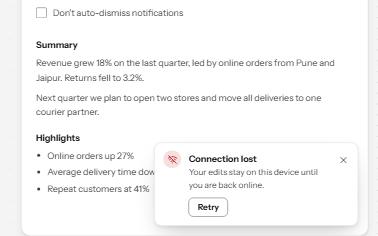
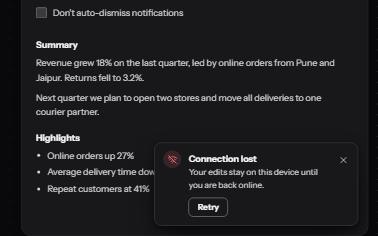
Short messages that appear in a corner, are announced politely, never take focus, and wait while you read or act on them.
-
Show more
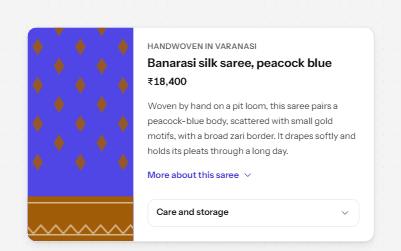
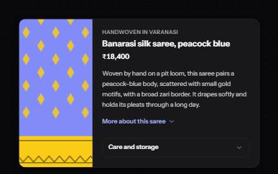
A button that reveals the rest of a long text in place, with the hidden part still reachable by find-in-page.