Accessibility pattern · Feedback and status
Progress steps
The steps are an ordered list; the current one carries aria-current="step", and every step starts with a hidden word, Completed, Current or Not started, so its state never rests on a color or a tick. Back and Next move the current step, announce "Step 3 of 4: Payment" politely and send focus to the new step's heading, so reading carries on from the right place.
- WCAG criteria
- 6
- Keyboard rules
- 4
- Checked with
- axe, keyboard and the inspector
Live demo
Try it
Use it with a mouse, a keyboard or a screen reader. The inspector beside it shows what the browser tells assistive technology as you go: focus, state changes and announcements.
- Completed: Bag
- Current: Address
- Not started: Payment
- Not started: Review
Step 1 of 4
Your bag
- Block-print cotton kurta, M
- ₹1,890
- Handloom stole, indigo
- ₹1,250
- Total
- ₹3,140
Step 2 of 4
Delivery address
Asha Rao, 14 MG Road, Kothrud, Pune 411038
Arrives Thursday, 9 October. Free delivery.
Step 3 of 4
Payment
Pay ₹3,140 by UPI, card or net banking.
Nothing is charged until you place the order.
Step 4 of 4
Review your order
- Items
- 2
- Deliver to
- Pune 411038
- Pay by
- UPI
- Total
- ₹3,140
All 4 steps done
Order placed
We have emailed your receipt. You can track the parcel from your orders page.
The demo works without JavaScript only as far as its HTML does; the inspector needs JavaScript.
Keyboard
Keys it answers to
Every action works without a pointer.
| Key | What it does |
|---|---|
| Tab | Skips the step list, which is information, and moves from the step's content to Back and Next. |
| Enter or Space | On Next, marks this step completed, makes the next one current, announces it and moves focus to its heading. |
| Enter or Space | On Back, makes the previous step current again and moves focus to its heading. |
| Enter or Space | On Place order, the last step's button, marks every step completed; Start again goes back to the first. |
Screen readers
What it announces
Written from the roles, names and states in the markup.
| When | Expected announcement |
|---|---|
| A screen reader reads the step list | Checkout progress, list, 4 items. Completed: Bag. Current: Address, current step. Not started: Payment. Not started: Review |
| Next is pressed on step 2 | Step 3 of 4: Payment |
| Focus lands on the new step's heading | Payment, heading level 3 |
| Back is pressed | Step 2 of 4: Address |
| The order is placed | Order placed. All 4 steps completed |
These are expected announcements, not recordings. Wording and order differ between screen readers and browsers.
Code
Copy the code
The exact files this demo runs on. The styles are served with a prefix that keeps this site's own styles out of the demo; what you copy is the original.
<div class="ap-stepper" data-ap-stepper>
  <ol class="ap-stepper__steps" aria-label="Checkout progress">
    <li class="ap-stepper__step" data-state="done">
      <span class="ap-stepper__marker" aria-hidden="true"><span class="ap-stepper__num">1</span><svg class="ap-stepper__tick" viewBox="0 0 24 24" aria-hidden="true" focusable="false"><path d="m5 12.5 4.5 4.5L19 7.5"/></svg></span>
      <span class="ap-stepper__label"><span class="ap-stepper__vh" data-ap-state>Completed:</span> <span class="ap-stepper__name">Bag</span></span>
    </li>
    <li class="ap-stepper__step" data-state="current" aria-current="step">
      <span class="ap-stepper__marker" aria-hidden="true"><span class="ap-stepper__num">2</span><svg class="ap-stepper__tick" viewBox="0 0 24 24" aria-hidden="true" focusable="false"><path d="m5 12.5 4.5 4.5L19 7.5"/></svg></span>
      <span class="ap-stepper__label"><span class="ap-stepper__vh" data-ap-state>Current:</span> <span class="ap-stepper__name">Address</span></span>
    </li>
    <li class="ap-stepper__step" data-state="todo">
      <span class="ap-stepper__marker" aria-hidden="true"><span class="ap-stepper__num">3</span><svg class="ap-stepper__tick" viewBox="0 0 24 24" aria-hidden="true" focusable="false"><path d="m5 12.5 4.5 4.5L19 7.5"/></svg></span>
      <span class="ap-stepper__label"><span class="ap-stepper__vh" data-ap-state>Not started:</span> <span class="ap-stepper__name">Payment</span></span>
    </li>
    <li class="ap-stepper__step" data-state="todo">
      <span class="ap-stepper__marker" aria-hidden="true"><span class="ap-stepper__num">4</span><svg class="ap-stepper__tick" viewBox="0 0 24 24" aria-hidden="true" focusable="false"><path d="m5 12.5 4.5 4.5L19 7.5"/></svg></span>
      <span class="ap-stepper__label"><span class="ap-stepper__vh" data-ap-state>Not started:</span> <span class="ap-stepper__name">Review</span></span>
    </li>
  </ol>

  <div class="ap-stepper__body">
    <section class="ap-stepper__panel" data-ap-panel="1" aria-labelledby="stepper-h-1" hidden>
      <p class="ap-stepper__kicker">Step 1 of 4</p>
      <h3 class="ap-stepper__h" id="stepper-h-1" tabindex="-1">Your bag</h3>
      <dl class="ap-stepper__facts">
        <div><dt>Block-print cotton kurta, M</dt><dd>₹1,890</dd></div>
        <div><dt>Handloom stole, indigo</dt><dd>₹1,250</dd></div>
        <div><dt>Total</dt><dd>₹3,140</dd></div>
      </dl>
    </section>
    <section class="ap-stepper__panel" data-ap-panel="2" aria-labelledby="stepper-h-2">
      <p class="ap-stepper__kicker">Step 2 of 4</p>
      <h3 class="ap-stepper__h" id="stepper-h-2" tabindex="-1">Delivery address</h3>
      <p class="ap-stepper__text">Asha Rao, 14 MG Road, Kothrud, Pune 411038</p>
      <p class="ap-stepper__note">Arrives Thursday, 9 October. Free delivery.</p>
    </section>
    <section class="ap-stepper__panel" data-ap-panel="3" aria-labelledby="stepper-h-3" hidden>
      <p class="ap-stepper__kicker">Step 3 of 4</p>
      <h3 class="ap-stepper__h" id="stepper-h-3" tabindex="-1">Payment</h3>
      <p class="ap-stepper__text">Pay ₹3,140 by UPI, card or net banking.</p>
      <p class="ap-stepper__note">Nothing is charged until you place the order.</p>
    </section>
    <section class="ap-stepper__panel" data-ap-panel="4" aria-labelledby="stepper-h-4" hidden>
      <p class="ap-stepper__kicker">Step 4 of 4</p>
      <h3 class="ap-stepper__h" id="stepper-h-4" tabindex="-1">Review your order</h3>
      <dl class="ap-stepper__facts">
        <div><dt>Items</dt><dd>2</dd></div>
        <div><dt>Deliver to</dt><dd>Pune 411038</dd></div>
        <div><dt>Pay by</dt><dd>UPI</dd></div>
        <div><dt>Total</dt><dd>₹3,140</dd></div>
      </dl>
    </section>
    <section class="ap-stepper__panel" data-ap-panel="done" aria-labelledby="stepper-h-done" hidden>
      <p class="ap-stepper__kicker">All 4 steps done</p>
      <h3 class="ap-stepper__h" id="stepper-h-done" tabindex="-1">Order placed</h3>
      <p class="ap-stepper__text">We have emailed your receipt. You can track the parcel from your orders page.</p>
    </section>
  </div>

  <div class="ap-stepper__nav">
    <button type="button" class="ap-btn" data-ap-back>
      <svg class="ap-btn__icon" viewBox="0 0 24 24" aria-hidden="true" focusable="false"><path d="m15 18-6-6 6-6"/></svg>
      Back
    </button>
    <button type="button" class="ap-btn ap-btn--primary" data-ap-next>
      <span data-ap-next-label><span>Next:</span> <span>Payment</span></span>
      <svg class="ap-btn__icon" viewBox="0 0 24 24" aria-hidden="true" focusable="false"><path d="m9 18 6-6-6-6"/></svg>
    </button>
  </div>

  <p class="ap-stepper__vh" role="status" data-ap-live></p>
</div>
/* Shared primitives: buttons and form fields used across the patterns.
   Uses the --ap-* design tokens. */

.ap-btn {
  display: inline-flex;
  align-items: center;
  justify-content: center;
  gap: 8px;
  min-height: 40px;
  padding: 0 16px;
  border: 1px solid var(--ap-border-strong);
  border-radius: var(--ap-radius-sm);
  background: var(--ap-surface);
  color: var(--ap-text);
  font: inherit;
  font-weight: 600;
  line-height: 1.2;
  text-decoration: none;
  white-space: nowrap;
  cursor: pointer;
  transition: background-color var(--ap-duration) var(--ap-ease), border-color var(--ap-duration) var(--ap-ease), box-shadow var(--ap-duration) var(--ap-ease);
}
.ap-btn:hover {
  background: var(--ap-surface-2);
}
.ap-btn:focus-visible {
  outline: 2px solid var(--ap-focus);
  outline-offset: 2px;
}
.ap-btn:disabled,
.ap-btn[aria-disabled="true"] {
  opacity: .55;
  cursor: not-allowed;
}
.ap-btn--primary {
  border-color: var(--ap-accent);
  background: var(--ap-accent);
  color: var(--ap-on-accent);
  box-shadow: var(--ap-shadow-sm);
}
.ap-btn--primary:hover {
  border-color: var(--ap-accent-hover);
  background: var(--ap-accent-hover);
}
.ap-btn--danger {
  border-color: var(--ap-danger);
  background: var(--ap-danger);
  color: var(--ap-surface);
}
.ap-btn--danger:hover {
  filter: brightness(1.08);
}
.ap-btn--ghost {
  border-color: transparent;
  background: transparent;
}
.ap-btn--ghost:hover {
  background: var(--ap-surface-2);
}
.ap-btn__icon {
  width: 18px;
  height: 18px;
  flex-shrink: 0;
  fill: none;
  stroke: currentColor;
  stroke-width: 2;
  stroke-linecap: round;
  stroke-linejoin: round;
}

.ap-field {
  display: grid;
  gap: 6px;
}
.ap-label {
  color: var(--ap-text);
  font-weight: 600;
  font-size: .9375rem;
}
.ap-hint {
  margin: 0;
  color: var(--ap-text-3);
  font-size: .875rem;
  line-height: 1.45;
}
.ap-error {
  display: flex;
  align-items: flex-start;
  gap: 6px;
  margin: 0;
  color: var(--ap-danger);
  font-size: .875rem;
  font-weight: 600;
  line-height: 1.45;
}
.ap-input {
  width: 100%;
  min-height: 44px;
  padding: 10px 12px;
  border: 1px solid var(--ap-border-strong);
  border-radius: var(--ap-radius-sm);
  background: var(--ap-surface);
  color: var(--ap-text);
  font: inherit;
  line-height: 1.4;
  transition: border-color var(--ap-duration) var(--ap-ease), box-shadow var(--ap-duration) var(--ap-ease);
}
.ap-input::placeholder {
  color: var(--ap-text-3);
}
.ap-input:hover {
  border-color: var(--ap-text-2);
}
.ap-input:focus-visible {
  outline: 2px solid var(--ap-focus);
  outline-offset: 1px;
  border-color: var(--ap-focus);
}
.ap-input[aria-invalid="true"] {
  border-color: var(--ap-danger);
  box-shadow: inset 4px 0 0 var(--ap-danger);
}
textarea.ap-input {
  resize: vertical;
  min-height: 88px;
}

@media (prefers-reduced-motion: reduce) {
  .ap-btn,
  .ap-input { transition: none; }
}

/* Progress steps. Uses the --ap-* design tokens and the shared primitives. */
.ap-stepper {
  width: min(100%, 640px);
  margin-inline: auto;
  border: 1px solid var(--ap-border);
  border-radius: var(--ap-radius-lg);
  background: var(--ap-surface);
  color: var(--ap-text);
  box-shadow: var(--ap-shadow-md);
  container-type: inline-size;
}
.ap-stepper [hidden] {
  display: none !important;
}

/* The steps: a row joined by connectors. Solid means done, dashed still to come. */
.ap-stepper__steps {
  display: flex;
  align-items: center;
  margin: 0;
  padding: 22px 24px;
  border-bottom: 1px solid var(--ap-border);
  list-style: none;
}
.ap-stepper__step {
  display: flex;
  align-items: center;
  gap: 10px;
  min-width: 0;
}
.ap-stepper__step:not(:last-child) {
  flex: 1;
}
.ap-stepper__step:not(:last-child)::after {
  content: "";
  flex: 1;
  min-width: 16px;
  margin: 0 6px 0 2px;
  border-top: 2px dashed var(--ap-border-strong);
}
.ap-stepper__step[data-state="done"]::after {
  border-top-style: solid;
  border-color: var(--ap-accent);
}
.ap-stepper__marker {
  display: grid;
  place-items: center;
  flex: none;
  width: 30px;
  height: 30px;
  border: 1.5px solid var(--ap-border-strong);
  border-radius: 50%;
  background: var(--ap-surface);
  color: var(--ap-text-3);
  font-size: .8125rem;
  font-weight: 650;
  font-variant-numeric: tabular-nums;
  transition: background-color var(--ap-duration) var(--ap-ease), border-color var(--ap-duration) var(--ap-ease), box-shadow var(--ap-duration) var(--ap-ease);
}
.ap-stepper__tick {
  display: none;
  width: 16px;
  height: 16px;
  fill: none;
  stroke: currentColor;
  stroke-width: 2.8;
  stroke-linecap: round;
  stroke-linejoin: round;
}
.ap-stepper__label {
  min-width: 0;
  font-size: .9375rem;
  line-height: 1.3;
  white-space: nowrap;
}
.ap-stepper__name {
  color: var(--ap-text-3);
  font-weight: 500;
}

/* Done: a filled circle with a tick. */
.ap-stepper__step[data-state="done"] .ap-stepper__marker {
  border-color: var(--ap-accent);
  background: var(--ap-accent);
  color: var(--ap-on-accent);
}
.ap-stepper__step[data-state="done"] .ap-stepper__num {
  display: none;
}
.ap-stepper__step[data-state="done"] .ap-stepper__tick {
  display: block;
}
.ap-stepper__step[data-state="done"] .ap-stepper__name {
  color: var(--ap-text-2);
}
/* Current: a thick ring, a halo, and the name in bold. */
.ap-stepper__step[data-state="current"] .ap-stepper__marker {
  border: 2px solid var(--ap-accent);
  background: var(--ap-accent-soft);
  color: var(--ap-accent-soft-text);
  box-shadow: 0 0 0 4px var(--ap-accent-soft);
}
.ap-stepper__step[data-state="current"] .ap-stepper__name {
  color: var(--ap-text);
  font-weight: 700;
}

/* The current step's content. */
.ap-stepper__body {
  min-height: 176px;
  padding: 22px 24px 6px;
}
.ap-stepper__panel:not([hidden]) {
  animation: ap-stepper-in 220ms var(--ap-ease);
}
.ap-stepper__kicker {
  margin: 0;
  color: var(--ap-accent-text);
  font-size: .8125rem;
  font-weight: 650;
}
.ap-stepper__h {
  width: fit-content;
  max-width: 100%;
  margin: 4px 0 12px;
  font-size: 1.25rem;
  font-weight: 650;
  line-height: 1.3;
}
.ap-stepper__h:focus-visible {
  outline: 2px solid var(--ap-focus);
  outline-offset: 3px;
  border-radius: 4px;
}
.ap-stepper__text {
  margin: 0;
  line-height: 1.55;
}
.ap-stepper__note {
  margin: 6px 0 0;
  color: var(--ap-text-3);
  font-size: .875rem;
  line-height: 1.5;
}
.ap-stepper__facts {
  display: grid;
  margin: 0;
}
.ap-stepper__facts div {
  display: flex;
  justify-content: space-between;
  gap: 16px;
  padding: 9px 0;
}
.ap-stepper__facts div + div {
  border-top: 1px solid var(--ap-border);
}
.ap-stepper__facts dt {
  color: var(--ap-text-2);
}
.ap-stepper__facts dd {
  margin: 0;
  font-weight: 600;
  font-variant-numeric: tabular-nums;
  text-align: end;
}
.ap-stepper__facts div:last-child dd {
  font-weight: 700;
}

.ap-stepper__nav {
  display: flex;
  flex-wrap: wrap;
  gap: 10px;
  padding: 14px 24px 22px;
}
.ap-stepper__nav .ap-btn {
  min-height: var(--ap-target);
}
.ap-stepper__nav [data-ap-next] {
  margin-left: auto;
}

.ap-stepper__vh {
  position: absolute;
  width: 1px;
  height: 1px;
  margin: -1px;
  padding: 0;
  overflow: hidden;
  clip-path: inset(50%);
  white-space: nowrap;
  border: 0;
}

/* Narrow: the same list, stacked, with the connectors running down. */
@container (max-width: 520px) {
  .ap-stepper__steps {
    flex-direction: column;
    align-items: stretch;
    padding: 18px 20px;
  }
  .ap-stepper__step,
  .ap-stepper__step:not(:last-child) {
    position: relative;
    flex: none;
    padding-bottom: 26px;
  }
  .ap-stepper__step:last-child {
    padding-bottom: 0;
  }
  .ap-stepper__step:not(:last-child)::after {
    position: absolute;
    top: 35px;
    bottom: 5px;
    left: 14px;
    min-width: 0;
    margin: 0;
    border-top: 0;
    border-left: 2px dashed var(--ap-border-strong);
  }
  .ap-stepper__step[data-state="done"]::after {
    border-left-style: solid;
    border-color: var(--ap-accent);
  }
  .ap-stepper__body { padding: 18px 20px 4px; }
  .ap-stepper__nav { padding: 14px 20px 20px; }
}

@keyframes ap-stepper-in {
  from { opacity: 0; transform: translateY(4px); }
}

@media (prefers-reduced-motion: reduce) {
  .ap-stepper__marker { transition: none; }
  .ap-stepper__panel:not([hidden]) { animation: none; }
}
/**
 * Progress steps: an ordered list of steps with aria-current="step" on the
 * current one and a hidden state word on each, plus Back and Next that move
 * the current step, announce it and focus its heading.
 *
 * Markup: [data-ap-stepper] holding ol > li.ap-stepper__step (each with a
 * [data-ap-state] word and an .ap-stepper__name), sections
 * [data-ap-panel="1…n"] and [data-ap-panel="done"] each with a heading
 * (tabindex=-1) and a .ap-stepper__kicker, button[data-ap-back],
 * button[data-ap-next] with a [data-ap-next-label], and a role=status
 * paragraph.
 */

const WORD = { done: "Completed:", current: "Current:", todo: "Not started:" };

export function init(root) {
  const steps = [...root.querySelectorAll(".ap-stepper__step")];
  const back = root.querySelector("[data-ap-back]");
  const next = root.querySelector("[data-ap-next]");
  const nextLabel = next.querySelector("[data-ap-next-label]");
  const live = root.querySelector("[data-ap-live]");
  const panel = (key) => root.querySelector(`[data-ap-panel="${key}"]`);
  const nameOf = (n) => steps[n - 1].querySelector(".ap-stepper__name").textContent.trim();

  const found = steps.findIndex((li) => li.getAttribute("aria-current") === "step");
  let current = found === -1 ? 1 : found + 1;
  let finished = false;

  const say = (text) => {
    live.textContent = "";
    requestAnimationFrame(() => { live.textContent = text; });
  };

  function label(...parts) {
    nextLabel.replaceChildren(...parts.flatMap((text, i) => {
      const span = document.createElement("span");
      span.textContent = text;
      return i ? [" ", span] : [span];
    }));
  }

  function paint() {
    steps.forEach((li, i) => {
      const n = i + 1;
      const state = finished || n < current ? "done" : n === current ? "current" : "todo";
      li.dataset.state = state;
      li.querySelector("[data-ap-state]").textContent = WORD[state];
      if (state === "current") li.setAttribute("aria-current", "step");
      else li.removeAttribute("aria-current");
    });
    for (const section of root.querySelectorAll("[data-ap-panel]")) {
      section.hidden = section.dataset.apPanel !== (finished ? "done" : String(current));
    }
    back.hidden = finished || current === 1;
    // The forward button names where it goes: "Next:" and the step's own name.
    if (finished) label("Start again");
    else if (current === steps.length) label("Place order");
    else label("Next:", nameOf(current + 1));
  }

  function go(to) {
    finished = false;
    current = Math.min(Math.max(to, 1), steps.length);
    paint();
    const shown = panel(current);
    say(`${shown.querySelector(".ap-stepper__kicker").textContent.trim()}: ${nameOf(current)}`);
    shown.querySelector("[tabindex='-1']").focus();
  }

  function finish() {
    finished = true;
    paint();
    say("Order placed. All 4 steps completed");
    panel("done").querySelector("[tabindex='-1']").focus();
  }

  function onClick(event) {
    if (event.target.closest("[data-ap-back]")) go(current - 1);
    else if (event.target.closest("[data-ap-next]")) {
      if (finished) go(1);
      else if (current === steps.length) finish();
      else go(current + 1);
    }
  }

  paint();
  root.addEventListener("click", onClick);
  return () => root.removeEventListener("click", onClick);
}

for (const root of document.querySelectorAll("[data-ap-stepper]")) init(root);
/* Design tokens for the pattern components. Light by default, dark when the
   system asks for it; set data-theme="dark" on :root to force dark. */
:root {
    --ap-radius-sm: 8px;
    --ap-radius: 12px;
    --ap-radius-lg: 16px;
    --ap-radius-full: 999px;
    --ap-font: "Instrument Sans", ui-sans-serif, system-ui, -apple-system, "Segoe UI", Roboto, sans-serif;
    --ap-mono: "JetBrains Mono", ui-monospace, "Cascadia Mono", "SF Mono", Consolas, monospace;
    --ap-ease: cubic-bezier(.2, .8, .2, 1);
    --ap-duration: 180ms;
    --ap-target: 44px;
    --ap-bg: #F4F4F5;
    --ap-surface: #FFFFFF;
    --ap-surface-2: #F4F4F5;
    --ap-surface-3: #E4E4E7;
    --ap-border: #E4E4E7;
    --ap-border-strong: #76767F;
    --ap-text: #18181B;
    --ap-text-2: #3F3F46;
    --ap-text-3: #5E5E66;
    --ap-accent: #4F46E5;
    --ap-accent-hover: #4338CA;
    --ap-on-accent: #FFFFFF;
    --ap-accent-text: #4338CA;
    --ap-accent-soft: #EEF2FF;
    --ap-accent-soft-text: #3730A3;
    --ap-focus: #4F46E5;
    --ap-danger: #B91C1C;
    --ap-danger-soft: #FEF2F2;
    --ap-success: #15803D;
    --ap-success-soft: #F0FDF4;
    --ap-warning: #A15C07;
    --ap-warning-soft: #FEFCE8;
    --ap-info: #1D4ED8;
    --ap-info-soft: #EFF6FF;
    --ap-scrim: rgb(9 9 11 / .48);
    --ap-shadow-sm: 0 1px 2px rgb(9 9 11 / .06);
    --ap-shadow-md: 0 1px 2px rgb(9 9 11 / .05), 0 6px 16px -4px rgb(9 9 11 / .1);
    --ap-shadow-lg: 0 2px 6px rgb(9 9 11 / .06), 0 20px 40px -12px rgb(9 9 11 / .22);
    --ap-light-bg: #F4F4F5;
    --ap-light-surface: #FFFFFF;
    --ap-light-surface-2: #F4F4F5;
    --ap-light-surface-3: #E4E4E7;
    --ap-light-border: #E4E4E7;
    --ap-light-border-strong: #76767F;
    --ap-light-text: #18181B;
    --ap-light-text-2: #3F3F46;
    --ap-light-text-3: #5E5E66;
    --ap-light-accent: #4F46E5;
    --ap-light-accent-hover: #4338CA;
    --ap-light-on-accent: #FFFFFF;
    --ap-light-accent-text: #4338CA;
    --ap-light-accent-soft: #EEF2FF;
    --ap-light-accent-soft-text: #3730A3;
    --ap-light-focus: #4F46E5;
    --ap-light-danger: #B91C1C;
    --ap-light-danger-soft: #FEF2F2;
    --ap-light-success: #15803D;
    --ap-light-success-soft: #F0FDF4;
    --ap-light-warning: #A15C07;
    --ap-light-warning-soft: #FEFCE8;
    --ap-light-info: #1D4ED8;
    --ap-light-info-soft: #EFF6FF;
    --ap-light-scrim: rgb(9 9 11 / .48);
    --ap-light-shadow-sm: 0 1px 2px rgb(9 9 11 / .06);
    --ap-light-shadow-md: 0 1px 2px rgb(9 9 11 / .05), 0 6px 16px -4px rgb(9 9 11 / .1);
    --ap-light-shadow-lg: 0 2px 6px rgb(9 9 11 / .06), 0 20px 40px -12px rgb(9 9 11 / .22);
    --ap-dark-bg: #09090B;
    --ap-dark-surface: #18181B;
    --ap-dark-surface-2: #27272A;
    --ap-dark-surface-3: #3F3F46;
    --ap-dark-border: #2E2E33;
    --ap-dark-border-strong: #8E8E97;
    --ap-dark-text: #FAFAFA;
    --ap-dark-text-2: #D4D4D8;
    --ap-dark-text-3: #A1A1AA;
    --ap-dark-accent: #818CF8;
    --ap-dark-accent-hover: #A5B4FC;
    --ap-dark-on-accent: #0C0A1F;
    --ap-dark-accent-text: #A5B4FC;
    --ap-dark-accent-soft: #1E1B4B;
    --ap-dark-accent-soft-text: #C7D2FE;
    --ap-dark-focus: #A5B4FC;
    --ap-dark-danger: #F87171;
    --ap-dark-danger-soft: #2A1215;
    --ap-dark-success: #4ADE80;
    --ap-dark-success-soft: #0F2A1A;
    --ap-dark-warning: #FACC15;
    --ap-dark-warning-soft: #2A2410;
    --ap-dark-info: #60A5FA;
    --ap-dark-info-soft: #0F1D33;
    --ap-dark-scrim: rgb(0 0 0 / .62);
    --ap-dark-shadow-sm: 0 1px 2px rgb(0 0 0 / .4);
    --ap-dark-shadow-md: 0 1px 2px rgb(0 0 0 / .4), 0 8px 20px -6px rgb(0 0 0 / .5);
    --ap-dark-shadow-lg: 0 2px 8px rgb(0 0 0 / .45), 0 24px 48px -12px rgb(0 0 0 / .7);
}
@media (prefers-color-scheme: dark) {
  :root:not([data-theme="light"]) {
      --ap-bg: #09090B;
      --ap-surface: #18181B;
      --ap-surface-2: #27272A;
      --ap-surface-3: #3F3F46;
      --ap-border: #2E2E33;
      --ap-border-strong: #8E8E97;
      --ap-text: #FAFAFA;
      --ap-text-2: #D4D4D8;
      --ap-text-3: #A1A1AA;
      --ap-accent: #818CF8;
      --ap-accent-hover: #A5B4FC;
      --ap-on-accent: #0C0A1F;
      --ap-accent-text: #A5B4FC;
      --ap-accent-soft: #1E1B4B;
      --ap-accent-soft-text: #C7D2FE;
      --ap-focus: #A5B4FC;
      --ap-danger: #F87171;
      --ap-danger-soft: #2A1215;
      --ap-success: #4ADE80;
      --ap-success-soft: #0F2A1A;
      --ap-warning: #FACC15;
      --ap-warning-soft: #2A2410;
      --ap-info: #60A5FA;
      --ap-info-soft: #0F1D33;
      --ap-scrim: rgb(0 0 0 / .62);
      --ap-shadow-sm: 0 1px 2px rgb(0 0 0 / .4);
      --ap-shadow-md: 0 1px 2px rgb(0 0 0 / .4), 0 8px 20px -6px rgb(0 0 0 / .5);
      --ap-shadow-lg: 0 2px 8px rgb(0 0 0 / .45), 0 24px 48px -12px rgb(0 0 0 / .7);
  }
}
:root[data-theme="dark"] {
    --ap-bg: #09090B;
    --ap-surface: #18181B;
    --ap-surface-2: #27272A;
    --ap-surface-3: #3F3F46;
    --ap-border: #2E2E33;
    --ap-border-strong: #8E8E97;
    --ap-text: #FAFAFA;
    --ap-text-2: #D4D4D8;
    --ap-text-3: #A1A1AA;
    --ap-accent: #818CF8;
    --ap-accent-hover: #A5B4FC;
    --ap-on-accent: #0C0A1F;
    --ap-accent-text: #A5B4FC;
    --ap-accent-soft: #1E1B4B;
    --ap-accent-soft-text: #C7D2FE;
    --ap-focus: #A5B4FC;
    --ap-danger: #F87171;
    --ap-danger-soft: #2A1215;
    --ap-success: #4ADE80;
    --ap-success-soft: #0F2A1A;
    --ap-warning: #FACC15;
    --ap-warning-soft: #2A2410;
    --ap-info: #60A5FA;
    --ap-info-soft: #0F1D33;
    --ap-scrim: rgb(0 0 0 / .62);
    --ap-shadow-sm: 0 1px 2px rgb(0 0 0 / .4);
    --ap-shadow-md: 0 1px 2px rgb(0 0 0 / .4), 0 8px 20px -6px rgb(0 0 0 / .5);
    --ap-shadow-lg: 0 2px 8px rgb(0 0 0 / .45), 0 24px 48px -12px rgb(0 0 0 / .7);
}
WCAG 2.2
What it meets
The success criteria this pattern takes care of, and how.
-
1.3.1 Info and Relationships
Level A
The steps are an ordered list, so their number and order are exposed, and aria-current="step" marks the current one in code, not only in looks.
-
1.4.1 Use of Color
Level A
State is never color alone: completed steps show a tick, the current one a ring and bold name, later ones a plain number, and the connectors are solid or dashed.
-
1.4.10 Reflow
Level AA
Below 520 pixels the row turns into a vertical list, so four steps never squeeze, truncate or scroll sideways on a phone.
-
2.4.3 Focus Order
Level A
Back and Next send focus to the new step's heading, so Tab and reading carry on from the top of the step just shown.
-
2.4.8 Location
Level AAA
The list, the visible Step 3 of 4 and the Next button's own name ("Next: Review") all say where the person is and what comes next.
-
4.1.3 Status Messages
Level AA
Each move is confirmed in a polite status message, "Step 3 of 4: Payment", without depending on where focus lands.
Usage
When to use it
Use it
- A task split into a few ordered steps, where knowing how many are left helps people decide to carry on.
- Showing where an order or an application has got to, on a page that summarises it.
Use something else
- More than about six steps: group them, or show "Step 4 of 9" in words instead.
- Steps people can do in any order: use a task list with a status beside each task.
- Progress through a single long operation: use a progress bar.
Common failures
How it usually goes wrong
State by color only
A green circle for done and a blue one for current read as the same to many people. Each state here has its own shape and a hidden word for screen readers.
Steps as a row of divs
Without a list, nothing says there are four steps or that this is the second. An ordered list gives both for free.
No aria-current
Styling the current step bold tells sighted people where they are and nobody else. aria-current="step" says it to assistive technology.
Focus left on Next
When the content changes and focus stays on the button at the bottom, a screen reader user has to hunt back up for the new step. Moving focus to its heading fixes that.
Steps that look clickable but are not
Hover effects on plain list items invite clicks that do nothing. Make finished steps real links or buttons, or style them as plain text, as here.
A horizontal row that overflows
Four labels in a fixed row get cut off or scroll sideways on a phone. The list turns vertical when its container is narrow.
Notes
Building it
- This is the indicator and its navigation; for the whole form flow with fields, checks and a review step, see the multi-step form pattern.
- The hidden words sit before each step's name so a screen reader reads "Completed: Bag"; change them in the script as steps move, along with aria-current.
- The layout switches with a container query on the stepper, not the viewport, so it also turns vertical in a narrow sidebar.
- If finished steps should be revisited, make each one a button that goes back to it, and keep aria-current on the list item, not the button.
- The Next button names the step it goes to ("Next: Payment"), which helps everyone, and costs nothing.
Sources: WAI-ARIA 1.2: aria-current · W3C WAI Tutorials: Multi-page forms
Checked with axe in light and dark themes, at desktop and phone widths, and by keyboard. Not yet tested with every screen reader and browser pair. Report a correction
Related
Patterns that go with it
-
Multi-step form
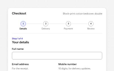
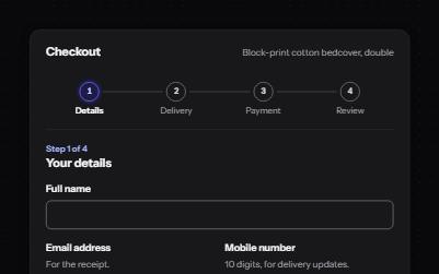
A checkout split into four steps, with a progress list, a heading that takes focus on every step, and a review to change answers.
-
Progress bar
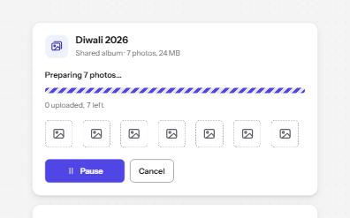
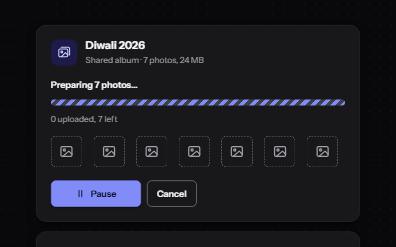
Determinate and indeterminate progress on the native progress element, with a label, visible numbers and milestone announcements.
-
Breadcrumb
A trail of links from the home page to the current one, so people can see where they are and step back up.
-
Status message
Results, confirmations and saves told to screen readers through role=status, without moving focus, once each time.