Accessibility pattern · Data display
Accessible bar chart
The bars are drawn in SVG for the eye and exposed as a named group of images for everything else: one tab stop, the arrow keys between months, each bar saying its month and value. Values sit on the bars, the comparison year is hatched as well as listed in a legend, and the same numbers are one button away as a real table.
- WCAG criteria
- 7
- Keyboard rules
- 5
- Checked with
- axe, keyboard and the inspector
Live demo
Try it
Use it with a mouse, a keyboard or a screen reader. The inspector beside it shows what the browser tells assistive technology as you go: focus, state changes and announcements.
The demo works without JavaScript only as far as its HTML does; the inspector needs JavaScript.
Keyboard
Keys it answers to
Every action works without a pointer.
| Key | What it does |
|---|---|
| Tab | Moves onto the chart once, landing on the last bar you visited; the next Tab leaves the chart. |
| Arrow Right or Arrow Left | Moves to the next or previous month and shows its tooltip; Arrow Down and Arrow Up do the same. |
| Home or End | Moves to the first or last month. |
| Escape | Hides the tooltip without moving focus; it comes back on the next bar. |
| Enter or Space | On Compare with last year, adds or removes the 2025 bars; on Show data table, opens or closes the table. |
Screen readers
What it announces
Written from the roles, names and states in the markup.
| When | Expected announcement |
|---|---|
| Tab reaches the chart | Monthly sales, 2026, group. Sales peaked at ₹4.2 lakh in March… January: ₹2.8 lakh, image |
| Arrow Right reaches March | March: ₹4.2 lakh, highest, image |
| Compare with last year is pressed | Compare with last year, toggle button, pressed |
| A bar is reached while comparing | March: ₹4.2 lakh, highest, image. 2025: ₹3.6 lakh, up 17% |
| The table is opened | Hide data table, button, expanded |
These are expected announcements, not recordings. Wording and order differ between screen readers and browsers.
Code
Copy the code
The exact files this demo runs on. The styles are served with a prefix that keeps this site's own styles out of the demo; what you copy is the original.
<figure class="ap-bar-chart" data-ap-bar-chart data-max="5" data-step="1" aria-labelledby="bar-chart-name">
  <div class="ap-bar-chart__top">
    <div class="ap-bar-chart__id">
      <h3 class="ap-bar-chart__name" id="bar-chart-name">Monthly sales, 2026</h3>
      <p class="ap-bar-chart__takeaway" id="bar-chart-takeaway">Sales peaked at ₹4.2 lakh in March, dipped in April and have grown every month since. <span class="ap-bar-chart__then">Every month beat 2025 except April.</span></p>
    </div>
    <button type="button" class="ap-btn ap-bar-chart__compare" aria-pressed="false" data-ap-compare>
      <svg class="ap-btn__icon ap-bar-chart__box" viewBox="0 0 24 24" aria-hidden="true" focusable="false"><rect x="4" y="4" width="16" height="16" rx="4"/><path class="ap-bar-chart__tick" d="m8 12 3 3 5-6"/></svg>
      Compare with last year
    </button>
  </div>

  <ul class="ap-bar-chart__legend ap-bar-chart__then">
    <li><svg class="ap-bar-chart__swatch" viewBox="0 0 14 14" aria-hidden="true" focusable="false"><rect x="1" y="1" width="12" height="12" rx="3"/></svg>2026</li>
    <li><svg class="ap-bar-chart__swatch ap-bar-chart__swatch--last" viewBox="0 0 14 14" aria-hidden="true" focusable="false"><rect x="1" y="1" width="12" height="12" rx="3"/></svg>2025, hatched</li>
  </ul>

  <div class="ap-bar-chart__chart" data-ap-chart>
    <span class="ap-bar-chart__unit" aria-hidden="true">₹ lakh</span>
    <svg class="ap-bar-chart__svg" aria-hidden="true" focusable="false">
      <defs>
        <pattern id="bar-chart-hatch" width="6" height="6" patternUnits="userSpaceOnUse" patternTransform="rotate(45)">
          <rect class="ap-bar-chart__hatch-ground" width="6" height="6"/>
          <path class="ap-bar-chart__hatch-ink" d="M1.5 0V6"/>
        </pattern>
      </defs>
      <g data-ap-grid></g>
      <g data-ap-bars></g>
      <g data-ap-values></g>
    </svg>
    <div class="ap-bar-chart__cols" role="group" aria-labelledby="bar-chart-name" aria-describedby="bar-chart-takeaway">
      <div class="ap-bar-chart__col" role="img" tabindex="0" aria-label="January: ₹2.8 lakh" data-value="2.8" data-last="2.5" data-ap-vs="bar-chart-vs-jan">
        <span class="ap-bar-chart__tip">
          <span class="ap-bar-chart__when">January 2026</span>
          <span class="ap-bar-chart__row"><span class="ap-bar-chart__key"></span><strong>₹2.8 lakh</strong></span>
          <span class="ap-bar-chart__row ap-bar-chart__vs ap-bar-chart__then" id="bar-chart-vs-jan"><span class="ap-bar-chart__key ap-bar-chart__key--last"></span>2025: ₹2.5 lakh, up 12%</span>
        </span>
        <span class="ap-bar-chart__month">Jan</span>
      </div>
      <div class="ap-bar-chart__col" role="img" tabindex="-1" aria-label="February: ₹3.1 lakh" data-value="3.1" data-last="2.7" data-ap-vs="bar-chart-vs-feb">
        <span class="ap-bar-chart__tip">
          <span class="ap-bar-chart__when">February 2026</span>
          <span class="ap-bar-chart__row"><span class="ap-bar-chart__key"></span><strong>₹3.1 lakh</strong></span>
          <span class="ap-bar-chart__row ap-bar-chart__vs ap-bar-chart__then" id="bar-chart-vs-feb"><span class="ap-bar-chart__key ap-bar-chart__key--last"></span>2025: ₹2.7 lakh, up 15%</span>
        </span>
        <span class="ap-bar-chart__month">Feb</span>
      </div>
      <div class="ap-bar-chart__col" role="img" tabindex="-1" aria-label="March: ₹4.2 lakh, highest" data-value="4.2" data-last="3.6" data-ap-vs="bar-chart-vs-mar">
        <span class="ap-bar-chart__tip">
          <span class="ap-bar-chart__when">March 2026</span>
          <span class="ap-bar-chart__row"><span class="ap-bar-chart__key"></span><strong>₹4.2 lakh</strong></span>
          <span class="ap-bar-chart__row ap-bar-chart__vs ap-bar-chart__then" id="bar-chart-vs-mar"><span class="ap-bar-chart__key ap-bar-chart__key--last"></span>2025: ₹3.6 lakh, up 17%</span>
          <span class="ap-bar-chart__note">Highest month</span>
        </span>
        <span class="ap-bar-chart__month">Mar</span>
      </div>
      <div class="ap-bar-chart__col" role="img" tabindex="-1" aria-label="April: ₹2.4 lakh, lowest" data-value="2.4" data-last="2.6" data-ap-vs="bar-chart-vs-apr">
        <span class="ap-bar-chart__tip">
          <span class="ap-bar-chart__when">April 2026</span>
          <span class="ap-bar-chart__row"><span class="ap-bar-chart__key"></span><strong>₹2.4 lakh</strong></span>
          <span class="ap-bar-chart__row ap-bar-chart__vs ap-bar-chart__then" id="bar-chart-vs-apr"><span class="ap-bar-chart__key ap-bar-chart__key--last"></span>2025: ₹2.6 lakh, down 8%</span>
          <span class="ap-bar-chart__note">Lowest month</span>
        </span>
        <span class="ap-bar-chart__month">Apr</span>
      </div>
      <div class="ap-bar-chart__col" role="img" tabindex="-1" aria-label="May: ₹2.9 lakh" data-value="2.9" data-last="2.6" data-ap-vs="bar-chart-vs-may">
        <span class="ap-bar-chart__tip">
          <span class="ap-bar-chart__when">May 2026</span>
          <span class="ap-bar-chart__row"><span class="ap-bar-chart__key"></span><strong>₹2.9 lakh</strong></span>
          <span class="ap-bar-chart__row ap-bar-chart__vs ap-bar-chart__then" id="bar-chart-vs-may"><span class="ap-bar-chart__key ap-bar-chart__key--last"></span>2025: ₹2.6 lakh, up 12%</span>
        </span>
        <span class="ap-bar-chart__month">May</span>
      </div>
      <div class="ap-bar-chart__col" role="img" tabindex="-1" aria-label="June: ₹3.3 lakh" data-value="3.3" data-last="2.8" data-ap-vs="bar-chart-vs-jun">
        <span class="ap-bar-chart__tip">
          <span class="ap-bar-chart__when">June 2026</span>
          <span class="ap-bar-chart__row"><span class="ap-bar-chart__key"></span><strong>₹3.3 lakh</strong></span>
          <span class="ap-bar-chart__row ap-bar-chart__vs ap-bar-chart__then" id="bar-chart-vs-jun"><span class="ap-bar-chart__key ap-bar-chart__key--last"></span>2025: ₹2.8 lakh, up 18%</span>
        </span>
        <span class="ap-bar-chart__month">Jun</span>
      </div>
      <div class="ap-bar-chart__col" role="img" tabindex="-1" aria-label="July: ₹3.6 lakh" data-value="3.6" data-last="3.0" data-ap-vs="bar-chart-vs-jul">
        <span class="ap-bar-chart__tip">
          <span class="ap-bar-chart__when">July 2026</span>
          <span class="ap-bar-chart__row"><span class="ap-bar-chart__key"></span><strong>₹3.6 lakh</strong></span>
          <span class="ap-bar-chart__row ap-bar-chart__vs ap-bar-chart__then" id="bar-chart-vs-jul"><span class="ap-bar-chart__key ap-bar-chart__key--last"></span>2025: ₹3.0 lakh, up 20%</span>
        </span>
        <span class="ap-bar-chart__month">Jul</span>
      </div>
      <div class="ap-bar-chart__col" role="img" tabindex="-1" aria-label="August: ₹3.8 lakh" data-value="3.8" data-last="3.1" data-ap-vs="bar-chart-vs-aug">
        <span class="ap-bar-chart__tip">
          <span class="ap-bar-chart__when">August 2026</span>
          <span class="ap-bar-chart__row"><span class="ap-bar-chart__key"></span><strong>₹3.8 lakh</strong></span>
          <span class="ap-bar-chart__row ap-bar-chart__vs ap-bar-chart__then" id="bar-chart-vs-aug"><span class="ap-bar-chart__key ap-bar-chart__key--last"></span>2025: ₹3.1 lakh, up 23%</span>
        </span>
        <span class="ap-bar-chart__month">Aug</span>
      </div>
    </div>
  </div>

  <details class="ap-bar-chart__data">
    <summary class="ap-btn ap-btn--ghost ap-bar-chart__toggle">
      <svg class="ap-btn__icon" viewBox="0 0 24 24" aria-hidden="true" focusable="false"><rect x="3.5" y="4.5" width="17" height="15" rx="2.5"/><path d="M3.5 9.5h17M3.5 14.5h17M9.5 9.5v10"/></svg>
      <span data-ap-label>Show data table</span>
    </summary>
    <div class="ap-bar-chart__scroll">
      <table class="ap-bar-chart__table">
        <caption>Monthly sales in ₹ lakh, January to August</caption>
        <thead>
          <tr><th scope="col">Month</th><th scope="col">2026</th><th scope="col" class="ap-bar-chart__then">2025</th><th scope="col" class="ap-bar-chart__then">Change from 2025</th></tr>
        </thead>
        <tbody>
          <tr><th scope="row">January</th><td>2.8</td><td class="ap-bar-chart__then">2.5</td><td class="ap-bar-chart__then">+12%</td></tr>
          <tr><th scope="row">February</th><td>3.1</td><td class="ap-bar-chart__then">2.7</td><td class="ap-bar-chart__then">+15%</td></tr>
          <tr><th scope="row">March</th><td>4.2</td><td class="ap-bar-chart__then">3.6</td><td class="ap-bar-chart__then">+17%</td></tr>
          <tr><th scope="row">April</th><td>2.4</td><td class="ap-bar-chart__then">2.6</td><td class="ap-bar-chart__then">−8%</td></tr>
          <tr><th scope="row">May</th><td>2.9</td><td class="ap-bar-chart__then">2.6</td><td class="ap-bar-chart__then">+12%</td></tr>
          <tr><th scope="row">June</th><td>3.3</td><td class="ap-bar-chart__then">2.8</td><td class="ap-bar-chart__then">+18%</td></tr>
          <tr><th scope="row">July</th><td>3.6</td><td class="ap-bar-chart__then">3.0</td><td class="ap-bar-chart__then">+20%</td></tr>
          <tr><th scope="row">August</th><td>3.8</td><td class="ap-bar-chart__then">3.1</td><td class="ap-bar-chart__then">+23%</td></tr>
        </tbody>
      </table>
    </div>
  </details>
</figure>
/* Shared primitives: buttons and form fields used across the patterns.
   Uses the --ap-* design tokens. */

.ap-btn {
  display: inline-flex;
  align-items: center;
  justify-content: center;
  gap: 8px;
  min-height: 40px;
  padding: 0 16px;
  border: 1px solid var(--ap-border-strong);
  border-radius: var(--ap-radius-sm);
  background: var(--ap-surface);
  color: var(--ap-text);
  font: inherit;
  font-weight: 600;
  line-height: 1.2;
  text-decoration: none;
  white-space: nowrap;
  cursor: pointer;
  transition: background-color var(--ap-duration) var(--ap-ease), border-color var(--ap-duration) var(--ap-ease), box-shadow var(--ap-duration) var(--ap-ease);
}
.ap-btn:hover {
  background: var(--ap-surface-2);
}
.ap-btn:focus-visible {
  outline: 2px solid var(--ap-focus);
  outline-offset: 2px;
}
.ap-btn:disabled,
.ap-btn[aria-disabled="true"] {
  opacity: .55;
  cursor: not-allowed;
}
.ap-btn--primary {
  border-color: var(--ap-accent);
  background: var(--ap-accent);
  color: var(--ap-on-accent);
  box-shadow: var(--ap-shadow-sm);
}
.ap-btn--primary:hover {
  border-color: var(--ap-accent-hover);
  background: var(--ap-accent-hover);
}
.ap-btn--danger {
  border-color: var(--ap-danger);
  background: var(--ap-danger);
  color: var(--ap-surface);
}
.ap-btn--danger:hover {
  filter: brightness(1.08);
}
.ap-btn--ghost {
  border-color: transparent;
  background: transparent;
}
.ap-btn--ghost:hover {
  background: var(--ap-surface-2);
}
.ap-btn__icon {
  width: 18px;
  height: 18px;
  flex-shrink: 0;
  fill: none;
  stroke: currentColor;
  stroke-width: 2;
  stroke-linecap: round;
  stroke-linejoin: round;
}

.ap-field {
  display: grid;
  gap: 6px;
}
.ap-label {
  color: var(--ap-text);
  font-weight: 600;
  font-size: .9375rem;
}
.ap-hint {
  margin: 0;
  color: var(--ap-text-3);
  font-size: .875rem;
  line-height: 1.45;
}
.ap-error {
  display: flex;
  align-items: flex-start;
  gap: 6px;
  margin: 0;
  color: var(--ap-danger);
  font-size: .875rem;
  font-weight: 600;
  line-height: 1.45;
}
.ap-input {
  width: 100%;
  min-height: 44px;
  padding: 10px 12px;
  border: 1px solid var(--ap-border-strong);
  border-radius: var(--ap-radius-sm);
  background: var(--ap-surface);
  color: var(--ap-text);
  font: inherit;
  line-height: 1.4;
  transition: border-color var(--ap-duration) var(--ap-ease), box-shadow var(--ap-duration) var(--ap-ease);
}
.ap-input::placeholder {
  color: var(--ap-text-3);
}
.ap-input:hover {
  border-color: var(--ap-text-2);
}
.ap-input:focus-visible {
  outline: 2px solid var(--ap-focus);
  outline-offset: 1px;
  border-color: var(--ap-focus);
}
.ap-input[aria-invalid="true"] {
  border-color: var(--ap-danger);
  box-shadow: inset 4px 0 0 var(--ap-danger);
}
textarea.ap-input {
  resize: vertical;
  min-height: 88px;
}

@media (prefers-reduced-motion: reduce) {
  .ap-btn,
  .ap-input { transition: none; }
}

/* Bar chart. Uses the --ap-* design tokens and the shared primitives. */
.ap-bar-chart {
  container-type: inline-size;
  width: min(100%, 680px);
  margin: 0 auto;
  padding: 22px 24px 18px;
  border: 1px solid var(--ap-border);
  border-radius: var(--ap-radius-lg);
  background: var(--ap-surface);
  box-shadow: var(--ap-shadow-md);
  color: var(--ap-text);
}

/* The parts that only belong to the comparison. */
.ap-bar-chart:not(.is-compare) .ap-bar-chart__then {
  display: none;
}

.ap-bar-chart__top {
  display: flex;
  flex-wrap: wrap;
  align-items: flex-start;
  justify-content: space-between;
  gap: 14px 20px;
}
.ap-bar-chart__id {
  flex: 1 1 280px;
  min-width: 0;
}
.ap-bar-chart__name {
  margin: 0;
  color: var(--ap-text);
  font-size: 1.0625rem;
  font-weight: 650;
  line-height: 1.35;
}
.ap-bar-chart__takeaway {
  max-width: 54ch;
  margin: 4px 0 0;
  color: var(--ap-text-2);
  font-size: .9375rem;
  line-height: 1.5;
}

/* The comparison switch: a toggle button whose box fills and ticks when pressed. */
.ap-bar-chart__compare {
  flex-shrink: 0;
}
.ap-bar-chart__compare[aria-pressed="true"] {
  border-color: var(--ap-accent);
  background: var(--ap-accent-soft);
  color: var(--ap-accent-soft-text);
}
.ap-bar-chart__box rect {
  transition: fill var(--ap-duration) var(--ap-ease);
}
.ap-bar-chart__tick {
  opacity: 0;
}
.ap-bar-chart__compare[aria-pressed="true"] .ap-bar-chart__box rect {
  fill: var(--ap-accent);
  stroke: var(--ap-accent);
}
.ap-bar-chart__compare[aria-pressed="true"] .ap-bar-chart__tick {
  opacity: 1;
  stroke: var(--ap-on-accent);
}

.ap-bar-chart__legend {
  display: flex;
  flex-wrap: wrap;
  gap: 6px 18px;
  margin: 14px 0 0;
  padding: 0;
  list-style: none;
  color: var(--ap-text-2);
  font-size: .8125rem;
  font-weight: 500;
}
.ap-bar-chart__legend li {
  display: inline-flex;
  align-items: center;
  gap: 7px;
}
.ap-bar-chart__swatch {
  width: 14px;
  height: 14px;
  flex-shrink: 0;
}
.ap-bar-chart__swatch rect {
  fill: var(--ap-accent);
}
.ap-bar-chart__swatch--last rect {
  fill: url(#bar-chart-hatch);
  stroke: var(--ap-text-3);
  stroke-width: 1.5;
}

/* The chart box. The script reads these three lengths to lay out the SVG. */
.ap-bar-chart__chart {
  --bc-gutter: 30px;
  --bc-head: 28px;
  --bc-axis: 30px;
  position: relative;
  height: 270px;
  margin-top: 16px;
}
.ap-bar-chart__unit {
  position: absolute;
  top: 0;
  left: 0;
  color: var(--ap-text-3);
  font-size: .75rem;
  line-height: 1.2;
}
.ap-bar-chart__svg {
  position: absolute;
  font-family: var(--ap-font);
  inset: 0;
  width: 100%;
  height: 100%;
  overflow: visible;
}

.ap-bar-chart__grid-line {
  stroke: var(--ap-border);
  stroke-width: 1;
  shape-rendering: crispEdges;
}
.ap-bar-chart__base-line {
  stroke: var(--ap-border-strong);
}
.ap-bar-chart__tick-label {
  fill: var(--ap-text-3);
  font-size: 12px;
  font-variant-numeric: tabular-nums;
  text-anchor: end;
}
.ap-bar-chart__band {
  fill: var(--ap-surface-2);
  opacity: 0;
  transition: opacity var(--ap-duration) var(--ap-ease);
}
.ap-bar-chart__band.is-active {
  opacity: 1;
}

.ap-bar-chart__bar {
  fill: var(--ap-accent);
  transform-box: fill-box;
  transform-origin: 50% 100%;
  transition: fill var(--ap-duration) var(--ap-ease);
  animation: ap-bar-chart-grow 560ms var(--ap-ease) both;
  animation-delay: calc(var(--i, 0) * 40ms);
}
.ap-bar-chart__bar.is-active {
  fill: var(--ap-accent-hover);
}
.ap-bar-chart__bar--last {
  display: none;
  fill: url(#bar-chart-hatch);
  stroke: var(--ap-text-3);
  stroke-width: 1.5;
}
.ap-bar-chart__bar--last.is-active {
  fill: url(#bar-chart-hatch);
  stroke: var(--ap-text-2);
}
.ap-bar-chart.is-compare .ap-bar-chart__bar--last {
  display: inline;
}
.ap-bar-chart__hatch-ground {
  fill: var(--ap-surface);
}
.ap-bar-chart__hatch-ink {
  stroke: var(--ap-text-3);
  stroke-width: 2;
}

.ap-bar-chart__value {
  fill: var(--ap-text-2);
  font-size: 12px;
  font-weight: 600;
  font-variant-numeric: tabular-nums;
  text-anchor: middle;
  animation: ap-bar-chart-fade 280ms ease both;
  animation-delay: calc(var(--i, 0) * 40ms + 380ms);
}
.ap-bar-chart__value--last {
  display: none;
  fill: var(--ap-text-3);
  font-weight: 500;
}
/* Last year's values only when each one fits over its own bar; the script measures. */
.ap-bar-chart.is-compare.is-roomy .ap-bar-chart__value--last {
  display: inline;
}

/* The bars people focus: one column per month, laid over the drawing. */
.ap-bar-chart__cols {
  position: absolute;
  inset: 0 0 0 var(--bc-gutter);
  display: grid;
  grid-auto-flow: column;
  grid-auto-columns: minmax(0, 1fr);
}
.ap-bar-chart__col {
  position: relative;
  display: flex;
  flex-direction: column;
  justify-content: flex-end;
  align-items: center;
  min-width: 0;
  border-radius: var(--ap-radius-sm);
  cursor: default;
}
.ap-bar-chart__col:focus {
  outline: none;
}
.ap-bar-chart__col:focus-visible {
  outline: 2px solid var(--ap-focus);
  outline-offset: -2px;
}
.ap-bar-chart__month {
  display: grid;
  place-items: center;
  width: 100%;
  height: var(--bc-axis);
  color: var(--ap-text-3);
  font-size: .8125rem;
  white-space: nowrap;
}
.ap-bar-chart__col.is-active .ap-bar-chart__month {
  color: var(--ap-text);
  font-weight: 600;
}

/* The tooltip: above the bar, inside its column, so the pointer can move onto it. */
.ap-bar-chart__tip {
  position: absolute;
  top: var(--bc-tip-y, 0px);
  left: 50%;
  z-index: 2;
  display: grid;
  gap: 3px;
  padding: 10px 12px;
  border: 1px solid var(--ap-border);
  border-radius: var(--ap-radius-sm);
  background: var(--ap-surface);
  box-shadow: var(--ap-shadow-lg);
  color: var(--ap-text);
  font-size: .8125rem;
  line-height: 1.4;
  white-space: nowrap;
  transform: translate(-50%, calc(-100% - 26px));
  visibility: hidden;
  opacity: 0;
  transition: opacity 120ms var(--ap-ease), visibility 0s linear 120ms;
}
.ap-bar-chart__col:nth-child(-n+2) .ap-bar-chart__tip {
  left: 0;
  transform: translate(0, calc(-100% - 26px));
}
.ap-bar-chart__col:nth-last-child(-n+2) .ap-bar-chart__tip {
  left: auto;
  right: 0;
  transform: translate(0, calc(-100% - 26px));
}
.ap-bar-chart__col.is-active:not(.is-dismissed) .ap-bar-chart__tip {
  visibility: visible;
  opacity: 1;
  transition: opacity 120ms var(--ap-ease);
}
.ap-bar-chart__when {
  color: var(--ap-text-3);
  font-size: .75rem;
}
.ap-bar-chart__row {
  display: flex;
  align-items: center;
  gap: 7px;
}
.ap-bar-chart__row strong {
  font-size: .9375rem;
  font-weight: 650;
}
.ap-bar-chart__vs {
  color: var(--ap-text-2);
}
.ap-bar-chart__key {
  width: 10px;
  height: 10px;
  flex-shrink: 0;
  border-radius: 3px;
  background: var(--ap-accent);
}
.ap-bar-chart__key--last {
  border: 1.5px solid var(--ap-text-3);
  background: repeating-linear-gradient(45deg, var(--ap-text-3) 0 1.5px, transparent 1.5px 4px);
}
.ap-bar-chart__note {
  margin-top: 2px;
  color: var(--ap-accent-text);
  font-size: .75rem;
  font-weight: 600;
}

/* The data table. */
.ap-bar-chart__data {
  margin-top: 14px;
  padding-top: 12px;
  border-top: 1px solid var(--ap-border);
}
.ap-bar-chart__toggle {
  width: fit-content;
  margin-left: -8px;
  padding: 0 10px;
  list-style: none;
}
.ap-bar-chart__toggle::-webkit-details-marker {
  display: none;
}
.ap-bar-chart__table {
  width: 100%;
  margin-top: 10px;
  border-collapse: collapse;
  font-size: .875rem;
  font-variant-numeric: tabular-nums;
}
.ap-bar-chart__table caption {
  padding: 0 0 8px;
  color: var(--ap-text-3);
  font-size: .8125rem;
  text-align: start;
}
.ap-bar-chart__table th,
.ap-bar-chart__table td {
  padding: 8px 10px;
  border-bottom: 1px solid var(--ap-border);
  text-align: end;
}
.ap-bar-chart__table thead th {
  background: var(--ap-surface-2);
  color: var(--ap-text-2);
  font-weight: 600;
}
.ap-bar-chart__table th:first-child {
  text-align: start;
}
.ap-bar-chart__table tbody th {
  color: var(--ap-text);
  font-weight: 500;
}
.ap-bar-chart__table td {
  color: var(--ap-text-2);
}

@container (max-width: 460px) {
  .ap-bar-chart {
    padding: 18px 16px 14px;
  }
  .ap-bar-chart__chart {
    --bc-gutter: 24px;
    height: 250px;
  }
  .ap-bar-chart__compare {
    width: 100%;
  }
}

@keyframes ap-bar-chart-grow {
  from { transform: scaleY(0); }
}
@keyframes ap-bar-chart-fade {
  from { opacity: 0; }
}

@media (prefers-reduced-motion: reduce) {
  .ap-bar-chart__bar,
  .ap-bar-chart__value { animation: none; }
  .ap-bar-chart__bar,
  .ap-bar-chart__band,
  .ap-bar-chart__tip,
  .ap-bar-chart__box rect { transition: none; }
}

/* Forced colors replace every color; keep the two years apart by ink and hatching. */
@media (forced-colors: active) {
  .ap-bar-chart__bar,
  .ap-bar-chart__swatch rect { fill: CanvasText; }
  .ap-bar-chart__bar.is-active { fill: Highlight; }
  .ap-bar-chart__bar--last,
  .ap-bar-chart__bar--last.is-active,
  .ap-bar-chart__swatch--last rect { fill: url(#bar-chart-hatch); stroke: CanvasText; }
  .ap-bar-chart__hatch-ground { fill: Canvas; }
  .ap-bar-chart__hatch-ink { stroke: CanvasText; }
  .ap-bar-chart__compare[aria-pressed="true"] .ap-bar-chart__box rect { fill: ButtonText; stroke: ButtonText; }
  .ap-bar-chart__compare[aria-pressed="true"] .ap-bar-chart__tick { stroke: ButtonFace; }
  .ap-bar-chart__grid-line { stroke: GrayText; }
  .ap-bar-chart__base-line { stroke: CanvasText; }
  .ap-bar-chart__tick-label,
  .ap-bar-chart__value { fill: CanvasText; }
  .ap-bar-chart__band { fill: Canvas; }
  .ap-bar-chart__key { forced-color-adjust: none; background: CanvasText; }
  .ap-bar-chart__key--last { border-color: CanvasText; background: repeating-linear-gradient(45deg, CanvasText 0 1.5px, Canvas 1.5px 4px); }
}
/**
 * Bar chart: an SVG column chart drawn from the data on its bars. The bars
 * share one tab stop, the arrow keys move between them, each shows a tooltip
 * that can be hovered and dismissed, and a second year can be compared.
 *
 * Markup: [data-ap-bar-chart] (data-max and data-step set the value axis)
 * holding a button[data-ap-compare][aria-pressed], and a chart box
 * [data-ap-chart] with an svg (groups [data-ap-grid], [data-ap-bars],
 * [data-ap-values]) and a role=group of role=img bars. Each bar carries
 * data-value, data-last and data-ap-vs, the id of its comparison line.
 * The box's CSS lengths --bc-gutter, --bc-head and --bc-axis place the plot.
 */

const SVG = "http://www.w3.org/2000/svg";
const MAX_BAR = 24; // thin bars read as calmer and leave air between months
const GRACE = 90;   // ms a shown tooltip waits before the next bar takes over

function make(tag, className, parent) {
  const el = document.createElementNS(SVG, tag);
  el.setAttribute("class", className);
  parent.append(el);
  return el;
}

const round = (n) => Math.round(n * 100) / 100;

/** A bar with rounded top corners and a square foot on the baseline. */
function barPath(x, w, top, base) {
  const h = base - top;
  if (h <= 0 || w <= 0) return "";
  const r = Math.min(4, w / 2, h);
  const [a, b, t, f] = [x, x + w, top, base].map(round);
  return `M${a} ${f}V${round(t + r)}A${r} ${r} 0 0 1 ${round(a + r)} ${t}H${round(b - r)}A${r} ${r} 0 0 1 ${b} ${round(t + r)}V${f}Z`;
}

export function init(root) {
  const chart = root.querySelector("[data-ap-chart]");
  const svg = chart.querySelector("svg");
  const grid = svg.querySelector("[data-ap-grid]");
  const group = chart.querySelector("[role=group]");
  const cols = [...group.querySelectorAll("[role=img][data-value]")];
  const compare = root.querySelector("[data-ap-compare]");
  const data = root.querySelector("details");
  const dataLabel = data?.querySelector("[data-ap-label]");
  const events = new AbortController();
  const on = (target, type, fn) => target.addEventListener(type, fn, { signal: events.signal });

  // One set of marks per bar, made once; draw() only moves them.
  const barLayer = svg.querySelector("[data-ap-bars]");
  const valueLayer = svg.querySelector("[data-ap-values]");
  const marks = cols.map((col, i) => {
    const band = make("rect", "ap-bar-chart__band", barLayer);
    const last = make("path", "ap-bar-chart__bar ap-bar-chart__bar--last", barLayer);
    const now = make("path", "ap-bar-chart__bar", barLayer);
    const lastValue = make("text", "ap-bar-chart__value ap-bar-chart__value--last", valueLayer);
    const nowValue = make("text", "ap-bar-chart__value", valueLayer);
    for (const el of [last, now, lastValue, nowValue]) el.style.setProperty("--i", i);
    const value = Number(col.dataset.value);
    const before = Number(col.dataset.last);
    nowValue.textContent = value.toFixed(1);
    lastValue.textContent = before.toFixed(1);
    return { band, last, now, lastValue, nowValue, value, before };
  });

  const comparing = () => root.classList.contains("is-compare");

  function draw() {
    const width = chart.clientWidth;
    const height = chart.clientHeight;
    if (!width || !height) return;
    const css = getComputedStyle(chart);
    const gutter = parseFloat(css.getPropertyValue("--bc-gutter")) || 30;
    const head = parseFloat(css.getPropertyValue("--bc-head")) || 28;
    const axis = parseFloat(css.getPropertyValue("--bc-axis")) || 30;
    const step = Number(root.dataset.step) || 1;
    const max = Number(root.dataset.max) || Math.ceil(Math.max(...marks.flatMap((m) => [m.value, m.before])));
    const base = height - axis;
    const y = (v) => base - (v / max) * (base - head);

    // Gridlines and their values, faint: every bar is labelled anyway.
    grid.replaceChildren();
    for (let v = 0; v <= max + 1e-9; v += step) {
      const line = make("line", v === 0 ? "ap-bar-chart__grid-line ap-bar-chart__base-line" : "ap-bar-chart__grid-line", grid);
      const at = round(y(v)) + 0.5;
      line.setAttribute("x1", gutter);
      line.setAttribute("x2", width);
      line.setAttribute("y1", at);
      line.setAttribute("y2", at);
      const label = make("text", "ap-bar-chart__tick-label", grid);
      label.setAttribute("x", gutter - 8);
      label.setAttribute("y", at);
      label.setAttribute("dy", "0.35em");
      label.textContent = String(round(v));
    }

    const band = (width - gutter) / cols.length;
    const pair = comparing();
    const single = Math.min(MAX_BAR, band * 0.56);
    const half = Math.min(MAX_BAR, (band * 0.8 - 2) / 2); // two bars and a 2px gap
    let widest = 0;

    marks.forEach((m, i) => {
      const centre = gutter + band * (i + 0.5);
      const w = pair ? half : single;
      const nowX = pair ? centre + 1 : centre - w / 2;
      const lastX = centre - 1 - half;
      m.band.setAttribute("x", round(gutter + band * i + 2));
      m.band.setAttribute("width", round(Math.max(0, band - 4)));
      m.band.setAttribute("y", round(head - 18));
      m.band.setAttribute("height", round(height - head + 18));
      m.band.setAttribute("rx", 8);
      m.now.setAttribute("d", barPath(nowX, w, y(m.value), base));
      m.last.setAttribute("d", barPath(lastX, half, y(m.before), base));
      m.nowValue.setAttribute("x", round(nowX + w / 2));
      m.nowValue.setAttribute("y", round(y(m.value) - 7));
      m.lastValue.setAttribute("x", round(lastX + half / 2));
      m.lastValue.setAttribute("y", round(y(m.before) - 7));
      widest = Math.max(widest, m.nowValue.getComputedTextLength?.() || 0);
      // The tooltip sits above the taller of the bars in this column.
      const top = pair ? Math.min(y(m.value), y(m.before)) : y(m.value);
      cols[i].style.setProperty("--bc-tip-y", `${round(top)}px`);
    });

    // Last year's values only where each fits over its own bar without touching.
    root.classList.toggle("is-roomy", half >= widest + 4);
  }

  /* ── Which bar is active: the one under the pointer, else the focused one ── */
  let hover = -1;
  let focused = -1;
  let shown = -1;
  let dismissed = false;
  let wait = 0;

  function paint() {
    const at = hover >= 0 ? hover : focused;
    if (at !== shown) {
      shown = at;
      dismissed = false;
    }
    cols.forEach((col, i) => {
      col.classList.toggle("is-active", i === at);
      col.classList.toggle("is-dismissed", i === at && dismissed);
    });
    marks.forEach((m, i) => {
      for (const el of [m.band, m.now, m.last]) el.classList.toggle("is-active", i === at);
    });
  }

  on(group, "focusin", (event) => {
    const i = cols.indexOf(event.target);
    if (i === -1) return;
    for (const col of cols) col.tabIndex = col === event.target ? 0 : -1;
    clearTimeout(wait);
    focused = i;
    hover = -1;
    paint();
  });
  on(group, "focusout", (event) => {
    if (!group.contains(event.relatedTarget)) {
      focused = -1;
      paint();
    }
  });
  // A shown tooltip waits a moment before giving way, so a pointer heading for
  // it on a slant can cross a neighbouring bar without losing it.
  function setHover(i) {
    clearTimeout(wait);
    if (i === hover) return;
    const tipShown = hover !== -1 && shown === hover && !dismissed;
    const apply = () => {
      hover = i;
      paint();
    };
    if (tipShown) wait = setTimeout(apply, GRACE);
    else apply();
  }
  on(group, "pointerover", (event) => {
    const i = cols.indexOf(event.target.closest("[role=img]"));
    if (i !== -1) setHover(i);
  });
  // Leaving the bars, or their tooltips, which sit inside them.
  on(group, "pointerleave", () => setHover(-1));

  on(group, "keydown", (event) => {
    const at = cols.indexOf(document.activeElement);
    if (at === -1) return;
    let next = -1;
    if (event.key === "ArrowRight" || event.key === "ArrowDown") next = Math.min(at + 1, cols.length - 1);
    else if (event.key === "ArrowLeft" || event.key === "ArrowUp") next = Math.max(at - 1, 0);
    else if (event.key === "Home") next = 0;
    else if (event.key === "End") next = cols.length - 1;
    else if (event.key === "Escape" && shown !== -1 && !dismissed) {
      // Hide the tooltip; focus and the pointer stay where they are.
      event.preventDefault();
      event.stopPropagation();
      dismissed = true;
      paint();
      return;
    }
    if (next === -1) return;
    event.preventDefault();
    cols[next].focus();
  });

  // Escape hides a tooltip shown by hovering too, wherever focus is on the page.
  on(document, "keydown", (event) => {
    if (event.key === "Escape" && !group.contains(document.activeElement) && shown !== -1 && !dismissed) {
      dismissed = true;
      paint();
    }
  });

  on(compare, "click", () => {
    const pressed = compare.getAttribute("aria-pressed") !== "true";
    compare.setAttribute("aria-pressed", String(pressed));
    root.classList.toggle("is-compare", pressed);
    // While comparing, each bar is described by its line about last year.
    for (const col of cols) {
      if (pressed) col.setAttribute("aria-describedby", col.dataset.apVs);
      else col.removeAttribute("aria-describedby");
    }
    draw();
  });

  // The toggle says what it will do next.
  if (data && dataLabel) {
    on(data, "toggle", () => {
      dataLabel.textContent = data.open ? "Hide data table" : "Show data table";
    });
  }

  const resize = new ResizeObserver(draw);
  resize.observe(chart);
  draw();

  return () => {
    events.abort();
    resize.disconnect();
    clearTimeout(wait);
  };
}

for (const root of document.querySelectorAll("[data-ap-bar-chart]")) init(root);
/* Design tokens for the pattern components. Light by default, dark when the
   system asks for it; set data-theme="dark" on :root to force dark. */
:root {
    --ap-radius-sm: 8px;
    --ap-radius: 12px;
    --ap-radius-lg: 16px;
    --ap-radius-full: 999px;
    --ap-font: "Instrument Sans", ui-sans-serif, system-ui, -apple-system, "Segoe UI", Roboto, sans-serif;
    --ap-mono: "JetBrains Mono", ui-monospace, "Cascadia Mono", "SF Mono", Consolas, monospace;
    --ap-ease: cubic-bezier(.2, .8, .2, 1);
    --ap-duration: 180ms;
    --ap-target: 44px;
    --ap-bg: #F4F4F5;
    --ap-surface: #FFFFFF;
    --ap-surface-2: #F4F4F5;
    --ap-surface-3: #E4E4E7;
    --ap-border: #E4E4E7;
    --ap-border-strong: #76767F;
    --ap-text: #18181B;
    --ap-text-2: #3F3F46;
    --ap-text-3: #5E5E66;
    --ap-accent: #4F46E5;
    --ap-accent-hover: #4338CA;
    --ap-on-accent: #FFFFFF;
    --ap-accent-text: #4338CA;
    --ap-accent-soft: #EEF2FF;
    --ap-accent-soft-text: #3730A3;
    --ap-focus: #4F46E5;
    --ap-danger: #B91C1C;
    --ap-danger-soft: #FEF2F2;
    --ap-success: #15803D;
    --ap-success-soft: #F0FDF4;
    --ap-warning: #A15C07;
    --ap-warning-soft: #FEFCE8;
    --ap-info: #1D4ED8;
    --ap-info-soft: #EFF6FF;
    --ap-scrim: rgb(9 9 11 / .48);
    --ap-shadow-sm: 0 1px 2px rgb(9 9 11 / .06);
    --ap-shadow-md: 0 1px 2px rgb(9 9 11 / .05), 0 6px 16px -4px rgb(9 9 11 / .1);
    --ap-shadow-lg: 0 2px 6px rgb(9 9 11 / .06), 0 20px 40px -12px rgb(9 9 11 / .22);
    --ap-light-bg: #F4F4F5;
    --ap-light-surface: #FFFFFF;
    --ap-light-surface-2: #F4F4F5;
    --ap-light-surface-3: #E4E4E7;
    --ap-light-border: #E4E4E7;
    --ap-light-border-strong: #76767F;
    --ap-light-text: #18181B;
    --ap-light-text-2: #3F3F46;
    --ap-light-text-3: #5E5E66;
    --ap-light-accent: #4F46E5;
    --ap-light-accent-hover: #4338CA;
    --ap-light-on-accent: #FFFFFF;
    --ap-light-accent-text: #4338CA;
    --ap-light-accent-soft: #EEF2FF;
    --ap-light-accent-soft-text: #3730A3;
    --ap-light-focus: #4F46E5;
    --ap-light-danger: #B91C1C;
    --ap-light-danger-soft: #FEF2F2;
    --ap-light-success: #15803D;
    --ap-light-success-soft: #F0FDF4;
    --ap-light-warning: #A15C07;
    --ap-light-warning-soft: #FEFCE8;
    --ap-light-info: #1D4ED8;
    --ap-light-info-soft: #EFF6FF;
    --ap-light-scrim: rgb(9 9 11 / .48);
    --ap-light-shadow-sm: 0 1px 2px rgb(9 9 11 / .06);
    --ap-light-shadow-md: 0 1px 2px rgb(9 9 11 / .05), 0 6px 16px -4px rgb(9 9 11 / .1);
    --ap-light-shadow-lg: 0 2px 6px rgb(9 9 11 / .06), 0 20px 40px -12px rgb(9 9 11 / .22);
    --ap-dark-bg: #09090B;
    --ap-dark-surface: #18181B;
    --ap-dark-surface-2: #27272A;
    --ap-dark-surface-3: #3F3F46;
    --ap-dark-border: #2E2E33;
    --ap-dark-border-strong: #8E8E97;
    --ap-dark-text: #FAFAFA;
    --ap-dark-text-2: #D4D4D8;
    --ap-dark-text-3: #A1A1AA;
    --ap-dark-accent: #818CF8;
    --ap-dark-accent-hover: #A5B4FC;
    --ap-dark-on-accent: #0C0A1F;
    --ap-dark-accent-text: #A5B4FC;
    --ap-dark-accent-soft: #1E1B4B;
    --ap-dark-accent-soft-text: #C7D2FE;
    --ap-dark-focus: #A5B4FC;
    --ap-dark-danger: #F87171;
    --ap-dark-danger-soft: #2A1215;
    --ap-dark-success: #4ADE80;
    --ap-dark-success-soft: #0F2A1A;
    --ap-dark-warning: #FACC15;
    --ap-dark-warning-soft: #2A2410;
    --ap-dark-info: #60A5FA;
    --ap-dark-info-soft: #0F1D33;
    --ap-dark-scrim: rgb(0 0 0 / .62);
    --ap-dark-shadow-sm: 0 1px 2px rgb(0 0 0 / .4);
    --ap-dark-shadow-md: 0 1px 2px rgb(0 0 0 / .4), 0 8px 20px -6px rgb(0 0 0 / .5);
    --ap-dark-shadow-lg: 0 2px 8px rgb(0 0 0 / .45), 0 24px 48px -12px rgb(0 0 0 / .7);
}
@media (prefers-color-scheme: dark) {
  :root:not([data-theme="light"]) {
      --ap-bg: #09090B;
      --ap-surface: #18181B;
      --ap-surface-2: #27272A;
      --ap-surface-3: #3F3F46;
      --ap-border: #2E2E33;
      --ap-border-strong: #8E8E97;
      --ap-text: #FAFAFA;
      --ap-text-2: #D4D4D8;
      --ap-text-3: #A1A1AA;
      --ap-accent: #818CF8;
      --ap-accent-hover: #A5B4FC;
      --ap-on-accent: #0C0A1F;
      --ap-accent-text: #A5B4FC;
      --ap-accent-soft: #1E1B4B;
      --ap-accent-soft-text: #C7D2FE;
      --ap-focus: #A5B4FC;
      --ap-danger: #F87171;
      --ap-danger-soft: #2A1215;
      --ap-success: #4ADE80;
      --ap-success-soft: #0F2A1A;
      --ap-warning: #FACC15;
      --ap-warning-soft: #2A2410;
      --ap-info: #60A5FA;
      --ap-info-soft: #0F1D33;
      --ap-scrim: rgb(0 0 0 / .62);
      --ap-shadow-sm: 0 1px 2px rgb(0 0 0 / .4);
      --ap-shadow-md: 0 1px 2px rgb(0 0 0 / .4), 0 8px 20px -6px rgb(0 0 0 / .5);
      --ap-shadow-lg: 0 2px 8px rgb(0 0 0 / .45), 0 24px 48px -12px rgb(0 0 0 / .7);
  }
}
:root[data-theme="dark"] {
    --ap-bg: #09090B;
    --ap-surface: #18181B;
    --ap-surface-2: #27272A;
    --ap-surface-3: #3F3F46;
    --ap-border: #2E2E33;
    --ap-border-strong: #8E8E97;
    --ap-text: #FAFAFA;
    --ap-text-2: #D4D4D8;
    --ap-text-3: #A1A1AA;
    --ap-accent: #818CF8;
    --ap-accent-hover: #A5B4FC;
    --ap-on-accent: #0C0A1F;
    --ap-accent-text: #A5B4FC;
    --ap-accent-soft: #1E1B4B;
    --ap-accent-soft-text: #C7D2FE;
    --ap-focus: #A5B4FC;
    --ap-danger: #F87171;
    --ap-danger-soft: #2A1215;
    --ap-success: #4ADE80;
    --ap-success-soft: #0F2A1A;
    --ap-warning: #FACC15;
    --ap-warning-soft: #2A2410;
    --ap-info: #60A5FA;
    --ap-info-soft: #0F1D33;
    --ap-scrim: rgb(0 0 0 / .62);
    --ap-shadow-sm: 0 1px 2px rgb(0 0 0 / .4);
    --ap-shadow-md: 0 1px 2px rgb(0 0 0 / .4), 0 8px 20px -6px rgb(0 0 0 / .5);
    --ap-shadow-lg: 0 2px 8px rgb(0 0 0 / .45), 0 24px 48px -12px rgb(0 0 0 / .7);
}
WCAG 2.2
What it meets
The success criteria this pattern takes care of, and how.
-
1.1.1 Non-text Content
Level A
Every bar has a name with its month and value, the group is named by the chart's heading and described by its takeaway, and the drawing itself is hidden from assistive technology.
-
1.3.1 Info and Relationships
Level A
The same numbers are in a table with a caption and row and column headers, so the relationships survive without the picture.
-
1.4.1 Use of Color
Level A
Last year's bars are hatched and outlined, listed in a legend and labelled with values, so the two years never depend on telling colors apart.
-
1.4.11 Non-text Contrast
Level AA
Both series clear 3:1 against the chart surface in light and dark themes; gridlines are kept faint on purpose because every value is also written out.
-
1.4.13 Content on Hover or Focus
Level AA
The tooltip stays while the pointer moves onto it, stays until you leave the bar or move focus, and Escape hides it without moving anything.
-
2.1.1 Keyboard
Level A
Every bar can be reached and read from the keyboard, and the comparison and table controls are native buttons.
-
2.4.7 Focus Visible
Level AA
The focused month shows a two-pixel ring around its whole column, as well as the highlighted bar.
Usage
When to use it
Use it
- Comparing amounts across a handful of categories or periods, like sales by month or tickets by team.
- A dashboard where people want the shape at a glance and the exact number on demand.
Use something else
- A single number that matters on its own: show it as a figure, not a one-bar chart.
- Many points over time: a line chart reads trends better than thirty thin bars.
- Data people mainly look up rather than compare: give them the table first.
Common failures
How it usually goes wrong
A picture with no words
An SVG chart with no name is announced as "graphic" or skipped. Here each bar has a name and the group is named and described by the visible title and takeaway.
Series told apart by color alone
Two shades of one hue look the same to many people and in grayscale print. Last year's bars are hatched, outlined and named in a legend.
Values only in the tooltip
If hovering is the only way to read a number, touch and keyboard users miss it. Values are on the bars, in each bar's name and in the table.
A tooltip that vanishes when you reach for it
Moving the pointer from the bar to its tooltip should not close it, and people who zoom need to dismiss it without moving away. It stays while hovered and closes on Escape.
Every bar a tab stop
Eight bars, or eighty, in the Tab order bury whatever follows the chart. The bars share one stop and the arrow keys move between them.
A chart that cannot be checked
Without the underlying numbers nobody can verify the picture or copy a value. The data table toggle shows a real table with the same figures.
Notes
Building it
- The bars are focusable images inside a named group, not one image for the whole chart, because people asked to move between months; a static chart is better as one role=img with a name and a description.
- The script draws the SVG from data-value and data-last on each bar and redraws when the chart resizes, so bars stay 24 pixels or thinner and the hatching keeps its angle. Generate the names, the data and the table from one source in your product.
- Text sits in HTML over the drawing: it wraps, zooms crisply, follows text-spacing settings and can be translated. Only the numbers on the bars are SVG text.
- Under forced colors the bars switch to CanvasText and the hatching to CanvasText on Canvas, so the two years stay distinct when the system replaces every color.
- The bars grow in once, briefly, and not at all when the system asks for reduced motion.
Sources: WAI Images Tutorial: Complex images · WCAG 2.2: Understanding Content on Hover or Focus
Checked with axe in light and dark themes, at desktop and phone widths, and by keyboard. Not yet tested with every screen reader and browser pair. Report a correction
Related
Patterns that go with it
-
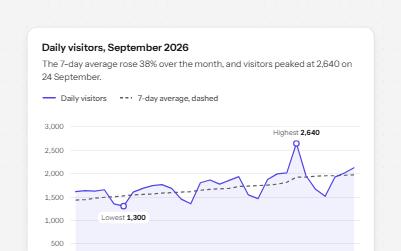
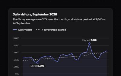
Accessible line chart
A line chart with a crosshair you can drive from the keyboard, each day read out, the peak marked and a table behind it.
-
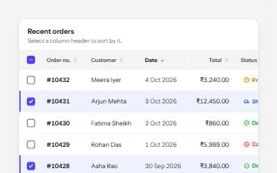
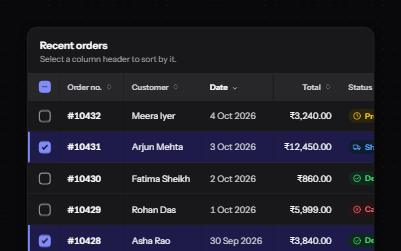
Sortable table
A data table with a caption, row headers, sort buttons that report the order, and row selection with a mixed Select all.
-
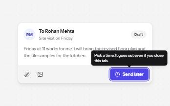
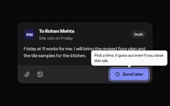
Tooltip
A short label or hint that appears on hover and keyboard focus, stays while you read it, and hides on Escape.
-
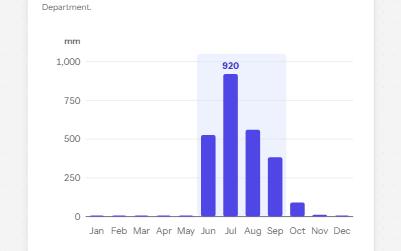
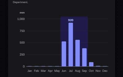
Complex image
A chart with a short alt that gives its point, a long description in a disclosure, and its data in a table beside it.